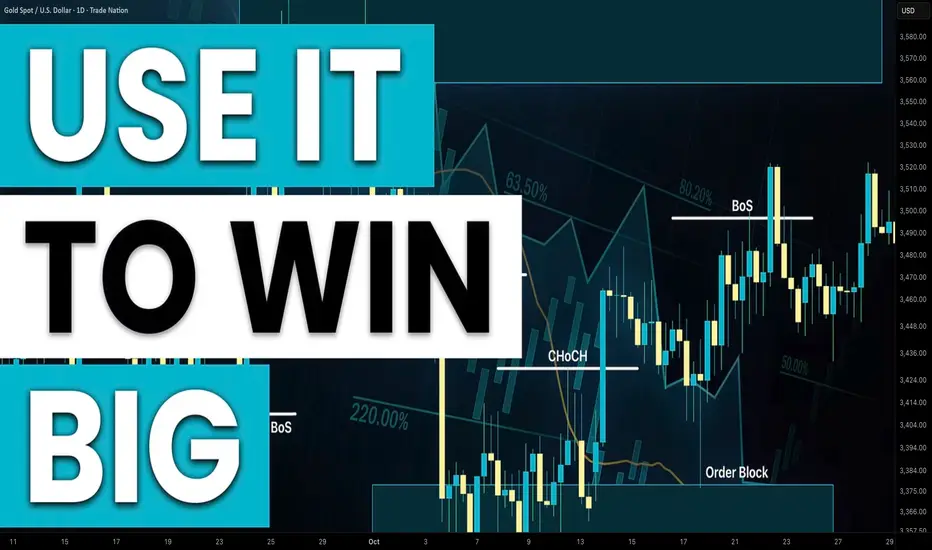
Smart Money Concepts SMC Detailed Learning Plan
If you want to learn Smart Money concepts, but you don't know what to start with, this article with help.
I will share with you 5-steps Smart Money Concepts learning plan. 5 important topics to study in SMC.
Topic 1:
Market Structure - the analysis of a behaviour of a price on a chart.
In the contest of Smart Money Concepts you should learn:
-SMC structure mapping
-Market trend identification, trend reversal & change
-SMC important events: BoS, CHoCH
Topic 2:
Liquidity Zones - learn to identify the areas on a price chart where liquidity concentrates.
Topic 3:
Imbalance - one of the most accurate signals of the presence of big players / smart money on the market.
Topic 4:
Order Block - the specific areas on a price chart where institutional traders / smart money are placing significant number of trading orders.
Top 5:
Top-Down Analysis - structured and consistent analysis of multiple time frames.
After you study Topic 1, 2, 3, 4, you should learn to apply these knowledge and techniques on multiple time frames, to make informed decisions, following long-term, mid-term, short-term analysis.
❤️Please, support my work with like, thank you!❤️
I am part of Trade Nation's Influencer program and receive a monthly fee for using their TradingView charts in my analysis.
Candlestick Analysis

4 Continuation Patterns Every Trader Must KnowWelcome back to another Mubite educational guide.
In trading, trends rarely move in a straight line. They pause, take a breath, and consolidate
before pushing forward. Unfortunately, many amateur traders mistake these healthy pauses for
reversals and panic-sell their positions too early.
To maximize your profits, you must learn to identify Continuation Patterns . These specific formations signal that the market is simply resting and the prevailing trend is about to resume.
Mastering these allows you to ride the trend to its full potential.
Here are the top 4 patterns you need to master.
1. The Rising Three Methods (Bullish)
This is a powerful pattern that occurs during a sustained uptrend. It represents a pause where
bulls take a break, but bears fail to push the price down significantly.
Structure:
1. Long Bullish Candle: A large green candle in line with the uptrend.
2. Three Small Bearish Candles: Three small red bodies that stay within the high
and low range of the first candle.
3. The Breakout Candle: A final large bullish candle that closes above the close of
the first candle.
● Psychology: The small pullback tricks weak hands into selling, but buyers step back in
with force, confirming the uptrend is still alive.
2. The Falling Three Methods (Bearish)
The opposite of the Rising Three, this pattern occurs in a downtrend and signals that selling
pressure is far from over.
Structure:
1. Long Bearish Candle: A large red candle in line with the downtrend.
2. Three Small Bullish Candles: Three small green bodies that retrace slightly but
stay within the range of the first candle.
3. The Breakout Candle: A final large bearish candle that closes below the close of
the first candle.
● Psychology: Sellers take profits, causing a small bounce, but buyers lack the conviction
to reverse the trend. Sellers return to push prices to new lows.
3. The Tasuki Gap (Upside & Downside)
Gaps are significant in price action. The Tasuki Gap is a unique continuation pattern that uses a
gap to confirm trend strength.
Upside Tasuki Gap (Bullish): A bullish candle is followed by another bullish candle that
"gaps up." The third candle is bearish and closes into the gap but does not close it
completely.
Signal: If the gap remains open, it acts as support. The trend is still up.
Downside Tasuki Gap (Bearish): A bearish candle is followed by another bearish
candle that "gaps down." The third candle is bullish and closes into the gap but does not
fill it.
Signal: The unfilled gap acts as resistance. The trend is still down.
4. Mat Hold Pattern (Bullish)
This is arguably one of the strongest continuation signals in Crypto and Forex trading. It is very
similar to the Rising Three Methods but shows even stronger bullish pressure.
● Structure: A long bullish candle is followed by a gap up and three small candles that
drift lower but stay well above the open of the first candle. A final large candle
continues the uptrend.
● The Difference: In a Mat Hold, the pullback is shallow (usually staying in the upper half
of the first candle's range), showing that bears have almost no power to push price
down.
3. The Tasuki Gap (Upside & Downside)
Gaps are significant in price action. The Tasuki Gap is a unique continuation pattern that uses a
gap to confirm trend strength.
● Upside Tasuki Gap (Bullish): A bullish candle is followed by another bullish candle that
"gaps up." The third candle is bearish and closes into the gap but does not close it
completely.
○ Signal: If the gap remains open, it acts as support. The trend is still up.
● Downside Tasuki Gap (Bearish): A bearish candle is followed by another bearish
candle that "gaps down." The third candle is bullish and closes into the gap but does not
fill it.
○ Signal: The unfilled gap acts as resistance. The trend is still down.
4. Mat Hold Pattern (Bullish)
This is arguably one of the strongest continuation signals in Crypto and Forex trading. It is very
similar to the Rising Three Methods but shows even stronger bullish pressure.
● Structure: A long bullish candle is followed by a gap up and three small candles that
drift lower but stay well above the open of the first candle. A final large candle
continues the uptrend.
● The Difference: In a Mat Hold, the pullback is shallow (usually staying in the upper half
of the first candle's range), showing that bears have almost no power to push price
down.
__________________________________________________________________________________
TRADING TIP: Context is King
Just like reversal patterns, continuation patterns must be traded with intent.
1. Volume Analysis: Look for lower volume during the "pause" (the small middle candles)
and exploding volume on the breakout candle.
2. Trend Confirmation: These patterns only work if there is an established trend. Do not
look for them in a chopping/ranging market.
__________________________________________________________________________________
Disclaimer: This analysis by Mubite is for educational purposes only and does not constitute
financial advice. Always manage your risk.
Which of these 4 patterns do you see most often on the Bitcoin chart? Let us know in the
comments below!

Quantitative Analysis of Algorithmic Candlestick Pattern● Quantitative Analysis of Algorithmic Candlestick Pattern Recognition: Code Logic, Statistical Reliability, and Market Psychology
● Introduction: The Intersection of Algorithmic Logic and Behavioral Finance
The digitization of financial markets has catalyzed a paradigm shift in technical analysis, moving from subjective visual interpretation to rigorous, rule-based algorithmic detection. Candlestick charting, a methodology with roots in 18th-century Japanese rice trading, serves as the foundational language for reading price action. However, in the context of modern high-frequency and systematic trading, the "art" of reading candles must be translated into the "science" of boolean logic, threshold ratios, and trend filters.
This report provides an exhaustive analysis of the 40+ candlestick patterns identified within the proprietary "Smart Candlestick Pattern Filter" indicator. By dissecting the source code, we isolate the specific mathematical conditions—such as the DOJI_RATIO of 0.05 or the SHADOW_MULT of 2.0—that determine pattern validity. Furthermore, we juxtapose these rigid algorithmic definitions against the theoretical underpinnings of market psychology and the statistical reliability data compiled by researchers such as Thomas Bulkowski.
The patterns are categorized by their signal strength (1 through 5), a hierarchical system inherent to the algorithm that attempts to filter market noise from actionable signal. This classification provides a structured framework for understanding how single-bar indecision evolves into complex, multi-bar reversal or continuation structures. The analysis reveals critical insights into the discrepancies between traditional textbook definitions and their code-based implementations, particularly regarding trend context and gap requirements, offering a nuanced perspective for professional traders deploying automated recognition systems.
• Methodological Framework of the Indicator
The analyzed script operates on a sophisticated logic engine that calculates candle metrics relative to trend context. Before individual patterns are detected, the system establishes a baseline for trend direction using a Simple Moving Average (SMA), defined by the input trendPeriod (default 20). This allows the algorithm to filter patterns contextually—for instance, a "Hanging Man" is only valid if detected within a mathematically defined uptrend ( trendUpCond ), while an "Inverted Hammer" requires a downtrend ( trendDownCond ).
This pre-processing step is critical. Traditional visual analysis often fails because traders identify reversal patterns in sideways markets. By enforcing boolean constraints such as close > trendSMA the algorithm attempts to solve the problem of false positives inherent in manual charting. Furthermore, the script utilizes dynamic variables for body size body_size = math.abs(c - o) and shadows ( upper_shadow , lower_shadow ), standardizing pattern recognition across varying asset classes and volatility regimes.
● Strength 1: The Architecture of Indecision and Volatility Compression
The first tier of patterns identified by the algorithm represents market indecision. While assigned the lowest strength rating, these patterns are statistically significant as precursors to volatility expansion. They signify a state of equilibrium where supply meets demand, often marking the calm before a breakout.
• The Doji: The Keystone of Equilibrium
The Doji is the most fundamental single-candle pattern, representing a total stalemate between bulls and bears.
Algorithmic Definition: The code defines a Doji not by a perfect equality of open and close, but by a specific ratio. The isDoji boolean variable returns true if the body_ratio (body size divided by high-low range) is less than or equal to DOJI_RATIO , which is set to 0.05. This quantitative threshold allows for "near-doji" candles to be recognized, accommodating the noise of modern electronic markets where exact price matches are rare due to micro-volatility.
Market Psychology: The formation of a Doji indicates that the conviction driving the prior trend has evaporated. If appearing in an uptrend, it suggests that buyers are no longer willing to bid prices higher, and sellers have found a price level they deem fair. It is a sign of hesitation. The market opens, explores a range, and closes virtually unchanged, signaling that the net result of the trading session was zero directional progress. This "tug-of-war" psychology is crucial; it does not guarantee a reversal but screams that the current trend is vulnerable.
• The Dragonfly Doji: Bullish Rejection
Algorithmic Definition: The Dragonfly Doji is a specialized Doji detected when the open and close occur at the session's high. The script's logic ( isDragonflyDoji ) is rigorous:
It must first satisfy the isDoji condition.
The upper shadow must be negligible, defined as
(h - c) <= ohlc_range * EDGE_RATIO
and
(h - o) <= ohlc_range * EDGE_RATIO
(where EDGE_RATIO is 0.1).
The total range must be substantial, specifically greater than three times the body size ohlc_range > body_size * 3
Psychology and Reliability: Visually appearing as a "T," the Dragonfly indicates that sellers dominated the early session, driving prices to a low. However, by the close, buyers resurged to push the price back to the opening high. This rejection of the lower prices is significantly bullish, especially at support levels. Bulkowski's research suggests that the Dragonfly Doji performs best as a reversal signal in bear markets, acting as a setup for a bullish breakout. The long lower shadow represents a "check" of liquidity at lower levels, which was found lacking, forcing price back up.
• The Gravestone Doji: Bearish Exhaustion
Algorithmic Definition: The inverse of the Dragonfly, the Gravestone Doji forms when the open and close are at the session low. The code checks isGravestoneDoji by ensuring the lower shadow is within the EDGE_RATIO (bottom 10% of the range) and the total range is significant.
Psychology and Reliability: Resembling an inverted "T," this pattern signifies a failed rally. Bulls attempted to drive the price up but were met with overwhelming supply, forcing the price back to the open by the close. It serves as a visual testament to the graves of the bulls who died defending the highs. In an uptrend, this is a distinct warning of overhead resistance and buyer exhaustion.
• The Long-Legged Doji: High Volatility Indecision
Algorithmic Definition: The isLongLeggedDoji pattern is identified when a Doji has massive shadows in both directions. The code requires both the upper and lower shadows to be greater than the body size multiplied by SHADOW_MULT (2.0).
Psychology: Unlike the standard Doji, which might indicate a quiet market, the Long-Legged Doji (or "Rickshaw Man") indicates violent indecision. The market traded significantly higher and significantly lower, yet closed unchanged. This reflects a market searching for value and finding none at the extremes. It is often a precursor to a major volatility breakout as the compression of the close belies the intraday chaos.
• Spinning Tops: The Pause
Spinning tops are defined by small bodies that are slightly larger than a Doji but still indicative of indecision.
Bullish Spinning Top ( isSpinTopBull ): A green candle where the body_ratio is less than SPIN_TOP_RATIO (0.4), and shadows are present.
Bearish Spinning Top ( isSpinTopBear ): A red candle with the same ratio constraints.
Algorithmic Note: The code ensures the shadows are prominent by checking (h - c) > body_size (upper shadow > body) and (o - l) > body_size (lower shadow > body)
Psychology: Spinning tops represent a "loss of steam." In a strong trend, the appearance of a spinning top suggests that the dominant group (bulls or bears) is losing control, and the opposing force is gaining ground. While not immediate reversal signals, they are critical components of larger patterns like Morning or Evening Stars. Bulkowski notes that spinning tops have a reversal success rate of approximately 48% when viewed in isolation, reinforcing the algorithm's decision to categorize them as low-strength indecision markers rather than actionable signals.
● Strength 2: Weak Reversal and Continuation Signals
Strength 2 patterns introduce directional bias but lack the conviction of multi-candle confirmations. They are often "setup" candles that require a subsequent trigger.
• The Hammer and Hanging Man: Context is King
These patterns share an identical shape—small bodies near the top of the range with long lower shadows—but their implications are diametrically opposed based on the prior trend.
The Hanging Man ( isHangingMan )
Algorithmic Validation: The code enforces strict geometry:
Shadows: lower_shadow >= body_size * SHADOW_MULT (2.0) and upper_shadow <= ohlc_range * EDGE_RATIO
Context: It must occur in an uptrend ( trendUpCond is true).
Position: The high must be greater than the previous high h > h1
Psychology: The Hanging Man appears at the peak of an uptrend. The long lower shadow indicates that for a portion of the session, sellers were able to drive the price significantly lower. Although buyers recovered the price by the close, the sell-off is a warning that bullish control is becoming fragile. The "hanging" nature suggests bulls are left dangling with positions at highs. Reliability statistics suggest a 59% accuracy for bullish continuation in some datasets, which is counter-intuitive and highlights why this is a Strength 2 pattern requiring confirmation (a lower close the next day).
The Inverted Hammer ( isInvHammer )
Algorithmic Validation: The mirror of the Hanging Man, validated by a long upper shadow (>= 2x body) and minimal lower shadow. Must occur in a downtrend ( trendDownCond ).
Psychology: Appearing at a bottom, the Inverted Hammer suggests that buyers attempted a rally (long upper shadow) but failed to hold it. However, the mere presence of buying pressure in a downtrend signals that sellers are losing their grip. It is a "testing of the waters" by bulls. Bulkowski estimates a 60% success rate for reversals when confirmed.
• Belt Hold Lines: The Yorikiri
Bullish Belt Hold ( isBullishBelt ): A candle that opens at its low (no lower shadow) and closes near its high, occurring in a downtrend. Code checks: math.abs(l - o) <= TOLERANCE * c
Bearish Belt Hold ( isBearishBelt ): A candle that opens at its high (no upper shadow) and closes near its low in an uptrend.
Psychology: Derived from the sumo term "Yorikiri" (pushing out), the Belt Hold signifies unidirectional dominance from the opening bell. A Bullish Belt Hold indicates that sellers were exhausted at the open, and buyers immediately took control, never allowing the price to dip. This abrupt shift in sentiment acts as a localized support level. Statistical analysis suggests a 71% success rate for bullish reversals, though the pattern is prone to failure in highly volatile markets without volume confirmation.
• The Neckline Continuation Series: On-Neck, In-Neck, and Thrusting
This trio of bearish continuation patterns is frequently confused. They all feature a bearish candle followed by a smaller bullish candle, distinguished solely by the depth of the bullish candle's close into the previous bearish body.
On-Neck ( isOnNeck ): The most bearish of the three. The second candle opens lower and rallies, but closes at or near the previous candle's low math.abs(c - l1) <= TOLERANCE * c It fails to enter the previous body. The buyers' attempt to rally is pathetic; they cannot even push the price back into the previous day's trading range.
In-Neck ( isInNeck ): The second candle closes slightly higher than the On-Neck, penetrating the previous body but staying within the bottom 10% of the range c <= c1 - (c1 - o1) * 0.1 Similar to On-Neck, but with slightly more buying pressure.
Thrusting ( isThrusting ): The bullish candle thrusts deeper into the bearish body but fails to close above the midpoint c < c1_midpoint . This is the strongest of the weak patterns but still a continuation signal. The failure to cross the equilibrium point (midpoint) of the previous sell-off implies that the bears still control the dominant trend.
● Strength 3: Moderate Reversal and Confirmation Patterns
Strength 3 patterns involve interaction between two or more candles, creating a "setup" and "trigger" dynamic that enhances reliability.
• The Harami: The Insider
Algorithmic Validation:
Bearish Harami ( isBearHarami ): Preceded by a bullish candle ( isBullish_1 ), the current bearish candle's body is completely engulfed by the previous body .
o <= c1 and o1 <= c
.
Bullish Harami ( isBullHarami ): A bearish candle followed by a smaller bullish candle inside its body.
The code enforces that body_size < body_size_1 .
Psychology: "Harami" means "pregnant" in Japanese. The large first candle is the mother, the small second candle is the baby. This pattern represents a sudden contraction in volatility. After a strong trend, the market stalls. In a downtrend (Bullish Harami), the small second candle indicates that selling pressure has dried up. While not a forceful reversal like an Engulfing pattern, it signals that the trend has hit a wall. Bulkowski rates the Bullish Harami with a 54% reversal success rate, suggesting it is better used as a "take profit" signal than an entry signal.
• Penetration Patterns: Piercing Line and Dark Cloud Cover
These patterns are stronger than Haramis because they involve a test and rejection of price extremes.
Piercing Line ( isPiercing ):
Gap: The second (bullish) candle must open below the previous low ( o < l1 ).
Penetration: It must rally to close above the midpoint of the previous bearish body c > c1 + body_size_1 * 0.5
Psychology: This is a panic-induced reversal. The gap down at the open signals capitulation by bulls. However, "smart money" steps in to buy the deep discount, driving prices up aggressively. The close above the midpoint is crucial—it signifies that the buyers have erased more than 50% of the previous day's losses.
Dark Cloud Cover ( isDarkCloud ):
Gap: Opens above the previous high/close.
Penetration: Closes below the midpoint of the previous bullish candle c < c1_midpoint
Psychology: A gap-up opening (greed) is met with heavy institutional selling. The failure to hold the highs and the subsequent collapse below the midpoint signals a "cloud" forming over the uptrend.
• Tweezer Tops and Bottoms
Algorithmic Validation: The code identifies Tweezers by matching extremes on adjacent candles.
Tweezer Bottom ( isTweezerBottom ): math.abs(l - l1) <= TOLERANCE * c
Tweezer Top ( isTweezerTop ): math.abs(h - h1) <= TOLERANCE * c
Psychology: Tweezers represent a "double tap" rejection of a price level. The market tested a specific low (or high) twice and failed to break it both times. This reinforcement of support/resistance suggests that the barrier is solid. In technical terms, it is a micro double-bottom or double-top forming on a lower timeframe.
• Matching Low and Matching High
Algorithmic Validation:
Matching Low ( isMatchingLow ): Two bearish candles in a downtrend with identical closing prices math.abs(c - c1) <= TOLERANCE * c
Matching High ( isMatchingHigh ): Two bullish candles in an uptrend with identical closes.
Psychology: The Matching Low is a unique and subtle bullish reversal signal. The market sells off on day one. On day two, it opens higher, attempts to rally, fails, and sells off again, but—crucially—closes at the exact same level as day one. The failure to make a new closing low despite the selling pressure indicates that support is forming. It differs from the "On-Neck" pattern because the second candle here is bearish, yet the implication is bullish reversal due to the support validation at the close. Bulkowski notes a 61% accuracy for this pattern.
• Separating Lines and Counterattack Lines
Separating Lines ( isSeparatingLinesBull/Bear ): A continuation pattern where two candles of opposite colors share the same opening price math.abs(o - o1) <= TOLERANCE_2 In an uptrend, a red candle forms. The next day, price opens at the same level as the red candle's open (erasing the red candle's impact immediately) and rallies. The prices "separate" in opposite directions from a common origin. It signals that the correction was a one-day fluke and the trend is resuming.
Counterattack Lines ( isCounterattackBull/Bear ): A reversal pattern where two candles of opposite colors share the same closing price math.abs(c - c1) <= TOLERANCE_2 . Also known as "Meeting Lines." The market gaps in the direction of the trend but reverses to close unchanged from the prior day. The gap has been neutralized, indicating momentum exhaustion.
● Strength 4: Strong Reversal and Momentum Patterns
Patterns at Strength 4 typically involve confirmation candles or massive momentum shifts, significantly increasing their statistical reliability.
• Engulfing Patterns: The Outside Bar
Algorithmic Validation:
Basic Logic: The current body completely overlaps the previous body c >= o1 and c1 <= o for bullish).
Smart Filter: The algorithm includes a loop for i = 1 to maxCheck to calculate bullEngulfCount . If the engulfing candle is large enough to engulf the range of multiple previous candles, its strength is upgraded to 5. This dynamic sizing is a significant improvement over standard definitions.
Psychology: An Engulfing pattern represents a total eclipse of the previous market sentiment. A Bullish Engulfing acts as a key reversal signal with a 63% success rate.
• Morning and Evening Stars: The Three-Act Play
Algorithmic Validation:
Morning Star: Long Bearish Candle -> Gap Down Small Candle -> Bullish Candle closing above midpoint of Candle 1.
Evening Star: Long Bullish Candle -> Gap Up Small Candle -> Bearish Candle closing below midpoint of Candle 1.
Psychology: These patterns visually depict a transfer of power over three periods: Dominance (Long Body), Equilibrium (Star/Doji), and Reversal (Third Candle). The Evening Star has a documented 72% accuracy rate, making it one of the most reliable top reversal patterns.
• Three Outside/Inside Up/Down: Confirmed Patterns
Algorithmic Validation:
Three Inside Up: A Bullish Harami followed by a third candle that closes higher than the Harami's top.
Three Outside Up: A Bullish Engulfing followed by a third candle that closes higher than the Engulfing candle's close.
Psychology: These are "confirmed" versions of the 2-candle patterns. The third candle provides the proof that the reversal signaled by the Harami or Engulfing was valid. The Three Outside Up is generally more reliable (approx. 70-75% success) than the Three Inside Up because the base pattern (Engulfing) is stronger than the Harami.
• Abandoned Baby: The Rare Island
Algorithmic Validation: A variation of the Morning/Evening Star where the middle "star" is a Doji that is completely separated by gaps from both the preceding and succeeding candles. The code checks h1 < low (gap down) and h1 < l (gap up) relative to the Doji.
Psychology: This is a rare and powerful "Island Reversal." The Doji is left "abandoned" in isolation. It represents a total dislocation of price. The gaps indicate extreme emotional shifts—panic selling to create the island, followed by panic buying to leave it. With a 70% accuracy rate, it is a high-conviction signal.
• Marubozu: Momentum Unleashed
Defined by a body_ratio >= MARUBOZU_RATIO (0.9) A candle with virtually no shadows. A Bullish Marubozu opens at the low and closes at the high. Buyers controlled every tick of the session. There was no hesitation at the open and no profit-taking at the close. It signals maximum conviction and often initiates or confirms a breakout.
● Strength 5: Very Strong Patterns and Anomalies
These patterns represent the highest tier of algorithmic confidence. They are rare, structurally complex, or represent violent market shocks.
• Three White Soldiers and Three Black Crows
Algorithmic Validation:
Three White Soldiers: Three consecutive bullish candles. The code requires each to open within the previous body o > o1, o < c1 and close higher (c > c1) This "stairstep" logic ensures a steady trend rather than a gap-driven spike.
Three Black Crows: Three consecutive bearish candles with the same overlapping logic.
Psychology: This pattern represents a sustained, methodical shift in capital flow. Three Black Crows indicates a collapse in buyer confidence; each day opens slightly higher (attempting to stabilize) but is crushed to a new low by the close. Reliability is exceptionally high, around 78-83% for reversals.
• The Kicker Pattern: The Shock Event
Algorithmic Validation: The Kicker is unique because it ignores the prior trend context in many interpretations, focusing on the immediate shock.
Bullish Kicker: A bearish candle followed by a bullish candle that opens at or above the previous open o >= o1
Bearish Kicker: A bullish candle followed by a bearish candle that opens at or below the previous open.
Psychology: The Kicker represents a violent repricing, usually driven by overnight news. The market gaps up above the previous day's open (erasing the entire previous bearish session instantly) and rallies. Short sellers are trapped with massive immediate losses, forcing a short squeeze. It is considered one of the most powerful reversal signals (Strength 5).
• The Three Line Strike: Continuation or Reversal?
Algorithmic Validation:
Bearish Three Line Strike: Three bearish candles (trend) followed by a massive bullish candle that engulfs all three previous candles c > o3
Bullish Three Line Strike: Three bullish candles followed by a massive bearish candle engulfing them.
Analysis of Conflict: Here lies a critical divergence between traditional theory and modern statistical analysis. The code logic labels this as a "Continuation" pattern (Strength 5). Traditional theory suggests the "strike" is merely deep profit-taking. However, Thomas Bulkowski's extensive backtesting reveals that the Bearish Three Line Strike actually functions as a Bullish Reversal 84% of the time.
Trader Implication: While the code flags this as isThreeLineStrikeBear , traders should treat the pattern (big green candle after three reds) as a high-probability Buy Signal (Reversal).
• Rising and Falling Three Methods
Algorithmic Validation: A 5-candle continuation pattern.
Rising: Long Bullish Candle -> Three small bearish candles holding within the first body -> Long Bullish Candle closing above the first. The code rigorously checks that the inner candles h3, l3, etc. do not breach the extremes of the first candle.
Psychology: This is a "Bull/Bear Flag" on a candlestick chart. The market explodes up (Candle 1), then consolidates on profit-taking. The fact that bears cannot push the price below the low of Candle 1 despite three days of trying proves selling pressure is weak. Candle 5 confirms the resumption. It is a highly reliable trend continuation signal (74-79% accuracy).
• Tasuki Gaps and Gap Three Methods
Upside Tasuki Gap: Bullish Candle -> Gap Up Bullish Candle -> Bearish Candle that opens inside the second body and closes inside the gap but does not close the gap completely c > h2
Psychology: The pattern tests the validity of a gap. In an uptrend, the market gaps up (strength). Profit-taking creates a red candle (Candle 3). Crucially, this red candle fails to "fill the gap." If the gap remains open, it is confirmed as support.
• Breakaway Patterns
Algorithmic Validation: A rare 5-candle reversal pattern. Example: Bearish Breakaway: Uptrend -> Long Bullish Candle -> Gap Up -> Three small candles continuing up but losing momentum -> Bearish candle closing inside the gap between Candle 1 and 2.
Psychology: This pattern captures the "exhaustion" phase of a trend. The gap accelerates the trend into an overbought state (climax). The subsequent small candles show that while price is drifting higher, momentum is dying (divergence). The final candle confirms the reversal by closing the initial gap.
● Comparative Analysis: Reliability and Performance
Using data from Thomas Bulkowski's Encyclopedia of Candlestick Charts, we can rank the reliability of the patterns detected by the algorithm. This helps traders prioritize which "Strength 5" signals are truly superior.
Three Line Strike (Bearish) - Bullish Reversal
Strength: 5 (Labeled Continuation) | Success Rate: 84%
Note: Top performer. Code labels as continuation; stats say reversal.
Three Black Crows - Bearish Reversal
Strength: 5 | Success Rate: 78%
Note: Highly reliable, especially in high volatility.
Evening Star - Bearish Reversal
Strength: 4 | Success Rate: 72%
Note: The most reliable 3-candle top reversal.
Abandoned Baby - Bullish Reversal
Strength: 4 | Success Rate: 70%
Note: Rare but exceptionally accurate due to gap structure.
Two Black Gapping - Bearish Continuation
Strength: 5 (Tasuki Variant) | Success Rate: 68%
Note: Strong continuation signal.
Inverted Hammer - Bullish Reversal
Strength: 2 | Success Rate: 65%
Note: Surprisingly high reliability for a single candle (needs confirmation).
Bearish Engulfing - Bearish Reversal
Strength: 2-5 | Success Rate: 79%
Note: Performs better than Bullish Engulfing (63%).
Rising Three Methods - Bullish Continuation
Strength: 5 | Success Rate: 74%
Note: Reliable flag pattern analog.
● Conclusion
The "Smart Candlestick Pattern Filter" script provides a robust, mathematically rigorous framework for identifying market sentiment. By establishing strict ratios for Dojis (0.05), enforcing trend context ( trendPeriod=20 ), and distinguishing between nuanced patterns like On-Neck vs. In-Neck, it filters out the noise that plagues manual analysis.
For the professional trader, the value lies not just in detection, but in understanding the specific logic constraints:
Context is Enforced: The code prevents "Hanging Man" signals in downtrends, a common amateur mistake.
Size Matters: The dynamic scaling of Engulfing patterns ( bullEngulfCount ) allows the system to weigh the magnitude of a reversal.
The Continuation Trap: Traders must be vigilant with the Three Line Strike. While the code identifies it as a continuation, empirical data suggests it is often a terminal blow-off move leading to a sharp reversal.
Ultimately, this algorithmic tool serves as a high-fidelity scanner. It effectively automates the recognition of complex structures like the Rising Three Methods and Kicker, which are statistically proven to offer an edge, allowing the trader to focus on secondary confirmations such as volume and market structure.

How to read candlestick: Part 2 (BEARISH REVERSAL PATTERNS)Identifying the top of a trend is one of the hardest skills in trading. While no one can catch the exact top every time, Bearish Reversal Patterns are the market’s way of signaling that the buyers are exhausted and the sellers (bears) are seizing control.
These patterns usually appear after a sustained uptrend or at a key resistance level.
1. The Shooting Star
The Shooting Star is one of the most reliable single-candle signals. It looks like an inverted hammer but appears at the top of an uptrend.
● Structure:
1. Small Body: The body (open and close) is small and located at the bottom of the
candle's range.
2. Long Upper Wick: The upper wick (shadow) is at least 2-3 times longer than the
body.
3. No Lower Wick: Ideally, there is little to no lower wick.
● Psychology: Buyers pushed the price up significantly during the session, but sellers fought back aggressively, forcing the price to close near where it opened. The rejection of higher prices is clear.
2. Bearish Engulfing
This is a powerful two-candle pattern that signifies a major shift in momentum. It "engulfs" the previous buying pressure.
● Structure:
1. Candle 1 (Bullish): A green candle continuing the current uptrend.
2. Candle 2 (Bearish): A large red candle that opens above the previous close and
closes below the previous open. Its body completely overlaps (engulfs) the body
of the first candle.
● Psychology: The bulls tried to push up, but the bears came in with overwhelming
volume, completely wiping out the gains of the previous session and driving the price lower.
3. The Evening Star
The Evening Star is a three-candle formation that is often seen as more reliable than single-candle patterns because it unfolds over three sessions.
● Structure:
1. The Trend Candle: A large bullish candle.
2. The Star: A small-bodied candle (can be green or red) that gaps up slightly. It
represents indecision.
3. The Reversal Candle: A large bearish candle that closes well into the body of
the first bullish candle.
● Psychology: The first candle shows buyers are in control. The second candle shows
they are losing momentum (indecision). The third candle confirms that sellers have taken over and the reversal is active.
4. Dark Cloud Cover
This pattern is similar to the Bearish Engulfing but slightly less aggressive. It typically occurs at resistance levels.
● Structure:
Candle 1: A strong bullish candle.
Candle 2: A bearish candle that opens above the high of the previous candle (a
gap up) but then closes below the midpoint (50% level) of the first candle's body.
● Psychology: The market gaps up on optimism, but the rally fails. Sellers push the price
down deep into the previous day's gains, signaling a "dark cloud" over the trend.
5. Hanging Man
Interestingly, this looks exactly like a bullish Hammer, but the context is different.
● Structure: A small body at the top of the range with a long lower wick. It appears at the top of an uptrend.
● Psychology: Even though the price recovered to close near the high, the long lower wick shows that sellers were able to push the price down significantly during the session. This "sell-off" indicates that support is weakening and the trend is fragile.
TRADING TIP: CONFIRMATION IS KEY
Seeing a bearish pattern does not mean you should instantly short the market.
1. Location: These patterns are most effective at Key Resistance levels or Supply Zones.
2. Confirmation: Wait for the next candle to close lower than the pattern to confirm the
reversal.
3. RSI/Indicators: Check if your indicators (like RSI) are showing "Overbought" conditions or bearish divergence to support your trade idea.

The Language of Price | Lesson 4 – Linking Candlesticks PracticeLesson Focus: Candlestick Combinations (Practice)
In the previous lesson, we explained combining candlesticks together using a theoretical illustration.
In this lesson, the same concept is now shown in practice on a real market chart , allowing the theoretical ideas to be observed in real price behavior.
📊 WHAT ARE WE LOOKING AT?
This chart demonstrates how individual candlestick behaviors can be combined together to read market structure more clearly.
Instead of focusing on a single candle, we observe how multiple candles communicate together over time within their surrounding context.
For readers who have not seen the previous lesson , reviewing the theoretical explanation of candlestick combinations may help provide clearer understanding, as this example directly builds on it.
🧠 COMBINATIONS IN PRACTICE
On this real chart example, you can see repeated combinations of:
• Shrinking candles → slowing momentum
• Long wicks / inverse long wicks → rejection and reaction
• Inside candles → consolidation within range
• Change color candles → pressure shift
• Momentum candles → temporary dominance
When several of these behaviors appear together, they provide a stronger directional bias compared to reading only one candle in isolation.
📌 IMPORTANT CLARIFICATION
• This is market reading , not prediction
• Bias does not mean certainty
• Candlesticks reflect past price behavior
• Nothing shown here is guaranteed
This example is presented strictly for educational and analytical purposes .
Those interested in continuing this educational series may choose to follow along, as upcoming lessons will further build on these concepts and explore market structure step by step.
ETHICAL & EDUCATIONAL NOTICE
This content is presented solely for educational and analytical purposes , based on historical price data.
It does not promote or encourage any specific trading method, financial instrument, gambling, leverage, margin usage, short selling, or interest-based activity .
Readers are encouraged to align any financial activity with their own ethical, legal, and religious principles .
⚠️ DISCLAIMER
This material is strictly educational and informational .
It does not constitute financial advice, investment recommendations, or trading instructions.
The author does not provide personalized guidance.
Any decisions made based on this content are the sole responsibility of the individual.

How To Judge First Candle Of Nifty 50This video explains how to judge the first candle of the Nifty 50 index by observing price behavior at the market open. The discussion focuses on how the opening candle reflects early participation, directional intent, and momentum, and how its bullish or bearish nature can be interpreted using basic price action logic.
The objective of this video is to help build understanding around opening-session behavior and candle structure from an educational perspective, without offering any trading or investment recommendations.

How to Swing Trade Breakouts in Forex Gold. Full Strategy
I'm giving you a complete, beginner-friendly trading plan to swing trade any Forex pair and Gold like a pro.
No confusing indicators—just pure price action and breakouts.
Get a complete breakout swing strategy with examples , an efficient price models for trading any currency pair and XAUUSD.
This strategy is a t rend-following strategy.
Remember, that a breakout that you identify should strictly align with the market trend.
I will show you how to trade both bullish and bearish breakouts.
Let's start with a bearish one.
How to Swing Trade Bearish Breakouts
Please, study the following model:
To swing trade bearish breakouts:
1. Market trend should be bearish
2. The price should break and close below a key horizontal support and set a new lower low lower close
3. The price should retest a broken support
4. The market should start consolidating within a range
Your signal to sell will be a breakout of a support of the range.
It will be used as a confirmation of a violation of a key support.
Your entry should be on a retest of a broken support of the range.
The level of the lowest daily candle close within that will be your perfect entry level.
Stop loss should lie above the highs of the range.
Take profit should be the next key historic support.
Examine a price action on GBPCHF forex pair on a daily time frame.
The market is trading in a bearish trend and the price broke and closed below a significant horizontal support, updating the low.
The price retested a broken support and started to consolidate on that.
Our plan to open a swing sell trade will be the following:
We will need to wait for a breakout of a support of the range on a daily candle close below that.
Our entry will be a l owest daily candle close within the range.
Stop loss will lie above its highs.
Take profit will be the next historic support.
How to Swing Trade Bullish Breakouts
Now, let me explain how to trade bullish breakouts in uptrend.
Study these model:
To swing trade bullish breakouts:
1. Market trend should be bullish
2. The price should break and close above a key horizontal resistance and set a new higher high higher close
3. The price should retest a broken resistance
4. The market should start consolidating within a range
Your signal to buy will be a breakout of a resistance of the range.
It will be used as a confirmation of a violation of a key resistance.
Your entry should be on a retest of a broken resistance of the range.
The level of the highest daily candle close within that will be your perfect entry level.
Stop loss should lie below the lows of the range.
Take profit should be the next key historic resistance.
See a price action on USDCAD forex pair on a daily time frame.
USDCAD is trading in uptrend and successfully violated a major horizontal resistance, setting a new higher high higher close.
After a retest of a broken resistance, the market started to consolidate within a horizontal range.
To open a swing buy trade, we will need a bullish breakout of a resistance of the range and a daily candle close above that as a confirmation .
Our entry will be on its retest .
Best entry level will be highest daily candle close within the range.
Stop loss is lying below the range's lows.
Take profit is the next historic resistance.
Many breakouts that we see in trading are in fact the traps .
We use this confirmation strategy to avoid them and trade safely.
It dramatically increases a win rate.
A breakout that aligns with the trend is a golden mine.
Such breakouts always provide very profitable trading opportunities.
Trade them smart, wait for a confirmation and set a safe stop loss.
Good luck in swing trading forex and gold.
❤️Please, support my work with like, thank you!❤️
I am part of Trade Nation's Influencer program and receive a monthly fee for using their TradingView charts in my analysis.

Top 4 Price Action Signals For Beginners. Forex, Gold Trading
I will reveal 4 accurate price action signals that even a newbie trader will manage to easily recognize.
Watch carefully because these signals alone will help you to make a lot of money trading Forex, Gold or any other financial market.
Change of Character
Change of character is a strong signal that indicates a trend violation and a highly probable market reversal.
In a bearish trend, the change of character will be a bullish violation of the level of the last lower high.
Check how the change of character accurately indicated a bullish reversal on EURJPY pair.
In a bullish trend, a bearish violation of the level of the last higher low will signify a change of character and a highly probable bearish reversal.
Bearish violation of the last higher low level and a change of character on USDJPY gave a perfect bearish signal.
Breakout of Consolidation
No matter what time frame you trader, you probably noticed that quite often the markets become weak and start consolidating .
Most of the time, the prices tend to consolidate within horizontal ranges.
Breakout of one of the boundaries of the range can give you a strong trading signal.
Check how the price acted on GBPCHF.
The breakout of the support/resistance of the range always gave an accurate signal, no matter what was the preceding direction of the market.
Trend Line Breakout of a Pattern
There are a lot of trend line based bullish and bearish price action patterns: the ranges, the wedges, the triangles, the channels.
What unites these patterns is that the violation of the trend line of the pattern gives a strong trading signal.
A bullish breakout of a resistance line of a falling wedge, a bullish flag and a symmetrical triangle will give us a strong bullish signal.
Just look how EURUSD bounced after a bullish breakout of a resistance line of a falling wedge pattern.
While a bearish breakout of a support line of a rising wedge, a bearish flag or a symmetrical triangle will indicate a highly probable bearish continuation
Here is how a bearish breakout of the support of a symmetrical triangle formation helped me to predict a bearish movement on Gold.
Neckline breakout of a horizontal pattern
There are a lot of different price action patterns.
One element that unites many of them is the so-called horizontal neckline.
In bearish price action patterns like double top, head and shoulders, descending triangle, triple top, etc. a horizontal neckline represents a support from where buyers are placing their orders.
Bearish violation of such a neckline will be considered to be an important sign of strength of the sellers and a strong bearish signal.
In bullish price action patterns like double bottom, inverted head and shoulders pattern, ascending triangle, cup & handle, etc. a horizontal neckline represents a resistance where sellers a placing their orders.
Its bullish violation will a strong bullish signal.
Below is a perfect example how a bullish breakout of a neckline of an inverted head and shoulders pattern on Bitcoin triggered a strong bullish rally.
Here is how a breakout of a neckline of a double top on USDCAD confirmed an initiation of a bearish correctional movement.
The most important thing about these price action signals is that it is very simple to recognize them. You should learn the basic price action rules and a couple of classic price action patterns, it will be more than enough for you to identify confirmed bullish and bearish reversals on any time frame and any trading instrument.
❤️Please, support my work with like, thank you!❤️
I am part of Trade Nation's Influencer program and receive a monthly fee for using their TradingView charts in my analysis.

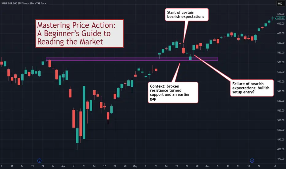
Mastering Price Action: A Beginner’s Guide to Reading the MarketThis discussion goes beyond the basic idea of "memorizing candlestick names." If you want to truly master price action as a tool for reading the market and understanding it as a basis for trading, this guide is for you.
Disclaimer:
The information provided in this tutorial is intended solely for educational purposes. Nothing in this material should be interpreted as financial, investment, or trading advice. Any strategies, methods, tools, or concepts discussed are presented for learning and demonstration only. You are responsible for evaluating your own decisions and risks. Always conduct independent research and consult a qualified professional before making financial or investment choices.
⚠️ WHY MOST TRADERS MISUSE PRICE ACTION
Most traders use price action in a simplistic way:
See a Pin Bar = Buy
See a Doji = Indecision
See an Engulfing = Reversal
The problem with this approach is that you are trading shapes instead of market dynamics.
Price action is not merely pattern recognition. It is a language.
To master price action, you must understand:
Volatility (Range)
Conviction (Body)
Buying/Selling Pressure (Shadows)
Context (Relative performance)
Expectation vs. Reality (Market Inertia)
Price action tells you the story of the battle between buyers and sellers.
📊 1. DECODING THE SINGLE BAR (THE DNA)
Before you can read a chart, you must be able to read a single bar.
Although a single bar is created from Open/High/Low/Close, it gives you critical information beyond that.
🕯️Range = Volatility
The distance between High and Low.
Wide Range: Active market, high volatility.
Narrow Range: Dead market, low volatility.
This chart shows the low volatility period transitioning to the high volatility prior to a major reversal.
🕯️Body = Conviction
Large Body: The market conquered territory. Strong conviction (Bullish or Bearish).
Small/No Body (Doji): The market is undecided. A battle with no winner.
This chart points out two bullish bars, one with weaker conviction than the other.
🕯️Shadows = Pressure
Upper Shadow: Selling Pressure. The market tried to go higher but was rejected.
Lower Shadow: Buying Pressure. The market tried to go lower but was rejected.
This chart shows how we can observe the shifting of buying/selling pressure by observing the wicks (tails/shadows) of candlesticks.
TIP: For examining shadows, focus on the shadows (wicks) that take up around at least 50% of the bar range.
📊 2. CONTEXT IS KING (TWO-BAR ANALYSIS)
Now, let’s go on to two-bar analysis.
Nothing works in isolation. A "wide" bar is only wide(r) if its range is larger than the previous bar.
The key here is to use the first bar to set the context for the second.
Volatility Check: Is the range expanding (market waking up) or contracting (market resting)?
The "Test": Every bar's High and Low are natural support and resistance levels.
- If Bar 2 breaks Bar 1's Low and closes lower → Bearish Victory .
- If Bar 2 breaks Bar 1's Low but reverses to close higher → Bullish Rejection (False Break) .
This chart focuses on one specific bar and compares it with the previous bar. Our observation produces no conclusion, only more questions.
📊 3. THE EXPECTATION GAME (THREE-BAR ANALYSIS)
This is the secret sauce of price action readers, forming expectations and observing. The market has inertia , for e.g. bullishness should follow bullishness.
This chart extends our earlier two-bar analysis. The third bar is a Doji, confirming uncertainty on the side of the bulls.
The Basic Analytical Framework For Close Price Action Analysis:
Read Bars 1 & 2: Form an expectation. (e.g., "Strong bearish bars, I expect Bar 3 to go down.")
Watch Bar 3: Does it confirm or fail your expectation?
Confirmation: Market moves as expected (Trend continues).
Failure: Market defies expectation (Potential Reversal).
📊 4. PATTERNS ARE JUST LABELS
Stop looking for "Pin Bars" or "Engulfing patterns" by name. Look for the behavior.
Pin Bar: Essentially a bar where the market tested a support/resistance level and was violently rejected (Long Shadow).
Outside Bar: A bar where volatility expanded and totally overwhelmed the previous session.
When you read the story, you don't need the labels.
📊 EXAMPLE TRADING FRAMEWORK
From the above, we can build a simple trading framework based on identifying context, forming expectations, and trading the failure of expectations . This is not the only framework but one of the many possible.
Bullish Setup
Context: Price tests a support level or previous low.
The Trigger: A bar shows a failure of bearish expectation (e.g., tries to go lower but closes high).
Bearish Setup
Context: Price tests a resistance level or previous high.
The Trigger: A bar shows a failure of bullish expectation (e.g., tries to break out but slams back down).
This chart shows a example leading to a potential long setup.
⚠️ COMMON MISTAKES
Trading in a Vacuum: Taking a "Pin Bar" signal without checking if the market is trending or ranging.
Ignoring the Body: A long shadow means nothing if the body shows the other side still has control.
Fixating on Names: Worrying if it's a "Harami" or an "Inside Bar" instead of asking "Who is winning?"
🎯 CONCLUSION
Reading price action is about knowing what the market has done and what it is doing now . It increases your chances of predicting what it will do .
Forget the fancy names.
Focus on the OHLC relationship.
Trade the failure of expectations.
Master this microscopic view, and then combine it with macroscopic market structure for the ultimate edge.
How do you read price action? Do you use patterns or read the flow? Share your approach below!
FireHoseReel | Engulfing Candlestick Pattern (Crypto Version)🔥 Welcome FireHoseReel !
Let’s dive into the Engulfing Candlestick Pattern.
✔️ Bearish Engulfing – Basics
The Bearish Engulfing is a two-candlestick reversal pattern.
The first candle is bullish, and the second is a larger bearish candle that fully engulfs the first candle’s body and closes below its low.
Since crypto rarely has gaps, the key condition is that the second body completely covers the first body.
Shadows are not significant.
This pattern is most reliable after a weakening uptrend.
🎯 Bearish Engulfing – Psychology
This pattern shows a strong bearish shift.
Buyers push price upward at first, but the second candle proves sellers have taken full control, dragging price down and even breaking the previous candle’s low.
It signals momentum shifting from bulls to bears.
🧮 Bearish Engulfing – Setup & Levels
• Trigger: Break below the low of the second candle.
• Confirmation: A close below the trigger.
• Stoploss: Above the high of the second candle or whole structure.
• Buy-stop entry: Only if the main trend remains strongly bullish (rare in crypto).
✔️ Bullish Engulfing – Basics
The Bullish Engulfing is a two-candlestick reversal.
The first candle is bearish, and the second is a larger bullish candle that fully engulfs the first body and closes above its high.
In crypto, the key factor is that the second bullish body fully covers the first bearish body.
It works best after a downtrend or capitulation phase.
🎯 Bullish Engulfing – Psychology
This pattern indicates a strong bullish reversal.
Sellers control the first candle, but buyers return aggressively on the second candle, overpowering them and closing above the previous high.
It signals momentum shifting from bears to bulls.
🧮 Bullish Engulfing – Setup & Levels
• Trigger: Break above the high of the second candle.
• Confirmation: A close above the trigger.
• Stoploss: Below the low of the second candle or structure.
• Sell-stop entry: Only in strong downtrends and rarely recommended.
🛞 Risk Management & Disclaimer
Please remember to always use proper risk management and position sizing. Nothing in this analysis is financial advice. The market can change quickly, so always trade based on your own strategy, research, and risk tolerance. You are fully responsible for your own trades.

Don't Trade These Trend Lines. Forex Gold Trading Basics
A lot of traders apply trend lines for trading and making predictions on different financial markets.
Trend line can also be an important element of price action patterns.
However, only few knows that some trend lines are better to be avoided .
In this article, I will share with you the types of trend lines that you should avoid and not rely on for making trading decisions.
Invalidated Trend Line
Even the strongest trend lines may lose their significance with time.
Before you take a trade from a trend line, make sure that it still remains valid.
If the trend line is not respected by the buyers and then by the sellers,
or by the sellers and then by the buyers, we say that such a trend line lost its significance, and it is better to not trade it.
Have a look at that rising trend line on USDCAD.
We see strong bullish reactions to that, and we may expect a bullish movement from that, once it is tested.
However, it was violated and after a breakout it should turn into a vertical resistance.
Retesting that, the price easily went through the broken trend line.
The trend line lost its significance, and it is better to not trade that in the future.
2 Touches Based Trend Line
When you are looking for a strong trend line to trade, remember that the trend line should be confirmed by at least 3 touches and 3 consequent bullish / bearish reactions to that.
Above is the example of a valid and reliable trend line.
However, quite often, newbie trade 2 touches based trend lines.
Most of the time, such trend lines are neglected by the market.
Moreover, relying on 2-touches-based trend lines, your chart will look like a complete mess .
Simply because there are too many trend line meeting that criteria.
Receding trend line
There are the trend lines that go against your trade with time while remaining valid.
Have a look at a major falling trend line on NZDCHF on a daily time frame.
You may open a swing long position from that on a daily or a day trade on intraday time frames like an hourly.
You can see that the market may easily go against your predictions for a long time, while perfectly respecting a trend line.
The price was sliding on that trend line for 6 consequent days before it finally started to grow.
Such trend lines are better to be avoided .
Make sure that a trend line and your trade have the same direction.
Trend lines can provide very safe points for trading entries. However, the trend lines are not equal and while some of them can be very profitable, some of them can lead to substantial losses.
❤️Please, support my work with like, thank you!❤️
I am part of Trade Nation's Influencer program and receive a monthly fee for using their TradingView charts in my analysis.

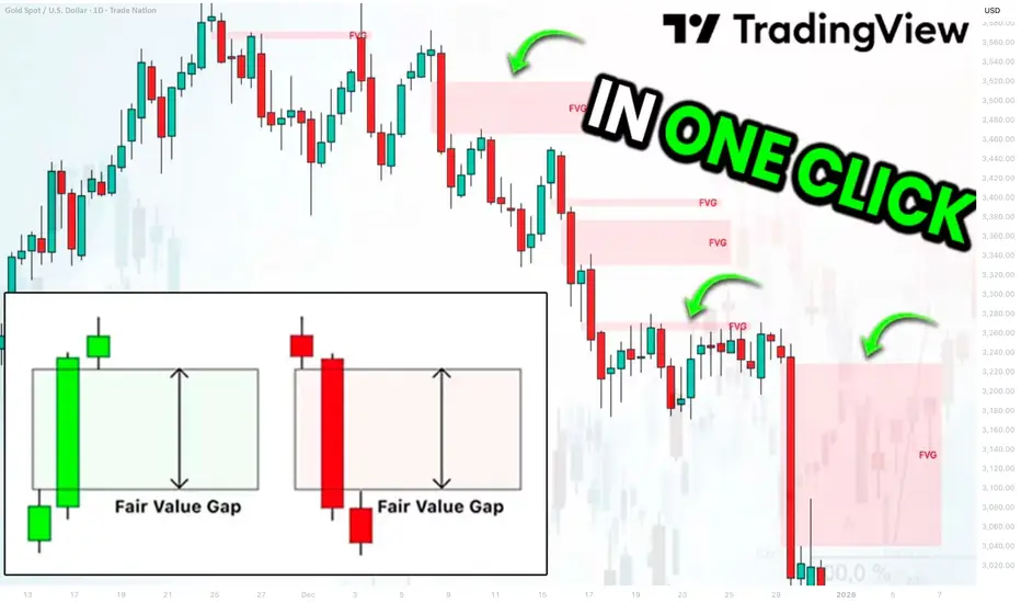
Best Free Fair Value Gap FVG Technical Indicator on TradingView
This free indicator accurately identifies Fair Value Gaps FVG on any market.
It is available on TradingView and it is very easy to set it up.
In this article, I will show you how to use this indicator and how to find a fair value gap easy in one click.
Let's start with my definition of a fair value gap because it is different from trader to trader.
FVG is a sudden, sharp price move that happens so fast that it leaves behind a price zone where very little trading actually occurred.
Because this zone saw almost no trading, it creates an imbalance .
Such a move is usually created by a large candle.
A candle with a big body and almost no wicks.
Among classic Japanese candlesticks, there is one such a candle.
It is called Marubozu.
Here are bullish and bearish structures of that candle.
A green one represents extremely strong bullish momentum. The price opened at the low of the period and closed at the high of the period. There were no pullbacks ; buyers were in complete control from the opening bell to the close.
Its bearish variation has the same logic.
The price opened at the high of the period and closed at the low of the period, with a very little trading activity within.
Our technical indicator will look for such a candle.
The indicator that we will use is called "All Candlestick Patterns".
In the settings of this indicator, we should select Marubozu White (bullish candle) and Marubozu Black (bearish candle).
After we click "OK", the indicator will immediately start working.
The indicator will show valid and significant Fair Value Gaps FVG on any time frame and any trading instrument.
Like any other indicator, it will miss some Fair Value Gaps, but while you are learning to identify them, it will help you to spot the most important ones.
❤️Please, support my work with like, thank you!❤️
I am part of Trade Nation's Influencer program and receive a monthly fee for using their TradingView charts in my analysis.
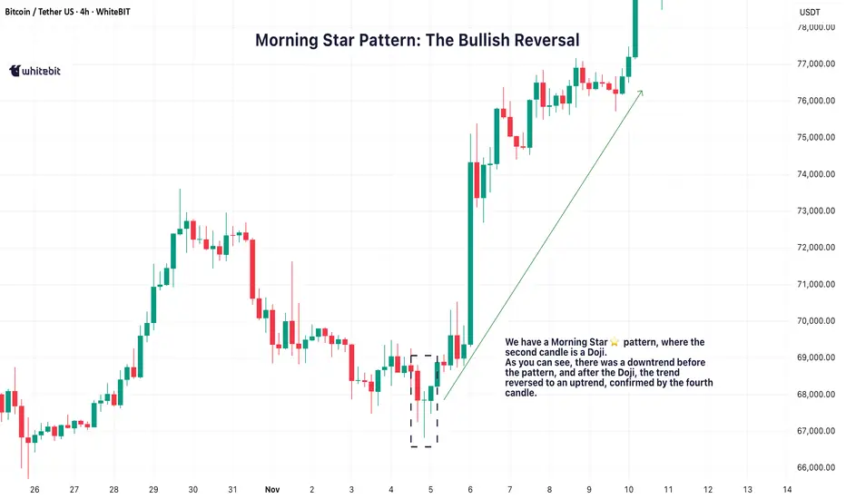
Mastering Trend Reversals: Morning & Evening Star PatternsSo, you're trying to nail those trend reversals? The Morning and Evening Star patterns are perfect for that. They show up right when the market’s about to shift, giving you a chance to get in before the move really takes off. Let’s break down how these setups work and why they’re such solid tools for traders like you.
🌅 Morning Star Pattern: The Bullish Reversal
The Morning Star pattern is one of the best ways to catch a trend reversal from bearish to bullish. It usually pops up after a downtrend, signaling that the market is about to make a move to the upside. It’s made up of three candles:
A long red candle that shows the market’s been selling off.
A small candle, often a Doji, that indicates indecision or a pause in the downtrend.
A big green candle that confirms the shift, showing buyers are taking control.
When you spot a Morning Star candlestick pattern, it’s a strong indication that the downtrend might be over and the bulls could be taking over. The third candle plays a crucial role here, confirming that the trend is likely reversing.
🌇 Evening Star Pattern: The Bearish Reversal
On the flip side, the Evening Star pattern is the bearish cousin of the Morning Star. It shows up after an uptrend and signals that the market is ready to start heading down. It also consists of three candles:
A long green candle that continues the uptrend.
A small candle, again often a Doji, that suggests the market’s losing momentum.
A big red candle that confirms the reversal, showing sellers are stepping in.
When you see the Evening Star candlestick pattern, it tells you that the market could be shifting from bullish to bearish. The third candle confirms that the reversal might be taking place.
💡 Trading the Star Patterns
Both the Morning Star trading pattern and Evening Star patterns are great for spotting potential trend reversals, but they shouldn't be relied on as the only signal. To increase the reliability of these patterns, consider confirming them with other indicators like RSI (Relative Strength Index) , MACD (Moving Average Convergence Divergence) , or volume analysis.
For example, if a Morning Star pattern candlestick appears and is followed by increasing volume, it adds strength to the reversal signal. Similarly, if the Evening Star shows up with an overbought RSI, it could provide further confirmation that the market is due for a pullback.
By using these additional tools, you can have more confidence in your analysis and make better-informed decisions.
📈 Why These Patterns Matter
The Morning Star and Evening Star patterns are powerful tools for identifying potential trend reversals. They give traders a visual cue that a market shift could be on the horizon, helping to spot potential turning points.
However, it’s crucial to make your trading decisions based on a combination of factors and not rely solely on these patterns. Always make sure to consider the broader market context and other technical indicators before acting on any pattern.
You Don’t Need a New Strategy—You Need a System (Here’s Proof)This week’s trade recap isn’t just about the winning setup — it’s about understanding why it worked and what that means for your long-term edge as a trader.
Most traders spend years chasing “the perfect strategy,” but strategy alone is just the product. Think of trading like business — McDonald’s and Burger King both sell burgers, but only one built a system that scales, duplicates, and dominates globally. The same applies to trading: your real edge isn’t the setup, it’s the structure behind it — your discipline, consistency, and process.
In this video, we break down:
The winning trade of the week and how the setup developed
Why edges are built through process, not predictions
How business thinking creates stronger traders
The mindset shift from “what to trade” to “how to operate”
Whether you’re trading forex, indices, or crypto, this session will help you think beyond entries and exits — and start building a business-level edge that lasts.
Tags: trading edge, trading psychology, weekly trade recap, trading mindset, how to build consistency in trading, forex strategy, trader discipline, trading process, profitable trading habits, business mindset for traders

Doji Candlestick: A Key to Market ReversalsAlright, let’s break down the Doji candlestick pattern.
If you're trading crypto, you've probably bumped into this little guy at some point. It’s not a wild trendsetter on its own, but it definitely has something to say about the market’s mood 🤔. The Doji is one of those candlestick patterns you’ll want to pay attention to if you're trying to catch reversals or just understand what's going on in the market.
What is the Doji Candlestick Pattern?
A Doji candlestick pattern forms when the opening and closing prices are almost identical. The body of the candle becomes tiny, while the shadows (the lines extending above and below the body) are long. It might look like a cross, plus sign, or even an “✖️.” The key point is that the market is indecisive, which is why this pattern gets so much attention.
🐂Bullish Doji Candlestick Pattern
So, what happens when you spot a Doji after a downtrend? You might be looking at a potential reversal, signaling that the bears are running out of steam. A bullish Doji candlestick pattern forms when the market closes near the opening price but after a steady downtrend. It’s like the bulls are just waiting for the right moment to step in. But don’t jump in too quickly! A single Doji doesn't mean the market's ready to flip. Look for confirmation in the following candles — ideally, a strong bullish candle that closes above the previous high.
🐻Bearish Doji Candlestick Pattern
Now, flip the script. If you see a bearish Doji candlestick pattern after a nice uptrend, it’s time to pay attention. This signals that the bulls might be running out of energy, and the bears could be gearing up for a push. It’s not an instant signal to sell, but it’s a red flag that the market’s strength is weakening. After spotting the Doji, wait for confirmation — usually in the form of a bearish candle that closes below the previous low.
How to Use the Doji Trading Pattern Effectively?
So you’ve spotted a Doji chart pattern. Now what? This pattern is all about context. If it shows up in the middle of a strong trend, it’s probably just a pause in the action — not a reversal. But, if it appears after a big rally or a significant drop, it could indicate that market sentiment is shifting.
Here’s the key: Confirmation is king. The Doji itself doesn’t tell you where the market is going. It only tells you that the market is uncertain. Look for the next few candles to see if they support a reversal — a bullish follow-up candle after a bearish Doji or a bearish candle after a bullish Doji.
🏁Final Thoughts
The Doji candlestick pattern can be a valuable addition to your trading strategy, offering insights into market sentiment when combined with other indicators. While it highlights moments of indecision, it's essential to exercise caution and not rely solely on a single signal. In trading, context, confirmation, and proper risk management are key. Remember, tools like the Doji are meant to inform your decisions, but ultimately, it's your judgment and strategy that will guide your moves. Happy trading!

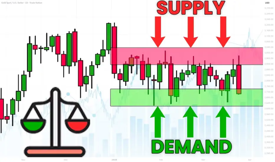
What is Equilibrium in SMC. Balance and Imbalance in Forex Gold
Equilibrium is one of the core elements for understanding market liquidity.
In this article, we will go through the essential basics of liquidity in Forex trading with Smart Money Concepts SMC.
You will learn the interconnections between supply and demand and I will explain how to easily identify balance and imbalance on any market.
Let's start our discussion with understanding how forex pairs move.
The price of an asset goes up if the market demand is stronger than the market supply. The excess of buying activity make the markets update the highs. In smart money concepts, such an event will also be called a buying imbalance.
Look at a strong bullish rally on Gold.
The price is going up because of a buying imbalance.
A strong buying activity creates a massive amount of buyers with unfilled orders.
To entice sellers to start selling, they must offer a higher-better price.
At the same time, if the price of an asset goes down , it means that the market supply is stronger than a demand. The excess of supply will make the markets update the lows. In smc, it will be called a selling imbalance.
That is exactly what is happening with GBPUSD forex pair.
A strong selling activity and the shortage of demand makes the price go down.
The excess of supply or demand on the market can not be eternal.
The lower the price becomes, the more buyers will start buying, and the more sellers will start closing their positions.
At some moment, the surplus of supply will be absorbed by the buyers.
That will be a moment when the market will find equilibrium , the balance between supply and demand.
A strong bearish imbalance on USDJPY made the price drop significantly.
The falling price made 3 things:
It attracted more buyers, because the lower the price the more profitable is buying USDJPY.
It discouraged some buyers from buying, considering that the price is already "too low".
It encouraged some buyers to close their positions in profit.
Because of that, USDJPY stopped falling and found a balance in supply and demand. That is what we call Equilibrium .
In a bull run, the higher the price will go, the more sellers will start selling.
At some moment, buying imbalance will be absorbed by the bears and supply & demand will eventually balance.
Such an event will be called the equilibrium .
EURGBP was rallying strongly.
The higher the price went, the more sellers started to sell, considering selling the pair more and more profitable.
And the same time, fewer buyers were buying and the more started to close their buy positions in profits.
At some moment, the entire excess of the market demand was absorbed by a supply. The market stopped growing and equilibrium was found.
One of the main characteristics of a market equilibrium is sideways price movement and a termination of a formation of new highs or new lows.
Usually, such a sideways price action will form a horizontal range.
That's a real example how a CAD JPY pair found an equilibrium after an extended bearish movement. A formation of a horizontal range confirmed a balance between a supply and a demand.
Please, note that these ranges will form on any time frame that you analyse.
The rule is that the higher is the time frame of the range, the stronger is the market equilibrium.
Above, I have 3 different charts:
USDJPY on a daily time frame, EURJPY on a 4H and GBPUSD on 15 minutes.
All the pairs found an equilibrium in horizontal ranges.
An equilibrium on USDJPY will signify intra week or even intra month balance,
while on EURJPY it will mean intraday/intra week balance.
On GBPUSD, it will signify intraday equilibrium.
Market equilibrium can not last forever.
Fundamentals news and changing market conditions, make the market participants constantly reassess a fair value of an asset.
A violation of the range and a breakout of one of its boundaries will be a trigger of an occurrence of an imbalance .
A bullish violation of the upper boundary of the range will signify a buying imbalance and a highly probable rise to the new highs.
While a bearish violation of the lower boundary of the range will mean a selling imbalance and a highly probable fall to the new lows.
Please, study how GBPCHF was moving for a week on an hourly time frame.
The periods of balance were changed by the periods of bullish or bearish imbalances, that found a new equilibrium on higher/lower price levels.
Understanding of basic principles of supply and demand in trading is essential for profitable trading smart money concepts.
Learn to recognize the periods of imbalance and equilibrium.
It will provide you the edge in understanding and trading any forex pair.
❤️Please, support my work with like, thank you!❤️
I am part of Trade Nation's Influencer program and receive a monthly fee for using their TradingView charts in my analysis.
How to Analyze Daily Time Frame on Gold. 5 Important Things
There are 5 important things that you should analyze on Gold on a daily time frame to accurately predict long term, midterm and short term movements.
In this article, I will share with you a step-by-step guide for daily time frame analysis that you can apply on Gold or any other financial instrument.
1 - Identify the market trend
When you analyze a daily time frame, you should identify long term, midterm and short term market trends.
Long-term trend is based on the analysis of one year long price action.
In the example above, Gold is trading in a long term bullish trend because the price keeps setting new higher high and new higher lows during the year.
Midterm trend is based on the analysis of a price action for the last 4–5 months.
Above, we can clearly see that a mid-term trend is bullish because again, the price sets new higher highs and higher lows over time.
Short-term trend is based on the analysis of price movements for the last 2 months.
Short-term price action is also bullish on Gold, with a clear sequence of higher highs and higher lows.
According to the trend analysis, long-term, mid-term and short-term trends are bullish.
2 - Identify the directional bias
The directional bias defines a highly probable future direction on the market.
In our example, we can anticipate that Gold will keep growing among all the dimensions: long-term, mid-term and short-term.
3 - Execute structure analysis
Identify important historic horizontal and vertical structures.
That will be the points from where you should look for trading opportunities.
When you analyze key levels, identify the structures that are lying close to the current price levels.
Make sure that all the structures that you spotted were respected by the market in the past.
4 - Look for price action patterns
Price action patterns are the language of the market.
Proper identification of the patters will help you correctly understand the intentions of the market participants.
You can see that a bearish breakout of a rising channel triggered a correctional movement on the market.
Gold started to fall steadily within a bullish flag pattern and after it tested a key support, the price violated the resistance of the flag.
5 - Analyze candlesticks
Candlestick patterns can provide extra clues and confirmations.
You can see that the market formed multiple rejections from key support, an inside bar formation and bullish engulfing candle.
Violation of the inside bar to the upside with a strong bullish candle is an important bullish signal.
Combining trend analysis, structure analysis, price action and candlestick analysis, and you can make predictions and look for trading opportunities.
You can also make your analysis even more sophisticated, for example, analyzing fundamental analysis or applying technical indicators.
❤️Please, support my work with like, thank you!❤️
I am part of Trade Nation's Influencer program and receive a monthly fee for using their TradingView charts in my analysis.
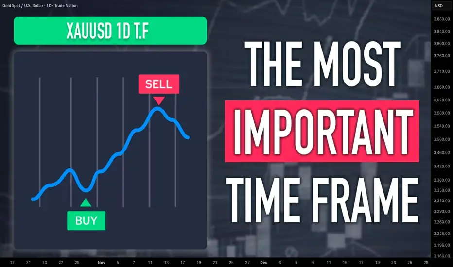
Mastering the Hanging Man PatternAlright, traders, let’s talk about the Hanging Man candlestick pattern.
This one’s a classic, and if you know what you’re looking at, it can be a game changer when you’re spotting potential reversals. So, what exactly is the Hanging Man pattern, and how can you use it to your advantage? Let’s break it down.
What Is the Hanging Man Pattern?
The Hanging Man pattern appears when the market has been pushing higher, and then—bam—a sign that it could be running out of steam. It’s called the Hanging Man chart pattern because the candlestick looks like a little figure hanging by its feet, with a long lower wick. The body is small, and the lower shadow is long—typically at least twice the size of the body. This shows that while buyers were in control, sellers came in strong towards the end of the session, pushing prices lower.
Hanging Man candles can be red or green. Even though the candle is green, it still suggests the same potential reversal because the rejection of higher prices by the sellers shows weakening bullish pressure. The key point to remember is that the Hanging Man candle pattern signals potential exhaustion in an uptrend. It doesn’t guarantee that the trend is reversing, but it highlights that the bullish momentum is waning, which could be a sign that a reversal is near.
Where to Look for the Hanging Man Pattern?
Context is everything. The Hanging Man pattern is much more significant when it appears at the top of an uptrend. In this case, it suggests that buyers are losing control, and the market could soon turn bearish. If it appears after a downtrend, it’s known as an Inverted Hammer, and its interpretation is different—it could signal a potential reversal to the upside.
So, while the Hanging Man is typically seen as a bearish reversal indicator after a sustained uptrend, it is crucial to recognize that the context matters. A Hanging Man at the peak of a strong bullish trend often attracts attention from traders as a potential signal for a shift in momentum.
How to Confirm the Reversal?
The key to using the Hanging Man pattern effectively is the confirmation candle. After spotting the Hanging Man candlestick pattern, you’ll want to wait for a bearish candlestick in the next session that closes below the low of the Hanging Man candle. This confirms that sellers have taken control and that the market is likely heading lower.
It’s also important to consider the volume during the confirmation. A strong bearish Hanging Man pattern with higher-than-usual volume adds strength to the reversal signal. If the confirmation candle has low volume, it might not carry as much weight, so always consider the volume when confirming the pattern.
However, the Hanging Man candlestick pattern is not foolproof. A Hanging Man trading pattern without confirmation can sometimes lead to a false reversal, especially in markets with high volatility or when the overall trend is still strong.
False Signals and Pitfalls
One of the biggest challenges when trading the Hanging Man pattern candlestick is false signals. In choppy or sideways markets, the pattern may form but fail to lead to a true reversal. To avoid these traps, consider waiting for the confirmation candle and also use other tools to verify the signal, like:
Trendlines: Ensure the market is actually in an uptrend before considering the Hanging Man pattern.
Support/Resistance Levels: Wait for a breakdown below a significant support level to increase confidence in the reversal.
Momentum Indicators (e.g., RSI or MACD): Use momentum indicators to confirm that buying pressure is truly weakening, as suggested by the Hanging Man pattern.
These additional tools can help you filter out false signals and increase the reliability of your trades.
The Hanging Man pattern can be a valuable tool when used correctly, but it’s not a standalone signal. It works best when combined with other forms of technical analysis, such as momentum indicators, trendlines, and volume analysis. Be patient, wait for confirmation, and always manage your risk. The Hanging Man trading pattern is a great addition to your candlestick pattern toolbox, but it should be used as part of a broader strategy that includes multiple indicators and sound risk management.

How to find algorithmic levels of support and resistanceUsing repeating pinpoint levels to form meaning of opens and closes around these levels give you an advantage in your analysis.
As price gives us clues to what levels are affecting price, we should mark the new candles that are responding to these levels by breaking and retesting these very levels.
Please let me know your thoughts! 🙏🏾

What is Bullish/Bearish Breaker Block & How to Find It Easily
Breaker blocks are easier to find than you think.
In this article, I will share with you very efficient price models for the identification of Order Blocks and Breaker Blocks.
You will learn their meaning, how to draw and use them in trading Smart Money Concepts SMC.
Bullish Trend Model & Breaker Block.
Let's start with an essential theory .
Please, examine a following price model:
In a classic bullish structure where the price consistently updates Higher Highs HH and Higher Lows HH, a bullish order block zone will be the area based on the last Higher How.
I will explain how to draw that zone in the examples below.
In some instances, a bullish order block zone will fail to deliver a bullish wave. Its bearish breakout will follow after its test instead.
It will be a critical event that is called a market structure shift in Smart Money Concepts SMC.
A formation of a new low will signify a violation of a bullish trend and a highly probable change of the market sentiment.
A broken bullish order block zone will turn into a Bearish Breaker Block.
The zone from where the next bearish wave will most likely follow.
It will provide a very safe place to sell from.
Market structure shift in a bullish trend is not a random event.
It usually occurs after a test of a significant supply zone with a liquidity grab.
It can help you to predict the change of the sentiment way before it happens.
That's an example of such a price model on GBPAUD forex pair.
We see a confirmed bullish liquidity sweep in uptrend after a test of a historic supply zone.
A bearish wave followed then and a bullish order block zone was broken.
To draw Order Block Zone, I picked the level of the last higher low as its lower boundary and a low of a body of that candlestick as the upper boundary.
After a breakout, it turned into a Bearish Breaker Block.
A bearish continuation occurred after its test.
Bearish Trend Model & Breaker Block.
Please, check this model:
In a classic bearish structure where the price consistently updates Lower Lows LL and Lower Highs LH, a bearish order block zone will be the area based on the last Lower High.
In some instances, a bearish order block zone will fail to deliver a bearish wave. Its bullish breakout will follow after its test instead.
It will be a significant event that is called a bullish market structure shift in Smart Money Concepts SMC.
A formation of a new high will signify a violation of a bearish trend and a highly probable change of the market sentiment.
A broken bearish order block zone will turn into a Bullish Breaker Block.
The zone from where the next bullish wave will most likely follow.
It will provide a very safe place to buy from.
Market structure shift in a bearish trend is not a random event.
It usually occurs after a test of a significant demand zone with a liquidity grab.
That's a real example of such a price model on WTI Crude Oil.
A bearish structure was violated after a test of a demand zone.
A bearish order block was broken, and it turned into a Bullish Breaker Block Zone then.
(Drawing a bullish order block zone, I picked the level of the last lower high as its upper boundary and a high of a body of that candle as its lower boundary )
A bullish movement followed after a deep test of that.
A proper combination of structure mapping and liquidity analysis will help you to predict a market structure shirt and a breaker block creation before they happen.
The models that I shared will help you to confirm bullish and bearish breaker blocks trading Forex or any other markets with Smart Money Concepts SMC ICT.
❤️Please, support my work with like, thank you!❤️
I am part of Trade Nation's Influencer program and receive a monthly fee for using their TradingView charts in my analysis.
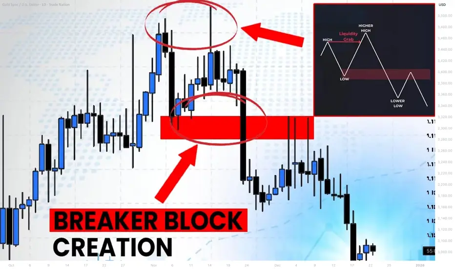
Learn Profitable Doji Candle Trading Strategy (GOLD, FOREX)
In the today's post, I will share my Doji Candle trading strategy.
This strategy combines the elements of multiple time frame analysis, price action and key levels.
Step 1
Analyze key levels on a daily time frame.
Identify vertical and horizontal supports and resistances.
Here are the key structures that I spotted on AUDUSD.
Step 2
Look for a formation Doji Candle on a key structure.
This rule is crucially important: we will trade only the Doji candles that are formed on key levels.
From key supports , we will look for buying , and we will look for shorting from key resistances .
Look at this Doji Candle that was formed on a key daily support on AUDUSD.
Step 3
Look for a horizontal range on a 4h/1h time frames.
Doji Candle signifies indecision . Quite often, you will notice the horizontal ranges on lower time frames when this candlestick is formed.
Here is a horizontal range that was formed on a 4H time frame on AUDUSD after a formation of Doji.
Step 4
Look for a breakout of the range.
To sell from a key resistance, we will need a bearish breakout of the support of the range. That will be our bearish confirmation.
To buy from a key support, we will need a bullish breakout of the resistance of the range. It will be our bullish signal.
Here is a confirmed breakout of the resistance of the range with a 4H candle close above. That is our bullish confirmation on AUDUSD.
Step 5
Buy aggressively or on a retest.
After you spotted a confirmed breakout of the range, open a trading position aggressively or on a retest.
Personally, I prefer trading on a retest.
If you sell, a stop loss should be above the high of the range and your target should be the closest key daily support.
If you buy, your stop loss should be below the low of the range and a take profit will be on the closest daily resistance.
On AUDUSD, a long position was opened on a retest. Stop loss is lying below the lows. Take profit is the closest resistance.
Here is how this great strategy works!
Always patiently wait for a confirmation! That is your key to successful trading Doji Candle.
❤️Please, support my work with like, thank you!❤️
I am part of Trade Nation's Influencer program and receive a monthly fee for using their TradingView charts in my analysis.
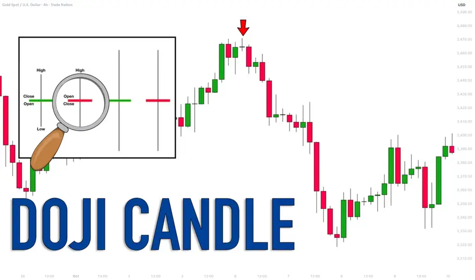
September 28, Forex Outlook: What Can Traders Expect This Week?Welcome back, traders!
In today’s video, we’ll be conducting a Forex Weekly Outlook, analyzing multiple currency pairs from a top-down perspective—starting from the higher timeframes and working our way down to the lower timeframes.
Our focus will be on identifying high-probability price action scenarios using clear market structure, institutional order flow, and key confirmation levels. This detailed breakdown is designed to give you a strategic edge and help you navigate this week’s trading opportunities with confidence.
📊 What to Expect in This Video:
1. Higher timeframe trend analysis
2. Key zones of interest and potential setups
3. High-precision confirmations on lower timeframes
4. Institutional insight into where price is likely to go next
Stay tuned, take notes, and be sure to like, comment, and subscribe so you don’t miss future trading insights!
Have a great week ahead, God bless you!
The Architect 🏛️📉

Profitable Multiple Time Frames Smart Money Strategy For Trading
In this post, I will share with you a very accurate and profitable SMC Smart Money trading strategy that combines top-down analysis, liquidity, imbalance, order block and inducement.
Step 1 - Identify liquidity zones on a daily
Liquidity zones are the areas on a price chart, where big players are placing their orders. From such areas, significant bullish and bearish movements initiate.
Liquidity zones that are above the current price will be the supply zones, while the liquidity zones that are below the current price will be the demand zones.
We will look for shorting opportunities from supply areas and for buying opportunities from demand zones.
Here are the liquidity zones that I identified on EURJPY.
Step 2 - Wait for a test of one of the liquidity zones
Let the market test the liquidity zone.
For buying, the price should reach a lower boundary of a demand zone.
For shorting, the price should test an upper boundary of a supply zone.
I underlined the exact levels that the price should test on EURJPY.
Here is the test of the lower boundary of the demand zone.
Step 3 - Look for inducement on an hourly time frame
With the inducement, smart money make the market participants think that the liquidity zone that the price is testing doesn't hold anymore.
When the price tests a supply area, an hourly candle close above its upper boundary will be a bullish inducement.
With that, the smart money incentivize buying orders.
When the price tests a demand area, an hourly candle close below its lower boundary will be a bearish inducement.
With that, the smart money incentivize selling orders.
The price closed below a lower boundary of a demand zone on EURJPY on 1H time frame.
Step 4 - Look for imbalance on an hourly time frame
After a violation of a supply area on an hourly time frame, look for a bearish imbalance.
Bearish imbalance is a strong bearish candle with wide range and big body. With that candle, the market should return within a supply zone and closed within or below that.
After a violation of a demand area on an hourly time frame, look for a bullish imbalance.
Bullish imbalance is a strong bullish candle with wide range and big body. With that candle, the market should return within a demand zone and closed within or above that.
Here is the example of a bullish imbalance on EURJPY.
After a bearish inducement, the price formed a high momentum bullish candle and closed within the demand zone.
The imbalance signify that a liquidity zone violation was a trap .
With that, smart money simply was trying to grab the liquidity.
That will be a signal for you to open an order.
Step 5 - Look for an order block
After the formation of the imbalance, the market becomes locally week and quite often corrects to an order block.
Order block will be the closest hourly liquidity zone.
After a formation of a bearish imbalance, look for a supply zone on an hourly time frame. That will be your perfect zone to sell .
After a formation of a bullish imbalance, look for a demand zone on an hourly. That will be your area to buy from.
Here is the order block on EURJPY.
Step 6 - Set a limit order
Set a sell limit order within a supply area after a formation of bearish imbalance on an hourly time frame.
Set a buy limit order within a demand area after a formation of a bullish imbalance on an hourly.
Here is your buy entry level on EURJPY.
Step 7 - Select the target
If you sell, your target should be the closest daily structure support: horizontal or vertical one.
If you buy, your target should be the closest daily structure resistance: horizontal or vertical one.
In our example, our closest structure resistance if a falling trend line.
Step 8 - Set stop loss
If you sell, stop loss will lie above a bullish inducement.
If you buy, stop loss will lie below a bearish inducement.
Here is a perfect point for a stop loss for a long trade on EURJPY.
Step 9 - Trade
Let the price trigger your entry, and then be prepared to wait.
It took many days for EURJPY to reach the target.
Trading Tips:
1. Make sure that you have a positive reward/ratio. It should be at least 1.2
2. Risk no more that 1% of your trading account per trade
Being applied properly, that strategy shows 70%+ accuracy.
Try it by yourself and let me know your results.
❤️Please, support my work with like, thank you!❤️
I am part of Trade Nation's Influencer program and receive a monthly fee for using their TradingView charts in my analysis.