Dotusd chartSince I posted a chart on the dotusdt pair showing the double bottom and the bearish head and shoulders pattern, I also wanted to post a polkadot idea that showed the bigger inverse head and shoulders pattern thats still very much in play as well. We can see how dot did a very convincing fake breakout above the neckline before dipping back down below it. It’s common for price to go above the neckline multiple times and then back below it in between those times before the actual breakout, usually it doesn’t go this high above the neckline without validating the breakout, but let this chart be a rare example that shows it can happen. We can see that the weekly 50ma in orange and the weekly 100ma in yellow is currently holding double reinforced support and could easily end up being the lowest part of the right shoulder of the inverse head and shoulders. On the previous dotusdt chart that I posted shortly before this one (which I will link to below) you can see the weekly 50 ma is double reinforced support with the top trendline of the channel also suggesting the bottom of the right shoulder may be in. The top trendline maintained support on the usdt pair but we can see price action had dipped below the trendline here on the usd pair and is still currently just below it. Need to reclaim that trendline as support on the usd pair too to help insure we won’t breakdown from the bearish smaller head and shoulder I posted on the usdt pair chart. *not financial advice*
50ma

A DOTUSDT chart per request.It was requested in the comment section of a previous chart I posted what I thought about the DOTUSDT chart so here I am taking a look at it on the weekly chart. We can see here how as soon as polkadot reache its full double bottom breakout target that it began a big correction…in doing so here it completed a head to a potential head and shoulders pattern and since it bounced from that low it is now forming the right shoulder to that head and shoulders pattern. f it were to validate the breakdown below the purple neckline of this head and shoulders pattern the full breakdown target would actually be even lower than the price range of our double bottom patterns lows. Because of this, I think this greatly reduces the probability that the pattern would hit its full breakdown target. Also since we are currently in the macro bull market cycle phase bearish patterns don't hit their full 100% targets as often. There is still a slight possibility it could hit the full breakdown target but imo that would likely have to coincide with a pretty severe black swan event to blame it on as a scapegoat. I think as long as we avoid some sort of crazy black swan in the coming months, that there is a higher probability the head and shoulders pattern doesn’t validate its breakdown. What to watch in order to know which way this will pan out is whether or not the top trendline of the yellow channel (aka the neckline of the double bottom) can maintain support on the weekly channel. Considering how the weekly50ma(in orange) is now coming up to overlap that trendline as double reinforced support, it’s wise to watch for price action to hod support on the weekly 50ma as well. Hopefully thisMA will help lift price action up and bounce it upward. As long as the weekly 50ma maintains that support the h&s pattern will not be validated. *not financial advice*

Microsoft bearish ideaGiven the recent decrease in earnings and the substantial holdings of shares by major institutions, it appears prudent for investors to consider taking profits and bolstering capital. This is particularly pertinent given the current bearish sentiment in the broader market, as evidenced by the downward trends in indices such as the S&P 500 and DJIA.
Against this backdrop, the market has recently tested the MA50, accompanied by notable volume, suggesting an increased likelihood of a bearish downturn. In light of these indicators, it may be wise to consider a short-selling strategy with a target profit of up to 21%, while remaining open to the possibility of earlier profit-taking opportunities. Momentum in prices is already trending downwards, and should the broader market continue its bearish trajectory, there is a substantial chance that major companies like Microsoft could experience downward pressure on their stock prices.

SPY: The Most Important Technical Turning Points (D&W analysis).The SPY is once again hitting a new all-time high today, with the market looking optimistic. As long as it continues to show the pattern of higher highs/higher lows, bullish sentiment will prevail. Last month, I made several warnings that we shouldn't try to guess the top, and that the trend is upwards. The only thing that could reverse the situation would be a clear reversal signal. The link to my last public study on SPY is below this analysis, as usual.
For now, I still don't see any technical evidence suggesting a correction or a pullback, but we should pay attention to some key points, especially its medium-term support levels, because if the SPY loses them, the bullish momentum could become weaker.
Despite leaving a gap below the price, today's candle is small, revealing a contained intraday movement. If this gap closes this week, it could be classified as an Exhaustion Gap, a technical piece of evidence that the trend is losing momentum.
However, the most important key point for the SPY is the yellow area in the chart above. This point is the area of the previous all-time high at $479.98, and a secondary top at $477.55. In addition, we see the 21 EMA rising, and it will probably enter this area soon, forming a triple support level.
A pullback to this triple support level is acceptable, and it's not a technical reason to believe in an immediate reversal; after all, pullbacks in an uptrend are buying opportunities most of the time. But if the SPY loses this point, the medium-term trend could reverse, in which case the next targets will be on the weekly chart.
We can see that just below the yellow area, we have support around $466, a previous bottom, and a point near the 50-MA (red line), which is set up for the daily chart, even though we see the weekly chart. This makes the area around $466 the next area of support should SPY begin a sharper correction.
Since SPY has materialized a Golden Cross pattern (when the 50-MA breaks through the 200-MA, the black line, upwards), we can say that the official trend is upwards, but it is important that SPY keeps prices above these support levels in order to maintain the long-term uptrend.
For now, we have to be aware that the trend is upwards, and we don't see the SPY losing any support levels yet, so there are no signs of a correction, let alone a reversal in sight. We'll proceed very cautiously, paying attention to its key points. In the absence of a clear bearish reversal structure, the SPY should continue to rise, until it reaches $500, which, although not a technical resistance, is more of a psychological resistance, as we know that the market has a soft spot for round numbers.
Of course, I’ll keep you updated on this, so consider supporting this idea if you liked the content, and follow me to keep in touch. What's more, keep in mind that the idea described above reflects my humble opinion. It is not investment advice, use it for educational purposes and to improve your own thesis about the market.
All the best,
Nathan.

TSLA: Has finally reached its critical support (D & W analysis)!TSLA shares have corrected to the support level we identified in our last public analysis, in the vicinity of the green line at $230, between the 50ma and the 200ma. In fact, it looks like the 200ma is serving as our last support, since the price is bouncing right back after hitting this indicator. The link to my previous public analysis is below this post, as usual.
Volume has fallen sharply and TSLA's shares are very weak, as it is the only one among the "magnificent 7" that is not showing any signs of recovery this week.
In two weeks the company will release its earnings report, and this will be an important event, but until then, we don't see any technical signs suggesting a bottom. Yes, the price has reached an extremely important support point, but we need to see confirmation of a bottom signal to believe in a decent recovery.
Despite the signs of weakness, the price is not in a downtrend yet, for that we need to see LHs/LLs. Now, let’s look at the weekly chart:
From a technical point of view, the next resistance is around $300, the previous top. Can TSLA get there? In theory yes, but in practice we need to see a clear bottom signal, as mentioned in the analysis of the daily chart.
You have to admit that if TSLA were going to react, now would be the perfect time, we just need confirmation. On the other hand, if the price loses the critical support point on the daily chart, nothing would prevent a sharper correction on the weekly chart, perhaps to its next support around $207, or even to the support line of its Descending Channel. This would frustrate the breakout of the previous resistance of this channel, characterizing a false breakout, a powerful bearish signal.
If you ask my personal opinion, I wish to see TSLA making a bottom around this support area, as the Risk/Reward ratio for a long trade would be attractive, however, we see no confirmation yet, and there is no meaningful bullish reaction suggesting a possible recovery yet.
I’ll keep you updated on this, so consider following me for more analysis like this, and support this idea if you liked it.
All the best,
Nathan.

TSLA: Approaching a major turning point.TSLA's shares are collapsing, even though the company is beating vehicle delivery expectations. This can be explained by the fierce competition coming from China, as TSLA lost its position as the world's biggest seller of electric cars to BYD in the last four months of 2023 - even though the American company managed to beat its own expectations.
This not only affects TSLA, but also the shares of RIVN and LCID, the former of which also managed to exceed expectations for vehicle production.
From a technical point of view, the price could fall to the next support level in the next few days, around $230 . The price is already entering a short-term downtrend , as it has lost the 21 EMA, and in the absence of a clear bullish reaction that could reverse sentiment, this is the most likely scenario.
What should the price do so it can reverse this bearish sentiment? It would be nice to see a clear reversal candlestick, closing above the 21 EMA again . So far, there are no technical buy signals in my view.
Are there any other possible support points? Yes, we see the 50-period and 200-period averages very close to each other, also in the $230 area mentioned earlier, reinforcing the idea that $230 could be an important support for TSLA . It would be important to see the price react above this area to avoid a Death Cross (when the 50MA breaks the 200MA downwards).
A warning sign is the divergence between the RSI and the price. While the price was making higher tops, the RSI was already making lower tops, as evidenced by the red arrows in the chart above.
In addition, the RSI is already losing its support levels, while the price is still above them (green lines). This can be characterized as an Advanced Breakout (when an indicator anticipates a breakout in price).
For now, TSLA shares are in correction territory, and although we see a promising support zone near $230, I don't see any technical evidence that convinces me of a bullish reversal at the moment.
I'll keep you updated on this, so remember to follow me for more daily analysis like this, and support this idea if you like it or learn something new here.
All the best,
Nathan.

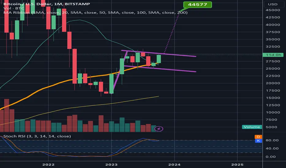
Bitcoin in a monthly bullflag that has a 44k breakout targetIf price can maintain support on the monthly 50ma(in orange) then we should likely see a breakout up from this monthly bullflag in the few candles. If so the target is around 44-45k. *not financial advice*
Current Weekly Chart Channel on BTCUSDWe can see the bottom trendline has held support thus far and the red double bottom neckline is holding wick support. Definitely key trendlines to watch in the near future. I could see it retesting the red neckline once the weekly 50ma(in orange) comes up to overlap it for double reinforced support. *not financial advice*

15 consecutive daily candles above totals descending channelWe can see price action came back down to retest the top trendline of this descending brown channel with exact precision and held above it now for 14 consecutive 1day candle closes. It is very likely to close a 15th consecutive candle here soon. We can see one wick back below the top trendline of the channel that was ultimately supported by the 1 day 5ma(in orange). That 50ma is now getting closes to rising above the channel itself for added springboard support. We can also see that the daily stoch rsi is reet as well with plenty of room to head upward. Everything is looking very good for the breakout of this channel to be validated in the ear future. *not financial advice*

Predict Bitcoin's Price with "W" pattern from the 50 and 200 MA 50 MA in blue, 200 MA in green. There is a "W" pattern where the 50 MA also crosses under or over the 200 MA. It can be useful in short-term and long-term trading.
If the pattern repeats itself, with your ruler you can see that there should be a correction for the next 2 months (according to the previous corrections in the bull run which are about the same length).
It’s also interesting to look at how deep the second correction, or “V”, will go. In the W pattern of End 2019 (October) - Middle 2020 (May), the 2nd dip was deeper than the first and it resulted in a bull market.
We could argue that it also happened back in July/August 2014 – October 2015.
In the W pattern of Middle 2021 (May) - End 2021 (October), the second dip was higher than the first and it resulted in a bear market.
We therefore have to wait to see if there will be a correction and how deep it will be, continue to use indicators, and find patterns.

BTC/USD 1 Week ChartOn Monday, BTC had finally crossed above and broke through its major resistance area located on this 1 week charts at $32,415 - $27,785.
Note:
BTC is still in a Rising Wedge Pattern as well as an Upwards Channel Pattern.
BTC is still in a massive Megaphone/Broadening Wedge Pattern otherwise known as an Ichimoku Y-Wave Pattern.
Take Note of the Liquidity Voids.
Note that the 50MA is moving upwards so if we continue having positive momentum, we will eventually see a Golden Cross on this BTC/USD 1 Week Chart when the 50MA (Yellow Line) crosses back above the 200MA (Red Line).
Here is a closer look at this BTC/USD 1 Week Chart.
RSI:
Note that the RSI has crossed into the Overbought Zone. Don't panic! The RSI Line can continue continue going further upwards as well as range sideways in this zone.
Up/Down Volume:

Consequence of DivergenceJW to again observe the divergence, I called this on prior posts, see what happens when RSI Falls in face of rising Price?!
Well, fine, hope you enjoyed your bearish gains. You shorted, right? O, still holding longs?
Well you might get a chance to close those out soon.
Notice how oversold it goes, trading at bottom of Bolly Band, under 50MA... might be a good place to close shorts, eh?
Selloff on retail sales report is overdone imo. What a nutty roller-coaster.
Can still go lower ofc; do not bet your farm on any wild notions!

Pearson down 11% on AI worriesIf AI is eating your lunch, your company better have a good strategic plan to adjust and create new revenue streams.
This is classic Marketing myopia, e.g. US railways, in mid 20th century, saw market share eroded by the airlines. That's because railroads never saw themselves in the transportation business, and limited themselves themselves by thinking they were in Railroads alone.
Pearson has had to deal with all sorts of changes, especially technology, and I'm sure they will have a strategic plan.
Technicals: Bearish reversal now under 50 weekly EMA, but volume isn't high so early days. Below 756 would confirm a new downtrend.

BTC/USDHere is a closer look at this chart.
BTC needs to turn the key Resistance area located around $32,157 - $28,682 into strong support.
That’s it, quick n dirty. I hope this chart is helpful.

EURCAD I Approach key reversal zone Welcome back! Let me know your thoughts in the comments!
** EURCAD Analysis - Listen to video!
We recommend that you keep this pair on your watchlist and enter when the entry criteria of your strategy is met.
Please support this idea with a LIKE and COMMENT if you find it useful and Click "Follow" on our profile if you'd like these trade ideas delivered straight to your email in the future.
Thanks for your continued support!

GBPUSD I Potential intraday long from support Welcome back! Let me know your thoughts in the comments!
** GBPUSD Analysis - Listen to video!
We recommend that you keep this pair on your watchlist and enter when the entry criteria of your strategy is met.
Please support this idea with a LIKE and COMMENT if you find it useful and Click "Follow" on our profile if you'd like these trade ideas delivered straight to your email in the future.
Thanks for your continued support!

Xrp still inside a slightly larger symmetrical log triangleWe had a glorious breakout yesterday and today have seen that candle retrace more than 50 % of its length liquidating all sorts of top buyers no doubt. This happened after price manages a wick above the monthly 50m (in orange) but ultimately was rejected from that zone. It wasn’t just the monthly 50ma that put up the resistance however…there is in fact one last top trendline of a slightly bigger triangle on the xrp log chart shown here in red. Price action got close enough to this line to experience a rejection through the combined resistance of it and the monthly 50ma…the red triangle’s apex isn’t until the end of June…hopefully price will break above it in the current zone though when patterns usually have their breakouts on average (about 5-15% away from the apex). If it takes as long as it did to break up from our pink triangle however it could consolidate inside the triangle here until late June. That would shake a lot of frustrated weak hands no doubt. However I’m still confident we have broken up from the pink triangle and should still reach its full $4.90 target, might just take many months to get us there. The first step will be flipping the top red trendline to solid support and an even more important next step will be flipping the monthly 50ma to solid support. Those are the 2 trendlines to watch. *not financial advice*

GRTUSD breaking up from symmetrical triangleShown here in yellow. If price action holds the 1 day 50ma (in orange) as solid support. The triangle should break up and take us above the horizontal green channel trendline. *not financial advice*

Have You Considered A Ride Down IWM 170? AMEX:IWM 50 MA crossed down the 200 MA on the daily and 4H timeframe. The daily chart shows a lot of sellers. IWM also made lower highs on the weekly timeframe. Also, the exchange traded fund is resting on a trendline that it's maintained since March 2020! If we break down below 170 and it holds, IWM should see more downside. The weekly chart shows an increase of sellers between last week and this week. Last but not least, the etf shows a shooting star candle that printed on the weekly chart (March 13-17, 2023). Therefore, my plan is to short IWM below 170!
I will ride down IWM 170 (provided price gets there of course).
*This is not financial advice
Peace & Harmony,
MrALtrades00

VET/USDVET/USD very quick update.
Here is a closer look at this VET/USD 1 day chart:
VeChain is in a new smaller Descending Channel which is in a massive Descending Channel. VeChain is also in a massive Symmetrical Triangle.
At the moment of typing this, VeChain is still in the Bullish Zone above its Ichimoku Cloud.
At the moment of typing this, VeChain is still above its 200MA. Note that the 50MA is still traveling upwards so we may eventually see the 50MA cross above the 200MA on this 1 day chart.
Not that overall traded volume is still very low compared to what we were getting from 2018 to 2021.
Looking at the Average Directional Index (ADX DI) we can see that the Trend Strength is dropping with the ADX (Orange Line) at 36.08 and under its 9 Period EMA (Black Line) which is at 39.52. Positive Momentum has dropped with the +DI (Green Line) dropping to 19.73. Negative momentum has also dropped a little with the -DI (Red Line) slightly dropping to 15.87 on this 1 day chart.
I hope this very quick update is helpful.


GBPUSD I Short and long opportunity outlookWelcome back! Let me know your thoughts in the comments!
** GBPUSD Analysis - Listen to video!
We recommend that you keep this pair on your watchlist and enter when the entry criteria of your strategy is met.
Please support this idea with a LIKE and COMMENT if you find it useful and Click "Follow" on our profile if you'd like these trade ideas delivered straight to your email in the future.
Thanks for your continued support!

Monthly 50MA pressure. For the first time in trading history, Bitcoin will close under 50MA on 1-month chart.
This is besides death cross on the 1 week chart.
Again and again, I urge those who are in love with 1-4 hour charts to watch the larger timeframes.
Unique events are happening and we can see that they are having an impact.
Who's to say how long the bear market will take now with an event like this?
We can only hope that 2024 brings some improvement.
And I really regret that Circle kept some of the currency collateral in that bank .
