Hindenburg Omen Is Flashing AgainThe Hindenburg Omen has triggered, and it’s lining up with what the market breadth data has been whispering for months. If you look at the bottom pane, you’ll see the percentage of stocks above their major moving averages has been sliding for about six months.
So even though the index has kept pushing to new highs, fewer stocks are moving with it. A small group of mega-caps is doing all the heavy lifting, while the broader market slowly weakens underneath.
Historically, that’s exactly the kind of environment where the Hindenburg Omen becomes relevant. It doesn’t promise a crash, but it flags when internal conditions have deteriorated enough to allow one. Several past signals have occurred before meaningful corrections.
Why This Matters Now
The next couple of weeks are important. CPI, PPI and labour data between now and 10 December will shape expectations heading into the FOMC meeting. If the Fed changes tone on monetary policy, liquidity, or the path of rates, it will feed directly into sector rotation and capital flows.
That’s why I’m not committing to any major trades right now. The signals are mixed, breadth is weakening, leadership is narrow and policy risk is rising. Capital preservation comes first until we get a clear direction from the data and the Fed.
Sometimes the smartest move is patience. Let the data confirm the story. The market isn’t going anywhere.
Breadth Indicators

Example of a Trading Style
Hello?
Hello, fellow traders.
Follow me to get the latest information quickly.
Have a great day.
-------------------------------------
While it's ideal to always close a trade in profit, this isn't always the case.
Therefore, you should maintain your trade by locking in profits through fractional trading.
Based on the trading information provided by the exchange, once a trade has turned into a loss, it's likely to take a considerable amount of time to turn into a profit again.
Therefore, you should trade at different buy and sell prices.
However, this is a rather tedious process, so it's not usually done that way.
-
If you were to buy near the area shown on the chart, the estimated average purchase price would be significantly higher than the current price.
Therefore, you wouldn't be able to proceed with the trade.
Therefore, we must trade by purchase price.
The purchase prices for positions 1 and 2 are quite high, so we don't pay attention to them.
Since the current price is near the purchase price for position 3, if it turns into a profit, you can sell the amount you purchased near position 3 to lock in the profit.
By subtracting this profit from the purchase price for positions 1 and 2, you can minimize your losses.
This trading method is possible because the coin market allows trading in decimals.
The key here is to trade by purchase price.
You should not trade in units of the number of coins you purchased.
For example, if you purchased $100 at point 3 (106431.68), you should sell $100 when the price rises.
Trading this way will allow you to quickly recover from losses and even generate profits even during losses.
-
You can profit whenever volatility occurs, regardless of whether the asset (coin or token) you're trading is in a loss or a profit.
You should avoid increasing the number of assets (coins or tokens) you're trading without managing them.
------------------------------------------------
To do this,
1. Mark support and resistance points on the 1M, 1W, and 1D charts.
2. Develop a basic trading strategy using these support and resistance points.
3. Avoid greed and execute split trades according to your trading strategy.
-
Thank you for reading to the end. I wish you successful trading.
--------------------------------------------------

Understanding the Money Flow in the Coin Market
Hello, fellow traders!
Follow me to get the latest information quickly.
Have a great day!
-------------------------------------
(USDT 1D Chart)
(USDC 1D Chart)
I believe that USDT and USDC show a gap up trend when funds flow into the coin market, and a gap down trend when funds flow out.
Therefore, unless the gap turns into a downtrend, the coin market is expected to maintain its upward trend.
-
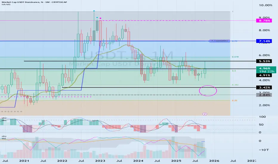
(USDT.D 1D Chart)
(1M Chart)
As funds flow into and out of the coin market through USDT and USDC, USDT dominance is likely to ultimately rise.
However, I believe that the funds (USDT, USDC) flowing into the coin market will change dominance through trading.
In other words, if USDT dominance declines, the coin market is likely to trend upward.
This is because coins (tokens) are being purchased with USDT.
If USDT dominance remains below 4.91 or declines, the coin market is likely to trend upward.
Therefore, if USDT dominance rises without any evidence of fund outflows through USDT or USDC, it can be interpreted as a temporary increase in selling pressure.
If USDT or USDC gaps downward in this situation, the price will fail to defend, leading to a downward trend in the coin market.
Therefore, it's best to look at the USDT and USDT.D charts to understand the general flow of funds.
-
(BTC.D 1D chart)
(1M chart)
I believe BTC dominance reflects the relationship with altcoins, rather than the rise or fall of the coin market or the rise and fall of BTC itself.
In other words, rising BTC dominance indicates a concentration of funds toward BTC, increasing the likelihood that altcoins will gradually move sideways or experience a downward trend.
Therefore, for an altcoin bull market to begin, it must remain below 55.01-62.47 or show a downward trend.
Therefore, it is recommended to check BTC dominance before trading altcoins and develop a trading strategy.
--------------------------------------------------
Summary of the above:
For the coin market to continue its bull market,
1. USDT and USDC must maintain a gaping upward trend.
2. USDT dominance should decline below 4.91.
3. BTC dominance should decline below 55.01.
-
Thank you for reading.
I wish you successful trading.
--------------------------------------------------
Trading Strategy
Hello, fellow traders!
By "Following" us, you'll always receive the latest information quickly.
Have a great day.
-------------------------------------
The conditions that lead people to start trading vary.
Before starting a trade, you should consider a trading strategy.
A trading strategy should include:
1. Investment period
2. Investment size
3. Trading method and profit realization method
You should categorize the coins (tokens) you wish to trade based on items 1-3 above.
1. The investment period is the most important.
While the investment period varies from person to person, BTC and ETH are generally considered long-term investments.
Since BTC and ETH are important coins that support the cryptocurrency market, I recommend investing in either BTC or ETH.
All coins other than BTC are broadly categorized as altcoins. However, among them, BNB, SOL, XRP, TRX, and ADA LINK, which have high market capitalizations and have been around for a long time, are suitable for mid- to long-term investment.
However, since these coins are also broadly categorized as altcoins, it's recommended to increase the number of coins (tokens) that generate income, if possible, for mid- to long-term investment.
This method involves selling the original purchase price (plus transaction fees) when the price rises, leaving the remaining coins (tokens) available for profit.
This allows you to increase the number of coins (tokens) with an average purchase price of zero, making mid- to long-term investment feasible.
While it's certainly advisable to sell your holdings to generate cash profits, this practice is not suitable for mid- to long-term investment.
This is because if you make a mistake, you could end up buying at a high price and incur losses for a long period of time.
-
2. You should determine your investment size based on your investment period.
In other words, if you're making a long-term investment and have already invested all your capital, you could miss out on good opportunities in the future.
Therefore, it's best to invest in the following order: long-term investment < mid- to long-term investment < short-term investment.
Furthermore, you should keep approximately 20% of your total investment in cash.
This allows you to trade when a good opportunity arises.
If you run out of cash after trading, try to sell when the price rises to secure cash.
Furthermore, you should avoid investing in too many coins (tokens).
-
3. Once you've determined your investment period and size, you need to find the right buy and sell points for actual trading.
Therefore, you need to define your trading method and profit-making method.
The basic trading strategy is to buy in the DOM(-60) ~ HA-Low range and sell in the HA-High ~ DOM(60) range.
However, if the price rises in the HA-High ~ DOM(60) range, a stepwise upward trend is likely, while if the price falls in the DOM(-60) ~ HA-Low range, a stepwise downward trend is likely.
Therefore, the basic trading strategy should be a split trading strategy.
In other words, if you buy in the DOM(-60) ~ HA-Low range and the price rises to form the HA-High ~ DOM(60) range, it's best to sell in splits and observe the situation.
This stabilizes your psychological state, allowing you to re-analyze the charts.
Maintaining a stable psychological state is crucial for trading.
If your psychological state is unstable, you're more likely to make unexpected trades.
Therefore, it's important to have a basic trading strategy that suits your investment style.
As mentioned earlier, to maintain a mid- to long-term investment, you need to decide whether to increase the number of coins (tokens) that generate profits or to generate cash returns. Before conducting a trade, you need to decide whether to do so.
Since the coin market is increasingly interconnected with the stock market, you can try to interpret it using the same method as the stock market.
In other words, rather than examining the flow of funds within the coin market itself, you should prioritize assessing the stock market, social issues, the economy, and politics to determine market trends.
I believe this problem stems from a lack of understanding of the coin market.
While some external factors may influence the flow of funds within the coin market, they are not suitable for predicting it.
Therefore, you should check the USDT, USDC, USDT.D, and BTC.D charts to confirm the flow of funds within the coin market.
Next, you should check the charts of the coin (token) you wish to trade to determine if it fits your basic trading strategy and develop a trading strategy.
Finally, by examining issues beyond the coin market, you can make an objective decision about your trading.
Otherwise, you will likely make inappropriate trades based on subjective opinions stemming from issues outside the coin market.
To analyze and interpret the coin market like the traditional stock market, the two markets must be integrated.
Otherwise, I believe the coin market should not be analyzed or interpreted like the stock market.
-
Thank you for reading to the end.
I wish you successful trading.
--------------------------------------------------

Explanation of the Basic Trading Strategy
Hello, fellow traders!
Follow me to get the latest information quickly.
Have a great day.
-------------------------------------
To understand the charts, the basic trading strategy is the concept used.
Let's look at an example.
---------------------------------------------------------
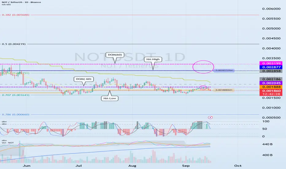
The OBV indicator, which follows the Low Line ~ High Line channel, has shown an upward trend as it has broken above EMA 1 and EMA 2.
Afterwards, the DOM(60) and HA-High indicators were formed, ultimately returning the price to its original position.
Since the HA-Low indicator is forming at 0.001888, we need to examine whether it can find support and rise around this level.
In other words, a buy signal is in the 0.001888-0.002045 range, where support is found and the price rises.
Since the HA-Low and HA-High indicators have converged, a sharp rise is expected if the sideways movement ends and the price rises above 0.002877-0.003199.
-
The basic trading strategy is based on the HA-Low and HA-High indicators, indicators developed for trading on Heikin-Ashi charts.
The basic trading strategy is to buy in the DOM(-60) to HA-Low range and sell in the HA-High to DOM(60) range.
However, if the price rises from the HA-High to DOM(60) range, a step-like upward trend is likely, while if it falls from the DOM(-60) to HA-Low range, a step-like downward trend is likely.
Therefore, the basic trading strategy should be a segmented trading approach.
Therefore, rather than predicting trends based on the movements of one or two indicators, you should prioritize developing a basic trading strategy.
-
If the HA-Low indicator touches and rises to meet the HA-High indicator, the wave should be considered closed.
Furthermore, if the HA-High indicator touches and falls to meet the HA-Low indicator, the wave should also be considered closed.
Remember that the closing of these waves serves as a benchmark for creating new trading strategies.
Previous waves should be forgotten and new trading strategies developed.
-
Thank you for reading to the end.
I wish you successful trading.
--------------------------------------------------
Long TLT/SPY📌 Bonds Explained: What They Are, How They Work & Key Risks
Bonds are one of the oldest and most important financial instruments in global markets. They are used by governments, corporations, and institutions to raise money, and by investors to earn income, diversify portfolios, and manage risk.
At their core, a bond is a loan:
The issuer (borrower) raises capital by selling bonds.
The investor (lender) provides money in exchange for periodic interest payments (coupon payments) and the return of the principal (face value) at maturity.
🔹 1. What is a Bond?
When you buy a bond, you are lending money to the issuer. The issuer promises:
Interest payments (usually fixed) on a regular schedule (semiannual or annual).
Repayment of principal (the original investment amount) when the bond matures.
📌 Example:
You invest $1,000,000 in a 10-year bond paying 3% annually (semiannual coupons).
Every 6 months, you receive $15,000 in interest payments.
At the end of 10 years, you (hopefully) receive back your original $1,000,000 principal.
🔹 2. Why Do Companies and Governments Issue Bonds?
Governments → Fund infrastructure, social programs, defense, or refinance existing debt.
Corporations → Finance expansion, research, acquisitions, or refinance loans.
Municipalities → Build schools, hospitals, and roads.
Bonds allow issuers to access large pools of capital without giving up ownership (like stocks).
🔹 3. Why Do Investors Buy Bonds?
Stable Income: Regular coupon payments.
Capital Preservation: Return of principal at maturity (assuming no default).
Diversification: Bonds often behave differently from stocks, balancing risk.
Hedging Inflation/Interest Rates: Certain bonds (like TIPS) protect against inflation.
Relative Safety: High-quality government bonds are considered safe-haven assets.
🔹 4. Key Types of Bonds
Government Bonds
Issued by sovereign states.
Example: U.S. Treasuries, UK Gilts, German Bunds.
Generally low risk, lower yields.
Corporate Bonds
Issued by companies.
Higher yields than government bonds but higher risk.
Municipal Bonds
Issued by local governments or agencies.
Often come with tax benefits for investors.
High-Yield (Junk) Bonds
Issued by lower-credit issuers.
Higher potential returns, but much riskier.
Inflation-Protected Bonds
Coupon/principal linked to inflation.
Example: U.S. TIPS (Treasury Inflation-Protected Securities).
🔹 5. Three Main Risks of Investing in Bonds
Even though bonds are often seen as “safe,” they carry risks that investors must understand:
1️⃣ Credit Risk (Default Risk)
The issuer may fail to pay coupons or repay the principal.
Higher with corporate bonds and emerging market government bonds.
Mitigated by credit ratings (Moody’s, S&P, Fitch).
📌 Example:
If a company defaults, you may lose part or all of your investment.
2️⃣ Interest Rate Risk
Bond prices move inversely to interest rates.
If rates rise, existing bond prices fall (since new bonds offer better yields).
If you sell before maturity, you could face a loss.
📌 Example:
You bought a 10-year bond at 3%. A year later, rates rise to 5%. Your bond’s market value falls, because investors prefer newer bonds paying higher coupons.
3️⃣ Inflation Risk (Purchasing Power Risk)
Even if you hold the bond to maturity, rising inflation erodes the real value of your returns.
A 3% coupon loses attractiveness if inflation rises to 6%.
📌 Example:
Your bond pays $30,000 annually, but inflation pushes up costs by $40,000 per year → you are effectively losing purchasing power.
🔹 6. Bonds vs. Stocks
Bonds: Debt, fixed income, contractual obligation, lower risk, limited upside.
Stocks: Equity ownership, dividends (optional), higher risk, unlimited upside.
In a company bankruptcy, bondholders are paid before shareholders.
🔹 7. How Investors Use Bonds in Portfolios
Income generation: Retirees and pension funds rely on coupon payments.
Diversification: Bonds often rise when stocks fall, reducing portfolio volatility.
Risk management: Safe-haven bonds (like Treasuries) act as “insurance” during crises.
Speculation: Traders can bet on interest rate moves via bond futures and ETFs.
🔹 8. Bonds vs. Stocks: The TLT–SPY Correlation
One of the most widely followed relationships in global markets is the correlation between:
TLT → iShares 20+ Year Treasury Bond ETF (tracks long-dated U.S. Treasury bonds).
SPY → SPDR S&P 500 ETF (tracks U.S. equities).
📈 Historical Relationship
Over the past two decades, TLT and SPY have often moved in opposite directions. (The Correlation between SPY/TLT often hovers around 0.)
Why? When stocks sell off, investors typically seek safety in Treasuries, pushing bond prices up (yields down).
This negative correlation makes bonds a powerful diversifier in equity-heavy portfolios (60/40).
📌 Example:
2008 Financial Crisis → SPY plunged ~37%, while long-dated Treasuries (TLT) surged as investors fled to safety.
March 2020 COVID Crash → SPY fell ~34% peak-to-trough, TLT spiked ~20% as the Fed cut rates and investors piled into Treasuries.
🐂 Strategy #1 (MA):
Buy SPY when TLT crosses below the 95 MA.
Sell SPY when TLT crosses above the 95 MA.
🔄 But the Correlation Can Shift
In inflationary environments, bonds and stocks can fall together.
2022 is a perfect example:
Inflation spiked → Fed hiked rates aggressively.
TLT dropped ~30% (yields surged).
SPY also fell ~19%.
Both asset classes sold off simultaneously, breaking the hedge.
🐂 Strategy #2 (Re-Balancing):
Buy TLT at the close of the seventh last trading day of the month.
Sell TLT at the close of the last trading day of the month.
Sell TLT short at the close of the month.
Cover TLT at the close of the seventh trading day of the month.
Higher Returns after rate hikes.
📊 Why This Matters for Investors
In normal times: TLT acts as a counterweight to SPY, smoothing portfolio volatility.
In inflationary shocks: Both can decline, reducing diversification benefits.
Lesson: Don’t assume bonds will always hedge equities — context (inflation, Fed policy, growth cycles) matters.
📌 Practical Uses of the TLT–SPY Correlation
Portfolio Diversification
A 60/40 portfolio (60% stocks, 40% bonds) relies on the negative correlation.
Works best when inflation is low and stable.
Risk-On / Risk-Off Gauge
If both SPY and TLT rise → markets are calm, liquidity flows into both risk and safety.
If SPY falls while TLT rises → classic risk-off move (flight to safety).
If both fall → inflation or policy tightening environment (no safe haven).
Trading Signals
Divergence trades: When SPY rallies but TLT also rallies strongly, it may signal equity rally exhaustion (risk-off brewing).
Macro hedge: Long TLT positions can offset downside risk in SPY-heavy portfolios — but only in disinflationary or deflationary shocks.
🔹 9. EWJ–TLT Correlation: Japan Equities vs. U.S. Treasuries
EWJ → Tracks Japanese equities (large & mid-cap companies).
TLT → Tracks U.S. long-dated Treasuries.
Unlike the classic SPY–TLT inverse correlation, the EWJ–TLT relationship is more complex, shaped by:
Global risk sentiment (risk-on/risk-off flows).
Currency effects (USD/JPY exchange rate).
Japan’s ultra-low interest rate environment (BoJ policy).
📈 Historical Tendencies
1️⃣ Risk-Off Periods (Global crises → flight to safety):
TLT rallies (U.S. Treasuries bid).
EWJ often falls, as Japanese equities are highly cyclical and export-driven.
Negative correlation dominates.
📌 Example:
2008 Crisis → TLT surged; EWJ plunged with global equities.
2020 COVID Crash → Same pattern: safety flows to Treasuries, Japanese stocks sold.
2️⃣ Risk-On Periods (Liquidity, global growth optimism):
EWJ rallies with global equities.
TLT may drift lower (yields rising on stronger growth).
Correlation weak to moderately negative.
📌 Example:
2016–2018: Global growth rebound → EWJ rose, TLT fell as U.S. yields climbed.
3️⃣ Currency Channel (USD/JPY)
Japanese equities (EWJ) are sensitive to the yen.
A stronger USD/JPY (weaker yen) boosts exporters (good for EWJ).
TLT rallies often coincide with USD weakness (yields down, dollar down), which can hurt Japanese exporters, adding another layer of inverse correlation.
🔄 Shifts Over Time
Long-term average correlation: Mildly negative (similar to SPY–TLT, but weaker).
During inflation shocks (2022): Correlation turned positive at times:
TLT fell as U.S. yields spiked.
EWJ also struggled due to global tightening & yen weakness.
Both moved down together, breaking the hedge.
📊 Why EWJ–TLT Matters
Global Diversification Check: Investors often think Japanese equities diversify U.S. equities, but they can be just as cyclical. Adding TLT creates the real hedge.
Risk-Off Signal: When both EWJ and TLT rise, it may indicate global liquidity easing (rare but bullish).
Currency Overlay: Always factor USD/JPY → sometimes EWJ’s move is more about currency than equities.
🐂 Strategy #3 (EWJ):
When Japanese stocks are above their 150-day moving average, go long TLT (US long-term Treasury). When the average is below the 150-day average, stay out. The correlation between TLT and EWJ can serve as a breath signal.
📌 Conclusion: Bonds as the Foundation of Finance
Bonds are the backbone of the global financial system, connecting borrowers (governments, corporations) with lenders (investors).
✅ Bonds provide regular income and capital preservation.
✅ They carry risks: credit, interest rate, and inflation.
✅ They are essential for diversification and risk management.
✅The TLT–SPY correlation is dynamic. Historically negative, providing diversification. In inflationary shocks (like 2022), the correlation turns positive, breaking the hedge.
✅ EWJ–TLT is a Global Macro Hedge, But Fragile. Usually inverse: Risk-off = TLT up, EWJ down. Sometimes aligned: Inflation shocks or synchronized global tightening → both down. Currency filter essential: USD/JPY often mediates the relationship. This makes EWJ–TLT correlation a powerful barometer of global macro regimes: Disinflationary slowdowns → Strong hedge. Inflationary crises → Hedge breaks.
For investors, understanding bonds is crucial, even if you primarily trade equities or commodities, because bond yields influence everything: stock valuations, mortgage rates, and even currency markets.

Examples of Conditions for Starting a Trade
Hello, fellow traders!
Follow us to get the latest information quickly.
Have a great day!
-------------------------------------
This time, I'm going to talk about when to start and when to close a trade.
Trading has no beginning or end.
In other words, you can start a trade at any time and close it at any time.
The only question is whether you can profit from the time you start the trade and when you close it.
Therefore, it's best to be clear about why you need to start trading.
In other words, you need to be able to explain why you need to start trading now.
If you can't, it's best not to start trading.
You should also be able to explain why you're closing the trade now or selling in installments.
If you can't, it's likely that you don't have a well-established trading strategy.
A trading strategy should be developed from a broad perspective.
After that, you should develop a detailed response strategy that stabilizes your psychological state according to price volatility and guides your trading accordingly.
Therefore, a basic trading strategy is essential.
This basic trading strategy may vary depending on your investment style, so it's important to establish a basic trading strategy that suits you.
My basic trading strategy is to buy in the DOM(-60) ~ HA-Low range and sell in the HA-High ~ DOM(60) range.
------------------------------------------------------------------------------
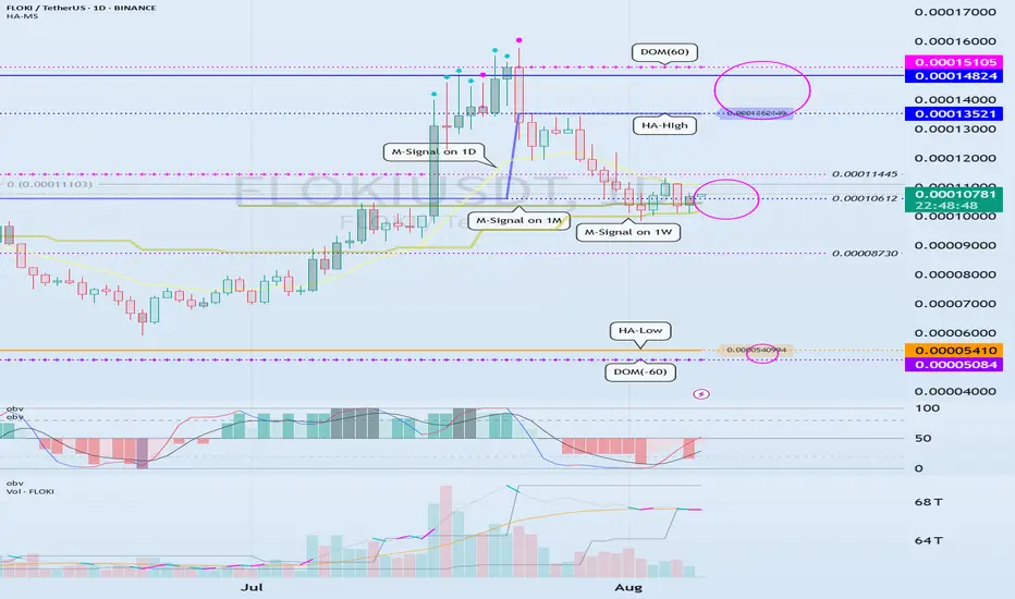
To initiate a trade, you can determine whether support is available at important support and resistance levels or areas.
The optimal range for this is when support is found and the price rises in the DOM (-60) ~ HA-Low range.
This corresponds to the conditions for trading on the Heikin-Ashi chart.
-
Next, the M-Signal indicators on the 1M, 1W, and 1D charts converge and break upward, sustaining the price.
In other words, the price rises when support is found around the current price range of 0.000010612-0.00011445.
This represents an important turning point from a trend perspective.
-
If you bought in the above range, the sell range would be 0.00013521-0.00014824.
This sell zone corresponds to the high point, HA-High ~ DOM(60).
This means that a stepwise uptrend, or a full-blown uptrend, is likely to begin only when the price rises above the HA-High ~ DOM(60) range.
-
If you start trading at other support and resistance points or zones, it can be difficult to respond to price volatility.
Therefore, it's best to check for support and initiate trading within the DOM(-60) ~ HA-Low and HA-High ~ DOM(60) zones, if possible.
From a trend perspective, if the M-Signal indicators on the 1M, 1W, and 1D charts converge, and the price breaks upward and sustains, as is currently the case, trading is possible if support is found at the support and resistance levels near those points.
While this trading method cannot guarantee profit, it is worth developing a trading strategy and attempting it.
-
Thank you for reading to the end. I wish you successful trading.
--------------------------------------------------
Need a trading strategy to avoid FOMO
Hello, traders.
If you "Follow", you can always get new information quickly.
Have a nice day today.
-------------------------------------
1D chart is the standard chart for all time frame charts.
In other words, if you trade according to the trend of the 1D chart, you can make profits while minimizing losses.
This can also be seen from the fact that most indicators are created based on the 1D chart.
In that sense, the M-Signal indicators of the 1M, 1W, and 1D charts are suitable indicators for confirming trends.
If the price is maintained above the M-Signal indicator of the 1M chart, it is highly likely that the upward trend will continue in the medium to long term, so it is recommended to take note of this advantage especially when trading spot.
The M-Signal indicator on the 1W, 1D chart shows the medium-term and short-term trends.
The M-Signal indicator uses the MACD indicator formula, but it can be seen as a price moving average.
You can trade with just the price moving average, but it is difficult to select support and resistance points, and it is not very useful in actual trading because it cannot cope with volatility.
However, it is a useful indicator when analyzing charts or checking general trends.
Therefore, what we can know with the M-Signal indicator (price moving average) is the interrelationship between the M-Signal indicators.
You can predict the trend by checking how far apart and close the M-Signal indicators are, and then checking the direction.
-
If you have confirmed the trend with the M-Signal indicator, you need support and resistance points for actual trading.
Support and resistance points should be drawn on the 1M, 1W, and 1D charts.
The order of the roles of support and resistance points is 1M > 1W > 1D charts.
However, the strength of the role of support and resistance points can be seen depending on how long the horizontal line is.
Usually, in order to perform the role of support and resistance points, at least 3 candles or more form a horizontal line.
Therefore, caution is required when trading when the number of candles is less than 3.
The indicators created considering this point are the HA-Low and HA-High indicators.
The HA-Low and HA-High indicators are indicators created for trading on the Heikin-Ashi chart and indicate when the Heikin-Ashi candle turns upward or downward.
Therefore, the creation of the HA-Low indicator means that there is a high possibility of an upward turn.
In other words, if it is supported by the HA-Low indicator, it is a time to buy.
However, if it falls from the HA-Low indicator, there is a possibility of a stepwise decline, so you should also consider a countermeasure for this.
The fact that the HA-High indicator was created means that there is a high possibility of a downward turn.
In other words, if there is resistance from the HA-High indicator, it is a time to sell.
However, if it rises from the HA-High indicator, there is a possibility of a stepwise upward turn, so you should also consider a countermeasure for this.
This is where a dilemma arises.
What I mean is that the fact that the HA-High indicator was created means that there is a high possibility of a downward turn, so you know that there is a high possibility of a downward turn, but if it receives support and rises, you think that you can make a large profit through a stepwise upward turn, so you fall into a dilemma.
This is caused by greed that arises from falling into FOMO due to price volatility.
The actual purchase time should have been when it showed support near the HA-Low indicator, but when it showed a downward turn, it ended up suffering a large loss due to the psychology of wanting to buy, which became the trigger for leaving the investment.
Therefore, if you failed to buy at the purchase time, you should also know how to wait until the purchase time comes.
-
It seems that you can trade depending on whether the HA-Low and HA-High indicators are supported, but the task of checking whether it is supported is quite difficult and tiring.
Therefore, to complement the shortcomings of the HA-Low and HA-High indicators, the DOM(60) and DOM(-60) indicators were added.
The DOM(-60) indicator indicates the end of the low point.
Therefore, if it shows support in the DOM(-60) ~ HA-Low section, it is the purchase time.
If it falls below the DOM(-60) indicator, it means that a stepwise downtrend is likely to begin.
The DOM(60) indicator indicates the end of the high point.
Therefore, if it is supported and rises in the HA-High ~ DOM(60) section, it means that a stepwise uptrend is likely to begin.
If it is resisted and falls in the HA-High ~ DOM(60) section, it is likely that a downtrend will begin.
With this, the basic trading strategy is complete.
This is the basic trading strategy of buying when it rises in the DOM(-60) ~ HA-Low section and selling when it falls in the HA-High ~ DOM(60) section.
For this, the trading method must adopt a split trading method.
Although not necessarily, if it falls in the DOM(-60) ~ HA-Low section, it will show a sharp decline, and if it rises in the HA-High ~ DOM(60) section, it will show a sharp rise.
Due to this volatility, psychological turmoil causes people to start trading based on the price, which increases their distrust in the investment market and eventually leads them to leave the investment market.
-
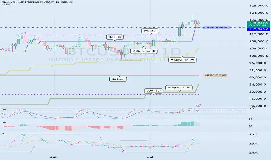
When looking at the movement of the 1D chart, it can be seen that it is not possible to proceed with trading at the moment because it is already showing a stepwise upward trend.
However, since there is a SHORT position in futures trading, trading is possible at any time.
In any case, it is difficult to select a time to buy because the 1D chart shows a stepwise upward trend.
However, looking at the time frame chart below the 1D chart can help you select a time to buy.
The basic trading strategy is always the same.
Buy when it rises in the DOM(-60) ~ HA-Low section and sell when it falls in the HA-High ~ DOM(60) section.
Currently, since the 1D chart is continuing a stepwise upward trend, the main position is to eventually proceed with a long position.
Therefore, if possible, you should focus on finding the right time to buy.
However, if it falls below the HA-High indicator of the 1D chart, the possibility of a downtrend increases, so at that time, you should focus on finding the right time to sell.
In other words, since the HA-High indicator of the current 1D chart is generated at the 115845.8 point, you should think of different response methods depending on whether the price is above or below the 115845.8 point.
Therefore, when trading futures, increase the investment ratio when trading with the main position (a position that matches the trend of the 1D chart), and decrease the investment ratio when trading with the secondary position (a position that is different from the trend of the 1D chart) and respond quickly and quickly.
When trading in the spot market, you have no choice but to trade in the direction of the 1D chart trend, so you should buy and then sell in installments whenever it shows signs of turning downward to secure profits.
In other words, buy near the HA-Low indicator on the 30m chart, and if the price rises and the HA-High indicator is created, sell in installments near that area.
-
You should determine your trading strategy, trading method, and profit realization method by considering these interrelationships, and then trade mechanically accordingly.
If you trade only with fragmentary movements, you will likely end up suffering losses.
This is because you do not cut your losses.
-
Thank you for reading to the end.
I hope you have a successful trade.
--------------------------------------------------
What is the key that makes you start trading?
Hello, traders.
If you "Follow", you can always get new information quickly.
Have a nice day today.
-------------------------------------
HA-Low, HA-High indicators are indicators created for trading on Heikin-Ashi charts.
Therefore, they are determined by Heikin-Ashi's Open, Close, and RSI values.
If the RSI indicator value is above 70 when the candle starts to rise and then falls on the Heikin-Ashi chart, the HA-High indicator is generated.
If the RSI indicator value is below 30 when the candle starts to rise and then falls on the Heikin-Ashi chart, the HA-Low indicator is generated.
Therefore, rather than judging the rise and fall with your eyes, you can judge the rise and fall transitions with more specific criteria.
If you look at a regular chart, you can see that there are many rise and fall transition points, unlike the Heikin-Ashi chart.
The Heikin-Ashi chart has the effect of reducing fakes.
Therefore, it has a higher reliability than judging with a regular chart.
The biggest disadvantage of the Heikin-Ashi chart is that it is difficult to know the exact values of the Open and Close values.
Therefore, the HA-Low, HA-High indicators are used to accurately and quickly identify the Open and Close values by indicating the rising and falling transition points of the Heikin-Ashi chart on a general chart.
-
The Heikin-Ashi chart uses the median.
Therefore, the HA-Low indicator corresponds to the median when it leaves the low range, and the HA-High indicator corresponds to the median when it leaves the high range.
If the HA-Low indicator is generated and then receives support, there is a high possibility that an upward trend will begin, and if the HA-High indicator is generated and then receives resistance, there is a high possibility that a downward trend will begin.
Therefore, the HA-Low, HA-High indicators are used in basic trading strategies.
However, since the HA-Low and HA-High indicators are intermediate values, if the HA-Low indicator resists and falls, there is a possibility of a stepwise decline, and if the HA-High indicator supports and rises, there is a possibility of a stepwise rise.
Therefore, to compensate for this, the DOM (60) and DOM (-60) indicators were used.
The DOM indicator is an indicator that comprehensively evaluates the DMI + OBV + MOMENTUM indicators.
When these indicators are above 60 or below -60, the DOM (60) and DOM (-60) indicators are created.
In other words, the DOM (60) indicator corresponds to the overbought range and indicates the end of the high point.
The DOM (-60) indicator corresponds to the oversold range and indicates the end of the low point.
Therefore, when the HA-Low indicator resists and falls, the actual stepwise decline is likely to start when it falls below DOM (-60).
On the other hand, when the HA-High indicator is supported and rises, the actual step-up trend is likely to start by rising above DOM (60).
This compensates for the shortcomings of the HA-Low and HA-High indicators.
-
There is no way to be 100% sure in all transactions.
Therefore, if the motivation to start a transaction is clear, it is only worth challenging the transaction.
Finding that motivation and deciding how to start a transaction that suits your investment style is the trading strategy and the core of trading.
-
Thank you for reading to the end.
I wish you successful trading.
--------------------------------------------------

An example of a new way to interpret the OBV indicator
Hello, traders.
If you "follow", you can always get new information quickly.
Have a nice day today.
-------------------------------------
I think the reason why there are difficulties in using auxiliary indicators and why they say not to use indicators is because they do not properly reflect the price flow.
Therefore, I think many people use indicators added to the price part because they reflect the price flow.
However, I think auxiliary indicators are not used that much.
Among them, indicators related to trading volume are ambiguous to use and interpret.
To compensate for this, the OBV indicator has been modified and added.
-
The ambiguous part in interpreting the OBV indicator is that the price flow is not reflected.
Therefore, even if it performs its role well as an auxiliary indicator, it can be difficult to interpret.
To compensate for this, the High Line and Low Line of the OBV auxiliary indicator have been made to be displayed in the price section.
That is, High Line = OBV High, Low Line = OBV Low
-
Then, let's interpret the OBV at the current price position.
The OBV of the auxiliary indicator is currently located near the OBV EMA.
That is, the current OBV is located within the Low Line ~ High Line section.
However, if you look at the OBV High and OBV Low indicators displayed in the price section, you can see that it has fallen below the OBV Low indicator.
In other words, you can see that the price has fallen below the Low Line of the OBV indicator.
You can see that the OBV position of the auxiliary indicator and the OBV position displayed in the price section are different.
Therefore, in order to normally interpret the OBV of the auxiliary indicator, the price must have risen above the OBV Low indicator in the price section.
If not, you should consider that the interpretation of the OBV of the auxiliary indicator may be incorrect information.
In other words, if it fails to rise above the OBV Low indicator, you should interpret it as a high possibility of eventually falling and think about a countermeasure for that.
Since time frame charts below the 1D chart show too fast volatility, it is recommended to use it on a 1D chart or larger if possible.
-
It is not good to analyze a chart with just one indicator.
Therefore, you should comprehensively evaluate by adding different indicators or indicators that you understand.
The indicators that I use are mainly StochRSI indicator, OBV indicator, and MACD indicator.
I use these indicators to create and use M-Signal indicator, StochRSI(20, 50, 80) indicator, and OBV(High, Low) indicator.
DOM(60, -60) indicator is an indicator that comprehensively evaluates DMI, OBV, and Momentum indicators to display high and low points.
And, there are HA-Low, HA-High indicators, which are my basic trading strategy indicators that I created for trading on Heikin-Ashi charts.
Among these indicators, the most important indicators are HA-Low, HA-High indicators.
The remaining indicators are auxiliary indicators that are necessary when creating trading strategies or detailed response strategies from HA-Low, HA-High indicators.
-
Thank you for reading to the end.
I hope you have a successful trade.
--------------------------------------------------

About the Volume OBV indicator...
Hello, traders.
If you "Follow", you can always get new information quickly.
Please click "Boost" as well.
Have a nice day today.
-------------------------------------
I think TradingView is attractive because users can create charts as they want.
However, since the number of indicators that can be added to the chart is limited depending on the plan, you have to add indicators that fit your plan.
As a result, I ended up integrating multiple indicators into one indicator.
-
The HA-MS indicator in this chart is a public indicator.
If you search the Internet, you can find detailed explanations on how to interpret the OBV indicator.
I expressed it as follows to make this interpretation method more realistic.
The body color of the candlestick is indicated by the 4-stage OBV indicator.
The OBV indicator is distinguished in the same way as the Price Channel indicator.
You can interpret it like the Bollinger Band.
That is, if the middle line that divides 2 and 3 rises by more than 3, you can interpret that the buying force is increasing.
1: It means below the lower line of the Price Channel and is indicated in dark red.
If you enter this section, there is a high possibility of a sharp decline.
You should check the support and resistance points because it is likely to stop falling soon and rise to 2.
2: It means between the lower line and the middle line of the Price Channel and is indicated in red.
This section is likely to show a weak downward sideways movement.
Therefore, if it rises from 1->2, there is a possibility of a short rise. However, if it fails to rise to 3, it is likely to fall back to 1, so it is recommended to make short trades.
3: It means between the middle line and the upper line of the Price Channel and is displayed in green.
This section is likely to show a weak upward sideways movement.
If it rises from 2 -> 3 and shows a sideways movement, you should focus on finding a buying point.
4: It means above the upper line of the Price Channel and is displayed in dark green.
If it enters this section, there is a high possibility of a sharp rise.
Since it is likely to stop rising soon and fall to 3, you should check the support and resistance points.
-
What we should pay attention to is when it changes from 1 -> 2, 4 -> 3.
As explained above, 1 is a section located below the lower line of the Price Channel, so there is a high possibility of a sharp fall.
4 is a section located above the upper line of the Price Channel, so there is a high possibility of a sharp rise.
Therefore, you can proceed with an aggressive buy when it changes from 1 -> 2, and you can proceed with a sell when it changes from 4 -> 3.
In the case of futures, it can be used as reference information for entering and liquidating LONG and SHORT positions.
-
They say that the only things you need on a chart are price and trading volume.
However, it is not easy to interpret this in reality.
To compensate for this, we hid the colors of the existing candles and displayed them in 4 stages of OBV so that you can intuitively see which stage the current price is at.
-
Thank you for reading to the end.
I hope you have a successful transaction.
--------------------------------------------------

DJI Hits Weekly Support: What's Next? - Market Breadth AnalysisThe DJI has recently declined as previously predicted and has now completed a CHoCH (Change of Character), signaling a bearish trend. The index has reached a significant weekly support zone around the 42,500 level (🟩 marked by the green box).
So, what’s next? 🤔
Looking at the H1 chart, we notice some interesting market breadth outlook:
- US30 Market Breadth EMA20 Indicator:
The EMA histogram has shifted from 🟩 green to 🟨 yellow, indicating an increasing number of stocks with strong bullish momentum.
However, the height of the histogram (yellow) bars 📉 is decreasing, suggesting that the overall number of stocks with strong bullish momentum is also diminishing.
- Market Breadth MACD Indicator:
The 🔴 red line (representing strongly bearish stocks) is clearly declining, showing a reduction in the number of stocks with strong downward momentum.
Meanwhile, the 🔵 blue line is increasing significantly, suggesting that many stocks are reversing upward even within a bearish momentum.
The 🟢 green line, which represents strongly bullish stocks, is climbing but still lacks the strength to signal a decisive shift. A significant breakout would require the green line to rise further, confirming a stronger bullish momentum across a larger number of stocks.
- Market Breadth EMA Alignment:
The 🔴 red line crossed above the 🟢 green line quite some time ago and continues to widen. This suggests that a bullish crossover (green crossing above red) is unlikely in the near term. A confirmed bullish signal would require the green line to overtake the red line again.
- Summary:
While there are early signs of potential reversal, the bullish momentum is not yet strong enough to suggest a significant upward breakout. It’s crucial to monitor whether the 🟢 green line in the MACD and US30 Market Breadth EMA20 indicators can rise substantially, indicating a larger number of stocks gaining solid bullish momentum.
⚠️ Until then, the uptrend remains weak, and caution is warranted. While DJI might retest previous highs, breaking past those highs to form new all-time highs seems challenging at this point.
Strategy: Given the current conditions, it might be more advantageous to look for shorting opportunities. 📉

How to Identify Market Downtrends Without Fundamentals🔍 A Fundamental Perspective
On December 18, 2024, the Federal Reserve cut interest rates by 25 basis points, bringing them to a range of 4.25%–4.5%. However, their guidance suggested a slower pace of rate cuts in 2025, with projections of only two reductions instead of four as previously expected.
This cautious stance, driven by lingering inflation concerns and a resilient labor market, triggered a sharp market sell-off. The Dow Jones Industrial Average (DJIA) plummeted over 1,100 points, recording its steepest single-day drop since 1974.
🔍 Market Breadth: A Technical Perspective
If you’re not tracking fundamental events, Market Breadth indicators can offer valuable insights into market trends and the health of the index.
1️⃣ US30 Market Breadth EMA 20
The histogram bars in yellow reflect the number range of stocks in the DJIA with strong uptrends. Recently, the height of these bars has been steadily declining, signaling that fewer stocks are maintaining bullish trends.
2️⃣ Market Breadth MACD
Conversely, the red line of the MACD indicator, which represents stocks in a strong downtrend, has been rising. This divergence indicates that bearish momentum is building across the market.
3️⃣ Market Breadth EMA Alignment
The red line crossing above the green line in this indicator confirms a strong downtrend, providing additional evidence of bearish dominance.
📈 Price Action Analysis
The price has broken below the ascending channel, which further supports the bearish case. Combining this with signals from the Market Breadth indicators strengthens the probability of a sustained downtrend in the DJIA.
✅ Key Takeaway
By analyzing Market Breadth and combining technical indicators, you can gauge the market's strength even if you're not following the fundamentals. As DJIA breaks below critical technical levels, traders should exercise caution and watch for further confirmation of bearish trends.

Avoid Betting at the Peak? Here's How Market Breadth HelpWe are Investic Lab, a quant-focused lab dedicated to designing tools that provide clients with actionable insights from quantitative data on global markets. Our tools offer a unique perspective by analyzing market data based on facts—not speculative price predictions.
⚠️ Disclaimer: This post is for informational purposes only and does not constitute financial advice.
Key Takeaways:
✅ Quantitative Insights Over Predictions:
Our tools explore the concept of "Peaks" using data-driven approaches, offering a distinct advantage compared to traditional predictive models.
✅ Why Market Breadth and DJIA (US30)?
The Dow Jones Industrial Average (US30) serves as a leading indicator for our analysis. By examining market breadth, we aim to identify potential short-term bullish weaknesses.
Market Breadth Analysis: Understanding the Red-to-Yellow Zone Transition
📊 Timeframe: Daily (TF Day)
The transition from the Red Zone to the Yellow Zone signals a shift in market dynamics. This change represents 7 to 24 stocks moving above the 20-day EMA, indicating moderate market strength and the emergence of a positive trend.
🔍 Not Bearish, but Weakening Bullish Momentum:
While this transition does not imply bearish conditions, it often reflects short-term bullish weakness.
🎯 Opportunity at or Near the Peak:
We suggest adjusting your Risk/Reward (R/R) to 3:1 to take advantage of this phase, which may represent the peak or near-peak conditions for the short term.
📊 Timeframe: 15 Minutes (TF m15)
For aggressive traders monitoring intraday price movements, we recommend incorporating Bollinger Bands into your strategy. Focus on the average line of the Bollinger Bands, which can serve as a reliable reference for trade setups.
✅ Use the Average Line for Entry Decisions:
If you're experienced with Bollinger Bands, rely on the average line as your primary guide. Either, If you’re unsure about Bollinger Band parameters, substitute the 39-period Exponential Moving Average (EMA) line for a clear trend-following signal.
Risk Management Reminder:
⚠️ Trading Against the Trend:
This strategy goes against the prevailing bullish market trend, which inherently carries more risk. If the price doesn’t move as expected, cut your losses and wait for the next trade setup.
💡 Opportunities Always Await:
Missed trades are part of the process. Stay disciplined—there will always be new opportunities ahead!

How to Use Trading Zones in CryptoHello, Skyrexians!
Last two articles were the deep dive into the Awesome Oscillator and Acceleration Deceleration indicators by Bill Williams. In conjunction with the fractals and the alligator these indicators are the powerful concept in cryptocurrency trading. It can significantly boost your cryptocurrency trading strategy, crypto trading algorithm or you can implement it into trading bot. Today we will expand this concept with the trading zones - the periods on the market with the bullish or bearish superiority.
Trading zones is not the popular concept in comparison to Awesome Oscillator, that's why using it can give you a huge advantage in crypto trading because even top crypto traders don't use it in their trading routine. Let's go through its concept.
Before start observing the trading zones concept we have to understand what are the Awesome Oscillator and Acceleration/Deceleration. Awesome oscillator is the approximation of the market's driving force. Usually it starts moving before the price if this is an impulsive wave. During corrections it can flash the false signals. Before the driving force starts moving the acceleration changes its direction. That's why combination of these indicators is so important.
What is the trading zone?
As you know from AO and AC descriptions they can have 2 conditions: increasing (greed bars) and decreasing (red bars). According to this we can define 3 marker conditions:
Green zone. Both AO and AC have the increasing columns. This is the strong bullish phase. Only long trades are allowed.
Red zone. Both AO and AC have the decreasing columns. This is the strong bearish phase. Only short trades are allowed.
Gray zone. AO and AC have the different directions. No signals can be generated by this trading zone

Example of Conditions for Starting Trading
Hello, traders.
If you "Follow", you can always get new information quickly.
Please also click "Boost".
Have a nice day today.
-------------------------------------
I will publish in advance due to an external schedule tomorrow.
Accordingly, I will take time to provide additional explanations on the ideas published today.
----------------------------------------
I will talk about the basis for indicating the direction of progress shown in the chart above.
In order to differentiate from other people's analyses, I am trying to explain the basis for indicating the support and resistance points or sections on the chart.
I think that if you understand why those points and sections were set, you will eventually be able to understand them without having to read the explanation all the way through.
For this, more support and resistance points are needed.
This is because we can select the volatility period by additionally drawing the trend line.
However, since all of these processes are displayed on the chart, there are many complaints that the chart is messy and confusing, so we are trying to reduce them as much as possible.
Therefore, there are cases where the chart is displayed in two versions.
The chart below is a chart that shows many support and resistance points and draws a trend line to select the volatility period.
Therefore, since the support and resistance points may be displayed differently, it is recommended that you refer to the points or sections that I have written.
-
The conditions for starting a transaction are simpler than they look.
However, when these conditions are met, the support and resistance points drawn on the 1M, 1W, and 1D charts must be displayed.
Therefore, even if the conditions for starting a transaction are met, if the support and resistance points are not displayed at the corresponding price, you cannot start a transaction.
Please read this carefully and thank you.
-
(It would be good to see this as an example of how to find the conditions that fit you and how to utilize them.)
Conditions for starting a transaction are
1. Buying time conditions
- When the StochRSI indicator rises in the oversold range and maintains the state of StochRSI > StochRSI EMA
- When the BW indicator forms a horizontal line at the lowest point (0)
- When the OBV indicator rises below the 0 point
- When the DMI indicator rises below the 0 point
2. Selling time conditions
- When the StochRSI indicator falls in the overbought range and maintains the state of StochRSI < StochRSI EMA
- When the BW indicator forms a horizontal line at the highest point (100)
- When the OBV indicator falls above the 0 point
- When the DMI indicator falls above the 0 point
When the above conditions are met, check whether there is support at the support and resistance points drawn near the price. Confirmation is used to proceed with the transaction.
The current price position is 60672.0-61099.25.
Therefore, you can proceed with the transaction depending on whether there is support in this section.
Since it is currently falling below 60672.0, there is nothing you can do in spot trading other than cutting losses.
In futures trading, you can enter with a sell (SHORT) position.
-
It is rare for all the conditions for starting a transaction mentioned above to be met.
Therefore, it is recommended to basically check whether the BW indicator forms a horizontal line at the lowest point (0) or highest point (100), and then proceed with the transaction by checking the movement of the StochRSI indicator.
Also, it is recommended to select a split sell section to make a profit by calculating the fluctuation range while checking the strength of the rise or fall with OBV and DMI.
-
In summary of the above,
Since the StochRSI indicator has not yet risen from the oversold zone and StochRSI < StochRSI EMA, it is recommended to check whether a reversal is occurring.
Also, you should check whether the BW indicator has fallen to the lowest point (0) and formed a horizontal line.
If the OBV and DMI indicators rise below the 0 point without meeting these conditions, you should proceed with an aggressive purchase (a transaction that requires a quick response similar to scalping or day trading).
If you do not proceed with an aggressive purchase, you should wait.
-
It is not a good idea to enter a current sell (SHORT) position in futures trading.
However, if you proceed with an aggressive transaction (scalping or day trading), you can start trading.
The reason why it is not a good condition for trading is because the price is located in the 1. purchase timing condition section among the conditions for starting a transaction mentioned above.
Therefore, the profit is small or you may even suffer a loss.
-
If you are not currently trading, I think the section where you should trade is when it rises around 61K.
Before that, it is highly likely that you will not be able to purchase because it seems like it will fall further.
I think this point, or the section where you actually trade, is the psychological volume profile section.
This psychological volume profile section is the section where psychology applies that you must trade even now.
Since this point is ultimately a low or high point, it is a section where you are likely to incur losses if you purchase.
The 61K section that I mentioned earlier is a section where it is highly likely to be a low point, so it is a section where you are likely to incur losses if you cut your loss or enter a sell (SHORT) position.
-
If it shows resistance near 60672.0, there is a possibility that a sharp decline will occur momentarily and touch 59K and then rise.
This phenomenon can be a fake or a sweep movement, so you need to be careful.
In order to avoid losses from this phenomenon, auxiliary indicators are necessary.
Since auxiliary indicators are lagging, they are unlikely to show large movements in sudden price fluctuations.
-
What I am talking about is not a method of chart analysis, but an example of how to set a standard for trading.
Therefore, I hope you do not misunderstand the above as about chart analysis.
Since chart analysis and trading are different, what you see on the chart is also different.
In order to complement this difference, what is needed is the support and resistance points drawn on the 1M, 1W, and 1D charts.
Since charts without support and resistance points are likely to be for chart analysis, there is no need to try to find a trading point on these charts.
-
Have a good time.
Thank you.
--------------------------------------------------
- Big picture
It is expected that the real uptrend will start after rising above 29K.
The section expected to be touched in the next bull market is 81K-95K.
#BTCUSD 12M
1st: 44234.54
2nd: 61383.23
3rd: 89126.41
101875.70-106275.10 (overshooting)
4th: 134018.28
151166.97-157451.83 (overshooting)
5th: 178910.15
These are points where resistance is likely to be encountered in the future. We need to see if we can break through these points.
We need to see the movement when we touch this section because I think we can create a new trend in the overshooting section.
#BTCUSD 1M
If the major uptrend continues until 2025, it is expected to start by creating a pull back pattern after rising to around 57014.33.
1st: 43833.05
2nd: 32992.55
-----------------

Indicators that can identify trends: MS-Signal indicatorHello?
Traders, welcome.
If you "Follow", you can always get new information quickly.
Please also click "Boost".
Have a good day.
-------------------------------------
(LINKUSDT chart)
The composition of the chart consists of price and volume.
Therefore, chart analysis can be interpreted differently depending on how you interpret price and volume.
First of all, if you look at the price part, you can see that the trend and various indicators were created based on price candles and moving averages.
Therefore, it will be difficult to interpret the chart as the concept of the arrangement of the candles and the price moving average is not established.
The array of price candles, that is, the high and low points formed by connecting the candles, draws each trend line to check which direction the current price movement is moving.
However, it is necessary to be careful because it is difficult to find the highs and lows of a low time frame chart, so it is possible to draw an incorrect trend line.
A false trend line means that you drew a trend line, but did nothing with it.
The more false trend lines you have, the less information you can get from chart analysis, and the trading strategy created with such reduced information loses its usefulness, so you need a solid basis even when drawing a trend line.
With a firm basis on how to draw a trend line, we will have time to explain in detail later on how to draw it.
The MS-Signal indicator shown in this chart is an indicator that can confirm the trend by using the formula of the MACD indicator.
Therefore, it is necessary to become familiar with the interpretation method using MS-Signal indicators before practicing drawing trend lines.
The MS-Signal indicator utilizes the formula of the MACD indicator. If you look at the formula of the MACD indicator, you can see that it was created using a moving average.
Therefore, if you understand the concept of moving averages, I think you will have no difficulty in using the MACD indicator.
MS-Signal indicator consists of M-Signal indicator and S-Signal indicator.
Therefore, an arrangement of M-Signal indicator > S-Signal indicator means that it is in an uptrend.
During this uptrend, if the price candle holds the price above the MS-Signal indicator, it means that the uptrend is likely.
We have also explained indicators that use volume to mark support and resistance points.
That index is the OBV index included in the HA-MS index.
The OBV indicator is an indicator that shows the change in trading volume due to price fluctuations, and the key point of the OBV indicator is 0.
Interpretation of trading volume can be difficult to understand, so we will take time to explain in detail when the explanation of the price chart part is being finalized.
In this chart, the 'Vol & Trend' sub-indicator includes indicators that utilize trading volume.
What I want to explain this time is about the MS-Signal indicator explained above.
Since the MS-Signal indicator is published in the trading view formula, you can look it up if you want to know the formula. (HA-MS indicator)
MS-Signal indicators are composed of M-Signal indicators and S-Signal indicators.
Among these two indicators, the key indicator is the M-Signal indicator.
Therefore, it is designed to display M-Signal indicators of 1M, 1W, and 1D charts separately.
Utilizing these indicators, it plays a role in showing the overall trend of the price chart immediately even if it is below the 1D chart.
(4h chart)
The 4h chart above is a chart set to display only the M-Signal indicators of the 1D, 1W, and 1M charts.
If the M-Signal indicators form a regular arrangement (1D > 1W > 1M), you can see that there is an upward trend from a long-term perspective, just by looking at the 4h chart.
These marks can reduce the time it takes to analyze a chart because it can shorten the viewing time when viewing multiple charts.
It also reduces the chance of getting caught in a whipsaw by price fluctuations.
Chart analysis is just analysis, you need a trading strategy to trade.
Chart analysis should focus on finding support and resistance, as it is possible to find support and resistance points by analyzing the shape of the chart in order to create a trading strategy.
As mentioned above, all you need for chart analysis is the shape of the candlestick and the concept of the moving average line.
Therefore, if this concept is in place, all the indicators shown in this chart are unnecessary.
However, chart analysis can take a long time, and it is recommended to use indicators that are basically reliable even in order to reduce psychological agitation caused by whipsaw-like volatility.
Descriptions of the MS-Signal indicator have been published several times.
Therefore, after candlesticks and moving averages, the indicator that must be familiar to the eye is the MS-Signal indicator.
This is because I think there is no better indicator than the MS-Signal indicator to find out the trend of the chart.
-------------------------------------------------- -------------------------------------------
** All descriptions are for reference only and do not guarantee profit or loss in investment.
** Even if you know other people's know-how, it takes a considerable period of time to make it your own.
** This is a chart created with my know-how.
---------------------------------

Hunting Breakouts with Bollinger Bands and OBVThanks to zAngus for the idea, here is a simple trading strategy that uses two tools: Bollinger Bands and OBV to find moments when an asset's prices can increase or decrease.
First and foremost, please note that this explanation is simplified and only covers the basics. Each individual can develop their own settings and adjustments according to their own preferences.
Imagine that you are looking at a price chart of an asset. This chart shows how prices have changed over time. Sometimes prices go up and sometimes they go down.
The trading strategy we are going to show you can help you find moments when prices are about to change direction.
- Bollinger Bands are lines that show a zone where prices of an asset are likely to stay.
These lines have two parts: a middle line that shows an average of prices and two other lines that show the zone where prices should be.
The lines widen and narrow based on the volatility of prices.
- OBV (On-Balance Volume) is another tool that measures whether more people are buying or selling an asset.
If more people are buying an asset, OBV increases, and if more people are selling an asset, OBV decreases.
Now, here is how we use these two tools to find moments when an asset's prices can increase or decrease:
1. First, we wait for prices to stabilize for a certain amount of time. This means that prices don't go up or down much during a given period.
2. Next, we look at the Bollinger Bands to see if prices have reached the upper or lower limit. If prices exceed the upper limit, it may mean that prices will increase.
If prices fall below the lower limit, it may mean that prices will decrease.
3. To confirm what we have seen in the Bollinger Bands, we look at the OBV.
If OBV increases or decreases at the same time as prices exceed the upper or lower limit of the Bollinger Bands, it means that more people are buying or selling the asset, and this reinforces our idea that prices will increase or decrease.
4. We enter the market by buying or selling the asset based on whether we think prices will increase or decrease.
5. We exit the market when prices reach the opposite upper or lower limit of the Bollinger Bands or an important resistance zone.
This is a simple strategy, but it can help find moments when an asset's prices can increase or decrease.
Remember that you must always use good risk management to avoid losing too much money if the market doesn't follow your forecast.
Please note that this Bollinger Bands and OBV breakout trading strategy involves risk and is intended for educational purposes only. Any investments made using this strategy are done at your own risk, and you should always do your own research and seek professional advice before making any investment decisions.

OBV & ETH - Charts don't lie. Banksters and politicians do...So, if you are new to the markets you might not know. If you are old, you do. Wall Street uses "weapons of mass destruction" against the average person. And banksters are running the world printing money enslaving the youth and developing nations. The world is voting with their wallets and are converting their worthless government IOUs (FIAT, dollar, pesos, rubles etc) to True and Honest Money.
And crypto assets, unlike physical gold and silver, DOES NOT NEED AN ARMY! There is no physical gold to hide or protect. All you need to remember is 12 to 24 words per cold crypto wallet (or have them stored in a bank vault in a way that nobody would know it's your recovery secret phrase for your wallet, ANYWHERE IN THE WORLD! Self control of your wallet is self control of your destiny. Knowledge and truth is pure energy for good. Manipulation and bad actors are evil energy that needs to be purified. Bitcoin, the Crypto King, and Ethereum ETC, the crypto Queen are dominating. The world just doesn't know. Yet.
The crooks in charge of world fiduciary duties have failed. They are being voted out. Trust the charts, trust yourself and verify everything else. An open, honest, verifiable ledger is the world savior from the toxic bomb set off in 1971. 50 years later, we have debt jubilee. Welcome Physical Bitcoin! Welcome Physical Ethereum. Bye, bye crooked Wall Street, CME, LME and all the scum in between us and our money and investments!
TradingView is the world leader in providing amazing data. One indicator seldom used to detect market manipulation is OBV.
Let's look at that in this tutorial for New World Honest Trading Views!
OBV clearly tells us Ethereum is bullish for the last 10 days although the price has been suppressed. What happen next on break of resistance. Let's make this a teaching moment for all your readers. There are NO WRONG answers, just different points of views. Based on analysis on the latest good data you have and let's chat here!
Thank you Bitcoin, Ethereum and TradingView and all the good rocket scientists out there. The new World "Law Makers and Regulatory Viewers". And Rocket Launchers and Landers! LOL
JustCharts! WOW! Wild $T1mes alright!

UNDERSTANDING PRICE ACTION USING FIXED RANGE VOLUME PROFILE Hello Tradingview,
Thank you so much for providing traders such a beautiful platform and it will not be an exaggerating that you are the idea master as your idea for adding community and allowing users to interact with each other and sharing knowledge with each other has changed the of trading of many.
Today I want to write something about one of your great addition to the system , that is FIXED RANGE VOLUME PROFILE which I believe would help many either in taking decisions or to filter the confusion.
The terms to be used in short
What is Volume Profile?
Volume profile is a charting feature (or indicator) that shows the traded volume amount of an asset, over a specified period at certain price levels.
Volume profile shows this data as a histogram in a Y-axis (vertical) next to price levels.
volume profile uses the past traded volume and all of the strategies and plans are coming from historical data.
POC --
Price Of Control, The point of control is simply the price at which the largest trading volume has been made over a period of time (buy/sales). This point is a rare point in the market because it is an indicator that can be observed before and not exactly when the price change occurs.POC or Point of Control is the highest volume node on the volume profile.
The point of control is the longest volume bar on the volume profile and there are lots of volumes transacted there.
Traders use POC as support and resistance or an important retest point.
Value Area (VA)
A Value Area or VA is where 70 % of the volume is located in the volume profile. Determined from surrounding nodes of POC.
In this area, the volume profile gets a little complicated.
what this means is that 70 percent of total volume transacted on the chart had occurred cumulatively at these price levels which are called Value Area or VA.
The Value Area is a Market Profile concept.
This is an area demarcated by 2 prices which bound the "most traded in" part of a time period.
Technically the value area is 1 standard deviation away from the most traded at price which is the price which has the highest number of TPO's. This price is also known as the Point of Control (POC).
Each time that the market trades at a price during a half hour bracket a letter is added to that price (one per half hour) and a vertically aligned bell curve is created. The middle chunk of that chart is the Value Area.
Typically, the upper and lower prices of the Value Area, know as Value Area High (VAH and Value Area Low (VAL) are seen as support and resistance lines - in their simplest terms.
Developing Point of Control (Developing POC)--
A Developing Point of Control is a change of POC over time. As a POC can change over time, you can see the change by looking at the Developing POC line and what it was in the past.
Developing Value Area (Developing VA)
A Developing Value Area is a value area that is changing over time. As the value area changes over time, you can see the change by looking at Developing VA.
Developing VA is determined on the price action and is shown by two lines which show both Value Area High and Value Area Low over time.
Volume Profile Rules
You can identify market states with a volume profile. When you found out what market state you are in, these rules tell you what to look for in volume profile in different market states.
If the price is consolidating (ranging price):
Value Area will be located in the middle of the volume profile.
The price will bounce between HVNs and LVNs
If the price is trending upward (uptrend):
The value area will be located at the bottom of the volume profile.
The price will likely retrace to Value Area High
If the price is trending downward (downtrend):
The value area will be located on the top of the volume profile.
The price will likely retrace to the value area low.
Clearance
A Clearance is an area in the volume profile in which only LVNs are located, and there are no HVNs(high volume node) on that area.
If price enters, this territory expects the price to fall or rise very quickly until it hits a significant HVN.The strategy is when you see the price is going up or going down and it goes through major HVNs; it shows you the momentum is on that side. You should wait until the price goes through HVNs successfully and arrives in a zone in which lots of LVNs (low volume nodes) are there.
You can buy (if the price is going up) or sell (if the price is going down) through the LVNs.(literature copied from the internet).
Now if we analyze US 100 chart with this strategy, from the weekly chart, taking last 20 weeks as history, we see that POC line becoming 14990 and it was hovering around 200 points since last four weeks, but could not break the POC. Fibonacci level 2.272 is coming at 15422 and this beautiful FIXED RANGE VOLUME PROFILE is indicating that a new value area is developing around 15443, and here this indicator becoming special from other indicators as we have got a point 14990 as POC, which will act as a long term support, fibonacci level 2.272 , at 15422 will act as an immediate support if it gives a close above it today as it will be a daily close along with a weekly close.And this move can be considered as a real break out, not fake.
This indicator becoming special for this kind of market behavior where either new highs are forming continuously or new lows are forming continuously , I mean where traders becomes confused and make a mistake . Finally hopes start trading waiting & waiting and often ends in a tragedy.
I believe from the above logical calculations, a conclusive assumption can come out that it will be a buying call which can be more profitable rather to sell like a gambler. And coming to this conclusion, the contributions of this indicator is worth praising.
Thank you once again Tradingview.

Update with examples of the BBK SqueezeBITFINEX:BTCUSD is starting to show another squeeze on the 30m timeframe as price begins to consolidate. There was a great trade on the 30m using the indicator over the weekend. I also look at where another BBK Squeeze took price from the 11000 levels on the swing trading timeframe a few weeks ago.
If you are patient and wait for the BBK Squeeze to filter out the noise you can find some great potential breakouts!
DM me or comment for more info...

Using OBV Divergence To Detect Barts And Wyckoff DistributionBarts (AKA bull or bear traps) are a common pattern in cryptos. The OBV indicator can be useful for detecting Wyckoff style accumulation or distribution.
It's especially useful for Barts which have a very flat section of price action which makes the OBV divergence very apparent in some cases. If you see a flat zone that looks like a potential bart, track it on a couple different time frames and see if a divergence pops out, it might show which wyckoff mode it's in.

NYSE AD Line Positive Divergence Means New High for S&P 500 DJIAI don't usually pay much attention to the NYSE Advance/Decline line, but right now I am. It is doing something very rare. It is creating a positive divergence with the S&P 500 and Dow Jones Industrial Average indexes. If you are not sure what this indicator is, or what positive divergence is, please ask.
When the NYSE AD line makes a new high the index tends to follow nearly all of the time. A positive divergence like this has only occurred 5 times in a correction (not including bear markets) since 1940! All 5 times the index has made a new high inside of 5 months, and 4 out of 5 times inside three months. The positive divergence became apparent about three weeks ago...so the signal suggests a new high inside of the next two months for the indexes.
If we include bear markets (the big market declines) positive divergences in the NYSE AD line have produced major new swing highs in the index 9 out of 10 times since 1940, although due to the magnitude of the drop the price has to recover from, it typically takes about 6 months for the index to record a new major swing high again (major swing highs are used instead of all-time highs, in this case, because it took nearly 3 decades to fully recover from the 1929 crash).
Positive divergence on the AD line (compared to the S&P 500 or Dow) is rare. It has a good track record, so it is worth paying attention to when it occurs. This time could be different. We shall see.
Lowry Research has loads of information on the AD line, it's historical significance, and multiple ways to use it.
Join my free swing trading community on Facebook. Engage, learn, and share with other traders: www.facebook.com
