Market Breadth Update: No News is Bad NewsMarket Breadth
HIGN/SPX:
The number of Stocks contributing to new highs continues to deteriorate and we haven't seen any improvement despite the gradual upside seen in Stocks indices..
This is the percentage of stocks on the New York stock exchange making new highs divided by the whole spx. The breadth shows that the bull market continues to be driven by fewer and fewer stocks, as the spx breaks to new highs however fewer and fewer stocks on the NYSE making new highs, driving the ratio down, especially within the recent months.
Stocks above long term average:
Swings from excessive bullish and bearish sentiment have been a good contrarian market indicator for the past years. Every time the indexes of stocks above or below 200-days Average reached an extreme of 90-100 percent a correction in SP500 was close.
Instances where the index started falling, diverging away from the SP500 index (indicating internal strength is weakening) were bearish signals, as at least a hefty correction followed. The chart below Illustrates these divergences, where periods of prolonged divergence followed by a more severe downside move, while minor divergences followed less severe corrections.
The ratio remains biased to the downside, failing to confirm rallies in the SPX ......
Good luck
Subscribe to my trading portal thefxchannel.com ,
My best regards
Technician
Breadth Indicators

On Balance Volume Explains what to Expect from SPY !SPY Has to break down one of these supports along with a Break down of OBV Horizontal support ( Red ) , OR SPY should make higher highs with OBV breaking out of the Descending Triangle Pattern , to sustain New Highs. !

Add This To Your Toolbox ~ Technician Breadth Indicator!Maybe its just the beginning... I am examining the market breadth by subtracting the number of NYSE stocks making new highs from the stocks making new lows, the study points to a potential major reversal could be at hand...
If for example:
-500 stocks making new highs and only 20 stocks making new lows then we will get a 480 stocks sum, and there for the index will spike higher
-Oppositely, if only 20 stocks making new highs while 500 stocks making new lows, then we will -480 sum, and the index spikes lower.
This is a clear indicator of the internal strength of market.
So if we add a tool to gauge the behavior of this index, and spot instances where the index deviates substantially from its mean, that might give us valuable information. Therefore, I added a 52-week Bollinger bands, with 3 standard deviation. Three STD means that the upper and lower bands deviates 3 times from the mid band (the 52-week average). Note that the possibility moving 3STD from the mean is very low.
That resulted in a very interesting indicator... Where instances of up and downside spikes out of the bands hinted extreme cases and potential key turning points. The interpretation of these spikes depends mainly on the prior price trend, please see the different cases I plotted on chart in numerical order.
I believe this is a very valuable indicator, and am happy and satisfied to share with you, where If you like it... Give a thumbs up and share it..
Comments are welcomed..
Best of Luck , join me at twitter.com
Also at my Facebook page www.thefxchannel.com
My best regards,
Technician

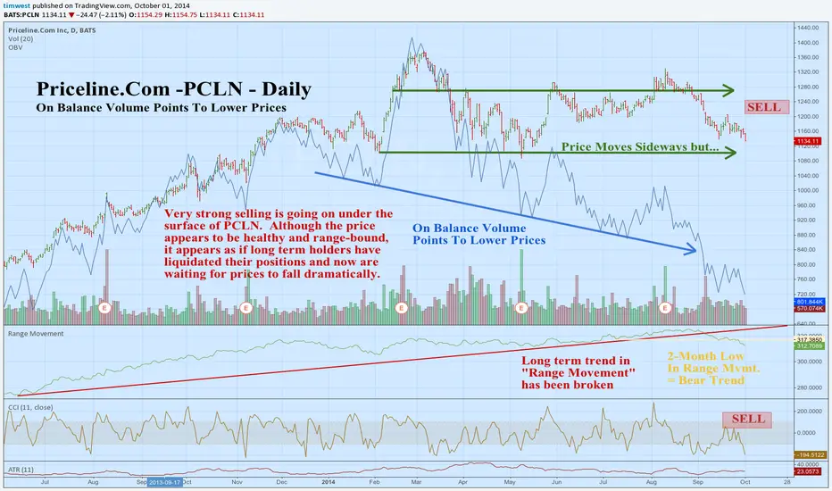
Priceline.Com -PCLN-Daily: On Balance Volume Saying Goodbye...Very strong selling is going on under the surface of PCLN. Although the price appears to be healthy and range-bound, it appears as if long term holders have liquidated their positions and now are waiting for prices to fall dramatically.
I know it looks like I'm kicking PCLN when it's down, but it is still just "rolling over" on the long term chart. The uptrend has been thousands of percent and this is only less than 20% off the highest highs.
Airline stocks rolled over and are very weak, so that bodes ill for all the stocks involved in the travel industry for the near term.
The ATR is 23 points. If you use 1 ATR as a measuring stick, your stop can be about 3 ATR's away and your target might be about the same. The probability of hitting 3 ATR's profit versus the 3 ATR stop is the key in the long run: I'd presume about 75% chance of a win from this setup. That makes a good system in the long run if you can find enough trades to take.
1:24PM EST Wednesday, October 1, 2014
Dow Jones - On-balance volume strategyI have checked and over checked this strategy a few times, so I hope there won't be too many mistakes. As you will see, this is a very simple and effective strategy, which produces signals when used on its own, without adding any other indicator on the chart or using any fundamental factor. All you need is the OBV indicator, candlesticks and support and resistance. This is how it goes :
1 Look for a divergence on OBV. It shouldn't be a divergence when the price goes flat, it should be a divergence formed on two peaks or troughs. Note that only class A and B divergences have been taken into consideration.
2 After spotting a divergence, wait for a bullish or bearish candlestick like : hammer. shooting star, doji, engulfing, piercing line, dark cloud cover, abandoned baby. Candlestick patterns can be considered too : Evening/morning star, island reversal.
3 Look for the first structure support, that is the start of the current rally or the start of the current correction and set a target above or below it by a few points. On that particular target, position should be closed by <=50%, of the entire position.
4 Before getting to the target, after moving in your favor, the stop should be adjusted to breakeven.
5 The remaining of the original position should be closed when the trader sees fit, or till a contrary signal appears. I have not found a proper closing signal yet.
In the period this strategy was tested, it produced 39 signals. That means 3 signals each year.
4 signals were whipsaws, the red lines.
5 signals broke even (if the stop would have been adjusted to breakeven after the trade moved in your favor)
11 signals went to structure support, and made a rebound.
19 signals went a lot below structure support, with some of them even predicting long lasting corrections.
You can see that I'm using the word support, and not resistance. That is because this strategy doesn't really give long signals, most of them are shorting signals. Out of the 39 signals, 9 were long, 30 were short. Out of the 9 long signals, 6 went through the immediate resistance, 2 made it only to the resistance, and one of them failed.
This is a trading strategy that I'm going to use from now on, separately from my usual trading system. I'll be back with more information.

U.S. Stocks: A Top Could be ImminentMarket Breadth:
52-week new highs:
Stocks that are breaking to new yearly highs, which is another key breadth indicator followed by market technicians, when the number starts to diverge failing to make new highs, while the price index continues to grind higher, this usually indicates the lack of internal strength and concerning.
Stocks above long term average:
Swings from excessive bullish and bearish sentiment have been a good contrarian market indicator for the past years. Every time the indexes of stocks above or below 200-days Average reached an extreme of 90-100 percent a correction in SP500 was close.
Instances where the index started falling, diverging away from the SP500 index (indicating internal strength is weakening) were bearish signals, as at least a hefty correction followed. The chart below Illustrates these divergences, where periods of prolonged divergence followed by a more sever downside move, while minor divergences followed less severe corrections.
Updates on twitter.com

Price & Volume Analysis - using OBV to confirm price action Today's tutorial session was spent examining my volume / money flow tool, the On Balance Volume (OBV) indicator. In this example, notice how price broke initially yet OBV did not. When price broke the uptrend line with a corresponding double top fail on the OBV the short really worked.
If my charts help you, or you use my indicators...
please consider a BTC donation to allow me to
continue my work :
1EBttA56cWsgtsZn83VGiNT8si7inZV5Z5
& follow me on Twitter @CRInvestor
Additionally, if you have questions about my indicators feel free to inquire as to when my next Google hangout tutorial session is scheduled so you can ask me in person...
(or go here: www.google.com)

How To Spot a Market PeakHow to spot market peaks using Advance/Decline ratio (ADR)?
First, look for divergence between the market and the indicator. Rising market index accompanied with declining number of advancing stocks means upcoming drop. Second, look for high readings of the ADR. Values above 3.5-4x to be considered as significant.
I've done some back testing, which showed pretty interesting results. Here they are:
o It is most likely to see ADR higher than 3 during first quarter of the year. Usually that is February or March as it happened in 2010, 2012 and as it seems in the current 2014.
o After the peak in ADR with values > 3.5 the bull market continues 40-70 more days before correction occurs (see 2010, 2012).
More on: www.capitalhubs.com

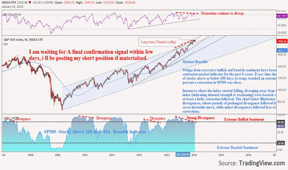
SP500: Approaching Bubble Territory?? Part 5: I am Out of StocksIn my series of posts "SP500 Approaching Bubble Territory' I was discussing my arguments for a major bearish move, and i believe we are very close to my awaited point. I am waiting for final confirmation signal which may occur today or Monday to post my short position. For now, I close any long position and cancel any long outlook.
Market Breadth:
Swings from excessive bullish and bearish sentiment have been a good contrarian market indicator for the past 6 years. Every time the indexes of stocks above or below 200-days Average reached an extreme of 90-100 percent a correction in SP500 was close.
Instances where the index started falling, diverging away from the SP500 index (indicating internal strength is weakening) were bearish signals, as at least a hefty correction followed. The chart below Illustrates these divergences, where periods of prolonged divergence followed by a more sever downside move, while minor divergences followed less severe corrections.