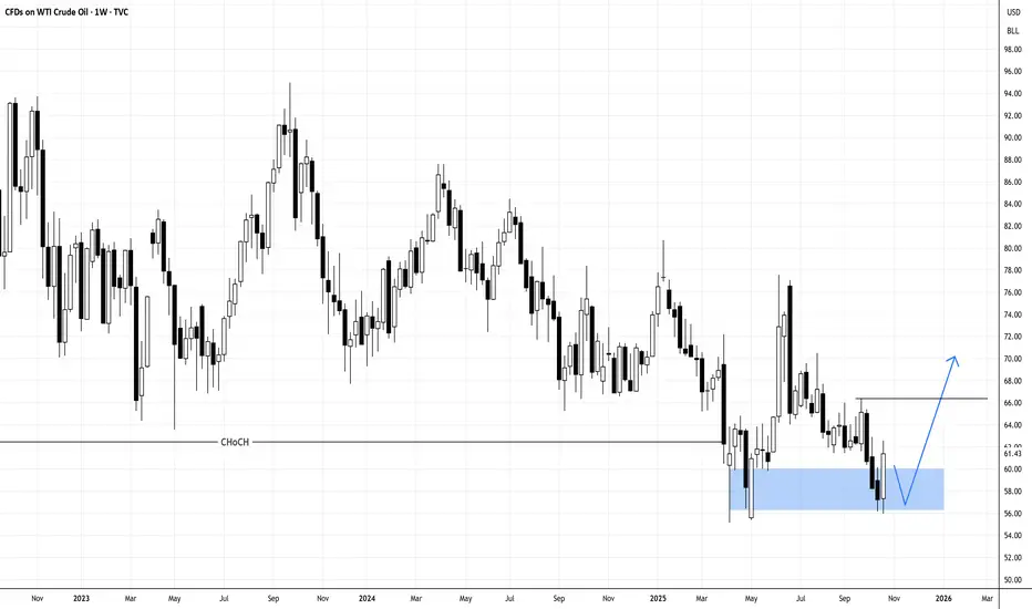
USOIL IN DOUBLE BOTTOM, MAYBE TARGETING ABOVE 66Oil may have found temporary bottom with the weekly double bottom.
N.B!
- USOIL price might not follow the drawn lines . Actual price movements may likely differ from the forecast.
- Let emotions and sentiments work for you
- ALWAYS Use Proper Risk Management In Your Trades
#usoil
#ukoil
Economic Cycles
Bull market still onUsing a top-down approach on the weekly BTC/USDT chart reveals something crucial that most traders overlook. On the weekly timeframe, Bitcoin hasn't actually broken its bullish market structure yet. We're still printing higher highs and higher lows, the fundamental definition of an uptrend. Until this pattern breaks on the weekly timeframe, we cannot definitively say the bull market structure is compromised.
Making decisions based on lower timeframes (daily or 4-hour charts) might suggest a correction, but not necessarily a trend reversal. This is a critical distinction that separates seasoned investors from those who get shaken out at the worst possible time.
Another crucial technical indicator to watch is the 200-day moving average, which historically signals major trend shifts. Right now, this level coincides almost perfectly with the bull market support zone around $100,000.

QQQ: Runaway or Exhaustion Gap?QQQ just printed a strong bullish gap on the daily chart, but context suggests caution. With widening SOFR spreads signaling a dollar funding shortage, this move may represent an exhaustion gap rather than a continuation breakout.
Runaway Gap Characteristics
Mid-trend breakout with moderate volume
Price holds above the gap for several sessions
Liquidity and macro conditions remain supportive
Exhaustion Gap Characteristics
Occurs after an extended trend
Large gap accompanied by a volume spike
Fails to hold above the gap and quickly reverses
Macro Context
SOFR–OIS spreads are widening, pointing to tightening dollar liquidity.
Similar conditions in Q4 2018 and February 2020 preceded major reversals in QQQ as funding stress reduced leverage and weakened follow-through in risk assets.
Current Read
Estimated odds: 35 percent runaway, 65 percent exhaustion.
A close below the gap low or a rapid fill within a few sessions confirms exhaustion.
Sustained price strength on steady volume favors continuation.
What to Watch
SOFR–OIS spread trend next week
Dollar index strength and its correlation with QQQ
Volume and RSI behavior near the gap zone
Bottom line:
This gap looks bullish on the surface, but underlying liquidity stress could turn it into a final pop before a corrective phase. Monitor liquidity data before assuming a continuation.

Zig Zag Indicator: Upd#2I've recently updated Zig Zag Trend Metrics again, and now I'd like to explain the changes, long before Monday strikes again.
What's being added:
Percentage Threshold: I figured any self-respected Zig Zag indicator should have percentage filter to target swings that satisfy min % of directional moves. It's important because PS functions like ta.highestbars(y, period) is based on raw period that covers even the most pathetically insignificant low volatility periods marking with swings that have no statistical significance for later on being processed along with rest sets of data ruining mouse wheel (it really broke) and the whole experience of proper charting.
Design: If you look close, the text labels are outlined with darker color and the contrast improves readability and orientation in big pieces of data without being overwhelmed. (Shoutout to ppl with dyslexia, this font is now readable!)
User Inputs : I also further compressed the sections of user inputs in settings to save the space by taking down "grouping".
Projection: Added averaged L2L & H2H linear difference as complementary for already existing projection lines. So now we have Temporal as well as Directional structure awareness.
Will experiment for a week before issuing some further changes. Like for example, having another pair with inverse slope to original.
That's all for now. Please share some thoughts if you're a user of these types of tools and have something to say!

GBPJPY Short Breakdown Video | 1:6 RR | Advanced TradingA breakdown video of the trade I took on Friday. I keep it short and simple for all of you to understand. Thank you for watching.

Utilities vs S&P 500 — defensive spread for market extremesWhen markets reach phases of overvaluation and extreme concentration, we believe positioning in the Utilities vs S&P 500 spread (XLU/SPX) can make sense.
Looking back, in every correction of more than 20% in the S&P 500, the Utilities sector has outperformed — by margins ranging from +13% to +68%, depending on the severity of the selloff.
This spread acts as a defensive play, isolating sector risk and reducing exposure to market-wide drawdowns, while still participating in the broader market cycle.
Utilities tend to hold up better when:
Rates stabilize or decline.
Market breadth narrows to a few mega caps.
Risk-off sentiment starts to rise.
📈 We’re watching this spread closely at current levels.

S&P 500 Value vs Growth — Reversion TradeS&P 500 Value vs Growth ( AMEX:IVE / AMEX:IVW ) is reaching a key long-term support zone after several years of Growth outperformance.
When you look under the hood, the valuation gap between the two styles is massive:
P/E: 23.4× (Value) vs 39.2× (Growth)
P/B: 3.4× vs 10.7×
Yield: 1.7% vs 0.4%
Value stocks are cheaper, offer higher income, and come with lower beta (0.96 vs 1.04).
We believe this spread has room to revert toward the mean after years of multiple expansion on the Growth side.
We’re comfortable positioning long Value / short Growth, which also acts as a hedge against potential market corrections given its defensive tilt.

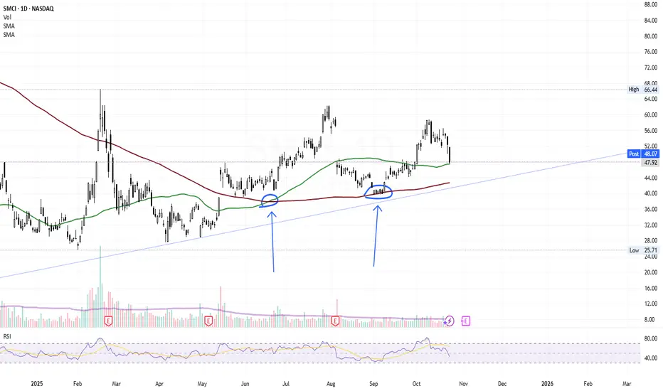
SMCI is checking supportsSMCI just bounced off the 50 MA support.
if breaking it -> will check tha previously succssesfull 200MA support.
I believe it to be a bull trap and im setting off alarms for buying at 45.
VIX fib based time extension on past high vol patterns.This is a rough estimate, but it looks about the same as all of the previous times. The chart is public so feel free to copy and publish. You have my full permission. Here's a link - sharing is on, and most layers are hidden (and on BTCUSD since that's usually what I trade)
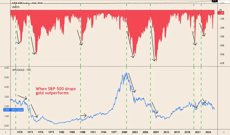
When Equities Fall, Gold Outperforms — SPX/Gold Says It All📊 Key insight
-Every major equity drawdown coincides with a drop in the SPX/Gold ratio — meaning gold outperforms stocks.
📉 What the chart shows
-1973–74 (stagflation): deep S&P 500 drawdown, SPX/Gold collapses.
-2000–02 (tech bust): ratio peaks ~5, then trends lower as gold rises and equities fall.
-2008–11 (GFC): brief liquidity hit to gold, then SPX/Gold plunges as gold rallies.
-2020 (COVID shock): rapid drop in SPX/Gold during equity sell-off.
-2022 bear market: ratio turns down again with inflation and rate stress.
Why it happens
-During market stress, investors seek safe collateral → gold demand spikes.
-Real rates and recession fears hurt equities more than gold.
-Silver carries industrial exposure, gold acts as a true safe haven.
🛡️ How to use it
-A gold allocation helps hedge against equity drawdowns.
-Long TVC:GOLD / short TVC:SPX (ratio trade) historically reduces portfolio volatility.
-Note: gold can dip during initial liquidity shocks (e.g., 2008, Mar 2020) — but recovers faster than equities.
Gold vs Silver – Which is the true safe haven?While everyone debates whether to buy gold or silver, this chart shows something often overlooked:
When markets crash, the Gold/Silver ratio spikes — meaning gold strongly outperforms silver.
That’s because:
TVC:GOLD behaves as a true safe-haven asset during drawdowns.
TVC:SILVER , with heavier industrial exposure, tends to fall alongside risk assets.
Historically, every major market correction (2000, 2008, 2020, 2022…) was followed by a sharp rise in the ratio.
👉 If you want protection during equity sell-offs, gold > silver — or even consider long Gold/Silver as a hedge.

$BTC/USDT LONG 30MIN
📊 **BTC/USDT – Smart Money + Bill Williams Confluence**
**Bias:** Long 🟩
After a clean **sell-side liquidity sweep** below the old low,
Bill Williams’ **Alligator lines** are flattening—indicating consolidation before a potential expansion upward.
🎯 **Setup Details:**
* **Entry:** $108,150
* **Stop Loss:** $107,536
* **Take Profit:** $110,390
* **R:R:** ≈ 3:1
🔹Confluence: MSS + FVG + OB + Bill Williams Alligator reset
🔹Expecting expansion once price closes above $108,700
#BTC #ICTtrading #SmartMoneyConcepts #BillWilliams #CryptoAnalysis #PriceAction

GOLD H4 DOUBLE TOP WILL LIKELY DRAG PRICE FURTHER DOWNXAUUSD on H4 chart, has confirmed a bearish Double Top pattern after failing to break resistance around the 4,380 level. The pattern was validated by a decisive break below the 4,200 neckline, signalling a clear shift in momentum from bullish to bearish. This breakdown suggests the recent uptrend is over and sellers are now in control, which will drag gold further down.
N.B!
- XAUUSD price might not follow the drawn lines . Actual price movements may likely differ from the forecast.
- Let emotions and sentiments work for you
- ALWAYS Use Proper Risk Management In Your Trades
#gold
#xauusd

EUR/USD: Cycle Analysis You Can’t IgnoreThis chart reveals a dominant 220-bar cycle in the EUR/USD pair ..a repeating rhythm that has shaped market structure for decades. Out of the last 13 major cycle signals, 10 have delivered strong trade results, each aligning closely with turning points in the broader trend.
Every major turning point has followed this same cyclical rhythm, proving that even through major global shifts, the market still moves in repeating, fractal patterns.
Cycle and fractal analysis continue to provide some of the most objective timing tools in modern trading. While many still dismiss cycles as “theoretical,” the data says otherwise.
Question for You:
Are you still dismissing cycle analysis, or are you ready to use it to stay ahead of the next major move? Watch the current cycle high!

ETHEREUM bullish signEthereum broke the long-term resistance line a few months ago and is backtesting it. Is this the time to go parabolic and reach the $14,000 target?


Yield Curve: The Calm Before the Storm?Over the past 30 years, every time the yield curve (10Y–1Y) inverted and then turned back to positive territory, a recession and a major equity drawdown followed shortly after.
🔹 Inversion phase:
When short-term yields exceed long-term yields, the market is signaling that the Fed has tightened too much and that growth will slow down.
🔹 Normalization phase (back to positive):
This is where things usually break. The Fed starts cutting rates, the curve steepens again — not because growth is rebounding, but because the economy is already weakening.
Historically, the real pain for equities (SPY) has come after the curve “un-inverts”, not when it first inverts.
📉 2000 — Dotcom bust
📉 2008 — GFC
📉 2020 — Pandemic shock
❓ 2025 — Same pattern repeating?
🧭 Takeaway:
The inversion warns you; the re-steepening confirms it.

$BTC.D Death Cross Has Occurred! The Signal on ₿itcoin Dominance We've Been Waiting All Cycle For 🔥
20 / 50 WMA Death Cross has officially occurred on CRYPTOCAP:BTC.D
So close to Alt Season I can taste it 😋

$TOTAL Crypto Market Cap Fights Back w/ Weekly CloseCrypto CRYPTOCAP:TOTAL Market Cap looking similar to CRYPTOCAP:BTC
Thankfully did not close outside of the Danger Zone.
It's absolutely imperative that Bulls reclaim the 20WMA this week and close above the .236 Fib
Losing the 20WMA has signaled more downside / sideways chop historically.
Hopefully this is just a fake-out, otherwise the 50% Gann will be retested alongside the 50WMA.

$BTC Bulls Fight Back With Weekly CloseNot sure how I continue to amaze myself, but I do 🤓
Notice how those MMs respected my DANGER ZONE POI to the dollar?
Thankfully CRYPTOCAP:BTC did not close the Week outside the DZ.
The battle between Bulls and Bears is FIERCE 🔥
Bulls cannot afford another blue weekly close.
If so, the 50WMA retest ~102k will be inevitable.
Bulls need to reclaim and close this upcoming week above the 20WMA and .236 Fib
A close ~$116k would be super bullish.
That should be enough ammo to spark the long awaited parabola that UpTober has historically brought us.

Zig Zag Indicator UPD: Cycle DualityIn some earlier works I've mentioned how Markets follow Brownian Motion that explains its probabilistic memory and denies geometric one. And with the recent update of Zig Zag that monitors both directive and temporal aspect of the swings, I'd like to return to review that subject again.
Recap of Known Contradicting Theories
Brownian motion is a random walk, often used as a model for stock price movements. In its simplest form, it assumes that price changes are independent and identically distributed with a normal distribution.
However, financial markets exhibit trends, cycles, and volatility clustering, which are not captured by simple Brownian motion.
Benoit Mandelbrot studied the fractal nature of financial markets. He proposed that markets are better modeled using fractal geometry and that price movements exhibit:
Fat tails: Extreme events occur more frequently than predicted by the normal distribution.
Long-term dependence: Price changes are not independent; there is persistence in volatility and sometimes in returns.
Self-similarity: Market patterns repeat at different time scales.
Why measuring both H2H and L2L cycles matters:
(Please do not confuse with directional swing HH LH LL HL, as they are of trend's price motion and not temporal!)
Basic Thoughts
The traditional way to measure cycles is through a systematic 𖼆 movements, so that the time distance between Lows counts as cycle length. The best way to fool myself would be to just stick with one method of tracking market rhythms. So, having second perspective of what cycle is, through inverse time count 𖼓 (H ➔ H), would technically back the original one or even challenge at times, which by definition increases awareness of the price fluctuation.
We figured that markets move in alternating phases of accumulation and distribution, that's why only measuring one gives half the story.
Cycle Confirmation: When H2H and L2L cycles align in duration, it suggests stable, rhythmic market behavior. Divergences signal potential trend changes.
Phase Relationships: The timing between highs and lows reveals market temperament:
Short 𖼆 + Long 𖼓 = Strong uptrend
Short 𖼓 + Long 𖼆 = Strong downtrend
Similar durations = Consolidation/balanced market
Brownian Motion Contrast
By default assumes H2H ≈ L2L (durations symmetry)
Random phase relationships
No persistent asymmetries
The indicator's value comes from measuring exactly what Brownian motion cannot explain.
I'm essentially interested in building a temporal map of market psychology rather than just a price map. The dual aspects of timing would letting you see the complete waveform rather than just half of it.
The next update would probably be after carefully linking normalized Averaged(True Range/close *100) to the directional wave, in order to reveal how price swings are naturally scaled. It might give some constants which could be used for modeling.

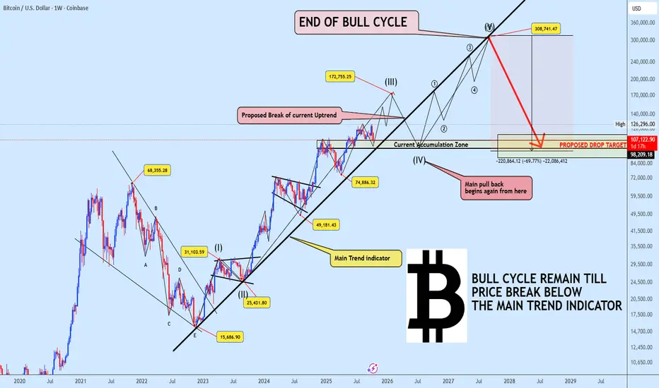
BITCOIN The Super Cycle Still Unfolding Wave 3 in Motion!Bitcoin continues to respect the Main Trend Indicator, keeping the broader super cycle wave (3) intact. Based on our projection, the ongoing bullish leg is expected to complete near $172,000, marking the end of wave (III).
From there, we anticipate a corrective wave (IV) to unfold likely breaking below the uptrend support toward the $107K region. This move will act as the last deep pullback before Bitcoin begins its final explosive rally (wave V) that could extend toward $300K, concluding the entire bull cycle before a true bear market emerges.
Historical Parallel:
To understand this better, it’s important to recall the 2020–2021 bull cycle. Back then, BTC repeatedly tested a similar dynamic trendline, maintaining its strength as long as the structure held. Even after the eventual breakdown that confirmed the bull cycle’s exhaustion, price still pushed to a new all-time high before the real decline began.
This serves as a crucial reminder market tops rarely happen instantly. They evolve with clear structural warnings, and we may be approaching such a phase again.
Key Takeaway:
As long as Bitcoin trades above the Main Trend Indicator, the bull cycle remains valid.
A confirmed breakdown below it, however, will signal the start of the macro correction phase one that may eventually reset the entire structure.
Stay prepared, stay disciplined, and understand that each phase of the cycle brings new opportunities. If you find this analysis insightful, don’t forget to like, share, and drop your thoughts below, your engagement helps keep quality analysis alive!
Meanwhile, I’ve noticed a surge in volume across Binance Alpha projects. Drop your coin name below for a quick market analysis.
Grand Silver SupercycleI present the Grand Silver Supercycle. Silver has followed Elliott Wave Theory nicely through the years. The price hit a century low during The Great Depression, beginning what I believe to be the first wave of a supercycle. There is a clear five wave pattern up from this low, peaking in 1980. This is supercycle wave 1. Then, we see a five wave corrective pattern down, bottoming out in the early 90s. Alternatively, a three wave ABC pattern could be drawn. This is where supercycle wave 3 begins. Wave 3 is typically much more prominent than wave 1 in Elliott Wave Theory. For this reason, it makes sense that the next five wave pattern ending in 2011 is only the first subwave of supercycle wave 3. The second subwave corrected to the 2020 low, and we are currently on the third subwave. Within this subwave, we could either be starting a third wave (as shown in the chart) or still be on the corrective second wave. I believe the former is much more likely due to fundamentals.
Price targets within the current subwave were estimated as follows:
wave 3 length = 1.618 X wave 1
wave 3 target = $48
wave 4 length = 38.2% retracement of wave 3
wave 5 length = 1.618 X (wave 3 end - wave 1 start)
I'm more confident on wave 3 ending near $48 than I am of wave 5 ending near $95. There is strong resistance at $50, which coincides with the Elliott target zone. Wave 5 length can vary significantly. For silver at least, fifth waves have traditionally been long ones.
Fundamentals
Elliott Wave Theory is only a tool. It needs to be backed up by fundamentals when forecasting on long time frames. Silver is undervalued due to many years of supply outstripping demand, creating cheap prices. That is in the early stages of changing as now demand outpaces supply. Global silver demand was expected to hit an all time high of 1.21 billion ounces in 2022 (www.silverinstitute.org). This is largely due to increases in demand in both industry (Green Revolution) and personal investment (stackers hedging against inflation). Silver reserves currently stand at 530,000 metric tons (www.statista.com). The current demand is 38,000 metric tons per year. A simple calculation shows existing reserves could be depleted in 14 years. However, this calculation doesn't take into account new discoveries and recycling, which have so far kept pace with demand. Estimates of time to depletion of reserves vary wildly from a couple decades to a few centuries. At the moment, the prime driver of price (in addition to inflation) will be the deficit, not depletion of reserves.
Inflation is a totally different animal that is much harder to forecast long term due to its close relationship to government and Federal Reserve policy. It is more likely that when presented the choice, our leaders choose high inflation over debt default and depression. How this all is going to play out is anyone's guess. It seems for now our leaders are trying to kick the can down the road for as long as possible. If hyperinflation hits, the silver price will reach extraordinary heights.
