Best Technical Indicator to Identify Order Block & Imbalance
Your ability to correctly identify Order Blocks on a price chart is essential for profitable trading Smart Money Concept.
In this article, I will show you a great technical indicator that will help you to spot Order Blocks on any financial market.
First, in brief, let me give you my definition of Order Block.
The problem is that in SMC trading there is no one single definition of that and many traders interpret it differently.
To me, an Order Block is a specific zone on a chart from where a strong price movement initiates and where a significant imbalance between supply and demand occurs .
This imbalance should strictly originate from a liquidity zone.
That definition implies that in order to identify an Order Block zone, one should learn to properly identify the imbalance and liquidity zones.
And again, there is no precise definition of an imbalance on a price chart. To me, a bullish imbalance is a formation of a bullish engulfing candle - the one that engulfs a range of previous bearish candle with its body.
Above is the example of a valid Order Block on GBPUSD.
A bearish imbalance is a formation of a bearish engulfing candle - the one that engulfs a range of a previous bullish candle with its body.
Above, you can see the example of an Order Block on USDCAD, based on a bearish imbalance.
There is one technical indicator that will help you to recognize such Order Blocks. It is called " All Candlestick Patterns" on TradingView.
Open settings of the indicator and make it show ONLY Engulfing Candles and choose "No Detection" in "Detect Trends Based on".
After that, hide the indicator and first, Identify the liquidity zones on a chart and wait for a test of one of these zones.
Here is a test of a liquidity zone on NZDUSD on an hourly time frame.
After that, turn on the indicator, and wait for its signal.
You can see that after some time, the price formed a bullish imbalance with a bullish engulfing candle. The indicator highlight that candle.
The Order Block zone will be based on the lowest low of 2 candles and the high of a bearish candle preceding the imbalance.
One more example. We see a test of a significant liquidity zone on EURAUD on a 4H time frame.
We turn on the indicator and look for a signal.
A bearish imbalance is formed and the indicator immediately notifies us.
An Order Block Zone in that case will be the area based on the highest high of 2 candles and the low of a bullish candle preceding the imbalance .
Of course, there will be the rare cases when the indicator will miss the imbalances. But while you are learning to recognize Order Blocks, this indicator will definitely help you a lot!
Thank you for reading!
❤️Please, support my work with like, thank you!❤️
I am part of Trade Nation's Influencer program and receive a monthly fee for using their TradingView charts in my analysis.
Oscillators

Mastering the Stochastic RSI - Guide to Spotting Momentum ShiftsIntroduction
In the world of technical analysis, momentum indicators are essential tools for understanding market sentiment and potential price movements. One such tool is the Stochastic RSI (Stoch RSI), a unique and highly sensitive variation of the traditional Relative Strength Index (RSI). While the standard RSI focuses on price, the Stoch RSI takes it a step further by measuring the momentum of the RSI itself. This makes it a faster-reacting and more dynamic indicator that many traders use to anticipate trend shifts and spot overbought or oversold conditions earlier.
What is the Stochastic RSI?
The Stochastic RSI (Stoch RSI) is a momentum oscillator that operates similarly to the RSI but with a twist — instead of measuring the price of an asset, it measures the movement of the RSI. Because of this, the Stoch RSI is typically more sensitive and quicker to respond to changes in market momentum.
It consists of two lines:
* The blue line: The primary line that reacts quickly and shows when the RSI is gaining or losing momentum.
* The orange line: A moving average of the blue line, which acts as a smoother version to help filter out noise and highlight potential turning points.
How to Read the Stoch RSI
The Stoch RSI moves between 0 and 100, and traders often focus on the 20 and 80 levels as key thresholds:
Above 80 (Overbought): Indicates that the RSI has been running hot compared to recent values. This suggests strong upward momentum that could be due for a slowdown or minor correction. However, it doesn’t necessarily mean the price will drop immediately, just that conditions are extended.
Below 20 (Oversold): Suggests the RSI has been suppressed, signaling weakening bearish momentum and a possible reversal upward. Again, this isn’t a guaranteed bounce but rather a situation where a shift may be more likely.
How to Trade with the Stoch RSI
While entering overbought or oversold zones can offer insight, trading solely based on those levels is risky. Instead, look for crossovers between the blue and orange lines:
Bearish signal: When the Stoch RSI is above 80 and the blue line crosses below the orange line, it can indicate that bullish momentum is fading — a potential short entry.
Bullish signal: When the Stoch RSI is below 20 and the blue line crosses above the orange line, it may suggest that bearish momentum is weakening — a potential long entry.
These crossover points provide more reliable signals than the levels alone, especially when confirmed by price action or other indicators.
What Timeframes to Use
The Stoch RSI can be applied to any timeframe, but its effectiveness varies. On lower timeframes (like 1-minute or 5-minute charts), it generates many signals, including plenty of false or weak ones. For stronger and more reliable signals, it’s best used on higher timeframes such as the 4-hour, daily, weekly, or monthly charts. Generally, the higher the timeframe, the more significant the signal becomes.
Conclusion
The Stochastic RSI is a powerful indicator that combines the strengths of the RSI and Stochastic Oscillator to deliver sharper, more responsive momentum signals. While it’s tempting to act on overbought or oversold readings alone, true effectiveness comes from understanding the behavior of the two lines and using it in conjunction with other analysis tools. Whether you're a short-term trader or a long-term investor, mastering the Stoch RSI can add depth to your strategy and help you make more informed decisions.

RSI 101: Revealing the Special Characteristics of RSIWhy does RSI have support and resistance levels at 40 and 60?
Why does divergence happen between RSI and price?
What is RSI momentum?
All the characteristics of RSI (that I know) will be explained here.
Formula and Meaning
If you are using TradingView, you probably already know what RSI is and what "overbought" and "oversold" mean. So, I won’t repeat it here. Instead, I’ll dive deeper into the true nature of RSI, giving you a different perspective.
You can skip the mathematical formula of RSI, it’s already discussed everywhere online. Just remember this ratio table:
Here’s how I explain the table:
At RSI = 50, the average gain equals the average loss (I'll call this the buy/sell ratio). This is a balanced point. Buyers and sellers are equally strong.
At RSI ~ 60 (66.66), the buy/sell ratio = 2/1. Buyers are twice as strong as sellers.
At RSI ~ 40 (33.33), the buy/sell ratio = 1/2. Sellers are twice as strong as buyers.
At RSI = 80, the buy/sell ratio = 4/1. Buyers are four times stronger.
At RSI = 20, the buy/sell ratio = 1/4. Sellers are four times stronger.
The formula shows that when RSI reaches 80 or 20, the buyer or seller is extremely strong — about four times stronger — confirming a clear trend.
At these levels, some Trading strategies suggest placing a Sell or Buy based on the overbought/oversold idea.
But for me, that’s not the best way. The right approach is: when a trend is clearly formed, we should follow it.
I'll explain why right below.
Look at this chart showing RSI changes with the buy/sell ratio:
When RSI > 50:
When RSI < 50:
You can see that the higher RSI goes, the slower it climbs, but the high buy/sell ratio makes price move up faster.
Similarly, when RSI goes lower, it drops slower but price drops faster.
That’s why at overbought (RSI=80) or oversold (RSI=20) areas, you need to be careful. Even a small RSI moving can lead to big price changes, easily hitting your stop loss.
On the other hand, if you follow the trend and wait for RSI to pull back, you will trade safer and more profitably.
RSI Key Levels
Here are some special RSI levels I personally find useful when observing FX:XAUUSD :
(These levels are relative. They might vary with different timeframes or trading pairs. Check historical data to find the right ones for you. On bigger timeframes like M15 or above, the accuracy is better.)
RSI = 20
When RSI hits 20, sellers dominate. This confirms a trend reversal to bearish.
RSI = 80
When RSI hits 80, buyers dominate. This confirms a trend reversal to bullish.
RSI = 40
This is a sensitive level. Sellers start gaining the upper hand (sell/buy = 2/1).
If buyers lose 40, they lose their advantage.
So RSI >= 40 is "buyer territory". In an uptrend, RSI usually stays above 40.
RSI = 40 acts as support in an uptrend.
RSI = 60
Same idea. RSI <= 60 is "seller territory".
RSI = 60 acts as resistance in a downtrend.
40 and 60 are considered the key levels of RSI.
Now you guys know why RSI has support/resistance around 40/60!
RSI Range
As you know, RSI moves between 0 and 100.
Since RSI >= 40 is buyer territory, we can see the relationship between price and RSI:
When RSI stays above 40, price tends to move in an uptrend:
When RSI stays below 60, price tends to move in a downtrend:
When RSI stays between 40 and 60, buyers and sellers are balanced, and price moves sideways in a box:
When RSI is moving, It creates a RSI Range.
Whenever the trend switches between the three states — uptrend, sideways, and downtrend — a Range Shift is formed.
At first, RSI moves in 40-60 range, price moves sideways. A strong price move pushes RSI to 80. Later, RSI stays above 50, helping price grow strongly. When momentum fades, RSI returns to 40-60 and price moves sideways again.
Note:
RSI reflects Dow Theory by showing the stages of accumulation, growth, and distribution.
And as you see, when RSI touches key levels, the trend often pulls it back.
RSI Momentum
Price momentum means how fast price changes.RSI momentum represents the change in the strength between buying and selling forces.
When RSI > 50:
If price falls, RSI shows high momentum — RSI drops fast but price drops slowly.
If price rises, RSI shows low momentum — RSI rises slowly but price rises fast.
For example, at first RSI is above 50.
Price drops from (a) to (b) by 44 units, RSI drops from (Ra) to (Rb) by 25 units.
Later, RSI drops from (Rb) to (Rc) (also 25 units) but price drops from (b) to (c) by 73 units.
When RSI < 50:
If price falls, RSI has low momentum — RSI drops slowly but price falls fast.
If price rises, RSI has high momentum — RSI rises fast but price rises slowly.
RSI and Price Divergence
Divergence happens when price and RSI move in opposite directions:
Price goes up but RSI goes down, or vice versa.
Why does divergence happen?
In a strong downtrend, price forms a bottom at point (1), and RSI drops to level (r1).
When a price pullback happens, price pushes up to a peak at point (2), and RSI also bounces back to level (r2).
Because the downtrend is strong, after completing the pullback (1-2), price continues to make a lower bottom at point (3).
At this point, remember the behavior of RSI momentum when RSI is below 50:
It takes a large price drop (from 2 to 3) to cause a small RSI drop (from r2 to r3).
Meanwhile, even a small price increase (from 1 to 2) causes a large RSI rise (from r1 to r2).
Since the distance (1-2) is smaller than (2-3), but the RSI move (r1-r2) is bigger than (r2-r3), divergence is created.
Divergence shows that the current trend is very strong, not a complete signal of a trend reversal.
(I might share with you how to spot a complete RSI reversal signal in future posts.)
As shown in the example above, after forming bottom (5) and creating a bullish divergence between (3-5) and (r3-r5), price still kept dropping sharply while RSI kept rising.
In these areas, if you keep trying to catch a reversal just based on divergence, you will likely need to DCA or cut your losses many times.
That’s why the most important thing in trading is always to follow the trend.
RSI Exhaustion
RSI Exhaustion happens when RSI keeps getting rejected by a resistance or support zone and can’t break through.
After a strong downtrend, RSI recovers but stalls around the 5x zone.
It tries many times but fails, showing buying power is weakening.
Then the downtrend continues:
Exhaustion near high or low RSI levels creates stronger divergences than exhaustion in the middle range:
Double or triple tops/bottoms on RSI (M or W shapes) basically indicate RSI exhaustion.
RSI Can Identify Trend Strength
In an uptrend:
If RSI pulls back to a higher level before going up again, the trend is stronger.
The pullback should not fall too deep (below 40).
Example:
First rally: RSI drops to 60 before rising again → strong rally (273 units).
Second rally: RSI drops to 50 before rising again → weaker rally (94 units).
Same idea for a downtrend:
If RSI pullbacks to 50 then drops again, the downtrend is stronger than if it pullbacks to 60.
RSI Support and Resistance
Besides 40-60 acting as support/resistance, RSI also reacts to old tops and bottoms it created.
Why does this happen?
RSI is calculated from closing prices.
On a higher timeframe, the candle close price is a high/low or support/resistance price on lower timeframes.
When RSI moves in a trend on a higher timeframe, it maintains a buy/sell ratio, forcing lower timeframe RSI to oscillate within a range.
Example:
On H4, RSI stays above 40 → uptrend.
It makes H1 RSI move between 30-80.
Sharp RSI tops/bottoms react even stronger because they show strong buying/selling forces.
Summary
When looking at the price chart, we can see that price can rise or fall freely without any defined boundaries.
However, RSI operates differently: it always moves within a fixed range from 0 to 100.
During its movement, RSI forms specific patterns that reflect the behavior of price.
Because RSI has a clear boundary, identifying its characteristics and rules becomes easier compared to analyzing pure price action.
By studying RSI patterns, we can make better assumptions and predict future price trends with higher accuracy.
I have shared with you the core characteristics of RSI, summarized as follows:
Besides overbought (80) and oversold (20), RSI respects 40 and 60.
40 is support level in an uptrend. 60 is resistance level in a downtrend.
In an uptrend, RSI stays above 40.
In a downtrend, RSI stays below 60.
An RSI Range-Shift leads to a trend change.
RSI Divergence shows strong trends.
Double or triple tops/bottoms show RSI exhaustion → potential reversals.
The higher the RSI level, the slower it moves, but the faster the price rises.
The lower the RSI level, the slower it moves, but the faster the price falls.
A strong uptrend can be identified when RSI moves within a higher range or shows continuous bearish divergences.
A strong downtrend can be identified when RSI moves within a lower range or shows continuous bullish divergences.
RSI reacts to its old tops and bottoms.
Sharper RSI peaks show stronger selling.
Sharper RSI bottoms show stronger buying.
In the next parts, I’ll show you how to apply these RSI's Characteristics to trend analysis, multi-timeframe analysis, and trading strategies, that you might have never seen before.
I trade purely with RSI. Follow me for deep dives into RSI-based technical analysis and discussions!

RSI 101: Scalping Strategy with RSI DivergenceFX:XAUUSD
I'm an intraday trader, so I use the H1 timeframe to identify the main trend and the M5 timeframe for entry confirmation.
How to Determine the Trend
To determine the trend on a specific timeframe, I rely on one or more of the following factors:
1. Market Structure
We can determine the trend by analyzing price structure:
Uptrend: Identified when the market consistently forms higher highs and higher lows. This means price reaches new highs in successive cycles.
Downtrend: Identified when the market consistently forms lower highs and lower lows. Price gradually declines over time.
2. Moving Average
I typically use the EMA200 as the moving average to determine the trend. If price stays above the EMA200 and the EMA200 is sloping upwards, it's considered an uptrend. Conversely, if price is below the EMA200 and it’s sloping downwards, it signals a downtrend.
3. RSI
I'm almost use RSI in my trading system. RSI can also indicate the phase of the market:
If RSI in the 40–80 range, it's considered an uptrend.
If RSI in 20 -60 range, it's considered a downtrend.
In addition, the WMA45 of the RSI gives us additional trend confirmation:
Uptrend: WMA45 slopes upward or remains above the 50 level.
Downtrend: WMA45 slopes downward or stays below the 50 level.
Trading Strategy
With this RSI divergence trading strategy, we first identify the trend on the H1 timeframe:
Here, we can see that the H1 timeframe shows clear signs of a new uptrend:
Price is above the EMA200.
RSI is above 50.
WMA45 of RSI is sloping upward.
To confirm entries, move to the M5 timeframe and look for bullish RSI divergence, which aligns with the higher timeframe (H1) trend.
RSI Divergence, in case you're unfamiliar, happens when:
Price forms a higher high while RSI forms a lower high, or
Price forms a lower low while RSI forms a higher low.
RSI divergence is more reliable when the higher timeframe trend remains intact (as per the methods above), indicating that it’s only a pullback in the bigger trend, and we’re expecting the smaller timeframe to reverse back in line with the main trend.
Stop-loss:
Set your stop-loss 20–30 pips beyond the M5 swing high/low.
Or if H1 ends its uptrend and reverses.
Take-profit:
At a minimum 1R (risk:reward).
Or when M5 ends its trend.
You can take partial profits to optimize your gains:
Take partial profit at 1R.
Another part when M5 ends its trend.
The final part when H1 ends its trend.
My trading system is entirely based on RSI, feel free to follow me for technical analysis and discussions using RSI.

Example of how to draw a trend line using the StochRSI indicator
Hello, traders.
If you "Follow", you can always get new information quickly.
Please click "Boost" as well.
Have a nice day today.
-------------------------------------
I have explained how to draw a trend line before, but I will take the time to explain it again so that it is easier to understand.
-
When drawing a trend line, it must be drawn on the 1M, 1W, and 1D charts.
However, since I focused on understanding the concept of drawing a trend line and the volatility period that can be seen with a trend line, I will explain it only with a trend line drawn on the 1D chart.
Please note that in order to calculate a somewhat accurate volatility period, support and resistance points drawn on the 1M, 1W, and 1D charts are required.
I hope this was helpful for understanding my thoughts on the concept of drawing trend lines and how to interpret them.
The main reason for drawing trend lines like this is so that anyone who sees it can immediately understand why such a trend line was drawn.
Then, there will be no unnecessary disagreements about the drawing, and each person will be able to share their opinions on the interpretation.
--------------------------
When drawing trend lines, the StochRSI indicator is used.
The reason is to secure objectivity.
When the StochRSI indicator touches the oversold zone and rises, the low corresponding to the peak is connected to draw a trend line between low points.
And, when the StochRSI indicator touches the overbought zone and falls, the Open of the downward candle corresponding to the peak is connected to draw a trend line between high points.
If the peak is not a downward candle, it moves to the right and is drawn with the Open of the first downward candle.
If you refer to the candlesticks of the arrows in the chart above, you will understand.
The trend line drawn as a dot is a high-point trend line, but it is a proper trend line because it does not touch the overbought zone between highs.
Therefore, you can draw a trend line corresponding to trend line 1.
Accordingly, around March 25-29, around April 8, and around April 14 correspond to the volatility period.
-
You can see how important the low-point trend line (2) is.
If the high-point trend line is properly created this time and the low-point trend line and the high-point trend line are displayed in the same direction, the trend is likely to continue along that channel.
If the StochRSI indicator rises and a peak is created in the overbought zone, you will draw a high-point trend line that connects to point A.
-
Thank you for reading to the end. I hope your transaction will be successful.
--------------------------------------------------

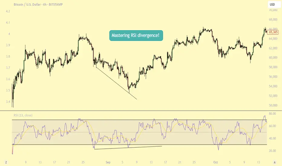
Mastering RSI Divergence: A Complete Guide to Trend ReversalsWhat Are Divergences?
In this guide, we will explore the concept of divergence and how it can be effectively utilized alongside the Relative Strength Index (RSI), one of the most popular momentum indicators in technical analysis. Divergence occurs when the price of an asset moves in the opposite direction of an indicator, such as the RSI. Understanding RSI divergence can be a powerful tool for identifying potential trend reversals or continuations. In this guide, we'll delve into the various types of divergence that can occur with the RSI and how to incorporate them into your trading strategy.
Types of Divergences?
There are three primary types of divergence: bullish, bearish, and hidden divergence. Each signals a distinct market condition and potential outcome, and understanding these nuances is key to using divergence effectively in your trading.
1. Bullish Divergence Bullish divergence happens when the price of an asset makes a lower low, while the RSI forms a higher low. This indicates that although the price is declining, momentum is weakening. The failure of the RSI to confirm the new low in price suggests that selling pressure is diminishing, potentially signaling that a reversal to the upside could occur. Essentially, the market is losing its downward momentum, setting the stage for a potential bullish move.
2. Bearish Divergence Bearish divergence occurs when the price forms a higher high, but the RSI forms a lower high. This indicates that although the price is rising, momentum is weakening. It suggests that the uptrend may be losing steam, signaling that a potential reversal to the downside could be on the horizon. As the price continues higher, but the RSI fails to confirm the new highs, it may indicate that the market is becoming overextended and ready for a correction.
3. Hidden Divergence Hidden divergence differs from regular divergence in that it signals a continuation of the existing trend, rather than a reversal. It typically occurs during pullbacks or retracements in a strong trend. Hidden divergence can appear in both uptrends and downtrends, providing traders with an indication that the prevailing trend is likely to continue after the short-term retracement is over. This type of divergence serves as a confirmation of trend strength and helps traders stay in profitable positions during market pullbacks.
Why Are RSI Divergences a Powerful Tool?
RSI divergence is a powerful tool in trading because it offers early insights into potential trend reversals or shifts in momentum before these changes are fully reflected in price movements. By recognizing divergence, traders can anticipate shifts in market sentiment and make timely decisions. One of the main reasons RSI divergence is so effective is that it serves as an early warning system. It signals when the momentum behind a price trend, whether up or down, is starting to weaken.
For example, in a strong uptrend, if prices continue to make new highs, but the RSI fails to reach new highs, this could signal that the buying momentum is losing strength, even though the price is still rising. This divergence indicates that a reversal or pullback might be imminent, allowing traders to exit their positions or prepare for a potential shift in market direction. Understanding this early warning can provide traders with an edge, helping them avoid being caught in the late stages of a trend and positioning themselves ahead of a change.
How to Trade RSI Divergences?
When the price makes a higher high but the RSI fails to confirm with a higher high, this is known as bearish divergence. While this situation suggests weakening momentum, it doesn’t necessarily mean a correction is imminent. The price may continue to rise for some time, and eventually, the RSI could catch up and make a higher high in line with the price action. Essentially, the market could remain in an uptrend, and the RSI could still align with the price over time.
This highlights the importance of not jumping to conclusions solely based on RSI divergence. Divergence can act as a useful warning, but it should not be relied upon as a definitive signal of a trend reversal. To increase the reliability of the signal, traders should wait for additional confirmation, such as a candlestick pattern indicating a potential trend reversal. Candlestick patterns like engulfing patterns, doji candles, or shooting stars at key support or resistance levels can provide stronger evidence that the trend may be about to change.
Therefore, it’s wise to wait for a more comprehensive confirmation from price action before making a move, rather than acting on divergence alone. Combining RSI divergence with other technical tools, such as candlestick patterns or chart patterns, can help increase the accuracy of your trade decisions.
Conclusion:
Divergence is a powerful tool that provides valuable insights into potential trend reversals or continuations. By understanding the different types of divergence and knowing how to identify them, traders can make more informed decisions. However, divergence should always be used in conjunction with other technical analysis tools to enhance the accuracy of your strategy. With practice, patience, and proper risk management, divergence trading can become a profitable strategy for identifying key market turning points. Whether you are seeking trend reversals or confirming ongoing trends, RSI divergence can be an essential component of your trading toolkit.
Thanks for your support.
- Make sure to follow me so you don't miss out on the next analysis!
- Drop a like and leave a comment!
What Is Momentum – And Why It’s Not Just a Trend IndicatorMost traders follow price — candles, trendlines, support/resistance. But there’s another layer that often tells the story before the price moves: momentum.
⸻
🔍 In this post, you’ll learn:
• What momentum really measures
• Why it’s not the same as price direction
• How momentum can signal a shift before the chart confirms it
• Why combining momentum with structure improves timing
⸻
📈 Momentum ≠ Direction
Price can be rising while momentum is fading. That’s often a clue of an upcoming slowdown or reversal — long before the price turns. Similarly, price can be flat, while momentum builds in one direction. That’s tension… and tension leads to moves.
⸻
🔥 Why Momentum Matters:
• It reveals intensity, not just direction
• It can act as a leading indicator — not lagging
• Momentum divergences often hint at hidden accumulation or distribution
• Tracking it helps you avoid late entries or false breakouts
⸻
🔧 Takeaway for traders:
If you’re only watching price, you’re only seeing half the picture.
Momentum shows what’s driving the move, and when that drive starts weakening.
⸻
💬 What’s your favorite momentum indicator? RSI, %R, CCI, or something else?

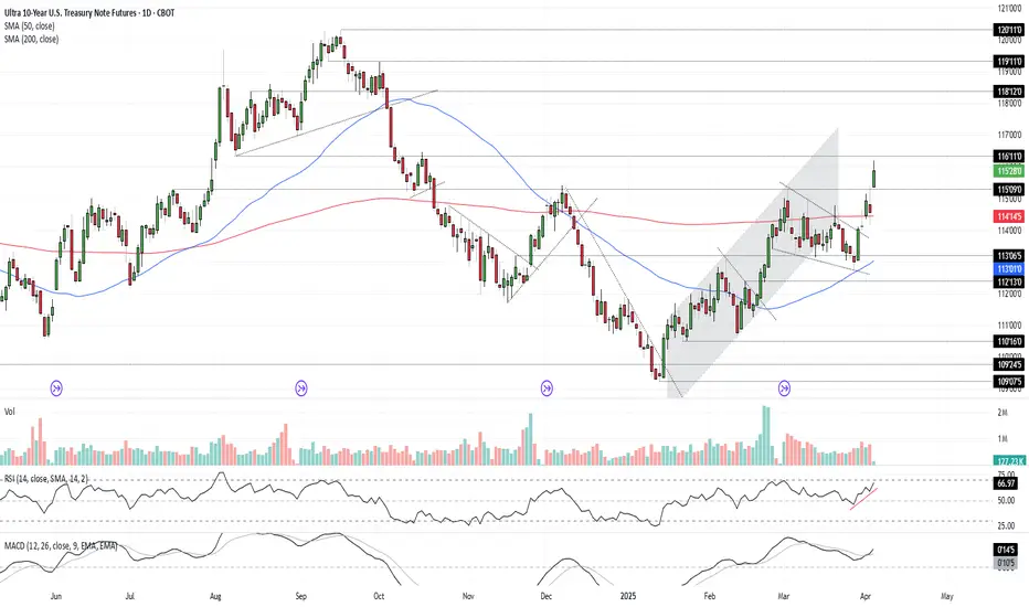
Bonds Don’t Lie: The Signal is ClearU.S. 10-year Treasuries are a crucial cog in the global financial machine, serving as a benchmark borrowing rate, a tool for asset valuation, and a gauge of the longer-term outlook for U.S. economic growth and inflation.
As such, I keep a close eye on 10-year note futures, as they can offer clues on directional risks for bond prices and yields. The price action over the past few days has sent a clear and obvious signal as to where the risks lie: prices higher, yields lower.
Futures had been grinding lower within a falling wedge for several weeks but broke higher last Friday on decent volumes following soft U.S. household spending data. It has since extended bullish the move, reclaiming the 200-day moving average before surging above key resistance at 115’09’0 after Trump’s reciprocal tariff announcement on Wednesday.
RSI (14) is trending higher but isn’t yet overbought, while MACD has crossed the signal line above 0, confirming the bullish momentum signal. That favours further upside, putting resistance at 116’11’0 and 118’12’0 on the immediate radar. For those who prefer it expressed in yield terms, that’s around 4% and 3.8% respectively.
Good luck!
DS
Soybean Futures Surge: ZS, ZL, and ZM Align for a Bullish MoveI. Introduction
Soybean futures are showing a potentially strong upcoming bullish momentum, with ZS (Soybean Futures), ZL (Soybean Oil Futures), and ZM (Soybean Meal Futures) aligning in favor of an upward move. The recent introduction of Micro Ag Futures by CME Group has further enhanced trading opportunities by allowing traders to manage risk more effectively while engaging with longer-term setups such as weekly timeframes.
Currently, all three soybean-related markets are displaying bullish candlestick patterns, accompanied by strengthening demand indicators. With RSI confirming upward momentum without entering overbought territory, traders are eyeing potential opportunities. Among the three, ZM appears to be the one which will potentially provide the greatest strength, showing resilience in price action and a favorable technical setup for a high reward-to-risk trade.
II. Technical Analysis of Soybean Markets
A closer look at the price action in ZS, ZL, and ZM reveals a confluence of bullish factors:
o Candlestick Patterns:
All three markets have printed bullish weekly candlestick formations, signaling increased buying interest.
o RSI Trends:
RSI is in an uptrend across all three contracts, reinforcing the bullish outlook.
Importantly, none of them are currently in overbought conditions, suggesting further upside potential.
o Volume Considerations:
Higher volume on up moves and decreasing volume on down-moves adds credibility to the bullish bias.
III. Comparative Price Action Analysis
While all three soybean-related markets are trending higher, their relative strength varies. By comparing recent weekly price action:
o ZM (Soybean Meal Futures) stands out as the one which will potentially become the strongest performer.
Last week, ZM closed above its prior weekly open, marking a +1.40% weekly gain.
RSI is not only trending higher but is also above its average, a sign of potential continued strength.
o ZS and ZL confirm bullishness but lag slightly in relative strength when compared to ZM.
This comparative analysis suggests that while all three markets are bullish, ZM presents the most compelling trade setup in terms of technical confirmation and momentum.
IV. Trade Setup & Forward-Looking Trade Idea
Given the strong technical signals, the trade idea focuses on ZM (Soybean Meal Futures) as the primary candidate.
Proposed Trade Plan:
Direction: Long (Buy)
Entry: Buy above last week’s high at 307.6
Target: UFO resistance at 352.0
Stop Loss: Below entry at approximately 292.8 (for a 3:1 reward-to-risk ratio)
Reward-to-Risk Ratio: 3:1
Additionally, with the introduction of Micro Ag Futures, traders can now fine-tune position sizing, making it easier to manage risk effectively on longer-term charts like the weekly timeframe. Given the novelty of such micro contracts, here is a CME resource that could be useful to understand their characteristics such as contracts specs .
V. Risk Management & Trade Discipline
Executing a trade plan is just one part of the equation—risk management is equally critical, especially when trading larger timeframes like the weekly chart. Here are key considerations for managing risk effectively:
1. Importance of Precise Entry and Exit Levels
Entering above last week’s high (307.6) ensures confirmation of bullish momentum before taking a position.
The target at 352.0 (UFO resistance) provides a well-defined profit objective, avoiding speculation.
A stop-loss at 292.8 is strategically placed to maintain a 3:1 reward-to-risk ratio, ensuring that potential losses remain controlled.
2. The Role of Stop Loss Orders & Hedging
A stop-loss prevents excessive drawdowns in case the market moves against the position.
Traders can also hedge using Micro Ag Futures to offset exposure while maintaining a bullish bias on the broader trend.
3. Avoiding Undefined Risk Exposure
The Micro Ag Futures contracts enable traders to scale into or out of positions without significantly increasing risk.
Position sizing should be adjusted based on account risk tolerance, ensuring no single trade overly impacts capital.
4. Adjusting for Market Volatility
Monitoring volatility using ATR (Average True Range) or other risk-adjusted indicators helps in adjusting stop-loss placement.
If volatility increases, a wider stop may be needed, but it should still align with a strong reward-to-risk structure.
Proper risk management ensures that trades are executed with discipline, preventing emotional decision-making and maximizing long-term trading consistency.
VI. Conclusion & Disclaimers
Soybean futures are showing bullishness, with ZS, ZL, and ZM aligning in favor of further upside. However, among them, ZM (Soybean Meal Futures) potentially exhibits the most reliable momentum, making it the prime candidate for a high-probability trade setup.
With bullish candlestick patterns, RSI trends confirming momentum, and volume supporting the move, traders have an opportunity to capitalize on this momentum while managing risk effectively using Micro Ag Futures.
When charting futures, the data provided could be delayed. Traders working with the ticker symbols discussed in this idea may prefer to use CME Group real-time data plan on TradingView: www.tradingview.com - This consideration is particularly important for shorter-term traders, whereas it may be less critical for those focused on longer-term trading strategies.
General Disclaimer:
The trade ideas presented herein are solely for illustrative purposes forming a part of a case study intended to demonstrate key principles in risk management within the context of the specific market scenarios discussed. These ideas are not to be interpreted as investment recommendations or financial advice. They do not endorse or promote any specific trading strategies, financial products, or services. The information provided is based on data believed to be reliable; however, its accuracy or completeness cannot be guaranteed. Trading in financial markets involves risks, including the potential loss of principal. Each individual should conduct their own research and consult with professional financial advisors before making any investment decisions. The author or publisher of this content bears no responsibility for any actions taken based on the information provided or for any resultant financial or other losses.

Trading is the realm of response
Hello, traders.
If you "Follow", you can always get new information quickly.
Please also click "Boost".
Have a nice day today.
-------------------------------------
It's been a while since I made an indicator and explained it, so I'd like to take the time to introduce and explain something I heard a long time ago.
(Original text)
I made purchases at m-signal 1W in yesterday's fall as I see it rose above ha-low and closed above m-signals. It looks like m-signals can't prevent traps. Now I'm losing money again. I think it's better to make purchases when RSI is below 30. I don't want to feed market makers, somehow it happens over and over.
-
Looking at the above, it seems that the purchase (LONG) was made when the price rose above the M-Signal indicator on the 1W, 1D chart and then started to fall.
If we check this on the 30m chart, it is expected that the purchase (LONG) was made near the section indicated by the circle section.
I said that it would have been much better to buy (LONG) when RSI was below 30, but when RSI was below 30, it refers to the section from February 25 to March 1, so I think it's regret due to the loss.
-
If you look at what I explained as an idea, I said that you need to get support in the section marked with a circle to continue the upward trend.
And, I said that support is important near the HA-Low indicator when it falls.
Therefore, if it falls in the section marked with a circle, you should enter a sell (SHORT) position.
However, if you do not see a downward trend, you should trade based on whether there is support in the HA-Low indicator.
-
To check for support, you need to check the movement for at least 1-3 days.
Therefore, checking for support is a difficult and tedious task.
Since most futures transactions are made on time frame charts below the 1D chart, you cannot check for support for 1-3 days.
Therefore, you need to check the movement at the support and resistance points you want to trade and respond accordingly.
-
The coin market is a market where trend trading is good.
Therefore, it is important to know what the current trend is.
It is better to think of the basic trend based on the trend of the 1D chart.
The current trend of the 1D chart is a downtrend.
Therefore, the SHORT position can be said to be the main position.
As mentioned earlier, in order to turn into an uptrend, support must be received within the range indicated by the circle.
If not, it is likely to continue the downtrend again.
Since the HA-Low indicator has been newly formed, the 89253.9 point is the point where a new trading strategy can be created.
If it is not supported by the HA-Low indicator, it is likely to lead to a stepwise downtrend, so you should also think about a countermeasure for this.
-
What we want to know through chart analysis is the trading point, that is, the support and resistance points.
You should decide whether to start trading depending on whether there is support at the support and resistance points.
Even if you start trading properly at the support and resistance points you want, you must also think about how to respond to a loss cut.
If you cannot think of a response plan for a loss cut, it is better not to trade at all.
-
Indicators are only reference materials for your decisions, not absolute.
- The M-Signal indicator on the 1D, 1W, and 1M charts is an indicator for viewing trends,
- The HA-Low and HA-High indicators correspond to points for creating trading strategies.
The creation of the HA-Low indicator means that it has risen from the low range, and if it is supported by the HA-Low indicator, it is the time to buy.
If it does not, and it falls, there is a possibility of a stepwise decline, so you should think about a response plan for this.
The creation of the HA-High indicator means that it has fallen from the high range, and if it is supported by the HA-High indicator, there is a possibility of a full-scale upward trend.
If not, it may fall until it meets the HA-Low indicator, so you should think about a countermeasure for this.
-
If the price is maintained near the StochRSI 50 indicator on the 1D chart, it is expected to lead to an increase to rise above the HA-Low indicator on the 1D chart.
At this time, if it rises above the M-Signal indicator on the 1D and 1W charts, it is likely to lead to an attempt to rise near 94827.9.
If not, it is likely to end as a rebound.
-
Thank you for reading to the end.
I hope you have a successful trade.
--------------------------------------------------

How to Set Multiple TPs...for BeginnersHey Rich Friends,
I wanted to share how I find multiple TPs for my Forex trades using free tools and only 1 technical indicator. This strategy is perfect for beginners because it is easy to follow and has clear confirmations for entering and exiting a trade in profit, even if it hits your Stop Loss.
I keep my charts clean and let price action do the talking. Here's my setup:
✅ Session Breaks & Horizontal Lines – I mark the previous day’s highs, lows, and key levels to identify potential areas of interest.
✅ Stochastic for Entries & Exits – I use the Stochastic indicator to time my trades when the price reacts at my key levels (80 and 20 are very important here!)
✅ Horizontal Lines = Potential TPs – Instead of setting a take profit, I let the market tell me when to exit based on price action around these levels.
Less noise, more precision. Drop a "7" if you made it to the end of the video and let me know if it was helpful!
Peace and Profits,
Cha

Use RSI Like a GoldmanYou might be wondering, do the traders at Goldman Sachs use the Relative Strength Index (RSI)? The answer is, perhaps they do, and perhaps they don’t. However, based on my experience, I can confidently say that even the most seasoned and professional traders rely on RSI from time to time.
While it may not be their sole tool for decision-making, it’s often included in their broader strategy due to its effectiveness in identifying overbought or oversold conditions in the market. RSI is one of many technical indicators that can serve as a helpful signal in navigating market trends, and even the best traders find it useful on occasion.
When trading with technical indicators like the Relative Strength Index (RSI), having a clear and structured approach is crucial to maximizing its effectiveness. While RSI can be a powerful tool for identifying potential trend reversals, it’s essential to understand the right conditions and context in which to use it.
Below are some key principles and guidelines that can help you apply RSI more effectively in your trading strategy. Whether you’re a swing trader or a day trader, these tips can help you avoid common pitfalls and make more informed decisions in the market.
⚙️ Keep Settings Simple
Keep the RSI settings minimal to avoid confusion. Stick to the standard 14-period lookback, which is widely used and reliable for most market conditions.
📉📈 Ensure Divergence Occurs Outside of Key Levels
Divergence should only be considered when the RSI reaches extreme levels, typically above 70 (overbought) or below 30 (oversold). This helps to identify potential trend reversals. Divergence at neutral levels (like between 40–60) may not be as effective.
🔥 Base Divergence on Candle Closes, Not Wicks
Always look for divergence based on the closing price of candles. Divergence created by wick movements is unreliable and can lead to false signals. Stick to the body of the candle to ensure accuracy.
⏳ Watch the Lookback Period
The RSI’s default lookback period is 14, and divergence with a gap of more than 14 candles is generally less reliable. Wider gaps often signal weak price momentum and a higher chance of failure, so focus on shorter, more recent divergences for better results.
💧 Liquidity Must Be Taken Before Entering Trades
Liquidity is essential when confirming trade setups:
The first high or low should take out liquidity from higher time frames (such as range highs and lows).
The subsequent highs or lows should take out local liquidity, which can be identified by overbought or oversold RSI conditions. Ensure there’s a clear market structure shift before entering trades.
⏰ Timeframe Considerations for Different Trade Types
For swing trades, focus on longer timeframes like the 4-hour chart to capture larger market moves and trends.
For day trades, the 15-minute timeframe is ideal for capturing short-term price action and finer market details.
🔄 Use Divergences for Trend Reversals, in Confluence with Other Analysis
RSI divergence is best used to identify potential trend reversals. However, it should not be used in isolation. Always look for confluence with other technical analysis methods (such as support/resistance levels, moving averages, or candlestick patterns) to increase the reliability of the signal. Combining multiple tools enhances the accuracy of your trade setups.
Stay sharp, stay ahead, and let’s make those moves. Until next time, happy trading!

Can we enhance the most popular Indicator on TradingView?I describe my implementation of the TTM Squeeze indicator, first coded by Lazybear and that became the most popular indicator on TradingView.
There's gotta be a reason for that to be the most popular, right? I wanted to find out and make it much easier to navigate as well as adding to it with my own touch.
Hope you enjoy it.

Divergence Trading Explained For Beginners -DAX Pullback TradeTrading divergence in the Forex or Stock market can be an important tool. Learn how to identify divergences & practically apply them to your technical analysis to increase your edge & profits in the financial markets.
In this video you'll learn
What is a bullish and bearish divergence
How to use divergence to spot potential reversals in the market
How to use volume to identify key levels of reversals
How to measure out a "Kill Zone"
What are tweezer tops & tweezer bottoms & why they are important
How to use the Fibonacci retracement tool
How to use the Relative Strength Index (RSI Indicator)
Your Trading Coach - Akil

Understanding RSI In TradingThis article takes a deep dive into the Relative Strength Index (RSI), a powerful tool for traders at any level. We’ll break down how RSI works, how to interpret it, and how to use it effectively in your trading strategies. Plus, we’ll touch on the math behind it. Whether you’re a seasoned pro or just getting started, this guide will give you the insights you need to make RSI a valuable part of your trading toolkit.
Understanding Oscillators in Trading
An oscillator is a technical indicator that moves between two extremes, usually ranging from 0 to 100. Traders use oscillators to spot overbought and oversold conditions in the market. An overbought signal suggests that excessive buying has driven prices too high and may not be sustainable, while an oversold signal indicates the opposite—excessive selling that could lead to a potential rebound. By tracking these price oscillations, traders can anticipate trend reversals and make more informed decisions.
Key Functions of Oscillators:
Momentum Analysis: Oscillators gauge the speed and strength of price movements, offering insights into an asset’s momentum.
Volatility Detection: They help identify periods of high or low volatility, enabling traders to adjust their strategies accordingly.
Trend Confirmation: When combined with other technical indicators, oscillators can validate or reveal emerging trends in the market.
Introduction to the RSI Indicator
The Relative Strength Index (RSI) is a momentum-based technical indicator used to assess the strength of recent price movements and identify overbought or oversold conditions in an asset. It helps traders spot potential trend reversals by oscillating between 0 and 100. An RSI above 70 suggests the asset may be overbought, while a reading below 30 indicates it may be oversold.
By the end of this, you'll be an RSI expert!
Interpreting RSI Readings
RSI values above 70 suggest that an asset is overbought, meaning it has likely experienced a sharp price increase and may be due for a correction. On the other hand, RSI values below 30 indicate that the asset is oversold, implying a steep price drop and the possibility of a rebound.
However, it's important to remember that RSI isn't foolproof and can occasionally give false signals. To increase accuracy, it's best to use RSI in combination with other technical indicators and fundamental analysis.
Overbought: An RSI reading above 70 signals that the asset may be overbought and due for a correction. This could present a potential selling opportunity, but traders should be cautious, as false signals can occur.
Oversold: An RSI reading below 30 indicates that the asset may be oversold and due for a rebound. This can signal a potential buying opportunity, but again, traders should be cautious of possible false signals.
Divergence: Divergence happens when the RSI moves in the opposite direction of the price. For instance, if the price makes new highs while the RSI forms lower highs, this could point to a potential trend reversal.
Support and Resistance: The RSI can also help identify support and resistance levels. If the RSI consistently bounces off the 30 level, it may indicate a support level. Conversely, if the RSI repeatedly fails to break through the 70 level, this could signal a resistance level.
RSI and Divergence
Divergence happens when the RSI moves in the opposite direction of the asset's price, often signaling a potential trend reversal. For example, if the price is hitting new highs but the RSI forms lower highs, it could indicate a bearish divergence, suggesting a possible sell signal.
A common example of bearish divergence is when the price of an asset makes higher highs, but the RSI forms lower highs. This suggests weakening buying momentum, even as the price continues to rise. It can be a sign that the uptrend may be losing steam, with a reversal to the downside potentially on the horizon.
On the other hand, bullish divergence occurs when the price is making lower lows, but the RSI is making higher lows. This indicates that selling pressure is subsiding, and the asset may be primed for a rebound to the upside. Traders can use this pattern to time their entries for long positions.
RSI divergence can help traders identify overbought or oversold conditions, enabling them to make more effective decisions about entry and exit points. However, divergence should always be used alongside other technical and fundamental analysis for confirmation before acting on the signal.
Calculating the RSI Indicator
Calculating the RSI is straightforward once you break it down. The goal is to determine the average gains and losses over a set period, typically 14 days. This helps assess the strength of price movements and identify overbought or oversold conditions. While the math may sound complex, understanding the formula is key to using the tool effectively.
The RSI formula is:
RSI = 100 - (100 / (1 + (Average Gains / Average Losses)))
This calculation provides valuable insights into the relative strength of an asset’s price movements.
Factors Affecting the RSI Calculation
The RSI calculation can be influenced by several factors, with the length of the time period being the most significant. A shorter period (e.g., 5 days) results in a more volatile RSI that responds quickly to price changes, while a longer period (e.g., 20 days) creates a smoother RSI, filtering out short-term fluctuations. The ideal time period depends on your trading style and the volatility of the market you're analyzing.
Why the RSI Indicator is Powerful
Identifies Overbought and Oversold Conditions: The RSI helps traders recognize when an asset is overbought or oversold, allowing them to time their entries and exits more effectively.
Detects Divergences: Divergences between the RSI and price can signal potential trend reversals, giving traders an early warning to adjust their positions accordingly.
Flexible and Customizable: Traders can adjust the RSI’s period to match their trading style and the specific market conditions, making it a highly versatile tool for technical analysis.
Widely Adopted and Well-Understood: The RSI is one of the most popular technical indicators, with a wealth of resources and analysis available to assist traders in interpreting its signals.
Practical Application in Real Life
Here are a few effective strategies where RSI can be combined with other technical indicators for a more comprehensive analysis:
Example 1: RSI + Support/Resistance + Moving Averages
Scenario:
You are analyzing a stock that has been in an uptrend, with the price currently approaching a key resistance level at $100. The 50-period moving average is also trending upwards, confirming the bullish trend.
The RSI is at 75, indicating an overbought condition.
As the price nears the resistance level, the RSI starts to flatten, suggesting the upward momentum might be weakening.
You wait for the price to fail to break above the $100 resistance level and the RSI to drop below 70, signaling a potential reversal. This provides a clearer sell signal, as both the price and RSI align with the idea that a correction could be coming.
Why this works:
By using both RSI and moving averages with support and resistance, you have a solid confirmation of the potential reversal, as it combines trend analysis with overbought conditions.
Example 2: RSI + SFP (Swing Failure Pattern) + Price Action
Scenario:
You’re monitoring a currency pair that recently made a new low, breaking through a previous swing low at 1.1500. However, the price quickly reverses and fails to sustain the breakdown, bouncing back above the previous low, forming an SFP.
At the same time, the RSI is below 30, but it starts to turn upward, forming a bullish divergence (higher lows on the RSI while the price makes lower lows).
This divergence and the SFP setup suggest that the selling pressure is decreasing, and a potential reversal to the upside could be imminent.
Why this works:
The Swing Failure Pattern highlights the false breakdown, and the RSI divergence confirms that momentum is shifting. This combination increases the likelihood of a successful trade when entering on the potential reversal.
Key Takeways
The RSI is an essential tool for traders looking to spot overbought or oversold conditions and potential trend reversals. By mastering how to interpret RSI readings and incorporating them into your strategies, you can improve your decision-making and potentially boost your trading results. For a more balanced approach, always use RSI alongside other technical indicators and fundamental analysis.

what is the most effective indicator?There isn’t a single "most effective" trading indicator that works for everyone, as effectiveness depends on your trading style, strategy, and the market conditions. However, some indicators are considered more versatile or reliable when used correctly. Here's a breakdown to help you choose:
Most Effective for Trends:
Moving Averages (EMA or SMA):
Simple and effective for identifying trends.
Works well in trending markets but less reliable in sideways or choppy markets.
Pro Tip: Combine short-term and long-term moving averages for crossovers.
Ichimoku Cloud:
A comprehensive indicator that provides trend direction, support/resistance, and momentum.
Effective but requires practice to interpret correctly.
Most Effective for Overbought/Oversold Levels:
Relative Strength Index (RSI):
One of the most popular and effective indicators for spotting overbought or oversold conditions.
Works well in both trending and range-bound markets when combined with other tools.
Stochastic Oscillator:
Similar to RSI but includes %K and %D lines for crossovers.
Effective for momentum confirmation.
Most Effective for Volatility:
Bollinger Bands:
Great for identifying periods of high or low volatility and potential breakout zones.
Useful for sideways (range-bound) markets and trend reversals.
Average True Range (ATR):
Excellent for setting stop-loss levels and identifying market volatility trends.
Works well in conjunction with trend indicators.
Most Effective for Momentum:
Moving Average Convergence Divergence (MACD):
Ideal for spotting trend reversals and momentum shifts.
Effective when used with a confirmation indicator like RSI.
Parabolic SAR:
Simple for identifying trend direction and potential exit points.
Works best in trending markets.
Combination for Higher Effectiveness:
Trend + Momentum: Combine EMA with MACD to identify trends and entry/exit points.
Overbought/Oversold + Volume: Use RSI with Volume Indicators (e.g., OBV) to confirm breakouts or reversals.
Volatility + Trend: Use Bollinger Bands with Ichimoku Cloud to spot breakout opportunities with clear trend guidance.

Example of explanation of chart analysis and trading strategy
Hello, traders.
If you "Follow", you can always get new information quickly.
Please click "Boost" as well.
Have a nice day today.
-------------------------------------
There was an inquiry asking for detailed information on how to analyze charts and create trading strategies accordingly, so I will take the time to explain it.
Before reading this article, you need a basic understanding of charts.
That is, you need to understand candles and price moving averages.
If you study this first and then read this content, I think you will have some understanding of trading.
---------------------------------------
Whether you are trading spot or futures, marking support and resistance points according to the arrangement of candles on the 1M, 1W, and 1D charts is the first task you need to do before trading.
To do this, you need to understand the arrangement of candles.
Therefore, before using my indicator, it is better to study candles first and understand the arrangement of candles.
When studying candles, it is better not to try to memorize the names or shapes of various patterns.
This is because the overall understanding of candles is important, not the various patterns of candles.
If you study with a book or video, you will be able to understand candles after reading or watching them at least 3 times.
We study charts to trade, not to analyze charts and teach them to others, so we need to study efficiently and save time.
-
If you study candles, you will naturally understand the price moving average.
The indicator corresponding to the price moving average is the MS-Signal indicator.
This MS-Signal indicator consists of the M-Signal indicator and the S-Signal indicator, and the main indicator is the M-Signal indicator.
Therefore, we added the M-Signal indicator of the 1W chart and the M-Signal indicator of the 1M chart to the 1D chart so that we can see the overall trend.
-
You can see the arrangement of the MS-Signal (M-Signal of 1M, 1W, 1D charts) indicators in the example chart.
Currently, since the M-Signal of the 1M chart > the M-Signal of the 1W chart, we can see that it is a reverse array.
If you understand the price moving average, you will understand that we should not trade when it is a reverse array, but when it is a regular array.
Therefore, since the current state of the example chart is a reverse array, it is not suitable for trading.
However, the reason we brought this chart in this state is because the M-Signal indicators of the 1M and 1W charts are converging.
As convergence progresses, it will eventually diverge.
Therefore, since the possibility of price volatility increases, the possibility of capturing the timing for trading increases depending on whether there is support at the support and resistance points.
-
The indicators included in the example chart are drawn as horizontal lines to indicate support and resistance points.
This work performs the same role as the support and resistance points drawn on the 1M, 1W, and 1D charts according to the arrangement of the candles mentioned above.
Therefore, on the 1M, 1W, and 1D charts, horizontal lines are drawn on the indicators to indicate support and resistance points.
You can draw horizontal lines on indicators that are horizontal for at least 3 candles, and if possible, 5 candles.
-
Among the HA-MS indicators, the important indicators are the HA-Low and HA-High indicators.
The HA-Low and HA-High indicators are indicators created for trading on the Heikin-Ashi chart.
Therefore, it is the next most important indicator after the MS-Signal (M-Signal on 1M, 1W, 1D charts) indicator that can tell the trend.
You can create a trading strategy depending on whether there is support near the HA-Low, HA-High indicators.
-
The next most important indicator is the BW(0), BW(100) indicator.
When this indicator is created or touched, it is time to respond in detail.
That is, when you are trading with a trading strategy created from the HA-Low, HA-High indicators, when the BW(0), BW(100) indicators are created or touched, you can choose whether to proceed with a split transaction.
In addition, you can understand the OBV, +100, -100 indicators as response points for split transactions.
Therefore, you do not need to indicate support and resistance points for the OBV, +100, -100 indicators.
However, it is recommended to mark support and resistance points for the HA-Low, HA-High, BW(0), BW(100) indicators.
-
If you look at the price position in the example chart, you can see that it is located in the 0.03347-0.03485 range.
And, the M-Signal indicator of the 1W chart is passing through this range, and the HA-High indicator of the 1W chart is acting as support and resistance.
Therefore, whether there is support near 0.03485 is an important key point.
If support is confirmed near 0.03485, it is a time to buy.
However, since the MS-Signal (M-Signal on the 1D chart) indicator is passing between 0.03485-0.03814, the point to watch is whether the MS-Signal (M-Signal on the 1D chart) indicator can break through upward.
As I mentioned earlier, if the MS-Signal indicator passes, a trend change will occur, so it is significant.
Therefore, in order to turn into a short-term uptrend, it is likely to be supported around 0.03814-0.03982.
Therefore, the first split selling section will be around 0.03814-0.03982.
At this time, whether to sell or hold depends on your investment style and investment period.
-
Since the M-Signal indicator on the 1M chart is passing around 0.04341, it is likely to start when the price is maintained above the M-Signal indicator on the 1M chart in order to turn into a long-term uptrend.
Therefore, the second split selling period will be around the M-Signal indicator on the 1M chart.
This is also something you can choose.
-
An important volume profile section is formed around 0.03038.
Therefore, the 0.03038 point corresponds to a strong support section.
-
(30m chart)
When the time frame chart you are trading is below the 1D chart, it is recommended to activate the 5EMA indicator on the 1D chart.
(I just used the 30m chart as an example. The same principle applies to any time frame chart you usually use.)
This is because there is a high possibility of volatility when the 5EMA of the 1D chart and the M-Signal indicator of the 1M, 1W, and 1D charts are touched.
In other words, you can understand that it plays a certain role of support and resistance.
If it touches the HA-High, BW(100) indicator and falls and falls below the MS-Signal indicator, it will basically touch the HA-Low or BW(0) indicator.
On the other hand, if it touches the HA-Low, BW(0) indicator and rises and rises above the MS-Signal indicator, it will basically touch the HA-High or BW(100) indicator.
However, since it may not do so and may rise or fall in the middle, it is necessary for the support and resistance points drawn on the 1M, 1W, and 1D charts as mentioned earlier.
The support and resistance points drawn on the 1D chart are currently indicated at the 0.03347 point.
Therefore, even if it falls below the MS-Signal indicator, you can understand that there is a possibility of rising again around 0.03347.
Since the 5EMA of the 1D chart and the M-Signal indicator of the 1W chart are passing around 0.03485, we can see that the area around 0.03485 is an important support and resistance zone.
-
Since the StochRSI indicator is currently above 50, we should focus on finding a time to sell.
Since it has fallen below the BW(100) and HA-High indicators, it has fallen too much to start trading with a sell (SHORT) position.
However, if you can respond quickly, you can enter a sell (SHORT) position when it falls from the 0.03411 point where the MS-Signal indicator is passing.
When the StochRSI indicator falls below 50, we should focus on finding a time to buy.
At this time, you can trade based on whether there is support or resistance at the support and resistance points drawn on the 1M, 1W, and 1D charts or around the MS-Signal (M-Signal on the 1M, 1W, and 1D charts), 5EMA, HA-Low, HA-High, BW(0), and BW(100) indicators on the 1D chart.
As mentioned earlier, you should not forget that trading strategies can be created based on whether there is support at the HA-Low and HA-High indicators.
Therefore, if possible, it is recommended to trade based on whether there is support near the HA-High indicator point of 0.03443.
-
Thank you for reading to the end.
I hope you have a successful trade.
--------------------------------------------------
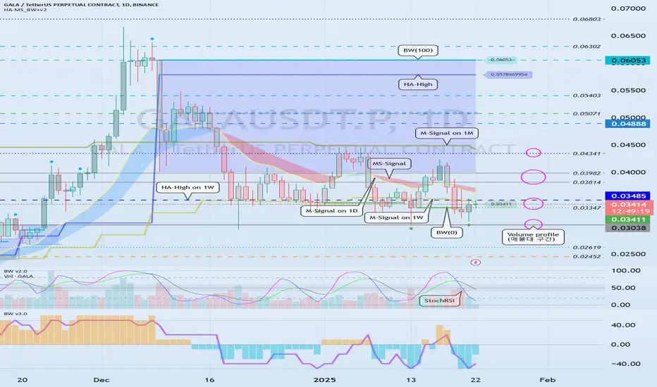
I need objective information to help me interpret the chart
Hello, traders.
If you "Follow", you can always get new information quickly.
Please click "Boost" as well.
Have a nice day today.
-------------------------------------
With this decline, the BW(100) indicator was created at 104556.23.
Accordingly, the high boundary section is the 101947.24-104556.23 section.
Unfortunately, since it fell below 101947.24, the key is whether it can receive support near the MS-Signal (M-Signal on the 1D chart) indicator, i.e., around 98892.0, and rise.
If it falls below the MS-Signal (M-Signal on the 1D chart) indicator and shows resistance, it is highly likely to turn into a short-term downtrend.
-
The settings for the StochRSI indicator I use are 14, 7, 3, 3 (RSI, Stoch, K, D).
The source value is ohlc4.
If you set it as above, it will show a movement similar to the StochRSI indicator on my chart.
When the StochRSI indicator
- falls in the overbought zone,
- is located near the 50 point,
- rises in the oversold zone,
volatility is likely to occur.
However, you should check whether there is support near the support and resistance points drawn on the 1M, 1W, and 1D charts and think of a corresponding response plan.
Therefore, by checking the relationship between the movement of the StochRSI indicator and the support and resistance points drawn on the 1M, 1W, and 1D charts, you can choose the point where you can make a trade.
If you can calculate these selection points, I think it is highly likely that you will be able to create a trading strategy that suits your investment style.
It is good to predict future movements with trends or waves, but if you can calculate the point where you can actually make a trade, I think you can create a better trading strategy.
-
I wrote a long article, but
1. Will the StochRSI indicator fall in the overbought zone?
2. Will it receive support near the MS-Signal (M-Signal on the 1D chart) indicator?
3. Will it rise to the high boundary section?
You should focus on the three things above.
---------------------------------
The method of drawing support and resistance points is drawn according to the arrangement of candles.
This method can actually include subjective thoughts, so it requires skill.
Therefore, if possible, I recommend that you sign up as a paid member of TradingView and share my charts with me, and use the HA-High, HA-Low, BW(100), BW(0), OBV, +100, -100 indicators that appear on 1M, 1W, and 1D charts by the HA-MS_BW+v2 indicator as horizontal lines and use them as support and resistance points.
Then, even if others look at the charts, they will be easier to understand, and it will be easier to share opinions on trading strategies according to each other's investment styles.
By utilizing indicators that anyone can use in this way, you will be able to view the charts objectively.
If you trade based on what others tell you, you will likely not be able to respond quickly when sudden volatility occurs.
Therefore, when creating a trading strategy, you should roughly think about how to respond to all cases, both when it goes up and when it goes down.
That's why it's best to draw support and resistance points or other reference materials on your chart if possible and prepare countermeasures accordingly.
-
Thank you for reading to the end.
I hope you have a successful trade.
--------------------------------------------------

combined guide for both the **Regime Classifier** and **kNN Here’s the combined guide for both the **Regime Classifier** and **kNN (k-Nearest Neighbors)** indicators with emojis, tailored for your TradingView chart description:
---
### **🔑 Individual Lesson Steps**
#### **Lesson 1: What is a Regime Classifier?**
👽 **Defining Market Regimes**
- A **market regime** refers to distinct market conditions based on price behavior and volatility.
- **Types of Market Regimes:**
- 🚀 **Advance** (Uptrend)
- 📉 **Decline** (Downtrend)
- 🔄 **Accumulation** (Consolidation)
- ⬆️⬇️ **Distribution** (Topping/Bottoming Patterns)
👾 **Why it Matters:**
- Identifying market regimes helps traders tailor their strategies, manage risk, and make more accurate decisions.
---
#### **Lesson 2: Anatomy of the Regime Classifier Indicator**
👽 **Core Components**
- **Median Filtering:** Smooths out price data to capture significant trends.
- **Clustering Model:** Classifies price trends and volatility into distinct regimes.
- **Volatility Analysis:** Analyzes price volatility with rolling windows to detect high and low volatility phases.
👾 **Advanced Features:**
- **Dynamic Cycle Oscillator (DCO):** Tracks price momentum and cyclic behavior.
- **Regime Visualization:** Color-coded display of market conditions to make trends and patterns clearer.
---
#### **Lesson 3: Configuring the Regime Classifier Indicator**
👽 **Customization Settings**
- **Filter Window Size:** Adjusts sensitivity for detecting trends.
- **ATR Lookback Period:** Determines how far back the volatility is calculated.
- **Clustering Window & Refit Interval:** Fine-tunes how the indicator adapts to new market conditions.
- **Dynamic Cycle Oscillator Settings:** Tailors lookback periods and smoothing factors.
👾 **Why It’s Useful:**
- Customizing these settings helps traders optimize the indicator for different trading styles (e.g., scalping, swing trading, long-term investing).
---
#### **Lesson 4: Using the Indicator for Regime-Based Trading Strategies**
👽 **Adapt Strategies Based on Regimes**
- **Advance Regime:** Focus on long positions and trend-following strategies.
- **Decline Regime:** Prioritize short positions or hedging strategies.
- **Accumulation Regime:** Watch for breakout opportunities.
- **Distribution Regime:** Look for trend reversals or fading trends.
👾 **Using the Dynamic Cycle Oscillator for Confirmation:**
- 🌡️ **Overbought/Oversold Conditions:** Identify potential reversals.
- 🔄 **Trend Momentum:** Confirm if the trend is gaining or losing strength.
---
#### **Lesson 5: Combining Volatility and Price Trends for High-Confidence Trades**
👽 **Interpreting Volatility Clusters**
- 🔥 **High Volatility:** Indicates caution, risk management, or hedging opportunities.
- 🌿 **Low Volatility:** Suggests consolidation or trend continuation.
👾 **How Volatility Clusters Interact with Price Trends:**
- Combine trend direction with volatility analysis to refine trade entries and exits for more precise decisions.
---
#### **Lesson 6: Backtesting and Live Application**
👽 **Validate Using Historical Data**
- Guide traders on **backtesting** strategies using historical data to see how the indicator would have performed.
👾 **Real-Time Application:**
- Implement the Regime Classifier in **live markets** to monitor ongoing price conditions and gain actionable insights.
---
### **🔑 kNN (k-Nearest Neighbors) Indicator Lesson Steps**
#### **Lesson 1: What is kNN?**
👽 **Defining kNN**
- **k-Nearest Neighbors** is a machine learning algorithm that makes predictions based on the proximity of data points.
- It identifies the nearest neighbors of a data point and classifies it according to the majority class of those neighbors.
👾 **Why it Matters:**
- **kNN** helps traders forecast price movement, trends, and potential reversals by analyzing historical data.
---
#### **Lesson 2: Anatomy of the kNN Indicator**
👽 **Core Components**
- **Training Data:** Historical price data used to identify the neighbors of a point.
- **Distance Metric:** Determines the closeness of data points (e.g., Euclidean distance).
- **k Parameter:** The number of nearest neighbors to consider for predictions.
👾 **Advanced Features:**
- **Distance Calculation:** Helps assess how similar current price movement is to historical patterns.
- **Prediction:** The majority of the nearest neighbors determines the expected price movement (up or down).
---
#### **Lesson 3: Configuring the kNN Indicator**
👽 **Customization Settings**
- **k (Number of Neighbors):** Adjust to control how many historical data points influence predictions.
- **Distance Metric:** Choose from Euclidean, Manhattan, or other metrics based on data characteristics.
- **Window Size:** Defines how many data points (e.g., time periods) are used for analysis.
👾 **Why It’s Useful:**
- Tuning these settings allows traders to adjust the sensitivity and precision of predictions, optimizing for various trading styles.
---
#### **Lesson 4: Using the kNN Indicator for Predictive Trading Strategies**
👽 **Predicting Price Movements**
- Use **kNN** to identify trend directions and price reversals based on historical proximity.
- **Uptrend Prediction:** Identify moments where the nearest neighbors suggest a continuation of the trend.
- **Downtrend Prediction:** Signal when the majority of neighbors point toward price decline.
👾 **Using Predictions to Enhance Trade Entries:**
- Use **kNN** signals in conjunction with **Regime Classifier** regimes to validate and enhance entry and exit points.
---
#### **Lesson 5: Combining kNN Predictions with Regime Classifier for Precision**
👽 **Refining Trade Confidence**
- Cross-reference **kNN predictions** (uptrend/downtrend) with **Regime Classifier’s** regime identification for higher precision trades.
- **Example:** If **kNN** predicts an uptrend and the **Regime Classifier** signals an **Advance** regime, you can confidently go long.
---
#### **Lesson 6: Backtesting and Live Application**
👽 **Validate Predictions with Historical Data**
- Backtest using **kNN** on past price data to measure accuracy in predicting trends and reversals.
- **Real-Time Application:** Implement **kNN** in live markets alongside **Regime Classifier** for comprehensive decision-making.
---
### **🔄 Combined Lessons for Advanced Mastery**
#### **Combo 1: Regime Identification and kNN Predictions for Strategy Optimization**
💡 **Objective:** Combine market regime identification with kNN predictions to refine trading strategies.
- Merge **Lesson 1 (Understanding Regimes)** and **Lesson 1 (What is kNN?)**.
- **Practical Exercise:** Use both indicators to identify regimes and predict price trends in live charts.
---
#### **Combo 2: Customization, Practical Usage, and Enhanced Predictions**
💡 **Objective:** Equip traders to fine-tune both indicators for their unique strategies.
- Merge **Lesson 3 (Settings Configuration for Regime Classifier)** and **Lesson 3 (kNN Indicator Configuration)**.
- Walkthrough: Customize settings and combine both indicators to predict price trends and adjust strategies accordingly.
---
#### **Combo 3: Comprehensive Trading Strategy with Regime Classifier and kNN**
💡 **Objective:** Build a full-fledged trading system using both indicators for market regime analysis and predictive signals.
- Combine **all lessons** for a complete, systematic trading approach:
- 🔍 **Identify market regimes**
- 🔄 **Use kNN predictions** to assess potential price movements
- 📈 **Combine with Dynamic Cycle Oscillator** for entry/exit timing
- 💥 **Execute trades** with a comprehensive strategy
---
These lessons and combos provide traders with the essential tools to master both the **Regime Classifier** and **k-Nearest Neighbors** indicators, from understanding the fundamentals to implementing advanced strategies and refining predictions for more accurate market analysis.

Moving Average Convergence Divergence MACD A Comprehensive GuideMastering the Moving Average Convergence Divergence (MACD): A Comprehensive Guide
Understanding the Moving Average Convergence Divergence (MACD): A Beginner’s Guide
The Moving Average Convergence Divergence (MACD) is a popular and powerful momentum and trend-following indicator used by traders across various markets. Developed by Gerald Appel in the late 1970s, MACD helps traders identify potential trend reversals, momentum strength, and buy or sell signals.
What is MACD?
MACD is based on the relationship between two moving averages of an asset’s price. It consists of three main components:
MACD Line:
Calculated as the difference between the 12-period Exponential Moving Average (EMA) and the 26-period EMA.
Signal Line:
A 9-period EMA of the MACD Line.
Serves as a trigger for buy or sell signals.
Histogram:
The difference between the MACD Line and the Signal Line.
Visual representation of momentum changes.
How to Interpret MACD
Crossovers:
Bullish Crossover: When the MACD Line crosses above the Signal Line, it signals upward momentum and is often interpreted as a buy signal.
Bearish Crossover: When the MACD Line crosses below the Signal Line, it indicates downward momentum and is often seen as a sell signal.
Centerline Crossovers:
When the MACD Line crosses above the zero line, it indicates bullish momentum.
When the MACD Line crosses below the zero line, it signals bearish momentum.
Divergence:
Bullish Divergence: Occurs when the price makes lower lows, but the MACD makes higher lows. This can indicate a potential upward reversal.
Bearish Divergence: Occurs when the price makes higher highs, but the MACD makes lower highs. This can suggest a potential downward reversal.
Strengths of MACD
Versatile: Combines trend-following and momentum analysis.
Easy to Use: Simple to interpret for traders of all skill levels.
Effective in Trending Markets: Provides clear signals during strong trends.
Limitations of MACD
Lagging Indicator: Since it relies on moving averages, MACD may provide signals after a trend has already started.
False Signals: In sideways or choppy markets, MACD can produce misleading crossovers.
Best Practices for Using MACD
Combine with Other Indicators:
Use MACD with support and resistance levels, RSI, or Bollinger Bands for confirmation of signals.
Combine it with volume analysis to validate momentum strength.
Adjust Periods for Your Strategy:
Shorten the EMA periods (e.g., 8, 18, and 6) for more responsive signals in fast-moving markets.
Lengthen the periods (e.g., 21, 50, and 9) for smoother signals in slower markets.
Understand Market Context:
Avoid relying solely on MACD in range-bound markets where false signals are more common.
Example of MACD in Action
Imagine a stock is in an uptrend, and the MACD Line crosses above the Signal Line while the histogram turns positive. This is a bullish signal suggesting that the upward momentum is strengthening. Conversely, if the MACD Line crosses below the Signal Line during a downtrend, it signals that bearish momentum may continue.
Conclusion
The MACD is a robust indicator that helps traders identify trends, momentum shifts, and potential buy/sell opportunities. While it’s easy to use, its effectiveness improves when combined with other technical tools and a solid understanding of market dynamics. As always, backtest your strategies and practice using the MACD on historical data before applying it to live trades.

Example of Interpretation of USDT, USDC, BTC.D, USDT.D
Hello, traders.
If you "Follow", you can always get new information quickly.
Please also click "Boost".
Have a nice day today.
Trading Strategy
-------------------------------------
(USDT 1D chart)
USDT is a stable coin that has a great influence on the coin market.
Therefore, the gap decline of USDT is likely to have a negative impact on the coin market.
Since the gap decline means that funds have flowed out of the coin market, it can be interpreted that funds have currently flowed out through USDT.
(USDC 1D chart)
USDC cannot help but have a lower influence on the coin market than USDT.
The reason is that USDC markets are not operated in all exchanges around the world.
In other words, USDC can be seen as having limitations compared to USDT as an American investment capital.
Therefore, the gap increase of USDT is likely to have a short-term impact on the coin market.
----------------------------------
(BTC.D 1D chart)
You can refer to BTC dominance to choose which side (BTC, Alts) to trade in the coin market.
Since the rise in BTC dominance means that funds are concentrated on BTC, it can be interpreted that Alts are likely to gradually move sideways or show a downward trend.
For this interpretation to be meaningful, USDT dominance must show a downward trend.
(USDT.D 1D chart)
Because the decline in USDT dominance is likely to result in a rise in the coin market.
Therefore, if USDT dominance rises, it may be a good idea to pause all trading and take a look at the situation.
-
You can roughly figure out whether funds are flowing into or out of the coin market with USDT and USDC.
You can roughly figure out which direction the funds in the actual coin market are moving with BTC dominance and USDT dominance.
As I am writing this, BTC dominance is rising and USDT dominance is falling, so it is better to trade BTC rather than Alts.
-
Thank you for reading to the end.
I hope you have a successful trade.
--------------------------------------------------

Example of how to trade without chart analysis
Hello, traders.
If you "Follow", you can always get new information quickly.
Please also click "Boost".
Have a nice day today.
-------------------------------------
Since the coin market can be traded 24 hours a day, 365 days a year, gaps do not occur as often as in the stock market.
(However, gaps may occur frequently in exchanges with low trading volume.)
In any case, I think that these movements provide considerable usefulness in conducting transactions.
Sometimes I told you to buy when the price drops by -10% or more.
Today, I will tell you why.
--------------------------------------
In order to trade, you must have basic knowledge of charts.
Otherwise, you are likely to conduct transactions incorrectly due to volatility.
However, such cases are less common in the coin market than in the stock market.
One of the reasons is that the current coins (tokens) are not being used for actual business purposes.
So, I think there are quite a few issues that cause volatility other than charts like stocks.
-
If the price falls one day and falls by about -10% from the high before a new candle is created, I buy.
The next day, if it falls by about -10% from the high again, I buy again.
When it falls by about -10% like this, I continue to buy in installments.
That's why I need to adjust my investment ratio.
-
If I buy like that, there will come a point where my price rises more than the average unit price.
In that case, when I'm making a profit, I sell the amount corresponding to the purchase principal in installments and leave the number of coins (tokens) corresponding to the profit.
If you want cash profit, you can sell a certain portion in installments.
Also, on the contrary, when it rises by about +10%, we proceed with a split sale.
-
As shown in the example chart, you can see that there are not many cases where it rises by -10% or +10%.
However, since it occurs more often in the case of altcoins than in BTC or ETH, you should pay special attention to adjusting your investment ratio when trading altcoins.
That is why you must check the price fluctuation range 1-3 hours before a new candle is created on the 1D chart.
This method is a method that can be traded even if you lack knowledge about charts.
If you let go of your greed a little and have the ability to split sell when you are making a profit, you will be able to meet the moment when a crisis becomes an opportunity.
-
Thank you for reading to the end.
I hope you have a successful trade.
--------------------------------------------------

The Relative Strength Index (RSI): A Beginner’s GuideThe Relative Strength Index (RSI) is one of the most widely used technical indicators in trading. Developed by J. Welles Wilder in 1978, it helps traders evaluate the momentum of a market and identify overbought or oversold conditions.
What is RSI?
RSI is an oscillator that measures the speed and magnitude of price changes over a specific period, typically 14 periods. It provides a value between 0 and 100, which helps traders gauge whether an asset is overbought or oversold.
Overbought: RSI above 70 suggests the asset might be overbought and due for a correction.
Oversold: RSI below 30 indicates the asset might be oversold and due for a rebound.
The RSI Formula
The RSI is calculated as:
Where:
RS= Average Gain of Up Periods (over the lookback period) / Average Loss of Down Periods (over the lookback period)
How to Interpret RSI
1. Overbought and Oversold Levels:
- When RSI crosses above 70, it may signal that the asset is overbought and could experience a price decline.
- When RSI drops below 30, it may indicate that the asset is oversold and could see a price increase.
2. Divergence:
- Bullish Divergence: When the price makes lower lows, but RSI makes higher lows, it suggests a potential upward reversal.
- Bearish Divergence: When the price makes higher highs, but RSI makes lower highs, it indicates a potential downward reversal.
3. Centerline Crossover:
- RSI crossing above 50 is often viewed as a bullish signal, indicating upward momentum.
- RSI crossing below 50 suggests bearish momentum.
Strengths of RSI
- Versatility: Works well in a variety of markets (stocks, forex, crypto, etc.) and timeframes.
- Simplicity: Easy to interpret for beginners.
- Divergences: Offers insight into potential trend reversals.
Limitations of RSI
- False Signals**: RSI can provide false overbought/oversold signals in strong trending markets.
- Lagging Indicator: Like most indicators, RSI relies on historical data, which may delay signals.
Best Practices for Using RSI
1. Combine with Other Indicators:
- Use RSI with trend-following indicators like Moving Averages or MACD to filter out false signals.
- Pair it with support and resistance levels to validate potential reversals.
2. Adjust the Period:
- Shorten the period (e.g., 7 or 9) for more sensitive signals.
- Lengthen the period (e.g., 20 or 30) for smoother, less frequent signals.
3. Context Matters:
- In a trending market, RSI may remain overbought or oversold for extended periods. Use it cautiously in such conditions.
Example of RSI in Action
Imagine a cryptocurrency like Bitcoin has been rallying for several days, and the RSI rises above 70. This suggests that Bitcoin might be overbought, and a pullback could occur soon. However, if the market trend is strong, Bitcoin’s RSI could stay above 70 for an extended period. Combining RSI with trend analysis or support/resistance levels can provide better insights.
Conclusion
The RSI is a powerful tool for traders seeking to understand market momentum and potential reversal points. While it’s simple to use, its effectiveness increases when combined with other indicators and market context. As always, practice using RSI on historical data before applying it to live trades, and remember that no single indicator guarantees success
