USDCAD with 2 situation in the bagat first this Idea was only looking out for continuation trend so I decided to make long idea first, but I'll provide short idea too because maybe others have different idea too, so why not 2 bird at one stone?
look at plotted Fibonacci Retracement, ploted on uptrend and blue elliotwave point 4 & 5 here price hits sweet spot 61.8% and did boosted up to green elliotwave 1.
and by focusing buy since 3rd blue wave seem to be nice hold till it reach new high.
but have a look back on green elliot wave 1 and 3 where downtrend start to forming, but moving average seem not to be conforming the downtrend so I'll provide short idea in picture on comment bellow.
All the best traders ^^/
Search in ideas for "PLOT"

SPY $280 targetMy next target for SPY is $280, but I think we'll get a bounce down or some sideways action first. Not exactly sure when or how, but it will get there eventually. Might just be a slow melt up, China deal, or something or other. It's obvious Powell wants to pump the market back up, so it will get there.
I would not be the least bit surprised if the market double tops, there's no selling except bad earnings and rate increases. Rate increases are easier to predict, lol. Back to buying the dips, boring trading.
Probably done plotting this thing unless we get another tank. A lot of stocks are just moving sideways now, let me know if you have any good ideas to plot.

ETHUSD ready for another leg UP? Ethereum's Line in the SandLooks like an ABC correction might be done.
The key price is 152.74 at the green 3.618 Fib.
That Fib has been in control of the entire move .
If bulls can break and hold (prove as support) that 3.618 then next leg up should start.
.
Background :
My ETH journey started a Fib observation from the bottom
Once that played out, I was looking for the retrace zones to enter long again
Above zones played out and as bounce progressed I saw 152 and 156 as possible targets
Then I saw the top coming, sold, and was looking for re-entry zones:
Got some long scalps in per above plan, then I saw another leg down to come
So next was plan to look for retrace zones to buy back in:
As per above plan, sold at 160 and wondering if correction is done with the current plot:

The indicator entered us short BTC/USD, where do we get out?The daily short setup the indicator gave us in our last Bitcoin idea triggered a short trade which we are still in (3). It’s the first trade the indicator entered us in since the end of August on bitcoin. The trade setups (1) and (2) missed the trigger level by just a tick. You may have been triggered here, in that case you took two small losses of less than 2%, which is reasonable :)
Now let’s look at managing this short trade: finding areas of interest and looking for the indicator signals at those levels.
First of all, the indicator hasn't shown any exhaustion signals, so we should be still good on momentum to the downside.
However, we've dropped violently and are reaching a support zone which I’ve talked about before (4). It’s the area between 5000 and 4500, taken from the untested high of September last year.
What we look for are exhaustion signals in or around that area, and reversal candles. According to the strategy we tighten the stop loss when we see those. The indicator still shows the technical stop loss at (5), but as the move down was quite violent, and the candles being quite overextended it’s smart to move the stop down to either swing high (6) or if you;re even more cautious to the middle of todays big candle (7). Remember, you can always re-enter a position, managing the risk is more important than exiting at the absolute maximum profit.
The indicator plotted a new short setup (8) which was triggered today. It’s not a trade I took, as I was in short already, but it is a signal, which definitely could have been taken. The stop loss for that entry is at the prior swing high (6).
From here a number of things can happen, and although there are differences in probabilities, we have to keep in mind that markets are inherently unpredictable . The mindset of a trader should not be having a scenario or prediction of what may happen, and hoping that that scenario will come true (or holding on to that prediction for dear life...). Rather, you should want be mindful of the different scenarios, and have a game plan for all of them. Every new candle gives you new information to base your decision on, use it!
In this case we have an area which we suspect the market should reach. But again, anything can happen so here’s the plan:
If we go down the the support level (4), we wait for the indicator to signal overextension and look for reversal candles to lower the stop loss to the top of the candle (as per the strategy).
Then we re-evaluate and wait for the market and indicator to show us a new trade.
If the market reaches (4) but crashes through, we’ll still be in the short. We’ll move the stop loss down according to the levels the indicator plots. And perhaps we will get a re-entry signal on the way down to reinforce the position.
If the markets decides to reverse from here we have our stop loss at either (6) or (7). We’ll be stopped out, and re-evaluate, waiting for the indicator to show us new trade opportunities.
If we move sideways, same thing: we either get stopped out and re-evaluate, or we remain in our short until the market hits our stop loss or moves down to the support area.
We have our plan set out, so now it’s the market turn to make it’s move…
Like and subscribe if you enjoy our work!
If you want to try our indicator out, follow us and drop a comment or pm and we’ll get you set up.
More information on our indicator can be found below:
Stay calm, and happy trading!

Oscillator Divergences Indicator UpdateSome new setting on the Oscillator Divergences Indicator.
Fixed the label position when plotting on the price chart.
Added option for EWS to only plot the currently developing divergence (if any).
Added a bunch of presets. These can be when plotting on the price chart and all have the standard defaults.
Presets
RSI: Relative Strength Index
MACD: Moving Average Convergence Divergence
FI: Force Index
AO: Awesome Oscillator
CCI: Commodity Channel Index
STOCH: Stochastic
OBV: On Balance Volume
SVAPO: Short-term Volume And Price Oscillator
WillR: Williams %R
WillR smoothed: A modified version Williams %R
Link To Oscillator Divergences Indicator
Link to full video setup (a few videos listed in the description)

NZDUSD SELLHARMONIC SCANNER PATTERN
PITCHFORK PLOTTED
ZONE PLOTED
WAITING FOR A BREAK OF ZONE AND RETEST TO ENTER A SELL.
TWIN TRADE
TP 1
TP 2

Dow Double Top Signal: at or near pivot in reaction waveBestimate projection for Dow going into August, tied with October for weakest month of the year.
Coming off a strong rally in July, odds favor more volatility.
Dow appears to be in a corrective, reactionary wave cycle: 'A' wave from first top 07/26 ran down to the flash crash Thursday 08/02 (Label 'W' of WXY reaction).
Notice labels for larger primary trend are ABCDE, so I used WXY for the reaction and 12345 for the minor wave cycles.
B wave of surprising strength carried index up to the 0.786 Fibonacci retrace (label 'X'). A complete 5 wave impulse in this reaction wave is apparent (labeled; 2-hr chart).
Dow banged on ceiling at 25500+ but pushed back, expect at least one retest. To continue the 3rd primary wave from here would require advance to higher high of > 25650 to meet top of rising channel; if index fails to retest channel, then this second high becomes part of a reactionary wave, rather than an actionary continuation of the primary.
Expect C wave (Labeled 'Y') to be shallow (Elliott alternating principle); bullish exuberance returns to the markets, buying the dips is back in fashion.
A .382 retrace would carry back to 24982; a 0.50 to 24794. A 0.618 to 24606 is quite possible, if anxiety returns to world markets.
Time frame for wave C: 5-10 sessions.
Very nice analysis at this link presenting two alternate ending plots:
www.scienceinvesting.com
Comments are welcome; Good luck traders!

EURUSD short scalp Ideas: EU entries to watchEU bear here since early 2018.
Always looking to add to my shorts.
For my Long Term trades, I add positions with a scalp in mind.
If a scalp hits target, I will take some off and let the rest of it add to my long term position.
The Grey Zones above are from my Fibonacci Support Resistance plot: (with some of those zones now in red or green to signify resistance and support role for current trade).
I started building my short position in early April of this year:
I then fine tuned the expected path in May:
Now I am waiting for the 1.15 support to break, while adding to my position in little bits.

AUDUSD short Idea: looking for a scalp on AULooking for a quick short.
Fundamentals say down (China deval, Aussi CPI with a bit of a miss, etc).
The grey zones on the chart are from my Fib Zone plot:

BTC vs GBTC (Bitcoin Investment Trust)Area plot: Bitcoin, Candles: GBTC
The GBTC is (was?) the only place where Bitcoin could be traded in the stock market. It works by holding several 100k BTC in trust and issuing shares on those holdings. It's been a round since 2016, so is a well established trust in the space (info, a bit out of date: investorplace.com) and is a pretty good "quasi-independent" indicator of investor sentiment (seekingalpha.com). Just look at that green dong!
Interesting is the fund charges very high premiums to its users. Still I think it is relatively popular with traditional type investors, who are too weird to learn how to use a hardware wallet. Also the portfolio is totally managed making asset transfer (e.g. inheritance)
relatively easy in case of death (www.reddit.com).

SILENCE OF THE LAM-ANOTHER FAILING CHIP STOCK-LRCXBasic Trading Techniques Explained (For This Example I Charted-LAM RESEARCH)
I believe LRCX-is a failing stock. If you consider shorting-LRCX, be careful. It is at a key support level. I have prepared this tutorial for you for two reasons: to keep you from losing money in a bad position, and to allow you to set up a chart of your own.
1. Establish the direction of the trend. An effective way to do this is to use a 150 to 180 point regression line. In this chart I used a 233 day moving average. This can be weekly, daily hourly (any time duration you wish to trade). Nevertheless, a 15-minute chart is not nearly as strong as a daily or weekly period . You can base the regression line or moving average on the close, but I like open, high, low, close divided by four.
2. Use a price channel, two if possible. Most trending stocks repeat within a channel. I like a 20-day channel, and I have found that if a 20-day channel is violated on the low side, this triggers “sell stops” from traders. The next channel is a 50 day. If this fails on the low side, the established trend may reverse. LRCX-HAS A WELL DEFINED DOWN TREND CHANNEL.
3. Ichimoku Cloud. This is a great indicator and I recommend that you use it. Because this chart does have a price channel, the cloud itself can confirm. Up trending stocks must be above a rising cloud. Tenkan-sen (Conversion Line): (9-period high + 9-period low)/2)).On a daily chart, this line is the midpoint of the 9-day high-low range, which is almost two weeks.
Kijun-sen (Base Line): (26-period high + 26-period low)/2)). On a daily chart, this line is the mid-point of the 26-day high-low range, which is almost one month.
4. Mean reversion. If you study financial instruments, in this case stocks, they tend to oscillate up and down around the “mean”, or the regression trendline . If a stock is at the upper band of a 20-day price channel , do not chase it, because it is likely to “revert to the mean”. Better yet, if you have an up trending stock, let it fall (at least) to the lower band of the 20 day price channel . Why? Because the price will tend to “revert to the mean”.
5. ADX. The ADX is a green line, red line, and black line. If the green line is on top, the trend is up. If the red line is on top, the trend is down. The black line indicates the strength of the trend. For example, if the black line is rising, the trend (up or down) is getting stronger. Always use some form of trend quality indicator. Another such “trend quality” indicator is “Aroon”.
6. RSI or Stochastics RSI. These indicators will guide you in the “mean reversion” you plot. For example, the RSI at 80 will tell you that what you are plotting is “over-bought”. Caution: an RSI indicator, in something that is “breaking out to the upside”, can remain over-bought for long periods. You should use some of your other indicators, such as the “Awesome Indicator”, to guide you on trend reversal. The "AO" is a series of green and red horizontal bars that show you strength and weakness in a stock.
7. The Choppiness Index (CHOP) is an indicator designed to determine if the market is choppy (trading sideways) or not choppy (trading within a trend in either direction). CHOP is not meant to predict future market direction; it is an indicator to be used to for defining the stock’s trendiness only. Higher values equal more choppiness , while lower values indicate directional trending. This is used with….chop zone.
8. I use a chop zone indicator that is green for up-trend, red for downtrend, and white for no trend. If you combine this color-coded format with #7 above ( choppiness ), a green color with a “chop” indicator line that is falling would indicate a strong trend. If the chop line breaks below the lower band, this indicates a statistically significant event (up for green, or down for red). This will tell you that the trend is very strong.
May all of your trades go well.

APPLIED MATERIALS - HOW TO DETERMINE WHEN A STOCK IS FAILINGBasic Trading Techniques Explained (For This Example I Charted Applied-Materials)
I believe AMAT-is a failing stock. I have prepared this tutorial for you for two reasons: to keep you from losing money in a bad position, and to allow you to set up a chart of your own. Then, when you see a "hot tip" on TV, you can determine if the financial asset is worth YOUR MONEY.
1. Establish the direction of the trend . An effective way to do this is to use a 150 to 180 point regression line. This can be weekly, daily hourly (any time duration you wish to trade). Nevertheless, a 15-minute chart is not nearly as strong as a daily or weekly period. You can base the regression line on the close, but I like open, high, low, close divided by four.
2. Use a price channel, two if possible. Most trending stocks repeat within a channel. I like a 20-day channel, and I have found that if a 20-day channel is violated on the low side, this triggers “sell stops” from traders. The next channel is a 50 day. If this fails on the low side, the established trend may reverse.
3. Ichimoku Cloud . This is a great indicator and I recommend that you use it.
4. Mean reversion. If you study financial instruments, in this case stocks, they tend to oscillate up and down around the “mean”, or the regression trendline. If a stock is at the upper band of a 20-day price channel, do not chase it, because it is likely to “revert to the mean”. Better yet, if you have an up trending stock, let it fall (at least) to the lower band of the 20 day price channel. Why? Because the price will tend to “revert to the mean”.
5. ADX . The ADX is a green line, red line, and black line. If the green line is on top, the trend is up. If the red line is on top, the trend is down. The black line indicates the strength of the trend. For example, if the black line is rising, the trend (up or down) is getting stronger. Always use some form of trend quality indicator. Another such “trend quality” indicator is “Aroon”.
6. RSI or Stochastics RSI . These indicators will guide you in the “mean reversion” you plot. For example, the RSI at 80 will tell you that what you are plotting is “over-bought”. Caution: an RSI indicator, in something that is “breaking out to the upside”, can remain over-bought for long periods. You should use some of your other indicators, such as the “Awesome Indicator”, to guide you on trend reversal. The "AO" is a series of green and red horizontal bars that show you strength and weakness in a stock.
7. The Choppiness Index (CHOP ) is an indicator designed to determine if the market is choppy (trading sideways) or not choppy (trading within a trend in either direction). CHOP is not meant to predict future market direction; it is an indicator to be used to for defining the stock’s trendiness only. Higher values equal more choppiness, while lower values indicate directional trending. This is used with….chop zone.
8. I use a chop zone indicator that is green for up-trend, red for downtrend, and white for no trend. If you combine this color-coded format with #7 above (choppiness), a green color with a “chop” indicator line that is falling would indicate a strong trend. If the chop line breaks below the lower band, this indicates a statistically significant event (up for green, or down for red). This will tell you that the trend is very strong.
Today’s Wisdom: “Wall Street is the only place that people ride to in a Rolls Royce to get advice from those who take the subway.” Warren Buffett
I hope these trading tips help you.
May all of your trades go well.

$XRP #Ripple - Bullish Divergence Plays - Likely Correction WaveI left the bullish divergence lines I drew (cyan) in my previous analysis since I was called out about my hanging onto it. The divergence played out and we are looking at a 0.06-7 bounce already.
I feel the need to remind everyone that my analysis isnt meant for long term, or even intermediate term, but generally less than a week, and even more so, 2-3 days. So, when I point out a divergence its not to say the overall trend is reversing but that the near term trend is. Yes, that could turn into a more long term situation, but unlike everyone else, Im not pretending to be able to predict the market.
Wave 5 ended perfectly at the 0.786 fib of Wave 3, and is currently at the 0.618 fib of Wave 5, which is usually a good spot for a Wave A scenario. Furthermore, there appears to be a bearish flag forming, which I plotted. a break down through the lower trend-line would likely confirm the ABC correction wave, which... as much as I hate to say it, could lead us far below 0.45.
I would want to see a continued run up past 0.61 to start seeing real confirmation of a bounce from 0.50.
Pay close attention to the 4H RSI trend-line plotted, or for a reversal in 4H Fisher.
The 4H LOI is retracing a bit, but with no confidence. In fact it looks like a bear flag. However, looking back, I see bounces at this level in LOI. See the chart shot I posted below in comments.
Please let me know if you have any questions or comments.
=======================
As always, this is my personal observation and analysis of the market and is not intended to be trading advice.
For future updates to this Analysis follow me here, or if you want to get more up-to-date updates to price action follow me on Twitter @ExsiliumI.
I am currently setting up a Patreon account at patreon.com/exilium. Right now I am looking at ways to structure things, like releasing analysis earlier for subscribers, etc. If you have any suggestions please let me know.

Experimental Trade opportunity This plot tries to predict a future buy that should happens on June 6th. Time and price are precisely depicted on the plot.
If the settings of the buy get accomplished from now to the 6th, then I will buy and I will close the trade as pointed by the green arrow.
This new experimental strategy is based purely on Fibonacci settings. We will see how good it could be.
Trade your own plan, good luck :)
Thor

BTCUSD ... Renko charts an underutilized tool?Dear team!
Another trick I'm sharing ... Renko charts. For those that don't know renko plots bars differently to candles. Each bar represents like a fixed price drop, say $100. If you drop by $400, then it plots 4 red bars (4 x $100), and if it increases by $500 it plots 5 green bars (5 x $100). This supposedly takes out all the noise in the system (or at least most of it), especially noise from fake news, FUD and FOMO. If a candle wicks up and down, it ignores all that ... it only cares about since yesterday's close did it drop or rise in increments of a certain amount (like $100).
Here I've plotted Renko on daily (a good time frame and available for free on TV), and I select "Traditional Box Size Assignment" and use a box size of $100.
The method I've used basically is based on the following:
- if there are 3 green blocks in a row ...you go long on the 4th green box (so after the 3rd, but before the 4th closes ... and the 4th needs to be green while you buy).
- if there are 3 red blocks in a row ... you go short on the 4th red box (again after the 3rd red, but during the 4th red before it closes).
I've gone back and showed how accurate the calls would have been if this method was employed since January 2018. The green L's are where a long call would have been made and the red S's are where short calls would have been made. The green zones I drawn are where profit is made. The red boxes I've shown are where a loss is made (the method failed). I'm sure you can see it's obvious, the technique works in a startling fashion! Way more green than red!
This is not theory ... I've applied it to REAL historical data and if I was simply to follow the two rules above in a strict fashion!
Remember only a fool relies on one potential outcome.
Do not make financial decisions with this info. For educational purposes only.
If you wish to make a donation, based on profit you made on my ideas ... it would be greatly appreciated.
BTC address 14i2Xit5pH7Sz5TMegDn8vDT6VcoN85f42
ETH address
0x8a62eE1B2628297EA51aD08dadFFCed3F73e6eed
LTC address
LXoyzmL85HvED1LyHkJtGygUPbBUZd

EURUSD Forecast FED Powell and No Man’s LandHighlights of Powell’s Speech:
The FED interest rate decision and the first meeting of Powell as chairman resulted in a 25 bp increase in current rates and no change in the 2018 dot plot.
Link to the chart of FED FUND TARGET RATES
chartreaderpro.com
Even though there is no definite agreement on the dot plot, for 2019 and 2020, markets get signals of rate hikes above the expectations.
Midterm Longterm:
Weekly Chart. Bearish Trend is still valid. – The descending trend line-
1.26500 is the critical resistance. Weekly closing above 1.26500 will take the pair in Bulls Market.
On the Daily Chart;
After breaking the triangle – the target of this formation is 1.30000 – EURUSD made 400 pips bullish move. 1.20900 is the critical support.
The pair squeezed in the rectangle, oscillates between 1.22 and 1.25.FED and Powell could not create the catalyst that would break this rectangle.
Technically, I do not get clear signals to take big positions on the pair. This is the case of ” not to trade is my trade ”
Smaller Chart Timeframes and Intraday Levels:
Price is above EMA 50,100,200 on H4 Chart. The trend is bullish. Pullback levels to add LONG are 1.23300 and 1.23000. However, we have 1.23650 resistance limiting the upward move. Break above 1.23650 will carry the pair 1.24500.
We will focus on 1.23650 – 1.230000 intervals. and take our position according to the direction of the breakout.

Aussie fib reversal Everything is plotted. wait for the retest.
watch out for the 14th, aussie fundamentals will be released.
Take prof is plotted as well. trail stop as you go.

SPX / D1 : consolidation already over ? Not really !Today's surprising rally that followed the weekend with what headlines tried to explain as Korea's redemption and "less expensive" damages from Irma !
Well.. call it however you want to me it fits in two words > stop hunting ! This might be the only actual fuel to this unexepecter price surge that came out of nowhere.
Anyway the right question to ask yourself is not why... it's where ! Where does that lead us ? Are we heading toward new historical highs ? Is this a buy signal ?
I'll try answering those questions with my usual setup !
First, Sinewave : it's showing early REVERSE signal.. ! Don't overestimated this... early signals are just warnings, they can be invalidated as long as they're not validated and trully ploted on the chart. But still.. reverse cycles are very risky to trade against... so bulls needs to be veeeery cautious here.. cause if it actually reverses here it generally means that we'll wrong foot them and go sharply bearish.
Then Momentum : curve is bearish (lower lows and lower highs) so basically supports are less likely to hold than resistance.
Finally the price level : We're now testing a pullback from the broken support trendline plotted from subwave 2-4 bottoms. Broken support is by definition a resistance. On Elliot perspective, all I can forecast is eventually an extended flat correction... with a limit target of 138% retracement of A wave.
Conclusion :
Despite all I can read here and there.. I can't support any bullish scenario. Simply because both Sinewave and Momentum tend to plead for a trap. The price level is still under a resistance trendline. So it's impossible for me to defend market calls ! All I need to short this market is to wait for it to reach momentum overload signaling or to see any candle reversal pattern under the resistance levels identified.
So... I'm already short, I'm not going to re-inforce agressively, I'll simply stay in and wait for a signal confirmation to go fully leveraged. Patience and anticipation... I know what I want to see on charts, if this happens I'll short again, if not I'll trigger stop losses if the market manages to break above the subwave 3-5 resistance trendline. Anyway I think the next few days will be crucials. I'll update the idea whenever I'll have new price infos to help clarifying which way will become the most probable.
Hope this idea will inspire some of you ! I'ld appreciate any like/follow if you feel like it deserve it ;)
You can check my indicators via my TradingView's Profile : @PRO_Indicators

Crude UpdateUpdated ABC correction as the 5 waves up within A were much steeper than I previously plotted. Possible ending of B & C waves plotted for the end of wave 4 down, wave 5 down to follow in the region of 4560 depending where C of 4 completes.
No position at the moment, waiting to short the end of C wave.

Bitcoin Long term GrowthI have shown Bitcoin all the way back to 2012 on a log plot. On a log plot, a straight line represents exponential growth.
The green line here is a growth rate of 3.8X per year. Notice that this is an extremely strong support line.
Even when looking at the daily and hourly charts, I use this chart to evaluate the position of bitcoin on a long term scale. While we are currently slightly above this line, we are no where near as far as we were in 2013! If this support continues, expect Bitcoin to reach $5000 by July/Aug 2018.

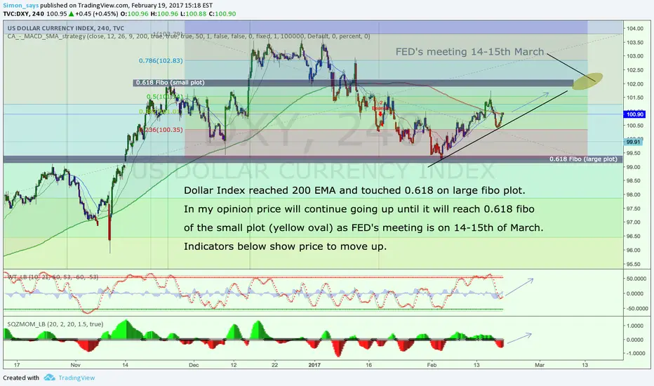
Accuracy is not celebrated. It's expected!My last plot on DXY was published over one month ago was very accurate:
Update is visible on the plot.
EUR/USD chartpack - technicals & trading setupEUR/USD hammer pattern hammers rallies but shooting star restrained below DMAs, bears resume in major downtrend:
The hammer pattern occurred at 1.0599 levels and evidences price spikes above 7DMAs but restrain below 21DMA, for now again the same pattern is occurred at 1.0557 levels subsequently, we’ve seen the evidences of bull swings but restraining again at 7DMAs. Thereby, we can foresee the weakness in this pair on repetitive struggle at DMAs with bearish DMA crossover to bring in more slumps (daily charts).
Shooting star patterns occurred even at 1.1088 and 1.1575 levels on monthly ploting which is well below 21EMAs.
As the interim bulls seem to have exhausted at 7-EMA, we call for more slumps rather than bulls extending rallies upto channel resistance.
EURUSD major trend has been sliding through slopping channel (monthly terms). While last two days’ price upswings ever since bulls took support at 1.0513 levels have now begun losing traction (see daily charts).
Although EURUSD spiked from channel support, it has been struggling to bounce further above 21SMA levels on monthly; as a result, we’ve seen shooting star and doji pattern candles are occurred at 1.1088 and 1.1157 levels where stiff channel resistance is observed repetitively.
The shooting star pattern even on daily plotting evidences price dips below DMAs.
To substantiate this bearish stance, 21DMA crosses over 7DMA which is a bearish DMA crossover to bring in more slumps.
RSI on both daily as well as monthly terms indicates convincing strength in declining trend downward with its convergence to the prevailing price declines.
While stochastic curves have been indecisive but bearish bias at oversold zone (on both dailies and monthly terms).
MACD’s indicates indecisiveness on monthly terms but remains bearish biased on dailies.
It is wise to snap rallies to deploy fresh shorts as you see no traces of indications of the robust uptrend for now, instead trace out selling momentum on shorter term charts.
Trade tips:
Well, contemplating above technical reasoning, on speculative grounds we advise tunnel spreads which are binary forms of the bear put spreads.
At spot reference: 1.0555, this strategy is likely to fetch leveraged yields than spot FX and certain yields keeping upper strikes at 1.0591 (around 30-40 pips) and lower strikes at 1.0513 levels (around 40 pips on southwards).
