Rabbit Season...Duck Season...Rabbit Season...ALT SeasonCRYPTOCAP:OTHERS - It has been a slippery slope throughout the crypto market and players continue to get bled out, and for good reason. But is there hope for an alt season?
I've decided take a deeper dive into more technical charts to try and find more clues that could suggest when and if that time will come. So, I've found that the BTC.D/TOTAL ratio chart is quite handy, and is one of my favorite charts in determining alt coin strength. Similar to USDT.D, it moves in inverse correlation to the market but with less noise. It also has a unique ability to distinguish between market distribution and accumulation, being that when significant market accumulation starts, there are drops to the down side in the BTC.D/TOTAL chart. The chart also seems to mimic a Wyckoff Accumaltion schematic during market accumulation events, but only to eventually print to the down side when significant support is broke, instead of a traditional rally up after accumulation.
In the published chart, you can see where our last significant support structure was broke, only to be regained by the recent shenanigans. According to previous cycles, it is inside this area where alts start to dominate more of the market. I have OTHERS layered with the maroon line graph.
A snap shot of accumulation before the 2018 Bull Market top: As the major support structure is broken, it gets exciting for alts as OTHERS creates a new high. 👇👇👇
Taking a look at accumulation before the 2021 Bull Market top: The support structures show their significance as OTHERS prints rally's to the upside. 👇👇👇
So, now we have been bumping into that same area of support (Selling Climax Support) this cycle since August and printing a descending wedge, which is generally considered a cause building event for a bullish move.It's possible that a retest of the upper supply line is in the MM playbook. It's also possible that there could be resistance up higher or further down. On a smaller time frame, there is a potential bullish pennant printing, we wouldn't know until or if a higher low is printed.
With this analysis in mind, we are close to a critical moment in crypto where the bulls have historically showed strength and reclaimed dominance in the market. It could be weeks or months, but this TA suggests that the moment is soon to come.
Good Luck Traders!
-Not Financial Advice-
Search in ideas for "RATIO CHART"

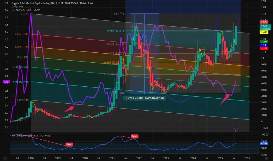
$TOTAL2 vs BTC shows momentum with $TOTAL2 nearing ATHWhere is the Alt season? CRYPTOCAP:TOTAL2 is the best indicator of the Altcoin rally which does not include CRYPTOCAP:BTC and Stablecoins. CRYPTOCAP:TOTAL2 peaked at 1.7 T $ in the last cycle. In this cycle we are very close to our target. But this outperformance can only happen if CRYPTOCAP:ETH breaks out above its previous cycle highs. Please visit my view on CRYPTOCAP:ETH and CRYPTOCAP:ETH.D in this blog.
CRYPTOCAP:BTC.D : Cycle tops are in. CRYPTOCAP:ETH.D : Bounce form the all-time lows for CRYPTOCAP:BTC.D by RabishankarBiswal — TradingView
Our target is 9K on $ETH. So if this happens then the CRYPTOCAP:TOTAL2 will break out of the Cup and handle formation we have been tracking since months on $TOTAL2. As the CRYPTOCAP:TOTAL2 is trying to break out of its ATH the ratio of CRYPTOCAP:TOTAL2 vs CRYPTOCAP:BTC is also making a reversal towards the upside. In the chart below I tried an unorthodox method to plot the Fib retracement levels of a downward slopping pattern joining the top of the lower lows in the ratio charts. Here we can clearly see that in this cycle it bottomed out at somewhere near to 0.786 level. Just extrapolating and following the pattern of lower lows and lower levels on the Fib retracement level I can predict to a certain degree of confidence that the ratio of CRYPTOCAP:TOTAL2 vs BTC can top out at 1.1 during this cycle. And the CRYPTOCAP:TOTAL2 might top out @ 2.6 T – 2.7 T $ which indicates a 60% rally to the next Fib retracement level on $TOTAL2.
Verdict : CRYPTOCAP:TOTAL2 vs BTC chart is on rally mode. CRYPTOCAP:TOTAL2 target remains 2.7 T $ and CRYPTOCAP:TOTAL2 vs BTC ratio target 1.1.
Gold | Long Bias | VWAP Zone | (June 8, 2025)Gold | Long Bias | SPX & Silver Ratio Support + VWAP Zone | (June 8, 2025)
1️⃣ Insight Summary:
Gold is holding strong at a key value area high while the gold/SPX and silver/gold ratios suggest we're entering a new phase of consolidation before the next leg up. Despite some calling for downside, the technicals point toward accumulation and a potential breakout.
2️⃣ Trade Parameters:
Bias: Long
Entry Zone: Current VWAP + value area high support zone (around $3,235)
Stop Loss: Slightly below the VWAP consolidation range
TP1: $3,316
TP2: $3,400 (final target for this wave)
3️⃣ Key Notes:
✅ Support Zone: We’re bouncing off a strong area of confluence — VWAP + value area high. This has held well and suggests accumulation rather than distribution.
📊 Gold/SPX Ratio: Shows gold is holding or gaining relative to equities — signaling investors are hedging risk and positioning for possible volatility or correction in SPX.
⚖️ Silver/Gold Ratio: Points to silver undervaluation — and historically, when this ratio tightens, silver often outperforms in the later phases of a gold rally.
📉 Expectations: A slight dip or fakeout to trap shorts is still possible before continuation. Watch closely for how price behaves during this potential flush.
💡 Alternative Play: You mentioned it — silver could be the better value buy in this scenario. Same macro thesis, but higher upside % if the ratio rebalances.
4️⃣ Follow-Up:
Monitoring for confirmation of support at VWAP and watching both ratio charts. If silver continues to strengthen relative to gold, I may scale more into silver positions over gold.
Please LIKE 👍, FOLLOW ✅, SHARE 🙌 and COMMENT ✍ if you enjoy this idea! Also share your ideas and charts in the comments section below! This is best way to keep it relevant, support us, keep the content here free and allow the idea to reach as many people as possible.
Disclaimer: This is not financial advice. Always conduct your own research. This content may include enhancements made using AI.

Total2 Market Cap vs BTC Market CapToday we are looking at ratio charts. We plot the ratio of Total 2 Market Cap (Total Crypto Market Cap excluding BTC) to BTC Market CAP. This ratio chart is making new lower highs this BTC Halving cycle. There seems to be no bounce from the lows and Alt coin season seems to be elusive. As we move towards the end of the halving cycle there is very little time left for this Alt season. To reach the previous cycle highs of 1.5 in the chart the Alt Coins have to more than double from here and BTC must remain at this price for the rest of the cycle. For this the total Crypto market cap must reach almost 5 trillion USD, which remains unlikely. A better estimate will be the ratio of Total 2 Market Cap vs BTC Market Cap ratio reaches 1.09 which will be 0.618 Fib retracement level. This 0.618 fib retracement repeats in many instances. The same is true for BTC.D. What do you think?

The TradingView Show: Charting Big Moves with TradeStationJoin us for our recurring series as we breakdown in great detail the latest market movements, emerging trends, and critical financial news with @TradeStation. This monthly show is meticulously crafted to keep traders informed about the developments that truly impact the markets. Explore our comprehensive video library on our profile—just scroll back to catch up on past episodes. And remember to follow our @TradingView account to ensure you never miss a show.
For our new traders, this episode will provide actionable insights, educational resources on charting, and a robust introduction to market dynamics.
In this episode, we’ll cover the following topics:
- Top-down analysis for informed decision-making
- Essential crude oil charts and their implications for energy stocks
- Insights into small-cap trends
- A deep dive into semiconductor stocks like ASML and NVDA
- The recent breakout in the banking sector
- An analysis of ratio charts for strategic positioning
- And much more!
Our show goes live each month, welcoming traders and investors of all levels to join the discussion, ask questions, and gain insights into what’s moving the markets. We encourage you to engage—leave comments, share your thoughts, and spread the word with your friends.
This show is sponsored by TradeStation. TradeStation pursues a singular vision to offer the ultimate online trading platform and services for self-directed traders and investors across the equities, equity index options, futures, and futures options markets. Equities, equities options, and commodity futures products and services are offered by TradeStation Securities Inc., member NYSE, FINRA, CME, and SIPC.
See below:
www.tradestation.com
www.tradestation.com
Thank you for tuning in!

Bitcoin vs Gold chart is one for the charting textbooksClassical charting principles has worked wonderful on the BTC/Gold ratio chart. Currently at 26.x, a decline to as low as 16.x could occur without disrupting a bullish interpretation of the chart.

TSI Market Timer V4.0TSI Market Timer Version 4.0
This indicator is probably one of the best, if not the best indicator out there on the market today. A bold claim. I say that because this indicator has been 10 years, at least, in the making.
I started using TradingView in 2015 when it was $5 to use. It was wonderful. And you could make your own indicators. I would copy and reuse many of the indicators I found.
This tinkering with indicators and theories would last until the present day. I find the market is interesting and there are many new things to learn and so you can make nearly endless indicators.
About This Indicator:
The TSI Market Timer Version 4.0. First, a little theory. I have found that, in practice, if you take any price or indicator (like Acc/Dist) or VIX or even ratio charts like (HIGN/LOWN , a new highs new lows ratio) and you apply the True Strength Indicator (TSI)... that you can plot everything on one charting window. I have extensively tested this out over the years.
There is a concept in math and statistics called standardization. One common way this is used in trading is the z-score. You may have heard of the Altman Z-score.
In this indicator, I have combined several useful signals into one indicator. These are plotted on an auto-scaled plot with a zero line.
Here is an explanation of the lines and their colors.
- White lines : These are TSI price lines using two variations in the calculations. One is done using a SMA or simple moving average, the other is done using an exponential moving average. I have even used the weighted moving average. However, I find the SMA/EMA to be the most "error free" version.
If the EMA white line (price) is above the SMA white line, then it is bullish because the most recent price changes are given more weighting with the EMA version. Thus, if EMA white line > SMA white line then it will fill green and if it is less than the SMA version, it will fill with red color.
- Lime Green fill : The lime green color on the EMA/SMA white line combo means a new high was touched. This is very useful if you are a William O'Neal Swing Trader as I am. Dr. Wish speaks of the Green Line Breaks which represent new highs and their importance. See www.wishingwealthblog.com
- Orange/Gold Line : The Orange Line is the TSI calculation of the DXY (or US Dollar Index). This is something that I noticed that no one else talks about.
The US Dollar Index used on the TSI chart is really useful since it moves in direct opposition to the price of many indices.
My theory on this is due to the fact that the US Dollar is the "other side of the trade". Thus, if you buy several billion dollars worth of a stock, the US Dollar Index goes down and when you sell the shares back, the US Dollar Index goes back up.
Thus, it is tied into borrowing, leverage, borrowing costs, interest rates and similar things.
It has a similar relationship to stocks as oil does to airlines. When USOIL is up, AAL or DAL stocks are often down.
The leveraging of stock purchases explains why the stock market and the US Dollar work in contrarian directions.
I don't know why others have not seen this. It is probably due to the fact that the DXY is a big number and the changes are small and thus it has scaling issues with other forms of analysis. In other words, if you try to evaluate it in other ways, it does not scale on the charting and thus, traders/analysts would dismiss it.
Purple Lines : Comparison Indexes
Dark Purple Line: TSI Comparison line. Default is VIX line. The Vix Index with the TSI calculation applied.
Light purple/ lavendar line: This is an index such as the QQQ, which is used as the default.
Both of the purple lines are customizable.
Centerline: Accumulation-Distribution (mini):
Lastly, we have the centerline which is a smaller version of the light blue line; the Accumulation/Distribution Line. In this case, I wanted to show it as a kind of "money flow". This is a mini-version of the AD line. You can adjust the size using the zoom % on the indicator settings tab. The default is zoomed out 10%.
In addition, you can toggle the red/green fills of the stock/DXY lines and the stock/index lines.
Cheers!

SPY Analysis (November)This is an analysis of the S&P 500 ETF ( SPY ) for November 2022.
Overview
The S&P 500 remains in a downtrend. While price bounced off of the 200-week moving average, there is a significant amount of overhead resistance. There has not yet been full backwardation in the VIX term structure that could lend credibility to the idea that a cycle low has been achieved. Cycle lows typically do not occur until after interest rates begin to decline. Therefore, so long as the Federal Reserve continues to raise interest rates, which reduces the supply of money, it is unlikely that the stock market can create new all-time highs.
The yield curve has inverted to an extreme degree. A yield curve inversion reflects a contraction in the credit market. Since credit is the main driver of the money supply and economic activity, an inverted yield curve is a warning sign of future economic decline. As the unemployment rate rises and corporate earnings decline, the stock market is likely to face a prolonged period of headwinds. Due to persistent supply issues in a deglobalizing world, commodity inflation is likely to persist even as demand cools, thus creating a difficult situation whereby, for the first time in a half-century, central banks' ability to increase the money supply to stimulate the economy is substantially limited.
The global economy is likely entering into a new supercycle where interest rates remain elevated or increase over the long term. This stagflationary environment is likely to stunt the S&P 500's growth prospects for the long term. Companies with negative cash flow and no pathway to profitability are likely to be severely affected. In the worst-case scenario, commodity hyperinflation, debt crises, and a monetary crisis are all possible in the years ahead.
Nonetheless, despite deteriorating macroeconomic conditions, plenty of great investment opportunities abound. Bullish post-election seasonality may carry the entire U.S. stock market higher, especially as market participants perceive a pivot in monetary policy. Overnight repo action hint that the Federal Reserve may have already stopped draining liquidity out of the banking system. As the world transitions to sustainable energy, companies that invest in sustainable infrastructure are likely to move substantially higher. Emerging markets, especially India and Latin America, are likely to be beneficiaries of flaring tensions between superpowers. It is during market turmoil that well-planned, risk-managed investments can prove most lucrative in the long term. Market bottoms form when all market participants become bearish and no sellers are left.
Quarterly Expected Move
There is a 68% chance that SPX will close the year within this price range.
High price: 4047
Low price: 3125
For those who do not already know, the quarterly expected move is the predicted range within which price is expected to remain at the close of the current quarter (3-month period). It is calculated using the implied volatility from the asset's options chain after the close of the prior quarter but before the market opens for the current quarter. For more information on how to calculate these values, please see the link at the bottom of this post.
Volatility & Seasonality
As noted above, there has not yet been complete VIX term structure backwardation. VIX term structure backwardation reflects that the market is pricing in decreasing volatility in the future. The VIX term structure usually goes into complete backwardation at cycle bottoms, as this structure reflects the type of capitulation that major stock market bottoms typically exhibit.
The VIX term structure currently shows that the market believes that higher volatility is to come (in 2023).
Fibonacci Levels
On the daily chart, price bounced at the 50% retracement level (Fibonacci levels drawn from the bottom in October to the most recent high on November 1st). If price can hold the 50% retracement level this shows relative bullishness.
Price also continues to cluster around the 3rd Fibonacci spiral that I discussed in my prior posts (see links to related ideas below).
Regression Channel
Regression simply refers to the idea that price tends to revert back (or regress) to its mean for a given timeframe. Regression channels can help us identify which trend is governing price action. These channels can give insight into trend reversals.
Since the start of 2022, the daily regression channel has been downsloping.
Price has recently bounced off the mean, despite downward oscillator momentum. This reflects bullishness.
Weekly Chart
In the below weekly chart, we can see the EMA ribbon has completely inverted. The EMA ribbon is a collection of exponential moving averages that act as resistance when price reaches it from below and support when price reaches it from above.
The last time the EMA ribbon completely inverted was during the Great Recession.
In general, the farther the S&P 500 falls, the wider the EMA ribbon will get. The wider the EMA ribbon gets, the harder it will be for price to pierce the ribbon and break out to the upside. The significance of this is that a wide and inverted EMA ribbon on the weekly chart makes a sharp V-shaped recovery less likely. This is because when the EMA ribbon is wide, each moving average will individually pose a challenge to price action more so than if all the moving averages are converged at nearly the same level.
Although the current situation differs in many ways from the Great Recession. Look below at how similar the weekly charts appear.
Another chart that has me concerned about a potential capitulation event is the weekly chart for the tech short derivative chart (SQQQ). As many of you know, when the price of tech stocks in the Nasdaq 100 ETF (QQQ) moves down, SQQQ moves up. SQQQ is an important chart to consider because it reflects the extent to which retail traders are bearish on tech stocks.
Right now, SQQQ's chart is particularly precarious and primed for a capitulation event because price fell to then bounced off of converged moving averages.
If we zoom out to view the entire price history of SQQQ we can see that its price rarely rises above the weekly EMA ribbon except during capitulation events, thus indicating that we are dealing with unprecedented bearishness of interest-rate-sensitive tech stocks.
For the tech bulls to prevail, SQQQ's price must fall below the EMA ribbon. Whereas if a capitulation event occurs, the Nasdaq 100 stocks can experience a rapid and significant decline back down to their pre-pandemic highs, as shown below.
This could mean that as a ratio to the money supply, the Nasdaq 100 goes all the way back to the March 2020 bottom, thereby wiping out all the wealth that investing in tech stocks created since the pandemic began.
To see why the money supply can be used in this manner, you can check out my post here:
Stage of the Economic Cycle
Since the 10Y/2Y yield curve remains inverted we are in the late stage of an economic cycle.
Below is a chart of how each sector typically performs during this stage.
Credit: Fidelity Investments
We are most likely in Stage 6 of the economic cycle as shown below because stock, bonds, and commodities have all been declining to some degree in the past several months and because the yield curve is inverted. Once the yield curve inverts, economic contraction will subsequently occur. Although the general trend of all assets is down during Stage 6 there can still be rallies before contraction takes hold.
Credit: StockCharts.com
Yearly Chart
When analyzed on the yearly chart, the S&P 500's current price action looks analogous to the Early 2000s Recession, as shown below.
Following the Early 2000s recession, it took over 12 years for the stock market to sustain new all-time highs. Although anything is possible, unfortunately the current situation is looking similar.
Bonds
This chart is a ratio of the S&P 500 (SPX) relative to the price of iShares 20 Plus Year Treasury Bond ETF (TLT). The regression channel gives us a very interesting piece of insight. It could suggest that the S&P 500 is nowhere near its bottom yet.
Since TLT's price drops when bond yields go up, this ratio chart suggests that for the current yield on risk-free long-dated government bonds, the S&P 500 could be way overpriced still. The higher the yields on government bonds rise, the more likely it is that capital will flow out of the stock market and into bonds. As shown below, the higher timeframe oscillators suggest this may be the case.
Yield Curve Inversion
The current yield curve inversion (as measured as a ratio between the 10-year vs. 2-year U.S. Treasuries) is the most extreme on record. This inversion is flashing a major recession warning.
Emerging Markets
Here's one investment idea that always works...
Please leave a comment if you find an error in my analysis above or if you'd otherwise like to share your thoughts. Thank you.
If you'd like to plot the weekly and daily expected moves for SPY on your chart, try the indicator "SPY Expected Move by VIX", which is calculated from the VIX rather than from the implied volatility of the options chain. The quarterly expected moves that I've posted above were calculated using options chain data. If you'd like to learn how to calculate the expected move yourself, this video can help: www.youtube.com

Utilities Are Sending Warning SignsThe chart above is a weekly chart of the entire price history of the PHLX Utility Sector (UTY). (The PHLX part of the name is just an historical reference to the Philadelphia Stock Exchange, which is now part of the Nasdaq.)
I chose this specific ticker over other utility tickers like XLU or VPU because it provides more historical data and therefore a more powerful statistical analysis.
The channel that you see is a regression channel. A regression channel shows how far above or below the mean price is currently trading. For more details about this channel, you can read the statistics note at the end of this post.
Here are some warning signs that this chart is showing:
1. Utilities are outperforming the broader market. See the chart below.
In the above chart, you can see that the utility sector ETF (XLU) just posted a new all-time high this past Friday. Utilities typically outperform the broader market in the late phase of the business cycle right before (and during) a recession. See below.
Credit: Fidelity Investments
In the main chart above (reposted below) we see that in 2022 price hit the 2nd standard deviation above the mean for the first time since 2007. Price is currently continuing to move higher and it is very possible that it can overthrow the 2nd standard deviation again. This is sending a warning sign that investors are shifting money into utilities because they believe that we are in the end stage of the economic cycle.
2. Utilities are ripping higher at the same time that tech is ripping higher. This is another warning sign. See below chart.
This is somewhat of a nuanced point: Although tech and utilities are not necessarily negatively correlated and can both rise at the same time, they rarely both outperform the broader market (S&P 500) at the same time as they are doing now.
To get to the bottom of what's going on, we should analyze a ratio chart between the two assets. See the chart below.
This chart suggests that tech (QQQ) is rallying because it is testing resistance levels. Tech's performance relative to utilities has fallen below the monthly exponential moving averages (known as the EMA ribbon). It has likely become trapped below the EMA ribbon as it did in 2000. We can be fairly safe in making this conclusion because of the Ichimoku Cloud is forming an ominous coverage (resistance) on the weekly ratio chart similar to 2000 {for this I used the Nasdaq (IXIC) and the PHLX Utility Sector (UTY) for the comparison only because they have enough historical data to form the Ichimoku Cloud for 2000}.
This is a warning sign that tech's rally is merely a bear market rally (or a rally in which resistance levels are retested but price fails to break through).
3. When I analyze utilities relative to the S&P 500 on the yearly chart two additional warning signs appear. See chart below.
First, the yearly stochastic RSI shows that we approaching full oscillation down. The K line has reached oversold territory and has already begun to move up toward the D line. This could mean that utilities are gearing up to outperform the broader market for years to come. Of note, since this a relative chart, it does not necessarily mean that the price in utilities will increase over the period of outperformance, it may merely decline by less than the S&P 500 if both are falling.
Second, the yearly candlesticks fully retraced to the low seen in 1999, right before the Dotcom Bubble burst. Although the SPX can squeeze out one last period of outperformance (one last bull run), the chart is sending a warning sign that this period of outperformance may be coming to an end. Further, the fact these two factors are coming together right as utility prices reach their 2nd standard deviation above the mean, in my opinion, presents a warning of what's to come for the broader market. So much confirmation is quite ominous.
4. Although, utilities are sending a signal that they may potentially outperform the broader market for years to come. When you observe the actual charts of utility components (companies that comprise the utility index), some of the charts are also extremely overbought on the highest timeframes and vulnerable to collapse, or at best stagnation.
Take for example the utility company Next Era Energy (NEE), shown below.
The regression channel in the chart above shows that, during the era of quantitative easing, NEE's price soared over the years to the highest levels that price can typically achieve from a probabilistic standpoint.
If some utility companies are so over-extended to the upside and are vulnerable to collapse or stagnation, then even utilities may fail to serve as a safe haven if the stock market collapses. This is reflective that in the face of quantitative tightening all risk assets are vulnerable to major declines.
My thoughts on how to trade this (not a recommendation): Personally, I'm ambivalent about entering a long position in utilities. Although they may outperform the broader market, since the price is already near the 2nd standard deviation above the mean, and at least some utility components are way overextended, utilities do not present an ideal risk-to-reward trade set up. Nonetheless, if I do end up taking a position in utilities, I will definitely use a trailing stop loss on my position. I see a better option in U.S. treasuries (e.g. TLT). Treasury rates typically go down, and therefore prices go up, during recessions. From a price regression perspective, treasuries are trading at historical lows, and therefore the upside potential is much better. I plan to accumulate treasuries when they reach their terminal rate again or after the weekly chart consolidates, whichever comes first.
With that said, not even trading treasuries is risk-free in this unprecedented time of quantitative tightening and persistently high inflation. If inflation persists, the yields on the 10-year U.S. treasuries may need to rise dramatically higher to definitively squash it. The yearly stochastic RSI for treasuries is providing a tailwind for higher yields over the years. This in turn could bring down the price of treasuries, thereby making not even treasuries fully safe in this new supercycle characterized by persistent inflation and slowing real GDP growth (i.e. stagflation).
Counterintuitively, it's a great time to be a trader as profit will likely only be made by those who constantly shift money into outperforming assets dynamically using charts and technical analysis.
Statistics note: The upper and lower channel lines are 2 standard deviations above and below the mean, respectively. A total of 1,821 data points (total amount of weekly candles) formed this channel. The Pearson score is .95676. This regression line is log-based. Although the data may not be normally distributed, I have found that these regression channels are nonetheless helpful in determining what's more likely than not. The channel lines are not drawn by me, they are automatically generated by the indicator based on the data points, so there is no bias in how they are drawn. I simply apply log-linear regression to the entire price history. This channel is different than a price channel in that the lines are not exact points of resistance or support. Price can easily overthrow or underthrow the channel lines and yet the channel is still completely valid. The channel merely represents probability which helps me base my trades. The channel is not static and changes dynamically with price action, though it becomes more and more static with the introduction of more and more data, which is why I only use regression channels on assets with a lot of data points. Finally, I am not a statistician and do not intend to hold myself out as an expert on statistical analysis.
Additional note: Some of my prior posts back in May and June called for bullishness in tech stocks. Those posts were for the intermediate term (months). Although I saw bullishness for tech in the intermediate term then, in the long term the picture is quite bearish.

Is The Bear Making You Sick? Time To Get Right With Healthcare!Bear markets, economic slow downs, recessions, inflation, the Fed, Jerome Powel, etc... It's enough to make anyone feel sick. Well, step right into the Doctors office because I have the cure for what is making you ill. But before I start writing prescriptions, we need to apply a diagnosis. First let us review the causes:
Soaring Commodities.
Crashing Growth.
Incoming Recession.
As this bug works its way through your system its going to manifest itself with several symptoms. Currently you're experiencing the following:
Inflation.
Bear Market.
Rising Rates.
As your natural immune system fights this off, you're going to experience the following side effects:
Deflation.
Decreased Earnings.
Falling Rates.
None of this is going to make you feel any better however. That's where the Doctor comes in. Allow me to explain. As the economy slows down we're going to experience cyclicals such as Semi's continuing their weakness and the Commodities will be rolling over. But the rising rates will crimp economic growth which will weaken earnings and put pressure on valuations. Eventually the FED will be forced to slow or stop their rate raising program as the economy grinds to a halt. This will hurt investors looking for yield. Not a great scenario for stocks. What's a sick investor to do?
You need alpha, yield, and protection from an economic slowdown. There's only one sector that can offer all three and that is Healthcare.
Healthcare is relatively resistant to any slow down in the economy, offers some yield in $XLV and some alpha in $XBI.
Both charts are ratio charts comparing the relative strength of Healthcare vs Semi's and Commodities.
The top chart is a monthly candle chart of $XLV the S&P Healthcare SPDR ETF vs $DBC The Broad Commodity ETF. The ratio rises when $XLV is out performing and falls when its under performing. As you can see the ratio is sitting right on an area of support and a hammer candle has formed after a protracted period of under performance. Implications are for a reversal that favors $XLV.
The bottom chart is a weekly line chart of $XBI the S&P Biotech ETF vs $SOXX the Philly Semiconductor ETF. Just like the above chart, the ratio rises as $XBI out performs and falls when it under performs. Just recently $XBI has reversed the trend of under performance and broke out through the downward trend line. The trend favors further out performance from $XBI.
I hereby prescribe to you the following pairs trades:
Long $XLV and Short $DBC.
Long $XBI and Short $SOXX.
Please start the prescription as soon as you can have it filled and keep the trade on for the rest of the year until January 1st 2023. Come back to see me for a follow up visit. Please make your appointment ahead of time as I book up fast.
I hope you feel better soon.
Sincerely, your Doctor.

Growth vs. Value: Skating to Where the Puck Will BeHockey legend Wayne Gretsky famously said: "Skate to where the puck is going to be, not where it has been." This sometimes applies in investing and trading.
Towards what object have investors been skating, figuratively speaking?
Currently, financial media, fund managers, and commentators have been emphasizing the opportunities in value over growth for several months. And for good reason: Energy, a value / cyclical sector unloved for about a decade, has outperformed every other sector this year by a huge margin. It has risen by approximately 20.5% since January 1, 2022. Even it's uptrend channel could not contain it (although it looks to be consolidating at the moment or perhaps mean-reverting).
Increasingly, market participants have been "skating" towards value areas and away from growth for over a year now, as anyone who has been burned by long trades in tech / disruptive innovation knows. For example, a spread chart (also called a ratio chart) of ARKK/SPY shows just how dramatically growth has struggled. ARKK is a well-known US ETF containing high-beta stocks typically categorized as disruptive-innovation stocks, i.e., high growth names. This chart evidences just how much growth has struggled vs. the S&P 500. Notice, though, how this spread chart shows how close to major, long-term support the ratio has moved.
Examples abound of high-growth names having been crushed in powerful bear markets in those names. Some of them are even top names with innovative products and services and an impressive record of earnings / sales growth: Square ( NYSE:SQ ) has declined about -68% from all-time highs, Upstart ( NASDAQ:UPST ) fell about -81% from its high to its low in late January 2022, and ( Roku ) dropped about 78% from its peaks. Even large cap tech not gone unscathed: Facebook NASDAQ:FB suffered a nearly -50% decline after a huge earnings / guidance disappointment. But in general, large-cap tech has been the exception in growth until the selloff this year. While growth / tech in general has struggled for months, large-cap tech names such as GOOGL, AAPL, MSFT, and NVDA have outperformed. Even AMZN's sideways move for about a year should be considered outperformance relative to other high-growth names as shown by the ARKK chart above: see the chart below, which is a relative chart of AMZN vs. ARKK, revealing that even with AMZN's lengthy sideways move, it has dramatically outperformed growth / tech names more generally.
Markets are in constant flux. So often, just when the little people (retail traders like me) take notice of a powerful new trend or outperformance, it ends. So I'm trying to watch for where markets are moving rather than focusing on where they are.
In short, is growth bottoming out relative to value? Here are a few charts to consider.
1. The main weekly chart above (also copied below) is a spread chart showing the ratio of NASDAQ:IJT (small-cap growth) vs. small cap value. Notice how close to major long-term up trendline support the ratio has moved. And the weekly ratio is also right at support at March 2021 and May-June 2021 lows. The RSI for this relative chart also shows that it's oversold to 33.65, a level that only appears in multi-month (and often multi-year) intervals. Even the two RSI lows in 1H 2021 occurred 2 months apart, but this is the exception looking back longer term.
2. Large-cap growth is right at support at a long-term uptrend line. See the weekly spread chart of the ratio between XLK/SPY. AMEX:XLK is a US ETF that is heavily weighted towards large-cap tech.
3. Equal-weighted growth vs. equal-weighted tech RYG/RPV is also very close to long-term upward trendline support.
4. Interest rates are nearing long-term downtrend channel resistance—at the upper line (the actual downtrend line). Interest rates have soared powerfully since mid-2020, and the Federal Reserve has hawkishly signaled coming rate hikes, and market participants have behaved as though rates will keep on going to the moon—by selling tech / growth, which struggle when rates rise b/c of discounting of future cash flows used to value such names. The viewpoint that rates could turn around in the near future seems radical, contrarian and unreasonable. But consider this chart below. Could rates turn around just after a large move just after millions of market participants have been flocking towards value names that outperform in rising-rate environments?
Some well-known experts have already taken this view. www.cnbc.com
It seems priced into the market right now that the 10-year yield could continue rising, that the interest rates could even breakout higher above long-term downtrend resistance, and that the Fed is likely behind the curve in controlling inflation. It seems consensus that value could continue to outperform long-term, and that growth could break even long-term support levels and continue to plummet. But if this is priced into the market, shouldn't one consider buying what's already priced in? Especially because maybe what is priced into the market will not last. Thinking about where the "puck is going to be" may suggest that tech / growth is making a multi-month or multi-year low or that interest rates are going to pullback in the next few months, allowing tech to thrive again.

MQP IRL CONTINUOUS DEMO 12P - EXIT STRATEGY HEADER - It's going to be tomorrow if early 3/2, 3/3 is still a tad bit early, 3/4 in the morning most likely, 3/7 if late, 3/8 if a drag. That covers all bases. The yellow highlight is most likely path. Blue highlight is bc post 3/3 still subject to change. PLEASE LIKE FOR SUPPORT.
IRL RATIOS: Chart above is ratio 9/16 for 30-min bar (zoom-able for 15min, 30min, 1h, 2H , 4H, 8H). If you have custom bars, use ratio 9/17 for 32-min bar (zoom-able for 1-, 2-, 4-, 8-, 16- 32, 64-, and 128-min bars; have not tested for 256- and so on...)
DIRECTIONS - Upload IRL from my scripts page because it can NOT be searched for. Add to your favorites, and then you can add it to your chart. Click settings icon, change ratio to stated ratio above and turn on Regressive Bands (if you want). Even though directions for IRL are only 60% completed (they are in the comments for that script), that's more than enough for you to apply it usefully. Please read directions first. In my charts, I try to match extension regression lines to its correct colors along with D+# labels. When I don't have time for that, D+# LABELS ALWAYS TAKE PRECEDENT.
SUMMARY - Please read last several posts if you are new for background. Post 12O, the most recent, has CRITICAL DETAILS posted just today. To sum it up, time to exit is next 4 trading days, let's get it right.
DETAILS - Broke up like we wanted, now let's finish like a boss. First of all, ALL SIGNS POINT TO TOMORROW BEING "A" HIGH, NOT "THE" HIGH. The only exception if we can tag 2030+ THEN TAKE THE MONEY AND WAIT FOR A TACTICAL SHORT AT 2060+/-10. Otherwise, my strategy is to EXIT THE FIRST RED BOX TOMORROW MORNING. WHY? There are two fed speakers in the morning after ADP and POWELL talks to congress at 10 AM ET. That's too much room for bad things to happen. Plus we've been long since under 1800, 2000 exit cannot be bad. If price can't clear 2030 (especially if it's 2010 OR LESS), the pullback should be 1960, THIS IS LIKELY TO BE A STRONG TACTICAL LONG TO 2070. I can't figure out when THE TOP is right now. It's looking like 3/03 PM TO 3/08 AM, so Thursday night to NEXT Tuesday morning. ANY THING ABOVE 2060 WILL BE EXCELLENT TACTICAL SHORT FOR 150 PTS IN 5 TRADING DAYS OR LESS.
NOTES - Good luck with this. Hope I've made it somewhat worthwhile of your time.

Metals & Miners Leading S&PThe metals and mining industry is performing solidly on both an absolute and relative basis.
This chart depicts the trend in relative strength of the S&P Metals & Mining ETF against the S&P 500 benchmark index. $XME/SPY - the relative ratio chart is showing five strong weeks of relative gains.
Interestingly, the ratio is above prior resistance on strong blue "Go" trend conditions. And, GoNoGo Oscillator has rallied positive after months of indecision at the zero-line on heavy volume.
Here's the checklist:
1) Trend is a "Go" (uptrend)
2) Momentum confirming price action
3) Volume confirming the positive momentum
Better Charts. Better Decisions. GoNoGo Charts

MQP 12L - ABOUT TIME MQP MAKE YOU REAL MONEY PART 6HEADER - If I could choose one moment in my life to bet on, it is one. I've made no secret that I've been all-in since February 1st. If you are still not in, it's not too late. This thing is not going to take a break until clear 2025 or higher.
IRL RATIOS: Chart above is ratio 9/16 for 30-min bar (zoom-able for 15min, 30min, 1h, 2H , 4H, 8H). If you have custom bars, use ratio 9/17 for 32-min bar (zoom-able for 1-, 2-, 4-, 8-, 16- 32, 64-, and 128-min bars; have not tested for 256- and so on...)
DIRECTIONS - Upload IRL from my scripts page because it can NOT be searched for. Add to your favorites, and then you can add it to your chart. Click settings icon, change ratio to stated ratio above and turn on Regressive Bands (if you want). Even though directions for IRL are only 60% completed (they are in the comments for that script), that's more than enough for you to apply it usefully. Please read directions first. In my charts, I try to match extension regression lines to its correct colors along with D+# labels. When I don't have time for that, D+# LABELS ALWAYS TAKE PRECEDENT.
SUMMARY - This is it. This is the moment. This is the time to be long gold.
DETAILS - This chart is focus on D10, D11, D12 and D13 which are 6-day, 3-day, 36H and 18H regressive curve waves. The highlighted path should nail this one like college freshman.

JNK/TLT and BTC plotI was watching a video by "Game of Trades" dated August 31, 2021. He went over a JNK/TLT chart. I HIGHLY recommend it! It was the first time I had ever seen this chart. The shape at the end caught my eye. I thought, hmm. That looks a bit like the BTC (BLX) correction pattern.
So I first drew a JNK/TLT chart then put the black tendency line at the JNK/TLT tops. Then I added BTC to the chart. Then I added the curved historical tendency lines to the BTC chart. Plus I added a blue 4 year cycle theory linear line to the BTC chart. I'm not a 4 year market cycle theory person, but I included it for those who are.
Black line (on BTC) - historical curved tendency line
Blue line (on BTC) - 4 year market cycle theory line
I added vertical solid lines on the JNK/TLT chart at ratio highs and lows and drew them up into the BTC chart. Vertical dotted lines indicate other significant pivot points in the JNK/TLT ratio chart.
JNK = SPDR Bloomberg Barclays High Yield BOND ETF
TLT = ISHARES 20+ Treasury Bond ETH
Vertical solid red lines - Ratio at a low
Vertical solid green lines - Ratio at a high
The idea is when the market is taking on risk, the JNK/TLT ratio goes up. When the market is decreasing risk seeking safety, the ratio goes down. And the chart is a plot of this ratio.
As I mentioned above, on the BTC (BLX) chart I put the black historical curved tendency lines. Plus I put the blue linear (4 year market cycle theory) line for those who believe in this. Why? I think the JNK/TLT line offers another way to help determine that the top is in for BTC. So, no matter what theory you hold to, you can test it as the market matures. Nobody wants to get caught wrong footed stubbornly holding to a target price (including myself) based on theories and tendency beliefs, whichever they may be.
**CONCLUSIONS**
**1)** BTC up/down tendency seems to trend with the JNK/TLT ratio. This makes sense. If a market is taking on risk, well that is good for crypto.
**2)** The JNK/TLT ratio tops, bottoms, and pivots sometimes correlate with the BTC chart, but only sometimes. There were some bullseyes at times.
**3)** The tendency line of the JNK/TLT ratio tops may offer another crypto top indicator. So keep an eye simultaneously to whatever belief you have for your BTC target price. If the JNK/TLT ratio touches the tendency line - watch out.

SILVER - The ShiningSilver intermediate cycle bottomed with gold on the 30th November.
Silver didn't have that serious decline at the end of the last intermediate cycle
like gold.
Notice that we were in a consolidation box for 4 months and today we broke out.
Is it too late to enter the party?
No. We are still early in this game and I think silver will run to 42 and maybe to 50 in the following 3-4 months.
I've already posted my thoughts regarding the XAUXAG ratio:
If you are looking for targets in silver I suggest to read the idea above .
If you are not in a position yet I would wait for a backtest of the consolidation box at 26.00$. If you already in a position I would increase the position size at 26$.
We have a lot of time in this trade before we have to worry about a top.
TSI is just turning up and RSI just reached the overbought territory.
RSI can stay overbought for a month or more just like last summer.
I will set this idea as a long idea as we broke out of the box but I would wait for a backtest at 26$ before entering.

XRP/BTC Update - Altcoin Season is ComingHey traders, today we're looking at XRP/BTC ratio chart. First off, it's pretty obvious that an altcoin season is underway. The Bitcoin dominance has peaked at around 72% and is having a hard time breaking back over support at 69. Meanwhile, all of the alts have slowly but surely been gaining satoshi value, and that isn't just going to reverse anytime soon.
Take a look at the 1st and 2nd wick on this chart, those wicks marked the absolute bottom of the market. It's delusional to think we're going back down there. XRP/BTC has also regained support of it's long term uptrend stending from ALL of the previous altcoin season run-ups.
The wedge I drew is basically just a resistance line at 3292 sats , confirmed uptrend from the 2nd wick. Just take a look at how the candlesticks interact with all of the lines I drew, trading really is just clockwork.
The big orange candle that wicked down below the long-term trendline, 3054 sat support, and the 3292 sat wedge is not something to take lightly. That is one of the craziest moves i've seen charting. XRP/BTC isn't going to dip farther than this, as of now it looks like its holding 3054 sats very well and consolidating.
Going into the month of November, we should continue to see accumulation around this region of 3054-3292 sats, until we inevitably break upwards.
XRP/BTC is a very easy altcoin to trade, its actually my favorite besides BAT and ZRX to make money. This is one of the most volatile altcoins with the most volume on all exchanges. I personally like Binance, just because of the simplicity. Like I could be on the toilet and make a trade directly from my phone using their app. If you live outside of the US, I suggest joining my signal group and creating a Binance account so you can make money with me.
NEW Trading Group: t.me
NEW Signal Group: t.me
Binance Sign-Up: www.binance.com
As always do your own research, I am not a financial advisor.

The Golden Ratio Multiplier - by Philip SwiftBy Philip Swift
Disclaimer: Nothing contained in this article should be considered as investment or trading advice.
As Bitcoin continues to progress on its adoption journey, we learn more about its growth trajectory.
Rather than Bitcoin price action behaving like a traditional stock market share price, we see it act more like a technology being adopted at an exponential rate.
This is because Bitcoin is a network being adopted by society, and because it is decentralised money with limited supply, its price is a direct representation of that adoption process.
There are a number of regression analysis tools and stock to flow ratio studies that are helping us to understand the direction of Bitcoin’s adoption curve.
The new tool outlined in this paper brings an alternative degree of precision to understanding Bitcoin’s price action over time. It will demonstrate that Bitcoin’s adoption is not only following a broad growth curve but appears to be following established mathematical structures.
In doing so, it also:
Accurately and consistently highlights intracycle highs and lows for Bitcoin’s price.
Picks out every market cycle top in Bitcoin’s history.
Forecasts when Bitcoin will top out in the coming market cycle.
To begin, we will use the 350 day moving average of Bitcoin’s price. It has historically been an important moving average because once price moves above it, a new bull run begins.
miro.medium.com
The new insight comes when we multiply the 350 day moving average (which we will refer to as the 350DMA) by specific numbers. Those mathematically important numbers are:
The Golden Ratio = 1.61803398875
Fibonacci Sequence = 1, 1, 2, 3, 5, 8, 13, 21…
You can use these hyperlinks if you need a refresher on the importance of the golden ratio or Fibonacci sequence in nature and mathematics. But we see them consistently throughout life whether it is in the pattern of how plants grow, the structure of hurricanes, or even trader behaviour in financial markets.
Building the cyclical layers
We will start with the Golden Ratio of 1.6 (rounded here to one decimal place).
If we take the 350DMA (orange line) and multiply its value by 1.6, we create a new line above it, the 350MA x 1.6 (green line).
We then discover in the chart below how this newly created green line has in fact acted as support and resistance throughout Bitcoin’s history, examples of which are highlighted by the arrows on the chart:
miro.medium.com
It is also worth noting that the 350DMA x 1.6 line acted as resistance in the parabolic price move from the Dec 2018 low. Rejecting price perfectly on the first touch and causing a $1,500 pullback before approaching it again and likely breaking through at the time of writing:
miro.medium.com
Things become more interesting when we then start to multiply the 350DMA by each number in the Fibonacci sequence: 1, 2, 3, 5, 8, 13, 21, etc.
Given that multiplying the 350DMA by 1 would not change its value, we start with the next number in the sequence, which is 2.
So we multiply the 350DMA by x2. Which is the red line in the chart below:
miro.medium.com
Again, the arrows highlight examples of where we see it act as a major level of support and resistance throughout Bitcoin’s history. As a trader or investor this, as well as the other multipliers, makes a potentially very useful short term take profit signal when price first reaches it.
The next number in the Fibonacci sequence is 3. So now we multiply the 350 day moving average by 3.
350DMA x 3 is the purple line in the chart below.
We see it acted as particularly strong resistance towards the upper stage of the 2017 bull market, with price unable to break above it on 5 separate occasions:
miro.medium.com
Using those three moving average lines (350DMA x 1.6, x2, x3) has allowed us to pick out almost every single intra-cycle price high in Bitcoin’s history.
The next numbers in the Fibonacci sequence are 5, 8, 13, and 21.
Remarkably, when we use these multiples of the 350 day moving average, they pick out each of Bitcoin’s market cycle tops going all the way back to the first price bubble in 2011. They are shown as dotted lines here:
miro.medium.com
350DMA x21 = 2011 top
350DMA x13 = 2013 top
350DMA x 8 = 2014 top
350DMA x5 = 2018 top
Practical application
As with any indicator, the Golden Ratio Multiplier should not be used in isolation, but it does offer a risk management opportunity. Using the previous cycle as an example, if one had bought the breakout at the 350DMA and then taken profit the first time price reached the x1.6, the x2, and the x3, buying back lower each time, that would have been a very successful investment strategy. One could then have sold the top of the market as price touched the 350DMA x5.
If Bitcoin’s market cycle tops continue to follow this declining Fibonacci sequence, then the next market cycle top will be when price hits the 350DMA x3 (purple line).
Why does price obey these levels?
We know that Bitcoin goes through multi-year market cycles which are driven by over-optimism and over-pessimism. The 350DMA appears to be particularly relevant to those market cycles as to date it has been the axis that the cycles have rotated on.
Given that market psychology (of over-optimism and over-pessimism) is a major factor driving these market cycles, it is plausible that part of the reason why Fibonacci multiples of the 350DMA are so important is due to how herd mentality responds to price action:
In many cases, it is believed that humans subconsciously seek out the golden ratio. For example, traders aren’t psychologically comfortable with excessively long trends. Chart analysis has a lot in common with nature, where things that are based on the golden section are beautiful and shapely and things that don’t contain it look ugly and seem suspicious and unnatural. This helps to explain why, when the distance from the golden section becomes excessively long, the feeling of an improperly long trend arises.
Understanding Fibonacci Numbers. Dima Vonko, Investopedia, 2019
Whatever the reason, the tool highlights the cyclical nature of Bitcoin adoption and the flattening of its growth trajectory on a log scale.
Bonus: picking market cycle tops to within 3 days
Using the x2 multiple of the 350 day moving average along with the 111 day moving average provides us with a different market cycle indicator.
When the 350DMA x2 crosses below the 111DMA, Bitcoin price peaks in its market cycle. Over the past three market cycles, this has been accurate to within three days of Bitcoin price topping out:
miro.medium.com
This will be something worth monitoring in the latter stages of the coming bull run.
It is also of interest to note what 350 / 111 equals:
350 / 111 = 3.153
Which is very close to Pi.
Pi = 3.142
It is, in fact, the closest we can get to Pi when dividing 350 by another whole number.
Conclusion
The Golden Ratio Multiplier will be a useful investment tool in this coming market cycle for identifying areas of take-profit as price approaches the multiplier levels of 350DMA x1.6, x2, and x3.
Assuming the Fibonacci sequence countdown continues to play out, the 350DMA x3 will signal the top of this coming market cycle.
The tool can also signal market tops when used alongside the 111DMA.
But arguably more powerful than these investment and trading benefits is the ability to demonstrate how Bitcoins adoption, and therefore our herd behaviour as humans, is following mathematical structures.
Via its price action, Bitcoin is offering us the opportunity to view free market adoption in real time, revealing how humans adopt at scale. Which is a beautifully humbling phenomenon to observe.
Thanks to Willy Woo for his assistance with the Golden Ratio chart layout aesthetic.
To use the live chart of the Golden Ratio Multiplier follow me on Twitter where there is a link to it in my bio. It is free to use and doesn’t require sharing any personal data. I’ll be sharing more tools via Twitter in the coming months.
All rights reserved Philip Swift
Article Link > HERE

Put Call Ratio/Volatility Skew CurveIn most mature markets, options can be a major indication on price direction, or at least the markets expectations of future market direction. One way of looking at this could be through the Call/Put Ratio. The ratio is a simple measure of how many call options are being traded relative to put options.
As you can see from the chart above (www.sk3w.co) the peak of this ratio was ~16 on 2/2/2019, with another peak on 12/6/2018 of ~9.5. When looking at these dates respectively on the BTC price chart below, these heavy Call buying days were precursors to a $800 rally over a 22-day period, and a $1,000 rally over an 8-day period. As you can see from the Call/Put Ratio chart, today the ratio is roughly around the average of 1.95.
Another good way of looking at options to get an indication on future price direction would be through the Volatility Smile or Volatile Skew. This skew will show the sentiment on the demand to buy or sell calls vs. puts. When a market has positive call skew, the calls will have a more expensive ‘implied vol’, and when the market has positive put skew, the puts will have the more expensive ‘implied vol’.
Below is the Volatility Skew Curve for March, June, and September BTC options. While analyzing this chart over the last week after this volatile price action, we have not seen a major shift one way or the other in regards to this skew. If BTC were to be exiting this BEAR market, we would expect to see Call Skew form within this chart. If you are of the opinion BTC will rally, then buying call volatility would be a smart play. If the $4,200 RESISTANCE that has formed in BTC breaks to the upside, we would expect calls to go bid and see call skew form in the chart.
As for now, through this analysis, we seem to be stuck in this $3,200-$4,200 range and therefore remain BEARISH. The ‘trend is our friend’, and will stick to this outlook until forced to do otherwise.
To see our full article with all charts and figures attached, please check out: medium.com

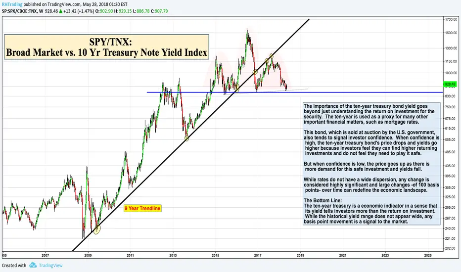
Charts That Make You Go Hmmm... (SPY/TNX)Thank you to all my followers that take the time to read this with me.
Some historical background on the importance of the 10 year Treasury Note Yield Index. (Hey, we all need to brush up on it from time to time)
This is a ratio chart of SPY/TNX with a 9 year trend. As is the case with most charts related to interest rates, it's pretty technically perfect.
I've always found this interesting because this is a market that is almost 100% Fundamentally driven, yet produces the cleanest technicals, but I digress.
I just stumbled across this ratio chart, as interest rates are increasingly on my radar. I think the chart is self-explanatory for the technicians out there.
Lastly, let's play 'Guess-That-Pattern' on the weekly 9-Year chart. Good luck to all.
Patterns forging Patterns // BIG IF=THEN ®4 eventual patterns for FX:USDJPY
The biggest game of "IF's"
AB=CD pattern:
target around 112
CYPHER:
Point B:
38.2% to 61.8% XA
Point C:
127% to 141% ext XA
Point D:
78.6% XC
Targets:
TP1 38.2% CD
TP2 61.8% CD
GARTLEY
Point B:
61.8% can not touch 78.6% XA
Point C:
38.2% to 88.6% AB
Point D:
78.6% XA
127% ext AB
Targets:
TP1 38.2% AD
TP2 61.8% AD
Check ratios:
Previous idea daily chart:
Safe trades;

Gartley&Crab Corp ® - Forging Pips since 1760 ;)IF=THEN ®
Notes on chart... for FX:AUDJPY
GARTLEY
Point B:
61.8% can not touch 78.6% XA
Point C:
38.2% to 88.6% AB
Point D:
78.6% XA
127% ext AB
Target:
TP1 38.2% AD
TP2 61.8% AD
--------------------------------------
CRAB
Point B:
38.2% to 61.8% XA
Point C:
38.2% to 88.6% AB
Point D:
161% ext XA
224% to 316% ext AB
Target:
TP1 61.8% CD
TP2 127% CD
Short @D
Ratios:
Check other AUD pairs (links below).
Safe trades;

Pound vs Gold and NZD: Time at mode analysis and ratio chartsAnalysis on chart.
We can see that there is potential pending upside in this ratio, as evidenced by Rgmov's intense uptrend signal and the EW count I could obtain for this leg, which shows an impulse top, but not a complete 5 wave advance.
I think this chart helps us devise the directional path for gold, nzdusd and gbpusd, as well as gbpnzd.
We might have a good opportunity to short the pound and go long gold but we will have to wait, since I think the decline we're seeing in the ratio is temporal, and will be followed by more upside.
As for gold, there's an incredibly bullish mood among most investors, and specially technical traders, who are calling bottoms everywhere, which makes me doubt that's the real case here.
A trader here posted a gold EW count which I subscribe with, AndyM, do check his stuff out, it's in related ideas.
I'll be exploiting the temporal gold strength to fade the NZD vs stronger currencies soon, and waiting for a clear sign of reversal before attempting long NZD or AUD strategies.
Cheers,
Ivan.
