AUD/NZD - KIWI IS STILL FIGHTING FITThis particular currency pair representing the two neighbouring economies with some similarities yet different dynamics in which one has larger dependence on mining resource and the other on dairy produce has been in very large sideways move in almost unrecognisable swings and patterns. This is so until you zoom out using larger time frame and look back with adequate historical price.
This massive sideways move since at least 1995 with very wide range which is easily seen using monthly time frame in my screencast chart Link: www.screencast.com
From general characteristics of the price action since February 2011, it appears that it is in 5 wave impulsive move to the downside. If this is correct then we could be close to completing (though it still has room to run) this larger sideways congestion with strong counter rally or new bullish cycle ensuing.
However, right now we had congestion during January - October 2014. Many who have posted their charts on this pair are interpreting this as beginning of the new bullish cycle to the upside. They seem to suggest that in addition to some price action analysis, they have taken into account fundamentals of two economies, interest differentials and large institutions positioning.
This is all far too complicated and beyond my ability to analyse and suspect other analyst attempting to do so too. So to resolve issue, I am proposing that you accept the premise, that the stronger economy in the main would likely have stronger currencies too. The one with the stronger economy would likely have stronger equity market out performing the weaker one.
From this supposition, consider:
the ratio chart of Australian Stock Index / Newzeland Stock Index. See the chart below ( ) . You will note that since 2011 we have Newzeland Equities out performing that of Australian. In addition it also appears to be in the process of completing a 5 wave decline which is possible in mid-stream ie wave iii of 5 appears to be in progress. If this is correct then AUDNZD pair is likely completing wave i of 5 and is lagging the equity ratio, therefore, any retracement could offer shorting opportunity that have some way to go before this bearish cycle is over.
On completion of this, there would be a possible deep retracement to the upside or new Bullish Cycle to unfold which will offer long opportunities.
The price progression will either confirm the above analysis or otherwise and hopefully assist in resolving the dilemma as to which way the AUD/NZD is headed, positioning you on the right side of the larger trend.
If you have a specific observation and one accompanied with chart to share please, feel free to do so.
Has this analysis helped you, then let me know by your positive comments and thumbs up. Select to follow me and this chart for any further updates.
Share it with other you know who might benefit for this chart.
Thank you for your time reading through my analysis.
Search in ideas for "RATIO CHART"

General market health intermediate termThis is a grid I put together showing different views of risk, or overall market health. I used renko bars for all the charts since really the overall trend is more important than any given day.
- IWM/SPY - When investors are putting risk on, they favor small cap stocks over large cap stocks since better returns can be found there. When they become risk adverse, money exits small caps and flows into large cap stocks, perceived as safer investments. The first chart shows a ratio of the Russell 2000 small cap stock ETF to the S&P 500 large cap ETF.
- SPY/TLT - When savvy investors start fearing a major correction, they start moving money out of stocks and into treasuries, which are as close as you can come to guaranteed returns. With SPY considered among many the best representation of the stock market, the next chart is a ratio of the stock market to 20yr treasury bonds.
- SPY/GLD - Similar to the last chart, gold is another one of those investments for the risk-adverse. It also can serve as a safe-haven for those fearing deflation. This chart is a ratio of stocks to gold.
- NYSE Advance Decline Ratio - the ratio of advancing to declining stocks on a daily basis. This is a time-proven market breadth barometer that generally should remain above 0 in a healthy market.
My takeaway from these charts is neutral bias for now, but exercise caution. The IWM/SPY chart shows that risk is possibly shifting out of small caps and into large cap stocks, but a definitive downtrend is not yet in place. The GLD and TLT ratio charts are similarly off their highs, but not yet showing a clear downtrend. The A/D ratio chart is showing a concerning trend of lower highs over the past year, but is still maintaining above 0.

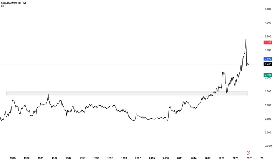
gold vs platinum ratio chart month scale gold strongly outperformed platinum on higher frame chart
Gold vs Platinum — A Tale of Two Precious Metals
Gold has always been the global store of value — a hedge against inflation, currency debasement, and geopolitical fear. Central banks hoard it, investors flock to it during crises. It’s less about industrial demand, more about trust.
Platinum, on the other hand, is the workhorse metal — crucial for automobile catalytic converters, hydrogen fuel cells, aerospace, and even medical implants. Unlike gold, its price is deeply tied to industrial cycles and EV transition trends.
🔎 Price Action Check (Gold/Platinum Ratio)
The chart shows the Gold-to-Platinum ratio stabilising after a steep fall, suggesting that platinum has been catching up after years of underperformance. Historically, whenever gold trades too far above platinum, it signals either platinum undervaluation... or gold over-enthusiasm.
With the renewable wave kicking in and auto demand reviving — is platinum gearing up for a comeback against gold?
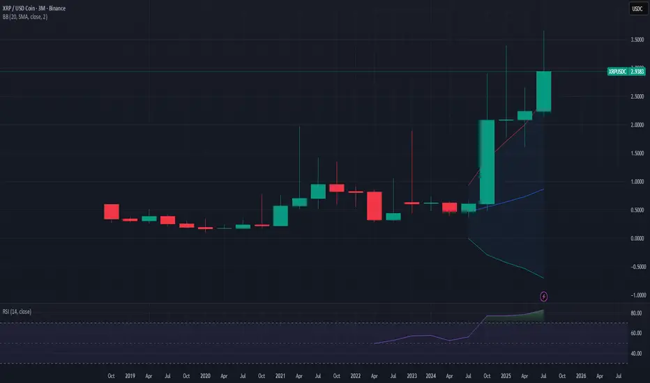
XRP Quarterly Breakout & XRP/BTC Ratio Analysis1) The Current Technical Structure (XRP/USD)
The quarterly chart for XRP confirms a powerful technical setup:
- A classic Bollinger Band breakout on this long timeframe.
- RSI at 82 , indicating extremely strong momentum.
- The quarterly candle closed significantly above the upper band, pulled back to test it, and is now pushing higher again.
- This is the exact type of pattern that has historically preceded major multi-year bull markets in other assets.
Quarterly Data
- Q3 2024: Closed at $2.08 (massive breakout quarter).
- Q4 2024: Closed at $2.09 (consolidation at resistance).
- Q1 2025: Closed at $2.24 (reaffirmation of trend).
- Q2 2025: Closed at $2.82 (continued expansion).
________________________
2) Historical Precedents and Outcomes
- Nasdaq (1999): Led to a 5-year rally before a significant correction.
- Gold (2006): Preceded a multi-year rally into 2011.
- Bitcoin (2017): Sparked a 3-year bull market cycle.
The failed examples:
- Oil (2008): Collapsed due to global recession and demand destruction.
- Bitcoin (2021): Failed due to excessive leverage and lack of regulatory clarity.
Key Insight: Sustained precedents coincided with fundamental shifts (tech adoption, central bank easing, institutional crypto entry). Failures were tied to crises or regulatory headwinds.
________________________
3) XRP’s Fundamental Context
XRP stands apart from failed cases because:
- It now has regulatory clarity that Bitcoin lacked in 2021.
- There is potential ETF approval , which could bring institutional flows.
- The financial industry continues to explore blockchain-based payment solutions.
________________________
4) Long-term Value Perspective
- Volume Confirmation: Breakout quarters showed 6–16bn vs prior lower levels, consistent with accumulation.
- Regulatory Sequenance: Momentum followed clarity, unlike Bitcoin 2021.
- Relative Valuation: Despite momentum, XRP hasn’t shown the euphoric valuations typical of late-cycle blow-offs.
Benjamin Graham’s principle applies: “The market is a voting machine in the short run, but a weighing machine in the long run.” The market here seems to be weighing XRP’s improved fundamentals.
________________________
5) XRP/BTC Ratio Analysis – Structural Strength
Looking at the XRP/BTC pair adds critical confirmation:
- Bottoming (2023–2024): Ratio held around 0.000007–0.000008 BTC.
- Breakout (Q3–Q4 2024): Jumped to 0.000022 (≈129% vs BTC).
- Consolidation (Q1 2025): Formed higher base at 0.000020–0.000025.
- Continuation (Q2 2025): Held 0.000026 despite Bitcoin’s own strength.
This is a textbook basing → breakout → consolidation → continuation pattern on a quarterly ratio chart — much stronger evidence than USD price alone.
________________________
6) Comparative Historical Context
- Bitcoin 2015–2017: Similar long-term basing before secular breakout.
- Ethereum 2016–2017: Ratio strength vs BTC came before ETH’s surge.
The distinction: XRP broke out after regulatory clarity, unlike BTC in 2021, which surged first and then faced challenges.
________________________
7) Volume Analysis
- Elevated volume through the 2023–2024 base.
- Explosive volume during Q3–Q4 2024 breakout.
- Healthy, consistent participation during Q1 2025 consolidation.
- Renewed interest into Q2–Q3 2025.
This mirrors institutional accumulation profiles in traditional markets during secular shifts.
________________________
8) Long-term Investment Perspective
From a value perspective, the XRP/BTC ratio suggests:
- Base Length: Nearly a year before breakout.
- Breakout Magnitude: More than doubled vs BTC.
- Consolidation Quality: Higher lows held above resistance.
- Regulatory Timing: Breakout followed, not preceded, clarity.
This aligns with the principle that the market is now “weighing” XRP’s improved fundamentals.
________________________
9) Risks to Monitor
- Correlation: XRP still linked to crypto market flows.
- RSI 82: Signals potential near-term overextension.
- ETF uncertainty: Approval timelines could sway sentiment.
- Invalidation levels: A quarterly close back inside Bollinger bands (USD) or sustained loss of 0.000020–0.000022 (BTC ratio).
________________________
10) Conclusion
Both the quarterly USD breakout and the XRP/BTC ratio strength point to a structural, early-to-mid cycle revaluation rather than late-cycle froth.
For long-term investors, this resembles the early stages of prior secular breakouts (Bitcoin 2015–2017, Ethereum 2016–2017, Gold 2006). While corrections of 30–40% are likely along the way, the structural thesis remains intact as long as the quarterly patterns hold.
________________________
Not financial advice. Extracted directly from TrendSpider Sidekick analysis (Warren, the Long Term Investor).
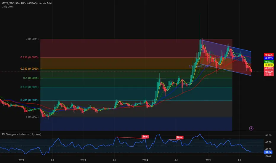
Is $MSTR only game in town? Charts seem to disagree. NASDAQ:MSTR was the first CRYPTOCAP:BTC treasury company in Wall Street. It provided the leverage required on the price by CRYPTOCAP:BTC by borrowing against its balance sheet and buying $BTC. This has worked well for Strategy as it was the only game in the town. But not anymore. With new Crypto treasury company coming to the public every single day and CRYPTOCAP:BTC treasury companies in abundance the attractiveness of NASDAQ:MSTR is decreasing.
In the chart below we check NASDAQ:MSTR stock price vs BITSTAMP:BTCUSD and see that it peaked in Nov 2024. Since then, it is a series of lower highs and lower lows. The downward sloping channel also makes things complicated for the stock in the mid-term. Just on the weekly there is some support in the chart between 0.0026 and 0.0021. This also happens to be between the 0.5 and 0.618 Fib retracement levels.
My assessment is we can see some support at 0.618 Fib levels but make no mistake if Crypto bear market comes in 2026 – 2027 then the ratio chart can visit the all-time lows of 0.0007.
Verdict: NASDAQ:MSTR / $ BITSTAMP:BTCUSD is in clear downturn. It can find support at 0.618 Fib retracement level. Ratio can visit the cycle lows of 0.0007.
Retro Editors' picks 2022Going further in our retro EP selection , we present to you the third collection of additional scripts that have earned a spot in our Editors' picks, now from 2022.
These retrospective selections reflect our continued commitment to honoring outstanding contributions in our community, regardless of when they were published. To the authors of these highlighted scripts: our sincere thanks, on behalf of all TradingViewers. Congrats!
Volume Profile, Pivot Anchored by DGT - dgtrd
Estimated Time At Price - KioseffTrading
Signs of the Times - LucF
Strategy (library) - TradingView
Intrabar Efficiency Ratio - TradingView
Over the next two months, in the last week of each month, we will share retro Editors' picks for subsequent years:
August: retro EPs for 2023
September: retro EPs for 2024
They will be visible in the Editors' picks feed .
Previously published retro Editors' picks:
May: retro EPs for 2020
June: retro EPs for 2021
█ What are Editors' picks ?
The Editors' picks showcase the best open-source script publications selected by our PineCoders team. Many of these scripts are original and only available on TradingView. These picks are not recommendations to buy or sell anything or use a specific indicator. We aim to highlight the most interesting publications to encourage learning and sharing in our community.
Any open-source script publication in the Community Scripts can be picked if it is original, provides good potential value to traders, includes a helpful description, and complies with the House Rules.
— The PineCoders team
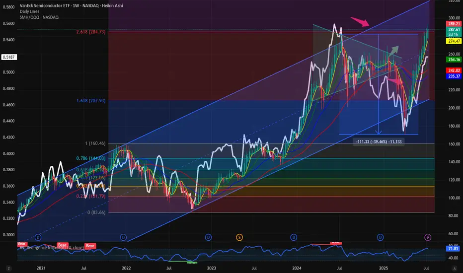
$SMH / $QQQ: Ratio below ATH; Still more room for upside It’s the semis which are the hallmark of a cyclical bull market. It is always the Semis which indicate the start of a bull market and the first to fold over towards the end of a cyclical bull market. Hence the outperformance of Semis as a momentum sector is important from a symbolism perspective and from a market indicator perspective.
When the semis outperform the NASDAQ100 we have momentous bull markets. Today we looked at the ratio chart between NASDAQ:SMH vs $QQQ. This measures the relative outperformance or the underperformance of Semis over the broader NASDAQ100.
This ratio of NASDAQ:SMH / NASDAQ:QQQ touched its ATH on June 2024. Since then, the Semis lost momentum with NASDAQ:NVDA and NASDAQ:AVGO going sideways for a year. Now the momentum is on the side of Semis. Even if the NASDAQ:SMH is at 287 $ and at ATH with price is at its 2.618 Fib Retracement level, still the NASDAQ:SMH / NASDAQ:QQQ is not at its ATH. The ratio is currently @ 0.5. Before we hit 0.56 in the ratio chart just like last June 2024, SMH must outperform the NASDAQ100. If that must happen what should be the price of NASDAQ:SMH ? My prediction is the ratio NASDAQ:SMH / NASDAQ:QQQ tops @ 0.56 and NASDAQ:SMH goes to 400$ this year.
Verdict: Long NASDAQ:SMH over $QQQ. NASDAQ:SMH / NASDAQ:QQQ tops 0.56. NASDAQ:SMH price target 400$.
$CRWD: Relative outperformance compared to its peersCybersecurity is one of our favorite themes. This is known to all who have been following this blog space. We have been bullish on the tech sector AMEX:XLK and specifically in the sub sectors within the tech sector. Cybersecurity is one of them. Within Cybersecurity we have some stocks which have outperformed the rest of its peers. One such name is Crowdstrike. NASDAQ:CRWD after suffering a 50% correction last year outage which took its price to 200 $ has recovered the loss and has recovered all the losses and then some. The stock is up almost 140% from its lows.
An outperformer in an outperforming sector. In the chart we also look at the ratio between NASDAQ:CRWD to $HACK. The ATH for the ratio chart was 6. Currently we are @ 5.6 in the ratio chart. The price chart of NASDAQ:CRWD alone looks bullish. If we plot the Fib retracement level just before the 2024 downturn then the next level in the price chart is 520 $. My price target is 520 $ before we can target 700 $ in the medium term.
Verdict : Go Long NASDAQ:CRWD for medium to long term. 520 $ first then 700 $.

ALTCOIN ROADMAP: REVISITED!!! Ethereum vs NvidiaOne of the most insightful ratio charts that provides a remarkable glimpse into the vitality of Altcoins and the appetite for risk is when Ethereum outshines one of the fastest rising stars in the stock market, #NVDA!
The conventional Altcoin index indicates how many of the top 100 Altcoins are outperforming #BTC.
This is indeed a valuable metric that we can rely on for identifying peaks.
However, I believe that if we broaden our perspective and examine the ETH ratio against a Tech Titan, we can truly pinpoint the timing of the banana zone. When it starts and when it is confirmed violent uptrend.
My interest in this ratio was sparked when ETH was still a proof of work coin, validated through GPUs; it seemed like a natural starting point to assess whether the ETH price was overvalued or undervalued.
Even after the transition to POS, I still think it’s worth analysing, as shown by the recent double bottom on the ratio!
The next crucial question is when we can break the multi-year downtrend to genuinely confirm the Banana zone. Because without ETH, there’s no party.
If we enter a big strong banana zone, I believe the ratio could swiftly trend towards 100, so we will be keeping a close eye on it!

Gold Futures, using a GC1!/DXY ratio, gold vs dollarUsing a gold futures continuous contract and the DXY i simply plotted the ratio and picked picot points to create a parallel channel on the GC1! graph....to which I doubled up the channel, or channel stacking, to see what would occur.
Make sure to utilize the "L" Log function in the bottom right of that chart to see something that may not be there and how perspectives can change when you reorient your scale.
Not much on analysis, just point to consider. That Fib Retrace was also don taking the lowest pivot point of this run and the top, most recent high, on the GC1!/DXY chart and plotting that to the exact location on the gold futures chart.
So somewhere in the 3100 to 3000 window looks good.
Gold chart with corresponding DXY ratio chart with points highlighted in green:
gold chart with momentum without Log function:
gold chart with momentum on Log function:

$BTC.D to 66%, $TOTAL2 / BTC down to 0.43The final year of bitcoin halving year is usually a bullish year for the Altcoins. CRYPTOCAP:TOTAL2 is the measure of the Total Market Crypto Market CAP without $BTC. Today we are looking into a ratio chart of TOTAL2 vs BTC Market cap. The supposed strength in Altcoin is missing as is evident from the CRYPTOCAP:BTC.D chart and the ration chart between TOTAL2 vs BTC.
If we plot the Fib Retracement levels on the CRYPTOCAP:BTC.D from the last cycle lows to the highs, we see that in the current halving cycle the CRYPTOCAP:BTC.D is progressing towards 0.786 Fib retracement levels which is currently indicating a CRYPTOCAP:BTC.D of 66.2 %. The ratio of Toatal2 vs BTC Market cap fits surprisingly within the Fib levels and makes new lows every week in this weekly chart. The levels to watch on the ratio chart will be 0.43
What does this trend tell us. It might be possible that the Altcoins USD pairs are bullish, but the Altcoins are making new lows vs BTC. So, it's a better strategy to go long $BTC. The risk reward is very much in favour of CRYPTOCAP:BTC rather than Altcoins.
Verdict: Long CRYPTOCAP:BTC , CRYPTOCAP:BTC.D to 66%.

Home Prices Peaking Relative To Household IncomeHere is a simple ratio chart of Home price/Household Income, YOY rate of change overlaid with plain home prices.
A few things we can learn from this chart.
1. A 4 to 5 X ratio used to be the bottom and top for home prices relative to household income.
the ratio in 2000 after decades of stability rose to 6X income. Today we have spiked to 7.7X income.
Clearly, homes have gotten much more expensive over time.
2. However a good time to buy has been around 5X income. Not necessarily a drop in home prices.
It helps to understand VALUE as a Ratio rather than price. Most typically think of an arbitrary number
and miss out on a great opportunity to buy bc it did not hit their magic number.
5. YOY spike in home prices/income ratio gives a nice ballpark idea of when the ratio is topping out.
4. Prices can rise over time and still end up with a great buying opportunity if people better understand
VALUE as a ratio rather than price.
Obviously, there are many more factors to consider when buying or investing in RE. I am no real estate expert.
But there is much to learn from this chart as to how to think about VALUE in general.
Having said all that, I am willing to guess that home prices relative to income have peaked and will likely start
to reverse here in the near future.

QQQ vs S&P500Today we are looking at a ratio chart from TradFi. We are plotting the ratio of Nasdaq100 vs S&P 500. Even if both charts observed separately tell us the same story. That we are in a bullish uptrend on the daily chart for the past 1 year. But the ratio chart clearly shows Nasdaq100 peaked out relative to S&P 500 on Aug 2024 just prior to the unravelling of Yen carry trade. Since then, the ratio has not broken to the upside and registered an ATH even if the tech stocks have been doing exceptionally well recently. The ratio of QQQ vs SPX is within a local uptrend but still within the upward sloping Fib Retracement level between 0 and 0.618. The tech heavy QQQ can and will claim leadership once we break out of the range in the upward sloping Fib retracement level and break above the 0.618 levels.

The TradingView Show: Post-Election Trades with TradeStationJoin us for our recurring series as we dive deep into the latest market movements, emerging trends, and key financial news with @TradeStation. This monthly show is designed to keep traders and investors up to date on the developments that truly move the markets. Don’t forget to explore our comprehensive video library on our profile—scroll back to catch past episodes, and follow our TradingView account to stay in the loop.
In this episode, we’ll provide actionable insights and educational resources for new traders, including charting tips and an introduction to market dynamics.
Here’s what we’ll be covering this time:
- A detailed analysis of NVIDIA’s earnings and what they mean for tech and semiconductor stocks
- How rising interest rates are influencing market sentiment and trading strategies
- Post-election trades: positioning for the rest of the year
- End-of-year trading opportunities: sectors and stocks to watch
- A look at the energy sector and how oil prices are affecting energy stocks
- Insights into the banking sector’s recent breakout and its potential impact
- Key ratio charts to help inform your strategy
- And much more!
Our live show airs monthly, welcoming traders of all experience levels to join the conversation, ask questions, and gain insights into what’s moving the markets. We encourage you to engage—leave comments, share your thoughts, and spread the word with fellow traders!
This show is sponsored by TradeStation. TradeStation pursues a singular vision to offer the ultimate online trading platform and services for self-directed traders and investors across the equities, equity index options, futures, and futures options markets. Equities, equities options, and commodity futures products and services are offered by TradeStation Securities Inc., member NYSE, FINRA, CME, and SIPC.
See below:
www.tradestation.com
www.tradestation.com

Gold is surging while Crude Oil is laggingHere is a ratio chart of Gold OANDA:XAUUSD and Crude Oil $USOIL.
Historically you can see it goes to extremes. Especially in 2020 when crude oil went to zero (and negative). I cut that spike out of the chart so hopefully it shows here.
When the Global Financial Crisis in 2008-2009 hit, crude oil hit $140 and gold was low which set up the bottom of this chart on the lower-left. Crude was expensive and gold was cheap.
The opposite happened during Covid when crude plunged and gold stayed relatively calm.
These are generational trades that can make traders rich but they take too long for the average small investor to stay focused and take advantage of these setups.
With Gold now at the upper end of the range of this ratio, it is time to start looking elsewhere to protect your wealth.
Can this ratio continue higher? Yes, of course.
I point it out as a starting point for your trading. If you are just getting long gold up here now, you need to understand where the historical range is for this ratio and decide if you want energy to keep you warm and let you travel or do you want a store of money. It is always a trade-off between the two. You can't live with only one of these commodities.
Cheers.
Tim
12:33PM EST, October 22, 2024

$DWCPF/$SPX comparison for the TSP
l am comparing DJ:DWCPF with SP:SPX and looking at the ratio for how to know how much to allot to each sector. (Us TSP folk only have a couple funds we're allowed to invest in). DJ:DWCPF is the S Fund, and SP:SPX is the C Fund in the TSP, for reference.
I added a comparison of AMEX:IWM and SP:SPX also, just because they really seem to move together and I wanted to see how true that was.
Baby blue = SP:SPX
Purple = $DWCPF/ SP:SPX
Yellow = $IWM/ SP:SPX
Come to your own conclusions, but for myself I think I'll look to be more long small caps after a major recovery in the markets. Could be years until that happens, but that ratio chart just looks abysmal.
I'm 100% DJ:DWCPF , but I'll be looking to deversify soon unless we continue to see small caps outperform. We'll let the charts tell the story and react to what I see with the data provided

$DWCPF/$SPX comparison for the TSP folkThis is mainly for the TSP folk.
I am comparing DJ:DWCPF with SP:SPX and looking at the ratio for how to know how much to allot to each sector. (Us TSP folk only have a couple funds we're allowed to invest in)
I added a comparison of AMEX:IWM and SP:SPX also, just because they really seem to move together and I wanted to see how true that was.
Baby blue = SP:SPX
Purple = DJ:DWCPF \ SP:SPX
Yellow = AMEX:IWM \ SP:SPX
Come to your own conclusions, but for myself I think I'll look to be more long small caps after a major recovery in the markets. Could be years until that happens, but that ratio chart just looks abysmal.
I'm 100% DJ:DWCPF , but I'll be looking to deversify soon unless we continue to see small caps outperform. We'll let the charts tell the story and react to what I see with the data provided

Gold vs the 10yr yieldThis is a ratio chart.
Gold is on top
10 year Yield is on bottom
in the middle you can see the ratio between gold prices and the 10yr yield rising and falling.
As you can tell, when the ratio reaches a low, gold prices tend to rise and yields tend to fall.
Vice/versa when the ratio is at a high, Gold prices tend to fall, and yields tend to rise.
Of course the ratio chart is not "CAUSING" the prices to rise or fall.
In my humble opinion, we are relatively close to the long term low point on the ratio chart.
Meaning that either gold prices should rise and or yields should fall, and or both maybe...
Barrons has recently published a piece saying that rising supply of gold could contribute to prices ending the year around 2100. usd
This would be a drop in price, and doesn't fit in with my narrative.
It might be interesting to see how this ratio plays out, and perhaps it will help you form a bias for your next Gold trade!

Gold heading for the Sh1t Hol3? 🐻🐻❄️are now in control As per the current market trends, it seems that the bears are still in control of the precious metals market. Despite our previous prediction of an upward trend, the bulls have not shown any significant signs of strength to hold the predicted support level. If this support level fails to hold, which is highly likely, it may result in heavy selling pressure, leading to a considerable decline in the market. It is crucial to keep a close eye on the market and take necessary measures to minimize any potential losses.
It's worth noting that there has been a significant increase in the number of sellers dumping silver, and this trend is often mirrored in the gold market as well. As a result, we are presently selling precious metals and have conducted an in-depth analysis of the G/S ratio to help inform our approach.
Silver
G/S Ratio

Live stream - The TradingView Show - Live With BadCharts!Welcome aboard, traders!
Today we meet the man who has mastered the art of big picture charting, ratio charts, and super cycles - tradingview.com
Ask questions, use the chat, and enjoy the show.
- TradingView Team

WIPRO: PICK OF THE YEARWipro Looks Great with Technical Analysis!
There are a lot of hidden reasons for selecting Wipro as the Pick of the Year.
Let me show you:
First, Wipro and Nifty Ratio Chart
This is a hidden Information, and see how chart is taking support
Secondly, Wipro and NiftyIT Ratio Chart
Again a hidden information and See how Wipro is taking support in this also
Both of Above information suggesting a good support after a long time in Wipro
And this support can give you the best investment price.
Third, watch how Wipro is taking support on Monthly chart
It was a resistance trendline where Wipro gave a breakout few years back and now it is retesting those levels, and is consolidating. This can be a good Demand Zone and we can expect a price reversal
Also, if you notice the previous Wipro High, It is giving Wipro a Horizontal Support.
And the best part is, the level is 0.618 Fibonacci Zone, that too in a Monthly Chart.
Fourth, Fundamentals are still great with Profits increasing every year.
FIIs and DIIs have increased there stakes in the company last quarter, so this information can be a highlight for us to invest in WIPRO.
With all these analysis, I think Wipro can be a very good reversal stock for next few months, and we can see a good up move in Wipro.
This all reasons make me pick WIPRO as the PICK OF THE YEAR.
What do you think about this idea?

Gold/Silver RatioGold/Silver ratio chart. When gold/silver ratio exceeds 80, there will be a buying opportunity for silver.

SPY divided by IWM, monthly Long term perspective.
Monthly and weekly charts showing a bull flag on this ratio chart with steep hidden bull divergence on monthly especially.
If we breakout of the flag it means IWM in general will start to lose much more value than SPY.
2.85 is the bull flag target but it could exceed that. Keep in mind this is a monthly chart so we're talking months and years of deterioration between these two etf's.
Good luck!
