US02Y: BOND MELTDOWN / 4.00% CROSS / MACD CONVERGENCE / RSIDESCRIPTION: In the chart above I have provided a simple MACRO ANALYSIS on current bond market meltdown where the US02Y dropped nearly 25% within FIVE TRADING SESSIONS.
POINTS:
1. US02Y deviation is simple & marked at every 1% difference as bonds rise and fall within the same range percentage therefore it has a rubber band like price action relationship with it's lowest 1% points.
2. Overlapping Orange Line represents ES1! a US Market Future.
3. Dotted Green Lines represent continuous downward momentum in past Bear Markets (2002 & 2008).
4. Bubbles overlapping dotted green lines represent initial break of supporting bond percentage %.
IMO: In my opinion the most concerning factor to take into consideration when it comes to current bond positioning is the STEEP RISE IN PERCENTAGE especially when the overall US market momentum is tied to BOND PERCENTAGE during both RISES & FALLS & the STEEPER THE INCLINE THE STEEPER THE DECLINE can become.
MACD: Notice a complete meltdown of Bonds when MACD confirms convergence to MEDIAN & eventually breaks past median and falls into into negative territory.
RSI: Notice that unlike in other recessions RSI levels have seen more consistent exposure to MEDIAN of 50. But as of lately from a MACRO perspective that is not the case as we have seen current RSI levels linger around 70 or above in EXTREMELY OVERBOUGHT TERRITORY.
SCENARIO #1: In a very BEARISH scenario we come to see BONDS PERCENTAGE go through a complete free fall.
SCENARIO #2: In a less BEARISH scenario we come to see BONDS PERCENTAGE go through an extended consolidation phase with PERCENTAGE LINGERING ABOVE 4%.
FULL CHART LINK: www.tradingview.com
TVC:US02Y
US02Y

US02Y is on a breaking point. Great news for stocks!The U.S. Government Bonds 2 YR Yield (US02Y) is testing its 1W MA50 (blue trend-line) for the first time since May 31 2021. The 1W RSI is on the very same Lower Highs trend-line rejection that it was during the December 17 2018 1W MA50 test!
Needless to say this shows that the price is on a critical point as when it broke in Dec 2018, a downtrend followed that was at the bottom of the U.S. - China trade war and sent stocks (black trend-line = S&P500) on a 1 year mega-rally (until the COVID crash).
Will we have a repeat?
-------------------------------------------------------------------------------
** Please LIKE 👍, FOLLOW ✅, SHARE 🙌 and COMMENT ✍ if you enjoy this idea! Also share your ideas and charts in the comments section below! **
-------------------------------------------------------------------------------
💸💸💸💸💸💸
👇 👇 👇 👇 👇 👇

$TNX Bouncing nicely as are shorter maturity YieldsWas kind of expected to get some bounce from #Bond #Yields.
The last two days, especially yesterday, was RARE in yield price action. It happens but it's rare.
The buys could have been investors trying to take advantage of higher rates being that they are "expecting" the Fed Reserve to lower rates.
We mentioned that most yields, when we posted, were at or close to support levels.
So the bounce we are getting today is not unexpected. Furthermore, the gap from two days ago attracted and it is filled today.
$TNX was also oversold.
Yields from here are tough to gauge but likely go a bit higher.

$TNX US02Y are CRATERING, Yields falling hardLast week we mentioned that #yields cratering like they did was not normal.
Currently they are all at support with $TNX holding better than short term yields. The 10Yr has BOUNCED a bit off support.
In a positive note it does lessens the inverted Yield curve :D
We'll see how this scenario holds.
What's happening today is more SPECULATION than anything else. The belief is that the #fed will stop raising rates due to the the bank closures that are happening.
IMO I don't think it'll stop them but MAY slow them down a bit.
The Fed Reserve HAS to pick between #economy & #stocks.
While the Fed has been friendly to equities and markets in the past its main concern in the US Economy. They also care about the US #dollar.

Yields are CRATERING - WHy?The Debt Market is significantly larger than the #stockmarket so it's VERY IMPORTANT what happens there.
It's way too early to see data but, JUST A HUNCH, this is most likely the #FED stepping in & buying bonds trying to calm the markets.
This is not normal to see #yields cratering so much.
The 1Yr is off almost 3.26%
The 2Yr is off 5.01
The 10Yr is off 5.33%
This is causing more of an inversion to the yield curve.
On other news, banks faltering isn't helping the case for stability or easing the fears of #economy being in turmoil.

Can we tag the 200 day ma without breaking below?Traders,
Technicals are still on point. The only question is, "Can we tag our 200 day moving average on the BTC chart without breaking below it"? $20,000 BTC is key. Any break below means trouble. But using it as support without breaking it is technically bullish.
Let's take a look at Bitcoin technicals as well as all the rest of the indicators we have been watching closely.
Stew

Japanese have been selling bonds, have Yields peaked for now?One of the reasons US Treasuries, and other bonds, have been selling off is the dumping by Japanese investors.
All duration #YIELDS have done well but more so the shorter term. The Inverted Yield Curve has widened over the last few months but has been significantly lately.
However, today we see the 1 & 10Yr ($TNX) selling off but the 2 Yr is CRATERING! Interesting.
Also interesting is that volume has been waning for investment grade and high yield bonds. Liquidity could be an issue later on if this continues.

The (4) Four Charts I am watching closely todayPull these charts up on your radar. They are key. With today’s spike on the VIX, we may see key resistance and support lines break. If any one of these critical trendlines/levels are broken, much more caution is warranted on the long side. Let’s quickly run through the charts I am observing.
DXY - A break to the upside of that macro uptrend (with confirmation on the daily) indicates a stronger dollar. A stronger dollar price must be calculated into current stock prices, weakening the current stock momentum.
US500 - Testing that Macro Uptrend as support. A break below may indicate further downside (pending FED language following FOMC press conference).
US Treasuries - Both the 10 year and the 2 year are pushing up against resistance. A break to the topside would indicate that the FED will continue its aggressive rate hikes strategy to tackle inflation. The dollar will follow with strength. The markets will depress even further. Crypto will follow. Treasuries seem to indicate that the FED will continue its aggression against inflation. We must pay attention closely to those purple lines/levels.
Also to note, Bitcoin is up against its 200-week ma. I don’t see that be broken immediately without some setback prior. The Bitcoin price battle with the 200 weekly ma may be the earliest indicator we have to what might follow in the next few days/weeks.
As always, be cautious. Don’t bite too hard on these last few weeks of bullish price action. Dollar-cost average yourself in. Place those stops. And best of luck to you all!
Stew

Keep a close eye on this breakout!Traders,
Keep a close eye on this breakout on our fear index. So far, nothing significant has followed to the same level of price movement: the dollar is still under its macro-uptrend resistance, the US500 is still using its macro-uptrend for support logarithmically, and the US10yr/US2yr remains under resistance.
But we want to track this closely to find out the legitimacy of this spike in fear. Confirmation can be had if one of the indicators mentioned above follows and breaks its support/resistance (see yesterday's video for more).
Best,
Stew

$DXY is pumping again & so are yieldsFrom Friday
People discounted the US #Dollar $DXY but it came back beating historical tendencies (usually breaks lows before eventually coming back
1, 2 & 10 Yr $TNX
Huge inverted #yield curve =expecting turbulence short term
#inlfation may FORCE #FEd to keep raising bit more

1Yr broke recent highs - Long term this could be dangerousShort rates flying (up to 1Yr #yield) Already broke previous highs
Compare to 2 (slightly lower than previous highs) & 10 $TNX (chart tells story)
#Market trading = #inflation higher vs #Fed expectation of 2%
Markets not expecting recession or lower inflation
NO soft landing - party on
But that'll mean eventual HAWKISH FED
Dilemma
#stocks or #economy, only 1

Yield InversionReally strange market, the yield inversion continues to grow. This site actually allows price calculations, this is 10Y yield minus 2Y yield.
Stock market still acting bullish, but I'm not feeling it.
Data on $DXY $TNX & 2Yr YieldPosted 1 thing on #DXY since the quoted post
Was just observation
Normally would've said that #DXY was done BUT
held back because something didn't look right
$UUP shows $ coming in last 2 days
$TNX & 2yr #yield support held WEL
Pumping actually
#GOLD #SILVER #Crypto #stocks

$TNX & 2Yr yield showing basing signs, issue for stocks soon?Haven't heard much on #yields lately
$TNX & 2yr #yield
#TNX forming base, what are bonds saying here?
2yr not as strong
Weekly shows squeeze in a direction soon for both
#technology $NDX #NDX

The QE(xperience)Quantitative Easing, a fancy way of describing a bubble, the easy way out.
QE Alpha
During QE Alpha, speculation lead to a massive bubble, and a painful burst.
Technicals: A Fibonacci Retracement shows that price followed closely it's levels.
QE Beta
During QE Beta, after stabilizing from the Great Depression, and after the end of WW2, economy rose steadily. US being one of the winners of WW2 and with the Marshall Plan deal, had a big advantage compared to the rest of the world.
Technicals: The 1.618 retracement proves a significant resistance from above, which behaved as the ceiling for the Great Stagflation period of 1960s. Price reached an indecision where price couldn't penetrate the 1.618 retracement, but didn't want to fall below the 1929 high. A golden bull-flag was created, which escaped to the upside in 1982.
QE 1.0
After severe stagflation, a new era of progressively lower yields led to the creation of the mechanism for QE1. It's fuel ended in 2000, and for a decade, the economy had big trouble going forward. It wasn't until the GFC when the foundation was set for the birth of QE2.
Technicals: We have reached the 3rd harmonic and this proves big resistance for price. During this time, a harmonic bull-flag shaped.
QE 2.0
The QExperience, which until now was unknown and unnamed, had now a name. And we have lived with it until 2021. Derivatives came about and inflated what is left to inflate. Since day 1 of 2022 we are outside it's trend.
Technicals: Retracements drawn using the Great Depression peaks/bottoms constitute significant support/resistance levels.
Conclusion: This SPX modificator makes historical analysis of SPX more mathematically accurate and clearer to see/analyze. A new era of increasing yields leads to multiplicative problems in the QE machine. Welcome to the QT era. We are already in it, for the past year, we hope you enjoy your stay!
Look at the GFC intervention.
The modified SPX chart depends on yields. More about it on this chaotic, full-of-mistakes idea.
Tread lightly, for this is hallowed ground.
-Father Grigori

Markets want their equities back.The market is longing equities, they miss them so much... Perhaps there are traders out there who actually long equities right now.
And maybe they have their reasons...
Yields are showing the first signs of exhaustion. Their chart by itself confirms it.
In the main chart above, we see support from the 200EMA (from 2M chart like before)
RSI went oversold (penetrated it's ATR channel to the downside) and is now back inside it. This is bullish.
This year stochastics were absolutely glued together, it doesn't get any tighter. Now they are ready for an upwards swing.
But wait. Not all is good.
The "true" SPX chart (SPX*US10Y) is showing it's first signs of weakness.
So we have reached the point of "diminishing returns". Any increase in equities is not providing wealth.
Like before, RSI, Stochastics and KC don't help.
SPX is showing signs of strength for the following months.
While I expect a degree of weakness in equities, not all hope is lost.
In the meantime, I expect horizontal movement for equities, and some probable growth.
Beware, for the cake is still a lie.
A couple of extra charts:
The chart I added above, the point we missed the trendline was in December 2018.
In December of 2018 was the time when Put/Call ratio and VIX took separate ways.
And what did equities do after this point in time?
PS. With all that conspiracy, I wander why I don't wear a tinfoil hat... yet.
Tread lightly, for this is hallowed ground.
- Father Grigori

S&P500 may be on the verge of a mega rally based on the US02YThe chart represents the US02Y on the 1W time-frame against the S&P500 index (green trend-line). The phase that the US02Y has entered is similar to that in entered in December 1994. As you see shortly after a Golden Cross, it made a Lower High on the RSI, flashing a Bearish Divergence, while the MACD Double Topped. This is exactly the same sequence of events in the exact same order since the June 2022 Golden Cross.
The US02Y fall of December 1994 practically started S&P's mega rally of mid-late 90s that led to the 2000 Dotcom Bubble. If history is repeated, instead of a continuation of the Bear Market that most expect, S&P500 my be on the verge of a new multi-year Bull Cycle.
-------------------------------------------------------------------------------
** Please LIKE 👍, FOLLOW ✅, SHARE 🙌 and COMMENT ✍ if you enjoy this idea! Also share your ideas and charts in the comments section below! **
-------------------------------------------------------------------------------
💸💸💸💸💸💸
👇 👇 👇 👇 👇 👇

Martin Luther King Jr. Day - Market AnalysisKey events:
US – Martin Luther King, Jr. Day
UK – BoE Gov Bailey Speaks
The recently released CPI is prompting investors to question the Fed's plans to raise the overnight rate above 5%. The market doesn't seem to care, and after this data coincides with the forecast, yields are falling across the curve. Thus, 2-year Treasury yields have fallen to their lowest level since October, with room to fall substantially.
If the Fed really does intend to raise rates that much and maintain tight financial conditions, then it appears that the market is not listening to the central bank and not paying attention to what it wants.
This only suggests that the Fed's forward guidance is no longer working. The Fed will have to dig into its toolbox to convince the market that it is serious. The central bank may have to talk about accelerating the pace of balance sheet reduction or outright sales of treasuries and mortgage-backed securities.
The market indicates that the Fed's interest rate hike cycle is coming to an end, with the belief that the central bank will be forced to cut rates as soon as 2023. However, the Fed continues to insist that it plans to raise rates above 5% and leave them high and financial conditions tight for a long time.
The 2-year Treasury yields fell to their lowest level since early October. This is the first weakening in months. Apparently, the rate cut is now embedded in the quotes of not only the federal funds rate futures market.
As a consequence, the Fed will be forced to use balance sheet talk as a last resort to ensure that rates remain elevated and the dollar remains strong enough to prevent a stronger-than-acceptable Fed easing of financial conditions.
The market, on the other hand, is trying to figure out how much pressure it can put on the Fed to maintain tight financial conditions. If the central bank is serious, sooner or later it will try to fight back. Otherwise, the Fed will lose control of the public discourse and won't be able to tell the markets what direction it thinks they should go.
Talk of a higher overnight rate is no longer having the desired effect, so the next option for the Fed is balance.
If it doesn't use that option, the markets will take it as a signal that the Fed is okay with easing financial conditions and thus gives the markets permission to continue the rally.

US10y vs FED rate. Should u put $ into bank or buy gold? 10/Jan/US2Y and 10Y bonds yields always “follow” FED rate paths. Now we “see” some “experts” encouraged us to “save” money into banks (especially USD denominated a.c) to gain higher rate. Hope to enjoy high fixed guaranteed return like early 1980s which was above 10%!!! Looking at those chart and gold price do you think “fixed deposits “ into bank is “worth” as investments?

Energy ready for prime-time?An updated view
Pattern taken from reverse symmetry.
Elliott Waves
Stochastic RSI Oscillators
The 12 Month oscillator pushes everything upwards. Since the 3M oscillator is at it's top, we expect a short drop until mid 2023. It will be short because of the effect of the 1M oscillator as well as the 12M one.
Oscillators tell us that it is probable for price of energy to drop until Q2 of 2023 and then begin it's rally. Energy could very well increase now. The ABC Elliott wave shown on the main chart is alarming.
An alternate scenario is this.
A 5-step Elliott wave.
Either of them could play out.
Tread lightly, for this is hallowed ground.
-Father Grigori

M2SL | Duplex Megaprinter 8000 ™Back in the 80s, we thought that by 2020 we would have an automated oven and flying cars. All we got is a money printer, and we liked it. We played with it a lot. And this year for Christmas, who wouldn't like some more printer ammo?
Since high inflation cannot ensure social stability, we have only one option. Lower inflation. That is the motto of the FED, the hope of every investor, a lower inflation figure. The consumer is overwhelmed from the increasing cost to survive . The inflation war is nowhere near it's end. We have gone from commodity inflation to services inflation, to the everything inflation. We haven't managed to stop it. What if there was another way?
Actually there is another way. If you break the oath of "never read the news" and actually read the news, you will realize that the average consumer is getting the help they need from grants. Governments throughout the world have found the way for social stability. They simply buy us off.
Record high electricity bill? No problem, here is a grant, the government is paying a percentage of the bill as a help.
Expensive fuel? Here are 100€ in fuel discount to go to work.
It is like the best Christmas ever. Businesses get to enjoy 100% of the earnings they want, consumers consume, and governments have social and financial stability. They just have to keep the game going, keep the printer full of ink. Everyone is happy. One could say that this perfect scenario we are in cannot fail. And even if it breaks, we keep the printer rolling.
Sometime in the not-so-distant-future of course, something could break. We have just moved the problem from the consumer to the investor/corporation/government. We have gained some time. It is just incredibly difficult for me to understand what could break if this game goes on and who will take the dive. At what point will this printer stop helping us?
Right now it helps many. Also go out and talk with people, almost nobody talks about inflation as a problem that could completely destabilize the global economy. They just care about the immediate issue, that everything is expensive.
We are humans, and not a very wise kind. We are an infant species (like Dr. Breen said). Even now that we realize what we have created, and try to solve it, we do it in a fashion that will ultimately turn against us. We buy out everyone and everything, we have made humans more dependent. With all that technology around us, I realize that we are incredibly fragile. We haven't managed to be empowered from technology, we are swallowed in it. And we hate the word Plan B, imagine how trapped we are in when we don't cover our bases.
We buy out our problems because we search for the easy way out. That's the reason we made the printer in the first place. We needed to solve one issue, ignoring the future repercussions.
After all that epilogue, I will now add the prologue. This idea is upside down, like everything around us these days.
On the main chart, we see that we have found support on the weekly ribbon.
The 1M (and 2M) chart suggests that we are heavily supported from below.
Do note that dropping oscillator on money supply does not mean significant price drop. Since money supply increases exponentially, a bearish oscillator suggests that we are on the upper side of the trend.
This chart shows us the Reverse Repurchase Aggreements.
We have RSI divergence, and stochastics dont help the situation. RRPONTTLD dropping is signaling QE.
As SPY_Master stated in this idea, this chart shows us the effort the FED does to fight inflation.
Yields show a similar picture. We are under significant resistance from the 200EMA in the 2M chart. Stochastics print a bearish signal.
CURRCIR/M2SL may be printing a bull flag.
What will be the effect if currency-in-circulation increases compared to money supply? How will prices and inflation react? We have already had significant increase in the past year in the ratio.
US money supply is showing signs of increasing, or at least stagnating. This chart comparing US and EU is alarming...
Tread lightly, for this is hallowed ground.
-Father Grigori

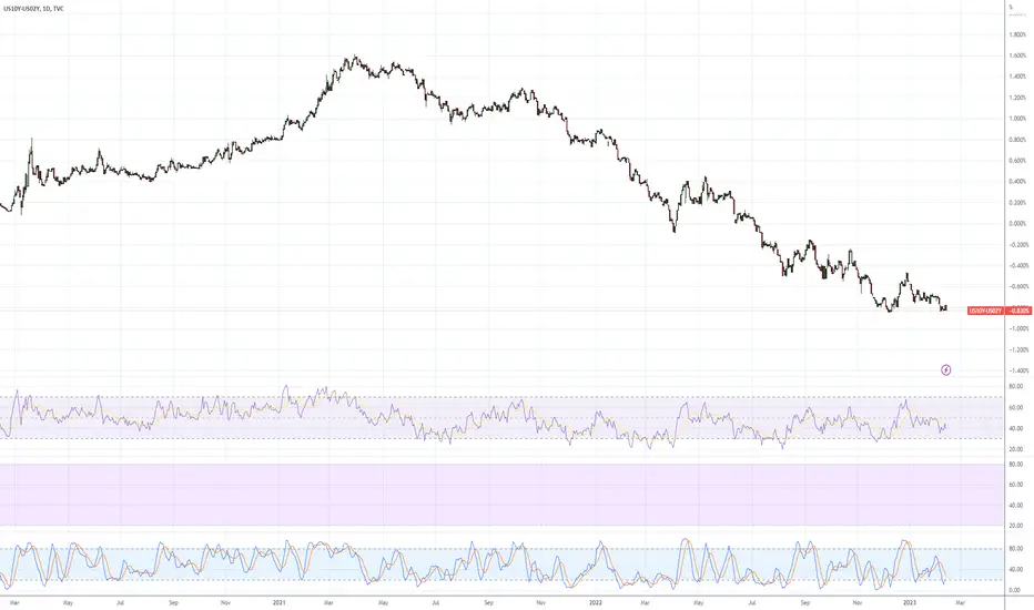
Are U.S. Yield Curve Inversions Signaling 2023 Recession? Looking at the Inverted Yield Curve Chart s of the U.S. 10yr Treasury vs. U.S. 3mo Treasury (US10Y - US03M), along with the U.S. 10yr Treasury vs. U.S. 2yr Treasury (US10Y - US02Y) — are yields signaling a topping process? Or, should we even higher yields into 23'?
4-Hour Inverted Yield Curve Chart 📊
Top Chart: US10Y - US03M
Bottom Chart: US10Y - US02Y
Daily Inverted Yield Curve Chart 📊
Top Chart: US10Y - US03M
Bottom Chart: US10Y - US02Y
Weekly Inverted Yield Curve Chart 📊
Top Chart: US10Y - US03M
Bottom Chart: US10Y - US02Y
Monthly Inverted Yield Curve Chart 📊
Top Chart: US10Y - US03M
Bottom Chart: US10Y - US02Y
Monthly Inverted Yield Curve Chart 📊
Bottom Chart: US10Y - US02Y
U.S. 2yr Treasury (Inverted) vs. SPY (SPX ES1!) 📊
Black Line: SPY
Blue Line: US02Y Inverted
U.S. 2yr Treasury (Inverted) vs. QQQ (NQ Nasdaq) 📊
Black Line: QQQ
Blue Line: US02Y Inverted
U.S. 2yr Treasury (Inverted) vs. DIA (Dow Jones Dow Jones Industrial Average DJIA) 📊
Black Line: DIA
Blue Line: US02Y Inverted
U.S. 2yr Treasury (Inverted) vs. IWM (Russell 2000 Russell Small Caps RUT) 📊
Black Line: IWM
Blue Line: US02Y Inverted
Do you think that yields have reached their peak for this Federal Reserve tightening cycle here in late 22'? Or, will we see further rises in yields, putting more pressure on risk assets in the new year (23')? 👇🏼
Yield Curve Inversion Chart Template 📊👇🏼
www.tradingview.com
Inverted U.S. 2yr Treasury Curve vs. Asset (SPY QQQ DIA IWM) Chart Template 📊👇🏼
www.tradingview.com

2022 Yearly Recap - SPY QQQ DIA IWM DXY US02Y EFFR USIRYY Looking back over the last year (22'), as the saying goes "hindsight is 20-20".
That said, here's the recap on the 22' market cycle against the backdrop of the Federal Reserve Interest Rate Hiking Cycle (one of the fastest on record) — while at the same time, we (investors) are all asking "What's next for 23'?"
TOP SECTION
DXY - Dollar Index ($104.51) 🔼 ✅ (Green Line)
US02Y - U.S. 2yr Treasury (4.38%) 🔼 ✅ (Black Line)
US10Y - U.S. 10yr Treasury (3.84%) 🔼 ✅ (Blue Line)
EFFR - Effective Federal Funds Rate (4.33%) 🔼 ✅ (Orange Line)
USIRYY - U.S. YoY Inflation Rate, Federal Reserve Target Rate = 2% (7.10%) 🔼 ✅ (Baseline = 2%, Red = Above Target, Green = Below Target)
BOTTOM SECTION
SPY - S&P 500 SPX ES1! (YTD 22', -19.92%) 🔽 🩸
QQQ - Nasdaq NQ (YTD 22', -33.95%) 🔽 🩸
DIA - Dow Jones Industrial Average DJIA (YTD 22': -8.77%) 🔽 🩸
IWM - Russell 2000 RUT (YTD 22': -22.57%)🔽 🩸
Prediction(s) these asset classes for 23'? Let me know your macro trade(s) in the comments below! 👇🏼
All Asset Class Chart Template 📊👇🏼
www.tradingview.com
Index Chart Template w/ YTD Return Indicator 📊👇🏼
www.tradingview.com
