US10Y Is Rising Again: Could 5.1% Trigger Pressure Across GlobalThe U.S. 10-Year Treasury Yield ( TVC:US10Y ) is one of the most important benchmarks for global interest rates and financial conditions.
A strong rise in US10Y can affect U.S. stocks, Gold, Silver, Bitcoin, and the broader crypto market.
Could US10Y continue rising toward 5.1% and create another wave of pressure across financial markets?
Macro Outlook
US10Y represents the yield investors receive from holding a 10-year U.S. Treasury bond and is widely used as a benchmark for long-term interest rates.
Its market impact can be summarized simply:
U.S. Stocks: Higher yields increase borrowing costs and pressure valuations, particularly in growth and technology stocks.
Gold & Silver: Higher yields—especially real yields—and a stronger U.S. Dollar generally create pressure on non-yielding precious metals.
Bitcoin & Crypto: Rising yields can tighten financial conditions, strengthen the Dollar, and reduce risk appetite.
For this reason, US10Y is an important macro indicator to monitor alongside the U.S. Dollar Index(DXY).
Technical Analysis
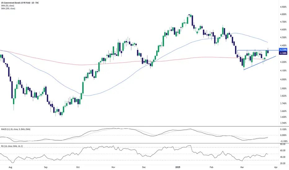
On the daily time frame, US10Y is approaching an important Resistance Zone after moving inside an Ascending Channel for approximately 190 days.
From an Elliott Wave perspective, the U.S. 10-Year Treasury Yield appears to be completing the main Wave X inside the Ascending Channel.
💡 Educational Note: Rising Treasury yields generally indicate tighter financial conditions, which can reduce demand for risk assets and increase pressure on equities, precious metals, and cryptocurrencies.
Considering recent U.S. economic data, persistent inflationary pressures, and geopolitical risks in the Middle East, I expect US10Y to continue moving higher.
The next major upside target could be around 5.1%.
If this scenario develops, higher Treasury yields could remain an important risk factor for the S&P 500, Nasdaq, Gold, Silver, Bitcoin, and the broader crypto market.
Target: 5.1%
Do you think the U.S. 10-Year Treasury Yield can reach 5.1%?
🟢 Yes
🔴 No
📌 U.S. 10-Year Treasury Yield(US10Y), Daily time frame.
🚀 If this analysis helps your trading plan, a BOOST would help more traders discover it.
US10Y
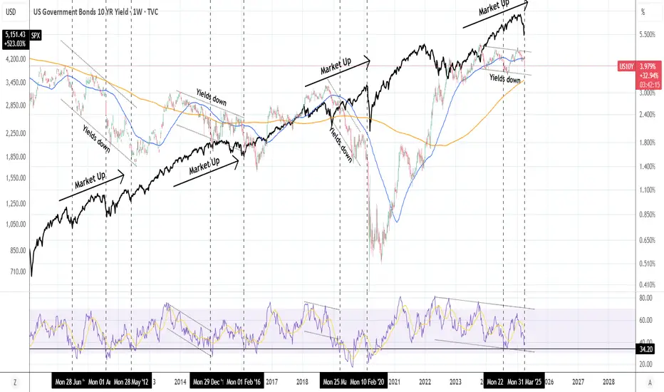
US10Y Rising Yields on a new massive Bull CycleAt the start of this year (January 02, see chart below) we gave a bullish call on the U.S. Government Bonds 10YR Yield (US10Y), expecting a rebound on its 1M MA50 (blue trend-line) and break-out above the 3-year Triangle:
That break-out happened in April and technically this is the start of a new Bullish Leg towards the 10-year Higher Highs trend-line.
After all, the market has entered a new massive Bull Cycle following the April 2022 bullish break-out above both the 1M MA200 (orange trend-line) and the Lower Highs trend-line, holding as Resistance since 1987!
Expect bond yields to keep rising, perhaps even more aggressively than now. Risky assets, like stocks won't be unaffected.
---
** Please LIKE 👍, FOLLOW ✅, SHARE 🙌 and COMMENT ✍ if you enjoy this idea! Also share your ideas and charts in the comments section below! This is best way to keep it relevant, support us, keep the content here free and allow the idea to reach as many people as possible. **
---
💸💸💸💸💸💸
👇 👇 👇 👇 👇 👇
US10Y - Bulls Face a Major Resistance Zone!US10Y remains bullish, trading inside the ascending blue channel while continuing to respect the long-term support and resistance zones.
Price is now testing the red resistance area, where a rejection could send price back toward the blue support area.
⭕For the bearish scenario to gain more strength, price would need to break below the blue trendline and the green trigger area, providing the first major indication that momentum may be shifting from bullish to bearish. Moreover, a bearish divergence is still developing, which is not confirmed yet but could add further confluence to the bearish scenario if confirmed.
⭕However, if the red resistance area fails to hold and buyers manage to break above it, the bullish structure would remain intact and the focus would stay on the continuation of the broader uptrend.
The reaction around this resistance may reveal whether sellers can push price back toward support or if buyers are ready to extend the broader bullish move.
⚠️ Disclaimer: This analysis reflects my personal market view and is not financial advice.
Rayan Nasser
#US10Y #TreasuryYields #Bonds #TechnicalAnalysis #PriceAction #Trading #MarketStructure #US10YYield
US 10 Yr Yield: The Final Squiggle and the TINA Tug of WarTake a look at the battle playing out between the 4 hour and the Daily charts on the 10 Yr Treasury.
Daily, the chart saw a sudden blast of buying energy pushing yields right up against 4.80 percent. But when you zoom in to the 4Hr timeframe, the picture tells a different story.
Right now, the 4 hour chart is painting a bearish engulfing candle after tapping that 4.80 percent mark. Yields could pull back to test support or an EMA (one of the colored moving avgs), one last quick pop to trap late breakout buyers, and then roll over into the September and October window.
Daily momentum is exhausted, printing lower momentum peaks on both RSI and TTM while yields struggle to make a clean, sustained breakout through this multi month ceiling.
The Squiggle Roadmap: One Last Fakeout Pop?
Markets love to sweep liquidity and trap late traders before making their real move.
That timing lines up with the macro schedule. The Treasury ramps up its expanded debt buyback operations to absorb long bond supply, putting a natural lid on how far yields can climb heading into the Fed meeting.
Where Does TINA Fit In?
For years, the market lived by the TINA rule: There Is No Alternative to equities.
Some say TINA is gone because risk free paper yields near 5 percent. But is it really dead? If true inflation is running hotter than stated figures, a 5 percent bond still locks in negative real purchasing power. Under that view, money is eventually forced back into companies with real pricing power and hard cash flows because bonds cannot outrun true cost of living increases.
In the short term, however, nearly 5 percent on cash creates a real headwind for stock multiples because big funds can park capital safely while waiting out volatility.
The Bottom Line
TINA is not dead, but it is facing a major short term test. We are watching for that final squiggle on yields to exhaust itself against heavy overhead resistance. Once the daily chart confirms a real rejection, the stage is set for a rate pullback into autumn.
Update: The Rates Trap Springs as Yields Threaten a BreakThe macro script shifted today. The US 10 Yr yield was not running earlier in the morning, but it has suddenly caught a strong bid and is aggressively moving to retest its highs.
The front end 2 Yr yield bounced off support, and the 10 Yr RSI is hooking sharply upward. That move puts the multi month bearish momentum divergence in immediate danger of breaking to the upside. Keep in mind that this is intraday action, so the daily closing print will be critical since price action can always shift before the closing bell.
Mid Caps SP:MID : Fundamental Pressure and Weakening Momentum
Unlike previous pullbacks where institutional dip buyers stepped in rapidly, the daily RSI has dumped into the mid 30s with zero dynamic bounce.
Mid cap heavy cyclicals and capital goods manufacturers are the first to feel sticky borrowing costs eat into cash flows and profit margins.
With momentum bars rolling over, mid caps are showing clear signs of buyer exhaustion under the weight of higher rates.
Small Caps TVC:RUT : Living on Borrowed Time
Russell 2000 small caps are still hovering inside their ascending channel near 2,980, but underlying momentum is exhausted. AMEX:IWM
Small caps carry significant floating rate debt and higher refinancing vulnerability. Daily RSI has failed to expand into new high territory, signaling that the move is running on thin breadth.
With mid caps already weakening under rate pressures, small caps look vulnerable to following closely behind.
The Main Takeaway
Higher borrowing costs are no longer just background noise, they are actively forcing a repricing across cyclical assets. As long as the 10 Y yield threatens to punch through 4.75 percent, attempting to catch falling knives in equities or long duration bond plays carries high risk until a true daily rejection candle confirms at the close.
TGtg!
Part 2: The Fiat Illusion and the Final EndgameWhy are stock markets still sitting near all time highs if yields are squeezing the economy?
The answer comes down to what measuring stick you are using.
When you look at SPCFD:SPX priced in nominal fiat dollars, the chart looks like an unstoppable powerhouse. But when you price AMEX:SPY in hard money like Gold, the entire illusion disappears.
At the 2k peak, one share of the SP 500 was worth roughly 5.4 ounces of gold. Today, even with the index trading above 6000, it buys under 2 ounces of gold. In real money terms, broad equities are down over 60 percent from their 2k highs and have traded sideways for two decades.
Much of the nominal equity rally is not pure productivity. It is denominator debasement. Stocks represent real assets with pricing power that mechanically rise as the currency devalues.
This connects directly to the Warsh vs Bessent standoff.
Treasury is funding long bond interventions by loading the front end with short paper. As the Fed holds short rates high, net interest on the national debt explodes. Deficits widen further, forcing even more debt issuance just to service existing obligations.
This is the fiscal dominance trap.
Either the Fed keeps rates high and breaks the debt rollover machine, or the system demands debt monetization. When private auctions get overwhelmed, the printing press becomes the only mathematical release valve left.
Watch the 2Y versus 10Y divergence closely. The front end is screaming that the policy tug of war is reaching its limit.
TGtg!
Part 1: The Yield Curve Battle! Warsh vs Bessent
The bond market is setting up for an epic clash between two opposing forces.
On one side we have Federal Reserve Chair Kevin Warsh. At Jackson Hole, Warsh delivered a clear message. Underlying inflation remains sticky and the Fed has work to do. He refused to promise rate cuts, warned markets against front running easy policy, and kept rate hikes firmly on the table.
On the other side we have Treasury Secretary Scott Bessent. The Treasury wants to keep borrowing costs from blowing out. To prevent the long end from exploding, Treasury is using duration buybacks to cap yields while tilting massive issuance toward short bills. Spoken on this.
The charts tell the whole story.
Look at the 10yr yield. Price is stalling at the 4.74% ceiling. RSI shows a clear bearish divergence while TTM momentum is bleeding down toward zero. The long end is hitting a wall of supply management AND intervention.
Now look at the 2yr. After retesting its broken trendline, it is ripping higher. The RSI printed a higher low and TTM momentum just flipped out of red contraction bars into an upside squeeze. The front end is pricing in the reality that the Fed is not coming to the rescue.
This creates an aggressive bear flattener.
Treasury is trying to suppress the back end to protect mortgages and corporate borrowing. The Fed is hammering the front end to crush sticky inflation.
When the 2 year runs hot while the 10 year is pinned, bank lending margins get squeezed and debt rollover costs spike. The Treasury is running out of room to play duration games before the front end forces a real economic break.
TGtg!
Yield Ceiling and the Rates Trap: Will Stocks Truly Benefit?Instead of big institutions and foreign holders dumping their long term Treasury bonds onto the open market and spiking yields through the roof, they can now use collateral loan programs.
By borrowing cash against their bonds instead of selling them, the market avoids forced fire sales. That removes the massive supply shock and helps explain why the 10 Year yield is hitting a brick wall.
We called earlier that the Fed would not be raising rates, and the market structure is validating that more every day.
Here is what the charts are telling us on rates.
US 10 Year
That 4.75 percent level is acting as a concrete ceiling. The daily RSI shows clear momentum exhaustion making lower highs while yields pushed sideways to slightly up. On top of that, the momentum squeeze bars have completely flattened to baseline dots. The push higher ran out of gas. TVC:TNX
US 2 Year
The 2 Year broke its major downtrend from late 2023. However, it has formed a clean lower high recently. Front end yields are rolling into a steady downtrend, OPINION, as rate cut expectations solidify. A drop down to test the 4.06 percent zone looks like the next logical move.
The Big Question: Will stocks rise on falling yields?
Not automatically.
There are two kinds of yield drops. If yields drop because inflation is beaten and the financial system is calm, stocks celebrate. But if yields roll over because economic growth is cooling off rapidly, lower yields will not save stock earnings multiples right away.
Cyclical businesses notice slowdowns first. If yields fall while the economy cools and the Dollar Index catches a short squeeze bounce off its lows, stock dips will struggle to find aggressive buyers immediately. Yield relief is coming, but the economic backdrop will dictate whether it is a launchpad or a trap for equities.
TGtg!
Why the Treasury's Bond Buyback Failed to Calm Bond MarketsOn August 19, 2026, the US Treasury made a surprising announcement: it would more than double its bond-buying operations to between 2 and 4 billion dollars each, with a focus on long-dated debt. Interest rates fell sharply in response to the news, with the 10-year Treasury down over 5 basis points and the 30-year down 9 basis points, while stock futures jumped.
However, by the next day, most of the gains had been erased, with the 30-year yield climbing back towards its 19-year peak. This article will discuss what happened, why the market reacted so positively to the news at first, and what this episode says about the effectiveness of government interventions in a market as large and complicated as that of the bonds.
What the Treasury actually did
The US government routinely issues new debt to finance its operations, but it also conducts occasional buybacks of its own bonds, which are designed to provide liquidity to the bond market and allow the Treasury to intervene in specific points of the yield curve.
The Treasury announced on August 19 that it would be increasing the scale of its buybacks for bonds between 10-20 and 20-30 years, starting on September 9 and ending on November 4. This announcement came at a time when the national debt of the US was approaching 40 trillion dollars for the first time, and the 30-year yield was at 5.323%, its highest level since 2007.
Why the market reacted positively to the news
The market’s positive reaction to the news was entirely rational, as the intervention the Treasury was planning to make was undeniably helpful. An increase in demand for bonds, even if it is not directly stated as such, will always have a positive effect on their prices and hence lower their yields, at least in the short term. This is precisely what happened on Wednesday, when both the 10- and 30-year yields fell by several basis points within hours of the announcement.
Why the market erased most of the gains
However, by Thursday, most of these gains had been erased, with the 30-year yield climbing back to near its 19-year peak. By Friday, the yield on the 10-year Treasury was nearly back to where it was before the announcement was made, having regained more than 5 basis points. Analysts have several reasons for believing that the positive reaction to the news was not justified.
First of all, they pointed out that the changes announced by the Treasury were not large enough to have a significant impact on the bond market. An increase in the scale of buybacks from 2 billion to 4 billion dollars, while significant, was not nearly as large as the 32 trillion dollars in bonds issued by the Treasury. According to one analyst from Jefferies, the intervention was too small to have a meaningful impact on the supply-demand dynamics of the bonds.
Furthermore, analysts pointed out that the buybacks essentially only address the symptoms of the yield increase, not the causes. Several strategists mentioned that the rising yields were the result of concerns about the size of the deficit and hence should have been addressed directly. Another analyst from JPMorgan noted that the market’s reaction to the news might have been counterproductive in the long run.
He stated that the market’s positive reaction to the news might have undermined the credibility of the Treasury’s commitment to a “steady and consistent” approach to managing the debt, as an unpredictable intervention of this sort creates a “higher risk premium” for bonds, which defeats the original purpose.
Another analyst noted that the buybacks can be seen as an informal attempt to intervene in the yield curve and limit its growth, which means that their effects should be interpreted with this in mind. The market takes such signals from the government seriously, and hence the yields did not fail to react to the news, despite the initial drop on Wednesday.
What lies ahead for bond yields
The increase in bond yields that started back in June was caused by several different factors, most of which are still present and contribute to the rise in yields. These include the concerns about the size of the deficit, the increase in the term premium, the shift in the composition of buyers of the bonds, and the increased issuance of corporate bonds backed by AI infrastructure.
Higher yields for longer-dated bonds are also felt outside the government debt, as the 30-year mortgage rates climbed to 6.75% around this time, which is a direct result of the same forces pushing the Treasury yields higher.
What to watch for
The most important development to watch for in the near future is the comments made by the Fed’s chairman, Kevin Warsh, at the Jackson Hole Economic Symposium, as the market is waiting for any signals about the intentions of the central bank to intervene. Several analysts believe that the recent jump in yields has essentially been a test of the resolve of the Fed, and hence its reaction will shape the future movements of the yields.
It will also be important to watch for any changes the Treasury makes to its bond-buying operations, as such a significant reaction to a relatively small intervention suggests that the government is concerned about the size of the yield increases. If the Treasury continues to make similar announcements in the future, it will show that the interventions announced so far were not nearly enough to stabilize the market.
The level of the 30-year yield relative to its 19-year peak is also a helpful indicator to watch, as the market’s attempts to push the yields higher suggest that the forces driving them upwards are still present.
My final thoughts
For one day, it seemed as if the concerns about rising yields had been calmed and the market had reacted positively to the news. However, by the end of the week, the market made it clear that, for the time being, the long-term yields were on a path towards higher levels.
While the announcement made by the Treasury was helpful, it failed to address the larger concerns about the size of the deficit and the risks posed by the growing national debt. The market made it clear that an increase in the scale of buybacks from 2 billion to 4 billion dollars was not enough to stabilize the bond market and hence stop the rise in yields.
Thank You
@VertexQore
Part 2: Macro and Rates (10 Year Yield and US Dollar)TVC:TNX
The 10 year yield reached a new local peak, but the momentum indicators completely failed to match that push. The momentum (TTM) bars have been steadily shrinking since May. Yields are grinding higher on fumes, which sets up a likely pullback.
US Dollar Index TVC:DXY
Even though the Dollar Index dropped below 99.00, the underlying momentum is quietly making higher lows.
That setup points to a short term bounce back.
The Big Picture
If the 10 year yield rolls over because the broader economy is cooling off, stocks will not see it as a relief rally.
Mid caps are on the point of breaking down because cyclical businesses feel higher costs first. If yields drop while the dollar stages a short squeeze, stock pullbacks will likely struggle to find strong dip buyers right away.
TGtg!
Weekly Review (Aug 24-28): EUR, GBP, AUD, Gold & RatesWeekly review for August 24–28. Not signals, just how I read the tape with the Conflux Method: structure (Reaction Levels), order flow (cluster / delta) and options data.
Context: last week Bessent announced a doubling of the government-bond buyback limits (running Sept 9 to Nov 4), timed around the elections and the Fed meeting to paper over the negative. The key thing: they've flagged their pain point on the Treasuries, and the market now knows it. But the buybacks are only $4 billion, carried purely verbally, like the yen interventions, and I don't think that holds the market for long.
CME:6EU2026 (EUR, main chart above)
Interesting options showed up. The central and the first and second strikes are sold. They've shown the working ranges: above 1.1988 it's almost unrealistic to get through. This straddle is very interesting into Wednesday, and given the day's balance at the open, it's attractive for longs on a pullback and for sells on a push up. For now the main plan is to buy it back. A ratio of at least 1 to 3 when taking profit, on both buys and sells, and the remainder left in the market at breakeven.
CME:6BU2026 (GBP)
Briefly on the pound: the zones of Wednesday, the Week and the Quarter, and the chances of reaching and breaking through them.
CME:6A1! (AUD)
The zones of Wednesday and the Contract; the weekly one is useless because it sits right next to the Contract boundary. From the open I'm very interested in working these intraday zones. At 0.7122 they added 700 contracts as support, almost at the high, so I'll definitely try to buy it back. Until expiration the 73 strike is almost unbreakable.
COMEX:GCZ2026 (Gold)
Here's what's very interesting from the open. 4530 and 4543 I'll definitely work. Right at the open there's support at 4642-4644, but only within the first 1-2 hours. 4593-4595 I'm interested in for market buys until the Japan close. Up top in the zones there are slabs too; volumes went through on these strikes and there's support there. Watch the open: if they try to break 4530, then 4315 starts lighting up strongly, because the MaxPain for September 20 hangs there and I doubt they'll leave that Debt. That move gets painted if Bessent deflates on the Treasury buybacks and they go back to conquering the highs.
COMEX:GCV2026 (Gold — October options, target reference)
Off-exchange, 1100+ puts went through with a breakeven around 4430 on the next contract, twelve million dollars' worth. There's a very good chance of reaching these options, so I'll leave it as a target for reference, and if it plays out, from there I'll look at shorts. Those players shorted at the highs with a clean breakeven, but by the close the strike emptied out.
TVC:US10Y (US rates — Bessent & Jackson Hole)
Just as the speculators work against the Bank of Japan, they can now start working against Bessent. So far it's only a verbal threat, no specifics, and $4 billion is laughable for a market that trades tens of billions a day. So the funds and the Treasury could drag the 30-year up to the 6 to 6.15% region before the Fed steps in and brings it down to 5% as a first target, but only a rate hike can do that. Jackson Hole is the intrigue of the week, and whether Warsh gives specifics or just spreads fog again.
These are zones and scenarios I'm watching, not a call to trade. Let price come to your levels and let the reads converge first.
Educational only, not investment advice. Trading carries a high risk of capital loss. Past results don't guarantee future performance.
#ConfluxMethod #trading #futures #options #forex #gold #bonds #orderflow
How a Treasury Policy Shift Sent Bitcoin Rocketing Past $69,000
Bitcoin advanced nearly 6% to $69,500 on Wednesday after the U.S. Treasury made a move nobody was fully pricing in: doubling its long-term bond buyback operations to pump liquidity into the market. The decision pushed bond yields lower, weakened the dollar, and sent traders scrambling to cover over $1 billion in crypto short positions.
The rise was prompted by a policy shift that improved the outlook for all risk assets.
Why the Treasury Announcement is so Important
The Treasury announced that it would increase the size of its long-dated buybacks by $2 billion to at least $4 billion per operation, starting in September. In other words, the government will be buying back more bonds in order to relieve pressure on the bond market.
This news sent yields on 10- and 30-year Treasuries lower, and the dollar lower, too. In turn, that has caused an inflow of money into risk assets, Bitcoin and gold among them.
The Short Squeeze Also Helps
Bitcoin’s ascent has caused many leveraged short sellers to liquidate their positions, which has resulted in more than $1 billion in short liquidation within hours. This caused a self-reinforcing loop: selling pressure sent the price of Bitcoin higher, which caused even more short sellers to liquidate, and so on. The resulting short squeeze has added to the price increase, beyond what the news on the Treasury actions alone would suggest.
Another Explanation is Inflation Hedge
Moreover, aggressive government support of the bond market has caused investors to interpret that as a sign of impending inflation. When investors believe that the currency they hold will depreciate, they seek to buy assets that will help preserve their purchasing power. Gold, Bitcoin, and other assets have been viewed by investors as inflation hedges.
What Does it Mean for Bitcoin?
It means that this time, the rise in Bitcoin was not specific to the cryptocurrency market but was rather part of a larger rally in liquidity and rates. The confluence of these factors has benefited not only Bitcoin but gold, risk assets, and the dollar. What will happen next depends on whether the Treasury’s support of the bond market is maintained and whether yields remain suppressed.
Thank You
@VertexQore
Hotel California Treasury TrapFrancis Hunt has used the "Hotel California" analogy ("you can check out anytime you like, but you can never leave") to illustrate how major holders of debt are effectively trapped and blocked from outright selling when they need liquidity. Love it!
Three examples:
Japan (Current Example)
Situation: Japan sought to liquidate roughly $58B to defend the plunging yen.
Trap: Selling caused 10yr and 30yr yields to spike, triggering panic. The U.S. intervened with currency operations and facilities, effectively saying "don't sell that, borrow against it". Essentially converting a massive creditor into a dependent borrower via a "soft lockout."
California Teachers' Retirement System
Situation: Approved an emergency policy permitting the fund to borrow over $30B in debt and leverage for cash flow and liquidity management.
Trap: Why borrow when you hold hundreds of billions in assets? Because in a fragile bond market, liquidating large blocks of fixed income to meet cash obligations risks triggering major capital losses and cratering secondary market bids.
Gulf States
Situation: Facing sudden revenue drops (bombed oil infrastructure, halt in desert tourism), Gulf nations wanted to liquidate U.S. Treasuries for cash.
Trap: The Federal Reserve stepped in with dollar swap lines to give them liquidity rather than allowing them to dump Treasuries into the secondary market.
DANGER:
Cayman Islands: Ghost Bid Propping Up Treasuries
Before looking at the liquidity traps, look at what is actually holding up the building.
The Cayman Islands has a nominal GDP of roughly $7B, yet it holds over $450B in official U.S. Treasuries, with total hedge fund Treasury exposure domiciled there exceeding $1.8T!
This is not organic sovereign demand; it is the Treasury cash futures basis trade:
Mechanism: Multi strategy hedge funds use offshore entities to borrow cheap short term cash (via repo markets and zero rate Yen carry trades).
The Trade: They buy cash Treasuries and short Treasury futures, leveraging tiny yield spreads up to 20x to 50x to juice returns.
Vulnerability: When repo rates spike or carry trades unwind, the trade implodes into forced selling, exposing that the marginal buyer of U.S. debt is not foreign governments, but opaque, levered offshore balance sheets.
us10y elliott wave theory analysisthe us10y wave count :
from march 2020 through october 2023, the us10y came up in what looks like a pretty picture perfect 5 wave move. since that peak, it hasn't been able to make a new high and has instead spent the last few years putting in a series of lower highs.
---
paired with the wyckoff distribution theory from my last post(attached at the bottom of this post), i'm assuming the us10y has already found its major peak and has been distributing since late 2023, basically getting ready for a much larger markdown.
---
if my wave count is correct, the move down should unfold in 3 waves. the first decline from the 2023 high would be wave a, this rally back toward the highs would be wave b, and once wave b is finished, we should eventually begin the larger wave c lower.
---
i think that decline could stretch into the early 2030s. my more conservative target is around 2.5% , but i wouldn't rule out something closer to 1% if wave c really extends.
---
the interesting part is that this entire decline would still be corrective by design. so even if yields come down massively from here, the larger trend would still suggest that the us10y eventually goes much higher again afterward.
we'll touch on that part at a later date.
🌙
us10y drops down to 1%
the TVC:US10Y distribution is getting interesting
the us10y has basically spent the last few years building out what looks like a pretty massive wyckoff distribution. to me, it looks closest to distribution schematic #2 , just with a slight modification in phase b. after the buying climax around 5%, yields got smacked down into the automatic reaction, bounced around the range for awhile, then tried to push back toward the highs. but it never actually got there. instead of giving us a clean upthrust above the bc, the phase b rally failed underneath it. and that's important. the market couldn't even sweep the previous high before rolling back over. that's weakness.
---
since then, the structure has continued to make sense. we got the phase b sow, then this long grind back toward the upper part of the range, with lower highs forming along the way. now we're sitting near what could potentially become the lpsy, last point of supply . if that's what this is, then we're probably getting pretty close to the end of the distribution. the big area i'm watching is around 3.78% to 3.60% . if yields eventually break through that support and can't reclaim it, that's where this starts looking less like a range and more like the beginning of an actual markdown, phase d into phase e.
---
the macro side of this is where things get really interesting, because this isn't your normal slowdown setup. the economy isn't falling apart. if anything, it's doing the opposite. the labor market remains incredibly strong, pmi has started picking back up, and we're entering a completely new productivity environment with ai increasingly being put into the hands of the people running the largest companies in the world. businesses are becoming more efficient, productivity has the potential to explode, and economic activity can continue accelerating. yet, at the same time, inflation has been cooling from its extremes. that's a pretty unique combination. the economy can rip while inflation cools.
---
if that continues, the fed could find itself in a situation where it no longer needs extremely restrictive monetary conditions, not because something broke, but because inflation is coming under control without requiring the economy to be crushed. that's the part i find fascinating. we could potentially get meaningful monetary easing alongside an economy that's actually accelerating, and the bond market might already be sniffing that out. the 10 year is constantly trying to price what comes next, not just what's happening today. so if this distribution really is completing, we could be looking at the beginning of a much larger move lower in long term yields without needing some massive recession or economic collapse to get us there.
---
quick glossary for anyone looking at the chart:
psy, preliminary supply is the first area where bigger sellers start showing up after a strong move higher. basically, the first hint that the trend might be getting tired.
bc, buying climax is the point where buying gets extreme. everyone wants in, demand is huge, and larger players finally have enough liquidity to unload into it. this usually helps establish the top of the range.
ar, automatic reaction happens once that huge wave of buying dries up and price drops hard. this helps establish the bottom of the range.
st, secondary test is when price comes back toward the highs to see if demand is still there. if the market is actually distributing, those pushes usually start looking weaker over time.
sow, sign of weakness is a move back toward the bottom of the range that shows supply is starting to take control. basically, the character of the market starts changing.
failed ut attempt is the slight modification i'm referring to in this structure. normally, distribution #2 can produce an upthrust above resistance, but ours never even made it above the buying climax. it failed underneath it, which to me is a pretty meaningful sign of weakness.
lpsy, last point of supply is one of the final rallies before markdown. price tries to push higher again, but demand just isn't strong enough anymore.
---
nothing is confirmed yet. phase d and phase e are still projections. but if this current rally really is the lpsy, and the us10y eventually loses that lower support zone, this could turn into one hell of a move. and the really interesting part is that we may not need an economic disaster to make it happen. this time around, we could see yields collapse while the economy continues to accelerate. a very different kind of cycle.
---
ps. i will share my wave count on the us10y in my next post.
US 10Yr vs 2Yr Analysis: Part 2Back to the domestic picture, the Treasury curve is flashing distinct technical signals across maturities.
US 10 Year Yield is showing notable exhaustion. Following the push toward the 4.8% zone, the daily frame is carving out a clear bearish divergence on the RSI alongside fading momentum on the TTM Squeeze histogram.
With momentum drying up at local highs, establishing a sustained push through 4.80% appears increasingly difficult without a fresh macroeconomic or inflation catalyst.
US 2 Year Yield is inside an active downtrend. The 4.38% horizontal red band remains a major technical roadblock. Every upside test into 4.38% has met heavy pressure, forcing yields back down. The front end is steadily pricing in monetary easing expectations, keeping the broader downtrend intact and making 4.38% formidable overhead resistance.
Social media screams rate hike but are charts are pointing to a rate cut?
US Yields: Inflation Signals vs Technical Structure 2Yr 10YrWith incoming inflation prints coming in cooler than expected, macro narratives suggest yields should drop. However, the charts tell a much more nuanced story across timeframes. Let’s break down what the technical is actually signaling on the 2 and 10 Year yield.
Bullish Juice
1. RSI Trendline Breakouts
Across both the daily and weekly timeframes, RSI has decisively broken out of its long-term downtrend lines and reset into the key 50–58 equilibrium zone.
Rather than crashing below the 50 mid line (which would signal downside momentum), the indicators digested previous overbought levels through time rather than deep price decay. This is a classic trend continuation signature.
2. Multi Year Moving Average Alignment
The short and medium term EMAs (Red/Green) remain stacked above long term dynamic support (Blue) across both curves.
Daily Support (NOT SHOWN): Since March, the daily Red EMA line has repeatedly held as dynamic support for the 2Yr, proving buyers continue to defend pullbacks despite soft macro headline data.
3. Structural Break & Retest on the 10Y
The 10 Yr executed a clean breakout above its multi year descending trendline/pennant resistance and is currently in the process of a structural retest. Former overhead supply is attempting to flip into major structural demand.
The Divergence:
10Yr Yield reentering the pennant formation would be highly unusual and represent a major technical failure/fakeout. As long as a retest of support holds, the structural path of least resistance points upward toward the macro $5.17 supply ceiling.
2Yr Yield is highly sensitive to short term rate expectations. Given the cooler inflation narrative, the 2Y can easily pull back deeper into its multi-year bull flag structure without destroying the macro thesis. A retest on a support horizontal pivot remains a plausible scenario while still keeping the larger consolidation pattern intact.
Summary: Keep a close eye on Monthly candle closes. Daily/weekly breakouts are showing appetite, but until we see a decisive monthly close above the macro 5.13 / 5.17 ceilings, expect choppy retests inside these higher timeframe flags.
TGtg!
What's your take? Is the 10Y retest going to hold, or does soft macro data force a deeper pullback on the 2Y first? Drop your thoughts below!
DXY - Will the dollar continue to fall?The dollar index (DXY) is below the EMA200 and EMA50 on the 4-hour timeframe and is moving within its daily ascending channel (it has reached the bottom of the daily channel). The range of 98.36 to 98.56 could be a low-risk area for buying the dollar index.
In the two supply areas above the current price, we will look for a resale of the dollar with a risk-adjusted reward in dollar currency pairs or for upward fluctuations in global gold ounces.
The Fed is now extremely polarized. At the July meeting, three members—Beth Hammock, Neil Kashkari, and Lori Logan—wanted to raise rates by 25 basis points; the majority, however, held rates steady. On the other hand, the very weak July jobs report and the heavy corrections two months ago have made the market take the possibility of a rate cut or at least no rate hike in September more seriously again. So the main question for the market is no longer just “Is the Fed hawkish or dovish?” but rather which will have the upper hand in the next decision, inflation or the labor market.
This story has directly affected the DXY. After the weak jobs report, the dollar came under pressure, with the DXY hovering around 99.70. The DXY’s short-term structure is currently more bearish, unless inflation data turns the market back toward rate hikes.
US 10-Year Yield: The Number That Controls EverythingLook at this for a second: one number moves by just 0.10%, and six different parts of the global economy react almost instantly: stocks sell off, borrowing costs rise, mortgage rates go up, the dollar strengthens, gold comes under pressure, and money starts leaving emerging markets. That's not an exaggeration. That's literally what happens, over and over, every time this number moves.
Most traders never look at this number properly. They watch their favorite stock, check the news, maybe glance at Fed headlines, but the real engine behind most of these moves is sitting quietly in the bond market. Let's break it down, one piece at a time.
First, what is the 10-Year Yield?
The US government borrows money by selling bonds. When you buy a 10-Year Treasury bond, you're lending the government money for 10 years, and they pay you interest for it. That interest rate is the yield.
The one thing beginners always get confused about: bond prices and yields move opposite to each other. If people are buying bonds, prices go up and yields go down. If people are selling bonds, prices go down and yields go up. So when yields rise, it usually means investors are selling either because they want a better return, or they're worried about inflation eating into their money over time.
This yield is called the risk-free rate because lending to the US government is about as safe as investing gets. Almost everything else in finance gets compared against it that's why this number carries so much weight.
1. Stock markets sell off
When big investors work out what a stock is really worth, they estimate the company's future profits and bring that value back to today's terms using a discount rate. The 10-Year Yield sits right inside that discount rate.
When yields rise, future profits are worth less in today's dollars, so stock prices tend to drop. This hits growth and tech stocks the hardest, since their value is based heavily on profits still years away.
Next time the 10-Year Yield spikes, watch how fast Nasdaq futures turn red, often before any actual news even comes out.
2. Borrowing costs rise for everyone
Companies borrow money to grow, hire people, and buy back their own shares. The rate they pay is basically the 10-Year Yield plus a bit extra depending on how risky the company is seen to be. When yields rise, borrowing gets more expensive across the board, even for financially strong companies. That means fewer stock buybacks, slower expansion, and real pressure on companies already carrying a lot of debt.
3. Mortgages and loans get more expensive
This is the one that hits regular people directly. Mortgage rates mostly track the 10-Year Yield, plus a margin added by lenders, not the Fed's rate decisions, as most people assume. If the 10-Year Yield jumps from 4.00% to 4.50%, mortgage rates usually move up close to the same amount. On a $400,000 home loan, that can add over $100 to your monthly payment. Multiply that across millions of buyers and the whole housing market slows down.
4. The US dollar strengthens
Money around the world is always looking for the best safe return. When the 10-Year Yield rises, US bonds become more attractive compared to bonds from other countries, so money flows into the dollar and it strengthens.
A stronger dollar creates its own chain reaction: US exports get more expensive for other countries to buy, debt gets more expensive for anyone who borrowed in dollars, and dollar-priced commodities like oil often get cheaper.
5. Gold and commodities come under pressure
Gold doesn't pay any interest it just sits there. So its appeal depends on what you're giving up by holding gold instead of something that pays you, like a Treasury bond. When yields rise, especially after adjusting for inflation, gold usually becomes less attractive and can fall.
When yields fall, especially while inflation stays high, gold tends to look more attractive and often rises.
6. Emerging markets see capital outflows
Countries like Brazil, Turkey, India, and Indonesia depend heavily on foreign money flowing into their stock and bond markets. When the 10-Year Yield rises, that "safe" American return looks more attractive, so foreign investors pull money out of these markets and move it back into US bonds.
This is called capital flight. A real example: 2013's "Taper Tantrum" when the Fed just hinted at slowing bond purchases, the 10-Year Yield jumped from around 1.6% to nearly 3% in a few months, and emerging market currencies fell sharply within weeks.
What happens when yields jump in a single day
Tech and growth stocks sell off within minutes as future profits get discounted more
Borrowing costs rise for companies trying to raise money
Mortgage quotes get adjusted higher, cooling down home buying
The dollar strengthens as money flows toward better US returns
Gold usually dips
Money starts flowing out of emerging markets back into the US
None of this needs a war, a crisis, or even a Fed meeting to happen. A single inflation report or a weak bond auction can set the whole thing off in one trading session.
A real-world example: banks feeling the pain
Banks hold large amounts of government bonds because they're considered safe. But when yields rise fast, the bonds a bank is already holding, bought back when yields were lower, lose value.
This is exactly what happened with Silicon Valley Bank in March 2023 . SVB had parked a big chunk of customer deposits into long-term bonds when yields were near zero. As yields climbed, those bonds lost value. When depositors got nervous and pulled their money out, the bank had to sell those bonds at a big loss, and it collapsed within days.
How to actually use this as a trader
Keep the 10-Year Yield chart open next to the Dollar Index, S&P 500, and Nasdaq to see the relationship in real time
Watch CPI reports, jobs data, and Treasury bond auctions; these move yields the most
Watch the gap between the 2-Year and 10-Year yield; when the 2-Year goes above the 10-Year, it's called an inversion, historically a strong recession warning sign
Don't trade off the yield alone; use it to confirm what your chart already shows
Remember: the real yield (10-Year Yield minus inflation expectations) matters most for gold, not just the raw number
My thought
Most traders spend all their time staring at one stock's chart and never realize the real force moving the market is sitting quietly in the background. The 10-Year Yield isn't just a bond thing. It touches stocks, borrowing costs, mortgages, the dollar, gold, and entire economies at the same time. Next time you see it move even a small amount, don't scroll past it. That tiny number is quietly moving trillions of dollars, and now you know exactly how.
Thank you,
@VertexQore
US10Y: The Macro Breakdown and Big Picture RoadmapThe daily chart shows losing momentum, but zooming out to the weekly and monthly timeframes paints a much bigger picture. Higher timeframes always control the trend, and the larger structure remains heavily slanted to the upside.
Daily Momentum Lag
Daily RSI shows a classic bearish divergence, signaling that the immediate momentum is cooling off. However, momentum loss does not equal an automatic trend reversal. It can resolve through sideways consolidation rather than a sharp selloff while the weekly trend continues to build steam.
Weekly Breakout
The weekly chart shows a clean expansion. Moving averages are aligned in full bullish order, overriding the short term daily slowdown and keeping pressure applied to overhead resistance.
Monthly Macro Perspective
Zooming out to the monthly chart, yield action has compressed within a massive multi year symmetrical triangle since 2022. Pushing above the upper boundary signals a macro continuation that puts multi decade levels back on the table.
Roadmap Ahead
Target 1: 4.8
The immediate magnet and horizontal ceiling. Expect the daily momentum reset to kick in near this level. Then a conceivable pullback forming bullish higher lows, setting the stage for the next leg up.
Target 2: 5 to 5.2
A clean weekly close above 4.80 percent clears the path to test the 2023 cycle high and the mid 2000s structural pivot.
Target 3: 5.5 Percent and Higher
Clearing 5.2 opens up the 2006 to 2007 pre financial crisis peaks, with long term macro targets stretching toward 6.00 percent over time.
Summary:
Respect the daily cooldown for short term entries, but do not lose sight of the weekly and monthly expansion. A support flip at 4.80 percent is the key signal for the next major leg higher.
10Y vs 2Y Yields: Momentum Is Fading at the TopTreasury yields have pushed back toward their summer highs, but the underlying technical momentum tells a very different story. Both the 2 Year and 10 Year yields are showing clear signs of momentum exhaustion.
2 Year:
Price Action
Yields recently pushed up to a new high, topping the May peak.
The Problem
The RSI and TTM Squeeze histogram failed to follow. While yields made a higher high, RSI did not push and TTM momentum printed lower.
Takeaway
This classic bearish divergence shows the push to new highs lacked true buying power.
10 Year:
Price Action
The 10 Year bested its May peak and is stalling.
The Problem
RSI strength did not show up. The TTM Squeeze momentum is weakening already..
Takeaway
The 10 Year looks structurally weaker than the 2 Year. It could not even clear its previous high despite market pressure.
What This Means:
When yields test key resistance levels on shrinking momentum, the risk of a pullback increases. Expect a potential move back to retest key moving average support levels unless fresh catalyst volume steps in to drive a real breakout.
US10YR 1W TIME CYCLESCYCLICAL PATTERN OF 65 - 70 WEEK HIGHS (+-2)
Smaller Pattern of 20 - 26 Week Lower Highs from Major One.
Based on this, Next Highs should be:
Sept 28th - Nov 21st 2026
Aug 16th - Oct 5th 2027 (Major)
Inversely correlated with Stocks/SPX/NDX so a High = a Low for those ones (usually)
Gold's 4,000 Decision: Markdown or New Base?Gold is sitting at a level that can tempt both sides: bears see a broken major top, while bulls see the psychological 4,000 area as support. The useful question is not “will 4,000 hold?” It is: what sequence of price, volume and relative-yield behavior would confirm either outcome?
This is an OANDA:XAUUSD 1D study as of 26 July 2026. The black zig-zag on the chart is a conditional scenario map, not a guaranteed path or a time-accurate prediction.
CURRENT SNAPSHOT
Gold closed near 4,052.845 after reaching an all-time high of 5,602.225 on 29 January 2026. That is roughly a 27.7% decline from the peak. Price is now around the 20-day SMA (4,068.707), but below the 50-day SMA (4,231.428), the 100-day SMA (4,480.376) and the 200-day SMA (4,494.530). This places the market below a large overhead moving-average cluster while it tests the 4,000 psychological zone.
The US10Y pane is shown as a relative-change comparison over the visible chart window; its displayed percentage is not the bond yield. The direction matters here: a rising relative US10Y line has accompanied pressure on gold. That is a confirmation input, not a mechanical inverse rule.
WYCKOFF PHASE MAP
PHASE A — BUYING CLIMAX AND AUTOMATIC REACTION
The January acceleration into 5,602.225 behaved like a Buying Climax (BC): price became steep, volatility expanded, and the move was followed by a sharp Automatic Reaction (AR). That reaction is the first evidence that the prior markup stopped behaving normally.
PHASE B — SECONDARY TEST AND RANGE
February and March formed a volatile range. The recovery produced a Secondary Test/lower high rather than clean acceptance above the January climax. Volume expanded around major reactions but follow-through weakened. This is where large operators can distribute inventory while the wider market still interprets every dip as a buying opportunity.
PHASE C — LOWER HIGH / LAST POINT OF SUPPLY
A classic distribution does not require an obvious UTAD. Gold did not make a clean new high above the BC; instead, the April–May lower-high structure can be read as a Last Point of Supply (LPSY). I prefer that interpretation because it matches the actual chart rather than forcing textbook labels onto price.
PHASE D — SIGN OF WEAKNESS
The June break and subsequent weak rebounds created a Sign of Weakness (SOW). Price moved under the major moving-average cluster and failed to regain it. The 50-day SMA now sits at 4,231, while the 100-day and 200-day SMAs form a heavier structural ceiling around 4,480–4,495.
PHASE E — DECISION, NOT CONFIRMATION YET
Gold is now testing 4,000. Phase E markdown is not confirmed merely because price touched the level. I want a daily close below 4,000 followed by a failed reclaim. Without that sequence, this can still become a range or accumulation attempt.
FOUR LEVELS THAT CONTROL THE THESIS
1. 4,490 — structural reclaim and 100D/200D supply cluster. Daily acceptance above this zone would materially damage the bearish distribution thesis.
2. 4,231 — reaction pivot and current 50-day SMA. This is the first likely resistance on a relief rally.
3. 4,000 — psychological support and Phase E decision line. A close below it is only the first step; the failed reclaim is the better confirmation.
4. 3,640 — primary markdown objective based on prior weekly structure and the longer-term moving-average region. It is a reaction zone, not a guaranteed final bottom.
SCENARIO MAP
BASE CASE — CONDITIONAL MARKDOWN
Price first retests 4,231, but demand cannot create daily acceptance above 4,490. Gold then loses 4,000, attempts to reclaim it, and fails. That sequence opens a measured move toward 3,640. Volume should expand on the breakdown and contract on the failed rebound. The black zig-zag illustrates this sequence only; the dates and exact turns are not forecasts.
NEUTRAL CASE — NO EDGE
Gold oscillates between roughly 3,950 and 4,231 while volume contracts. That would keep both breakout and breakdown traders vulnerable. In this case, patience is the position: wait for acceptance outside the range instead of predicting every swing.
BULLISH INVALIDATION
A strong daily acceptance above 4,490, followed by a higher low that holds the reclaimed zone, would invalidate the immediate markdown case. That would shift attention to 4,700–4,800 first and then approximately 5,100. A single wick above 4,490 is not enough; structure and follow-through matter.
CONFIRMATION CHECKLIST
• Price: close below 4,000, then fail to reclaim it for bearish confirmation.
• Volume: expansion on weakness; lighter volume on the rebound.
• Moving averages: 4,231 and 4,490 continue acting as resistance.
• US10Y: a rising relative line supports the headwind; a sustained reversal lower weakens it.
• Structure: lower highs and lower lows remain intact.
WHAT WOULD PROVE THIS READING WRONG?
The bearish interpretation is wrong if gold reclaims 4,490 with acceptance, builds a higher low above it, and the moving-average cluster starts turning into support. It is also weakened if a temporary break below 4,000 is immediately recovered on strong volume. Those are observable conditions, not opinions.
HOW TO READ THIS TYPE OF CHART
Start with structure, not a narrative. Mark the climax, the strongest reaction, the retest, the first sign of weakness, and the level that must be reclaimed. Then ask whether volume confirms the direction. Use macro comparisons such as US10Y only after price structure; they should confirm the chart, not replace it. Finally, write the invalidation before the target. If the invalidation is vague, the thesis is not tradeable.