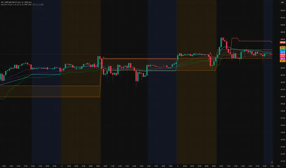
Crypto MVRV ZScore - Strategy [PresentTrading]█ Introduction and How it is Different
The "Crypto Valuation Extremes: MVRV ZScore - Strategy " represents a cutting-edge approach to cryptocurrency trading, leveraging the Market Value to Realized Value (MVRV) Z-Score. This metric is pivotal for identifying overvalued or undervalued conditions in the crypto market, particularly Bitcoin. It assesses the current market valuation against the realized capitalization, providing insights that are not apparent through conventional analysis.
BTCUSD 6h Long/Short Performance
Local
█ Strategy, How It Works: Detailed Explanation
The strategy leverages the Market Value to Realized Value (MVRV) Z-Score, specifically designed for cryptocurrencies, with a focus on Bitcoin. This metric is crucial for determining whether Bitcoin is currently undervalued or overvalued compared to its historical 'realized' price. Below is an in-depth explanation of the strategy's components and calculations.
🔶Conceptual Foundation
- Market Capitalization (MC): This represents the total dollar market value of Bitcoin's circulating supply. It is calculated as the current price of Bitcoin multiplied by the number of coins in circulation.
- Realized Capitalization (RC): Unlike MC, which values all coins at the current market price, RC is computed by valuing each coin at the price it was last moved or traded. Essentially, it is a summation of the value of all bitcoins, priced at the time they were last transacted.
- MVRV Ratio: This ratio is derived by dividing the Market Capitalization by the Realized Capitalization (The ratio of MC to RC (MVRV Ratio = MC / RC)). A ratio greater than 1 indicates that the current price is higher than the average price at which all bitcoins were purchased, suggesting potential overvaluation. Conversely, a ratio below 1 suggests undervaluation.
🔶 MVRV Z-Score Calculation
The Z-Score is a statistical measure that indicates the number of standard deviations an element is from the mean. For this strategy, the MVRV Z-Score is calculated as follows:
MVRV Z-Score = (MC - RC) / Standard Deviation of (MC - RC)
This formula quantifies Bitcoin's deviation from its 'normal' valuation range, offering insights into market sentiment and potential price reversals.
🔶 Spread Z-Score for Trading Signals
The strategy refines this approach by calculating a 'spread Z-Score', which adjusts the MVRV Z-Score over a specific period (default: 252 days). This is done to smooth out short-term market volatility and focus on longer-term valuation trends. The spread Z-Score is calculated as follows:
Spread Z-Score = (Market Z-Score - MVVR Ratio - SMA of Spread) / Standard Deviation of Spread
Where:
- SMA of Spread is the simple moving average of the spread over the specified period.
- Spread refers to the difference between the Market Z-Score and the MVRV Ratio.
🔶 Trading Signals
- Long Entry Condition: A long (buy) signal is generated when the spread Z-Score crosses above the long entry threshold, indicating that Bitcoin is potentially undervalued.
- Short Entry Condition: A short (sell) signal is triggered when the spread Z-Score falls below the short entry threshold, suggesting overvaluation.
These conditions are based on the premise that extreme deviations from the mean (as indicated by the Z-Score) are likely to revert to the mean over time, presenting opportunities for strategic entry and exit points.
█ Practical Application
Traders use these signals to make informed decisions about opening or closing positions in the Bitcoin market. By quantifying market valuation extremes, the strategy aims to capitalize on the cyclical nature of price movements, identifying high-probability entry and exit points based on historical valuation norms.
█ Trade Direction
A unique feature of this strategy is its configurable trade direction. Users can specify their preference for engaging in long positions, short positions, or both. This flexibility allows traders to tailor the strategy according to their risk tolerance, market outlook, or trading style, making it adaptable to various market conditions and trader objectives.
█ Usage
To implement this strategy, traders should first adjust the input parameters to align with their trading preferences and risk management practices. These parameters include the trade direction, Z-Score calculation period, and the thresholds for long and short entries. Once configured, the strategy automatically generates trading signals based on the calculated spread Z-Score, providing clear indications for potential entry and exit points.
It is advisable for traders to backtest the strategy under different market conditions to validate its effectiveness and adjust the settings as necessary. Continuous monitoring and adjustment are crucial, as market dynamics evolve over time.
█ Default Settings
- Trade Direction: Both (Allows for both long and short positions)
- Z-Score Calculation Period: 252 days (Approximately one trading year, capturing a comprehensive market cycle)
- Long Entry Threshold: 0.382 (Indicative of moderate undervaluation)
- Short Entry Threshold: -0.382 (Signifies moderate overvaluation)
These default settings are designed to balance sensitivity to market valuation extremes with a pragmatic approach to trade execution. They aim to filter out noise and focus on significant market movements, providing a solid foundation for both new and experienced traders looking to exploit the unique insights offered by the MVRV Z-Score in the cryptocurrency market.
Fundamental Analysis
LIT - Timings Fx MartinThe Asia Liquidity Points Indicator is a powerful tool designed for traders to identify key liquidity points during the Asia trading session. This script is tailored specifically to aid traders in capitalizing on the unique characteristics of Asian markets, providing invaluable insights into liquidity zones that can significantly enhance trading decisions.
Key Features:
Asia Session Focus: The indicator focuses exclusively on the Asia trading session, which encompasses the trading activity primarily in the Asian markets such as Tokyo, Hong Kong, Singapore, and others.
Liquidity Zones Identification: The script utilizes advanced algorithms to identify and map out liquidity zones within the Asia trading session. These zones represent areas where significant buying or selling pressure is likely to occur, thus presenting lucrative trading opportunities.
Customizable Parameters: Traders have the flexibility to customize various parameters such as time frame, sensitivity, and display options to suit their trading preferences and strategies.
Visual Alerts: The indicator provides visual alerts on the trading chart, clearly indicating the location and strength of liquidity points. This feature enables traders to quickly identify potential entry or exit points based on the liquidity dynamics in the market.
Real-Time Updates: The script continuously monitors market activity during the Asia session, providing real-time updates on liquidity points as they evolve. This ensures traders stay informed and adaptable to changing market conditions.
Integration with Trading Strategies: The Asia Liquidity Points Indicator seamlessly integrates with various trading strategies, serving as a valuable tool for both discretionary and algorithmic traders. Whether used in isolation or in combination with other technical analysis tools, this indicator can enhance trading performance and profitability.
User-Friendly Interface: The indicator boasts a user-friendly interface, making it accessible to traders of all levels of experience. Whether you are a novice trader or a seasoned professional, you can easily incorporate this tool into your trading arsenal.
In conclusion, the Asia Liquidity Points Indicator offers traders a strategic advantage in navigating the nuances of the Asia trading session. By identifying key liquidity zones and providing real-time insights, this script empowers traders to make informed decisions and capitalize on lucrative trading opportunities in the dynamic Asian markets.
Company FinancialsThis fundamental indicator shows the latest figures for the selected ticker (assuming they are published in Factset)
The relevant metrics include:
- Cash and Equivalents
- EBIT
- EBITDA
- EBITDA Margin
- Enterprise Value EBID
- Enterprise Value EBITDA
- Free Cash Flow
- Net Debt
- Net Income Starting Line
- Total Current Assets
- Total Liabilities
- Total Revenue
These metrics are available for the Fiscal Year or Fiscal Quarter
Each metric can be chosen and plotted along with the price (values are on the left axis)
Blockunity Address Synthesis (BAS)Track the address status of the various cryptoassets and their evolution.
The Idea
The goal is to provide a simple tool for visualizing the evolution of different types of crypto addresses.
How to Use
This tool is to be used as fundamental information. It is not intended for investment or trading purposes.
Elements
Active Addresses
Active Addresses represent the subset of total addresses that made one or more on-chain transaction on a given day.
New Addresses
New Addresses refer to addresses that receive their first deposit in the selected crypto-asset.
Zero Balance Addresses
Zero Balance Addresses are addresses that transferred out (potentially sold) all of their holdings for the selected crypto-asset.
Total Addresses
Total Addresses refer to the overall count of unique addresses that have been created on a blockchain network.
Settings
In the settings, you can :
Adjust line smoothing (in terms of number of days).
Change the lookback period used to calculate the different variations.
Display or not the different address types (for better visualization, Total Addresses should be shown alone).
Show or hide labels and configure their offset.
Lastly, you can modify all table parameters.
COT Index by NielsThe COT index is an indicator for determining trend reversals based on the net positions of commercials from the CFTC COT report.
A time frame of 26 weeks is selected as the basis. If the value is greater than or equal to 75, this is a bullish sign; if it is less than or equal to 25, this is a bearish sign.
You can select the number of weeks to be used for the calculation.
As the CFTC data is only published on Fridays at 21:30, the value of the current week is hidden until the market closes.
In addition, the background changes color when the index reaches an extreme range.
Both functions can be deactivated in the settings.
Crypto Stablecoin Supply - Indicator [presentTrading]█ Introduction and How it is Different
The "Stablecoin Supply - Indicator" differentiates itself by focusing on the aggregate supply of major stablecoins—USDT, USDC, and DAI—rather than traditional price-based metrics. Its premise is that fluctuations in the total supply of these stablecoins can serve as leading indicators for broader market movements, offering traders a unique vantage point to anticipate shifts in market sentiment.
BTCUSD 6h for recent bull market
BTCUSD 8h
█ Strategy, How it Works: Detailed Explanation
🔶 Data Collection
The strategy begins with the collection of the closing supply for USDT, USDC, and DAI stablecoins. This data is fetched using a specified timeframe (**`tfInput`**), allowing for flexibility in analysis periods.
🔶 Supply Calculation
The individual supplies of USDT, USDC, and DAI are then aggregated to determine the total stablecoin supply within the market at any given time. This combined figure serves as the foundation for the subsequent statistical analysis.
🔶 Z-Score Computation
The heart of the indicator's strategy lies in the computation of the Z-Score, which is a statistical measure used to identify how far a data point is from the mean, relative to the standard deviation. The formula for the Z-Score is:
Z = (X - μ) / σ
Where:
- Z is the Z-Score
- X is the current total stablecoin supply (TotalStablecoinClose)
- μ (mu) is the mean of the total stablecoin supply over a specified length (len)
- σ (sigma) is the standard deviation of the total stablecoin supply over the same length
A moving average of the Z-Score (**`zScore_ma`**) is calculated over a short period (defaulted to 3) to smooth out the volatility and provide a clearer signal.
🔶 Signal Interpretation
The Z-Score itself is plotted, with its color indicating its relation to a defined threshold (0.382), serving as a direct visual cue for market sentiment. Zones are also highlighted to show when the Z-Score is within certain extreme ranges, suggesting overbought or oversold conditions.
Bull -> Bear
█ Trade Direction
- **Entry Threshold**: A Z-Score crossing above 0.382 suggests an increase in stablecoin supply relative to its historical average, potentially indicating bullish market sentiment or incoming capital flow into cryptocurrencies.
- **Exit Threshold**: Conversely, a Z-Score dropping below -0.382 may signal a reduction in stablecoin supply, hinting at bearish sentiment or capital withdrawal.
█ Usage
Traders can leverage the "Stablecoin Supply - Indicator" to gain insights into the underlying market dynamics that are not immediately apparent through price analysis alone. It is particularly useful for identifying potential shifts in market sentiment before they are reflected in price movements. By integrating this indicator with other technical analysis tools, traders can develop a more rounded and informed trading strategy.
█ Default Settings
- Timeframe Input (`tfInput`): Allows users to specify the timeframe for data collection, adding flexibility to the analysis.
- Z-Score Length (`len`): Set to 252 by default, representing the period over which the mean and standard deviation of the stablecoin supply are calculated.
- Color Coding: Uses distinct colors (green for bullish, red for bearish) to indicate the Z-Score's position relative to its thresholds, enhancing visual clarity.
- Extreme Range Fill: Highlights areas between defined high and low Z-Score thresholds with distinct colors to indicate potential overbought or oversold conditions.
By integrating considerations of stablecoin supply into the analytical framework, the "Stablecoin Supply - Indicator" offers a novel perspective on cryptocurrency market dynamics, enabling traders to make more nuanced and informed decisions.
[Spinn] All Time High MonitorThis indicator is made in addition to the free |Spinn| All Time High indicator (here's the link: click ). With this Monitor, you can see the status of a large number of coins at once and choose a coin for analysis, while with the second indicator, you can analyze the chart of the selected coin.
Definitions
For simplification, in the following text, I will refer to the price movement from one value to another, expressed in percentages and/or multiples, as "distance".
ATH - All Time High
Low - the minimum reached after the ATH
Price - current price
Last Dump - distance from ATH to Low
Potential Growth - distance from Price to ATH
The indicator displays a table with the names of the coins. For each coin, you can see the distance from Price to ATH, and the distance from ATH to Low.
Since it is impossible to process more than forty coins in one indicator, the table contains up to forty coins (plus you can see the current coin). However, you can make several copies of the indicator and monitor up to nine tables simultaneously on one chart in different parts of the screen - that's more than three hundred coins. By the way, to prevent the current chart from obstructing the view, I recommend hiding it - for this, you need to click on the 👁️ next to the coin's name in the object tree (on the right, on the panel).
The code of the indicator includes 360 coins (9 sets of 40 coins), taken from the Coinmarketcap website at the time of the indicator's publication, and exchanges: Binance, Bybit, Okx, Bitget, BingX, and Huobi. Additionally, there is an option to set your custom set of coins (in the zero set). By default, the coins are sorted by the Coinmarketcap rating, but they can be sorted alphabetically. In the settings, you can specify any exchange and base currency (by default, it is USDT).
If a particular coin is not traded on the exchange, the background will be dark gray. You can set three thresholds of multiples, for which coins will be highlighted in different colors. Additionally, coins with the last dump of 99% or more are marked with the ⛔️ sign (you can change this parameter).
The indicator works on a weekly timeframe, if the timeframe is smaller, an error will be displayed. This is done to ensure that historical bars are not "cut off" on junior timeframes. Moreover, the indicator works faster this way.
----------
Этот индикатор сделан в дополнение к бесплатному индикатору |Spinn| All Time High (вот ссылка на него: тыц ). С помощью данного Монитора вы можете увидеть статус большого количества монет одновременно и выбрать монету для анализа, с помощью второго индикатора вы можете анализировать график выбранной монеты.
Определения
Для упрощения дальше в тексте я буду называть расстоянием ход цены от одного значения к другому, выраженный в процентах и/или иксах.
ATH - исторический максимум
Low - минимум, который был достигнут после ATH
Price - текущая цена
Последний дамп - расстояние от ATH до Low
Потенциальный рост - расстояние от Price до ATH
Индикатор выводит таблицу с названиями монет. Для каждой монеты можно увидеть расстояние от Price до ATH, расстояние от ATH до Low.
Поскольку невозможно обрабатывать более сорока монет в одном индикаторе, то таблица содержит до сорока монет (плюс можно видеть текущую монету). Однако можно сделать несколько копий индикатора и мониторить на одном графике одновременно до девяти таблиц в разных частях экрана - это три с лишним сотни монет. Кстати, чтобы текущий график не закрывал обзор, я рекомендую его скрыть - для этого надо кликнуть на 👁️ возле названия монеты в дереве объектов (справа, на панели).
В код индикатора зашиты 360 монет (9 наборов по 40 монет), взятых с сайта Coinmarketcap в момент публикации индикатора, а также биржи: Binance, ByBit, Okx, BitGet, BingX, Huobi, GateIO, MEXC, CoinEx и KuCoin. Кроме того, есть возможность задать свой кастомный набор монет (в нулевом наборе). По умолчанию монеты отсортированы по рейтингу Coinmarketcap, но их можно отсортировать по алфавиту. В настройках можно задать любую биржу и базовую валюту (по умолчанию это USDT).
Если данная монета не торгуется на бирже, то фон будет темно-серый. Вы можете задать три порога иксов, для которых монеты будут подсвечены разными цветами. Кроме того, знаком ⛔️ помечены монеты, у которых последний дамп составил 99% и больше (вы можете менять этот параметр).
Индикатор работаеть на недельном таймфрейме, если таймфрейм будет меньше, то будет выдана ошибка. Это сделано для того, чтобы не были «обрезаны» исторические бары на более младших таймфреймах. Кроме того, индикатор так работает шустрее.
[Spinn] All Time HighOverall, the cryptocurrency market moves cyclically upwards. There is a renewal of the All Time High (ATH), followed by a dump, accumulation over several years, and a new renewal of the ATH.
In a bullish cryptocurrency market, Bitcoin usually grows before other coins (which makes sense - the crowd invests money first in what is growing), then there is a shift of money from Bitcoin to altcoins, and altcoins catch up to Bitcoin (and often grow by larger percentages than Bitcoin, as their market capitalization is significantly less).
After Bitcoin grew and it became obvious that we are at the beginning of a bull market, I thought it would be a good idea to invest a certain amount in altcoins that have the potential for good growth. (By the way, I like the idea of closing half of the position at two times the gain to get back my investment and have free coins - even in the case of a "black swan" there will be profit and one can sleep peacefully.)
Therefore, I made this indicator to understand which alts are still at the bottom, to be able to buy them as an investment. Of course, this does not cancel out other analysis - the number of coins held by early investors, etc., but for starters, I wanted to choose a list of coins for further research.
The main goal of this indicator is to find coins that are far from their All Time High, to understand the distance they need to travel from the current price to the ATH. The indicator can also be used as a quick marker - to see on which exchanges from a given list the current coin is traded (for this, you can remove all drawing elements except for the second table) - after all, it's cool: you switch between coins and instantly see how many exchanges it is traded on.
In the process, the indicator searches for the All Time High (ATH), after which it searches for the Low, after which it searches for the High again. All three points are marked with horizontal lines. For simplicity, in the text below, I will refer to the price movement from one value to another, expressed in percentages and/or multiples, as "distance."
As a criterion for analysis, I chose the distance between the All Time High and the dump (distance from ATH to Low) after it. Firstly, I will not consider coins where the dump was more than 99%. Sure, many of them will shoot up and may even give hundreds of multiples, but I do not consider it sensible to experiment with them. Moreover, many coins have already grown quite significantly - they do not interest me either. In this study, I am interested in coins that existed before the beginning of Bitcoin's dump in the fall of 2021 and that can show from 5 to 10 multiples, as well as coins that fell very little during this Bitcoin dump, such as OKB from the Okx exchange.
The indicator outputs two tables. In the first one, it outputs values for the current chart:
Distance from the current price (Price) to ATH
Distance from Low to ATH
Ratio of segments |Low..Price| to |Price..ATH|
The same, but comparing not with the current price, but with High
The size of the drop (distance) from ATH to Low
Distance from Low to ATH
In the second one, it compares three indicators of the current trading pair on several exchanges (Binance, Okx, Bitget, Bybit, BingX, Huobi, GateIO, MEXC, CoinEx, KuCoin). You can set the names of the exchanges yourself:
Distance from Price to ATH
Distance from Low to ATH
ATH
Start date of trading for the trading pair (date of the first bar)
The size of the chart history in weeks
The indicator compares charts to USDT, USDC, USD, and USDT.P and selects the pair with the longest history. Here it shows the ticker of the selected currency
To understand how close we are to the All Time High, I analyze such parameters:
The size of the last big dump
How many percent from the current price is needed to reach ATH
How many percent we have already grown from the lowest point of the fall
What part of the path from the lowest point to ATH we have already passed
Furthermore, you can plot a dotted horizontal line on the chart, which will divide the distance from Low to ATH in a given ratio, for example, as 20 to 80 or as 10 to 90. This way, we can assess whether the price is below this line, which may help in our analysis.
It is intended that the indicator should work on a weekly timeframe; if the timeframe is smaller, there is a risk that not all historical bars will be processed, and then the results will be false. Nevertheless, on most charts, even the hourly timeframe works fine (although, perhaps, this depends on your subscription to Tradingview - lower subscriptions provide a smaller number of historical bars).
Note 1.
On coins with a short history, such analysis does not make sense, the indicator is useless. Also, if the coin made a new high and there has not been a dump yet, then the indicator has fulfilled its function, and it will only be useful on the next dump.
Note 2.
If the price made a +100% increase, then the value doubled, i.e., the coin made two multiples. If the price grew by 900%, then the value increased tenfold = 10 multiples.
Note 3.
This indicator is not a guarantee that the coin will reach its All Time High. It is merely a kind of calculator that helps analyze the price position on the chart and make trading decisions.
----------
В целом, рынок криптовалют движется циклически вверх. Происходит обновление исторического максимума (All Time High или ATH), потом происходит дамп, накопление в течение нескольких лет, и новое обновление исторического максимума.
На бычьем рынке криптовалют Биткоин обычно растет раньше других монет (это и понятно - толпа вкладывает деньги в первую очередь в то, что растет), затем происходит перелив денег из биткоина в альткоины, и альткоины подтягиваются к битку (и часто растут на бОльшие проценты, чем биткоин, так как их капитализация существенно меньше).
После того, как биткоин вырос и стало очевидно, что мы находимся в начале бычьего рынка, я задумался, что неплохо было бы инвестировать некую сумму в альткоины, которые имеют потенциал к хорошему росту. (Кстати, мне нравится идея закрывать половину позиции при двух иксах, чтобы вернуть себе инвестицию и иметь бесплатные монеты - даже в случае «черного лебедя» будет профит и можно спать спокойно.)
Поэтому я сделал этот индикатор, чтобы понять, какие альты еще болтаются внизу, чтобы успеть их купить в качестве инвестиции. Понятно, что никто не отменял прочий анализ - количество монет у ранних инвесторов и т.п., но для начала я хотел выбрать список монет для дальнейшего исследования.
Итак, главная цель данного индикатора - найти монеты, которые находятся далеко от своего исторического максимума, чтобы понять, какое расстояние им нужно пройти от текущей цены до ATH. Также индикатор можно использовать в качестве быстрого маркера - на каких биржах из заданного списка торгуется текущая монета (для этого можно убрать все элементы рисования кроме второй таблицы) - ведь это круто: переключаетесь между монетами и мгновенно видите на скольки биржах она торгуется.
В процессе работы индикатор ищет исторический максимум (ATH), после которого он ищет минимум (Low), после которого он снова ищет максимум (High). Все три точки отмечены горизонтальными линиями. Для упрощения дальше в тексте я буду называть расстоянием ход цены от одного значения к другому, выраженный в процентах и/или иксах.
В качестве критерия для анализа я выбрал расстояние между историческим максимумом и дампом (расстояние от ATH до Low) после него. Во-первых, я не буду рассматривать монеты, у которых дамп был больше 99%. Нет, конечно, многие из них выстрелят, и дадут может даже и сотни иксов, но ставить эксперименты с ними я не считаю целесообразным. Кроме того, многие монеты подросли уже достаточно сильно - они меня тоже не интересуют. В данном исследовании меня интересуют монеты, которые существовали до начала дампа битка осенью 2021-го года и которые могут показать от 5 до 10 иксов, а также монеты, которые на этом дампе битка упали совсем мало, как, например, OKB от биржи Okx.
Индикатор выводит две таблицы. В первой он выводит значения для текущего графика:
расстояние от текущей цены (Price) до ATH
расстояние от Low до ATH
соотношение отрезков |Low..Price| и |Price..ATH|
то же самое, но сравниваем не с текущей ценой, а с High
размер падения (расстояние) от ATH до Low
расстояние от Low до ATH
Во второй - он сравнивает три показателя текущей торговой пары на нескольких биржах (Binance, Okx, Bitget, Bybit, BingX, Huobi, GateIO, MEXC, CoinEx, KuCoin, названия бирж можно задавать самостоятельно):
расстояние от Price до ATH
расстояние от Low до ATH
ATH
Дата старта торгов по торговой паре (дата первого бара)
Размер истории графика в неделях
Индикатор сравнивает графики к USDT, USDC, USD и USDT.P и выбирает пару с самой длинной историей. Здесь он показывает тикер выбранной валюты
Для того, чтобы понять, насколько мы приблизились к историческому максимуму, я анализирую такие параметры:
размер последнего большого дампа
на сколько процентов от текущей цены надо вырасти, чтобы достичь ATH
на сколько процентов мы уже выросли от самой нижней точки падения
какую часть пути от нижней точки до ATH мы уже прошли
Кроме того, можно вывести на график пунктирную горизонтальную линию, которая будет разделять расстояние от Low до ATH в заданном соотношении, например, как 20 к 80 или как 10 к 90. Таким образом, мы сможем оценивать, находится ли цена ниже этой линии, что может помочь в нашем анализе.
Предусмотрено, что индикатор должен работать на недельном таймфрейме, если таймфрейм будет меньше, то есть риск, что не все исторические бары будут обработаны, и тогда результаты будут ложными. Тем не менее, на большинстве графиков даже часовой таймфрейм работает нормально (хотя, наверное, это зависит от вашей подписки на Tradingview - на младших подписках предоставляется меньшее количество исторических баров).
Примечание 1.
На монетах с короткой историей такой анализ смысла не имеет, индикатор бесполезен. Также, если монета сделала перехай и еще не было дампа, то индикатор выполнил свою функцию, и он пригодится только на следующем дампе.
Примечание 2.
Если цена сделала +100%, то стоимость увеличилась в 2 раза, то есть, монета сделала два икса. Если цена выросла на 900%, то стоимость увеличилась в 10 раз = 10 иксов.
Примечание 3.
Данный индикатор не является гарантией того, что монета достигнет своего исторического максимума. Он является лишь своего рода калькулятором, который помогает анализировать положение цены на графике и принимать торговые решения.
Interest Rate IndicatorThis script offers a overview of Year-over-Year (YoY) interest rates for key countries. The interest rate data utilized by default are sourced from TradingView Tickers, but they can be modified to any preferred source via the settings.
The script does not perform any calculations; its primary function is to present a comparative view of interest rates across different countries in a single indicator.
Key features include:
Interest rate data for the USA, European Union, Australia, Canada, Switzerland, Japan, United Kingdom, and New Zealand (Interest Rate Symbols are editable in the settings).
A table displaying country flags, names, and the latest interest rates, providing a clear and immediate comparison.
Country-representative colors for easy identification and visual distinction between different countries' data.
This indicator is designed for traders and analysts looking for a quick and efficient way to monitor and compare the interest rates of major economies directly within TradingView, facilitating better informed financial and investment decisions.
Debasement Adjusted CAGREquity growth may appear less significant when juxtaposed with the expansion of the money supply. This is because markets tend to adjust prices to reflect changes in money supply almost immediately.
Our indicator offers a unique perspective by adjusting the current ticker price for the M2 money supply and normalizing this data to show the percentage appreciation since the first visible bar on the chart. Users can also select alternative money supply measures, such as the EU-M2, via the indicator's settings.
This approach essentially redefines the price as the "growth of the relative share of the total money supply," providing a novel lens through which to view equity performance.
Additionally, the indicator computes both the Compound Annual Growth Rate (CAGR) and the total growth observed from this adjusted standpoint. These metrics are calculated within the context of the selected time range, adding depth to the analysis.
Although this indicator is compatible with all timeframes, it is primarily designed as a macroeconomic tool. It yields the most meaningful insights when applied to longer-term perspectives, such as weekly or monthly timeframes.
This tool builds upon the foundational work presented in the "Inflation Adjusted Performance Ticker," accessible at Inflation Adjusted Performance Ticker , enhancing its application by normalizing the results and computing CAGR and total growth.
(CF|360) Caruso Financial DashboardThe Caruso Financial 360 Dashboard (CF|360) revolutionizes your TradingView charts by seamlessly integrating comprehensive Fundamental, Statistical, Technical, Performance, and Event information into an intuitively organized dashboard. This empowers users to make informed investment decisions effortlessly, eliminating the need to switch between pages or applications.
The dashboard is strategically divided into five distinct sections, each color-coded for user-friendly navigation. A quick glance at the dark blue "Fundamentals" table reveals two years of quarterly EPS and Sales data, YoY % change, and Surprise %, complete with report dates. Users can explore eight years of annual data and choose between Non-GAAP EPS, Diluted EPS, and Basic EPS for versatile analysis. Opting for Non-GAAP EPS also unveils next quarter estimates. The Fundamentals section further encompasses P/E and P/S data, alongside TTM dividend and dividend yield information.
In the yellow "Extended Fundamentals" section, users gain insights into Gross, EBITDA, and Net margins for easy profitability comparisons within the same industry group. Return on Equity data and Free Cashflow per share provide perspectives on profitability, efficiency, and financial flexibility.
The light blue "Statistics" section furnishes essential statistical measures for a rapid grasp of a company's trading characteristics. Metrics such as Market Cap, Average Volume per day (Shares and $ value), VWAP, Up/Down volume ratio, ATR%, Alpha, Beta, Shares Outstanding & Float, 52-week High/Low, and % distance from the 52-week high are presented. Additionally, market breadth is depicted through Nasdaq and NYSE 52-week high/low data.
The purple "Technical & Performance" section seamlessly integrates both Technical Analysis data and Performance statistics, enabling users to assess the stock's technical context and performance against the market over different periods. Technical indicators, including three customizable moving average types, RSI, ADX, Bollinger Band, Keltner Band, and daily and weekly closing ranges, are featured.
The grey top "Events" section offers a quick overview of the next earnings release date, countdown, and associated color changes as the date approaches. Company name, sector, and industry details are also presented.
To enhance information visibility, record EPS and Sales data are highlighted, emphasizing new records, along with highlights for new 52-week highs and lows.
The CF|360 offers customization options , including three display styles for Desktops, Desktop Slim, and Mobile devices.
Users can also tailor the lengths of technical indicators to suit their preferences. International market enthusiasts will appreciate that the CF|360 provides financial and market data for various regions, including the US, EU, Canada, and beyond.
88 Metrics Included:
Fundamentals Section (Dark Blue Group)
EPS (Adjusted Non-GAAP, Diluted, Basic)
- Quarterly, YoY % Chg, Surprise, Report Date, Next Quarter Estimate (Adjusted EPS only)
- Annual, YoY % Chg
Sales
- Quarterly, YoY % Chg, Surprise, Report Date, Next Quarter Estimate
- Annual, YoY % Chg
P/E ratio
P/S ratio
Dividend TTM
Dividend TTM Yield
Fundamentals Extended (Yellow Group)
Gross Margin
EBITDA Margin
Net Margin
Return on Equity (ROE)
Free Cashflow per Share (FCFPS)
Debt to Equity (Debt)
Effective Interest Rate (Int Rate)
Statistics (Light Blue Group)
Market Cap
Average Daily Volume (Shares)
Average Daily Volume (Dollar Value)
VWAP (Daily)
Average True Range Percent
Shares Outstanding
Shares in Float
Percentage of Share in Float
52-Week High
52-Week Low
% off of 52-Week High
Up / Down Volume Ratio
Beta
Alpha
Nasdaq Net 52-Week High/Lows
Nasdaq 52-Week Highs
Nasdaq 52-Week Lows
NYSE Net 52-Week High/Lows
NYSE 52-Week Highs
NYSE 52-Week Lows
Technical & Performance (Purple Group)
Moving Average Value (3 different averages)
Distance from Moving Average (3 different averages)
Relative Strength Index (RSI)
Average Directional Index (ADX)
Bollinger Band Value (Upper/Lower)
%b
Keltner Band Value (Upper/Lower)
%k
Percentage Changes Since Today’s Open
Daily Closing Range (DCR)
Weekly Closing Range (WCR)
Current Week % Change
1 Month % Change
3 Month % Change
6 Month % Change
1 Year % Change
3 Year % Change
YTD % Change
S&P 500 YTD % Change
Name, Group, & Events (Grey Section)
Company Name
Sector
Industry
Next Earnings Date
Days Until Next Earnings Date
Event Highlights
Record EPS (Quarterly/Annual)
Record Sales (Quarterly/Annual)
52-Week High
52-Week Low
Layout Types
Desktop
Get the full experience with the Desktop view.
Desktop Slim
Save screen real estate with a slim version of the dashboard.
Mobile
Take the most vital metrics with you on your mobile device. For the best experience, view in landscape mode.
LV Stock Valuation by Benjamin Graham's FormulaBenjamin Graham's stock valuation formula for growth companies is based on the principle that a stock is a part of a business, and that by analyzing the fundamentals of any company in the stock market, you should be able to derive its intrinsic value independent from its current stock price. Graham suggests that over the long-term, the stock price of a company and its intrinsic/fair value will converge towards each other until the stock price reflects the true value of the company. Finally, Graham recommends that after estimating the intrinsic value of a stock, investors should always purchase the stock with a "margin of safety," to protect oneself from assumptions and potential errors made in the valuation process.
Graham's stock valuation formula to calculate intrinsic value was originally shown in the 1962 edition of Security Analysis as follows:
V = EPS * (8.5 + 2g)
where:
V = intrinsic value per share (over the next 7-10 years)
EPS = earnings per share (over the trailing twelve months (TTM))
8.5 = price-to-earnings (P/E) base for a no-growth company
g = reasonably expected annual growth rate (over the next 7-10 years)
In 1974, Graham revised this formula, as published in The Intelligent Investor, to include a discount rate (aka required rate of return). This was after he concluded that the greatest contributing to stock values and prices over the past decade had been due to interest rates.
Graham's current stock valuation formula is shown below:
V = (EPS * (8.5 + 2g) * Z) / Y
where:
V = intrinsic value per share (over the next 7-10 years)
EPS = diluted earnings per share (over the trailing twelve months (TTM))
8.5 = price-to-earnings (P/E) base for a no-growth company (you can change it manually)
g = reasonably expected annual growth rate (calculated by 5-Yr EPS CAGR%) (you can change year period)
Z = average yield of XXX Bonds (4.4 is default on Graham's formula)
Y = current yield of XXX Bonds
Current bond yield values (Z and Y) are selected as an example from Turkey. You need to change it according to the country of stocks.
Buy price (BP) = Intrinsic value per share * (1 - Margin of safety %)
Margin of safety = selected 20% (you need to change it to 0, if you don’t want to use margin of safety and to see intrinsic value)
Buy price > Current market price: Consider buying the stock, as the current market price appears to be undervalued.
Buy price < Current market price: Consider selling or not buying the stock, as the current market price appears to be overvalued.
Keep in mind that this buy/sell recommendation is purely based on Graham's stock valuation formula and the current market price, and ignores all other fundamental, news, and market factors investors should examine as well before making an investment decision.
Buy price is calculated for 5 different P/E values in the script.
1. with fixed P/E
2. with current P/E
3. with forward P/E
4. with sector P/E (optional)
5. with index P/E (optional)
You can also do calculations by using different growth rate by selecting that option.
Different type of moving averages is also included in the script as an option.
TraderHouse signals RSI+QQETraderHouse signals RSI+QQE
The Relative Strength Index (RSI), developed by J. Welles Wilder, is a momentum oscillator that measures the speed and change of price movements. The RSI oscillates between zero and 100. Traditionally the RSI is considered overbought when above 70 and oversold when below 30.
The QQE (Quantitative Qualitative Estimation) indicator is based on Welles Wilder’s RSI. QQE is based on a smoothed RSI value that is plotted. The absolute value of the change in smoothed RSI values from bar to bar is calculated and averaged twice. This double-smoothed value is then multiplied by two user-specified constants to create two additional lines (FastTL and SlowTL) that are also plotted.
As a trending indicator, look for the SmoothRSI to cross above or below the 50 level. As an oscillator, much like the RSI it is based on, look for overbought or oversold conditions. Generally greater than 70 is considered overbought, while values less than 30 are considered oversold.
Divergence is another way to use QQE by looking for divergences between the QQE momentum and price momentum.
Inflation IndicatorThis script provides a great view of Year-over-Year (YoY) inflation rates for key countries.
The inflation data used per default are TradingView Tickers, but you can change them to anything you want from the settings.
There is no calculation in this script, all it does is providing a overview of inflation rates in a single indicator.
Inflation data for the USA, European Union, Australia, Canada, Switzerland, Japan, United Kingdom, and New Zealand (Inflation Symbols editable in the settings)
Customizable static line to indicate a specific threshold value (default: 2.0).
Table displaying country flags, names, and the latest inflation rates.
Country-representative colors for easy identification.
Economic Growth Index (XLY/XLP)Keeping an eye on the macroeconomic environment is an essential part of a successful investing and trading strategy. Piecing together and analysing its complex patterns are important to detect probable changing trends. This may seem complicated, or even better left to experts and gurus, but it’s made a whole lot easier by this indicator, the Economic Growth Index (EGI).
Common sense shows that in an expanding economy, consumers have access to cash and credit in the form of disposable income, and spend it on all sorts of goods, but mainly crap they don’t need (consumer discretionary items). Companies making these goods do well in this phase of the economy, and can charge well for their products.
Conversely, in a contracting economy, disposable income and credit dry up, so demand for consumer discretionary products slows, because people have no choice but to spend what they have on essential goods. Now, companies making staple goods do well, and keep their pricing power.
These dynamics are represented in EGI, which plots the Rate of Change of the Consumer Discretionary ETF (XLY) in relation to the Consumer Staples ETF (XLP). Put simply, green is an expanding phase of the economy, and red shrinking. The signal line is the market, a smoothed RSI of the S&P500. Run this on a Daily timeframe or higher. Check it occasionally to see where the smart money is heading.
MVRV Z-Score [AlgoAlpha]Introducing the ∑ MVRV Z-Score by AlgoAlpha, a dynamic and sophisticated tool designed for traders seeking to gain an edge in INDEX:BTCUSD analysis. This script employs advanced statistical techniques on Bitcoin On-Chain data to offer a deeper understanding of market conditions, focusing on valuation extremes and momentum trends. Let's explore the features and functionalities that make this tool a valuable addition to your trading arsenal.
Key Features:
🔶 Adjustable Parameters: Customize the Z score lookback length, moving average lookback length, and choose from six moving average types, tailoring the analysis to your trading style.
🔶 Heiken Ashi Compatibility: Incorporate Heiken Ashi plots to visualize market trends, adding a layer of clarity to your technical analysis.
🔶 Divergence Alerts: Detect significant bullish and bearish divergences, allowing for timely identification of potential market reversals.
🔶 Configurable Alerts: Set alerts for overbought, oversold, and divergence conditions, ensuring you never miss an opportunity.
How to Use:
1. ➡️ Parameter Selection: Start by configuring the Z-Score and moving average settings according to your analysis needs. This includes selecting the lookback period and the type of moving average.
2. ➡️ Visualization Options: Choose to enable Heiken Ashi plots for an alternative view of the Z-Score, which can help in identifying trend directions more clearly.
3. ➡️ Monitor for Signals: Keep an eye out for divergence signals and overbought/oversold conditions as potential indicators for entering or exiting trades.
4. ➡️ Alert Setup: Configure alerts based on your selected parameters to receive notifications for important market movements and conditions.
How It Works:
The core of this tool is the Z-Score calculation, which assesses the standard deviation of the current market value from its mean, highlighting overvalued or undervalued market conditions. Here's a brief overview of the script's operational mechanics:
1. 📊 Calculating the Z-Score: The script first calculates the mean over a user-defined lookback period of the MVRV ratio, then it computes the Z-Score to identify deviations from the average.
meanValue = ta.sma(marketValue, zScoreLookback)
zScoreValue = (marketValue - meanValue) / ta.stdev(marketValue, zScoreLookback)
2. 📈 Applying a Moving Average: To smooth the Z-Score data and make trends more discernible, a moving average is applied. Users can choose from several types, such as SMA, EMA, or HMA, based on their preference.
3. 🔄 Heiken Ashi Visualization: For those opting for a more intuitive trend analysis, Heiken Ashi plots can be enabled, transforming the Z-Score data into candlestick charts that simplify trend identification.
4. 🔍 Identifying Divergences: The script is equipped to spot divergences between the market price action and the Z-Score, signaling potential bullish or bearish market reversals.
oscHigherLow = haClose > ta.valuewhen(findPivotLow, haClose , 1) and isInRange(findPivotLow )
priceLowerLow = low < ta.valuewhen(findPivotLow, low , 1)
bullishCondition = enablePlotBullish and priceLowerLow and oscHigherLow and findPivotLow
5. 🚨 Configurable Alerts: Lastly, the script allows for the setting of customizable alerts based on the Z-Score, moving averages, and identified divergences, enabling traders to react promptly to market changes.
The ∑ MVRV Z-Score by AlgoAlpha is an essential tool for traders looking to analyze and interpret market dynamics through a quantitatively rigorous lens. Whether you're focused on identifying market extremes or tracking trend momentum, this script offers the insights needed to support informed trading decisions. 🌟📊💡
Bitcoin Price Based On ElectricityThis script Calculates the price of Bitcoin solely on the hashrate and the cost of electricity.
The calculation is quite conservative considering its based on the average cost of electricity globally and we are assuming that everyone is running the latest mining hardware, which is the most efficient and cost effective.
Under both of these assumptions the calculation for bitcoins price is almost identical to the price we are seeing now.
If we change the reward rate to 3.125 (Aprils reward amount) then the price of one bitcoin per cost of work will be around 100k.
I am sure I am missing some important numbers in this calculation, fees, start up costs etc. However, it is very interesting to see that the price of Bitcoin can be calculated almost perfectly based on the hashrate and cost of electricity.
PROOF OF WORK
Ohlson O-Score IndicatorThe Ohlson O-Score is a financial metric developed by Olof Ohlson to predict the probability of a company experiencing financial distress. It is widely used by investors and analysts as a key tool for financial analysis.
Inputs:
Period: Select the financial period for analysis, either "FY" (Fiscal Year) or "FQ" (Fiscal Quarter).
Country: Specify the country for Gross Net Product data. This helps in tailoring the analysis to specific economic conditions.
Gross Net Product : Define the number of years back for the index to be set at 100. This parameter provides a historical context for the analysis.
Table Display : Customize the display of various tables to suit your preference and analytical needs.
Key Features:
Predictive Power : The Ohlson O-Score is renowned for its predictive power in assessing the financial health of a company. It incorporates multiple financial ratios and indicators to provide a comprehensive view.
Financial Distress Prediction : Use the O-Score to gauge the likelihood of a company facing financial distress in the future. It's a valuable tool for risk assessment.
Country-Specific Analysis : Tailor the analysis to the economic conditions of a specific country, ensuring a more accurate evaluation of financial health.
Historical Context : Set the Gross Net Product index at a specific historical point, allowing for a deeper understanding of how a company's financial health has evolved over time.
How to Use:
Select Period : Choose either Fiscal Year or Fiscal Quarter based on your preference.
Specify Country : Input the country for country-specific Gross Net Product data.
Set Historical Context : Determine the number of years back for the index to be set at 100, providing historical context to your analysis.
Custom Table Display : Personalize the display of various tables to focus on the metrics that matter most to you.
Calculation and component description
Here is the description of O-score components as found in orginal Ohlson publication :
1. SIZE = log(total assets/GNP price-level index). The index assumes a base value of 100 for 1968. Total assets are as reported in dollars. The index year is as of the year prior to the year of the balance sheet date. The procedure assures a real-time implementation of the model. The log transform has an important implication. Suppose two firms, A and B, have a balance sheet date in the same year, then the sign of PA - Pe is independent of the price-level index. (This will not follow unless the log transform is applied.) The latter is, of course, a desirable property.
2. TLTA = Total liabilities divided by total assets.
3. WCTA = Working capital divided by total assets.
4. CLCA = Current liabilities divided by current assets.
5. OENEG = One if total liabilities exceeds total assets, zero otherwise.
6. NITA = Net income divided by total assets.
7. FUTL = Funds provided by operations divided by total liabilities
8. INTWO = One if net income was negative for the last two years, zero otherwise.
9. CHIN = (NI, - NI,-1)/(| NIL + (NI-|), where NI, is net income for the most recent period. The denominator acts as a level indicator. The variable is thus intended to measure change in net income. (The measure appears to be due to McKibben ).
Interpretation
The foundational model for the O-Score evolved from an extensive study encompassing over 2000 companies, a notable leap from its predecessor, the Altman Z-Score, which examined a mere 66 companies. In direct comparison, the O-Score demonstrates significantly heightened accuracy in predicting bankruptcy within a 2-year horizon.
While the original Z-Score boasted an estimated accuracy of over 70%, later iterations reached impressive levels of 90%. Remarkably, the O-Score surpasses even these high benchmarks in accuracy.
It's essential to acknowledge that no mathematical model achieves 100% accuracy. While the O-Score excels in forecasting bankruptcy or solvency, its precision can be influenced by factors both internal and external to the formula.
For the O-Score, any results exceeding 0.5 indicate a heightened likelihood of the firm defaulting within two years. The O-Score stands as a robust tool in financial analysis, offering nuanced insights into a company's financial stability with a remarkable degree of accuracy.
Earnings CountdownSince TradingView for some reason removed the small UI element in the symbol details window showing the amount of days left til a company releases its next earnings report, I decided to make my own.
A simple script with options for choosing the position and at what amount of days left the displayed color should change to red (mimicking the old feature).
I would suggest placing the indicator somewhere else than the main price chart, since it will be difficult to place it somewhere where it doesn't obscure something. Default is bottom and right since I place it on a separate volume indicator where the number is clearly visible.
THISMA cbpremiumDescription:
This script is tailored for traders interested in monitoring the premium difference between the Coinbase BTCUSD pair and another selected exchange.
Key Features:
- Customizable Exchange Selection: Users can input the symbol of any other exchange to compare against Coinbase's BTCUSD pair. The default comparison is set against BITFINEX:BTCUSD.
- Real-Time Premium Calculation: The script calculates the premium or discount of Coinbase's Bitcoin price over the chosen exchange. It does this by subtracting the closing price of Bitcoin on the selected exchange from Coinbase's closing price.
- Intuitive Color Coding: The premium difference is visually represented in a histogram format. If Coinbase's price is higher, the bar is shown in a bright yellow (RGB: 236, 222, 92), indicating a premium. If it's lower, the bar is displayed in a deep blue (RGB: 46, 125, 189), signifying a discount.
Applications:
- Market Comparison: This tool is excellent for traders who want to compare Bitcoin's market value across different exchanges quickly. It helps in identifying potential arbitrage opportunities.
- Price Analysis: By understanding the premium or discount of Bitcoin on Coinbase compared to another exchange, traders can gain insights into market sentiment and potential price movements on different platforms.
ROCE with 3-Year EMAThis Pine Script indicator, "3-Year EMA of Return on Capital Employed (ROCE)," is designed for investors and traders who incorporate both fundamental and technical analysis in their market approach. ROCE is a crucial metric for evaluating the efficiency and profitability of a company's capital employment. Our script enhances this analysis by overlaying a 3-year Exponential Moving Average (EMA) on the ROCE, allowing users to compare current performance against a longer-term trend.
Key Features:
ROCE Calculation: The script calculates the Return on Capital Employed (ROCE) using EBIT (Earnings Before Interest and Taxes) for the Trailing Twelve Months (TTM) and Capital Employed (Total Assets minus Short Term Debt) for the Fiscal Year (FY). This calculation provides a snapshot of how effectively a company is using its capital to generate profits.
3-Year EMA Overlay: The script features a 3-year EMA of the ROCE, providing a smoothed, long-term trend line. This EMA helps in identifying broader trends in a company's operational efficiency and profitability, making it easier to spot deviations from the historical norm.
Customizable for Different Data Frequencies: Whether your data is quarterly, monthly, or weekly, the script is adaptable. The length of the EMA is adjustable to suit the data frequency, ensuring accurate representation over a 3-year period.
Visualization: The ROCE and its 3-year EMA are plotted with distinct colors for easy comparison and analysis. This visual representation aids in quickly assessing the company's current performance against its historical trend.
Customization: Users can adjust the EMA length to match the frequency of their data (e.g., 12 for quarterly, 36 for monthly, 156 for weekly data).
Usage Tips:
Best used on companies with stable and consistent reporting.
Combine with other fundamental and technical indicators fo
r comprehensive analysis.
Disclaimer: This script is provided for informational and educational purposes only and should not be construed as investment advice.
Election Year GainsShows the yearly gains of the chart in U.S. Election years.
Use the options to turn on other years in the cycle.
For use with the 12M chart.
Will show non-sensical data with other intervals.
Crypto USD LiquidityThe "Crypto USD Liquidity " indicator is designed to offer a comprehensive analysis of liquidity dynamics within the cryptocurrency market, specifically focusing on various stablecoins. This versatile tool allows users to tailor their analysis by adjusting key parameters such as the Rate of Change (ROC) length and the smoothing rate.
The indicator incorporates a user-friendly interface with options to selectively display the supply data for major stablecoins, including USDT, BUSD, USDC, DAI, and TUSD . Users can toggle these options to observe and compare the liquidity trends of different stablecoin assets.
The total liquidity is computed as the summation of the selected stablecoin supplies, providing a holistic view of the overall crypto market liquidity. The Rate of Change (ROC) and its smoothing are then applied to the aggregated liquidity data. This process helps users identify trends and potential turning points in the liquidity landscape.
The visual representation on the chart includes a color-coded display: positive changing ROC values are shaded in green, indicating potential increases in liquidity, while negative values are shaded in red, suggesting potential decreases. This color scheme enhances the user's ability to quickly interpret the changing dynamics of stablecoin liquidity.
Moreover, the script includes a Zero Line for reference and overlays the raw ROC values for additional insight. The resulting chart not only serves as a powerful analytical tool for traders and investors but also contributes to a deeper understanding of the nuanced movements within the broader cryptocurrency market.
In summary, the "Crypto USD Liquidity" Pine Script indicator empowers users with a customizable and visually informative tool for analyzing and interpreting the complex dynamics of stablecoin liquidity, facilitating more informed decision-making in the realm of cryptocurrency trading and investment.
BTB - Bitcoin (BTC) Top and Bottom Indicator [Logue]This indicator is a combination of multiple on-chain, seasonality, and momentum BTC macro cycle bottom and top indicators. The BTB detects confluence of multiple indicators to select bottoms and tops of each BTC macro cycle. More detail can be seen on the BTI and BBI indicators. The BTB indicators are:
1) Cumulative Value Days Destroyed (CVDD) - The CVDD is the ratio of the cumulative value of coin days destroyed in USD and the market age (in days). When the BTC price goes below this value, BTC is generally considered to be undervalued. The bottom indicator is triggered when the BTC price is below the CVDD or above the CVDD extension. Because the "strength" of the BTC tops has decreased over the cycles, a logarithmic function for the extension was created by fitting past cycles as log extension = slope * time + intercept.
2) Net Unrealized Profit Loss (NUPL) - The NUPL measures if past transfers of BTC are currently in an unrealized profit or loss state. Historically positive or negative NUPL values indicate an over/undervaluation of the BTC network. The bottom indicator is triggered when the NUPL is below -15 and the top is triggered above an adjusted value based on decreasing "strength" of BTC tops. A decreasing linear function (trigger = slope * time + intercept) was fit to past cycle tops and used to determine overvaluation.
3) Market Value-Realized Value Z-score (MVRV-Z) - The MVRV-Z measures the value of the bitcoin network by comparing the market cap to the realized value and dividing by the standard deviation of the market cap (market cap – realized cap) / std(market cap)). The bottom indicator is triggered when the MVRVZ value is below 4 and tops are above 55.
4) Puell multiple (PUELL) - PUELL is the ratio between the daily coin issuance in USD and its 365-day moving average. This multiple helps to measure miner profitability. Extremes in PUELL may indicate tops or bottoms. The bottom indicator triggers when the PUELL is below 0.4 and top is triggered above 3.33.
5) Calendar Seasonality Index (CSI) - The CSI takes advantage of the consistency of BTC cycles. Past cycles have formed macro bottoms every four years between December and February which triggers the bottom indicator. Past cycles have formed macro tops every four years between October 21st and December 12th, triggering the top indicator.
6) Halving Seasonality Index (HSI) - Past cycles have formed macro bottoms approximately 948 days after each halving, triggering this indicator at set times, 948 +- 45 days, after each halving. Aside from the first halving, cycles have formed macro tops approximately 538 days after each halving. Therefore, this indicator triggers at 538 +- 10 days after each halving.
7) Polylog Regression (PLR) - The BTC cycle tops and bottoms were separately fit using a polynomial regression. The shape of the regression into the future was estimated and a fit was used to estimate when tops and bottoms are near. This triggers when the BTC price is inside or below the lower polylog regression channel and when the BTC price is inside or above the upper polylog regression channel.
8) Realized Price (RP) - The RP is summation of the value of each BTC when it last moved divided by the total number of BTC in circulation. This gives an estimation of the average "purchase" price of BTC. This indicator triggers when the BTC price is below the realized price or above an RP extension. Because the "strength" of the BTC tops has decreased over the cycles, a logarithmic function for the extension was created by fitting past cycles as log extension = slope * time + intercept.
9) Plus Directional Movement (PDM) weekly index - The PDM is a momentum indicator that measures the strength of a trend in the positive direction. The weekly PDM is calculated by determining the difference between the week's high price and the previous week's high price smoothed by a 14-period moving average. Higher PDM values indicate higher momentum in the positive (higher price) direction. Based on decreasing "strength" of BTC tops, a decreasing linear function (trigger = slope * time + intercept) was fit to past cycle tops for this indicator. This indicator is triggered when the PDM is above the trigger value or below 14.
10) Logarithmic Moving Average Convergence Divergence (LMACD) weekly indicator - The LMACD is a momentum indicator that measures the strength of a trend using the difference of the log values of the 12-period and 26-week exponential moving averages. Larger positive numbers indicate a larger positive momentum. Based on decreasing "strength" of BTC tops, a decreasing linear function (trigger = slope * time + intercept) was fit to past cycle tops for this indicator. This indicator is triggered when the PDM is above the trigger value or below -0.06.
11) Hash Rate Capitulation (HRC) - The HRC indicator measures the rate of change of the hash rate. Steadily increasing hash rate is a sign of health of the bitcoin network. This indicator uses moving averages (20- and 100-day) of the hash rate to indicate when a decrease in the rate of change is has occurred (i.e., the 20-day MA goes below the 100-day MA). This indicator triggers when the 20-day moving average of the hash rate going below the 100-day moving average.
12) Pi-cycle Top (PCT) - The PCT indicator is simply the cross of the 111-day moving average above a 2x multiple of the 350-day moving average of the BTC price. While there is no fundamental reasoning behind why this works, it has worked to indicate previous bitcoin tops by taking advantage of the cyclicality of the BTC price and measurement overextension of BTC price. This indicator triggers when the fast moving average (111-day) crosses above the 2x multiple of the slow moving average (350-day).
13) Transaction Fee Spike (TFS) - Transaction fees on the bitcoin network can signal a mania phase when they increase well above historical values. This mania phase may indicate we are near a top in the BTC price. The daily transaction fee total in USD is divided by the number of daily transactions to calculate the average transaction fee paid on the bitcoin network. The transaction fees increasing above $40 trigger this indicator.
The on-chain indicators (CVDD, NUPL, MVRV-Z, PUELL, RP, and HRC) work together to give a health check of the BTC price as compared to its network health. The seasonality indicators (CSI, HSI, and PLR) work together to map the macro cycles of BTC. The momentum indicators (PDM and LMACD) give the strength of the BTC trend. Each of these indicators is weighted evenly when selected and if over 45% of the indicators are triggering on a candle, the overall BTB indicator prints a clear signal. This signal is meant to indicate when the macro cycle bottom or top is likely hit or is near.
You are able to deselect any indicator you do not wish to have considered and select it back again. To prepare you for indicators triggering, the BTB shows dark blue or dark green when the indicator is close to triggering. The background color of the BBI becomes blue when at least 30% of the indicators considered are triggering and it becomes green when the BBI fully triggers. The BLX is most appropriate chart, but the indicator works on all BTC/USD charts. Because of the limitations of TradingView, the indicator doesn't work on time frames lower than 4 h or over one week.
Use this indicator at your own risk. I make no assertions that this indicator will work to detect any future bottom or top since we all know that past performance is no guarantee of future results.