TPO Market Profile [Kioseff Trading]REPOST; SCRIPT WORKS!!
Due to technical error, this script was republished! Thank you for your support (:
Hello!
This indicator comprises a real time TPO Market Profile!
The script works on any timeframe 1 second or greater - the script calculates relative to the timeframe selected for your chart.
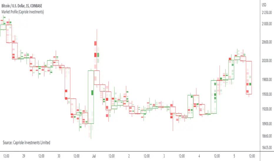
The image above shows the 1-minute BTCUSD chart; 650 +/- tick levels are set.
To see the script in full functionality - try using bar replay on a cryptocurrency 1-minute chart (start at the beginning of a regular hours session). Be sure to adjust the tick spread if necessary (:
So far, the script's held up in real time - I've not had any array loop errors or timeouts. The TPO profile updates accordingly with changes in time / high and low prices. Letters are appended to the profile in real time.
The image above shows configurations for the indicator. I plan to update the indicator quite a bit over the coming days - more to come.
You can select the timeframe change the indicator accounts for. For instance, you can have set the indicator to reset every day, every 30 minutes, every 5 minutes, every week, month, etc.
In the image above, I configured the indicator to recalculate every 3 months. Consequently, the indicator will record a TPO profile for three consecutive, reset, then record a TPO profile for the next 3 months. This setting makes the indicator compatible with any timeframe greater than 1 minute.
You can also use a drag & drop time-start bar to modify the starting point for the market profile TPO calculation.
The indicator hosts an option to auto calculate the tick spread between levels. However, as you switch timeframes and assets, sometimes, you'll have to manually set the tick range (:
Thanks for checking it out; more to come!
Sep 4
Release Notes: UPDATE: The indicator can work on seconds-based charts.
The image above shows the indicator working on the 1-second chart.
(Screenshot is old; characters are now numbered instead of strange unicode)
Release Notes: Added value area + vah + val. Font update. Changed characters to numbered once the alphabet is exhausted. POC, VAH, and VAL label located left of the first bar of the interval. Initial balance range can be toggled. Spaced the characters (more legible). Quite a bit of aesthetic changes so check it out!
Soon, I'll release a version of the script that shows VAH, POC, VAL, and TPO letters from previous sessions. I coded this feature into this indicator; however, it was removed due to load time complications. This feature will be its own script (:
If the script has trouble loading please let me know (:
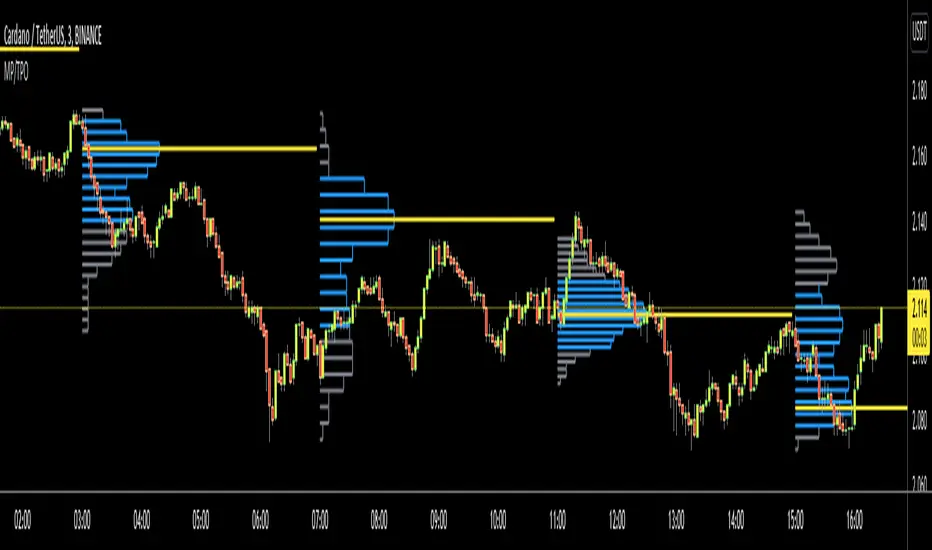
Marketprofile

TPO Profile with Day StatFirst of all I want to Thank @noop42 for creating this wonderful Market Profile chart in Pine script
I have made some changes to this scripts
This Script can auto calculate the TPO Size for NSE Symbols and MCX Crude oil.
This Script Will only calculate the TPO's for visible range only so that the script use less heap size.
I have added some of the day Statistics to enhance your visualization.
Limitations of this Script
Currently This Script can Plot Market Profile Chart only for Historical Data.
It Can only Plot Market Profile Charts in 30-Mins Time Frame only so that you can't use it for Composite Profile Analysis.
To plot Market Profile Chart in Real Time and Historical please use "Market Profile With TPO by Drother"

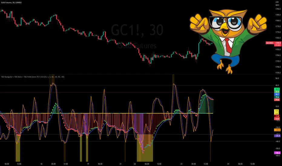
TAS Navigator + TAS Ratio + TAS Yield Zones [TASMarketProfile]This bundle of 3 TAS Market Profile indicators reveal when markets are gaining momentum, exhausted and reaching critical overbought/oversold conditions. The indicators display on a space-saving bottom pane and provide multi-perspective analysis that yield confidence in what direction to trade and when. The TAS Navigator, TAS Ratio, and TAS Yield Zones can be applied to any financial market such as stocks, ETFs, futures, Forex and digital currencies.
∟ ABOUT TAS NAVIGATOR:
TAS Navigator is a versatile indicator that combines several signals to help you manage your trades and avoid unfavorable situations. At a glance, the Navigator can provide the trader with useful information about underlying trading conditions for any time frame chart. The Navigator is comprised of three primary components – the histogram, the moving average and the zero line.
The histogram consists of the vertical bars plotted above and below the horizontal “zero line.” The bars are color-coded to provide the following information:
NEON GREEN / RED – The directional move continues to gain momentum.
DARK GREEN / RED – The buying or selling momentum is falling off.
MAGENTA – Exhaustion warning and the move has reached “peaking” conditions that may be difficult to maintain. Markets are likely to run sideways for a period of time or a direction change may be near.
The moving average (MA) is the blue line that travels horizontally across the Navigator and provides a relative measure of the overall levels of buying or selling. You will notice that the dots capping the histogram bars change from green to red as they move above or below the MA. The color of these dots tells us the following:
GREEN DOTS – The buyers are currently in control.
RED DOTS – The sellers are currently in control.
The zero line is the horizontal line around which the histogram plots. It provides a reference point for the larger momentum shifts. It is color-coded in the following manner:
CYAN – The current market phase is trending / unbalanced.
YELLOW – The current market phase is sideways / balanced.
INTERPRETATION AND RULES:
The TAS Navigator’s inherent ability to visualize the overall pulse of the market can inform your trading decisions in several ways:
>>> If the histogram is neon green or red, the trader should look for trading opportunities in the appropriate direction (green = long; red = short) and hold for increased profits as long as the bars remain neon green or red.
>>> If magenta bars appear, the trader knows to tighten stops and look for profit-taking opportunities because the trend has reached peaking conditions.
>>> When the histogram switches to dark green or red – indicating momentum is slowing – the trader can look to tighten stops and consider technical areas for reentry.
>>> Once the histogram crosses the MA and the capping dot changes to the opposite color of the histogram bar, a trader knows that they can begin looking for countertrend trade opportunities.
>>> Most importantly, until that dot changes color, the trader knows that the odds do not favor looking for trading opportunities against the current trend.
>>> The relative peaks of the histogram bars can also provide valuable information. As consecutive histogram peaks move further away from the zero line, price should extend the trending move. When consecutive histogram peaks become closer to the zero line, the price should create a lower high or higher low soon.
>>> A trend line connecting histogram peaks can be used to identify trading levels based upon momentum reaching the necessary level to touch the projected trend line.
>>> Trading opportunities can also be found when divergence occurs between the histogram and price. For example, consecutive histogram peaks move further away from zero line, but price cannot extend the trend.
∟ ABOUT TAS RATIO:
TAS Ratio is a leading indicator which helps forecast short-term price movements. It is best used for gauging targeted areas for entry and exit points. It was designed to identify when price movement is confirmed by volume and volatility as well as when market moves lack momentum, conviction and follow through. TAS Ratio levels are determined by a defined time within a 24-hour period and applicable for intraday charts only. The analysis can be applied to any liquid financial instrument and provides target trading zones in either direction.
INPUT SETTINGS FOR TAS RATIO:
There are 3 inputs for TAS Ratio and below you’ll find the default settings:
Ratio RangeBars: 10
Ratio AverageBars: 3
Ratio MABars: 3
>>> Ratio RangeBars – Sets the desired lookback period. Default = 10.
>>> Ratio AverageBars – Sets the smoothing factor and should be the same as MABars setting. Default = 3.
>>> Ratio MABars – Sets the smoothing factor and should be the same as AverageBars setting. Default = 3.
CONFIGURATION NOTES:
As a rule, the RangeBars period should be twice (or more) than the AverageBars and MABars setting. Remember that the AverageBars and MABars settings should be equal. For example, 6/3/3 or 8/4/4 would be minimum separation.
Faster time charts may prefer slower indicator settings for smoother readings. For example, on 30-minute charts or lower the settings for RangeBars period and AverageBars and MABars could be 10/5/5 or even 16/8/8 respectively.
TAS RATIO DISPLAY:
TAS Ratio – Displays more volatile orange-colored line
Moving Average – Displays smoothed moving average purple-colored line
Note that the default colors can be adjusted in the Style settings.
INTERPRETATION AND RULES:
TAS Ratio is displayed on the same pane and scale as TAS Navigator in which readings of +40 is considered overbought and -40 is oversold.
TAS Ratio is especially effective when traders are aiming to time entry points into emerging intraday trends which can be observed when the price is making new “higher lows” or alternatively when price is making new “lower highs.”
TAS Ratio is a sensitive indicator by nature and should be viewed as a tool for fine-tuning a more granular entry or exit within the scope of other TAS Indicators.
TAS Ratio is useful in confirming when price may be at an area of divergence to locate and target higher probability entries and exits.
In general, price should move freely in the same direction of the indicator and in a proportionate range of movement.
When price fails to move proportionately, as much as TAS Ratio moves or stalls, this divergence alerts you to focus on immediate areas of support and resistance.
When price stalls and TAS Ratio does not stall, this is an indication to seek confirmation for a valid counter-trend trading opportunity.
Pay attention to TAS Ratio (orange line) crossovers above and below the Moving Average line (purple line), but also observe the trajectory and whether the Ratio line is pulling away and creating greater distance from the Moving Average line. Increasing distance is a sign of strength of move in that direction.
∟ ABOUT TAS YIELD ZONES:
TAS Yield Zones provides a valuable visual warning via a yellow background color when TAS Navigator and/or TAS Ratio indicators are exceeding specific overbought or oversold threshold lines dictated by the user. The indicator is visible in the same bottom pane as these two indicators. The user controls how extreme of the overbought or oversold condition they mandate in order to trigger the “Yield Zone” warning for each indicator based on the inputs for the TAS Yield Zones threshold lines.
INPUT SETTINGS FOR TAS YIELD ZONES:
Within the Input settings, you can activate or deactivate the visibility of TAS Yield Zones for TAS Navigator or TAS Ratio. By default, both will be visible. There are 4 inputs for TAS Yield Zones and below you’ll find the default settings:
Yield Zones Nav Overbought Line: 40 (red line by default)
Yield Zones Nav Oversold Line: -40 (green line by default)
Yield Zones Ratio Overbought Line: 40 (gray line by default)
Yield Zones Ratio Oversold Line: -40 (gray line by default)
The farther away the Inputs are from the 0 line, the stronger the move must be bullish or bearish in order to get to the threshold lines. For instance, Inputs of 50/-50 would require a more substantial move than 30/-30 settings. Additionally, the user can adjust the coloring of the TAS Yield Zones inside the Style settings.
TAS Yield Zones are best used in conjunction with TAS Navigator and TAS Ratio so the user can visually see when the threshold lines are near being approached and exceeded. When all three indicators are visible on the pane, you can see when there is a confluence of overbought or oversold conditions simultaneously on both TAS Navigator and TAS Ratio indicators and when exhaustion warning conditions are present. When these three conditions occur, there is a likelihood that a move in the opposite direction (or at a minimum a sideways condition) may be near.
Trade Well My Friends,
TAS Boxes + TAS Vega + TAS Compass [TASMarketProfile]This bundle of 3 TAS Market Profile indicators provides a shaded background that reveals directional bias, colored price bars show clearly when breakout conditions are bullish (green) or bearish (red) as well as 3 real-time dotted lines that show developing commercial balance areas known as “value areas.” These TAS Boxes 3 lines are calculated in real-time and leveraged to identify trade entry zones, trailing stops and targets. The 3 indicators can be activated and applied to a chart simultaneously (as shown) or individually in the Inputs settings tab. This description contains descriptions for all 3 indicators in the order of TAS Boxes, TAS Vega and TAS Compass so you’ll need to scroll below to get to the one you want insight.
∟ ABOUT TAS BOXES:
TAS Boxes (also known as TAS Dynamic Profile) offers a dynamic representation of developing commercial balance areas known as “value areas” and are depicted with 3 colored horizontal dotted lines. Note that the thickness of the dotted lines may be adjusted in the Style settings.
Red Line- Supply / High Value Area (HVA) / Resistance
Cyan Line- Point of Control (POC)
Green Line- Demand / Low Value Area (LVA) / Support
The TAS Boxes calculate and display in real-time intrabar and are finalized at the close of the bar. The levels may dynamically update intrabar and move and this is viewed as foreshadowing of where new value areas may be attempting to appear next. When the market is between the top and bottom lines, the market is considered “in value” or “in balance.” When the market closes outside the top or bottom lines, the market is considered out of value/unbalanced and in breakout mode in that direction.
INPUT SETTINGS FOR TAS BOXES:
There are 3 inputs for TAS Boxes and below you’ll find the default settings:
MinSignal_123: 2 (only options are 1, 2, or 3)
Length: 7
MapLength: 7
MinSignal_123 -- Measures how established the commercial interest creating the balance area must be to create a new TAS Box. In other words, this input is a measure of the strength of the box.
Length –- Takes into consideration the relative “momentum” behind the move and how extended the move must be before the formation of new TAS Box levels.
MapLength –- Specifies the number of bars of data used to create the parameters of the TAS Box.
In summary, the first two inputs determine how often a new TAS Box will appear. The higher the input numbers the less often and harder it is to establish a new TAS Box, and vice versa. The last input simply determines how much data is included in the calculation of the new TAS Box.
While we recommend the default 2-7-7 as standard inputs for most traders as they work well with any tradable instrument with sufficient liquidity, other input combinations can be explored per the user’s preferences for varying sensitivity to market conditions and how recent of market conditions. Other settings to consider are 2-14-7 or 3-4-50. We invite the user to explore the cause and effect of changing the settings but doing so only after they have mastered an understanding of the strategy deployment with the defaults. The vast majority of users do not change the default settings.
WHAT MARKETS AND TIMEFRAMES CAN BE TRADED?
TAS Boxes can be displayed on Stocks, ETFs, futures, Forex and digital currencies. TAS Boxes can be applied to a chart of any time frame (e.g. 1-minute, 5-minute, 20-minute, daily, weekly, etc.) and will also function with many other style charts such as Range and Renko. Boxes displayed on longer time frames designate more significant balance areas and can be used to locate higher probability entries. Boxes on shorter time frames can be used to identify if the tradable instrument is currently in balance or breaking out, and pinpoint entries accordingly.
INTERPRETATION AND BASIC RULES:
HEIGHT OF BOXES: The height of the TAS Boxes from top line to bottom line is a measure of volatility. When taller Boxes are present and subsequent Boxes expand, this means the volatility of the market has increased. When the height of the Boxes is smaller or contracting, then we are experiencing a market in decreasing volatility or consolidating.
WIDTH OF BOXES: The width of the TAS Boxes are a measure of significance. The longer TAS Boxes have remained at the same levels, the higher the impact they will generally have as support or resistance levels, and in the instances they are breached the market may experience fast and vertical movement.
The TAS Boxes are used to identify high-probability zones for trading both inside the range of the Boxes and also when in breakout mode outside the Boxes:
>>> When price is trading within the boundaries of a normal to wide range commercial
balance area, we can consider trades within the range of the Boxes and should look for entries around the support (green line) or resistance (red line) areas with profit targets around the POC (cyan line) or opposite boundary.
>>> When taking trades near both the upper and lower boundaries, we like to see the POC
near the middle of the box’s range. This is known as a “symmetrical box” as pictured below.
>>> If the POC is plotted tightly close to or at the same price level as the green or red line, we refer to this as forming a “wall” or "plywood" and anticipate stronger commercial interest providing support or resistance in those areas.
>>> When trading above or below the current box, price is said to be in breakout/breakdown mode. During these modes, one should be getting out of any opposing positions that are not in the direction of the breakout. Not all breakout/breakdowns are created equal. Moves outside of TAS Boxes when the vertical distance from Top to Bottom is minimal will tend to have more powerful moves, especially in instances when there are recent long-range bars in the direction of the break.
>>> When markets are breaking out or down outside of Boxes, if there is sizeable space before you encounter recent historal TAS Boxes levels that is favorable for good follow through of the move. Prior TAS Boxes levels do serve as as areas the market may encounter friction and go sideways for a period of time.
MANAGING RISK WITH STOP LOSSES:
We highly recommend the use of stop losses when trading. You can place stop losses outside of the 3 lines of TAS Boxes and trail them behind the market as new Boxes appear in the direction of the trade. You may also move trailing stops among the 3 levels to suit your risk tolerance (e.g. when market is in breakout mode, trailing it from out the Boxes to outside the POC level or opposing level). You can start your initial stop outside the opposite of all 3 lines or on the other side of the POC for lower risk.
∟ ABOUT TAS VEGA:
TAS Vega changes the coloring of the price bars to provide a more meaningful interpretation of when markets are in balance (based on TAS Boxes) or in bullish/bearish breakout mode. There are four colors generated for TAS Vega:
GREEN – Bullish breakout / Don’t be short
RED – Bearish breakdown / Don’t be long
ORANGE – 1st bar back inside TAS Boxes after prior move outside.
GRAY – Balanced, each subsequent bar after the 1st bar closes inside Boxes.
INTERPRETATION AND BASIC RULES:
WHEN VEGA IS GREEN:
Don’t be short.
Consider longs only or retain existing long positions.
Entering on the bar close above the Boxes is higher probability than intrabar entry.
Many consecutive bar closes above Boxes increases probability of eventual move higher.
WHEN VEGA IS RED:
Don’t be long.
Consider shorts only or retain existing short positions.
Entering on the bar close below the Boxes is higher probability than intrabar entry.
Many consecutive bar closes below Boxes increases probability of eventual move lower.
WHEN VEGA IS ORANGE:
If orange due to closing back inside Boxes of your initial entry Box, hold.
If orange due to closing inside a new Box appearing in the direction of your trade (higher Boxes for longs, lower Boxes for short) consider this a potential 1st tier profit-taking opportunity for multi-lot/shares positions. If single units, exit is at the trader's discretion contingent on the extent of the move.
It is prudent risk management to also use the appearance of orange closed bars as a reminder to trail your stop loss behind the new TAS Boxes levels.
Many times you may see many orange bars over a series of bars (not consecutive, however) and this means the market continues to explore both sides of TAS Boxes and is indecisive about intentions. Be cautious at these times.
WHEN VEGA IS GRAY:
Gray bars simply means the bar has closed in balance within the value area of TAS Boxes.
Gray bars are not a cue to exit a position necessarily. It is just a visual that the bar has closed in the value area. Often a trending move will have many periods that the market closes back inside new Boxes that are appearing in the direction of the trend and your largest trades will require that you simply adjust your trailing stop rather than exit with gray bars.
It is prudent risk management to also use the appearance of orange closed bars as a reminder to trail your stop loss behind the new TAS Boxes levels.
Many times you may see many orange bars over a series of bars (not consecutive, however) and this means the market continues to explore both sides of TAS Boxes and is indecisive about intentions. Be cautious at these times.
The user can adjust the coloring of the TAS Vega bars in Style settings.
∟ ABOUT TAS COMPASS:
TAS Compass changes the background color of the chart to reveal the directional bias of the market. It may be applied to charts in any timeframe for stocks, ETFs, futures, Forex and digital currencies.
There are two colors generated for TAS Compass:
GREEN – Bullish directional bias
RED – Bearish directional bias
INTERPRETATION AND BASIC RULES:
The directional bias is established (or changes) when a bar closes outside of TAS Boxes levels. When a market closes above the TAS Boxes, it will establish a bullish bias (green background) and this will remain intact until there is a close below the TAS Boxes. At the time there is a bar close below the TAS Boxes, then the TAS Compass bias changes to bearish bias (red background). This sequence continues back and forth indefinitely. When using TAS Compass, one should still follow the prudent rules and best practices of TAS Boxes as there may be opportunities to exit a losing position sooner by doing so even in the instance a TAS Compass directional bias has not changed.
TAS Compass can be used as a stand-alone visual cue on a chart, but will have accentuated value when used in conjunction with TAS Boxes and TAS Vega indicators included within this bundle.
Below is an example showing TAS Compass with TAS Boxes in order to show how the closes outside of TAS Boxes is the trigger to the background color change logic.
Trade Well My Friends,

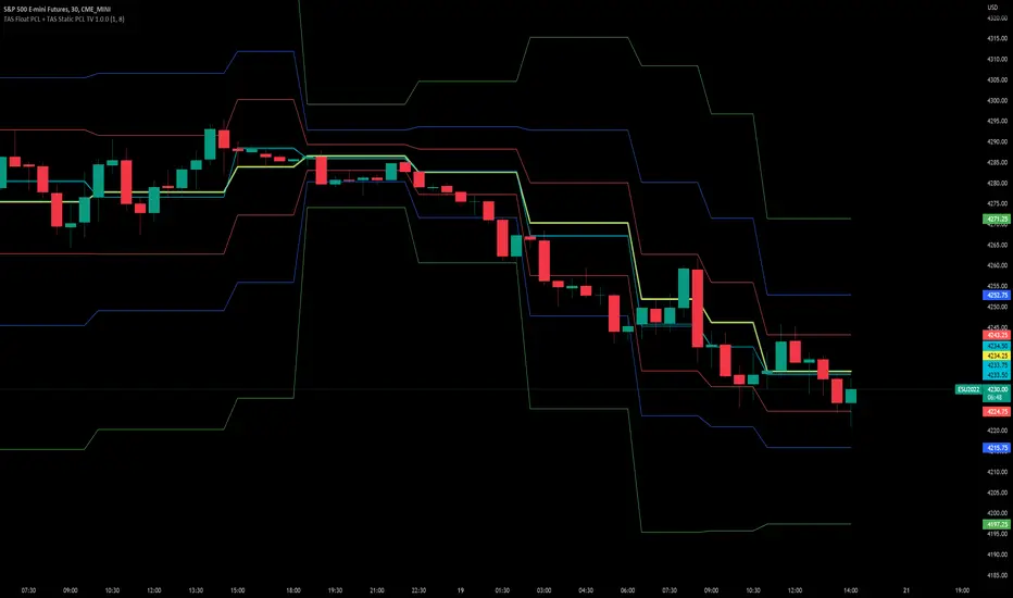
TAS Float PCL + TAS Static PCL [TASMarketProfile]TAS PRICE COMPRESSION LEVELS (PCLs) includes 2 distinct indicators that use volume at price analysis, volume aggregation and multi-timeframe confluence to calculate and display significant levels of commercial interest above and below the market. These levels reveal reliable trading levels which can be leveraged for enhanced trade entries, trailing stops and targets.
THERE ARE TWO TYPES OF TAS PCLs:
TAS Float PCLs - These levels take into account new data flow throughout the trading session and expands or contracts the levels dynamically in accordance with changing market conditions. These are often referred to by traders as “Floaters” or “Dynamic PCLs.”
TAS Static PCLs - These levels are set upon the start of the trading session and remain intact throughout the duration of the session. Many traders These are often referred to by traders as “Statics.”
Both TAS Floaters and TAS Statics have up to 10 horizontal lines available to display. The four center lines are referred to as Points of Control (POC). Three of these lines are colored cyan and one is yellow. The yellow line is more prominent and referred to as the Master Point of Control (MPOC) of the Price Compression Levels on display. The first area of commercial suppor t and resistance are plotted with red lines on both sides of the POC lines and commonly referred to as S1 and R1 levels. The next level of support and resistance areas are designated by blue lines (S2 and R2 levels) and then lastly the farthest from the POC lines are the green lines (S3 and R3 levels). By default, typically the green lines are not displayed but can be activated on an “as needed” basis within the indicator Style settings.
EXAMPLE OF TAS FLOAT PCLs:
ABOUT TAS FLOAT PCLs:
The TAS Dynamic PCLs (Floaters) reveal the price areas that attract commercial interest based on the current market conditions.
How the PCLs are plotted can be adjusted with two inputs controlled by the user.
----------1) MinSignal_123: This setting controls the sensitivity of the calculations. The default is set to 1 and this represents the most sensitive input that makes it easiest for market conditions to trigger new PCL levels. A setting of 2 is considered “medium” sensitivity and lastly a setting of 3 would require the most substantial change in conditions to trigger an adjustment of PCLs on the chart.
----------2) Length: This input setting determines the number of bars of data included in the calculation for new TAS Float PCLs to be adjusted on the chart. The default is set to 8.
MORE ON INPUT SETTINGS:
Using higher values in both inputs will display more significant areas of commercial interest for higher probability support and resistance levels around PCLs. These are referred to as “slow” Floaters.
Using lower value inputs will create Floaters that are more responsive to market conditions. These are referred to as “fast” Floaters.
When fast Floaters are contracted (cover a narrow range of prices) the market is tightly balanced and can easily enter into breakout conditions, if price closes outside of the TAS Float PCLs.
Expanded Floaters that are wider apart provide for greater rotational range trading conditions.
BELOW ARE THE RECOMMENDED INPUT SETTINGS COMBINATIONS THAT WILL DICTATE HOW RESPONSIVE THE PCLs WILL REACT TO CONDITIONS:
FAST (default): 1 - 8
MEDIUM: 2 - 14
SLOW: 3 - 34
The user will typically choose to have either Statics or Float PCLs active on the chart at a time, but not both as you'll have up to 20 levels on your chart (too many). You can, however, put them on different panes. Visit the INPUT settings of the indicator to select which one you want active.
The user can change the coloring, line type and thickness in the STYLE settings.
ABOUT TAS STATIC PCLs:
Many traders opt for TAS Static PCLs because they prefer to know the significant commercial interest price areas before they trade.
Unlike Floaters, TAS Static levels will not change throughout the trading session and are only affected if the user changes the opening and closing time parameters for the trading session displayed. By default, Static levels will recalculate and display new levels upon the reopen of the next session.
Tightly compacted POC lines designate an area of particularly strong commercial interest that provides higher probability, lower risk entries for extended directional moves. These areas are often referred to as “walls.”
If the POC lines are spread out over a wider range, a trader should be on the lookout for a more rotational trading session.
Periodically, one of the POC lines may be plotted outside of a red line (S1 or R1). In this case, the market may be biased in the same direction that the POC line is in relation to the red line.
TAS PRICE COMPRESSION LEVELS can be used as a stand-alone trading guidance system or in conjunction with other popular TASMarketProfile indicators.
Trade Well My Friends!
SpaceTime LevelsSpaceTime Levels Part of the SpaceTime Complete Suite
SpaceTime Levels provides a much needed improvement in the display of multi session compatible levels related to TPO calculations (Time x Price)
The relevant levels are neatly mapped out in a way that is easy to read without the need of the whole profile, e.g. having VA levels D/W/M without the addition
D/W/M Profiles being attached to them reducing the onscreen clutter.
Fully customizable for display includes:
Line styles,
Thickness,
and Coloring.
Text Size,
Coloring.
Custom offset for levels
Pros:
Visible levels, lack of onscreen distractions.
Previous Profile levels included, e.g. pVAH related to previous Value Area High
Cons:
Limited to one previous profile session
Updates incoming:
Additional levels if people request such as NPOCs
Full suite view:

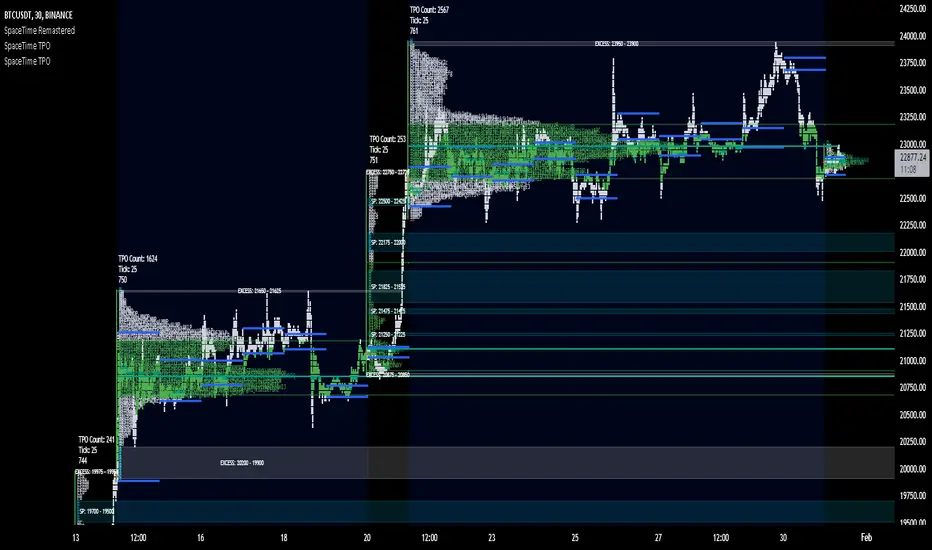
SpaceTime TPOSpaceTime TPO Part of the SpaceTime Complete Suite
SpaceTime TPO Provides an modified codebased to remastered to display the TPO Calculations in a separate indicator with multiple new features, a separate release was necessary in order to maximise the usage of the draw history that can be provided.
Significantly improved from its predecessor Spacetime advanced, the display options used here are less resource heavy and therefore can display multiple profiles in comparison to the previous "high res lettering"
Full suite view:
The main additional advantage of this separate indicator comes in the form of Split TPO profiles ! This utilizes the tradingview display engine creating a whole new way to display data comparative to the candlestick method, doing so will help visualise the profile as it develops.
The Split profiles comes with a pro and con
Pro:
Split profile makes it easier to detect real price movement adjusted to tick
Also tracks the VA travel by history so it is easier to visualise value expansion!
Con:
Due to some limitation some data may occasionally be missed on very volatile candles
Fix:
Increase ticksize/Leave on wicks for candles to see these fluctuations
Update fix inbound: Will display the overflow in a dynamic way so no wicks are needed for all candles if this persists to be a problem
SpaceTime TPO also comes with the same advantages of multi session profile TPOs
Additionally comes with the ability to have a session line
Session Line tracking can continue with "Total" For full length of profile
And
"VA" for Value Area tracking
(or off)
Close tracking in the form of a square is available
Pending updates:
Split profile improvement
Close tracking improvement
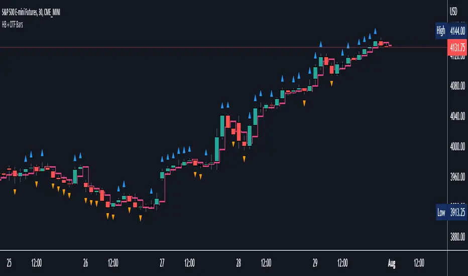
Halfback + One-Time-Framing BarsThis indicator is designed to be used with Market Profile / Volume Profile trading techniques on a 30min chart.
The halfback of a candle is the mid point between the high and the low of the candle. A halfback trade can be taken once price retraces into this point as support/resistance using the prevailing trend as your trade direction.
One-Time-Framing is a fancy term for trending in one direction. One-Time-Framing happens when a candle breaks the previous candle's high without testing the low or when a candle breaks the low of the previous candle without testing the high. This indicates that the trend is one directional and opposing pressure is very weak. Taking trades in the opposing direction of multiple OTF bars is typically a bad trade setup.
Halfback and OTF setups are typically used on a 30min timeframe combined with Market or Volume Profile, but you can experiment with these setups on any timeframe if you wish.
I hope you all enjoy this indicator, comment below if you have any questions.
Market ProfileSimple "Market Profile" script to help visualize where high volume nodes are occurring on higher-time frame candles.
Historical lookback is visually limited based on the number of candles TradingView provides on the chosen timeframe.
The script calculates the buy/sell pressure on the timeframe chosen, and aggregates volume up to the higher timeframe of choice (default: 4hr).
The volume for each candle is then normalized to assess how many standard deviations away from the mean it is. The color gradient on the chart is stronger for readings with more extreme z-scores.
Readings which are less than 2-standard deviations from the mean are not colored (white) - making it easier to visualize where the extremities of volume occur only.
Recommend using on default settings, on the 5-min of 15-min chart. Then hide the normal price data by clicking the "eye" symbol.
If you want to visualize historic periods, you can change the lookback settings.
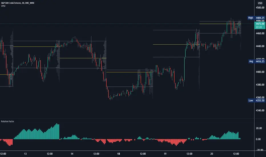
Rotation Factor: Buy/Sell Pressure for Market/Volume ProfileRotation Factor is a simple formula to figure out the buy and sell pressure of the overall day. Rotation Factor is usually combined with Market Profile or Volume Profile analysis. It is designed to be used on the 30min timeframe with a 1D interval reset. It can be used on other timeframes, but results will vary. Some Rotation Factor traders like to use it on a daily with a 1M interval reset for longer term trading.
The formula is very clean because it only focuses on price action, highs and lows. The formula is as follows:
Current Bar makes Higher High and Higher Low +2 points
Current Bar makes Lower High and Lower Low -2 Points
Current Bar makes Higher High and Lower Low 0 Points
Current Bar makes Lower High and Higher Low 0 Points
Current High and Previous High are Equal and Higher Low +1 Points
Current Bar makes Higher High but Current and Previous lows are equal +1 Points
Current Bar makes Lower High but Current and Previous lows are equal -1 Points
Current High and Previous High are Equal and Lower Low -1 Points
I hope you enjoy this indicator, if you have any questions let me know in the comments.
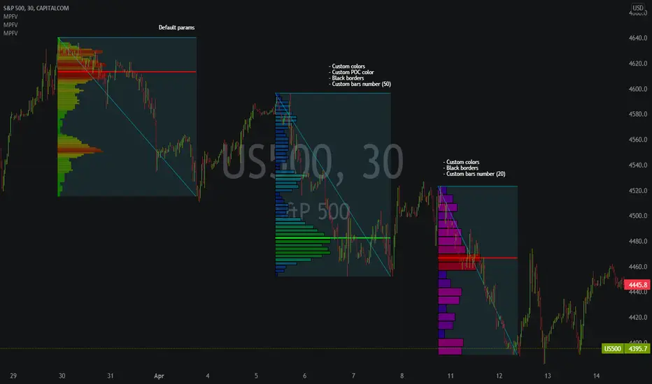
Market Profile Fixed ViewSome instruments does not provide any volume information, therefore, as a fixed volume profile user, I needed a fixed market profile indicator to use the same principles, regardless of whether the volumes are available or not.
This script draws a market profile histogram corresponding to price variations within a specific duration, you only need to specify Start and End date/time values to see the histogram on your chart.
Details
Two lines corresponding to highest/lowest prices are displayed around the histogram
The redline corresponds to the POC (point of control)
Options
Start calculation
End calculation
Bars number (histogram resolution, currently locked to a max value of 50 bars)
Display side/Width (allows to modify size of bars, to the left or to the right)
Bars/Borders/POC Color customization
Notes
This script will probably be updated (to add VAH/VAL zones, and maybe other options). However, some common market profile attributes have not been implemented yet since I don't really use them)
SpaceTime RemasteredSpaceTime Remastered
SpaceTime Remastered provides a new code base for TPO Calculations. Significantly enhanced and some differences justifying leaving both choices for users to choose between. Using the PineV5 library, providing the ability to create a profile of price and time.
The main advantage is now being able to run multiple sessions simultaneously whilst also being more efficient. This has allowed for synchronous data generation for multi profile uses and still executing at a faster speed. Additionally this has given the rise to London, New York and Asia sessions as options with this new knowledge in mind. However, the sessions can be utilised beyond this in the form of D,W,M at the same time as an example with a multitude of possible combinations up to the users interest.
Tick for the multiple sessions to determine the segmented data generation of the TPO, can be split between the sessions and work independently of one another. This tick is vital alongside time and price. The generation of this tool can be used to highlight trending and ranging conditions and opportunities to spot both can be used to take trades, e.g. using value migration in use of trend development.
The release of the AutoTick improvements is significant as well providing more consistency and less affected reaction to the volatility in its calculation leading to a more accurate profile tool. AutoTick is a global controller and will handle tick generation for any enabled session.
The words and their abbreviation plus key.
POC: Point Of Control
VA: Value Area
SP: Single Print
EXS: Excess *sell or buy tail
PHL: Poor High/Low
TPO: Time Price Opportunity
N = Naked e.g. NPOC Naked Point of Control
D = Developing e.g. DVA Developing Value Area
VAStyles and POCStyles exist to better customise the representation of datak,
Show Text Data is toggleable to give the text representation of key inflection points and data. TPO Count, TickSize used, Excess location boundaries, Single Print Location Boundaries.
Display modes exist for All data, VA + Levels and Levels up to the users choosing.
Session timings are adjustable.
ToDo:
Add Initial balance if requested.
Add User Settings for select members of the community.
Add TPO lettering, delayed as mostly unused in predecessor.
Add Rotation Factor

SpaceTime Profile CompositesSpaceTime Profile Composites
SpaceTime Profiel Composites provides an alternative composite builder to the existing solution in the SpaceTime Profile Advanced.
Using the new pinev5 I utilize the ability for user confirmed data to give them the choice in time in a more interactable and user friendly way.
The main advantage of this is the ability to create multiple composites without multiple uses of SpaceTime Profile Advanced, additionally the user can select the indicator and edit the composite start time using the chart as opposed to the date picker in pine.
The indicator is fully fleshed out with all the features:
PoC
NPoC
Single Prints
Naked Single Prints
Value Area
Value Area Levels
Naked Value Area Levels
Excess
Poor highs and lows
Initial Balance
Auto TickSize
Auto TickSize
This has been heavily adjusted to allow greater detail, and less reliant on volatility, should this work well consistently SpaceTime Profile Advanced may also recieve this change to auto ticksize.
How To Use
Composites are best utilized when multiple value areas are overlapping with their POCS in range of the previous VA's, using a composite
the user is able to generate the greater picture for how this area will provide useful levels of interest, instead of multiple smaller profiles, the user can utilize one larger profile to give more accurate levels of reaction.

Market Profile with TPOThis is is Market Profile with TPO (the letters) on the current session. Due to pinescript limitations, we are limited to 500 TPOs, since this script uses 1 label per TPO. It is NOT volume profile, this is Time Profile (Time spent at a price).

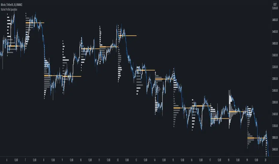
SpaceTime Profile Regular SpaceManBTCSpaceTime Profile Regular SpaceManBTC
Is a profiling tool for a market session.
Using time and price it calculates the TPO mapping the POC on your chart as well as the general profile.
The tool is useful as it can give you a general idea of how a day traded/is trading based off of its shape.
As well as provides the current developing POC as a reference for potentially a dynamic level of interest.
Value area shading is also including in the release using 68% as my reference of personal choice to represent where
bulk of the market activity occured on a given time frame.
To generate the data the indicator aims to look at the price variations over time of the given session (you can choose this in settings), this will then stack
and overlay on the chart to generate the TPO calculations by mapping 1 to 1 with the price you see on the chart.
This will give you areas of importance such as the POC which can be retested when naked providing a point of interest.
Works similar to volume profile but with no volume calculations only with price and time in mind.
Very useful tool for trend / market analysis by providing this graphical representation of a trading session between buyers and sellers!
Low Timeframe POCI have recently made a High Timeframe POC script (HFT POC) which is pretty popular. Thanks for this!
There are many requests to include lower timeframes in this script, that is why I created this script. I could have incorporated all the timeframe POC's into one indicator but I went this route to keep things more organized between all the different timeframes.
Currently included: Daily, 6H, 3H and 1H
/* DEFINITION */
Point Of Control (= POC) is a price level at which the heaviest volumes were traded.
/* HOW TO TRADE WITH THIS INDICATOR */
The basis for POC is determining bias on whichever timeframe you choose.
1. Identify a POC on the timeframe of your choosing.
/* If you choose the lowest timeframe (1H here) then always make sure to look at the higher timeframes to see how it is trading against a HTF POC.
2. When the price is moving away from the POC (either to the upside or downside) this can confirm or invalidate a trade.
3. You can now enter the trade on bias or wait for a retest of the same POC.
/* EXAMPLE TRADES /*
Here is a screenshot of some of the trades that are possible using these Low Timeframe POC's and some common sense.
s3.tradingview.com

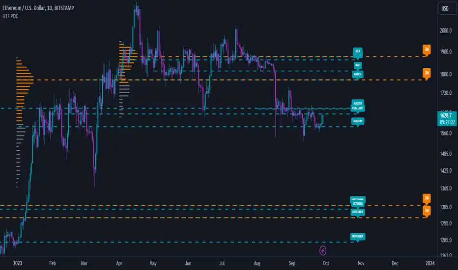
High Timeframe POCBecause the big Bitcoin crash I have been looking a lot at high timeframe metrics. I never spent much time learning POC so I decided to create a little script for determining these on higher timeframes.
Currently included: Monthly, 3 months and 6 months.
/* DEFINITION */
Point Of Control (= POC) is a price level at which the heaviest volumes were traded.
Value Area High/Low (=VAH/VAL) is a range of prices where the majority of trading volume took place. Naturally, Value Area High being the top price level and Value Area Low being the lowest. POC always is between the two.
/* HOW TO TRADE WITH THIS INDICATOR */
The basis for POC is determining bias on whichever timeframe you choose.
1. Identify a POC on the timeframe of your choosing.
/* If you choose a "low" timeframe (monthly here) then make sure to look at the higher timeframes to see how it is playing against a higher timeframe POC.
2. When the price is moving away from the POC (either to the upside or downside) this will confirm or invalidate the trade.
3. You can now enter the trade on bias or wait for a retest of the same POC.
/* EXAMPLE TRADES /*
Here is a screenshot of some of the trades that are possible solely using the POC and some common sense.
s3.tradingview.com
SpaceTime Profile AdvancedSpaceTime Profile Advanced is different to the non overlay with a different codebase.
The main advantages are the 1:1 price mappings that occur on this data generation as well as the auto mapping POC line!
The implementation is heavily different and therefore they both provide different uses
Overlay is better for current chart data being mapped up to 10 days minimum in most cases
As well as POC lines and soon High value areas
ToDo:
Naked POC
High value areas
Auto Tick Size
Better colouring

SpaceTime Profiles Non Overlay SpacemanBTCSpaceTime Profiles Non Overlay is a tool used by many traders that aim to get more confluence with their trading style.
ALPHA V1.0.0
Typically, market profile can be used to help determine high value areas where a likely reaction is to occur when price reaches this level, this can provide market generated support and resistance . This indicator uses time price interaction to accurately create a market profile for TradingView, a feature that is useful for many traders who want to expand their knowledge.
User can choose to enable or disable lettering, and further features such as tick size and color are customizable.
Soon I will include additional features such as point of control extending the area of interest.
Currently works in non overlay mode, apply to existing panel to make it easier to chart lines.
Further more an overlay version is in the works
Looking forward to everyone trying this, you can appropriately message me for access.

Market ProfileHello All,
This is Market Profile script. "Market Profile is an intra-day charting technique (price vertical, time/activity horizontal) devised by J. Peter Steidlmayer. Steidlmayer was seeking a way to determine and to evaluate market value as it developed in the day time frame. The concept was to display price on a vertical axis against time on the horizontal, and the ensuing graphic generally is a bell shape--fatter at the middle prices, with activity trailing off and volume diminished at the extreme higher and lower prices." You better search it on the net for more information, you can find a lot of articles and books about the Market Profile.
You have option to see Value Area, All Channels or only POC line, you can set the colors as you wish.
Also you can choose the Higher Time Frame from the list or the script can choose the HTF for you automatically.
Enjoy!
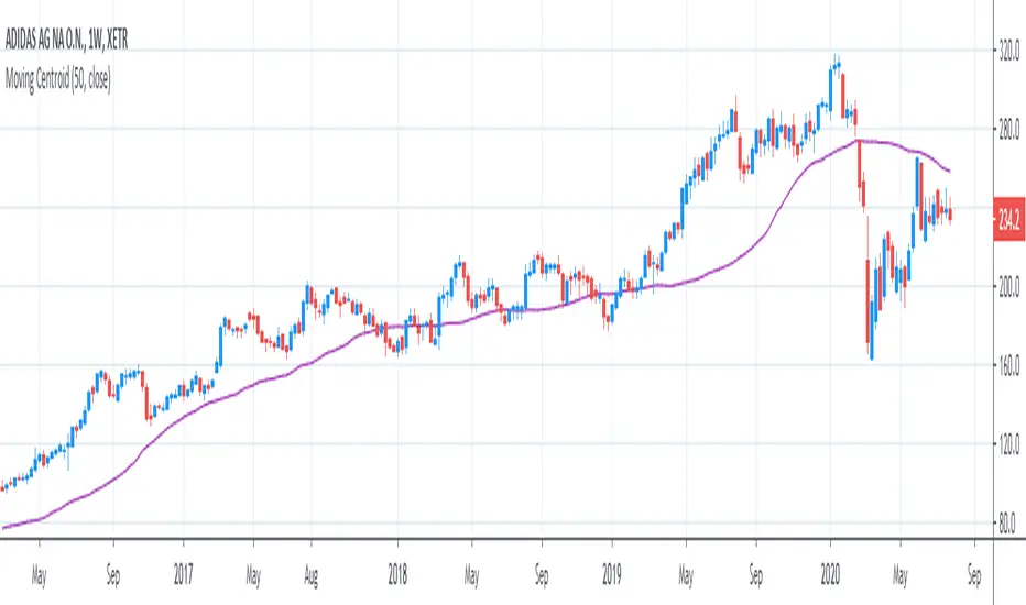
[R&D] Moving CentroidThis script utilizes this concept. Instead of weighting by volume, it weights by amount of price action on every close price of the rolling window. I assume it can be used as an additional reference point for price mode and price antimode.
it is directly connected with Market (not volume) profile, or TPO charts.
The algorithm:
1) takes a rolling window of, for example, 50 data points of close prices:
2) for each of this closing prices, the algorithm will check how many bars touched this close price.
3) then: sum of datapoints * weights/sum of weights
Since the logic is implemented in pretty non-efficient way, the script sometimes can take time to make calculations. Moreover, it calculates the centroid taking into account only close prices, not every tick. of a given rolling window That's why it's still experimental.
Poor man's volume profileThis is an attempt to get something more or less similar to the volume profile for free.
The code is generated using a template. To change the settings, you may need to regenerate the code. The code has a link to the repository with the template.
Volume Profile [Makit0]VOLUME PROFILE INDICATOR v0.5 beta
Volume Profile is suitable for day and swing trading on stock and futures markets, is a volume based indicator that gives you 6 key values for each session: POC, VAH, VAL, profile HIGH, LOW and MID levels. This project was born on the idea of plotting the RTH sessions Value Areas for /ES in an automated way, but you can select between 3 different sessions: RTH, GLOBEX and FULL sessions.
Some basic concepts:
- Volume Profile calculates the total volume for the session at each price level and give us market generated information about what price and range of prices are the most traded (where the value is)
- Value Area (VA): range of prices where 70% of the session volume is traded
- Value Area High (VAH): highest price within VA
- Value Area Low (VAL): lowest price within VA
- Point of Control (POC): the most traded price of the session (with the most volume)
- Session HIGH, LOW and MID levels are also important
There are a huge amount of things to know of Market Profile and Auction Theory like types of days, types of openings, relationships between value areas and openings... for those interested Jim Dalton's work is the way to come
I'm in my 2nd trading year and my goal for this year is learning to daytrade the futures markets thru the lens of Market Profile
For info on Volume Profile: TV Volume Profile wiki page at www.tradingview.com
For info on Market Profile and Market Auction Theory: Jim Dalton's book Mind over markets (this is a MUST)
BE AWARE: this indicator is based on the current chart's time interval and it only plots on 1, 2, 3, 5, 10, 15 and 30 minutes charts.
This is the correlation table TV uses in the Volume Profile Session Volume indicator (from the wiki above)
Chart Indicator
1 - 5 1
6 - 15 5
16 - 30 10
31 - 60 15
61 - 120 30
121 - 1D 60
This indicator doesn't follow that correlation, it doesn't get the volume data from a lower timeframe, it gets the data from the current chart resolution.
FEATURES
- 6 key values for each session: POC (solid yellow), VAH (solid red), VAL (solid green), profile HIGH (dashed silver), LOW (dashed silver) and MID (dotted silver) levels
- 3 sessions to choose for: RTH, GLOBEX and FULL
- select the numbers of sessions to plot by adding 12 hours periods back in time
- show/hide POC
- show/hide VAH & VAL
- show/hide session HIGH, LOW & MID levels
- highlight the periods of time out of the session (silver)
- extend the plotted lines all the way to the right, be careful this can turn the chart unreadable if there are a lot of sessions and lines plotted
SETTINGS
- Session: select between RTH (8:30 to 15:15 CT), GLOBEX (17:00 to 8:30 CT) and FULL (17:00 to 15:15 CT) sessions. RTH by default
- Last 12 hour periods to show: select the deph of the study by adding periods, for example, 60 periods are 30 natural days and around 22 trading days. 1 period by default
- Show POC (Point of Control): show/hide POC line. true by default
- Show VA (Value Area High & Low): show/hide VAH & VAL lines. true by default
- Show Range (Session High, Low & Mid): show/hide session HIGH, LOW & MID lines. true by default
- Highlight out of session: show/hide a silver shadow over the non session periods. true by default
- Extension: Extend all the plotted lines to the right. false by default
HOW TO SETUP
BE AWARE THIS INDICATOR PLOTS ONLY IN THE FOLLOWING CHART RESOLUTIONS: 1, 2, 3, 5, 10, 15 AND 30 MINUTES CHARTS. YOU MUST SELECT ONE OF THIS RESOLUTIONS TO THE INDICATOR BE ABLE TO PLOT
- By default this indicator plots all the levels for the last RTH session within the last 12 hours, if there is no plot try to adjust the 12 hours periods until the seesion and the periods match
- For Globex/Full sessions just select what you want from the dropdown menu and adjust the periods to plot the values
- Show or hide the levels you want with the 3 groups: POC line, VA lines and Session Range lines
- The highlight and extension options are for a better visibility of the levels as POC or VAH/VAL
THANKS TO
@watsonexchange for all the help, ideas and insights on this and the last two indicators (Market Delta & Market Internals) I'm working on my way to a 'clean chart' but for me it's not an easy path
@PineCoders for all the amazing stuff they do and all the help and tools they provide, in special the Script-Stopwatch at that was key in lowering this indicator's execution time
All the TV and Pine community, open source and shared knowledge are indeed the best way to help each other
IF YOU REALLY LIKE THIS WORK, please send me a comment or a private message and TELL ME WHAT you trade, HOW you trade it and your FAVOURITE SETUP for pulling out money from the market in a consistent basis, I'm learning to trade (this is my 2nd year) and I need all the help I can get
GOOD LUCK AND HAPPY TRADING
