Intermarket Swing Projection [LuxAlgo]The Intermarket Swing Projection allows traders to plot price movement swings from any user-selected asset directly onto the chart in the form of zigzags and/or horizontal support and resistance levels.
This tool rescale the external asset price on the user chart, enabling traders to make direct comparisons.
It answers the question of how different the price behavior is between two assets, accounting for each asset's volatility.
🔶 USAGE
This tool is based on swing detection of two different assets: the chart and a user-selected asset. It allows traders to compare two assets on an equal footing while accounting for volatility and price behavior.
Traders can customize the detection by selecting a custom ticker, timeframe, the number of swings and length for swing detection. This makes the tool a Swiss army knife for asset comparison.
As we can see in the image below, the Show Last, Pivot Length, and Spread parameters are key to defining the final output of the tool.
"Show Last" defines how many pivots are displayed. "Pivot Length" is used for pivot detection; a larger value will detect larger market structures. "Spread" defines how far apart the horizontal levels will be from their original location in terms of volatility.
🔹 Comparing different assets
This image shows the Nasdaq 100 futures contract compared to four other futures contracts: S&P 500, gold, bitcoin, and euro/U.S. dollar.
Plotting all of these assets in Nasdaq 100 terms makes it easy to compare and analyze price behaviors and identify key levels.
In the top left chart, we have NQ vs. ES. It's no surprise that they are practically an exact match; a large portion of the S&P 500 is technology.
In the top right chart, NQ vs. GC, we see totally different behaviors. We can clearly see the summer consolidation in gold and the resumption of the uptrend, which took gold above 29,200 NQ points, up from 21,200.
In the bottom right chart, we see bitcoin making new highs, way above the Nasdaq in May, July, and October. However, the last high was way below the Nasdaq prices on October 27—the first lower high in a while. Sellers are pushing down.
Finally, the bottom left chart is NQ vs. 6E. We can see large volatility in the uptrend since February, with NQ unable to catch up until now. The last swing low was almost a match, and 6E is in a range.
As we can see, this tool allows us to perform intermarket analysis properly by accounting for each asset's volatility and price behavior. Then, we plot them on the same scale on equal terms, which makes performing this kind of analysis easy.
As we can see in the chart above, the assets are the same as in the previous image, but the timeframe is 1H with different settings.
Note the horizontal levels acting as support and resistance, as well as how NQ prices react to the zones marked with white circles. These levels are derived from custom assets selected by the user.
🔹 Displaying Elements
Zig-zag allows traders to clearly see the path that the selected asset's price took, as well as its turning points.
Horizontal levels are displayed from those turning points to the present and can be used as support or resistance. Traders can adjust the spread parameter in the settings panel to expand or contract those levels' volatility.
There are two color modes for the levels: average and pivots. In the first mode, green is used for levels below the average and red for levels above the average. The second uses green for swing lows and red for swing highs.
The backpaint feature is enabled by default and allows the swings to be displayed in the correct location. With this feature disabled, the swings will be displayed in the current location when a new swing is detected.
🔶 DETAILS
On a more technical note, the rescaling is formed by calculating three main elements from all the swings detected on the custom and chart assets:
The chart asset's average of all swing points
The chart asset's standard deviation of all swing points
The custom asset's z-score for each swing point
Then, the re-scaled swing point is calculated as the average plus the z-score multiplied by the standard deviation. This makes it possible to plot AAPL swings on an NQ chart, for example.
Thanks to re-scaling, we can directly compare the price behavior of two assets with different price ranges and volatility on the same chart.
🔶 SETTINGS
🔹 Trendlines
Ticker: Select the custom ticker.
Timeframe: Select a custom timeframe.
Show Last: Select how many swing points to display.
Pivot Length: Select the size for swing point detection.
Spread: Volatility multiplier for horizontal levels. Larger values mean the levels are farther apart.
Backpaint: Enable or disable the backpaint feature. When enabled, the drawings will be displayed where they were detected. When disabled, the drawings will be displayed at the moment of detection.
🔹 Style
Show ZigZag: Enable or disable the ZigZag display and choose a line style.
Show Levels: Enable or disable the levels display and choose a line style.
Color Mode: Choose between Average Mode, which colors all levels below the average bullish and all levels above bearish, and Pivot Mode, which colors swing highs bearish and swing lows bullish.
Bullish: Select a bullish color.
Bearish: Select a bearish color.
ZigZag: Select the ZigZag color.
Indicators and strategies

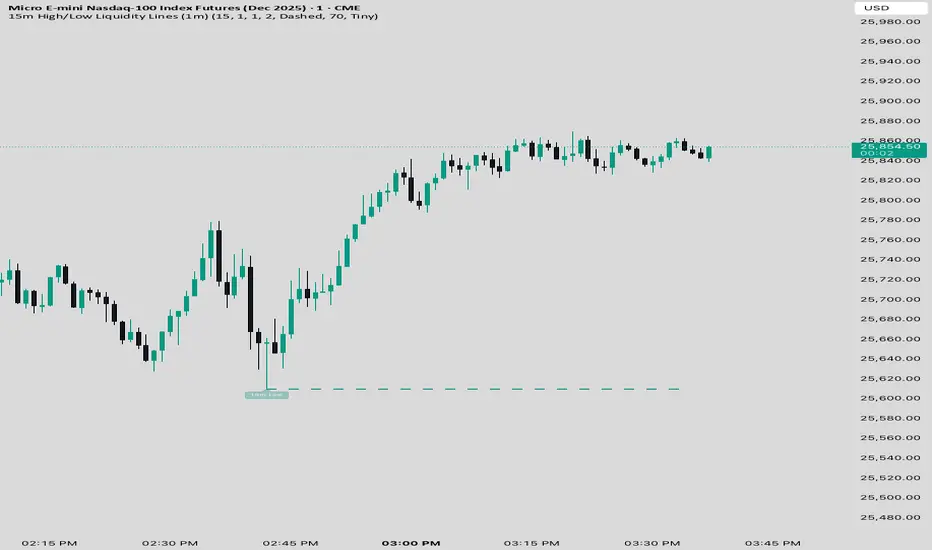
15 min Trailstop15m High/Low Liquidity Lines (1m) — Indicator Description
15m High/Low Liquidity Lines (1m) is a precision liquidity-mapping tool designed for intraday traders who understand the importance of higher-timeframe liquidity levels while executing on the 1-minute chart.
This indicator automatically detects confirmed 15-minute swing highs and swing lows using pivot logic. When a new 15m high or low forms:
✔ Liquidity Line Generation
A horizontal line is drawn exactly at the price level of the pivot.
The line is anchored to the exact 1-minute candle that produced the 15m high/low, ensuring perfect visual alignment.
The line extends only up to the current bar — not across the whole chart.
Optional text labels (“15m High”, “15m Low”) can be shown at the start of each line.
✔ Auto-Cleanup (Smart Liquidity Sweep Detection)
If price trades through the level, the corresponding line and label are:
Instantly deleted
Marking the level as taken/swept
Allowing the chart to stay clean and focused on active liquidity only
This mimics institutional liquidity logic: once the high or low is violated, the target is considered filled and removed.
✔ Alerts
The indicator includes built-in alerts that fire when:
A new 15m high is confirmed
A new 15m low is confirmed
This allows the trader to react immediately when fresh liquidity levels appear.
✔ Customization Options
You can fully tailor the visual representation:
Turn highs and/or lows on or off
Choose line style (solid, dashed, dotted)
Customize line color and thickness
Customize the label style, size, and transparency
Who Is This For?
This indicator is ideal for:
ICT-style traders
Liquidity-based scalpers
1-minute ES/NQ traders
Anyone who uses HTF liquidity levels to frame trades on the LTF
It provides a clean, automated method to track active 15-minute liquidity levels directly on the 1-minute chart with zero clutter and perfect alignment.
Advanced Confluence DashboardAdvanced Confluence Dashboard - Multi-Indicator Technical Analysis Tool
OVERVIEW
The Advanced Confluence Dashboard is a comprehensive technical analysis tool designed to help traders identify high-probability trade setups by tracking multiple technical indicators simultaneously. The indicator displays up to 13 different technical confluences in an easy-to-read dashboard format, providing both individual signals and an overall market bias percentage. Switch between full table view and condensed view for maximum chart flexibility.
FEATURES
- 13 Technical Confluences: RSI, VWAP, EMA Cross (9/21), MACD, Stochastic, Trend (50 EMA), Bollinger Bands, ADX Strength, Price Momentum, Volume Breakout, VWAP Bands, 200 EMA, and Price Action (Higher Highs/Lower Lows)
- Real-time Confluence Scoring: Automatically calculates bullish vs bearish signal strength
- Multi-Timeframe Support: Analyze indicators on any timeframe while viewing your chart on another
- Customizable Display: Toggle individual indicators on/off, adjust table position, size, and transparency
- ATR Information: Optional ATR display for volatility-based position sizing
- Condensed View Mode: Ultra-minimal display showing only confluence score and ATR (perfect for scalpers who want maximum chart visibility)
- Full Table View: Detailed breakdown of each indicator's value and signal
- Color-Coded Signals: Green (bullish), red (bearish), white (neutral) for instant visual clarity
HOW IT WORKS
The indicator evaluates each enabled technical indicator and assigns it either a bullish or bearish signal based on its current state. The confluence score shows how many indicators are aligned in each direction, giving you a clear percentage-based view of market bias. For example, if 8 out of 13 indicators are bullish, you'll see a 62% LONG BIAS signal.
DISPLAY MODES
Full View: Shows all enabled indicators with their current values and signals in a detailed table format. Perfect for understanding exactly which indicators are bullish or bearish and why.
Condensed View: Shows only the confluence score (e.g., "4/13 LONG | 9/13 SHORT - SHORT BIAS 69%") and optional ATR information. This minimal display keeps your chart clean while still providing the essential confluence data you need for quick trading decisions. Ideal for scalpers and traders who want maximum chart space.
CONFLUENCES EXPLAINED
- RSI: Momentum oscillator (>50 bullish, <50 bearish, shows overbought/oversold)
- VWAP: Volume-weighted average price (above = bullish, below = bearish)
- EMA Cross: Fast EMA (9) vs Slow EMA (21) with price position
- MACD: Trend-following momentum (line above signal = bullish)
- Stochastic: Momentum oscillator (>50 bullish, <50 bearish)
- Trend (50 EMA): Price position relative to 50-period EMA
- Bollinger Bands: Volatility and mean reversion (above middle = bullish)
- ADX Strength: Trend strength indicator (shows strong trends)
- Price Momentum: Rate of price change over specified period
- Volume Breakout: Detects unusual volume with directional bias
- VWAP Bands: Standard deviation bands around VWAP
- 200 EMA: Long-term trend indicator
- Price Action: Higher Highs and Lower Lows pattern detection
SETTINGS
Timeframe Settings:
- Indicator Timeframe: Analyze indicators on a different timeframe than your chart
Display Options:
- Condensed View: Toggle between full table and minimal display
- Show ATR Info: Display/hide ATR information
- Table Position: 9 positions (top/middle/bottom + left/center/right)
- Text Size: Auto, tiny, small, normal, large, huge
- Table Transparency: 0-100%
- Border Width: 1-5 pixels
Confluence Toggles:
- Enable/disable any of the 13 confluences individually
- Confluence score automatically adjusts based on enabled indicators
Indicator Settings:
- RSI Length (default: 14)
- ATR Length (default: 14)
- Fast/Slow EMA (default: 9/21)
- Trend EMA (default: 50)
- Volume SMA Length (default: 20)
- Volume Breakout Multiplier (default: 2.0x)
- Bollinger Bands Length/StdDev (default: 20/2.0)
- ADX Length (default: 14)
- ADX Strength Threshold (default: 25)
- Momentum Length (default: 10)
IDEAL USE CASES
- Scalping: Quick identification of confluence for fast entries/exits - use condensed view for clean charts
- Day Trading: Multi-timeframe analysis for intraday setups
- Swing Trading: Confirmation of longer-term bias
- Risk Management: Higher confluence = higher probability trades
- Trade Filtering: Only take trades when confluence reaches your threshold
- Multi-Monitor Setups: Use condensed view on execution charts, full view on analysis charts
HOW TO USE
1. Add the indicator to your chart
2. Toggle on/off the confluences you prefer to use
3. Choose between Full View (detailed) or Condensed View (minimal)
4. Adjust the table position and size to your preference
5. Look for high confluence percentages (70%+ is strong bias)
6. Use the individual indicator signals (full view) to understand market structure
7. Combine with your trading strategy for entry/exit confirmation
TIPS
- Use Condensed View when scalping to keep your chart clean and uncluttered
- Switch to Full View when you need to analyze which specific indicators are conflicting
- Higher confluence doesn't guarantee success - always use proper risk management
- Consider using 60%+ confluence as a minimum threshold for trades
- Pay attention to which specific indicators are aligned vs conflicting
- Use the ATR display for quick reference on position sizing
- Experiment with different timeframes to find what works for your style
- Disable indicators you don't use to simplify your confluence scoring
DISCLAIMER
This indicator is for educational and informational purposes only. It does not constitute financial advice, investment advice, trading advice, or any other type of advice. Trading and investing in financial markets involves substantial risk of loss and is not suitable for every investor. Past performance is not indicative of future results. Always do your own research and consult with a qualified financial advisor before making any investment decisions.

RSI Swing Indicator (Win-Rate + Forecast Line + Range Row)What the script does:
It’s essentially an enhanced RSI tool that doesn’t just show the raw RSI line. Instead, it adds forecasting, trade statistics, and range detection so you can see how reliable RSI signals have been historically and what they might mean going forward.
The main components
RSI Calculation
- Uses your chosen source (close, hl2, etc.) and length (default 7).
- Plots the RSI line (orange).
Forecasting
- Projects RSI into the future using slope extrapolation.
- Plots a forecast line (blue) and shows whether RSI is likely to become overbought, oversold, or stay neutral.
Trade Statistics
- Tracks how many long and short trades would have been profitable based on RSI bias.
- Calculates Win‑Rate (percentage of profitable trades) and Average Return (average gain/loss per trade).
- This gives you a statistical edge: are longs or shorts historically working better?
Bias & Conflict Detection
- Defines current bias (Bullish, Bearish, Neutral).
- Flags Conflict when the forecast disagrees with the current bias (e.g., RSI bullish now but forecast bearish).
- Helps you avoid trading against weakening momentum.
Range Detection
- Checks if RSI slope is flat and values are between mid‑bounds (40–60).
- Calculates Range Probability (how often range conditions occur).
- Adds a Range row to the table so you know when the market is likely sideways instead of trending.
Table Display
- Summarizes everything in a neat table: Forecast, Win‑Rates, Avg Returns, Prob Bias, Conflict, Range Prob, and Range status.
- Color‑coded so you can instantly see what’s favorable (green), risky (red), or neutral (yellow/orange).
How to use it
- Trend trading: Look for Profitable Bias with forecast alignment.
- Range trading: When both win‑rates are weak and Range row says Range Likely, fade extremes (buy low RSI, sell high RSI).
- Risk management: Avoid trades when Conflict is flagged.
- Forecasting: Use the projected RSI to anticipate overbought/oversold zones before they happen.
In short:
The script is like a “smart RSI dashboard”. It takes the basic RSI, adds forecasting, tracks how well past trades worked, and tells you whether the market is trending or ranging. This way, you’re not just reacting to RSI — you’re trading with context, probabilities, and forward‑looking signals.

Stage 2 Pullback Swing indicatorThis scanner is built for swing traders who want high-probability pullbacks inside strong, established uptrends. It targets names in a confirmed Stage 2 bull phase (Weinstein model) that have pulled back 10–30% from a recent swing high on light selling volume, while still respecting fast EMAs.
Goal: find powerful uptrending stocks during controlled dips before the next leg higher.
What it looks for
Strong prior uptrend: price above the 50 and 200 SMAs, momentum positive over multiple timeframes
Confirmed Stage 2: price above a rising 30-week MA on the weekly chart
Pullback depth: 10–30% off recent swing highs—not too shallow, not broken
Pullback quality: range contained, no panic selling, trend structure intact
EMA behavior: price near EMA10 or EMA20 at signal time
Volume contraction: sellers fading throughout the pullback
Bullish shift: green candle back in trend direction
Why this matters
This setup hints at institutions defending positions during a temporary dip. Strong stocks pull back cleanly with declining volume, then resume the primary trend. This script alerts you when those conditions align.
Best way to use
Filter a strong universe before applying—quality tickers only
Pair with clear trade plans: risk defined by prior swing low or ATR
Trigger alerts instead of hunting charts manually
Intended for
Swing traders who want momentum continuation setups
Traders who prefer entering on controlled retracements
Anyone tired of chasing extended breakouts

machine_learningLibrary "machine_learning"
euclidean(a, b)
Parameters:
a (array)
b (array)
manhattan(a, b)
Parameters:
a (array)
b (array)
cosine_similarity(a, b)
Parameters:
a (array)
b (array)
cosine_distance(a, b)
Parameters:
a (array)
b (array)
chebyshev(a, b)
Parameters:
a (array)
b (array)
minkowski(a, b, p)
Parameters:
a (array)
b (array)
p (float)
dot_product(a, b)
Parameters:
a (array)
b (array)
vector_norm(arr, p)
Parameters:
arr (array)
p (float)
sigmoid(x)
Parameters:
x (float)
sigmoid_derivative(x)
Parameters:
x (float)
tanh_derivative(x)
Parameters:
x (float)
relu(x)
Parameters:
x (float)
relu_derivative(x)
Parameters:
x (float)
leaky_relu(x, alpha)
Parameters:
x (float)
alpha (float)
leaky_relu_derivative(x, alpha)
Parameters:
x (float)
alpha (float)
elu(x, alpha)
Parameters:
x (float)
alpha (float)
gelu(x)
Parameters:
x (float)
swish(x, beta)
Parameters:
x (float)
beta (float)
softmax(arr)
Parameters:
arr (array)
apply_activation(arr, activation_type, alpha)
Parameters:
arr (array)
activation_type (string)
alpha (float)
normalize_minmax(arr, min_val, max_val)
Parameters:
arr (array)
min_val (float)
max_val (float)
normalize_zscore(arr, mean_val, std_val)
Parameters:
arr (array)
mean_val (float)
std_val (float)
normalize_matrix_cols(m)
Parameters:
m (matrix)
scaler_fit(arr, method)
Parameters:
arr (array)
method (string)
scaler_fit_matrix(m, method)
Parameters:
m (matrix)
method (string)
scaler_transform(scaler, arr)
Parameters:
scaler (ml_scaler)
arr (array)
scaler_transform_matrix(scaler, m)
Parameters:
scaler (ml_scaler)
m (matrix)
clip(x, lo, hi)
Parameters:
x (float)
lo (float)
hi (float)
clip_array(arr, lo, hi)
Parameters:
arr (array)
lo (float)
hi (float)
loss_mse(predicted, actual)
Parameters:
predicted (array)
actual (array)
loss_rmse(predicted, actual)
Parameters:
predicted (array)
actual (array)
loss_mae(predicted, actual)
Parameters:
predicted (array)
actual (array)
loss_binary_crossentropy(predicted, actual)
Parameters:
predicted (array)
actual (array)
loss_huber(predicted, actual, delta)
Parameters:
predicted (array)
actual (array)
delta (float)
gradient_step(weights, gradients, lr)
Parameters:
weights (array)
gradients (array)
lr (float)
adam_step(weights, gradients, m, v, lr, beta1, beta2, t, epsilon)
Parameters:
weights (array)
gradients (array)
m (array)
v (array)
lr (float)
beta1 (float)
beta2 (float)
t (int)
epsilon (float)
clip_gradients(gradients, max_norm)
Parameters:
gradients (array)
max_norm (float)
lr_decay(initial_lr, decay_rate, step)
Parameters:
initial_lr (float)
decay_rate (float)
step (int)
lr_cosine_annealing(initial_lr, min_lr, step, total_steps)
Parameters:
initial_lr (float)
min_lr (float)
step (int)
total_steps (int)
knn_create(k, distance_type)
Parameters:
k (int)
distance_type (string)
knn_fit(model, X, y)
Parameters:
model (ml_knn)
X (matrix)
y (array)
knn_predict(model, x)
Parameters:
model (ml_knn)
x (array)
knn_predict_proba(model, x)
Parameters:
model (ml_knn)
x (array)
knn_batch_predict(model, X)
Parameters:
model (ml_knn)
X (matrix)
linreg_fit(X, y)
Parameters:
X (matrix)
y (array)
ridge_fit(X, y, lambda)
Parameters:
X (matrix)
y (array)
lambda (float)
linreg_predict(model, x)
Parameters:
model (ml_linreg)
x (array)
linreg_predict_batch(model, X)
Parameters:
model (ml_linreg)
X (matrix)
linreg_score(model, X, y)
Parameters:
model (ml_linreg)
X (matrix)
y (array)
logreg_create(n_features, learning_rate, iterations)
Parameters:
n_features (int)
learning_rate (float)
iterations (int)
logreg_fit(model, X, y)
Parameters:
model (ml_logreg)
X (matrix)
y (array)
logreg_predict_proba(model, x)
Parameters:
model (ml_logreg)
x (array)
logreg_predict(model, x, threshold)
Parameters:
model (ml_logreg)
x (array)
threshold (float)
logreg_batch_predict(model, X, threshold)
Parameters:
model (ml_logreg)
X (matrix)
threshold (float)
nb_create(n_classes)
Parameters:
n_classes (int)
nb_fit(model, X, y)
Parameters:
model (ml_nb)
X (matrix)
y (array)
nb_predict_proba(model, x)
Parameters:
model (ml_nb)
x (array)
nb_predict(model, x)
Parameters:
model (ml_nb)
x (array)
nn_create(layers, activation)
Parameters:
layers (array)
activation (string)
nn_forward(model, x)
Parameters:
model (ml_nn)
x (array)
nn_predict_class(model, x)
Parameters:
model (ml_nn)
x (array)
accuracy(y_true, y_pred)
Parameters:
y_true (array)
y_pred (array)
precision(y_true, y_pred, positive_class)
Parameters:
y_true (array)
y_pred (array)
positive_class (int)
recall(y_true, y_pred, positive_class)
Parameters:
y_true (array)
y_pred (array)
positive_class (int)
f1_score(y_true, y_pred, positive_class)
Parameters:
y_true (array)
y_pred (array)
positive_class (int)
r_squared(y_true, y_pred)
Parameters:
y_true (array)
y_pred (array)
mse(y_true, y_pred)
Parameters:
y_true (array)
y_pred (array)
rmse(y_true, y_pred)
Parameters:
y_true (array)
y_pred (array)
mae(y_true, y_pred)
Parameters:
y_true (array)
y_pred (array)
confusion_matrix(y_true, y_pred, n_classes)
Parameters:
y_true (array)
y_pred (array)
n_classes (int)
sliding_window(data, window_size)
Parameters:
data (array)
window_size (int)
train_test_split(X, y, test_ratio)
Parameters:
X (matrix)
y (array)
test_ratio (float)
create_binary_labels(data, threshold)
Parameters:
data (array)
threshold (float)
lag_matrix(data, n_lags)
Parameters:
data (array)
n_lags (int)
signal_to_position(prediction, threshold_long, threshold_short)
Parameters:
prediction (float)
threshold_long (float)
threshold_short (float)
confidence_sizing(probability, max_size, min_confidence)
Parameters:
probability (float)
max_size (float)
min_confidence (float)
kelly_sizing(win_rate, avg_win, avg_loss, max_fraction)
Parameters:
win_rate (float)
avg_win (float)
avg_loss (float)
max_fraction (float)
sharpe_ratio(returns, risk_free_rate)
Parameters:
returns (array)
risk_free_rate (float)
sortino_ratio(returns, risk_free_rate)
Parameters:
returns (array)
risk_free_rate (float)
max_drawdown(equity)
Parameters:
equity (array)
atr_stop_loss(entry_price, atr, multiplier, is_long)
Parameters:
entry_price (float)
atr (float)
multiplier (float)
is_long (bool)
risk_reward_take_profit(entry_price, stop_loss, ratio)
Parameters:
entry_price (float)
stop_loss (float)
ratio (float)
ensemble_vote(predictions)
Parameters:
predictions (array)
ensemble_weighted_average(predictions, weights)
Parameters:
predictions (array)
weights (array)
smooth_prediction(current, previous, alpha)
Parameters:
current (float)
previous (float)
alpha (float)
regime_classifier(volatility, trend_strength, vol_threshold, trend_threshold)
Parameters:
volatility (float)
trend_strength (float)
vol_threshold (float)
trend_threshold (float)
ml_knn
Fields:
k (series int)
distance_type (series string)
X_train (matrix)
y_train (array)
ml_linreg
Fields:
coefficients (array)
intercept (series float)
lambda (series float)
ml_logreg
Fields:
weights (array)
bias (series float)
learning_rate (series float)
iterations (series int)
ml_nn
Fields:
layers (array)
weights (matrix)
biases (array)
weight_offsets (array)
bias_offsets (array)
activation (series string)
ml_nb
Fields:
class_priors (array)
means (matrix)
variances (matrix)
n_classes (series int)
ml_scaler
Fields:
min_vals (array)
max_vals (array)
means (array)
stds (array)
method (series string)
ml_train_result
Fields:
loss_history (array)
final_loss (series float)
converged (series bool)
iterations_run (series int)
ml_prediction
Fields:
class_label (series int)
probability (series float)
probabilities (array)
value (series float)

Premarket&Regular Session VolumeThis script provides a clean and practical overview of premarket cumulative volume compared with regular session volume, helping traders instantly identify unusual early-session liquidity.
Features
Tracks total premarket volume from 4:00–9:30 ET
Shows cumulative premarket buildup as a smooth line
Helps detect early liquidity spikes that often lead to halts, gap-ups or momentum runs
Designed for intraday scalpers and small-cap/momentum traders
Why It’s Useful
Premarket activity frequently reveals hidden demand long before the opening bell.
When premarket volume significantly exceeds average daily levels, the probability of early spikes, volatility events, or continuation moves increases.
This indicator offers a simple but powerful visual tool for evaluating market interest before the open and comparing it with regular session volume

ATR Stop Loss Finder (Strict Breakout Mode)Title: ATR Stop Loss Finder (Strict Breakout Mode)
Description:
Volatility-Based Risk Management: Generates dynamic trailing stop-loss lines for both Long (Lower Line) and Short (Upper Line) positions based on ATR volatility.
Strict Breakout Detection: Features a unique "Strict Breakout" logic that highlights trend acceleration. It visually marks whenever the Long SL breaks a historical high or the Short SL breaks a historical low over a user-defined lookback period (e.g., 50 bars).
Visual Signals: Automatically plots Red Circles for bullish SL breakouts (New Highs) and Blue Circles for bearish SL breakdowns (New Lows), making strong momentum shifts easy to spot.
Real-Time Dashboard: Includes an informative table displaying current ATR and SL price levels for quick reference.

Opening Range — Four Sessions (v6, multi-TF, seconds-aware)This script creates the opening ranges for major markets. You can configure period, opening and closing hours.

Mirpapa_Lib_StructsLibrary "Mirpapa_Lib_Structs"
ICT 구조 변화 감지 라이브러리 (BOS, CHoCH, MSS, Sweep)
initStructState()
StructState 초기화
checkBOS(_trend, _currentClose, _lastHHPrice, _lastLLPrice)
BOS 체크 (추세 지속) - 종가 기준
Parameters:
_trend (string) : 현재 추세
_currentClose (float) : 현재 종가
_lastHHPrice (float) : 마지막 HH 가격
_lastLLPrice (float) : 마지막 LL 가격
Returns:
checkCHoCH(_trend, _currentClose, _lastHHPrice, _lastLLPrice)
CHoCH 체크 (추세 전환) - 종가 기준
Parameters:
_trend (string) : 현재 추세
_currentClose (float) : 현재 종가
_lastHHPrice (float) : 마지막 HH 가격
_lastLLPrice (float) : 마지막 LL 가격
Returns:
checkSweep(_currentHigh, _currentLow, _currentClose, _lastHHPrice, _lastLLPrice)
Sweep 체크 (유동성 수집)
Parameters:
_currentHigh (float) : 현재 고가
_currentLow (float) : 현재 저가
_currentClose (float) : 현재 종가
_lastHHPrice (float) : 마지막 HH 가격
_lastLLPrice (float) : 마지막 LL 가격
Returns:
checkMSS(_hadCHoCH, _chochDir, _currentHigh, _currentLow, _chochPrice)
MSS 체크 (CHoCH + 리테스트 확인)
Parameters:
_hadCHoCH (bool) : CHoCH 발생 여부
_chochDir (string) : CHoCH 방향
_currentHigh (float) : 현재 고가
_currentLow (float) : 현재 저가
_chochPrice (float) : CHoCH 발생 가격
Returns:
drawStructLabel(_price, _time, _type, _dir, _lblColor)
구조 변화 라벨 그리기
Parameters:
_price (float) : 가격
_time (int) : 시간
_type (string) : 구조 타입
_dir (string) : 방향
_lblColor (color) : 라벨 색상
drawStructLine(_price, _startTime, _endTime, _lineColor, _lineWidth)
구조 변화 라인 그리기
Parameters:
_price (float) : 가격
_startTime (int) : 시작 시간
_endTime (int) : 끝 시간
_lineColor (color) : 라인 색상
_lineWidth (int) : 라인 두께
StructType
구조 타입 상수
Fields:
BOS (series string)
CHOCH (series string)
MSS (series string)
SWEEP (series string)
TrendDir
추세 방향 상수
Fields:
UP (series string)
DOWN (series string)
NONE (series string)
StructState
구조 변화 상태
Fields:
_trend (series string) : 현재 추세 방향
_lastHHPrice (series float) : 마지막 HH 가격
_lastHHTime (series int) : 마지막 HH 시간
_lastLLPrice (series float) : 마지막 LL 가격
_lastLLTime (series int) : 마지막 LL 시간

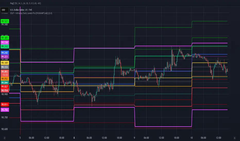
IDLP – Intraday Daily Levels Pro [FXSMARTLAB]🔥 IDLP – Intraday Daily Levels Pro
IDLP – Intraday Daily Levels Pro is a precision toolkit for intraday traders who rely on objective daily structure instead of repainting indicators and noisy signals.
Every level plotted by IDLP is derived from one simple rule:
Today’s trading decisions must be based on completed market data only.
That means:
✅ No use of the current day’s unfinished data for levels
✅ No lookahead
✅ No hidden repaint behavior
IDLP reconstructs the previous trading day from the intraday chart and then projects that structure forward onto the current session, giving you a stable, institutional-style intraday map.
🧱 1. Previous Daily Levels (Core Structure)
IDLP extracts and displays the full previous daily structure, which you can toggle on/off individually via the inputs:
Previous Daily High (PDH)
Previous Daily Low (PDL)
Previous Daily Open
Previous Daily Close,
Previous Daily Mid (50% of the range)
Previous Daily Q1 (25% of the range)
Previous Daily Q3 (75% of the range)
All of these come from the day that just closed and are then locked for the entire current session.
What these levels tell you:
PDH / PDL – true extremes of yesterday’s price action (liquidity zones, breakout/reversal points).
Previous Daily Open / Close – how the market positioned itself between session start and end
Mid (50%) – equilibrium level of the previous day’s auction.
Q1 / Q3 (25% / 75%) internal structure of the previous day’s range, dividing it into four equal zones and helping you see if price is trading in the lower, middle, or upper quarter of yesterday’s range.
All these levels are non-repaint: once the day is completed, they are fixed and never change when you scroll, replay, or backtest.
🎯 2. Previous Day Pivot System (P, S1, S2, R1, R2)
IDLP includes a classic floor-trader pivot grid, but critically:
It is calculated only from the previous day’s high, low, and close.
So for the current session, the following are fixed:
Pivot P – central reference level of the previous day.
Support 1 (S1) and Support 2 (S2)
Resistance 1 (R1) and Resistance 2 (R2)
These levels are widely used by institutional desks and algos to structure:
mean-reversion plays, breakout zones, intraday targets, and risk placement.
Everything in this section is non-repaint because it only uses the previous day’s fully closed OHLC.
📏 3. 1-Day ADR Bands Around Previous Daily Open
Instead of a multi-day ADR, IDLP uses a pure 1-Day ADR logic:
ADR = Range of the previous day
ADR = PDH − PDL
From that, IDLP builds two clean bands centered around the previous daily Open:
ADR Upper Band = Previous Day Open + (ADR × Multiplier)
ADR Lower Band = Previous Day Open − (ADR × Multiplier)
The multiplier is user-controlled in the inputs:
ADR Multiplier (default: 0.8)
This lets you choose how “tight” or “wide” you want the ADR envelope to be around the previous day’s open.
Typical use cases:
Identify realistic intraday extension targets, Spot exhaustion moves beyond ADR bands, Frame reversals after reaching volatility extremes, Align trades with or against volatility expansion
Again, since ADR is calculated only from the completed previous day, these bands are totally non-repaint during the current session.
🔒 4. True Non-Repaint Architecture
The internal logic of IDLP is built to guarantee non-repaint behavior:
It reconstructs each day using time("D") and tracks:
dayOpen, dayHigh, dayLow, dayClose for the current day
prevDayOpen, prevDayHigh, prevDayLow, prevDayClose for the previous day
At the moment a new day starts:
The “current day” gets “frozen” into prevDay*
These prevDay* values then drive: Previous Daily Levels, Pivots, ADR.
During the current day:
All these “previous day” values stay fixed, no matter what happens.
They do not move in real time, they do not shift in replay.
This means:
What you see in the past is exactly what you would have seen live.
No fake backtests.
No illusion of perfection from repainting behavior.
🎯 5. Designed For Intraday Traders
IDLP – Intraday Daily Levels Pro is made for:
- Day traders and scalpers
- Index and FX traders
- Prop firm challenge trading
- Traders using ICT/SMC-style levels, liquidity, and range logic
- Anyone who wants a clean, institutional-style daily framework without noise
You get:
Previous Day OHLC
Mid / Q1 / Q3 of the previous range
Previous-Day Pivots (P, S1, S2, R1, R2)
1-Day ADR Bands around Previous Day Open
All calculated only from closed data, updated once per day, and then locked.

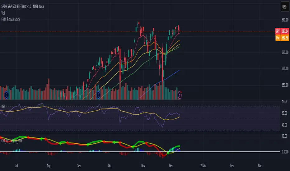
EMA & SMA StackA clean, lightweight trend-structure tool that overlays six moving averages on price so you can instantly see direction, momentum, and trend health.
Includes
3 Exponential Moving Averages with adjustable lengths
3 Simple Moving Averages with adjustable lengths
Thin, color-coded lines for fast visual clarity
Default layout: 8 EMA (red), 21 EMA (orange), 34 EMA (yellow), 50 SMA (green), 100 SMA (blue), 200 SMA (purple)
How to use
When faster EMAs are above slower EMAs and price is above all lines, trend strength is bullish.
When faster EMAs fall below slower SMAs and price is under all lines, trend strength is bearish.
Tight stacking = compression and potential breakout zones.
Wide separation = strong trend or exhaustion risk.
Why it helps
This removes guesswork. You get immediate confirmation of trend direction, support and resistance, and momentum shift on any timeframe.
Minimal clutter. Maximum signal.
Daily Tracker Highs LowsSolid lines mark the most recent daily highs/lows that have not been crossed yet (you choose how many per side).
Dashed lines mark daily highs/lows from the last N days that have been crossed since—use as secondary S/R or “magnet” levels.
White lines show today’s high/low updating in real time.
Tune settings to pick how many uncrossed levels per side (1–10), the lookback window for crossed levels, and an optional cap per side.

Fanfans极简原版优化版### 中英文双语总结(300字内)
中文:该指标为Fanfans极简原版优化版,基于RSI和ATR构建核心交易信号,新增趋势(EMA)、成交量、时间、价格位置多维度过滤,及动态ATR倍数调整功能。含同方向订单间隔限制、多级止盈止损(支持阈值触发),内置信号质量评分、标签标注与警报推送,可自定义过滤规则和显示样式,通过多维度筛选降低无效信号,提升短周期交易信号准确性。
English: This is an optimized version of Fanfans' minimalist indicator, building core trading signals based on RSI and ATR. It adds multi-dimensional filters (trend/EMA, volume, time, price position) and dynamic ATR multiplier adjustment, includes same-direction order interval limits, multi-level SL/TP (supporting threshold triggers), built-in signal quality scoring, label annotation and alert push. Customizable filter rules and display styles reduce invalid signals via multi-dimensional screening, improving short-term trading signal accuracy.

Fanfans结构加强vwap版 + 极简系统### 中英文双语总结(300字内)
中文:该指标整合Fanfans结构、动态摆动VWAP、高斯GWMA、MACD及极简交易系统,支持趋势过滤(可选GWMA/VWAP/结构维度)、多离场模式(ATR止盈止损/GWMA离场/混合)与移动止损。具备多空信号标注、止损止盈线绘制、多维度共振警报,图表信息面板实时展示结构/VWAP/GWMA/MACD状态,可自定义过滤规则、显示样式及交易参数,适配短周期交易,兼顾趋势判断与信号执行的灵活性。
English: This indicator integrates Fanfans structure, dynamic swing VWAP, Gaussian GWMA, MACD and a simple trading system. It supports trend filtering (GWMA/VWAP/structure optional), multiple exit modes (ATR SL/TP, GWMA exit, hybrid) and trailing stop. Featuring long/short signal labeling, SL/TP line drawing, multi-dimensional resonance alerts, its chart info panel displays real-time status of structure/VWAP/GWMA/MACD. Customizable filter rules, display styles and trading parameters make it suitable for short-term trading, balancing trend judgment and signal execution flexibility.

RSI 40-60 Range (30 Bars)RSI 40-60 Range (30 Bars) test for pine screenner for detec rsi 40-60 during 30 days

Fanfans结构+极简合并增强版V2
中文:该指标整合Fanfans结构、高斯GWMA、动态摆动VWAP、MACD及极简交易信号,内置结构/GWMA/VWAP/EMA多维度过滤、成交量确认、动态ATR等优化功能。支持多空信号标注、止损止盈分层设置、信号质量评分,搭配图表信息面板与多级别警报共振机制,适用于1分钟等短周期交易,兼顾信号灵敏度与准确性。
English: This indicator integrates Fanfans structure, Gaussian GWMA, dynamic swing VWAP, MACD, and simple trading signals. It features multi-dimensional filters (structure/GWMA/VWAP/EMA), volume confirmation, dynamic ATR optimization. Supporting long/short signal labeling, layered SL/TP settings, signal quality scoring, it comes with a chart info panel and multi-level alert resonance. Suitable for short-term trading (e.g., 1-minute timeframe), balancing signal sensitivity and accuracy.

PEG RSI [Auto EPS Growth]The PEG RSI is a hybrid indicator that combines fundamental valuation with technical momentum. It applies the Relative Strength Index (RSI) directly to the Price/Earnings-to-Growth (PEG) Ratio.
Unlike traditional PEG indicators that require manual input for growth rates, this script automatically calculates the Compound Annual Growth Rate (CAGR) of Earnings Per Share (EPS) based on historical data.
Key Features
- Auto-Calculated Growth: Uses historical TTM Earnings Per Share (EPS) to calculate the CAGR over a user-defined period (Default: 4 years).
- Dynamic Valuation: Converts the static PEG ratio into an oscillator (RSI) to identify relative valuation extremes.
- Trend & Momentum: Visualizes the momentum of the PEG ratio relative to its own history.
Educational Case Study
This indicator is designed for educational purposes and research. Instead of relying on fixed overbought or oversold levels, users are encouraged to study the correlation between the PEG RSI and price action independently.
- Observe how the price reacts when the PEG RSI reaches upper or lower extremes.
- Different stocks may respect different RSI zones based on their growth stability.
- Use this tool to analyze how market valuation momentum shifts over time.
Settings:
- Years for CAGR Growth: Timeframe to calculate EPS growth (Default: 4 years).
- RSI Length: Lookback period for the RSI calculation (Default: 14).
Note: This indicator works best on stocks with a consistent history of earnings. It requires financial data to function (will not work on assets without EPS like Crypto or Forex).

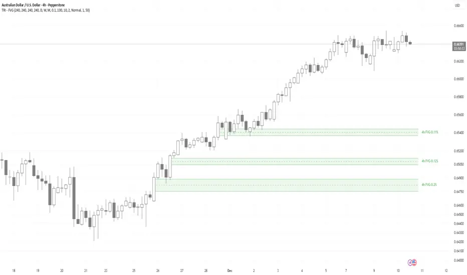
TRI - Multi-Timeframe FVGTRI - MULTI-TIMEFRAME FAIR VALUE GAPS v1.0.0
DESCRIPTION:
Advanced multi-timeframe Fair Value Gap (FVG) indicator that displays FVG zones from higher timeframes
on your current chart. Supports automatic or manual timeframe selection with comprehensive visualization
and alert system.
KEY FEATURES:
Multi-timeframe FVG detection - view FVG from any higher timeframe
Automatic timeframe selection - configure different FVG timeframes for each chart timeframe
Automatic mitigation detection - zones change color when price mitigates them
Configurable FVG threshold - filter out small gaps
Customizable visualization - colors, borders, labels, text colors
Smart zone inclusion - larger zones automatically remove smaller included zones
Memory efficient - automatic cleanup of expired zones
HOW IT WORKS:
A Fair Value Gap (FVG) is detected when there's a 3-candle pattern with a gap between candle 1 and
candle 3, indicating institutional order flow imbalances. Bullish FVG occurs when candle 3's low is
above candle 1's high (gap up), creating a demand zone shown in green. Bearish FVG occurs when candle
3's high is below candle 1's low (gap down), creating a supply zone shown in red.
The indicator uses request.security() to fetch data from the selected higher timeframe, detects FVG
patterns on that timeframe, and displays them on your current chart. FVG zones remain active until
price closes through them (mitigation), then change color and remain visible for a configurable
number of bars before disappearing.
TIMEFRAME CONFIGURATION:
Configure different FVG timeframes based on current chart timeframe:
1m-5m charts → Default 4h FVG
15m charts → Default 4h FVG
30m-1h charts → Default 4h FVG
4h charts → Default 4h FVG
Daily charts → Default Daily FVG
Weekly charts → Default Weekly FVG
Monthly charts → Default Monthly FVG
All timeframes are configurable via input settings.
BEST USE:
Works on all timeframes and asset classes. Particularly useful for intraday traders who want to see
higher timeframe FVG zones on their lower timeframe charts. FVG zones often act as support/resistance
and are frequently filled by price returning to rebalance the imbalance. Use them to identify potential
entry/exit points, stop-loss placement, and institutional order flow areas.

Qullamaggie 3★ / 4★ / 5★ Setup Detector (Clean, Colored Labels)Qullamaggie 3★ / 4★ / 5★ Setup Detector (Clean, Colored Labels)-Thaha

cảnh báo Khi Nến M15 Đóngtoday timeframe today timeframe today timeframe today timeframe today timeframe
