krishnadeshmukh/NIFTY50 Micro Sentiment Part 1📘 Script Description: NIFTY50 Micro Sentiment — Part 1
This indicator tracks real-time micro sentiment across the top 25 weighted stocks of the NIFTY50 index using a volume-based distribution model.
🔍 How it works:
Scans last N bars (configurable) for each stock.
Divides each stock’s price range into equal bins.
Measures bullish vs bearish volume in each bin based on:
Candle Color (Close > Open) or
Close Near High (Close > Midpoint).
Assigns a sentiment value:
+1 → Bullish dominance
-1 → Bearish dominance
0 → Neutral
📊 Each stock's sentiment is weighted by its contribution to the index.
🧮 Displays:
Weighted Sentiment Score
Bullish / Bearish / Neutral Components
Updated every 5 bars with an easy-to-read table.
Use this to gauge underlying micro shifts in sentiment before broader market moves.
Indicators and strategies

Professional 3SD Institutional Rejection
This indicator identifies institutional "liquidity grab" and "momentum exhaustion" zones using the statistical extremes of 3 Standard Deviations (3SD) on Bollinger Bands. Unlike standard strategies, it doesn't just look for band touches; it confirms price "wicking" outside the 3SD and closing back inside the 2SD band (rejection), while ensuring the Money Flow Index (MFI) shows signs of exhaustion. It is highly effective on 1H, 4H, and Daily timeframes for mean-reversion setups targeting the median line.

Multi-Timeframe High Low Marking LinesThis indicator automatically draws clean horizontal lines at the high and low of the previous 10 periods (adjustable) for four different timeframes simultaneously: Daily, Weekly, Monthly, and Quarterly.
Perfect for marking key support/resistance levels across multiple timeframes on any chart.
Key features:
• Shows previous 10 highs and lows per timeframe (change to 5, 15, 20 etc. in settings)
• Lines extend 20 bars to the right so they remain visible (adjustable)
• Individual on/off switch for each timeframe
• Clean blue lines, max 500 lines limit respected
• Works perfectly on any chart timeframe (1-minute to monthly)
• No repainting – lines only appear after the period has closed
Use cases:
Spot major daily/weekly/monthly support & resistance at a glance
Trade breakouts and reversals with higher-timeframe confirmation
Combine with your existing strategy (ICT, SMC, price action)
Ideal for stocks, forex, crypto and futures
Settings explained:
Timeframe 1–4 → Choose any timeframe (D, W, M, 3M already preset)
Show/Hide → Turn any timeframe on or off instantly
Periods to show → How many previous highs/lows you want visible
Extend lines → How far right each line continues (default 20 bars)
Completely free to use.
If you like it, please add to favorites and leave a comment – it helps other traders find it!
Enjoy cleaner charts and stronger confluence.
Happy trading!

A program written by a beginner# TXF Choppy Market Detector (Whipsaw Filter)
## Introduction
This project is a technical indicator developed in **Pine Script v5**, specifically optimized for **Taiwan Index Futures (TXF)** intraday trading.
The TXF market is known for its frequent periods of low-volatility consolidation following sharp moves, often resulting in "whipsaws" (double-loss scenarios for trend followers). This script utilizes **volatility analysis** and **trend efficiency metrics** to filter out noise and detect potential "Stop Hunting" or "Liquidity Sweep" setups within range-bound markets.
## Methodology & Algorithms
The strategy operates on the principle of **Mean Reversion**, combining two core components:
### 1. Market Regime Filter: Choppiness Index (CHOP)
We use the Choppiness Index (originally developed by E.W. Dreiss) to determine if the market is trending or consolidating based on **Fractal Dimension** theory.
* **Logic**:
The index ranges from 0 to 100. Higher values indicate low trend efficiency (consolidation), while lower values indicate strong directional trends.
* **Condition**: `CHOP > Threshold` (Default: 50).
* **Application**: When this condition is met, the background turns **gray**, signaling a "No-Trade Zone" for trend strategies and activating the Mean Reversion logic.
### 2. Whipsaw Detection: Bollinger Bands
Bollinger Bands are used to define the dynamic statistical extremities of price action.
* **Logic**:
We identify **Fakeouts** (False Breakouts) that occur specifically during the choppy regime identified above. This is often where institutional traders hunt for liquidity (stops) before reversing the price.
#### Signal Algorithms (Pseudocode)
**A. Bull Trap (Washout High)**
A false upside breakout designed to trap long traders.
```pine
Condition:
1. Is_Choppy == true (Market is sideways)
2. High > Upper_Bollinger_Band (Price pierces the upper band)
3. Close < Upper_Bollinger_Band (Price fails to hold and closes back inside)

MTF rsi/stoch imdI just built this indicator.
It displays a multi-timeframe (MTF) table directly on the chart, showing Stoch RSI K and RSI values per timeframe.
Cell background colors are driven by predefined value ranges, while text color turns green or red depending on whether the value is rising or falling compared to the previous candle on the same timeframe.
The RSI color conditions are based on the levels 36, 46, 56, and 65.
The Timeframe Pack selector works as follows:
Pack 1 (BNC): 3m, 9m, 27m, 1h, 81m, 3h, 9h, 12h, 1D, 3D, 1W, 9D
Pack 2: 1h through 24h
Pack 3: 1D through 24D
Pack 4 (Custom): fully user-defined timeframes via the 24 slots
Only when Pack 4 (Custom) is selected do the custom timeframe slots apply; in Packs 1–3 they are ignored.
All visual behavior (box colors, text colors, transparency, or a single-color override) is configurable under Style, and the entire table can be toggled on or off.

10>20,p>50 DEMARenders daily EMA, 10, 20 and 50 on any timeframe below 1D
30m timeframe works well.
Use trend of 10 > 20 + price > 50 for long and 10 < 20 + price < 50 for shorts or exits.

AKILLI ANALIZ TERMINALI (V20-REVIZE)SMART ANALYSIS TERMINAL (V20-ULTIMATE)
This indicator is a professional-grade analysis terminal designed for both strategic daily analysis (Swing Trade) and real-time intraday trading (Scalp/Day Trade). It allows you to perform a complete technical X-ray of the market on a single dashboard.
CORE FEATURES:
- Dual-Mode Hybrid Engine: Choose between "NIGHT (ANALYSIS)" or "IN-DAY (AGGRESSIVE)" modes in settings. Mathematical periods and target levels update automatically.
- Smart Scoring System: Blends RSI, MACD, EMA, ADX, and Volume data to produce 5 distinct signals from "VERY POSITIVE" to "VERY NEGATIVE."
- Symmetrical Visual Panel: Left panel displays Live Signal, Pivot Balance, Money Flow, and Target/Support; right panel focuses on RSI, Trend, Momentum, and Volume confirmation.
- Money Flow Algorithm: Detects institutional accumulation (Entry) or distribution (Exit) by analyzing price-volume correlation.
USER GUIDE:
1. NIGHT MODE: Use for evening analysis to plan for the next day. Based on EMA 20/50 and standard MACD values.
2. IN-DAY MODE: Use during live sessions on 5m and 15m charts. Catch instant momentum shifts with EMA 9/21 and aggressive settings.

Vishall BTST- final - option 1.2Reverse of X, Z from - Vishall BTST- final - option 1.1
X = Spot Price @ Normal - Spot Price @HA
Z = Spot Future@ Normal - Spot Future Price @ HA

Refined Liquidity Flow IndicatorRefined Liquidity Flow Indicator - How It Works
The Refined Liquidity Flow Indicator is designed to help traders identify the flow of liquidity into and out of the market based on multiple technical factors. It combines price movement, market sentiment, volatility, and volume to give a comprehensive view of market conditions. The indicator gives buy and sell signals by calculating the flow of liquidity based on these factors.
Key Components of the Indicator:
Liquidity Flow Calculation:
The core of the indicator is the liquidity flow calculation, which is based on several factors:
Liquidity Flow=(V×ΔP)+(α×ATR)+(β×RSI)+(γ×ΔP)
Where:
𝑉 is the volume (the amount of trading activity).
ΔP is the price change (the difference between the current and previous closing price).
ATR (Average True Range) is used to measure market volatility.
RSI (Relative Strength Index) reflects market sentiment.
𝛼 𝛽 𝛾
are adjustable weights (parameters) that allow you to control how much influence each factor has on the liquidity flow calculation.
Key Indicators:
Volume (V): The amount of trades occurring in the market. A high volume indicates more activity, which is essential for confirming liquidity flow.
Price Change (ΔP): The difference between the current price and the previous price, which helps assess the strength and direction of the market move.
ATR (Average True Range): A measure of market volatility, indicating how much the price fluctuates over a specified period. A higher ATR suggests greater volatility, which often corresponds with a greater flow of liquidity.
RSI (Relative Strength Index): A momentum oscillator that measures whether a market is overbought or oversold. The RSI can help determine whether the market sentiment is bullish or bearish.
How to Use the Indicator:
Set Up: After adding the Refined Liquidity Flow Indicator to your chart, you can adjust the following settings directly from the indicator's settings panel:
α: Weight for volatility (ATR).
β: Weight for market sentiment (RSI).
γ: Weight for price change.
ATR Length: Customize the period for the ATR.
RSI Length: Customize the period for the RSI.
SMA Length: Customize the period for the Simple Moving Average.
Interpreting Signals:
Green Signal (Liquidity In): Indicates that liquidity is entering the market. This often signals a potential buy opportunity when the price is moving upwards with strong volume and market sentiment.
Red Signal (Liquidity Out): Indicates that liquidity is leaving the market. This typically signals a potential sell opportunity when the price is moving downwards with strong volume and market sentiment.
Fine-Tuning for Your Strategy:
By adjusting the weights and the lengths of the indicators, you can fine-tune the indicator to match your trading style. For example, if you want to give more weight to price movements, you can increase γ. If you want to focus more on market sentiment, adjust β.

Trade Time & Position Duration Monitor (Multi-Entry)Overview
Active Position Hold Timer is a specialized risk management tool designed to track the "psychological time cost" of your trades. Beyond just monitoring price, it focuses on the precise duration your position stays in profit or loss.
Key Features:
Real-time Duration Tracking: Automatically calculates total time in profit vs. loss.
Max Loss Streak: Records the longest continuous time in a losing state.
Multi-Entry Cost Averaging: Supports initial entry plus 2 scale-ins.
Dual Language Interface: Switch between English and Traditional Chinese.
Time-Based Alerts: Set custom alerts for total or consecutive duration.
Calculation Logic:
Baseline Calculation: Starts accumulating once entry time is reached.
Profit/Loss Detection: Compares Close Price to Average Cost on every bar.
Live Update: Uses timenow for second-by-second dashboard updates.
中文說明
本指標專為管理「心理時間成本」而設計。它不僅監控價格,更專注於記錄倉位處於盈虧狀態的精確時間,幫助交易者克服持倉時的心理壓力。
主要功能:
即時時長統計:自動計算總浮盈/浮虧時間,以及當前連續狀態的持續時間。
歷史最大浮虧時長:記錄該筆交易中,最長一次連續虧損的時間壓力。
多筆進場計算:支援初始進場加上兩次加倉,自動繪製動態成本線。
雙語切換:表格界面支援中/英文切換。
多維度警報:可針對總時間或連續時間設定警報,提醒您交易是否持有過久。
計算邏輯:
基準計時:當時間超過進場點後,根據圖表週期累加時長。
盈虧判定:每根 K 棒收盤時,自動比較收盤價與平均成本。
即時秒級更新:加入 **Live Timer** 邏輯,計算當前 K 棒已跳動的時間,確保儀表板數據每秒更新。
壓力追蹤:持續追蹤並記錄最長的連續虧損時長。

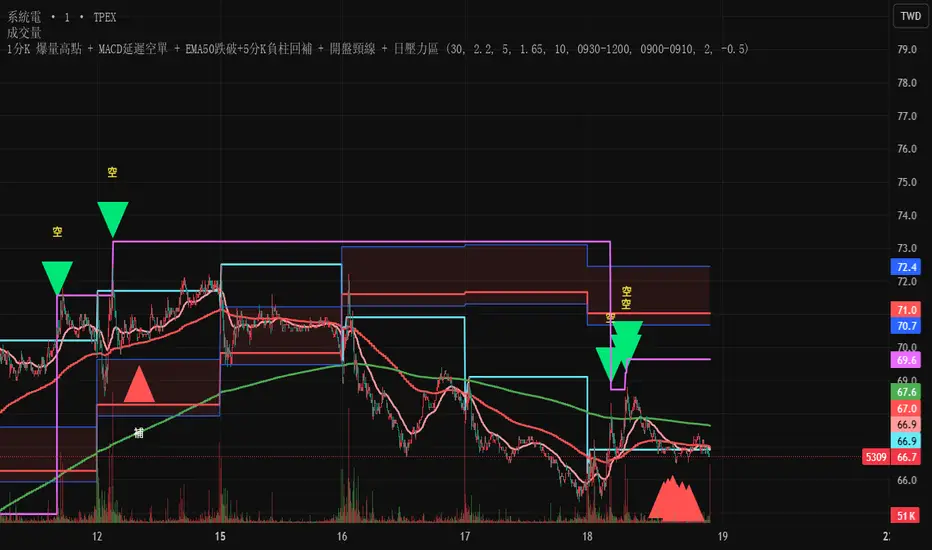
Test此指標為測試階段
最近手法改變,高點出現率後移,
此指標為爆量後跌破12ema才放空,
由於操盤手還是可以騙線,故時間設定為10:00之後成功率比較大
This indicator is in the testing phase.
Recently, the method has changed, and the occurrence rate of high points has shifted later.
This indicator only calls for shorting after a surge in volume followed by a drop below the 12-day moving average (EMA).
Because traders can still create false signals, setting the time after 10:00 AM increases the success rate.
krishnadeshmukh/NIFTY50 Micro Sentiment Part 2📘 Script Description: NIFTY50 Micro Sentiment — Part 2
This indicator continues the NIFTY50 Micro Sentiment model by analyzing the remaining 25 stocks (Rank 26–50 by index weight) of the NIFTY50.
🔍 Key Features:
Applies the same volume-bin methodology used in Part 1.
Sentiment detection based on:
Candle Color (default) or
*Close vs Midpoint of the candle range.
Stocks are weighted by their index influence.
Output is a clean sentiment table:
+ve / -ve / Neutral Volume Score
Weighted Sentiment Output
Use this in conjunction with Part 1 to analyze the entire NIFTY50 sentiment landscape.
📘 Script Description: NIFTY50 Combined Score
This script aggregates live sentiment data from both:
🧩 NIFTY50 Micro Sentiment — Part 1
🧩 NIFTY50 Micro Sentiment — Part 2
🚀 What it does:
Imports Score, +ve, -ve, and Neutral components from both scripts.
Combines them to produce:
✅ Total Weighted Sentiment
🟢 Bullish Weight
🔴 Bearish Weight
🟡 Neutral Component
📊 Outputs are shown via a middle-right sentiment table, updated every 5 bars.
Perfect for traders seeking a unified view of micro sentiment across the entire NIFTY50 ecosystem — in one glance.

Monthly High/Low - [JTCAPITAL]Monthly High/Low Probability Table - is a modified way to use historical monthly high and low tracking combined with probabilistic analysis for bullish and bearish months to detect potential patterns in monthly price behavior.
The indicator works by calculating in the following steps:
Variable Declaration
Persistent variables ( var ) are used to store monthly highs, lows, open and close prices, and the days on which highs and lows occurred. Separate arrays track bullish and bearish month statistics for highs and lows ( highBull, lowBull, highBear, lowBear ). Counters ( bullCount, bearCount ) store the number of bullish and bearish months recorded.
New Month Detection
The script detects the start of a new month by comparing the current bar’s month to the previous bar’s month. If a new month is detected, the script proceeds to update statistics for the previous month.
Monthly High/Low Recording and Classification
At the start of each new month, the previous month’s high, low, open, and close are evaluated:
If monthClose > monthOpen , the month is classified as bullish.
If monthClose < monthOpen , the month is classified as bearish.
The arrays ( highBull, lowBull, highBear, lowBear ) are updated at the respective high and low days of the month by incrementing counts, which allows the script to keep track of the frequency of monthly highs and lows occurring on specific days.
Monthly High/Low Tracking
During the month, the script continuously updates monthHigh and monthLow if the current bar’s high exceeds monthHigh or the low is below monthLow . The days on which these highs and lows occur are recorded ( highDay and lowDay ). The monthClose variable is continuously updated to the latest closing price.
Probability Calculation
Once monthly data is accumulated, the script calculates probabilities for each day of the month:
bullHighProb and bullLowProb represent the probability (in percentage) that a bullish month’s high or low occurred on a given day.
bearHighProb and bearLowProb represent the probability for bearish months.
These probabilities are calculated by dividing the count of high or low occurrences on each day by the total number of bullish or bearish months, then multiplying by 100. This probabilistic approach allows traders to see recurring patterns for highs and lows across multiple months.
Gradient Coloring Function
The helper function gradientRelative computes a color gradient between lowColor and highColor based on the relative probability value. Higher probabilities are colored closer to highColor , and lower probabilities closer to lowColor . This visual representation allows for quick identification of the most probable days for highs and lows in bullish or bearish months.
Dynamic Updates
As new bars are processed, the table is updated in real-time with new probabilities reflecting the most recent month’s data. This dynamic behavior ensures that the table remains accurate and responsive to the latest market information.
Buy and Sell Conditions:
This indicator does not provide direct buy or sell signals. Instead, it provides probabilistic information about historical patterns for bullish and bearish months. Traders can use the table to:
Identify days in the month where highs or lows are statistically more likely to occur.
Combine with other trend-following or reversal strategies to optimize entry and exit points.
For example, if a trader notices that bullish month highs frequently occur around day 15, they may plan trades around that period when other indicators align.
Features and Parameters:
Dynamic Probability Table : Updates in real-time as new monthly data becomes available.
Historical Pattern Tracking : Maintains arrays for highs and lows in bullish and bearish months.
Gradient Visualization : Uses color interpolation to quickly highlight higher probability days.
Specifications:
Monthly High/Low Tracking
Tracks the highest and lowest prices within each month. This is the foundation of the probability calculations. It allows traders to understand when significant price events historically occur.
Bullish/Bearish Month Classification
Each month is classified based on the relationship between monthClose and monthOpen . This provides context for the high/low occurrences: whether they happened in bullish or bearish months.
High/Low Occurrence Arrays
Four arrays ( highBull, lowBull, highBear, lowBear ) store the count of high and low occurrences for each day of the month. These arrays are the core of the statistical analysis.
Probability Calculation
Divides the count of occurrences for each day by the total number of months in that category (bullish/bearish). Multiplying by 100 converts this to a percentage probability, giving traders a numerical sense of recurrence.
Real-Time Updates
The table and probabilities are recalculated and refreshed with each new bar. This ensures that traders have the most current information available without manual recalculation.
User-Centric Visualization
By showing probabilities for both bullish and bearish months separately, traders gain a deeper understanding of market tendencies and recurring monthly patterns, which can be leveraged for improved timing and strategy alignment.
Important:
There is a misalign in percentages due to not all months having the same amount of days.

First Presented FVGSummary: First Presented FVG Indicator
This is a Pine Script v6 TradingView indicator that identifies and visualizes the first Fair Value Gap (FVG) that forms within configurable time windows during a trading session.
What it Does
1. Detects FVGs : Uses the classic 3-candle FVG definition:
- Bullish FVG: When low > high (gap up)
- Bearish FVG: When high < low (gap down)
2. "First Presented" Logic : For each configured time slot, it captures only the first qualifying FVG that forms—subsequent FVGs in that window are ignored.
3. Visual Display :
- Draws a colored box spanning from detection time to session end
- Optional text label showing detection time (e.g., "9:38 Tue FP FVG")
- Optional grade lines at 25%, 50%, and 75% levels within the FVG
Key Configuration
Setting Description
Timeframe Only works on 5-minute charts or lower
Timezone IANA timezone for session times (default: America/New_York)
Session Futures trading hours (default: 1800-1715)
Min FVG Size Minimum gap size in ticks to qualify
4 Time Slots Each with enable toggle, time window, and color
Default Time Slots
Slot 1 (enabled): 09:30-10:30 — lime green
Slot 2 (enabled): 13:30-14:30 — blue
Slot 3 (disabled): 13:00-13:30 — teal
Slot 4 (disabled): 14:15-14:45 — fuchsia
Technical Features
Handles cross-midnight sessions correctly
Resets all drawings at each new session
Skips the first bar of each window to ensure valid 3-candle lookback
Clamps slot windows to session boundaries

EMA12/50 如果放空後趨勢由背景紅轉綠可以考慮常抱
抱到背景再次翻紅而比較不被雜訊洗掉
現階段指標合併在一起會出BUG
If the trend changes from red to green after shorting, consider holding for a longer period.
Hold until the background turns red again to avoid being washed out by noise.
Currently, merging them together will cause bugs.

QuantLabs Multi Asset Similarity Matrix [V3 Final]The Market is a graph. See the flows:
The QuantLabs MASM is not a standard correlation table. It is an Alpha-Grade Scanner architected to reveal the hidden "hydraulic" relationships between global macro assets in real-time.
Rebuilt from the ground up for Version 3, this engine pushes the absolute limits of the Pine Script™ runtime. It utilizes a proprietary Logarithmic Math Engine, Symmetric Compute Optimization, and a futuristic "Ghost Mode" interface to deliver a 15x15 real-time correlation matrix with zero lag.
Under the Hood: The Quant Architecture
We stripped away standard libraries to build a lean, high-performance engine designed for institutional-grade accuracy.
1. Alpha Math Engine (Logarithmic Returns) Most tools calculate correlation based on Price, which generates spurious signals (e.g., "Everything is correlated in a bull run").
The Solution: Our engine computes Logarithmic Returns (log(close /close )) by default. This measures the correlation of change (Velocity & Vector), not price levels.
The Result: A mathematically rigorous view of statistical relationships that filters out the noise of general market drift.
Dual-Core: Toggle seamlessly between "Alpha Mode" (Log Returns) for verified stats and "Visual Mode" (Price) for trend alignment.
Calculation Modes: Pearson (Standard), Euclidean (Distance), Cosine (Vector), Manhattan (Grid).
2. Symmetric Compute Optimization Calculating a 15x15 matrix requires evaluating 225 unique relationships per bar, which often crashes memory limits.
The Fix: The V3 Engine utilizes Symmetric Logic, recognizing that Correlation(A, B) == Correlation(B, A).
The Gain: By computing only the lower triangle of the matrix and mirroring pointers to the upper triangle, we reduced computational load by 50%, ensuring a lightning-fast data feed even on lower timeframes.
3. Context-Aware "Ghost Mode" The UI is designed for professional traders who need focus, not clutter.
Smart Detection: The matrix automatically detects your current chart's Ticker ID. If you are trading QQQ, the matrix will visually highlight the Nas100 row and column, making them opaque and bright while dimming the rest.
Dynamic Transparency: Irrelevant data ("Noise" < 0.3 correlation) fades into the background. Only significant "Alpha Signals" (> 0.7) glow with full Neon Saturation.
Key Features
Dominant Flow Scanner: The matrix scans all 105 unique pairs every tick and prints the #1 Strongest Correlation at the bottom of the pane (e.g., DOMINANT FLOW: Bitcoin ↔ Nas100 ).
Streak Counter: A "Stubbornness" metric that tracks how many consecutive days a strong correlation has persisted. Instantly identify if a move is a "flash event" or a "structural trend."
Neon Palette: Proprietary color mapping using Electric Blue (+1.0) for lockstep correlation and Deep Red (-1.0) for inverse hedging.
Usage Guide
Placement: Best viewed in a bottom pane (Footer).
Assets: Pre-loaded with the Essential 15 Macro Drivers (Indices, BTC, Gold, Oil, Rates, FX, Key Sectors). Fully editable via settings (Ticker|Name).
Reading the Grid:
🔵 Bright Blue: Assets moving in lockstep (Risk-On).
🔴 Bright Red: Assets moving perfectly opposite (Hedge/Risk-Off).
⚫ Faded/Black: No statistical relationship (Decoupled).
Key Improvements Made:
Formatting: Added clear bullet points and bolding to make it scannable.
Clarity: Clarified the "Logarithmic Returns" section to explain why it matters (Velocity vs. Price Levels).
Tone: Maintained the "high-tech/quant" vibe but removed slightly clunky phrases like "spurious signals" (unless you prefer that academic tone, in which case I left it in as it fits the persona).
Structure: Grouped the "Modes" under the Math Engine for better logic.
Created and designed with love by David James @QuantLabs : )

Double Cross Strategy - directional color plus golden crossCandle color changes to dark green when opening below 9/20 SMAs when 9 is below the 20 and closes above.
Candle color changes to dark red when opening above the 9/20 SMAs when the 9 is above the 20 and closes below.
Candle color changes to yellow when either of the above occurs plus crosses the vwap.

MRX_M7 777//@version=5
indicator("MRX_M7 777 MTF ALERT (jgar)", overlay=true)
// === SOZLAMALAR ===
tfInput = input.timeframe("15", "Qaysi TF")
showZone = input.bool(true, "Zonani ko‘rsat / o‘chirish")
zoneColor = color.new(color.lime, 75)
// === MTF DATA (BITTA QATORDA!) ===
= request.security(syminfo.tickerid, tfInput, )
// === ENGULF ===
engulf = mtfHigh > mtfHigh and mtfLow < mtfLow
// === ZONA ===
zoneHigh = mtfHigh
zoneLow = mtfLow
// === CHARTGA CHIZISH ===
if engulf and showZone
box.new(bar_index - 1, zoneHigh, bar_index, zoneLow, bgcolor = zoneColor, border_color = color.lime)
label.new(bar_index, zoneHigh, "ENGULF " + tfInput, style = label.style_label_down, textcolor = color.white, bgcolor = color.lime)
// === ALERT ===
alertcondition(engulf, title="MTF ENGULF", message="ENGULF " + tfInput + " timeframe da sodir bo‘ldi")

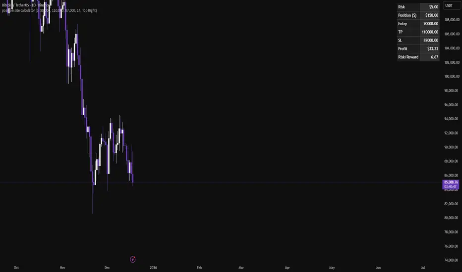
Position size calculatorA clean position size calculator designed specifically for leverage traders.
It calculates your position size, potential profit, and risk-to-reward ratio (R/R) based on fixed dollar risk.
Simply enter your entry price, stop-loss, take-profit, and risk in USD to receive precise results.
The position size is currently calculated using the following risk-based formula:
Position Size = Risk ($) / Stop-Loss distance.
This approach keeps risk constant regardless of leverage.
All colors are fully customizable to seamlessly fit your chart theme.
If you have ideas for additional calculation models or if you find any issues, leave a comment and help improve the tool.
IQR Bands boromeyIQR is the price's "comfort zone," covering the middle 50% of activity.
Inside: Just noise. Ignore it.
Breakout: A real move. Pay attention.
It filters out choppy markets so you only catch the true trends.


High Volume Breakout DetectorThis indicator is a dedicated volume analysis tool displayed in a separate pane below the price chart. It visually highlights significant volume surges (spikes) by comparing the current bar's volume to a dynamic threshold based on a Simple Moving Average (SMA) of volume.
Key Concepts and Methodology:
- The core calculation uses a user-configurable Simple Moving Average (default: 20 periods) of historical volume to establish a baseline of "normal" trading activity.
- A customizable multiplier (default: 1.50, meaning 150% of the SMA) defines the threshold for a volume spike. When the current bar's volume meets or exceeds this threshold, it is classified as a spike—indicating unusually high participation that often accompanies breakouts, reversals, climaxes, or institutional activity.
- Volume bars are plotted as columns and colored based on two factors:
- Candle direction: Green shades for bullish candles (close ≥ open), red shades for bearish candles (close < open).
- Spike status: Brighter/solid colors for confirmed spikes, muted/translucent colors for normal volume. This candle-matched coloring helps traders quickly assess whether the surge supports buying pressure (green spike on up candle) or selling/distribution (red spike on down candle).
- Optional overlays include the volume SMA line (blue) and the dynamic threshold line (orange, plotted as circles for easy distinction).
Features and Customization:
- Fully adjustable inputs: SMA length, multiplier threshold, colors for up/down/normal/spike bars, and toggles for showing the SMA line, threshold line, or background highlighting on spikes.
- Built-in alert condition triggers reliably on volume spikes (≥ selected multiplier of SMA), with a constant message string including ticker, timeframe, volume value, and threshold reference.
How to Use:
- Add to any chart in a separate pane (overlay=false).
- Look for brighter colored volume bars as potential signals of conviction in price moves. For example:
- Green spikes on up candles may signal strong accumulation or breakout confirmation.
- Red spikes on down candles may indicate distribution or exhaustion selling.
- Combine with price action, support/resistance, or trend indicators for confluence.
- Ideal for day trading, swing trading, or spotting volume climaxes on stocks, forex, crypto, or futures across any timeframe.
The unique combination of candle-direction-matched coloring for spikes, visual threshold plotting, and focused spike highlighting provides clearer, more actionable insight into directional volume pressure compared to standard volume displays.
