15-Min Opening Range Indicator & Breakout Targets (ORB)- Willy
🔍 Overview
The **15-Min ORB (Opening Range Breakout)** indicator automatically identifies the **first 15-minute high and low range** after a market opens — and plots breakout targets based on user-defined expansion multiples.
It’s designed for traders who use **Opening Range Breakout (ORB)** strategies across multiple markets or sessions — and want **precise timing adjusted to their own timezone**.
---
⚙️ Features
🕐 **Time-Zone Offset (Local Adjustment)**
* Automatically shift your ORB window to match your **local timezone**.
* No more guessing when “09:30” happens in your region.
* Simply set the **offset (hours ahead or behind chart time)** and the indicator adjusts everything automatically.
⏱ **15-Minute Opening Range**
* Plots the high and low of your chosen 15-minute window.
* Works with any market or trading session (NYSE, London, Tokyo, Crypto, etc.).
* User can define **custom start hour and minute**.
🎯 **Breakout Targets (TP1, TP2)**
* Automatically calculates and draws **Take Profit levels** using customizable expansion multiples.
* Configurable TP1 / TP2 lines and labels with selectable styles (solid, dashed, dotted).
💬 **Visual Labels**
* Clear text labels showing:
* 15m High and Low levels.
* TP1 and TP2 targets.
* Label placement (left or right) adjustable for chart preference.
🧹 **Automatic Daily Reset**
* Resets all levels and targets at your midnight (or market day boundary).
* Ensures clean new ORB levels every day.
🔔 **Breakout Alerts**
* Built-in TradingView alerts for:
* **Closed Above 15m High**
* **Closed Below 15m Low**
---
🧭 How to Use
1. **Add to Chart**
* Click “Add to Favorite Scripts” and apply to your desired symbol.
* Works best on intraday timeframes (1m–15m).
2. **Set Your Market Session**
* Choose your **Range Start Hour and Minute** (e.g., 9:30 for NYSE).
* Set **My Time Offset from Chart (hours)** — for example:
* NYSE 9:30 New York → Bangkok (+12 hours)
* London 8:00 → Bangkok (+7 hours)
* The indicator adjusts automatically.
3. **Monitor the Range**
* The first 15-minute high and low are drawn as purple lines.
* When price breaks above or below, TP levels appear.
4. **Trade Your Plan**
* Alerts trigger when candles close outside the range.
* Manage targets using the expansion multipliers.
---
🧮 Example Settings
| Market | Local Open (Your Time) | Range Start (chart time) | Offset | Notes |
| :----------- | :--------------------------------- | :----------------------- | :----- | :----------------------- |
| NYSE (US) | 9:30 AM New York → 9:30 PM Bangkok | 9 | +12 | Typical for Thai traders |
| LSE (UK) | 8:00 AM London → 3:00 PM Bangkok | 8 | +7 | EU market overlap |
| Tokyo | 9:00 AM Tokyo → 7:00 AM Bangkok | 9 | +2 | Asian session |
| Crypto (UTC) | 0:00 UTC → 7:00 AM Bangkok | 0 | +7 | 24/7 markets |
---
📐 Parameters
### 15-Minute Range
* **Display 15-Minute Range** — toggles the range lines.
* **Show 15-Minute Labels** — toggles the range high/low labels.
* **Range Start Hour / Minute** — defines the start of your 15m window.
* **My Time Offset from Chart (hours)** — shifts the calculation to your local time.
* **Range Color / Style** — customize the look of your range lines.
### Targets
* **TP1 Expansion Multiple** — default `1.0` (equal to full range).
* **TP2 Expansion Multiple** — default `2.0`.
* **Show TP1 / TP2 Levels & Labels** — toggle individually.
* **TP Label Color** — customize breakout target visuals.
### Labels
* **Label Position (Left/Right)** — choose where labels appear on chart.
---
## 💡 Strategy Ideas
* Combine with volume or volatility filters for better confirmation.
* Use alongside VWAP, EMA, or session profiles for confluence.
* Apply on different markets:
* **Stocks (NYSE, NASDAQ)** — morning ORB strategy.
* **FX (London Open)** — volatility breakout.
* **Crypto (UTC 00:00)** — daily range breakout.
---
🧩 Technical Notes
* Built in **Pine Script v6**.
* Works on all intraday timeframes.
* Time calculations are local-adjusted using integer offset logic (avoids DST issues).
* No repainting — range values lock once 15m window completes.
---
🚀 Author Notes
Created for traders who want **simple, reliable ORB logic that respects your timezone**.
No unnecessary complexity — everything resets cleanly each day.
Tested and verified on:
* BTCUSD (Binance)
* ES1! (CME Futures)
* NAS100 / SPX500
* EURUSD / GBPJPY
* Thai SET50 index
---
🔔 Alerts
* “Closed Above 15m High”
* “Closed Below 15m Low”
You can configure custom alerts with your own messages.
---
## ⚠️ Disclaimer
This script is **for educational purposes only**.
It does not constitute financial advice or guarantee results.
Always backtest and trade responsibly.
Sentiment

[KF] Multi-Duration Rate Expectations IndicatorAfter last fed cut in Oct then following jump in rates, I was frustrated at not having access to good rate expectations vs actual because the market usually prices in prior to fed action. This indicator was developed to make futures market rate expectations accessible and interpretable without requiring professional bond analytics systems.
Summary
This Pine Script indicator reveals what the futures market expects for interest rates across three key durations: Fed Funds (overnight), 2-Year, and 10-Year Treasury yields. By comparing futures-implied rates against current spot yields, it provides a clear visual signal of whether the market expects rates to rise, fall, or remain steady.
Understanding Rate Futures
Fed Funds futures (ZQ1!) use a simple design where the expected rate equals 100 minus the futures price. If ZQ1! trades at 96.12, the market expects a 3.88% Fed Funds rate. Treasury futures work differently - they trade as bond prices (typically 102-115) that move inversely to yields. Converting Treasury futures to implied yields requires complex bond mathematics involving duration and conversion factors.
This indicator solves the Treasury futures complexity by implementing a self-calibrating sensitivity model. It observes the historical relationship between futures prices and yields, then uses this to project rate expectations. The model also compares front-month to next-month contracts to detect expected rate direction, automatically adapting as market conditions change.
How to Use
Add the indicator to any chart and select your desired duration in the settings. The display shows the futures-implied rate, current yield, and the difference between them. Green indicates the market expects higher rates, red means lower expectations, and gray shows expectations in line with current rates.
The indicator excels at identifying divergences between market expectations and current rates, which often precede rate movements or futures repricing. Comparing expectations across different durations reveals insights about yield curve positioning and Fed policy anticipation.
Technical Note
While Fed Funds futures provide exact rate expectations, Treasury futures conversions are sophisticated approximations that provide reliable directional signals and reasonable magnitude estimates sufficient for most trading applications.

VIX/VVIX Spike RiskVIX/VVIX Spike Risk Analyzer
The VIX/VVIX Spike Risk Analyzer analyzes historical VIX behavior under similar market conditions to forecast future VIX spike risk.
By combining current VIX and VVIX levels as dual filters, it identifies historical precedents and calculates the probability and magnitude of VIX spikes over the next 1, 5, and 10 trading days.
IMPORTANT: This indicator must be applied to the VIX chart (CBOE:VIX) to function correctly.
Methodology
1. Dual-Filter Pattern Matching
The indicator uses both VIX and VVIX as simultaneous filters to identify historically analogous market conditions:
By requiring BOTH metrics to match historical levels, the indicator creates more precise market condition filters than using VIX alone. This dual-filter approach significantly improves predictive accuracy because:
VIX alone might be at 15, but VVIX can tell us if that 15 is stable (low VVIX) or explosive (high VVIX)
High VVIX + Low VIX often precedes major spikes
Low VVIX + Low VIX suggests sustained calm
2. Tolerance Settings
VIX Matching (Default: ±10% Relative)
Uses relative percentage matching for consistency across different VIX regimes
Example: VIX at 15 matches 13.5-16.5 (±10%)
Can switch to absolute tolerance (±5 points) if preferred
VVIX Matching (Default: ±10 Points Absolute)
Uses absolute point matching as VVIX scales differently
Example: VVIX at 100 matches 90-110
Can switch to relative percentage if preferred
3. Historical Analysis Window
The indicator scans up to 500 bars backward (limited by VVIX data availability) to find all historical periods where both VIX and VVIX were at similar levels. Each match becomes a "sample" for statistical analysis.
4. Forward-Looking Spike Analysis
For each historical match, the indicator measures VIX behavior over the next 1, 5, and 10 days
Display Metrics Explained
Average Highest Spike
Shows the average of the maximum VIX spikes observed.
Highest Single Spike
Shows the single largest spike ever recorded
Probability No 10% Spike
Shows what percentage of historical cases stayed BELOW a 10% spike:
Probability No 20% Spike
Shows what percentage of historical cases stayed BELOW a 20% spike:
Note : You'll see many more shaded bars than the sample count because each match creates up to 5 consecutive shaded bars (bars 1-5 after the match all "look back" and see it).
Short Volatility Strategies:
Enter when there's a LOW probability of big vol spikes based on today's metrics
Long Volatility Strategies
Enter when there's a HIGH probability of big vol spikes based on today's metrics

Mum Formasyonları TespitiIt is used to detect candles.
It is designed to analyze all the candles that form.
The most frequently formed candles are displayed on the price chart.

VIX Regime AnalyzerVIX Regime Analyzer
The VIX Regime Analyzer is an analytical tool that examines historical VIX patterns to provide insights into how your asset typically performs under similar volatility conditions.
Key Features:
Historical Pattern Matching: Automatically scans up to 1,000 bars of history to find all periods when VIX was at levels similar to today, using customizable tolerance ranges (absolute or percentage-based).
Forward-Looking Statistics: For each VIX regime match, calculates what actually happened to your asset over the next 1, 5, 10, and 20 trading days, providing both average returns and probability of positive outcomes.
Regime Classification System: Intelligently categorizes the current market environment as bullish or bearish: Visual Historical Context:
Background shading throughout your chart highlights every historical period when VIX matched current levels, color-coded by subsequent performance (green for gains, red for losses).
User Inputs:
VIX Level Tolerance (+/-): How closely VIX must match (default: ±5 points)
Use Relative Tolerance (%): Switch to percentage-based matching for consistency across different VIX levels
Lookback Period: How many bars to analyze
Highlight Historical VIX Matches: Toggle background highlighting of past matching periods
The Data Table
The statistics box appears in the right handside of your chart and contains three main sections:
Section 1: VIX REGIME
Current VIX: The live VIX closing price
Range: The tolerance band being searched (e.g., if VIX is 18 with ±5 tolerance, range is 13-23)
Historical Samples: Number of matching periods found in the lookback window (minimum 10 required for statistical validity)
Section 2: FORWARD RETURN
Shows the average percentage change in your asset over different timeframes following similar VIX levels:
Avg Next Day: What typically happened by the next trading session
Avg Next 5 Days: Average 5-day forward performance
Avg Next 10 Days: Average 10-day forward performance
Avg Next 20 Days: Average 20-day forward performance (approximately 1 month)
Section 3: PROBABILITY UP
Shows the win rate - the percentage of times your asset closed higher after VIX matched current levels:
Next Day: Probability of being up the next session
Next 5 Days: Probability of being up after 5 days
Next 10 Days: Probability of being up after 10 days
Next 20 Days: Probability of being up after 20 days
Colors:
🟢 Green: Bullish regimes (various strengths)
🔴 Red: Bearish regimes (various strengths)
🟡 Yellow: Choppy/uncertain regime
When "Highlight Historical VIX Matches" is enabled:
Scroll back through your chart and you'll see colored backgrounds highlighting every period when VIX matched today's level. The color tells you whether that match led to gains (green) or losses (red). This provides instant visual pattern recognition - you can quickly see if similar VIX levels historically led to bullish or bearish outcomes.
Practical Example:
If you see that most historical periods with similar VIX levels are highlighted in green, it suggests the current VIX level has historically been a bullish signal for your asset.
How The Indicator Makes Decisions
The regime classification uses both magnitude AND probability to avoid false signals:
Example of Strong Classification:
Average 5-day return: +1.5%
Win rate: 65%
Result: STRONG BULLISH (both high return and high probability)
Example of Weak Signal:
Average 5-day return: +2.0%
Win rate: 35%
Result: CHOPPY (high average but low consistency = unreliable)
This dual-factor approach ensures the indicator doesn't mislead you with regimes that had a few huge winners but mostly losers, or vice versa.
Best Practices
Combine with your existing strategy: Use this as a regime filter rather than standalone signals
Check sample size: More historical matches = more reliable statistics
Consider multiple timeframes: If 5-day and 20-day metrics disagree, proceed with caution
Asset-specific tuning: Different assets may require different tolerance settings
VIX spikes: The indicator is particularly useful during VIX spikes to understand if panic is justified
What Makes This Different
Unlike simple VIX indicators that just plot the fear index, this tool:
Quantifies the actual impact of VIX levels on YOUR specific asset
Provides probability-based forecasts rather than subjective interpretation
Shows historical context visually so you can see patterns at a glance
Uses rigorous statistical criteria to avoid false regime classifications

MLogic v5 — Lean, EOD Momentum System for Serious TradersMLogic v5 is a clean, end-of-day momentum framework built for traders who value clarity, discipline, and audibility. It combines Supertrend-style trend logic with RSI filtering, MACD-based prep signals, and a volatility-aware trailing stop to deliver high-integrity buy/sell signals across global markets.
Core Features:
• Confirmed Buy/Sell Signals based on trend flips and RSI momentum
• MACD Prep Tier with shaded background alerts for early rotation cues
• Volatility-Scaled Trailing Stop to protect gains and reduce drawdown
• Unified Sell Alerts triggered by either trend reversal or stop breach
• EOD Confirmation Logic ensures stable, auditable signals—no intraday noise
Designed For:
• Systematic momentum traders
• Global equity and ETF portfolios (India, Eurozone, US, UK)
• Public-facing performance reporting and visual clarity
• Scalable list-based scanning and automation workflows
For ETF scanning, RSI threshold should be adjusted to 50 to improve responsiveness in slower-moving instruments. A dedicated ETF-optimized version of MLogic may be released separately.
MLogic v5 is not a scalping tool or a mean-reversion system—it’s built for clean, sustainable momentum capture with minimal cognitive load. Whether you’re trading sector ETFs or high-beta names, MLogic helps you stay focused, disciplined, and transparent.

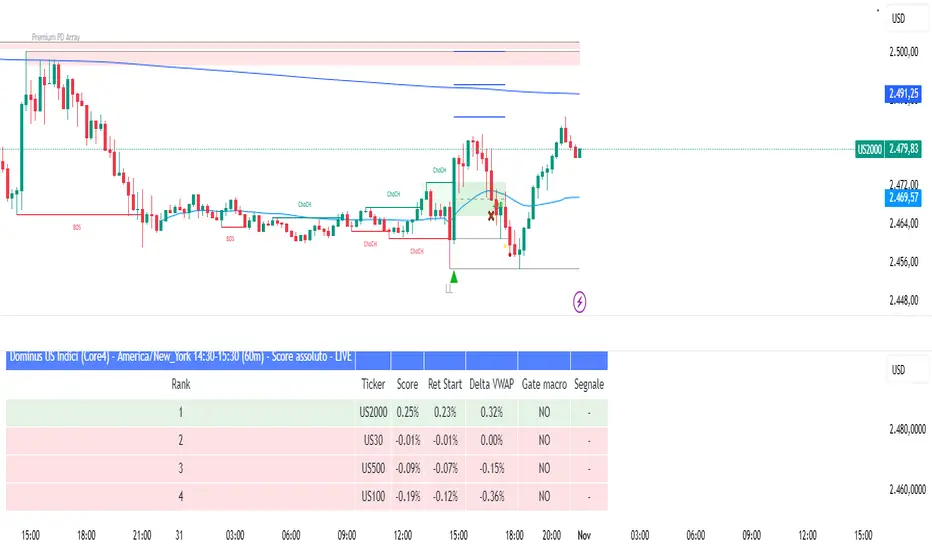
Dominus US Indici - Core4 (ES,NQ,YM,RTY) - EditabileOne-liner
“Dominus US Indici ranks ES, NQ, YM, RTY at the NY open using a blended Score (return from window start + VWAP delta) to highlight the strongest long/short and give clean BUY/SELL signals.”
Short paragraph
“Dominus US Indici analyzes the four core US indices (ES, NQ, YM, RTY) from the New York open. It builds a single Score by combining momentum from the window start with distance from VWAP, ranks the indices, and flags only the top, high-quality opportunity. Optional ‘Alpha vs S1’ (beta-neutral), macro gate (DXY & US10Y), editable symbols/timezone, and a freeze snapshot keep decisions consistent.”
Bullets
Core4: ES, NQ, YM, RTY (editable).
Score = Return from start + VWAP delta (weighted).
Live table + ranking; threshold → BUY/SELL signals.
Optional Alpha vs S1 and macro filter (DXY, US10Y).
Custom window/timezone + freeze at window end.
If you want, I can add a tighter IG caption + hashtags in your Dominus style.
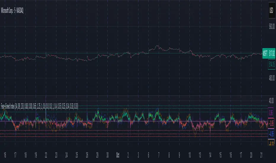
Fear–Greed Index📈 Fear–Greed Index
This indicator provides a sophisticated, multi-faceted measure of market sentiment, plotting it as an oscillator that ranges from -100 (Extreme Fear) to +100 (Extreme Greed).
Unlike standard indicators like RSI or MACD, this tool is built on principles from behavioral finance and social physics to model the complex psychology of the market. It does not use any of TradingView's built-in math functions and instead calculates everything from scratch.
🤔 How It Works: The Three-Model Approach
The final index is a comprehensive blend of three different academic models, each calculated across three distinct time horizons (Short, Mid, and Long) to capture sentiment at different scales.
Prospect Theory (CPT): This model, based on Nobel Prize-winning work, evaluates how traders perceive gains and losses. It assumes that the pain of a loss is felt more strongly than the pleasure of an equal gain, modeling the market's asymmetric emotional response.
Herding (Brock–Durlauf): This component measures the "follow the crowd" instinct. It analyzes the synchronization of positive and negative returns to determine if traders are acting in a coordinated, "herd-like" manner, which is a classic sign of building fear or greed.
Social Impact Theory (SIT): This model assesses how social forces influence market participants.
It combines three factors:
Strength (S): The magnitude of recent price moves (volatility).
Immediacy (I): How recently the most significant price action occurred.
Number (N): The level of market participation (volume).
The indicator calculates all three models for a Short, Mid, and Long lookback period. It then aggregates these nine components (3 models x 3 timeframes) using customizable weights to produce a single, final Fear–Greed Index value.
Interpretar How to Read the Index
Main Line: This is the final FGI score.
Lime/Green: Indicates Greed (positive values).
Red: Indicates Fear (negative values).
Fading Color: The color becomes more transparent as the index approaches the '0' (Neutral) line, and more solid as it moves toward the extremes.
Key Zones:
+100 to +30 (Extreme Greed): The market is highly euphoric and potentially overbought. This can be a contrarian signal for caution or profit-taking.
+30 to +18 (Greed Zone): Strong bullish sentiment.
+18 to -18 (Neutral Zone): The market is undecided, or fear and greed are in balance.
-18 to -30 (Fear Zone): Strong bearish sentiment.
-30 to -100 (Extreme Fear): The market is in a state of panic and may be oversold. This can be a contrarian signal for potential buying opportunities.
Reference Plots: The indicator also plots the aggregated scores for each of the three models (Herding, Prospect, and SIT) as faint, secondary lines. This allows you to see which component is driving the overall sentiment.
⚙️ Settings & Customization
This indicator is highly tunable, allowing you to adjust its sensitivity and component makeup.
Time Windows:
Short window: Lookback period for short-term sentiment.
Mid window: Lookback for medium-term sentiment.
Long window: Lookback for long-term sentiment.
Model Aggregation Weights:
Weight CPT, Weight Herding, Weight SIT: Control how much each of the three behavioral models contributes to the final score (they should sum to 1.0).
Cross-Horizon Weights:
Weight Short, Weight Mid, Weight Long: Control the influence of each timeframe on the final score (they should also sum to 1.0).
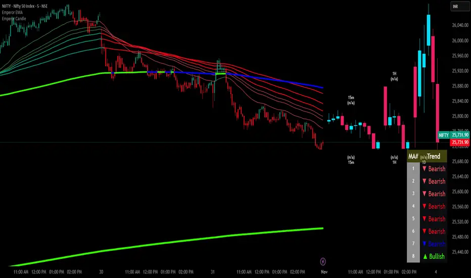
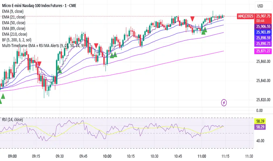
Emperor Moving Averages📘 Description: Emperor Moving Averages — Smart Trend Strength System
Emperor Moving Averages (EMA) is a next-generation trend tracking and confirmation system designed for traders who demand clarity, structure, and actionable precision.
It goes beyond traditional moving averages — combining multi-length dynamic trend analysis, color-coded slope momentum, trend strength visualization via table, and smart crossover alerts.
This indicator is ideal for scalpers, swing traders, and position traders who want to stay aligned with the dominant market momentum without cluttering the chart.
⚙️ Core Features
🧠 1. Dynamic Multi–Moving Average System
Plot up to 8 customizable MAs (EMA, SMA, WMA, or HMA).
Each line dynamically reflects short to long-term trend behavior — perfect for spotting confluence zones and directional bias.
🎨 2. Auto Slope Coloring
Each moving average is automatically colored based on slope direction:
🟢 Bullish (Up Slope) — Trend gaining strength upward
🔴 Bearish (Down Slope) — Trend losing strength or reversing
The slope logic helps identify momentum shifts far earlier than crossover-based signals.
🌫️ 3. Clean Chart Toggle
Toggle all MA lines ON/OFF instantly using
“Show Moving Average Lines?”
for a clutter-free chart — view only the Trend Strength Table when you want a quick macro snapshot.
📊 4. Trend Strength Table
The heart of the indicator — the Trend Strength Table displays every MA’s direction in real-time.
It instantly tells you:
Which MAs are bullish or bearish
How many are aligned in one direction
Whether the overall bias is strengthening or weakening
You can move this table anywhere on your chart — including:
Top / Middle / Bottom + Left / Center / Right positions
This makes it ultra-flexible for any chart layout or resolution.
🔔 5. Intelligent Cross Alerts
Built-in alerts notify you whenever a faster MA crosses over or under a slower MA.
Crossover Up: Fast MA breaks above slow MA → Bullish signal
Crossunder Down: Fast MA breaks below slow MA → Bearish signal
You can adjust the cross sensitivity for tighter or wider detection.
📈 How to Use
Choose your MA type (EMA / SMA / WMA / HMA).
Set the number of MAs (up to 8) and their lengths.
Turn “Show Moving Average Lines” on or off based on preference.
Use the Trend Table to instantly gauge trend strength alignment across all MAs.
Turn on Cross Alerts to get notified on key trend shifts.
🧩 Recommended Setups
Short-term traders (Scalping):
Use smaller MA lengths (e.g., 9, 21, 34) to capture micro-trends.
Swing traders:
Combine 20, 50, 100, 200 to analyze structure shifts and retracements.
Institutional confluence:
Use all 8 MAs together for high-confidence directional bias.
⚡ Advantages
✅ Trend visualization made intuitive
✅ No lagging repainting elements
✅ Adjustable table positioning
✅ Lightweight performance
✅ Perfect companion to price action strategies
💬 Alerts
MA Crossover Up: Fast MA > Slow MA
MA Crossover Down: Fast MA < Slow MA
Use these alerts for automated trend confirmation and entry management.
👑 Final Words
Emperor Moving Averages isn’t just another MA indicator —
it’s a visual intelligence tool that helps traders see market structure clearly, without noise.
Built for clarity, precision, and professional-grade usability.
⚔️ Perfect Combination — Emperor RSI Candle + Emperor Moving Averages
🔸 Emperor RSI Candle
Detects internal candle momentum and RSI power zones
Identifies early exhaustion or entry zones
Great for timing precise entries and exits
🔹 Emperor Moving Averages
Confirms directional trend and slope strength
Validates macro structure and overall momentum direction
Great for staying aligned with the dominant trend flow
✅ Together they create a complete Emperor Trend System:
Use RSI Candle for entry timing and momentum confirmation.
Use Emperor MA Trend Table to confirm overall trend strength.
Enter trades when both align — for maximum accuracy and confidence.
📢 Credits
Developed by Live Trading Emperor — Creator of the Emperor Series for advanced market analysis.
Follow for more premium-grade, scalper-friendly, and MTF-enhanced tools.

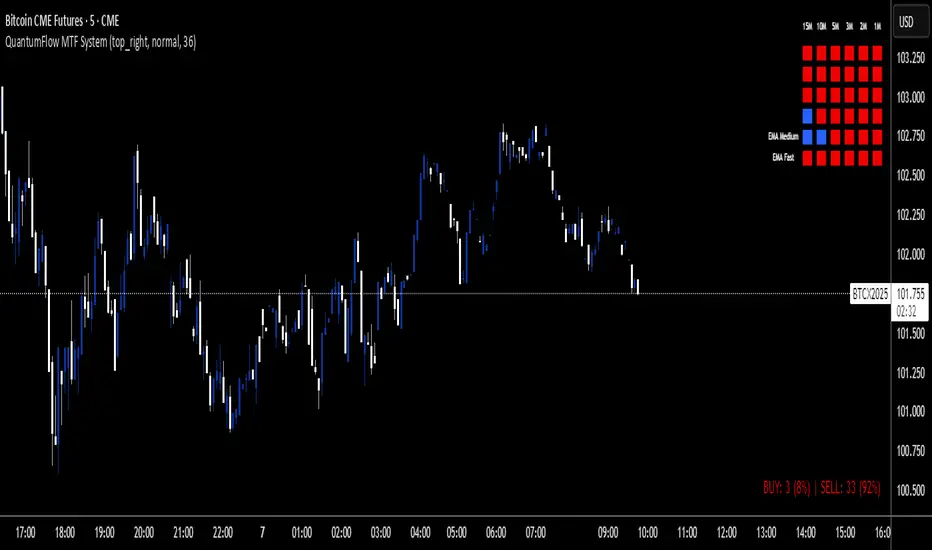
QuantumFlow MTF SystemQuantumFlow MTF System © 2025
Multi-Timeframe Directional Flow & Volatility Alignment Engine
QuantumFlow MTF System is designed to synchronize volatility- and trend-based signals from multiple timeframes into a single, structured view of market flow.
Concept
The system evaluates confirmed Supertrend directions from several lower timeframes, then aggregates them into normalized bullish/bearish values. These values are combined with dual-layer EMA momentum filters to verify directional strength. The resulting matrix provides a precise snapshot of alignment across short- to medium-term market structures.
Unlike classical ATR-based systems, QuantumFlow employs multiple ATR layers with multiple deviation factors that have been extensively tested over the years.
This multi-ATR framework acts as an adaptive volatility filter, allowing each asset class to respond dynamically to its intrinsic volatility profile.
The result is a robust and consistent analytical engine capable of adapting to varying market conditions across assets and timeframes.
How It Works
- Confirmed Multi-Timeframe Supertrend:
Each timeframe calculates a close-confirmed Supertrend direction, preventing repainting and ensuring signal reliability.
- Multi-ATR Volatility Model:
Several ATR instances with distinct deviation multipliers define volatility thresholds that adjust sensitivity across market conditions.
- Dual EMA Structure:
Two independent EMA layers act as momentum validators to confirm or filter each Supertrend direction.
- Flow Totals Engine:
The script sums all directional states into a real-time ratio of bullish vs bearish conditions, visualized through color-coded totals.
- Adaptive Alerts:
Optional thresholds allow traders to receive alerts when directional imbalance reaches predefined intensity levels.
Use Cases
- Identify when multiple timeframes align in the same trend direction.
- Quantify the relative dominance of bullish or bearish pressure.
- Filter trades using adaptive multi-ATR volatility filters per asset type.
- Confirm entries by validating multi-timeframe directional consensus.
Chart Display
QuantumFlow displays a structured table showing the state of each analyzed timeframe and the current flow balance. Works seamlessly on any instrument and timeframe.
This invite-only indicator provides a systematic way to analyze directional flow alignment using a multi-ATR volatility engine combined with momentum synchronization across multiple timeframes.
---
Author’s Instructions:
To request access, please contact the author privately through the TradingView profile.
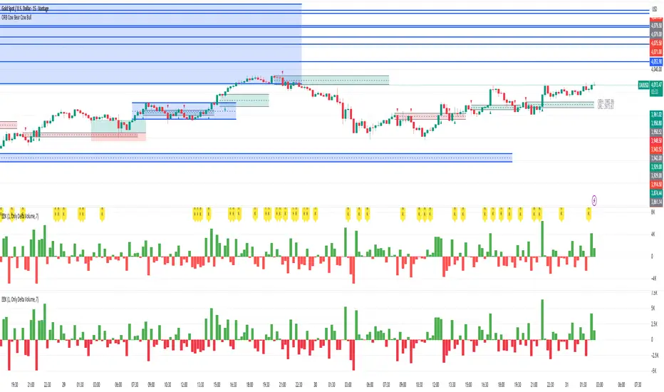
异常KOriginal: Delta Volume by Sidd_wolf
Added features:
Alert notification option.
Option to highlight when there is a 异常K.
原作:Delta Volume by Sidd_wolf
新增功能:
闹铃通知选项
异常K出现时高亮显示选项
Delta Volume is Difference between Buying Volume and Selling Volume. This is calculated on the basis of Lower TimeFrame Candles。
✅ For example: If you open 4 hours chart, this indicator checks volume of 1 minute chart and separates Buying-Selling volume and calculates Delta Volume.
✅ This indicator also shows Smooth Delta Volume to find trends.
USD Session 8FX - LDN & NY (TF-invariant, Live + Table)What changed
Flexible session window
Removed the old fixed NY end-time selector.
Added new inputs so you can pick start time and length:
London: ldnStartSel (default 08:00) and ldnLenSel with options 45/60/90 minutes.
New York: nyStartSel (default 15:30) and nyLenSel with options 45/60/90 minutes.
The session string used by time(refTF, sess, tz) is now built dynamically as "HHMM-HHMM" from start + length (e.g., 1530-1630).
The label shown in the table (winTxt) auto-formats to HH:MM–HH:MM.
New time helpers
addMinutesHHMM() computes the end time from a "HHMM" start plus a minute length.
makeSess() produces the session string "HHMM-HHMM".
prettySess() converts "HHMM-HHMM" → "HH:MM-HH:MM".
(Kept on one line to avoid the “end of line without line continuation” error.)
Stability & UI fixes
Main table now uses table.new(f_pos(tablePos), ...) directly (no undeclared pos variable).
Trade Gate panel uses a properly initialized gatePosEnum before table.new(...) (fixes “Undeclared identifier”).
Minor cleanups; no logic changes.
What did NOT change
Scoring logic: returns → optional ATR normalization → weights → anti-USD vs USD-base averages → final score.
Thresholds: minAbsScore and live intrath alerts are unchanged.
VWAP Gate logic is the same (price vs VWAP consistency depending on USD Strong/Weak).
Freeze/Lock of values at session end is unchanged.
Alerts (session close bias, live threshold cross, and “Entry hint”) are unchanged.
Why this helps (practical impact)
Longer windows (e.g., NY 60/90, LDN 60/90) usually make the score more robust, filtering noise and reducing false signals—at the cost of a slightly slower signal.
You can now A/B test:
London: 45 vs 60 vs 90
New York: 45 vs 60 vs 90
without touching anything else; the indicator adapts automatically.
How to use
Choose Session (London / New York).
Set the start and length for that session.
The background highlight, the winTxt, and the entry/exit logic all follow the dynamic window.
Quick tips to reduce false signals
Try NY 60 or NY 90 and LDN 60 when volatility is choppy.
Keep ATR normalization ON (useATRnorm = true) for more comparable returns.
Consider raising minAbsScore slightly (e.g., from 0.12 → 0.15–0.20) if you still see noise.
Use the VWAP Gate panel: only act when Bias OK and at least one of the Top-3 pairs shows VWAP OK.
If you want, I can add quick presets (buttons) to jump between LDN 45/60/90 and NY 45/60/90, or plot two Scores side by side for direct comparison.

True Average PriceTrue Average Price
Overview
The indicator plots a single line representing the cumulative average closing price of any symbol you choose. It lets you project a long-term mean onto your active chart, which is useful when your favourite symbol offers limited history but you still want context from an index or data-rich feed.
How It Works
The script retrieves all available historical bars from the selected symbol, sums their closes, counts the bars, and divides the totals to compute the lifetime average. That value is projected onto the chart you are viewing so you can compare current price action to the broader historical mean.
Inputs
Use Symbol : Toggle on to select an alternate symbol; leave off to default to the current chart.
Symbol : Pick the data source used for the average when the toggle is enabled.
Line Color : Choose the display color of the average line.
Line Width : Adjust the thickness of the plotted line.
Usage Tips
Apply the indicator to exchanges with shallow history while sourcing the average from a complete index (e.g., INDEX:BTCUSD for crypto pairs).
Experiment with different symbols to understand how alternative data feeds influence the baseline level.
Disclaimer
This indicator is designed as a technical analysis tool and should be used in conjunction with other forms of analysis and proper risk management.
Past performance does not guarantee future results, and traders should thoroughly test any strategy before implementing it with real capital.

Buying/Selling PressureBuying/Selling Pressure - Volume-Based Market Sentiment
Buying/Selling Pressure identifies market dominance by separating volume into buying and selling components. The indicator uses Volume ATR normalization to create a universal pressure oscillator that works consistently across all markets and timeframes.
What is Buying/Selling Pressure?
This indicator answers a fundamental question: Are buyers or sellers in control? By analyzing how volume distributes within each bar, it calculates cumulative buying and selling pressure, then normalizes the result using Volume ATR for cross-market comparability.
Formula: × 100
Where Delta = Buying Volume - Selling Volume
Calculation Methods
Money Flow (Recommended):
Volume weighted by close position in bar range. Close near high = buying pressure, close near low = selling pressure.
Formula: / (high - low)
Simple Delta:
Basic approach where bullish bars = 100% buying, bearish bars = 100% selling.
Weighted Delta:
Volume weighted by body size relative to total range, focusing on candle strength.
Key Features
Volume ATR Normalization: Adapts to volume volatility for consistent readings across assets
Cumulative Delta: Tracks net buying/selling pressure over time (similar to OBV)
Signal Line: EMA smoothing for trend identification and crossover signals
Zero Line: Clear visual separation between buyer and seller dominance
Color-Coded Display: Green area = buyers control, red area = sellers control
Interpretation
Above Zero: Buyers dominating - cumulative buying pressure exceeds selling
Below Zero: Sellers dominating - cumulative selling pressure exceeds buying
Cross Signal Line: Momentum shift - pressure trend changing direction
Increasing Magnitude: Strengthening pressure in current direction
Decreasing Magnitude: Weakening pressure, potential reversal
Volume vs Pressure
High volume with low pressure indicates balanced battle between buyers and sellers. High pressure with high volume confirms strong directional conviction. This separation provides insights beyond traditional volume analysis.
Best Practices
Use with price action for confirmation
Divergences signal potential reversals (price makes new high/low but pressure doesn't)
Large volume with near-zero pressure = indecision, breakout preparation
Signal line crossovers provide momentum change signals
Extreme readings suggest potential exhaustion
Settings
Calculation Method: Choose Money Flow, Simple Delta, or Weighted Delta
EMA Length: Period for cumulative delta smoothing (default: 21)
Signal Line: Optional EMA of oscillator for crossover signals (default: 9)
Buying/Selling Pressure transforms volume analysis into actionable market sentiment, revealing whether buyers or sellers control price action beneath surface volatility.
This indicator is designed for educational and analytical purposes. Past performance does not guarantee future results. Always conduct thorough research and consider consulting with financial professionals before making investment decisions.

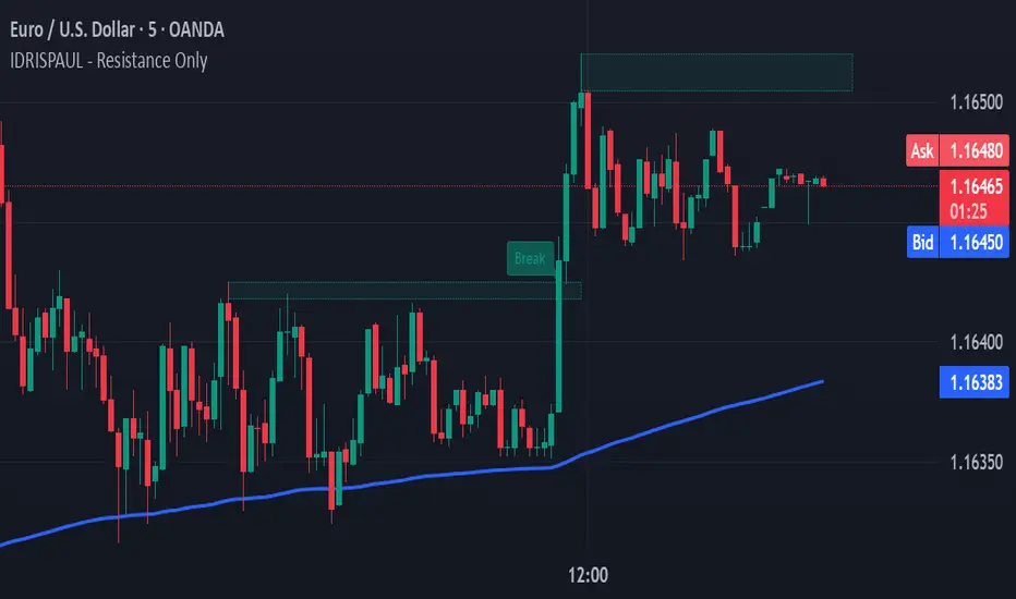
IDRISPAUL - Resistance OnlyThe script continuously scans recent price action to identify pivot highs that qualify as potential resistance zones. Once a resistance level is detected, the indicator:
Draws a resistance box around the identified zone.
Monitors for breakouts above that resistance.
Tracks potential retests and confirms valid retests when price action revisits the broken level.
Triggers alerts for each event: new resistance, breakout, potential retest, and confirmed retest.
All levels and labels automatically update as the chart evolves
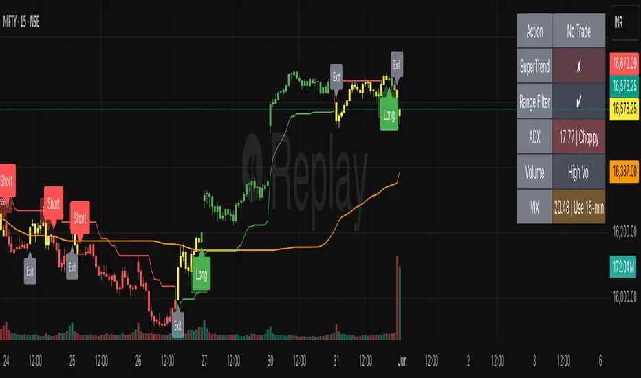
SmartTrend Pro - Options [V5.0 ]A Multi-filter trend-following system designed specifically OPTION SPREAD STRATEGY in NIFTY and Indian Indices - Works by combining price action, volatility, and market regime awareness to reduce whipsaws while capturing strong trends. The indicator dynamically adapts to market conditions using real VIX data and enforces disciplined entry/exit rules based on confirmed signals.
Adaptive Timeframe Guidance
Recommends 15-minute chart when VIX ≥ 13 (high volatility)
Recommends 45-minute chart when VIX < 13 (low volatility)
Uses real-time NSE:INDIAVIX data (daily close)
Whipsaw-Resistant Logic
SuperTrend (ATR 10, Multiplier 3.0) for stable trend direction
Range Filter (100-period smoothed median) to confirm price structure
2-bar confirmation required for all entries (avoids false breakouts)
ADX ≥ 25 ensures only strong trends are traded
Smart Trade Management
Exits based purely on price action (no premature exits due to volatility drops)
No forced reversals — positions held until trend truly end
Designed For
Traders who want fewer, higher-quality signals
Markets with volatile regime shifts (like NIFTY)
Avoiding choppy, sideways whipsaws without missing major moves
Philosophy
“Be patient in noise, aggressive in trend.”
This system stays out during uncertainty (yellow candles) and commits fully when all conditions align — letting winners run while cutting losers quickly.
How to Use
Apply to NIFTY futures or spot
Check dashboard:
If VIX ≥ 13 → use 15-min chart
If VIX < 13 → use 45-min chart
Only take trades when:
All ✔ align under “Long” or “Short”
Candle turns green/red (not yellow)
This indicator is not a black box — it’s a transparent, rule-based framework that puts you in control, with full visibility into why every signal appears (or doesn’t).
STRFV - Trend Chaser with No Trade ZoneA robust, multi-filter trend-following system designed specifically for NIFTY and Indian markets, combining price action, volatility, and market regime awareness to reduce whipsaws while capturing strong trends. The indicator dynamically adapts to market conditions using real VIX data and enforces disciplined entry/exit rules based on confirmed signals and official trading hours.
Adaptive Timeframe Guidance
Recommends 15-minute chart when VIX ≥ 13 (high volatility)
Recommends 45-minute chart when VIX < 13 (low volatility)
Uses real-time NSE:INDIAVIX data (daily close)
Whipsaw-Resistant Logic
SuperTrend (ATR 10, Multiplier 3.0) for stable trend direction
Range Filter (100-period smoothed median) to confirm price structure
2-bar confirmation required for all entries (avoids false breakouts)
ADX ≥ 25 ensures only strong trends are traded
Smart Trade Management
Entries only during NSE session (9:15 AM – 3:30 PM IST)
Exits based purely on price action (no premature exits due to volatility drops)
No forced reversals — positions held until trend truly end
Designed For
Traders who want fewer, higher-quality signals
Markets with volatile regime shifts (like NIFTY)
Avoiding choppy, sideways whipsaws without missing major moves
Philosophy
“Be patient in noise, aggressive in trend.”
This system stays out during uncertainty (yellow candles) and commits fully when all conditions align — letting winners run while cutting losers quickly.
How to Use
Apply to NIFTY futures or spot
Check dashboard:
If VIX ≥ 13 → use 15-min chart
If VIX < 13 → use 45-min chart
Only take trades when:
All ✔ align under “Long” or “Short”
“Session” = ✔
Candle turns green/red (not yellow)
This indicator is not a black box — it’s a transparent, rule-based framework that puts you in control, with full visibility into why every signal appears (or doesn’t).

SC_Reversal Confirmation 30 minutes by Claude (Version 1)📉 When to Use
Use this setup when the stock is in a downtrend and a bullish reversal is anticipated.
🔍 Recommended Usage This model is designed for pullback phases, where the asset is declining and a reversal is expected. It helps filter out weak signals and waits for technical confirmation before triggering an entry.
✅ Entry Signal Green triangles appear only when all reversal conditions are fully met. Entry may occur slightly after the bottom, but with a reduced likelihood of false signals.
📊 Suggested Settings Apply on a 30-minute chart using a 100-period Exponential Moving Average (EMA) based on close. Recommended for Cobalt Chart 0.
--------------------------------------------------------------------------------------
Dow Jones Trading System with PivotsThis TradingView indicator, tailored for the 30-minute Dow Jones (^DJI) chart, supports DIA options trading with a trend-following approach. It features a 30-period SMA (blue) and a 60-period SMA (red), with an optional 90-period SMA (orange) drawn from rauItrades' Dow SMA outfit. A bullish crossover (30 SMA > 60 SMA) displays a green "BUY" triangle below the bar for potential DIA longs, while a bearish crossunder (30 SMA < 60 SMA) shows a red "SELL" triangle above for shorts or exits. The background turns green (bullish) or red (bearish) to indicate trend bias. Pivot points highlight recent highs (orange circles) and lows (purple circles) for support/resistance, using a 5-bar lookback. Alerts notify for crossovers.

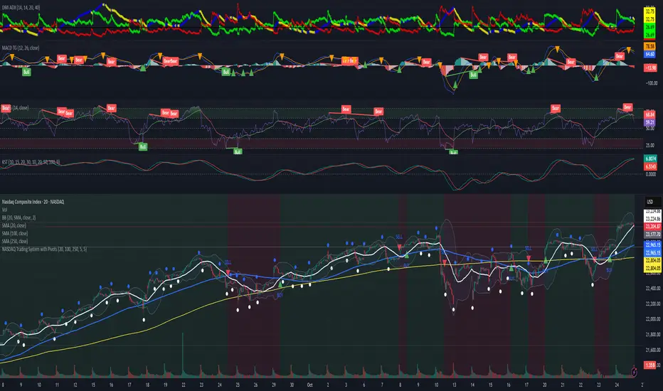
NASDAQ Trading System with PivotsThis TradingView indicator, designed for the 30-minute NASDAQ (^IXIC) chart, guides QQQ options trading using a trend-following strategy. It plots a 20-period SMA (blue) and a 100-period SMA (red), with an optional 250-period SMA (orange) inspired by rauItrades' NASDAQ SMA outfit. A bullish crossover (20 SMA > 100 SMA) triggers a green "BUY" triangle below the bar, signaling a potential long position in QQQ, while a bearish crossunder (20 SMA < 100 SMA) shows a red "SELL" triangle above, indicating a short or exit. The background colors green (bullish) or red (bearish) for trend bias. Orange circles (recent highs) and purple circles (recent lows) mark support/resistance levels using 5-bar pivot points.