RSI to 50 (decimal version) - TemujinTradingSimple indicator that shows the price levels required for the RSI to get to the value of 50.
What I observe is 50 rsi often acts as support or resistance and is a fair indication of bullish/bearish sentiment and price action and bounce/rejection levels.
It provides a table showing current time frame, 4 hr, daily, weekly describing the current rsi value and the price needed for that rsi to get to 50. This table is colored red when bearish at the time frame and green when bullish (as per <50 rsi or >50rsi).
Plots historical lines of each previous candle in the series showing how price interacts.
Updated script to allow manual input of price decimals to enable more assets price to be viewable in the table format.
Sentiment

RSI to 50 - TemujinTradingSimple indicator that shows the price levels required for the RSI to get to the value of 50.
What I observe is 50 rsi often acts as support or resistance and is a fair indication of bullish/bearish sentiment and price action and bounce/rejection levels.
It provides a table showing current time frame, 4 hr, daily, weekly describing the current rsi value and the price needed for that rsi to get to 50. This table is colored red when bearish at the time frame and green when bullish (as per <50 rsi or >50rsi).
Plots historical lines of each previous candle in the series showing how price interacts.

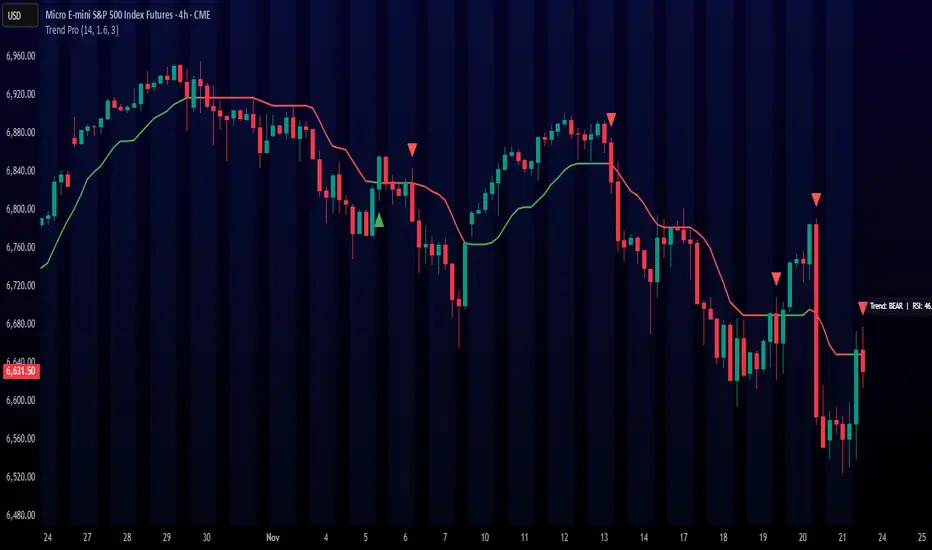
Trend ProTrend Pro is a volatility-adaptive trend and momentum system designed for scalping, day trading, and short-term swing trading.
It uses an ATR-based dynamic trend line (Alpha-Trend style) to identify momentum shifts and confirm directional strength.
Unlike traditional moving averages, Trend Pro adapts to volatility and reacts faster during expansions while filtering noise during chop.
🔍 How Trend Pro Works
Trend Pro builds a dynamic volatility channel using ATR and tracks whether price stays above or below this adaptive line.
When price crosses and closes on the opposite side, it suggests a shift in market control.
When price closes above the line → the trend turns BULLISH (green)
When price closes below the line → the trend turns BEARISH (red)
This gives a clear, visual trend state without repainting.
Tips for Best Performance:
✔ Avoid signals directly inside major ranges or sideways chop
✔ Strongest entries come after small pullbacks into the line
✔ Combine signals with:
Market structure
Key swing highs/lows
Liquidity sweeps
Session timing (NYSE open, power hour)
✔ Trend Pro works best when used with the trend, not counter-trend
Enjoy!
MarketMafia Internals (TICK / ADD / VOLD)this indicator has been built to give the over all heartbeat of the market. Keeping you from fake outs .
100+ BTC Tracker + 182-Day Dormant (6-Month HODL)Instantly see what the biggest Bitcoin whales are doing — and exactly how much of the supply has been completely untouched for 6 full months or longer (182+ days), the strictest and most respected definition of true HODLing.
What this indicator shows you in real time:
Number of wallets holding ≥100 BTC (~15,800 whales)
Total Bitcoin controlled by these whales (~3.25 million BTC)
6-Month Dormant Supply — Bitcoin that hasn’t moved in 182+ days (~14.1 million BTC)
6-Month Dormant % — What percentage of circulating supply is truly locked away
Why 182 days matters:
The 6-month threshold (≈182 days) is the industry-standard cutoff used by Glassnode, CryptoQuant, and analysts worldwide to define ultra-long-term holders. These are the coins least likely to ever hit exchanges — the ultimate measure of conviction and scarcity.
Key features:Live or fallback? — Instantly know if you’re seeing real-time on-chain data (green) or verified backup values (yellow)
Works on free accounts — No paid data subscription required (though it becomes even more accurate with Glassnode/CryptoQuant add-ons)
Clean, non-intrusive design — Three bold plots + sleek dark table in the top-right corner
Always up to date — Fallback values manually verified as of November 21, 2025
Perfect for:
Spotting whale accumulation/distribution phases
Tracking real Bitcoin scarcity during bull or bear markets
Confirming long-term holder conviction before big moves
Add it to any BTC chart and instantly understand who really controls Bitcoin — and how much of it is locked away forever by the strongest hands in crypto.

CNN Fear and Greed StrategyAdaptation of the CNN Fear and Greed Index Indicator (Original by EdgeTools)
The following changes have been implemented:
Put/Call Ratio Data Source: The data source for the Put/Call Ratio has been updated.
Bond Data Source: The data sources for the bond components (Safe Haven Demand and Junk Bond Demand) have been updated.
Normalization Adjustment: The normalization method has been adjusted to allow the CNN Fear and Greed Index to display over a longer historical period, optimizing it for backtesting purposes.
Style Modification: The display style has been modified for a simpler and cleaner appearance.
Strategy Logic Addition: Added a new strategy entry condition: index >= 25 AND index crosses over its 5-period Simple Moving Average (SMA), and a corresponding exit condition of holding the position for 252 bars (days).
CNN Fear & Greed Backtest Strategy (Adapted)
This script is an adaptation of the popular CNN Fear & Greed Index, originally created by EdgeTools, with significant modifications to optimize it for long-term backtesting on the TradingView platform.
The core function of the Fear & Greed Index is to measure the current emotional state of the stock market, ranging from 0 (Extreme Fear) to 100 (Extreme Greed). It operates on the principle that excessive fear drives prices too low (a potential buying opportunity), and excessive greed drives them too high (a potential selling opportunity).
Key Components of the Index (7 Factors)
The composite index is calculated as a weighted average of seven market indicators, each normalized to a score between 0 and 100:
Market Momentum: S&P 500's current level vs. its 125-day Moving Average.
Stock Price Strength: Stocks hitting 52-week highs vs. those hitting 52-week lows.
Stock Price Breadth: Measured by the McClellan Volume Summation Index (or similar volume/breadth metric).
Put/Call Ratio: The relationship between volume of put options (bearish bets) and call options (bullish bets).
Market Volatility: The CBOE VIX Index relative to its 50-day Moving Average.
Safe Haven Demand: The relative performance of stocks (S&P 500) vs. bonds.
Junk Bond Demand: The spread between high-yield (junk) bonds and U.S. Treasury yields.
Critical Adaptations for Backtesting
To improve the index's utility for quantitative analysis, the following changes were made:
Long-Term Normalization: The original normalization method (ta.stdev over a short LENGTH) has been replaced or adjusted to use longer historical data. This change ensures the index generates consistent and comparable sentiment scores across decades of market history, which is crucial for reliable backtesting results.
Updated Data Sources: Specific ticker requests for the Put/Call Ratio and Bond components (Safe Haven and Junk Bond Demand) have been updated to use the most reliable and long-running data available on TradingView, reducing data gaps and improving chart continuity.
Simplified Visuals: The chart display is streamlined, focusing only on the final Fear & Greed Index line and key threshold levels (25, 50, 75) for quick visual assessment.
Integrated Trading Strategy
This script also includes a simple, rules-based strategy designed to test the counter-trend philosophy of the index:
Entry Logic (Long Position): A long position is initiated when the market shows increasing fear, specifically when the index score is less than or equal to the configurable FEAR_LEVEL (default 25) and the index crosses above its own short-term 5-period Simple Moving Average (SMA). This crossover acts as a confirmation that sentiment may be starting to turn around from peak fear.
Exit Logic (Time-Based): All positions are subject to a time-based exit after holding for 252 trading days (approximately one year). This fixed holding period aims to capture the typical duration of a cyclical market recovery following a major panic event.

Frank Strategy V2.06 Quantum FilterThe Frank Strategy indicator version 2.06 is designed to:
Identify high-probability entries
Filter out false signals typical of XAUUSD (especially M1–M5)
Enter only when trend + momentum + market coherence are aligned
Provide automatic TP/SL based on volatility
Get additional confirmation with the quant filter
It is a strategy for short and medium-term trends, not for impulsive scalping or excessively long cycles.
The Frank Strategy aims to:
Do not chase the price
Do not enter sideways
Do not trade without momentum
Do not trade without coherence between trend + strength + volatility
Avoid impulsive and noisy entries
It is a strategy designed to be:
selective
precise
repeatable
disciplined

BTC CB Discount / PremiumThe scripts shows the difference between BTCUSD on Coinbase and BTCUSDT on Binance - also known as CB Premium & Discount.

US & EU Airlines Basket Analysis This Pine Script v5 indicator is a multi-faceted analysis tool designed primarily for monitoring the collective sentiment and technical health of a basket of US and EU airline stocks. It overlays this basket analysis onto the chart of a single security, using advanced metrics like moving average (MA) crosses, Volume-RSI scoring, broader market indices, and oil price action to generate a Combined Sentiment Index and projected Strike Price targets.
1. ⚙️ Core Logic and Calculations
The script performs three main categories of analysis: A. Airline Basket Analysis (US & EU): The core of the indicator calculates the sum of prices and moving averages (9-period and 50-period Simple Moving Averages) for the European and US airline baskets separately. Basket Signal: A signal is generated based on the relative difference between the basket's total 9-period MA and its 50-period MA. Signals (Strong/Medium/Weak): Defined by user-set thresholds, if the following conditions are met simultaneously: Buy: Price increases, Volume is above average, and RSI is in the upper half. Sell: Price decreases, Volume is above average, and RSI is in the lower half. The Net Vol/RSI Score (sum of all individual scores) is displayed on the chart labels. B. Combined Sentiment Index: This index is a weighted aggregation that consolidates all major influences into a single plot line positioned relative to the visible price range. Metrics and Influence: The index includes the Basket MA Score (directional strength of MAs), Basket Vol/RSI Score (momentum-backed moves), Main Chart RSI Score (momentum of the current symbol), Index Bias (influence from DJI, S&P 500, and NASDAQ), DXY Influence (USD Index breakouts), Oil Influence (Inverted change of Brent crude oil price, reflecting fuel costs), and a Vol/RSI Bonus for extreme scores. The final index determines the position and color of the plot line, with a sensitivity factor to control movement away from the anchor. C. Oil Inflection Points: This logic compares large moves in the Brent Crude Oil price against simultaneous large moves in the Focused Airline Basket on a user-defined, higher timeframe (e.g., Daily). Inverse Inflection (Yellow Line): Signals when Oil and Airlines move in opposite directions, confirming the expected inverse relationship (e.g., Oil \uparrow & Airlines \downarrow). Direct Inflection (Blue Line): Signals when Oil and Airlines move in the same direction, suggesting the inverse relationship is currently broken.
2. 📊 Visual Outputs and Signals
Basket MA Lines: Overlaid on Price (Green for EU, Blue for US Total MAs). Basket Signals: Below/Above Bars with Labels (EUs/USs, etc.) indicating MA cross strength. Sentiment Plot: User-defined Anchor line with a superimposed line colored Lime (Bullish) or Red (Bearish) representing the Combined Sentiment Index. Strike Price Line: Overlaid on Price as a Solid White line, an estimated near-term target price projected from the sentiment strength. Indices Table: Located at the Bottom Center, displaying real-time percentage change and alerts for the major US stock indices. Oil Inflection: Overlaid on Price as Thick Yellow/Blue Lines highlighting bars where the oil/airline relationship is confirmed or broken.
3. Adjust Inputs: Open the indicator settings (the gear icon) and adjust the included regions ("Include EU/US Airlines") and the Oil Inflection Timeframe (use a higher timeframe like 'D' for Daily for more significant signals).
4. Interpretation: A Sentiment Plot line moving significantly above the Anchor (Lime) indicates strong bullish conviction; moving below (Red) indicates strong bearish conviction. The white Strike Price Line provides a potential short-term target.
Oil is included as a feature with this indicator to assess if any possible relevance exists or seems to exist as relationship with price action value of the air travel asset class conversely or inversely: which is presented by blue and yellow bars.

Magnificent 7 Basket Analysis V2 (V7.5 - Peak Anchor)This is the version 2 of the magnificent 7 indicator basket. The update to this indicator is the look back period for overbought and oversold estimate included in the sentiment box price. Second update is the Probability of success lines "Green above and purple bellow" (POS) toggle setting which enables closer POS lines to the candles on lower timeframes..
Subscribers can use either the first version of this indicator or this updated version 2.
INSTRUCTIONS..
Magnificent 7 instructions
high-signal, multi-layered decision engine
Starting with the basket indicator features display.
┌────────────────────────────────────┐
│ MAG-7-BASKET │
│ Sentiment: STRONG BULLISH │
│ Target Conf.: BULLISH CONFIRMED │
│ Change: +2.34% │
│ Est Target: ▲ 728.50 │
└────────────────────────────────────┘
How it works with the probability of success lines “POS”
┌────────────────────────────────────┐ │ MAG-7-BASKET │ │ Sentiment: STRONG BULLISH │ ← Lime = GO │ Target Conf.: BULLISH CONFIRMED │ ← Confirmed = HIGH confidence │ Change: +2.34% │ │ Est Target: 728.50 │ ← Take-profit level │ PoS Bull: 78% | PoS Bear: 22% │ ← Dual odds └────────────────────────────────────┘
**Color Logic** white line through the candles is a self confirmation line of the expected direction x
| Color | Meaning |
|-------|--------|
| **Green** | **Reached Est Target successfully** |
| **Red** | **Reached opposite target successfully** |
| **White** | **Near Est Target (within buffer)** |
| **Orange**| **Complete failure** (price too far away) |
**How to Use**
- **White line appears** → Price touched **Est Target**
- **Turns GREEN** → **Bullish prediction hit** → **Hold or trail**
- **Turns RED** → **Bearish prediction hit** → **Hold or trail**
- **Turns ORANGE** → **Bad estimate** → **Exit or reassess**
- **Still WHITE** → **In buffer zone** → **Wait for confirmation**
---
### 5. QUICK TABLES
#### Top-Left: Mag7 Health
| NVDA | Buy | Green | 8 Bull |
|------|-----|-------|--------|
#### Bottom-Center: Market Pulse
| DJI | S&P | NASDAQ | VOL |
|-----|-----|--------|-----|
| Up | Up | Up | Low |
**How to Use**
- **Green + Up + Low vol** → **All clear**
- **Red or mixed** → **Be cautious**
---
## YOUR 3-SECOND CHECKLIST
1. **Box = Lime + STRONG + CONFIRMED?**
2. **Dashed PoS line shows 60%+ in your direction?**
3. **Glowing line near price?**
4. **White line appears → turns GREEN/RED?**
**YES to all → ENTER & HOLD** (or sell an existing early entry, your discretion)
**Est Target = Take Profit**
**PoS Line = Trailing Target**
**White Line = Confirmation**
---
## QUICK CHEAT SHEET
| You See | You Do |
|--------|-------|
| **Lime box + High PoS Bull** | Buy |
| **Red box + High PoS Bear** | Sell |
| **High PoS in opposite direction** | Consider counter-trade |
| **Dashed line + 70%+** | High-confidence |
| **Glowing line near price** | Entry zone |
| **White line → GREEN** | **Bullish confirmed** |
| **White line → RED** | **Bearish confirmed** |
| **White line → ORANGE** | **Exit – bad estimate** |
---
**That’s it. Look. Glow. Confirm. Win.**
Further reading for indicator logic:
The estimated target price shown in the floating sentiment tag (the box in the top-right of the chart) is not a fixed level — it moves higher or lower dynamically depending on both the current sentiment strength and the historical lookback context, even when the sentiment appears to contradict the price direction.
Here’s how the system can project a price higher during a bearish phase, or lower during a bullish phase — based on the lookback period acting as an “anchor of realism”:
Core Mechanism: Sentiment Drives Direction, Lookback Caps Extremes
1. Sentiment Index (from MA, RSI, volume, AAI, indices, etc.)
→ Determines bullish vs bearish bias and strength (mild/strong).
2. Target Base Price
→ Usually the prior close, but can be influenced by supply/demand zones.
3. Multiplier Factor
→ A small percentage (target_factor) is scaled by sentiment magnitude and directional magnifiers (bullish vs bearish).
4. Lookback Period (via Adaptive Range Lines)
→ Defines realistic high/low boundaries over recent price action (either fixed bars or peak-anchored).
How a Bearish Sentiment Can Still Project Higher Price
Even when overall sentiment is bearish, the system checks historical range:
• If price is already near or below the lower adaptive range line (from lookback),
• The model assumes downside is exhausted.
• Even with bearish signals, it limits further downside and may project up toward the strike price as a mean-reversion target.
Result: Bearish reading → but estimated target is above current price
Because the lookback says: “We’re already at extremes — bounce likely.”
How a Bullish Sentiment Can Project Lower Price
Conversely, during strong bullish sentiment:
• If price is near or above the upper adaptive range line,
• The system recognizes overextension.
• It caps upside and projects a pullback target downward, even if sentiment is green.
Result: Bullish reading → but estimated target is below current price
Because lookback says: “Too far, too fast — correction expected.”
→ Even if sentiment says “MILD BEARISH”,
→ If price is deep in the lower range, the ▲ points up to a realistic recovery level.
Or:
→ Even if sentiment says “STRONG BULLISH”,
→ If price is at peak resistance, the ▼ points down to a probable retracement.
Why This Happens: Sentiment ≠ Blind Trend-Following
• Sentiment = current momentum & conviction
• Lookback range = context of valuation & volatility
• Target price = where momentum meets realism
The system blends aggressive sentiment with conservative anchoring, preventing absurd projections.
This creates intelligent, context-aware targets — not just trend-chasing arrows.
the PoS (Probability of Success) trend lines broadly use the same reverse logic as the estimated target price in the floating box.
They are not purely driven by AAI or sentiment strength alone.
They are context-aware, and price location within the adaptive range plays a central role — just like in the estimated strike price box logic.

Smart Money Concepts [XoRonX]# Smart Money Concepts (SMC) - Advanced Trading Indicator
## 📊 Deskripsi
**Smart Money Concepts ** adalah indicator trading komprehensif yang menggabungkan konsep Smart Money Trading dengan berbagai alat teknikal analisis modern. Indicator ini dirancang untuk membantu trader mengidentifikasi pergerakan institusional (smart money), struktur pasar, zona supply/demand, dan berbagai sinyal trading penting.
Indicator ini mengintegrasikan multiple timeframe analysis, order blocks detection, fair value gaps, fibonacci retracement, volume profile, RSI multi-timeframe, dan moving averages dalam satu platform yang powerful dan mudah digunakan.
---
## 🎯 Fitur Utama
### 1. **Smart Money Structure**
- **Internal Structure** - Struktur pasar jangka pendek untuk entry presisi
- **Swing Structure** - Struktur pasar jangka panjang untuk trend analysis
- **BOS (Break of Structure)** - Konfirmasi kelanjutan trend
- **CHoCH (Change of Character)** - Deteksi potensi reversal
### 2. **Order Blocks**
- **Internal Order Blocks** - Zona demand/supply jangka pendek
- **Swing Order Blocks** - Zona demand/supply jangka panjang
- Filter otomatis berdasarkan volatilitas (ATR/Range)
- Mitigation tracking (High/Low atau Close)
- Customizable display (jumlah order blocks yang ditampilkan)
### 3. **Equal Highs & Equal Lows (EQH/EQL)**
- Deteksi otomatis equal highs/lows
- Indikasi liquidity zones
- Threshold adjustment untuk sensitivitas
- Visual lines dan labels
### 4. **Fair Value Gaps (FVG)**
- Multi-timeframe FVG detection
- Auto threshold filtering
- Bullish & Bearish FVG boxes
- Extension control
- Color customization
### 5. **Premium & Discount Zones**
- Premium Zone (75-100% dari range)
- Equilibrium Zone (47.5-52.5% dari range)
- Discount Zone (0-25% dari range)
- Auto-update berdasarkan swing high/low
### 6. **Fibonacci Retracement**
- **Equilibrium to Discount** - Fib dari EQ ke discount zone
- **Equilibrium to Premium** - Fib dari EQ ke premium zone
- **Discount to Premium** - Fib full range
- Reverse option
- Show/hide lines
- Custom colors
### 7. **Volume Profile (VRVP)**
- Visible Range Volume Profile
- Point of Control (POC)
- Value Area (70% volume)
- Auto-adjust rows
- Placement options (Left/Right)
- Width customization
### 8. **RSI Multi-Timeframe**
- Monitor 3 timeframes sekaligus
- Overbought/Oversold signals
- Visual table display
- Color-coded signals (Red OB, Green OS)
- Customizable position & size
### 9. **Moving Averages**
- 3 Moving Average lines
- Pilihan tipe: EMA, SMA, WMA
- Automatic/Manual period mode
- Individual color & width settings
- Cross alerts (MA vs MA, Price vs MA)
### 10. **Multi-Timeframe Levels**
- Support up to 5 different timeframes
- Previous high/low levels
- Custom line styles
- Color customization
### 11. **Candle Color**
- Color candles berdasarkan trend
- Bullish = Green, Bearish = Red
- Optional toggle
---
## 🛠️ Cara Penggunaan
### **A. Setup Awal**
1. **Tambahkan Indicator ke Chart**
- Buka TradingView
- Klik "Indicators" → "My Scripts" atau paste code
- Pilih "Smart Money Concepts "
2. **Pilih Mode Display**
- **Historical**: Tampilkan semua struktur (untuk backtesting)
- **Present**: Hanya tampilkan struktur terbaru (clean chart)
3. **Pilih Style**
- **Colored**: Warna berbeda untuk bullish/bearish
- **Monochrome**: Tema warna abu-abu
---
### **B. Penggunaan Fitur**
#### **1. Smart Money Structure**
**Internal Structure (Real-time):**
- ✅ Aktifkan "Show Internal Structure"
- Pilih tampilan: All, BOS only, atau CHoCH only
- Gunakan untuk entry timing presisi
- Filter confluence untuk mengurangi noise
**Swing Structure:**
- ✅ Aktifkan "Show Swing Structure"
- Pilih tampilan struktur bullish/bearish
- Adjust "Swings Length" (default: 50)
- Gunakan untuk konfirmasi trend utama
**Tips:**
- BOS = Konfirmasi trend continuation
- CHoCH = Warning untuk possible reversal
- Tunggu price retest ke order block setelah BOS
---
#### **2. Order Blocks**
**Setup:**
- ✅ Aktifkan Internal/Swing Order Blocks
- Set jumlah blocks yang ditampil (1-20)
- Pilih filter: ATR atau Cumulative Mean Range
- Pilih mitigation: Close atau High/Low
**Cara Trading:**
1. Tunggu BOS/CHoCH terbentuk
2. Identifikasi order block terdekat
3. Wait for price pullback ke order block
4. Entry saat price respek order block (rejection)
5. Stop loss di bawah/atas order block
6. Target: swing high/low berikutnya
**Color Code:**
- 🔵 Light Blue = Internal Bullish OB
- 🔴 Light Red = Internal Bearish OB
- 🔵 Dark Blue = Swing Bullish OB
- 🔴 Dark Red = Swing Bearish OB
---
#### **3. Equal Highs/Lows (EQH/EQL)**
**Setup:**
- ✅ Aktifkan "Equal High/Low"
- Set "Bars Confirmation" (default: 3)
- Adjust threshold (0-0.5, default: 0.1)
**Interpretasi:**
- EQH = Liquidity di atas, kemungkinan sweep lalu dump
- EQL = Liquidity di bawah, kemungkinan sweep lalu pump
- Biasanya smart money akan grab liquidity sebelum move besar
**Trading Strategy:**
- Wait for EQH/EQL formation
- Anticipate liquidity grab
- Entry setelah sweep dengan konfirmasi (order block, FVG, CHoCH)
---
#### **4. Fair Value Gaps (FVG)**
**Setup:**
- ✅ Aktifkan "Fair Value Gaps"
- Pilih timeframe (default: chart timeframe)
- Enable/disable auto threshold
- Set extension bars
**Cara Trading:**
1. Bullish FVG = Support zone untuk buy
2. Bearish FVG = Resistance zone untuk sell
3. Price tends to fill FVG (retest)
4. Entry saat price kembali ke FVG
5. Partial fill = valid, full fill = invalidated
**Tips:**
- FVG + Order Block = High probability setup
- Multi-timeframe FVG lebih kuat
- Unfilled FVG = strong momentum
---
#### **5. Premium & Discount Zones**
**Setup:**
- ✅ Aktifkan "Premium/Discount Zones"
- Zones akan auto-update berdasarkan swing high/low
**Interpretasi:**
- 🟢 **Discount Zone** = Area BUY (price murah)
- ⚪ **Equilibrium** = Neutral (50%)
- 🔴 **Premium Zone** = Area SELL (price mahal)
**Trading Strategy:**
- BUY dari discount zone
- SELL dari premium zone
- Avoid trading di equilibrium
- Combine dengan structure confirmation
---
#### **6. Fibonacci Retracement**
**Setup:**
- Pilih Fib yang ingin ditampilkan:
- Equilibrium to Discount
- Equilibrium to Premium
- Discount to Premium
- Toggle show lines
- Enable reverse jika perlu
- Custom colors
**Key Levels:**
- 0.236 = Shallow retracement
- 0.382 = Common retracement
- 0.5 = 50% golden level
- 0.618 = Golden ratio (penting!)
- 0.786 = Deep retracement
**Cara Pakai:**
- 0.618-0.786 = Ideal entry zone dalam trend
- Combine dengan order blocks
- Wait for confirmation candle
---
#### **7. Volume Profile (VRVP)**
**Setup:**
- ✅ Aktifkan "Show Volume Profile"
- Set jumlah rows (10-100)
- Adjust width (5-50%)
- Pilih placement (Left/Right)
- Enable POC dan Value Area
**Interpretasi:**
- **POC (Point of Control)** = Harga dengan volume tertinggi = magnet
- **Value Area** = 70% volume = fair price range
- **Low Volume Nodes** = Weak support/resistance
- **High Volume Nodes** = Strong support/resistance
**Trading:**
- POC acts as support/resistance
- Price tends to return to POC
- Breakout dari Value Area = momentum
---
#### **8. RSI Multi-Timeframe**
**Setup:**
- ✅ Aktifkan "Show RSI Table"
- Set 3 timeframes (default: chart, 5m, 15m)
- Set RSI period (default: 14)
- Set Overbought level (default: 70)
- Set Oversold level (default: 30)
- Pilih posisi & ukuran table
**Interpretasi:**
- 🟢 **OS (Oversold)** = RSI ≤ 30 = Kondisi jenuh jual
- 🔴 **OB (Overbought)** = RSI ≥ 70 = Kondisi jenuh beli
- **-** = Neutral zone
**Trading Strategy:**
1. Multi-timeframe alignment = strong signal
2. OS + Bullish structure = BUY signal
3. OB + Bearish structure = SELL signal
4. Divergence RSI vs Price = reversal warning
**Contoh:**
- TF1: OS, TF2: OS, TF3: OS + Price di discount zone = STRONG BUY
---
#### **9. Moving Averages**
**Setup:**
- Pilih MA Type: EMA, SMA, atau WMA (berlaku untuk ketiga MA)
- Pilih Period Mode: Automatic atau Manual
- Set period untuk MA 1, 2, 3 (default: 20, 50, 100)
- Custom color & width per MA
- ✅ Enable Cross Alerts
**Interpretasi:**
- **Golden Cross** = MA fast cross above MA slow = Bullish
- **Death Cross** = MA fast cross below MA slow = Bearish
- Price above all MAs = Strong uptrend
- Price below all MAs = Strong downtrend
**Trading Strategy:**
1. MA1 (20) = Short-term trend
2. MA2 (50) = Medium-term trend
3. MA3 (100) = Long-term trend
**Entry Signals:**
- Price bounce dari MA dalam trend = continuation
- MA cross dengan konfirmasi structure = entry
- Multiple MA confluence = strong support/resistance
**Alerts Available:**
- MA1 cross MA2/MA3
- MA2 cross MA3
- Price cross any MA
---
#### **10. Multi-Timeframe Levels**
**Setup:**
- Enable HTF Level 1-5
- Set timeframes (contoh: 5m, 1H, 4H, D, W)
- Pilih line style (solid/dashed/dotted)
- Custom colors
**Cara Pakai:**
- Previous high/low dari HTF = strong S/R
- Breakout HTF level = significant move
- Multiple HTF levels confluence = major zone
---
### **C. Trading Setup Combination**
#### **Setup 1: High Probability Buy (Bullish)**
1. ✅ Swing structure: Bullish BOS
2. ✅ Price di Discount Zone
3. ✅ Pullback ke Bullish Order Block
4. ✅ Bullish FVG di bawah
5. ✅ RSI Multi-TF: Oversold
6. ✅ Price bounce dari MA
7. ✅ POC/Value Area support
8. ✅ Fibonacci 0.618-0.786 retracement
**Entry:** Saat price reject dari order block dengan confirmation candle
**Stop Loss:** Below order block
**Target:** Swing high atau premium zone
---
#### **Setup 2: High Probability Sell (Bearish)**
1. ✅ Swing structure: Bearish BOS
2. ✅ Price di Premium Zone
3. ✅ Pullback ke Bearish Order Block
4. ✅ Bearish FVG di atas
5. ✅ RSI Multi-TF: Overbought
6. ✅ Price reject dari MA
7. ✅ POC/Value Area resistance
8. ✅ Fibonacci 0.618-0.786 retracement
**Entry:** Saat price reject dari order block dengan confirmation candle
**Stop Loss:** Above order block
**Target:** Swing low atau discount zone
---
#### **Setup 3: Liquidity Grab (EQH/EQL)**
1. ✅ Identifikasi EQH atau EQL
2. ✅ Wait for liquidity sweep
3. ✅ Konfirmasi dengan CHoCH
4. ✅ Order block terbentuk setelah sweep
5. ✅ Entry saat retest order block
---
### **D. Tips & Best Practices**
**Risk Management:**
- Selalu gunakan stop loss
- Risk 1-2% per trade
- Risk:Reward minimum 1:2
- Jangan over-leverage
**Confluence adalah Kunci:**
- Minimal 3-4 konfirmasi sebelum entry
- Lebih banyak konfirmasi = higher probability
- Quality over quantity
**Timeframe Analysis:**
- HTF (Higher Timeframe) = Trend direction
- LTF (Lower Timeframe) = Entry timing
- Align dengan HTF trend
**Backtesting:**
- Gunakan mode "Historical"
- Test strategy di berbagai market condition
- Record dan analyze hasil
**Market Condition:**
- Trending market = Follow BOS, use order blocks
- Ranging market = Use premium/discount zones, EQH/EQL
- High volatility = Wider stops, wait for clear structure
**Avoid:**
- Trading di equilibrium zone
- Entry tanpa konfirmasi
- Fighting the trend
- Overleveraging
- Emotional trading
---
## 📈 Recommended Settings
### **For Scalping (1m - 5m):**
- Internal Structure: ON
- Swing Structure: OFF
- Order Blocks: Internal only
- RSI Timeframes: 1m, 5m, 15m
- MA Periods: 9, 21, 50
### **For Day Trading (15m - 1H):**
- Internal Structure: ON
- Swing Structure: ON
- Order Blocks: Both
- RSI Timeframes: 15m, 1H, 4H
- MA Periods: 20, 50, 100
### **For Swing Trading (4H - D):**
- Internal Structure: OFF
- Swing Structure: ON
- Order Blocks: Swing only
- RSI Timeframes: 4H, D, W
- MA Periods: 20, 50, 200
---
## ⚠️ Disclaimer
Indicator ini adalah alat bantu analisis teknikal. Tidak ada indicator yang 100% akurat. Selalu:
- Lakukan analisa fundamental
- Gunakan proper risk management
- Praktik di demo account terlebih dahulu
- Trading memiliki resiko, trade at your own risk
---
## 📝 Version Info
**Version:** 5.0
**Platform:** TradingView Pine Script v5
**Author:** XoRonX
**Max Labels:** 500
**Max Lines:** 500
**Max Boxes:** 500
---
## 🔄 Updates & Support
Untuk update, bug reports, atau pertanyaan:
- Check documentation regularly
- Test new features in replay mode
- Backup your settings before updates
---
## 🎓 Learning Resources
**Recommended Study:**
1. Smart Money Concepts (SMC) basics
2. Order blocks theory
3. Liquidity concepts
4. ICT (Inner Circle Trader) concepts
5. Volume profile analysis
6. Multi-timeframe analysis
**Practice:**
- Start with higher timeframes
- Master one concept at a time
- Keep a trading journal
- Review your trades weekly
---
**Happy Trading! 🚀📊**
_Remember: The best indicator is your own analysis and discipline._

Open Interest Surge OverlayOpen Interest Surge Overlay is an indicator designed to detect and highlight abnormal movements in Open Interest (OI). It plots Spike Up and Spike Down arrows directly on the chart whenever a significant increase or decrease in OI occurs.
The script uses aggregated OI data and is fully parameterizable, allowing you to fine-tune sensitivity, thresholds, and calculation settings to match your trading style.
When an OI surge is detected, the indicator automatically displays the corresponding arrow on the price chart, providing clear visual cues for potential reversals, liquidations, aggressive position changes, or institutional activity.
It also includes complete alert conditions for both Spike Up and Spike Down, making it suitable for real-time monitoring or automated webhook workflows.
This tool is ideal for traders who rely on Open Interest behavior to interpret market positioning, liquidity events, and shifts in directional conviction.

Cjack COT IndexHere's the updated description with the formula and additional context:
---
**Cjack COT Index - Commitment of Traders Positioning Indicator**
This indicator transforms raw Commitment of Traders (COT) data into normalized 0-100 index values, making it easy to identify extreme positioning across different trader categories.
**How It Works:**
The indicator calculates a min-max normalized index for three trader groups over your chosen lookback period (default 26 weeks):
- **Large Speculators** (Non-commercial positions) - typically trend followers
- **Small Speculators** (Non-reportable positions) - retail traders
- **Commercial Hedgers** - producers and consumers hedging business risk
The normalization formula is: **Index = (Current Position - Minimum Position) / (Maximum Position - Minimum Position) × 100**
This calculation shows where current net positioning sits between the minimum and maximum levels observed in the lookback window. A reading of 100 means current positioning equals the maximum net long over that period, 0 equals the minimum (most net short), and 50 is the midpoint of the range.
**Important:** The lookback period critically affects index readings - shorter lookbacks (13-26 weeks) make the index more sensitive to recent extremes, while longer lookbacks (52-78 weeks) provide broader historical context and identify truly exceptional positioning. Min-max normalization is essential because it makes positioning comparable across different contracts and time periods, regardless of the absolute size of positions.
**What It's Good For:**
The indicator excels at identifying **crowded trades** and potential reversals by tracking contrarian setups where commercials (smart money) position opposite to speculators. Background highlighting automatically flags:
- **Long setups** (green): Commercials heavily long while speculators are heavily short
- **Short setups** (red): Commercials heavily short while speculators are heavily long
The "Shift Index" option (enabled by default) displays last week's tradeable COT data aligned with current price action, ensuring you're working with actionable information since COT reports publish with a delay.
Works on weekly timeframes and below for commodities and futures with available COT data.

Jet Stream V1Jet Stream catches the trends. Forgets the noise and allows you to lock into those big moves.
Wed, Nov 19 2025 V3 - Everything but alerts work.
Quant Master Flow [Cumulative Volume Delta]Quant Master Flow
The Quant Master Flow indicator is a tool that analyzes market aggression by tracking the Cumulative Volume Delta (CVD), providing critical insight into institutional participation and short-term liquidity absorption. It acts as the "Conviction Filter" to confirm the statistical signals provided by the Z-Oscillator.
Core Philosophy: Aggression vs. Absorption
The CVD measures the running total of the difference between aggressive buyer-initiated volume and aggressive seller-initiated volume. By plotting this cumulative total, the indicator reveals whether the net effect of market orders is one of accumulation (aggressive buying, driving the price up) or distribution (aggressive selling, driving the price down).
Key Components
Cumulative Tally: The indicator plots the running sum of the volume delta. A rising CVD suggests buyers are more aggressive than sellers; a falling CVD suggests the reverse.
Color Coding: The CVD is colored to visualize flow:
Green: Periods of net aggressive buying (accumulation).
Red: Periods of net aggressive selling (distribution).
Volume Thresholds (Optional/Implied): Allows for filtering of low-impact noise, ensuring the cumulative line only reflects significant shifts in order flow.
Strategic Use Cases
The power of the Quant Master Flow is realized by comparing its trajectory to the price action, validating Z-Score extremes, and spotting liquidity grabs.
1. High-Conviction Confirmation
Use the CVD to confirm a directional signal from the Z-Oscillator:
Bullish Confirmation: When the Z-Oscillator hits Oversold ($\pm 2\sigma$) and the price begins to move up, a strong rising (Green) CVD confirms that the reversal is being fueled by institutional accumulation.
Bearish Confirmation: When the Z-Oscillator hits Overbought ($\pm 2\sigma$) and the price begins to fall, a strong falling (Red) CVD confirms that the drop is being driven by institutional distribution.
2. Divergence (The Early Warning System)
Divergence between the CVD and price is the strongest signal of impending failure or reversal, indicating that the current price movement is unsupported by institutional commitment.
Bearish Divergence: Price makes a Higher High while the CVD makes a Lower High. This is a warning that institutional players are distributing into the rally, signaling a failure to continue the trend.
Bullish Divergence: Price makes a Lower Low while the CVD makes a Higher Low. This shows institutional accumulation is occurring despite falling prices, often preceding a strong reversal.
3. Flow Exhaustion
When the CVD line flattens out during a strong price rally or drop, it signals that the market aggression is exhausted. This often happens right before the Z-Oscillator hits its $\pm 3\sigma$ Extreme zone, providing the earliest warning of a statistical reversal.

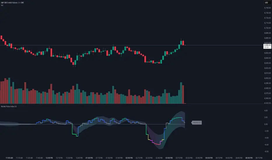
Market Pulse IndexOverview
Market Pulse Index condenses intraday market breadth into a single, color-coded score from -7 to +7 on intraday timeframe charts. It analyzes gap behavior and the markets internals into a single “pulse” line with an optional adaptive envelope that reacts to session volatility.
Designed for U.S. regular hours (09:30–16:00 ET), it actively highlights real-time regime shifts.
Unified Sentiment Score (-7…+7): Fast, visual proxy for broad intraday risk-on/off.
Intraday Session Awareness: Resets logic and envelopes each cash session; plots during 09:30–15:55 ET.
Gap Regime Intelligence
Internals: VOLD, ADD, NYSE TICK Momentum, NASDAQ TICK Momentum, TICK Counter, and UVOL/DVOL.
Filtered vs. Raw Data Modes: Choose smoother Filtered (dynamic moving average) or immediate raw data for maximum responsiveness.
Adaptive Envelope: Session-aware bands with gradient fill that reflects trend acceleration/deceleration.
Configurable Visuals: Pick Bull/Bear colors and envelope transparency; non-overlay pane keeps price clean.
Calculation Timeframe Override: Optionally compute on a fixed TF (e.g., 5m) while viewing any chart TF.
Conclusion
Market Pulse Index bridges multiple intraday breadth streams into one decisive line—ideal for confirming bias, filtering setups, and spotting regime transitions. Use the score and envelope together: strong positive readings with expanding envelope favor risk-on continuation, while deep negatives with persistent breadth weakness warn of risk-off conditions. Pair with your entries, levels, and risk controls for a complete intraday framework.
Market Type ClassifierMARKET TYPE CLASSIFIER
Overview
The Market Type Classifier analyzes overnight session behavior to predict daily market character. It classifies each trading day as either TRENDING (bullish or bearish) or CONTRADICTING based on how price interacts with established overnight ranges during specific time windows.
Core Methodology
Time-Based Session Analysis:
The indicator divides the overnight period into fixed and variable phases for both Asia and London sessions.
Asia Session:
Fixed Phase (18:00-19:30 EST): Establishes the initial range high and low - visualized with a customizable gray box
Variable Phase (19:30-02:30 EST): Tests the fixed range to determine direction and validity
London Session:
Fixed Phase (02:30-03:30 EST): Establishes the initial range high and low - visualized with a customizable gray box
Variable Phase (03:30-07:30 EST): Tests the fixed range to determine direction and validity
Direction Logic:
The FIRST break during the variable phase determines the session direction:
Long: First break is above the fixed range high
Short: First break is below the fixed range low
Validity Logic:
Session validity depends on whether price breaks one or both sides:
True Session: Breaks only one side of the fixed range (directional conviction)
False Session: Breaks both sides of the fixed range (lack of conviction)
Visual Components
Fixed Range Boxes:
Light gray shaded boxes mark the high-to-low ranges established during the fixed periods. These boxes help you visualize:
The exact price levels being tested during variable sessions
Where the critical breakout/breakdown levels are located
The size of the overnight consolidation ranges
Box color is fully customizable in settings and can be toggled on/off.
Classification Table:
A compact table displays:
Asia/London Direction (Long/Short) with color coding
Asia/London Session validity (True/False) with color coding
Final Market Type classification
Trading guidance based on classification
Market Type Classification
The indicator combines Asia and London session characteristics into 16 possible combinations, classified as:
Bullish TRENDING (4 combinations) - Green:
Long True + Long True
Long True + Short False
Short False + Short False
Short False + Long True
Bearish TRENDING (4 combinations) - Red:
Short True + Short True
Short True + Long False
Long False + Long False
Long False + Short True
CONTRADICTING (8 combinations) - Orange:
All remaining combinations indicate conflicting overnight behavior
Interpretation & Usage
TRENDING Markets (Green = Bullish, Red = Bearish):
When both overnight sessions show aligned conviction, the daily high/low is often created during overnight hours. The fixed range boxes will show you where these key levels formed. Expect continuation or reversion strategies to work best.
CONTRADICTING Markets (Orange):
When overnight sessions show conflicting signals, expect the daily high/low to be created during Regular Trading Hours (RTH). Opening Range (OR) breakouts and intraday range expansion strategies tend to perform better.
Color Coding System
Direction & Session Rows:
Green text: Bullish combinations (Long True or Short False)
Red text: Bearish combinations (Short True or Long False)
Gray text: N/A or incomplete sessions
Market Type:
Green "TRENDING": Bullish trending day
Red "TRENDING": Bearish trending day
Orange "CONTRADICTING": Contradicting market conditions
Settings & Customization
Table Display:
Position: 9 placement options
Size: Tiny, Small, Normal, or Large
Fixed Range Boxes:
Toggle boxes on/off
Customize box background color and transparency
Boxes automatically appear only during fixed session periods
Unique Features
First-Break Direction: Unlike typical range breakout indicators, this uses the FIRST break to establish directional bias, not the final direction
Dual Session Analysis: Combines both Asia and London sessions for comprehensive overnight market characterization
Validity Framework: The True/False session concept quantifies overnight conviction levels
Visual Range Display: Fixed range boxes show exactly what levels the indicator is monitoring
Daily Reset: Automatically resets at 18:00 EST for the new trading day
Best Practices
Instrument: Designed for NQ (NASDAQ 100 E-mini futures)
Timeframe: Works best on 15-minute charts or lower
Timing: Check the classification before RTH open (09:30 EST)
Integration: Use as a market filter with your existing trading methodology
Strategy: TRENDING days favor overnight high/low holding; CONTRADICTING days favor intraday breakouts
Development Note
This indicator is the result of extensive backtesting on 15+ years of NQ data. The specific time windows and classification combinations have been optimized through historical analysis revealing that markets split nearly 50/50 between Trending (48.92%) and Contradicting (51.08%) conditions, with distinct performance characteristics for each market type.

Daily Candle by NatantiaIntroduction to the Daily Candle Indicator
The Daily Candle Indicator is a powerful and customizable tool designed for traders to visualize daily price action on any chart timeframe.
This Pine Script (version 5) indicator, built for platforms like TradingView, overlays a single candle representing the day's open, high, low, and close prices, with options to adjust its appearance and session focus.
Key Features:
Customizable Appearance: Users can set the colors for bullish (default green) and bearish (default white) candles, as well as the wick color (default white). The horizontal offset and candle thickness can also be adjusted to fit the chart layout.
Dynamic Updates: The candle updates on the last bar, with wicks drawn to reflect the daily high and low, providing a clear snapshot of the day's price movement.
This is the same version as before, but we had to republish it because the chart contained other indicators, which violated the publication rules. We apologize for the inconvenience.
Have a nice trades!
-Natantia

BS by bigmmBS by bigmm is a powerful tool designed to track and display cumulative trading volumes for bullish (green) and bearish (red) bars over a user-defined period. This indicator provides valuable insights into market sentiment by quantifying buying and selling pressure through volume analysis.
Adjustable lookback period from 20 to 10,000 bars
Default setting of 500 bars for balanced analysis
Real-time calculation updates on each new bar
BUY Volume: Total volume of green bars (close > open)
SELL Volume: Total volume of red bars (close < open)
Interpretation:
Higher BUY Volume: Indicates stronger buying pressure
Higher SELL Volume: Suggests stronger selling pressure
Balanced Volumes: Shows equilibrium between buyers and sellers
Ideal For:
Swing traders analyzing medium-term trends
Position traders evaluating long-term market sentiment
Volume-based trading strategies
Market structure analysis

NHEST Liquidity Ultra Minimal (Short Labels)
NHEST Liquidity Ultra Minimal is a clean, lightweight, and distraction-free liquidity mapping tool designed for traders who want institutional-grade clarity without chart noise.
It highlights only the most important liquidity zones — nothing extra, nothing cluttered — giving you a pure view of where price is most likely to react, reverse, or sweep.
✔ Ultra-Minimal Design
This indicator removes all unnecessary visuals and focuses solely on key liquidity levels derived from price structure. No boxes, no labels, no shading overload — just the critical price zones that matter.
✔ Smart Liquidity Levels
NHEST Liquidity Ultra Minimal automatically detects major liquidity pools such as:
• Buy-side liquidity (BSL) above price
• Sell-side liquidity (SSL) below price
• Primary and secondary liquidity shelves
These levels help traders anticipate where smart money may target next.
✔ Higher-Timeframe Stability
Built to work cleanly across all timeframes, from scalping to swing trading. Liquidity zones update smoothly and remain stable even during high-volatility conditions.
✔ Perfect for Smart Money Concepts (SMC)
This indicator is ideal for traders who follow:
• ICT concepts
• Liquidity hunts
• Market structure
• Breakers & mitigation blocks
• Sweep-into-imbalance setups
✔ No Lag — No Repaints
All levels are calculated in real-time using non-repainting logic.
✔ Clean Visuals for Any Style
Whether you’re using a dark chart or a white chart, NHEST Liquidity Ultra Minimal keeps your workspace clean, organized, and easy to read — perfect for professional analysis, live streaming, and trading education content.
⸻
How to Use
1. Identify zones above price (BSL) as potential liquidity targets for bullish expansions.
2. Identify zones below price (SSL) as downside liquidity targets for bearish expansions.
3. Expect price to gravitate toward the nearest liquidity pool during consolidation.
4. Use the levels to anticipate sweeps, reversals, or continuation moves.
⸻
Best For
• Smart money traders
• Gold (XAUUSD) traders
• Crypto, Forex, Indices
• Scalpers & intraday traders
• Price-action purists
• Traders who want a clean chart
⸻
Disclaimer
This script is for educational purposes only and is not financial advice.
Always use proper risk management.
By NHEST TRADING LLC

ICS🏛️ Institutional Confluence Suite (ICS) Indicator
The Institutional Confluence Suite is a powerful and highly customizable TradingView indicator built to help traders identify key institutional trading concepts across multiple timeframes. It visualizes essential market components like Market Structures (MS), Order Blocks (OB)/Breaker Blocks (BB), Liquidity Zones, and Volume Profile, providing a confluence of institutional price action data.
📈 Key Features & Components
1. Market Structures (MS)
Purpose: Automatically identifies and labels shifts in market trends (Market Structure Shift, MSS) and continuations (Break of Structure, BOS).
Timeframe Detection: You can select detection across Short Term, Intermediate Term, or Long Term swings to match your trading horizon.
Visualization: Plots colored lines (Bullish: Teal, Bearish: Red) to mark the structures and optional text labels (BOS/MSS) for clear identification.
2. Order & Breaker Blocks (OB/BB)
Purpose: Detects and projects potential Supply and Demand zones based on recent price action that led to a swing high or low.
Block Types: Distinguishes between standard Order Blocks and Breaker Blocks (OBs that fail to hold and are traded through, often serving as support/resistance in the opposite direction).
Customization:
Detection Term: Adjusts sensitivity (Short, Intermediate, Long Term).
Display Limit: Sets the maximum number of recent Bullish and Bearish blocks to display.
Price Reference: Option to use the Candle Body (Open/Close) or Candle Wicks (High/Low) to define the block boundaries.
Visualization: Displays blocks as colored boxes (Bullish: Green, Bearish: Red) extending into the future, with a dotted line marking the 50% equilibrium level. Breaker Blocks are indicated by a change in color/line style upon being broken.
3. Buyside & Sellside Liquidity (BSL/SSL)
Purpose: Highlights areas where retail stops/limit orders are likely clustered, often represented by a series of relatively equal highs (Buyside Liquidity) or lows (Sellside Liquidity).
Detection Term: Adjustable sensitivity (Short, Intermediate, Long Term).
Margin: Uses a margin (derived from ATR) to group similar swing points into a single liquidity zone.
Visualization: Plots a line and text label marking the swing point, and a box indicating the clustered liquidity zone.
4. Liquidity Voids (LV) / Fair Value Gaps (FVG)
Purpose: Identifies areas where price moved sharply and inefficiency was created, often referred to as Fair Value Gaps or Imbalances. These are price ranges where minimal trading volume occurred.
Threshold: Uses a multiplier applied to the 200-period ATR to filter for significant gaps.
Mode: Can be set to Present (only show voids near the current price) or Historical (show all detected voids).
Visualization: Fills the price gap with colored boxes (Bullish/Bearish zones), often segmented to represent the price delivery across the gap.
5. Enhanced Liquidity Detection
Purpose: A complementary feature that uses volume and price action to highlight areas of high liquidity turnover, potentially indicating stronger Support and Resistance zones.
Calculation: Utilizes a volume-weighted approach to color-grade liquidity zones based on their significance.
Visualization: Plots shaded boxes (gradient-colored) around swing highs/lows, with text displaying the normalized volume strength.
6. Swing Highs/Lows
Purpose: Directly marks the price points identified as Swing Highs and Swing Lows based on the lookback periods.
Timeframe Detection: Can be enabled for Short Term, Intermediate Term, or Long Term swings.
Visualization: Plots a small colored dot/label (e.g., "⦁") at the swing point.
This indicator is an invaluable tool for traders employing ICT (Inner Circle Trader), Smart Money Concepts (SMC), or general price action strategies, as it automatically aggregates and displays these critical structural and liquidity elements.

Expsoure Guide by Tradewith_GaryDaily Guide for exposure building. Use this Indicator to improve your profitability by avoiding over-trading and picking the best days to initiate new trades. Valid only for swing trading format.
