Ultimate Risk Management Toolkit [ T W K ] :Smart Levels is Smart Trades!
All Trading View users and Stock market Enthusiast, get charged with the all new ( never seen before ) " Ultimate Risk Management Toolkit ⚙📏⚙ " .
Inputs and Features:
1: Drag the Bar-Time vertical line to the desired Entry candle ( manually ) for R:R management and controlling emotional trading.
2: Target, Entry, and SL line style, Width input.
3: Manual specific level Entry and Stop-Loss, input option.
4: Three types of Auto / Manual ' R:R ' risk reward ratio, targets with proper Entry, Stop-Loss points, and Stop-Loss level.
5: Three types of Entry options to fix Emotional trading habit.
6: Trailing Stop-Loss input option ( can be utilize as profit locking/booking ).
It will give more Power to manage your trades with proper R:R ( Auto / manual ) ratio, defined Entry and controlled Stop-Loss Levels.
Compatible with All Devices (Laptop / Mobile / Tablet / PC).
✅ HOW TO GET ACCESS :
Add to favorite and enjoy the true Trading View's sprit of community growth, without any limitations.
If you like any of my Invite-Only indicators, kindly DM and let me know!
⚠ RISK DISCLAIMER :
All content provided by "@TradeWithKeshhav" is for informational & educational purposes only.
It does not constitute any financial advice or a solicitation to buy or sell any securities of any type. All investments / trading involve risks. Past performance does not guarantee future results / returns.
Regards :
Team @TradeWithKeshhav
Happy trading and investing!
Sentiment

Show current ADR from last previous peakCalculates ADR over a 21 day average
Allows you to manually enter the price of a previous peak
Shows current ADR

Market Sentiment Overlay: PCCE + VIX Zones📊 Market Sentiment Suite: PCCE + VIX
Track fear & greed in real time using Put/Call Ratio and VIX percentile.
Spot potential tops and bottoms before they form — ideal for SPX/SPY swing traders.Identify fear, greed, and turning points in the market.
This script combines the CBOE Put/Call Ratio (PCCE) with the VIX volatility index percentile to visualize crowd sentiment and highlight potential market tops and bottoms.
🔍 Key Features
Dual-indicator design: PCCE + normalized VIX percentile
Color-coded zones for Greed (<0.6) and Fear (>1.2)
Automatic alert signals when sentiment reaches extremes
Live sentiment table displaying real-time PCCE and VIX data
Works seamlessly on SPX, SPY, QQQ, or any major index
🧠 How to Use
When PCCE > 1.2 and VIX percentile > 80%, fear is extreme → possible market bottom
When PCCE < 0.6 and VIX percentile < 20%, greed is extreme → possible market top
Perfect for contrarian traders, sentiment analysts, and swing traders
✨ Best Timeframe: Daily
⚙️ Markets: SPX / SPY / QQQ / Global Indexes
📈 Type: Contrarian Sentiment Indicator

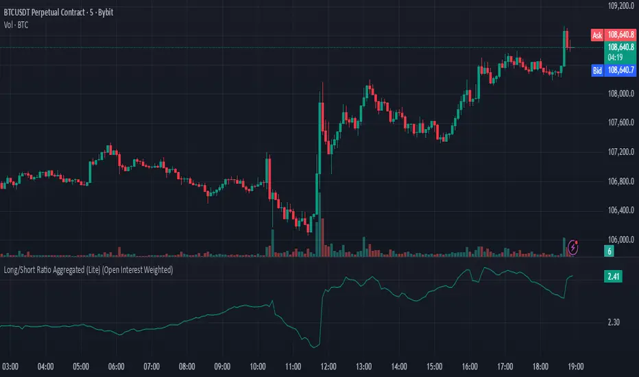
Long/Short Ratio Aggregated (Lite)Description — Long/Short Ratio Aggregated (Lite)
This indicator provides a cross-exchange, open-interest-weighted aggregation of the Long/Short Ratio (LSR) for the cryptocurrency asset currently on your chart. It is designed to unify fragmented derivatives positioning data from multiple major exchanges into a single normalized signal that more accurately reflects real market sentiment and positioning bias across platforms.
Concept and Originality
Traditional Long/Short Ratio indicators are exchange-specific. They show how many traders are long versus short, but only within the scope of one venue (e.g., Binance or Bybit). This makes them incomplete and often misleading for directional bias analysis, since different exchanges host different participant profiles, levels of leverage, and quote-currency exposures.
This script addresses that limitation by:
Aggregating LSR data across multiple exchanges (Binance and Bybit).
Weighting each ratio by Open Interest (OI) — ensuring exchanges with higher open positions contribute proportionally more to the overall sentiment.
Normalizing all contract types (USDT, USDC, and USD-margined) into a consistent base-currency format.
This step corrects for structural differences between coin- and stablecoin-margined instruments, producing a true like-for-like comparison.
The result is a globalized Long/Short Ratio, normalized by exposure and liquidity, suitable for multi-venue orderflow estimation and directional bias assessment.
Note for moderators: I know there are already other scripts out there, but they may not support Open Interest Weighting or the same number of pairs. They also might not support proper normalization like in my script.
Calculation Methodology
For each supported exchange and contract type:
The script retrieves the latest Long/Short Ratio (LSR) and Open Interest (OI) values.
OI is used as the weighting factor, creating a proportional representation of positioning volume.
Values denominated in USD are normalized into base currency using close-price adjustment.
The final value is computed as:
Weighted LSR = (Σ (LSRᵢ × OIᵢ)) / (Σ OIᵢ)
This ensures that if, for example, Binance has twice the open interest of Bybit, its LSR contributes twice as much to the total weighted sentiment.
Interpretation
Value > 1.0 → Market participants are net-long (bullish bias).
Value < 1.0 → Market participants are net-short (bearish bias).
Strength of deviation from 1.0 indicates positioning imbalance magnitude.
Because the ratio is OI-weighted, large players or heavily margined exchanges influence the output proportionally more than smaller, low-volume venues — making this metric a better reflection of true market positioning rather than isolated retail sentiment.
Usage and Applications
Use this indicator as a component in:
Orderflow and sentiment confirmation, alongside price action and volume.
Funding rate correlation studies.
Intraday reversals or exhaustion zones, when combined with volatility or OI delta metrics.
Overlaying or combining this indicator with open interest change, cumulative volume delta, or funding rate divergence allows traders to build a high-resolution understanding of positioning shifts and crowd behavior.
Notes
The “Lite” version is optimized for execution and accessibility, focusing on accuracy while staying within Pine Script’s computational limits.
Exchange data availability may vary by symbol; unsupported pairs automatically return na and are automatically not included in the weighted calculation.
In summary:
This indicator transforms fragmented, exchange-specific Long/Short Ratio into a unified, OI-weighted global sentiment measure — a foundational tool for traders seeking to quantify derivative-side orderflow bias with cross-venue accuracy.
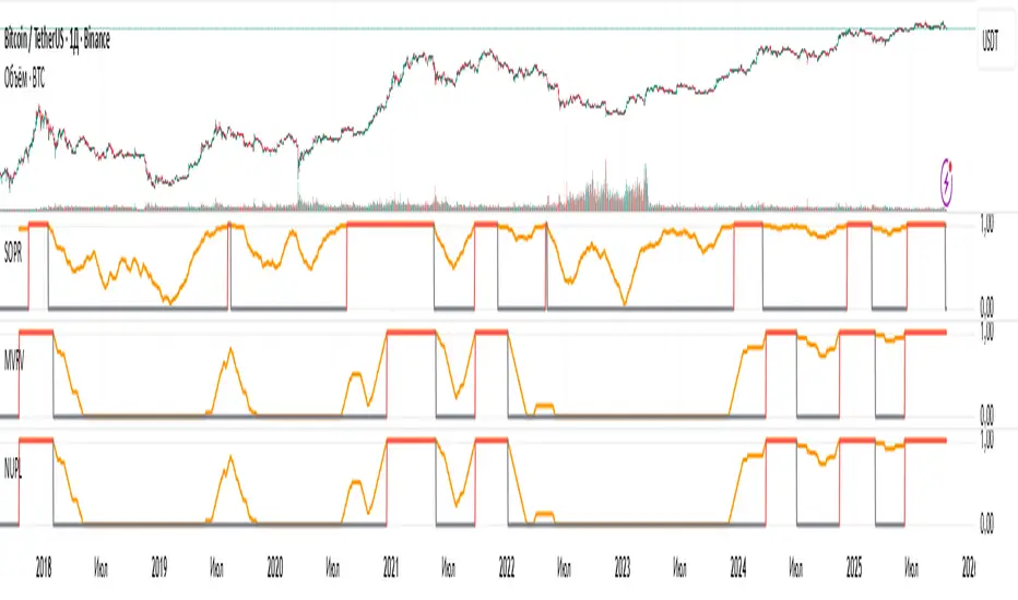
NUPL: Overbought SignalResult of processing the NUPL cryptocurrency indicator. The red line denotes the cycle high.
Unfortunately, I cannot show the raw values from Glassnode, as that would violate their EULA, so I’m presenting derivatives of their indicators.

MVRV: Overbought SignalResult of processing the MVRV cryptocurrency indicator. The red line denotes the cycle high.
Unfortunately, I cannot show the raw values from Glassnode, as that would violate their EULA, so I’m presenting derivatives of their indicators.

SOPR: Overbought SignalResult of processing the SOPR cryptocurrency indicator. The red line denotes the cycle high.
Unfortunately, I cannot show the raw values from Glassnode, as that would violate their EULA, so I’m presenting derivatives of their indicators.
ATR DAILY PROGRESSION)Indicator: ATR Daily Progression — Final Compact Edition
1. Indicator Objective
The ATR Daily Progression indicator measures the progression of intraday volatility as a percentage of the daily Average True Range (ATR).
It provides a quick visual overview of whether the market has reached or exceeded its average daily range of movement.
This helps traders avoid entering low-probability continuation trades once the day’s ATR is already completed.
2. Visual Presentation
Horizontal bar ranging from 0% to 150% of the ATR.
Green color up to 100%, then red beyond that point.
Main ticks: 0, 25, 50, 75, 90, 100, and 150%.
Full-height white vertical lines at 0%, 100%, and 150%.
A floating badge displaying the current ATR completion percentage, always visible.
Compact Height mode enabled by default for optimal visual integration.
3. Key Features
Function Description
Precise alignment The transition from green to red occurs exactly after the 100% tick.
Audio & visual alerts Triggered at 75%, 90%, 100%, and 150%.
Session flash effects The filled bar blinks when the ATR is reached (100%) or exceeded (150%).
Dynamic badge Displays the current ATR %, green before 100%, red after.
Compact layout Three-line table format for better chart integration.
4. Recommended Settings
ATR Length (Daily): 14
Bar width (steps): 32–40 (depending on chart size)
Always green below 100%: enabled
Show floating % badge: enabled
Compact Height: enabled by default
Flash at 75% and 90%: enabled
Flash at 100% and 150%: enabled
5. Strategic Use
The ATR Done Today is a visual discipline tool designed to help traders:
Identify when the market has likely completed its daily move.
Avoid late-session counter-trend trades.
Visualize volatility compression or expansion.
Determine optimal times to take profits or pause trading.

Leverage & Liquidations (Margins) Plotter - [SANIXLAB]Leverage & Liquidations (Margins) Plotter —
This indicator visualises liquidation zones across multiple leverage tiers and helps traders manage margin exposure .
It dynamically plots the liquidation ranges for 5x → 100x positions, highlighting where leveraged traders could get wiped out.
Add manual long / short markers , choose leverage and margin size, and the script calculates your exact liquidation prices — buffered for realism.
A clean control panel shows entries, liquidation levels, and percentage distance to liquidation.
Features
Visual leverage zones (5x → 100x)
Manual Long / Short marker system
Margin-based liquidation math with buffer
Toggleable entry & liq lines
Compact top-right control panel
Floating mid-zone leverage labels
Fully customizable colors
Use Case
Quickly see:
Where 10x / 20x traders get squeezed
How far your own trade can move before margin burn
Where cascading liquidations might begin
Perfect for futures & leverage traders who want to keep one eye on price … and the other on survival.
— MR.L ☕
Brewed with caffeine, coded with care.

BTC Flow Dashboard (Spot Premium + OI + Funding)It builds a single flows dashboard that shows whether real spot demand (fiat buyers) or leveraged perps (futures traders) are driving BTC, and then cross-checks that with Open Interest (OI) and funding pressure—all normalized so you can spot regime shifts and squeeze risk fast.
How to read it (practical playbook)
Continuation (healthier trend)
Price ↑, premium > 0 and rising, oiZ ≥ 0 → spot sponsoring the move; perps chase → add on pullbacks.
Leverage-led & vulnerable
Price ↑, premium < 0, fundZ > 0 (expensive longs) → crowding → fade extensions / expect sharp pullbacks.
Buyable dip / absorption
Price ↓, premium ≥ 0 (spot supporting), oiZ flat/down, fundZ ≤ 0 → selling looks weak → scale into reversals.
Exhaustion / mean reversion
premZ ≥ +2 after a run → flows unusually hot → take profits / tighten risk.
premZ ≤ −2 into key support → capitulation risk but also bounce setups if OI/funding aren’t pressuring.

GC1-XAUUSD Premium Monitor <SunanLabs>Sunan Labs – GC1–XAUUSD Premium (Standard Edition)
This indicator compares COMEX Gold Futures (GC1!) with Spot Gold (XAUUSD) to reveal market regime shifts: Contango (Futures > Spot), Backwardation (Futures < Spot), or Parity (neutral).
Metrics shown:
• Status – Current regime (Contango, Backwardation, or Parity)
• Premium (USD) – Price difference in USD per ounce
• Premium (%) – Relative spread between GC1! and XAUUSD
• Sparkline – 24-bar mini chart of premium history
• Range Position – Shows where the current premium sits in its recent range (0–100%). Near highs = stretched, near lows = compressed.
• Futures & Spot – Latest closing prices for GC1! and XAUUSD
• Alerts – Triggered when premium crosses thresholds or regime shifts occur
Interpretation:
• Contango – Market expects higher future prices; spot may cool.
• Backwardation – Strong near-term demand; spot likely to rise.
• Parity – Neutral zone or transition period.
Includes dynamic alerts, customizable display, and detailed status labels.
Developed by Sunan Labs
Contact: wali9@hotmail.com
© 2025 Sunan Labs – Creative Standard License (CSL-2025)

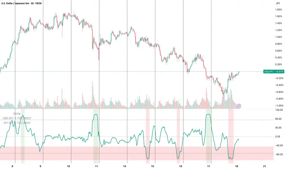
FX vs Yield-Spread OscillatorFollow me at for more guidance on how to use the indicator:
www.instagram.com
The FX vs Yield-Spread Oscillator measures how an exchange rate’s movement compares with changes in its corresponding interest-rate differential. It quantifies whether a currency pair is moving in line with, or diverging from, the bond-market forces that normally drive it.
At its core, the indicator tracks the relative performance between:
The price change of the selected FX pair, and
The change in the yield spread between the base country’s and quote country’s government bonds (e.g., US02Y − JP02Y for USDJPY).
Concept of Indicator
Currencies tend to strengthen when their domestic yields rise faster than their counterpart’s—reflecting higher expected returns or tighter monetary policy. This indicator visualizes that relationship dynamically.
When the oscillator rises, the FX pair is outperforming what the yield spread implies (the currency is stronger than rates alone justify).
When it falls, the pair is underperforming the spread (rates are favorable, but the currency lags).
Key Features
Auto-mapping: Detects the chart’s base and quote currencies and automatically selects their corresponding bond yields from TradingView’s TVC database.
Tenor Control: Choose bond maturity (1-month to 10-year) to match your trading horizon.
Mode Selection: Compare moves using percentage change or basis-point (bps) spread delta.
Rescaled Oscillator: Normalized between −100 and +100, highlighting relative extremes over a chosen look-back window.
Visual Alerts: Shaded background marks strong positive (overperformance) and negative (underperformance) zones.
Manual Override: Manually specify yield symbols if your data plan uses different tickers (e.g., DE02Y for EUR).
Alerts: Optional signals when the oscillator crosses zero or predefined upper/lower thresholds.
Interpretation
Above +75 / below −75: FX price has deviated sharply from yield-spread behavior—potential exhaustion or continuation zone.
Crossing 0: Realignment between FX movement and yield differential; often coincides with regime or sentiment shifts.
Persistent divergence: May indicate risk-sentiment decoupling (safe-haven flows, intervention expectations, or commodity-price effects).
Typical Uses
Intraday or swing-trading confirmation of rate-driven impulses.
Identifying when currencies are over- or under-reacting to bond-market repricing.
Cross-checking macro trades (e.g., carry trades, policy-expectation trades).
Early warning when price diverges from fundamental yield direction.

Liquidations Aggregated (Lite)Liquidations Aggregated (Lite)
The Liquidations Aggregated (Lite) script provides a unified cross-exchange visualization of short and long liquidation volumes, allowing traders to identify high-impact market events and sentiment reversals driven by forced position closures. It aggregates normalized liquidation data from Binance, Bybit, and OKX into a single coherent output, offering a consolidated perspective of derivative market stress across major venues.
Core Concept
Liquidations are involuntary closures of leveraged positions when margin requirements are breached. They represent points of structural orderflow imbalance, often triggering localized volatility spikes and price pivots. This indicator isolates and aggregates those liquidation volumes by direction (short vs. long), allowing traders to map where leveraged traders are being forced out and whether current market movement is driven by short covering or long capitulation.
Underlying Methodology
Each connected exchange provides liquidation feeds via standardized symbols (e.g., BTCUSDT.P_LQBUY or BTCUSD.P_LQSELL).
The script differentiates between:
Short Liquidations → Buy Volume: Forced covering of shorts, representing upward pressure.
Long Liquidations → Sell Volume: Forced selling of longs, representing downward pressure.
Bybit’s inverse data is normalized to align directional logic with Binance and OKX. Data is drawn through the request.security() function per symbol and per exchange, with per-exchange scaling adjustments applied to compensate for differences in reported nominal sizes (USD vs. coin-margined). The script is meant to match the calculation methods of professional-grade data sources (e.g., Velodata, Coinalyze). The value is denominated in the base currency at all times.
Computation Logic
Liquidation volumes are fetched separately for USD- and USDT-margined pairs on each exchange.
Exchange-specific magnitude adjustments are applied to account for nominal denomination differences.
Normalized liquidation buy and sell volumes are summed into two global aggregates:
combinedBuyVolumeLiquidationsShort → aggregated buy volume from forced short positions closes (Short Liquidations)
combinedSellVolumeLiquidationsLong → aggregated sell pressure from forced long position closes (Long Liquidations)
Final series are plotted as mirrored column charts around a zero baseline for direct comparison.
How to Use
Apply the script to any crypto perpetual futures symbol (e.g., BTCUSDT, ETHUSDT).
Observe teal bars (Buy Volume from Short Liquidations) for short squeezes and red bars (Sell Volume from Long Liquidations) for long wipes.
Strong teal spikes during downtrends often indicate aggressive short liquidations leading to short-term bounces.
Strong red spikes during uptrends often mark long unwinds that can trigger sharp retracements.
Sustained asymmetry in either direction suggests systemic imbalance across leveraged positioning.

Open Interest + Continuation/Discontinuation Patterns📈 Open Interest + Continuation/Discontinuation Patterns
This indicator analyzes Open Interest data to detect four key convergence/divergence patterns that signal potential trend continuation or reversal:
Buyer Continuation
Seller Continuation
Buyer Discontinuation
Seller Discontinuation
Each pattern is identified by comparing price action with Open Interest behavior, using pivot-based logic and ATR filtering for precision. When a valid pattern is detected, the indicator draws visual lines on the chart and triggers custom alert conditions for each type, enabling timely decision-making.
The Open Interest data is plotted as a candle-style oscillator, offering a clear view of momentum shifts. The detection logic is fully configurable, allowing users to adjust pivot sensitivity, lookback ranges, and ATR filters to suit different market conditions.
Key features:
🔍 Detects continuation and discontinuation patterns via convergence/divergence logic
🔔 Alerts for all four pattern types
🕯️ Candle-style visualization of Open Interest
⚙️ ATR-based filtering and pivot customization
Perfect for traders seeking to enhance their market timing using Open Interest dynamics and divergence-based signals.

Spot vs Leverage — Lite (QQQ/NQ) The indicator works like a thermometer for the quality of a market move.
Score > +20 → “Spot dominant”
👉 The rise (or price stability) is supported by real buying:
strong cash/ETF/equity inflows,
positive price–volume correlation,
low or negative basis (futures aren’t artificially pulling price up).
→ This is a healthy, structurally solid rally.
Score < −20 → “Leverage dominant”
👉 The move is mostly driven by leverage:
overbought futures,
options speculation,
weak spot volume.
→ The trend is fragile — it can collapse quickly if leveraged positions unwind (deleverage, inverse short squeeze, etc.).
Zone between −20 and +20 → Neutral / mixed
→ The market is balanced — neither purely “air” nor purely “cash.”

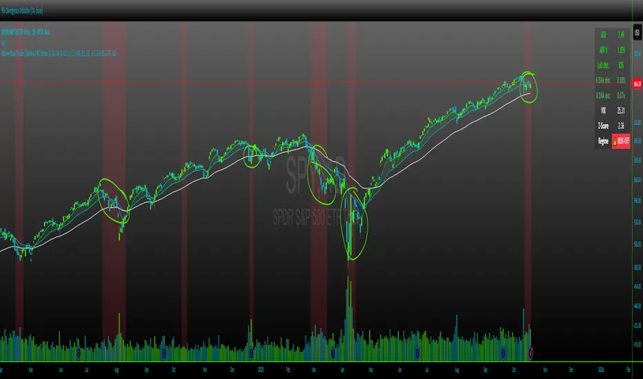
Momentum Traders Toolbox PROMomentum Traders Toolbox PRO
Description:
Momentum Traders Toolbox PRO is a comprehensive trading dashboard that combines daily moving averages, volatility metrics, and average daily range analysis into a single overlay for active traders. Designed for both swing traders and intraday momentum traders, this tool helps visualize key price levels, trend direction, and market risk in real-time.
Key Features:
Daily EMAs & Bands
Plots 8, 21, and 50-day EMAs directly on the chart.
Highlights the EMA band between 8 and 21 EMAs with dynamic coloring for the buyers cloud, when markets are shaky, but wanting to enter into a position on a high momentum stock in a hot sector, these are key areas buyers show up.
ADR (Average Daily Range) Analysis
Displays ADR% and ATR values for daily volatility.
Calculates distance from daily lows and EMA levels, helping identify potential entry/exit points.
Shows EMA extension relative to ADR, highlighting overextended or balanced conditions.
VIX Z-Score Integration
Monitors the CBOE VIX with daily Z-Score to indicate market volatility regimes.
Displays a “RISK-ON / NEUTRAL / RISK-OFF” signal.
Helps traders align trades with overall market sentiment.
Customizable Table Overlay
Provides a clean, real-time table with ATR, ADR%, LoD distance, EMA distance, EMA extension, and VIX data.
Table text and background colors are fully customizable.
Works on intraday charts while locking VIX and ADR calculations to daily values.
Visual Alerts
Color-coded EMA bands and table metrics for quick identification of momentum shifts.
Easily distinguish between extended, slightly extended, and balanced price conditions using configurable thresholds.
Benefits:
Quickly identify high-probability momentum trades without switching between multiple indicators.
Reduce risk exposure by factoring in VIX-driven market conditions.
Fully customizable visuals allow for personalized trading setups.
Recommended Use:
Best used on daily and hourly timeframes, with daily EMA, ADR, and VIX calculations.
Use in conjunction with price action and volume analysis for momentum-based entries.
Ideal for swing traders and intraday traders who want a clear view of trend and volatility simultaneously.
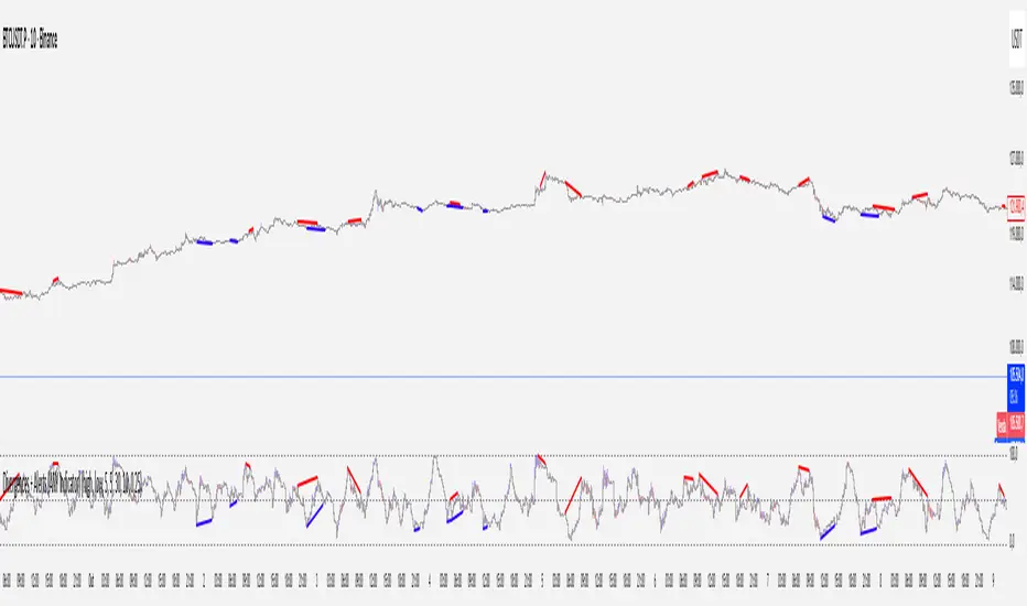
Divergences + Alerts (ANY Indicator)📊 Divergences + Alerts (ANY Indicator)
This versatile indicator detects four types of divergences between price action and an oscillator:
Buyer Exhaustion
Buyer Absorption
Seller Exhaustion
Seller Absorption
Each divergence type is automatically identified and visually marked on the chart with colored lines. The indicator also includes built-in alert conditions for all four divergence types, allowing traders to receive real-time notifications when potential reversal signals occur.
By default, the oscillator is a candle-style visualization of the Money Flow Index (MFI), enhanced with volatility filtering via a VWMA-based ATR. However, users can replace the default MFI oscillator with any external source using the “Plug External Source” input, enabling full customization and compatibility with other indicators.
Key features:
🔍 Detects both exhaustion and absorption divergences
🔔 Alerts for each divergence type
🕯️ Candle-style oscillator visualization
🔌 Optional input for external indicator sources
⚙️ ATR-based filtering for precision
Ideal for traders seeking to spot early signs of trend reversals or momentum shifts with customizable flexibility.
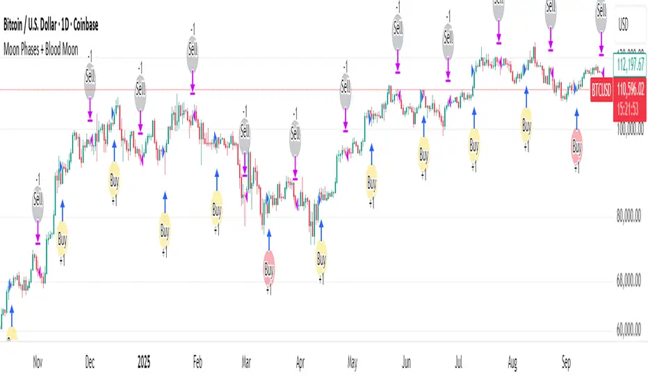
Moon Phases + Blood MoonWhat it is
This is a simple, time-based strategy that goes long on full moons and exits on the next new moon, while visually highlighting historically known “Blood Moon” (total lunar eclipse) dates. It’s built for exploratory testing of lunar timing effects on price, not for predictive claims.
Why it’s useful / originality
Most lunar scripts only mark phases. This one (1) computes lunar phases on the chart, (2) normalizes and flags Blood Moon days from a curated list, and (3) turns the phase changes into an executable strategy with clear, reproducible entry/exit rules and a configurable start date—so traders can quickly evaluate whether a lunar timing overlay adds any edge on their market/timeframe.
How it works (concept)
Moon phase detection: Uses Julian date conversion and standard astronomical approximations to determine the most recent phase change at each bar. The script classifies phase turns as +1 = New Moon and –1 = Full Moon, tracking the latest valid time to avoid lookahead.
Blood Moon tagging: A built-in array of UTC timestamps (total lunar eclipses) is date-matched to the current session and marked as “Blood Moon” when a full moon coincides with a listed date.
Signals & trades
Plot circles above/below bars: New Moon (above), Full Moon (below), Blood Moon (below, red).
Entry: Long at Full Moon once the bar time ≥ the user’s Start date.
Exit: Close the long on the next New Moon.
How to use
Add to your chart (non-monthly timeframes only).
Optionally adjust the Start date (default: 2001-12-31 UTC) to control the backtest window.
Use the color inputs to style New Moon / Full Moon / Blood Moon markers.
Evaluate performance on liquid symbols and timeframes that provide a sufficient number of phase cycles.
Default / publish settings
Initial capital: $10,000 (suggested)
Commission: 0.05% per trade (suggested)
Slippage: 1 tick (suggested)
Position sizing: TradingView strategy defaults (no leverage logic is added).
Timeframes: Intraday/Daily/Weekly supported. Monthly is blocked by design.
Chart type: Use standard chart types only (no Heikin Ashi, Renko, Kagi, P&F, Range) for signals/backtests.
Reading the chart
New Moon: soft gray circle above bars.
Full Moon: soft yellow circle below bars.
Blood Moon (if date-matched): soft red circle below bars.
The script also ensures symbol/timeframe context is visible—keep your chart clean so the markers are easy to interpret.
Limitations & important notes
This is a time-based heuristic. It does not forecast price and does not repaint via lookahead tricks; it avoids future leakage by anchoring to the last known phase time at each bar.
No non-standard chart signals. Using non-standard charts can produce unrealistic results.
Strategy properties like commission/slippage materially affect results—please set them to realistic values.
Backtests should include a large sample (ideally >100 trades over many cycles) to make statistics meaningful.
Past performance does not guarantee future results.
Open-source reuse / credits
Uses standard, public-domain techniques for Julian date conversion and lunar-phase approximations.
Blood Moon dates are incorporated as a hard-coded list for convenience; you may extend or adjust this list as needed.
No third-party proprietary code is reused.
Changelog / versioning
v1: Initial public release on Pine v6 with phase detection, Blood-Moon tagging, and a minimal long-only phase strategy.
Quarterly Theory True Opens by Mr. ConsistentQuarterly Theory True Opens (MTF)
This indicator plots key institutional price levels known as "True Opens" based on the principles of Quarterly Theory, as taught by Trader Daye. It is designed to identify the start of Q2 manipulation cycles across yearly, monthly, weekly, daily, and intra-day session timeframes.
The levels are drawn as clean horizontal rays and are anchored to the 1-minute timeframe, ensuring they are perfectly accurate and consistent on ANY chart timeframe you view.
🎯 Core Concepts
Each line represents the "True Open" at the start of a new Q2 cycle:
📅 Yearly True Open: The open of the first trading day of April.
🗓️ Monthly True Open: The open of the second Monday of each month.
Weekly True Open: The open of the Monday 6:00 PM EST session.
🏙️ Daily True Open: The open at Midnight EST.
⏰ Session True Opens: The open at the start of the second 90-minute quarter of each session (1:30 AM, 7:30 AM, 1:30 PM, 7:30 PM EST).
✨ Key Features
Multi-Timeframe (MTF) Accuracy: Lines are anchored to the 1-minute open price, ensuring they remain perfectly consistent on any chart timeframe (e.g., the 7:30 AM open is the same on the 5min, 1-hour, and Daily charts).
Clean Horizontal Rays: Plots clean horizontal rays that extend forward, avoiding chart clutter. Old lines are automatically removed as new ones form.
Right-Aligned Labels: Text labels are positioned on the right edge of your screen, so they are always visible and never covered by price action.
Fully Customizable: Toggle the visibility of each True Open line (Yearly, Monthly, etc.) and their labels individually in the settings. You can also customize colors and line width.
New York (EST) Timezone: All calculations are hard-coded to the America/New_York timezone for consistency.
⚙️ How to Use
Use these levels as key points of interest for potential support, resistance, or areas where price may show a significant reaction.
Observe how price interacts with these levels after they are established.
Customize the indicator in the settings (⚙️ icon) to show only the levels relevant to your trading style.
⚠️ Troubleshooting: Lines Not Showing Correctly?
If the indicator lines don't seem to plot at the correct price levels when you first add it to your chart, it's almost always a scaling issue.
Hover over the indicator's name on your chart and click the three dots (...) for "More".
Scroll down to "Pin to Scale".
Select "Pin to Right Scale" (or whichever scale your price is on). The indicator levels must be pinned to the same scale as the price to display accurately.
If it is set to "No Scale," the levels will not reflect their true price values.
This tool was developed based on the public teachings of Trader Daye. All credit for the underlying concepts of Quarterly Theory belongs to him. This indicator is for educational and analytical purposes only.
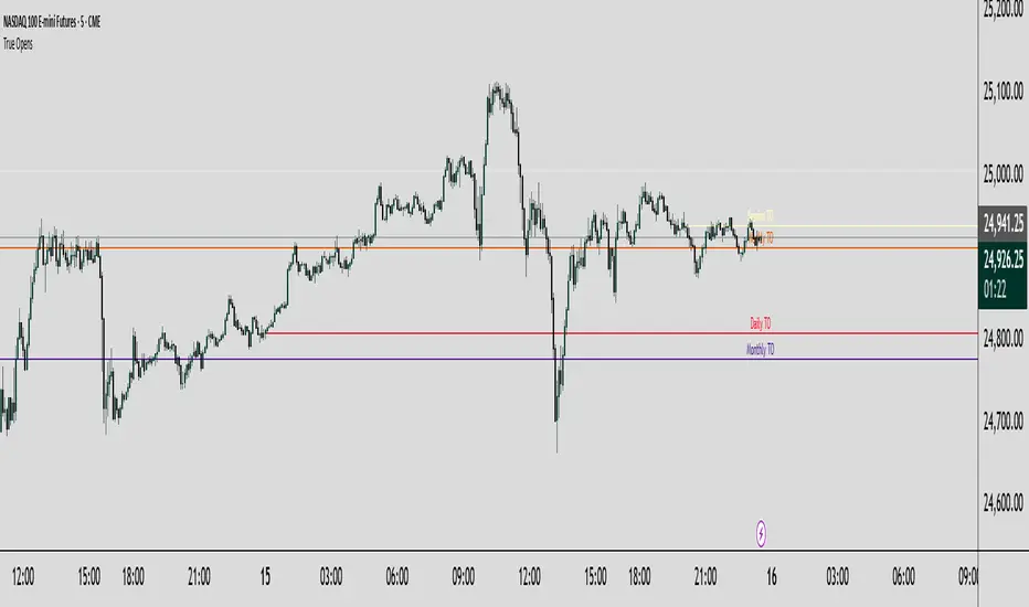
Image Plotter [theUltimator5]Image Plotter is a visual alerting tool that drops fun, high-contrast ASCII (braille) art (e.g., Rocket, Cat “hang in there”, Babe Ruth, etc.) directly on your price chart when a technical trigger fires. It’s designed for quick, glanceable callouts without cluttering your chart with lines or sub-indicators.
If there are any specific images you would like to be able to add to your plot, please comment with the image you want to see and if it is reasonable, I will add it.
How it works
On each bar close, the script evaluates your selected Trigger Source. When the condition is true, it places a label that contains the selected ASCII art at a configurable offset above or below the candle.
You can choose to only keep the most recent art on the chart, or accumulate every trigger as a historical breadcrumb trail.
Positioning uses either the bar’s high (for above-candle placements) or low (for below-candle placements), then applies your vertical % offset and horizontal bar shift.
Inputs & Controls
Trigger Source
Select which condition will fire the ASCII placement:
RSI Oversold / Overbought — Triggers on cross through the threshold (under/over).
MACD Bullish Cross / Bearish Cross — MACD line crossing the Signal line.
BB Lower Touch / BB Upper Touch — Price crossing below the lower band / above the upper band.
Stochastic Oversold / Overbought — %K crossing through your thresholds.
Volume Spike — Current volume > (Volume MA × Spike Multiplier).
Price Cross MA — Close crossing above the chosen moving average (bullish only).
Custom Condition — Optional user condition (see “Custom Condition” below).
Plot Mode
Latest Only — The indicator deletes the previous label and keeps only the newest trigger on chart.
Every Trigger — Leaves all triggered labels on the chart (historical markers).
Note: TradingView caps the number of labels per script; this indicator sets max_labels_count=500. Heavy triggering can still hit limits.
Practical usage tips
Choose “Latest Only” for cleanliness if your trigger is frequent. Use “Every Trigger” when you want a visual audit trail.
Tune vertical offset by symbol — low-priced tickers may need a smaller %; volatile names may need more spacing.
Quick start
Add the indicator to any chart (any timeframe).
Pick a Trigger Source (e.g., RSI Oversold) and set thresholds/lengths.
Choose ASCII Image, Position Above/Below, Offsets, and Plot Mode.
(Optional) Enable Custom Condition and select your Custom Plot Source.
Create an Alert on “ASCII Trigger Alert” using Once Per Bar Close.
Have a variant you’d like (e.g., bearish MA cross, multi-alert pack by trigger, or time-window filters)? Tell me what workflow you want and I’ll tailor the script/description to match.

Binary Options Fast Scalping [TradingFinder] M1 & M5 Signals🔵 Introduction
In the structure of financial markets, spiky moments and sudden price movements play a key role in Liquidity Grabs and Market Structure Resets. These movements usually occur after the accumulation of orders in Buy Side or Sell Side Liquidity zones and are accompanied by rapid breaks in the form of Break of Structure (BoS) or Change of Character (CHoCH).
At this stage, the market temporarily moves in the direction of liquidity to trigger counter orders and then enters a Retracement or Pullback phase, a point where professional traders using the Smart Money Concept (SMC) look for candle confirmation to enter with precision.
This strategy is built upon the same logic : an initial spiky move as a signal of institutional or liquidity driven algorithms, followed by a controlled pullback toward areas such as the Order Block, Fair Value Gap (FVG), or Imbalance Zone, and finally an entry based on a strong confirmation candle (Engulf, Rejection, Breaker) that defines the true direction of order flow.
This combination of price behavior, especially on lower timeframes such as M1 or M5, provides an ideal setup for fast Scalping, Micro Structure Trading, and even short term directional prediction in Binary Options Trading.
Since the main focus of this method is on identifying liquidity phases, structural confirmations, and momentum confirmation candles, the trader can design entries with high probability and logical stop loss placement using the concepts of Fractal Market Structure and Multi Timeframe Confirmation.
In the scalping version, the main objective is to capture the move toward the next liquidity pool or opposite demand and supply zone, while in the binary version, only the prediction of the next candle’s direction matters. This strategy inherently operates based on Smart Money Behavior, Liquidity Engineering, and Order Flow Dynamics, allowing the extraction of fast and profitable moves from the internal logic of market structure.
🔵 How to Use
The operational logic of this strategy is based on Liquidity Sweep, Pullback, and Confirmation Candle. The trader should first identify the initial Impulse Move, which is often accompanied by liquidity absorption around Buy Side or Sell Side Liquidity areas. After that, the market enters the Retracement phase and returns to structural zones such as the Order Block or the Fair Value Gap (FVG).
At this point, a position is taken only when a confirmation candle (Engulf, Breaker, or Rejection Candle) closes in the direction of continuation and aligns with the new structure (BOS or CHoCH). Applying this model on lower timeframes offers the highest precision for fast Scalping or for predicting the next candle’s direction in Binary Option trading.
🟣 Bullish Setup
In the bullish setup, the market first forms a spiky upward move with a sudden increase in momentum, indicating the activation of liquidity flow in the Buy Side Liquidity zone. This movement is usually accompanied by a Break of Structure (BOS) to the upside and marks the beginning of the Impulse Move phase. After this move, the price enters the Pullback phase and returns to structural areas such as the Bullish Order Block, Fair Value Gap (FVG), or Mitigation zone.
At this stage, the trader waits for a bullish confirmation candle (Bullish Engulf or Breaker Candle) to validate the end of the retracement. Entry is made at the close of the confirmation candle or on a minor pullback, with the stop loss placed below the Swing Low or below the pullback zone. The target is set at the next Buy Side Liquidity or Equal Highs. In the binary version, only the direction of the next candle matters and the entry takes place immediately after the confirmation candle.
🟣 Bearish Setup
In the bearish setup, the market first forms a spiky downward move, signaling increased selling pressure and liquidity absorption at the Sell Side Liquidity zone. This movement is accompanied by a Break of Structure (BOS) to the downside and represents the beginning of a bearish momentum phase. After the spike, the price enters the Retracement phase and returns to the Bearish Order Block or bearish Fair Value Gap zone. Within these areas, the formation of a bearish confirmation candle (Bearish Engulf, Breaker, or Rejection Candle) validates the continuation of the downtrend.
The entry is taken at the close of the confirmation candle, with the stop loss placed above the Swing High or above the pullback zone, and the target set toward the next Sell Side Liquidity or Equal Lows. In binary applications, only the direction of the next candle is considered and the confirmation candle serves as the entry trigger.
🔵 Conclusion
This strategy, by combining the principles of the Smart Money Concept, Liquidity Dynamics, and Candle Confirmation Logic, offers a precise and multi functional approach to market entry. Its core structure, identifying the initial spiky movement, waiting for a structural pullback, and entering based on a confirmation candle allows quick interpretation of institutional liquidity behavior and provides trading opportunities with high accuracy and controlled risk.
On lower timeframes, this logic becomes a powerful tool for Scalping and Micro Structure Trading, while in binary markets it delivers high success rates due to its focus on predicting the next candle’s direction. Built upon the foundations of Order Flow, Market Structure, and Fractal Liquidity Behavior, this strategy demonstrates that even in the fastest and noisiest market conditions, the order of Smart Money remains observable and exploitable.

India VIX Based Nifty/BankNifty Range Calculator (Auto Fetch)VIX-Based Expected Daily Range (Auto Volatility Forecast)
Created by: Harshiv Symposium
📖 Purpose
This indicator automatically fetches the India VIX value and calculates the expected daily price range for major Indian indices such as Nifty and BankNifty.
It helps traders understand how much the market is likely to move today based on current volatility conditions.
Designed for educational and analytical awareness, not for signals or profit-making systems.
⚙️ Core Logic
Expected Daily Move (Range) = (India VIX × Current Index Price) ÷ Multiplier
- Multiplier for Nifty: 1000
- Multiplier for BankNifty: 700
This calculation projects the 1-standard-deviation (≈ 68% probability) and 2-standard-deviation (≈ 95% probability) movement zones for the day.
📊 Example
If India VIX = 15 and Nifty = 25,000:
Expected Move ≈ (15 × 25,000) ÷ 1000 = 375 points
Hence,
- 68% Range: 24,625 – 25,375
- 95% Range: 24,250 – 25,750
This gives traders a realistic idea of daily volatility boundaries.
🧭 Key Features
✅ Auto-Fetch India VIX
No need for manual input — automatically pulls live data from NSE:INDIAVIX.
✅ Dynamic Range Visualization
Plots upper/lower boundaries for 1σ and 2σ probability zones with shaded expected-move area.
✅ Dashboard Panel
Displays:
- Current VIX
- Expected Move (in points and %)
- Upper and Lower Ranges
✅ Smart Alerts
Alerts when price crosses upper or lower volatility range — potential breakout signal.
🎯 How It Helps
Intraday Traders:
Know the likely daily movement (e.g., ±220 pts on Nifty) and plan realistic targets or stops.
Options Traders:
Quickly assess whether it’s a seller-friendly (low VIX, small range) or buyer-friendly (high VIX, large range) session.
Risk Managers:
Use volatility context for stop-loss width and position sizing.
Breakout Traders:
If price breaks beyond the 2σ range → indicates potential volatility expansion.
💡 Interpretation Guide
Condition Market Behavior Strategy Insight
VIX ↓ ( < 14 ) Calm / Range-bound Option Selling Edge
VIX ↑ ( > 20 ) Volatile Sessions Option Buying Edge
Price within Range Stable Market Mean Reversion Setups
Price breaks Range Volatility Expansion Breakout Trades
⚠️ Disclaimer
This indicator is for educational and awareness purposes only.
It does not generate buy/sell signals or guarantee returns.
Always apply your own analysis and risk management.
