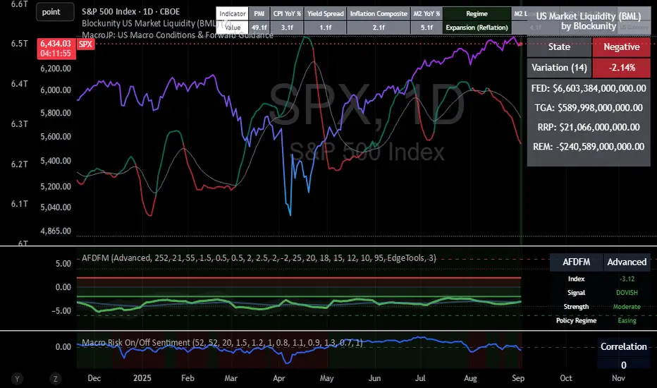
SPX – Dovish Fed, Negative Liquidity, and the Next TriggerThe S&P 500 sits near 6,435, holding steady at highs while the liquidity backdrop remains negative. This divergence between price and plumbing sets up the next major move.
Macro backdrop:
The Advanced Fed Model (AFDFM) signals a dovish/easing regime, with moderate strength.
Liquidity, however, is still draining. Treasury’s cash account (TGA) remains elevated, while the Fed’s RRP facility continues to park trillions. Together, these offset easing policy tone.
Net liquidity (BML variation) = –2.14%, a headwind for equities.
Implication for SPX:
Liquidity and SPX correlation has weakened. Historically, that does not last long. Either liquidity improves, or price resets lower.
Key support sits at 6,350. A sustained break below would open 6,200.
On the upside, a liquidity turn (TGA drawdown + RRP decline) would support a breakout toward 6,500–6,550.
Conclusion / Trade View:
The market is balanced between a dovish Fed tone and restrictive liquidity mechanics. As long as SPX holds above 6,400, the structure favors upside, but liquidity needs to flip to sustain momentum. Watch for the next liquidity shift as the trigger.
Disclaimer: For educational purposes only. This is not financial advice.
SPIUSD trade ideas
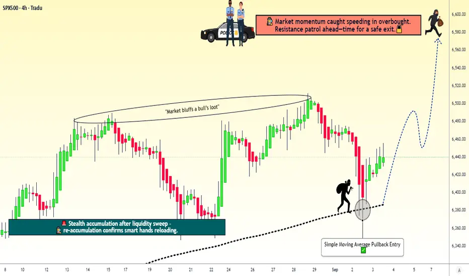
SPX500 Index – Ready for the Next Pullback Heist Move?🚨 SPX500 / US500 Index – The Money Heist Swing Plan 🎭💰
📊 Plan Overview
Bias: Bullish 200-SMA Pullback Plan @ 6380.00
Entry Strategy (Layering Style):
Thief strategy = multiple buy limit orders stacked like layers 🎯
6400.00 ✅
6410.00 ✅
6420.00 ✅
6440.00 ✅
(You can increase or adjust the layering based on your own style and risk tolerance.)
🛡️ Stop Loss (Thief SL)
SL: 6360.00 ⚠️
Dear Ladies & Gentlemen (Thief OG’s), adjust your SL to fit your risk style. This is just the plan’s guardrail.
🎯 Target / Exit
Target Zone: 6580.00 🚀
Note: This is the “Police Resistance” 🛑 – an overbought + trap zone. Escape with the stolen money 🎭💰 before getting caught.
Reminder: Not financial advice. You decide where to take profits.
🤔 Why This Plan?
🔹 200 SMA Pullback Logic: Price retraced into moving average = classic thief-style entry.
🔹 Layering Strategy Advantage: Building positions gradually improves average entry price & reduces risk.
🔹 Momentum & Sentiment: Neutral Fear & Greed Index (53/100) 😐 and low volatility (VIX 16.9) = stable environment for pullback entries.
🔹 Market Strength: US500 is up +16.81% YTD 🚀 with strong sector support (Alphabet +8.57%, Macy’s +19%).
🔹 Risk Factor: Economic data shows weakness (job openings & factory orders ↓), but bulls remain in control = reason for cautious layering.
🔹 Overall Outlook: Bullish score 65/100 ✅ → Mildly bullish bias fits perfectly with a buy-the-dip pullback strategy.
🔹 Trap Zone Awareness: Plan exits near resistance at 6580.00 to avoid overbought trap — thieves always escape before alarms go off 🚨.
📊 US500 INDEX CFD Real-Time Data (September 03)
Daily Change: +0.51% ↗️
Monthly Performance: +1.87% ↗️
Yearly Performance: +16.81% 🚀
All-Time High: 6,510.93 (August 2025)
😰😊 Investor Sentiment: Fear & Greed Index
Current Reading: 53/100 (Neutral) 😐
Trend: Balanced sentiment with no extreme fear or greed.
Key Indicators:
Market Momentum: S&P 500 above 125-day moving average (positive momentum) ↗️
Volatility (VIX): Low volatility (16.90), indicating stability 🟢
Options Activity: Put/Call ratio stable (no significant fear)
Junk Bond Demand: Moderate risk appetite
Safe Haven Demand: Bonds underperforming stocks (greed signal)
📈 Fundamental & Macro Score
Market Breadth: Moderate (balanced volume) ⚖️
Economic Data:
Job openings lowest since Sept (weakness) 🔻
Factory orders down -1.3% 🔻
Friday’s jobs report = critical ⚠️
Sector Performance:
Communication services (Alphabet +8.57%) 🟢
Consumer discretionary (Macy’s +19%) 🟢
Energy sector weak (Exxon Mobil -2.08%) 🔻
🐂🐻 Overall Market Outlook
Bullish Score: 65/100 (Mildly Bullish) ✅
Reasons:
Strong yearly gains (+16.81%)
Low volatility & neutral sentiment support stability
Tech & communication sectors leading momentum
Risks:
Weakening job & factory data
High valuations near ATH
💡 Key Takeaways
US500 trending upward with neutral short-term sentiment.
Friday’s jobs report = key catalyst.
Sector rotation in play: tech strong, energy weak.
Balanced fear/greed supports controlled bullish setups.
📌 Related Pairs to Watch
FOREXCOM:SPX500
CAPITALCOM:US500
TVC:DJI
NASDAQ:NDX
TVC:VIX (for risk gauge)
✨ “If you find value in my analysis, a 👍 and 🚀 boost is much appreciated — it helps me share more setups with the community!”
#SPX500 #US500 #IndexTrading #SwingTrade #LayeredEntry #SMAPullback #TradingPlan #StockMarket #SP500 #InvestorSentiment #FearGreed
Food Security & Global Market PricesIntroduction
Food is the most fundamental human need, yet in the 21st century, billions of people still struggle with hunger, malnutrition, and unstable food access. At the same time, global markets heavily influence the price and availability of food commodities such as wheat, rice, corn, soybeans, and edible oils. The link between food security and global market prices has become one of the defining challenges of our era.
Food security, as defined by the Food and Agriculture Organization (FAO), exists when all people, at all times, have physical, social, and economic access to sufficient, safe, and nutritious food to meet their dietary needs and food preferences for an active and healthy life. Achieving this requires stability in production, affordability of prices, resilience against shocks, and equitable distribution.
Global market prices, meanwhile, are shaped by international trade, supply-demand balances, speculation in commodity markets, climate events, geopolitical conflicts, and policy decisions such as subsidies or export bans. When prices spike, food insecurity rises—especially in poorer countries where households spend a large share of their income on food.
This essay explores the intricate relationship between food security and global market prices, examining causes, consequences, and policy responses.
Section 1: Understanding Food Security
Food security rests on four pillars:
Availability – Adequate supply of food from domestic production or imports.
Access – Economic and physical access, meaning people can afford and obtain food.
Utilization – Proper nutrition, safety, and absorption of food in the body.
Stability – Reliable supply and access over time, without major disruptions.
Food insecurity emerges when any of these pillars is weak. For instance:
A drought may reduce availability.
Rising global prices can weaken access.
Poor sanitation or lack of dietary diversity can affect utilization.
Wars, conflicts, or pandemics disrupt stability.
Section 2: The Role of Global Market Prices in Food Security
Global markets set benchmarks for staple foods. Prices in Chicago, Paris, or Singapore often determine what wheat, rice, or soybeans cost in Africa, South Asia, or Latin America.
Why Prices Matter for Food Security
High Prices = More Hunger
When global food prices rise, poorer households reduce consumption or switch to less nutritious diets.
FAO estimates that the 2007–08 food price crisis pushed more than 100 million people into hunger.
Low Prices = Farmer Distress
While high prices hurt consumers, very low prices can harm small farmers, reducing their incomes and discouraging future production.
This creates a cycle of poverty, migration, and reduced agricultural investment.
Price Volatility
Unpredictable swings are as harmful as high prices. Farmers cannot plan their crops, governments struggle with food subsidy budgets, and traders hoard supplies, worsening instability.
Section 3: Historical Food Price Crises
1. The 1970s Oil Shock & Food Prices
Oil price hikes raised fertilizer, transport, and irrigation costs, driving global food inflation.
2. 2007–2008 Global Food Price Crisis
Wheat, rice, and maize prices doubled or tripled due to biofuel demand, export bans, and speculation.
Riots broke out in more than 30 countries, including Haiti, Egypt, and Bangladesh.
3. 2010–2011 Price Surge (Arab Spring Trigger)
Poor harvests in Russia and Ukraine, coupled with droughts, drove wheat prices higher.
Food inflation was a key factor fueling protests in Tunisia, Egypt, and across the Arab world.
4. COVID-19 Pandemic (2020–2022)
Supply chain disruptions, export restrictions, and labor shortages pushed food prices up.
Millions of urban poor in developing countries were hit hardest.
5. Russia–Ukraine War (2022–present)
Ukraine and Russia supply 30% of global wheat exports, 20% of maize, and 75% of sunflower oil.
The war disrupted Black Sea trade routes, triggering a surge in global grain prices.
Section 4: Key Drivers of Global Market Prices
Supply & Demand Imbalances
Rising demand for meat (China, India) increases feed grain demand.
Population growth (expected to reach 10 billion by 2050) pressures supplies.
Climate Change & Extreme Weather
Droughts in Africa, floods in South Asia, and wildfires in North America reduce output.
El Niño and La Niña cycles influence rainfall and crop yields globally.
Energy Prices
Oil prices affect fertilizer, irrigation, and transport costs.
Biofuel policies (e.g., ethanol in the US, biodiesel in Europe) divert grains from food to fuel.
Trade Policies
Export bans (India on rice, Russia on wheat) reduce global supply and spike prices.
Import tariffs and quotas distort markets further.
Speculation & Financialization of Commodities
Hedge funds and institutional investors increasingly trade food futures.
While providing liquidity, speculation can amplify price swings.
Geopolitical Conflicts & Wars
War zones reduce production (Ukraine) or block exports.
Sanctions can disrupt fertilizer supplies (Russia-Belarus potash).
Section 5: Food Security Challenges in Different Regions
Africa
Heavy reliance on imported wheat and rice.
Vulnerable to global price shocks due to weak currencies.
Climate shocks (drought in Horn of Africa) worsen hunger.
Asia
India: major producer but also restricts exports during inflation.
China: massive food demand, maintains large reserves.
Southeast Asia: rice-dependent economies vulnerable to export bans.
Middle East & North Africa (MENA)
Highly import-dependent (over 50% of food).
Price shocks linked to political unrest (Arab Spring).
Latin America
A food-exporting region (Brazil, Argentina) but faces domestic food inflation.
Export crops often prioritized over local food needs.
Developed Countries
More resilient due to subsidies and safety nets.
Still vulnerable to rising food inflation, affecting lower-income households.
Section 6: Consequences of Rising Food Prices
Hunger & Malnutrition
Poor families spend 50–70% of income on food.
Rising prices mean reduced meals, more stunting in children.
Social Unrest & Political Instability
Food riots, protests, and revolutions often follow price spikes.
Economic Strain on Governments
Higher subsidy bills (India’s food subsidy crosses billions annually).
Pressure on foreign reserves for food-importing countries.
Migration & Refugee Crises
Hunger drives rural-to-urban migration and cross-border displacement.
Section 7: Policy Responses to Balance Food Security & Prices
Global Cooperation
WTO rules to prevent arbitrary export bans.
FAO-led initiatives for transparency in food markets.
National Policies
Price stabilization funds and buffer stocks.
Social safety nets: food stamps, cash transfers, subsidized food.
Investment in Agriculture
Modern farming, irrigation, storage, and logistics.
Encouraging climate-resilient crops.
Sustainable Practices
Reduce food waste (1/3 of global food is wasted).
Diversify crops to reduce reliance on wheat/rice/maize.
Regional Food Reserves
ASEAN rice reserve mechanism.
African Union initiatives for emergency grain stocks.
Private Sector & Technology
Precision farming, AI-driven yield forecasts.
E-commerce platforms improving farmer-market linkages.
Section 8: The Future – Can We Ensure Food Security Amid Price Volatility?
By 2050, food demand will rise by 60–70%.
Climate change could reduce yields by 10–25% in some regions.
Global interdependence means local crises (Ukraine war, Indian export bans) ripple worldwide.
The challenge is balancing farmer incomes, consumer affordability, and global stability.
Promising solutions include:
Climate-smart agriculture.
International grain reserves.
Digital platforms for real-time price transparency.
Stronger trade cooperation and less protectionism.
Conclusion
Food security is deeply tied to global market prices. When markets are stable and predictable, people eat well, farmers earn fair incomes, and societies remain peaceful. But when prices spike due to conflict, climate change, or speculation, millions are pushed into hunger and political instability rises.
The future demands a balanced approach—ensuring affordable food for consumers, fair returns for farmers, and resilience in supply chains. Global cooperation, sustainable practices, and smart technology will be central to ensuring that food security is not left hostage to market volatility.
In short: food is not just a commodity—it is a foundation of human survival, dignity, and global stability.

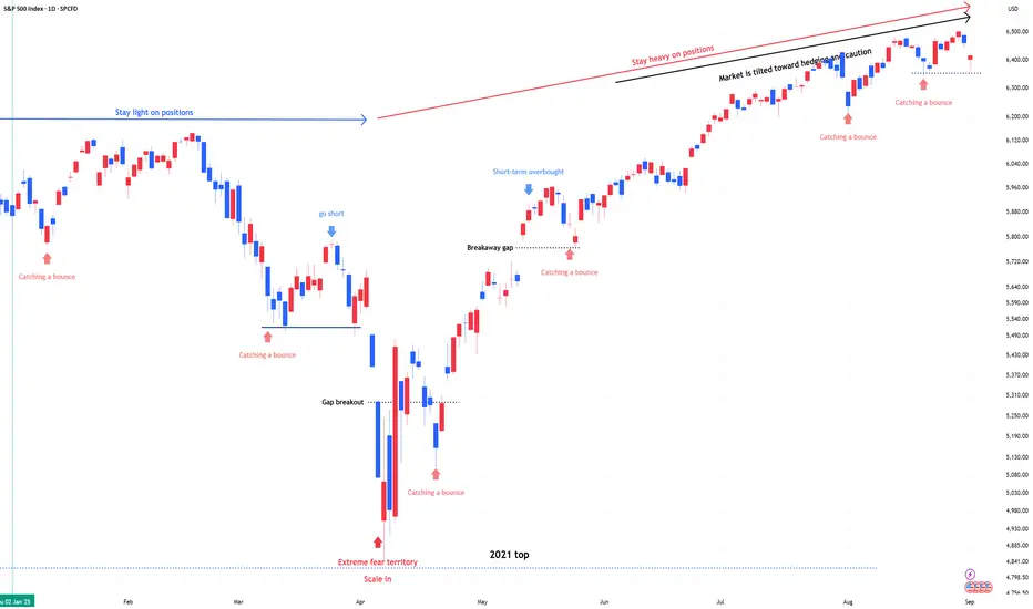
SPX & NDX : Stay heavy on positionsSPX & NDX : Stay heavy on positions (2x leverage)
Same view as before. No change
** This analysis is based solely on the quantification of crowd psychology.
It does not incorporate price action, trading volume, or macroeconomic indicators.
S&P500 THE MOST IMPORTANT ANALYSISSP:SPX The S&P500 is in it's 5th wave and about to reverse. In addition to the expanding diagonal.
The currenct situation is an economic bubble. Compare it to the S&P500 gold ratio. NVDA is reversing.
Markets Titan

Yields front and center: Fundamental analysis Following 'labour day' the first trading day proper of September has kicked off with a bang. 'Rising yields' being a concern during the European session. A UK cabinet reshuffle caused UK GILTS to rapidly rise as the market grows increasingly concerned about the government's ability to guide the UK economy. The GBP weakened considerably.
Bonds in particular can be difficult to interpret, why would the GBP weaken so much with rising yields, but the USD strengthen when the US10 year is rising at the same time? I would suggest today's movement highlights the precarious situation the UK economy is currently in compared to the US economy. Meaning the market thinks the US consumer can withstand higher interest rates better than the UK consumer. There is also the case to say the USD was bought as a 'safe haven' in what amounted to a yields up / stocks down = risk off European session.
During the North American session, 'soft ISM data' put the breaks on the rising yield narrative, creating a 'bad news is good news' scenario. Meaning 'soft US data' still keeps rate cuts on the table. And overall, my underlying 'risk on' bias remains in tact. The market has (not yet) reacted to the tariff supreme court ruling, which is something to keep an eye on.
I also think the door has been open for potential GBP short 'relative fundamental' trade. Something like an AUD GBP short (depending on the outcome of upcoming AUD GDP data).
SPX Likely flat unit Sept. ExpirationSeems to be heading as planned. Extended Profit taking wave 4 between option expiration. Still see another leg higher . Looking 2026, MARCH to MAY next year as a start of a major potential major pull back.

Consolidation before ATHThe S&P 500 will likely consolidate and correct slightly before the next leg up. A rally will probably start a day or two before the upcoming Fed meeting.
The correction could reach the 0.38 Fibonacci level maybe 0.5, meaning a maximum drop of around 10%.
The RSI indicates that the market needs to cool off, and the MACD shows a similar pattern.
However, the advance-decline line remains extremely bullish, with no signs of a major drop ahead.


S&P500 Strong buy signal if the 4H MA200 holds.The S&P500 index (SPX) has been pulling back since the August 28 All Time High (ATH) and is headed for a 4H MA200 (orange trend-line) test.
This is a major short-term buy point as since April 25, every contact with this trend-line (6 so far) resulted into a new rally/ Bullish Leg.
The last two in particular rose as high as the 1.236 Fibonacci extension. So as long as the 4H MA200 holds, that gives us a 6530 short-term Target.
-------------------------------------------------------------------------------
** Please LIKE 👍, FOLLOW ✅, SHARE 🙌 and COMMENT ✍ if you enjoy this idea! Also share your ideas and charts in the comments section below! This is best way to keep it relevant, support us, keep the content here free and allow the idea to reach as many people as possible. **
-------------------------------------------------------------------------------
💸💸💸💸💸💸
👇 👇 👇 👇 👇 👇

US500 Needs retracementVery good opportunity to sell above 6400... and then i expect it to touch 6085

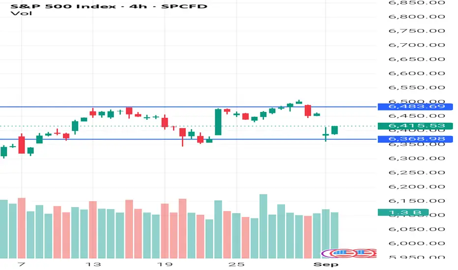
S&P 500 Under Pressure as Pivot 6,425 HoldsSPX500 – Overview
The index dropped nearly 500 points (~0.9%), in line with the previous outlook, and continues to face bearish pressure as long as it trades below the pivot at 6,425.
Technical Outlook:
🔻 Bearish scenario: While under 6,425, downside momentum remains intact toward 6,389 → 6,366.
🔺 Bullish scenario: A confirmed 1H close above 6,425 would shift momentum upward, targeting 6,442 → 6,468.
Key Levels:
Pivot: 6,425
Support: 6,389 – 6,366
Resistance: 6,442 – 6,468
Previous idea:

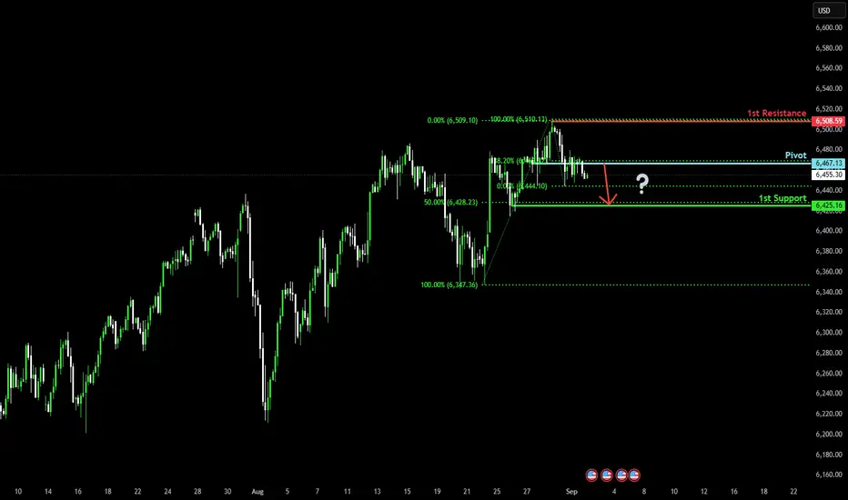
Bearish reversal setup?S&P500 (US500) has rejected off the pivot, which is a pullback resistance, and could potentially drop to the 1st support.
Pivot: 6,467.13
1st Resistance: 6,508.59
1st Support: 6,425.16
Risk Warning:
Trading Forex and CFDs carries a high level of risk to your capital and you should only trade with money you can afford to lose. Trading Forex and CFDs may not be suitable for all investors, so please ensure that you fully understand the risks involved and seek independent advice if necessary.
Disclaimer:
The above opinions given constitute general market commentary, and do not constitute the opinion or advice of IC Markets or any form of personal or investment advice.
Any opinions, news, research, analyses, prices, other information, or links to third-party sites contained on this website are provided on an "as-is" basis, are intended only to be informative, is not an advice nor a recommendation, nor research, or a record of our trading prices, or an offer of, or solicitation for a transaction in any financial instrument and thus should not be treated as such. The information provided does not involve any specific investment objectives, financial situation and needs of any specific person who may receive it. Please be aware, that past performance is not a reliable indicator of future performance and/or results. Past Performance or Forward-looking scenarios based upon the reasonable beliefs of the third-party provider are not a guarantee of future performance. Actual results may differ materially from those anticipated in forward-looking or past performance statements. IC Markets makes no representation or warranty and assumes no liability as to the accuracy or completeness of the information provided, nor any loss arising from any investment based on a recommendation, forecast or any information supplied by any third-party.
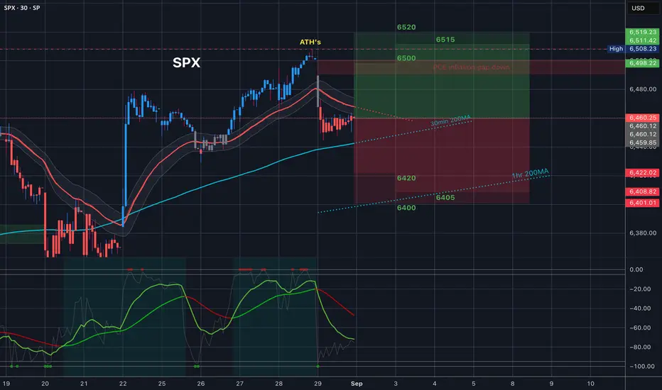
$SPX Trading Range for 9.2.25
Tomorrow’s Trading range looks fun. All of Friday’s candle’s were red, and we have the 35EMA as resistance. Under that we have the 30min 200MA so definitely keep an eye out for that, it is still facing up so it should offer some support - even if just for a technical bounce, and under that all the way at the bottom of the trading range, even underneath the implied moves for the next two days is the 1hr 200MA
At the top of the trading range we have a bear gap just under ATH’s.
Let me know how you plan to trade this. Let’s make some money.
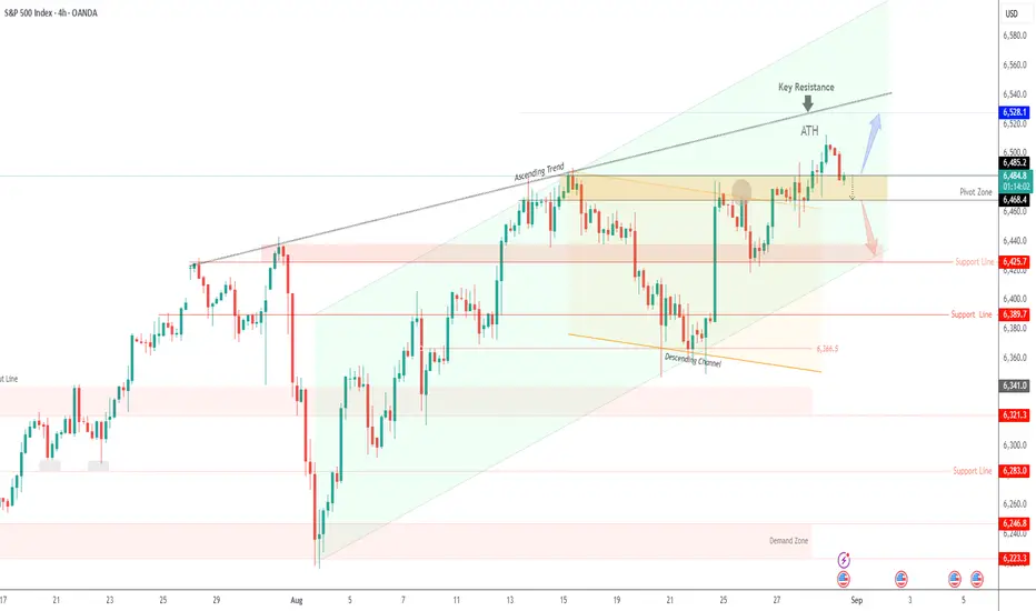
Very Important TrendlineWatch the S&P 500 (SPX) rising trendline from the 05/23/25 bottom. SPX has found support at this line three times, a break below it could trigger a rapid drop to at least 5,900.
Daily Stochastic has a bearish divergence at its all-time high and a bearish line cross.
RSI has a double bearish divergence off its late July peak and has crossed below its moving average line.
The Fibonacci .382 retrace of the April to August rally is at 5,871, broader support zone is 5,930 to 5,780.
U.S. stocks are seasonally bearish from August to October.
September is statistically the most bearish month.

SPX500 Slips Ahead of Key Inflation Data (PCE Report in Focus)SPX500 – Overview
Wall Street Slips Ahead of Key Inflation Data
U.S. stock indices fell on Friday as traders turned cautious ahead of the PCE inflation report, a key release that could shape the Federal Reserve’s September rate decision. Market sentiment remains highly sensitive to incoming data.
🔹 Technical Outlook
The index is expected to pull back from 6,485 toward 6,468.
✅ A confirmed 1H close below 6,468 would extend the bearish move toward 6,447 → 6,425.
⚠️ However, if price stabilizes above 6,486 (1H/4H close), bullish momentum would resume, with upside targets at 6,506 → 6,528.
🔹 Key Levels
Support: 6,468 – 6,447 – 6,425
Resistance: 6,506 – 6,528
✅ Summary:
SPX500 is consolidating just below resistance as markets await the PCE inflation release. A break below 6,468 would confirm bearish continuation, while holding above 6,486 would reignite bullish momentum.

SPX: NVIDIA shines; Jobs data aheadThe optimism on the US equity markets continued through the week, where the S&P 500 managed to achieve another all-time highest level this year, at 6.507. Friday brought some profit taking, where the index slipped by 0,64%, ending the week at 6.460. Some of the most important US macro data included the PCE, which was in line with market expectations at the level of 0,2% in July, while the second estimate of the GDP growth rate beat market expectations with 3,3% q/q, in relation to 3,0% estimated by market.
NVIDIA was in the center of investors attention, due to the post of its quarterly results. The company delivered a standout second-quarter performance, with revenue soaring to $46.7 billion—up 56% year-over-year—driven largely by the AI-focused data-center segment, while also launching a massive $60 billion stock buyback program to return capital to shareholders. Despite the strong financials, the stock slid about 3% after hours, as investors voiced concerns around softer-than-expected data-center momentum and ongoing geopolitical exposure, particularly to China.
Although the market generally remains optimistic, it should be considered that the week ahead is bringing two currently important indicators. These are related to Non-farm payrolls and JOLTs Job Openings. In case that some indicator deviates from market expectations, it might trigger short term higher volatility on US equity markets

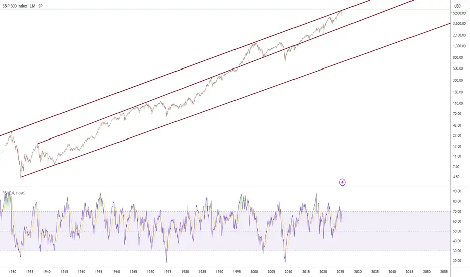
1929 to Present day Trendline Channels The chart represents some very meaningful and powerful trendlines.
I have magnetised these trend lines to be exactly on the peak of September 1929 and exactly on the peak March 2000.
I drew these lines to the high of day on the given peak days in Sep 1929 and March 2000, combined with a line extension.
(Meaning its not a manual placement this is the exact trendline channel)
Trendline validation (how many times have we tagged it per month - it has also been tagged many more days):
August 1929
September 1929
March 2000
November 2024
December 2024
January 2025
February 2025
When you zoom in to our present year/months/weeks/days, you can see we tagged the trendline November 2024 to February 2025.
We have now broken above the trendline for July and August 2025.
You will also notice a middle trendline this support formed on the 1st of March 1937 and acted as resistance until it broke through on the 1st of May 1995 about the time when everyone had a home computer and windows 95.
This middle support held strong during the 2000-2003 dotcom crash
The middle support broke during the 2008 financial crisis.
However it regained its support in 2013 and then tagging it in the 2020 covid crash.
Over nearly 100 years these channels have remained strong, it is honestly crazy to think we have now broken a 96 year old trendline in 2025.
The question is does this trendline become support or resistance?
So, the market will never fall ever again ?Sentiment in the market is max bullish right now, which has historically been a very good time to be bearish.

ES bullishS&P500 has formed a smt divergence with nasdaq.
I think when weekly opens we will witness a massive buy.
Or this thing could just give us another flash to the downside .
Either way we are prepared .
Excited for what is coming for the Q4 of this year.
Lets make it a great week.

THE 75-YEAR SECRETHOW ONE ECONOMIC NUMBER PREDICTS STOCK MARKET MOVES
Edgetools Macro Alpha Series
Imagine if you could predict stock market movements with remarkable accuracy using just one simple economic indicator. This isn't fantasy - it's the power of the Purchasing Managers' Index (PMI), a little-known economic metric that has been quietly beating the market for over 75 years.
This analysis reveals how PMI has consistently predicted S&P 500 movements using 931 monthly readings spanning from 1948 to 2025. Our research shows that when PMI signals economic expansion, your chances of making money in stocks jump to 41.2% - significantly better than the 35.8% win rate during economic contractions. More importantly, we'll show you exactly which PMI levels have historically delivered the best returns and how ordinary investors can use this knowledge to their advantage.
What Is PMI and Why Should You Care?
Think of the Purchasing Managers' Index (PMI) as the economy's early warning system. Every month, purchasing managers at manufacturing companies across America answer a simple survey about their business: Are things getting better or worse? The combined responses create a single number between 0 and 100 that reveals the health of the manufacturing sector.
Here's the key insight that most investors miss: PMI doesn't just predict manufacturing trends - it predicts stock market movements. When PMI rises above 50, it signals economic expansion and historically better stock returns. When it falls below 50, it warns of economic contraction and typically weaker market performance.
The beauty of PMI lies in its simplicity and timing. Unlike corporate earnings that are reported quarterly and often manipulated, PMI comes out monthly and reflects real business activity. Manufacturing managers can't fake whether they're ordering more materials or hiring more workers - and these decisions directly impact the broader economy and stock prices.
The Science Behind PMI's Market-Beating Power
PMI isn't just another economic statistic - it's a carefully constructed indicator that captures the pulse of American business. The Institute for Supply Management surveys purchasing managers across five critical business areas: new orders (future demand), inventory levels (current stock), production (current activity), supplier deliveries (supply chain health), and employment (hiring trends).
What makes PMI so powerful for investors is its direct connection to corporate profits. When purchasing managers report increasing orders and production, companies are literally manufacturing more products to meet growing demand. This directly translates into higher revenues and profits, which drive stock prices higher.
Major financial institutions have recognized PMI's predictive power. T. Rowe Price, managing over $1.7 trillion in assets, developed a model using PMI that explains 85% of corporate earnings changes over time. Similarly, the Bank for International Settlements found that PMI changes predict both stock market movements and corporate bond prices with remarkable accuracy.
The Missing Link for Individual Investors
Despite PMI's proven track record with institutional investors, individual investors have largely ignored this powerful indicator. Most retail trading education focuses on technical analysis or company fundamentals, completely overlooking the macro-economic signals that drive broad market movements. This creates a massive opportunity for informed investors who understand how to read and act on PMI data.
How We Cracked the 75-Year Code
Our Research Method
To prove PMI's market-beating power, we analyzed an unprecedented dataset spanning over 75 years of market history. We examined daily S&P 500 prices from 1942 to 2025 (over 20,800 trading days) alongside 931 monthly PMI readings from 1948 to 2025. This massive dataset includes every major market crash, bull market, recession, and economic expansion of the modern era.
What We Measured
To understand PMI's true predictive power, we tracked multiple types of market performance. We measured short-term returns (1-20 days) and longer-term returns (up to 60 days) to see how quickly PMI signals translate into market movements. Most importantly, we calculated "forward-looking" returns meaning we looked at what happened to stock prices AFTER each PMI reading was released.
We also categorized PMI readings into five distinct economic zones:
- Deep Contraction (PMI below 45): Economic crisis territory
- Contraction (PMI 45-50): Economic weakness
- Expansion (PMI 50-55): Healthy economic growth
- Strong Expansion (PMI 55-60): Robust economic growth
- Very Strong Expansion (PMI above 60): Exceptional economic strength
For each category, we calculated win rates (how often you made money), average returns, and risk levels. This allowed us to identify exactly which PMI levels have historically produced the best investment opportunities.
Our Testing Methods
We didn't just look for patterns we rigorously tested PMI's predictive power using multiple statistical approaches. First, we measured correlation strength between PMI readings and future stock returns across different time periods. Think of correlation as measuring how closely two things move together the closer to 1.0, the stronger the relationship.
We then compared stock market performance during PMI expansion periods (above 50) versus contraction periods (below 50) to see if the differences were statistically significant. This isn't just about finding patterns that might be random we needed to prove the relationships were real and repeatable.
To find the optimal PMI levels for investing, we grouped similar PMI readings together and calculated average returns for each group. We only included groups with at least 10 historical examples to ensure our findings were statistically reliable, not just lucky coincidences.
We also tracked how PMI's predictive power changed over time using rolling 60-day correlations. This helped us confirm that PMI's market-beating ability has been consistent across different decades and market environments, not just a temporary phenomenon.
Finally, we examined performance during extreme PMI readings (the highest and lowest 10%) to understand how PMI signals work during unusual economic conditions like recessions and economic booms.
The Shocking Results: PMI's 75-Year Track Record
The Big Picture
Chart 1 reveals the remarkable long-term relationship between PMI and the S&P 500 from 1948 to today. Here's what 75 years of data tells us: PMI has spent 69% of the time above 50 (expansion territory), which explains why the stock market has historically trended upward over long periods.
But here's the eye-opening part: Every major market crash coincided with PMI warnings. The dot-com crash of 2000, the financial crisis of 2008, and even the COVID-19 market collapse of 2020 all happened when PMI signaled economic weakness. In many cases, PMI actually warned investors BEFORE the market crashes occurred, giving smart money time to protect their portfolios.
This isn't just correlation it's causation. When purchasing managers report declining orders and production cuts, it directly means less economic activity, lower corporate profits, and inevitably, falling stock prices. PMI gives you a front-row seat to this economic cause-and-effect relationship.
How Strong Is PMI's Predictive Power?
Chart 2 shows the mathematical relationship between PMI and future stock returns across different time periods. While the correlations appear modest (the strongest is only +0.100), this is actually remarkable for any economic indicator. In the notoriously unpredictable world of stock markets, any consistent relationship above +0.05 is considered significant.
Here's what the numbers tell us: PMI has a -0.101 correlation with recent 5-day stock performance, meaning when stocks have been falling, PMI often rises shortly after (and vice versa). This makes PMI excellent for spotting market turning points.
But the real magic happens with forward-looking predictions. PMI shows a +0.100 correlation with stock returns 60 days in the future meaning higher PMI readings today predict better stock performance two months from now. This gives you a legitimate crystal ball for market direction.
The key insight: PMI works best as an early warning system for market changes, not for confirming what already happened. When everyone else is panicking about recent market drops, PMI can tell you if the worst is over or just beginning.
Understanding PMI's Normal Range
Chart 3 shows you what "normal" looks like for PMI over 75 years. The average PMI reading is 52.8, which means the U.S. economy spends most of its time in mild expansion mode. This explains why patient long-term investors have historically been rewarded - the economy grows more often than it contracts.
The chart also reveals PMI's sweet spot: readings between 45-60 cover most of the historical data. The magic number of 50 (the line between expansion and contraction) sits right in the middle, making it a reliable benchmark for economic health.
Pay special attention to the extremes: PMI readings below 40 or above 65 are rare but incredibly powerful signals. When PMI drops below 40, you're looking at potential recession territory time to protect your capital. When PMI soars above 65, you're witnessing economic euphoria that often precedes market corrections as growth becomes unsustainable.
These extreme readings don't happen often (maybe once every few years), but when they do, they represent some of the most important investment decision points you'll ever face.
Proof That PMI Predicts Market Moves
Chart 4 is where theory meets reality. This scatter plot shows every PMI reading plotted against what the stock market did over the following 20 days. Each dot represents a real historical moment where you could have used PMI to predict market direction.
The upward-sloping trend line tells the story: higher PMI readings consistently led to better stock market performance over the next 20 trading days. While the relationship isn't perfect (no market predictor ever is), the consistency over 75 years is remarkable.
Notice the outliers those dots far from the trend line represent extreme market events like crashes or melt-ups. What's fascinating is that even during these unusual periods, PMI often provided early warning signals. The color coding shows that this relationship has remained stable across different decades and market environments.
The bottom line: PMI gives you a statistically proven edge in predicting market direction. It's not perfect, but in the zero-sum game of investing, any legitimate predictive edge is pure gold.
The PMI Sweet Spot: Where to Make Your Money
Chart 5 reveals the secret sauce of PMI investing by showing exactly how much money you could have made (or lost) in each economic zone. This box plot analysis breaks down 75 years of market data into five distinct PMI categories, and the results are eye-opening.
Deep Contraction (PMI below 45): This is investment purgatory. Not only do you lose money on average, but the volatility is brutal meaning big swings both up and down. When PMI hits this zone, your best strategy is often to sit on cash and wait.
Contraction (PMI 45-50): Still dangerous territory with below-average returns and high uncertainty. The market doesn't know which direction the economy is heading, creating choppy, unpredictable price action.
Expansion (PMI 50-55): Here's where the magic begins. Positive median returns with manageable risk - this is the bread and butter of PMI investing. When PMI enters this zone, the odds finally tip in your favor.
Strong Expansion (PMI 55-60): The sweet spot! This zone delivers the best risk-adjusted returns in our entire 75-year dataset. Higher returns with controlled volatility - exactly what every investor wants.
Very Strong Expansion (PMI above 60): Great returns, but use caution. These extreme readings don't last long and often signal that the economy may be overheating.
Time-Varying Relationships
Chart 6 presents 60-day rolling correlations between PMI and 20-day forward SPX returns, illuminating the dynamic nature of the PMI-equity relationship across different market regimes and economic cycles. The correlation exhibits substantial variation, ranging from -0.44 to +0.37, with an average rolling correlation of +0.063.
Particularly noteworthy are periods of strong positive correlation that tend to occur during market stress events, suggesting that PMI's predictive power may strengthen precisely when investors most need reliable signals. This counter-cyclical enhancement of signal quality represents a valuable characteristic for risk management applications.
The correlation volatility of 0.134 indicates meaningful relationship instability over time, reflecting structural changes in the economy, monetary policy regimes, and market microstructure evolution. This finding underscores the importance of implementing adaptive approaches with regular model revalidation rather than assuming static relationships.
The time-varying nature of the PMI-equity relationship suggests that successful implementation requires ongoing monitoring and periodic strategy adjustments to account for changing market conditions and structural economic shifts.
Optimal Entry Points
Chart 7 identifies optimal PMI levels for SPX entries through comprehensive binned return analysis, providing the empirical foundation for systematic timing decisions. The analysis reveals that PMI level 60 generates the highest average 20-day forward returns at 1.07%, representing the optimal timing zone for maximizing expected returns.
Conversely, PMI level 42 produces the worst performance with average 20-day returns of -2.1%, highlighting the importance of avoiding equity exposure during severe manufacturing contractions. The 3.17% performance differential between optimal and worst entry points demonstrates the substantial value creation potential of systematic PMI-based timing.
Sample sizes displayed for each bin ensure statistical validation of findings, with minimum thresholds applied to prevent spurious results from small sample bias. The analysis reveals clear performance deterioration below PMI 45, supporting defensive positioning during deep contraction periods.
This empirical framework provides the quantitative foundation for general timing principles and investment considerations based on current PMI levels.
Win Rate Analysis
Chart 8 tracks win rates, defined as the percentage of positive returns, across different PMI levels, providing essential risk assessment information for position sizing and risk management decisions. The analysis identifies PMI level 60 as producing the highest win rate at 50.0%, marked prominently in the visualization to highlight this optimal entry zone.
The overall pattern demonstrates that win rates increase systematically with PMI levels, providing strong empirical support for the regime-based approach to equity timing. This monotonic relationship suggests that PMI serves as a reliable discriminator of equity market conditions across different economic environments.
The critical threshold at PMI 50 shows marked improvement in win rates, confirming the theoretical significance of the expansion-contraction dividing line. Below this threshold, win rates deteriorate significantly, with particularly poor performance evident when PMI falls below 45.
The progressive degradation of win rates during contraction periods provides essential calibration data for risk management frameworks, enabling systematic reduction of position sizes or implementation of defensive strategies when PMI indicates challenging equity market conditions.
Advanced Analytics
Our advanced analytics reveal important risk characteristics that provide deeper insight into the regime-dependent nature of PMI-based strategies. Risk-adjusted metrics demonstrate that expansion periods generate superior Sharpe ratios of -0.087 compared to -0.156 during contraction periods, indicating better risk-adjusted performance during favorable economic conditions.
Volatility analysis shows that expansion periods exhibit lower volatility at 4.22% compared to 4.76% during contractions, contradicting the common assumption that economic growth periods necessarily involve higher market volatility. This finding suggests that manufacturing expansion provides a stabilizing influence on equity market performance.
Extreme event analysis reveals pronounced performance differences during tail conditions. The bottom 10% of PMI readings (below 43.9) generate average returns of -1.27% with win rates of only 29.5%, highlighting the severe equity market challenges associated with deep manufacturing contractions. Conversely, the top 10% of PMI readings (above 60.8) produce average returns of -0.75% with improved win rates of 38.5%, demonstrating the benefits of strong manufacturing expansion for equity performance.
General Investment Considerations for PMI-Based Market Timing
Conceptual Framework
Based on our quantitative analysis, several general principles emerge for investors interested in incorporating economic regime analysis into their investment approach. The research demonstrates that PMI levels relative to empirically derived thresholds can serve as valuable economic context for investment decisions, providing a systematic framework grounded in robust statistical relationships rather than subjective market interpretation.
The analysis suggests that intermediate-term investment horizons, particularly around 20 trading days, may provide optimal balance between capturing economic signal benefits and managing exposure to regime changes and external market shocks. This timeframe allows sufficient time for PMI signals to manifest in equity market performance while limiting overexposure to single economic readings.
Investment allocation considerations may benefit from awareness of PMI strength, with historical analysis indicating varying risk-adjusted return potential across different economic environments. This adaptive awareness enables more informed investment decisions while maintaining prudent risk management across different economic conditions.
Risk management approaches should incorporate both time-based considerations and regime awareness, ensuring investment decisions account for both predetermined time horizons and evolving economic conditions as reflected in PMI readings.
Investment Timing Considerations
PMI Threshold Awareness
The empirical analysis reveals several PMI threshold levels that historically coincide with different risk-return environments, providing general guidance for investment timing considerations. Historical data suggests that PMI readings of 52 and above have generally been associated with more favorable equity market conditions, while readings below this level have historically coincided with increased market challenges.
Particularly strong PMI readings above 55 have historically corresponded with improved risk-return profiles, while readings above 60 have shown the most favorable historical outcomes. Conversely, PMI readings below 47 have historically been associated with deteriorating market conditions, with readings below 43 corresponding to the most challenging periods for equity investments.
These threshold observations provide general context for investment decision-making rather than specific trading rules, allowing investors to incorporate economic regime awareness into their broader investment approach.
Timing Framework Considerations
The research suggests several timing considerations that may enhance investment decision-making. Historical analysis indicates that intermediate-term holding periods around 20 trading days have provided optimal balance between capturing PMI signal benefits and managing exposure to economic volatility.
Time-based considerations may complement regime-based awareness, with predetermined investment horizons helping to eliminate emotional decision-making while regime awareness provides context for adjusting investment approach based on evolving economic conditions.
The analysis suggests that investors might benefit from graduated approach to investment adjustments, with moderate changes in allocation corresponding to moderate PMI movements, rather than dramatic shifts based on single economic readings.
Practical Implementation Considerations
Data Monitoring Approach
Investors interested in incorporating PMI analysis into their investment approach should establish systematic methods for monitoring economic data releases. The U.S. Manufacturing PMI is typically released on the first business day of each month, providing a regular schedule for investment review and consideration.
Effective implementation requires establishing consistent review processes that examine PMI readings in context with broader market conditions. This includes monitoring PMI trends over time rather than reacting to single data points, and considering PMI data alongside other economic indicators and market factors.
Investment platforms commonly provide access to PMI data through economic calendars and market data feeds, enabling investors to incorporate this information into their regular market analysis routine.
Allocation Considerations
The research suggests that PMI awareness might inform allocation decisions across different market environments, though specific allocation percentages should reflect individual risk tolerance and investment objectives. Historical analysis indicates that different PMI ranges have been associated with varying risk-return environments, providing context for investment allocation decisions.
Investors might consider graduated allocation approaches that reflect PMI strength, with stronger PMI readings potentially supporting higher equity allocations and weaker readings suggesting more defensive positioning. However, PMI should represent one factor among many in allocation decisions rather than the sole determinant.
The analysis suggests that moderate allocation adjustments may be more appropriate than dramatic portfolio shifts, allowing investors to benefit from PMI insights while maintaining diversified investment approaches.
Risk Management and Limitations
Analytical Limitations
The analysis reveals several important limitations that investors should consider when incorporating PMI data into investment decisions. Statistical relationships between PMI and equity returns prove generally weak, with all correlations falling below 0.11 in absolute terms. This modest correlation strength suggests that PMI should serve as one input among many rather than a primary investment driver.
Limited PMI historical data compared to SPX data creates additional analytical constraints, with PMI data extending back only to 1948 while SPX data reaches 1942. This data limitation means that PMI analysis covers fewer complete economic cycles than ideal for robust statistical inference.
Past performance relationships may not predict future results, particularly given the evolving nature of the U.S. economy and changing relationships between manufacturing activity and overall economic performance. The increasing service sector dominance may gradually reduce PMI's predictive power for overall market performance.
Market Risk Considerations
Several market risk factors may impact the effectiveness of PMI-based investment approaches. PMI represents a somewhat lagging rather than purely leading indicator, as manufacturing surveys reflect recent business conditions rather than purely forward-looking assessments. This timing characteristic may limit PMI's effectiveness during rapidly changing economic conditions.
Federal Reserve monetary policy may override PMI signals, particularly during periods of unconventional monetary policy or when Fed actions diverge from economic fundamentals. Market regime changes can alter historical relationships between PMI and equity performance, requiring ongoing monitoring and potential strategy adjustments.
Implementation challenges include transaction costs that may erode the modest edge provided by PMI timing, monthly PMI release schedules that create signal delays, and behavioral biases that may impact systematic implementation of PMI-based investment approaches.
Risk Control Framework
Effective risk management requires consideration of multiple levels and timeframes. Portfolio level risk controls should limit allocation to PMI-based approaches, maintain diversification across multiple timeframes and indicators, and implement regular strategy review processes to assess ongoing effectiveness.
Individual investment decisions should incorporate time-based considerations alongside PMI analysis, maintain position sizing discipline based on overall portfolio volatility, and monitor correlation with other holdings to prevent excessive concentration in similar economic factors.
Market level awareness should include consideration of broader market volatility conditions, economic calendar events that may override PMI signals, and sector rotation patterns that may affect the relationship between PMI and overall market performance.
Historical Performance Analysis and Validation
Performance Characteristics
The 75+ year analysis reveals distinct performance characteristics across different PMI regimes that provide insight into the potential benefits of PMI-aware investment approaches. PMI expansion periods demonstrate win rates of 41.2% compared to 35.8% during contraction periods, indicating a meaningful performance differential between economic regimes.
Average 20-day returns show notable variation across PMI environments, with expansion periods generating -0.37% average returns compared to -0.74% during contractions. The optimal PMI range around level 60 demonstrates +1.07% average returns, highlighting the potential value of economic regime awareness in investment timing.
Risk-adjusted metrics reveal expansion periods generating superior Sharpe ratios of -0.087 compared to -0.156 during contraction periods, indicating better risk-adjusted performance during favorable economic conditions. Overall strategy volatility of approximately 4.2% for 20-day periods provides context for risk management considerations.
Analytical Robustness
PMI-SPX relationships have demonstrated relative stability across different economic regimes, supporting the robustness of the analytical framework. The consistency of relationships across multiple decades and various economic cycles provides confidence in the underlying economic logic connecting manufacturing activity and equity market performance.
The analysis benefits from 931 PMI observations across 75+ years, providing sufficient statistical power for meaningful inference. This sample size encompasses multiple complete economic cycles, recession periods, and structural economic changes, enhancing the reliability of observed relationships.
The approach aligns with established economic theory regarding leading indicators and market efficiency, providing theoretical support for the empirical findings. The economic logic connecting manufacturing health to corporate profitability and equity market performance provides a rational foundation for the observed statistical relationships.
Practical Implementation Considerations for Investors
Preparation and Setup
Investors considering PMI-based market timing should begin with careful consideration of their investment approach and risk tolerance. Determining appropriate allocation levels represents a critical first step, with consideration of how PMI-based decisions will integrate with existing investment strategies and portfolio management approaches.
Technical preparation involves establishing reliable access to PMI data through economic calendars, market data platforms, or financial news services. Many investment platforms provide economic indicator tracking capabilities that can facilitate regular monitoring of PMI releases and historical trends.
Systematic approach development requires establishing consistent review processes and decision-making frameworks that incorporate PMI data alongside other investment considerations. This includes determining how PMI information will influence allocation decisions and what thresholds might trigger investment review or adjustment.
Ongoing Management
Effective implementation requires establishing regular review cycles that align with PMI release schedules and investment timeframes. Monthly PMI releases provide natural review points for assessing current economic conditions and their implications for investment allocation decisions.
Regular portfolio monitoring should encompass both PMI-related performance tracking and broader market condition assessment. This includes monitoring the ongoing relationship between PMI readings and market performance to ensure that historical patterns continue to provide useful investment guidance.
Periodic strategy evaluation should examine the effectiveness of PMI-based timing decisions compared to alternative approaches. This includes assessing whether PMI awareness has enhanced investment outcomes and whether adjustments to the approach might improve effectiveness.
Performance Evaluation
Meaningful performance evaluation requires tracking relevant metrics that capture both the benefits and costs of PMI-based investment decisions. Win rate analysis by PMI regime provides insight into the effectiveness of economic timing decisions, while risk-adjusted return measures help evaluate whether PMI awareness improves investment efficiency.
Ongoing correlation monitoring helps assess whether historical relationships between PMI and market performance continue to provide useful investment guidance. Significant changes in these relationships might signal the need for strategy adjustment or reduced reliance on PMI-based timing.
Regular evaluation should consider both quantitative performance measures and qualitative factors such as implementation complexity and behavioral challenges that may affect long-term strategy sustainability.
The Bottom Line: Your New Market Edge
After analyzing 75 years of market data, the evidence is clear: PMI gives ordinary investors a legitimate edge in timing the stock market. While the correlations aren't perfect (no market indicator ever is), the consistency of PMI's predictive power across decades of bull markets, bear markets, recessions, and booms is remarkable.
Here's what you need to remember:
PMI above 50 has historically meant better odds of making money in stocks, with the sweet spot between 55-60 delivering the best risk-adjusted returns. PMI below 47 signals danger, and PMI below 43 means it's time to get defensive with your money.
The optimal investment horizon appears to be around 20 trading days - giving PMI signals time to work while avoiding excessive exposure to economic volatility. This isn't day trading; it's intelligent, macro-driven position sizing.
PMI works best when combined with other investment tools rather than used in isolation. Think of it as a powerful economic weather report that helps you decide whether to carry an umbrella (defensive positioning) or wear sunglasses (aggressive positioning) for your investment journey.
The key insight for individual investors: while Wall Street institutions have used PMI for decades, retail investors have largely ignored this free, publicly available predictor. This creates an opportunity for informed investors who understand how to read economic signals that the crowd overlooks.
Remember, markets are ultimately driven by economics, and PMI gives you a monthly update on the economic engine that powers corporate profits and stock prices. In a world where everyone is trying to find an edge, PMI offers a research-backed approach to market timing based on fundamental economic data rather than chart patterns or market sentiment.
This is your invitation to join the ranks of macro-aware investors who understand that sometimes the best trading signals come not from price charts, but from the real economy itself.
References
Bank for International Settlements. (2019). *PMI and financial market indicators*. BIS Quarterly Review, September 2019.
Koenig, E. F. (2002). Using the purchasing managers' index to assess the economy's strength and the likely direction of monetary policy. *Federal Reserve Bank of Dallas Economic and Financial Review*, 1-14.
Lahiri, K., & Moore, G. H. (1991). *Leading Economic Indicators: New Approaches and Forecasting Records*. Cambridge University Press.
T. Rowe Price. (2025). What macro data does and does not tell us about earnings. *Institutional Insights*.

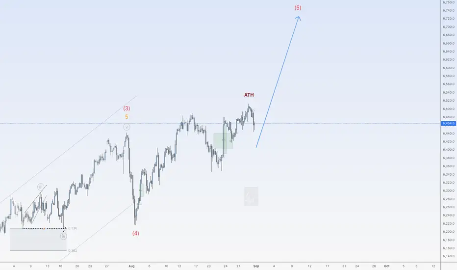
Impulse wave up for SPX500USDHi traders,
Since my last post SPX500USD made a sharp correction (wave 4) and after that it went up again making ATH's.
Last week it made a correction (Flat).
So next week after the finish of the c-wave of the correction, we could see the next impulsive wave up.
Let's see what the market does and react.
Trade idea: Wait for a small pullback and a change in orderflow to bullish on a lower timeframe to trade longs when the correction is finished.
If you want to learn more about trading FVG's & liquidity sweeps with Wave analysis, then please make sure to follow me.
This shared post is only my point of view on what could be the next move in this pair based on my technical analysis.
Don't be emotional, just trade your plan!
Eduwave