BTC in a bearish triangleI will have to join the bulls in this time.
BTC proved to have relatively strong support at 30k at 2 different occasions already, it could crab in the 30-33 region for a while or break the triangle immediately and start going up as seen in the analysis.
My idea is however mostly influenced by the rHodl ratio chart over at www.lookintobitcoin.com
It is not supposed to be the end of the bear season just Yet.
Trade responsibly boyos.
Search in ideas for "RATIO CHART"

ETH probably will outperform BTC like 2017This is a monthly ETH to BTC ratio chart. It shows how ETH outperformed BTC in the last bull cycle and underperforms BTC in the last bear cycle. The ETH:BTC and BTC:ETH ratios are as follows:
Month/Yr ETH:BTC BTC:ETH
Nov 2015 0.00137 730
Mar 2016 0.0372 27
Dec 2016 0.007302 137
Jun 2017 0.1530 6.5
Sep 2019 0.01615 62
Sep 2020 0.04055 25
Dec 2020 0.002272 44
Jan 16, 2021 0.03315 30
The ETH:BTC ratio went generally up in the 2015-17 bull cycle. A well place ETH buy in Dec 2016 would have outperformed BTC by 20 to 1 in six months by June 2017. Could this happen again and ETH outperform BTC the next few months? The Elliot Wave has bottomed and recently moved up from .002272 last month to .03315 now. I believe the ETH:BTC ratio could rise again to 0.1530 like Jun 2017 later this year. If so, then ETH would outperform BTC 4.6 to 1.
Some are expecting $200,000 for the BTC price later this year. A ETH:BTC ratio of 6.5 would yield a $30000+ ETH price. Similarly, a $300,000 BTC price would yield a $46,000 ETH price.

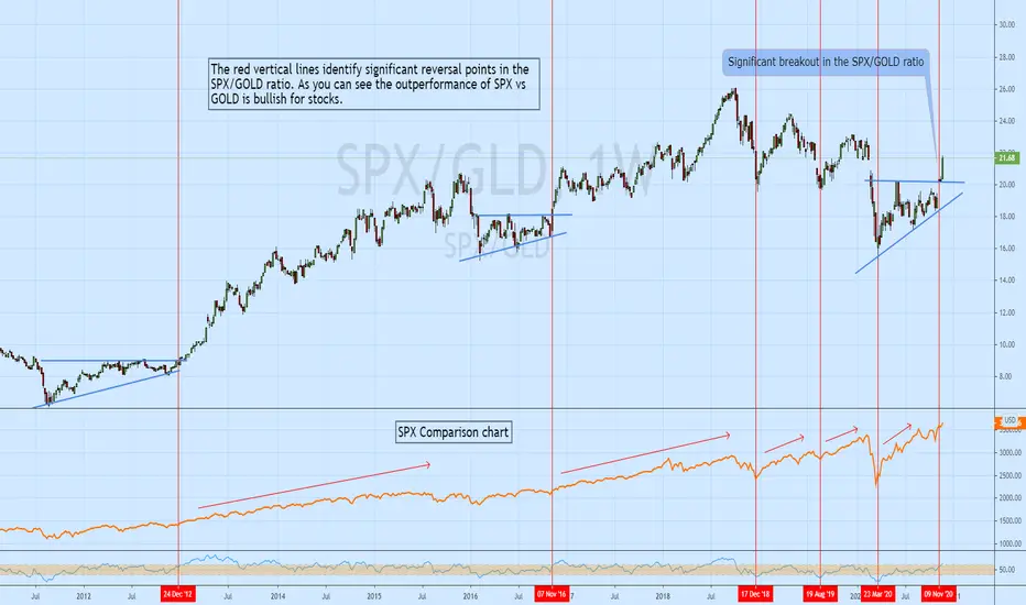
SPX vs GOLD ratio anaysisI like to use ratio charts to compare one instrument/sector/index to another as it can give you better a perspective on the market. One ratio I track is SPX to GOLD.
Gold is seen by many as a risk off asset so a strengthening SPX to GOLD ratio suggests traders are willing to take on more risk which is typically bullish for stocks. One can also
compare the SPX to ETFs like XLU, XLP or use ratio charts like XLK/XLP to gauge the market's appetite for risk.
ETHBTCRatio trading is asking for trouble. But will consider flipping some corn into this if 200d MA hits. The oscillators look fine for further bullish signals and looking good now tbh, just a watch and wait here... and good DCA flip time i think in coming days weeks potentially. Stop loss is there because its where previous support is and below 618 and break that, go back in at 786/886 area... and If ratio suffers from a BTC tank, then stop loss is spot on from a $ value perspective. But if BTC rallys, then $ wise safe bet to stop loss into BTC and await the slingshot with Eth 2 coming etc.
Elephant in the room is eths 200 Weekly MA, oddly above the 200D and therefore may be painting their own support and resistance. Thats a basic, nice and simple target area. Lets hope it doesnt hit if eth hits 270 again.
Never confident in ratio charts, but TA looks like its worth keeping an eye on this one as its still higher lows, higher high territory and thus 200DMA is historically the jesus of flip areas.

Potential Increase In Infrastructure and Housing. Monitor CementThis is a Ratio Chart between the Cement Sector Index (consist of SMGR and INTP) and Composite.
The Chart has been in Downtrend since 2013 so that means Cement Stocks are Underperforming Composite. But this trend might be over soon since the Chart (or Ratio Chart) is moving Sideways since 2017. The sideways move might end the Downtrend (that happened since 2013) so there is a possibility that Cement Stocks will Outperform Composite - if the Ratio Chart starts to move Upward.
I'm monitoring the Cement Sector because there is a possibility that the Housing Sector (and Infrastructure Sector) will increase in 2021. That will increase the demand for cement.

Hi Ho Silver, we go like this till we go up!As you can see on the tremendous chart, silver will go and do things before it goes on a tremendous rocket ride.
Some little gap resitances and supports being seen on the different time frames.
Overall bigger picture is a symmetrical triangle which should resolve bullishly based on the SLV/GLD ratio chart.
In the shorter term we may follow roughly follow the yellow line into some of the gap candle resistances on different time frames.
Upper spot which the yellow path I've drawn hits comes into a moving average at the same time, then back down into our triangle before we resolve to a grind upwards out of September before final rocket up.
I haven't posted the SLV/GLD ratio, but I guess I should to show that the timeframes are in alignment for the bull run.

[VVIX/SPX] Volatility Ratio Encore: New Perspectives = More $$$The volatility landscape is getting clearer with each passing day.
It seems my first Volatility Ratio chart of VIX/SPX broke some interesting ground. Managed to pull my first Editor's Pick.
In order to further refine our Volatility Trading Strategy here we must expand and find other major S/R from as many angels as we can.
VVIX is the next logical choice.
Whenever the ratio breaks under the major support the price tends to swing down and back up, this recent swing low was due to breaking the 7Y green support line Aug 21st.
It dropped all the way down to the next green support and bounced back up to touch the 1Y blue uptrend S/R and fell down to the 8Y red downtrend S/R. These lines were mapped at the 1W scale.
We are getting wedged down under the blue, green and yellow into red. This also aligns with a early Sept volatility movement. Most likely that will be a sustained break above green that triggers a spike up to the next yellow downtrend and possibly up the blue uptrend.
OG Volatility Ratio:

VIX/VIX3M Ratio Chart A favorite ratio of mine has reached the low end of its range.
The sentiment ratio which illustrates complacency and suggests a contrarian stance is warranted.
Like all contrarian metrics, betting on mean reversion typically comes to fruition eventually, but tells you nothing about when that will occur.
That being said, I try to be as 'timely' as possible though when I make alternative posts.
What's Going On?
The market is taking a leap of faith by investors who have a trust in policymakers to
maintain the flow of stimulus, and for things to return to some form of normalcy.
Investors are taking a leap of faith from here, clearing the chasm of economic realities.
Fiscal life-support measures, Stimulus measures, and investor faith that's stopping the
whole thing from unravelling.
What Should I Do?
Be mindful of these charts, and monitor the progression of them.. because if there's
any sign that the narratives supporting investor faith start to dissipate or disappear,
or that faith gets shaken, then we could get a bit of an unravelling here. In the mean
time, Central Banks have our back.
Best,
RH

"Safe Haven" AppleTech (Apple in particular) has been seen as a safe haven from the lockdown recession; stretched price per share in AAPL is making historical fundamentals hard to justify even with everything the Fed is doing (PS and PE Ratios Charted). Technically overstretched as well and wouldn't be afraid to start to shorting here.

BTC long-term analysis using log-scale and stock-to-flow ratioHi folks,
The next Bitcoin halving takes place in less than a month and I want to provide an outlook of the Bitcoin price for the coming years. For the chart I am using the weekly timeframe with y-axis price illustrated in log.
From the halving date on (mid May) we can expect a significant decrease in sell-pressure since the block reward for miners will be halved (12.5 to 6.25). Even if we assume miners completely sell-off their block rewards, we can expect the same demand as we have now to increase the price strongly on a long-term perspective. From the last Bitcoin halving date to the peak of our last bull market it increased 3000%. My point is not, that we will see that increase again, but x multiple is realistic in the coming years, alone by the fact that the supply will decrease.
I drew a triangle in the chart (ignoring the 2 wicks) and I believe the Bitcoin halving will help us to break through the upside of it resulting in a strong price gain in the end of 2020 or beg of 2021. In Bitcoin's history the 50-55 RSI lvl tends to serve as support and right now we haven't even reached it. Once we get above it and manage to stay there, we should experience the full strength of the bulls.
The stock-to-flow ratio confirms that assumption (stock-to-flow ratio = current reserves / annual generation) given that the price will always move close to it. It is no guarantee, but serves as a great reference.
EDIT: I wanted to add a stock-to-flow ratio chart, but I don't know how do it. If anyone knows, I'd highly appreciate it.

SILVER EXPLOSTION !! Gold / Silver ratioSupporting the SILVER EXPLOSION idea... here is the rising wedge on the Gold / Silver ratio chart.
Below is an example of a rising wedge from the BCH/USD chart that recently played out to give you an idea of how these can move.
Looking at the SILVER EXPLOSION chart, and using this as supporting evidence, only adds to the probability of much gains.

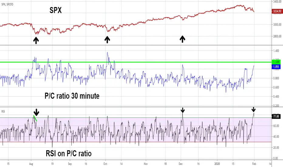
Watch 30 Minute PC Ratio for Possible Buy SignalMy previous post noted the SPX has over the last several months a very reliable 42 trading day cycle of bottoms. The next cycle bottom is due on 2/4/20. Periodic cycles can have leeway, in this case a leeway of two trading days is acceptable, so its possible an SPX bottom could be in place on 1/31/20. If not, watch the 30 minute P/C ratio - chart symbol PC.
Investors Business Daily uses the PC level of 1.15 as an alert for possible bottoms. The two largest SPX corrections on the chart illustrate that when PC goes above 1.15 bottoms can form.
On 1/31/20 the RSI on the PC Ratio hit its highest level since the tiny 12/3/19 bottom which is evidence that an SPX bottom could already be in place. However the PC ratio could continue to rise above 1.15 with the RSI diverging against the high it made on 1/31/20.
Be on alert February 3rd to the 6th, if the SPX goes below its low made on 1/31/20 with a PC ratio above 1.15 it could be a fantastic opportunity to go long stocks.
Mark
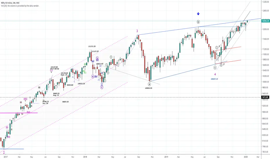
NIFTY50...New High`s! What to expect?Hello Traders
NIFTY50 closed the week @ 12352.35 and moved above last weeks high, which was a „hammer-candle“ and it is bullish. Any price action below the hammer´s candle low @ 11929.60 open the door to much higher price still, `cause a hammer candle reflects 3-5 weeks (at this case) of advancing price. This weeks high touched the upper rising trendline, blue, and closed above the high of last week's candle. So, a pop above 12389.05 is the door opener for new ATH in the coming days and weeks.
Let us consider the a/d-ratio as per Friday`s close, it was just tame @ 1.03 for the NSE
www.traderscockpit.com ! I think this ratio is important to watch. Because a nearly flat ratio at a new ATH is not what I like to see at this point.
The TRIN popped this week to 3.202 (Friday) and indicates possibly overwhelming optimism for advancing price! If so, such behavior at this point at chart will alert us for a possible correction at a larger degree, maybe more.
For now, there is no such sign to observe, but as always. Nobody will knock at your door and tells you:“..Hey, a crash is just around the corner“!
Always expect the unexpected and be patient these days.
At the 2-hour chart, you will observe price action at or close above the rising red trendline, that connects the late October 2018 low and the mid-February 2019 low. Price popped on January 9 above the line and holds above this line since then. So, any trading above is bullish, while a correction has to end 12027 on a daily basis (closing price) at a minimum. As you know „round“ numbers as the 12K level often act as a magnet for price. Note this!
On the other hand and as before. `Cause of the weekly hammer-candle a phase of 3-5 weeks of advancing price is possible, as long as the low of the candle @ 11929.60 is valid. A close below this area is a failed buy-signal and these are more often than not a good sell-signal.
Keep that in mind.
Have a great week...
ruebennase
Feel free to ask or comment.
Trading this analysis is at your own risk!
XRP/BTC Start of Altcoin SeasonHey traders, today we're looking at XRP/BTC ratio chart. First off, it's pretty obvious that an altcoin season is underway. The Bitcoin dominance has peaked at around 72% and is having a hard time breaking back over support at 69. Meanwhile, all of the alts have slowly but surely been gaining satoshi value, and that isn't just going to reverse anytime soon.
Take a look at the 1st and 2nd wick on this chart, those wicks marked the absolute bottom of the market. It's delusional to think we're going back down there. XRP/BTC has also regained support of it's long term uptrend stending from ALL of the previous altcoin season run-ups.
The wedge I drew is basically just a resistance line at 3292 sats, confirmed uptrend from the 2nd wick. Just take a look at how the candlesticks interact with all of the lines I drew, trading really is just clockwork.
Now with the price of XRP/BTC, this week I don't expect a huge move from either coin, actually don't expect anything until the start of the new monthly candle in November. If anything, we could see a retest of the 4H hold or even the topside of the wedge at 3292 sats.
All I know is, we're not going back down to touch the monthly all the way at the bottom. Possibly not even touching that long term uptrend until the bottom of the next cycle. This coin is actually about to pop off very soon, it's just a matter of time before it does.
Nothing breaks a yearly long downtrend and has no price movement. We're going to see something crazy..
Every single time the XRP/BTC chart has looked like this, we've seen a rocket shooting the price up within weeks. I don't think this time should be any less different, history repeats itself.
As always, do your own research, I am not a financial advisor.

BTC.Divergence Hypothesis.Version 4.UpdateThis Divergence hypothesis is just that, a HYPOTHESIS looking at the Daily RSI chart pattern and what or how it develops (not to be taken seriously).
However saying that, today, I looked at the RSI more closely and found some fluency in the pattern\s. Interesting at that.
Guessing what will come is just that, but the historical formation with both price and RSI pattern gives good insight. Its interesting and possible can help us to look at specific things as time goes by, leaving a clues as to how it will behave in the future.
For now, it doesn't help with the daily trading but I think it gives us something to keep an eye out.
Note: Moving beyond today, these red arrows indicate the bottom <<"SUPPORT" >> of the future support\resistance movement. Not the top lines.
Also NVT and RVT Ratio helps in some way to identify tops and bottoms. Right now, I believe we have more to the down side at the micro level within the formation
Looking at the RVT ratio chart, historical support level gives us a clue
charts.woobull.com
RSI Daily Chart
BULLISH RSI Daily Chart Hypothesis
Cheers,
S.Sari
Previous Posts
Version 3
Version 2
Version 1
Platinum Looking to Join Gold / Silver RallyPlatinum looks like bulls have finally stepped in.
It has been consolidating within a $150 range for over a year.
The blue dashed line in a trend-line connected from the all time low in 2008.
The Gold /Silver ratio recently started to reverse. This could indicate that gold is being perceived as "expensive" compared to related metals. I have no reason to think why platinum would be excluded from this class.
There are a couple more resistance areas (marked on the chart), but we could see a decent run in once price breaks above these levels.
I have a couple ratio charts that I will post along with my interpretation of what they are telling us.
I will post the weekly chart in the comments just to show the potential upside if price returns to historical levels.

The REAL Bitcoin market structureEarlier today, I saw a chart of the BTCUSD/SPX chart on twitter. The structure of that chart is more accurate than the original BTCUSD chart.
And then I tested it by the same methodology but this time on SHCOMP (SSE Composite Index which is the Chinese stock market index).
The final formula is BITSTAMP:BTCUSD*FOREXCOM:USDCNH/
Here is where the magic happens:
This ratio chart shows a precisely clear triangle structure in 2018 and a double bottom in early 2019.
This result means that the money flow from China to the Bitcoin market leads.

ETHXBT: Scariest chart ever...I set an alert here to monitor this chart, if $ETHBTC were to fall below 0.02405, things could turn from bad to worse in the ratio chart.
I'm currently long $ETHUSD, and waiting to exit in profit, and I think at one point during July we may get a retracement in crypto markets accross the board...I also think $ETHUSD can confirm a monthly uptrend during July, so I will carefully watch how chart patterns and sentiment evolve over time from here onwards. We need to be aware of this trend signal in the monthly ratio chart as well...positioning of crypto portfolios might be better off if there is exposure to $BTCUSD, and not only alts (even though $ETHUSD will likely perform well).
This chart shows the doomsday scenario for altcoin holders, where NO single altcoin beats $BTCUSD ever again...IF this trend signal confirms, odds of that happening will be 70%, for as long as price doesn't go back up, and above the levels specified on chart. USD wise we can make profits in alts, specially in solid ones like $ETHUSD, but they might end up falling short compared to $Bitcoin. Since most people have been stuck on long alt positions since 2017 (where altcoins surged like never before), this chart signal actually working is a very real contrarian scenario.
Keep this in mind...
Best of luck,
Ivan Labrie.

MARKET LONG (SPY)This is a spy/tlt ratio chart. It shows relative strength of market vs bonds. Clearly bullish market (SPY) at this point, even if I don't see how I listen to the chart and I'd be and am long this chart.

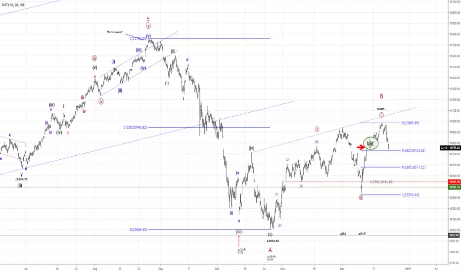
NIFTY50...Wave "B" done or up to new highs?Hello Traders,
I wish you merry christmas and happy holiday.
As of my last analyse has gaped higher, after taking a „deep breath“ to a new countertrend high. N50 also created a „Island reversal gap“ which often indicate a change of trend.
So by observing the hourly and 15 min chart, since the high at 10985 a sharp cecline to the downside is in progress. The first countertrend from 10985 to 10880 was just retraced by 0.8 tics of the 0.786 retracement. So the odds are to favor, that as long the high at 10985 is in place, the next move is focused to the downside and will lead to an impulsiv structure.
Another pretty good view is to check the SGX NIFTY INDEX Future that too shows the strucure with overlapping waves amd a retracement just shy below the 0.618 Fibonacci.
On the longterm chart you will observe that it is poosible to count a complete „five-up“ which will lead definetly to a correction that has started at 11751.80. The drop down to 1003 is either wave A of this correction or it is done. To my view it is not done, because it is not clear to watch that this drop is a „three-down“! So we might had a Wave „A“ down, a „B“ up and next is „C“ down to fresh new lows. A solid break of the red trendline, that connect the lows from 2008-10-13 @ 2252.75 and 2016-02-29 @ 6825 will a first hint that the wave C down is underway. It is to early to call a price target for such a drop but a possible range could be at 8710. More bearish potencial exist!
On the short term view, price have come back to a 0.382 Fibonacci from 10333-10985. This level is often an important one and will show some reaction by traders and investors. It is quite possible that price will bounce for some hours to correct this drop.
As long as the high at 10985 is not exceed the focus is to the downside. A sizeable targetzone is around the 10582, a 0.618 Fibonacci.
A solid close below the 10473 will increase the odds for a ongoing decline in N50 while a solid cross above the level of 10880 will eliminate the bearish idea of an impulsiv structure, `cause we will get a „wave cut“ and indicate an a-b-c move, so the next push will be to the upside.
The graph below the analyse show you the TRIN (Arms Index) which is often use as an indicator for oversold/overbought levels. There is nothing to observe that show some extraordinary conditions.
www.traderscockpit.com
Just a quick look to the „option chain“ shows some interesting position in case of OI for N50! There is a huge OI around the 10K area which possible will lead N50 to a sharp decline within the next days or weeks, because investors will do „everyhing“, sooner or later, to get there positions „into money“! The Put/Call-Ratio (Dec 27, 2018) for NIFTY IT shows a Ratio of 2 that suggest a bearish sentiment too.
I will update the chart if the odds have changed or a clear wave strucure is to observe.
Have a great day...
ruebennase
Beaware of shorting USDPY.The chart i have put up here is Ratio chart between US & Japan 10 year Bond price. this ratio chart has inverse correlation to $/Yen. Ratio chart which is a blue line broke down from the channel is likely to continue lower given the momentum on weekly & daily chart, which is likely to send the pair higher from here. I am also doubtful whether issue between N.K. & U.S. would actually escalate further as china is urging restraint over North Korea. Moreover the world knows about the destruction which nukes can have, but you never know as both Trump & Kim-Jong-Un are extreme minded people they can worsen the situation though.

Analysis Risk Reward ratio of entering Peercoin! PPCChecking out multiple risk/reward ratio charts
More charts to coming! :)

Vote on your opinion for the next $10 move in USOIL!I've published other charts that involve the ratio of gold to oil but this chart just "looked" like something I wanted you all to see. You can see the "relationship" that silver and crude oil have over the long haul (the last 10+ years) and how these markets move with each other.
When we look for a bull market in silver, for example, we really also need a bull market in crude oil to help it along. You don't get one without the other.
The cost of goods has fallen here and have enriched all of the consuming countries and are leaving the producing countries and companies in a dangerous position here where their ability to survive is being challenged.
The amount of debt in the energy sector will have a difficult time being rolled over with every day that oil spends down at these prices.
I'll make a ratio chart next to see how many ounces of silver it takes to buy a barrel of oil over the long term and see where we are in the relationship. Is oil too cheap here relative to the S&P500? I think so. Could it go lower still in the short term? Yes, of course. Traders could push it down further and squeeze the producers who are running short on cash. OR, we could have a supply disruption event like we saw in the 1970's where all of our assumptions could be turned upside down very quickly.
What are your thoughts? Feel free to share here.
Easier question: What direction is the next $10 move in crude oil?
I'll put an UP comment and a DOWN comment - click on AGREE of whichever one you think. (Only vote once)
Tim 11:42AM EST 11/17/2015
