EURUSD Buyers in Control After Corrective Move, Eyes on 1.1930Hello traders! Here’s my technical outlook on EURUSD (1H) based on the current chart structure. EURUSD previously traded within a strong bullish environment, supported by a well-defined rising trend line. During this phase, price consistently formed higher highs and higher lows, confirming sustained buyer control and healthy upside momentum. This bullish impulse led to a breakout above the key Buyer Zone around 1.1810, which acted as a strong demand area and structural support. After the impulsive move, price reached the Seller Zone / Resistance Level near 1.1930, where selling pressure stepped in. This resulted in a corrective pullback, with price respecting a descending resistance line, indicating a controlled correction rather than a full trend reversal. Importantly, the pullback found support back at the previous Buyer Zone, which has now been tested multiple times and shows clear acceptance as support. Currently, EURUSD is consolidating inside a tight range above the Buyer Zone, while also respecting the rising trend line from below. This compression between horizontal demand and dynamic support suggests that the market is building energy for the next directional move. The recent breakout attempt from the range indicates early bullish intent, while the structure still favors higher continuation as long as support holds. My primary scenario favors a bullish continuation as long as EURUSD remains above the 1.1810 Buyer Zone and continues to respect the rising trend line. The current consolidation appears to be a corrective pause within a broader bullish structure rather than distribution. A successful hold above support could lead to a gradual push higher, with the 1.1930 Resistance / Seller Zone acting as the first upside target (TP1). A clean breakout and acceptance above this resistance would confirm trend continuation and open the door for further upside expansion. However, a strong rejection from the Seller Zone could trigger another pullback toward demand. A decisive breakdown and acceptance below the Buyer Zone and trend line would invalidate the bullish scenario and signal a deeper corrective phase or potential range expansion to the downside. For now, market structure favors buyers, with demand holding firm and price compressing below resistance — a classic setup for a potential continuation move. Please share this idea with your friends and click Boost 🚀
Community ideas

Paypal Bottom is in ?! Long from herePayPal Holdings (PYPL) is currently trading at approximately $40.42 (as of the latest close, +1.30% on the session), marking a continuation of the multi-year downtrend from its 2021 peak of ~$310–$340.
The chart applies a Fibonacci retracement drawn from the 2021 high (~$310.16) to the post-peak low zone (~$30–$34 area projected or historical).
Price has broken below several key Fib levels in sequence:
0.618 (~$89–$105 zone, previously respected as support)
0.705 / 0.786 (~$51–$67 cluster)
Current price action is testing the deeper 0.886 retracement level near $40, aligning closely with the current close.
A notable 1st Quarter Order Block (1Q OB) is visible in the $45–$50 region (prior consolidation/support area), now acting as overhead resistance following the breakdown.
Buy now, or wait for the trendline confirmation.

$PL - RACE TO SPACE!This reported merger proposal between SpaceX and xAI, along with the broader industry moves toward orbital AI data centers, represents a bold and high-stakes strategic gambit in the escalating global AI infrastructure race. Here’s a structured analysis of the implications, motivations, and challenges.
1. Strategic Rationale: Why Merge SpaceX and xAI?
Vertical Integration of AI and Infrastructure:
By merging, Musk would create a unified entity that controls both the AI models (via xAI’s Grok) and the physical infrastructure to run them (via SpaceX’s launch and satellite capabilities). This mirrors the vertical integration seen in tech giants like Google (TPU chips + data centers + AI models) but extends it into space.
Funding and Scale:
SpaceX’s potential IPO could raise massive capital. Merging with xAI would channel those funds directly into building orbital data centers, giving xAI a unique competitive edge in computing capacity without relying on third-party cloud providers like AWS or Azure.
Synergies with Starlink:
Starlink’s existing low-Earth orbit (LEO) constellation provides a ready-made network for data relay, latency reduction, and global coverage. AI satellites could integrate into or augment this network, creating an interconnected orbital ecosystem for communication and computation.
2. The Orbital Data Center Vision: Promise and Problems
Potential Advantages:
Nearly Unlimited Solar Power: In orbit, solar panels can generate power continuously (except during brief eclipses), eliminating a major constraint of terrestrial data centers.
Free Cooling: In the vacuum of space, heat can be radiated away passively, avoiding the enormous energy costs of cooling on Earth.
Global Low-Latency Access: Orbital data centers could serve AI applications anywhere on Earth with minimal latency, especially if networked with LEO satellite constellations.
Major Technical and Economic Hurdles:
Radiation Hardening: Space radiation can degrade electronics rapidly. AI chips and memory systems need robust shielding or fault-tolerant designs.
Space Debris and Reliability: Collision risks are real. Redundancy and repair strategies (like robotic maintenance) are unproven at scale.
Launch Costs: Despite SpaceX’s reductions, launching thousands of heavy compute satellites remains prohibitively expensive for now.
Data Transmission Limits: Moving vast datasets to and from orbit requires enormous bandwidth, which could become a bottleneck.
3. Competitive Landscape: Who Else Is Playing?
Blue Origin (Bezos): Also eyeing orbital data centers, leveraging Amazon’s cloud expertise and deep pockets. Bezos has stated a 10–20 year timeline for economic viability.
Starcloud (Nvidia-backed): Already testing AI chips in orbit (Starcloud-1 with an Nvidia H100). Their modular “hypercluster” vision is one of the most concrete near-term plans.
Google (Project Suncatcher): Partnering with Planet Labs for prototype launches around 2027, using custom TPUs.
China’s “Space Cloud” Plan: State-backed effort to deploy AI data centers in space within five years, indicating this is now a geostrategic priority.
The race is no longer just about building better AI models—it’s about securing sovereign control over the next-generation computational infrastructure.
4. Musk’s Timetable: Ambitious or Overoptimistic?
Musk claims space will be “the lowest-cost place to put AI within two years, three at the latest.” Most experts and rivals see this as extremely aggressive.
Deutsche Bank’s forecast (small-scale deployments in 2027–28, scaling in the 2030s) aligns more closely with industry consensus.
The challenge isn’t just launching one satellite with an AI chip (Starcloud already did); it’s deploying hundreds or thousands of them reliably and cost-effectively.
5. Broader Implications
AI Nationalism and Security: If orbital AI infrastructure becomes viable, it could redefine global tech sovereignty. Nations may seek to control their own orbital compute clusters for security and economic advantage.
Environmental Impact: Could reduce terrestrial data centers’ energy and water usage, but might increase launch activity and space debris.
Market Disruption: Companies that master orbital AI infrastructure could undercut terrestrial cloud providers on cost and performance, reshaping the $1T+ cloud computing market.
Conclusion
The reported SpaceX-xAI merger is less about immediate AI model competition and more about positioning for the next frontier of computing itself. Musk is betting that the future of AI scalability lies in space, and he wants to own both the rockets and the AI that runs on them.
While the engineering and economic hurdles are immense, the breadth of investment—from Musk and Bezos to Google and China—suggests this is more than science fiction. It may well become the next great infrastructure battleground of the 2030s.
The key questions remain:
Can radiation-hardened, high-performance computing be reliably deployed at scale in orbit?
Will launch costs fall enough to make this economically viable?
Who will establish the first mover advantage—and will it be decisive?
For now, the race to build the AI backbone in space is officially on.
Bitcoin Back Above $70,000. Here Are Key Levels to Watch NowA trip to $60,000 and back before coffee.
Bitcoin BITSTAMP:BTCUSD spent the end of last week doing what it does best: reminding traders that fire-breathing dragons aren’t in fairytales only.
After a sharp drop to $60,033 on Thursday torched thousands of long positions, the world’s largest cryptocurrency bounced hard. By Friday, it had clawed its way back above $70,000. Still, that dip was the orange coin’s lowest level since October 2024 and roughly 52% below last year’s record of $126,000 .
By Monday morning, Bitcoin looked almost calm. It hovered around $70,700, barely changed on the day. The contrast with last week’s price action felt dramatic. Bitcoin rarely travels in straight lines, and this was another reminder.
🤔 Buy the Dip or Declare It Gone?
As always, opinions split fast. Some traders rushed to declare Bitcoin’s demise (for the 463th time – there’s a website for that ). Others quietly loaded up, calling the move a classic paper-hands shakeout.
Markets, by nature, lean optimistic. The real question is whether optimism has enough fuel to pull Bitcoin out of its recent slump and into a renewed upside phase. The bounce has been impressive, an 18% upswing, but conviction remains fragile.
🌪️ Volatility Is a Feature, Not a Bug
Extreme volatility comes with the territory. Bitcoin’s slide from a $126,000 peak in October arrived despite a crypto-friendly White House and accelerating institutional adoption.
For some investors, that raised uncomfortable questions about Bitcoin’s role during periods of geopolitical stress.
Digital gold? Perhaps. Perfect hedge? That debate remains open.
🧊 The Market Finds Its Feet, Carefully
The broader crypto market has stabilized, though nerves remain close to the surface and Bitcoin still commands the lion’s share, according to the dominance chart . Traders describe the tone as cautious rather than confident. Or every analyst’s favorite expression: cautious optimism.
One level stands out on everyone’s chart. The $60,000 threshold has emerged as the primary near-term support. It marked the floor of last week’s selloff and remains the line bulls prefer not to revisit anytime soon.
On the upside, $75,000 carries symbolic weight. A sustained break above that zone would strengthen the case that the worst of the bear phase has passed and that buyers are regaining control.
📈 Institutions Quietly Step Back In
While price action grabbed headlines, flows told a quieter story. US Bitcoin exchange-traded funds recorded $221 million in inflows on February 6, suggesting that some investors viewed the selloff as an opportunity rather than a warning sign.
Institutional participation tends to move slowly and deliberately. These flows do not guarantee higher prices, but they add some confidence during moments of stress. For a market built on confidence, that matters.
🧮 The Levels That Matter Now
If Bitcoin is serious about $70,000, attention turns to a handful of technical levels that traders are watching closely.
But before that, let’s talk about the 200-week moving average near $58,000, a level Bitcoin respected during the recent dip. Holding above it keeps the longer-term structure intact.
Next sits the $73,000 to $75,000 zone, an area packed with prior support and resistance. Clearing it convincingly would signal momentum shifting back toward the bulls.
Beyond that, the path opens toward $81,000, a level that could act as the next magnet if sentiment continues to improve.
Again, that is if the OG coin manages to reel itself out of the sub-$70,000 area. The bounce from $60,000 reminded traders that sharp selloffs often attract bargain hunters and dip scoopers.
Off to you : So where do you stand right now? Are you holding your Bitcoin, exploring alternatives, or watching from the sidelines? Share how you are navigating this market in the comments.

An At Market & Future Trading Opportunity on GOLDWhat’s Really Going On With Gold?
Gold took a sharp hit to close out last week—but let’s keep things in perspective. This market has been on a massive bullish run, and after a move like that, consolidation isn’t a surprise… it’s normal.
Barring any unexpected geopolitical headlines, the most logical next phase for gold is a pause. And pauses are where some of the best advanced pattern opportunities tend to show up.
A Potential Setup Forming
Dropping down to the 4-hour chart makes things clearer & immediately puts a bat pattern on the radar.
Something Already in Play
If you’re looking for a setup right now, gold has already completed a bearish cypher pattern near the end of last week. Price is currently trading inside the cypher completion zone, which helps explain the recent hesitation and chop.
If you have any questions, comments or want to share your ideas, please do so below!
I wish you guys a great trading week ahead!
Akil

RIOT: Looking for bottoming formationThe overall equity and crypto market crash didn't do any favor to RIOT stock. Despite a lot of good things happening for the company, the short-term headwinds are propelling much of the selling. The rapid selling across the markets has a strong signature of capitulation. Which means, I am now looking for bottoming characteristics to go back in RIOT.
EW count suggests we should have wave 3 of 3 of C complete or near complete. This is usually the strongest part of selling. If we get a consolidation soon for a few days, that will make a strong case for wave 4 and we should see the finishing move with divergences on indicator and sharp reversal soon after. Will look for a turnaround somewhere between $10 and $8. $6.2 cannot break. If that is breached, then RIOT is in a world of hurt.
However, the bottom forms now, I would like to wait to see 5 waves move up. Then on the retrace of that move, the risk to reward would be much better and adding a stop loss should be much clearer. I'd say, time to buy is coming up by the end of February/early March, or maybe sooner.

This Isn’t a Reversal — It’s Only Phase Two. $BTC>65k Thank you for your attention! This is exactly what you've been hearing since September 2025. Next, we'll form the bottom, and reaccumulate until October.
A smart person told me to stop posting publicly. Make everything private, but I continue to publish my thoughts for you.
There are no entry points for positions here; my positions are elsewhere.
I accidentally made a private post yesterday
Right now, it’s still too early to talk about any meaningful reversal. We’re not in a recovery phase - we’re in phase two of the market cycle, and this phase tends to last longer than most expect. The structure is forming exactly as it should: slowly, unevenly, with pockets of stress that haven’t fully played out yet.
Bitcoin is dropping, but for me there’s nothing surprising in this move.
If you’ve been following my posts for a while, you know this scenario was not only possible
— it was highly probable. We’ve already reached the first target zones I highlighted earlier, and the market is now moving toward the deeper structural points that complete this segment of the cycle.
There are still shocks ahead, and the system hasn’t finished recalibrating.
This is not a trend market — this is a regime market. And regime markets demand patience, discipline, and the ability to read liquidity, not headlines.
2026: A Year of Market Regimes
2026 feels like a year defined by regimes, not direction.
This is a market that punishes overconfidence and rewards discipline: managing leverage, staying patient, and understanding liquidity matter more than any narrative.
Liquidity today behaves like a system of pipes. Sometimes the taps look wide open, yet the internal pressure shifts so fast that trends break long before the crowd can explain the move with headlines.
In these phases, Bitcoin behaves not like a “legend”, but like the most liquid proxy for risk:
under stress, it’s the first asset sold because reducing exposure through BTC is the easiest and fastest way.
This leads to a key insight:
Even during superficially “risk-on” news cycles, BTC can underperform when several forces align:
- rising demand for USD (dollar squeeze)
- carry trades unwinding
- capital rotating into leading sectors (metals, indices)
- portfolios cutting risk and closing leverage
Three Structural Scenarios for 2026
I avoid guessing levels; instead, I work with structural patterns. For 2026, I see three core possibilities:
1) Capitulation → Base Formation
A sharp washout, volatility climax, then a broad range and gradual base building.
2) Rallies Within a Larger Downtrend
Strong upside moves that turn into distribution.
The market gives hope — and takes it back on retests.
3) Macro Shock
An event in FX, rates, or liquidity triggers fast deleveraging.
Moves overshoot, correlations spike, and a violent mean reversion follows.
This is why my approach now is very simple:
fewer trades, higher quality.
I’m deliberately reducing the number of positions and focusing only on moments where structure provides a clear edge — because in years like this, capital is preserved not by activity, but by the right pauses.
About the Academy
In parallel, I’m updating my Academy in real time: weekly materials, market structure breakdowns, liquidity updates, USD dynamics, and risk indicators.
The access is open and free — anyone can stay aligned with the current regime without noise.
Current Market Structure
Looking at today’s structure, the market is forming precisely the segment I expected.
The key volume level ahead remains intact, and with high probability, price will break through it. Only after that expansion may we see the formation of the first real leg of the next cycle.
The conservative zones I mentioned earlier remain valid. More negative scenarios exist, yes — but the underlying logic does not change:
Accumulate gradually — on fear, liquidations, and liquidity distortions.
The main zone is very close, and that is where, in my view, the most interesting continuation setup will appear.
Best regards EXCAVO
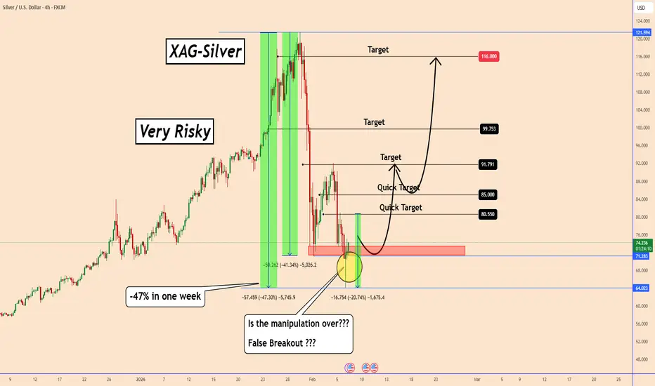
Silver: From -47% to Bullish Momentum: Silver’s Chaotic WeekSilver: From -47% to Bullish Momentum: Silver’s Chaotic Week
In the first sell-off that silver experienced, the price fell by almost -40%.
After a correction these days, we saw silver move lower overnight creating another structural low.
Just yesterday, silver fell by almost -21%, adding to the biggest drop a correction value of almost -47% in just one week.
Why all this mess, when nothing has changed from a geopolitical perspective.
(Just manipulation by those who created the big bullish wave - My opinion and I don't expect everyone to agree with it)
On the 4-hour chart, the price created a possible false breakout and today silver is resuming the bullish move again as shown in the chart.
However, the bullish move is related to the US-Iran talks. If they don't reach an agreement, silver could probably skyrocket again.
If the US and Iran reach an agreement over the weekend, we could see the markets calm down and perhaps silver could also fall further.
However, this is related to the news in this analysis, but remains bullish and highly manipulated. A bullish wave can happen in the same way as a bearish wave too without any clear idea why. In the same way as it moved down.
You may find more details in the chart.
Thank you and good luck! 🍀
❤️ If this analysis helps your trading day, please support it with a like or comment ❤️
Oracle - The worst drawdown ever!💣Oracle ( NYSE:ORCL ) will ends its bearmarket soon:
🔎Analysis summary:
Over the past five months, Oracle has been correcting more than -60%. And while we can clearly witness a major selloff, Oracle is also approaching a major support area. And if we see bullish confirmation in the near future, Oracle might even create new all time highs.
📝Levels to watch:
$125
SwingTraderPhil
SwingTrading.Simplified. | Investing.Simplified. | #LONGTERMVISION

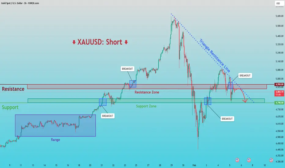
XAUUSD: Breakdown & Retest Signals Bearish ContinuationHello everyone, here is my breakdown of the current XAUUSD setup.
Market Analysis
XAUUSD previously traded within a well-defined consolidation range, where price moved sideways for an extended period, indicating balance between buyers and sellers and gradual liquidity accumulation. This range eventually resolved to the upside, triggering a clean bullish breakout and a strong impulsive rally. Following the breakout, gold expanded higher aggressively, confirming bullish intent and attracting momentum buyers. However, after reaching the upper highs near the peak of the move, bullish momentum began to fade, and price formed a clear swing top.
Currently, XAUUSD is trading below a key Resistance Zone around 4,950, which previously acted as support but has now flipped into resistance. Several breakouts above this zone failed, suggesting lack of acceptance and strong seller presence. At the same time, price recently broke below the descending triangle support and is attempting a weak pullback toward the broken structure — a classic bearish retest scenario.
My Scenario & Strategy
My primary scenario favors a short continuation, as long as price remains below the descending triangle resistance line and below the 4,950 Resistance Zone. The recent breakout attempts above resistance appear corrective and liquidity-driven rather than signs of a trend reversal. As long as these levels cap price, rallies are viewed as selling opportunities rather than bullish continuation signals. From a structural perspective, the market is transitioning from a bullish expansion phase into a broader corrective or distribution phase. The loss of higher highs and repeated rejections from resistance support the bearish case. The first downside objective lies near the 4,790 Support Zone, which represents a key demand area and a prior breakout level. This zone is expected to act as the first major target where buyers may attempt a reaction. If price reaches the support zone and shows strong rejection or consolidation, a temporary bounce is possible.
However, a clean breakdown and acceptance below 4,790 would confirm bearish continuation and open the door for a deeper move toward lower demand areas. The short bias remains valid as long as price stays below resistance and the descending structure remains intact. Any strong breakout and acceptance above the triangle resistance and the 4,950 zone would invalidate the short scenario and shift focus back to bullish continuation. Until then, structure favors sellers.
That’s the setup I’m tracking. Thank you for your attention, and always manage your risk.
Is Overtrading Holding You Back? Or Why Less Is MoreMany traders think that activity means productivity. More charts, more clicks, more trades… more monitors?
The day feels productive when something is always happening (ref: the economic calendar ). The sense of participation feels rewarding.
This mindset forms early. And it’s normal — markets stay open across time zones and social feeds reinforce the idea that opportunity lives in constant motion. It becomes easy to believe that frequent action leads to faster learning and better results.
Markets, however, reward decision quality far more than decision quantity.
🤑 The Market Never Sleeps, but Your Edge Does
Markets offer endless movement all across the macro board . Stocks trend, currencies oscillate, crypto trades through weekends, and futures light up overnight. Availability creates temptation. But it also creates a false sense of urgency. And that can lead to overtrading.
Overtrading emerges when availability replaces selectivity. The presence of movement becomes enough reason to participate. Over time, that shift erodes consistency.
📉 How Trade Frequency Dilutes Quality
As trade count increases, standards tend to loosen. Entries happen at random points. Rationales fade and vague ideas begin to qualify. (Why not buy silver OANDA:XAGUSD at $120?)
This process rarely feels reckless. It feels adaptive. The trader remains engaged, yet the edge spreads thinner with each additional position. Performance suffers through gradual dilution rather than sudden failure.
🧮 Why Fewer Trades Improve the Math
Every trade carries friction. Spreads, swaps, slippage, fees, and mental effort accumulate with frequency.
When trades are selective, friction affects fewer outcomes and higher-quality setups offset costs more efficiently.
Many traders improve results by removing their weakest trades rather than adding new tools. Fewer decisions often lead to stronger averages.
🧘 Learning to Sit with Inactivity
Periods without trades feel uncomfortable at first. But with time, perspective shifts and missed trades reveal themselves as avoided losses. Market clarity improves without pressure to act.
After all, you’re not a hedge fund (yet) and you’re not obligated to produce quarterly results for your clients (ok, fine… yet). You don’t need the pressure to act.
Sitting on your hands becomes a skill rather than a weakness. Many traders identify this transition as a turning point in their development.
Here it from the legend himself:
“I began to realize that the big money must necessarily be in the big swing.” - Jesse Livermore.
📊 Cleaner Data, Better Reviews
Fewer trades create clearer feedback because patterns stand out and mistakes become easier to diagnose. What’s more, you can do a much better homework on one or two trades a month than 30-40 trades.
On the flipside, overtrading floods review processes with noise. Selectivity produces cleaner datasets and more actionable insights.
Improvement accelerates when analysis focuses on quality rather than volume.
🎯 Why Less Is More
And here’s why less is more. When you trade less, you do more intentional participation.
It involves waiting for familiar conditions, accepting missed moves, and treating restraint as a form of risk management.
The objective centers on precision rather than presence. The goal here is to last to see another day, because markets will be there tomorrow, offering another chance to pick up a profit.
Again, overtrading often feels productive. Screens stay active and effort remains visible. Markets, however, reward patience, clarity, and selectivity. If the “more is less” concept sounds as distant as “cut losses, let profits run,” worry not — it gets easier.
“It never was my thinking that made the big money for me. It always was my sitting. Got that? My sitting tight!” - Jesse Livermore.
Off to you : How do you approach your trades? Are you the active trader seeking out daily moves in multiple trades or you take a broader view with less time spent in and out of positions?

FTSE100 Breakout supported at previous consolidation zoneThe FTSE remains in a bullish trend, with recent price action showing signs of a breakout within the broader uptrend.
Support Zone: 10340 – a key level from previous consolidation. Price is currently testing or approaching this level.
A bullish rebound from 9490 would confirm ongoing upside momentum, with potential targets at:
10450 – initial resistance
10490 – psychological and structural level
10550 – extended resistance on the longer-term chart
Bearish Scenario:
A confirmed break and daily close below 10340 would weaken the bullish outlook and suggest deeper downside risk toward:
10307 – minor support
10250 – stronger support and potential demand zone
Outlook:
Bullish bias remains intact while the FTSE holds above 10340. A sustained break below this level could shift momentum to the downside in the short term.
This communication is for informational purposes only and should not be viewed as any form of recommendation as to a particular course of action or as investment advice. It is not intended as an offer or solicitation for the purchase or sale of any financial instrument or as an official confirmation of any transaction. Opinions, estimates and assumptions expressed herein are made as of the date of this communication and are subject to change without notice. This communication has been prepared based upon information, including market prices, data and other information, believed to be reliable; however, Trade Nation does not warrant its completeness or accuracy. All market prices and market data contained in or attached to this communication are indicative and subject to change without notice.

MNQ Daily Analysis - Tuesday February 3 2026 part 1As a learning, beginner day trader I go through the market replay predefining what I am looking for to enter a trade and walk through my thoughts as I experience the market action bar by bar throughout the entire day to see how I handle various events and assess my execution.
This is for me and others to learn if you desire.

Why the Same Strategy Performs Differently in Crypto and ForexMany traders experience the same frustration. A strategy shows consistency in one market and breaks down in another. The instinctive reaction is to question the rules, indicators, or entries. In most cases, the strategy is not the problem. The environment is.
Crypto and Forex operate under very different structural conditions. Crypto trends tend to expand faster, with sharper volatility and deeper intraday swings. Liquidity is thinner, order books change rapidly, and price frequently overshoots levels before stabilizing. Forex moves more slowly, with deeper liquidity and more controlled reactions, especially during active sessions.
These differences change how a strategy behaves in practice. Stop placement that works well in Forex can be too tight for Crypto, where routine volatility regularly exceeds technical boundaries. Profit targets that feel conservative in Crypto may be unrealistic in Forex, where expansion unfolds more gradually. The logic of the setup remains sound, but the execution parameters no longer match the market.
Time also plays a role. Crypto trades continuously, meaning trends can develop at any hour and extend without the pauses created by session boundaries. Forex activity is concentrated around specific windows, and strategies often perform best when aligned with those periods. Running the same rules outside their optimal timing reduces effectiveness.
Risk sequencing further amplifies these differences. In Crypto, clusters of volatility can create rapid drawdowns even when the strategy remains statistically valid. In Forex, losses are often more evenly distributed, allowing smoother equity curves. Traders who do not adjust position sizing or expectations misinterpret this as inconsistency.
Successful traders adapt execution while preserving logic. Entry criteria, risk models, and trade management evolve to fit the market’s structure. The strategy stays the same. The application changes. Understanding this distinction is what allows traders to remain consistent across asset classes rather than constantly searching for something new.

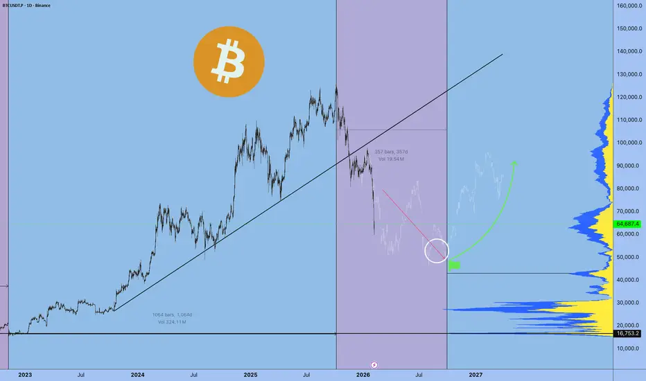
BITCOIN and the powerful Stoch RSI Cycle SignalThe Stoch RSI is a very rarely used indicator, in fact the last time we made use of it on Bitcoin (BTCUSD) was around the bottom of the 2022 Bear Cycle. We bring it forward to you once more as December closed with the 1M Stoch RSI below the 20.00 level. Historically, every time the market did that, BTC's new Bear Cycle had already started but it was still in its beginning.
You can see that during the majority of each Bear Cycle, the 1M Stoch RSI settled sideways below the 20.00 mark and when it broke back above it, the new Bull Cycle had already started. The time distance between those signals during the last two Cycles has been just over 1 year (13 months, 396 days). This suggests that by January 2027, BTC's new Bull Cycle will already have started most likely.
As to a potential bottom? The strongest candidate is the 3W MA100 (red trend-line), which has been hit during all previous three Cycles. That is currently around $53000 and rising, so we expect BTC to hit at least this level before a Bear Cycle bottom around October 2026. Additionally, the Mayer Multiple Bands (MMBs) green Zone, offers a Buy Zone, which priced the November 2022 bottom.
So what do you think? Is this Stoch RSI signal useful in your long-term positioning? Feel free to let us know in the comments section below!
---
** Please LIKE 👍, FOLLOW ✅, SHARE 🙌 and COMMENT ✍ if you enjoy this idea! Also share your ideas and charts in the comments section below! This is best way to keep it relevant, support us, keep the content here free and allow the idea to reach as many people as possible. **
---
💸💸💸💸💸💸
👇 👇 👇 👇 👇 👇

GBPNZD - Two Magnets, Two Clear JobsGBPNZD is trading between two zones that keep acting like magnets:
On the upside, the red structure has been attracting price again and again. Every time price reaches that area, sellers show up. As long as that structure holds, that’s where I’ll be looking for shorts.📉
On the downside , the blue demand zone keeps pulling price back in. That’s where buyers previously stepped in with strength. As price approaches that zone, I’ll be looking for longs.📈
For now, we wait!⏱️
Which magnet do you think price hits next? 🤔
⚠️ Disclaimer: This is not financial advice. Always do your own research and manage risk properly.
📚 Stick to your trading plan regarding entries, risk, and management.
Good luck! 🍀
All Strategies Are Good; If Managed Properly!
~Richard Nasr

Intuit and Netflix. The Danger of Broken TrendsIntuit and Netflix. The Danger of Broken Trends
Momentum is the most powerful force in physics and finance but when an object in motion suddenly stops the impact is catastrophic. We often assume trends last forever yet the moment a multi year structure fractures it triggers a violent repricing event known as a liquidation cascade. This is not just a dip. It is a structural failure.
Observe the massive channel on Netflix .
This structure guided price for over a decade creating a psychological safety net for investors. Every time price touched the lower rail buyers stepped in with confidence. But look at the breakdown. The moment price closed below that ascending support the character of the asset changed instantly.
When a long term trendline breaks it traps years of volume above the current price . Every investor who bought the dip during the ascent is now underwater. Their rush to exit creates a supply imbalance that can lead to legendary drops . The market mechanism shifts from accumulation to distribution and the floor becomes a resistance.
We see a similar ominous setup developing on Intuit .
The chart respects a 22% annual growth line which has acted as a distinct line in the sand for institutional support. A violation of this level is not merely a technical signal. It suggests the fundamental thesis of the company is being re evaluated by the market.
Patterns like this rarely fail without consequence. If Intuit cannot reclaim this trendline quickly the probability of a deep correction increases exponentially. The previous support level of $550 now looms as a formidable barrier.
The nuance here is critical.
🤔 A broken trend does not guarantee a crash but it invalidates the bullish thesis.
The smart money does not argue with the tape. We wait for confirmation . If price remains below these broken structures we assume the trend has reversed. We do not catch falling knives.
We wait for the dust to settle and new structures to form. Like the Double Bottom in AMEX:GROY after a large channel decline!
👇 WANT MORE?
🚀 Hit the rocket, read my profile and follow so we can find each other again.

The Simplest Trading Strategy Nobody Talks AboutOpen charts. Open six timeframes. Start “analyzing.” and end up more confused than when you started. Daily, 4H, 1H, 15M, 5M, even M1… and somehow you still missed the real move?
Its because, you are looking everywhere and nowhere at the same time.
Problem is not having a simple repeatable plan, so you keep searching for certainty. And the more you search, the more anxious you get. Then you start trading feelings instead of data.
Here is a clean and simple framework which allows you check the charts once per day at 9:30 Same process. Same trigger. Same execution.And most importantly: if the market doesn’t do what we waiting for, you don’t trade. Period. No more stress guess work and wasted time on computer.
🧪 Daily Sweep (manipulation)
Levels to Watch - Daily highs / Lows
Execution Timeframe - M15 / M5 / M3
Confirmation: CIOD - M15 / M5
SL Placement: Above / Below manipulated H/L
Target: fixed 2R - No overthinking 2R and get out.
Instruments: NAS100, US500, US30, GER40
Trading time : 9 - 11 CET 💢 This structure removes all the subjective decisions we traders love to make:
No more “maybe it’ll reverse here.”
No more “I think it looks strong.”
No more hunting entries for hours.
🧪 The whole concept is built around three steps:
1. Direction (Daily Bias)
2. Manipulation (Liquidity)
3. Execution (Rule based + fixed target)
🧩 Step 1: Daily Bias
It's not just random buying and selling daily highs and lows. It has to go with the daily / weekly bias based on the liquidity. It's not dificult. Just look how Daily Candles are closing and follow it. I will explain it below.
⁉️Where is the liquidity ? Always follow the Daily / Weekly candle close.
📈 Continuation
If todays daily candle closed above previous days high and its still not reaching the key level, then liquidity is above todays high. Why ? Because people have intentions to sell highs to early, so and price will most likely go there. So we are bullish. Bullish Close 📈 Reversal
If todays candle wicked above previous day high, but closed below , then we can expect liquidity is below Previous days low. Why? Because mostl likely traders entered fake high break out they put SL below days low. It's signs of reversal. 📌Reversal Setup
first lets have a look to the reversal. We want see a candle high being taken and closed below. In that case draw on liquidity is below the daily low. Sign of reversal. So we can position ourselves in a trade as described on the picture, wick above and close inside is not enough for the signifcant HTF reversal. But its enough for our continuation setup,
📌Continuation setup
We want to see bullish candle close above previous days high and not liquidity taken above that wick. Then we can assume that liquidity is still resting above and we want to position ourselves during the LTF reversal in the direction of the HTF liquidity. 📌 Continuation LTF reversal timing
same case now you must already see it bullish close above PDH and that high was not swept so liquidity is still above , next day is inside candle once price dips below inside candle low we cans spot reversal setup on LTF and by creation of order block we enter the position during the NY session manipulation ‼️ Remember : You’re not predicting the future.
You’re following what the market already printed.
🧩 Step 2: Wait for the manipulation of Daily H/L and rejection(
This is where most traders mess up. No manipulation - No trade. We are focusing solely to the US session it comes usually at 9:30 US time. This is only time you are looking for the setups. This prevents you form sitting by charts whole day and give you a momentum to your trades during active hours of NY session.
In other words you want see manipulation of daily Highs. / Lows around 9:30 US time. Thats your strategy. ‼️ Important detail - CIOD: you wait for the close, If it hasn’t closed back inside the range and bellow consecutive up candles that created manipulation then it’s not confirmed.A wick alone is not enough.
I don’t care how “perfect” it looks mid-candle. I want the close.
❌ No sweep, no trade
This is the rule that saves you from overtrading. If price doesn’t raid the swing level and fail, you don’t have your setup. So you stay out.
🧩 Step 3: Drop to lower timeframe only AFTER confirmation
This part changed my execution.Before, I’d bounce between timeframes all day with no reason. I’d see something on 5M, panic, jump to 1M, enter like a maniac, get stopped, then watch it run.
🧪 CIOD - Change in Order flow - Order block
A down-close candle (before an impulsive move up) that acts as the “last sell” before
Or the opposite for shorts. 🛡️ Risk Management - This is key To keep it going long therm.
🧪 Max 2 attempts.
If trade 1 loses, trade 2 uses half risk.
🧪 Your max daily loss is -1.5R
Trade 1: -1R
Trade 2: -0.5R
🧪 Time is important
If you take these setups during dead hours, you’ll convince yourself the model “doesn’t work.” Time filters are part of the strategy, not an optional add-on. 🧪 Daily Processes
1. Mark swing highs and swing lows.
2. Decide your bias for tomorrow: mainly buys or mainly sells.
3. Wait for price to sweep a prior swing level.
4. Require the close back inside the range.
5. Only then go to 5M and execute using your entry model.
6. Fixed RR. Max 2 attempts. Done.
📒 You have a checklist.
And the market either gives it to you or it doesn’t. That’s the point.
Most traders fail because they treat trading like a constant activity.
This turns it into a conditional activity. 📉 Backtesting advice (so you actually trust it)
If you want this to become real for you, don’t just read it and feel motivated.
Go chart by chart and log:
- Market bias (based on swing points)
- Was there a sweep?
- Did it close back inside the range?
- What entry model did you use?
- RR result
- Time of day
💊 After 20–30 examples you’ll start seeing it everywhere.
💊After 100 examples you’ll stop hesitating.
🎯 When you stop hesitating, you stop improvising.
🎯 When you stop improvising, you stop donating money to the market.
I promised myself I’d become the person I once needed the most as a beginner. Below are links to a powerful lessons I shared on Tradingview. Hope it can help you avoid years of trial and error I went thru.
📊 Sharpen your trading Strategy
⚙️ 100% Mechanical System - Complete Strategy
🔁 Daily Bias – Continuation
🔄 Daily Bias – Reversal
🧱 Key Level – Order Block
📉 How to Buy Lows and Sell Highs
🎯 Dealing Range – Enter on pullbacks
💧 Liquidity – Basics to understand
🕒 Timeframe Alignments
🚫 Market Narratives – Avoid traps
🐢 Turtle Soup Master – High reward method
🧘 How to stop overcomplicating trading
🕰️ Day Trading Cheat Code – Sessions
🇬🇧 London Session Trading
🔍 SMT Divergence – Secret Smart Money signal
📐 Standard Deviations – Predict future targets
🎣 Stop Hunt Trading
💧 Liquidity Sweep Mastery
🔪 Asia Session Setups
📀 Gold Strategy
🧠 Level Up & Mindset
🛕 Monk Mode – Transition from 9–5 to full-time trading
⚠️ Trading Enemies – Habits that destroy success
🔄 Trader’s Routine – Build discipline daily
💪 Get Funded - $20 000 Monthly Plan
🧪 Winning Trading Plan
⭕ Backtesting vs Reality
🛡️ Risk Management
🏦 Risk Management for Prop Trading
📏 Risk in % or Fixed Position Size
🔐 Risk Per Trade – Keep consistency
🧪 Risk Reward vs Win Ratio
💎 Catch High Risk Reward Setups
☯️ Smart Money - Who control Markets
Adapt useful, Reject useless and add what is specifically yours.
David Perk 5.png

Bitcoin - Last drop, then a huge pump! (watch this wedge)Bitcoin is currently trading at around 78,000 at the time of writing this article, and I expect the price to go down to 71k - 72k in the short term. Why? As we can see on the chart, there are many reasons why Bitcoin should go down. The first reason is that whales (banks, institutions) still didn't sweep liquidity below the April 2025 swing low. This is a huge point of interest because a lot of retail traders have their stop losses exactly below this swing low. The second reason is that the price should touch the falling wedge's downward-sloping trendline.
I think this is a pretty good opportunity to buy/long Bitcoin at these levels because also the RSI indicator is starting to be oversold. I think we should definitely see a temporary rise to 83k - 84k before eventually going lower. It depends on the falling wedge pattern - will bulls be strong enough to break out of this pattern? We will see, but right now, we want to buy this strong support of 72k!
This is my plan for the next weeks. Right now I expect a drop, but soon we should see a pretty strong rebound. If you watch my previous ideas and you are my follower, you probably know that Bitcoin will go down even lower this year, probably below 60k! So, I am not recommending buying any altcoins whatsoever. We may see some interesting gains in the short term, but in the mid-term altcoins are still bearish. A good opportunity to buy altcoins would be in October 2026, but we still need more data to confirm this bias.
Write a comment with your altcoin + hit the like button, and I will make an analysis for you in response. Trading is not hard if you have a good coach! I am very transparent with my trades. Thank you, and I wish you successful trades!

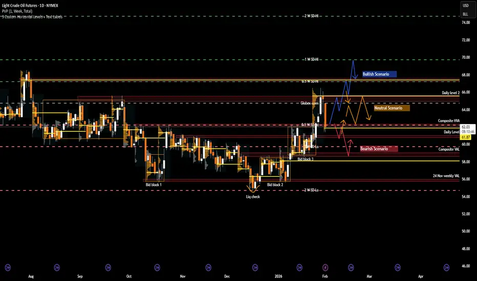
CL: Crude Oil at a Crossroads as Geopolitics Meet Key LevelsRecent Sentiment and Key Headlines Driving Crude
Crude oil sentiment over recent weeks has been shaped by a renewed mix of geopolitical risk and shifting expectations around global supply discipline. Headlines tied to Venezuela and Iran have been particularly influential, adding a layer of risk premium back into the market after a prolonged period of bearish positioning.
In Iran, renewed domestic unrest has been a notable catalyst. Protests that emerged in late December were initially sparked by economic pressures, including currency weakness, elevated inflation, and deteriorating living standards. As demonstrations spread across several major cities, concerns shifted from purely domestic stability toward potential implications for energy production and exports. While Iranian crude flows have not seen immediate disruption, the market has reacted to the increased uncertainty around enforcement of sanctions, internal security priorities, and the broader risk of escalation in an already fragile region.
Venezuela remains another key variable. Ongoing questions around sanctions compliance, export licenses, and the sustainability of recent production gains have kept traders cautious about assuming incremental supply will remain consistent. Any tightening of enforcement or breakdown in negotiations could quickly alter expectations, particularly given the market’s sensitivity to marginal barrel availability.
Beyond geopolitics, crude continues to trade against a mixed macro backdrop. Global growth expectations remain uneven, with slowing industrial activity in some economies offset by resilient consumption elsewhere. At the same time, OPEC plus communication has reinforced a willingness to manage supply if downside pressure accelerates. Together, these factors have kept sentiment reactive and highly responsive to both headlines and technically defined levels rather than driven by a clear fundamental trend.
What the market has done
• In November 2025, the market was in a grind trend down to bid block 1, where there was a liquidity check and buyers responded by holding the 56 level.
• Since December, the market has been in a block step trend up due to improving risk sentiment, renewed geopolitical premium, and reduced willingness by sellers to press below established value.
• In the past week, the market imbalanced out of bid block 3 above the 62.4 area (the composite HVA) and rotated higher toward the 65 area at daily level 2. This move coincided with a noticeable rise in geopolitical risk premium in oil markets as tensions between the U.S. and Iran escalated. Markets were responding to reports that the U.S. was considering possible military action if Iran did not negotiate a settlement on key issues, which was interpreted by traders as increasing the chance of supply disruption in the Persian Gulf. This elevated risk pricing helped push crude higher into the 65 area as participants priced in the possibility that instability could affect exports or shipping routes through the Strait of Hormuz. During the same period, there were also reports that Iran had announced live-fire exercises in the Strait of Hormuz, a key oil chokepoint, reinforcing those risk premiums even though no actual supply disruption occurred. The combination of geopolitical headlines and elevated risk appetite drove sellers to defend higher levels only after the initial breakout, leading the market back down toward 62.5 where responsive orders re-entered.
• Sellers responded by pushing price back down toward the 62.5 area, which corresponds with the weekly 0.5 SD low, signaling responsive selling rather than initiative downside continuation. This pullback was supported by an easing of the geopolitical risk premium that had driven the prior breakout. Over the weekend, no U.S. strike on Iran actually took place, and comments from U.S. leadership over the weekend suggested that Iran and Washington were “seriously talking” about negotiations rather than immediate military action. These remarks reduced the acute fear of an imminent strike that had been pushing oil toward multi-month highs late last week. As a result, the risk premium priced into crude unwound somewhat when markets reopened, and prices retraced back toward the 62.5 area as traders reassessed the likelihood of a near-term supply disruption.
What to expect in the coming weeks
The 62.5 area, which marks the level where the market imbalanced out of bid block 3 last week, remains the key level to monitor.
Bullish Scenario
• If the market holds above the 62.5 area, expect a rotation back up toward the 66 area (daily level 2), where sellers are likely to respond initially.
• If sellers fail to regain control at 66, the market could extend higher toward the 67.5 area, which aligns with the 28 Jul 2025 VPOC and the weekly 0.5 SD high.
• Acceptance above that zone would open the door for a test of the 70 area, corresponding with the weekly 1.0 SD high and a more pronounced shift in medium term structure.
Neutral Scenario
• If buyers defend the 62.5 area but sellers respond firmly at 66, expect a two-way auction to develop.
• In this case, price is likely to re- establish value and work through the repair of the previous week’s LVA, favoring rotational trade rather than trend continuation.
Bearish Scenario
• If buyers fail to defend the 62.5 area, expect a move back down into bid block 3 toward 59.7, which aligns with the weekly 1.0 SD low.
• Further downside could test the 59 area, defined by the bid block 3 low and the CVAL, where buyers are expected to respond and attempt to stabilize price.
Conclusion
Crude oil is currently balancing well defined technical structure against an evolving geopolitical backdrop. Risk premiums re-entered the market as unrest in Iran, U.S. rhetoric around a potential strike, and Iran’s live firing exercises near the Strait of Hormuz raised concerns about supply disruption, even though no strike ultimately materialized. The absence of escalation over the weekend led to some unwinding of that premium, reinforcing the recent pullback as responsive rather than initiative selling. At the same time, Venezuela remains a moderating variable, with questions around sanctions enforcement and incremental supply limiting follow through on both extremes.
From a technical perspective, price remains anchored around the 62.5 area, which continues to act as the primary pivot for directional intent. Acceptance above this level would favor renewed upside rotation toward higher distribution targets, while failure to hold would suggest a return into lower value and corrective trade. As geopolitical headlines continue to ebb and flow, traders should remain focused on how price responds at key levels.
If you found this analysis helpful, consider sharing your own levels or scenarios and join the discussion below
Disclaimer: This is not financial advice. Analysis is for educational purposes only; trade your own plan and manage risk.
Acronyms:
C - Composite
w - Weekly
m - Monthly
VAH - Value Area High
VAL - Value Area Low
VPOC - Volume Point of Control
LVN - Low Value Node
HVN - High Value Node
LVA - Low Value Area
SP - Single print
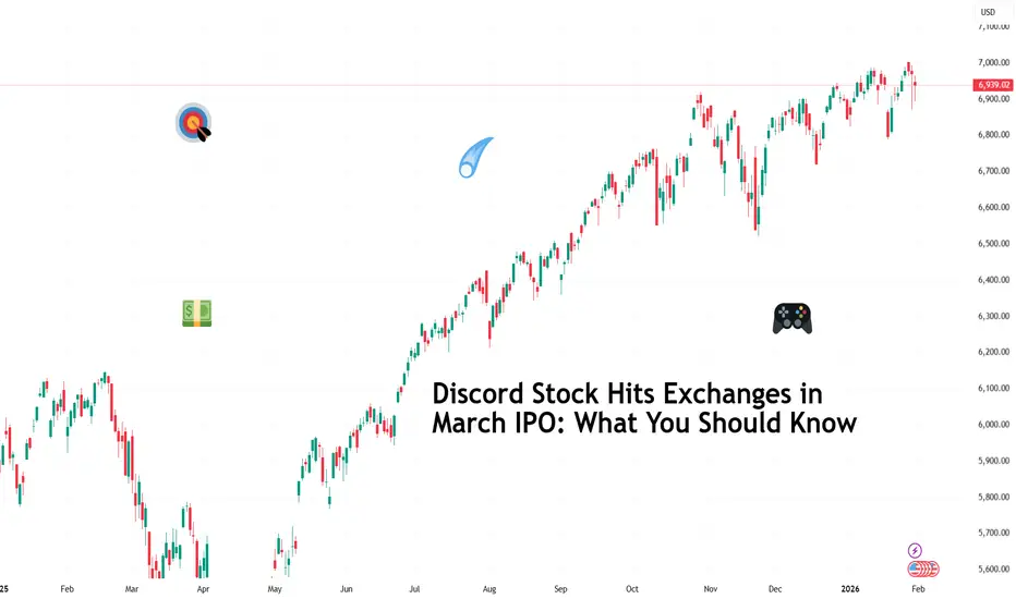
Discord Stock Hits Exchanges in March IPO: What You Should KnowDiscord NASDAQ:DISCORD has filed confidential IPO paperwork with the SEC and is aiming for a March debut (ref: the IPO calendar ), reigniting speculation around one of Silicon Valley’s most closely watched private companies.
The late-stage startup has lined up heavyweight underwriters Goldman Sachs NYSE:GS and JPMorgan Chase NYSE:JPM , a signal that things are getting serious. If market conditions cooperate, Discord could become one of the most prominent IPOs of the year.
🎮 From Gaming Sidekick to Internet Infrastructure
Discord began life in 2015 as a gamer-friendly voice chat tool. It quickly evolved into something far bigger. Today, Discord functions as a digital town square for creators, communities, developers, study groups, and friends who never leave the group chat.
User growth tells the story. Monthly active users expanded from 10 million in 2016 to 150 million by 2019, reaching around 200 million by early 2025. That scale places Discord among the largest real-time communication platforms in the world, well beyond its gaming roots.
Unlike enterprise tools that charge per seat, Discord leaned into a freemium model, keeping core features free and monetizing through optional subscriptions and add-ons. That choice helps build loyalty first and revenue later.
💸 Revenue Grows, Profit Still Waits
From an investor’s perspective, Discord’s financial arc looks familiar. Revenue climbed from $45 million in 2019 to an estimated $725 million by the end of 2024, a remarkable expansion that reflects the platform’s growing relevance.
At the same time, average revenue per user remains modest, and operating losses persist. Discord prioritized scale, product development, and community trust over near-term profitability.
That strategy won fans and mindshare. Public markets, however, tend to ask harder questions once the ticker symbol goes live.
🧠 The Microsoft That Got Away
Discord’s independence has become part of its mythology. In 2021, the company walked away from a reported $10 billion acquisition offer by Microsoft NASDAQ:MSFT , choosing to remain private and chart its own course.
That decision looks prescient today. Discord was last valued at $14.7 billion in a 2021 funding round that raised $500 million. IPO chatter now centers on a potential valuation in the $25 to $30 billion range, depending on market appetite and final timing.
📊 A Friendlier IPO Backdrop
Timing is big here. Discord’s filing arrives as public markets reopen their doors to tech companies after a cautious stretch. The IPO market improved meaningfully in 2025, encouraged by steadier rates, resilient equity indexes, and renewed investor appetite for growth stories.
That said, conditions remain fluid. Trade tensions, regulatory scrutiny, and macro surprises could still influence pricing or timing. Discord is reportedly still deliberating whether to proceed as planned, keeping flexibility as part of the strategy.
🧑🤝🧑 Community as a Competitive Advantage
One of Discord’s strongest assets does not appear on the balance sheet. The platform enjoys a community-first reputation that few tech companies manage to sustain at scale.
That dynamic could translate into strong retail investor interest, especially among younger audiences who already use the product daily. IPOs thrive when familiarity meets optimism, and Discord checks both boxes.
The challenge lies in converting engagement into durable margins without eroding the culture that fueled growth in the first place.
As March approaches, the real question centers on valuation and timing rather than viability. Discord already proved it can build something people care about. But can it get Wall Street onboard?
Off to you : Where do you think the IPO will go? Pop or flop? Share your views in the comments!
AUD/USD – H1 - Head & Shoulders BreakdownAUD/USD has printed a clean Head & Shoulders pattern on the H1 timeframe , signaling a potential trend reversal after a strong bullish run. Price has now broken below the neckline, confirming bearish momentum and opening the door for a deeper correction. OANDA:AUDUSD
🔍 Technical Analysis
🧠 Classic Head & Shoulders formation
Left Shoulder → Head → Right Shoulder clearly respected
❌ Neckline break confirms bearish bias
📉 Momentum shifting from bullish to bearish
🎯 Downside targets:
1.First Key Support Zone
2.Psychological level & lower demand zone
As long as price stays below the neckline, bearish continuation remains favored.
✅Psychological Discipline:
1️⃣Stick to plan – No Revenge Trades.
2️⃣Accept losing trades as part of the strategy.
3️⃣Risk only 1–2% of your account balance per trade.
✅ Support this analysis with a
LIKE 👍 | COMMENT 💬 | FOLLOW 🔔
It helps a lot & keeps the ideas coming!
⚠️ Disclaimer: This analysis is for educational purposes only and does not constitute financial advice. Forex trading involves high risk. Trade only with capital you can afford to lose and always do your own research.

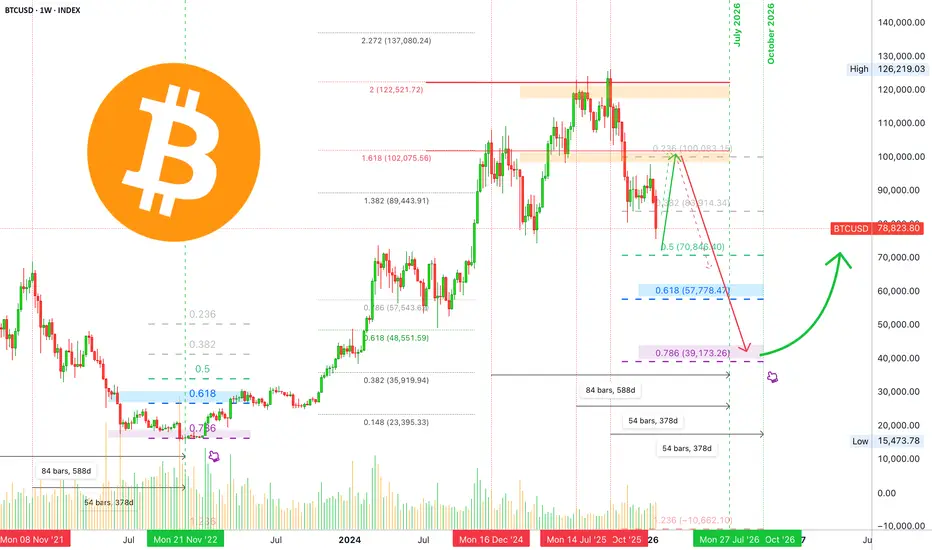
Bitcoin long-term: Full analysis year 2026 including 2027 & 2029My dear reader... It is my pleasure to write again for you today. I would like to show you the chart for Bitcoin long-term; what it looks like, what to expect.
Recently, we had a nice surprise with a bearish move that lasted just a few days longer than expected. A supposed retrace that went from $98,000 to $76,000 in a matter of 16 days. A drop more than 22% strong (-22.76%).
I was having doubts about the final wave of the relief rally. I continued to doubt its duration with an end date around mid-February being just too early, things just didn't add up.
The picture is clear now, based on the current move and the four consecutive red months close, we can easily see a full green February 2026 and also March 2026. The variation comes in March. It can be full green as well with a top in April, as it happened many times in previous cycles, or until mid-March. But now, the picture is clear when it comes to room for growth and duration for a relief rally.
Since $98,000 produced such a strong rejection, this becomes the main resistance on the way up. That is, ~$100,000 is the barrier now, keep this level in mind to prepare for short at the end of the C wave.
There is a saying in this market, "Sell in May and go away."
Let's start to map Bitcoin's long-term chart.
Q1 2026 bullish. Sometime around February, March and April. Can be just February and March. Allow for strong variations.
Q2-Q3 2026 bearish. Bear market climax. Two dates are available for the main lows. July 2026, a major low. October 2026, potential final low. Can be a lower low or higher low or double-bottom. October 2026 is of great interest because the peak happened October 2025. Bitcoin tends to turn bearish for a full year.
Q4 2026 neutral. Recovery period. Bottom consolidation. Some weak bullish action. The start of bullish action very late in the year.
Q1 2027 bullish recovery. The bullish recovery is confirmed.
Q2-Q3 2027 consolidation after initial bullish breakout.
Q4 2027 the start of a new bullish cycle. A new uptrend is fully formed and confirmed. Long-term growth until the final peak sometime around late 2029.
This is our long-term map. As the action unravels, we adapt to market conditions. The map is not the terrain.
Going deeper into the action:
February 2026 can be a bit tricky. While action can turn extremely bullish, an entire month is still a long time. The market can be quite cunning and deceiving. The month can start weak, red, only to turn at some point and produce strong bullish action; do not be deceived. Everything on this chart allows for a wave of growth.
With that said, there is a scenario where the market goes straight down but this is the least probable one but still possible.
A bullish wave in the coming months would produce the classic head and shoulders pattern to conclude Bitcoin's 2025 bullish cycle. The right shoulder is a lower high and this confirms the 2026 major lower low.
Remember how PAXGUSDT and TSLA went bearish recently, clearly showing a worldwide bearish bias in 2026.
It is not yet over, there is time to prepare. When the final high is in, I will share lots of instructions, techniques and opportunities to weather the bear market. We are going up next.
Namaste.