Is it a HS? RSP SPX equal weightHS pattern on the making? Would confirm if neckline is broken to the downside.
RSP trade ideas

Shorting the trend line break on RSP. You can see that RSP has lost touch with it's trend line, including its buffer zone. Furthermore, the DTL buffer zone wasn't even tested on the the Adam and Eve double top. Volume has been above average, validating distribution. Seems likely to test the double top neckline.

Cap weighted vs Equal Weight SPY at ExtremesAre the times when the cap wtd S&P500 is crushing the EW AMEX:SPY also the times when AMEX:SPY is most vulnerable? At present, you would have to go back to Q1 2009 to find a simliar ratio to today (using AMEX:RSP as the EW SPY in comparison to AMEX:SPY ). Another period when this extreme was reached was 2020.

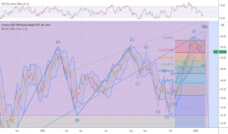
RSP is now in wave 5 as stated it should The chart posted is the RSP index for the SP 500 equal weight index . last week I said it needed to rally still in a 5th up. I am waiting for confirmation of the End of the 5th .It is a 5 wave rally as I said at the oct low major short squeeze . I do see this as the end of wave B just above the 2022 top . This is the bearish wave count.. The Alt would then see this rally to end on april 2nd for the end of a bigger wave 3 top all wave counts show a very deep and sharp break is now just ahead NEXT DATE is MAY 2could we see a sharp drop into april 10/12 and then rally ??? will we see sell in may and go away ?? . Best of Trades WAVETIMER

RSP - Equally Weighted S&P 500 ETF Long RSP for an expansion in Market Breadth
I think one of the most interesting developments today is that the RSP is breaking higher.
Since the beginning of '24 there has been bad breadth and thin leadership. Now the RSP is above its Feb Value Area and above recent highs. I particularly like the consolidation before this push higher.
My intermediate target using the MarketWebs Indicator is $165.9, which is an extension away from this months Value Area

RSP ready to ROCK N ROLL target 161.84All models are in very very deep over sold and the NYSI is nearing the 500 area this is what I had hoped for . the markets are now ready to Squeeze the last of shorts and trap most every bull on this next move . The NYSI will setup a perfect NON -CONFIRMATION
RSP performing better than $SPX, good news for breadthThe AMEX:SPY is underperforming AMEX:RSP (equal weight SP:SPX ).
This means that underperformers could very well pick up the slack & outperform the Big 7 going forward. They have been performing well.
The Volatility Index TVC:VIX is down on the day BUT up from open.
Will the moving avg's push it lower or do we get some sort of support here? This is a MAJOR SUPPORT level!
TVC:VIX rarely gets close to oversold, let alone oversold.
AMEX:SPXS AMEX:SPXL #stocks

S&P 500 Equal Weight ETF (RSP) ~ December 4H SwingAMEX:RSP chart analysis/mapping.
RSP ETF rally representing S&P market breadth - offering legitimacy to overall market strength & further indication of healthy stock rotation, instead of "Magnificent 7" concentration.
Trading scenarios:
Continuation rally #1 = ascending trend-line (white) / descending trend-line (light blue) confluence zone.
Continuation rally #2 = multiple gap fills / 78.6% confluence zone.
Shallow pullback #1 = 61.8% Fib / ascending trend-line (green dashed).
Shallow pullback #2 = gap fill / 50% Fib / 200MA confluence zone.
Deeper pullback #1 = gap fill / 38.2% Fib confluence zone.
Capitulation #1 = descending trend-line (white) / gap fill / ascending trend-line (light blue) / 23.6% Fib confluence zone.

Its been ugly I know, but...I'm very wary of the mag 7 as the valuations are still way too high imo, however when I look at the RUT or RSP equal weight I see real value. Here is a quick volume profile measure from the September 22' low, notice how close we came to the 8/1 Gann line also pulled from the 22' low. I think real long term investors are stepping here. Surley the Fed has finished with rates, not to mention rates have out paced the FED anyway for some time now. This rate cycle is over imo, and it will not be long before QT becomes QE once again, Treasury needs the money and the middle class is tapped.
Be safe out there

Breadth-Based Momentum Swing Strategy/Trend IndicatorThis is an interesting strategy.
From my little bit of back-testing, RSP seems to work best just because it is a breadth indicator.
Seems to work better in more volatile times with bigger moves.
Daily timeframe only. Basically, tracks overbought and oversold conditions but can signal momentum shifts and trend. Looking for long trades above, short trades below.
Don't use it alone, use it in confluence with your TA.
3 Major components:
- RSP (SP500 Equal Weight Index)
- S5TW ticker added to chart (SP500 % of stocks above 20MA)
- Ripster EMA cloud
Indicator setup:
- Add S5TW Line Chart as an indicator in a separate pane
- Apply EMA cloud to S5TW (9 ShortEMA1 and 21 LongEMA1, disable all others)
- Set both scales to Regular (will set to % automatically)
- Add two horizontal lines at 85 and 15, these indicate overbought and oversold levels (you can do 80/20 or 90/10 as well)
You technically could just buy/sell the EMA crosses, but your entry will not be optimal. There are three things you want to look for when a reversal is happening:
- Bull cross:
1. Price to cross over EMA cloud definitively (MINIMUM 2 candles)
2. Higher high on S5TW, higher low after for confirmation (HH and over 2 days above should be good enough)
3. Move across the 50% midpoint
- Bear cross:
1. Price to cross below EMA cloud definitively (MINIMUM 2 candles)
2. Lower low on S5TW, lower high after for confirmation (LL and over 2 days below should be good enough)
3. Move across the 50% midpoint
After the reversal, you can take three approaches to exiting:
- Exit once overbought/oversold
- Exit with trailing stop or to price target
- Exit with opposite reversal
This back-test used the exit with opposite reversal strategy. The max drawdown from this small sample size of back-testing is just under 3%, but every trade ended up winning.
- 100% win-rate out of sample of 11 trades.
- Average move is 6%
- Smallest is 0.42%
- Highest is over 11%.
Gonna be fun to track this.

SPX | Balance of PowerNot all is equal. And nothing is static.
Entropy is the foundation of our world, and it is the bane of a rich man's existence.
You collect in one spot, then nature comes up and spreads your work around.
Entropy is the unbeatable power of justice. In the end entropy always wins.
One has limited amount of time to temporary evade it.
Panta Rhei - Heraclitus
Everything flows. Money just like water, tends to move around. It is what it is meant to do.
Rich men need poor ones to collect from. In the end, there is nothing else to collect from the poorer ones. But the cycle must continue. No rich man could ever possibly give out wealth for free. Instead, they let nature do its trick and rebalance things.
I will now try to make a rough model of the changes in markets. Divide markets in distinct periods so as to have a better understanding on the progress of a bull market.
Energy Conservation
Money and entropy tend to spread out. When the stock market was "invented", few had the stocks and many had the money. Trading is a way to manipulate entropy to our advantage. We let nature spread what we don't need, and as a repayment we accumulate what we need. The stock market is like a free energy machine .
The invention of the stock market resulted in a massive wealth transfer, and ended with a painful crash; The Great Depression. The peak of the Roaring '20s was the peak of wealth accumulation from the few.
In the post-Great-Depression economy, money spread out again. From the few to the many.
In these decades, DJI (the big 30) stagnated while SPX (the 500) progressively got stronger.
But the big-30 had an ace up their sleve.
In trading the game must always go on. There is always a way to get richer.
And so, commodities became the new place for wealth to accumulate to.
From all of the above we have come to realize that bubble tops come when the few have accumulated the maximum possible from the many. DJI/SPX measures oligarchy, while the inverse SPX/DJI measures democracy in the spread of wealth in stocks.
Many bubbles and many crashes have followed after the Great Depression. The .com bubble crash and the GFC are memorable to young and old alike. And they all exhibit the same base structure. It is all the same, with one crucial difference.
The 2020 economy is vastly different from the 1920 economy.
The role of SPX and DJI has changed in the last few decades. DJI used to represent the companies that shaped bubbles and SPX the ones that followed. Now NDX and SPX are the indices that represent fast growth while DJI has taken the role of the "index of stability".
The modern balance-of-power measure is the following:
SPX-equal-weight divided by SPX-market-cap.
www.tradingview.com
Since I couldn't find an SPX-equal-weight index in TradingView, I have constructed a similar chart using two ETFs, RSP and IVV. The RSP/IVV chart is a good analogue to the standard chart.
And so, where do we conclude?
After much analysis we can say the following in retrospect.
The 2008 bubble was quick but with big repercussions.
Money democracy shows signs of impeding financial weakness.
And as for the post-2009 Bull Market...
We realize that it progressively turns into a bubble. While there is no definitive way to "normalize" SPX, SPX/M2SL proves a good candidate for absolute SPX cost.
Yield rates tell many tales.
Usually yield rates increase as the wide economy needs them. Strong economies need a lot of money and they can withstand high yield rates. And contrary to popular belief, yield rates are positively correlated with yield rates. Now however, the wide economy refuses to absorb such high yield rates. High production cost and high rates can destabilize the economy.
Money Democracy is Positively Correlated to Yield Rates.
Now we witness the wide economy refuse to absorb these yields.
This has resulted in unprecedented wealth accumulation from the few.
Speculation Chart:
While this type of analysis is subjective, it is interesting to see patterns repeat.
Composite Chart:
An experimental chart attempts to calculate the scale of the derivative bubble we are in.
We realize that equity prices are now lying. They are simply too inflated and riddled with derivatives to believe in.
All of that was quite complex to follow through, and even harder to make a conclusion.
In the end, the simplest analysis might be the best.
A massive bearish upward channel has formed. Now price has rejected once again off the ceiling. The real recession may have not even started yet...
Tread lightly, for this is hallowed ground.
-Father Grigori
Bonus Charts:
Have we reached a golden ceiling?

RSP 5 WAVES DOWN WAVE 1 HAS ENDED The chart posted tonight is the Equal weighted SP 500 So far this is the cleanest wave structure of all the indexes and as of tonight I can say this is my Preferred wave count and should be the guide going forward for the next 6 to 9 months . So The rally from the oct low of 2022 rallied in a abc x abc for the students for the rest of you it was a ABC rally it did fall short of a .786 to peak at 75 % W.D GANN and an old friend Don Wolanchuk . since the july 27 turn I can count 5 clean waves down and waves 1 and 5 are equal within .25 of one point at the lows .This is now labeled WAVE 1 or wave A but I lean towards wave 1 of wave C which means we have a much bigger decline coming after the A B C rally back to 50 = 144 to .618 % 147 of the drop from July and should peak into the previous 4th wave which was 143.5 . from this rally we should hear good news . This rally I will mark as WAVE 2 or B Wave 3 or C target is in to targets and both are into a perfect Fibonacci retracement
92 and the alt is 75.6. Has I stated the data for the last 121.9 years shows me the avg bear market is 2.4 to 3.2 years long and the price damage is from 38 to 55 % and the avg is 44 % plus or minus 1.75 % .So has I stated in the first week of July long term holdings should be hedged or sold and into 30 and 90 day tbills !!! I see the odds of 92 being the target as it is also .786 from the march 23 low 2020 and 50 % from the march 2009 low as well. BEST OF TRADES WAVETIMER !
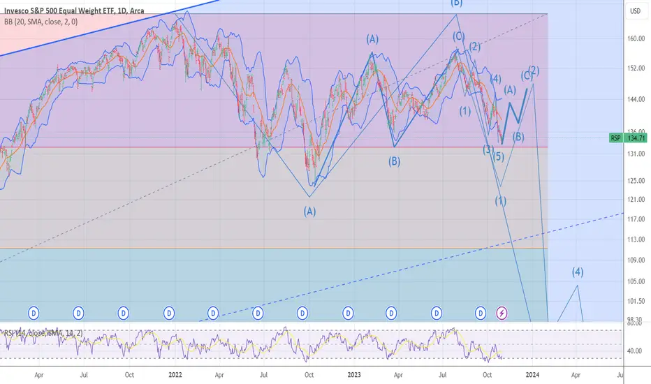
The reduction target is $117According to the Butterfly pattern, according to Fibo, the decline at the target 117$ perfectly converges. We also go down the channel where the lower border of the channel will be. All 3 parameters should be added together. We should reach it by June 2024, there will be a great point for going to long.

Will the AI mania to begin to wane ushering a summer recession?Will the Pluto retrograde in Capricorn June 11, 2023 usher in the inverted yield recession this summer? Will the AI mania abruptly wane until Pluto in Aquarius returns in Jan 2024?

RSP H&S pattern: Bear Market to begin this summerThe RSP H&S is hinting at what the real broad Market via breadth looks like if the 'tide' were to go out, revealing there is little support for the overall market other than the few tech big caps. It looks like we'll soon see if the net line is broken downwards to a minimum 10% correction or worse. Inverted yields always lead to recession...

S&P sector analysis. Just stick with energy?Energy remains the only up-trending sector. AMEX:XLE
AMEX:XLC is the cleanest dirty shirt with an inside month.
Overall, not a good look of the market with the 3 remaining days of the ugly month of September NASDAQ:QQQ AMEX:IWM AMEX:RSP NASDAQ:QQEW

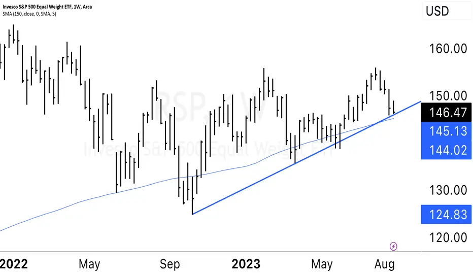
RSP 2H 2023, 3d ChartPublishing the RSP chart, for the equal weighted SP500 to track how it moves. This broke down its wedge like structure, and is now approaching its near term support.
Failure to hold that 140ish range and you would expect it to revisit 129-133.
Personally expecting a bounce around 141, revisit to 146 before it breaks down and revisits the 2022 low area around 130ish.
This is getting interesting.

$RSP Higher Low or Head & Shoulders?AMEX:RSP is very interesting here and I have started a full-size position as I can easily define my risk with a stop just under the most recent daily low.
See chart for notations. Ideas, not investing / trading advice. Comments always welcome. Thanks for looking.

$RSP This chart becomes significantly crucial if the trend line AMEX:RSP This chart becomes significantly crucial if the trend line is breached. "trend line break" refers to a situation where the price of an asset moves beyond or crosses over a trend line that has been drawn on a price chart. Trend lines are used to represent the direction and strength of a trend in a market. A trend line break can signal a potential change in the trend direction or a shift in market sentiment.
Uptrend Line Break: An uptrend line break occurs when the price moves below an ascending trend line. This can indicate a potential shift from an uptrend to a downtrend or a period of consolidation.
$SPY no longer underperforming $RSP or $RUTLooks like the idea of BTD (Buy the Dip) is still in place.
IMO not enough EUPHORIA for "crash" (like many are calling).
AMEX:RSP (equal weight SP:SPX ) was outperforming AMEX:SPY but that is no longer the case as of yesterday.
TVC:RUT AMEX:IWM also lagging but the chances are that it will likely catch up in time.
#stocks

Is the rest of the market joining the rally?The weekly chart (on the bottom) shows that SPY and RSP were highly correlated until early March. After March, we have seen the two separate in YTD returns. The correlation coefficient confirms this break in trading. The breakdown in correlation between the RSP and SPY is most evident between May and June when RSP lost value and SPY gained value.
In the last week, we have seen SPY clear August '22 high. For many, this confirms that a new bull market has begun.
While the RSP is far from its August '22 high, we saw it break a short-term resistance level yesterday (6/13/23). The correlation coefficient is also rising back towards 1. It appears that RSP is beginning a new leg up. I believe a new leg up in the RSP confirms the Bull case for the SPY.
With the Fed decision this week and both equities close to a support/resistance line, I am also watching for the invalidation of this breakout in the RSP and SPY. For me, that would be both equities closing below their near support/resistance lines.


$RSP performing better than $SPY, like we caleldAMEX:RSP = equal weight SP:SPX
We see that volume has been very good
AMEX:SPY is underperforming it & that is a good sign
NASDAQ:NDX underperforming as well
This means money is moving around & every one gets a chance to play
AMEX:IWM TVC:RUT has legs, call that it would break out was good
It also had great volume a few days ago
IMO #Stocks have what it takes to keep moving
