Mean Reversion in Action | Intraday Structure & Market MechanicsShort-term market moves often appear chaotic, but beneath the surface, price frequently follows statistical and structural tendencies — one of the most important being mean reversion.
This chart provides a clean real-time example of how price behavior stabilizes following volatility expansion.
What Is Mean Reversion?
Mean reversion describes the tendency for price to return toward its short- and medium-term averages after extended deviation.
Rather than forecasting direction, this framework focuses on understanding market mechanics — specifically:
• Volatility expansion
• Distance from trend EMAs
• Momentum exhaustion
• Structural re-balancing
What We Observe Here
Following aggressive downside momentum:
• Price extended significantly below key short-term EMAs
• Volatility expanded rapidly
• Momentum reached short-term exhaustion levels
• Mean distance became statistically stretched
As a result, price began reverting back toward its structural equilibrium zone.
This process reflects mechanical market behavior, not predictive bias.
Why This Matters
Mean reversion is one of the most important principles for understanding:
• Intraday stabilization
• Volatility compression
• Structural resets
• Trend sustainability
Rather than attempting to predict bottoms or tops, observing how price behaves around its structural means offers clearer insight into market condition and participation.
Final Structural Note
When markets experience rapid deviation, reversion toward trend averages is a natural response — especially when volatility becomes extended.
This does not imply directional certainty.
It simply demonstrates how markets normalize after imbalance.
Technical Analysis

Why Gold Respects Supply and Demand ZonesA Complete Price Action Guide for XAUUSD Traders
Gold (XAUUSD) is one of the most technically respected markets in the financial world. Unlike many instruments that behave erratically, gold consistently reacts to supply and demand zones, making it ideal for price action and institutional trading strategies.
What Are Supply and Demand Zones?
Supply and demand zones are areas on the chart where large orders from institutions (banks, hedge funds, central banks) are placed.
Supply Zone: Area where strong selling pressure enters the market
Demand Zone: Area where aggressive buying absorbs selling pressure
These zones represent imbalances between buyers and sellers, not random lines.

Fake Move at the European Open — A Familiar LessonIf you’ve traded Forex, Gold, or Crypto for any length of time, you’ve likely experienced this scenario:
The European session opens.
Price makes a clean break above a high or below a low.
You enter on the breakout.
Minutes later — your stop loss is taken.
Then the market moves in the exact direction you originally anticipated.
This isn’t bad luck.
This is the fake move at the European open — a recurring market behavior.
1. Why Do Fake Moves Often Appear at the European Open?
The European session is when:
- Liquidity starts to increase rapidly
- New capital enters the market
- Pending orders from the Asian session are still in place
This overlap creates ideal conditions for price to:
- Push slightly beyond the Asian session high or low
- Trigger stop losses and early breakout entries
- Attract impatient traders
But that initial push does not represent the true direction of the day.
2. A Breakout at the European Open ≠ A Real Breakout
A breakout that looks “clean” is not always a meaningful one.
Fake moves at the European open often show:
- A break in structure without follow-through
- Fast price expansion followed by immediate hesitation
- Weak or fading volume
- Candles with long wicks or poor closes
These are signs that:
The market is testing liquidity, not starting a trend.
3. Who Falls Into This Trap Most Often?
Fake moves at the European open usually trap:
- New traders
- Traders driven by FOMO
- Those who enter simply because price “broke a level”
The issue isn’t the strategy.
It’s timing and patience.
4. The Market Needs Liquidity Before a Real Move
Before a strong move begins, the market often needs to:
- Clear stop losses
- Remove early positions
- Create the illusion of a wrong direction
Fake moves at the European open are how the market:
Cleans the path before committing to the real direction.
5. The Lesson for Traders
- Not every breakout is worth trading
- Timing matters as much as the setup
- The European open is often a time to observe before committing
Instead of asking:
“Did price break the level?”
Ask:
“Can this breakout hold after 15–30 minutes?”

3 Best Forex Scalping Strategies For 15-Minutes Minutes Trading
If you are looking for a profitable gold forex scalping strategy, but you are struggling to choose one among hundreds that are available,
I prepared for you 3 must-try profitable scalping strategies.
These strategies are very different and unique:
one is based on a p rice action analysis , one is smart money concepts based and one is a technical indicator strategy.
So you will definitely find the one that suits your trading style.
One important note before we start.
There is one crucial element that unites all these strategies:
we will strictly look for trading entries from 4H key levels: key horizontal supports and resistances.
Only when the price tests such structures, we will start searching for a trading signal on 15 minutes time frames.
For that reason, make sure that you execute structure analysis on a 4h time frame.
Here is how a 4h time frame structure analysis should look like.
You should underline recent, historically significant horizontal support and resistance areas.
Strategy 1
Price action
Scalping with a price action on 15 minutes time frames, you should look for:
- a bullish price action pattern after a test of a 4H support
- a bearish price action pattern after a test of a 4H resistance
Here is the list of bullish patterns:
Double bottom, horizontal range, inverted head & shoulders pattern,
cup & handle pattern, ascending triangle.
Your bullish signal will be a breakout - a candle close above a neckline of the pattern.
After a test of a 4H horizontal support, EURUSD formed an ascending triangle formation on 15 minutes time frame.
Its neckline violation is a strong bullish confirmation.
A perfect entry point should be a retest of a broken neckline.
The safest stop loss will be below the low of the pattern.
Target - the closest 15 minutes key resistance.
Formation of a bullish price action pattern and its neckline breakout signifies the strength of the buyers and confirms the validity of a structure that was identified on a 4H time frame.
Here is the list of bearish patterns:
Double top, horizontal range, head & shoulders pattern, inverted cup & handle pattern, descending triangle.
Your bearish signal will be a breakout - a candle close below a neckline of the pattern.
Take a look at the example:
after a test of a key horizontal 4H resistance, the price formed a double top formation on a 15 minutes time frame.
The violation of a neckline of the pattern is a strong bearish confirmation.
Set a sell-limit order on a retest of a broken neckline,
place stop loss above the highs of the pattern,
target will be the closest 15 minutes key support.
Formation of a bearish price action pattern and its neckline breakout signifies the strength of the sellers and confirm the validity of a structure that was identified on a 4H time frame.
Strategy 2
Smart Money Concepts
Scalping with SMC, key horizontal 4H supports and resistances will be perceived as liquidity zones.
Your bullish confirmation after a test of a bullish liquidity zone will be an inducement (a false violation of a lower boundary of the zone) with a consequent formation of an imbalance bullish candle that completely engulfs the range of a previous bearish candle with its body.
Here are the examples of bearish inducements - a false structure violation.
Here is the example of a bullish imbalance after the inducement.
An imbalance bullish candle should have a relatively big body and should completely engulf the entire range of a previous bearish candle.
You should open a long position immediately after the close of a bullish imbalance candle.
Stop loss should lie below its low.
Take profit - the closest 15 minutes resistance.
With bearish inducement, smart money are attempting to force buyers close their position in losses and force sellers to open short positions, grabbing their liquidity.
Formation of a bullish imbalance indicates a real intention of big players.
Your bearish confirmation after a test of a bearish liquidity zone will be an inducement (a false violation of an upper boundary of the zone) with a consequent formation of an imbalance bearish candle that completely engulfs the range of a previous bullish candle with its body.
Above is the example of a bullish inducement followed by a bearish imbalance that completely engulfed the range of a previous bullish candle.
Short position should be opened immediately after a close of an imbalance bearish candle.
Take profit - the closest 15 minutes support.
Stop loss above the high of the candle.
With bullish inducement, smart money are attempting to force sellers close their position in losses and force buyers to open long positions, grabbing their liquidity.
Formation of a bearish imbalance indicates a real intention of big players.
Scalping Strategy 3
Technical Indicators
Technical indicators can provide a strong confirmation after a test of key 4H horizontal structure.
One of the most accurate technical indicators is the combination of 2 Moving Averages with different ranges.
Their crossover will provide an accurate bullish and bearish signal.
For our strategy, we will take Simple Moving Average with 5 range and Exponential Moving Average with 9 range.
The crossover of Exponential Moving Average by Simple Moving Average from downside will be a strong bullish signal and a long position should be opened immediately then.
Stop loss should lie below the entire 4H horizontal support, and the target will be THE CLOSEST 4H resistance.
In comparison to 2 previous strategies, the Moving Average confirmation gives much bigger profit potential.
The crossover of Exponential Moving Average by Simple Moving Average from the upside will be a strong bearish signal and a short position should be opened immediately then.
Stop loss should lie above the entire 4H horizontal resistance, and the target will be THE CLOSEST 4H support.
Being applied properly, the strategy will provide very high accuracy and reward to risk ratio.
Try these 3 scalping strategies, backtest them and choose the one that suites your trading style.
❤️Please, support my work with like, thank you!❤️
I am part of Trade Nation's Influencer program and receive a monthly fee for using their TradingView charts in my analysis.

Breaking the High — Doesn’t Always Mean a Real BreakoutIn trading, there’s a moment so familiar it’s almost… painful:
Price breaks the previous high, the candle closes beautifully, volume looks decent.
You hit Buy.
A few minutes later… your stop loss is gone, price reverses and moves exactly in the direction you anticipated — without you on board.
The problem isn’t that you were too slow.
The problem is a hard truth to accept:
Not every break of a high is a real breakout.
1. Breaking the high — what everyone sees
The previous high is where:
Retail traders wait for a breakout
Sell stop losses sit just above
Liquidity is clearly concentrated
The market knows this very well.
And when price approaches the high, its first job isn’t to go far,
but to check whether there’s enough liquidity to take.
2. When a “break” is just a liquidity grab
Many breaks of highs are actually doing just one thing:
Sweeping stop losses
Triggering FOMO Buy orders
Collecting enough liquidity
After that… price reverses.
What you see:
A very strong breakout candle
But no follow-through
Price fails to hold above the broken level
That’s not a random failure.
That’s a familiar market script.
3. A real breakout always has conditions
A reliable break of a high usually has at least one of the following:
A breakout after consolidation, not after a vertical push
Price retests the old high and holds
The break comes with clear market structure (a protected higher low)
Momentum is maintained, no immediate rejection
If there’s only one pretty candle — it’s not enough.
4. Traders don’t lose because they can’t analyze
Most traders lose on breakouts because they:
Focus on one candle and ignore the context
Enter out of fear of missing out (FOMO)
Believe that “if it breaks, it has to run”
While the market operates on a different logic:
Liquidity first — trend later.
5. The most important lesson
Next time you see price break a high, ask yourself:
Is it breaking to continue, or breaking to grab liquidity?
Is price being accepted at higher levels?

Holding Profits by Structure vs. Taking Profits Too EarlyIn trading, many people enter correctly and catch the right trend,
yet in the end, their account still doesn’t grow.
The reason isn’t in the analysis.
It’s in how you exit the trade.
One side holds profits based on structure.
The other takes profits too early because… the heart starts racing.
1. Taking Profits Too Early — A Familiar Psychological Trap
Early profit-taking usually comes from fear:
Fear the price will reverse
Fear of losing current profits
Fear of “this is enough, better secure it”
Common signs:
Closing the trade at just +1R or +2R
Exiting as soon as a candle pulls back slightly
After exiting… price runs dozens of pips further
👉 The biggest problem with early exits is not whether the trade wins or loses,
but that you destroy your long-term expectancy.
You may win many trades,
but your R:R is always small,
and just 1–2 losing trades can wipe out all the effort.
2. Holding Profits by Structure
Holding profits by structure is not blind holding.
It’s based on market structure, not emotions.
For example, in an uptrend:
Price forms Higher Highs – Higher Lows
The structure is still intact
No clear reversal signals appear
➡️ There is no technical reason to exit
A structure-based trader will:
Trail the stop loss below structural lows
Let the market decide the exit
Accept pullbacks as long as structure holds
💡 Big profits don’t come from taking many trades,
but from a few trades held the right way.
3. One Critical Question Before You Exit
Before clicking the close button, ask yourself:
“Has the market structure really broken, or am I just scared by a candle?”
If the structure hasn’t broken,
closing the trade means you’re handing your own money back to the market.
4. Conclusion
Taking profits too early makes you feel safe in the short term
Holding by structure helps you survive and grow in the long run
New traders learn how to enter.
Progressing traders learn how to hold profits.

FOMO When Gold Explodes: The Trap Most Traders Fall IntoIf you’ve ever chased a strong gold rally, entered a trade out of fear of “missing the move,” and then watched price reverse and stop you out minutes later — you’re not alone.
That’s FOMO (Fear of Missing Out), and it is one of the most dangerous psychological traps when trading XAUUSD.
How FOMO shows up when gold moves aggressively
Gold is a market known for speed, volatility, and expansion.
When price starts printing large bullish candles, the trader’s mind often reacts instinctively:
“Price is running, if I don’t enter now I’ll miss it”
“Everyone is buying, it must keep going”
“I’ll just enter quickly and use a tight stop”
The problem is simple: you’re reacting emotionally, not executing a plan.
In many cases, those strong impulsive moves you see are:
- The late-stage expansion of a trend
- A liquidity push designed to trigger late buy orders
- Or the area where institutions begin distributing positions
By the time FOMO kicks in, the best part of the move is often already over.
Why FOMO is especially dangerous in gold trading
Unlike many forex pairs, gold:
- Creates sharp spikes and deep pullbacks
- Frequently produces false breakouts around key levels
- Sweeps both sides before committing to the real direction
When you trade with FOMO:
- Stops are placed too tight
- Entries are made at expensive prices
- A normal technical pullback is enough to take you out
Price may still move in the direction you expected — just without you in the trade.
Signs you’re trading with FOMO (even if you don’t realize it)
Ask yourself:
- Did I enter because of my plan, or because price was moving too fast?
- Am I trading outside my pre-marked zones?
- Am I ignoring market structure because I’m afraid of missing out?
If the answer is yes, FOMO is likely driving your decision.
How to avoid the FOMO trap when gold is running
1. Trade levels, not candles
Large green candles are not signals. Zones are.
If price has already left your area, accept the missed opportunity.
2. Ask one key question: “Who is entering here?”
If you buy after a strong expansion, you’re often buying from traders who are taking profit.
3. Accept missing trades as part of the game
No professional trader catches every move.
Missing a trade is cheaper than forcing a loss.
4. Wait for reactions, not movement
The market always offers a second chance — pullbacks, consolidations, or clearer structure.

Price Breakout vs Confirmed CloseA small difference — but a very high price to pay
1. What is a price breakout?
A price breakout simply occurs when a candle’s wick or body touches or moves above a previous high.
The key point is this:
- A breakout does not mean the market has accepted a new price level.
Many breakouts last only a few seconds and exist purely to sweep liquidity.
- In practice, breaking a high is a very cheap action for the market. It often takes only a small amount of orders to push price above a high in the short term.
2. What is a confirmed close?
A confirmed close occurs when:
– The candle finishes completely above the previous high
– The market accepts the new price level instead of pulling back below it
This is the critical distinction:
Price can touch a high with a wick,
but it is only confirmed by the close.
A close reflects consensus, not an instant reaction.
3. Why do breakouts often cause traders to lose?
When traders enter immediately after price breaks a high, they often place themselves right in a liquidity cluster. Stop losses are typically positioned just below the old high, making it easy for the market to sweep those orders.
The common scenario is price breaking the high, triggering buy orders, then reversing before continuing in the original direction. The market is not wrong — the entry timing is.
4. Why is the close more important than the break?
Because:
Price can be pushed up artificially,
but a close requires sustained participation.
Without real money flow, price cannot hold the level.
A confirmed close shows that:
Buyers are willing to hold positions,
Selling pressure has been absorbed,
The probability of continuation is significantly higher.
5. Practical application
A healthy trading mindset:
❌ Do not enter just because price touches a high
✅ Wait for a clear candle close
✅ Prioritize:
Close above → pullback → continuation
Or a strong close with structure remaining intact
If there is no confirmed close, there is no reason to rush.

Why You Should NOT Go All-In When Trading GOLDGold is one of the most attractive markets, but it is also where many traders pay the highest price because of a single decision: going all-in. Not because their analysis is wrong, but because they underestimate gold’s volatility.
1. Gold Has Strong Trends, But It Rarely Moves in a Straight Line
Gold can trend beautifully, but along the way there are always:
Deep pullbacks
Sudden news-driven spikes
Liquidity sweeps before the next continuation
When you go all-in, there is no room to absorb volatility. A single short liquidity sweep is enough to knock you out of the trade, even if the final direction is exactly what you anticipated.
2. All-In Turns Small Risk Into “Fatal” Risk
A normal losing trade is simply a trading cost.
But a losing all-in trade can cost you the ability to trade at all.
Trading is not about winning or losing a single position.
It is a game of survival.
3. All-In Damages Your Psychology More Than You Think
When all your margin is tied to one trade:
You fear the stop loss more than you respect market structure
You move your SL emotionally
You hope instead of acting correctly
And in the gold market, hope never pays traders.
4. Gold Is a Liquidity Market, Not an Emotional One
Gold frequently sweeps levels that everyone can clearly see on the chart.
All-in traders who place tight, “perfect-looking” stop losses unintentionally become ideal liquidity for the market.
🎯 Conclusion
All-in is not confidence — it is a gamble.
To trade gold sustainably, you need to:
Split your position size
Keep margin flexibility
Prioritize survival before profits

Recent Movers – Pullback ExamplesRecent session showed several short-term momentum opportunities. The watchlist was created based on a normalized condition: stocks that made a 52-week high within the last three months. From this scan multiple names were selected with focus on viable pullback trades.
A pullback is a short-term counter-move in response to an impulse move. It represents a controlled reversion toward the mean and provides a structured way to participate if momentum resumes.
There is a pullback indicator is shown on the charts as a visual reference. It shows when price moves outside recent behavior and marks the subsequent reversion. The indicator was not made for entries, but for standardization and consistent evaluation.
Example Charts:
ADI
CPRI
CTRI
SOLV
RF
PFG
NTRS
More than 35 percent of the current watchlist is concentrated in the financial sector. This was also visible through sector relative strength over the past month, led by XLB (Materials) and XLF (Financials). This view can support a top-down perspective but is not required.

Gold in NFP week — When the chart out-plays the traderNFP week (Non-Farm Payrolls) is known for wide ranges, frequent SL sweeps, and sharp reversals that make retail traders believe the trend has broken, while the market is actually just collecting liquidity before the real move.
1. Gold is “calm” early week, “crazy” late week
Mon – Tue: Price usually compresses and moves sideways to build positions and stack liquidity
Wed – Thu: Spikes, fake breakouts, and Stop Hunts happen more often
Friday (NFP release): Volatility explodes, spreads widen, and price can hit both directions within minutes
During NFP week, gold isn’t hard to analyze — it’s hard because it won’t let you be right too early.
2. NFP news doesn’t just create a trend, it creates noise before the trend
Before running the main direction, gold often:
Breaks a level quickly to trigger retail SL
Wicks back into the original zone (liquidity sweep)
Then launches the real move
That’s why traders get “stopped at the top or bottom” — not because they’re wrong, but because their SL is sitting at the most obvious liquidity spot.
3. Where does gold react the hardest during NFP week?
Typically at:
Recent highs and lows
Round numbers
Zones where structure looks too clean and everyone draws the same
These areas are liquidity magnets, not true breakout guarantees.
4. What should traders do this week?
Reduce position size, avoid all-in
Don’t place SL too tight near early-week levels
Wait for liquidity to be swept before entering
Avoid FOMO when spikes appear too soon
Prioritize setups that revalidate structure after the noise
5. The classic gold storyline every NFP week
Retail traders hunt perfect entries.
Institutions hunt perfect SL.
Gold hunts SL first, then delivers trend later.

Gold doesn’t hate you. Gold just loves… your liquidity.If you’ve ever felt like XAUUSD has a personal grudge against you — price spikes the moment you enter, sweeps your SL perfectly, then runs strongly in your predicted direction right after you exit — take a breath. Pause for a second.
The gold market doesn’t move based on emotions.
It moves based on liquidity — the fuel behind every major move .
1. Retail traders trade price. Institutions trade orderflow.
You look at the chart to find a perfect entry.
Institutions look at the chart to find where the most SL and pending orders are stacked.
To them, it’s not a “resistance zone” — it’s a liquidity pool.
When retail SL gets triggered, it turns into market orders.
And those market orders become the free matching engine for big players to enter without excessive slippage.
You think you’re protecting your risk with SL.
The market thinks you’re placing free orders for them to fill their positions.
2. Gold loves clean levels because SL sits at clean levels.
Liquidity sweep zones usually share the same traits:
- Recent highs/lows everyone can see
- Support/resistance that looks clean and easy to draw
- Attractive round numbers like 2,700 – 2,650 – 2,600…
These areas are liquidity magnets, not breakout signals.
3. “Sweep then run” is a process, not an exception.
A major gold move typically has 2 phases:
- Liquidity grab (SL sweep, pending activation)
- Expansion (the real trend begins)
Most traders lose because they confuse phase 1 with phase 2.
Retail sees a spike → fear trend break.
Institutions see a spike → mission accomplished, liquidity collected, positions filled.
4. The market doesn’t need you to be wrong — it only needs you forced out.
Gold doesn’t need to prove your analysis was bad.
It just needs enough volatility to make you:
- Hit SL
- Or close manually out of panic
Either way, the market gets the liquidity you left behind.
5. Trading maturity = not turning yourself into liquidity.
You don’t need to remove SL. You just need to:
- Place SL where the structure is truly invalidated, not where liquidity is obvious
- Enter after liquidity is swept, not before
- Keep margin to reposition during pullbacks
- Understand: being right isn’t enough — you must be right at the right time.

4 Continuation Patterns Every Trader Must KnowWelcome back to another Mubite educational guide.
In trading, trends rarely move in a straight line. They pause, take a breath, and consolidate
before pushing forward. Unfortunately, many amateur traders mistake these healthy pauses for
reversals and panic-sell their positions too early.
To maximize your profits, you must learn to identify Continuation Patterns . These specific formations signal that the market is simply resting and the prevailing trend is about to resume.
Mastering these allows you to ride the trend to its full potential.
Here are the top 4 patterns you need to master.
1. The Rising Three Methods (Bullish)
This is a powerful pattern that occurs during a sustained uptrend. It represents a pause where
bulls take a break, but bears fail to push the price down significantly.
Structure:
1. Long Bullish Candle: A large green candle in line with the uptrend.
2. Three Small Bearish Candles: Three small red bodies that stay within the high
and low range of the first candle.
3. The Breakout Candle: A final large bullish candle that closes above the close of
the first candle.
● Psychology: The small pullback tricks weak hands into selling, but buyers step back in
with force, confirming the uptrend is still alive.
2. The Falling Three Methods (Bearish)
The opposite of the Rising Three, this pattern occurs in a downtrend and signals that selling
pressure is far from over.
Structure:
1. Long Bearish Candle: A large red candle in line with the downtrend.
2. Three Small Bullish Candles: Three small green bodies that retrace slightly but
stay within the range of the first candle.
3. The Breakout Candle: A final large bearish candle that closes below the close of
the first candle.
● Psychology: Sellers take profits, causing a small bounce, but buyers lack the conviction
to reverse the trend. Sellers return to push prices to new lows.
3. The Tasuki Gap (Upside & Downside)
Gaps are significant in price action. The Tasuki Gap is a unique continuation pattern that uses a
gap to confirm trend strength.
Upside Tasuki Gap (Bullish): A bullish candle is followed by another bullish candle that
"gaps up." The third candle is bearish and closes into the gap but does not close it
completely.
Signal: If the gap remains open, it acts as support. The trend is still up.
Downside Tasuki Gap (Bearish): A bearish candle is followed by another bearish
candle that "gaps down." The third candle is bullish and closes into the gap but does not
fill it.
Signal: The unfilled gap acts as resistance. The trend is still down.
4. Mat Hold Pattern (Bullish)
This is arguably one of the strongest continuation signals in Crypto and Forex trading. It is very
similar to the Rising Three Methods but shows even stronger bullish pressure.
● Structure: A long bullish candle is followed by a gap up and three small candles that
drift lower but stay well above the open of the first candle. A final large candle
continues the uptrend.
● The Difference: In a Mat Hold, the pullback is shallow (usually staying in the upper half
of the first candle's range), showing that bears have almost no power to push price
down.
3. The Tasuki Gap (Upside & Downside)
Gaps are significant in price action. The Tasuki Gap is a unique continuation pattern that uses a
gap to confirm trend strength.
● Upside Tasuki Gap (Bullish): A bullish candle is followed by another bullish candle that
"gaps up." The third candle is bearish and closes into the gap but does not close it
completely.
○ Signal: If the gap remains open, it acts as support. The trend is still up.
● Downside Tasuki Gap (Bearish): A bearish candle is followed by another bearish
candle that "gaps down." The third candle is bullish and closes into the gap but does not
fill it.
○ Signal: The unfilled gap acts as resistance. The trend is still down.
4. Mat Hold Pattern (Bullish)
This is arguably one of the strongest continuation signals in Crypto and Forex trading. It is very
similar to the Rising Three Methods but shows even stronger bullish pressure.
● Structure: A long bullish candle is followed by a gap up and three small candles that
drift lower but stay well above the open of the first candle. A final large candle
continues the uptrend.
● The Difference: In a Mat Hold, the pullback is shallow (usually staying in the upper half
of the first candle's range), showing that bears have almost no power to push price
down.
__________________________________________________________________________________
TRADING TIP: Context is King
Just like reversal patterns, continuation patterns must be traded with intent.
1. Volume Analysis: Look for lower volume during the "pause" (the small middle candles)
and exploding volume on the breakout candle.
2. Trend Confirmation: These patterns only work if there is an established trend. Do not
look for them in a chopping/ranging market.
__________________________________________________________________________________
Disclaimer: This analysis by Mubite is for educational purposes only and does not constitute
financial advice. Always manage your risk.
Which of these 4 patterns do you see most often on the Bitcoin chart? Let us know in the
comments below!

Happy New Year 2026 TRADERSAs we close the chapter on 2025, it’s worth acknowledging what this year truly tested — not just strategies, but discipline, patience, and emotional control. The market offered moments of clarity and long stretches of uncertainty, sharp trends followed by brutal consolidations, and powerful macro moves that rewarded preparation while punishing impulse. Every win came from respecting structure, and every loss carried a lesson for those willing to learn from it.
To all traders who stayed committed to the process managing risk, protecting capital, and waiting for high-probability setups this year has strengthened you more than any single trade ever could. Progress in trading is built quietly, over time, through consistency and self-control.
As we step into 2026, may your decisions be calm, your risk disciplined, and your confidence grounded in experience rather than emotion. May you trade with clarity, adapt quickly, and continue evolving with the market. Wishing every trader health, resilience, and a year ahead filled with focus, growth, and sustainable profitability.
HAPPY NEW YEAR 2026

DOW THEORY – THE FOUNDATION OF TREND READING1. The Market Moves in Trends – Not Randomly
Price does not move randomly. What looks like chaos is simply organized collective behavior.
A trend exists only when price structure is respected:
Uptrend: Higher Highs & Higher Lows
Downtrend: Lower Highs & Lower Lows
As long as this structure remains intact, the trend is still valid, regardless of news, opinions, or emotions.
2. Every Trend Has Three Levels of Movement
Markets operate across multiple time layers simultaneously:
Primary Trend: The dominant direction (weeks to months)
Secondary Move: Corrections against the main trend
Minor Swings: Short-term noise
Most traders lose money because they trade against the primary trend, reacting emotionally to minor fluctuations and mistaking them for reversals.
3. The Three Psychological Phases of a Trend
A trend evolves through three distinct phases:
🔹 Accumulation
Smart money builds positions quietly
Sideways price action, low volatility
Minimal public interest
🔹 Participation
Trend becomes obvious
Breakouts occur
This is where most profits are made
🔹 Distribution
Late buyers enter emotionally
Volatility increases
Smart money exits
Understanding these phases helps traders avoid buying tops and selling bottoms.
4. Structure Is the Only Valid Trend Confirmation
A trend is not confirmed by indicators.
A trend is confirmed when:
- Price breaks structure in the trend direction
- Pullbacks respect previous swing levels
- Momentum continues after corrections
If structure is not broken, there is no reversal only a correction.
This is why predicting tops and bottoms is dangerous.
5. Volume Confirms Direction — Not Timing
Volume does not tell you when to enter — it tells you whether the move is real:
- Rising volume with the trend → confirmation
- Weak volume during pullbacks → healthy correction
- High volume against structure → warning sign
Price leads. Volume confirms.
HOW TO APPLY DOW THEORY IN REAL TRADING
A simple, repeatable framework:
1. Identify the dominant trend (HH/HL or LH/LL)
2. Wait for a correction, not a reversal
3. Enter only after structure resumes in trend direction
4. Place stop-loss where structure becomes invalid
5. Hold until the market changes structure
No prediction. No guessing.
Just reading what price is already telling you.

How to read candlestick: Part 2 (BEARISH REVERSAL PATTERNS)Identifying the top of a trend is one of the hardest skills in trading. While no one can catch the exact top every time, Bearish Reversal Patterns are the market’s way of signaling that the buyers are exhausted and the sellers (bears) are seizing control.
These patterns usually appear after a sustained uptrend or at a key resistance level.
1. The Shooting Star
The Shooting Star is one of the most reliable single-candle signals. It looks like an inverted hammer but appears at the top of an uptrend.
● Structure:
1. Small Body: The body (open and close) is small and located at the bottom of the
candle's range.
2. Long Upper Wick: The upper wick (shadow) is at least 2-3 times longer than the
body.
3. No Lower Wick: Ideally, there is little to no lower wick.
● Psychology: Buyers pushed the price up significantly during the session, but sellers fought back aggressively, forcing the price to close near where it opened. The rejection of higher prices is clear.
2. Bearish Engulfing
This is a powerful two-candle pattern that signifies a major shift in momentum. It "engulfs" the previous buying pressure.
● Structure:
1. Candle 1 (Bullish): A green candle continuing the current uptrend.
2. Candle 2 (Bearish): A large red candle that opens above the previous close and
closes below the previous open. Its body completely overlaps (engulfs) the body
of the first candle.
● Psychology: The bulls tried to push up, but the bears came in with overwhelming
volume, completely wiping out the gains of the previous session and driving the price lower.
3. The Evening Star
The Evening Star is a three-candle formation that is often seen as more reliable than single-candle patterns because it unfolds over three sessions.
● Structure:
1. The Trend Candle: A large bullish candle.
2. The Star: A small-bodied candle (can be green or red) that gaps up slightly. It
represents indecision.
3. The Reversal Candle: A large bearish candle that closes well into the body of
the first bullish candle.
● Psychology: The first candle shows buyers are in control. The second candle shows
they are losing momentum (indecision). The third candle confirms that sellers have taken over and the reversal is active.
4. Dark Cloud Cover
This pattern is similar to the Bearish Engulfing but slightly less aggressive. It typically occurs at resistance levels.
● Structure:
Candle 1: A strong bullish candle.
Candle 2: A bearish candle that opens above the high of the previous candle (a
gap up) but then closes below the midpoint (50% level) of the first candle's body.
● Psychology: The market gaps up on optimism, but the rally fails. Sellers push the price
down deep into the previous day's gains, signaling a "dark cloud" over the trend.
5. Hanging Man
Interestingly, this looks exactly like a bullish Hammer, but the context is different.
● Structure: A small body at the top of the range with a long lower wick. It appears at the top of an uptrend.
● Psychology: Even though the price recovered to close near the high, the long lower wick shows that sellers were able to push the price down significantly during the session. This "sell-off" indicates that support is weakening and the trend is fragile.
TRADING TIP: CONFIRMATION IS KEY
Seeing a bearish pattern does not mean you should instantly short the market.
1. Location: These patterns are most effective at Key Resistance levels or Supply Zones.
2. Confirmation: Wait for the next candle to close lower than the pattern to confirm the
reversal.
3. RSI/Indicators: Check if your indicators (like RSI) are showing "Overbought" conditions or bearish divergence to support your trade idea.

Regime Detection: The AI Trader's Secret Weapon
Your Strategy Didn’t "Stop Working" - The Market Regime Changed
Every trader knows the feeling:
Same signals
Same rules
Suddenly, completely different results
Most people call this "my edge stopped working".
Often, the truth is simpler: the regime changed, but your strategy didn’t.
---
What We Really Mean by "Regimes"
Regimes are just labels for how the market is behaving:
Trending vs ranging
High volatility vs low volatility
Risk‑on vs risk‑off
AI and systematic tools see this in the data:
ATR, realized volatility, and correlation spikes
Trend strength from measures like ADX
Clustered patterns in returns and volume
You feel it as:
"Breakouts keep failing now"
"Mean‑reversion is getting steamrolled"
"Options premium isn't decaying like it used to"
Same observation, different language.
---
Why Regime Awareness Is Mandatory in the AI Era
When you use AI or algo systems, you're often:
Running the same rules from last month
On today's data
If the rules were built in one regime and deployed in another, results will diverge.
AI can help by:
Classifying days/weeks into regime buckets
Tracking how each strategy performs in each bucket
Alerting you when the regime label flips
But you still have to decide how your playbook changes when the label changes.
---
A Simple Regime → Strategy Mapping
You don’t need complex ML to get started. Even a basic map helps:
Trending + Normal Vol → Trend‑following systems sized normally
Trending + High Vol → Same systems, reduced size, wider risk buffers
Ranging + Low Vol → Mean‑reversion and carry trades
Choppy + High Vol → Trade less, focus on defense, maybe only scalp
AI can refine the labels; your job is to define what each label means for you

DOUBLE TOP PATTERN – A CLASSIC BEARISH REVERSAL SETUP📚 DOUBLE TOP PATTERN – A CLASSIC BEARISH REVERSAL SETUP
The Double Top is one of the most reliable bearish reversal patterns, commonly appearing after a strong uptrend. Understanding its structure and confirmation rules helps traders avoid false signals and improve trade accuracy.
🔍 Structure of the Double Top
The pattern consists of three key phases:
1️⃣ First Top
Price rallies strongly and forms the first peak, showing strong bullish momentum.
Afterward, price pulls back, creating a temporary low — this level later becomes the neckline.
2️⃣ Second Top
Price attempts another push upward but fails to break above the first top.
This failure signals weakening buying pressure and early distribution by smart money.
3️⃣ Neckline Breakdown
The pattern is confirmed only when price breaks below the neckline.
This breakdown marks the shift from bullish control to bearish dominance.
👉 Important:
Without a neckline break, a Double Top is NOT valid.
📉 Market Meaning Behind the Pattern
- Bullish momentum weakens after the second top
- Buyers lose control, sellers gradually step in
- A neckline break confirms trend reversal
- When formed after a clear uptrend, Double Top is considered a high-probability reversal pattern
✅ Conditions for a High-Quality Double Top
For better reliability, the following conditions should be met:
✔️ A clear prior uptrend
✔️ Both tops are approximately equal in height
✔️ Volume is higher on the first top and lower on the second
✔️ Strong bearish candles or volume expansion on the neckline break
🛠️ How to Trade the Double Top
🔴 SELL Entry
The safest approach is to wait for a neckline break, then SELL on the retest of the neckline.
This reduces the risk of false breakdowns and improves risk-to-reward.
❌ Stop Loss (SL)
Place SL above the second top (or above both tops).
The stop must be outside the structure to avoid liquidity sweeps.
🎯 Take Profit (TP)
To estimate the target:
- Measure the distance from the top to the neckline
- Project that distance downward from the neckline break
⚠️ Common Mistakes to Avoid
❌ Selling just because price forms a second top
❌ Ignoring neckline confirmation
❌ Trading without volume or candle confirmation
❌ Not combining with other tools
📌 Pro Tip for Higher Accuracy
Combine the Double Top with:
- RSI divergence
- Fair Value Gaps (FVG)
- Trendlines
- Liquidity zones
This multi-confirmation approach significantly increases trade probability.

Stop Hunt or True Breakout?If you've ever entered a trade in the right direction but still got your SL swept right before price rocketed… congratulations — you've witnessed one of gold’s most sophisticated market maneuvers: the Stop Hunt.
The problem isn’t that the market is unfair.
The real issue is: we can’t tell when price is hunting liquidity and when it’s genuinely breaking out.
1. Stop Hunt — A calculated trap
On XAUUSD, stop hunts usually happen around levels that almost every trader draws the same way: short-term highs/lows, obvious support/resistance, or tight consolidation zones.
Typical behavior:
Price spikes through the level fast and aggressively, but shows no follow-through (no candle closes confirming outside the zone). After sweeping stops, price reverses cleanly — as if the breakout never happened.
The objective? Grab liquidity from clustered SL orders sitting above/below key levels before the big players push price in the real direction.
2. True Breakout — The real declaration of control
A real breakout doesn’t need to look dramatic.
It’s not one lightning-strike candle spearing through a level — it’s a sequence of price action proving that buyers or sellers have fully taken over.
How to identify it:
Price breaks the level, then:
A candle clearly closes outside the level
A retest respects the level without slipping back into the old range
Market structure continues in the new trend (HH-HL for bullish, LH-LL for bearish)
At this point, the breakout is no longer a “test” — it’s a true shift in capital flow.
3. The 5-second rule to spot the difference
Breaks level but closes back inside the old zone → Stop Hunt
Breaks level, closes outside, retest holds → True Breakout
No indicator needed. No complex patterns.
Just answer this: Did price hold its ground after the break?
If no → liquidity got hunted.
If yes → a new trend is born.
4. Survival tactics when trading gold
Don’t place SL right above obvious highs or below clear lows
Wait for a confirming candle close before entering
A retest that respects the level is the safest entry
Breakouts with no retest are often fakeouts
Gold is a market driven by liquidity first, technique second.
Those who understand this don’t just avoid getting stopped out — they trade alongside the real institutional flow.

Most Traders Lose Because They Don’t Know What a Trend Really IsDOW THEORY – THE FOUNDATION OF TREND READING
1. The Market Moves in Trends – Not Randomly
- Price does not move randomly. What looks like chaos is actually structured movement driven by collective behavior.
A trend exists when the market consistently creates:
+ Higher Highs & Higher Lows → Uptrend
+ Lower Highs & Lower Lows → Downtrend
As long as this structure remains intact, the trend remains valid regardless of news, opinions, or emotions.
2. Every Trend Has Three Levels of Movement
- Understanding timeframe hierarchy is critical.
Markets move in three simultaneous layers:
+ Primary Trend – the dominant direction (weeks to months)
+ Secondary Move – corrective phases against the main trend
+ Minor Swings short-term noise
Most traders lose money because they trade against the primary trend, reacting to minor swings and mistaking them for reversals.
3. The Three Phases of a Trend
A trend does not start or end suddenly. It evolves through three psychological phases:
1️⃣ Accumulation Phase
Smart money quietly builds positions
Price moves sideways, volatility is low
Public interest is minimal
2️⃣ Participation Phase
Trend becomes clear
Breakouts occur
Most trend-following profits are made here
3️⃣ Distribution Phase
Late buyers enter emotionally
Volatility increases
Smart money exits
Understanding these phases helps traders avoid buying tops and selling bottoms.
4. Structure Is the Only Valid Trend Confirmation
A trend is not confirmed by indicators alone.
A trend is confirmed when:
+ Price breaks structure in the trend direction
+ Pullbacks respect previous swing levels
+ Momentum continues after corrections
If structure is not broken, there is no reversal only a correction.
This is why predicting tops and bottoms is dangerous.
5. Volume Confirms Direction, Not Timing
Volume does not tell you when to enter — it tells you whether the move is real.
- Rising volume in the direction of the trend = confirmation
- Weak volume during pullbacks = healthy correction
- High volume against structure = warning sign
Price leads. Volume confirms.
6. A Trend Continues Until Proven Otherwise
This is the most ignored rule and the most important.
A trend does NOT end because:
- Price “already went too far”
- Indicators are overbought/oversold
- Social media says “top is in”
A trend ends only when structure breaks and fails to recover.
HOW TO APPLY THIS IN REAL TRADING
Simple, repeatable framework:
- Identify the dominant trend (HH/HL or LH/LL)
- Wait for a correction not a reversal
- Enter only after structure resumes in trend direction
- Place stop-loss where structure becomes invalid
- Hold until the market changes structure
No prediction. No guessing. Just reading what price is already telling you.
FINAL THOUGHT
Most traders don’t lose because they lack indicators.
They lose because they don’t understand trend behavior.
When you stop predicting and start reading structure,
the market becomes clear, calm, and repeatable.

DOW THEORY – THE FOUNDATION OF TREND READINGDOW THEORY – THE FOUNDATION OF TREND READING
1. The Market Moves in Trends – Not Randomly
- Price does not move randomly. What looks like chaos is actually structured movement driven by collective behavior.
A trend exists when the market consistently creates:
+ Higher Highs & Higher Lows → Uptrend
+ Lower Highs & Lower Lows → Downtrend
As long as this structure remains intact, the trend remains valid regardless of news, opinions, or emotions.
2. Every Trend Has Three Levels of Movement
- Understanding timeframe hierarchy is critical.
Markets move in three simultaneous layers:
+ Primary Trend – the dominant direction (weeks to months)
+ Secondary Move – corrective phases against the main trend
+ Minor Swings short-term noise
Most traders lose money because they trade against the primary trend, reacting to minor swings and mistaking them for reversals.
3. The Three Phases of a Trend
A trend does not start or end suddenly. It evolves through three psychological phases:
1️⃣ Accumulation Phase
Smart money quietly builds positions
Price moves sideways, volatility is low
Public interest is minimal
2️⃣ Participation Phase
Trend becomes clear
Breakouts occur
Most trend-following profits are made here
3️⃣ Distribution Phase
Late buyers enter emotionally
Volatility increases
Smart money exits
Understanding these phases helps traders avoid buying tops and selling bottoms.
4. Structure Is the Only Valid Trend Confirmation
A trend is not confirmed by indicators alone.
A trend is confirmed when:
+ Price breaks structure in the trend direction
+ Pullbacks respect previous swing levels
+ Momentum continues after corrections
If structure is not broken, there is no reversal only a correction.
This is why predicting tops and bottoms is dangerous.
5. Volume Confirms Direction, Not Timing
Volume does not tell you when to enter — it tells you whether the move is real.
- Rising volume in the direction of the trend = confirmation
- Weak volume during pullbacks = healthy correction
- High volume against structure = warning sign
Price leads. Volume confirms.
6. A Trend Continues Until Proven Otherwise
This is the most ignored rule and the most important.
A trend does NOT end because:
- Price “already went too far”
- Indicators are overbought/oversold
- Social media says “top is in”
A trend ends only when structure breaks and fails to recover.
HOW TO APPLY THIS IN REAL TRADING
Simple, repeatable framework:
- Identify the dominant trend (HH/HL or LH/LL)
- Wait for a correction not a reversal
- Enter only after structure resumes in trend direction
- Place stop-loss where structure becomes invalid
- Hold until the market changes structure
No prediction. No guessing. Just reading what price is already telling you.
FINAL THOUGHT
Most traders don’t lose because they lack indicators.
They lose because they don’t understand trend behavior.
When you stop predicting and start reading structure,
the market becomes clear, calm, and repeatable.

A good gold trade doesn’t need to be earlyIn my view, a good gold trade doesn’t need to be early.
Gold never lacks opportunities — but the market seriously lacks patience.
Anyone who trades XAUUSD knows:
It loves to sweep SL before the real trend begins
It prefers to retest zones more than once
It creates more fake breaks than my end-of-year resolutions
So entering early isn’t always wrong — it’s just usually unnecessary.
A beautiful trade is not the fastest trade
A beautiful trade is one where you:
Don’t FOMO
Don’t guess
Don’t enter while price is still shaking out stops
Enter when the chart finally starts telling a clear story, even if that story appears a few candles later
Sometimes waiting for 1–2 confirmation candles gives you:
A more confident entry
A safer SL that’s less likely to be hunted
A lighter mindset
And most importantly: placing a trade without feeling like you're gambling
The real story behind a “worth-it” gold entry
Price touches zone once → no rush.
Touches twice → still chill.
Touches the third time + closes a clean rejection candle + structure intact → this is the moment to enter, not early, but comfortable.
3 simple reminders, nothing too philosophical
Being one step late on the chart is better than being one step late in your account
Price touching a zone is just a greeting — confirmation is the real invitation
A good trade is one that doesn’t make you doubt yourself
Wishing you more comfortable, smooth, and effective entries.

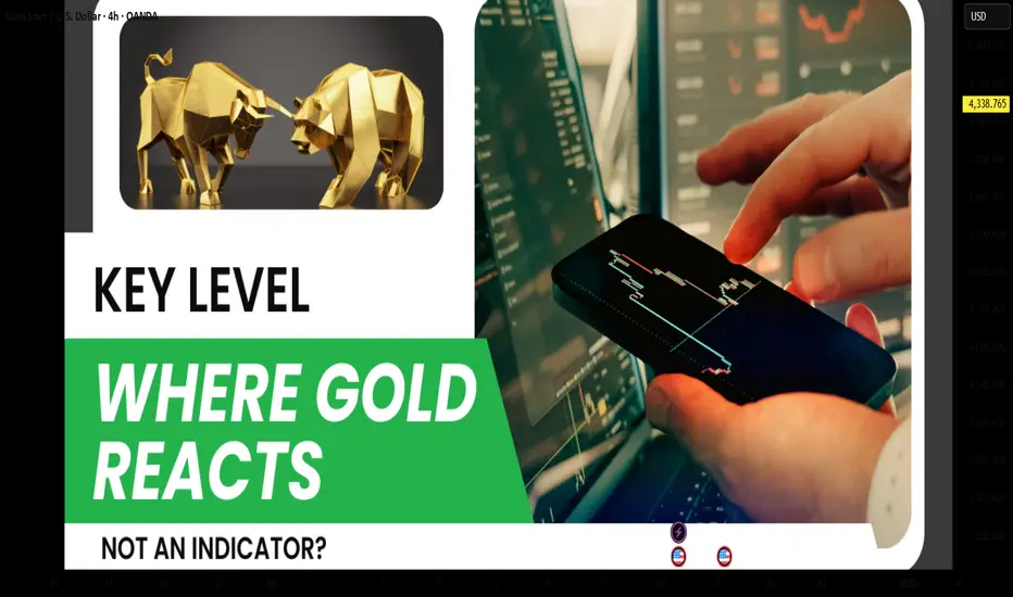
Key Levels – Where Gold Reacts, Not Indicators?Many traders start trading gold using indicators, and that’s something almost everyone goes through. However, the longer you stay in the market, the more clearly you realize one important truth: gold does not react to indicators; it reacts at key levels . Indicators only describe what price has already done, while key levels are where real money actually makes decisions.
Price does not move randomly. It reacts at important price zones.
Key levels are areas where the market has shown clear reactions in the past — strong reversals, repeated rejections, or consolidation before a breakout. In gold trading, these zones often align with major highs and lows, round numbers, or areas of concentrated liquidity.
This is where both retail traders and large capital are paying attention.
One major reason many traders consistently enter too late is over-reliance on indicators. Indicators are always based on past price data, so when a signal appears, the key reaction has often already happened. At that point, entries are less attractive, risk-to-reward deteriorates, and the probability of false breaks or stop hunts increases.
Indicators are not wrong, but they always lag behind price.
Professional traders don’t try to predict whether price will go up or down. They wait for price to reach a key level and then observe how the market reacts. Is price strongly rejected, or does it break through easily? Is real buying or selling pressure actually showing up?
Key levels are not places to predict — they are places to observe and react.
This doesn’t mean indicators are useless. Indicators still have value for momentum confirmation or for understanding market context. But they should not be the primary factor for making entry decisions.
Key levels tell you where to trade.
Indicators only help you understand how price is behaving.
Conclusion
If you are trading gold and still searching for the “best indicator for XAUUSD,” you may be asking the wrong question.
The better question is:
Which key level is the market respecting right now?
Because in the end, price reacts at levels — not at indicators.