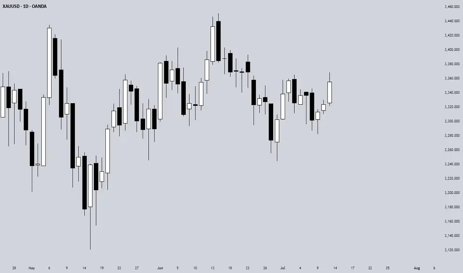
Welcome Back! Gold Trading Strategy & Key Zones to WatchIn this week’s welcome back video, I’m breaking down my updated approach to XAU/USD and how I plan to tackle the Gold markets in the coming days. After taking a short break, I’m back with fresh eyes and refined focus.
We’ll review current market structure, identify key liquidity zones, and outline the scenarios I’m watching for potential entries. Whether you’re day trading or swing trading gold, this breakdown will help you frame your week with clarity and confidence.
📌 Covered in this video:
My refreshed trading mindset after a break
Key support/resistance and liquidity zones
Market structure insights and setup conditions
What I’ll personally avoid this week
The “trap zones” that might catch retail traders off guard
🧠 Let’s focus on process over profits — welcome back, and let’s get to work.
Technical Analysis

The 3-Method Framework: Simplifying Technical AnalysisMost traders get caught up in complex indicator setups, thinking that more tools equal better results. We rely on moving averages to tell us if prices are trending up or down, and we depend on support and resistance levels to predict market movement. But what if I told you there's a simpler, more powerful way to read the market using pure price action?
Today, I want to share my experience and understanding of bias and expectations for the next candle formation. This approach is refreshingly simple because we don't need to understand every single price movement - we just need to focus on what matters most.
Method 1: Opening Price Comparison
The first method is beautifully straightforward. For a bullish bias, the current opening price should be above the previous opening price. That's it. Sounds almost too simple, right? But simplicity often holds the greatest power in trading.
For Gold yesterday, we simply needed to compare the latest opening price on the Daily timeframe with the previous opening price. It's that simple.
Method 2: Mid-Level Analysis
The second approach involves comparing mid-levels between candles. We compare the mid-level of the previous candle with the mid-level of the candle before that. I know it might sound a bit complicated when explained this way, but once you visualize it on your chart, the concept becomes crystal clear.
Still on Gold, we just compare the 50% or mid-level of the previous candle with the candle two periods back from the latest candle on the daily chart.
Method 3: Expansion Expectations
The third method helps us anticipate expansion in price. Traditional complex methods require analyzing numerous factors, but this simplified approach only needs two candles before the current one. Here's how it works: we use the high and low of the candle two periods back, and the open and close (body) of the previous candle. If the previous candle's body sits within the high-low range of the two-candle-back formation, we can expect price expansion.
The beauty of this method is that we don't care whether the price is bullish or bearish - we simply expect expansion to occur. Think of it like a compressed spring: when price gets squeezed within a previous range, it often seeks to break out in either direction. We're not predicting the direction, just the likelihood of significant movement.
Still on Gold, I randomly selected all inside candles on the Daily timeframe. Remember, the purpose is only to expect expansion, not direction. If you want to use this for directional bias, make sure you apply the additional analysis required.
Remember, there are no guarantees in trading, but this method provides valuable insight into potential market expansion.
Advanced Combinations for Enhanced Analysis
Combining Methods 1 and 2 creates our most accessible approach since you only need two candles. When both the opening price and mid-point from two candles ago indicate bullish conditions, we can expect the current candle to follow an OLHC bullish pattern.
You can see the 3 examples I've provided in the image, and all of these are applicable across all timeframes, both daily and 4-hour.
Combining all three methods offers a more sophisticated analysis, particularly useful for anticipating market reversals. This involves marking the current and previous opening prices, comparing mid-levels from the last two candles, and identifying the high/low range from two to three candles back.
Now I'm adding Inside Candles from 2-3 periods back (My personal rule is maximum 3 candles before the current candle, or this analysis will lead to analysis paralysis).
The Bullish and Bearish Rules
Bullish Rule 1:
Opening price above the previous opening price
Mid-level of the previous candle above the mid-level of the previous candle before that.
Inside candle formation (optional)
Bearish Rule 1:
Opening price below the previous opening price
Mid-level of the previous candle below the mid-level of the previous candle before that.
Inside candle formation (optional)
The Secret Sauce: Timeframe Harmony
Here's where the "devil is in the details" comes into play. You might find perfect bullish conditions on your chart, but the market still reverses. The secret lies in using this method on Daily and 4-hour timeframes simultaneously.
Simply understand it from the chart.
Simply understand it from the chart.
If Rule 1 conditions are met on the daily chart, they must also align on the 4-hour chart. When the 4-hour contradicts the daily, follow the 4-hour signal as it might indicate a "sell on strength" or "buy on weakness" scenario.
The formula is simple: must align with
I've never tested this on 1-hour charts because the Daily and 4-hour combination provides sufficient accuracy for my trading approach.
Enhanced Rules for Precision
Rule 2 makes the inside candle formation mandatory rather than optional. Sometimes you'll encounter mixed signals where the mid-level suggests one direction while the opening price suggests another. The solution? Drop down to a lower timeframe for additional confirmation.
I don't recommend using this method below the 4-hour timeframe, but you can certainly apply it to Monthly or Weekly charts for long-term bias determination. The key is analyzing both Daily AND 4-hour timeframes together, not just one or the other.
When timeframes conflict, often just one key level provides the confirmation you need - typically a previous Monthly or Weekly high or low.
Final Thoughts
Pure price action mastery isn't about having the most sophisticated setup or the most indicators on your chart. It's about understanding the fundamental relationship between opening prices, mid-levels, and candle formations across meaningful timeframes.
This approach has served me well because it cuts through market noise and focuses on what price is actually telling us. Start with these three methods, practice identifying the patterns, and gradually build your confidence in reading pure price action.
Remember, consistent profitability comes from mastering simple, reliable methods rather than chasing complex strategies. Keep practicing, stay disciplined, and let price action guide your trading decisions.
Good Luck! :)
What is Dynamic Support and Resistance Levels & Zones in Forex
Dynamic supports and resistances play a crucial role in technical analysis.
Unlike classic supports and resistances, these zones change and adapt to a market price action in real time.
Learn what is dynamic support and resistance in Forex, Gold trading and how to find it easily.
Discover its main types and real market examples.
Let's start with the basics.
There are 2 major types of supports and resistances in technical analysis.
The first type is called static .
Such supports and resistances are fixed and don't change with time.
It should be strictly horizontal key levels or the zones.
Market price action and momentum beyond them do not affect these supports and resistances.
In the example above, you can find static supports and resistances on Gold. The market may return to one of those levels or the zones today, tomorrow or in a month, but it will not move.
In comparison to static supports and resistances, the dynamic ones shift with time. They constantly change and adjust as the time flies.
One of the obvious types of dynamic supports and resistances is a trend line.
Above is the example of a dynamic rising support based on trend line.
As the time goes, a support shifts and becomes higher and higher.
I found a great example of a dynamic resistance on Dollar Index.
Depending on the moment when the price tests that, the resistance will be on different levels.
The later the price tests the trend line, the lower is the resistance.
When newbie traders learn dynamic supports and resistances, they usually stop on trend lines.
But it is just a beginning.
Really significant dynamic supports are resistances will be the zones .
The areas based on static horizontal supports and resistances and trend lines.
Examine a price action on GBPCHF forex pair.
We have a static horizontal support area and a dynamic rising trend line.
Two supports intersect, composing a contracting dynamic support zone.
With time, it will become narrower, accumulating buy orders within.
On NZDCAD forex pair, I underlined a contracting dynamic resistance zone that is based on an intersection of a static horizontal resistance area and a falling trend line.
Selling orders will be distributed within.
The 2 dynamic support and resistance zones that we discussed are narrowing , but that is not always the case.
A dynamic support zone that I found on GBPNZD is expanding and broaden with time.
It is based on a dynamic falling trend line and a static horizontal support.
With time its boundaries will be wider and a bullish reaction may initiate from any level within that.
A dynamic resistance area that I spotted on EURCAD forex pair is a great example of an expanding resistance.
It is based on a static horizontal resistance and a rising trend line.
We can easily recognize how it grows with time.
Of course, another types of dynamic supports and resistances exist. But they are more nuanced and rare.
As soon as you learn to recognize the clusters that we discussed in this article, you will be able to recognize the less obvious ones as well.
Next time, when you execute a support and resistance analysis, try to find a dynamic zone. You can find it on any time frame, and forex pair and gold, and it will completely change your perspective on the market.
❤️Please, support my work with like, thank you!❤️
I am part of Trade Nation's Influencer program and receive a monthly fee for using their TradingView charts in my analysis.

Master the Trio => to Level Up Your Trading🧠Most traders obsess over chart patterns and price action—but lasting success comes from mastering three pillars together:
Technical Analysis. Risk Management. Trading Psychology.
Miss one, and the structure collapses.
Let’s dive into each one, and see how they work together like a high-performance trading engine:
📈 1. Technical Analysis – Think in Layers, Not Lines
Most traders draw lines. Great traders read behavior.
Instead of asking “Is this support holding?”, ask “Why would smart money defend this level?”
Markets aren’t driven by lines—they’re driven by liquidity, trapped traders, and imbalances. That’s why:
A fakeout isn’t failure—it’s often a feature.
A breakout isn’t a buy signal—it’s bait.
Trendlines aren’t magic—they’re just visualizations of collective bias.
🔍 Advanced tip: When analyzing a chart, map out:
Where liquidity is resting (above equal highs/lows, tight consolidations)
Who’s likely trapped (late buyers at resistance, early sellers during accumulation)
Where the market must not go if your bias is correct (invalidations)
The real edge? Seeing the chart as a battle of intentions, not just candles.
🛡️ 2. Risk Management – Your License to Play the Game
Every trade is a bet. But without proper risk, it’s a gamble.
Risk management isn’t just about stop losses—it’s about position sizing, asymmetry, and survival.
I risk no more than 1% per trade , regardless of conviction.
I aim for 2R minimum —because even with a 50% win rate, I still grow.
I define my invalidation before I enter, never after.
You can’t control the outcome, but you can control your exposure. That’s professional.
🧠 3. Trading Psychology – Where Most Traders Break
You can have the perfect setup and smart risk, but still sabotage yourself.
Why? Because emotion overrides logic —especially when money is on the line.
Ever moved your stop? Chased a candle? Closed a trade too early, only to see it hit your TP later?
That’s not lack of skill—it’s lack of emotional discipline.
What works for me:
Journaling every trade—not just the result, but how I felt
Practicing “sit tight” discipline after entries
Reminding myself that no single trade matters—only the process does
You don’t trade the chart—you trade your beliefs about the chart. Master yourself first.
🔄 Final Thoughts
Trading isn’t just about entries.
It’s a mental game played on financial charts, where edge lies in understanding market mechanics, protecting capital, and staying emotionally grounded.
TA shows you the “what”
Risk shows you the “how much”
Psychology decides the “how well”
Master all three—and you’ll separate yourself from 95% of traders.
💬 Which of the three is your strongest? And which one needs more work?
Let’s grow together—drop your thoughts in the comments 👇
All Strategies Are Good; If Managed Properly!
~Richard Nasr

Best Free Volatility Indicator on TradingView for Gold Forex
This free technical indicator will help you easily measure the market volatility on Forex, Gold or any other market.
It will show you when the market is quiet , when it's active and when it's dangerous .
We will go through the settings of this indicator, and you will learn how to set it up on TradingView.
Historical Volatility Indicator
This technical indicator is called Historical Volatility.
It is absolutely free and available on TradingView, MetaTrader 4/5 and other popular trading terminals.
TradingView Setup
Let me show you how to find it on TradingView and add it to your price chart.
Open a technical price chart on TradingView and open the "Indicators" menu (you will find it at the top of the screen).
Search "Historical Volatility" and click on it.
It will automatically appear on your chart.
"Length" parameter will define how many candles the indicator will take for measuring the average volatility. (I recommend keeping the default number, but if you need longer/shorter-term volatility, you can play with that)
Timeframe drop-down list defines what time frame the indicator takes for measuring the volatility. (I recommend choosing a daily timeframe)
And keep the checkboxes unchanged .
How to Use the Indicator
Now, let me show you how to use it properly.
Wider the indicator and analyse its movement at least for the last 4 months.
Find the volatility range - its low levels will be based on the lower boundary of the range, high levels will be based on its upper boundary.
This is an example of such a range on USDCAD pair.
When the volatility stays within the range, it is your safe time to trade.
When volatility approaches its lows, it may indicate that the market might be slow .
Highs of the range imply that the market is very active
In-between will mean a healthy market.
The Extremes
The violation of a volatility range to the downside is the signal that the market is very slow . This would be the recommended period to not trade because of high chance of occurrence of fakeouts.
An upward breakout of a voliatlity range is the signal of the extreme volatility . It will signify that the market is unstable , and it will be better to let it calm down before placing any trade.
Volatility Analysis
That is how a complete volatility analysis should look.
At the moment, volatility reached extreme levels on CADJPY pair.
The best strategy will be to wait till it returns within the range.
Remember This
With the current geopolitical uncertainty and trade wars, market volatility reaches the extreme levels.
Such a volatility is very dangerous , especially for newbie traders.
Historical volatility technical indicator will help you to easily spot the best period for trading and the moment when it is better to stay away.
❤️Please, support my work with like, thank you!❤️
I am part of Trade Nation's Influencer program and receive a monthly fee for using their TradingView charts in my analysis.

When and How to Use Weekly Time Frame in Gold Forex Trading
Ignoring weekly time frame chart analysis could cost you big losses in Forex, Gold trading!
Discover 3 specific cases when weekly time frame beats daily time frame analysis.
Learn the situations when weekly timeframe exposes what daily charts can’t, how to analyze it properly and when to check it.
1. Long-term historic levels
When the market trades in a strong bullish or bearish trend and goes beyond recent historic levels, quite often the daily time frame will not be sufficient for the identification of significant supports and resistances.
The proven way to identify the next meaningful levels will be to analyze a weekly time frame.
Examine a price action on EURAUD forex pair on a daily time frame chart. The market is trading in a strong bullish trend and just updated the high.
Checking the historic price action, we don't see any historic resistance on the left.
Switching to a weekly time frame chart, we can easily recognize a historic resistance that the price respected 5 years ago.
That's a perfect example when weekly t.f revealed a historic price action that a daily didn't.
2. Trend-lines
Weekly time frame analysis is important not only for a search of historic levels. It can help you find significant vertical structures - the trend lines.
We can easily find several meaningful historic resistances on EURUSD pair on a daily time frame.
Though, there are a lot of historic structures there, let's check if there are some hidden structures on a weekly.
Weekly time frame reveals 2 important trend lines, one being a vertical support and another being a vertical resistance.
With a daily time frame analysis, these trend lines would be missed .
3. More accurate breakout confirmations
Some false support and resistance breakouts that you see on a daily could be easily avoided with a weekly time frame analysis.
Quite regularly, a daily time frame support or resistance is in fact a weekly structure. And for its breakout, a weekly candle close will provide more accurate confirmation.
From a daily time frame perspective, we see a confirmed breakout - a daily candle close above a solid resistance zone.
It provides a strong bullish signal on AUDUSD forex pair.
However, the violation turned out to be false and dropped.
Such a false breakout , could be easily avoided, checking a weekly time frame chart.
The underlined resistance is in fact a weekly structure.
The price did not manage to close above, and perfectly respected that, starting to fall after its test.
Such a deeper analysis would completely change our bias from strong bullish (based solely on a daily) to strongly bearish (based on a daily AND weekly)
Remember This
Do not ignore and always check a weekly time frame.
It shows a unique perspective on the market and reveals a lot of hidden elements that you would not notice.
No matter whether you are a scalper, day trader or swing trader,
remember that weekly time frame structures are very impactful and accumulate large trading volumes.
❤️Please, support my work with like, thank you!❤️
I am part of Trade Nation's Influencer program and receive a monthly fee for using their TradingView charts in my analysis.

Multi-Time Frame Analysis (MTF) — Explained SimplyWant to level up your trading decisions? Mastering Multi-Time Frame Analysis helps you see the market more clearly and align your trades with the bigger picture.
Here’s how to break it down:
🔹 What is MTF Analysis?
It’s the process of analyzing a chart using different time frames to understand market direction and behavior more clearly.
👉 Example: You spot a trade setup on the 15m chart, but you confirm trend and structure using the 1H and Daily charts.
🔹 Why Use It?
✅ Avoids tunnel vision
✅ Aligns your trades with the larger trend
✅ Confirms or filters out weak setups
✅ Helps you find strong support/resistance zones across time frames
🔹 The 3-Level MTF Framework
Use this to structure your chart analysis effectively:
Higher Time Frame (HTF) → Trend Direction & Key Levels
📅 (e.g., Daily or Weekly)
Mid Time Frame (MTF) → Structure & Confirmation
🕐 (e.g., 4H or 1H)
Lower Time Frame (LTF) → Entry Timing
⏱ (e.g., 15m or 5m)
🚀 If you’re not using MTF analysis, you might be missing critical market signals. Start implementing it into your strategy and notice the clarity it brings.
💬 Drop a comment if you want to see live trade examples using this method!

How to use advanced candlestick anatomy in trading: CADJPYEvery candlestick on the chart is made up of different or multiple candles on the lower timeframe. For example, a weekly candle is made up of seven daily candles. While a 4 hours candle is made up of four 1 hour candles. Understanding how these candles contribute to the formation of a single or more candlesticks will go a long way in improving our performance.
Candlestick anatomy has to do with the formation of candlestick on the chart and the implication of such candlestick. Conventionally, common candlesticks are engulfing candlestick, doji, evening star, hammer, pin bar and the rest. Some signify continuation while others are meant for reversal. The formation of these candlesticks at key levels provide an helpful insights into understanding the next market move. Hence, they can serve as confluence and confirmation for our trading decision.
Taking this further a bit, by examining these candlesticks, one can get to understand better a precise point for entry and exit. This may be new to a retail trader who trades just the candlestick while it will provide more insights for anyone looking for ways to optimize his performance.
As a case study, I had a sell setup on CADJPY and it gave a bearish engulfing candlestick on 1 hour timeframe as a confirmation for selling. Instead of entering the trade after the bearish candle closed, I changed to 5 minutes timeframe to examine the anatomy of the candlestick. Then, I discovered that there was sweep and change of character. Based on the price narrative on 5 minutes timeframe, then trading decision was made using the 5 minutes timeframe, targeting 3 RR. If 1 hour timeframe had been used for taking the trade, one is likely to have lost the profit by now.
Candlestick anatomy will help you to optimize your performance and returns.
I hope you've learnt something helpful from this post.
Thanks.
Fatai Kareem, Kof T Fx.

Learn TOP 3 Elements of a Perfect SWING TRADE (GOLD, FOREX)
In the today's post, I will share with you a formula of ideal swing trading setup.
✔️Element 1 - Market Trend
When you are planning a swing trade, it is highly recommendable that the direction of your trade would match with the direction of the market trend.
If the market is trading in a bullish trend, you should look for buying the market while if the market is bearish, you should look for shorting.
Take a look at CHFJPY pair on a daily. Obviously, the market is trading in a bullish trend and your should look for swing BUYING opportunity.
✔️Element 2 - Key Level
You should look for a trading opportunity from a key structure.
IF the market is bullish, you should look for buying from a key horizontal or vertical SUPPORT, WHILE if the market is bearish, you should look for shorting from a key horizontal or vertical RESISTANCE.
CHFJPY is currently approaching a rising trend line - a key vertical support.
Please, note that if the price is NOT on a key structure, you should patiently wait for the test of the closest one.
✔️Element 3 - Confirmation
Once the market is on a key level, do not open a trading position blindly. Look for a confirmation - for the sign of strength of the buyers, if you want to buy or for the sign of strength of the sellers, if you are planning to short.
There are dozens of confirmation strategies, one of the most accurate is the price action confirmation.
Analyzing a 4H time frame on CHFJPY, we can spot a falling wedge pattern. While the price is stuck within that, the minor trend remains bearish. Bullish breakout of the resistance of the wedge will be the important sign of strength of the buyers and can be your strong bullish confirmation.
Following these 3 conditions, you will achieve high win rate in swing trading. Try these techniques yourself and good luck in your trading journey.
❤️Please, support my work with like, thank you!❤️
I am part of Trade Nation's Influencer program and receive a monthly fee for using their TradingView charts in my analysis.

What Makes a Chart Tradable – Part TwoIn the previous post , we explored the foundations of technical trading. We examined how market behavior can appear structured even when it results from randomness, how bias affects interpretation and how volatility persistence helps explain why certain moves tend to cluster rather than appear in isolation. This post builds on that foundation by focusing on how to recognize meaningful movement and determine whether a chart structure is tradable.
Technical charts often present a wide range of setups, patterns, and interpretations. But a core distinction must be made between coincidental formations and actual price behavior driven by imbalance. Not all movements are equal, and recognizing the difference between random fluctuation and purposeful structure is essential.
A common assumption in technical analysis is that certain patterns or shapes inherently provide a specific outcome. This assumption is problematic without a defined context. The ability to recognize a flag or wedge does not imply statistical validity. For a price movement to be tradable, there should be characteristics that suggest underlying buying or selling pressure.
Unusual Movement
To determine whether a price move is meaningful, it must be assessed in relation to what is typical for that market. All assets have their own average range, pace and rhythm. When price breaks from that baseline through unusually strong or sustained movement, it can signal momentum or imbalance.
What makes these moves relevant is not their size alone, but the fact that they differ from normal behavior. This kind of shift may reflect changes in supply and demand or a reaction to new information. Such movements could mark a change in behavior and can serve as reference points. Their value lies in being statistically uncommon, which may suggest that market conditions have changed.
Pullbacks as Rebalance
Following strong directional movement, price tends to enter a state of reversion or pause. This is known as a pullback, a controlled retracement .It is not merely a pause. It reflects a psychological reset and the temporary rebalancing of order flow in response to imbalance.
Not all pullbacks are viable. For a setup to be considered tradable, the retracement must occur in the context of a meaningful prior move. When the underlying trend is intact and the pullback is controlled, the structure can offer a more reliable opportunity.
The Role of Standardization
Trading should be based on discretion. It involves interpretation, context and deliberate decision-making. But without structure, it risks becoming inconsistent and reactive.
Therefore movement and momentum should be measurable. What appears meaningful must be evaluated relative to the asset’s own historical behavior, not assumed based on surface-level appearance. Without a reference, the evaluation may lack foundation.
Measurement supports model building. Standardization supports disciplined execution. A trader might believe a move is strong based on visual cues or pattern familiarity, but if it lacks historical context or fails to meet defined criteria, that evaluation could be flawed.
Framework and Models
There are categories of tools that can be incorporated to support standardization. The choice is not fixed and should be based on personal preference, methods and research. Example:
Volatility Measure: Could be used to confirm when price moves outside a volatility-based envelope, indicating movement beyond the average range.
Momentum Measure: Could be used to confirm whether current price action is faster or stronger compared to recent historical behavior.
Such models are used to define context, not to predict outcomes. They help standardize analysis and filter out questionable movements and patterns.
Conclusion
The textbook patterns often referenced on their own do not create edge. Tradable charts are those where meaningful movement, defined by momentum, imbalance and structure, can be observed and evaluated using standardized methods. The purpose is not precision but repeatability. Discretionary trading is built on contextual evaluation supported by consistency and objective tools.

Are You Using Technical Indicators All Wrong?Most indicators aren’t broken. Most traders use them wrong.
Thousands of traders rely on RSI, MACD, and moving averages — and most of them still lose money. Why? Because they use tools the wrong way, in the wrong context, with the wrong mindset.
Let’s break it down:
1. Indicators don’t predict — they react.
RSI hitting 30 doesn’t mean “buy”. It means selling pressure dominated recently.
2. One tool ≠ one strategy.
MACD or CCI alone won’t build you a system. Context, confluence, and confirmation matter.
3. Emotional confirmation kills discipline.
Seeing RSI 70 after price moves doesn’t mean you’re late. It means your emotions want to join the move — not your logic.
🚨 Solution?
Use indicators as filters, not triggers.
Build rules. Track what works. Trade the system — not your excitement.
Want to see more posts like this? Let us know — We're preparing a series of deep-dives into indicator psychology and structure.

Learn KEY PRINCIPLES of Technical Analysis in Gold Forex Trading
In the today's article, we will discuss the absolute basics of trading - 3 key principles of technical analysis in Forex & Gold Trading.
1️⃣History Repeats
History tends to repeat itself in the Forex market.
Certain trends are cyclical and may reemerge in a predictable manner, certain key levels are respected again and again over time.
Take a look at the example:
Silver perfectly respected a historical horizontal resistance in 2011 that was respected in 1980 already. Moreover, the price action before and after the tests of the underlined zone were absolutely identical.
2️⃣Priced In
All relevant information about a currency pair: economical and political events, rumors, and facts; is already reflected in a price.
When the FED increased the rate 26th of July by 25 bp, EURUSD bounced instead of falling. Before the rate hike, the market was going down on EXPECTATIONS of a rate hike. The release of the news was already price in.
3️⃣Pattern DO Work
Some specific price models can be applied for predicting the future price movements.
Technicians strongly believe that certain formations - being applied and interpreted properly, can give the edge on the market.
Depending on the trading style, different categories of patterns exist: harmonic patterns, price action patterns, wave patterns, candlestick patterns...
Above, I have listed various price action patterns that are applied by many traders and investors as the main tool for analyzing the financial markets.
If you believe in these 3 principles, you are an inborn technician!
Study technical analysis and learn to apply these principles to make money in trading.
b]❤️Please, support my work with like, thank you!❤️
I am part of Trade Nation's Influencer program and receive a monthly fee for using their TradingView charts in my analysis.

How to Use Renko Charts for Drawing Support and ResistanceHow to Use Renko Charts for Drawing Support and Resistance Like a Pro
Most traders rely on candlestick charts to identify support and resistance zones—but if you’re still sleeping on Renko charts, you’re missing out on one of the cleanest ways to map market structure.
Renko charts filter out noise and only plot price movement, not time, giving you a stripped-down view of market momentum. That’s exactly what makes them powerful for spotting true support and resistance zones—without all the clutter.
Why Renko Charts Work for Support & Resistance
Support and resistance are areas where price historically reacts—either bouncing or reversing. On traditional candlestick charts, these zones can be hard to identify clearly because of wicks, time-based noise, and volatility.
Renko charts simplify that.
Because Renko bricks are only formed after a specific price move (like 20 pips or using ATR), the chart naturally filters out sideways chop and lets key levels stand out like neon signs.
How to Draw Support and Resistance with Renko
Here’s a quick step-by-step process:
Set Your Brick Size
Use an ATR-based Renko setting (ATR 14 is common), or set a fixed brick size that fits your trading style. For swing trading, slightly larger bricks will work best.
Look for Flat Zones
Identify areas where price stalls or flips direction multiple times. These flat “shelves” on the Renko chart often line up with strong historical support or resistance.
Mark the Bricks, & Sometimes The Wicks
With Renko, you’re not dealing with traditional candlestick wicks. So your levels are based on the tops and bottoms of the bricks, not erratic spikes.
Check for Confirmation
If a level held as resistance and later flips into support (or vice versa), that’s a key zone to mark. These “flip zones” are often hotbeds of institutional activity.
Bonus Tip: Combine with Price Action
Renko charts tell you where price is likely to react—but combining them with price action techniques (like engulfing candles, pin bars, or M/W formations on traditional charts) will give you a lethal edge.
Use Renko to mark the zone, then switch to candlesticks to fine-tune the entry. Best of both worlds.
If you’ve been struggling to draw clean support and resistance levels—or find yourself second-guessing your zones—Renko might be your solution. It’s not about fancy indicators or chart tricks; it’s about removing the noise so you can trade what really matters: structure and momentum.
Are you using Renko in your strategy? Drop a comment or shoot me a message—I want to hear how it’s working for you.

How to Analyze a Technical Chart: Practical Guide (BTC EXAMPLE)Hello, traders! ✍🏻
Understanding a chart isn't about predicting the future — it’s about recognizing what’s already happening. Whether you're evaluating a Bitcoin breakout or watching a new altcoin pump, technical chart analysis is one of the most powerful tools traders use to make sense of price movements. But how exactly do you read a technical analysis chart? What matters most — and what’s just noise?
Let’s break it down.
1. Look at the Big Picture: Price Trends and Structure
Before zooming in, zoom out. Start with the daily or weekly chart to identify the primary trend. Is the asset making higher highs and higher lows (an uptrend)? Or is it stuck in a sideways channel?
In Price Analysis, Market Structure Is Your Anchor:
Uptrend: Higher Highs and Higher Lows
Downtrend: Lower Highs and Lower Lows
Consolidation: Sideways Moves with Clear Support/Resistance
This high-level view helps you avoid common traps, like going long in a downtrend or shorting near long-term support.
2. Use Support and Resistance Like a Map
Support and resistance levels form the backbone of chart technical analysis. They show you where price reacted in the past — and likely will again.
Support: A Price Level Where Buyers Previously Stepped In.
Resistance: A Level Where Sellers Pushed Price Down.
The more times a level is tested, the more important it becomes. These zones can act as entry/exit points or as signals for potential breakouts or reversals.
3. Add Indicators — But Don’t Overload!
Indicators are helpful — if used right. The key is to complement price action, not replace it. Start Simple:
RSI (Relative Strength Index): Detect Overbought/Oversold Conditions
Volume: Confirms Strength Behind Price Moves
Moving Averages: Help Identify Trends and Dynamic Support/Resistance
Avoid piling on too many indicators. If your technical analysis chart looks like a control panel, you might be overcomplicating your decision-making.
4. Timeframes Matter — And So Does Context
Don’t mix signals across timeframes without context. A bullish setup on the 15-minute chart can collapse under a bearish daily trend.
Watch for Multi-Timeframe Analysis:
Weekly: Macro Trend
Daily: Trading Bias
4H/1H: Entry and Exit Planning
This layered approach helps you stay aligned with momentum while avoiding short-term noise.
Full Breakdown: Technical Chart Analysis of BTC/USDT (1W)
The BTC/USDT weekly chart presents a textbook example of how price evolves through well-defined market phases, structural levels, and momentum shifts. Let’s walk through each component in detail — not just what is shown on the chart, but also why it matters and how it’s typically identified in technical analysis.
We begin by examining the market structure. From mid-2020 to late 2021, Bitcoin followed a strong uptrend, consistently printing higher highs and higher lows. This kind of price action is characteristic of bullish expansion phases, where momentum builds gradually and pullbacks are shallow. Technically, an uptrend is confirmed when each new peak surpasses the previous, and support continues to form above former lows. In this case, the trend accelerated rapidly into the $60K–$70K zone before exhaustion set in.
The shift occurred in late 2021, as the market transitioned into a macro correction. From a structural standpoint, the pattern reversed — lower highs began to form, and key support levels were breached. This downtrend, lasting through 2022, is a typical bear phase in a market cycle, where distribution outweighs accumulation. Price made several failed attempts to reclaim previous highs, confirming bearish control and increased selling pressure.
What followed was an extended period of sideways movement between late 2022 and early 2023 — a classical accumulation zone. This phase is often overlooked but is critical in technical chart analysis. Here, price consolidated in a narrow range, with volatility contracting and RSI hovering near oversold territory. This kind of stabilization often signals that selling pressure has subsided and that larger players may be building positions ahead of a breakout. It is identified not just by price flattening, but by volume dropping and the absence of directional follow-through in either direction.
By mid-2023, a recovery structure began to emerge. Bitcoin started printing higher lows and eventually broke above prior resistance zones, indicating the formation of a new trend. As of early 2025, this trend appears to be unfolding, though price is once again facing historical resistance near its all-time highs — the $69K–$74K zone. This region has acted as a ceiling in both the 2021 and 2024 cycles, making it a well-established historical resistance level. In technical terms, the more times a level rejects price, the more significant it becomes, as market participants tend to place orders around such zones in anticipation of repeated behavior.
One of the most important structural zones on the chart lies around the $50K–$53K range. This mid-zone has acted as support during the 2021 bull run, flipped into resistance during the 2022 downtrend, and has once again returned to functioning as a support area in the current recovery. This phenomenon — where old support becomes new resistance and vice versa — is a classic concept in technical chart analysis, signaling that market memory is active and that this level is psychologically and technically significant.
At the lower end, the $30K level has held repeatedly across multiple market phases, establishing itself as a long-term support zone. Its durability, despite heavy corrections, suggests significant accumulation and investor interest at that level. This zone has marked major bottoms and remains a key threshold that, if broken, could signal a structural shift in sentiment.
Momentum analysis further confirms these phases. The Relative Strength Index (RSI), plotted beneath the price chart, hovered in overbought territory during both the 2021 and 2024 peaks, exceeding 70 and signaling potential exhaustion. In contrast, the RSI dipped into the 30s in 2022, aligning with the end of the downtrend and beginning of accumulation. These signals are not to be taken in isolation, but when combined with structure and volume, they add powerful confirmation to trend shifts. At the time of writing, RSI sits around 48 — neutral ground, indicating the market has not yet committed to a new directional move.
This layered approach — combining trend structure, support and resistance zones, and momentum indicators like RSI — is fundamental to technical chart analysis. It enables traders to navigate through market noise and identify phases of expansion, correction, and re-accumulation with greater clarity. Each of these elements, when aligned, increases the probability of high-conviction setups and helps avoid emotionally driven decisions in volatile environments.
Final Thought
Mastering technical chart analysis isn’t about memorizing patterns — it’s about training your eyes to read structure, sentiment, and context. And like any skill, the more charts you read, the sharper you get.
This is only an isolated analysis of the macro trend — a high-level look at Bitcoin’s price structure using weekly timeframes. In reality, technical analysis can be performed across multiple timeframes, combining far more indicators, chart patterns, and volume-based tools depending on your strategy and goals.
Platforms like TradingView offer a wide range of features for deeper technical insight — from advanced oscillators to custom scripting and community-driven indicators. The chart above serves as a historical case study, not a trading signal. It provides a reference point for how sentiment shifts can be visualized over time through structure and momentum.
If you’d like to explore other educational breakdowns or real-time analysis, feel free to check out more content on our TradingView page. This post is not financial advice, but 100% a technical perspective on past price action and market behavior.
💬 What’s your go-to indicator or setup when doing token price analysis?
This analysis is performed on historical data, does not relate to current market conditions, is for educational purposes only, and is not a trading recommendation.

How Momentum Divergence Reveals Hidden Market Strength and WeaknMost traders watch price action closely: candlesticks, moving averages, trendlines. But there’s a deeper, less obvious layer of information that often signals shifts in direction before price confirms it: momentum.
📌 Quick overview – what you'll learn:
What momentum divergence is (clearly explained)
How it helps predict potential trend shifts
Practical ways to spot and trade divergences
📈 Price vs Momentum: They're Not the Same!
Momentum doesn't simply track price direction. Instead, it measures the strength behind price movements.
Rising prices, falling momentum often signals upcoming bearish reversals.
Falling prices, rising momentum often hints at bullish reversals building beneath the surface.
These subtle divergences are powerful because they reveal hidden market shifts before everyone else notices them.
⚠️ How to Spot Momentum Divergence (Simple Steps):
Step-by-step:
- Find clear price swings:
Clearly defined highs/lows on your chart.
- Check momentum indicators (RSI, MACD, CCI, etc.):
Does the indicator agree or disagree with the price action?
- Spot divergence:
Bullish divergence: Price makes lower lows, indicator shows higher lows.
Bearish divergence: Price makes higher highs, indicator shows lower highs.
- Confirmation:
Always wait for price confirmation like a reversal candle or break of a trendline.
🔥 Why Momentum Divergence Works:
Divergence highlights hidden accumulation or distribution by smart money.
Helps you anticipate reversals before price confirms.
Filters out weak moves and helps you avoid fake breakouts.
📊 Real Example (XAUUSD – April 2025):
Recently in Gold:
Price was dropping steadily, reaching new lows.
Meanwhile, RSI showed clear higher lows – classic bullish divergence.
Result: Price exploded significantly shortly after momentum divergence appeared clearly.
🧠 Trading Tips to Remember:
Divergence signals are stronger near key support/resistance zones.
Use momentum divergence with your existing strategy for confirmation, not isolation.
Always define your risk clearly (set stops above/below recent highs/lows).
🚩 Common Pitfalls to Avoid:
Trading divergence without confirmation: always wait for the market to show its hand.
Ignoring the bigger picture: check higher timeframes for stronger signals.
Overtrading: not every divergence leads to a reversal; quality beats quantity.
🚀 Your Action Plan for Next Week:
Pick one momentum indicator and identify at least 3 divergences on your favorite assets.
Monitor how they play out.
Note down what works best in your trading journal.
💬 Question for you:
What’s your go-to momentum indicator when spotting divergence? RSI, MACD, CCI, or something else? Drop a comment below!
Happy trading!
TrendGo Team

Foundation of Technical Trading: What Makes a Chart Tradable?The Foundation of Technical Trading
There is an abundance of information on price charts, technical methods, indicators, and various tools. However, the required first step is to understand basic market structure. Without this foundational knowledge, technical applications risk becoming inconsistent and disconnected from broader market behavior.
It is also important to question whether technical charts and tools are effective at all. What makes the market responsive to a trendline, a pattern, or an indicator? And why, at other times, do these tools seem entirely irrelevant? Is the market random? If certain events are predictable, under what conditions can such occurrences be expected?
Experiment: Random Charts
Here is an illustration of four charts; two showing real price data and two randomly generated. While some visual distortion gives away subtle differences, there are more refined methods to construct this experiment that makes telling the difference between real and random almost impossible.
All these charts show viable patterns and possible applications. When presented with these, even experienced people tend to construct narratives, whether or not structure is present. This raises a fundamental question; how can one distinguish real occurrences from coincidental formations on a chart? In case all movements are considered random, then this should indicate that applied methods perform no better than coincidence?
Bias and Distortion
It’s also important to comprehend the influence our perception. As humans we are wired to find patterns, even in random data, which can lead to various cognitive biases that distort our interpretation. For example, confirmation bias may lead us to focus only on evidence that supports our expectations, while apophenia causes us to see patterns where none exist. Similarly, hindsight bias can trick us into believing past patterns were obvious, which can develop overconfidence in future decisions. Awareness of these biases allows us to approach technical tools and charts with greater objectivity, with more focus on probabilistic methods and calculated risks.
Experiment: Random Levels
Perform the following experiment; open a chart and hide the price data. Then draw a few horizontal lines at random levels.
Then reveal the price again. You’ll notice that price can touch or reverse near these lines, as if they were relevant levels.
The same thing can happen with various indicators and tools. This experiment shows how easy it is to find confluence by chance. It also raises an important question, is your equipment and approach to the markets more reliable than random?
Market Disorder
Financial markets consist of various participants including banks, funds, traders and algorithmic systems. These participants operate with different objectives and across multiple timeframes resulting in a wide range of interpretations of market behavior. Trades are executed for various reasons such as speculation, hedging, rebalancing, liquidation or automation; directional intent could be unclear. For instance, the prior may serve to offset exposure, and portfolio rebalancing could require the execution of large orders without directional intent.
Technical and chart-based trading likely makes up a minor segment of the overall market; even within this subset, there is considerable variation in perception and interpretation. There could be differences in timeframe, reference points, pattern relevance and responses to similar information. The market is broader, more complex and less definitive than it appears. The point is that markets contain a high degree of structural disorder, which means most assumptions should be questioned and perceived as estimative.
The effect of buying and selling pressure on multiple timeframes sets the foundation for oscillation in price movements, rather than linear and monotonic movements. This pattern of rising and falling in a series of waves sets the points for where the current structure transitions between balance and imbalance. An overall equilibrium between buying and selling pressure results in consolidative price movement, whereas dominance leads to trending or progressive movement.
Volatility Distribution
To answer the main question: What differentiates real market behavior and charts from random data, and ultimately makes it tradable, is the distribution of volatility. This forms the basis for the phenomenon of volatility clustering, where periods of high volatility tend to follow high volatility, and low volatility follows low volatility. It is rare for the market to shift into a volatile state and then immediately revert to inactivity without some degree of persistence. Research supports the presence of this volatility persistence, though with the important caveat that it does not imply directional intent.
Volatility Cycles
These phases tend to occur in alternation, known as volatility cycles, which set the foundation for tradable price structures. This sequence consists of a contractive phase, marked by compression in price movements, followed by an expansive phase, characterized by increased volatility and directional movement. The alternation reflects shifts in underlying buying and selling pressure. This behavior offers a practical approach to interpret market behavior. A more detailed explanation of the concept could be explored in a future post.
Conclusion
While the idea of profitability through technical trading is often questioned, it remains a viable approach when based on sound principles. The edges available to the average trader are smaller and less frequent than commonly presumed. The concepts of volatility and the ability to locate areas of imbalance forms the basis for identifying conditions where market behavior becomes less random and more structured. This sets the foundation for developing technical edges.
The content in this post is adapted from the book The Art of Technical Trading for educational purposes.
Real Reason Most Strategies Fail–“Overfitting” Explained Simply!Hello Traders!
Have you ever seen a strategy work amazingly on historical charts, but fail badly in live markets? You’re not alone. One of the biggest reasons this happens is due to something called Overfitting . Today, let’s understand this concept in the simplest way — so you can avoid falling into this trap and build smarter strategies.
What is Overfitting in Trading?
Overfitting means your strategy is too perfect for past data:
It works great on old charts, but only because it was made to match that exact data.
It fails in real-time because the market changes:
The strategy doesn’t adapt well to new price behavior — it’s not flexible.
Example:
A strategy with 10 indicators giving perfect backtest results may be too specific and only fits that period — not future ones.
Signs Your Strategy Might Be Overfitted
Too many rules or filters:
If your strategy has too many conditions just to improve past results, that’s a red flag.
Works only on one stock or timeframe:
A good strategy should work on different stocks and market conditions.
Great backtest, bad live performance:
If your real trades don’t match the backtest, it might be too customized to the past.
How to Avoid Overfitting in Trading
Keep it simple:
Use fewer indicators and rules. Focus on clean price action and proven setups.
Test on different stocks/timeframes:
See if your setup works across Nifty, Bank Nifty, stocks, or different timeframes.
Use forward testing:
Try the strategy on live charts (paper trade) before putting real money into it.
Rahul’s Tip
A perfect backtest doesn’t mean a perfect future. Build your strategy to be reliable — not just impressive on history.
Conclusion
Overfitting is like memorizing old exam answers and failing the new paper. Don’t build strategies that only look good on past data. Make them strong, simple, and adaptable to real market conditions.
Have you faced this issue before? Let’s discuss in the comments and help each other improve!

What Is Momentum – And Why It’s Not Just a Trend IndicatorMost traders follow price — candles, trendlines, support/resistance. But there’s another layer that often tells the story before the price moves: momentum.
⸻
🔍 In this post, you’ll learn:
• What momentum really measures
• Why it’s not the same as price direction
• How momentum can signal a shift before the chart confirms it
• Why combining momentum with structure improves timing
⸻
📈 Momentum ≠ Direction
Price can be rising while momentum is fading. That’s often a clue of an upcoming slowdown or reversal — long before the price turns. Similarly, price can be flat, while momentum builds in one direction. That’s tension… and tension leads to moves.
⸻
🔥 Why Momentum Matters:
• It reveals intensity, not just direction
• It can act as a leading indicator — not lagging
• Momentum divergences often hint at hidden accumulation or distribution
• Tracking it helps you avoid late entries or false breakouts
⸻
🔧 Takeaway for traders:
If you’re only watching price, you’re only seeing half the picture.
Momentum shows what’s driving the move, and when that drive starts weakening.
⸻
💬 What’s your favorite momentum indicator? RSI, %R, CCI, or something else?

$100, $1,000, $100,000 — When Numbers Become Turning PointsHey! Have you ever wondered why 100 feels... special? 🤔
Round numbers are like hidden magnets in the market. 100. 500. 1,000. They feel complete. They stand out. They grab our attention and make us pause. In financial markets, these are the levels where price often slows down, stalls, or makes a surprising turn.
I’ll admit, once I confused the market with real life. I hoped a round number would cause a reversal in any situation. Like when I stepped on the scale and saw a clean 100 staring back at me, a level often known as strong resistance. I waited for a bounce, a sudden reversal... but nothing. The market reacts. My body? Not so much. 🤷♂️
The market reacts. But why? What makes these numbers so powerful? The answer lies in our minds, in market dynamics, and in our human tendency to crave simplicity.
-------------------------------------
Psychology: Why our brain loves round numbers
The human mind is designed to create structure. Round numbers are like lighthouses in the chaos — simple, memorable, and logical. If someone asks how much your sofa cost, you’re more likely to say "a grand" than "963.40 dollars." That’s normal. It’s your brain seeking clarity with minimal effort.
In financial markets, round numbers become key reference points. Traders, investors, even algorithms gravitate toward them. If enough people believe 100 is important, they start acting around that level — buying, selling, waiting. That belief becomes reality, whether it's rational or not. We anchor decisions to familiar numbers because they feel safe, clean, and "right."
Walmart (WMT) and the $100 mark
Round numbers also carry emotional weight. 100 feels like a milestone, a finish line. It’s not just a number, it’s both an ending and a beginning.
-------------------------------------
Round numbers in the market: Resistance and support
Round number as a resistance
Imagine a stock climbing steadily: 85, 92, 98... and then it hits 100. Suddenly, it stalls. Why? Investors who bought earlier see 100 as a "perfect" profit point. "A hundred bucks. Time to sell." Many pre-set sell orders are already waiting. Most people don’t place orders at $96.73. They aim for 100. A strong and symbolic.
At the same time, speculators and short sellers may step in, viewing 100 as too high. This creates pressure, slowing the rally or pushing the price back down.
If a stock begins its journey at, say, $35, the next key round levels for me are: 50, 100, 150, 200, 500, 1,000, 2,000, 5,000, 10,000…
Slide from my training materials
These levels have proven themselves again and again — often causing sideways movement or corrections. When I recently reviewed the entire S&P 500 list, for example $200 showed up consistently as a resistance point.
It’s pure psychology. Round numbers feel "high" — and it's often the perfect moment to lock in profits and reallocate capital. Bitcoin at $100,000. Netflix at $1,000. Tesla at $500. Walmart at $100. Palantir at $100. These are just a few recent examples.
Round number support: A lifeline for buyers
The same logic works in reverse. When price falls through 130, 115, 105... and lands near 100, buyers often step in. "100 looks like a good entry," they say. It feels like solid ground after a drop. We love comeback stories. Phoenix moments. Underdogs rising. Buy orders stack up and the price drop pauses.
Some examples:
Meta Platforms (META)
Amazon.com (AMZN) — $100 acted as resistance for years, then became support after a breakout
Tesla (TSLA)
-------------------------------------
Why round numbers work for both buyers and sellers
Buyers and the illusion of a bargain
If a stock falls from 137 to 110 and approaches 100, buyers feel like it’s hit bottom. Psychologically, 100 feels cheap and safe. Even if the company’s fundamentals haven’t changed, 100 just "feels right." It’s like seeing a price tag of $9.99 — our brain rounds it down and feels like we got an epic deal.
Sellers and the "perfect" exit
When a stock rises from 180 to 195 and nears 200, many sellers place orders right at 200. "That’s a nice round number, I’ll exit there." There’s emotional satisfaction. The gain feels cleaner, more meaningful, when it ends on a round note.
To be fair, I always suggest not waiting for an exact level like 200. If your stock moved through 145 > 165 > 185, don’t expect perfection. Leave room. A $190 target zone makes more sense. Often, greed kills profit before it can be realized. Don’t squeeze the lemon dry.
Example: My Tesla analysis on TradingView with a $500 target — TESLA: Money On Your Screen 2.0 | Lock in Fully…
Before & After: As you see there, the zone is important, not the exact number.
-------------------------------------
Round numbers in breakout trades
When price reaches a round number, the market often enters a kind of standoff. Buyers and sellers hesitate. The price moves sideways, say between 90 and 110. Psychologically, it’s a zone of indecision. The number is too important to ignore, but the direction isn’t clear until news or momentum pushes it.
When the direction is up and the market breaks above a key level, round numbers work brilliantly for breakout trades or strength-based entries.
Slide from my training materials
People are willing to pay more once they see the price break through a familiar barrier. FOMO kicks in. Those who sold earlier feel regret and jump back in. And just like that, momentum builds again — until the next round-number milestone.
Berkshire Hathaway (BRK.B) — every round number so far has caused mild corrections or sideways action. I’d think $500 won’t be any different.
-------------------------------------
Conclusion: Simplicity rules the market
Round numbers aren’t magic. They work because we, the people, make the market. We love simplicity, patterns, and emotional anchors. These price levels are where the market breathes, pauses, thinks, and decides. When you learn to recognize them, you gain an edge — not because the numbers do something, but because crowds do.
A round number alone is never a reason to act.
If a stock drops to 100, it doesn’t mean it’s time to buy. No single number works in isolation. You need a strategy — a set of supporting criteria that together increase the odds. Round numbers are powerful psychological levels, but the real advantage appears when they align with structure and signals.
Keep round numbers on your radar. They’re the market’s psychological mirror, and just like us, the market loves beautiful numbers.
If this article made you see price behavior differently, or gave you something to think about, feel free to share it.
🙌 So, that's it! A brief overview and hopefully, you found this informative. If this article made you see price behavior differently, or gave you something to think about, feel free to share it & leave a comment with your thoughts!
Before you leave - Like & Boost if you find this useful! 🚀
Trade smart,
Vaido

3 Best Trading Opportunities to Maximize Profit Potential
Hey traders,
In the today's article, we will discuss 3 types of incredibly accurate setups that you can apply for trading financial markets.
1. Trend Line Breakout and Retest
The first setup is a classic trend line breakout.
Please, note that such a setup will be accurate if the trend line is based on at least 3 consequent bullish or bearish moves.
If the market bounces from a trend line, it is a vertical support.
If the market drops from a trend line, it is a vertical resistance.
The breakout of the trend line - vertical support is a candle close below that. After a breakout, it turns into a safe point to sell the market from.
The breakout of the trend line - vertical resistance is a candle close above that. After a breakout, it turns into a safe point to buy the market from.
Take a look at the example. On GBPJPY, the market was growing steadily, respecting a rising trend line that was a vertical support.
A candle close below that confirmed its bearish violation.
It turned into a vertical resistance .
Its retest was a perfect point to sell the market from.
2. Horizontal Structure Breakout and Retest
The second setup is a breakout of a horizontal key level.
The breakout of a horizontal support and a candle close below that is a strong bearish signal. After a breakout, a support turns into a resistance.
Its retest is a safe point to sell the market from.
The breakout of a horizontal resistance and a candle close above that is a strong bullish signal. After a breakout, a resistance turns into a support.
Its retest if a safe point to buy the market from.
Here is the example. WTI Crude Oil broke a key daily structure resistance. A candle close above confirmed the violation.
After a breakout, the broken resistance turned into a support.
Its test was a perfect point to buy the market from.
3. Buying / Selling the Market After Pullbacks
The third option is to trade the market after pullbacks.
However, remember that the market should be strictly in a trend .
In a bullish trend, the market corrects itself after it sets new higher highs. The higher lows usually respect the rising trend lines.
Buying the market from such a trend line, you open a safe trend-following trade.
In a bearish trend, after the price sets lower lows, the correctional movements initiate. The lower highs quite often respect the falling trend lines.
Selling the market from such a trend line, you open a safe trend-following trade.
On the chart above, we can see EURAUD pair trading in a bullish trend.
After the price sets new highs, it retraces to a rising trend line.
Once the trend line is reached, trend-following movements initiate.
What I like about these 3 setups is the fact that they work on every market and on every time frame. So no matter what you trade and what is your trading style, you can apply them for making nice profits.
❤️Please, support my work with like, thank you!❤️
I am part of Trade Nation's Influencer program and receive a monthly fee for using their TradingView charts in my analysis.

How to Draw Trendlines Like a Pro – Rulers Out, Rules In!Hi everyone!
If you don’t have any rules for drawing a trendline, then this is by far the most subjective technical analysis criterion of all. So, grab your ruler, and let’s dive in! ;)
Without clear guidelines, you can draw it however you want, shaping the narrative to fit your bias. This makes it the perfect tool to talk yourself into a trade or justify staying in a bad one—there’s always a new “support” coming…
If you don't have rules, you can always find some dots to connect, making it look "perfect" for you.
In this post, I'll discuss buying opportunities using trendlines, share key rules for drawing them correctly, and highlight common mistakes to avoid - all with a focus on mid- and long-term investment opportunities.
-------------------------
The Basics: How to Draw a Trendline
The trendline is a highly effective tool for mid- and long-term investors to find an optimal buying zone for their chosen asset. I always take a full view of the chart, analyzing its entire history to find the longest trendline available. The longer the trendline, the stronger it is!
To draw a trendline, we simply connect two points and wait for the third touch to confirm it. Easy, right?
The strongest trendline comes from points that are easily recognizable—you should spot them in a split second.
Maximum view, if possible Monthly chart, connect the dots and wait for a third one.
For me, the third and fourth touches are the most reliable.
If you have to look deeply to find where to draw a trendline, then it's already a first sign that it’s not strong! The best ones appear instantly.
---------------------------
Two Myths About Trendlines
Myth #1: "You cannot draw a trendline without three touching points."
Don’t even remember from where I heard that kind of bs but as you see in the images above, yeah I can. If I have a correct lineup, the third touch is the strongest.
Myth #2: "The more touches, the stronger the trendline."
Yes, a trend appears stronger with more touches, but each additional touch increases the odds of a break or trend change. To buy from, let’s say, the sixth touch, there must be strong confluence factors, and fundamentals should support the investment.
“The trend is your friend, until the end when it bends.” — Ed Seykota
Sure, I’ve had great trades from the fifth or seventh touch, but as said, the area has to be strong, combining multiple criteria. Think of a trendline like 3-5 cm thick ice on a lake. You can’t break it with one hit, or the second, or the third. But after the fourth or fifth, it starts to crack, and by the sixth—boom!
From my psychological perspective, the more touches, the weaker the trendline becomes.
-----------------------
Rule #1: Wick to Wick or Body to Body
If there aren't any anomalies, the trendline should always be drawn from wick to wick (image below) or body to body.
Here was the trendline draw from wick to wick
I mostly use body-to-body when there is a lot of noise on the chart and many large wicks that don’t show the real price behavior—whether from a panic sell-off or other unexpected market moves.
Candlestick chart, the trendline drawn from body-to-body
Tip! Body-to-body means drawing trendlines from closing prices to remove unnecessary noise from the chart. To make the chart even clearer, I often use a line chart (it tracks closing prices), which filters out the noise and gives a cleaner view of the price action.
The same chart as above using line chart.
Mistake to avoid: If you start from the wick but the second point is from the body, it's wrong. This can lead to misleading breakout trades or confusing rejection trades.
If there are no significant large wicks, go from wicks.
If a chart offers a lot of huge panic-sell wicks, use bodies instead to get a cleaner setup.
Quite often, I use a hybrid version as well. We are investors, not traders. We need a price zone, not an exact price!
In these cases, I combine wicks and closing prices to find the optimal trendline, which stays somewhere between them.
Light-blue is the zone
-----------------------
Rule #2: Higher Highs Strengthen the Trendline
A trendline is more reliable if the price makes a new higher high (HH) after the previous rejection, and before it approaches a trendline.
The third and fourth touch came from higher high (HH) levels
This confirms that the recent trend is strong. If it all lines up, we can step in!
-----------------------
Rule #3: Even Timing Between Touches
A trendline rejection works best when the timing between touches is symmetrical. They don’t have to be perfectly equal but they also shouldn’t be wildly different - one touch being very small and another very large can weaken the trendline’s reliability.
A good combinations is when the price comes from higher high levels, the next touch has an equal or fairly similar distance between previous ones.
Yeah, there are quite a lot of touches, but you get the point; market symmetry plays an important role in making decisions.
Warning: If the next touch comes too soon, especially from a lower high (LH) levels, which signals that momentum may be fading, and the touch happens at an uneven distance, it weakens the trendline’s reliability. So, watch out for that.
Two alerts: uneven length between touches & comes from lower highs.
Next red alert: When there are huge uneven gaps between touches, as shown in the picture below.
The first and second touch compared to the second and third touch are out of balance, weakening the trendline's reliability.
------------------------
Trendline Summary: Key Criteria for Mid- to Long-Term Analysis
Open the maximum chart view – analyze all available data for the asset.
The higher the timeframe, the stronger the trendline.
A trendline needs two clean and clear points to be drawn.
The highest probability rejection happens at the third and fourth touch.
If there are large wicks or panic sell-offs, use closing prices (body-to-body).
Remove noise and wicks by using a line chart for a clearer view.
A trendline touch is strongest when the price approaches from a higher high (HH).
A trendline touch is strongest when the distance between touches is symmetrical.
A slight flex in the trendline is ideal; it should be between 20 to 35 degrees, not too steep in its climb. ;)
These are the main criteria for a trendline that I use when analyzing stocks or any asset from a mid-to long-term perspective.
----------------------
Trendlines Alone Are Not Enough
Now, here’s the interesting part. Even if a trendline looks perfect and meets all criteria, I still won’t rush to share an analysis. Why? Because a trendline alone isn’t enough.
A trendline is just one piece of the puzzle. We need multiple confluence factors in a single price zone to make the setup truly strong and reliable. Usually, I need at least 3-7 criteria to align before making a move or recommendation.
So, that's it! A brief overview and hopefully, you found this informative. Feel free to leave a comment with your thoughts!
Before you leave - Like & Boost if you find this useful! 🚀
Trade smart,
Vaido

TradeCityPro Academy | Dow Theory Part 3👋 Welcome to TradeCityPro Channel!
Welcome to the Educational Content Section of Our Channel Technical Analysis Training
We aim to produce educational content in playlist format that will teach you technical analysis from A to Z. We will cover topics such as risk and capital management, Dow Theory, support and resistance, trends, market cycles, and more. These lessons are based on our experiences and the book The Handbook of Technical Analysis.
🎨 What is Technical Analysis?
Technical Analysis (TA) is a method used to predict price movements in financial markets by analyzing past data, especially price and trading volume. This approach is based on the idea that historical price patterns tend to repeat and can help traders identify profitable opportunities.
🔹 Why is Technical Analysis Important?
Technical analysis helps traders and investors predict future price movements based on past price action. Its importance comes from several key benefits:
Faster Decision-Making: No need to analyze financial reports or complex news—just focus on price patterns and trading volume.
Better Risk Management: Tools like support & resistance, indicators, and chart patterns help traders find the best entry and exit points.
Applicable to All Markets: Technical analysis can be used in Forex, stocks, cryptocurrencies, commodities, and even real estate.
In the previous session, we explained Principles 3 and 4 of the Dow Theory. Be sure to review and study them, and if you have any questions, let us know in the comments.
📑 Principles of Dow Theory
1 - The Averages Discount Everything (Not applicable to crypto)
2 - The Market Has Three Trends
3 - Trends Have Three Phases
4 - Trend Continues Until a Reversal is Confirmed
5 - The Averages Must Confirm Each Other
6 - Volume Confirms the Trend
📈 Principle 5: Trends Persist Until a Clear Reversal Signal Appears
Full Explanation:
Dow Theory says that once a market picks a direction—like going up (bullish trend) or down (bearish trend)—it keeps moving that way until something big and obvious says, “Nope, we’re turning around!” Think of it like momentum: the market’s lazy and sticks to its path unless it gets a solid reason to switch.
What’s a Trend? It’s the market’s overall direction. Uptrend means higher highs and higher lows (prices keep climbing). Downtrend means lower highs and lower lows (prices keep dropping). Sideways means it’s stuck in a range.
What’s a Reversal Signal? In an uptrend, if prices stop making new highs and start forming lower highs and lows, plus break a key level (like support), that’s a sign the trend’s flipping. In a downtrend, it’s the opposite—higher highs and lows plus breaking resistance mean it’s turning up.
Why Does This Happen? Markets reflect crowd behavior. When everyone’s buying or selling, the trend builds steam and doesn’t stop until the crowd’s mood shifts big-time.
Key Point: Small dips or spikes don’t count. A little drop in an uptrend? Normal. You need a clear pattern or a big break to call it a reversal.
Practical Use: Traders use this to avoid panic-selling on tiny moves and wait for strong signals before jumping ship.
Simple Example:
It’s like riding a bike downhill—you keep rolling fast until you hit a wall or slam the brakes.
📊 Principle 6: Trends Must Be Confirmed by Volume
Full Explanation:
This principle says a trend isn’t legit unless trading volume backs it up. Volume is how much is being bought or sold. If the trend’s real, volume should match it—high volume means lots of people are in on it, low volume means it might be fake or weak.
Uptrend: Prices rising with growing volume? That’s a strong bull run—buyers are all in. Prices up but volume’s tiny? Could be a fluke or manipulation.
Downtrend: Prices falling with big volume? Sellers mean business—bear trend’s solid. Falling prices with low volume? Might just be a quick dip, not a real crash.
How Volume Confirms: It’s like a lie detector for trends. Big volume says, “This move’s for real!” Low volume says, “Eh, don’t trust it yet.”
Extra Detail: In an uptrend, if volume starts dropping, it’s a warning—buyers might be losing steam. In a downtrend, low volume could mean sellers are running out of ammo, hinting at a bounce.
Why It Matters? Dow believed volume shows the market’s true energy. No crowd, no power—simple as that.
Practical Use: Traders check tools like OBV (On-Balance Volume) or volume bars. If a stock jumps but volume’s dead, they might skip it it’s a trap.
Simple Example:
It’s like a party if tons of people show up dancing, it’s a real vibe. If just two guys are there, it’s probably lame.
🎉 Conclusion
We’ve reached the end of today’s educational segment! We’ll start by explaining all of Dow Theory’s principles, and in the future, we’ll move on to chart analysis and the strategy I personally use for trading with Dow Theory. So, make sure you fully grasp these concepts first so we can progress together in this learning journey!
💡 Final Thoughts for Today
This is the end of this part, and I must say we have a long journey ahead. We will continually strive to produce better content every day, steering clear of sensationalized content that promises unrealistic profits, and instead, focusing on the proper learning path of technical analysis.
⚠️ Please remember that these lessons represent our personal view of the market and should not be considered financial advice for investment.

Soybean Futures Surge: ZS, ZL, and ZM Align for a Bullish MoveI. Introduction
Soybean futures are showing a potentially strong upcoming bullish momentum, with ZS (Soybean Futures), ZL (Soybean Oil Futures), and ZM (Soybean Meal Futures) aligning in favor of an upward move. The recent introduction of Micro Ag Futures by CME Group has further enhanced trading opportunities by allowing traders to manage risk more effectively while engaging with longer-term setups such as weekly timeframes.
Currently, all three soybean-related markets are displaying bullish candlestick patterns, accompanied by strengthening demand indicators. With RSI confirming upward momentum without entering overbought territory, traders are eyeing potential opportunities. Among the three, ZM appears to be the one which will potentially provide the greatest strength, showing resilience in price action and a favorable technical setup for a high reward-to-risk trade.
II. Technical Analysis of Soybean Markets
A closer look at the price action in ZS, ZL, and ZM reveals a confluence of bullish factors:
o Candlestick Patterns:
All three markets have printed bullish weekly candlestick formations, signaling increased buying interest.
o RSI Trends:
RSI is in an uptrend across all three contracts, reinforcing the bullish outlook.
Importantly, none of them are currently in overbought conditions, suggesting further upside potential.
o Volume Considerations:
Higher volume on up moves and decreasing volume on down-moves adds credibility to the bullish bias.
III. Comparative Price Action Analysis
While all three soybean-related markets are trending higher, their relative strength varies. By comparing recent weekly price action:
o ZM (Soybean Meal Futures) stands out as the one which will potentially become the strongest performer.
Last week, ZM closed above its prior weekly open, marking a +1.40% weekly gain.
RSI is not only trending higher but is also above its average, a sign of potential continued strength.
o ZS and ZL confirm bullishness but lag slightly in relative strength when compared to ZM.
This comparative analysis suggests that while all three markets are bullish, ZM presents the most compelling trade setup in terms of technical confirmation and momentum.
IV. Trade Setup & Forward-Looking Trade Idea
Given the strong technical signals, the trade idea focuses on ZM (Soybean Meal Futures) as the primary candidate.
Proposed Trade Plan:
Direction: Long (Buy)
Entry: Buy above last week’s high at 307.6
Target: UFO resistance at 352.0
Stop Loss: Below entry at approximately 292.8 (for a 3:1 reward-to-risk ratio)
Reward-to-Risk Ratio: 3:1
Additionally, with the introduction of Micro Ag Futures, traders can now fine-tune position sizing, making it easier to manage risk effectively on longer-term charts like the weekly timeframe. Given the novelty of such micro contracts, here is a CME resource that could be useful to understand their characteristics such as contracts specs .
V. Risk Management & Trade Discipline
Executing a trade plan is just one part of the equation—risk management is equally critical, especially when trading larger timeframes like the weekly chart. Here are key considerations for managing risk effectively:
1. Importance of Precise Entry and Exit Levels
Entering above last week’s high (307.6) ensures confirmation of bullish momentum before taking a position.
The target at 352.0 (UFO resistance) provides a well-defined profit objective, avoiding speculation.
A stop-loss at 292.8 is strategically placed to maintain a 3:1 reward-to-risk ratio, ensuring that potential losses remain controlled.
2. The Role of Stop Loss Orders & Hedging
A stop-loss prevents excessive drawdowns in case the market moves against the position.
Traders can also hedge using Micro Ag Futures to offset exposure while maintaining a bullish bias on the broader trend.
3. Avoiding Undefined Risk Exposure
The Micro Ag Futures contracts enable traders to scale into or out of positions without significantly increasing risk.
Position sizing should be adjusted based on account risk tolerance, ensuring no single trade overly impacts capital.
4. Adjusting for Market Volatility
Monitoring volatility using ATR (Average True Range) or other risk-adjusted indicators helps in adjusting stop-loss placement.
If volatility increases, a wider stop may be needed, but it should still align with a strong reward-to-risk structure.
Proper risk management ensures that trades are executed with discipline, preventing emotional decision-making and maximizing long-term trading consistency.
VI. Conclusion & Disclaimers
Soybean futures are showing bullishness, with ZS, ZL, and ZM aligning in favor of further upside. However, among them, ZM (Soybean Meal Futures) potentially exhibits the most reliable momentum, making it the prime candidate for a high-probability trade setup.
With bullish candlestick patterns, RSI trends confirming momentum, and volume supporting the move, traders have an opportunity to capitalize on this momentum while managing risk effectively using Micro Ag Futures.
When charting futures, the data provided could be delayed. Traders working with the ticker symbols discussed in this idea may prefer to use CME Group real-time data plan on TradingView: www.tradingview.com - This consideration is particularly important for shorter-term traders, whereas it may be less critical for those focused on longer-term trading strategies.
General Disclaimer:
The trade ideas presented herein are solely for illustrative purposes forming a part of a case study intended to demonstrate key principles in risk management within the context of the specific market scenarios discussed. These ideas are not to be interpreted as investment recommendations or financial advice. They do not endorse or promote any specific trading strategies, financial products, or services. The information provided is based on data believed to be reliable; however, its accuracy or completeness cannot be guaranteed. Trading in financial markets involves risks, including the potential loss of principal. Each individual should conduct their own research and consult with professional financial advisors before making any investment decisions. The author or publisher of this content bears no responsibility for any actions taken based on the information provided or for any resultant financial or other losses.
