DXY Self Analysis Price Insights from Technical Point of ViewDaily candlestick failed to break and close above previous 3-months high. Daily bullish candle close around 97.5 price area may lead the price to go low around 96.75 price area and previous daily low during NFP later this night.
Analysis solely based on technical, no fundamental involved.
Technical Analysis

EURUSD [1-3 days view]This trade was triggered earlier this week. However, I chose not to publish it as it was a low probability trade for me at that time for the following reasons:
Market was only testing the ascending trendline support (now resistance)
Normally I would wait for a pullback to retest the trendline before entering to short
Market was also forming a Head & Shoulders reversal pattern however at trade time, it was still not confirmed.
I choose to publish this trade now because I believe it presents a very strong case of how a trade can really move in your direction when multiple technical elements show confluence to provide that confirmation despite the low conviction I had.
1. Market was forming a Head & Shoulders reversal pattern
2. Market broke below the ascending trendline support (now resistance).
3. At the same time, market also had one candle close just below the EMA (13). This EMA as noted in the past provided quite a good support/resistance where price reacted above and below it.
4. MACD momentum indicator at trade execution crossed below 0% and entered bearish territory. The MACD and signal line also showed strong downwards momentum.
5. Everytime price broke below an ascending trendline support (turned resistance), market will make a strong and sustained downwards push. This happened at the 2nd week of Jan 2019 and once more at the start of Feb 2019. Now at the start of March 2019, we see this pattern repeated again.
This is a quite a beautiful example of how technical analysis can be a very powerful skill to have for any market participant. Reach out to me to find out more!


The Week Ahead: EURUSDThe 0.618 retracement level held and the price broke the Parabolic SAR levels as discussed last week.
The market played out with Scenario A and continued to sell off towards the 1.3000 level. This week we have NFP data released which will give the EURUSD a push.
Scenario A: Continued strength in the USD could see the market move lower than 1.3000 and head towards to the structure low of 1.1235. For it to get to that level, it must also trade lower than it's support level at 1.1250 which has been held there since November 2018. Should it continue further, then we are looking at the 1.1188 and 1.1129 levels.
Scenario B: Should momentum change and Euro strengthens then we could see two key support areas the lower 0.618 retracement level and the 1.1250 support. If the market moves lower then we will look out for a retracement from these areas. Should Scenario B playout then it is reasonable to predict that price levels of 1.1340 would be tested as a resistance level.
This analysis is for informational purposes only and is not a recommendation, buy/sell signal, or advice in any format.

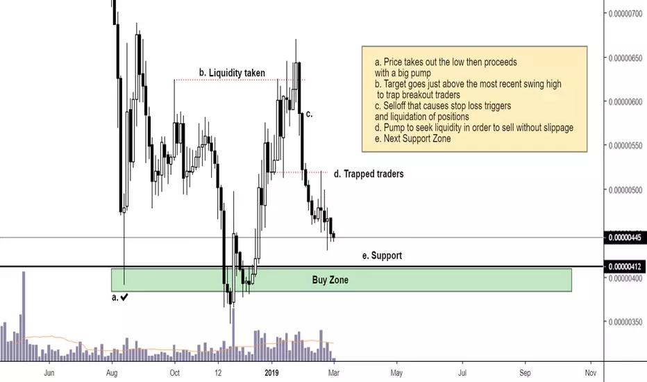
How altcoins pump - [Educational] - #TATipOn the chart there are notes that describe in detail a typical way that an altcoin pumps.
In this particular example we notice 5 phases that occured.
a. Price takes out the low then proceeds
with a big pump (Accumulation)
b. Target goes just above the most recent swing high
to trap breakout traders (Distribution)
c. Selloff that causes stop loss triggers
and liquidation of positions
d. Pump to seek liquidity in order to sell without slippage
e. Next Support Zone (Accumulation)
Hybrid Analysis (RTI.TSXV)Overlaying fundamental factors on technical information (known as hybrid analysis) allows for analysts to understand what moves the market.
Hybrid analysis is useful in particular when it comes to stocks and options (as opposed to currencies and futures) as direct links can be more easily drawn between stock price and fundamental factors. When used in penny-stocks, knowing what moves the market is key to making rewarding trades whilst minimizing risk.
Hybrid analysis requires good understanding in the economic factors that move the market, knowledge that is often overlooked by retail analysts.

Understanding Consolidation (BTCUSD)Proximal and distal lines used here to highlight a type of consolidation pattern known as a triangle pattern. Consolidation patterns are commonly understood to represent the redistribution of an asset due to shifts in sentiment, profit taking and/or revaluation.
In this particular case, due to recent break of an area of price-interest (5,800-6,200), I would venture to assume this consolidation is caused by profit taking and is most likely going to lead to a retest of said area. However, my outlook is neutral until price will have broken out of consolidation in either direction.
Understanding consolidation is fundamental to a trader's success and should not be overlooked.

The Week Ahead: S&P500S&P500 has enjoyed a strong upward move in 2019.
We see that it has continued to make higher highs and lower highs which is positive for the S&P500, yet we approach a trendline that was created by a sloping triple top which has held strong since October. Should the price penetrate this line, $2776, then we could see a continued move upwards for the S&P500.
Plotted with the Linear Regression tool, we can also see an agreement that the price has traded back to it's mean, which also adds confluence to the trade as the mean and the breakout level are the same. Should the S&P500 open positive this week, we could see the market break the level and make its move upwards to breaking the $2800 level. Continuing higher up, we could see it reach as high as $2925-$2945.
However, if the price doesn't continue and the trendline resists the market, plus the price reverts away from the mean lower, then we could see a move lower towards the $2718 level.
This analysis is for informational purposes only and is not a recommendation, buy/sell signal, or advice in any format.

The SMA cross strategy In this educational idea I’ll cover the SMA cross strategy. I’ll will cover how it works, what my peripheral values are and how it can work for you.
The Simple moving averages cross strategy is a strategy where you buy something on a buy-signal of the indicator and sell it on a target, for example if you had 5% profit.
What is a moving average? A moving average is an indicator which helps you smooth out “noise” in a graph. The indicator is based on a formula you can find the formula below. You can add values to the indicator, let’s say you want a MA of 9 candles you just add a value of 9. You usually use more than one MA, I prefer using a 7 candle MA and a 25 candle MA. The thing I like on moving averages is that you can use them in any time frame.
What is a buy signal? A buy signal is created when the long moving averages (in my case the 25 candle MA) gets underneath the short one (in my case the 7 candle MA). When that happens a buy signal is created. When the opposite occurs it’s a sell order.
How to determine a target. Your goal is to make money, but how can you make as much money as possible with this strategy. You have to determine a goal, so an exit-position. Your exit-position is the hardest thing of this strategy, but you can use an average of what happened before. If the average of positive “breakouts” is for example 5% profit you can use 5% profit as target.
How to use a SMA strategy to make you money. Not all the SMA crosses will lead to profit, most of them are even false “breakouts”. So before you buy something on a buy-signal you have to wait a few seconds and watch what the price will do, when it goes up you buy, when it does nothing of goes down you do nothing. If you want to make money using this strategy you have to set a stop-loss, I recommend to always set a stop-loss not only for this strategy. You can keep your stop-loss really close to your buy order.
www.investopedia.com():max_bytes(150000):strip_icc():format(webp)/latex_b8b977c06a4bf64591506c2bd9e918c6-5c474c25c9e77c0001d3b0e9.jpg

Calling to Arms Bitcoin HODLers of 2017! Read now!Think of the market not bound by Ponzi schemes or conspiracy theories, but instead of one gigantic physics experiment. The candle sticks you see printed on any pricing timeframe for any given asset is electricity as the fuel represented by humans’ cycles of Fear and Greed. Electricity is the energy component that moves the markets.
It takes more energy to propel a rocket ship to escape Earth’s gravity vs. letting it free-fall back to the surface. If you think of the markets in its cycles of Fear and Greed whoever has the upper-hand requires less energy output to move the needle in their favor. For example, when NasDaq entered its first hyper wave beginning in the 1980’s and just before the dotcom crash in 2000 the momentum was behind the bull’s sails. The bears didn’t have enough organization, will power and fight in them to stop the running of the bulls. Like any great party where the drinks are flowing, the music is popping and it seems the night will never end until it does. Your hours away waking up with cotton mouth, hang over and at minimum 24-48 hours of the worst version of yourself. You can thank yourself.
This is where you need to pay attention if you bought Bitcoin above $8,000 in 2017 and decided to HODL because a bunch of people you don’t know on twitter thought it was cool to hashtag everything HODL. Well it wasn’t cool and it’s understandable that you’ve given up and not put another penny into the market.
If you want to learn about the Bitcoin Greed and Fear cycles you need to study other markets. All markets are different, but the underlying emotions and energy is the same.
Had you bought into the NasDaq that is a composite of technology stocks near the height of the bull run in March 2000 and watched your investment crash 83% by 2002 it took 16 years for you to get back to even had you HODL and not put another penny into the market. On the flip side had you bought near the bottom in 2002 and held until the NasDaq reached its former glory in 2000 you had an ROI over 500%, but it took 14 years. Study this chart and go from left to right and you will see Warren Buffett is 100% correct. Buy the dips. Always. But be SMART when and where you buy the dips.
Yes, Bitcoin only has a 10-year old history, but cycles of Fear and Greed are represented on any timescale. If you’re a day trader you’re looking at a 60 second to hourly chart. If you’re a swing trader you’re more focused on hourly to Daily. If you’re a trend investor with a long-term time horizon you’re focused on Daily to Monthly charts. Depending on your investment goals and time horizon these human cycles can appear in fractions of a moment to longer term trends. This is where different types of investors and traders exploiting the market to their advantage.
This is not financial advice, but it doesn’t take long to understand this chart as to how much better investors did when buying the FUD (fear, uncertainty and doubt) versus those who gave up or sold out. The blue trend line you can see is the 200-week moving average. This is a long-term support area for any assets and anytime you see a stock, currency or commodity break this moving trend line it usually leads to a short-term capitulation. Smart money always buys this area. If you don’t have the stomach to buy in the capitulation zone even buying near the 200-week average has always been a great ROI by dollar cost average down your holdings.
This leads me to my final point. You will never catch the absolute bottom and sell the absolute top. Yes, it’s not wise to catch falling knives unless you’re Freddy Kruger or Edward Scissorhands. However, if you had enough conviction to buy Bitcoin at $8,000 than you should have even more conviction to understand the importance in managing your underwater investments. It might be wise to really focus on the longer-term trend here with Bitcoin. Read my Bitcoin cycles report where I show you the past three major bull and bear cycles and where we could head based on technical framework. Currently, Bitcoin has tested the 200 Week moving average and bounced off of it twice. First at $3,120 dollars in December 2018 and now more recently at $3,300. Could Bitcoin capitulate under its 200-week moving average and fall another 30%, yes. Will smart money be scooping up tens of thousands of bitcoins if this happens–yes.
Just like the NasDaq cycles smart money understands the basic market principles and the energy behind the Greed and Fear. When bears are able to thrust a market near its breaking point and push for the final attack the smart bulls know to start sharpening their swords, get into formation and be prepared to fight.
This is not financial advice: But have some guts, sharpen your sword and get your @ss on the front lines.

Tip and Trick on Tradingview Indicators: Save your eyes!!!!Shout out to Chris Moody on tradingview and his indicators. Tons of free ones that are visually easy to read, understand and can save you a little time. More importantly saves you some eye strain!
Cheers,
Bobby

Retest of Resistance on the AUDCAD?If this resistance holds we could see a nice move down, but if it breaks we can look for the move up to at least fill the range of the fake out (false break of resistance)

NVDA Current Movement: $NVDA currently has higher lows and lower highs! What is this opposite day?
Which side will break first? Earnings Incoming!
$SPY $QQQ $DIA
#StockMarket #stocks #Investing #Wallstreet #Money #SwingTrade #MondayMotivation #OptionsTrading

BTC current candlestick patterns: Morning star vs. Bull PennantHi all,
I've been getting a few DM's and emails on what I think of the current price action. In past videos and written publications I have said that things got into extreme overbought territory on the shorter time frame charts. I mentioned that things could trade sideways and be a little choppy for a few days while momentum rolls back to neutral territory. If the bulls step up you'll see reactivation of the trend as momentum neutralizes before the next push.
I wanted to put out a quick educational content on two candlestick patterns and how to handle them. On the daily chart you can see a risk of Bitcoin forming a bearish morningstar reversal. However, on the 2 hour you can see a Bull Flag. So which is it? Are the bulls or bears winning?
Classical Chart Patterns:
1. Morning star Pattern - this can be a bull or bear reversal pattern. The current situation is perfectly setup for a reversal if the bears capitalize. It's a 3 candle chart pattern, which I have highlighted below. #1 - You have a bull impulse candle, followed by #2 a doji and then 3rd candle has to break below more than 50% of the bull candle #1. The doji candle looks like a star in this case and signals that the market has uncertainty where it's going as momentum is neutral. So the morning star reversal is confirmed if BTC were to break below the level I have highlighted in the chart. Which happens to be our buy zone. Now of course worst case scenario is that you put your stop loss just under this level and the market reverses only to stop you out and reverses back to a bull. This is where you need to pick a side and accept the fact that you maybe wrong and manage your capital losses. I'm keeping my stop at $3300 for now until I see further breakdowns below the market mainly because I can afford to take such a loss (less than 2% draw down on my portfolio). However you need to do the math and figure out what is the maximum hit you can handle without going over 2% draw down. Depending on your trade size maybe you can afford to keep your stop in safe territory with me because you didn't take on too much risk or you might have to keep it around that $3,500 level. Do the math and figure it out.
2. Bull Pennant Many of you already know the Bull Flag and Pennant pattern here. On the BTC 2 hour chart frame you can see this bull pennant forming. Ideally BTC is supported at $3,600. The way you measure the profit zone on such a pattern is measuring the length of the flag pole and then adding that back on top of the flag. This puts us right at $4,000. Bear flags you do the reverse.
Please do your own research and google these patterns and more to build out your knowledge base as a technical trader.
Regards,
Bobby

ETH patternslargest time frame pattern (blue): falling wedge, ETH has been riding resistance for a while, a drop to support would be devasting bring price to the 10-25 dollar range...(funny oscar predicted ETH to 16, and i have a chart to support that).
medium time frame pattern (red): descending wedge, ETH fell outside of this pattern in december but got right back into it, currently sitting on support, a move up to test resistance brings prices to 120. Descending wedges typically break down. Target for this pattern fits perfectly with the larger time frame pattern @ 25.
small time frame pattern (yellow): falling wedge, currently playing around at resistance, a fall to support lands ETH around 90-92. This pattern typically breaks up. A breakout could take ETH to 140. This target is also the .65 on the fib retracement from high in january.
If the small TF wedge breaks up, this could get us out of the other patterns. I noted in the green marker a potential IHS with a descending neckline. 140 could potentially be the neckline test, and a bullish break of that pattern could bring us to 240. Excited to see how the next week or so plays out!

Technical Framework for Beginners 101 Part IIHi there,
The goal of every market speculator is to be able to think and trade confidently themselves. Not having to rely on anyone person. But to get there you need someone to tell you some basic first steps. If you are just starting out there's no need to go full obsessive reading every TA publication on tradingview. In most cases the best way is to simply just do it yourself. Be original. Come up with your own ideas and creativity. Don't be afraid to be wrong. Experiment with all the drawing tools and analytic tools on tradingview.
To summarize my main points during this 2 part series:
1) If your end goal is to be a market speculator you need to be a STUDENT of your asset. Study it. Pretend it's your child even. Get to know it's temperament. Look at the entire price history of the chart.
2) Create an economic cycle report showing all the bull and bear cycles, noting periods of Greed, Fear, Despair, Accumulation. Note how long these different cycles took. Having this knowledge will allow you to better understand the current cycle we are in and where things might head.
3) When you are first starting out always study the longer time frame charts. Daily, Weekly, Monthly. Anything less than an hour takes lots of skill to trade.
4) Get to know common moving averages and what they can tell you
5) Note previous major resistances and supports on your chart based on historical prices
6) Get to know your friend Fibonacci
7) Get to know different momentum indicators
8) Lastly - always make sure you technical frame work is super clean and concise. It should never EVER be cluttered. Just because a chart has a million trend lines and indicators doesn't mean it's good. Mostly likely it's garbage.
Anyway, I hope some of the info was helpful for you. Again, 99% of the leg work will need to be done by you and that's ok. If this is something you really want to do as a profession someday you'll be disciplined to learn as much as possible.
Take care and hit me up with any questions. I like being engaged with the community on TV
Regards,
Bobby

Technical Framework For Beginners 101 Part 110 minutes go by so fast....like/follow/comment.
Part II coming out soon.

My thoughts on trading indicators (VIDEO) If you appreciate please hit the like/follow and comment.
*correction towards end of video. RSI overbought is anything over 70, not 80.
Thanks,
Bobby

TrendlinesNot all trendlines have to be build using higher highs and lower lows. Some work perfectly as a trend direction and parallel channel middle line. The more bounces it has the more important it is for the chart (not stronger, but important). Also pay attention to volume - it should increase at line cross or bounce zones, confirming the line.
Example - look at blue trendline that worked as SR through all the way MCO made up, before BTC cracked it down. Breakdown of trendline started fast dump. In combination with horizontal SR line crossover price movement increase exponentially.

The Game of Charts: Trade setup BITFINEX:BTCUSD
My chart speaks louder than words.
Daily bitcoin technical analysis with fewer words and more information so that you can have maximum information just with a glance without wasting any time.
Disclaimer:
This is purely a technical analysis and it is to be used for entertainment purposes only. This is not a financial advise to buy or sell Bitcoin and I am not a financial advisor. Do your own research before investing.


IMPROVE YOUR TRADING PSYCHOLOGY NOW / VIDEO / EDUCATIONALHey TradingView
In this video I will be going over a swing trade from this week and breaking down how this trade could impact a trader's psychology both positively and negatively. I also cover some easy to implement strategies that will make it much easier for you to let your winners run.
It really bothers me how little attention seems to be devoted to trading psychology. This is by far the hardest thing for most traders to grasp and master.
Please take a look at this video and let me know if it is able to help you.
