Introduction to Technical Analysis - Handbook for a laymanHi all, today we are going to study about basics and usage of technical analysis. I have prepared this wholesome post so that you guys are able to understand what technical analysis is all about. I have shortened the sentences to readable points, hence, don't mind the grammar.
Learning objectives:
After studying this post the student should be able to understand:
1. The basis of technical analysis
2. Top-down analysis in TA
3. Assumptions on which TA is based on
What is Technical Analysis?
1. Art and science of forecasting future prices based on an examination of the past price movements.
2. Based on analyzing demand-supply in any tradable instrument.
3. Analyze prices, volumes, open interest, various patterns, and indicators to it in order to assess the future price movements.
4. It can be applied to any time frame.
5. TA ignores fundamentals (like financial and non-financial aspects of the company) and focuses on actual price movements.
6. TA is not astrology for predicting futures prices.
The Basis of Technical Analysis
What makes the Technical Analysis an effective tool to analyse the price behaviour, is explained by following theories given by Charles Dow:
1. Price discounts everything
“Each price represents a momentary consensus of value of all market participants – large commercial interests and small speculators, fundamental researchers, technicians and gamblers- at the moment of transaction” – Dr Alexander Elder
The current price fully reflects all the possible material information which could affect the price.
The market price reflects the sum knowledge of all participants, including traders, investors, portfolio managers, buy-side analysts, sell-side analysts, market strategist, technical analysts, fundamental analysts and many others.
Technical analysis looks at the price and what it has done in the past and assumes it will perform similarly in future under similar circumstances.
2. Price movements are not totally random
If prices were always random, it would be extremely difficult to make money using technical analysis.
Technical analysis is a trend following system. Most technicians acknowledge that hundreds of years of price charts have shown us one basic truth – prices move in trends.
A technician believes that it is possible to identify a trend, invest or trade based on the trend and make money as the trend unfolds.
TA can be applied to many different time frames, and so it is possible to spot both short-term and long-term trends.
3. What is more important than why
“A technical analyst knows the price of everything, but the value of nothing”.
Technical analysts are mainly concerned with two things:
1. The current price
2. The history of the price movement
All of you will agree that the value of any asset is only what someone is willing to pay for it. Who needs to know why? By focusing just on price and nothing else, technical analysis represents a direct approach.
The price is the final result of the fight between the forces of supply and demand.
The objective of analysis is to forecast the direction of the future price.
Fundamentalists are concerned with “why the price is what it is”. Technicians believe it is best to concentrate on what and never mind why. Why did the price go up? Simple, more buyers (demand) than sellers (supply).
The principles of technical analysis are universally applicable. The principles of support, resistance, trend, trading range and other aspects can be applied to any chart.
TA can be used for any time horizon; for any marketable instrument like stocks, futures and commodities, fixed-income securities, forex, etc.
Top-down analysis in Technical analysis
Consider the overall market, most probably the index. If the broader market were considered to be in bullish mode, analysis would proceed to a selection of sector charts.
Those sectors that show the most promise would be selected for individual stock analysis.
Once the sector list is narrowed to 3-5 industry groups, individual stock selection can begin.
With a selection of 10-20 stock charts from each industry, a selection of 3-5 most promising stocks in each group can be made.
After the stock selection, start with higher time frame charts and move down to the lower time frames.
Technical Analysis: The basic assumptions
The field of technical analysis is based on three assumptions:
1. The market discounts everything.
2. Price moves in trends.
3. History tends to repeat itself.
The market discounts everything
Technical analysis is criticised for considering only prices and ignoring the fundamental analysis of the company, economy etc.
TA assumes that, at any given time, a stock’s price reflects everything that has or could affect the company - including fundamental factors.
The market is driven by mass psychology and fluctuates with human emotions. Emotions may respond rapidly to extreme events, but normally change gradually over time.
It is believed that the company’s fundamentals, along with broader economic factors and market psychology, are all priced into the stock, removing the need to actually consider these factors separately.
This only leaves the analysis of price movement, which technical theory views as a product of the supply and demand for a particular stock in the market.
Price move in trends
“Trade with the trend” is the basic logic behind TA.
Once a trend has been established, the future price movement is more likely to be in the same direction as the trend than to be against it. Analysts frame strategies based on this assumption only.
Trend is your friend. Don’t betray your friend.
History tends to repeat itself
People have been using charts and patterns for several decades to demonstrate patterns in price movements that often repeat themselves.
The repetitive nature of price movements is attributed to market psychology.
Market participants tend to provide a consistent reaction to similar market stimuli over time. Big Green candle = Buy, Big Red candle = Sell.
So, this is it for this post. It should clear all the basic doubts about TA. If it doesn't, post the queries in the comments and I will try to help you out.
I spend a lot of time creating these educational posts, illustrations, charts, and PDFs. Please be appreciative of that and leave a like and comment if you found these helpful. It will help me to know that people are actually reading these posts. Also, if you need a PDF of this post with all the charts and illustrations, check out the links below this post.
Disclaimer : This is NOT investment advice. This post is meant for learning purposes only. Invest your capital at your own risk.
Happy learning. Cheers!
Rajat Kumar Singh (@johntradingwick)
NSE Certified Technical & Fundamental Analyst
Technical Analysis

MACD + VWAP Strategy tip DAILY PRIMERHey traders!
We are LOVING the volatility this week! Volatility is vital for day traders as we have many breakouts and short-term impact moves which allow us to profit!
In todays Daily Primer we talk about 2 indicators we use, the VWAP and the MACD.
There is some uniqueness to the way we use these indicators and this video explains a little bit futher!
To learn more see our signiture!

Is It Chart Damage?Market index is being in this pattern for a while, the pattern is bullish its called ascending triangle pattern which occurs after a defined uptrend. With todays closing we can see first candle - doji of of this chart pattern so is this a manipulation? of the pattern is invalid now?
Well in my opinion nothing is perfect in this world and I think market is still bullish todays Doji candle is not very significant. We need more clarity on this may be a weekly closing will help us to decide. One thing is for sure that the breakout of this chart pattern will be very big. I am bullish bias so i am expecting a big breakout to the upper side of this triangle pattern. A solid green candle above 3300 level will confirm a breakout to the upside and we can expect market to cross 2500 soon.
Hit like & follow guys ;)

break out of channels!when you can actually realize that channel we can find out that channel is broke but we know that if a channel breakout there can be another channel forming in the same direction until a big breakout brake the old channel.

The power of the VWAP!As day traders we use the VWAP lots in our trading and have even created custom versions of it which help us manage our trades.
In this video I go over exactly what happened to US30 / Down Jones at the Frankfurt open and the New York open, and by using the VWAP today we could have taken advantage of these moves, both up and down!
Do you use the VWAP? Let us know in the comments below!
Also attached to this video are other educaitonal videos you might find value in!

Risk Management Basics | Retest Trading 💡
Hey traders,
Being breakout traders we have two options for trade entries:
when the breakout is confirmed we can either open a trading position aggressively once the candle closes above/below the structure or we can be conservative and wait for a retest of the broken structure first.
What is peculiar about the second option is the fact that the majority of pro traders prefer the retest entries. In this article, we will discuss the pros and cons of retest trading.
✔️First, let's discuss whether the retest is guaranteed. NO. How often do we see that? Around 50-55% of the time. Does it mean that 45-50% of breakout trades will be missed? YES.
The main disadvantage of retest trading is that a lot of trading opportunities will be missed. Occasionally the breakout triggers a strong market rally not letting the price return back to the broken structure.
So what is the point to wait for a retest then? Why let the market go without us in case if there is no retest?
✔️Most of the time the breakout candle closes quite far from a broken level. Opening the trading position once the candle closes and setting a stop loss below/above the broken structure, one can get a very big stop loss. Such a big stop that its pip value exceeds or equals the potential return.
🖼️In the picture, I drew a classic channel breakout trade.
The aggressive trader opened a long position as the candle closed above the channel's resistance.
His stop loss is lying below the lower low of the channel.
Analyzing his risk to reward ratio, we can see that his reward equals his risk.
On the right side is the position of the conservative trader.
His stop loss in lying on the same level.
However, instead of opening a trading position on a breakout candle, he decided to wait for a retest of the broken resistance of the channel. Just a slight adjustment of his entry-level gives him a completely different risk to reward ratio.
❗️Patience pays in trading. Missing some trades a retest trader will outperform the aggressive trader in the long run.
Trading is about weighting your potential gains & losses. Paying commissions and swaps for every trade, it is much better for us to trade less but pick the setups that give us a decent potential reward.
What type of trading do you prefer?
❤️Please, support this idea with like and comment!❤️

Breakout Trading | 7 Steps to Follow 📝
Hey traders,
Breakout trading is one of the most popular trading strategies.
Being quite simple in theory, it remains quite complex and complicated in practice.
In this post, we will discuss 7 steps every breakout trader must follow.
💬And just in brief about a breakout trading itself:
this method aims to spot a key level (it might be horizontal support/resistance or a trend line) and then to trade its occasional breakout assuming that it will trigger an impulsive move.
1️⃣No surprise, the first task of a breakout trader is the identification of key levels. Preferably these levels should be spotted on weekly/daily time frames.
2️⃣Once key levels are spotted, a breakout trader should patiently wait for the test of one of those. His goal is to wait for a breakout.
In that step, many traders fail. The problem is that in order to confirm the breakout, one should have strict & reliable rules to follow. The rules that describe a confirmed breakout.
*I apply the following rule: the breakout of a level will be considered to be confirmed once the candle closes above/below the structure on the highest time frame where the structure is recognizable.
3️⃣Once the breakout is confirmed, the next step is to wait for a retest of a broken level. Why retest? Simply because a retest gives a better risk to reward ratio for the trade. And even though there is no guarantee that the price will retest the broken level and because of that some trading opportunities will be missed, in the long run, retest trading produces higher gains.
4️⃣Opening a trade on a retest one should know the exact target levels. The levels where the profits will be taken. Again, newbies traders make a lot of mistakes on that step. Remember that your targets must be realistic, they must be based on closest strong structure levels, not on your desired returns.
5️⃣Also, a breakout trader should set a stop loss. And again, a stop-loss level must be safe, it must be set at least below/above a previous minor structure to protect you from stop-hunting.
Stop-loss reflects the point where the trader becomes wrong in his predictions and where the trading setup becomes invalid.
6️⃣Once the trading position is opened and stop-loss & take-profit are set, one should patiently wait. There is no guarantee that the price will start falling/growing sharply after the breakout. The market may start coiling for a quite long period of time before it starts acting.
Breakout trader must be patient not allowing his emotions to intervene.
7️⃣Lastly, one should remember that his exit points are stop-loss/take-profit levels. Stop-loss adjustment in case of a position drawdown, preliminary profit-taking, and target extension are your worst enemies. Be disciplined, don't be greedy, and keep your emotions in check.
Of course, this 7-steps trading plan is not sufficient enough for profitable breakout trading. There are so many nuances on each step of the plan to consider.
However, let this plan be your initial guideline: learn & follow that and with time, keep elaborating its rules until you become a consistently profitable trader.
Are you a breakout trader?
❤️Please, support this idea with like and comment!❤️

Learn Top-Down Analysis | The Best Trading Strategy 🏆
Hey traders,
🔝Top-Down analysis is one of the most efficient ways to analyze & trade different financial markets. In this post, we will discuss the time frames to watch and the main steps to go through to execute a Top-Down trading strategy properly.
Being a Top-Down trader your task is to assess the global market perspective and identify the zones, the areas from where it will be relatively safe for you to trade it following the trend or catching the reversals.
➖Weekly time frame shows you the price action during the last couple of years. It unveils the major zones of supply and demand and indicates the long-term direction of the market.
Your task is to spot these zones and underline them.
The strongest market moves most of the time initiate from these zones.
At the same time, you must remember that on a weekly time frame the market is extremely slow. Being beyond the key zones 90% of the time, it takes many weeks, even months for the market to reach them.
➖Once you completed a weekly time frame analysis,
the next on your radar is a daily time frame.
Daily time frame shows you 1-year-long price action.
It indicates a mid-term sentiment.
And again, here your task is to simply identify the market trend and underline major key levels.
*It is highly recommendable to apply different colors for highlighting weekly/daily levels.
Completing weekly/daily time frame analysis, your task is to set the alerts on at least two closest support/resistance clusters. You must patiently wait for the moment when the price reaches one of them.
Once the underlined key level is reached, you start the analysis of intraday time frames.
➖The intraday time frames on focus are 4H/1H.
Your task here is to spot the price action/candlestick patterns.
With such formations, the market unveils its reaction to the key level that it is approaching.
You are looking for a pattern that confirms the strength of the level.
Spotting the pattern you are looking for a trigger to open a trading position. Most of the time it is a breakout of a trend line or a horizontal neckline.
The breakout confirms the willingness of buyers/sellers to buy/sell from the underlined support/resistance. Only then a trading position is opened.
Of course, in practice, Top-Down analysis is very complex and many things and concepts must be learned in order to apply that strategy properly. Follow the steps described in this post, learn to identify key levels and recognize the price action patterns and you will see how efficient this strategy is.
Do you apply a Top-Down trading strategy?
❤️Please, support this idea with like and comment!❤️

What Type of Trader Are You? 🤔
Hey traders,
In this post, I decided to make a comparative analysis of three main trading styles: scalping, day trading, and swing trading.
We will go throw the main pros and cons of each approach and discuss common misconceptions.
🏃♀️🏃 Let's start with scalping.
I guess many of us were impressed by videos on youtube showing how a guy makes thousands of dollars applying a simple scalping strategy.
Some of these videos get millions of views and excitement from the audience. No surprise the majority of newbies start their trading journey with scalping strategies.
Practicing some of them and trading on a real account, these traders suddenly realize that the youtube videos barely reflect the reality of scalping.
Scalping requires being extremely reactive, making trading decisions quickly, and constantly staying focused.
Moreover, it turns out that this trading style is extremely risky, and occasional losing streaks become an essential part of the process.
A pro scalper usually opens dozens of trading positions per day and manages many of them simultaneously.
Even though it is a fact that a solid scalping strategy is a true cash machine, the constant pressure and high level of stress make many traders leave that game blowing their trading account.
A true scalper is a guy with iron nerves and a sharp mind.
It takes many many years to become a person like that.
🚶♀️🚶Intraday trading is a bit simpler. While quite often scalping gives a trader just a couple of minutes to react and make a trading decision, intraday trading gives the hours. Such a trading style is slower, the intraday perspective is not that chaotic and irrational. It takes many hours for the trading setup to play out making the trade management process not that time-consuming. Moreover, intraday trader tends to open much fewer trading positions than a scalper. Analyzing primarily 4h/1h time frames less trading setups meet the entry conditions.
That primarily affects the potential gains though. Lesser you trade, the less money you make.
I consider myself to be an intraday trader. Trading full-time of course I was trying different scalping strategies, but I must admit that I can’t make the decisions that quickly, I can’t constantly hold so many active trading positions in my mind, I need some time to think, I need some time to do other things, I want more freedom. For that reason, intraday trading is my choice.
And let me be frank right here: I am not trying to say that intraday trading is simple, it is SIMPLER than scalping still remaining extremely complicated to master.
🕴🕴 If you want trading to become your side income if you have a full-time job and just a couple of hours per day for charting, I believe that intraday trading/scalping are not appropriate for you. In your situation, I would consider swing trading.
Swing trading is extremely slow. Being primarily focused on weekly/daily time frames a swing trader tends to hold trading positions for weeks, sometimes even months.
Moreover, it takes many days for a swing trading setup to form and the market gives a trader much time for reflection.
Of course, that primarily affects the potential gains:
I believe that among the 3 trading styles that we discussed, swing trading generates the lowest returns.
Swing trader is the best starter for newbie traders.
Analyzing higher time frames they can constantly follow the market and don’t miss the major moves.
Just 1-2 hours per day are enough to follow dozens of financial instruments.
Only by becoming a consistently profitable swing trader, one can try himself in intraday trading.
Working with hundreds of struggling traders from different parts of the world I realized that the majority has the inverted perception of scalping/intraday/swing trading. I hope that this article will shed a light on that topic.
What trading style do you prefer?
❤️Please, support this idea with like and comment!❤️

My Issue With Technical AnalysisI am going to have to choose my words carefully in this article, as I am sure it will be an unpopular one. I first want to say that TA clearly has a time and a place, and is excellent for certain aspects of creating your position. But I fear the idea of TA is far to simple and it fails to recognize the various factors of market price.
Where TA Works
The idea of Technical Analysis in theory is a magnificent one. The idea that people are consistent and that trends will repeat themselves. In some cases I would agree; TA is highly useful for determining the short term price action of a stock. RSI (Relative Strength Index) is a solid measure of whether a stock is over bought or over sold, and momentum indicators are a sound way to map out the length and intensity a security will move. Finding the price channel of a security is a highly effective way to map out price targets, you may use the Fib Retracement Lines. The three techniques mentioned above are backed by history and are all based around direction of price due to the days prior. I believe that if using TA in this manner, traders can be very successful, if they consider many other factors.
Where TA Doesn't Work
I believe there is far to much "wishy-washy", for the lack of a better term, ideas in TA. There is far to many people "Reading candle sticks", an ineffective method backed by absolutely nothing. Before you come for my head, understand; In finance, all securities fairly priced are backed by the numbers to support that price. They are backed by the previous momentum and are tied heavily to the overall market. Nothing in finance is just a random occurrence, somebody somewhere planned for, and made it happen. So the idea that a close and a open are going to effect the next day's price, is nonsense. The idea that patterns may happen again, is valid, but the environment which it is set up in must be the exact same. I believe there are far to many strategies that people claim to work, that don't. I believe it is far to difficult for any human to see a pattern in the midst of it happening, rather than after the fact.
In conclusion, I want to say I am not bashing on those who believe in TA, but I see too many inconsistencies with it. I believe when mapping momentum, planning entrance and exits, and looking into weather a security is overbought or undersold, TA can be highly effective. I would be cautious when looking into any strategy not backed by math, or that involves symbols. I believe all investors should learn the skills of TA, but should use them in a realistic sense. I see far to many influencers talking about unrealistic strategies, and only showing their success's.
Have a great day everyone!

Going With The Herd - Part 5/5I follow a technomental analytic approach to the commodities markets in a quest to determine the path of least resistance of prices. Each piece of a market’s structure provides a clue. When assembled, a picture tends to emerge, increasing the odds of success for long or short positions.
The last in the series- We looked at the other components of market structure
Fundamentals versus technicals
The wisdom of the crowd
Trend following indicators establish support and resistance levels
The trend is your greatest friend in markets- Prices tend to rise or fall to unforeseen levels that defy logic
Market structure deals with each commodity’s supply and demand fundamentals. Each market has idiosyncratic characteristics as production locations are in areas where the earth’s crust is rich in reserves or the climate supports crop growth. Consumption is ubiquitous as people worldwide depend on raw materials to power their lives, provide shelter and nutrition. Fundamentals are a substantial part of the analytical equation, but crowd behavior is equally important. The saying, “the trend is your friend,” is critical as when buyers are more aggressive, prices rise, and when sellers dominate, they decline.
Therefore, technical analysis is a crucial tool that enhances the clarity of a picture created by the various market structure pieces.
The last in the series- We looked at the other components of market structure
In past articles, we looked at how term structure or the price differentials between delivery periods can offer clues about the supply and demand equation in commodity markets. We examined processing, quality, location, and substitution spreads which provide more insight into the path of least resistance of prices.
The market structure components are puzzle pieces dealing with fundamentals. Many variables can push commodity prices higher or lower. The spreads and differentials that determine the overall market structure are a microeconomic approach to analysis. While they provide critical information, it is incomplete without taking the technical state of a market into account. Market structure deals with endogenous factors on the microeconomic side. Technical analysis tends to incorporate the market’s interpretation of macroeconomic factors.
Fundamentals versus technicals
Fundamental and technical analysis are not mutually exclusive; they can be complementary. In commodity markets, as in all markets, there are cycles. Understanding the history of cyclical behavior can help predict the future. Fortunately, you do not have to pour over thousands of pages of prices and data. All the data required for technical analysis are contained in one picture—a price chart.
Fundamental analysis examines numerous aspects of an individual commodity market, while technical analysis studies past and current price action in futures contracts.
The wisdom of the crowd
In his 2004 book, The Wisdom of Crowds, author James Surowiecki explained “why the many are smarter than the few and how collective wisdom shapes business, economies, societies and nations” through a series of case studies. The book applies to the commodity markets as a price chart is a track record of collective wisdom.
Prices move higher when buyers are more aggressive than sellers. They fall when sellers dominate buyers.
Trend following indicators establish support and resistance levels
Many technical indicators and price patterns reflect the crowd’s wisdom. Support levels are below the current price. They are levels where technical analysts believe that buyers will outnumber sellers. Resistance levels are above the current price. They are levels where technicians believe sellers will outnumber buyers. These beliefs often lead to a self-fulfilling prophecy as technical analysts sell near resistance and buy near support.
Bullish or bearish trends do not last forever as markets rarely move in straight lines. Short-term traders watch very short-term, often intraday, charts. Longer-term technical traders and investors watch daily, weekly, monthly, or longer-term charts.
Price momentum and trend strength are two critical components of technical analysis. A stochastic oscillator quantifies the momentum of a price rise or decline. They compare closing prices for a stated period with price ranges over time. The theory behind stochastics is prices tend to close near the highs in rising markets and the lows in falling markets. A reading below 20 indicates an oversold condition, while a reading above 80 points to an overbought condition.
The daily CBOT wheat chart shows that overbought conditions lead to price corrections while oversold conditions lead to rallies. However, a market can remain in overbought or oversold territory for extended periods. When the stochastic reaches an overbought or oversold condition, the price action tends to run out of upside or downside steam, leading to a reversal.
The relative strength indicator compares recent gains and losses in a market to establish overbought or oversold conditions. An RSI below 30 indicates an oversold condition, while a reading over the 70 level indicates that a market is in overbought territory.
The daily chart of NYMEX crude oil futures shows the decline in the RSI to below 30 in late August 2021 led to a reversal and price rally. While the indicator remained above the 70 level from late September through late October, it eventually ran out of upside steam, leading to a price correction in November. On November 26, 2021, crude oil experienced the most significant decline since April 2020. The RSI fell to an oversold condition. We will find out over the coming days and weeks if the decline leads to a bottom with the technical metric in oversold territory.
These technical indicators reflect price action only. They ignore all of the noise that can lead to emotional impulses. Technicians use stochastics, Bollinger bands (which highlight support and resistance levels), RSI, and many other technical tools, for any time frame ranging from minute-to-minute to very long-term horizons.
Technical analysis is far from perfect, but it adds another dimension and creates another puzzle piece for determining the path of least resistance for prices in markets across all asset classes.
The trend is your greatest friend in markets- Prices tend to rise or fall to unforeseen levels that defy logic
The old saying that “the trend is your friend” reflects an acceptance that crowds make better decisions than individuals. Trends are an integral part of investing and trading calculus. Ignore trends at your peril as going against conventional wisdom is one of the leading causes of losses. Markets often move to extremes and remain irrational for far longer than most market participants can stay solvent. Commodities are highly volatile assets. Price variance can lead to wild swings to highs and lows. In April 2020, crude oil fell to negative $40.32 per barrel in a bearish frenzy. In May 2021, lumber futures rose to over $1700 per 1,000 board feet as bullish price action pushed the price to an irrational and unsustainable level. However, crude oil at zero was illogical, as was lumber at $1,000. Market participants that did not respect the trend suffered financial distress.
Trends often carry prices to price levels on the up or downside that defy logic, reason, and rational analysis. Following and respecting trends often saves a trader or investor from catastrophic losses. We never attempt to pick a top or bottom in any market because we respect the crowd’s wisdom. However, when the trend bends, we adjust our risk positions accordingly.
Finally, discipline is what defines success in markets. Remember, a professional baseball player needs a 0.300 batting average to make it into the Hall of Fame. That average means they make an out two out of every three trips to the plate. Trading and investing are similar. Many of the most successful traders call the market wrong more than half the time. However, those that approach markets with a risk-reward plan and stick to it improve their chances of success. Following trends allows profits to run. It also is self-correcting as it causes a market participant to reevaluate and close losing risk positions, before they cause severe financial damage.
One of the leading causes of losses is allowing a short-term trade to become a long-term investment because the price moves contrary to a forecast. Trend following is a tool that helps to correct as it validates or refutes an original thesis.
Respecting the crowd’s wisdom is an integral part of traders and investing and goes hand in hand with the puzzle pieces of a market’s structure.
--
Use the link below to sign up for the Monday Night Strategy Call. You can use the other link provided below to get early access to the full articles and more for free.
Trading advice given in this communication, if any, is based on information taken from trades and statistical services and other sources that we believe are reliable. The author does not guarantee that such information is accurate or complete and it should not be relied upon as such. Trading advice reflects the author’s good faith judgment at a specific time and is subject to change without notice. There is no guarantee that the advice the author provides will result in profitable trades. There is risk of loss in all futures and options trading. Any investment involves substantial risks, including, but not limited to, pricing volatility, inadequate liquidity, and the potential complete loss of principal. This article does not in any way constitute an offer or solicitation of an offer to buy or sell any investment, security, or commodity discussed herein, or any security in any jurisdiction in which such an offer would be unlawful under the securities laws of such jurisdiction.

WHY 95% OF TRADERS FAIL | Top 6 Mistakes to Avoid 🙅♂️🙅♀️
Hey traders,
That is the absolute fact:
95% of traders will fail.
Working with hundreds of struggling traders from different parts of the world, studying their trades & following their reasoning I found a lot of commonalities. In this post, we will discuss the top 6 mistakes to avoid to succeed in trading.
🤖 Rather than studying the market structure, rather than learning price action, many traders are looking for a "secret indicator". The one that will accurately indicate when to buy or sell the market.
Failing to find the one, they start looking for a set of indicators giving them magic profit formula. At some stage, they stop analyzing the chart at all. They become obsessed with the indicators.
Remember, naked chart analysis always goes first.
The indicator is the tool in your toolbox that is applied as one of the confirmations.
💫 The expectations & mindset play a very important role here as well.
Many people come in trading with a desire to become rich quick. To buy a subscription to some signal service promising them thousands of pips monthly and quite their 9:5 job.
Or to watch a couple of educational videos about trading and after a couple of days of practicing become a whale of Wallstreet making thousands of dollars with a single trade.
Such a mindset is completely wrong. Instead, you must realize that trading is extremely hard. It will take many years and a lot of blown trading accounts before you get how to trade properly.
Moreover, even once you mature, you won't make millions of dollars. Professional trading is simply about winning slightly more than you lose and then living on a margin.
📉 Poor risk management is the primary reason for blown trading accounts. And here I am not talking about some "advanced" risk management techniques.
Many traders simply trade with oversized lots.
Having high leverage & 1000$ deposit at hand the one can simply open a trading position with 1 standard lot and be kicked in by a spread.
Or they open a trading position without a stop loss. Being wrong in their predictions instead of closing a losing position they keep holding it. And while the market keeps going against them they pray the God for a market reversal. At some moment they get the margin call.
You must learn to calculate a lot size for all your trades. Instead of risking a huge portion of your trading account, learn to set a stop loss and risk no more than 1% of your deposit.
📝 Lastly, discipline plays a crucial role in your success in trading. Once you developed a trading strategy & backtested that you must learn to follow its rules no matter what. Usually, once traders catch a losing streak they start changing their rules, they start adjusting their trading strategy. Remember that losses are inevitable. The only correct way to stay afloat is to be consistent and don't break the rules.
Avoiding these common mistakes your chances to succeed in trading will increase dramatically. I wish you be among 5% of traders who made it.
Did you make these mistakes?
❤️Please, support this idea with like and comment!❤️

FALSE BREAKOUTS | SPOT/AVOID/TRADE THEM LIKE PRO📈📉
FALSE BREAKOUTS | SPOT/AVOID/TRADE THEM LIKE PRO📈📉
How often have you opened a key level breakout trade, and then the price turned against you? False breakout happens quite often and it is a problem for many traders who buy at highs and sell at lows.
❗️Breakout trading is a fairly popular and viable trading strategy. However, some breakouts often turn out to be false. This can be quite frustrating, not to mention that it can often lead to a losing trade.
However, in many cases, an experienced trader can analyze the market situation and react to it accordingly. False breakouts can make a profit if you know how to trade them correctly.
⚠️A false breakdown is a situation when the price violates an obvious level, but then suddenly changes direction. When the initial breakout of the level occurs, many traders open a trade in the direction of the breakdown. These traders are trapped when the price reverses, which triggers a series of stop losses. New traders are also entering the market, and this puts additional pressure on the price. This often turns the price into a new trend, the opposite of the initial breakout.
A breakout that turns out to be false is a sign of strength in a downtrend or weakness in an uptrend.
As you can see, a false breakout can easily cause significant losses for any trader.
Some traders develop their entire strategy around trading false breakouts, as this can be a very powerful trading approach. Some of the best trades happen when market players fall into a trap and their stops start to work.
✅How to find patterns of false breakouts?
🟢If you do not learn how to correctly identify false breakouts, you will not be able to trade them profitably. For example, there will be situations when the price returns to the breakout point, and only then continues its movement.
🟢One of the ways to detect false breakouts is to monitor the volume. Real breakouts are usually accompanied by strong indications of trading volume at the time of the breakout. When this volume is absent, there is a higher probability that the breakout will not happen.
🟢Thus, if the trading volume is low or it decreases during the breakout, a false breakout is likely to occur. In contrast, if the volume is large or it increases, a real breakdown is likely.
🟢It is also useful to monitor not only the trading volume but also the price movement on the lower timeframe. In many cases, you will see that the price makes a very sharp pullback on the lower timeframe, which is not visible on the higher timeframe.
✅False Breakout Trap
🔴After all, many trading textbooks say that a breakout can be considered confirmed when a candle closes above the resistance level. However, the price moves in your direction for a while and then turns 180 degrees. As a result, you have a stop loss triggered.
🔴The false breakout trap includes several candlesticks, usually 1-4, that go beyond the key support or resistance level. Such breakouts occur after a strong movement, as the market has reached an important level, but the price momentum still retains its strength.
Have you ever been trapped by a false breakout?

4 Types of Trading Confirmations"Wait for this confirmation!"
"Look for this confirmation!"
When I first began my trading journey, these are phrases that I kept seeing get thrown around and had no clue what it meant! What am I supposed to be looking for? What do these confirmations exactly mean? It quickly began to get frustrating and confusing...
Then eventually, things started to click one piece after another. Confirmations are a fundamental part of your trading and must be fully understood if you want to be successful in this game.
So, what is a confirmation? Well, it depends on many different scenarios, but in this post I will talk about 4 of the most common forms of confirmations with examples!
1️⃣ Price Action
When analysing many different instruments whether that is forex currencies, crypto projects or even stocks. You will often see when searching for trading opportunities that there are various confirmations that price will give clues about on the chart that we can trade from.
Price action & candlestick patterns are one of the strongest form of confluences as far as confirmations in trading go. They can be accurate reflections of the current market sentiment and gives you clues of what price is trying to communicate with you. Making them very reliable when used in the right hands of course.
Different types of price action confirmations such as doji's, pin bars, double top/bottoms & engulfing candlesticks have been proven by history time & time again to be a reliable method of identifying and predicting future market movements and is a major part of my technical analysis.
But, is it a good habit to instantly place a trade as soon as we see one of these confirmations? Short answer, NO! I wish it could be that simple... Trading with only one price action confluence will soon bring inconsistencies into your results and will negatively impact your overall success rate.
Instead, we need multiple confluences layered on top of one another to give us the best chance of predicting where price will head next.
2️⃣ Indicators
Whether you're purely a price action trader or an indicator heavy trader. From simple moving averages to complex computer algorithms, indicators play a big role in the trading industry.
Being 100% objective and removing all psychological aspects through providing real numbers, figures and data. They can be extremely beneficial to certain traders when it comes to carrying out their technical analysis.
For many traders, the various signals from indicators are considered to be accurate and reliable information. However, all indicators share one negative thing in common and that is that they are all lagging .
Meaning the data provided is not a live representation since it uses previous price action to pull its data and is unable to account for what is happening in the market in the right here, right now.
Often resulting in traders missing out on the big power moves, getting into positions too late or executing trades with bad risk:reward setups. Not to mention the potential for many traders to rely on indicators too much and begin to lose their own edge in the market (imagine a double edged sword if you will).
3️⃣ Fundamentals
Which are figures deriving from news events such as in an economic calendar, news & tweets etc. Actual fundamental news can become your best confirmation tool. However, the main obstacle right here is the promptness, validity and reliability of the data that you get.
The information shouldn't be delayed and it must be objectively true. The search for such a source is by itself is a very time-consuming and labor-intensive business not even mentioning its potential costs.
And that is not all. Knowing how to make sense of that data, its proper perception, and understanding requires a solid economical and financial background and experience.
At the end of the day, becoming an expert in fundamental analysis, the trader can easily sort the trading zones and trade only the ones that are confirmed by a decent fundamental trigger.
4️⃣ Key Levels
Us retail traders unfortunately don't control the market. There is an average of $5 trillion flowing in and out of the foreign exchange market every single day!
And the majority of this trading volume comes from the big institutional players such as banks & hedge funds etc. Therefore, it's important to know where these big players are buying/selling & why...
When analysing you pairs, you'll often see that price will naturally be magnetised to specific key levels. For example, key whole round figures that end in 0's & 50's such as 1.5000 or 1.5500. These are called psychological levels which the institutional market participants like to trade around purely for ease of mind.
These levels on various pairs have stayed the same for decades and for many years in the future and is one important form of a key level. Trading these key levels will allow you to find great liquidity zones, rejection areas and break + retest setups.

Learn To Trade Technical Analysis Hammer & Shooting StarHey Traders today I wanted to go over what I believe is one of the best ways to trade any market with Japanese Candlesticks using hammers and shooting stars. Normally you want the wick of the candle to be at least twice the size of the body of the candle. Alot of times they can lead to explosive moves in the markets. So lets dive in and see how to use this powerful technique in your trading arsenal.
Enjoy!
Trade Well,
Clifford

The Only Chart Pattern You'll Ever NeedIn this video, I speak on the patterns that you need. that means---discard the rest you use.
These patterns for the basis for... The other chart patterns.
Learn why.
Let me know the chart patterns you've been using in the comments below.

Multiple Chart TypesConsider using multiple chart types when performing technical analysis for a clearer picture of what the market may be telling you. Here is a tri-screen view of Traditional Japanese Candles on top, Renko Candles in the middle, and Heiken-Ashi Candles on the bottom. Each setup has something to share.

What are the patterns of "M" and "W"?Hello everyone, in this post, I tried to show you the concept of "M" and "W" Patterns shortly and simply. I hope this article is useful for you and wish you all the best.

Technical Analysis. HOW to identify trend,support and resistance📊Technical analysis
Technical analysis is a way to predict the future price movement according to the price chart. The price takes everything into account - this is the main idea of technical analysis . This idea means that we only need to see the price chart to find out where it will go in the future.
The main tools of technical analysis are trend lines , support and resistance lines. So how do you find them on the chart?
📈Downtrend and Uptrend📉
The price is always in motion and when the price shows each new high below the previous one and each new low below the previous one - we say that there is a downtrend now and to make it clearly visible, analysts connect the highs and lows with lines - this is how the downtrend lines are drawn.
To identify an uptrend, the same idea is used, only in a different direction - every time the price forms new highs above the previous ones and new lows above the previous ones, we say that there is an uptrend now.
➖Support and resistance➖
Combining the highs and lows, technical analysts noticed that the price is facing resistance on the one hand and support on the other. These zones prevent the price from going higher or lower, depending on the trend. It is very important to see these zones, because, as a rule, trade is conducted from them.
Also, there are frequent moments when support, after its penetration, becomes resistance.
❗️Remember❗️
It is important to remember that the trend, resistance and support lines are just zones and the price sometimes goes beyond the lines, but then comes back. The price will make false breakouts of resistance or support from time to time. This is normal and it should always be remembered.
It is important that the price rebounds from these zones at least twice, so that there are reasons to draw lines and identify the trend.
🚀Profitable Result🚀
Thanks to these simple methods of technical analysis , a trader can easily determine the trend and avoid stupid money losses, the method will also help in the correct setting of stop orders, which will make your trading more accurate and more profitable.
Trend is your friend, be able to find it.

Technical Analysis. HOW to identify trend,support and resistanceTechnical analysis
Technical analysis is a way to predict the future price movement according to the price chart. The price takes everything into account - this is the main idea of technical analysis. This idea means that we only need to see the price chart to find out where it will go in the future.
The main tools of technical analysis are trend lines, support and resistance lines. So how do you find them on the chart?
Downtrend and Uptrend.
The price is always in motion and when the price shows each new high below the previous one and each new low below the previous one - we say that there is a downtrend now and to make it clearly visible, analysts connect the highs and lows with lines - this is how the downtrend lines are drawn.
To identify an uptrend, the same idea is used, only in a different direction - every time the price forms new highs above the previous ones and new lows above the previous ones, we say that there is an uptrend now.
Support and resistance
Combining the highs and lows, technical analysts noticed that the price is facing resistance on the one hand and support on the other. These zones prevent the price from going higher or lower, depending on the trend. It is very important to see these zones, because, as a rule, trade is conducted from them.
Also, there are frequent moments when support, after its penetration, becomes resistance.
Remember
It is important to remember that the trend, resistance and support lines are just zones and the price sometimes goes beyond the lines, but then comes back. The price will make false breakouts of resistance or support from time to time. This is normal and it should always be remembered.
It is important that the price rebounds from these zones at least twice, so that there are reasons to draw lines and identify the trend.
Profitable Result
Thanks to these simple methods of technical analysis, a trader can easily determine the trend and avoid stupid money losses, the method will also help in the correct setting of stop orders, which will make your trading more accurate and more profitable.
Trend is your friend, be able to find it.

Finding That Perfect Strategy When it comes to choosing the best strategies, most traders are often hoaxed into believing that there's a perfect strategy that works irregardless. The stream of loosing trades that comes after they've purchased or spent alot in implementing the strategy contradicts this. Well that's true for the most part. Indicators on the other hand, considered to be lagging, depending on the way they're used can be of great help but also misleading to some point. I once read an article that said to learn, we must unlearn what we've learnt. The way we're used to using indicators may or may not be the correct way they're to be used. Now most people have indicators in their strategies for confluence. I can't for sure say that that's right or wrong because trading isn't about what you see, it's about how you see the markets, and how you interpret that info. It's also about how you handle yourself before and after trades. Your reactions to the outcome of any trade, be it a winner or a loser. So whatever the things that make up your stategy, its all up to you to decide. Because what works for you might not work for me for obvious reasons. Intensively testing a strategy to find out if it works or not before trading in the live markets is the best way to ensure that you understand what you're doing. Its also one way train yourself to take responsibility of whatever outcome the trade you've taken brings. So when you place a trade you always know why you're doing it.
Let me know what you think in the comments section.

Narrowing Wedges - Advanced AnalysisIn the last post in this series on chart patterns, we described the characteristics, rules, and causes of broadening wedges patterns (if you haven't seen it, see the related ideas below).
In this post, we shall perform an advanced analysis of a related pattern, narrowing wedges. We provide a description of each pattern and its implications.
That's the way it ends. The thin edge of the wedge.
- Bulkowski (1)
1. Narrowing Wedges
Narrowing Wedge patterns are reversal patterns that are characterized by price variations laying within one support and resistance and both having the same direction and narrowing over time. In a narrowing wedge, the apex is located at the end of the formation.
1.1 Rising Wedge
Rising wedges mostly occur during uptrends, with raising local maxima (higher highs) forming an upward sloping resistance and raising local minimas (higher lows) forming an upward slopping support. The slope of both the support and resistance should be significantly different from 0.
Bulkowski suggests the price should test the support and resistance 5 times.
Volume tends to decrease during the formation of such patterns.
Ascending wedges are bearish-biased, with breakouts mostly occurring downward. Downward breakouts are often followed by a decrease in price.
Example of rising wedge on Visa daily followed by a downward breakout.
1.2 Falling Wedges
Falling wedges mostly occur during downtrends, with declining local maxima (lower highs) forming a downward sloping resistance and declining local minima (lower lows) forming a downward slopping support. The slope of both the support and resistance should be significantly different from 0.
Like with rising wedges, Bulkowski suggests the price should test the support and resistance 5 times.
Volume tends to decrease during the formation of such pattern.
Descending wedges are bullish biased with breakouts mostly occurring upward. Upward breakouts are often followed by an increase in price.
Example of falling wedge on Trivago daily.
2. Measure Rule
The measure rule allows for the determination of where to set a take-profit/stop-loss after a breakout in a narrowing wedge formation. Rules differ from an upward to downward breakout of the formation.
When price breaks the support of a rising wedge, the take-profit is determined from the lowest low inside the formation. When the price breaks the resistance, the take-profit is determined by adding the height of the formation to the breakout point.
When price breaks the resistance of a falling wedge, the take-profit is determined from the highest high inside the formation. When the price breaks the support, the take-profit is determined by subtracting the height of the formation from the breakout point.
3. Some Observations
Technical analysts believe that narrowing wedges indicate a sentiment switch. The impulses within the formation have a decreasing amplitude over time, indicating a potential change in trend. The amplitude of the impulses decrease linearly over time.
The underlying trend in narrowing wedges formation is linear. Detrended prices within a narrowing wedge would highlight a damping effect.
Rising Wedges have been studied with climate time-series data (2)
References
(1) Bulkowski, T. N. (2021). Encyclopedia of chart patterns. John Wiley & Sons.
(2) Kaiser, J. (2017). Technical analysis of climate time series data.

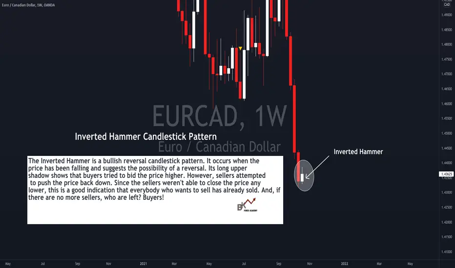
What Does the Inverted Hammer Candlestick Pattern Mean? Hello Traders!
Have you ever wondered when will a strong trend end? Do you struggle to spot candlestick patterns that potentially signal when the bulls or bears might take over?
Take a look at this example of EUR/CAD and let's see how the trade plays out! :)
About the Inverted Hammer Candlestick Pattern and Why It Forms:
The Inverted Hammer is a bullish reversal candlestick pattern. It occurs when the price has been falling and suggests the possibility of a reversal. Its long upper
shadow shows that buyers tried to bid the price higher. However, sellers attempted to push the price back down. Since the sellers weren't able to close the price any
lower, this is a good indication that everybody who wants to sell has already sold. And, if there are no more sellers, who are left? Buyers!
And just an important observation, the Inverted Hammer has a small real body, and has a large upper shadow with a small or no lower shadow (also known as "wick").
Would you like to receive more "live charting" tutorials like this?? Comment below and let us know! :)
Happy Trading!