Global Trading Trends 2025Introduction: The Pulse of Global Trading
The world of trading is not just about buying and selling financial instruments — it’s a dynamic ecosystem shaped by technology, policy shifts, geopolitical changes, and human psychology. In 2025, global markets are evolving faster than ever before. Traders, investors, and institutions are adapting to a new age where artificial intelligence, digital currencies, and sustainability are rewriting the rules of the game.
Understanding key trends in global market trading is essential for anyone who wishes to navigate these turbulent waters successfully. The forces influencing the markets today go far beyond traditional economic data; they encompass technological disruption, global integration, environmental priorities, and shifting monetary dynamics.
Let’s dive deep into the major trends shaping the global trading landscape in 2025 — and how they’re transforming investment decisions, strategies, and outcomes.
1. Rise of Artificial Intelligence and Algorithmic Trading
Artificial Intelligence (AI) has become the backbone of modern trading. From hedge funds to retail traders, AI-powered systems are now used to analyze data, detect patterns, and execute trades within milliseconds.
Key features driving this trend include:
Machine Learning Models: These systems learn from market behavior, identifying profitable entry and exit points more accurately than traditional models.
Natural Language Processing (NLP): AI now interprets financial news, social media sentiment, and earnings reports, turning unstructured data into actionable insights.
Algorithmic Execution: Automated bots handle high-frequency trading (HFT), reducing emotional bias and improving precision.
AI’s role in market prediction has expanded beyond equities — it now influences forex, commodities, and even crypto. By 2025, more than 70% of global trades are estimated to be executed through AI-driven algorithms, creating both efficiency and new ethical questions about fairness and transparency.
2. The Decentralization Revolution: Blockchain and Digital Assets
Blockchain technology is revolutionizing how financial assets are traded. Cryptocurrencies and tokenized assets are no longer fringe ideas — they are becoming integrated into mainstream portfolios.
Key global developments:
Central Bank Digital Currencies (CBDCs): Many nations, including China, India, and the European Union, are experimenting with or launching their own digital currencies.
Decentralized Finance (DeFi): This blockchain-based ecosystem allows users to lend, borrow, and trade assets without traditional intermediaries.
Tokenization of Assets: From real estate to art, tokenization enables fractional ownership, making investments more accessible to global investors.
Digital assets are reshaping cross-border payments, reducing transaction costs, and challenging the dominance of the U.S. dollar in international trade. As this shift continues, the decentralized economy is becoming a cornerstone of future trading systems.
3. Sustainability and ESG Investing
Environmental, Social, and Governance (ESG) factors have evolved from being “optional” to “essential.” Investors today evaluate companies not only by their profits but also by their ethical and environmental footprint.
Key reasons for this transformation:
Regulatory Push: Governments worldwide are mandating sustainability disclosures.
Investor Awareness: Millennial and Gen Z investors prefer sustainable portfolios.
Long-Term Stability: ESG-aligned companies are proving more resilient during economic downturns.
Global funds are now channeling trillions of dollars into green energy, carbon-neutral technologies, and socially responsible enterprises. Trading strategies increasingly incorporate ESG metrics, creating new market opportunities in clean energy, electric vehicles, and circular economy sectors.
4. Global Economic Realignment and De-dollarization
The global financial order is gradually shifting from a U.S. dollar-dominated system toward a multipolar currency environment. Emerging markets, particularly China and India, are exploring trade settlements in local currencies, challenging the dollar’s supremacy.
Drivers of this change:
Bilateral Trade Agreements: Countries are bypassing the dollar for local currency trade.
Gold and Yuan Reserves: Nations are diversifying their foreign exchange reserves.
Geopolitical Tensions: Sanctions and trade wars are pushing countries to seek independence from the U.S. financial system.
This de-dollarization trend could redefine forex markets, commodity pricing, and global trade balances in the next decade. For traders, currency volatility and macroeconomic shifts are becoming critical factors in strategy formulation.
5. Integration of Emerging Markets
Emerging markets (EMs) have become the new growth engines of the global economy. Countries like India, Brazil, Indonesia, and Vietnam are attracting substantial foreign investments due to demographic advantages, digital adoption, and robust domestic consumption.
What makes EMs attractive:
Rapid Economic Growth: GDP growth rates in EMs are outpacing developed economies.
Technological Adoption: Fintech and e-commerce sectors are expanding rapidly.
Infrastructure and Manufacturing Boom: Supply chain diversification is benefiting EMs post-COVID-19.
Global investors are increasing allocations to EM equities and bonds, though risks such as political instability and currency fluctuations remain. For traders, emerging markets offer high-risk, high-reward opportunities, especially in the technology and consumer sectors.
6. Volatility as the New Normal
Global markets have become more volatile due to rapid information flow, geopolitical tensions, and unpredictable policy moves. Events like wars, pandemics, and central bank decisions can trigger market-wide reactions within minutes.
Key sources of volatility include:
Interest Rate Cycles: The U.S. Federal Reserve and European Central Bank decisions directly impact global liquidity.
Energy Market Fluctuations: Oil and gas prices continue to influence inflation and global trade costs.
Geopolitical Uncertainty: Conflicts and political instability can quickly disrupt global supply chains.
While volatility poses challenges, it also creates opportunities for short-term traders. Sophisticated hedging instruments like options and futures are increasingly used to manage risks and capitalize on market swings.
7. Technological Integration and Real-Time Data Access
Technology has democratized access to financial markets. Platforms like Robinhood, Zerodha, and eToro have empowered millions of retail investors worldwide. Real-time analytics, advanced charting tools, and mobile trading apps have turned the average smartphone into a global trading terminal.
Major impacts include:
24/7 Global Trading: Crypto and forex markets operate continuously, aligning with global time zones.
Cloud and Edge Computing: Real-time trade execution and analytics are faster than ever.
Big Data Analytics: Traders can now analyze global economic data instantly and react to changes.
The fusion of technology and finance (FinTech) is driving inclusivity, transparency, and efficiency in trading. As a result, markets have become more liquid, though also more sensitive to digital information flows.
8. The Return of Commodities and Real Assets
After years of underperformance, commodities — such as gold, silver, oil, and agricultural products — are regaining prominence. Investors are turning to tangible assets to hedge against inflation and currency depreciation.
Why commodities are trending again:
Inflation Hedge: With global inflation staying elevated, commodities act as a store of value.
Supply Chain Disruptions: Ongoing shortages and conflicts affect commodity pricing.
Green Transition: Metals like lithium, cobalt, and copper are in demand due to the EV revolution.
Additionally, real assets like real estate and infrastructure are drawing institutional investments as they offer stability in uncertain times. For traders, this shift means renewed focus on commodity derivatives and ETFs.
9. Regulatory Evolution and Global Standardization
Financial regulations are evolving to catch up with the speed of innovation. Governments and regulators are introducing frameworks for cryptocurrency trading, AI-driven platforms, and ESG disclosures.
Recent developments include:
MiCA in Europe: The “Markets in Crypto-Assets” regulation sets standards for digital asset trading.
U.S. SEC Oversight: Stricter monitoring of high-frequency and social-media-driven trading.
Cross-border Collaboration: Countries are aligning standards to prevent money laundering and fraud.
This regulatory clarity boosts investor confidence but also demands compliance and transparency from traders and institutions. Understanding global regulatory trends is becoming as important as technical analysis itself.
10. The Rise of Retail Power and Social Trading
Retail investors are no longer passive spectators. The meme-stock phenomenon and the popularity of social trading platforms have proven that collective retail sentiment can move markets.
New dynamics include:
Social Media Influence: Tweets, Reddit posts, and YouTube channels can spark buying frenzies.
Copy Trading and Community Platforms: Traders can follow and replicate strategies of successful peers.
Gamification: Platforms use interactive tools to make trading more engaging.
This democratization of market access has increased participation but also created volatility spikes. It’s a reminder that in the digital era, market psychology is as powerful as financial fundamentals.
11. The Shift Toward Data-Driven and Quantitative Trading
Data has become the new gold in financial markets. Quantitative trading strategies use complex mathematical models and statistical analysis to forecast market behavior.
Core aspects include:
Alternative Data Sources: Satellite imagery, shipping data, and social sentiment are analyzed for market signals.
Quant Funds: Hedge funds now rely on data scientists as much as on economists.
Predictive Analytics: Combining big data with AI to anticipate price movements.
This trend reflects a broader truth — trading success increasingly depends on data literacy and access to real-time information rather than intuition alone.
12. Geopolitics and Global Supply Chain Reconfiguration
Global trade and market trends are now inseparable from geopolitics. The Russia-Ukraine war, U.S.-China trade tensions, and Middle East conflicts have underscored how political events directly impact global financial flows.
Emerging patterns:
Regional Trade Blocs: Nations are forming new alliances to reduce dependency.
Friend-shoring and Near-shoring: Companies are relocating manufacturing closer to home.
Defense and Energy Sectors: Both are seeing renewed investment amid global uncertainties.
Traders must now monitor geopolitical risk indicators as carefully as technical charts, since global politics can move markets overnight.
Conclusion: Adapting to the Future of Trading
The global trading landscape in 2025 is marked by innovation, integration, and unpredictability. Traders who adapt to these shifts — embracing AI tools, understanding macroeconomic dynamics, and practicing risk management — will thrive in this new era.
Tomorrow’s successful traders will be data-driven, globally aware, and technologically agile. As the lines between traditional finance and digital innovation blur, one thing remains constant: those who stay informed and adaptive will continue to find opportunity amid uncertainty.
Chart Patterns
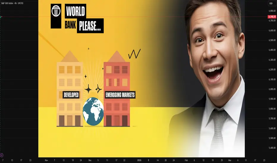
The Role of Developed and Emerging Markets in the World Bank’s Introduction: A Tale of Two Worlds in One Financial Institution
The World Bank stands as one of the most influential international financial institutions in the modern era — a cornerstone of global economic stability and development. Since its establishment in 1944 at the Bretton Woods Conference, the World Bank has evolved from a post-war reconstruction lender to a powerhouse for global poverty reduction, infrastructure development, and economic reform.
At its heart, the World Bank is not merely a bank — it is a bridge between developed and emerging markets. Developed nations bring capital, expertise, and governance, while emerging economies bring growth, opportunities, and development challenges. Together, these two groups form the backbone of the institution’s structure, mission, and functioning.
This intricate partnership shapes the global economy, influences international policy, and determines the future of sustainable development. Understanding their respective roles within the World Bank reveals how global economic cooperation works — and sometimes, where it struggles.
1. The World Bank: Structure and Objectives
The World Bank Group (WBG) consists of five institutions:
International Bank for Reconstruction and Development (IBRD) – lends to middle-income and creditworthy low-income countries.
International Development Association (IDA) – provides concessional loans and grants to the poorest nations.
International Finance Corporation (IFC) – focuses on private sector development.
Multilateral Investment Guarantee Agency (MIGA) – offers political risk insurance and credit enhancement.
International Centre for Settlement of Investment Disputes (ICSID) – handles investment disputes between governments and foreign investors.
Together, they aim to reduce poverty, promote sustainable development, and enhance living standards across the world. But the direction of these goals and their implementation depend largely on the interplay between developed and emerging markets within the institution.
2. Developed Markets: The Pillars of Financial Strength
Developed economies — primarily the United States, Japan, Germany, France, and the United Kingdom — are the largest shareholders and financial contributors to the World Bank. Their roles are multifaceted and deeply rooted in both economic capacity and geopolitical influence.
A. Capital Contribution and Voting Power
The World Bank operates on a shareholding system where financial contributions determine voting power. Developed countries hold the majority of votes — for example, the U.S. alone has around 16–17% of voting rights, giving it significant influence over key decisions.
This capital infusion ensures the World Bank’s ability to provide loans at favorable rates to developing nations, maintain creditworthiness, and attract investors from international capital markets.
B. Policy Influence and Governance
Developed nations also shape the strategic priorities of the World Bank. They influence policy directions on:
Climate change initiatives
Good governance and anti-corruption frameworks
Debt sustainability
Gender equality and education programs
However, critics argue that this dominance can sometimes lead to policies that reflect the interests or economic ideologies of the developed world — particularly the neoliberal approach of privatization and deregulation.
C. Technical Expertise and Innovation
Developed economies contribute advanced research, technology, and institutional know-how to World Bank projects. For instance:
The U.S. contributes technological expertise in energy transition and innovation financing.
European countries drive climate adaptation, green infrastructure, and human rights frameworks.
Japan often supports disaster resilience and urban infrastructure development.
This infusion of expertise helps ensure that World Bank-funded projects are not only financially viable but also sustainable and modern in design.
3. Emerging Markets: The Engines of Growth and Development
Emerging economies — such as India, China, Brazil, Indonesia, and South Africa — play an equally vital yet distinct role within the World Bank. Once the primary recipients of development aid, many have now evolved into both borrowers and contributors.
A. Borrowers and Beneficiaries
Historically, emerging markets have been the primary recipients of World Bank loans and grants aimed at:
Building infrastructure (roads, dams, energy grids)
Expanding access to education and healthcare
Promoting agricultural and rural development
Strengthening governance and public institutions
For example:
India has been one of the largest recipients of World Bank loans, supporting rural electrification, sanitation, and digital finance initiatives.
China, before transitioning to an upper-middle-income economy, utilized World Bank funds to modernize infrastructure and improve poverty reduction programs.
These investments have had a profound multiplier effect — accelerating economic growth, improving living standards, and positioning these countries as regional powerhouses.
B. Emerging Donors and Shareholders
In recent years, several emerging economies have transitioned from aid recipients to development partners.
China has become a major shareholder and now contributes to World Bank financing pools.
India and Brazil participate in knowledge-sharing programs and South-South cooperation.
This evolution symbolizes a more balanced and inclusive global development model, where emerging economies not only receive aid but also help shape and fund development efforts in poorer nations.
C. Field Implementation and Local Innovation
Emerging markets also serve as testing grounds for innovative development models. Their on-ground experiences in poverty alleviation, microfinance, digital inclusion, and renewable energy provide blueprints for other developing nations.
For example:
India’s Aadhaar digital identity program inspired similar digital inclusion models across Africa.
Brazil’s Bolsa Família program influenced social welfare strategies in multiple countries.
Thus, emerging economies bring the voice of practicality, representing real-world development challenges and scalable solutions.
4. Collaboration Between Developed and Emerging Markets
The partnership between developed and emerging markets within the World Bank framework is both strategic and symbiotic.
A. Funding and Execution
Developed nations provide capital and governance, while emerging markets provide execution capacity and local insight.
This balance ensures that funds reach where they’re needed most and are used effectively for on-ground transformation.
B. Knowledge Transfer
The World Bank acts as a platform for knowledge exchange — developed countries share technical know-how, while emerging economies share policy lessons and innovations that work in resource-constrained environments.
C. Sustainable Development Goals (SDGs)
Both blocs are integral to achieving the United Nations’ 2030 SDGs. Developed nations finance and design global frameworks, while emerging markets implement and test these goals in diverse contexts — from renewable energy transitions to healthcare reforms.
5. Challenges in the Relationship
Despite mutual benefits, the relationship between developed and emerging markets in the World Bank is not without friction.
A. Governance Imbalance
Developing and emerging economies have long called for greater voting representation. Although reforms have been introduced, developed countries still dominate decision-making — limiting the voice of fast-growing economies like India or Brazil.
B. Policy Conditionalities
Many emerging nations criticize the World Bank’s loan conditions, which often require structural reforms like privatization or fiscal tightening. These can conflict with domestic socio-economic priorities and sometimes exacerbate inequality.
C. Geopolitical Tensions
The rise of China and the creation of the Asian Infrastructure Investment Bank (AIIB) has challenged the World Bank’s dominance, signaling emerging economies’ desire for alternative frameworks that better represent their interests.
D. Climate Finance Divide
Developed countries advocate for rapid green transitions, but emerging markets argue they need more time and support, as their economic growth still relies on energy-intensive sectors. Balancing development and decarbonization remains a key tension point.
6. The Evolving Role of Emerging Markets in the 21st Century
Emerging economies are no longer passive participants — they are increasingly shaping the World Bank’s agenda.
India champions digital public infrastructure and inclusive finance.
China promotes infrastructure-led growth and south-south cooperation.
Brazil emphasizes social protection and sustainable agriculture.
These nations push for a development model that blends economic growth with social inclusion, moving beyond the purely economic paradigms of the past.
Furthermore, as emerging markets contribute more financially and intellectually, the World Bank’s governance structure is slowly evolving toward greater inclusivity.
7. The Road Ahead: Toward a Balanced Global Partnership
For the World Bank to remain relevant in an increasingly multipolar world, it must strengthen the partnership between developed and emerging markets.
Key future directions include:
Reforming voting rights to reflect modern economic realities.
Enhancing transparency and accountability in project selection and implementation.
Promoting green finance and climate-resilient infrastructure, especially in the Global South.
Expanding digital transformation programs, leveraging emerging market innovation.
Encouraging co-financing and joint initiatives between developed and emerging nations.
The ideal future for the World Bank is not dominated by one group over another — but one where mutual respect, shared responsibility, and equitable participation drive global development.
8. Conclusion: A Shared Mission for Global Prosperity
The World Bank’s success depends on how effectively it balances the strengths of both developed and emerging markets. Developed countries provide stability, financial capacity, and institutional frameworks, while emerging economies bring energy, growth potential, and real-world experience.
Together, they represent the two engines of global progress — one supplying resources, the other driving innovation and execution.
As the 21st century unfolds, the collaboration between these two worlds within the World Bank will determine not only the institution’s future but also the fate of global development itself. The mission is clear: to bridge divides, foster inclusivity, and ensure that prosperity is not the privilege of a few nations — but the shared heritage of all.
The Journey of the World EconomyIntroduction: The Pulse of Civilization
The story of the world economy is, in many ways, the story of human progress itself — a journey from barter to blockchain, from localized trade to globalized finance. Every era of history — from the ancient Silk Road to the digital highways of the 21st century — has shaped how nations produce, distribute, and consume wealth. The evolution of the global economy is not merely an economic tale; it is a social, political, and cultural transformation that reflects the very essence of humanity’s pursuit of growth and stability.
This comprehensive narrative explores the journey of the world economy, tracing its transformation through centuries — highlighting its major milestones, challenges, and the forces that continue to redefine it in the modern era.
1. The Dawn of Trade: Barter Systems and Early Economies
In the earliest human societies, there was no formal concept of money or global trade. People survived through barter systems, exchanging goods and services based on need. A farmer might trade grain for tools made by a blacksmith, or wool for pottery. This system worked in small, self-sufficient communities but faced limitations as societies expanded — differences in value, perishability, and coincidence of wants made trade cumbersome.
The first real economic revolution began with the invention of money — shells, metal coins, and later, paper notes — which enabled standardized exchange. Ancient civilizations like Mesopotamia, Egypt, and the Indus Valley established structured economies where trade routes linked distant lands. The Silk Road connected Asia to Europe, allowing not just the flow of goods like silk, spices, and gold, but also the spread of knowledge, religion, and technology.
This early phase laid the foundation of what would eventually become the global economy — an interconnected web of production and exchange that transcended borders.
2. The Age of Empires: Expansion, Colonization, and Mercantilism
From the 15th to 18th centuries, global trade was dominated by European powers seeking wealth through colonization and mercantilism. Nations like Britain, Spain, Portugal, France, and the Netherlands established colonies across Asia, Africa, and the Americas.
The mercantilist theory of this era believed that a nation’s wealth was measured by its stockpile of gold and silver. This drove colonial expansion as European powers exploited resources and labor from their colonies to fuel their own industrial and military growth.
The triangular trade system between Europe, Africa, and the Americas epitomized this global economic structure — with raw materials flowing from colonies, manufactured goods from Europe, and enslaved labor from Africa. This period brought immense wealth to Europe but at a devastating human cost.
Yet, mercantilism also laid the groundwork for capitalism, as trade, finance, and innovation flourished. The establishment of joint-stock companies like the British East India Company and Dutch VOC introduced the concept of corporate capitalism, where investments and profits were shared among shareholders — a precursor to the modern stock market.
3. The Industrial Revolution: The Birth of Modern Economics
The late 18th and 19th centuries marked the Industrial Revolution, a turning point that transformed the economic fabric of the world. Britain led this transformation, powered by technological innovations such as the steam engine, textile machinery, and railways.
Factories replaced workshops, and production shifted from manual labor to machine-driven efficiency. Urbanization surged as people moved to cities for work. Productivity soared, and with it, global trade expanded exponentially.
The revolution also birthed the modern capitalist system theorized by economists like Adam Smith, whose 1776 work “The Wealth of Nations” introduced the idea of free markets and the “invisible hand.” Capitalism emphasized private property, competition, and profit — principles that shaped economic policy for centuries to come.
However, industrialization also deepened class divides, giving rise to socialist ideologies and labor movements. Thinkers like Karl Marx criticized capitalism for exploiting workers and creating inequality — debates that still resonate in modern policy discussions.
4. The Age of Global Conflict and Recovery (1914–1945)
The early 20th century tested the global economy with unprecedented crises. The First World War (1914–1918) devastated Europe, draining resources and collapsing trade networks. The interwar years saw unstable financial systems, culminating in the Great Depression of 1929, one of the darkest economic periods in history.
Unemployment, deflation, and bankruptcies spread worldwide. The U.S. stock market crash exposed the fragility of the global financial system, leading to the rise of protectionism — countries imposed tariffs, restricting trade in a desperate attempt to save domestic industries.
As if that weren’t enough, the world plunged again into World War II (1939–1945). Economies were redirected toward military production, and destruction swept across continents. Yet, out of this devastation emerged the seeds of modern economic cooperation.
The Bretton Woods Conference (1944) laid the foundation for a new global economic order. Institutions like the International Monetary Fund (IMF) and World Bank were created to promote stability, reconstruction, and development — ushering in the post-war economic era.
5. The Post-War Boom: The Golden Age of Capitalism (1945–1973)
The period following World War II was one of unprecedented economic growth. The United States emerged as the global economic leader, while Europe and Japan rebuilt through programs like the Marshall Plan.
This era witnessed the rise of consumer economies, with booming industries, suburbanization, and technological innovation. The Bretton Woods system pegged currencies to the U.S. dollar, establishing global financial stability.
Trade liberalization under organizations like the General Agreement on Tariffs and Trade (GATT) encouraged global commerce. Living standards rose dramatically, and the middle class expanded.
However, the system began to strain by the early 1970s as inflation, oil shocks, and currency imbalances emerged. The collapse of the Bretton Woods system in 1971, when the U.S. abandoned the gold standard, marked the beginning of floating exchange rates and a more volatile financial environment.
6. The Era of Globalization: Technology, Trade, and Transformation (1980–2008)
From the 1980s onward, the world entered an era of hyper-globalization. Technological revolutions in computing, telecommunications, and the internet transformed production, communication, and finance.
Policies of economic liberalization, led by figures like Ronald Reagan and Margaret Thatcher, encouraged privatization, deregulation, and free-market capitalism. Global institutions such as the World Trade Organization (WTO) promoted open trade and reduced barriers between nations.
Emerging economies — particularly China and India — became key players. China’s market reforms under Deng Xiaoping and India’s 1991 liberalization opened new frontiers for global investment and manufacturing.
The European Union (EU) and the rise of multinational corporations deepened global integration. Outsourcing, global supply chains, and financial markets connected the world more tightly than ever before.
Yet, this period also created inequality and financial bubbles, culminating in the Global Financial Crisis of 2008, which exposed the vulnerabilities of unregulated markets and excessive debt.
7. The Post-Crisis Rebalancing: A New Global Reality (2008–2020)
After 2008, the world economy underwent significant restructuring. Governments and central banks implemented massive stimulus programs, including quantitative easing, to revive growth.
The crisis led to introspection — the need for sustainable, inclusive, and resilient economies became central to global policy. Emerging markets continued to rise, shifting the economic balance toward Asia.
Meanwhile, technological disruption accelerated. The rise of digital economies, fintech, and artificial intelligence transformed how people work, invest, and consume. Platforms like Amazon, Google, and Alibaba redefined commerce and competition.
At the same time, new challenges — climate change, automation, and inequality — demanded global cooperation. The United Nations’ Sustainable Development Goals (SDGs) emerged as a blueprint for balanced economic progress.
However, by 2020, the world faced another major disruption — the COVID-19 pandemic, which shook the foundations of global trade, travel, and supply chains.
8. The Pandemic Era and the Road Ahead (2020–Present)
The COVID-19 pandemic triggered one of the largest economic contractions since World War II. Lockdowns, factory closures, and disrupted logistics paralyzed industries. Global GDP fell sharply in 2020, and unemployment soared.
Yet, the crisis also accelerated digital transformation and remote work, while governments launched unprecedented fiscal and monetary interventions. Stock markets rebounded quickly, fueled by liquidity and innovation in sectors like technology, healthcare, and renewable energy.
The pandemic revealed the fragility of global supply chains, prompting countries to rethink economic self-reliance and strategic manufacturing. It also intensified discussions around de-globalization, climate finance, and digital currencies.
As nations recovered, attention shifted toward green economies, AI-driven productivity, and de-dollarization — as countries sought alternatives to U.S. financial dominance. The rise of BRICS nations, especially with China and India at the forefront, marked a multipolar shift in global power dynamics.
9. The Future of the World Economy: Innovation, Sustainability, and Inclusion
Looking ahead, the global economy is entering a transformational phase. Several key trends are shaping its trajectory:
Technological Revolution – AI, blockchain, and quantum computing are redefining industries, from finance to manufacturing.
Green Transition – Renewable energy, carbon markets, and sustainable finance are becoming economic cornerstones.
Geopolitical Realignment – The U.S.-China rivalry, de-dollarization, and regional trade blocs (like RCEP) are reshaping global alliances.
Digital Currencies & Fintech – Central Bank Digital Currencies (CBDCs) and decentralized finance (DeFi) are revolutionizing monetary systems.
Inclusive Growth – Nations are emphasizing equity, social welfare, and education as pillars of future prosperity.
The new world economy will be digital, decentralized, and data-driven — but its success will depend on how humanity balances innovation with inclusion and sustainability.
Conclusion: A Journey Without an End
The journey of the world economy is far from over. From primitive bartering to algorithmic trading, from local markets to the metaverse, each phase of economic evolution has mirrored humanity’s endless quest for growth, efficiency, and fairness.
Today, as we stand at the crossroads of technology, climate change, and geopolitics, the world economy is being rewritten once again — not by conquest or colonization, but by collaboration, innovation, and consciousness.
The next chapter will not just measure wealth in GDP, but in sustainability, resilience, and shared prosperity. The global economy’s true strength will lie not in how fast it grows, but in how well it uplifts humanity as a whole.

De-Dollarization and the Global Currency WarIntroduction: The Shifting Sands of Global Finance
For decades, the United States dollar (USD) has reigned supreme as the world’s dominant reserve currency — the central pillar of global trade, finance, and economic stability. From oil transactions to international debt settlements, the dollar became more than just a currency; it was the bloodstream of globalization. But in recent years, a strong wave of economic nationalism, geopolitical rivalry, and strategic diversification has begun to challenge this hegemony — a process known as “de-dollarization.”
Simultaneously, we’re witnessing an intensifying “currency war” — a global competition among nations to protect their economic sovereignty, control exchange rates, and reduce dependency on U.S.-led monetary influence. Together, de-dollarization and currency warfare are reshaping the financial map of the 21st century, with implications that reach from the energy markets of the Middle East to the central banks of Asia and Latin America.
This 2000-word analysis dives deep into the rise of de-dollarization, explores its causes and strategies, examines the mechanics of currency wars, and forecasts the potential shape of the next global monetary order.
1. The Roots of Dollar Dominance
After World War II, the 1944 Bretton Woods Agreement established the U.S. dollar as the world’s reserve currency, pegged to gold at $35 per ounce. Other global currencies were tied to the dollar, making it the foundation of postwar economic stability. Even after President Richard Nixon ended the gold standard in 1971, the dollar retained its dominance because of its stability, liquidity, and the economic might of the United States.
By the late 20th century, the dollar had become:
The primary reserve currency, held by central banks worldwide.
The medium of international trade, particularly in oil (the “petrodollar” system).
The currency of global finance, underpinning stock markets, bonds, and derivatives.
In short, control of the dollar meant control of the global economic bloodstream — and this financial power translated into political leverage.
2. What Is De-Dollarization?
De-dollarization refers to the deliberate process of reducing reliance on the U.S. dollar in international trade, finance, and reserves. It’s not about completely abandoning the dollar, but about diversifying away from it to limit vulnerability to U.S. monetary policy and sanctions.
Countries and blocs leading this movement include:
China, promoting the yuan (renminbi) in global trade.
Russia, moving away from dollar-based settlements after sanctions.
BRICS nations (Brazil, Russia, India, China, South Africa, now joined by others) working toward a shared currency system.
Middle Eastern countries, exploring non-dollar oil transactions.
Latin America and Africa, forming regional trade agreements in local currencies.
The motivation? A mix of economic independence, geopolitical resilience, and strategic competition.
3. The Key Drivers Behind De-Dollarization
(a) U.S. Sanctions and Weaponization of Finance
The U.S. uses its control over global payment systems (like SWIFT and dollar-clearing banks) as a geopolitical tool. Nations such as Iran, Venezuela, and Russia have faced financial exclusion through U.S. sanctions.
This has sparked fear among emerging economies that dollar dependency exposes them to political risk — accelerating efforts to create alternative payment systems (e.g., China’s CIPS, Russia’s SPFS, and India’s RuPay/UPI cross-border systems).
(b) Rise of China and the Yuan
China’s economic growth and the Belt and Road Initiative (BRI) have given the yuan increasing global exposure. Beijing aims to internationalize its currency by encouraging trade in yuan and developing offshore yuan markets (especially in Hong Kong, Singapore, and London).
(c) The BRICS Challenge
The BRICS alliance has emerged as a collective front against Western economic dominance. The bloc’s discussions around a BRICS common currency or a gold-backed trade settlement system indicate a long-term ambition to challenge dollar supremacy.
(d) U.S. Debt and Inflation
The U.S. government’s rising national debt (over $34 trillion) and the repeated use of quantitative easing have weakened confidence in the dollar’s stability. Countries fear that excessive dollar printing could erode their reserves’ value, prompting diversification into gold, the yuan, and other currencies.
(e) Digital Currencies and Blockchain
Central Bank Digital Currencies (CBDCs) offer new pathways for global payments. China’s digital yuan is leading this race, aiming to bypass the traditional dollar-based banking infrastructure entirely.
4. The Mechanics of a Global Currency War
A currency war, also known as “competitive devaluation,” occurs when countries intentionally lower the value of their own currencies to boost exports, attract foreign investment, and reduce trade deficits.
How It Works:
By devaluing their currency, a country’s goods become cheaper abroad.
This can strengthen exports but also increases import costs and inflation.
When multiple countries engage in this simultaneously, global financial instability can follow — hence the term “war.”
Historical Examples:
1930s Great Depression: Nations devalued currencies to recover from economic collapse.
1980s U.S.-Japan tension: Japan’s yen appreciation reshaped global trade.
2010s “Currency War 2.0”: After the financial crisis, countries used ultra-loose monetary policy and quantitative easing to stay competitive.
Today, the modern currency war involves not just exchange rates but geopolitical influence, payment systems, and financial infrastructure.
5. De-Dollarization and Currency Wars: The Modern Battlefield
In the 2020s, de-dollarization and currency competition have become two sides of the same coin. The following arenas illustrate this growing conflict:
(a) Energy Markets
The traditional petrodollar system — oil sold in U.S. dollars — is under strain.
China and Russia have signed major energy contracts in yuan and rubles, while Saudi Arabia has hinted at accepting non-dollar payments for oil. The India-UAE rupee-dirham trade settlement is another example of regional diversification.
(b) Central Bank Reserves
According to IMF data, the dollar’s share of global reserves has declined from 70% in 2000 to around 58% in 2024, marking a slow but steady erosion. Central banks are increasing holdings in gold, yuan, and euro, signaling a rebalancing of trust.
(c) Cross-Border Settlements
Nations are exploring bilateral trade agreements in local currencies — for instance, India-Russia rupee-ruble trade, China-Brazil yuan settlement, and ASEAN nations’ local currency framework.
(d) Digital Currency Warfare
With the U.S. lagging in CBDC development, countries like China are pioneering digital payment systems that can function independently of SWIFT and U.S. banking oversight. This could redefine how international money moves in the next decade.
6. Winners and Losers in the De-Dollarization Era
Winners:
Emerging Economies – Greater autonomy over monetary policy and trade settlements.
China and BRICS Members – Enhanced global financial influence and regional cooperation.
Commodity Exporters – Ability to price goods in multiple currencies.
Gold and Digital Asset Markets – Investors view these as alternative stores of value amid dollar uncertainty.
Losers:
U.S. Financial System – Reduced demand for U.S. Treasury bonds and the dollar may weaken the U.S. fiscal position.
Dollar-Debt Dependent Nations – Countries heavily indebted in dollars could face volatility.
Global Investors – Increased currency risk and reduced liquidity in traditional markets.
7. Is a New Global Currency Order Emerging?
While de-dollarization is gaining traction, a complete end to dollar dominance is unlikely in the short term. The U.S. still has unmatched advantages:
The deepest financial markets in the world.
Global trust in its institutions and legal system.
Military and geopolitical clout backing the currency’s credibility.
However, the trend is unmistakable — the world is slowly transitioning toward a multipolar currency system, where the dollar, euro, yuan, and possibly regional digital currencies coexist in a competitive balance.
Future trade blocs might operate on multi-currency platforms, and international reserves could become more diversified.
8. The Future: Cooperation or Confrontation?
The next decade could unfold in one of two broad scenarios:
Scenario 1: Cooperative Multipolarity
Nations collaborate through institutions like the IMF, BRICS Bank, and AIIB, building systems that support currency diversity while maintaining global liquidity. In this world, de-dollarization doesn’t mean destruction — it means balance.
Scenario 2: Financial Fragmentation
Geopolitical rivalry intensifies, creating currency blocs (USD-based, yuan-based, euro-based). Trade becomes more regionalized, and financial flows become fragmented. This could lead to volatility, capital flight, and higher transaction costs worldwide.
In either case, technological innovation — from digital currencies to blockchain trade settlements — will play a defining role in shaping monetary competition.
Conclusion: The Dawn of a New Financial Era
De-dollarization and the currency war are not isolated economic trends; they are strategic transformations redefining how power is distributed across nations. What began as a defensive move by a few sanctioned countries has evolved into a systemic global recalibration of monetary order.
The dollar will likely remain powerful, but its monopoly is fading. The 21st-century global economy may no longer be built around a single currency but around a network of competing and cooperating monetary systems.
For traders, policymakers, and investors, this means one thing: the world of finance is entering a new era — more decentralized, more digital, and more dynamic than ever before.

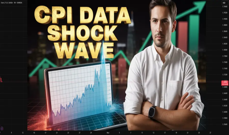
CPI Data and Its Power in Global Trading MarketsIntroduction: The CPI—A Mirror of Inflation and Economic Health
In the fast-paced world of global finance, one number can send markets soaring or tumbling—the Consumer Price Index (CPI). Whether it’s a sudden rise in U.S. inflation or a dip in Japan’s consumer prices, traders across the world hold their breath when CPI data is released. CPI is more than just an economic statistic—it’s the heartbeat of inflation monitoring, influencing everything from interest rate decisions, currency movements, bond yields, and global stock performance to commodity prices.
The CPI reflects the average change over time in the prices paid by consumers for goods and services. When prices rise, purchasing power falls; when they decline, deflationary risks loom. For traders, investors, and policymakers, CPI acts as a compass, signaling where economies—and markets—are heading next.
In this comprehensive discussion, we’ll explore the importance, impact, and trading implications of CPI data in the global market, with detailed insights into how it shapes financial trends, investor sentiment, and global capital flows.
1. What is CPI and Why It Matters Globally
The Consumer Price Index (CPI) measures the change in prices of a "basket" of commonly purchased goods and services—such as food, housing, clothing, transportation, and healthcare—over a specific period. It’s typically released monthly by government statistical agencies (e.g., the U.S. Bureau of Labor Statistics, the UK Office for National Statistics, or India’s Ministry of Statistics).
The CPI serves as a key inflation indicator. Inflation, in turn, influences the monetary policies of central banks like the Federal Reserve (Fed), European Central Bank (ECB), and Reserve Bank of India (RBI).
For global traders, this means that CPI data releases are among the most market-moving events. A single surprise in CPI—say, inflation coming in higher than expected—can lead to sharp movements in currencies, bonds, equities, and commodities.
2. Components of CPI: The Building Blocks of Inflation
To understand how CPI affects global trading, it’s vital to know what it measures. CPI baskets vary by country, but they usually include:
Food and Beverages: Covers groceries, dining out, and beverages—one of the most volatile components due to weather and geopolitical issues.
Housing: Rent, utilities, and maintenance costs; the largest weight in most economies’ CPI.
Apparel: Clothing and footwear prices, reflecting consumer trends and supply chain conditions.
Transportation: Fuel, vehicle prices, and public transport—closely tied to crude oil prices.
Medical Care: Hospital, medicine, and health insurance costs.
Education and Communication: Tuition fees, phone bills, and internet costs.
Recreation and Other Goods: Entertainment, travel, and miscellaneous services.
Each sector’s performance contributes to the overall CPI value, revealing which parts of the economy are heating up or cooling down.
For example:
Rising housing and fuel costs often signal broad inflationary pressure.
Falling food and commodity prices may indicate deflationary trends or reduced demand.
3. CPI’s Role in the Global Financial Ecosystem
CPI doesn’t operate in isolation—it interacts deeply with global financial systems. Here’s how:
A. Influence on Central Bank Policy
Central banks use CPI to set monetary policy. If inflation exceeds target levels (e.g., the Fed’s 2%), they may raise interest rates to cool spending. Conversely, if inflation is too low, they might cut rates or use quantitative easing to stimulate demand.
Higher CPI → Rate hikes → Stronger currency, weaker stocks
Lower CPI → Rate cuts → Weaker currency, stronger stocks
For instance, when U.S. CPI data shows persistent inflation, the Fed signals rate hikes—strengthening the U.S. dollar (USD) but often causing global equity markets to fall.
B. Impact on Global Currencies
Currency traders react instantly to CPI data. Countries with higher inflation and higher interest rates usually see currency appreciation, as investors chase higher yields.
For example:
A hotter-than-expected U.S. CPI often boosts the USD/INR pair as the dollar gains.
A lower Eurozone CPI may weaken the Euro (EUR/USD), hinting at looser ECB policy.
C. Effect on Bond Markets
Bonds are extremely sensitive to inflation data. Rising CPI reduces the real return from fixed-income securities, prompting investors to sell bonds and push yields higher.
For traders, CPI data drives Treasury yield volatility, a crucial input for pricing everything from derivatives to mortgage rates.
D. Stock Market Reactions
Stock indices like the S&P 500, FTSE 100, and Nifty 50 often rally when CPI cools, as it signals lower inflation and potential rate cuts. Conversely, a spike in CPI dampens investor sentiment, especially in rate-sensitive sectors like banking, housing, and technology.
E. Commodity and Energy Markets
Commodities, particularly gold and oil, react sharply to inflation readings.
Gold acts as an inflation hedge—rising CPI often triggers gold rallies.
Crude oil prices influence and are influenced by CPI; rising energy costs feed inflation and vice versa.
4. CPI Data and Global Market Volatility
The release of CPI data often sparks immediate volatility. For professional traders, it’s a critical time for positioning. Algorithmic and institutional traders monitor CPI in real-time, executing trades within seconds of the release.
A. Pre-Announcement Positioning
Markets often price in expected inflation based on forecasts. If the actual CPI data deviates sharply from expectations, it triggers rapid market repricing.
For instance:
If U.S. CPI is forecast at 3.2% but comes at 3.8%, traders expect tighter Fed policy, selling equities and buying dollars.
If CPI underperforms, investors anticipate easing, leading to a risk-on rally in global stocks.
B. The Volatility Chain Reaction
CPI data doesn’t just move one asset—it triggers a chain reaction:
CPI → Interest rate expectations
Interest rate expectations → Currency and bond yields
Currency moves → Commodity and equity adjustments
This chain makes CPI the most-watched economic indicator globally, alongside GDP and employment data.
5. Global Examples: How CPI Data Drives Markets Worldwide
1. United States (US CPI)
The U.S. CPI release is arguably the most impactful in the world. As the dollar is the global reserve currency, U.S. inflation data shapes global risk appetite.
When the U.S. CPI surged above 9% in 2022—the highest in 40 years—it triggered aggressive Fed rate hikes, leading to:
A stronger dollar,
Global equity selloffs,
Declines in emerging market currencies,
Sharp corrections in tech stocks.
2. Eurozone (HICP – Harmonised Index of Consumer Prices)
The Eurozone uses the HICP for consistency across member states. When Eurozone CPI rises, the ECB faces pressure to tighten policy, affecting global bonds and EUR/USD levels.
3. India
In India, CPI is crucial for the RBI’s monetary policy. A rise in food or fuel inflation pushes the RBI toward rate hikes, influencing:
The Nifty and Sensex indices,
Bond yields,
The Rupee’s strength against the Dollar.
4. Japan
Japan’s CPI data has global attention because of its history with deflation. When Japan’s inflation rose above 2% in 2023, the Bank of Japan hinted at policy normalization, shaking up global carry trades and Yen-linked assets.
5. Emerging Markets
In developing economies like Brazil, Turkey, and South Africa, CPI spikes often lead to currency depreciation and investor flight, as markets fear policy instability and economic overheating.
6. How Traders Use CPI Data Strategically
CPI data isn’t just for economists—it’s a vital signal for trading opportunities. Let’s explore how professional traders integrate it into their strategies:
A. Forex Traders
They trade based on interest rate differentials caused by CPI surprises.
Example: If U.S. CPI beats expectations, traders go long USD/INR or short EUR/USD, anticipating a Fed rate hike.
B. Equity Traders
They focus on sector rotation:
High inflation → Banks and Energy outperform, Tech underperforms.
Low inflation → Growth sectors (Tech, Consumer discretionary) shine.
C. Commodity Traders
They monitor CPI as a proxy for demand. Rising CPI hints at economic expansion, lifting demand for industrial metals and energy.
D. Bond Traders
They hedge inflation risk using Treasury Inflation-Protected Securities (TIPS) or short-duration bonds when CPI is expected to rise.
E. Derivative Traders
CPI announcements often lead to volatility spikes, creating opportunities in options trading, especially in volatility-based instruments like VIX futures.
7. The Global CPI Chain: How Inflation Spreads Across Borders
In an interconnected economy, inflation in one region affects others through trade, energy prices, and currency flows.
Rising U.S. inflation leads to stronger USD → Weakens emerging market currencies → Raises import prices in India, Brazil, etc.
Europe’s energy-driven inflation spills into Asian import prices, raising CPI globally.
Global supply chain disruptions (like during COVID-19) create synchronized CPI surges across continents.
Thus, CPI is not just national data—it’s a global ripple effect determining trade competitiveness and monetary coordination.
8. The Future of CPI and Global Market Analysis
With the advent of AI, big data, and real-time analytics, CPI measurement and interpretation are evolving. Traders now use:
Alternative data (e.g., online retail prices, freight rates) to forecast CPI before official releases.
Machine learning models to detect inflation trends early.
Global CPI correlation models to assess cross-border inflation risks.
Moreover, energy transition, climate costs, and geopolitical risks are reshaping inflation dynamics. CPI in the future may include green energy indices and carbon costs, making it more reflective of modern consumption.
Conclusion: CPI—The Guiding Star of Global Traders
In global trading, CPI is more than just an economic indicator—it’s a market driver. It influences everything from central bank policy decisions to daily trading volumes on Wall Street, London, and Mumbai. Understanding CPI means understanding how money flows, assets reprice, and investor psychology shifts across borders.
For traders and investors, mastering CPI analysis provides an edge in forecasting macro trends, identifying trading opportunities, and managing risks. Whether you’re in forex, equities, bonds, or commodities, CPI remains the most powerful pulse point of global economic health.
In the era of inflation uncertainty and global interconnectedness, keeping an eye on CPI data isn’t optional—it’s essential. It tells the story of every nation’s economic heartbeat and shapes the rhythm of global markets.
Commodities: The Pulse of Global TradeIntroduction: The Lifeblood of Global Trade
Commodities are the foundation of global trade, the building blocks upon which the modern economy thrives. From crude oil powering industries to gold backing currencies, and agricultural goods feeding nations — commodities shape economic policies, influence geopolitics, and drive the rhythms of international commerce.
The global commodity market is a vast and dynamic ecosystem where raw materials are bought, sold, and traded across borders. It serves as a vital link between producers (countries rich in natural resources) and consumers (industrialized economies and emerging markets).
Understanding this market is crucial because fluctuations in commodity prices can make or break national economies, impact inflation, shape trade balances, and even alter political relationships.
1. What is the Commodity Market?
A commodity market is a place where raw materials or primary products are exchanged. These are typically divided into two main categories:
Hard Commodities: Natural resources that are mined or extracted — such as crude oil, natural gas, gold, silver, copper, and iron ore.
Soft Commodities: Agricultural or livestock products that are grown or raised — including wheat, corn, coffee, cotton, sugar, and soybeans.
The trading of these commodities happens both in physical form (actual goods being delivered) and financial form (through futures, options, and derivatives contracts).
Commodities are the first stage of production — they feed into industries like energy, manufacturing, construction, and consumer goods. As such, they reflect global economic health and industrial demand.
2. The Structure of Global Commodity Markets
Global commodity trading is facilitated through organized commodity exchanges, which act as platforms for price discovery and standardization. Some of the most influential commodity exchanges include:
New York Mercantile Exchange (NYMEX) – USA (for crude oil, natural gas, and metals)
Chicago Board of Trade (CBOT) – USA (for grains, soybeans, and other agricultural products)
London Metal Exchange (LME) – UK (for base metals like copper, zinc, and aluminum)
Intercontinental Exchange (ICE) – Global (for energy and soft commodities)
Multi Commodity Exchange (MCX) – India (for energy, metals, and agri commodities)
Shanghai Futures Exchange (SHFE) – China (for metals and energy)
These exchanges operate as transparent markets where prices are determined by supply and demand dynamics, speculation, hedging activities, and global economic indicators.
3. The Role of Commodities in Global Trade
Commodities are the building blocks of the world economy. Their importance in global trade can be understood in multiple ways:
a) Driving Economic Growth
Commodity exports are the primary source of revenue for many developing and resource-rich countries. For example:
Oil accounts for over 90% of export revenue in nations like Saudi Arabia and Nigeria.
Agricultural commodities dominate the exports of Brazil and Argentina.
Metals and minerals are key exports for Australia, Chile, and South Africa.
b) Enabling Industrialization
Industrial economies like China, the US, and Germany rely heavily on importing raw materials to fuel their manufacturing sectors. Without commodity imports, their industrial engines would stall.
c) Influencing Currency and Inflation
Commodity prices directly affect inflation rates and currency valuations. For instance:
A surge in oil prices increases transportation costs, leading to global inflation.
Commodity-exporting nations’ currencies (like the Canadian Dollar and Australian Dollar) often rise with higher global commodity prices.
d) Powering Global Supply Chains
Every major global supply chain — from food production to electronics — begins with commodities. For example:
Copper and lithium are crucial for electric vehicles and renewable energy infrastructure.
Wheat and corn are essential for global food security.
4. Factors Influencing Commodity Prices
Commodity markets are known for their volatility, driven by a complex web of factors:
a) Supply and Demand
This is the core driver. When demand exceeds supply (as seen in post-pandemic recoveries), prices surge. Conversely, when oversupply hits the market, prices fall sharply.
b) Geopolitical Tensions
Conflicts, trade sanctions, and political instability can disrupt supply chains. For example:
The Russia–Ukraine war affected wheat and crude oil supplies.
Sanctions on Iran influenced global oil markets.
c) Climate and Weather Conditions
Agricultural commodities are heavily influenced by climate. Droughts, floods, or hurricanes can devastate crop yields and spike prices for grains, coffee, or cotton.
d) Technological Developments
Innovation in extraction and farming methods can improve supply. For instance, the shale revolution in the US transformed it into a major oil exporter, altering global energy dynamics.
e) Speculation and Investment
Institutional investors and hedge funds actively trade commodities as an asset class. Large inflows of speculative money can amplify price movements.
f) Currency Fluctuations
Since most commodities are priced in US dollars, a strong dollar makes them more expensive for other countries, reducing demand and impacting prices globally.
5. The Global Commodity Supercycles
A commodity supercycle refers to a prolonged period of rising or falling prices driven by structural shifts in global demand and supply.
Historically, there have been several notable supercycles:
1950s–1970s: Post-war reconstruction in Europe and industrial expansion in Japan.
2000s: China’s rapid industrialization and infrastructure boom drove massive demand for metals and energy.
2020s (Emerging): The green energy transition is creating new demand for copper, lithium, and rare earth metals.
Each cycle has reshaped global trade flows and altered the balance of power between resource-rich and manufacturing nations.
6. The Role of Developing Nations in Commodity Trade
Developing countries are the main suppliers of global commodities, while developed nations are the primary consumers. This dynamic defines much of global trade.
a) Resource Dependency
Many developing nations rely heavily on commodity exports for government revenue and employment. However, this dependence can lead to vulnerability — known as the “resource curse” — where economic instability follows commodity price fluctuations.
b) Trade Imbalance
Commodity-rich nations often face trade imbalances due to their reliance on exporting raw materials while importing finished goods, trapping them in low-income cycles.
c) Diversification and Industrialization
To reduce this dependency, many emerging economies are now focusing on value addition, investing in refining, processing, and manufacturing to capture higher margins within the global supply chain.
7. Commodity Derivatives and Financialization
The evolution of commodity derivatives has transformed global trade by enabling participants to manage risk.
a) Futures Contracts
These allow buyers and sellers to lock in prices for future delivery, providing price certainty and stability in volatile markets.
b) Options and Swaps
These instruments allow traders to speculate on or hedge against price fluctuations without directly owning the physical commodity.
c) The Rise of Financial Investors
Banks, hedge funds, and ETFs have turned commodities into an investment asset class, linking them more closely to global financial markets. While this enhances liquidity, it also increases price volatility.
8. The Impact of Technology and Sustainability
The commodity market is undergoing a transformation driven by technological innovation and sustainability concerns.
a) Digitalization and Blockchain
Blockchain technology is enhancing transparency in commodity trading by creating secure, tamper-proof records of transactions. This reduces fraud and improves trust between buyers and sellers.
b) Automation and AI
AI and big data analytics are helping traders predict price trends, manage risks, and optimize logistics and supply chain operations.
c) Green Transition
The global shift toward renewable energy is reshaping demand for commodities:
Oil and coal demand may decline, while lithium, cobalt, and nickel demand surges for battery production.
Renewable infrastructure requires vast amounts of copper and aluminum.
Sustainability is now at the core of commodity trade, pushing producers to adopt eco-friendly practices.
9. Challenges in the Global Commodity Market
Despite its central role, the global commodity market faces numerous challenges:
Price Volatility: Unpredictable price swings disrupt planning for producers and consumers alike.
Supply Chain Disruptions: Wars, pandemics, and trade restrictions can halt the flow of goods.
Environmental Concerns: Mining and extraction often damage ecosystems, sparking global protests.
Economic Inequality: Resource wealth often benefits elites, not the broader population.
Policy and Regulatory Risks: Sudden government interventions, export bans, or taxation changes affect stability.
These challenges underline the need for resilient, transparent, and sustainable commodity trading systems.
10. Future Outlook of the Global Commodity Market
The future of commodities is intertwined with global megatrends — climate change, technological innovation, population growth, and geopolitical realignments.
a) Green Commodities Will Dominate
With the rise of electric vehicles, renewable energy, and decarbonization efforts, the demand for green metals like lithium, nickel, and copper will skyrocket.
b) Digital Commodity Exchanges
Digital platforms will make global trading more accessible, efficient, and transparent — benefiting small traders and emerging markets.
c) Strategic Resource Alliances
Nations will form alliances to secure access to critical minerals, leading to “resource diplomacy” becoming as vital as military or trade diplomacy.
d) Climate Risk Integration
Commodity prices will increasingly factor in climate risks, such as carbon footprints, water usage, and environmental impact.
e) Sustainable Investing
Institutional investors will favor ESG-compliant (Environmental, Social, and Governance) commodity producers, reshaping investment flows.
Conclusion: Commodities as the Pulse of the World Economy
The global commodity market is not just about trade—it’s about survival, growth, and balance. It powers industries, feeds populations, and fuels innovation. Every price movement in oil, gold, or grain ripples through the world economy, influencing policies, investments, and livelihoods.
In essence, commodities are the pulse of global trade, reflecting humanity’s evolving relationship with nature, technology, and economics. As the world transitions toward a green and digital future, the role of commodities will remain central — not just as resources, but as strategic instruments shaping the destiny of nations and the direction of global commerce.
World Economy Gets Affected by Shocks, Policies, and CrisesIntroduction: The Interconnected Web of Global Markets
The global market is no longer a collection of isolated economies—it’s an intricate web of trade, finance, technology, and politics. Every decision made in one corner of the world, whether it’s a central bank raising interest rates or a sudden geopolitical conflict, sends ripples across continents. A small policy tweak in Washington can impact commodity prices in Africa, stock indices in Europe, and currency markets in Asia within hours.
Understanding how the global market gets affected means looking deeply into the interconnections between macroeconomic policies, trade relations, technological innovations, geopolitical tensions, and investor sentiment. Over the past few decades, the world has witnessed several global market shocks—from the Dot-Com Crash (2000) to the Global Financial Crisis (2008), COVID-19 pandemic (2020), and the Russia-Ukraine War (2022)—each one teaching a new lesson about how fragile yet resilient the global economy truly is.
1. The Power of Monetary Policies: Central Banks as Global Market Movers
Central banks are the most influential entities in the financial world. Their decisions on interest rates, liquidity injections, and bond purchases have the power to strengthen or weaken economies.
For instance, when the U.S. Federal Reserve increases interest rates to control inflation, the effects are felt worldwide. Higher U.S. rates make the dollar stronger, attracting global capital into American assets. Emerging markets then see capital outflows, currency depreciation, and rising import costs.
A perfect example is the 2022–2023 tightening cycle, when the Fed raised rates aggressively. As a result:
The Indian rupee, Japanese yen, and Euro weakened.
Stock markets in emerging countries saw volatility.
Global investors moved funds to safer U.S. Treasury bonds.
On the other hand, when central banks lower rates or introduce quantitative easing (QE)—as seen during the 2008 financial crisis and the COVID-19 pandemic—markets experience liquidity boosts. Cheap money flows into equities, commodities, and even cryptocurrencies, inflating asset prices.
Thus, monetary policy isn’t just a domestic tool—it’s a global economic lever that affects trade balances, inflation, and investment trends across the world.
2. Trade Wars and Global Supply Chains: The Domino Effect
Trade is the lifeblood of the global economy, but it’s also one of the most vulnerable sectors. In recent decades, trade wars and protectionist policies have created ripple effects across industries and borders.
The U.S.–China trade war (2018–2019) showcased how tariff hikes between two major economies can disrupt global manufacturing chains. Companies dependent on Chinese components or American technology were forced to relocate, adapt, or shut down.
Supply chain disruptions not only raise production costs but also trigger inflationary pressures globally. During the COVID-19 pandemic, supply chain bottlenecks led to shortages in semiconductors, automobiles, and electronics, which in turn pushed up prices everywhere.
This domino effect demonstrates how interconnected and fragile the world’s production networks are. A single disruption in one country can cascade through the system, affecting manufacturing output, consumer prices, and employment in others.
3. Geopolitical Tensions and Conflicts: The Invisible Hand of Instability
Political instability, wars, and international sanctions play a major role in shaping global markets. They directly impact oil prices, commodity supplies, defense spending, and investor confidence.
For example:
The Russia–Ukraine War (2022) led to an immediate surge in crude oil and natural gas prices. European nations struggled with energy shortages, and inflation soared globally.
The Middle East conflicts often cause spikes in crude prices, influencing global inflation and currency movements.
Tensions in the South China Sea impact shipping routes, trade logistics, and manufacturing costs in Asia.
Investors hate uncertainty. When geopolitical risks rise, global markets experience volatility. Gold, the U.S. dollar, and government bonds often become safe havens, while equities and emerging market currencies decline.
In essence, the geopolitical environment acts as the emotional pulse of the global market—capable of triggering rapid swings based on fear, hope, or conflict resolution.
4. Technological Disruptions: Innovation, Automation, and the Digital Economy
Technology has reshaped global trade, investment, and consumer behavior. From automation and AI to blockchain and fintech, technological revolutions have created both opportunities and challenges for global markets.
The rise of the digital economy—driven by giants like Amazon, Apple, and Alibaba—has transformed how value is created and exchanged. At the same time, automation and AI-driven manufacturing have shifted the balance of labor-intensive industries, making some economies winners and others losers.
Moreover, the cryptocurrency boom in the 2010s and 2020s introduced a new digital asset class, disrupting traditional financial systems. Bitcoin, Ethereum, and blockchain technology sparked debates about monetary sovereignty, central bank digital currencies (CBDCs), and decentralized finance (DeFi).
Technological innovation also drives stock market trends. Sectors like semiconductors, green energy, and AI have outperformed traditional industries, influencing investor sentiment and portfolio allocations worldwide.
Thus, the tech wave is not only shaping economies—it’s redefining the future of global finance.
5. Global Crises: From Financial Meltdowns to Pandemics
Nothing affects global markets more severely than a full-blown crisis. History offers multiple lessons:
The 2000 Dot-Com Bubble: Overvaluation of tech stocks led to a crash, wiping out trillions in market value and marking the start of a recession.
The 2008 Global Financial Crisis: Triggered by the U.S. subprime mortgage collapse, it resulted in massive bank failures, job losses, and government bailouts.
The 2020 COVID-19 Pandemic: A global health crisis turned into an economic catastrophe. Markets crashed, unemployment soared, and governments unleashed record stimulus measures.
Each crisis led to profound market transformations. After 2008, the world saw the rise of low-interest-rate regimes and QE policies. After COVID-19, the focus shifted to digital acceleration, supply chain resilience, and remote work economies.
Crises also change investor psychology. They remind traders and governments alike that risk management, diversification, and regulation are essential to prevent future collapses.
6. Currency Fluctuations and Global Trade Imbalances
Currencies act as the bloodstream of global commerce. When exchange rates fluctuate significantly, the entire market structure feels the impact.
For instance, a stronger U.S. dollar makes American exports expensive but reduces import costs. On the other hand, a weaker yen or rupee benefits exporters but increases the cost of imports like crude oil.
Currency volatility also affects global investment flows. Hedge funds, multinational corporations, and even retail traders respond to exchange rate trends, often leading to speculative movements.
Global trade imbalances—like the persistent U.S. trade deficit with China—reflect deeper structural issues in competitiveness, consumption, and currency policies. Countries sometimes intervene in markets (through central banks or sovereign funds) to stabilize their currencies, which in turn affects global capital distribution.
7. Commodity Prices: The Pulse of Global Inflation
Oil, gold, copper, wheat, and other commodities form the backbone of the global economy. When their prices change sharply, it alters everything from inflation to interest rates.
For example:
Rising crude oil prices increase transportation and manufacturing costs, pushing inflation higher globally.
Falling metal prices hurt resource-dependent economies like Australia, Brazil, and Russia.
Gold prices often rise during uncertainty, reflecting investor flight from risky assets.
The 2022 energy crisis, triggered by the Russia-Ukraine conflict, is a recent example of how a regional issue can cause global inflation. Central banks worldwide had to raise rates aggressively to control prices, leading to slower growth and higher borrowing costs.
Thus, commodities act as global economic thermometers, signaling the health, fear, or optimism of the market ecosystem.
8. The Role of Global Institutions and Cooperation
Organizations like the IMF, World Bank, WTO, and G20 play crucial roles in maintaining financial stability and promoting international cooperation. They provide emergency loans, policy guidance, and platforms for dialogue during crises.
However, global coordination often faces challenges due to national interests, political rivalries, and economic disparities. The COVID-19 pandemic revealed deep inequalities between developed and developing nations in vaccine access and economic recovery speed.
Still, initiatives like climate finance, sustainable development goals (SDGs), and global debt relief show how multilateral cooperation can stabilize markets and promote long-term growth.
In the modern era, collaboration between countries is not optional—it’s a necessity to maintain global market equilibrium.
9. Investor Psychology: The Invisible Force Behind Market Movements
Markets are not just driven by data—they are powered by human emotions. Fear, greed, optimism, and panic collectively determine the direction of global indices.
During times of uncertainty, investors rush to safe-haven assets like gold, bonds, and the U.S. dollar. During bullish phases, risk appetite increases, pushing up equities, cryptocurrencies, and emerging market assets.
The rise of social media, algorithmic trading, and real-time news has amplified these emotional swings. A single tweet from a policymaker or a viral rumor can move billions of dollars in minutes.
Therefore, understanding market sentiment is as vital as understanding fundamentals. It explains why markets sometimes move irrationally—even against economic data.
10. The Future of Global Markets: Towards Sustainability and Digitalization
The next phase of global market evolution will be defined by two megatrends: sustainability and digital transformation.
Green Finance & ESG Investing: Investors are increasingly prioritizing environmental, social, and governance (ESG) factors. Countries are shifting towards renewable energy, electric mobility, and carbon-neutral strategies.
Digitalization: The integration of artificial intelligence, blockchain, and data analytics is transforming financial services, making transactions faster, cheaper, and more transparent.
Additionally, deglobalization trends—reshoring, local manufacturing, and regional trade agreements—are reshaping how countries interact economically.
While challenges like climate change, inequality, and cyber threats persist, the world is gradually moving toward a more digitally integrated yet locally resilient market ecosystem.
Conclusion: A Global Market in Constant Motion
The global market is a living organism—dynamic, interconnected, and highly sensitive. It reacts not only to economic data but also to politics, psychology, technology, and nature itself.
Every event—whether a war, a policy shift, or a tech breakthrough—sends signals through this global network, shaping prices, profits, and possibilities.
To thrive in this ecosystem, investors, policymakers, and citizens must understand that no economy stands alone anymore. The fate of the world market depends on collaboration, innovation, and adaptability.
As we step into the next decade, the key to success lies not in predicting every shock but in building systems resilient enough to withstand them.
The world may change, but one truth remains: global markets move together—sometimes in fear, sometimes in hope, but always forward.
Ascending channels trading applied to Gold current situation🔼 Ascending Channel – Explained Simply
An ascending channel is a bullish pattern — but not always a bullish ending.
It shows a market climbing step by step between two parallel rising lines:
the lower trendline (support) and the upper trendline (resistance).
🧠 Market Psychology
Buyers dominate, but sellers still show up at every swing high.
Each dip gets bought, keeping the trend alive —
until one side finally breaks the rhythm.
⚙️ How to Trade It
• Inside the channel:
Buy near the lower rail, take profit near the upper rail.
• Breakout play:
Go long on a confirmed close above resistance,
or short on a clean break below support.
• Stops:
Just outside the opposite rail — below support for longs, above resistance for shorts.
• Targets:
Use the channel height projected from the breakout point.
⚠️ What to Watch Out For
• False breakouts happen often.
• Too-steep channels usually fail faster.
• Volume must confirm — low volume = fake strength.
• Statistically, breakdowns occur slightly more often than breakouts.
________________________________________
Key takeaway:
An ascending channel isn’t a promise of a bull run —it’s a structured climb that eventually ends.
Trade the rhythm, not the hope. 🎯
Statistically, in 57% of cases, up channels are broken to the downside
Gold now situation: the recent 1k pips is way-way-way to steep
Confirmation came with a drop under 3950 zone
Usually, in the case of such a steep channel, all the move is negated, so a drop to the 3850 zone.
However 3900 zone is strong support now, so a break under 3950 zone could lead to "only" a drop to this support.
Why is the Stock Market UP when the Government is shut down?The stock market has been trending upward via the indexes as representative of the overall stock market. The Government of the US has been shut down for over a week, but stocks, especially big blue chip stocks keep moving upward. WHY?
Is it Wall Street vs Main Street? No.
Is it because the "economy is unstoppable? No.
Is it because of tariffs? and all that money going to the government? No.
So what is driving big name companies upward when the market should be crashing because of the shut down as stock market has ALWAYS DONE in the past any time the ceiling budget increase fails in Congress?
Corporations, with the huge tax cuts this year, and with AI providing significant lower overhead costs, and payroll costs, are in a massive buyback program once again, as they were in 2018 and 2019.
Buybacks are intended to move price of a stock upward and or maintain a price that the corporation has targeted for their buybacks.
The Bank of Record for the corporation does the actual physical work of buying shares of a company back to return the ownership of those shares to the corporation. This boost dividends which keep the Buy Side Institutions, who hold the majority of shares of many corporations, from lowering inventory for that stock. Buy Side Institutions are the most important investors for every corporation. Keep the Buy Side Institutions content with how the company is being managed is a key element of maintaining a high Percentage of Shares held by Institutions which is the primary goal of every corporation. Corporations focus on keeping shareholders holding their stock is not about the average small lot investor. It is all about keeping the Buy Side Institutions pleased with the price of the stock during extreme stress to the market. This is very important information as it tells you WHO CONTROLS PRICE and that tells you when to enter a stock, how to trade that stock, what strategies will work best for your trading style, and when and how to exit to close the trade at the ideal profit taking price level.

How We Can Handle & Benefit From The Gaps ? When We Can Enter ?If we checked all JPY Pairs we will see that we have gaps in all JPY Pairs , this post will be on how we can benefit from this gaps , i have my own method , for example in this pair EUR/JPY , The price opened in gap to upside and 95% the price will cover this gap , but when we can do that , in my method , we should wait the price to close below last res with 4h candle and then we can enter a sell trade and targeting the gap . try it and tell me in the comments if it worked with you .
Options Blueprint Series [Advanced]: Gap Fill Time Spread Play1. The Market Context — Yen’s Weekend Gap and Mean Reversion Setup
The Japanese Yen futures (6J) reopened after the weekend with an aggressive downside gap, immediately catching the eye of volatility traders. Gaps of this nature are often emotional reactions to global macro news or overnight FX shifts — yet, when structural levels like the Bollinger Band lower boundary are involved, traders begin to anticipate a mean reversion rather than continued momentum.
This is exactly what we see on 6J:
Price plunged into the lower Bollinger Band, finding temporary balance near 0.0067+, while the middle band — representing the 20-period mean — sits around 0.0068+. The gap above remains open, and that area coincides with the Bollinger mean, creating a convergence between technical equilibrium and market memory.
Historically, the Yen tends to exhibit mean reversion behavior after outsized weekend gaps, as liquidity normalizes. That statistical tendency does not guarantee results, but it provides the foundation for a non-directional strategy applied with a slight directional bias — exactly where options on futures can shine.
2. Strategy Rationale — A Non-Directional Tool Used Directionally
Instead of a pure directional play (like buying calls), we opt for a Horizontal Call Spread — also known as a Calendar Spread or Time Spread — positioned around the 0.00680 strike. This structure allows us to express a view on time and volatility, rather than raw price movement.
Objective: capture a modest recovery or stabilization near 0.0068
Approach: profit from time decay and implied volatility behavior as the front option (short leg) loses value faster than the back month (long leg)
Outcome: defined risk, limited exposure to violent swings, and a smoother equity curve
In essence, we’re using a non-directional strategy (time-based) in a slightly directional context (mean reversion target) — a powerful way to let the clock, not the market, do most of the work.
3. Constructing the 6J Horizontal Call Spread
Let’s break it down with specific contracts:
Buy Nov 7 Call (0.00680 strike)
Sell Oct 24 Call (0.00680 strike)
This combination forms a calendar spread, where both options share the same strike but different expirations. The trade is initiated for a net debit, meaning we pay a small premium upfront for the position.
Mechanics
As time passes, the shorter-dated Oct 24 call decays faster.
If price drifts toward the 0.0068 area by the front expiry, the short leg expires near-the-money (or worthless), while the back-month call retains time value.
The spread expands — producing the ideal outcome.
The position benefits from stabilization, controlled volatility, and time decay alignment — instead of needing a directional surge.
Greeks behave in a nuanced way:
Theta: positive near the target zone
Vega: long volatility — the position gains if implied volatility rises in the back month
Delta: small positive exposure (mild bullish tilt)
That’s the “slightly directional” essence of this setup — time-sensitive, but gently leaning toward a gap-fill move.
4. Chart Perspective — The Technical Catalyst
The Bollinger Bands® tell the story clearly.
Lower band: 0.00672 → recent test zone
Mean (20-period average): 0.00681 → target
Upper band: 0.00690 → secondary resistance
The weekend gap remains unfilled, overlapping perfectly with the Bollinger mean.
Should price gravitate back toward equilibrium, the spread reaches its best reward zone as Oct 24 time decay accelerates.
5. Risk Management — Structuring Control, Not Hope
Every options trade begins with a cost — the net debit — which defines maximum risk. This makes the horizontal spread particularly appealing in uncertain environments.
Here’s the structured approach:
Entry zone: 0.0067+ area or below the lower Bollinger Band
Target zone: 0.0068+ (Bollinger mean & partial gap fill)
Stop: below 0.0066575 (recent intraday swing), or no stop at all since the options strategy provides a limited risk natively.
That defines a maximum reward-to-risk ratio of roughly 3:1 when measured against time decay and expected mean reversion distance.
It’s also crucial to track macro catalysts. The Yen can react sharply to U.S. yields or Bank of Japan policy headlines. Avoid holding this position through major FX events if volatility spikes uncontrollably — horizontal spreads work best in stable-to-moderate volatility environments.
Lastly, avoid scaling without liquidity awareness. 6J options are institutionally liquid, but ensure bid–ask stability during execution.
6. CME Context — Contract Specs
Understanding contract size and margin requirements is essential before structuring any options-on-futures strategy.
Contract size: 12,500,000 Japanese Yen
Minimum tick: 0.0000005 USD per JPY
Tick value: $6.25 per contract
Trading hours: Nearly 24-hour access Sunday–Friday
As of recent CME data, the initial margin for the standard 6J futures contract is around $2,800, though this varies with volatility. Traders using options on futures generally post the premium paid as margin (for debit spreads), which in this case is $237.5 (0.000019/0.0000005 x $6.25).
7. Risk, Reward & Realistic Expectations
The goal here is not to “predict” a direction — it’s to position intelligently around time.
A well-constructed calendar spread lets traders participate in short-term stabilization moves with predefined exposure.
If 6J consolidates and slowly lifts toward 0.0068:
The short Oct call decays,
The long Nov retains premium,
The spread widens — success.
If the Yen collapses further or volatility implodes across the curve, losses remain contained to the initial debit — no margin calls, no open-ended risk.
For advanced traders, layering such spreads across correlated expirations can create calendar ladders, offering continuous time exposure while recycling theta — but that’s a topic for another Blueprint.
8. Key Takeaways
Directional calendar spreads can be powerful after emotional gaps.
6J’s gap down plus Bollinger reversion potential creates an interesting time-based setup.
Using non-directional tools directionally provides precision control over risk and exposure.
Proper risk management defines the edge — not prediction accuracy.
This approach emphasizes professional-grade thinking: controlling variables (time, volatility, strike) rather than chasing price movement.
When charting futures, the data provided could be delayed. Traders working with the ticker symbols discussed in this idea may prefer to use CME Group real-time data plan on TradingView: www.tradingview.com - This consideration is particularly important for shorter-term traders, whereas it may be less critical for those focused on longer-term trading strategies.
General Disclaimer:
The trade ideas presented herein are solely for illustrative purposes forming a part of a case study intended to demonstrate key principles in risk management within the context of the specific market scenarios discussed. These ideas are not to be interpreted as investment recommendations or financial advice. They do not endorse or promote any specific trading strategies, financial products, or services. The information provided is based on data believed to be reliable; however, its accuracy or completeness cannot be guaranteed. Trading in financial markets involves risks, including the potential loss of principal. Each individual should conduct their own research and consult with professional financial advisors before making any investment decisions. The author or publisher of this content bears no responsibility for any actions taken based on the information provided or for any resultant financial or other losses.
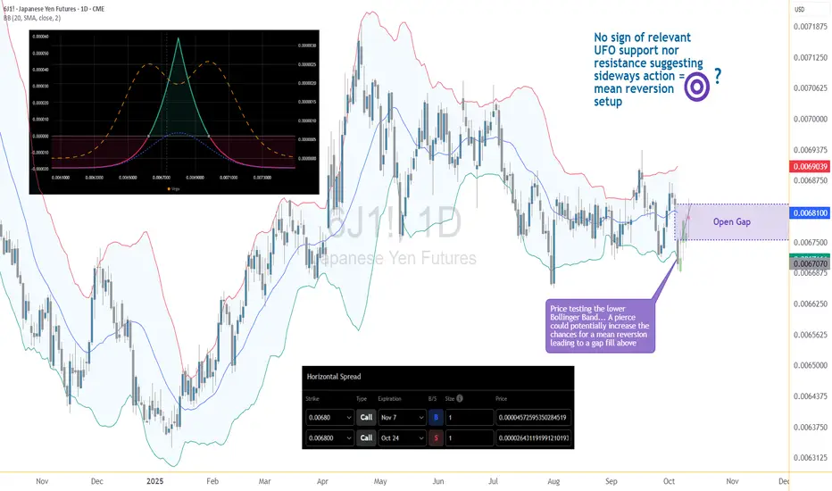
Smart Money Support/Resistance + ATAI Volume Analysis —PracticalApplication
When these two indicators work together — Smart Money Support/Resistance (Lite) and ATAI Volume Analysis with Price Action — the chart begins to speak a clearer language: one defines where the reaction zones form, and the other explains what happens inside them. The purpose is not prediction but understanding the balance between smart money pressure and retail momentum.
1. Parameter Alignment
On the right side of the chart, the green info panel confirms that both indicators share identical configurations. In this example, the lookback period is set to 52, chosen deliberately because it must be smaller than the total number of LTF coverage bars (65). For the Smart Money Support/Resistance indicator, the projection is set to 26 — extending the detected zones forward without adding excessive visual noise. This alignment is crucial; mismatched parameters can desynchronize volume readings and structural boundaries.
2. Reading the Chart
In this sample chart, the upper red area represents a Smart Money resistance zone — a region of concentrated selling pressure detected from lower timeframe volume. Simultaneously, ATAI Volume Analysis signals an Overbought (6/7) condition, meaning multiple oscillators confirm exhaustion while seller volume (S.Max) begins to outweigh buyer volume (B.Min). This overlap suggests that liquidity has shifted and the prior bullish impulse is weakening. From here, price may consolidate within the zone or initiate a structured retracement toward the blue support area, previously defined by accumulation volume. The red projected path simply visualizes one potential structural scenario; it is not a prediction or trade signal.
3. Broader Context
This example serves only as a demonstration of how these two tools interact when properly tuned. Different assets and timeframes naturally yield unique structures and behaviors, yet the principle remains consistent: define the territory first with Smart Money Support/Resistance, then interpret market behavior within it using ATAI Volume Analysis.
This content is for educational purposes only — not financial advice. User feedback and practical observations play a key role in refining future versions of both indicators.
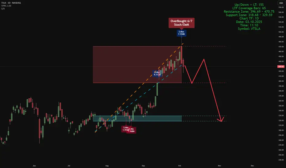
How I Used The 45m Time Frame To Make Over 500%My main timeframes of choice with back tested data are 3m, 12m, 45m, and 3H (192m).
With just the 45m and 3H one can make have solid entries around similar preset times, allowing you to plan for trades around your daily life.
Not everyone can be on screens all day. Some have jobs, professions, families, etc...
Using the 45m candle open and 3m for executions, I entered a short on spx via 6700 puts which traded at a low of .50 - .60 around the time of entry and ran to a high of 8.10.
All of my cons were exited in the 4.6 - 5.0 Range.
The Entry 45m Candle Open: 9:30 PST
Exit Next 45m Candle at Preset Exit Price.
AMEX:SPY
OANDA:SPX500USD
OPRA:SPXW251003P6700.0

Global Market Participants: Players Shaping the World Economy1. Understanding Global Market Participants
A market participant refers to any individual, institution, or entity that engages in buying, selling, or investing in financial instruments such as stocks, bonds, currencies, derivatives, or commodities. Their participation drives market activity, facilitates capital allocation, and ensures continuous price formation through demand and supply.
Global market participants can broadly be divided into institutional participants and non-institutional (retail) participants. Institutional participants dominate the market due to their large capital base and sophisticated strategies, while retail participants add diversity and depth.
2. Categories of Global Market Participants
a) Central Banks
Central banks are the most influential entities in the financial world. They control a nation's monetary policy, manage foreign exchange reserves, and stabilize the currency and financial system. Examples include the U.S. Federal Reserve, European Central Bank (ECB), Bank of Japan (BoJ), and Reserve Bank of India (RBI).
Key functions:
Setting benchmark interest rates.
Controlling money supply to influence inflation and growth.
Managing exchange rate stability.
Acting as a lender of last resort during crises.
Regulating the banking sector.
Central banks’ decisions can cause global ripple effects. For instance, a rate hike by the U.S. Fed can strengthen the U.S. dollar, attract global capital inflows, and pressure emerging market currencies.
b) Commercial Banks
Commercial banks are vital intermediaries between savers and borrowers. They accept deposits, provide loans, and participate actively in money markets, foreign exchange markets, and credit markets.
Their roles include:
Facilitating trade finance and foreign exchange transactions.
Managing corporate treasury operations.
Participating in interbank lending.
Investing in sovereign bonds and other assets.
Commercial banks also engage in proprietary trading and market-making, providing liquidity to the market.
c) Investment Banks
Investment banks specialize in capital market operations, helping companies raise funds through IPOs, bond issuances, or private placements. They also provide advisory services for mergers and acquisitions (M&A), portfolio management, and structured finance.
Major global players like Goldman Sachs, Morgan Stanley, and J.P. Morgan play crucial roles in shaping global capital flows.
Core functions:
Underwriting securities.
Advising on mergers and acquisitions.
Asset securitization.
Providing derivatives and risk management solutions.
Investment banks are considered the "architects" of global finance, linking capital seekers and investors across continents.
d) Institutional Investors
Institutional investors are large organizations that invest on behalf of clients or members. They include mutual funds, pension funds, insurance companies, and sovereign wealth funds.
Examples:
BlackRock and Vanguard (mutual funds)
CalPERS (pension fund)
Norwegian Sovereign Wealth Fund
Allianz and AIA Group (insurance firms)
Importance:
They manage trillions of dollars, often determining global market trends.
They are long-term investors, influencing corporate governance.
Their actions impact asset allocation, market liquidity, and volatility.
Institutional investors’ investment decisions are data-driven, often guided by macroeconomic conditions, risk models, and diversification strategies.
e) Hedge Funds
Hedge funds are privately managed investment vehicles that use sophisticated strategies to generate high returns. They often employ leverage, short selling, arbitrage, and derivatives trading to exploit market inefficiencies.
Examples: Bridgewater Associates, Renaissance Technologies, and Citadel.
Their significance:
Hedge funds enhance market efficiency by arbitraging mispriced assets.
They take contrarian or speculative positions.
Their rapid trading strategies can amplify market volatility, especially in times of stress.
Hedge funds are major players in currency, commodity, and derivatives markets, frequently setting trends that influence other investors.
f) Corporations and Multinational Companies
Large corporations are key participants, especially in foreign exchange and commodity markets. They engage in international trade, requiring them to manage currency exposure and input cost fluctuations.
For example:
A U.S.-based company exporting to Europe may hedge against a weakening euro.
An airline company may hedge fuel costs using futures contracts.
Corporations also issue bonds or equities to raise capital, becoming integral to capital market operations. Their strategic financial management contributes to overall market stability and liquidity.
g) Sovereign Wealth Funds (SWFs)
SWFs are state-owned investment funds that invest surplus revenues (often from oil exports or trade surpluses) into global assets like stocks, bonds, infrastructure, and real estate.
Examples:
Norway’s Government Pension Fund Global
Abu Dhabi Investment Authority
China Investment Corporation
Role in markets:
Provide long-term, stable capital inflows.
Invest counter-cyclically during market downturns.
Promote cross-border investments and global diversification.
SWFs are crucial in stabilizing markets, especially during economic downturns, as their investment horizon spans decades.
h) Retail Investors
Retail investors — individual participants — are the foundation of market democratization. They invest through stock exchanges, mutual funds, ETFs, and online trading platforms.
Characteristics:
Smaller investment size.
Motivated by wealth creation, savings, or speculation.
Increasingly active through mobile trading apps and social trading platforms.
Retail investors have gained immense power in recent years, driven by digitalization and financial literacy. Events like the GameStop short squeeze (2021) demonstrated how retail participation can disrupt institutional dominance.
i) Brokers and Market Makers
Brokers facilitate transactions between buyers and sellers, while market makers continuously quote buy (bid) and sell (ask) prices to provide liquidity.
Roles:
Ensuring price discovery and efficient order execution.
Offering leverage and margin trading to clients.
Acting as intermediaries for foreign exchange and derivatives trading.
With algorithmic trading, many market-making activities are now automated through high-frequency trading (HFT) systems.
j) Regulatory Bodies and Exchanges
Although not direct investors, regulators and exchanges are crucial participants ensuring market integrity, transparency, and stability.
Examples:
U.S. SEC (Securities and Exchange Commission)
FCA (UK)
SEBI (India)
Financial exchanges: NYSE, NASDAQ, LSE, NSE, and CME.
Regulators safeguard investor interests, while exchanges serve as platforms for price discovery, trading, and clearing.
3. The Interconnectedness of Global Market Participants
Modern financial markets are highly interconnected. A decision by one participant — such as the Federal Reserve’s rate change — can ripple through global markets, influencing bond yields, equity valuations, and currency rates worldwide.
For example:
Central banks influence the cost of capital.
Institutional investors allocate funds globally, affecting capital flows.
Corporations react by adjusting hedging or investment strategies.
Retail investors respond through short-term trading or portfolio rebalancing.
This web of interactions defines the global financial ecosystem, where every participant indirectly shapes the behavior of others.
4. Technological Evolution and Market Participation
Technology has dramatically reshaped how participants interact. The rise of algorithmic trading, blockchain, AI analytics, and fintech platforms has made markets more efficient but also more complex.
Key transformations:
Automation: AI-based trading systems execute millions of trades per second.
Accessibility: Retail investors can trade global markets via mobile apps.
Transparency: Blockchain enables auditable and secure transactions.
Data-driven decisions: Big data helps institutions forecast market trends.
These innovations have lowered entry barriers but also increased systemic risk due to automation and cyber vulnerabilities.
5. The Role of Market Participants During Crises
During crises like the 2008 Global Financial Crisis or COVID-19 pandemic, the coordination between participants becomes critical.
Central banks injected liquidity and cut rates.
Governments implemented fiscal stimulus.
Institutional investors rebalanced portfolios toward safer assets.
Retail investors used market dips as buying opportunities.
Such coordinated yet diverse actions reflect how the global market’s resilience depends on its participants’ adaptability.
6. Challenges and Risks for Market Participants
Despite advances, participants face persistent challenges:
Volatility and uncertainty: Driven by geopolitical events and rate changes.
Currency fluctuations: Affect cross-border investments and trade.
Regulatory tightening: Especially after financial crises.
Technological risks: Cyberattacks and algorithmic malfunctions.
Liquidity risks: Especially during sudden market stress.
Participants must balance risk and reward using advanced hedging, diversification, and compliance strategies.
7. The Future of Global Market Participation
The next decade will redefine global participation patterns through:
Sustainable investing (ESG): Institutions prioritizing environmental and social factors.
Decentralized finance (DeFi): Blockchain enabling peer-to-peer trading.
Cross-border digital assets: Cryptocurrencies becoming mainstream.
AI-driven trading ecosystems: Enhancing efficiency but raising ethical concerns.
The blend of traditional and digital participants will create a hybrid global market that is more inclusive, transparent, and data-centric.
8. Conclusion
Global market participants are the lifeblood of the international financial system. Each plays a distinctive yet interconnected role in maintaining liquidity, enabling capital formation, and ensuring efficient price discovery. From central banks that dictate monetary policy to individual traders executing positions on mobile apps, every participant contributes to the constant pulse of global finance.
As globalization deepens and technology evolves, the diversity and complexity of market participants will continue to expand. Understanding their functions, interrelations, and influences is not just essential for traders or economists — it’s vital for anyone seeking to grasp how modern finance truly operates.
In essence, the story of global markets is the story of its participants — dynamic, interdependent, and constantly evolving in pursuit of opportunity, stability, and growth.

Forex Trading Options: Opportunities in the Global Currency 1. Understanding Forex Options
A forex option (FX option) is a financial contract based on a currency pair such as EUR/USD, USD/JPY, or GBP/INR. It allows a trader to speculate on or hedge against movements in the exchange rate. The contract gives the holder the right (not obligation) to buy or sell the base currency at a specific strike price before or at expiration.
For example:
A trader buys a EUR/USD call option with a strike price of 1.1000 expiring in one month. If, at expiry, EUR/USD rises to 1.1200, the trader can exercise the option to buy euros cheaper at 1.1000, profiting from the difference (minus the premium paid). If EUR/USD falls below 1.1000, the trader can simply let the option expire—losing only the premium.
Thus, forex options combine flexibility, limited risk, and exposure to currency volatility—all critical factors for sophisticated traders and corporations alike.
2. Key Components of Forex Options
To fully understand forex options, let’s break down their main components:
Currency Pair:
The underlying instrument (e.g., USD/JPY or GBP/USD) that the option is based on.
Option Type:
Call Option: Right to buy the base currency.
Put Option: Right to sell the base currency.
Strike Price:
The agreed-upon price at which the holder can buy or sell the currency pair.
Expiration Date:
The date when the option contract expires.
Premium:
The cost paid upfront to purchase the option. It represents the maximum loss for the buyer and income for the seller (writer).
Notional Amount:
The total size of the currency exposure covered by the option.
Settlement Type:
Physical Settlement: Actual currency exchange occurs.
Cash Settlement: Only the profit or loss difference is settled in cash.
3. Types of Forex Options
Forex options come in several types, depending on how they’re structured and traded.
A. Vanilla Options
These are the most common and straightforward options, similar to stock options:
European Style: Can only be exercised at expiration.
American Style: Can be exercised at any time before expiration.
B. Exotic Options
Exotic options are more complex and tailored for specific trading or hedging needs:
Barrier Options: Activated or canceled if the price crosses a specific level (knock-in/knock-out).
Digital Options: Pay a fixed amount if the currency reaches a target level.
Binary Options: Offer an all-or-nothing payoff based on whether a condition is met.
Asian Options: Payoff depends on the average exchange rate over a period rather than the rate at expiry.
Lookback Options: Allow the holder to "look back" and choose the most favorable exchange rate during the contract period.
Institutional traders and corporations often use exotic options due to their customizable nature.
4. How Forex Options Trading Works
Forex options can be traded in two main ways:
A. Over-the-Counter (OTC) Market
Most forex options are traded OTC between banks, corporations, and institutional clients.
Contracts are customized in terms of notional value, expiration, and structure.
Provides high flexibility but less transparency than exchange-traded options.
B. Exchange-Traded Options
These are standardized contracts traded on regulated exchanges like the Chicago Mercantile Exchange (CME).
Offer greater liquidity, transparency, and regulatory oversight.
Useful for retail traders who prefer standardized products.
5. Why Traders Use Forex Options
1. Hedging
Businesses, investors, and institutions use forex options to protect against unfavorable currency movements.
For instance, an Indian exporter expecting USD payments may buy a USD/INR put option to hedge against the rupee strengthening.
2. Speculation
Traders speculate on future exchange rate movements while limiting risk.
Buying options lets them benefit from volatility or directional moves without risking more than the premium.
3. Arbitrage
Some advanced traders exploit pricing inefficiencies between spot, forward, and options markets to earn risk-free profits.
4. Volatility Trading
Options are sensitive to implied volatility—a measure of expected market movement. Traders can profit by betting on whether volatility will increase or decrease, regardless of direction.
6. Pricing Factors of Forex Options
The price (premium) of a forex option depends on several key variables, explained through the Black-Scholes model and its forex adaptations:
Spot Price: Current exchange rate of the currency pair.
Strike Price: The price at which the option can be exercised.
Time to Expiration: More time means more uncertainty and thus a higher premium.
Interest Rate Differential: The difference in interest rates between the two currencies.
Volatility: Higher expected volatility increases the premium.
Option Type (Call/Put): Determines payoff structure.
Options pricing is a balance between potential reward and perceived risk.
7. Common Forex Option Strategies
Forex options can be combined in various ways to create structured positions. Here are the most widely used strategies:
A. Protective Put
Used to hedge an existing long spot position.
If a trader owns EUR/USD and fears depreciation, buying a EUR/USD put option protects against downside risk.
B. Covered Call
A trader holding a long spot position sells a call option at a higher strike price—earning premium income while capping potential upside.
C. Straddle
Buying both a call and put option with the same strike and expiry to profit from high volatility.
If the price moves sharply in either direction, the position gains.
D. Strangle
Similar to a straddle, but with different strike prices—cheaper but requires larger price movement to profit.
E. Butterfly Spread
Combines multiple options to profit from low volatility when the price is expected to stay near a certain level.
F. Risk Reversal
Involves buying a call and selling a put (or vice versa) to express a directional view with limited cost.
These strategies allow traders to tailor risk and reward profiles to market conditions.
8. Advantages of Forex Options
Limited Risk for Buyers:
The maximum loss is the premium paid.
Unlimited Profit Potential:
Especially for call options in strong trends.
Hedging Flexibility:
Corporations use options to protect cash flows against adverse currency moves.
Volatility Opportunities:
Traders can profit from rising or falling volatility.
No Margin Calls:
Unlike leveraged spot trading, option buyers don’t face margin requirements or liquidation risks.
Strategic Versatility:
Can combine with spot or forward positions for creative structures.
9. Risks and Challenges of Forex Options
Premium Costs:
Options can be expensive, especially in volatile markets.
Complex Pricing:
Requires understanding of volatility, interest rate differentials, and option Greeks (Delta, Gamma, Theta, Vega).
Time Decay (Theta):
Option value decreases as expiry approaches, even if the market doesn’t move unfavorably.
Limited Liquidity (in OTC Market):
Especially for exotic options or less-traded currency pairs.
Misjudging Volatility:
Incorrect forecasts of volatility can lead to losses even if the direction is right.
10. The Role of Forex Options in the Global Market
Forex options are not just speculative tools—they’re integral to global finance.
Central banks, multinational corporations, and institutional investors use them to manage currency exposure in trade, investment, and portfolio management.
Multinationals: Hedge foreign revenues or expenses.
Importers/Exporters: Lock in favorable exchange rates.
Fund Managers: Use options to reduce portfolio currency risk.
Banks: Offer structured products to clients using complex option strategies.
These contracts contribute to global liquidity, risk distribution, and price discovery in the FX market.
Conclusion
Forex options trading represents one of the most strategic, flexible, and risk-controlled ways to engage in the global currency markets. Whether used for hedging, speculation, or volatility trading, these instruments provide traders and institutions the ability to tailor risk exposure precisely to their financial goals.
While forex options require a deeper understanding of pricing dynamics, volatility, and global macroeconomic trends, they offer unmatched flexibility in managing uncertainty. As the world economy becomes increasingly interconnected, forex options will continue to play a critical role in stabilizing global trade, protecting investments, and enabling smarter cross-border financial strategies.
In essence, Forex Options Trading bridges the gap between opportunity and protection—allowing participants to navigate the ever-changing tides of global currency movements with precision, control, and strategic advantage.
The Best Way of Trading Cryptocurrency in the Global Market1. Understanding the Foundations of Cryptocurrency Trading
Before diving into advanced strategies, every trader must understand the basics that drive the crypto market.
Decentralization: Cryptocurrencies operate without central banks or intermediaries, making global participation seamless.
Volatility: Price swings in crypto are more extreme than in traditional assets, offering both opportunity and danger.
Liquidity: Some cryptocurrencies trade with massive daily volumes (e.g., BTC, ETH), while others are illiquid and prone to manipulation.
24/7 Market: Unlike stock exchanges that close daily, crypto markets never sleep — requiring traders to manage positions constantly or use automated tools.
Global traders must recognize that crypto prices are influenced by several macroeconomic and technological factors, including:
U.S. interest rate policies
Bitcoin halving cycles
Exchange liquidity and regional trading activity
Technological upgrades like Ethereum’s scalability improvements
Government regulation and institutional adoption
2. Choosing the Right Exchange and Platform
Trading globally requires access to reliable exchanges. Some of the most trusted international exchanges include Binance, Coinbase, Kraken, OKX, Bybit, and Bitfinex.
When choosing an exchange, consider:
Security: Two-factor authentication (2FA), cold wallet storage, and insurance protection are essential.
Liquidity: High liquidity ensures better prices and smoother order execution.
Fee Structure: Look for competitive trading fees and hidden costs such as withdrawal or conversion charges.
Global Accessibility: Traders should ensure that the platform allows trading in their region and supports multiple fiat currencies.
For professional-level trading, decentralized exchanges (DEXs) such as Uniswap, SushiSwap, and PancakeSwap provide non-custodial trading, giving traders full control over their funds while participating in global liquidity pools.
3. Trading Styles in the Global Crypto Market
Different traders adopt different styles based on time commitment, risk appetite, and capital. Here are the main approaches:
a. Day Trading
Day traders buy and sell crypto within a single day to capture short-term volatility. They rely heavily on technical indicators such as:
Relative Strength Index (RSI)
Moving Averages (MA & EMA)
MACD (Moving Average Convergence Divergence)
Volume Profile & Market Structure
Day trading requires speed, precision, and emotional discipline. It’s suited for traders who can monitor markets constantly.
b. Swing Trading
Swing traders hold positions for days or weeks to capitalize on medium-term trends. They combine technical analysis with fundamental insights (e.g., regulatory news, partnerships, or upgrades like Bitcoin ETFs or Ethereum forks).
c. Position Trading
Position traders or “HODLers” take long-term positions, betting on the broader growth of cryptocurrencies. For instance, investors who bought Bitcoin under $1,000 and held for years achieved massive returns.
d. Arbitrage Trading
Crypto arbitrage exploits price differences across exchanges. Since crypto is global, prices may differ slightly between Binance and Coinbase. Traders can profit by buying low on one exchange and selling high on another.
e. Algorithmic & Bot Trading
Automated bots can execute trades faster than humans, following programmed strategies like market making, trend following, or mean reversion. Platforms like 3Commas, Bitsgap, and Pionex help global traders automate their strategies efficiently.
4. Technical Analysis: The Trader’s Compass
Technical analysis (TA) remains the backbone of crypto trading. Since crypto markets are driven by trader psychology and speculation, chart patterns and indicators play a vital role in predicting movements.
Key TA tools for global crypto traders include:
Candlestick Patterns (Doji, Hammer, Engulfing) — indicate market sentiment.
Support & Resistance Levels — highlight areas where price historically reverses or consolidates.
Volume Profile Analysis — reveals where most trading activity occurs, identifying accumulation and distribution zones.
Fibonacci Retracements — help identify potential reversal levels during trends.
Market Structure Analysis — understanding higher highs, higher lows (bullish), and lower highs, lower lows (bearish).
Professional traders often combine multiple signals to confirm entries, reducing false signals in volatile crypto markets.
5. Fundamental and On-Chain Analysis
Beyond charts, understanding fundamentals and on-chain data separates skilled traders from gamblers.
Fundamental Factors Include:
Network Activity: Number of transactions, active addresses, and hash rate for proof-of-work coins.
Tokenomics: Supply, distribution, inflation rate, and utility.
Development Activity: GitHub commits and project updates indicate developer confidence.
Adoption Metrics: Partnerships, exchange listings, and merchant acceptance.
On-Chain Indicators:
MVRV Ratio: Compares market value to realized value, identifying overbought or undervalued conditions.
Whale Wallet Tracking: Large wallet movements often precede major market shifts.
Exchange Inflows/Outflows: When large amounts of crypto move off exchanges, it may signal accumulation by long-term holders.
Global traders often combine TA with on-chain data to gain a 360-degree market view.
6. Risk Management and Capital Preservation
Crypto trading is lucrative but risky. Without proper risk management, even skilled traders can lose everything.
Key principles:
Position Sizing: Never risk more than 1–2% of your portfolio on a single trade.
Stop-Loss Orders: Always define an exit point to limit losses.
Diversification: Spread exposure across multiple coins and strategies.
Avoid Overleveraging: High leverage amplifies both gains and losses.
Emotional Control: Greed and fear are the biggest enemies of a trader.
Professional traders emphasize preserving capital first and growing capital second.
7. Global Market Trends and Institutional Adoption
Crypto’s integration into the global financial system has accelerated since 2020. Key trends shaping the future of global crypto trading include:
Institutional Involvement: Companies like BlackRock and Fidelity now offer Bitcoin ETFs, providing global investors easy exposure.
Central Bank Digital Currencies (CBDCs): Governments are exploring blockchain-backed national currencies, legitimizing digital assets.
Tokenization of Real-World Assets (RWA): Real estate, bonds, and commodities are being tokenized on blockchain networks.
Layer-2 Scaling Solutions: Technologies like Polygon, Arbitrum, and Optimism are making decentralized trading faster and cheaper.
AI & Machine Learning in Trading: Predictive analytics powered by AI are helping traders identify market anomalies early.
The convergence of blockchain, AI, and global finance signals that crypto trading is no longer speculative — it’s becoming a cornerstone of the digital economy.
8. The Psychology of a Successful Global Trader
Success in crypto is not just about strategy — it’s about mindset. The most profitable global traders master emotional control.
Core psychological traits:
Discipline: Following a well-tested plan even when emotions run high.
Patience: Waiting for the perfect setup instead of chasing every move.
Adaptability: Adjusting to changing market conditions quickly.
Continuous Learning: Staying updated with blockchain developments and regulatory shifts.
Traders should treat crypto trading as a business — with clear strategies, reviews, and goals.
9. Regulatory Landscape and Global Compliance
Each country has its own crypto regulations:
U.S. & EU: Focus on investor protection, requiring KYC/AML compliance.
Asia: Mixed responses — Japan supports regulated trading, while China bans it.
India: Taxation and reporting requirements are tightening, but crypto remains legal to trade.
Global traders must be aware of:
Tax implications on capital gains
Reporting requirements for offshore accounts
Exchange registration rules in specific jurisdictions
Compliance ensures smooth operations and protects traders from legal risks.
10. Building a Long-Term Global Crypto Portfolio
While short-term trading generates quick profits, long-term wealth in crypto often comes from strategic investing.
A balanced portfolio might include:
50% in blue-chip coins: Bitcoin, Ethereum
30% in mid-cap projects: Solana, Chainlink, Polygon
10% in DeFi tokens: Aave, Uniswap, Curve
10% in speculative small caps: Promising but high-risk tokens
Diversifying across categories reduces volatility and provides exposure to emerging blockchain innovations worldwide.
11. Tools and Resources for Global Crypto Traders
To stay competitive in the global market, traders use advanced tools:
Charting Platforms: TradingView, Coinigy
Market Data Providers: CoinMarketCap, CoinGecko, Messari
On-Chain Analytics: Glassnode, Nansen, Santiment
Portfolio Trackers: CoinStats, Delta, Zapper
News Aggregators: The Block, CoinDesk, CryptoSlate
These tools help traders analyze, track, and execute decisions effectively across international markets.
12. The Future of Crypto Trading in the Global Economy
As blockchain adoption expands, crypto trading will merge deeper with traditional finance. We’ll witness:
Integration of tokenized assets with stock markets
Decentralized identity systems replacing KYC
Global interoperability of digital wallets
Rise of regulated DeFi and hybrid exchanges
Ultimately, the global crypto market will become more transparent, liquid, and institutionalized — rewarding those who combine technological insight with disciplined strategy.
Conclusion
The best way of trading cryptocurrency in the global market lies in mastering three pillars — knowledge, strategy, and discipline.
A successful trader understands market structure, leverages technical and fundamental tools, manages risks efficiently, and continuously learns.
Global crypto trading is not just about chasing profits — it’s about navigating a revolutionary financial ecosystem that’s reshaping the world economy. Those who adapt early, think strategically, and trade responsibly will not only survive but thrive in this digital financial era.
Devaluation Competition in the Global MarketIntroduction: Understanding Currency Devaluation
Currency devaluation refers to the deliberate downward adjustment of a country’s currency value relative to other major currencies, typically done by its government or central bank. The purpose of this policy move is to make a country’s exports cheaper and imports more expensive, thereby stimulating domestic production, boosting employment, and improving trade balances. While devaluation can be a strategic tool for economic revival, when several nations adopt this tactic simultaneously, it can lead to what economists call “competitive devaluation” — a global “race to the bottom” where countries continuously lower their currency value to gain short-term advantages.
In the globalized economy, currency values play a significant role in determining trade competitiveness, investment flows, and overall economic stability. The competition among countries to devalue their currencies has become an increasingly common phenomenon during times of economic slowdown, trade wars, or deflationary pressure. This form of competition has far-reaching implications for financial markets, inflation, global trade balance, and investor confidence.
Historical Background of Competitive Devaluation
The concept of competitive devaluation is not new. It dates back to the 1930s Great Depression, when major economies like the United States, United Kingdom, and France sought to devalue their currencies to support domestic industries amid collapsing global demand. This led to a series of retaliatory devaluations, trade barriers, and protectionist measures — ultimately worsening the global economic crisis.
After World War II, the Bretton Woods system (1944–1971) established a fixed exchange rate regime anchored to the US dollar, which was convertible to gold. This arrangement temporarily curtailed currency devaluation wars, as countries maintained stable exchange rates to support post-war recovery. However, once the US abandoned the gold standard in 1971, currencies began to float freely, reintroducing exchange rate volatility and renewed opportunities for competitive devaluation.
In the 1980s and 1990s, emerging economies often used currency devaluation as a tool to enhance export competitiveness. China’s undervalued yuan policy, for example, contributed significantly to its export-led growth model, leading to global imbalances and tensions with trading partners.
The Global Financial Crisis of 2008 reignited this phenomenon. With central banks lowering interest rates and injecting liquidity through quantitative easing (QE), currencies depreciated sharply. The US dollar weakened, prompting nations like Japan, China, and several European countries to respond with similar monetary easing to protect their exports. Thus, a new phase of currency wars began, shaping the modern dynamics of global economic competition.
Mechanics of Devaluation and Its Immediate Effects
Devaluation is primarily achieved through monetary and fiscal policy tools. A government may devalue its currency either by direct intervention (selling domestic currency and buying foreign reserves) or by indirect measures like lowering interest rates, printing money, or implementing expansionary monetary policies.
The immediate effects of devaluation are:
Boost in Exports:
A weaker currency makes a nation’s goods cheaper for foreign buyers, encouraging exports and improving trade balance.
Reduced Imports:
Imported goods become more expensive, discouraging domestic consumption of foreign products and promoting local industries.
Increased Inflation:
Higher import prices can lead to inflation, as raw materials, fuel, and consumer goods become costlier.
Debt Burden:
For countries with foreign-denominated debt, devaluation increases repayment costs, potentially worsening fiscal stability.
Short-term Economic Growth:
Export-driven sectors experience growth, helping reduce unemployment and stimulate production.
While these outcomes can be beneficial in the short term, the long-term consequences of repeated or competitive devaluations can be destabilizing for the global economy.
Competitive Devaluation: The Global Perspective
In a globalized market, one country’s devaluation affects many others. When several countries simultaneously pursue devaluation policies, the collective result can undermine global economic stability.
This phenomenon is often referred to as a “currency war”, a term popularized by Brazilian Finance Minister Guido Mantega in 2010. He described how nations were using monetary policies to weaken their currencies and gain trade advantages at others’ expense.
1. Trade Imbalances and Retaliation
When a major economy, such as the United States or China, devalues its currency, trading partners are forced to respond to protect their own export competitiveness. This can lead to retaliatory devaluations, creating global trade tensions. For instance, during the US-China trade war (2018–2020), the yuan’s depreciation was viewed by Washington as a deliberate attempt to offset tariffs, prompting accusations of “currency manipulation.”
2. Inflationary Spillovers
Devaluation often leads to imported inflation. For developing nations dependent on imported commodities like oil or machinery, this can significantly increase production costs, reducing consumer purchasing power.
3. Capital Flight
When investors sense a weakening currency, they may withdraw investments, leading to capital outflows, falling stock markets, and declining foreign exchange reserves. Emerging economies are particularly vulnerable to this.
4. Global Monetary Distortion
Competitive devaluations disrupt global financial markets by distorting interest rate differentials and exchange rate expectations. It complicates the conduct of international monetary policy coordination under institutions like the IMF or G20.
5. Loss of Credibility
Frequent devaluations can erode investor and consumer confidence in a nation’s economic management, leading to speculative attacks and exchange rate volatility.
Recent Examples of Competitive Devaluation
The 2010–2015 Currency Wars:
After the 2008 crisis, the US Federal Reserve’s quantitative easing programs weakened the dollar, prompting countries like Japan, South Korea, and Brazil to intervene in foreign exchange markets. Central banks flooded markets with liquidity, leading to sharp fluctuations in exchange rates.
Japan’s Abenomics (2012–2015):
Under Prime Minister Shinzo Abe, Japan adopted aggressive monetary easing to weaken the yen and stimulate exports. This triggered similar measures by other Asian economies to prevent their currencies from appreciating.
China’s Yuan Adjustments (2015–2019):
China devalued the yuan in 2015, sending shockwaves through global markets. The move was intended to support slowing exports and signal greater market determination in exchange rate policy. However, it sparked fears of a global deflationary spiral.
Post-COVID Monetary Expansion (2020–2022):
During the pandemic, massive monetary stimulus and low interest rates weakened most major currencies. As economies recovered, central banks began tightening policies unevenly, causing volatile exchange rate adjustments.
Russia and Sanctions (2022–2023):
Following geopolitical tensions and sanctions, Russia devalued the ruble to maintain export competitiveness, illustrating how currency devaluation can be both a political and economic weapon.
Economic Theories Behind Competitive Devaluation
Several economic theories explain the logic and risks behind devaluation competition:
Beggar-thy-neighbor Policy:
This classic theory suggests that one country’s devaluation benefits itself by boosting exports at the expense of others. While beneficial domestically, it harms global demand and cooperation.
J-Curve Effect:
After devaluation, trade balances may initially worsen due to existing contracts and higher import costs, but eventually improve as exports rise.
Purchasing Power Parity (PPP):
Over time, exchange rates should adjust to reflect relative price levels between countries. However, competitive devaluations often distort this natural equilibrium.
Mundell-Fleming Model:
This model highlights the trade-off between fixed exchange rates, capital mobility, and monetary independence — explaining why countries often use devaluation when capital is mobile and domestic growth is weak.
Winners and Losers of Competitive Devaluation
Winners:
Export-oriented Economies: Countries like China, Japan, and South Korea benefit when their goods become cheaper in global markets.
Tourism-driven Nations: A weaker currency attracts foreign tourists by making travel cheaper.
Manufacturing Sectors: Domestic industries gain competitiveness, leading to higher production and employment.
Losers:
Import-dependent Economies: Developing nations reliant on imported goods face inflationary pressure.
Foreign Investors: Currency depreciation reduces returns on investments denominated in local currency.
Consumers: Higher import prices reduce purchasing power and living standards.
Global Economy: Widespread devaluation undermines global demand, creates instability, and can trigger recessions.
The Role of Central Banks and Global Institutions
Institutions like the International Monetary Fund (IMF) and the World Bank play critical roles in monitoring currency policies and preventing manipulative devaluations. The IMF encourages transparent exchange rate mechanisms and discourages countries from artificially influencing their currency values to gain unfair trade advantages.
The G20 summits frequently address exchange rate stability as part of global financial governance. Central banks — such as the Federal Reserve, European Central Bank (ECB), and Bank of Japan — coordinate policy discussions to minimize harmful currency competition.
However, despite these efforts, monetary sovereignty allows nations to pursue independent policies, making coordination challenging.
Impact on Financial Markets and Global Investment
Competitive devaluation influences global markets in multiple ways:
Forex Markets:
Exchange rate volatility creates trading opportunities but increases uncertainty for long-term investors.
Commodity Prices:
Since commodities like oil and gold are priced in USD, a weaker dollar often drives their prices higher, affecting global inflation.
Stock Markets:
Export-oriented companies benefit from weaker domestic currencies, while import-dependent sectors suffer.
Bond Markets:
Currency depreciation often leads to higher bond yields, as investors demand greater returns to offset exchange rate risk.
Capital Allocation:
Investors tend to move capital toward stable-currency economies, leading to volatility in emerging markets.
The Future of Competitive Devaluation
In the 21st century, the global economy is more interconnected than ever. The digitalization of finance, rise of cryptocurrencies, and integration of global supply chains have changed the nature of currency competition. Future devaluations may not be purely monetary — they may involve digital currency manipulation, data-driven trade policies, or strategic fiscal interventions.
However, as globalization deepens, excessive devaluation will likely prove counterproductive. Investors demand stability, not volatility. Thus, maintaining currency credibility and sustainable growth will become the new measure of economic competitiveness.
Central banks will increasingly focus on coordinated policies, inflation targeting, and macroeconomic stability rather than unilateral devaluation. In a world of interconnected capital flows, the effectiveness of competitive devaluation is likely to diminish over time.
Conclusion
Competitive devaluation represents a paradox in global economics: while it can provide short-term relief for individual countries, it often triggers long-term instability for the global system. It reflects the tension between national interests and global interdependence.
The 21st-century global market needs cooperative currency management rather than destructive competition. As the lessons of history show — from the 1930s Great Depression to the post-2008 currency wars — devaluation races ultimately harm everyone. Sustainable economic growth will depend not on weakening currencies, but on strengthening productivity, innovation, and international trust.

Banks and Markets: Their Role in the Global EconomyIntroduction
In the vast and interconnected global economy, banks and financial markets play a fundamental role in ensuring stability, efficiency, and growth. They act as the twin pillars of the financial system—facilitating the flow of funds, supporting investments, managing risks, and promoting economic development. While banks serve as intermediaries between savers and borrowers, financial markets function as platforms for direct transactions between investors and issuers. Together, they form a dynamic ecosystem that influences everything from corporate financing and consumer spending to global trade and government policies.
Understanding the roles of banks and markets in the global context is crucial to grasping how modern economies function. Their interdependence shapes global capital flows, influences exchange rates, determines interest rates, and affects the pace of industrial and technological innovation.
1. The Role of Banks in the Global Market
Banks have evolved from simple money lenders and safekeepers to complex financial institutions that manage vast networks of credit, liquidity, and payment systems. Their global influence extends beyond national borders, affecting trade, investment, and financial stability.
1.1. Financial Intermediation
At their core, banks serve as financial intermediaries—linking those who have surplus funds (depositors) with those who need funds (borrowers). This intermediation ensures efficient allocation of capital. In the global market, this means channeling savings from developed economies (like the U.S., Japan, and Europe) into investment opportunities in emerging economies (like India, Brazil, or Indonesia).
By evaluating creditworthiness, managing risks, and offering tailored lending solutions, banks ensure that capital is allocated to productive uses. This process underpins economic growth and job creation worldwide.
1.2. Facilitating International Trade
International trade would not function smoothly without banks. Through mechanisms such as letters of credit, trade finance, and foreign exchange services, banks help importers and exporters conduct cross-border transactions securely.
For instance, a bank in India may guarantee payment to a supplier in Germany once the goods are shipped—reducing risk for both parties. Large multinational banks like HSBC, JPMorgan Chase, and Citibank have become key enablers of global trade, ensuring liquidity and trust between distant markets.
1.3. Supporting Monetary Policy and Financial Stability
Central banks—such as the Federal Reserve (U.S.), European Central Bank (ECB), and Reserve Bank of India (RBI)—play a special role in controlling the money supply, setting interest rates, and ensuring financial stability. Their decisions ripple through the entire global financial system.
For example, when the U.S. Federal Reserve raises interest rates, capital often flows out of emerging markets as investors seek higher returns in the U.S. This can cause currency depreciation and inflationary pressures in developing countries, illustrating how global banking policies interlink economies.
1.4. Managing Currency and Exchange Risks
With globalization, businesses deal in multiple currencies. Banks help manage foreign exchange risk by providing hedging tools like forward contracts, options, and swaps. Global banks act as major players in the forex market, providing liquidity and enabling international investors to move funds across borders efficiently.
1.5. Promoting Investment and Development
Banks finance infrastructure projects, startups, and industries that drive national and global development. In emerging markets, development banks like the World Bank and Asian Development Bank (ADB) provide long-term financing for projects that may not attract private investors. These investments support sustainable growth, reduce poverty, and create employment.
2. The Role of Financial Markets in the Global Economy
Financial markets complement the role of banks by providing a platform for direct capital exchange. They allow individuals, corporations, and governments to raise funds, trade assets, and manage financial risks efficiently.
2.1. Types of Financial Markets
The global financial system is composed of several interrelated markets:
Capital Markets: Where long-term securities like stocks and bonds are traded.
Money Markets: Where short-term debt instruments like treasury bills and commercial paper are exchanged.
Foreign Exchange (Forex) Markets: Where currencies are traded.
Derivatives Markets: Where futures, options, and swaps are used for speculation and hedging.
Commodity Markets: Where physical goods like oil, gold, and agricultural products are traded.
Each of these markets plays a crucial role in ensuring liquidity, price discovery, and efficient allocation of resources globally.
2.2. Facilitating Capital Formation
Financial markets help companies and governments raise funds by issuing shares or bonds to investors. For instance, when Apple issues corporate bonds, global investors—from pension funds in Canada to sovereign wealth funds in Singapore—can buy them. This mobilization of savings into investment fosters global economic development and innovation.
2.3. Promoting Liquidity and Price Discovery
Markets provide liquidity by allowing investors to easily buy or sell assets. The constant trading activity ensures that securities are fairly priced based on supply and demand. This price discovery function reflects real-time market sentiment about a company’s or economy’s health.
For example, if investors believe an economy is slowing down, stock indices fall—signaling caution to policymakers and businesses alike.
2.4. Risk Management through Derivatives
Derivatives markets allow investors to hedge against various financial risks, such as interest rate fluctuations, currency volatility, or commodity price changes. Airlines, for example, use futures contracts to lock in fuel prices, while exporters hedge against currency depreciation.
This risk transfer mechanism enhances global financial stability by distributing risks among willing participants.
2.5. Encouraging Global Integration
Financial markets link economies through cross-border investments. Institutional investors diversify portfolios by buying foreign securities, while multinational corporations issue bonds in multiple currencies. This integration deepens capital mobility, allowing funds to flow to regions offering the best returns.
However, it also means that shocks in one market—like the 2008 U.S. subprime crisis—can quickly spread globally, underscoring the interconnectedness of financial systems.
3. The Interdependence of Banks and Financial Markets
Banks and markets do not function in isolation. They are deeply interconnected, with each relying on the other for liquidity, pricing, and credit signals.
3.1. Banks as Market Participants
Banks actively participate in financial markets as investors, market makers, and risk managers. They trade government securities, manage portfolios of equities and bonds, and offer structured products to clients. Their trading activities help maintain market liquidity and stability.
3.2. Markets as Funding Sources for Banks
Banks themselves raise funds through capital markets by issuing bonds or equity. This diversification of funding sources strengthens their balance sheets and reduces dependence on deposits.
3.3. Transmission of Monetary Policy
Financial markets amplify the effects of central bank policies. When interest rates change, bond prices, equity valuations, and currency exchange rates adjust accordingly—affecting investment, consumption, and global trade patterns.
4. The Globalization of Banking and Markets
The 21st century has seen unprecedented global financial integration. Capital now flows across borders instantly, and financial institutions operate globally with advanced technology and regulation.
4.1. Cross-Border Banking
Large banks maintain operations in multiple countries, offering services from investment banking to retail lending. This enables efficient cross-border financing, supports global trade, and enhances capital mobility. However, it also introduces systemic risks when crises spread through global networks.
4.2. Technology and Fintech Revolution
Digital transformation has reshaped global banking and markets. Fintech companies, online trading platforms, blockchain, and cryptocurrencies have democratized access to financial services. Individuals can now trade global assets or transfer money across borders instantly.
This digitization of finance enhances efficiency but also challenges regulatory frameworks and traditional banking structures.
4.3. The Rise of Global Capital Flows
Global capital flows—foreign direct investment (FDI), portfolio investments, and remittances—have become key drivers of global economic activity. Financial markets serve as the main channels for these flows, helping countries finance deficits, build infrastructure, and stabilize currencies.
5. Challenges Faced by Banks and Markets in the Global Context
Despite their importance, both banks and markets face several risks and challenges that can threaten global stability.
5.1. Financial Crises and Systemic Risk
Events like the 2008 Global Financial Crisis and the 2020 COVID-19 market crash exposed vulnerabilities in both banking and market systems. Excessive leverage, poor risk management, and inadequate regulation can lead to contagion effects that spread across countries and sectors.
5.2. Regulatory Complexity
The global financial system is governed by a web of regulations—Basel norms for banks, securities laws, and anti-money-laundering frameworks. Ensuring compliance across jurisdictions is complex, particularly for multinational institutions.
5.3. Technological and Cybersecurity Risks
As banks and markets digitize, cyber threats pose significant risks. Data breaches, fraud, and hacking incidents can undermine trust and disrupt financial systems globally.
5.4. Inequality and Market Concentration
While financial globalization has boosted wealth creation, it has also widened income inequalities. Large financial institutions and investors often benefit disproportionately, while smaller participants struggle to compete.
5.5. Climate Change and Sustainable Finance
Modern banking and markets are under pressure to support sustainable finance—channeling capital into green and ethical investments. Institutions are now integrating Environmental, Social, and Governance (ESG) criteria into lending and investment decisions to ensure long-term sustainability.
6. The Future of Global Banking and Financial Markets
As the world moves deeper into the digital and data-driven era, the structure and role of banks and markets are evolving rapidly.
6.1. Digital Banking and Decentralized Finance (DeFi)
Traditional banking is being transformed by digital banks, blockchain, and DeFi platforms. These technologies remove intermediaries, reduce costs, and increase transparency—potentially reshaping how global capital moves.
6.2. Artificial Intelligence and Automation
AI-driven analytics, robo-advisors, and algorithmic trading are revolutionizing decision-making in both banking and markets. They enable faster, data-backed investment strategies and risk assessments, though they also introduce new systemic risks.
6.3. Central Bank Digital Currencies (CBDCs)
Many central banks are exploring CBDCs to modernize payment systems and enhance financial inclusion. Digital currencies could make cross-border transactions faster and cheaper while maintaining state oversight.
6.4. Global Cooperation and Regulation
Future financial stability will depend on international regulatory coordination. Organizations like the IMF, World Bank, and Financial Stability Board (FSB) will continue to play key roles in guiding policy frameworks and crisis management.
Conclusion
Banks and financial markets are the lifeblood of the global economy. They connect savers with borrowers, enable trade, manage risks, and drive innovation. Together, they form a complex yet indispensable system that powers growth, investment, and prosperity across nations.
However, their increasing globalization, technological transformation, and systemic interdependence also make them vulnerable to shocks and crises. The challenge for policymakers, investors, and institutions is to balance efficiency with stability, innovation with regulation, and profit with sustainability.
In the future, as the global economy becomes more digital, inclusive, and sustainable, the partnership between banks and markets will remain the cornerstone of economic progress—shaping how nations develop, businesses grow, and individuals achieve financial well-being in an interconnected world.
Competitive Currency War: Global Battle for Economic DominanceIntroduction
In the vast and interconnected world of global finance, currencies play a central role in determining the strength, stability, and competitiveness of nations. A competitive currency war—often called a currency devaluation war—occurs when countries deliberately devalue their currencies to gain an advantage in international trade. While this strategy may seem beneficial for exports and economic growth, it often triggers retaliation, leading to global financial instability and geopolitical tension.
In this detailed exploration, we’ll discuss the origins, mechanisms, effects, and modern implications of competitive currency wars—an ongoing struggle that shapes the balance of global economic power.
Understanding the Concept of Currency War
A currency war refers to a situation where multiple countries intentionally devalue their currencies to make their exports cheaper and imports more expensive. The goal is to boost domestic industries, reduce trade deficits, and stimulate economic growth. However, when many countries engage in the same practice, it leads to “beggar-thy-neighbor” policies—where one nation’s gain becomes another’s loss.
The term gained modern popularity after Brazil’s Finance Minister Guido Mantega warned of a “currency war” in 2010 when countries worldwide adopted aggressive monetary policies to recover from the 2008 global financial crisis.
Historical Background of Currency Wars
Currency wars are not a new phenomenon. They have appeared throughout economic history—usually in response to global recessions or competitive trade pressures. Let’s trace some major instances:
1. The 1930s: The Great Depression Era
After the Great Depression (1929), many countries sought to recover by devaluing their currencies. The U.K. abandoned the gold standard in 1931, followed by the U.S. in 1933, and several others soon after. The objective was to make exports cheaper and revive domestic production.
However, this sparked a chain reaction of competitive devaluations, leading to trade barriers, tariffs, and reduced global trade—worsening the global economic slump.
2. The Post-World War II Bretton Woods Era
In 1944, the Bretton Woods Agreement established a fixed exchange rate system, pegging global currencies to the U.S. dollar, which was backed by gold. This framework was designed to prevent currency instability.
However, by the late 1960s, the U.S. faced massive trade deficits and inflation, leading President Richard Nixon to end the dollar’s convertibility into gold in 1971, effectively dismantling the Bretton Woods system. The result was a move to floating exchange rates, opening the door for competitive devaluations once again.
3. The 1980s: The U.S.–Japan Currency Conflict
During the 1980s, Japan’s growing trade surplus with the U.S. led to tensions. To correct the imbalance, the Plaza Accord (1985) was signed by the U.S., Japan, West Germany, France, and the U.K., agreeing to devalue the U.S. dollar and appreciate the Japanese yen.
While the accord stabilized trade temporarily, it caused Japan’s asset prices to soar—eventually contributing to Japan’s “Lost Decade” in the 1990s.
4. The 2008 Financial Crisis and Modern Currency War
After the Global Financial Crisis of 2008, central banks worldwide—especially the U.S. Federal Reserve, European Central Bank (ECB), and Bank of Japan—implemented quantitative easing (QE). QE flooded markets with liquidity, weakening domestic currencies to spur exports.
Emerging markets accused advanced economies of manipulating currencies and “exporting inflation” to developing nations—a clear revival of competitive devaluation dynamics.
Mechanisms of Competitive Devaluation
Countries can weaken their currencies through several mechanisms. These actions may be direct (intervention in currency markets) or indirect (monetary and fiscal policies):
1. Monetary Easing
Central banks lower interest rates or implement quantitative easing to increase the money supply. This reduces currency value as investors seek higher yields elsewhere.
2. Foreign Exchange Intervention
Governments or central banks actively buy or sell their own currencies in foreign exchange markets to influence exchange rates. For example, China has often been accused of buying U.S. dollars to keep the yuan undervalued and support exports.
3. Capital Controls
To prevent capital inflows that might strengthen their currencies, some nations impose capital controls—restrictions on foreign investment or money movement.
4. Fiscal Expansion
High government spending can weaken a currency by increasing inflation expectations, reducing purchasing power, and discouraging foreign investment.
5. Competitive Interest Rate Reductions
When one country lowers interest rates to spur growth, others often follow suit to prevent their currencies from appreciating, triggering a race to the bottom in global monetary policy.
Economic Motives Behind Currency Wars
The motives behind a currency war are primarily economic survival and competitive advantage:
Boosting Exports: A weaker currency makes domestic goods cheaper abroad, improving trade balances.
Reducing Trade Deficits: It discourages imports, helping to reduce dependency on foreign goods.
Attracting Tourism: A cheaper currency makes travel to the country more affordable.
Supporting Employment: Export-led growth can help reduce unemployment during economic downturns.
Managing Debt: Inflation caused by currency depreciation reduces the real value of government debt.
Consequences of Currency Wars
While devaluation can offer temporary relief, competitive currency wars often lead to long-term economic instability and loss of trust between nations. Key consequences include:
1. Inflationary Pressures
Currency devaluation raises import prices, leading to higher inflation. For resource-importing nations, this can worsen living standards.
2. Loss of Investor Confidence
Frequent devaluations create uncertainty. Investors may withdraw funds from unstable economies, leading to capital flight.
3. Retaliatory Policies
When one country devalues, others retaliate. This “tit-for-tat” policy spiral often ends in trade wars—as seen between the U.S. and China.
4. Volatility in Financial Markets
Exchange rate fluctuations affect stock markets, bond yields, and commodities. Businesses dependent on global supply chains suffer due to unpredictability.
5. Global Economic Imbalance
Currency wars distort trade flows and investment patterns, destabilizing emerging markets that rely heavily on exports and foreign capital.
Currency War vs. Trade War
Although interconnected, currency wars and trade wars are distinct.
A trade war involves tariffs and import restrictions, while a currency war manipulates exchange rates. However, both aim to protect domestic industries and improve trade balances.
For example, during the U.S.–China tensions (2018–2020), the U.S. accused China of deliberately weakening the yuan to offset the impact of tariffs—essentially combining both wars simultaneously.
Major Players in Modern Currency Wars
1. United States
The U.S. dollar remains the world’s dominant reserve currency. The Federal Reserve’s monetary policy directly impacts global liquidity.
During QE phases (2008–2015 and 2020 pandemic stimulus), the U.S. faced accusations of weakening the dollar to aid recovery.
2. China
China has often been accused of managing the yuan to maintain export competitiveness. Its massive foreign exchange reserves and control over capital flows allow it to influence its currency more easily than floating-rate economies.
3. Japan
Japan’s Abenomics in the 2010s involved aggressive monetary easing, pushing the yen lower to combat deflation and revive exports—a classic currency war tactic.
4. European Union
The European Central Bank has engaged in QE and negative interest rates to stimulate growth, leading to a weaker euro, especially between 2015–2019.
5. Emerging Economies
Countries like India, Brazil, and South Korea often face the spillover effects of major powers’ currency policies. They must manage capital inflows and outflows while maintaining exchange rate stability.
Currency Wars in the Digital Era
The rise of digital currencies and central bank digital currencies (CBDCs) adds a new dimension to currency wars.
China’s Digital Yuan (e-CNY) challenges the U.S. dollar’s dominance in cross-border trade.
Cryptocurrencies like Bitcoin are viewed by some as a hedge against fiat currency manipulation.
U.S. and EU CBDC projects aim to retain influence in the global payments ecosystem.
Thus, the modern currency war is not just about exchange rates but also about technological dominance in financial infrastructure.
Case Study: The U.S.–China Currency War
One of the most notable modern examples is the U.S.–China currency conflict.
Background: China’s massive trade surplus with the U.S. led to accusations of currency manipulation, with the U.S. Treasury labeling China a “currency manipulator” in 2019.
Tactics: China managed its yuan to offset tariffs, while the U.S. used monetary stimulus to lower the dollar’s value.
Outcome: The trade war and currency war combined, creating volatility in global markets.
Implications: Both countries diversified reserves and reduced dependence on the U.S. dollar—fueling the trend toward de-dollarization.
Global Coordination to Prevent Currency Wars
To avoid destabilization, countries often use international cooperation frameworks:
International Monetary Fund (IMF): Monitors exchange rate manipulation and encourages transparency.
G20 Summits: Serve as platforms for global coordination of fiscal and monetary policies.
Central Bank Agreements: Bilateral and multilateral swaps help stabilize currencies during crises.
World Trade Organization (WTO): Addresses the trade-related effects of currency policies.
However, enforcement remains difficult, as sovereign nations guard monetary autonomy closely.
The Future of Currency Wars
The landscape of competitive currency manipulation is evolving rapidly. Future currency wars may be fought not through direct devaluations but through digital and policy tools, including:
Digital currency competition (CBDCs, stablecoins)
Technological control of payment systems
Geopolitical sanctions using currency dominance
Reserve diversification (rise of gold, yuan, and crypto as alternatives)
As nations strive to maintain competitiveness, monetary nationalism may rise again, creating an increasingly fragmented global financial system.
Conclusion
A competitive currency war represents far more than a battle of exchange rates—it is a struggle for economic supremacy, trade influence, and monetary sovereignty. While short-term currency weakening can support exports and growth, the long-term costs often outweigh the benefits—fueling inflation, damaging global cooperation, and undermining trust in financial systems.
The future may see new forms of currency wars, fought in the realms of digital finance, central bank policy, and global trade networks. To prevent economic fragmentation, global cooperation, transparency, and responsible monetary governance are essential.
Ultimately, in the globalized 21st-century economy, currency wars remind us that no nation operates in isolation—and that the value of money is not just a reflection of numbers, but of economic confidence and international balance.
Global Shadow Banking System in the World MarketIntroduction
The global financial system is not confined to traditional banks and regulated institutions. A vast parallel network of financial intermediaries—commonly referred to as the shadow banking system—plays an increasingly important role in the allocation of credit, liquidity, and investment flows across the world. Unlike conventional banks, shadow banking entities operate outside the traditional regulatory framework, which makes them both a source of innovation and a potential systemic risk.
The global shadow banking system has expanded significantly since the 1980s, especially after the 2008 Global Financial Crisis (GFC), when regulatory reforms tightened the space for traditional banks. This expansion has reshaped global capital markets, influencing liquidity, credit creation, and financial stability in both developed and emerging economies.
In this article, we explore the definition, evolution, key players, economic significance, risks, and regulatory perspectives of shadow banking worldwide.
What is Shadow Banking?
The term “shadow banking” was popularized by Paul McCulley in 2007 to describe credit intermediation carried out by entities and activities outside the regular banking system.
Characteristics of Shadow Banking:
Outside traditional regulation – Unlike commercial banks, they are not subject to strict regulatory oversight.
Maturity transformation – Borrow short-term (like money market funds) and lend long-term (like securitization).
Credit intermediation – Facilitate loans, investments, and securities issuance without being a formal bank.
Market-based funding – Depend heavily on capital markets rather than deposits.
Examples include hedge funds, private equity firms, securitization vehicles, money market funds, structured investment vehicles (SIVs), and peer-to-peer lending platforms.
Evolution of Shadow Banking Globally
1. Early Foundations (1980s–1990s)
Liberalization of financial markets in the US and Europe created space for non-bank financial intermediaries.
Development of securitization and derivative markets enabled institutions to bypass banking regulations.
2. Shadow Banking Before 2008 Crisis
Rapid growth in securitization and off-balance-sheet vehicles by investment banks.
Heavy reliance on short-term wholesale funding.
Played a crucial role in housing bubbles and subprime lending.
3. Shadow Banking Post-2008
Traditional banks faced stricter rules under Basel III, which limited leverage.
Non-bank intermediaries stepped in to provide credit and liquidity.
Growth of fintech, peer-to-peer lending, and private debt markets.
4. Current Landscape (2020s)
Shadow banking assets estimated at over $65 trillion globally (FSB estimates).
Largest contributors: US, China, EU, and Japan.
Increasing role in corporate bond markets, private credit funds, and asset management.
Key Components of the Global Shadow Banking System
1. Money Market Funds (MMFs)
Provide liquidity to corporations and investors.
Offer an alternative to bank deposits.
Vulnerable to “runs” during market stress (e.g., 2008 Reserve Primary Fund collapse).
2. Securitization Vehicles
Pool loans (mortgages, auto loans, credit card receivables) and sell them as securities.
Increase market liquidity but spread systemic risk (subprime mortgage crisis example).
3. Hedge Funds & Private Equity
Engage in leveraged trading, arbitrage, and alternative financing.
Play a role in distressed debt markets and private credit.
4. Structured Investment Vehicles (SIVs)
Borrow short-term via commercial paper and invest in long-term securities.
Collapsed massively during 2008 due to maturity mismatch.
5. Fintech & Peer-to-Peer (P2P) Lending
New entrants disrupting credit markets.
Provide credit access in regions underserved by banks (especially Asia & Africa).
6. Repo Markets (Repurchase Agreements)
Allow institutions to borrow against securities.
Critical for liquidity but highly vulnerable to shocks.
Role of Shadow Banking in the World Market
1. Enhancing Credit Availability
Shadow banks channel funds to sectors and borrowers often ignored by traditional banks, such as startups, SMEs, and high-risk borrowers.
2. Supporting Market Liquidity
By engaging in repo transactions, securitizations, and asset trading, shadow banks provide crucial liquidity to global capital markets.
3. Diversification of Financial Intermediation
Non-bank intermediaries add resilience by diversifying sources of credit, reducing dependency on commercial banks.
4. Innovation in Financial Products
Structured finance, fintech lending, and alternative investments often originate in the shadow banking world.
5. Supporting Economic Growth in Emerging Markets
In economies like China and India, shadow banking has filled gaps left by traditional banks, fueling entrepreneurship and private sector expansion.
Global Distribution of Shadow Banking
United States
Largest shadow banking system, estimated at over $20 trillion.
Dominated by money market funds, securitization vehicles, and hedge funds.
Plays a crucial role in corporate debt and mortgage markets.
European Union
Asset managers, insurance firms, and pension funds are key players.
Growth of investment funds post-crisis due to stricter banking rules.
Concerns about systemic risks in bond markets.
China
Rapid expansion since 2010, driven by trust companies, wealth management products, and online lending platforms.
Estimated shadow banking assets exceed $10 trillion.
Important for private enterprises but also a source of hidden credit risks.
Japan
Smaller but stable shadow banking sector.
Strong presence of insurance firms and pension funds in capital markets.
Emerging Markets
Latin America, Africa, and Southeast Asia seeing rapid rise in P2P lending and fintech-based shadow banking.
Helps bridge financial inclusion gaps.
Risks Associated with Shadow Banking
1. Systemic Risk & Contagion
Interconnectedness with traditional banks can spread financial shocks.
Example: 2008 crisis, where collapse of mortgage-backed securities destabilized global banking.
2. Liquidity Risks
Heavy reliance on short-term funding can trigger “runs” during stress.
3. Leverage & Opacity
Use of complex derivatives and leverage amplifies risk.
Lack of transparency makes it difficult to assess exposures.
4. Regulatory Arbitrage
Entities exploit gaps in regulations to bypass banking restrictions.
5. Credit Risk
Shadow banks often lend to riskier borrowers. Defaults can create chain reactions.
6. Cross-Border Risks
Global nature of shadow banking spreads financial risks internationally.
Regulatory Responses to Shadow Banking
1. Financial Stability Board (FSB)
Established frameworks for monitoring shadow banking globally.
Tracks size, activities, and systemic risks.
2. Basel III & IV Regulations
Tightened rules for banks to reduce dependence on shadow structures.
3. US Regulations
Dodd-Frank Act imposed stricter oversight on securitization and hedge funds.
SEC regulates money market funds.
4. China’s Crackdown
Government tightened controls on wealth management products and online lending.
Efforts to shift shadow credit back into regulated banks.
5. EU Initiatives
European Securities and Markets Authority (ESMA) oversees investment funds.
Implementation of reforms in repo and securitization markets.
Opportunities & Benefits of Shadow Banking
Financial Innovation – Expands new financing models like crowdfunding and digital lending.
Economic Growth – Provides credit for small businesses and consumers.
Investment Opportunities – Offers investors access to higher-yield products.
Resilience to Banking Crises – Provides alternative funding channels when banks restrict lending.
Future of Shadow Banking in the Global Market
1. Growth in Emerging Economies
Shadow banking is expected to expand in Asia, Africa, and Latin America due to financial inclusion needs and fintech innovation.
2. Digital Transformation
Fintech platforms, blockchain-based lending, and decentralized finance (DeFi) could become part of shadow banking 2.0.
3. Stricter Oversight
Governments and regulators will likely tighten monitoring to reduce systemic risks.
4. Integration with Traditional Banks
Many shadow banking activities are becoming more closely linked to commercial banks through partnerships and acquisitions.
5. Sustainable Finance & ESG Integration
Shadow banks may play a role in financing green bonds, renewable energy, and sustainable projects.
Conclusion
The global shadow banking system has become a central pillar of modern financial markets. By providing credit, liquidity, and innovative financial solutions, shadow banks complement the traditional banking system. However, the very features that make them attractive—regulatory flexibility, market-based funding, and risk-taking—also create vulnerabilities.
The world market depends on shadow banking for economic dynamism, but unchecked growth could destabilize financial systems, as witnessed in 2008. The challenge lies in balancing innovation with oversight, ensuring that shadow banking continues to support global economic growth without creating hidden systemic risks.
As financial markets evolve with technology, shadow banking will continue to expand, especially in emerging economies. Policymakers, investors, and global institutions must remain vigilant to manage both its opportunities and threats in shaping the future of the world economy.
Eurodollar Secrets: The Hidden Engine of Global Finance1. Origins: The Birth of the Offshore Dollar System
The Eurodollar market began almost accidentally in the 1950s. During the Cold War, the Soviet Union and other nations feared their U.S. dollar deposits held in American banks could be frozen by Washington. To avoid that risk, they began placing their dollar deposits in European banks — primarily in London.
These dollars, though denominated in U.S. currency, were held outside the United States and therefore outside U.S. regulatory jurisdiction. Thus, the term “Eurodollar” was born — not because it was related to the euro currency, but because the dollars were deposited in Europe.
Soon, non-European financial centers like Singapore, Hong Kong, and the Cayman Islands joined the network, expanding the reach of Eurodollars across the globe. What began as a political workaround became a vast, unregulated financial ecosystem that allowed banks, corporations, and governments to borrow and lend U.S. dollars freely.
2. What Are Eurodollars, Really?
Eurodollars are simply U.S. dollar deposits held in foreign banks or in overseas branches of U.S. banks. These are not “physical dollars” but electronic bank liabilities — IOUs — that circulate globally among institutions.
Unlike domestic U.S. deposits, Eurodollar accounts are not subject to Federal Reserve reserve requirements, FDIC insurance, or U.S. banking regulations. This freedom made them attractive for banks and corporations seeking higher returns and lower costs.
In essence, the Eurodollar market represents a shadow dollar system, where private banks create dollar credit outside the official oversight of U.S. authorities. The result is a parallel monetary system that finances trade, investments, and even entire economies.
3. The Mechanics: How Eurodollars Work
Here’s how the system typically operates:
A corporation deposits U.S. dollars into a London bank account.
The London bank, in turn, lends those dollars to another corporation or financial institution.
The borrowing bank may relend the funds again, creating layers of interbank liabilities, similar to how fractional reserve banking multiplies money.
These transactions are recorded electronically — no physical dollars move across borders.
This process means Eurodollar banks can effectively create dollar liquidity just like U.S. banks, but without the Federal Reserve’s control. As a result, the Eurodollar market serves as a global money supply engine, often larger and more flexible than the domestic U.S. system.
4. Why Eurodollars Matter: The Global Liquidity Engine
The true secret of the Eurodollar system lies in its role as the world’s main source of dollar liquidity. Since the U.S. dollar is the global reserve currency, international trade and finance depend heavily on dollar funding.
For instance:
Oil and commodities are priced in U.S. dollars.
Emerging markets borrow in dollars to fund infrastructure.
Banks use dollar funding to back loans and securities.
When the Eurodollar market expands, global liquidity increases — financing booms, rising asset prices, and economic growth. Conversely, when Eurodollar credit tightens, liquidity dries up, leading to market selloffs, funding crises, and recessions.
Thus, many financial crises — from the 2008 Global Financial Crisis to the 2020 COVID liquidity shock — were actually Eurodollar shortages rather than traditional banking crises.
5. London: The Heart of the Eurodollar Market
London became the central hub of Eurodollar activity due to its unique regulatory flexibility. British authorities allowed banks to conduct dollar transactions without the restrictions faced in the United States.
By the 1970s, London’s financial institutions were offering higher interest rates on dollar deposits than U.S. banks could legally provide under domestic rate caps. This “Regulation Q arbitrage” attracted massive inflows of U.S. dollars offshore.
The result was a financial revolution: London turned into the “money capital of the world”, with Eurodollars as its primary fuel. To this day, the City of London remains the nerve center of offshore dollar finance, supported by a network of global branches from New York to Singapore.
6. The Rise of Eurodollar Instruments
The Eurodollar system gave birth to an array of financial instruments that expanded global finance:
Eurodollar deposits: Time deposits held in offshore banks.
Eurodollar loans: Dollar-denominated loans made between international banks or to corporations.
Eurodollar futures: Contracts traded on the Chicago Mercantile Exchange (CME) that allow hedging against changes in short-term interest rates.
Eurobonds: Bonds issued in dollars (or other currencies) outside the jurisdiction of the issuing country.
These instruments transformed Eurodollars from a simple deposit market into a complex web of global derivatives and debt markets, connecting every corner of the financial world.
7. Eurodollars and the Federal Reserve: A Complex Relationship
Although the Eurodollar market operates outside U.S. borders, it remains deeply intertwined with the Federal Reserve’s policies. When the Fed raises or lowers interest rates, Eurodollar borrowing costs often adjust in tandem.
However, during financial stress, the Fed’s lack of direct control over offshore dollar creation becomes a problem. To prevent global liquidity collapses, the Fed has often extended swap lines — agreements to lend dollars to foreign central banks — especially during crises like 2008 and 2020.
In short, the Fed is the ultimate backstop for a system it does not officially regulate — a paradox that reveals how interdependent the global monetary system truly is.
8. The Secret Power of Eurodollar Futures
Among the many innovations in this market, Eurodollar futures hold special importance. Traded on the CME since 1981, these contracts allow investors to bet on or hedge against future U.S. interest rates.
Each contract represents a three-month, $1 million deposit in the Eurodollar market, settled at the London Interbank Offered Rate (LIBOR). These futures became a benchmark for global interest rates, influencing everything from corporate loans to mortgage rates.
For decades, LIBOR reflected the cost of borrowing dollars in the Eurodollar market — effectively serving as the “global price of money.” Although LIBOR has now been phased out and replaced by SOFR (Secured Overnight Financing Rate), the Eurodollar market’s influence persists in other derivative and funding instruments.
9. The Eurodollar Market and Global Crises
The Eurodollar system’s opacity and leverage have often played central roles in global financial crises.
In 2008, many European and international banks had borrowed heavily in Eurodollars to fund investments in U.S. mortgage-backed securities. When those assets collapsed, these banks faced a dollar funding shortage, triggering a global liquidity freeze.
The Fed had to inject trillions of dollars into the system through emergency swap lines to restore stability.
In 2020, during the COVID-19 pandemic panic, corporations and investors worldwide rushed to hoard dollars, causing another Eurodollar squeeze. Once again, the Fed’s global dollar facilities saved the system.
These events reveal a hidden truth: the world runs on Eurodollars. When offshore dollar liquidity tightens, the entire global economy feels the shockwaves.
10. Eurodollars vs. Petrodollars
While both terms involve U.S. dollars, Eurodollars and Petrodollars are distinct concepts:
Eurodollars are offshore dollar deposits and loans, part of the global banking system.
Petrodollars are the proceeds oil-exporting nations earn by selling oil priced in U.S. dollars.
However, the two are closely linked. Oil revenues often flow into Eurodollar banks, reinforcing the system’s liquidity. The recycling of Petrodollars into Eurodollar markets during the 1970s and 1980s financed developing nations and global trade expansion.
11. The Eurodollar Market Today
Despite tighter regulations after 2008, the Eurodollar market remains enormous — estimated at tens of trillions of dollars in size. Offshore dollar deposits, loans, and derivatives continue to power trade finance, global investments, and cross-border banking.
Moreover, digital banking and fintech have introduced new dimensions to the Eurodollar world. Digital dollar transfers, stablecoins, and blockchain-based settlements are essentially the modern evolution of the same concept — dollar liquidity outside U.S. borders.
The Eurodollar market’s reach now extends into Asia, with Hong Kong, Singapore, and Tokyo serving as major centers for dollar funding. Its shadow influence continues to define credit cycles, capital flows, and even central bank policies.
12. The Hidden Risks and Future of Eurodollars
While the Eurodollar system provides global liquidity, it also carries hidden dangers:
Lack of Transparency: No central authority fully tracks Eurodollar flows, making it hard to measure real global dollar liquidity.
Credit Chain Fragility: The system relies on trust between banks; a loss of confidence can quickly freeze funding.
Dependence on the Fed: Despite being offshore, the system ultimately depends on the Federal Reserve for crisis rescue operations.
Shift to Digital Dollars: With the rise of central bank digital currencies (CBDCs) and stablecoins, the Eurodollar market may evolve or fragment further.
Going forward, the key challenge will be how global policymakers handle this vast, unregulated dollar shadow system without stifling the liquidity it provides.
13. The Secret of Its Endurance
Why has the Eurodollar market survived for over seven decades despite regulatory scrutiny and crises?
Because it fulfills a global need that no domestic system can: a flexible, efficient, and universal dollar credit market.
As long as the U.S. dollar remains the world’s dominant currency, offshore dollar demand will persist. The Eurodollar market, invisible to most, will continue to lubricate the wheels of world trade, finance, and investment.
It is the hidden heart of the global financial system — unregulated, essential, and immensely powerful.
Conclusion: The Invisible Dollar Empire
The Eurodollar market is not just a financial curiosity; it is the foundation of the modern global economy. It determines how money flows, how credit expands, and how crises unfold. While central banks and policymakers appear to control global liquidity, the truth is that much of the real money creation happens offshore, beyond their reach.
Understanding Eurodollars is understanding how the world really works. The next time you hear about a liquidity crisis, rate hike, or currency shock, remember: behind every movement in global finance lies the silent pulse of the Eurodollar system — the world’s most powerful and least understood monetary network.
Trading : Lesson 1 -> Pivot Points and Fractal levelsThis is the first video in a series of videos about trading, here we discuss pivot points and fractal dimensions/levels.

TA Never Fails, But Traders Often Do
Why Technical Analysis Doesn’t Fail, and How to Make It Work for You
Has it ever happened to you that your system or technical analysis gives you the perfect signal… and the trade still goes wrong? And then, other times, with the exact same pattern, everything clicks magically and you end up with textbook profits, the kind proudly posted on social media.
Every trader has felt that same confusion at some point. At some stage in their career, every trader has questioned whether technical analysis really works. And if that question still lingers unanswered in your mind, this post is for you.
Here, I’ll walk you through why technical analysis sometimes seems to work like magic and other times fails miserably, and, more importantly, how understanding its true role can turn it into a tool that meaningfully strengthens your trading
Understanding the Real Role and Reach of Technical Analysis
At its core, technical analysis (TA) studies past price and volume behavior. But here’s the key point many overlook: expecting it to predict the future with certainty is like assuming that because something happened under certain conditions once, it will play out exactly the same way again. That’s rarely true.
When you rely on a chart pattern or setup, what you’re really hoping for is that the market environment hasn’t changed much. But markets don’t stay still. They are dynamic, adaptive, and constantly shifting. That’s why sometimes the “perfect” signal delivers textbook profits… and other times it collapses into a loss.
I’m sure you can relate: you spot the perfect setup, take the trade with full confidence, everything looks aligned, and then Powell makes a comment, volatility spikes, and your stop is hit in seconds. Did technical analysis fail? Not really. The conditions changed, and the past environment could not be reproduced.
From this perspective, TA stops being a deterministic tool (“if price breaks support, the market will fall”) and becomes a probabilistic one (“if price breaks support, there’s a certain probability the market will fall”). This isn’t a weakness, it’s an honest recognition of the uncertainty that governs financial markets and their ever changing nature.
When we strip away the myths and put technical analysis in its rightful place, it becomes clear: at best, TA allows us to frame probabilities, never certainties. It’s not a crystal ball, it’s a framework for making informed probabilistic assessments in a world that will always remain uncertain.
Where the True Power of TA Really Lies
Take the classic example: “if price breaks support, the market has a higher probability of falling than of rising.” That statement doesn’t promise certainty, but if it turns out that, say, 60% of the time the market does fall after breaking support, then you’ve uncovered something valuable: an edge.
And here’s where trading shifts from chasing luck to building consistency. If out of every 10 trades, 6 follow through in your favor, then all you really need is solid risk management, for example, keeping a minimum 1:1 risk to reward ratio. Do that, and over the long run you don’t just “sometimes win,” you run a system with a positive expectancy.
Once you’ve found that edge, the real trick is repetition. And this isn’t just motivational talk, it’s math. Statistics has a law (and in science, a law means tested truth) that guarantees the more you repeat your process, the closer your actual results will move toward that expected 60/40 edge. With discipline and patience, the math will always pull you back toward being a long term winner.
This also means you don’t second guess yourself the next time the market breaks support just because the last time it didn’t work out (thanks, Powell). You keep playing your probabilistic edge. The outcome of a single trade is irrelevant, what matters is the process repeated over time. I wrote about this earlier, and it’s worth remembering: consistency in applying your edge always beats obsessing over one result.
TA as a Compass, Not a Crystal Ball
The smartest and most effective use of technical analysis is not to predict exact prices, but to build a probabilistic edge.
TA only becomes truly powerful when it’s integrated into a system with positive expectancy, not when it’s treated like an oracle. It’s not about guessing where the next tick will land, but about shaping a repeatable process that, over time, compounds into long term gains.
Seen in this light, TA stops being a magic wand and instead becomes a compass, a steady guide to help you navigate with consistency. You don’t need to know the exact shape of every curve in the road. What you need is a reliable compass and a clear map that, with enough repetition, will get you to your destination.
How to Make TA Not Fail You
The key takeaway is simple: the problem isn’t that technical analysis “fails,” but how we interpret it and what we expect from it. Demanding certainty only leads to frustration and blinds us to its real value.
Used probabilistically and as part of a structured system, TA becomes a valuable ally. So the next time that ‘perfect setup’ fails, don’t waste energy asking what went wrong. You already know, it’s just uncertainty doing its job. Don’t let it shake your confidence, and don’t let Powell, or anything else, ruin your day. Instead, focus on the next repetition, because that’s where your edge truly lives.
The market doesn’t owe you certainty. But with an edge and discipline, probability will reward you with consistency, and that’s what compounds into real results
________
👉 If you’d like to dig deeper into this mindset shift, check out my earlier post on True Laser Vision, where I explain why projecting the value of your account is infinitely more powerful than trying to project the price of an asset. And if you’d like a more structured walk through these ideas, visit my profile, you’ll find plenty of posts where I break down how probability, expectancy, and discipline can catapult your trading to the next level. Follow along if you want to keep sharpening these skills