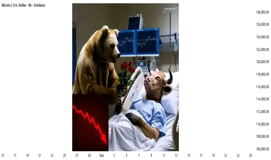
The Market Crash Friday was NOT what you have been told.The stock market crash was blamed on many things but NONE are true.
The reason why the stock market had a huge run down on Friday was due to
a VOID of BUYERS.
Who were the buyers???
You will never guess.
It was the 436 of the SP 500 companies that have buybacks underway, newly created, or open ended. Corporations have been supporting their own individual stock price.
WHY? To maintain their Market Cap during stressed market times.
To improve their dividend yield for the Buy Side Institutions who many 145 trillion dollars of assets and who own the bulk of those companies stock.
To keep their stock from dropping further on retail news.
Why did the corporations stop buying their stock on Friday?
Because the Earnings Season is getting underway this week and they stop buybacks to avoid a conflict of interest or other regulatory situations from buyin back shares during or before their CEO reports.
The corporations are likely to resume their accumulation a week or so after their CEO guidance and reports.
Chart Patterns

Teacup Chart Pattern — Brewing Bullish MomentumSup, legends! Shall we tea it up? ☕
Today, we’re not just talking about your morning cuppa. We’re diving into something traders get excited about — the Teacup Chart Pattern. Just like a perfect brew, this pattern takes time to form, and knowing how to spot it can make your trading experience much smoother.
What Is the Teacup Chart Pattern?
The teacup chart pattern is a bullish continuation setup that resembles the shape of a tea cup when plotted on a price chart. It typically forms after an extended uptrend, signaling a consolidation phase before the asset resumes its upward trajectory.
Key characteristics of the tea cup pattern include:
A rounded bottom that reflects a gradual shift from selling pressure to buying support.
A slight pullback, known as the "handle," which represents a brief pause or shakeout before the next move.
A breakout above the resistance line at the cup’s rim, often accompanied by strong trading volume.
Anatomy of the Teacup and Handle Pattern
To apply teacup pattern trading effectively, traders must understand the structure:
The Cup – This is the rounded consolidation. It can take several weeks or months to form, depending on the timeframe. A smoother curve is generally considered stronger than a sharp V-shaped recovery.
The Handle – Following the cup’s formation, price action typically retraces slightly, creating a downward or sideways movement. This handle reflects short-term profit-taking and helps “reset” market sentiment.
The Breakout – Once the handle is complete, a breakout above the cup’s rim confirms the tea cup trading pattern and signals renewed bullish momentum.
Trading the Teacup Pattern
When approaching tea cup pattern trading, consider the following strategies:
Entry Point : A common entry is at the breakout above the rim of the cup, once volume confirms the move.
Stop Loss Placement : Traders usually place stops slightly below the handle’s low to minimize downside risk.
Target Projection : The potential price target can be estimated by measuring the depth of the cup and projecting it upward from the breakout point.
Why the Teacup Trading Pattern Works?
The teacup trading pattern embodies market psychology. The rounded cup reflects gradual accumulation, while the handle signals a controlled pullback that shakes out weak hands. When the breakout occurs, it often triggers a surge of buying pressure from both breakout traders and those re-entering the market.
For crypto traders, the tea cup chart pattern is particularly valuable because digital assets are prone to sharp moves. Recognizing this structure early can provide an edge in catching strong upside momentum.
Common Mistakes in Teacup Pattern Trading
Even experienced traders can misinterpret the teacup chart pattern. Some common pitfalls include:
Mistaking a sharp V-shaped rebound for a valid cup formation.
Entering too early, before the handle completes.
Ignoring volume confirmation, which often validates the breakout’s strength.
Patience and discipline are critical in successfully applying the tea cup pattern trading strategy.
Final Thoughts
The teacup and handle pattern is one of those OG bullish setups in crypto that just works when you read it right. Think of it as the market taking a chill before the next leg up. You spot the rounded cup, wait out that handle fake-out, and when volume kicks in — that’s your green light.
With crypto’s crazy volatility, the teacup trading pattern can be a solid way to catch continuation moves and ride some serious momentum. Just don’t ape in blind — always stack confirmations. Watch the volume, line it up with MAs or momentum tools, and filter out the noise. The pattern’s strong, but context is king if you don’t wanna get trapped in a fake breakout.

how i Predicted Bitcoin’s Historic crash“Sometimes, structure speaks louder than sentiment.”
When markets erupted after the Trump tariff tweetstorm and global risk sentiment turned on its head, Bitcoin experienced one of the sharpest liquidations in months. Traders across social media called it “impossible to predict” but the chart structure had already told the story.
This was my before chart, posted days prior to the collapse.
Price was trading around $121,000, testing a clear supply and demand confluence point (CP) at $123,796.00.
On the multi-timeframe framework (MTFA), several elements aligned:
Supply Zone overlapping with prior intraday imbalance
Fib retracement confluence of 61.8% and 50.0%, measured from the intraday swing high at $126,296.00 and swing low at $120,636.00
Price rejection wicks indicating institutional distribution activity
Liquidity pool between $121,115.33 and $121,523.68 acting as the near-term trap for late longs
This setup hinted at exhaustion of bullish momentum and possible short-term reversal.
⚙️ MTFA in Action: Reading Structure Across Timeframes
Multi-Timeframe Analysis (MTFA) isn’t about random levels, it’s about how structure nests across time horizons.
Weekly: Showed exhaustion candles near prior all-time highs (ATH) and extended momentum.
Daily: Confirmed lower-high formation inside distribution range.
4H: Provided precise entry trigger wick rejection at supply and liquidity sweep confirmation.
Even though a full OCHL close below liquidity hadn’t yet formed, the reaction wicks at the confluence zone were the early footprint of bears reclaiming control.
💥 Then It Happened
When the U.S. announced 100% tariffs on Chinese imports, markets sold off aggressively. Bitcoin followed suit cascading below liquidity, slicing through $118K, and finally tagging the $115,000 demand zone target drawn days before.
What most called a “black swan”, the chart had already mapped out.
📈 Lessons from the Setup
Structure leads news. Fundamentals create fuel; technical structure shows where it burns.
MTFA reveals timing. Without alignment across timeframes, entries lose context.
Respect confluence. When supply, fib, and liquidity all align probability spikes.
🔮 Looking Ahead
While Bitcoin later stabilized after the crash, the precision of this setup reinforced why chart structure remains the language of the market.
This was more than a trade, it was a live case study in how multi-timeframe logic captures market behavior before headlines do.
the analysis can be found on the 3rd section of the publication :
✍️ Final Nerdy Thoughts
This analysis wasn’t luck; it was structure.
Whether Bitcoin continues consolidating or seeks new highs, the “Trade of the Year” stands as proof that when fundamentals collide with perfect technical alignment, history doesn’t repeat, it rhymes in price action.
put together by : Pako Phutietsile as @currencynerd
The Role and Impact of Agencies in Global Finance and Trading1. Understanding the Concept of Agencies in Global Finance
Agencies in global finance refer to both public and private institutions that are entrusted with regulatory, supervisory, analytical, and facilitative roles within the global financial ecosystem. They act as intermediaries between governments, corporations, and investors to ensure that financial activities are conducted fairly and efficiently. The primary types of agencies include:
Regulatory Agencies – Such as the U.S. Securities and Exchange Commission (SEC), the Commodity Futures Trading Commission (CFTC), and the European Securities and Markets Authority (ESMA), which enforce laws and ensure transparency.
Rating Agencies – Institutions like Moody’s, Standard & Poor’s (S&P), and Fitch Ratings that assess the creditworthiness of governments, corporations, and financial instruments.
Monetary Agencies – Central banks and supranational institutions such as the International Monetary Fund (IMF) and the World Bank, which manage monetary policy, financial stability, and economic development.
Trade and Financial Agencies – The World Trade Organization (WTO) and the Bank for International Settlements (BIS) regulate trade practices and provide frameworks for financial cooperation among nations.
Collectively, these agencies influence market confidence, liquidity, capital allocation, and cross-border investment flows — all of which are essential to global trading operations.
2. The Importance of Regulatory Agencies in Global Finance
Regulatory agencies serve as the guardians of financial integrity. Their primary mission is to ensure fair trading practices, prevent manipulation, and maintain investor trust.
2.1 Market Oversight and Investor Protection
Global financial markets operate with vast sums of capital and involve millions of participants. Regulatory agencies impose rules that protect investors from fraud, insider trading, and market abuse. For instance:
The U.S. SEC enforces laws against securities fraud, ensuring corporate transparency through mandatory filings.
The European Securities and Markets Authority (ESMA) harmonizes regulation across EU member states, preventing regulatory arbitrage.
Such oversight helps maintain confidence in the global financial system — a crucial element for the smooth functioning of international trade and investment.
2.2 Maintaining Systemic Stability
Regulatory agencies monitor systemic risks that can destabilize markets. During crises such as the 2008 global financial meltdown, agencies tightened regulations, introduced Basel III norms, and imposed capital adequacy requirements to strengthen banking resilience.
By enforcing these standards, agencies ensure that financial institutions maintain sufficient buffers to withstand shocks, thereby preventing contagion effects across global markets.
2.3 Promoting Fair Competition
Agencies such as the Federal Trade Commission (FTC) in the United States and the European Commission’s Directorate-General for Competition monitor mergers and acquisitions to prevent monopolistic practices. This ensures fair market competition, innovation, and equal opportunity for firms engaged in global trade.
3. Credit Rating Agencies: Shaping Investment Decisions
Credit rating agencies are among the most influential actors in the financial world. Their ratings affect how investors perceive the creditworthiness of sovereign nations, corporations, and financial instruments.
3.1 Role of Credit Ratings in Global Trading
Credit ratings act as signals of financial health. When agencies assign a high rating (e.g., AAA), it implies low risk, encouraging foreign investment and reducing borrowing costs. Conversely, downgrades can trigger capital flight, higher yields, and economic contraction.
For example:
A downgrade of a country’s sovereign debt can increase its cost of borrowing in global markets.
Corporate bond ratings influence investment fund allocations, liquidity, and interest rates.
3.2 Controversies and Global Impact
While ratings are essential, they have also faced criticism. During the 2008 crisis, agencies were accused of inflating ratings on mortgage-backed securities, contributing to the market collapse. Since then, reforms have sought to improve transparency, accountability, and conflict-of-interest management.
Nonetheless, rating agencies continue to be critical in shaping cross-border capital movements and influencing investor sentiment in global trade.
4. Monetary and Financial Agencies: IMF, World Bank, and BIS
4.1 International Monetary Fund (IMF)
The IMF plays a central role in stabilizing the global economy. It provides financial assistance to countries facing balance-of-payments crises, monitors global economic trends, and offers policy advice to foster sustainable growth.
In global trading, the IMF helps maintain exchange rate stability and encourages free trade by ensuring liquidity through its Special Drawing Rights (SDR) mechanism.
4.2 World Bank
The World Bank focuses on long-term economic development and poverty reduction. Through its financial and technical assistance, it facilitates infrastructure development, which in turn boosts trade and investment. Roads, ports, and digital connectivity projects funded by the World Bank enhance global supply chains, promoting smoother trade flows.
4.3 Bank for International Settlements (BIS)
Known as the “central bank of central banks”, BIS fosters international monetary and financial cooperation. It sets global banking standards (like Basel I, II, and III) that ensure financial stability. Through its regulatory guidelines, BIS influences how banks manage liquidity and credit risks, which directly affects global trading capital and interest rate dynamics.
5. Trade and Economic Agencies: Facilitating Global Commerce
5.1 World Trade Organization (WTO)
The WTO governs international trade by establishing fair-trade rules, reducing tariffs, and resolving disputes. Its policies ensure predictability and transparency in trade relations, thereby influencing the financial transactions underpinning global commerce.
For example, when the WTO mediates trade conflicts (like the U.S.–China tariff disputes), the outcomes significantly impact global markets, commodity prices, and investor confidence.
5.2 Organisation for Economic Co-operation and Development (OECD)
The OECD fosters economic cooperation and policy alignment among member nations. By promoting responsible taxation, anti-bribery measures, and sustainable investment practices, it enhances investor trust and corporate accountability in global trade.
6. Impact of Financial Agencies on Currency and Capital Markets
6.1 Influence on Exchange Rates
Monetary agencies and central banks have a profound impact on foreign exchange (forex) markets. Through interventions, interest rate adjustments, and monetary policy decisions, they affect currency values — which in turn influence trade competitiveness and capital flows.
For instance, when the U.S. Federal Reserve raises interest rates, the U.S. dollar strengthens, making imports cheaper and exports less competitive, thereby reshaping global trade balances.
6.2 Regulation of Capital Flows
Agencies set rules that regulate the flow of capital between nations. The IMF monitors these flows to prevent speculative attacks on currencies and financial contagion — where instability in one market spreads to others. Proper regulation ensures smoother functioning of global capital markets, essential for international trade financing.
7. Technological and ESG Agencies: The New Frontier of Global Finance
7.1 Financial Technology (FinTech) Oversight
As digital trading platforms, cryptocurrencies, and algorithmic trading gain prominence, new regulatory agencies have emerged to oversee digital finance. Institutions like the Financial Conduct Authority (FCA) in the UK and the U.S. CFTC have introduced frameworks for crypto assets, digital securities, and online trading to prevent cyber fraud and enhance transparency.
7.2 Environmental, Social, and Governance (ESG) Standards
Agencies now emphasize sustainable finance. Organizations such as the United Nations Principles for Responsible Investment (UNPRI) and the Task Force on Climate-Related Financial Disclosures (TCFD) promote ESG reporting standards.
By linking environmental and social impact with financial performance, these agencies are reshaping global trading norms — driving capital toward green and ethical investments.
8. Challenges and Criticisms of Global Financial Agencies
Despite their significance, financial agencies face multiple challenges:
Overregulation vs. Market Freedom: Excessive rules may stifle innovation and market efficiency.
Conflict of Interest: Especially among rating agencies that are paid by the entities they rate.
Unequal Representation: Developing nations often argue that institutions like the IMF and World Bank favor Western economies.
Delayed Responses: Bureaucratic processes sometimes hinder timely interventions during crises.
Technological Lag: The rapid rise of decentralized finance (DeFi) and cryptocurrencies outpaces traditional regulatory frameworks.
These limitations underscore the need for continual evolution in agency governance and accountability.
9. The Future of Agencies in Global Finance
As global markets become more interconnected and digitized, agencies must adapt to new realities. The future landscape will likely see:
Integrated Global Regulation: Greater cooperation among international agencies to standardize cross-border financial regulations.
Digital Financial Oversight: Stronger frameworks for blockchain, AI-driven trading, and cyber resilience.
Sustainability-Linked Policies: ESG standards becoming mandatory for international financial reporting.
Decentralized Agency Roles: New institutions emerging to govern decentralized finance and tokenized assets.
Agencies that evolve with innovation, transparency, and inclusiveness will define the next era of global financial stability and growth.
10. Conclusion
Agencies serve as the nervous system of global finance, transmitting information, enforcing discipline, and maintaining equilibrium across an increasingly complex trading ecosystem. From regulatory oversight to monetary stabilization and sustainability advocacy, their influence pervades every aspect of global trade and investment.
In a world where financial transactions transcend borders within milliseconds, the role of agencies in ensuring trust, fairness, and resilience has never been more vital. While challenges persist — ranging from bias and bureaucracy to technological disruption — their continued evolution will determine how effectively global finance can navigate uncertainty, foster inclusive growth, and sustain economic stability in the decades ahead.
Bonds Trading in the Global MarketUnderstanding Bonds and Their Structure
A bond is a financial instrument representing a promise to repay borrowed money at a future date with interest. When an investor purchases a bond, they are essentially lending money to the issuer — which could be a government, municipality, or corporation. The key elements of a bond include:
Face Value (Par Value):
The principal amount the issuer agrees to repay the bondholder at maturity.
Coupon Rate:
The interest rate that the issuer pays on the bond’s face value, typically expressed as an annual percentage.
Maturity Date:
The date when the bond’s principal is repaid to the investor.
Yield:
The return an investor expects to earn if the bond is held until maturity, influenced by market interest rates and the issuer’s credit risk.
Credit Rating:
Issued by rating agencies such as Moody’s, S&P, and Fitch, credit ratings assess the issuer’s ability to meet its debt obligations. Higher-rated bonds (AAA, AA) are safer but offer lower returns, while lower-rated (junk) bonds carry higher risk and yield.
Types of Bonds in the Global Market
The bond market comprises diverse instruments, each serving distinct investment and policy objectives. The major categories include:
Government Bonds:
These are issued by national governments to finance public spending and manage debt. Examples include U.S. Treasury bonds, U.K. Gilts, German Bunds, and Indian Government Securities (G-Secs). Government bonds are generally considered low-risk due to sovereign backing.
Corporate Bonds:
Issued by companies to fund operations, expansion, or acquisitions. They carry varying degrees of credit risk depending on the issuer’s financial health.
Municipal Bonds:
Issued by local governments or municipalities to fund infrastructure projects like schools, roads, or hospitals. They are often tax-exempt in many countries.
Sovereign Bonds:
These are debt securities issued by national governments in foreign currencies, such as Eurobonds or Samurai bonds, allowing access to international investors.
High-Yield (Junk) Bonds:
Offered by entities with lower credit ratings. These provide higher returns but come with elevated risk.
Inflation-Linked Bonds:
Bonds like U.S. Treasury Inflation-Protected Securities (TIPS) adjust their principal value based on inflation, safeguarding investors from purchasing power erosion.
Green Bonds:
A modern innovation in fixed-income markets, green bonds finance environmentally sustainable projects. They have gained prominence as climate change awareness rises globally.
Global Bond Market Structure and Participants
The global bond market operates through both primary and secondary markets:
Primary Market:
Bonds are first issued to investors, typically through auctions or syndications. Governments frequently use competitive bidding processes, while corporations may rely on underwriters.
Secondary Market:
After issuance, bonds are traded among investors in the secondary market. Trading occurs over-the-counter (OTC), facilitated by brokers and dealers, rather than on centralized exchanges.
Key participants include:
Governments and Central Banks:
They issue bonds and use them as tools for monetary policy, such as open market operations.
Institutional Investors:
Pension funds, insurance companies, and mutual funds are dominant players due to their need for stable returns.
Corporations:
Issue and invest in bonds to manage liquidity and financing.
Retail Investors:
Participate directly or through bond mutual funds and exchange-traded funds (ETFs).
Rating Agencies and Regulators:
Maintain transparency and risk assessment to stabilize markets.
Major Global Bond Markets
United States:
The U.S. bond market is the largest in the world, driven by Treasury securities, municipal bonds, and corporate debt. Treasuries serve as global benchmarks for interest rates and risk-free returns.
Europe:
The European bond market includes German Bunds, U.K. Gilts, French OATs, and corporate bonds. The European Central Bank (ECB) plays a significant role in influencing yields through quantitative easing (QE) and rate policies.
Japan:
Japan’s Government Bonds (JGBs) are critical to its financial stability. With ultra-low interest rates and yield curve control, the Bank of Japan heavily intervenes to manage debt sustainability.
China:
China’s bond market has grown rapidly, becoming the second largest globally. The inclusion of Chinese bonds in global indices has attracted substantial foreign investment.
Emerging Markets:
Countries like India, Brazil, South Africa, and Indonesia issue sovereign and corporate bonds to attract global capital. However, these markets often experience higher volatility and currency risk.
Factors Influencing Global Bond Markets
Bond prices and yields are sensitive to numerous macroeconomic and geopolitical factors:
Interest Rates:
The inverse relationship between bond prices and interest rates is fundamental. When central banks raise rates, bond prices fall, and yields rise.
Inflation:
Rising inflation erodes fixed-income returns, prompting investors to demand higher yields.
Economic Growth:
Strong growth often leads to higher interest rates and lower bond prices, while recessions boost bond demand as investors seek safety.
Monetary Policy:
Actions by central banks such as the Federal Reserve, ECB, or Bank of Japan significantly affect global bond yields.
Fiscal Policy and Debt Levels:
Governments’ borrowing needs and fiscal health directly impact the supply of bonds and market confidence.
Geopolitical Events:
Wars, trade tensions, and political instability drive investors toward safe-haven assets like U.S. Treasuries or German Bunds.
Currency Movements:
Exchange rate fluctuations influence returns for foreign investors in sovereign and corporate bonds.
Bond Trading Strategies
Professional traders and institutional investors employ various strategies to profit from bond price movements and yield differentials:
Buy and Hold:
Investors purchase bonds and hold them until maturity, earning fixed interest and principal repayment.
Yield Curve Strategies:
Traders exploit shifts in the yield curve — such as steepening or flattening — by adjusting portfolio durations.
Duration Management:
Managing interest rate risk through bond selection based on duration sensitivity to rate changes.
Credit Spread Trading:
Involves capitalizing on widening or narrowing yield spreads between different issuers or ratings.
Arbitrage and Relative Value Trades:
Institutions identify mispricings between similar bonds across markets or maturities.
Inflation-Protected Investing:
Allocating capital into inflation-linked bonds during periods of expected price pressure.
Technology and Innovation in Bond Trading
Advancements in digital trading platforms, data analytics, and artificial intelligence have revolutionized bond trading globally. Key trends include:
Electronic Trading Platforms:
The rise of systems like MarketAxess and Tradeweb has enhanced liquidity, transparency, and efficiency.
Algorithmic and High-Frequency Trading:
Automated strategies optimize pricing and execution across fragmented OTC markets.
Blockchain and Tokenized Bonds:
Governments and corporations are experimenting with blockchain-based bond issuance to enhance security, reduce costs, and enable real-time settlement.
ESG Integration:
Environmental, Social, and Governance (ESG) considerations increasingly influence bond portfolio construction and trading strategies.
Challenges in Global Bond Markets
Despite its size and importance, the global bond market faces several challenges:
Interest Rate Volatility:
Rapid changes in rates due to inflation or central bank actions can erode portfolio values.
Liquidity Risks:
Some corporate and emerging market bonds lack sufficient trading activity, complicating exit strategies.
Sovereign Debt Crises:
Events like the Greek debt crisis or potential defaults by emerging economies highlight systemic vulnerabilities.
Currency and Political Risks:
Cross-border investments expose investors to exchange rate swings and policy uncertainties.
Regulatory Complexity:
Different jurisdictions impose varied compliance and disclosure requirements, complicating global operations.
Future Trends in Global Bond Markets
Sustainable Finance Growth:
Green and social bonds will continue to expand as investors prioritize climate-friendly projects.
Rising Role of Asia:
China, India, and other Asian markets are becoming major bond trading hubs, attracting institutional capital.
Digital Transformation:
Tokenization, AI analytics, and real-time data processing will redefine how bonds are issued and traded.
Monetary Policy Normalization:
As global interest rates stabilize post-pandemic, investors may shift from riskier assets to quality bonds.
Integration of Global Markets:
Cross-border settlement systems and unified regulations may improve transparency and reduce transaction costs.
Conclusion
The global bond market serves as the backbone of the world’s financial infrastructure — enabling governments to fund development, corporations to expand operations, and investors to earn steady returns. Its deep liquidity, diversification benefits, and relative safety make bonds an indispensable part of any balanced investment portfolio.
However, as global economies evolve, bond markets are increasingly influenced by complex interdependencies — from inflation and interest rates to geopolitical conflicts and technological disruptions. Understanding these dynamics is essential for investors seeking to navigate volatility and capitalize on opportunities.
In the years ahead, innovation, sustainability, and policy coordination will shape the next era of bond trading. Whether for portfolio diversification, risk management, or long-term wealth preservation, bonds will remain at the heart of the global financial ecosystem — a timeless bridge connecting capital with economic growth.

Global Soft Commodity Trading: Challenges, and Future OutlookUnderstanding Soft Commodities
Soft commodities are agricultural goods that are cultivated for consumption or industrial use. These include:
Food commodities: Coffee, sugar, cocoa, corn, wheat, soybeans, rice, and orange juice.
Fiber commodities: Cotton, jute, wool.
Biofuel-related commodities: Corn (for ethanol), sugarcane, and palm oil.
Unlike metals or energy products, the production of soft commodities is highly dependent on biological and environmental factors. This makes them particularly vulnerable to changes in weather, pests, diseases, and shifting agricultural practices.
The global market for soft commodities operates through both spot trading (physical goods) and derivatives trading (futures, options, and swaps). The latter enables producers, consumers, and investors to hedge risks associated with price volatility or to speculate on future price movements.
Key Players in Global Soft Commodity Trading
Producers:
Farmers and cooperatives form the foundation of the soft commodity supply chain. Their productivity depends on access to land, water, seeds, fertilizers, and financing. Countries like Brazil, Vietnam, Indonesia, and India are major agricultural producers in global markets.
Traders and Exporters:
Large multinational trading houses such as Cargill, Archer Daniels Midland (ADM), Bunge, and Louis Dreyfus Company—collectively known as the ABCD firms—dominate global agricultural trade. These companies buy directly from producers, manage logistics, and sell to processors or wholesalers worldwide.
Importers and Processors:
These include food manufacturing companies, textile producers, and biofuel refineries that convert raw commodities into finished or semi-finished goods.
Commodity Exchanges:
Exchanges like the Chicago Board of Trade (CBOT), Intercontinental Exchange (ICE), and Euronext provide structured platforms for futures and options trading. These markets help in price discovery and risk management.
Investors and Speculators:
Institutional investors, hedge funds, and retail traders participate in soft commodity futures to diversify portfolios or profit from short-term price movements.
Governments and Regulatory Bodies:
Many countries have regulatory agencies overseeing agricultural exports, subsidies, and quality standards. Trade policies, tariffs, and export bans also shape market dynamics.
Major Soft Commodities and Their Markets
Coffee:
One of the most traded soft commodities, coffee is primarily grown in tropical regions—especially Brazil, Vietnam, and Colombia. Coffee prices are highly sensitive to weather, crop diseases like leaf rust, and global consumption trends.
Cocoa:
Predominantly produced in West Africa (Côte d’Ivoire and Ghana), cocoa is the key ingredient in chocolate production. Political instability and sustainability concerns, such as child labor and deforestation, often affect its supply.
Sugar:
Produced mainly from sugarcane (Brazil, India) and sugar beet (Europe), sugar prices fluctuate based on weather, energy prices (since sugarcane is also used for ethanol), and government policies like subsidies.
Cotton:
A major fiber commodity, cotton is vital for the textile industry. Leading producers include China, India, the U.S., and Pakistan. Weather conditions and trade tensions (especially between the U.S. and China) impact cotton markets.
Grains (Wheat, Corn, Soybeans):
These form the staple diet of billions worldwide and are critical to both food and feed industries. The U.S., China, Russia, Brazil, and Argentina are among the largest producers and exporters.
Price Determinants in Soft Commodity Trading
Supply and Demand:
Prices are directly influenced by crop yields, consumption patterns, and global inventories. A bumper harvest usually leads to lower prices, while poor yields or rising demand can cause spikes.
Weather and Climate Change:
Droughts, floods, and unpredictable weather patterns significantly affect agricultural output. Long-term climate change is creating new challenges for farmers, forcing adaptation through technology and sustainable practices.
Geopolitical Events:
Trade wars, export restrictions, and sanctions can disrupt supply chains and influence commodity prices. For example, conflicts in major grain-producing regions can lead to global shortages.
Currency Movements:
Since commodities are typically priced in U.S. dollars, fluctuations in exchange rates can affect export competitiveness and prices in local markets.
Energy Prices:
Agricultural production and transportation depend heavily on fuel. Rising oil prices increase production costs and affect the pricing of soft commodities.
Speculation and Market Sentiment:
Large inflows of speculative capital can amplify price movements, creating volatility that sometimes diverges from fundamental demand-supply factors.
Trading Mechanisms
Soft commodities can be traded through:
Physical Trading (Spot Market):
Direct purchase and sale of goods where delivery occurs immediately or within a short time frame. Prices depend on quality, quantity, and logistics.
Futures Contracts:
Agreements to buy or sell a commodity at a predetermined price on a future date. Futures trading allows producers and consumers to hedge against price fluctuations.
Options and Swaps:
Derivative instruments that provide flexibility in managing price risk. Options give the right (but not the obligation) to buy or sell at a set price, while swaps involve exchanging cash flows related to commodity prices.
Over-the-Counter (OTC) Markets:
Customized contracts between parties without the involvement of formal exchanges, often used by large institutions for complex hedging strategies.
Risks and Challenges in Global Soft Commodity Trading
Price Volatility:
Prices can swing sharply due to weather events, policy shifts, or speculative trading. This volatility affects both producers and consumers.
Political and Regulatory Risks:
Export bans, import tariffs, and subsidy changes can disrupt markets and distort price signals.
Supply Chain Disruptions:
Events such as pandemics, port congestion, or shipping crises can halt the movement of goods, leading to price inflation or shortages.
Sustainability and Ethical Issues:
Environmental degradation, deforestation, and unethical labor practices (like child labor in cocoa) have raised concerns, pushing the industry toward sustainability certifications.
Technological Disparity:
While advanced nations use data analytics, AI, and precision farming, small-scale farmers in developing countries often lack access to these tools, limiting productivity.
Technological Advancements in Commodity Trading
Digital Platforms:
Online trading platforms have improved price transparency, reduced transaction costs, and expanded market access for smaller players.
Blockchain Technology:
Enables transparent and tamper-proof tracking of commodities from farm to market, reducing fraud and enhancing traceability.
Artificial Intelligence (AI) and Big Data:
AI models predict crop yields, weather risks, and price movements, allowing traders to make more informed decisions.
Sustainable Farming Technologies:
Innovations like precision agriculture, drone monitoring, and climate-resilient crops are improving efficiency and mitigating risks from environmental changes.
Global Trade Hubs and Logistics
Major trading centers include Chicago, London, Rotterdam, Singapore, and Dubai, where commodity exchanges and logistics networks converge. Efficient transport—by sea, rail, and road—is essential for the movement of bulk agricultural products. Shipping routes like the Panama Canal and Suez Canal play strategic roles in global commodity flow.
Storage facilities and warehousing are also critical. The ability to store commodities safely affects both pricing and availability. Poor infrastructure in developing countries often leads to post-harvest losses, reducing export potential.
Sustainability and ESG in Soft Commodity Trading
Environmental, Social, and Governance (ESG) standards are reshaping how commodities are traded. Major companies now commit to ethical sourcing, carbon reduction, and sustainable farming practices. Certification programs like Fairtrade, Rainforest Alliance, and RSPO (Roundtable on Sustainable Palm Oil) ensure that products meet environmental and labor standards.
Consumers are increasingly conscious of sustainability, influencing corporate policies and government regulations. In the coming years, carbon footprint transparency and regenerative agriculture will become integral to commodity trading.
Future Trends and Outlook
Digitalization and Smart Contracts:
The integration of blockchain and IoT will automate and secure transactions, improving efficiency.
Climate Adaptation:
Climate-resilient crops and sustainable irrigation practices will become vital as weather patterns grow more unpredictable.
Emerging Market Growth:
Rising consumption in Asia and Africa will expand trade volumes, especially in food-related commodities.
Financialization of Agriculture:
Increased participation by institutional investors will continue to blur the line between physical and financial trading.
Focus on Food Security:
Governments are likely to impose stricter controls on exports to ensure domestic supply, especially after crises like COVID-19 and geopolitical conflicts.
Conclusion
Global soft commodity trading stands at the crossroads of agriculture, finance, technology, and sustainability. It connects farmers in developing nations to consumers worldwide, drives economic development, and shapes international relations. However, it also faces immense challenges—from price volatility and environmental pressures to geopolitical uncertainty.
The future of soft commodity trading will depend on how effectively the world can balance economic efficiency with ethical responsibility and environmental stewardship. As technology transforms the sector, transparency, traceability, and sustainability will no longer be optional—they will define the success and credibility of the global commodity trade in the decades ahead.
Trading Crude Oil and the Geopolitical Impact on Prices1. The Basics of Crude Oil Trading
Crude oil trading involves buying and selling contracts that represent the value of oil, typically through futures, options, and spot markets. The two most widely used benchmarks are:
West Texas Intermediate (WTI): A light, sweet crude primarily produced in the United States.
Brent Crude: Extracted from the North Sea, it serves as the global benchmark for oil pricing.
Oil prices are determined by a combination of market fundamentals (supply and demand), speculative activities, and geopolitical factors. Traders use various tools to forecast price movements, such as analyzing OPEC reports, inventory levels, and global economic data.
The key players in oil trading include:
Oil-producing countries and national oil companies (e.g., Saudi Aramco, Rosneft).
International oil corporations (e.g., ExxonMobil, BP, Shell).
Financial institutions and hedge funds.
Retail traders and investors trading oil futures or ETFs.
2. Geopolitical Factors Influencing Crude Oil Prices
Oil is not merely a commodity; it is a strategic resource. This makes it extremely sensitive to political instability, war, sanctions, and diplomatic decisions. Some of the major geopolitical influences on crude oil prices include:
a. Conflicts in Oil-Producing Regions
Most of the world’s oil reserves are located in politically volatile regions like the Middle East, Africa, and parts of South America. Any conflict in these areas can lead to supply disruptions or fears of shortage, pushing prices higher.
For example:
The Iraq War (2003) caused Brent crude prices to spike above $40 per barrel, reflecting fears of supply disruptions.
The Yemen conflict and attacks on Saudi Aramco facilities in 2019 led to a sudden 15% increase in global oil prices within a day.
Traders closely monitor these developments because they directly affect production, transportation, and export capacities.
b. OPEC and OPEC+ Decisions
The Organization of the Petroleum Exporting Countries (OPEC), along with its allies (OPEC+), plays a critical role in controlling global oil supply. Decisions regarding production quotas can dramatically alter prices.
For instance:
When OPEC decided to cut output in 2016 to stabilize prices, Brent crude rose from around $30 to over $50 per barrel within months.
In contrast, during the 2020 price war between Saudi Arabia and Russia, oil prices collapsed, with WTI even turning negative briefly.
Geopolitical alliances and disagreements within OPEC+ remain a major source of price volatility.
c. Sanctions and Trade Restrictions
Economic sanctions imposed on oil-producing nations can limit their ability to export crude, tightening global supply and raising prices.
Prominent examples include:
Iranian oil sanctions by the U.S., which have repeatedly affected global oil markets.
Sanctions on Russia following the invasion of Ukraine in 2022, which drastically reduced its oil exports to Europe, causing a surge in global prices.
In such situations, traders speculate on potential supply shortages, leading to sharp movements in futures contracts.
d. Strategic Petroleum Reserves (SPR) Releases
Governments, especially major consumers like the U.S., China, and India, maintain strategic reserves of oil to cushion against supply disruptions. When tensions rise or prices spike, these countries may release oil from reserves to stabilize markets.
For example, in 2022, the U.S. released millions of barrels from its SPR to counter rising prices after the Russia-Ukraine conflict. While these releases provide short-term relief, they rarely alter long-term price trends unless accompanied by broader policy shifts.
e. Global Alliances and Energy Policies
Energy policies and diplomatic relations also play a huge role. Countries may enter alliances to secure stable oil supplies or diversify their sources. For instance:
The China-Russia energy partnership has reshaped global oil trade patterns.
The U.S. shale revolution reduced American dependence on Middle Eastern oil, altering geopolitical power balances.
3. Case Studies: How Geopolitics Moves Oil Markets
Case 1: The Russia-Ukraine War (2022–Present)
This conflict caused one of the most dramatic spikes in oil prices in recent history. Russia, being one of the largest oil and gas exporters, faced severe sanctions from Western nations. As a result:
Brent crude surged above $120 per barrel.
European nations scrambled to find alternative suppliers.
Energy inflation soared globally, contributing to a global economic slowdown.
This case shows how a single geopolitical event can alter supply chains, trade routes, and investment flows within weeks.
Case 2: The Middle East Tensions
Recurring tensions between Iran, Saudi Arabia, and Israel have historically shaken oil markets. The closure threats of the Strait of Hormuz, through which nearly 20% of global oil passes, are particularly alarming for traders. Even rumors of blockade or military action lead to speculative buying and price hikes.
Case 3: The U.S. Shale Boom
While not a “conflict,” the rise of shale oil production in the United States changed global geopolitics. By 2018, the U.S. became the world’s largest oil producer, reducing its dependency on OPEC and reshaping global energy diplomacy. This led to more competitive pricing, strategic shifts in OPEC policies, and a new era of price volatility.
4. Trading Strategies During Geopolitical Uncertainty
Professional traders and investors employ various strategies to navigate geopolitical risks in oil markets:
a. Hedging
Companies involved in energy-intensive industries use futures and options to hedge against price fluctuations. For example, airlines lock in fuel prices to avoid losses due to sudden price spikes.
b. Speculative Trading
Traders often capitalize on volatility triggered by geopolitical news. They use tools like technical analysis, sentiment indicators, and futures spreads to predict short-term price movements.
c. Diversification
Investors may diversify their portfolios across different commodities or asset classes (such as gold, natural gas, or renewable energy stocks) to reduce exposure to oil market volatility.
d. Monitoring News and Reports
Geopolitical events unfold rapidly. Traders rely on real-time news, OPEC bulletins, and government reports to make quick decisions. Platforms like Bloomberg, Reuters, and TradingView offer live analysis tools tailored to geopolitical risks.
5. The Role of Speculation and Market Psychology
In modern oil markets, perception often drives prices as much as actual supply-demand data. A threat of conflict or a statement by a political leader can move prices instantly, even before any tangible disruption occurs.
For instance:
Tweets from policymakers or rumors of sanctions can trigger algorithmic trading activity.
Fear of shortages leads to speculative buying, amplifying price rallies.
Conversely, peace agreements or ceasefires often trigger sell-offs.
This behavior shows how market psychology magnifies geopolitical effects, making oil one of the most sentiment-driven commodities.
6. Global Economic Impact of Oil Price Volatility
Oil prices affect every sector of the global economy. The consequences of geopolitical-driven price swings are far-reaching:
Inflation: Higher oil prices raise transportation and manufacturing costs, leading to overall inflation.
Currency Fluctuations: Oil-exporting countries benefit from stronger currencies during price spikes, while import-dependent economies face weakening currencies.
Stock Markets: Rising oil prices often pressure equities in energy-dependent industries but benefit oil producers.
Interest Rates: Central banks may adjust interest rates in response to energy-driven inflation.
Trade Balances: Nations that import large volumes of oil, like India and Japan, experience worsening trade deficits when oil prices rise.
Thus, geopolitical disruptions in the oil market can reshape global financial stability.
7. The Transition to Renewable Energy and Future Outlook
As the world moves toward renewable energy, the geopolitical landscape of oil is slowly shifting. However, oil remains indispensable in global energy consumption. Despite rising investments in solar and wind, oil still accounts for over 30% of the world’s primary energy supply.
In the future:
Energy diversification may reduce the geopolitical leverage of major oil producers.
Green energy policies in the U.S., EU, and China may dampen long-term oil demand.
Yet, short-term volatility driven by geopolitics is likely to persist as conflicts and alliances evolve.
Furthermore, the rise of electric vehicles (EVs) and energy storage technologies will reshape demand patterns. However, developing economies will continue to rely heavily on oil for decades, ensuring that geopolitical influences remain potent.
8. Conclusion
Trading crude oil is not merely a financial activity—it is a reflection of global power dynamics, politics, and economic interests. The intricate relationship between geopolitical events and oil prices ensures that traders must constantly monitor global developments, from military conflicts to OPEC meetings.
Key takeaways:
Oil is both an economic and political weapon.
Geopolitical instability often leads to supply fears and price surges.
Sanctions, wars, and alliances directly impact trading strategies and market psychology.
Understanding global events is essential for successful crude oil trading.
In essence, geopolitics is the invisible hand that moves the oil market. Whether it’s a conflict in the Middle East, sanctions on Russia, or production decisions in OPEC+, each event creates ripples across global trade and financial markets. For traders, mastering the art of interpreting these events is the key to navigating the world’s most volatile and influential commodity—crude oil.
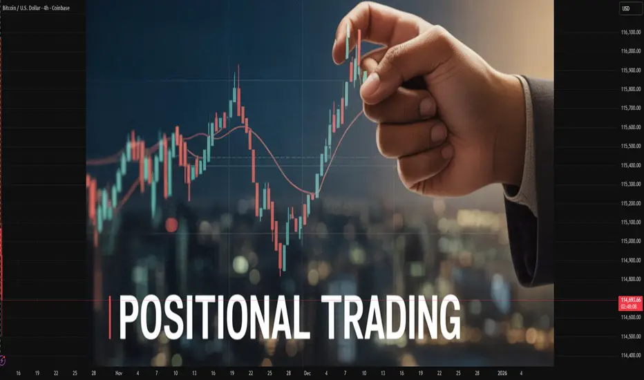
Positional Trading Globally1. Understanding Positional Trading
Positional trading is a strategy where a trader or investor takes a long-term position in an asset with the expectation that its price will move substantially in their favor over time. The trader ignores short-term volatility and focuses on the broader market trend.
Unlike day trading, which relies on short-term price fluctuations, positional trading depends on macro-level factors such as economic cycles, interest rates, corporate earnings, and geopolitical developments. The key objective is to ride a major trend until there are clear signs of reversal.
Key Characteristics of Positional Trading:
Holding period: Several weeks to years
Focus: Long-term trends and fundamentals
Tools used: Technical charts (weekly/monthly), fundamentals, macroeconomic indicators
Risk tolerance: Moderate to high
Goal: Capture large market movements rather than frequent small profits
Positional traders are patient and strategic, often viewing the market through a broad lens. They are less concerned about daily market noise and more focused on trend confirmation and momentum.
2. The Global Perspective on Positional Trading
Positional trading is practiced worldwide, from Wall Street to Dalal Street, and across all asset classes — equities, forex, commodities, and cryptocurrencies. Each global market has its own rhythm and volatility, which influences how positional traders operate.
a. United States
In the U.S., positional trading has deep roots due to the stability and liquidity of markets like the New York Stock Exchange (NYSE) and NASDAQ. Traders often rely on fundamental indicators such as earnings growth, Federal Reserve policies, and GDP trends.
Prominent examples include:
Warren Buffett, who epitomizes long-term positional investing with his buy-and-hold philosophy.
Ray Dalio, whose macro-trading strategies focus on long-term global economic shifts.
b. Europe
European positional traders pay close attention to interest rates, ECB policies, and energy prices, given the region’s sensitivity to commodities and geopolitical issues. The FTSE 100, DAX, and CAC 40 indices are common targets for positional plays.
c. Asia
In Asia, markets like India, Japan, and China have seen a surge in positional trading, especially among retail investors. India’s Nifty 50 and Sensex are popular for medium-to-long-term positions, supported by strong corporate growth and favorable demographics.
d. Middle East & Africa
In emerging economies, positional trading often centers on commodities like oil and gold. Traders focus on global demand-supply trends, OPEC decisions, and currency movements.
e. Global Commodities & Forex
In the forex market, positional traders bet on long-term currency trends based on interest rate differentials, inflation, and trade balances. Similarly, in commodities, traders analyze seasonal cycles, geopolitical tensions, and global demand patterns to hold long-term positions in assets like crude oil, gold, or copper.
3. Core Principles of Positional Trading
1. Trend Following
The foundation of positional trading lies in identifying and following trends. Traders use tools like:
Moving Averages (50-day, 200-day)
MACD (Moving Average Convergence Divergence)
ADX (Average Directional Index)
to determine whether a market is trending upward or downward.
2. Fundamental Analysis
Fundamentals play a critical role. Traders assess:
Earnings reports
Debt levels
Economic growth rates
Inflation and interest rates
Industry trends
A fundamentally strong company or economy provides the confidence to hold a position long-term.
3. Technical Confirmation
Even long-term traders use charts to find ideal entry and exit points. Weekly and monthly charts reveal major trend lines, support/resistance levels, and volume patterns that help refine timing.
4. Patience and Discipline
The hallmark of successful positional trading is patience. Traders must tolerate drawdowns and avoid reacting to short-term volatility. Emotional stability and adherence to a well-defined plan are essential.
5. Risk Management
Despite being long-term in nature, positional trading requires proper stop-loss levels, position sizing, and portfolio diversification to protect against adverse movements.
4. Strategies Used in Positional Trading
Positional traders globally use several strategic approaches depending on their risk appetite and market conditions:
a. Trend Following Strategy
This involves entering positions aligned with the prevailing trend — buying during uptrends and shorting during downtrends. Indicators like moving averages or trendlines confirm direction.
b. Breakout Strategy
Traders enter when the price breaks out of a major resistance or support zone, signaling the start of a strong trend. This is effective in markets with high momentum.
c. Fundamental Positioning
Based on long-term macroeconomic or corporate fundamentals. For example, investing in renewable energy stocks anticipating global energy transition trends.
d. Contrarian Strategy
This involves going against prevailing sentiment, buying undervalued assets when the majority are bearish, and selling overvalued ones during excessive optimism.
e. Global Macro Strategy
Positional traders adopt a macroeconomic approach — investing based on factors like interest rates, inflation, or geopolitical shifts. Hedge funds like Bridgewater Associates employ this strategy.
5. Tools and Indicators for Positional Traders
Successful positional trading depends on combining technical and fundamental tools. Key instruments include:
Moving Averages (SMA & EMA): To identify long-term trends
Relative Strength Index (RSI): To gauge overbought or oversold levels
MACD: To spot trend reversals
Fibonacci Retracement: For long-term entry levels
Volume Analysis: Confirms the strength of price movements
Economic Calendars: To track interest rate decisions, GDP data, inflation, etc.
Earnings Reports: For stock-specific decisions
Globally, platforms like TradingView, MetaTrader, and Bloomberg Terminal help traders analyze data across markets.
6. Global Examples of Successful Positional Trades
Apple Inc. (AAPL):
Long-term investors who held Apple since the early 2000s have seen massive returns as the company evolved into a global tech giant.
Gold (2008–2020):
Investors who entered during the 2008 financial crisis captured a multiyear bull run as central banks pursued monetary easing.
Bitcoin (2015–2021):
Early positional holders witnessed exponential gains as digital assets gained mainstream acceptance.
Indian IT Sector (2020–2023):
Traders who held positions in Infosys, TCS, or HCL Tech benefited from the global digital transformation wave.
These examples highlight how patience, conviction, and timing define the success of positional trading globally.
7. Advantages of Positional Trading
Lower Stress:
Since positions are held long-term, traders avoid the daily pressure of short-term fluctuations.
Time Efficiency:
Positional trading doesn’t require constant market monitoring.
Tax Efficiency:
In many countries, long-term capital gains are taxed at lower rates than short-term profits.
Compounding Growth:
The longer an investor holds a quality asset, the more compounding enhances returns.
Reduced Transaction Costs:
Fewer trades mean lower brokerage and slippage costs.
Ability to Capture Major Trends:
Long-term positioning allows traders to benefit from large, sustained price movements.
8. Challenges and Risks in Global Positional Trading
While rewarding, positional trading isn’t without challenges:
Market Volatility: Unexpected geopolitical events can disrupt long-term trends.
Interest Rate Changes: Central bank policies directly impact valuations.
Psychological Pressure: Holding during drawdowns tests emotional discipline.
Global Uncertainty: Economic downturns, wars, or pandemics can distort fundamentals.
Currency Fluctuations: For cross-border positions, forex risk can erode returns.
Hence, diversification, hedging, and dynamic risk management are crucial for sustainability.
9. Technology’s Role in Modern Positional Trading
Technology has revolutionized global positional trading. AI-driven analytics, big data, and automated alerts now help traders identify long-term opportunities more efficiently.
AI Algorithms: Analyze large datasets to detect emerging macro trends.
Machine Learning Models: Forecast long-term price behavior using pattern recognition.
Robo-Advisors: Assist in portfolio rebalancing based on market shifts.
Blockchain Transparency: Provides secure and traceable data for crypto positional traders.
Digital platforms also allow traders to participate globally, accessing assets across continents with minimal friction.
10. The Psychology of a Positional Trader
A successful positional trader embodies:
Patience: Understanding that wealth grows over time.
Conviction: Confidence in research-backed positions.
Resilience: Ability to withstand market corrections.
Discipline: Avoiding impulsive reactions to short-term volatility.
In essence, positional trading blends the mindset of an investor with the agility of a trader — creating a balanced approach to long-term wealth creation.
11. The Future of Global Positional Trading
As global markets evolve, positional trading is set to become even more strategic. Factors shaping its future include:
AI-based analytics that enhance long-term forecasting
Global capital flow integration allowing cross-border investments
Sustainable investing trends, as ESG factors drive long-term positions
Decentralized finance (DeFi) creating new asset classes for positional exposure
With increasing financial literacy and access to digital platforms, positional trading is becoming more democratized — accessible to both institutional and retail participants worldwide.
Conclusion
Positional trading globally stands at the crossroads of patience, knowledge, and vision. It requires understanding not only technical charts but also the economic heartbeat of nations and industries. In a world of constant volatility and noise, positional traders remain the calm strategists — those who see beyond the day-to-day chaos and focus on the long-term direction of progress.
By combining global market awareness, disciplined strategy, and emotional control, positional traders harness the true potential of markets — turning time into their greatest ally.
Energy Market Analysis and the Rising Geopolitical Tensions1. Overview of the Global Energy Market
The global energy market is a vast network of interconnected systems that encompass fossil fuels (oil, coal, and natural gas), renewable sources (solar, wind, hydro, and bioenergy), and emerging technologies such as hydrogen and nuclear fusion. As of 2025, fossil fuels still account for approximately 80% of global energy consumption, although renewable energy’s share is growing rapidly due to environmental pressures and technological progress.
Key Players in the Energy Market
OPEC and OPEC+: The Organization of the Petroleum Exporting Countries (OPEC), led by Saudi Arabia, along with partners like Russia (OPEC+), plays a central role in regulating global oil supply and influencing prices.
The United States: A global leader in shale oil and gas production, the U.S. has transformed from an energy importer to a major exporter, significantly altering global trade flows.
China and India: As the world’s largest energy consumers, these nations’ growing demand drives global market trends, particularly in coal and renewable energy investments.
Russia: A dominant exporter of natural gas to Europe and oil to Asia, Russia’s geopolitical strategies have direct consequences on global energy stability.
Current Market Trends
Increased diversification toward renewable energy and energy storage systems.
Shift in trade patterns as Europe reduces dependence on Russian energy.
Price volatility driven by conflicts, sanctions, and supply chain disruptions.
Strategic stockpiling and national energy security initiatives.
2. The Role of Geopolitics in Energy Markets
Energy and geopolitics are deeply intertwined. Control over energy resources has long been a source of both cooperation and conflict among nations. Geopolitical events often cause significant fluctuations in energy supply and prices. For example:
The 1973 Oil Crisis, when Arab nations embargoed oil exports to the West, caused severe economic shocks.
The Gulf War (1990–91) disrupted oil flows and reshaped Middle Eastern energy politics.
The Russia–Ukraine war (2022–present) has triggered global energy shortages and a reorientation of European energy policy.
Why Geopolitics Matters
Energy as a Strategic Weapon: Countries with abundant energy reserves use them as geopolitical tools to influence others.
Supply Chain Disruptions: Political instability or sanctions can halt production or transportation.
Investment Uncertainty: Geopolitical risks discourage long-term investments in exploration and infrastructure.
Shifts in Alliances: Nations often realign politically to secure stable energy supplies.
3. Geopolitical Flashpoints Affecting the Energy Market
a. The Russia–Ukraine Conflict
The ongoing Russia–Ukraine war has had one of the most profound impacts on the global energy system in decades. Before the conflict, Russia supplied nearly 40% of Europe’s natural gas. Sanctions and the subsequent cutoffs have forced Europe to diversify rapidly toward liquefied natural gas (LNG) from the U.S., Qatar, and Norway.
This geopolitical shift has led to:
Record-high energy prices in Europe (2022–2023).
Acceleration of renewable energy projects to reduce dependence on imports.
Growth in LNG infrastructure, especially in Germany, the Netherlands, and Poland.
Increased Russian energy exports to China and India, creating new trade alliances.
b. Middle East Tensions
The Middle East remains the heart of global oil production, with countries like Saudi Arabia, Iran, Iraq, and the UAE controlling vast reserves. However, the region’s persistent instability—stemming from political rivalries, sectarian divides, and external interventions—creates continuous uncertainty.
Recent flare-ups, such as Iran–Israel tensions and Red Sea shipping disruptions, have threatened supply routes through vital chokepoints like the Strait of Hormuz and Suez Canal, through which nearly 20% of global oil shipments pass.
c. The South China Sea Dispute
The South China Sea is a key maritime route that handles nearly 30% of global trade, including large volumes of energy cargo. Competing territorial claims between China, Vietnam, the Philippines, and others create risks for oil and gas exploration and maritime transport. China’s increasing militarization of the area has strategic implications for global energy logistics, especially for nations dependent on oil imports from the Middle East.
d. U.S.–China Strategic Competition
The rivalry between the U.S. and China extends beyond trade—it encompasses technology, semiconductors, and energy resources. Both nations are competing for leadership in clean energy technologies such as solar panels, batteries, and electric vehicles. Additionally, the race to control rare earth minerals—vital for renewable technologies—has become a geopolitical battleground.
4. Energy Security and Supply Chain Vulnerabilities
Energy security refers to the uninterrupted availability of energy sources at an affordable price. Geopolitical tensions undermine this stability in multiple ways:
Disrupted Supply Chains: Wars or sanctions can halt production and transport of energy commodities.
Infrastructure Attacks: Pipelines and refineries are often prime targets during conflicts.
Price Volatility: Market panic and speculation amplify price swings, harming consumers and industries.
Dependence Risks: Heavy reliance on a single supplier or route increases vulnerability.
In response, many countries are pursuing energy diversification strategies, developing domestic reserves, investing in renewables, and building strategic petroleum reserves (SPR) to cushion against shocks.
5. The Green Energy Transition Amid Geopolitical Uncertainty
The global shift toward renewable energy is reshaping the geopolitical map. Solar, wind, hydro, and green hydrogen are reducing dependence on fossil fuels, yet they introduce new challenges—especially around the sourcing of critical minerals like lithium, cobalt, and nickel.
Opportunities in the Green Transition
Energy Independence: Nations can reduce reliance on imports by producing renewable energy domestically.
Job Creation: Expansion of renewable infrastructure creates employment and stimulates innovation.
Climate Commitments: The transition supports global sustainability goals under the Paris Agreement.
Challenges
Mineral Dependency: Many clean technologies rely on minerals concentrated in politically unstable regions (e.g., Congo for cobalt).
High Initial Investment: Developing renewable capacity requires significant capital.
Technological Gaps: Developing nations may struggle to keep pace with advancements in green technology.
6. Market Impacts: Price Fluctuations and Investment Trends
Geopolitical instability exerts a direct impact on energy prices:
Oil Prices: Fluctuate sharply with supply disruptions. For instance, Brent crude spiked above $120 per barrel in 2022 due to the Ukraine crisis.
Natural Gas Prices: Europe’s gas prices increased fivefold amid the cutoff from Russia.
Coal Demand: Surged temporarily as nations sought alternatives to gas.
Renewable Energy Investments: Hit record highs as governments sought energy security through self-sufficiency.
Investors are increasingly incorporating geopolitical risk assessments into portfolio decisions. Energy companies are diversifying geographically and shifting capital toward renewables and resilient infrastructure.
7. Regional Analysis
a. Europe
Europe has taken bold steps toward energy independence. The EU’s REPowerEU plan aims to cut Russian gas imports by 90% and expand renewable capacity. However, the short-term transition has been costly, leading to inflation and industrial challenges.
b. North America
The U.S. continues to leverage its shale revolution and emerging hydrogen sector to strengthen energy security. Canada’s vast oil sands also play a role in regional stability.
c. Asia-Pacific
Asia remains the largest energy-consuming region. China leads in solar and battery manufacturing, while India is aggressively expanding its renewable portfolio. However, both nations remain dependent on coal and imported oil.
d. Middle East and Africa
The Middle East continues to dominate fossil fuel exports, but some nations—like the UAE and Saudi Arabia—are investing in renewable diversification through initiatives like NEOM and Masdar. African countries such as Nigeria and Mozambique are emerging gas exporters, though political instability hinders growth.
8. The Future of Energy Geopolitics
The energy landscape is moving toward multipolarity—no single region will dominate global energy supply. Key trends shaping the future include:
Energy Transition Diplomacy: Nations will compete to lead in clean technology exports.
Technological Dominance: Control over green technology patents and supply chains will become a geopolitical tool.
Strategic Partnerships: New alliances will form around renewable energy corridors, critical minerals, and hydrogen infrastructure.
Decentralization of Power: Smaller nations rich in minerals or renewable potential will gain strategic significance.
9. Policy Recommendations
To mitigate risks and foster stability, global policymakers should:
Diversify Energy Sources: Reduce dependence on single suppliers or regions.
Invest in Infrastructure Security: Protect pipelines, grids, and data networks from attacks.
Strengthen Multilateral Cooperation: Use institutions like the IEA, WTO, and G20 to mediate energy disputes.
Accelerate Renewable Adoption: Support financing and innovation in clean energy technologies.
Promote Strategic Reserves: Maintain emergency stockpiles for oil, gas, and critical minerals.
Conclusion
The global energy market stands at a crossroads where geopolitics and sustainability intersect. Rising geopolitical tensions—whether from wars, trade rivalries, or territorial disputes—continue to disrupt supply chains and influence market dynamics. Yet, this period of uncertainty also presents an opportunity: to accelerate the transition toward a more secure, diversified, and sustainable energy future.
Energy will always remain a cornerstone of national power, but its sources, structures, and strategies are evolving. Nations that adapt—by embracing renewable energy, strengthening supply resilience, and engaging in cooperative diplomacy—will not only withstand geopolitical shocks but also lead the next chapter of the global energy revolution.

Global Trading in the Modern Market: Challenges, and Opportuniti1. Evolution of Global Trading
Global trade has evolved through distinct historical phases, each marked by technological innovation and geopolitical change.
Early Trade Networks:
Trade in goods such as spices, silk, and metals dates back thousands of years. Ancient trade routes like the Silk Road connected Asia, Africa, and Europe, laying the foundation for international commerce.
The Age of Exploration (15th–18th Centuries):
Maritime advancements and colonial expansion by European powers gave rise to the first global trade networks. This period introduced concepts of mercantilism, tariffs, and monopolistic trade companies such as the British and Dutch East India Companies.
The Industrial Revolution (18th–19th Centuries):
The rise of manufacturing, steamships, and railroads expanded trade volumes exponentially. Nations began specializing in production based on comparative advantage—a concept formalized by economist David Ricardo.
The 20th Century and Globalization:
Post–World War II, institutions like the World Trade Organization (WTO), International Monetary Fund (IMF), and World Bank were established to facilitate international trade, stabilize currencies, and promote economic development.
The Digital Era (21st Century):
The rise of the internet, algorithmic trading, blockchain technology, and e-commerce has revolutionized how trade is executed. Financial globalization has led to instantaneous capital flows and real-time trading across continents.
2. Structure of the Modern Global Market
Modern global trading is not limited to goods—it spans multiple asset classes and sectors. The structure can be broadly categorized into:
A. Goods and Services Trade
This includes the physical exchange of products (raw materials, consumer goods, machinery) and services (IT, finance, consulting, tourism). The WTO regulates global trade agreements, while regional trade blocs such as the European Union (EU), ASEAN, and NAFTA (now USMCA) influence trade flows.
B. Financial Markets
Financial markets play a central role in modern global trade, enabling cross-border investments, risk management, and liquidity creation. Key components include:
Equities (Stock Markets): Global corporations raise capital through stock exchanges such as the NYSE, NASDAQ, and London Stock Exchange.
Bonds (Debt Markets): Governments and corporations issue debt instruments to international investors.
Foreign Exchange (Forex): The largest market globally, with over $7 trillion traded daily.
Derivatives: Futures, options, and swaps are used to hedge risks or speculate on asset movements.
C. Digital and Commodity Markets
Modern trade extends beyond financial instruments to digital and physical commodities:
Energy Commodities: Crude oil, natural gas, and electricity are traded globally with significant geopolitical implications.
Soft Commodities: Agricultural products like coffee, sugar, and cotton are influenced by weather, demand cycles, and sustainability trends.
Digital Assets: Cryptocurrencies and tokenized assets are the newest frontier of global trade, offering decentralized and borderless financial systems.
3. Drivers of Modern Global Trading
A. Technological Innovation
The most transformative driver of modern trade is technology.
Electronic Trading Platforms: Systems like Bloomberg Terminal, MetaTrader, and Binance facilitate instant global transactions.
Algorithmic and High-Frequency Trading (HFT): Automation has increased liquidity but also introduced volatility.
Blockchain and Smart Contracts: Enhance transparency, reduce costs, and enable decentralized exchanges.
Artificial Intelligence (AI): Used for predictive analytics, risk assessment, and market forecasting.
B. Globalization and Economic Integration
Free trade agreements and globalization have eliminated many barriers, allowing goods, capital, and information to flow seamlessly. Emerging economies like India, China, and Brazil have become integral parts of global supply chains.
C. Financial Liberalization
The deregulation of financial markets in the late 20th century encouraged international investment and currency convertibility, expanding the global flow of capital.
D. Institutional Frameworks
Institutions like the WTO, IMF, and regional trade blocs promote fair competition, resolve trade disputes, and stabilize markets through policy coordination.
E. Investor Behavior
Institutional investors (mutual funds, hedge funds, sovereign wealth funds) and retail traders play vital roles. The democratization of trading through mobile platforms has broadened participation globally.
4. Key Participants in Global Trading
Governments and Central Banks: Regulate trade policy, manage foreign reserves, and stabilize currencies.
Multinational Corporations (MNCs): Operate global supply chains and influence cross-border capital movement.
Financial Institutions: Banks, investment funds, and brokerage firms act as intermediaries and liquidity providers.
Retail Traders: Individual investors now contribute significantly to trading volumes, especially in forex and crypto markets.
Speculators and Hedgers: Speculators seek profits from price movements; hedgers protect against adverse market shifts.
5. Modern Trading Instruments
The variety of instruments available today reflects the complexity of global markets:
Spot Contracts: Immediate exchange of assets or currencies.
Futures and Options: Derivatives used for hedging or speculation on price movements.
Exchange-Traded Funds (ETFs): Offer diversified exposure to global markets.
CFDs (Contracts for Difference): Enable leveraged exposure without owning the underlying asset.
Cryptocurrencies and Digital Tokens: Provide decentralized alternatives to fiat currency trading.
These instruments, facilitated by advanced technology, allow investors to diversify portfolios and access markets worldwide.
6. Risks and Challenges in Modern Global Trade
A. Market Volatility
Rapid technological execution amplifies price swings, especially in derivatives and cryptocurrencies. Geopolitical events—wars, sanctions, and political instability—can also trigger volatility.
B. Protectionism and Trade Wars
Rising nationalism and economic protectionism threaten globalization. Examples include U.S.–China tariff conflicts and Brexit-related trade barriers.
C. Regulatory Fragmentation
Global markets lack uniform regulation, especially in digital asset trading, leading to inconsistencies and opportunities for exploitation.
D. Cybersecurity Threats
Digital trading platforms are vulnerable to cyberattacks, data breaches, and fraud, making cybersecurity a top priority for financial institutions.
E. Environmental and Ethical Concerns
Trade in fossil fuels, deforestation-related commodities, and unethical labor practices raise sustainability issues, prompting ESG (Environmental, Social, and Governance) integration into trading strategies.
F. Currency Fluctuations
Exchange rate volatility can affect trade profitability, especially for companies with global operations.
7. The Role of Technology in Market Transformation
Technology continues to redefine how global trade functions:
Big Data Analytics: Helps traders process vast market information for better decision-making.
Cloud Computing: Facilitates scalable data management for global institutions.
Machine Learning Models: Predict market trends and automate trading strategies.
Blockchain: Enables transparent and tamper-proof record-keeping for transactions.
Fintech Innovations: Digital payment systems, decentralized finance (DeFi), and tokenized assets are transforming cross-border payments.
The convergence of finance and technology—FinTech—has democratized trading access and improved efficiency, though it also raises new risks around data privacy and system stability.
8. Impact of Geopolitics on Global Trading
Global trade cannot be isolated from politics. Geopolitical dynamics often dictate the flow of goods, capital, and energy.
Sanctions and Embargoes: Restrict trade with specific nations (e.g., Russia sanctions impacting energy exports).
Regional Conflicts: Affect commodity prices, such as oil spikes due to Middle East tensions.
Trade Alliances: Strengthen cooperation among nations; e.g., RCEP (Regional Comprehensive Economic Partnership).
Supply Chain Reconfiguration: The COVID-19 pandemic and the Russia–Ukraine war have pushed countries to diversify manufacturing and energy sources.
Geopolitics thus remains both a risk factor and a determinant of global trading opportunities.
9. Emerging Trends in Global Trading
Sustainability and Green Trading:
ESG investing and carbon credit markets are gaining prominence as the world transitions toward low-carbon economies.
Digital Currencies:
Central Bank Digital Currencies (CBDCs) and blockchain-based payment systems could redefine international settlement mechanisms.
Artificial Intelligence in Trading:
AI-driven predictive models and automated portfolio management are shaping next-generation investment strategies.
Regionalization of Trade:
While globalization remains strong, many nations are shifting toward regional trade partnerships for economic resilience.
Decentralized Finance (DeFi):
The rise of DeFi allows for peer-to-peer global transactions without intermediaries, challenging traditional banking systems.
10. The Future of Global Trading
The future of global trading will likely be defined by digital integration, sustainability, and decentralization.
Digitalization will make markets more efficient and inclusive.
Sustainability will drive investment decisions and regulatory policies.
Decentralization through blockchain will reduce dependency on centralized financial intermediaries.
However, challenges such as cyber risks, regulatory coordination, and geopolitical uncertainty must be managed carefully to ensure stability. The emphasis on ethical, transparent, and resilient systems will shape the trajectory of global trade in the coming decades.
Conclusion
Global trading in the modern market represents the culmination of centuries of evolution, innovation, and economic interdependence. It has connected economies, created wealth, and fostered innovation on a scale unprecedented in human history. Yet, it also faces profound challenges—ranging from geopolitical tensions to technological disruptions and environmental imperatives.
The success of the modern global trading system depends on balancing efficiency with equity, innovation with regulation, and growth with sustainability. As technology continues to advance and global interconnections deepen, the world must ensure that trading serves not only financial gain but also the collective progress of humanity.
In essence, modern global trading is no longer just an economic mechanism—it is a complex ecosystem where finance, technology, politics, and sustainability converge to shape the future of global prosperity.
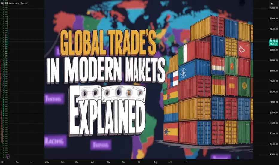
The Hidden Power of Timeframes – Part 2 🔮 The Hidden Power of Timeframes – Part 2 Connection Confluence” – The Invisible Architecture of Precise Trades
Seeing the Invisible
Welcome to Part 2.
If Part 1 gave you clarity on how timeframes interact, we now go one level deeper — into the unseen forces that move beneath the surface of every chart.
🧠 The question is:
“How can I recognize where structure is headed — before it even forms?”
🧠 It’s Not Just About Alignment – It’s About Multi-Timeframe Confluence
The magic doesn’t lie in one indicator or one pattern.
It’s born in the interplay of powerful concepts:
🌀 Wolfe Waves forming at the edges of Order Blocks
🧬 Harmonic Patterns merging with RSI or MACD divergences
🔢 TD Sequential counts signaling exhaustion at precise turning points
🕯️ Japanese Candlesticks confirming what orderflow already whispers
🔐 Smart Money footprints revealing where the crowd dreams — and where those dreams get crushed
This is more than technical analysis.
This is about reading intention — before it becomes visible.
⏳ Multi-Timeframe Fractals – The Echo of the Market
The market is fractal.
What unfolds on a 15-minute chart can mirror the Daily — and often previews the next big move on the Weekly.
📌 Example Scenario:
✅ Bullish divergence on the 4H chart
✅ Aligns with a Gartley pattern on the Daily
✅ Completes just as a TD9 count signals exhaustion on the Weekly
✅ While retesting a monthly liquidity pool
That’s not coincidence — that’s Signal Confluence.
And those who read it are always one step ahead of the market.
🛰️ Smart Money & Orderflow – Trade the Why, Not Just the What
Smart Money doesn’t chase candles.
It trades intent, imbalance, and psychology.
🛠️ Tools of the Trade:
Fair Value Gaps (FVG)
Order Blocks
Liquidity Sweeps
Breaker Blocks
Displacement & Inducement
Retail traders chase patterns.
Smart Money chases the dreams of retail.
🔗 The Real Edge: Seeing Connections Others Miss
A Wolfe Wave is just a shape
An Elliott Wave is just a count
A TD9 is just a number
But when…
🌀 A Wolfe Wave forms during the 5th Elliott Wave
🔢 Ends with a TD9 at a liquidity high
🔐 Inside an Order Block...
💥 That’s not just technicals — that’s chess on the chart.
That’s how real precision is born.
That’s how you anticipate moves weeks — or even months — in advance.
🧭 The Meta Skill: Navigating Confluence Across Timeframes
You don’t need to know everything.
You just need to:
✔️ Recognize when timeframes align
✔️ Feel where systems converge on one idea
✔️ Avoid forcing trades when there’s no synergy
✔️ Only act when the market’s story is consistent across all levels
A true edge doesn’t come from more tools —
It comes from clarity in complexity.
🧩 Bonus Insight: Alignment Within a Single Timeframe
Timeframe confluence is powerful.
But don’t underestimate the strength of multiple high-probability signals inside just one timeframe.
Example:
In a 4H chart:
Wolfe Wave
Harmonic Pattern
Orderflow Zone
Divergence
…all pointing to the same reversal area.
That’s not clutter — that’s weighted confluence.
These moments often deliver the most decisive trades.
💬 Comment below – or share this with someone who’s always fighting their own timeframes.
🚀 Let’s trade with precision — not prediction.
Something worth learning Black lines on the chart are zones
Purple lines on the chart are trendlines
If you connect the blue circle on the chart you can see how they align with zones and trendlines you can use them for xtra confluence
If you look at the chart you'll some blue circle that consists of trendline touch + zones + candle patterns
Having 2 or 3 xtra confirmation can also help you win more trades
Take a screenshot
Connect the blue circle + trendlines + zones together and it all make sense
Drop your thoughts on the comments

Xmoon Indicator Tutorial – Part 3 – Step Entry (DCA Entry)📘 Xmoon Indicator Tutorial – Part 3
🎯 Step Entry (DCA Entry)
Step-by-step entry, also known as DCA (Dollar Cost Averaging), is one of the key parts of the Xmoon – 3 Push Divergence strategy.
🔹 Why is it important?
After a 3 Push Divergence pattern appears, the market usually doesn’t reverse immediately.
It often moves a bit further in the same direction before turning back.
If we put all our capital in at once, the risk of liquidation increases.
🔹 The solution
We split the capital into several parts and enter the market step by step:
✦ If the market doesn’t reverse from Entry 1 , the chance of reversal at Entry 2 is higher
✦ If it doesn’t reverse from Entry 2, the chance at Entry 3 increases even more
✦ And so on — with each new step, the probability of reversal grows
Benefits of step entries:
✅ Lower overall risk
✅ Higher win rate
✅ Positions reach the Risk Free point faster
📣 If you have any questions or need guidance, feel free to ask us. We’d be happy to help.
BITCOIN – THE REAL REASON BEHIND THE FALLWhen I started trading someone told me something I’ll never forget: “If you can predict tomorrow’s newspaper headline, you understand the market.”
He didn’t mean I should chase news. He meant I should read structure so well that I know what kind of headline the market is already writing, before the mass even see it.
And now, looking around online, I see the complete opposite. Everywhere you look, there’s another “confluencer” talking about crypto with big words and zero understanding.
People selling dreams, memberships, and indicators, while they don’t even know what open interest or CVD means.
I’m not here to sell anything. I’m here to help people actually learn how to read data and see through the noise. Because what most of these so-called experts call “analysis” is just emotional guessing wrapped in confidence.
What I called and what happened
Last week I posted my “Big Dump” thesis.
I said Bitcoin would swing fail above the highs, then drop into the 104K region. That is exactly what happened.
Price ran the sweep into 126K, trapped the late buyers, and dumped straight into 104K.
People blamed tariffs. The tariff headline was the spark. The fuel was crypto’s own positioning.
Why the structure was ready to snap
Before the crash, the data told the story clearly.
Stablecoin OI went from 257K to 285K contracts (+10.9%). That is new leveraged exposure.
Coin-margined OI dropped during the breakout, then rose again near the highs. Shorts were fading strength.
Spot CVD stayed flat to slightly negative. Real buyers were missing.
The long/short ratio fell from 2.05 to 1.02 even while price kept climbing.
That’s what distribution looks like. Buyers on leverage pushing price up while stronger hands sell into them. No real spot demand, just futures exposure.
You don’t need a macro event to fall. You only need a reason for those leveraged buyers to stop bidding. Think of it like a crowded elevator. Everyone keeps piling in as it moves up, feeling safe because it hasn’t stopped yet. But the moment one person hesitates, the weight shifts. When the next person panics, the whole thing drops.
That’s what happens when a market is driven by leverage instead of conviction. You don’t need bad news, you just need hesitation.
Look back at similar events.
In May 2021, funding rates were insane, perps overloaded, and spot volume thin. Elon Musk tweeted about Bitcoin’s energy use. That tweet didn’t cause the dump. It just made leveraged longs pause. The bids disappeared and the cascade started.
In August 2023, Evergrande headlines hit. Bitcoin was sitting at resistance with flat spot CVD and rising OI. Equities wobbled, crypto longs hesitated, and the structure collapsed within hours.
In March 2020, when COVID panic hit, Bitcoin had already been stretched thin. Funding was high, leverage was heavy, and liquidity was weak. The virus didn’t break the market, leverage did.
Leverage creates confidence until it doesn’t. Price doesn’t fall because people start selling. It falls because nobody steps in to buy. Headlines decide when the drop starts. Structure decides how far it goes.
Why 104K was my first target
I didn’t pick 104K out of thin air. That level was built on confluence.
1) AVWAP from the April 7 auction
That swing low kicked off with massive volume. When a move starts with that kind of participation, the anchored VWAP becomes a key reference for institutional flow. It represents the average cost of that whole auction, and when extended forward, it acts as a dynamic area where liquidity and algorithms interact.
That blue AVWAP line from April has been running right through the 104K region.
It’s not that price revisited that auction, it’s that the anchored VWAP from that event still marks the fair value area for that entire move.When price traded back down into that region, it met that same volume-weighted anchor, creating a major confluence zone that algos and larger players watch closely.
2) The June 22 breakout left an LVN
A new auction started on June 22 and pushed higher, leaving a Low Volume Node behind.
An LVN is a thin zone on the volume profile where the market moved quickly with little trade.
Markets often revisit these thin areas later to find balance or test unfinished business.
3) HTF Fibonacci cluster
Multiple higher timeframe Fibonacci retracements and extensions overlapped near the same 104K area. When several fib levels align with structure, that’s a strong confluence zone watched by both human traders and algorithms.
The 104K region was where the AVWAP line, LVN, and fib cluster all met. That’s not a random target. It’s a structurally defined area where liquidity concentrates and where markets tend to react sharply. And that’s exactly what happened.
The spark versus the structure
The tariff headline didn’t cause the drop. It triggered it.
The structure was already unstable. Leverage was maxed. Spot demand was flat. Funding was positive and rising. When the tariff news hit, traditional markets pulled back and crypto followed instantly. It wasn’t correlation, it was liquidity contagion.
Traders managing multiple books de-risk across assets when volatility spikes. That creates a gap in liquidity. When the bids vanish, the market falls into the first real pool of resting orders — in this case, the 104K zone.
You saw the same mechanics during the March 2020 crash and the 2021 deleverage. External shocks trigger internal liquidation cascades. That’s why saying “this had nothing to do with crypto is completely wrong.
This had everything to do with crypto. It’s like blaming the thunder for breaking a window when the glass was already cracked. Or saying the iceberg sank the Titanic when the captain was already steering through a sea of warnings.
Crypto was structurally weak. Leverage was stretched, spot demand was gone, and funding was positive. When the headline hit, it didn’t cause the collapse. It just gave the market permission to do what it was already set up to do — unwind.
Crypto is built on leverage.
Perpetual futures dominate volume.
Stablecoin collateral drives exposure.
When external risk events change funding conditions or risk appetite, the crypto market reacts instantly because its structure is fragile by design.
Example:
When yields spike, the dollar strengthens and funding costs rise. Leveraged longs become more expensive to hold, so traders unwind positions.
When equities dump, cross-asset desks reduce risk globally, which pulls liquidity out of crypto perps too.
Intermarket correlation always matters. Macro sets the mood. But the speed and violence of crypto moves always come from leverage inside the system.
How you can spot it next time
Compare Spot CVD vs Stablecoin CVD. If stablecoin CVD rises while spot stays flat or negative, the rally is leverage-driven.
Track Open Interest vs Price. Both rising together usually means exposure is building. Confirm with spot flow.
Watch the Long/Short ratio. If it drops while price rises, shorts are entering and the move may be getting absorbed.
Anchor VWAPs to real pivots like swing lows, breakouts, or liquidation spikes. Those levels attract institutional flow.
Study Volume Profiles. LVNs are thin and often retested. HVNs are balance zones that attract price.
Map HTF fib clusters for confluence. Reactions are stronger when multiple timeframes agree.
Note single prints and thin brackets on TPO or volume profiles. These often act as magnets.
When these factors line up, you don’t need to predict headlines.
You’ll already most likely know which headline will break the market.
TLDR
The rally was leverage-driven: Stablecoin OI up 10.9%, Spot CVD flat, Long/Short ratio down from 2.05 to 1.02
The swing fail at 126K was the final liquidity grab
104K was the target due to AVWAP + LVN + HTF fib cluster
The tariff headline was the spark, not the cause
The crash was caused by leverage and missing spot demand
Crypto didn’t fall because of politics. It fell because the market was already begging for an excuse to reset.
The data showed it clearly weeks before the drop.
If this helped you see the market a little clearer or made you think differently about how price really moves, please leave a like and drop a reaction. It keeps me motivated to keep posting real analysis, not the copy-paste bullshit hype that floods your feed every day.
Check the Order Flow Data from 6 October here: ibb.co
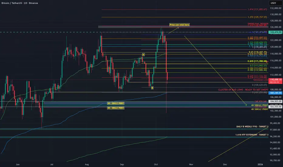
The History of War, Gold, Fiat, and EquitiesGold vs. Equities — The 45-Year Cycle and a Pending Monetary Reset
The interplay of war, gold, fiat money, and equities has long been a barometer of real wealth and economic stability. A recurring pattern emerges across modern history: approximately 45-year intervals when gold strengthens relative to equities.
From the Panic of 1893 to the present, these cycles have coincided with major monetary shifts and geopolitical shocks.
With a broadening 100-year pattern, rising geopolitical tension, and roughly $300 trillion in global debt, a monetary reset by the early 2030s is plausibly on the horizon.
The 45-Year Cycle — Gold’s Strength at Equity Troughs
The pattern’s first trough is traced to 1896, when William Jennings Bryan’s “Cross of Gold” speech preceded the Gold Standard Act of 1900. Equities were weak after the Panic of 1893, and gold gained prominence. Thirteen years later, the Federal Reserve would be created. More on the 45-year cycle later.
The 50-Year Jubilee Cycle
The Torah’s 50-year Jubilee cycle, as outlined in Leviticus 25:8–12, is a profound economic and social reset that follows seven 7-year Shemitah cycles, totaling 49 years, with the 50th year designated as the Jubilee.
Each Shemitah cycle concludes with a sabbatical year (year 7, 14, 21, 28, 35, 42, 49), during which the land rests, debts are released, and economic imbalances are addressed (Leviticus 25:1–7).
The Jubilee, occurring in the 50th year, amplifies this reset by mandating the return of ancestral lands, freeing of slaves, and further debt forgiveness, symbolizing a divine restoration of societal equity.
While built on the 49-year framework of seven Shemitahs, the 50th year stands distinct, marking a transformative culmination rather than a simple extension of the Shemitah cycle.
The five-year Jubilee windows highlighted at the base of the chart compliment the 45-year cycles previously noted. The 4 year Jubilee windows are projected from the roaring 20s peak in 1929 and the 1932 bear market low four years later.
The next Jubilee window is scheduled to occur some time between 2029 and 2031.
Returning to History and the 45-Year Cycles:
The Panic of 1907 and the Fed
The Panic of 1907 was a severe crisis, with bank runs, failing trust companies, and a liquidity crunch centered in New York. The collapse of copper speculators (F. Augustus Heinze and Charles W. Morse) triggered runs on institutions like the Knickerbocker Trust.
Private bankers led by J.P. Morgan injected liquidity (over $25 million) to stabilize the system. The shock exposed the absence of a lender of last resort and precipitated reforms.
Congress responded with the Aldrich–Vreeland Act (1908) and the National Monetary Commission, whose 1911 report recommended a central bank to supply “elastic currency.”
After debate and hearings, President Woodrow Wilson signed the Federal Reserve Act on December 23, 1913, creating a decentralized central bank with 12 regional banks.
Some alternative accounts (e.g., The Creature from Jekyll Island) argue that the panic was exploited to centralize financial control. Mainstream history, however, treats the panic as the genuine catalyst for reform.
Whatever the intent, the Fed’s creation shifted the tools available to manage crises—and, over time, central banks have played an instrumental role in financing wars and expanding Fiat currency.
The Fed and World War I
World War I began in Europe in 1914 (U.S. entry in 1917). The Fed began operations in November 1914 and later supported wartime financing by:
Marketing Liberty Bonds (~$21.5 billion raised, 1917–1919).
Providing low-interest loans to banks buying Treasury securities (via 1916-era amendments).
Expanding the money supply, which contributed to wartime inflation.
Although the Fed was created primarily to prevent panics and stabilize banking, its early role in war finance shifted expectations about central banking’s functions.
From Confiscation to Bretton Woods to the Nixon Shock
In 1933, during the Great Depression, the U.S. effectively nationalized gold—private ownership was outlawed, and the official price was later reset at $35/oz by the Gold Reserve Act of 1934. Private ownership remained restricted until President Ford legalized it again in 1974.
World War II and the Bretton Woods Agreement (1944) cemented gold’s role: the dollar became the anchor of the system, and other currencies pegged to it.
That status persisted until August 15, 1971, when President Nixon suspended dollar-gold convertibility—the “Nixon Shock”—moving the world toward fiat currencies.
The Petrodollar and Post-1971 Arrangements
After 1971, the U.S. worked to preserve dollar demand. The petrodollar system emerged in the early 1970s: following the 1973 oil shock, a U.S.–Saudi understanding (1974) helped ensure oil continued to be priced in dollars and that oil revenues were recycled into U.S. Treasuries—supporting the dollar’s global role despite its fiat status.
Devaluations, Floating Rates, and the End of Bretton Woods
Two formal “devaluations” followed the Nixon Shock:
Smithsonian Agreement (Dec 18, 1971): Raised the official gold price from $35 to $38/oz (an 8.57% change) as a stopgap attempt to stabilize fixed rates without restoring convertibility. It widened exchange banding but proved unsustainable.
On February 12, 1973, the official gold price was revalued to $42.22/oz (roughly a 10% change), a symbolic acknowledgment that Bretton Woods was collapsing. By March 1973, major economies had effectively moved to floating exchange rates, and market gold prices surged.
These moves were reactive attempts to adjust the dollar’s value amid trade deficits, inflation, and speculative pressures. They ultimately ushered in a fiat era, where market forces, not official pegs, set the price of gold.
Triffin’s Dilemma — Then and Now
Triffin’s Dilemma describes the structural tension faced by a reserve currency issuer: it must supply enough currency to ensure global liquidity (running deficits) while risking domestic instability and a loss of confidence.
Britain faced this under the gold standard; the U.S. faced it under Bretton Woods and again after 1971, albeit in a different form.
Modern manifestations include inflation, persistent fiscal and external deficits, and mounting debt. International policy coordination (e.g., the Plaza and Louvre Accords) repeatedly tried—and only partially succeeded—to manage these tensions.
The Plaza (1985) and Louvre (1987) Accords
Plaza Accord (Sept 22, 1985): G5 nations coordinated to depreciate the dollar (it had appreciated ~50% since 1980). The goal was to ease U.S. trade imbalances. The dollar fell substantially vs. the yen and mark by 1987.
Louvre Accord (Feb 22, 1987): G6 sought to stabilize the dollar after its rapid decline following the Plaza Accord, setting informal target zones and coordinating intervention. It temporarily checked volatility but did not solve underlying imbalances.
Both accords illustrate the extreme difficulty in balancing global liquidity needs with domestic economic health in a fiat system.
De-industrialization, Bubbles, and the Broadening Pattern
Orthodox history would argue that U.S. de-industrialization in the 1990s was rational at the time. Globalization and cost arbitrage provided short-term benefits, but they increased trade deficits, foreign dependency, and robbed the middle class of high-paying jobs. That loss of capacity heightens vulnerability to dollar shocks and complicates any re-industrialization efforts today.
Measured in gold, equities have experienced expanding ranges:
Equity peaks (1929, 1967, 1999) were followed by troughs where gold outperformed (1896, 1941, 1980/86).
Gold peaked in 1980, even though the cyclical trough in the broader pattern was nearer 1986—showing that cycles can shift.
The dot-com peak (1999) marked a secular low for gold relative to equities. The ensuing crashes, 9/11, and the War in Afghanistan, followed by the 2008–2009 Financial Crisis (GFC), moved markets profoundly—both nominally and in terms of gold.
From 1999, relative equity values fell until a trough around 2011 (coinciding with the European debt crisis). Quantitative easing and policy responses (2010 onward) restored growth, but frailties remained (e.g., repo market stress in 2018).
COVID produced another shock; aggressive fiscal and monetary responses engineered a V-shaped asset recovery but also higher inflation.
Relative to gold, equities peaked in 1999 and have trended lower since. As nominal stock prices register all-time-highs in dollars—fueled by AI and other themes—equities are historically overvalued. When priced against gold, the apparent bubble in nominal terms looks more like an extended bear market ready for its next down-leg.
The Broadening Pattern and the Next Trough
A broadening pattern illustrates the gold equity ratio range expanding with each major peak and trough. If we accept a roughly 45-year rhythm from the 1980/86 period, the next cyclical trough may fall between 2025 and 2031, with 2031 a focal point. Whether this manifests as a runaway gold price, a sharp equity collapse, or both remains uncertain.
If a sovereign-debt crisis or major war escalates, changes could accelerate—some scenarios even speculate about a negotiated new monetary framework (e.g., “Mar-A-Lago Accords”) in the next 5–15 years.
Geopolitics and the $300 Trillion Debt
Geopolitical tension compounds financial stress. The Russia-Ukraine war, plausibly the start of World War III, NATO involvement, and nuclear saber-rattling evoke systemic risk. Global debt—estimated at around $300 trillion (over 300% of GDP per the Institute of International Finance)—is unsustainable.
U.S. public debt (~$38 trillion) now carries interest costs comparable to defense spending.
Central bank money creation to service debt erodes confidence in fiat currencies and boosts demand for gold. Historical monetary resets (Bretton Woods, Nixon Shock) followed similar pressures of debt and conflict.
A modern reset could push gold well beyond current records—potentially into the high thousands or five-figure territory if confidence collapses.
Implications of a Pending Monetary Reset
A reset might take various forms:
A partial return to a gold-linked standard, perhaps supplemented by tokenized/digital assets.
Forced debt restructuring or coordinated global defaults.
Rapid adoption of digital currencies (including state-issued tokens—CBDCs) as part of a new settlement architecture.
Given Triffin’s Dilemma, inflated financial assets, and interconnected global linkages, a modern reset could be far larger in scale and speed than past adjustments. Assets, trade, and supply chains are far larger and more intertwined than in 1971, increasing contagion risk.
Practical takeaway: investors should consider gold’s role in portfolios; policymakers must confront debt sustainability or risk a market-driven reckoning that could disrupt global finance.
Conclusion
The Torah's 50-year Jubilee, the 45-year cycle and the century-long broadening pattern suggest we are approaching a structural turning point.
Triffin’s Dilemma, decades of accumulated imbalances, de-industrialization, and escalating geopolitical risk suggest a monetary reset is plausible between 2030 and 2035—possibly sooner under severe stress.
A modern reset would be more disruptive than past episodes because today’s global economy is larger, more integrated, and technologically complex. The question is not only whether such a reset will occur, but how policymakers and markets will manage it.
The stakes—global financial stability and the relative value of fiat versus real assets—could not be higher.
Descriptions about the market! Read the caption!Given Mr. Trump's remarks and the unprecedented crash in cryptocurrencies, I must say this individual significantly harms markets, especially investors. Imposing a 100% tariff on Chinese goods essentially means "we want no trade with you," which is fundamentally unfeasible. The United States and China will undoubtedly negotiate. However, our main focus here is the financial market collapse. This decline isn’t merely about falling prices—it goes beyond that. The core issue is the loss of market trust and credibility. Once confidence is broken, it is difficult to restore and may take a long time.
In any case, I felt it was my duty to bring this up and remind you to stay composed. Never forget to use stop-losses in your trades and practice proper capital management.
If needed, you can always message me on this platform for advice.
NOTE: This post is This post is educational.
Friday - the day the market shows its true faceEveryone loves chasing moves early in the week - Monday, Tuesday, news, data drops. But if you look closer, the most honest market signals usually appear on Fridays. By that time, the fight between buyers and sellers is settled, and the price reveals who really has control.
When big funds and banks are confident about direction, they don’t rush to close positions before the weekend. The market often ends the week at its highs - and Monday continues the same move. But if selling pressure picks up late on Friday, it’s usually a warning sign: traders are nervous and prefer not to hold risk over the weekend.
Friday’s close isn’t just another candle - it’s the verdict for the entire week. A close near the top of the range means demand is strong; near the bottom means fear and profit-taking are taking over.
Retail traders often close everything before the weekend to “stay safe.” But smart money uses those thin Friday hours to shake out weak hands and grab liquidity. That’s why the real moves often begin right after those late-week impulses.
What to keep an eye on:
1. Watch where the price closes within the weekly range - it sets the tone for Monday.
2. Check volume during the last trading hours - it tells you who’s really in control.
3. A strong Friday move with no news? Often that’s the setup for next week’s trend.
Friday’s action is rarely random. It’s the final scene before the next act of the market drama.
Global Recession and Its Impact on the Global Market1. Causes of a Global Recession
a. Financial Crises
One of the most common causes of global recessions is a financial system breakdown, often triggered by excessive borrowing, speculative investments, or asset bubbles. The 2008 financial crisis began with the collapse of the U.S. housing bubble and spread through interconnected global banking systems. As credit markets froze, liquidity dried up, leading to a synchronized economic downturn.
b. Geopolitical Tensions
Wars, trade conflicts, and political instability also play major roles in creating global recessions. For example, the Russia–Ukraine conflict disrupted energy and grain supplies, leading to global inflationary pressures. Trade wars between the U.S. and China have also strained global supply chains, dampening international investment.
c. Supply Chain Disruptions
The global economy relies on intricate networks of production and logistics. Disruptions in one part of the chain—such as factory shutdowns in Asia or port closures in Europe—can lead to shortages, inflation, and reduced production worldwide. The COVID-19 pandemic exposed the fragility of these systems.
d. Inflation and Monetary Tightening
When inflation rises sharply, central banks raise interest rates to control it. However, aggressive monetary tightening—as seen in 2022–2023—can choke business investments, increase debt burdens, and reduce consumer spending, collectively leading to a global slowdown.
e. Energy Price Shocks
A sharp rise in oil and gas prices increases production costs across industries. Historically, oil crises in the 1970s triggered worldwide recessions, as economies dependent on fossil fuels faced both inflationary and growth pressures.
2. Key Indicators of a Global Recession
Declining Global GDP Growth – A consistent drop in growth across multiple economies is a primary signal of a global recession.
Falling Trade Volumes – Reduced import/export activity reflects weakened global demand.
Stock Market Declines – Global equity indices such as the S&P 500, FTSE, and Nikkei often fall sharply during recessions.
Rising Unemployment – Companies cut costs by reducing staff, leading to lower household incomes and spending.
Currency Volatility – Investors flee risky assets and move to safe-haven currencies like the U.S. dollar or Swiss franc.
Declining Consumer and Business Confidence – Sentiment surveys show reduced optimism about future growth prospects.
3. Impact on Global Financial Markets
a. Stock Markets
During recessions, corporate profits shrink due to declining sales and rising costs. Investors sell off equities, causing sharp corrections or bear markets. Sectors like technology, consumer discretionary, and finance are often hit hardest. However, defensive sectors such as healthcare, utilities, and consumer staples tend to outperform during downturns.
b. Bond Markets
As investors seek safety, demand for government bonds increases. This leads to lower yields on U.S. Treasuries, German bunds, and other sovereign debt instruments. However, riskier corporate bonds may experience widening yield spreads as default fears rise.
c. Currency Markets
Currency movements become volatile during global recessions. Safe-haven currencies (USD, JPY, CHF) strengthen, while emerging market currencies weaken due to capital outflows and reduced export revenues. For example, during the 2008 crisis, the dollar surged as investors sought security in U.S. assets.
d. Commodity Markets
Demand for commodities like oil, copper, and agricultural products falls during recessions as industrial output and consumer demand decline. Energy markets are particularly sensitive, with crude oil prices often collapsing amid falling global demand.
e. Gold and Precious Metals
Gold acts as a safe-haven asset during economic uncertainty. Investors flock to gold, silver, and other precious metals to hedge against inflation, currency depreciation, and financial instability.
4. Sectoral Impact of a Global Recession
a. Manufacturing and Industry
Industrial production declines due to reduced global demand, supply chain disruptions, and tighter credit conditions. Auto manufacturing, electronics, and machinery sectors are among the hardest hit.
b. Technology Sector
Tech companies experience falling valuations as advertising, consumer spending, and venture capital funding decline. However, firms with strong cash reserves and recurring revenues, like software-as-a-service (SaaS) providers, tend to weather recessions better.
c. Energy and Commodities
Falling demand leads to lower energy prices. Oil-exporting countries face budget deficits, while importers temporarily benefit from lower fuel costs.
d. Real Estate and Construction
High interest rates and weak consumer sentiment reduce property demand. Real estate investment trusts (REITs) and construction companies experience revenue declines, though infrastructure-focused government projects may provide some support.
e. Banking and Financial Services
Recessions lead to higher loan defaults, reduced credit activity, and shrinking investment banking revenues. However, strong regulatory frameworks and capital buffers can mitigate systemic risk.
f. Retail and Consumer Goods
Consumers prioritize essentials, cutting back on luxury and discretionary spending. Discount retailers, supermarkets, and essential goods producers often perform better than premium brands.
5. Global Trade and Supply Chain Impacts
A recession causes a sharp contraction in global trade volumes. Export-oriented economies such as China, Germany, Japan, and South Korea face slower industrial output. Shipping costs and port activity decline, while multinational corporations reassess their supply chains for resilience rather than efficiency.
Additionally, protectionist policies tend to rise during recessions, as countries attempt to safeguard domestic industries. This leads to tariffs, export restrictions, and currency interventions, further dampening international cooperation.
6. Impact on Emerging and Developing Economies
Emerging markets are often the most vulnerable during global recessions. They face:
Capital outflows as foreign investors retreat to safer markets.
Currency depreciation that increases debt burdens on dollar-denominated loans.
Declining export revenues, especially for commodity-dependent nations.
Social and political unrest, as unemployment and inflation rise simultaneously.
Countries in Africa, Latin America, and South Asia often suffer deeper recessions due to weaker fiscal capacity and limited access to international credit lines.
7. Employment and Social Impact
The human cost of a global recession is immense. Rising unemployment leads to income inequality, poverty, and social instability. Small and medium-sized enterprises (SMEs) suffer the most as they lack access to capital. Women, youth, and informal workers are disproportionately affected. Governments often respond with fiscal stimulus and social welfare programs to stabilize demand and prevent widespread hardship.
8. Central Banks and Government Responses
To combat recessions, policymakers deploy a mix of monetary and fiscal tools:
Monetary Policy
Interest Rate Cuts: Central banks lower rates to stimulate borrowing and investment.
Quantitative Easing (QE): Purchase of government securities to inject liquidity.
Currency Interventions: To stabilize exchange rates and prevent capital flight.
Fiscal Policy
Government Spending: Infrastructure, healthcare, and defense projects to create jobs.
Tax Cuts or Rebates: To increase disposable income and consumption.
Corporate Support: Financial aid and low-interest loans to struggling businesses.
The coordination between central banks like the U.S. Federal Reserve, European Central Bank, and others is crucial for restoring global market confidence.
9. Long-Term Structural Effects
A global recession not only disrupts short-term growth but also reshapes the economic architecture of the world:
Shift Toward Automation: Companies invest in robotics and AI to reduce dependence on labor.
Deglobalization Trends: Nations prioritize self-reliance, local manufacturing, and “friend-shoring.”
Digital and Green Transition: Governments emphasize clean energy and digital innovation to drive post-recession recovery.
Inequality and Policy Reforms: Rising inequality sparks debates about tax reforms, social welfare, and labor rights.
Investment Reorientation: Investors favor sustainable sectors like renewable energy, healthcare, and technology infrastructure.
10. Historical Examples and Lessons
a. The Great Depression (1929–1939)
Triggered by the U.S. stock market crash, it led to massive unemployment, deflation, and global trade collapse. The lesson: overleveraged markets and lack of regulation can devastate the global economy.
b. The 2008 Global Financial Crisis
Caused by subprime mortgage defaults, it exposed systemic risks in the banking sector. The coordinated response by the G20, IMF, and central banks helped avert a complete collapse, teaching the importance of global financial cooperation.
c. The 2020 COVID-19 Recession
Triggered by a global health crisis, it caused the sharpest economic contraction since World War II. The recovery was led by massive fiscal stimulus and accelerated adoption of digital technologies and remote work.
Conclusion: Navigating the Future of Global Markets
The impact of a global recession is deep and multifaceted—affecting not only financial markets but also the very structure of global trade, employment, and policymaking. However, recessions also serve as catalysts for transformation. They expose economic vulnerabilities, encourage innovation, and reset market expectations.
In the coming years, the resilience of global markets will depend on how effectively nations coordinate monetary, fiscal, and trade policies, and how businesses adapt to new realities shaped by technology, sustainability, and shifting geopolitical dynamics. Investors and policymakers must embrace adaptability, transparency, and long-term thinking to ensure that future recessions become stepping stones toward a more stable and equitable global economy.
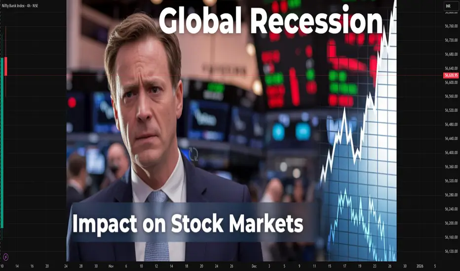
CBDCs in Global TradeThe Digital Currency Revolution Transforming International Commerce.
1. Understanding CBDCs: The Foundation of Digital Sovereign Money
A Central Bank Digital Currency (CBDC) is a digital form of a nation’s fiat currency issued directly by its central bank. Unlike cryptocurrencies such as Bitcoin or stablecoins like USDT, CBDCs are fully backed by the state and have legal tender status. They combine the stability of fiat currency with the efficiency of digital payment systems.
CBDCs can be retail (for everyday citizens and businesses) or wholesale (for banks and large financial institutions engaged in cross-border or interbank transactions). The core idea is to modernize money itself, bringing central bank-backed currency into the digital age.
Types of CBDCs:
Retail CBDC: Used by individuals and businesses for daily transactions, similar to digital cash.
Wholesale CBDC: Used for interbank settlements and large-scale trade or financial transactions.
For global trade, wholesale CBDCs play a more critical role, as they directly impact cross-border payments, trade financing, and settlements between international companies and governments.
2. The Need for CBDCs in Global Trade
The current global trade payment system relies heavily on a network of correspondent banks, SWIFT messaging systems, and foreign exchange intermediaries. While effective, it is slow, expensive, and prone to compliance and settlement risks. For example, an international trade transaction can take several days to complete, with high transaction fees and exchange rate fluctuations eroding profit margins.
CBDCs are designed to eliminate these inefficiencies. They enable instant settlement, reduce transaction costs, and allow for direct currency swaps between trading nations without the need for third-party intermediaries. This has massive implications for both developed and emerging markets.
Current Pain Points in Global Trade Payments:
High transaction fees due to multiple intermediaries.
Delays caused by time zone differences and banking hours.
Currency conversion risks and volatility.
Compliance and anti-money laundering (AML) challenges.
Limited access for smaller businesses in developing nations.
CBDCs aim to solve these challenges by creating a seamless, transparent, and programmable payment ecosystem that functions in real time.
3. How CBDCs Transform Cross-Border Trade
CBDCs can fundamentally change how imports, exports, and settlements occur between nations. By connecting central banks directly through digital networks, countries can bypass traditional systems and conduct instant, low-cost international settlements.
a) Faster Settlements
With blockchain or distributed ledger technology (DLT), CBDC transactions can be completed in seconds instead of days. This speed reduces liquidity needs and increases operational efficiency for exporters, importers, and financial institutions.
b) Reduced Currency Conversion Costs
CBDCs can enable direct currency exchange between two national digital currencies without involving an intermediary like the US dollar. For example, a trade between India and Singapore could use the digital rupee (e₹) and digital Singapore dollar (eSGD) for direct settlement.
c) Enhanced Transparency and Security
Every transaction made with CBDCs can be recorded on a secure digital ledger, ensuring full traceability and reducing the risk of fraud, money laundering, or trade-based financial crimes.
d) Programmable Smart Contracts
CBDCs integrated with smart contracts can automate payments upon fulfillment of trade conditions—such as delivery of goods, verification of documents, or customs clearance. This reduces disputes and increases trust in trade relationships.
4. CBDC Pilot Projects in Global Trade
Many nations are experimenting with CBDCs for cross-border trade. Some of the most advanced projects include:
a) China’s Digital Yuan (e-CNY)
China is leading the CBDC race with its digital yuan. It aims to internationalize its currency and reduce dependence on the US dollar in trade settlements, especially within the Belt and Road Initiative (BRI). The e-CNY has already been tested in Hong Kong and is being explored for cross-border trade in Asia and Africa.
b) Project Dunbar (BIS Initiative)
The Bank for International Settlements (BIS) collaborated with the central banks of Singapore, Malaysia, South Africa, and Australia to test a multi-CBDC platform. Project Dunbar demonstrated that multiple central banks could share a single platform for cross-border payments without needing intermediaries.
c) India’s Digital Rupee (e₹)
India’s Reserve Bank of India (RBI) launched pilots for the digital rupee, focusing on wholesale trade settlements between banks. In the future, India aims to use the e₹ for trade with friendly nations in Asia and the Middle East, reducing dependency on the US dollar.
d) Project mBridge
A collaboration between China, Thailand, Hong Kong, and the UAE, Project mBridge is one of the most promising multi-CBDC platforms. It aims to facilitate instant cross-border trade settlements among participating countries.
These experiments signal a major shift toward CBDC interoperability, where different nations’ digital currencies can seamlessly interact within a shared technological framework.
5. Geopolitical Implications: Redefining Economic Power
CBDCs have deep geopolitical consequences. For decades, the US dollar has dominated global trade and finance, giving the United States immense influence over international monetary policy and sanctions enforcement. However, with CBDCs, nations now have a tool to bypass the dollar-based system, reducing US leverage.
a) De-dollarization
Countries like China and Russia are exploring CBDCs to conduct trade directly with partners, avoiding SWIFT and dollar settlement systems. This could accelerate de-dollarization, reshaping global financial power dynamics.
b) Regional Trade Blocks
CBDCs could strengthen regional trade blocs like ASEAN, BRICS, and the EU, as members adopt interoperable digital currencies. For example, BRICS nations (Brazil, Russia, India, China, South Africa) are considering a common digital settlement platform for trade within the group.
c) Financial Sovereignty
CBDCs give countries more control over their monetary policy and international transactions, especially against the backdrop of sanctions, currency manipulation, and capital flight.
6. The Role of CBDCs in Trade Finance
Trade finance involves providing credit and payment guarantees to importers and exporters. Currently, it’s a complex system involving multiple banks, documentation, and intermediaries. CBDCs can simplify this by enabling instant, transparent, and programmable transactions.
Benefits in Trade Finance:
Real-time verification of documents and goods through blockchain.
Reduced paperwork via smart contracts and digital documentation.
Lower default risks due to traceable payment flows.
Easier compliance with KYC (Know Your Customer) and AML (Anti-Money Laundering) norms.
Financial institutions could use CBDCs to streamline letters of credit, escrow arrangements, and payment guarantees, making international trade faster and more reliable.
7. Challenges in Implementing CBDCs for Global Trade
Despite the immense potential, CBDCs also face several hurdles before they can become the backbone of international commerce.
a) Lack of Global Standards
Different countries are developing CBDCs using various technologies and regulatory frameworks, making interoperability a major challenge. A lack of common standards could lead to fragmentation in the digital currency ecosystem.
b) Cybersecurity Risks
CBDCs operate on digital infrastructure that is susceptible to hacking, cyberattacks, and data breaches. Ensuring strong cybersecurity measures is essential to protect national monetary systems.
c) Privacy Concerns
CBDCs can enable governments to monitor transactions in real-time, raising privacy and surveillance concerns among citizens and businesses.
d) Technological and Infrastructure Gaps
Developing countries with limited digital infrastructure may face difficulties in adopting CBDCs efficiently, creating digital inequality in global trade participation.
e) Monetary Policy Impacts
Widespread use of CBDCs could impact traditional monetary policy tools and potentially alter interest rate transmission and capital flows across borders.
8. The Road to Interoperability: A Global CBDC Network
The long-term goal of CBDC adoption in global trade is to achieve cross-border interoperability—the ability of one nation’s digital currency to transact seamlessly with another’s. Central banks and institutions like the BIS, IMF, and SWIFT are working on frameworks to make this possible.
Key Developments:
Multi-CBDC platforms such as mBridge and Dunbar.
Interlinking payment systems, like India’s UPI connected with Singapore’s PayNow.
Digital identity systems integrated with CBDCs for seamless verification.
A future global CBDC network could enable trade settlements that are instant, transparent, and secure, reducing friction and creating new efficiencies across supply chains.
9. The Future of CBDCs and Global Trade Dynamics
As CBDCs mature, we could see the birth of a new global payment architecture—one that is digital-first, decentralized, and less dependent on legacy banking systems. The implications will be profound:
Trade settlements could shift from the US dollar to regional CBDC pairs.
Emerging markets could gain greater participation in global trade.
Smart trade contracts could automate international logistics and compliance.
Real-time trade data could enhance transparency for governments and corporations alike.
Over the next decade, CBDCs could become as central to trade as shipping containers were to the globalization era.
10. Conclusion: A New Era of Digital Trade
CBDCs represent the next frontier of global finance and trade. They hold the power to make international commerce more efficient, inclusive, and transparent, while also challenging existing geopolitical and financial structures.
For businesses, this means faster payments, lower costs, and more predictable trade settlements. For governments, it means enhanced control and sovereignty over cross-border transactions. And for the world, it signifies the dawn of a digitally interconnected economy, where trade flows as seamlessly as information.
The rise of CBDCs is not just a technological evolution—it’s a monetary revolution. As nations continue to pilot and deploy these digital currencies, global trade is poised to enter a new era defined by speed, security, and sovereignty.

Understanding the Carry Trade Strategy1. The Core Concept of Carry Trade
The essence of carry trade lies in exploiting interest rate differentials between two countries. Every currency has an interest rate attached to it—set by its central bank. For instance, if the interest rate in Japan is 0.1% and in Australia is 4.5%, a trader can borrow Japanese yen at the lower rate and invest in Australian dollars to earn the higher rate.
The formula for expected profit in a simple carry trade is:
Carry Trade Profit = Interest Rate Differential + Currency Appreciation (or - Depreciation)
Thus, profits come from two sources:
Interest income from the higher-yielding currency.
Exchange rate gains if the invested currency appreciates relative to the funding currency.
2. Real-World Example of Carry Trade
Consider the USD/JPY carry trade—a classic example often used by traders.
Suppose the U.S. interest rate is 5% and Japan’s is 0.1%.
A trader borrows ¥10 million (Japanese yen) at 0.1% and converts it into U.S. dollars.
The trader then invests that money in a U.S. bond or other instrument yielding 5%.
Annual Profit (approx.):
Interest differential = 5% - 0.1% = 4.9%
If the USD/JPY exchange rate remains stable, the trader earns nearly 4.9% as profit. If the dollar appreciates against the yen, profits rise further when converting back to yen. However, if the dollar weakens, part of the profit—or even all of it—can be wiped out.
3. Historical Perspective: The Rise of Carry Trades
Carry trades gained prominence in the 1990s and early 2000s, driven by globalization and massive liquidity in global markets.
One of the most famous examples was the Japanese Yen Carry Trade. Japan’s ultra-low interest rates encouraged global investors to borrow yen cheaply and invest in higher-yielding assets across the world—especially in emerging markets and commodities.
Between 2003 and 2007, this strategy helped fuel asset bubbles in stocks, real estate, and commodities. Investors were earning attractive returns as long as volatility remained low. But when the 2008 Global Financial Crisis hit, markets turned risk-averse, and carry trades were rapidly unwound. The yen surged as traders rushed to repay yen loans, resulting in sharp losses for many.
4. The Mechanics of Carry Trade Profits
Carry trade profits can be broken down into three main elements:
A. Interest Rate Differential
This is the basic profit component. The greater the difference between the two countries’ interest rates, the higher the potential return.
B. Exchange Rate Movements
The real profit or loss depends heavily on how exchange rates move during the investment period. If the high-yield currency strengthens, profits increase; if it weakens, losses mount.
C. Leverage
Forex markets allow high leverage—sometimes up to 100:1 or even higher. This means traders can amplify returns (and risks) substantially. A small interest rate difference can produce significant profits when multiplied by large positions.
5. Factors Influencing Carry Trade Returns
Several macroeconomic and market factors determine how profitable carry trades can be:
1. Central Bank Policies
Changes in interest rates by central banks directly impact carry trade returns. If a central bank raises rates, its currency becomes more attractive for investment; if it cuts rates, the currency weakens.
2. Inflation Expectations
High inflation can erode real returns, making a high-yield currency less appealing. Traders prefer stable economies with manageable inflation.
3. Market Volatility
Carry trades thrive in periods of low volatility. When markets are calm, traders are more willing to take on risk. During crises, investors rush to safe-haven currencies like the U.S. dollar, Swiss franc, or Japanese yen, often leading to large carry trade losses.
4. Global Risk Sentiment
Carry trades are often referred to as “risk-on” trades. They perform well when global markets are optimistic and fail when fear dominates. This is why equity market trends, bond yields, and commodity prices all indirectly affect carry trade profitability.
5. Currency Liquidity
Major currencies like USD, EUR, JPY, and GBP are highly liquid and preferred for carry trades. Emerging market currencies may offer higher yields but also carry higher volatility and default risk.
6. Popular Carry Trade Currency Pairs
Some of the most widely used carry trade pairs include:
AUD/JPY (Australian Dollar / Japanese Yen) – Classic pair due to Australia’s historically high rates and Japan’s near-zero rates.
NZD/JPY (New Zealand Dollar / Japanese Yen) – Similar to AUD/JPY, with higher yield differentials.
USD/CHF (U.S. Dollar / Swiss Franc) – Used when U.S. rates are higher than Switzerland’s.
TRY/JPY (Turkish Lira / Japanese Yen) – Extremely high yields but high volatility.
BRL/JPY (Brazilian Real / Japanese Yen) – Popular during commodity booms, but risky during downturns.
7. Risks in Carry Trade Strategy
While carry trades can generate steady profits in stable times, they are not risk-free. Major risks include:
A. Exchange Rate Risk
The biggest danger. A sudden appreciation in the funding currency or depreciation in the target currency can erase profits instantly.
B. Interest Rate Changes
Unexpected central bank decisions can sharply change interest rate differentials, hurting carry positions.
C. Market Sentiment Shifts
During global crises or geopolitical tensions, investors rush to unwind carry trades, leading to rapid currency reversals.
D. Leverage Risk
Because carry trades often use high leverage, even small currency moves can cause large losses.
E. Liquidity Risk
In volatile markets, traders might face liquidity shortages, making it difficult to close positions at desired prices.
8. Modern Trends in Carry Trades
In today’s financial environment, carry trade strategies have evolved beyond simple currency pairs. Institutional investors use derivatives, swaps, and ETFs to implement sophisticated carry trade structures.
Post-2020, as global central banks diverged in their policy responses, carry trades returned in new forms:
U.S. Dollar Carry Trades (2022–2024): As the U.S. Federal Reserve raised rates, investors borrowed in low-yielding currencies (like yen) to invest in dollar assets.
Emerging Market Carry Trades: Countries like Mexico, Brazil, and India offered high returns due to elevated interest rates, attracting foreign capital.
Crypto Carry Trades: Some investors even use stablecoins and crypto lending platforms to earn yield differentials, though with added risks.
9. Carry Trade and Global Financial Stability
Carry trades play a crucial role in global capital flows. When investors move funds across borders seeking yield, they influence exchange rates, bond yields, and asset prices.
However, this can create instability:
A large unwinding of carry trades can trigger currency crashes.
It can fuel asset bubbles in emerging markets.
It may distort monetary policy transmission in developing economies.
For example, during the 2008 crisis, the yen surged as carry trades unwound, destabilizing global markets. Similarly, during 2020’s COVID panic, the rapid appreciation of the dollar caused liquidity stress worldwide.
10. Managing Risks and Enhancing Carry Trade Profits
Successful carry traders don’t rely solely on interest differentials—they actively manage risk through various techniques:
A. Hedging
Using options and forward contracts to protect against adverse currency moves.
B. Diversification
Spreading investments across multiple currency pairs reduces exposure to a single market shock.
C. Monitoring Economic Data
Keeping track of inflation, central bank meetings, GDP growth, and unemployment helps anticipate policy changes.
D. Using Technical Analysis
Identifying strong trends and key support/resistance levels can optimize entry and exit points.
E. Position Sizing
Maintaining disciplined position sizes relative to account equity prevents catastrophic losses during unexpected events.
11. Carry Trade in the Post-Interest Hike World
After years of ultra-low rates, the world entered a new monetary era post-2022, where inflation surged and central banks tightened policies. This reshaped carry trade dynamics:
The U.S. Dollar became the favored investment currency due to its high yields.
The Japanese Yen and Swiss Franc again became popular funding currencies.
Emerging markets like India, Indonesia, and Brazil attracted carry flows due to strong domestic demand and stable growth.
However, volatility remains high. With central banks recalibrating rates, traders must remain agile, adapting strategies to shifting yield curves.
12. The Psychology Behind Carry Trades
Carry trades are as much about psychology as economics. When markets are optimistic (“risk-on”), investors believe currencies with higher yields will remain stable, leading to self-reinforcing inflows. But once fear sets in (“risk-off”), the same investors rush for safety, causing violent reversals.
This herd behavior explains why carry trades often “grind higher slowly” but “crash quickly.”
13. Carry Trade and Macroeconomic Indicators
Certain indicators provide clues about carry trade potential:
Interest Rate Differentials: The larger the spread, the greater the opportunity.
Volatility Index (VIX): Low VIX values favor carry trades; high VIX signals danger.
Commodity Prices: For countries like Australia or Brazil, commodity booms strengthen their currencies, enhancing carry returns.
Current Account Balance: Surplus nations have more stable currencies, reducing depreciation risk.
14. Example: The AUD/JPY Case Study
Let’s revisit the Australian Dollar / Japanese Yen pair—a carry trade classic.
Between 2003 and 2007:
Australia’s interest rate averaged around 6%, while Japan’s was near 0%.
Investors borrowing yen and investing in AUD earned a 6% interest differential plus additional currency gains as AUD appreciated.
However, during the 2008 financial crisis, the AUD/JPY pair fell nearly 40% in months as investors fled to safety. This demonstrated the twin-edged nature of carry trades—profitable during stability but dangerous in turmoil.
15. The Future of Carry Trade Profits
Looking ahead, carry trades will continue to evolve with shifting global monetary landscapes. Key trends shaping their future include:
AI-driven Forex Trading: Algorithms now optimize carry strategies based on real-time data, volatility signals, and machine learning models.
Decentralized Finance (DeFi): On blockchain platforms, yield differentials between tokens and stablecoins mimic traditional carry trades.
Diverging Monetary Cycles: With some central banks cutting rates while others hike, new opportunities will emerge across regions.
However, geopolitical uncertainty, inflationary pressures, and climate-related disruptions will keep volatility elevated—testing even the most sophisticated carry traders.
Conclusion: The Double-Edged Sword of Carry Trade Profits
Carry trades remain one of the most powerful yet perilous tools in global finance. They thrive in stability and crumble in panic. At their best, they provide consistent yield and drive cross-border investment; at their worst, they amplify global financial shocks.
For modern traders and investors, understanding the mechanics, risks, and psychology behind carry trade profits is essential. Success lies not merely in spotting interest differentials but in anticipating the shifts in market sentiment and monetary cycles that dictate when the trade will shine—or collapse.
Ultimately, carry trade profits are not just a measure of financial skill—they reflect the pulse of the global economy itself, balancing between the search for yield and the instinct for safety.
Global Market Analysis: Dynamics of the World Economy1. The Structure of the Global Market
The global market isn’t a single entity but rather a network of interconnected sub-markets—each influencing the other. These include:
Equity Markets: Stock exchanges across the world like NYSE (USA), LSE (UK), NSE (India), and Nikkei (Japan) where investors buy and sell company shares.
Bond Markets: Governments and corporations issue bonds to raise capital, influencing global interest rates and credit flows.
Foreign Exchange (Forex) Markets: The largest financial market globally, with a daily turnover exceeding $7 trillion, dictating exchange rates between currencies.
Commodity Markets: Covering energy (oil, gas), metals (gold, copper), and agricultural products (wheat, soybeans), these markets affect inflation and industrial costs.
Derivatives Markets: Financial instruments like futures, options, and swaps that allow investors to hedge risks or speculate on price movements.
These markets operate through both developed economies (like the U.S., Japan, and the EU) and emerging economies (like China, India, and Brazil), whose increasing influence has reshaped global trade and investment flows.
2. Key Drivers of the Global Market
Global markets respond to a mix of economic, political, and technological factors. The main drivers include:
a) Economic Indicators
Economic health is reflected through metrics such as:
GDP Growth Rates: Indicate whether economies are expanding or contracting.
Inflation & Interest Rates: Affect consumer spending, borrowing, and corporate investment.
Employment Data: High employment boosts consumption; unemployment signals economic stress.
Trade Balances: Show the difference between exports and imports, influencing currency strength.
b) Monetary Policy
Central banks like the U.S. Federal Reserve, European Central Bank, and Reserve Bank of India regulate liquidity and interest rates. A dovish stance (low interest rates) usually stimulates growth and stock markets, while a hawkish stance (high rates) can slow them down.
c) Geopolitical Stability
Wars, trade conflicts, and political shifts (like Brexit or U.S.-China tensions) can disrupt supply chains, affect oil prices, and create investor uncertainty.
d) Technological Innovation
Technology drives productivity, reshapes industries, and spawns new sectors such as AI, renewable energy, and digital finance, which attract global capital.
e) Investor Sentiment
Perception often drives short-term market movements. When optimism prevails, “risk-on” assets like equities rise; when fear sets in, “safe-haven” assets like gold and the U.S. dollar gain.
3. Regional Market Analysis
Global market dynamics differ across regions, each contributing uniquely to the world economy.
a) The United States
The U.S. remains the largest and most influential economy, contributing about 25% to global GDP. Its stock markets (Dow Jones, S&P 500, NASDAQ) serve as global benchmarks.
Key trends include:
Strong consumer-driven growth.
Leadership in technology and innovation.
Monetary policy shifts under the Federal Reserve.
Fiscal deficits and debt ceiling debates impacting investor confidence.
b) Europe
Europe’s markets are heavily influenced by the European Central Bank (ECB) and political cohesion within the European Union (EU).
Key challenges include:
Energy dependence post-Russia-Ukraine conflict.
Slower growth in aging economies.
Regulatory leadership in green and digital finance.
c) Asia-Pacific
Asia is the growth engine of the global economy, led by:
China: Transitioning from export-led to consumption-driven growth.
India: A rising powerhouse in technology, services, and manufacturing.
Japan and South Korea: Advanced in technology and industrial exports.
ASEAN nations (like Indonesia, Vietnam, and Malaysia) are also gaining traction as supply chain alternatives to China.
d) Middle East and Africa
The Middle East, dominated by oil exporters like Saudi Arabia and UAE, is diversifying through Vision 2030-type reforms.
Africa, meanwhile, is emerging with vast natural resources and young demographics, attracting long-term infrastructure investments.
e) Latin America
Countries like Brazil, Mexico, and Chile are resource-rich economies sensitive to commodity cycles. Political instability and inflation remain challenges, but trade relations with the U.S. and China support recovery.
4. Interconnectedness and Globalization
Global markets are deeply interconnected, meaning a policy decision in one country can ripple across the world.
Examples include:
U.S. interest rate hikes affecting capital outflows from emerging markets.
China’s slowdown reducing demand for global commodities.
European energy crises impacting industrial production worldwide.
This interdependence has both benefits (growth opportunities) and risks (contagion effects). The 2008 global financial crisis and the 2020 pandemic illustrated how quickly economic shocks can spread globally.
5. Role of Currencies and Forex Markets
Currency markets are the lifeblood of global trade. Exchange rates determine export competitiveness and investment returns.
Key currency dynamics include:
U.S. Dollar Dominance: The dollar remains the global reserve currency, used in 80% of trade settlements.
Euro and Yen Influence: Widely used in international trade and finance.
Emerging Market Currencies: Often volatile, influenced by capital flows and inflation.
Digital Currencies & CBDCs: Central Bank Digital Currencies (CBDCs) are reshaping how cross-border payments occur.
Currency volatility affects companies’ profits, inflation, and global investment flows, making forex analysis central to global market forecasting.
6. Commodity Market Overview
Commodities form the foundation of industrial and consumer economies.
Key categories include:
a) Energy
Crude oil and natural gas dominate global energy trade. Prices fluctuate with OPEC+ decisions, geopolitical tensions, and renewable energy transitions.
b) Metals
Gold, silver, copper, and lithium are vital for industries, technology, and investments. The global shift toward electric vehicles (EVs) has increased demand for lithium and copper.
c) Agriculture
Food commodities like wheat, corn, and soybeans are influenced by weather, trade policies, and geopolitical disruptions.
Commodities often act as inflation hedges and safe-haven assets during market uncertainty.
7. Emerging Market Trends
a) Digital Transformation
E-commerce, fintech, and digital payments have redefined trade and consumption. Platforms like Amazon, Alibaba, and Paytm are reshaping economies.
b) Renewable Energy Transition
As climate concerns rise, investment is shifting from fossil fuels to green technologies, including solar, wind, and hydrogen energy.
c) AI and Automation
Artificial intelligence is boosting efficiency, data analysis, and algorithmic trading, impacting labor markets and productivity.
d) Supply Chain Diversification
Post-pandemic disruptions and geopolitical risks have encouraged “China+1” strategies, moving manufacturing to countries like India and Vietnam.
e) Financial Inclusion
Microfinance, mobile banking, and digital currencies are bringing millions into the formal economy in developing nations.
8. Risks and Challenges in the Global Market
a) Inflation and Interest Rate Volatility
High inflation erodes purchasing power, prompting central banks to raise interest rates — often slowing growth and raising recession fears.
b) Geopolitical Tensions
Conflicts in Ukraine, Middle East tensions, and U.S.-China rivalry continue to threaten global stability.
c) Climate Change
Extreme weather impacts agriculture, infrastructure, and migration patterns, introducing long-term risks.
d) Debt Crisis
Several nations face rising public debt burdens due to post-pandemic stimulus measures and global borrowing costs.
e) Cybersecurity Threats
As financial systems digitize, cyberattacks pose serious risks to global financial stability.
9. Tools and Techniques for Global Market Analysis
Professionals use multiple analytical frameworks to understand market movements:
Fundamental Analysis: Examines economic data, earnings reports, and macro indicators.
Technical Analysis: Studies price patterns, volume, and momentum indicators for trading insights.
Sentiment Analysis: Gauges investor mood using surveys, volatility indexes (VIX), and media trends.
Quantitative Models: Use algorithms and big data for predictive insights.
Comparative Analysis: Compares economies or sectors to identify relative strengths and weaknesses.
Data sources include IMF, World Bank, OECD, and Bloomberg, which provide real-time global financial information.
10. The Future of Global Markets
The coming decade promises profound transformation in how global markets operate:
a) Multipolar World Order
Power is shifting from the West to Asia, especially China and India, creating new centers of influence.
b) Rise of Green Finance
Investments in renewable energy, ESG (Environmental, Social, Governance) funds, and carbon trading are gaining momentum.
c) Digital Currencies and Blockchain
Blockchain-based systems may reduce transaction costs, enhance transparency, and change global banking.
d) Artificial Intelligence in Trading
AI-driven trading and predictive analytics are enhancing efficiency but also increasing systemic risks from algorithmic errors.
e) Inclusive Globalization
Future markets will focus on inclusive growth, ensuring developing economies benefit equitably from global trade.
Conclusion
Global market analysis is more than tracking numbers—it’s about understanding the story of interdependence, where economic, political, and social forces intersect. The 21st-century global market is a complex web that connects the fate of nations and individuals alike.
From the movement of oil prices to central bank policies, from AI-driven innovation to geopolitical realignments, every element plays a role in shaping global outcomes.
For investors, policymakers, and businesses, mastering global market analysis means recognizing patterns, anticipating shifts, and adapting strategies in an ever-evolving environment.
As we move toward 2030 and beyond, the future global market will be defined by sustainability, technology, and cooperation—where knowledge, agility, and foresight become the true currencies of success.
Currency Wars and Forex TradingThe Battle Behind Global Exchange Rates.
1. Understanding Currency Wars
A currency war, often called a “competitive devaluation,” occurs when countries intentionally lower the value of their currencies to boost exports, reduce imports, and stimulate domestic economic growth. The logic is simple:
A cheaper currency makes a nation’s goods more affordable abroad.
Exports rise, and trade balance improves.
However, it comes at a cost — other nations retaliate, leading to global instability.
The term “currency war” gained popularity during the 2008 global financial crisis, when major economies used monetary easing policies to flood markets with liquidity, weakening their currencies in the process. But the roots of currency manipulation stretch back centuries — from the 1930s Great Depression to modern-day U.S.-China tensions.
A currency war can start subtly — through interest rate cuts, quantitative easing (QE), or direct market intervention — but its ripple effects can disrupt entire markets, especially the forex market, where even a 0.5% change can move billions of dollars.
2. The Mechanics of a Currency War
To understand how a currency war unfolds, it’s essential to look at the tools nations use to influence their exchange rates.
a. Monetary Policy Manipulation
Central banks are the first line of action. By cutting interest rates, a country makes its currency less attractive to investors, thereby reducing its value. Conversely, raising rates strengthens the currency.
Example: When the U.S. Federal Reserve cuts rates, the dollar weakens, boosting American exports.
b. Quantitative Easing (QE)
QE involves printing money or purchasing financial assets to inject liquidity into the economy. This floods the market with domestic currency, increasing supply and pushing its value down.
Example: Japan and the European Central Bank have extensively used QE to combat deflation and stimulate exports.
c. Foreign Exchange Intervention
Sometimes, central banks directly buy or sell currencies in the forex market to influence rates.
Example: The Swiss National Bank (SNB) famously intervened to keep the Swiss franc from becoming too strong during the Eurozone crisis.
d. Capital Controls
In extreme cases, countries may restrict capital flows to prevent unwanted appreciation or depreciation of their currency.
Each of these tools affects not just domestic economics but also global forex trading dynamics, as investors respond to shifts in interest rates, liquidity, and political intentions.
3. Historical Examples of Currency Wars
Currency wars are not new. They have shaped global trade and politics for nearly a century.
a. The 1930s “Beggar-Thy-Neighbor” Era
During the Great Depression, countries like the U.K. and U.S. abandoned the gold standard and devalued their currencies to make exports cheaper. This triggered retaliatory actions from others, worsening global economic tensions.
b. The Plaza Accord (1985)
In the 1980s, the U.S. faced massive trade deficits with Japan and Germany. To correct this, the Plaza Accord was signed, where nations agreed to devalue the U.S. dollar. It worked temporarily, but the unintended consequence was Japan’s asset bubble in the 1990s.
c. The Modern Currency War (Post-2008)
After the 2008 global financial crisis, central banks adopted zero interest rates and quantitative easing. The U.S. dollar, euro, and yen became heavily manipulated currencies as nations sought export competitiveness.
China, on the other hand, was accused by the U.S. of artificially weakening the yuan to keep exports cheap — an accusation that led to the so-called U.S.-China currency war.
4. The Role of Forex Traders in a Currency War
Currency wars create both risks and opportunities for forex traders. When nations intervene in their exchange rates, it generates high volatility, making the forex market extremely reactive.
a. Increased Volatility
Central bank announcements or policy changes can lead to sudden 2–3% moves in major currency pairs. Traders who can anticipate or react quickly can profit — but the risk of being caught on the wrong side is immense.
b. Predictable Trends
Currency wars often create long-term directional trends. For example, during QE periods, the USD/JPY or EUR/USD pairs followed consistent paths that skilled traders could exploit.
c. Fundamental Trading Becomes Key
In a currency war, understanding macroeconomic indicators — like interest rates, inflation, and trade data — becomes essential. Technical charts alone are not enough; traders must interpret central bank statements, policy outlooks, and global trade flows.
d. Safe-Haven Currencies
When tensions rise, traders flock to “safe-haven” currencies like the Swiss franc (CHF), Japanese yen (JPY), or U.S. dollar (USD). These currencies tend to strengthen during crises, creating defensive strategies for traders.
5. Major Players in Currency Manipulation
The world’s major economies often play leading roles in currency adjustments, either overtly or covertly.
a. The United States (USD)
The dollar is the world’s reserve currency, making it central to all currency wars. The Federal Reserve’s monetary policy has global consequences — a weaker dollar benefits emerging markets, while a stronger dollar tightens global liquidity.
b. China (CNY)
China has historically pegged the yuan to the dollar to control its export competitiveness. The People’s Bank of China (PBoC) carefully manages its exchange rate, often leading to accusations of manipulation from the U.S.
c. Japan (JPY)
Japan’s decades-long battle with deflation led to repeated rounds of currency weakening through Abenomics, a policy mix of fiscal stimulus and monetary easing.
d. The European Union (EUR)
The European Central Bank (ECB) engages in QE and negative interest rates to stimulate growth in the Eurozone, often weakening the euro.
e. Emerging Markets
Countries like India, Brazil, and Russia intervene occasionally to stabilize their currencies against volatile capital flows or inflationary pressures.
6. How Currency Wars Impact the Global Economy
Currency wars can initially appear beneficial for export-heavy economies, but prolonged conflicts have widespread negative effects:
a. Trade Imbalances
While devaluation boosts exports temporarily, it also increases import costs, leading to inflationary pressures and higher prices for consumers.
b. Inflation and Purchasing Power
A weaker currency means imported goods become expensive. This reduces purchasing power and can erode domestic savings.
c. Market Instability
Competitive devaluations can lead to capital flight, stock market crashes, and loss of investor confidence in emerging economies.
d. Geopolitical Tensions
Currency manipulation often leads to diplomatic strains. The U.S. frequently labels countries as “currency manipulators,” triggering trade disputes and tariffs.
e. Race to the Bottom
When every country tries to devalue its currency simultaneously, it results in a zero-sum game — no one truly wins. Instead, the global financial system becomes more unstable.
7. Forex Trading Strategies During Currency Wars
Smart traders understand that currency wars are not random; they follow predictable policy patterns. Here are some effective strategies to trade during such times:
a. Follow Central Bank Policies
Monitor statements from major central banks like the Federal Reserve, ECB, BoJ, and PBoC. Currency trends often align with their monetary direction.
b. Use Carry Trades Cautiously
In normal times, traders borrow low-interest-rate currencies to invest in high-interest ones. During currency wars, however, central banks often cut rates, making carry trades riskier.
c. Focus on Safe-Haven Assets
When uncertainty rises, traders shift funds to safe-haven currencies and assets like gold or the U.S. Treasury bonds. Pairing risk currencies (like AUD or NZD) against safe havens (like JPY or CHF) can yield profits.
d. Use Fundamental + Technical Analysis
Combine macroeconomic understanding (inflation, GDP, interest rates) with technical signals (support, resistance, trendlines) to identify high-probability trades.
e. Manage Risk Aggressively
Currency wars bring unpredictable volatility. Setting tight stop-loss levels, using smaller position sizes, and avoiding overleveraging are crucial.
8. The Digital Age: Currency Wars in the Era of Cryptocurrencies
The emergence of digital currencies and blockchain technology has introduced a new dimension to currency competition. Nations are now exploring Central Bank Digital Currencies (CBDCs) to maintain control over monetary policy and reduce reliance on foreign currencies.
Cryptocurrencies like Bitcoin are often seen as a hedge against fiat currency manipulation. During aggressive devaluations or hyperinflation, digital assets gain appeal as “non-sovereign stores of value.”
For forex traders, the rise of crypto–forex hybrids — trading Bitcoin against fiat pairs (BTC/USD, BTC/JPY) — offers new diversification opportunities. However, it also adds volatility and complexity to traditional currency markets.
9. The Future of Currency Wars
As global economies recover from recent crises and navigate geopolitical tensions, currency wars are expected to evolve — not disappear.
Artificial Intelligence & Algorithms: Central banks and trading firms are increasingly using AI to predict and manage currency flows.
Energy & Commodity Influence: Nations rich in energy reserves (like Russia or Saudi Arabia) may use oil and commodity pricing to influence currency demand.
De-Dollarization: Many nations, especially BRICS members, are pushing for trade settlement in non-dollar currencies to reduce dependence on the U.S. dollar.
Global Coordination: Institutions like the IMF and G20 continue to push for coordination to prevent destructive currency competition.
The next phase of currency wars may not be about devaluation alone but about digital dominance, monetary sovereignty, and data control.
10. Conclusion: Trading in the Midst of Monetary Battles
Currency wars remind us that the forex market is not just about charts, pips, and leverage — it’s about political strategy, economic survival, and global power. For traders, understanding the deeper forces behind exchange rate movements is crucial.
A skilled forex trader doesn’t just react to price — they interpret the motive behind central bank actions, fiscal policies, and trade tensions. The winners in this environment are those who can combine macro insight with disciplined strategy.
In the end, currency wars may be fought by nations, but their outcomes are traded by individuals. Every pip of movement reflects a global tug-of-war between economic giants — and for those who understand the game, it’s both a battlefield and a goldmine.
GameStop and Fibonacci: It's About TimeThis is my first attempt at publishing a video on TradingView, so hopefully it works.
I wanted to put together something educational about fib channels and why I like to use them. They're not a silver bullet, but they do tell you a lot about where to expect support and resistance because the chart has a very good memory, and you can see this play out on pretty much any instrument, including cryptocurrencies.
I follow NYSE:GME closer than any other ticker, so this video is about my philosophy on the fib channels that I have been using on the GME chart and talking about on the Echo Chamber Podcast. Hopefully this adds a little more context to that discussion, how the flat price levels are not always the only thing that matters, but taking time-based trends into account can make a big difference in your analysis and understanding of price movement.
Happy to hear people's thoughts on my crayons 🖍️ which color should I eat next?
Since this is a bit of a longer video, here's an AI summary of the content with timestamps:
Introduction 00:00-01:05
I introduce the topic of explaining my TradingView chart, which has many colorful lines. I clarify that I didn't manually draw all the lines, but used Fibonacci channels that only require selecting 3 points.
Explaining Current Chart 01:05-04:33
I show my current GameStop chart, explaining various trend lines and Fibonacci channels. I demonstrate how to adjust the Fibonacci channel points to analyze different price movements.
Fresh Chart Walkthrough 04:33-11:57
Moving to a clean chart, I explain global chart items, including trend lines from major tops and bottoms. I discuss dividend-adjusted vs non-adjusted charts and explain the "Gandalf line" of support.
Fibonacci Channels Explanation 11:57-24:54
I provide a detailed explanation of how Fibonacci channels work, demonstrating how to draw them and interpret the resulting lines. I show how these channels can describe price action across long time periods.
Additional Examples 24:54-33:44
I show more examples of Fibonacci channels applied to GameStop's entire price history. I discuss how these channels can provide insight into potential future price movements and support/resistance levels.
Conclusion 33:44-34:40
I summarize my thoughts on GameStop's current price action in relation to the Fibonacci channels and support levels identified.
Some Quotes
"I find them mathematically interesting." 11:54 - Referring to trend-based Fibonacci tools.
"Math is your friend here. But you don't have to do the math, you just can use tools that will help you." 17:19
"Price is fractal in nature in that patterns are repeating and Fibonacci is everywhere." 17:19
"Things like history repeats itself. It's just a question of when, not if." 24:30
"The point I want to drive home here is that when we start to get a little bit more granular here, and this is why I have lots of crayons on my chart." 28:34
Key Tips/Concepts
Fibonacci channels can be powerful tools for technical analysis, providing insight into potential support and resistance levels.
These channels can sometimes describe price action across very long time periods, even when drawn based on recent price movements with thoughtfully selected endpoints.
The importance of considering price, time, and volume in technical analysis, as demonstrated by the "Gandalf line".
The value of using multiple timeframes and chart types (dividend-adjusted vs non-adjusted, trading hours only vs extended hours included) to gain a more complete picture of a stock's price history. (Editorial note: something I didn't cover in the video, but the difference between log scale and linear scale sometimes will make for an interesting story on trendlines and fib channels too. I prefer to keep my chart in log scale, but will toggle between log and linear occasionally to see if there's something interesting there in the lines already drawn.)
The concept of fractal nature in price movements and how patterns tend to repeat over time.
