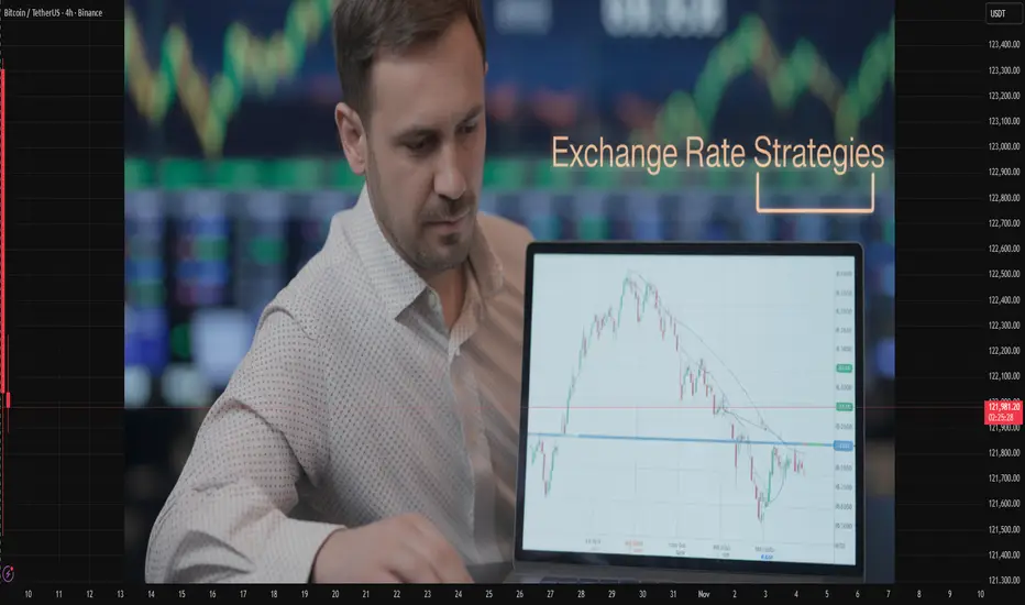
Exchange Rate StrategiesIntroduction
Exchange rates play a central role in international economics, influencing trade balances, capital flows, inflation, and monetary policy. The exchange rate refers to the price of one currency in terms of another — a measure of how much one nation’s money is worth compared to another’s. It affects every aspect of an open economy: from exporters and importers to investors, policymakers, and consumers. Therefore, the management of exchange rates — known as exchange rate strategies — is one of the most crucial components of economic policy.
Countries adopt various exchange rate strategies depending on their economic goals, structural conditions, and level of integration with the global economy. Some nations prefer fixed exchange rates to maintain stability, while others choose floating systems to allow market forces to determine currency values. Between these two extremes lie hybrid or managed systems designed to balance stability and flexibility.
This essay explores the different exchange rate strategies, their mechanisms, advantages and disadvantages, the rationale behind policy choices, and their implications for economic performance and global financial stability. It also examines the evolution of exchange rate regimes in both developed and developing economies, including contemporary challenges like currency wars, speculative attacks, and digital currency impacts.
1. Understanding Exchange Rates
1.1 Definition and Importance
An exchange rate determines how much one currency can be exchanged for another. For example, if 1 U.S. dollar equals 83 Indian rupees, the exchange rate is 1 USD = ₹83. Exchange rates affect:
Trade Competitiveness: A stronger domestic currency makes exports more expensive and imports cheaper.
Inflation: A depreciating currency raises import prices, leading to inflationary pressures.
Investment Decisions: Investors seek markets with stable currencies and predictable returns.
Monetary Policy Transmission: Exchange rates influence interest rates, money supply, and economic growth.
1.2 Determinants of Exchange Rates
Key factors influencing exchange rate movements include:
Interest Rate Differentials – Higher interest rates attract foreign capital, leading to currency appreciation.
Inflation Rates – Countries with lower inflation typically experience currency appreciation.
Current Account Balances – Persistent deficits weaken a currency, while surpluses strengthen it.
Political Stability and Economic Performance – Confidence in governance and growth prospects attracts investment.
Speculation – Traders’ expectations can drive short-term currency fluctuations.
2. Types of Exchange Rate Strategies
Exchange rate strategies can be broadly divided into three categories: fixed, floating, and hybrid (intermediate) regimes.
2.1 Fixed Exchange Rate Strategy
Mechanism
Under a fixed exchange rate system, a country’s currency value is tied (“pegged”) to another major currency such as the U.S. dollar or a basket of currencies. The central bank intervenes in the foreign exchange market to maintain the target rate.
Examples
The Hong Kong dollar is pegged to the U.S. dollar at around HK$7.8 = US$1.
The Gulf Cooperation Council (GCC) countries peg their currencies to the dollar to stabilize oil revenues.
Advantages
Stability and Predictability: Businesses can plan international transactions without fear of volatile currency swings.
Inflation Control: Pegging to a stable currency can help import monetary discipline.
Investor Confidence: Predictable exchange rates attract foreign investors.
Disadvantages
Loss of Monetary Independence: Domestic monetary policy is constrained to maintain the peg.
Speculative Attacks: Fixed regimes are vulnerable if markets perceive the peg as unsustainable.
External Shocks: The economy becomes sensitive to fluctuations in the anchor currency.
Case Study: The Bretton Woods System
After World War II, the Bretton Woods Agreement (1944) established a system of fixed exchange rates where the U.S. dollar was pegged to gold, and other currencies were pegged to the dollar. It created post-war economic stability but collapsed in 1971 when the U.S. suspended the dollar’s convertibility into gold due to inflationary pressures and trade imbalances.
2.2 Floating Exchange Rate Strategy
Mechanism
In a floating exchange rate system, currency values are determined by market forces — the supply and demand for currencies in foreign exchange markets. Central banks do not fix or peg the rate, though they may occasionally intervene to curb volatility.
Examples
The U.S. dollar, euro, Japanese yen, and British pound are under floating regimes.
Advantages
Monetary Policy Independence: Central banks can adjust interest rates freely to target inflation or growth.
Automatic Adjustment: Trade imbalances adjust naturally through currency movements.
Resilience to External Shocks: The exchange rate acts as a buffer against global volatility.
Disadvantages
Volatility: Exchange rates may fluctuate widely, affecting trade and investment.
Uncertainty: Businesses face exchange risk, increasing hedging costs.
Speculative Flows: Short-term capital movements can destabilize markets.
Case Study: The U.S. Dollar System
Since the 1970s, the U.S. has maintained a floating exchange rate. This system allows the Federal Reserve to pursue independent monetary policies but sometimes results in large currency fluctuations affecting trade competitiveness.
2.3 Managed Floating (Hybrid) Strategy
Mechanism
A managed float or dirty float combines market determination with occasional government intervention. Central banks may buy or sell currencies to smooth excessive volatility or maintain competitiveness without a strict target.
Examples
India, China, and Singapore follow managed floating regimes.
The People’s Bank of China allows the yuan to move within a set band around a reference rate.
Advantages
Flexibility with Stability: Allows adjustment to shocks while avoiding extreme volatility.
Competitiveness: Authorities can influence the exchange rate to support exports.
Policy Balance: Combines elements of autonomy and stability.
Disadvantages
Lack of Transparency: Market participants may find policy motives unclear.
Limited Discipline: Interventions can delay necessary adjustments.
Potential for Manipulation: Other countries may accuse managed regimes of currency manipulation.
3. Factors Influencing Exchange Rate Strategy Choice
Countries choose their exchange rate strategies based on multiple economic and political factors.
Economic Structure:
Open economies dependent on exports (e.g., Singapore) may prefer stable or managed rates.
Large economies (e.g., the U.S., Japan) favor floating rates.
Inflation History:
Nations with a history of high inflation may peg to a stable currency to build credibility.
Financial Market Development:
Advanced markets can handle floating rates, while emerging markets may need managed systems.
Capital Mobility:
With free capital flows, maintaining a fixed rate becomes challenging (as per the “impossible trinity” principle).
Political Considerations:
Governments may prefer stable exchange rates for political stability and investor confidence.
4. The Impossible Trinity (Trilemma)
A central theory in exchange rate economics is the impossible trinity, or Mundell-Fleming trilemma, which states that a country cannot simultaneously achieve:
A fixed exchange rate,
Free capital mobility, and
Independent monetary policy.
A nation can only choose two out of three. For instance:
A fixed rate + free capital flow requires surrendering monetary policy (e.g., Hong Kong).
A floating rate + free capital flow allows monetary independence (e.g., the U.S.).
A fixed rate + monetary independence requires capital controls (e.g., China).
This trade-off explains why exchange rate strategies differ globally.
5. Exchange Rate Policy Tools
Central banks employ several instruments to implement their chosen strategies:
Foreign Exchange Intervention:
Buying or selling foreign currencies to influence the rate.
Interest Rate Policy:
Adjusting domestic interest rates to attract or repel capital flows.
Capital Controls:
Restricting cross-border capital movements to maintain stability.
Foreign Reserve Management:
Accumulating reserves to defend against volatility or speculative attacks.
Communication and Forward Guidance:
Managing market expectations through official statements.
6. Exchange Rate Strategies in Practice
6.1 Developed Economies
The U.S., UK, Eurozone, and Japan largely follow floating regimes.
The European Central Bank (ECB) manages a shared currency (the euro), emphasizing stability within the Eurozone.
Japan’s frequent interventions (e.g., yen weakening) show that even floating systems are occasionally managed.
6.2 Emerging Economies
China employs a managed float tied loosely to a basket of currencies.
India follows a flexible inflation-targeting framework with periodic interventions to avoid sharp rupee movements.
Brazil, South Africa, and Indonesia adopt hybrid systems balancing stability and autonomy.
6.3 Dollarization and Currency Boards
Some nations abandon independent currency management altogether:
Ecuador, El Salvador, and Panama use the U.S. dollar.
Hong Kong operates a currency board, fully backing its money supply with foreign reserves.
These strategies provide credibility and stability but at the cost of policy flexibility.
7. Challenges in Managing Exchange Rate Strategies
Global Capital Flows: Sudden inflows or outflows can disrupt stability.
Speculative Attacks: Overvalued pegs attract speculative pressure (e.g., 1997 Asian Financial Crisis).
Currency Wars: Competitive devaluations can trigger trade tensions.
External Shocks: Commodity price swings and geopolitical crises impact currency performance.
Digital Currencies and Crypto-assets: The rise of cryptocurrencies challenges traditional exchange rate control mechanisms.
8. Case Studies of Exchange Rate Strategy Outcomes
8.1 The Asian Financial Crisis (1997)
Many East Asian economies maintained fixed or semi-fixed exchange rates pegged to the U.S. dollar. When investors lost confidence due to large current account deficits and excessive short-term debt, massive capital flight occurred. Countries like Thailand, Indonesia, and South Korea were forced to devalue their currencies, leading to deep recessions. The crisis highlighted the risks of rigid exchange rate commitments amid open capital markets.
8.2 China’s Managed Exchange Rate System
China’s exchange rate policy has evolved from a strict peg to a managed float. By maintaining a relatively undervalued yuan for years, China boosted exports and industrial growth. However, global criticism of “currency manipulation” led to gradual liberalization. Today, the yuan’s value is guided by a reference rate within a limited daily band, reflecting both market forces and state control.
8.3 The Eurozone Experience
The Eurozone represents a unique fixed exchange rate system — a monetary union. Member states share a common currency and monetary policy but retain independent fiscal policies. This setup offers stability but can cause imbalances, as seen in the European debt crisis (2010–2012), where weaker economies like Greece couldn’t devalue their currencies to restore competitiveness.
9. Modern Developments in Exchange Rate Management
9.1 Floating with Inflation Targeting
Many central banks now combine floating exchange rates with inflation targeting. For instance, the Reserve Bank of India (RBI) targets inflation around 4%, using exchange rate flexibility as a stabilizer.
9.2 Role of Derivatives and Hedging
The growth of financial markets has introduced instruments like futures, forwards, and swaps to manage currency risk. Corporates and investors use these tools to hedge against volatility, complementing official exchange rate policies.
9.3 Central Bank Digital Currencies (CBDCs)
The introduction of digital currencies may reshape exchange rate dynamics by altering cross-border payments, capital mobility, and monetary control mechanisms. Central banks worldwide, including the RBI and PBOC, are exploring digital currency frameworks.
10. Conclusion
Exchange rate strategies lie at the heart of global financial stability and economic performance. The choice of an exchange rate regime reflects a delicate balance between stability, flexibility, and sovereignty. While fixed systems offer predictability and control, they expose economies to speculative pressures and loss of autonomy. Floating regimes allow market efficiency and independent policy-making but come with volatility and uncertainty. Managed floats, the most common modern arrangement, attempt to blend the best of both worlds.
In the era of globalization, where capital flows and digital finance transcend borders, no exchange rate strategy remains permanently optimal. Countries must adapt dynamically, ensuring that their policies support long-term growth, competitiveness, and resilience against global shocks. The evolution of exchange rate strategies — from Bretton Woods to blockchain — illustrates the ongoing quest for balance between economic discipline and financial freedom in an interconnected world.
Chart Patterns
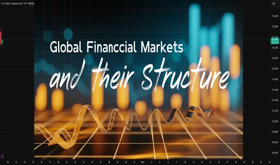
The Global Financial Market and Its StructureIntroduction
The global financial market represents one of the most complex, dynamic, and interconnected systems in the modern world economy. It serves as the backbone of global capitalism, facilitating the exchange of capital, credit, currencies, and financial instruments across nations. By connecting investors, corporations, governments, and institutions, it enables efficient allocation of resources, supports international trade, and drives economic growth. However, its structure is multifaceted—comprising various sub-markets, institutions, and regulatory frameworks that differ across regions and economic systems.
In this essay, we will explore the concept, structure, components, and functioning of the global financial market. We will also examine the key participants, instruments, and the role of technology and regulation in shaping modern finance. Lastly, we will analyze the risks and challenges that affect the stability of this vast network.
1. Understanding the Global Financial Market
The global financial market can be defined as a network of markets and institutions that facilitate the exchange of financial assets and instruments between nations. It includes all systems through which capital flows internationally, such as the stock market, bond market, foreign exchange market, derivatives market, and money market.
At its core, the global financial market performs four fundamental functions:
Mobilization of savings: It channels household, corporate, and government savings into productive investments.
Price discovery: It determines prices for financial assets through the forces of demand and supply.
Liquidity provision: It allows investors to buy and sell assets easily.
Risk management: It enables participants to hedge against uncertainties through instruments like derivatives and insurance.
The market operates 24 hours a day, across multiple time zones—from Tokyo and Hong Kong to London, New York, and beyond—creating a seamless global financial ecosystem.
2. Structure of the Global Financial Market
The structure of the global financial market is typically divided into several major segments based on the type of instruments traded and the maturity of assets. These include:
a. The Money Market
The money market deals with short-term funds and instruments that have maturities of less than one year. It provides liquidity to the financial system and supports short-term financing needs of corporations and governments.
Major instruments include:
Treasury Bills (T-Bills)
Certificates of Deposit (CDs)
Commercial Papers (CPs)
Repurchase Agreements (Repos)
Interbank loans
Participants: Central banks, commercial banks, corporations, and institutional investors.
Function: To manage liquidity, meet working capital requirements, and maintain monetary stability.
b. The Capital Market
The capital market deals with long-term funds and securities, primarily equities (stocks) and debt instruments (bonds). It is a critical source of financing for businesses and governments to fund long-term projects.
Subdivisions:
Primary Market: Where new securities are issued (e.g., IPOs).
Secondary Market: Where existing securities are traded among investors (e.g., stock exchanges).
Major Institutions: Stock exchanges (NYSE, NASDAQ, London Stock Exchange, BSE, NSE), investment banks, mutual funds, and insurance companies.
Function: Capital markets promote investment and economic growth by facilitating access to long-term capital.
c. The Foreign Exchange (Forex) Market
The foreign exchange market is the world’s largest and most liquid financial market. It enables the conversion of one currency into another and supports international trade and investment.
Key Features:
Decentralized and operates over-the-counter (OTC).
Daily turnover exceeds $7 trillion (according to the BIS 2022 report).
Major currencies: USD, EUR, JPY, GBP, CHF, CNY.
Participants: Central banks, commercial banks, corporations, hedge funds, and retail traders.
Functions:
Facilitates cross-border transactions.
Determines exchange rates.
Provides hedging against currency risks.
d. The Derivatives Market
The derivatives market involves financial instruments whose value is derived from underlying assets like stocks, bonds, commodities, or currencies.
Types of Derivatives:
Futures
Options
Swaps
Forwards
Purpose: To hedge risk, speculate on price movements, and enhance market efficiency.
Example: Commodity futures on crude oil or agricultural products; interest rate swaps between banks.
Institutions: Chicago Mercantile Exchange (CME), Intercontinental Exchange (ICE), National Stock Exchange (NSE), etc.
e. The Commodity Market
The commodity market deals with the trading of physical goods such as metals, energy, and agricultural products.
Categories:
Hard commodities: Gold, silver, crude oil, natural gas.
Soft commodities: Wheat, coffee, cotton, sugar.
Purpose: To allow producers and consumers to hedge price risks and to discover global prices for commodities.
Examples: London Metal Exchange (LME), Chicago Board of Trade (CBOT).
f. The Insurance and Pension Market
This segment focuses on risk transfer and long-term savings. Insurance markets protect against losses, while pension markets accumulate retirement savings.
Institutions: Life insurance companies, reinsurance firms, pension funds, annuity providers.
Function: Provide stability and long-term investment capital for other financial markets.
3. Key Participants in the Global Financial Market
The global financial market involves a wide range of participants, each playing a specific role in its functioning.
a. Central Banks
Central banks like the Federal Reserve (U.S.), European Central Bank (ECB), Bank of Japan (BoJ), and Reserve Bank of India (RBI) are the most influential participants. They regulate money supply, control interest rates, and maintain financial stability.
b. Commercial Banks
They act as intermediaries between savers and borrowers. They provide liquidity, credit, and payment systems for international trade.
c. Investment Banks
Institutions such as Goldman Sachs, Morgan Stanley, and JPMorgan Chase specialize in underwriting securities, mergers & acquisitions, and market-making.
d. Institutional Investors
These include pension funds, mutual funds, insurance companies, and sovereign wealth funds. They manage vast pools of capital and influence market trends.
e. Corporations
Multinational corporations raise capital, manage currency exposure, and invest excess funds through global markets.
f. Governments
Governments issue bonds and treasury bills to finance fiscal deficits and influence economic policy.
g. Retail Investors
Individual investors participate through stock markets, mutual funds, ETFs, and online trading platforms, increasingly shaping market sentiment.
4. Financial Instruments in Global Markets
Global financial markets deal with a wide range of instruments designed for investment, risk management, and liquidity.
Major categories:
Equities: Represent ownership in a company. Provide dividends and capital appreciation.
Bonds: Fixed-income securities representing debt obligations.
Currencies: Used in forex trading and international payments.
Derivatives: Used for hedging and speculation.
Commodities: Physical goods traded for investment or consumption.
ETFs and Mutual Funds: Pooling instruments offering diversified exposure.
These instruments vary in terms of risk, return, liquidity, and regulatory oversight.
5. Global Financial Institutions
A number of global institutions play crucial roles in maintaining financial stability and promoting economic cooperation.
a. International Monetary Fund (IMF)
Provides financial assistance to countries facing balance of payments crises.
Monitors global economic developments.
Promotes exchange rate stability.
b. World Bank
Offers long-term loans and grants for development projects.
Focuses on poverty reduction and infrastructure development.
c. Bank for International Settlements (BIS)
Acts as a bank for central banks.
Promotes global financial stability and cooperation.
d. Financial Stability Board (FSB)
Coordinates global financial regulation.
Develops policies to prevent systemic crises.
e. World Trade Organization (WTO)
Regulates international trade policies that indirectly influence financial markets.
6. Interconnectedness and Globalization of Financial Markets
The globalization of finance has made the world’s markets more interconnected than ever before. Technological advancements, liberalization policies, and cross-border capital mobility have transformed local markets into a unified global system.
Key Drivers of Globalization:
Deregulation: Liberalization of capital accounts in the 1980s–90s.
Technological progress: Online trading, blockchain, and fintech.
Cross-border investments: Growth of foreign direct investment (FDI) and portfolio flows.
Integration of stock exchanges: Cross-listings and global indices (like MSCI, FTSE).
However, this interdependence also means that financial shocks in one region—such as the 2008 U.S. housing crisis or 2020 COVID-19 pandemic—can rapidly transmit worldwide, affecting currencies, trade, and growth.
7. Regulation of Global Financial Markets
Regulation is essential to ensure market integrity, protect investors, and prevent systemic crises. Each country has its own regulatory framework, but international coordination is vital due to globalization.
Major Regulatory Bodies:
U.S.: Securities and Exchange Commission (SEC), Federal Reserve, CFTC.
U.K.: Financial Conduct Authority (FCA).
India: SEBI, RBI.
EU: European Securities and Markets Authority (ESMA).
Global Coordination: IMF, BIS, FSB, and Basel Committee on Banking Supervision (BCBS).
Key Objectives of Regulation:
Prevent fraud and manipulation.
Ensure transparency and disclosure.
Maintain systemic stability.
Promote investor protection.
Encourage fair competition.
8. Role of Technology in Financial Markets
The rise of technology has revolutionized global financial markets, giving rise to FinTech, algorithmic trading, and digital assets.
Key Developments:
Electronic Trading Platforms: Faster, more efficient transactions.
Blockchain and Cryptocurrencies: Decentralized financial systems.
Artificial Intelligence (AI): Automated portfolio management and risk analysis.
Big Data Analytics: Enhanced market forecasting.
Mobile Banking and Digital Payments: Greater inclusion and convenience.
Technology has made markets more accessible but also more volatile due to algorithmic speed and speculative behavior.
9. Risks and Challenges in Global Financial Markets
Despite their importance, global financial markets face significant risks and vulnerabilities:
a. Systemic Risk
Failure of major institutions (e.g., Lehman Brothers, 2008) can trigger widespread panic.
b. Market Volatility
Sudden fluctuations in prices due to speculation, interest rate changes, or geopolitical tensions.
c. Currency Risk
Exchange rate movements impact international investments and trade balances.
d. Liquidity Risk
Difficulty in buying/selling assets without affecting prices.
e. Cybersecurity Threats
Digitalization increases vulnerability to hacking and fraud.
f. Regulatory Arbitrage
Firms exploiting loopholes across jurisdictions.
g. Global Economic Imbalances
Unequal capital flows between developed and developing countries.
h. Climate and ESG Risks
Financial exposure to environmental and sustainability issues.
10. Future Trends in Global Financial Markets
The global financial landscape is evolving rapidly with several emerging trends:
Digital Currencies and Central Bank Digital Currencies (CBDCs): Central banks exploring digital versions of fiat currencies.
Sustainable Finance: Growing focus on ESG (Environmental, Social, and Governance) investing.
Decentralized Finance (DeFi): Blockchain-based platforms offering peer-to-peer financial services.
Artificial Intelligence in Trading: Enhancing efficiency and predictive analysis.
Cross-border Integration: Merging of global exchanges and standardized regulations.
Rise of Emerging Markets: Greater participation from Asia, Africa, and Latin America.
Geopolitical Risks: Trade wars, sanctions, and political instability influencing capital flows.
The future of global finance will depend on balancing innovation with stability and inclusivity.
Conclusion
The global financial market is an intricate web of institutions, instruments, and participants that collectively shape the world economy. Its structure—spanning money, capital, forex, derivatives, and commodity markets—supports the efficient movement of capital, fosters growth, and enables international cooperation. However, with increased integration comes vulnerability. Economic crises, technological disruptions, and regulatory challenges constantly test the system’s resilience.
As the world moves toward a more digital, sustainable, and interconnected future, the need for transparent governance, robust regulation, and equitable participation becomes critical. The global financial market will continue to evolve, reflecting the dynamic balance between risk and opportunity that defines modern finance.
The U.S.–China Trade WarIntroduction
The U.S.–China trade war, one of the most significant economic confrontations in modern history, represents far more than a dispute over tariffs and trade imbalances. It is a geopolitical and economic conflict between the two largest economies in the world—one an established superpower, the United States, and the other, China, an emerging global powerhouse. At its core, the trade war reflects deeper struggles over technology, global influence, intellectual property rights, and the future architecture of the global economy.
Beginning officially in 2018 under the administration of U.S. President Donald Trump, the trade war disrupted global supply chains, affected billions of consumers, and redefined international trade relations. The tariffs imposed by both sides reshaped business decisions, investment patterns, and economic strategies across the globe. Although several rounds of negotiations and partial deals have attempted to ease tensions, the rivalry persists, influencing trade policy, economic planning, and diplomacy even into the mid-2020s.
This essay explores the origins, dynamics, and far-reaching consequences of the U.S.–China trade war. It examines the historical background, economic and political motivations, key developments, global reactions, and long-term implications for international trade and economic order.
1. Background: U.S.–China Economic Relations Before the Trade War
1.1 The Rise of China as a Global Economic Power
Over the past four decades, China’s economic transformation has been nothing short of remarkable. Following economic reforms initiated by Deng Xiaoping in 1978, China transitioned from a centrally planned system to a market-oriented economy. The nation’s entry into the World Trade Organization (WTO) in 2001 marked a turning point, integrating China into the global trading system and allowing it to become the “world’s factory.”
China’s GDP grew at an average of 9–10% annually for decades, lifting hundreds of millions out of poverty. Its exports—ranging from low-cost manufactured goods to high-tech products—flooded global markets. By 2010, China surpassed Japan to become the world’s second-largest economy.
1.2 The U.S.–China Trade Relationship
For decades, the U.S. and China maintained a mutually beneficial, though increasingly unbalanced, trade relationship. The United States became China’s largest export market, while American companies gained access to cheap Chinese manufacturing and labor. However, this relationship created large trade imbalances. By 2017, the U.S. trade deficit with China exceeded $375 billion, the largest bilateral trade deficit in the world.
While American consumers benefited from lower prices, U.S. policymakers and industries grew concerned about lost manufacturing jobs, intellectual property theft, and China’s alleged unfair trade practices. These issues planted the seeds of economic confrontation that would later erupt into a full-scale trade war.
2. Causes of the U.S.–China Trade War
2.1 The Trade Imbalance
A central grievance of the U.S. was the massive trade deficit with China. The Trump administration viewed this imbalance as evidence that trade relations were unfair and that China was manipulating the system to its advantage. While economists argue that trade deficits are not inherently harmful, politically, the deficit symbolized lost jobs and weakened American industries.
2.2 Intellectual Property and Technology Theft
Another major factor was the alleged theft of intellectual property (IP). The U.S. accused China of forcing American companies operating in China to transfer technology as a condition of market access. Reports suggested that Chinese firms benefited from stolen U.S. trade secrets, patents, and software, particularly in advanced sectors like aerospace, semiconductors, and biotechnology.
2.3 “Made in China 2025” Strategy
China’s “Made in China 2025” initiative, launched in 2015, aimed to transform the country into a global leader in advanced manufacturing and high-tech industries such as robotics, AI, and renewable energy. The U.S. perceived this policy as a direct challenge to American technological dominance and economic leadership. Washington feared that China’s state-led industrial policies would tilt global competition unfairly.
2.4 Currency Manipulation Accusations
The U.S. also accused China of artificially devaluing the yuan to make Chinese exports cheaper and imports more expensive, thereby maintaining its export competitiveness. Although this accusation has been debated, it contributed to the perception that China was manipulating market dynamics to gain an advantage.
2.5 Political and Strategic Rivalry
Beyond economics, the trade war was deeply rooted in strategic competition. The U.S. viewed China’s growing influence in Asia, its Belt and Road Initiative, and its military modernization as a challenge to American global dominance. Thus, the trade conflict became a proxy for broader geopolitical rivalry.
3. Timeline of Key Events
3.1 2018: The War Begins
March 2018: The U.S. imposed tariffs on steel (25%) and aluminum (10%) imports, targeting China among other nations.
April 2018: China retaliated with tariffs on $3 billion worth of U.S. goods, including agricultural products.
July 2018: The U.S. imposed 25% tariffs on $34 billion worth of Chinese goods. China responded in kind.
September 2018: The U.S. levied tariffs on $200 billion worth of Chinese imports, prompting further Chinese retaliation.
3.2 2019: Escalation and Negotiations
May 2019: Trade talks broke down, and the U.S. increased tariffs on $200 billion of Chinese goods from 10% to 25%.
August 2019: The U.S. labeled China a “currency manipulator.”
December 2019: Both nations agreed on a “Phase One” trade deal, easing tensions.
3.3 2020: The Phase One Deal
The Phase One Agreement, signed in January 2020, required China to purchase an additional $200 billion in U.S. goods over two years and improve intellectual property protections. However, the COVID-19 pandemic disrupted trade flows, and China failed to meet its purchase commitments.
3.4 2021–2024: Lingering Tensions
Even after President Joe Biden took office, most tariffs remained in place. The administration maintained a tough stance on China, focusing on strategic decoupling, technology restrictions, and alliances with other democratic nations to counter China’s rise. The U.S. CHIPS and Science Act (2022) and export controls on semiconductors further intensified competition.
4. Economic Impact of the Trade War
4.1 Impact on the U.S. Economy
The trade war had mixed effects on the American economy.
Manufacturing and Agriculture: U.S. manufacturers faced higher input costs due to tariffs on Chinese components, while farmers suffered from China’s retaliatory tariffs on soybeans, pork, and corn. The U.S. government provided billions in subsidies to affected farmers.
Consumers: American consumers paid higher prices for goods such as electronics, clothing, and furniture. Studies by the Federal Reserve and academic institutions found that most tariff costs were passed on to U.S. consumers.
Employment: While some domestic industries benefited from tariff protections, others faced uncertainty, layoffs, and reduced investment.
4.2 Impact on the Chinese Economy
China also faced significant challenges:
Export Decline: Chinese exports to the U.S. fell, forcing many manufacturers to seek alternative markets.
Economic Slowdown: China’s GDP growth slowed from over 6% in 2018 to around 5% in 2020.
Currency Fluctuations: The yuan depreciated during the height of the trade war, cushioning export losses but signaling instability.
Policy Response: China implemented fiscal stimulus measures and accelerated domestic innovation to reduce reliance on U.S. technologies.
4.3 Global Impact
The trade war had global ripple effects:
Supply Chains: Many multinational companies diversified production away from China to countries like Vietnam, India, and Mexico.
Commodity Markets: Global demand fluctuations affected prices for oil, metals, and agricultural goods.
Stock Markets: Trade tensions fueled market volatility and investor uncertainty.
Global Growth: The International Monetary Fund (IMF) estimated that the trade war shaved 0.8% off global GDP by 2020.
5. Technological Competition and Decoupling
5.1 The Technology Frontline
Technology became the heart of the trade war. The U.S. targeted Chinese tech giants like Huawei and ZTE, citing national security concerns. Restrictions were imposed on the export of American semiconductors, software, and equipment to Chinese firms. The U.S. also pressured allies to exclude Huawei from 5G networks.
5.2 Semiconductor and AI Race
Semiconductors emerged as the most critical battleground. The U.S. sought to limit China’s access to advanced chips used in artificial intelligence and defense systems. In response, China invested heavily in building its domestic semiconductor capabilities, aiming for technological self-sufficiency.
5.3 Digital Decoupling
The concept of “decoupling”—separating U.S. and Chinese technological ecosystems—gained traction. This shift included restrictions on data sharing, investment screening, and the creation of alternative technology supply chains. While full decoupling remains unlikely, the trend has reshaped the global tech landscape.
6. Political and Strategic Dimensions
6.1 Nationalism and Domestic Politics
In both countries, nationalism played a major role. In the U.S., the trade war was framed as a battle to protect American jobs and sovereignty. In China, the government used the conflict to rally domestic support and promote economic self-reliance under slogans like “dual circulation” and “national rejuvenation.”
6.2 Global Alliances and Power Shifts
The trade war pushed countries to reassess alliances and trade policies. The European Union, Japan, India, and ASEAN nations found themselves balancing relations between the U.S. and China. Many nations benefited from supply chain diversification, attracting new investments as companies sought alternatives to China.
6.3 The New Cold War Narrative
Many analysts have described the trade war as part of a broader “New Cold War”—an ideological, technological, and strategic struggle between democratic capitalism and authoritarian state capitalism. Unlike the U.S.–Soviet Cold War, however, the U.S. and China remain economically intertwined, creating a complex interdependence.
7. Lessons Learned and the Future of Global Trade
7.1 The Limits of Tariffs
The trade war demonstrated that tariffs alone cannot resolve complex structural issues. While they exerted pressure, they also harmed domestic stakeholders and disrupted global commerce. Both economies remained resilient but not without cost.
7.2 The Shift Toward Protectionism
The conflict accelerated a broader global shift toward economic nationalism and protectionism. Countries began to prioritize domestic production, strategic autonomy, and resilience over globalization. The COVID-19 pandemic further reinforced this trend.
7.3 The Redefinition of Global Supply Chains
Multinational corporations began adopting a “China + 1” strategy—maintaining operations in China while expanding production elsewhere. This diversification has benefited emerging economies like Vietnam, India, and Indonesia.
7.4 The Rise of Technological Sovereignty
Both nations are pursuing technological sovereignty—control over critical technologies like semiconductors, 5G, and AI. This race will define future power dynamics more than traditional trade measures.
8. The Way Forward
8.1 Diplomatic Engagement and Cooperation
Despite tensions, cooperation remains essential on global issues like climate change, cybersecurity, and pandemic response. Constructive dialogue and adherence to multilateral institutions such as the WTO can prevent further escalation.
8.2 Economic Rebalancing
Both nations must address the structural causes of imbalance. The U.S. should invest in innovation, education, and industrial competitiveness, while China should open markets, reform state enterprises, and enhance transparency.
8.3 The Role of Multilateralism
Global trade institutions need reform to reflect modern economic realities. A rules-based system that ensures fair competition and technological collaboration is crucial for global stability.
Conclusion
The U.S.–China trade war is more than a dispute over tariffs or trade deficits—it is a defining conflict of the 21st century that encapsulates the struggle for global leadership in economics, technology, and ideology. While both nations suffered short-term losses, the deeper consequence has been a reconfiguration of the global economic order.
The trade war accelerated shifts toward protectionism, technological nationalism, and supply chain diversification. It exposed vulnerabilities in global interdependence and highlighted the need for a balanced approach between competition and cooperation. As both the U.S. and China continue to shape the post-globalization era, the rest of the world watches closely, adapting to the new reality of multipolar economic power.
Ultimately, the future of global prosperity depends not on economic warfare but on how effectively the two giants can coexist—balancing competition with collaboration, and rivalry with responsibility. Only through a stable and fair trade environment can sustainable global growth be achieved in the decades ahead.

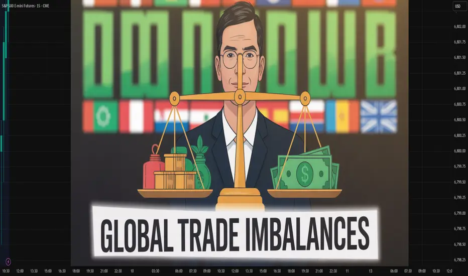
Imbalance in Global TradeIntroduction
Global trade forms the backbone of the modern international economy. It connects nations, drives industrial growth, and allows countries to access goods and services that they cannot efficiently produce domestically. Yet, the global trading system is rarely balanced. Trade imbalances—situations where a country’s exports and imports are unequal—have persisted for decades, shaping global economic relations, currency movements, and geopolitical power dynamics.
The term global trade imbalance refers to persistent surpluses in some countries and chronic deficits in others. While in theory, these imbalances should correct themselves through market forces like currency adjustments, in practice, they often persist for years or even decades. This imbalance affects growth, employment, debt sustainability, and even political stability worldwide.
This essay provides a comprehensive examination of the causes, impacts, and potential remedies of global trade imbalances, exploring both macroeconomic and structural dimensions.
1. Understanding Global Trade Imbalance
1.1 Definition
A trade imbalance occurs when the value of a country’s imports does not equal the value of its exports.
Trade surplus: When a country exports more than it imports.
Trade deficit: When a country imports more than it exports.
On a global scale, total exports should equal total imports. However, measurement discrepancies, financial flows, and uneven development levels cause persistent imbalances across nations.
1.2 Measurement of Imbalances
Trade imbalances are primarily measured using:
Balance of Payments (BoP): Captures the difference between exports and imports of goods and services.
Current Account Balance: Includes trade in goods and services, income flows, and transfer payments.
Persistent current account surpluses or deficits reflect underlying structural issues in savings, investments, productivity, and competitiveness.
2. Historical Context of Global Trade Imbalance
2.1 Post-World War II Period
After World War II, the Bretton Woods system established a dollar-based trade framework. The United States, with its vast industrial capacity, ran consistent trade surpluses, supplying goods to war-torn Europe and Asia. However, as Europe and Japan rebuilt their economies, U.S. surpluses diminished, giving way to growing deficits in the 1970s and beyond.
2.2 Rise of Export-Led Economies
The late 20th century witnessed the emergence of export-oriented economies, particularly in East Asia. Japan, South Korea, Taiwan, and later China, adopted strategies emphasizing industrialization through exports. These nations accumulated large trade surpluses, while countries like the United States, with high consumption and low savings, developed persistent deficits.
2.3 The China-U.S. Dynamic
The China–U.S. trade relationship epitomizes the global imbalance. China’s manufacturing dominance and low labor costs have led to enormous trade surpluses with the U.S., while the American economy, driven by consumer spending, has run chronic deficits. This imbalance is both economic and political, influencing currency policies, tariffs, and global investment patterns.
3. Causes of Global Trade Imbalances
Global trade imbalances arise from multiple, interconnected causes—macroeconomic, structural, and institutional.
3.1 Differences in Savings and Investment Rates
According to macroeconomic theory, a country’s current account balance equals its national savings minus investment:
𝐶
𝑢
𝑟
𝑟
𝑒
𝑛
𝑡
𝐴
𝑐
𝑐
𝑜
𝑢
𝑛
𝑡
=
𝑆
𝑎
𝑣
𝑖
𝑛
𝑔
𝑠
−
𝐼
𝑛
𝑣
𝑒
𝑠
𝑡
𝑚
𝑒
𝑛
𝑡
Current Account=Savings−Investment
Countries like China, Germany, and Japan have high savings and relatively low domestic consumption, leading to surpluses.
Conversely, countries like the United States, India, and the UK have lower savings and higher consumption or investment levels, resulting in deficits.
3.2 Exchange Rate Policies
Exchange rates play a critical role in determining trade competitiveness.
Undervalued currencies (as historically maintained by China) make exports cheaper and imports expensive, sustaining trade surpluses.
Overvalued currencies hurt export competitiveness, leading to deficits.
Currency manipulation or managed exchange rates can thus perpetuate global imbalances.
3.3 Structural Economic Differences
Industrial Base: Surplus nations often have strong manufacturing sectors, producing high-value exports.
Consumption Patterns: Deficit countries typically have high domestic demand for foreign goods.
Technological Capability: Advanced technology allows surplus countries to dominate key export industries.
3.4 Trade and Tariff Policies
Protectionist or liberal trade policies influence the direction of global trade.
Export subsidies and tariff barriers distort trade balances.
Free trade agreements (FTAs) can also shift imbalances by favoring competitive economies.
3.5 Role of Multinational Corporations (MNCs)
Global value chains managed by MNCs contribute significantly to trade imbalances. For instance:
U.S. companies producing goods in China for export back to the U.S. inflate China’s trade surplus.
Profit repatriation and transfer pricing further distort trade statistics.
3.6 Technological Advancements and Automation
Automation and digitalization have enabled advanced economies to maintain productivity with fewer domestic jobs, encouraging outsourcing to low-cost nations. This shift reinforces trade imbalances between developed and developing economies.
3.7 Fiscal and Monetary Policies
Expansionary fiscal policies (e.g., government deficits) increase imports by boosting domestic demand. Loose monetary policies can also depreciate the currency and affect trade flows.
4. Major Examples of Trade Imbalances
4.1 United States
The U.S. has run persistent trade deficits since the 1970s, largely due to:
High consumer spending,
Dependence on imports for manufactured goods,
Strong U.S. dollar attracting capital inflows.
4.2 China
China has maintained large trade surpluses through export-led growth, cheap labor, and government support for manufacturing. However, recent shifts toward domestic consumption aim to reduce dependence on external demand.
4.3 European Union and Germany
Germany’s trade surplus within the EU has created intra-European imbalances. Southern European economies (e.g., Greece, Spain, Italy) face deficits due to weaker competitiveness and higher borrowing.
4.4 Oil-Exporting Countries
Nations like Saudi Arabia and the UAE run large surpluses because of high energy exports, while oil-importing nations accumulate deficits.
5. Economic and Social Impacts of Global Trade Imbalances
5.1 Impact on Employment and Wages
Surplus countries gain jobs in export industries, improving employment and wages.
Deficit countries lose manufacturing jobs, leading to deindustrialization and income inequality.
5.2 Financial Market Effects
Trade surpluses lead to accumulation of foreign exchange reserves and capital outflows (investments in deficit countries). For instance, China and Japan invest heavily in U.S. Treasury bonds.
5.3 Exchange Rate Volatility
Persistent imbalances can lead to speculative attacks and currency crises, as seen during the Asian Financial Crisis (1997–98).
5.4 Global Inequality
Trade imbalances contribute to inequality—both between and within nations. Workers in deficit countries face job losses, while surplus economies accumulate wealth.
5.5 Political and Geopolitical Consequences
Trade imbalances often translate into trade wars and protectionist measures. The U.S.–China trade tensions, Brexit debates, and WTO disputes all have roots in perceived unfair trade advantages.
5.6 Environmental Impact
Export-driven industrialization increases carbon emissions and resource depletion in surplus countries, while deficit nations outsource environmental costs abroad.
6. The Role of Global Institutions
6.1 International Monetary Fund (IMF)
The IMF monitors current account balances and provides policy recommendations to correct imbalances. However, its influence is often limited in large economies.
6.2 World Trade Organization (WTO)
The WTO enforces trade rules and resolves disputes, but its ability to address macroeconomic imbalances is constrained.
6.3 G20 and Multilateral Forums
The G20 periodically addresses global imbalances through coordination of fiscal, monetary, and structural policies, though implementation varies across nations.
7. Corrective Mechanisms and Policy Responses
7.1 Exchange Rate Adjustment
Allowing market-determined exchange rates can help correct trade imbalances:
Surplus countries’ currencies appreciate, making exports less competitive.
Deficit countries’ currencies depreciate, boosting exports.
7.2 Fiscal and Monetary Policies
Surplus countries can stimulate domestic demand through fiscal expansion.
Deficit countries can reduce public and private spending to cut imports.
7.3 Structural Reforms
Encouraging innovation, improving productivity, and diversifying exports can reduce dependency on specific trade partners.
7.4 Trade Policy Coordination
Balanced trade agreements and reduction of non-tariff barriers can promote equitable trade growth.
7.5 Promoting Global Savings-Investment Balance
Reforms to encourage savings in deficit countries and boost domestic consumption in surplus economies can gradually narrow imbalances.
8. The Future of Global Trade and Emerging Trends
8.1 Digital Trade and Services
As global commerce increasingly shifts toward digital platforms and services (e.g., cloud computing, fintech, AI), trade imbalances may take new forms unrelated to goods.
8.2 Supply Chain Reconfiguration
Post-pandemic disruptions have prompted nations to diversify supply chains. “Friend-shoring” and “near-shoring” could rebalance trade geographically.
8.3 Green Trade and Sustainable Economics
Climate goals and carbon tariffs are influencing trade flows. Countries investing in green technologies may reshape future trade balances.
8.4 Rise of the Global South
Emerging economies in Africa, Latin America, and South Asia are gaining prominence in manufacturing and resource exports, potentially reducing dominance of traditional surplus nations.
8.5 Digital Currencies and Trade Settlement
The rise of central bank digital currencies (CBDCs) may redefine international payments, potentially reducing the U.S. dollar’s role and altering trade dynamics.
9. Case Study: The U.S.–China Trade War
The 2018–2020 U.S.–China trade conflict exemplifies the tensions arising from imbalances. The U.S. accused China of unfair trade practices and currency manipulation, while China defended its developmental model.
Outcomes:
Tariffs disrupted supply chains.
Global growth slowed.
Some production shifted to Southeast Asia.
Despite tariffs, the fundamental imbalance remained, reflecting deep structural differences rather than simple trade barriers.
10. Long-Term Outlook
10.1 Potential Scenarios
Gradual Rebalancing: Through policy coordination and rising consumption in surplus countries.
Persistent Polarization: If structural inequalities and protectionist trends continue.
Digital and Green Transformation: As new industries emerge, trade patterns may shift toward services, energy, and technology sectors.
10.2 Challenges Ahead
Political resistance to reducing surpluses or deficits.
Climate and energy transitions disrupting traditional trade flows.
Fragmentation of global economic governance.
Conclusion
The imbalance in global trade is not a simple arithmetic issue but a reflection of deep-seated economic, structural, and political asymmetries. Persistent deficits and surpluses distort growth, employment, and international relations. While globalization has brought prosperity, it has also created vulnerabilities that require coordinated policy responses.
Achieving balanced trade requires:
Cooperation among major economies,
Reforms in fiscal and monetary policies,
Fair trade practices, and
A transition toward sustainable and inclusive globalization.
In the 21st century, the challenge is not to eliminate trade imbalances entirely—since some are natural and cyclical—but to ensure they do not destabilize global prosperity or deepen inequality. A balanced global trade framework, grounded in fairness, innovation, and sustainability, remains essential for shared global growth.
Global Market Shifts in the 21st CenturyIntroduction
The global market landscape of the 21st century is undergoing a profound transformation. Rapid technological innovation, geopolitical realignments, demographic changes, and sustainability imperatives are redefining how nations trade, produce, and grow. The once-dominant economies of the West now share the stage with emerging markets in Asia, Africa, and Latin America. Meanwhile, the digital economy, artificial intelligence, and green energy are creating entirely new forms of value and competition.
Globalization has connected markets more than ever before, but it has also created interdependence, fragility, and volatility. Events such as the COVID-19 pandemic, the U.S.-China trade war, and the Russia-Ukraine conflict have exposed vulnerabilities in global supply chains and shifted priorities toward resilience, self-reliance, and technological sovereignty. This essay explores the key drivers, consequences, and future trajectories of global market shifts in the 21st century.
1. The Historical Context of Global Market Evolution
To understand the present shifts, it is essential to reflect on the evolution of global markets over the past century.
Post–World War II Era:
The mid-20th century saw the rise of a U.S.-centric economic order supported by institutions like the IMF, World Bank, and GATT (later WTO). This era emphasized free trade, reconstruction, and industrial expansion.
Globalization Boom (1980s–2008):
The 1980s ushered in neoliberal policies emphasizing deregulation, privatization, and open markets. China’s economic reforms (1978) and the collapse of the Soviet Union opened vast new markets. Multinational corporations expanded globally, seeking cheaper labor and resources.
Post-2008 Realignment:
The 2008 global financial crisis marked a turning point. Western economies slowed, and confidence in the global economic model weakened. Emerging economies—particularly China, India, and Southeast Asia—became new centers of growth.
These historical milestones set the stage for the dramatic market realignments we see today.
2. The Rise of Emerging Economies
One of the most visible global shifts is the rise of emerging markets, particularly in Asia.
China:
Over four decades, China transformed from an agrarian economy to the world’s manufacturing hub and second-largest economy. Its Belt and Road Initiative (BRI) has extended its economic influence across continents.
India:
With its robust IT services, growing manufacturing base, and large consumer market, India is emerging as a major economic powerhouse. Reforms such as “Make in India” and the digitalization of payments have accelerated its growth.
Southeast Asia & Africa:
Countries like Vietnam, Indonesia, and Kenya are increasingly integrated into global supply chains, offering competitive labor and young workforces.
Together, these regions now account for more than half of global GDP (on a PPP basis). The economic center of gravity has shifted decisively from the Atlantic to the Indo-Pacific region.
3. Technological Transformation and the Digital Economy
Technology is the single biggest disruptor of global markets in the 21st century.
a. Artificial Intelligence and Automation
AI, robotics, and machine learning are redefining industries from manufacturing to finance. Automation enhances productivity but also threatens traditional employment, especially in developing economies reliant on low-cost labor.
b. Digital Platforms and E-Commerce
Companies like Amazon, Alibaba, and Shopify have revolutionized retail by connecting producers directly with consumers across borders. Digital payments and logistics networks have made small businesses globally competitive.
c. Fintech and Decentralized Finance (DeFi)
Blockchain and cryptocurrency technologies are reshaping how money moves globally. Nations are experimenting with Central Bank Digital Currencies (CBDCs), signaling a move toward digitized monetary systems.
d. Cybersecurity and Data Sovereignty
As economies digitalize, data becomes the new oil — and the new battleground. Governments and corporations are investing heavily in protecting information infrastructure, leading to new policies on data localization and cross-border privacy.
4. Global Supply Chain Reconfiguration
The pandemic exposed how dependent the world had become on complex, fragile supply chains — particularly those centered in China. Companies and countries are now rethinking production and logistics.
Nearshoring & Friend-shoring:
Many Western firms are relocating production to politically aligned or geographically closer nations like Mexico, India, and Vietnam.
Strategic Resilience:
Nations are investing in domestic capacity for critical sectors like semiconductors, pharmaceuticals, and renewable energy technologies.
Technological Integration:
AI-driven supply chain management and IoT monitoring are making logistics smarter, faster, and more transparent.
This restructuring represents not just an economic adjustment but a geopolitical reorientation — where resilience now outweighs efficiency.
5. Energy Transition and the Green Economy
Climate change has become a defining force shaping global markets. The transition to green energy — solar, wind, hydrogen, and electric vehicles — is reshaping industries and trade patterns.
Fossil Fuel Decline:
Traditional energy exporters like Saudi Arabia and Russia face challenges as global demand shifts toward renewables.
Renewable Superpowers:
Countries investing early in clean technology — such as China, Germany, and the U.S. — are gaining leadership in future energy markets.
Carbon Markets & ESG Investing:
The rise of Environmental, Social, and Governance (ESG) frameworks has transformed global finance. Investors are increasingly directing funds toward sustainable ventures, pressuring companies to reduce emissions.
This green revolution is both a necessity and an opportunity — creating new markets, jobs, and innovations.
6. Geopolitical and Economic Fragmentation
The optimistic globalization of the 1990s has given way to a more fragmented, competitive world order.
a. U.S.-China Rivalry
The economic and technological competition between the U.S. and China defines the 21st-century geopolitical landscape. Trade restrictions, semiconductor bans, and AI development races reflect this strategic struggle for supremacy.
b. Regional Alliances
Regional blocs such as ASEAN, the EU, and the African Continental Free Trade Area (AfCFTA) are gaining influence, promoting regional trade and self-reliance.
c. Sanctions and Economic Nationalism
Economic tools like sanctions and export controls are increasingly used as geopolitical weapons. Countries are responding by diversifying trade partners and reducing dependency on Western financial systems.
This multipolarity is reshaping global finance, trade routes, and diplomatic alignments.
7. Shifting Labor Dynamics and Human Capital
The future of labor is being rewritten by technology, demography, and education.
Remote Work & the Gig Economy:
The pandemic accelerated remote work adoption, creating a global freelance economy. Platforms like Upwork and Fiverr connect skilled workers across borders.
Skill Gaps and Education:
Automation demands reskilling. Nations investing in digital literacy and AI education — such as South Korea and Singapore — are preparing their workforces for the new economy.
Demographic Shifts:
Developed nations face aging populations, while Africa and South Asia have young, expanding workforces. This creates both challenges and opportunities for global labor mobility.
Human capital is now the most critical asset in sustaining competitive advantage in global markets.
8. Financial Market Volatility and New Investment Trends
Financial markets have become more interconnected and volatile than ever.
Monetary Policy Divergence:
Central banks worldwide face challenges balancing inflation, growth, and currency stability. Post-pandemic stimulus measures led to massive liquidity, followed by inflationary pressures and interest rate hikes.
Rise of Retail Investors:
Platforms like Robinhood and Zerodha have democratized investing, bringing millions of small traders into markets previously dominated by institutions.
Alternative Assets:
Investors are diversifying into cryptocurrencies, real estate, and commodities to hedge against inflation and market uncertainty.
Sovereign Wealth Funds & Institutional Capital:
Middle Eastern and Asian sovereign funds are playing a growing role in shaping global investments, from tech startups to infrastructure.
9. Global Trade and the Shift Toward Regionalization
While globalization remains vital, regionalization is becoming a dominant theme.
Free Trade Agreements (FTAs):
Agreements like RCEP (Regional Comprehensive Economic Partnership) and CPTPP (Comprehensive and Progressive Agreement for Trans-Pacific Partnership) are redrawing trade flows in Asia.
Digital Trade Rules:
Nations are negotiating data-sharing and digital commerce agreements, marking a shift from physical to digital trade infrastructure.
Localized Manufacturing:
Governments are offering incentives for domestic production in strategic sectors — from semiconductors to electric vehicles — to reduce dependency on imports.
Regional supply chains will define the next phase of globalization — one that is more balanced, digital, and resilient.
10. Future Outlook: Where Are Global Markets Heading?
The next two decades will likely be defined by five transformative trends:
Technological Sovereignty:
Nations will seek to control critical technologies such as AI, semiconductors, and quantum computing.
Green Industrialization:
Renewable energy, EVs, and sustainable manufacturing will drive the next industrial revolution.
Digital Currency Ecosystems:
Blockchain and CBDCs will reshape international finance and trade settlements.
Resilient Globalization:
The new global order will emphasize strategic partnerships, risk diversification, and self-sufficiency rather than pure efficiency.
Inclusive Growth and Inequality Reduction:
As automation and AI disrupt jobs, social policies and education systems must adapt to ensure equitable participation in global prosperity.
Conclusion
The global market is not merely shifting — it is transforming at a pace unmatched in history. Technology, sustainability, and geopolitics are the new drivers of change. The post-war global order based on liberalized trade and U.S. dominance is giving way to a multipolar, tech-driven, and sustainability-focused system.
Emerging economies are no longer followers but leaders, setting new standards for innovation and growth. As the digital and green revolutions unfold, adaptability will define success — for nations, corporations, and individuals alike.
In the end, the global market shift is not a threat but an opportunity: a chance to rebuild the global economy to be more inclusive, sustainable, and technologically advanced. The future belongs to those who can anticipate change and harness it for progress.

Global Equities Under PressureIntroduction
Global equity markets have long served as the pulse of the world economy, reflecting investor sentiment, corporate performance, and macroeconomic stability. Yet, in recent years, equities have come under immense pressure due to a combination of economic uncertainties, geopolitical tensions, inflationary trends, and shifting monetary policies. From Wall Street to emerging markets in Asia and Latin America, investors are grappling with heightened volatility and declining valuations. The phrase “global equities under pressure” encapsulates a broader narrative — one that intertwines economic cycles, policy shifts, and behavioral finance in a world increasingly influenced by interconnected risks.
This essay explores the multiple dimensions behind the sustained pressure on global equities. It examines macroeconomic factors such as inflation and interest rates, geopolitical instability, technological disruption, and investor psychology. It also discusses the impact on different regions, sectors, and investment strategies, before concluding with insights on the long-term outlook and possible recovery paths.
1. Understanding Global Equities and Market Dynamics
Equity markets represent ownership in publicly traded corporations, and their prices are primarily influenced by expectations of future earnings and overall economic performance. Global equity markets include major indices such as the S&P 500 (U.S.), FTSE 100 (U.K.), DAX (Germany), Nikkei 225 (Japan), Shanghai Composite (China), and NIFTY 50 (India).
When equities are “under pressure,” it means that broad indices are declining, investor confidence is weakening, and risk appetite is diminishing. Pressure on equities often arises when macroeconomic and geopolitical uncertainties cloud future earnings visibility or when liquidity conditions tighten due to changes in central bank policy.
The modern global equity landscape is also highly interconnected. With the expansion of cross-border capital flows, what happens in the U.S. Federal Reserve or the Chinese property market can have ripple effects across continents. This interdependence amplifies both growth opportunities and systemic risks.
2. Key Drivers of Pressure on Global Equities
2.1 Rising Inflation and Tightening Monetary Policies
One of the most prominent factors pressuring global equities in recent years has been persistent inflation. Post-pandemic economic recovery led to strong demand, while supply chain bottlenecks and commodity price shocks—particularly in energy and food—drove inflation to multi-decade highs.
Central banks responded with aggressive interest rate hikes. The U.S. Federal Reserve, the European Central Bank (ECB), and the Bank of England all shifted from near-zero rates to the highest levels in over a decade. Higher interest rates raise borrowing costs for companies, reduce consumer spending, and lower the present value of future corporate earnings—all of which weigh heavily on equity valuations.
In emerging markets, the situation has been even more acute. Countries with large dollar-denominated debt faced increased repayment burdens as the U.S. dollar strengthened. This led to capital outflows and further declines in local stock markets.
2.2 Geopolitical Tensions and Global Fragmentation
The world has witnessed heightened geopolitical instability: the Russia-Ukraine conflict, tensions between the U.S. and China, and conflicts in the Middle East have all disrupted global trade and energy markets. Sanctions, supply chain realignments, and military uncertainties have created a complex investment environment.
For example, the war in Ukraine triggered a surge in oil and natural gas prices, increasing input costs for manufacturing companies and reducing profitability. Similarly, U.S.-China tensions over technology exports and semiconductor supply chains have pressured tech stocks globally.
Geopolitical risk also undermines investor sentiment, leading to “risk-off” behavior, where investors pull money from equities and move to safe-haven assets like U.S. Treasuries, gold, or the Swiss franc.
2.3 Economic Slowdown and Recession Fears
As interest rates rise, economic growth slows. Many advanced economies are teetering on the edge of recession. Lower consumer spending and weaker industrial activity reduce corporate revenues and profit margins.
In the U.S., for example, fears of a “hard landing” have led analysts to cut earnings forecasts for major corporations. In Europe, energy costs and sluggish demand have hit industrial output. Meanwhile, China’s post-COVID recovery has been uneven, with the property sector crisis and deflationary pressures dampening market confidence.
The synchronized slowdown across major economies has contributed to a global equity selloff, as investors anticipate lower earnings growth worldwide.
2.4 Technological and Sectoral Realignments
Technology stocks, which led the equity rally during the 2010s and the pandemic years, have come under pressure as valuations corrected. Companies like Apple, Amazon, and Meta faced investor scrutiny as their price-to-earnings ratios soared to unsustainable levels.
The rise of artificial intelligence (AI) has provided new momentum to some tech firms, yet concerns about regulatory oversight, data privacy, and job displacement have introduced new volatility. Additionally, sectors like renewable energy, fintech, and biotech—once considered future growth engines—are now facing profitability challenges amid tighter financial conditions.
2.5 Currency Volatility and Global Capital Flows
Currency movements play a critical role in global equity performance. When the U.S. dollar strengthens, it becomes more expensive for foreign investors to buy American stocks, and it erodes earnings for multinational companies that earn revenue abroad. Conversely, emerging markets often experience capital flight during periods of dollar strength, leading to double pressure on equities and currencies.
For instance, investors withdrawing capital from developing markets to invest in higher-yielding U.S. assets can trigger sharp declines in those markets’ equity indices. Countries like Turkey, Argentina, and South Africa have experienced such cycles repeatedly.
2.6 Investor Sentiment and Behavioral Factors
Equity markets are not only driven by fundamentals but also by psychology. During periods of uncertainty, investors tend to react emotionally—selling in panic or buying on speculative hope. Behavioral finance suggests that herd behavior, loss aversion, and confirmation bias often amplify market volatility.
Institutional investors, hedge funds, and retail traders increasingly rely on algorithmic and high-frequency trading, which can exacerbate short-term swings. Social media and online trading platforms have also democratized participation but sometimes fuel irrational exuberance or fear.
3. Regional Impact Analysis
3.1 United States
The U.S. remains the world’s largest equity market. Its indices, particularly the S&P 500 and Nasdaq, are heavily influenced by mega-cap technology firms. The Federal Reserve’s monetary tightening and persistent inflation have led to valuation corrections, though AI-driven optimism has created pockets of resilience.
Earnings growth has slowed, with many firms facing margin pressure from rising labor costs. However, the U.S. market retains structural strengths such as innovation capacity, deep liquidity, and institutional trust.
3.2 Europe
Europe’s equity markets face a unique combination of challenges—energy dependency, demographic aging, and slow productivity growth. The Euro Stoxx 50 index has remained volatile, with energy and banking sectors performing relatively better than technology and industrials.
The ECB’s delayed but determined tightening cycle, combined with fiscal constraints in countries like Italy and France, has weighed on growth expectations. Moreover, political uncertainty—from Brexit aftermath to nationalist movements—continues to cloud long-term investment confidence.
3.3 Asia-Pacific
Asia’s equity landscape is diverse. China’s markets have suffered from the property sector collapse, weak consumer demand, and regulatory crackdowns on technology firms. Japan’s equities have seen renewed foreign investor interest amid corporate governance reforms and yen weakness. India, however, has emerged as a bright spot, with strong GDP growth, domestic liquidity, and digital transformation driving equity resilience.
Southeast Asia and Australia are also facing mixed conditions—benefiting from commodities demand but vulnerable to global trade disruptions.
3.4 Emerging Markets
Emerging markets have been hit hardest by global equity pressures. Capital outflows, debt burdens, and political instability have combined to reduce valuations. However, selective opportunities remain in markets with strong domestic demand, stable governance, and commodity exports.
Countries like Brazil and Indonesia, rich in natural resources, have benefited from the green transition and commodity upcycles, while others like Turkey and Argentina struggle with inflation and currency instability.
4. Sectoral Breakdown
Technology: Under pressure due to regulatory scrutiny and valuation corrections. AI is a bright spot but concentrated in few companies.
Energy: Oil and gas companies have benefited from supply constraints but face long-term sustainability questions.
Financials: Banks enjoy higher interest margins but face credit risks as economies slow.
Healthcare: Remains defensive amid uncertainty, supported by aging populations.
Consumer Goods: Facing cost pressures and reduced discretionary spending.
Industrial & Manufacturing: Impacted by supply chain realignment and higher input costs.
Real Estate: One of the most affected sectors due to rising interest rates and declining property valuations.
5. Broader Consequences of Equity Market Pressure
5.1 Wealth Effect and Consumer Confidence
Falling stock prices reduce household wealth and investor confidence, leading to lower consumption. This “negative wealth effect” can slow economic recovery and deepen recessions.
5.2 Corporate Financing Challenges
Lower valuations restrict companies’ ability to raise capital via equity issuance. Firms may resort to debt financing, which becomes more expensive in a high-rate environment, further pressuring balance sheets.
5.3 Pension Funds and Institutional Investors
Pension funds rely on equity returns to meet long-term liabilities. Sustained declines threaten their solvency and may push them toward riskier investments in search of yield.
5.4 Policy Implications
Persistent equity weakness can influence central bank decisions, as policymakers weigh financial stability alongside inflation control. Governments may introduce fiscal measures or stimulus programs to support growth.
6. Strategic Responses and Investor Adaptation
Investors are adapting to the new environment in several ways:
Diversification: Expanding portfolios across asset classes, including commodities, bonds, and alternative investments.
Value Investing Revival: Renewed interest in companies with strong cash flows, dividends, and low debt.
Focus on Quality: Preference for firms with resilient balance sheets, competitive advantages, and pricing power.
Sustainability and ESG: Increased focus on long-term sustainability, ethical governance, and climate resilience.
Geographic Rotation: Shifting capital from developed markets to select emerging markets with favorable demographics.
7. The Road Ahead: Outlook for Global Equities
While the current environment is challenging, it also presents opportunities for long-term investors. Historically, equity markets recover from downturns stronger than before, driven by innovation, productivity gains, and cyclical rebounds.
Short-Term (1–2 years): Continued volatility expected as inflation moderates but remains above target, and geopolitical risks persist.
Medium-Term (3–5 years): Stabilization likely as interest rates plateau and corporate earnings adjust to new realities.
Long-Term (5+ years): Structural shifts such as AI adoption, green energy transition, and emerging market growth will redefine equity leadership.
However, investors must prepare for a more fragmented world economy, where regional blocs, supply chain diversification, and economic nationalism alter traditional correlations.
Conclusion
The phrase “global equities under pressure” captures more than a market trend—it reflects a paradigm shift in global finance. The combined forces of inflation, monetary tightening, geopolitical instability, and technological realignment have created one of the most complex environments for investors in decades.
Yet, history shows that periods of pressure often precede renewal. As economies adjust, inflation subsides, and innovation continues, equities will likely regain their footing. For prudent investors, this period offers a chance to reassess risk tolerance, strengthen diversification, and align portfolios with the structural forces shaping the next global economic cycle.
In essence, the current equity downturn is not an endpoint but part of the continuous evolution of global capitalism—one that rewards resilience, adaptability, and long-term vision.

SILVER BULLET-CENTRAL STANDARD TIMESunday Open around 24,813 level..Market traded back into Sunday's open on 10/7/25 created a Silver bullet @ 1PM CST(2pm NYC)..began to trade to the upside 10/8/25..1:4-1:5 RR

seeing the market in layers.. "A 3PART SERIES"The Art and Science of Timeframes (Part I): Matching Timeframes to Your Trading Style
Every trader operates within a different rhythm. Some thrive on fast scalps, others on slow swings. The secret is to match your personality to the right timeframe not the other way around.
1. Scalpers (1M–15M)
Term: Short
Characteristics: Lightning-fast execution, exploiting small intraday moves.
Pros: Frequent setups, many profit opportunities.
Cons: High stress, risk of overtrading, spreads and slippage matter.
Best For: Traders who enjoy instant feedback and thrive on volatility.
MTFA Tip: Use 15M for structure, 5M for setup, 1M for entries.
2. Day Traders (15M–1H)
Term: Short to Medium
Characteristics: Combine intraday technicals with small-scale structure.
Pros: Clear daily cycles, lower overnight risk.
Cons: Requires constant attention and discipline.
Best For: Traders with time during active sessions.
MTFA Tip: Use 1H for bias, 15M for setup, 5M for execution.
3. Swing Traders (1H–4H)
Term: Medium
Characteristics: Ride waves lasting several days to weeks.
Pros: Less screen time, cleaner structure.
Cons: Exposure to weekend gaps and news spikes.
Best For: Professionals balancing trading with other commitments.
MTFA Tip: Use Daily for bias, 4H for setup, 1H for execution.
4. Position Traders (Daily–Weekly)
Term: Long
Characteristics: Focus on macro trends and fundamentals.
Pros: Larger reward potential, fewer decisions.
Cons: Patience required; drawdowns can be larger.
Best For: Investors and macro traders.
MTFA Tip: Use Weekly for trend, Daily for confirmation, 4H for entries.
The Takeaway: Timeframes as a Symphony
Think of the market as a piece of music, each timeframe a different instrument. The higher timeframe sets the melody, the mid-timeframe adds rhythm, and the lower timeframe provides texture and precision. When they play in harmony, your trades flow with the market instead of fighting it.
The Art and Science of Timeframes (Part II): The Multi-Timeframe Edge
Every price candle tells a story but no single timeframe tells the whole story. To trade with clarity instead of confusion, you need to see how the market breathes across multiple scales. That’s where Multi-Timeframe Analysis (MTFA) becomes a trader’s most powerful lens.
Most beginners lock themselves into a single chart, maybe a 15-minute or 1-hour and miss the broader context that defines the real opportunity. Professionals, on the other hand, zoom in and out like astronomers switching between telescopes, observing both the vast structure and the fine detail of price action.
Let’s break down the science behind this art.
1. Choose Your Timeframes
The key is to pick two to three timeframes that serve different purposes:
Higher Timeframe (HTF) → defines the trend and macro structure.
Mid Timeframe (MTF) → helps you spot setups and consolidation zones.
Lower Timeframe (LTF) → fine-tunes entries and exits.
Example for a swing trader:
Trend: Daily (D1)
Setup: 4H
Entry: 1H or 15M
Each timeframe acts like a different layer of resolution from the forest down to the individual leaves.
2. Analyze the Higher Timeframe (HTF)
Always begin from the top down. The higher timeframe shows the path of least resistance.
Ask:
Is price trending or ranging?
Where are the key supply/demand or support/resistance zones?
What is the dominant direction of institutional flow?
This framework prevents you from buying into resistance or shorting into demand. Remember: the HTF is the map; the LTF is the magnifying glass.
3. Study the Mid Timeframe (MTF)
This is where traders plan their battlefield. The MTF captures structure, accumulation, and distribution phases.
You might see:
Trend continuation flags
Range breakouts
Retests and confluence zones
It bridges the macro and micro perspectives. When the HTF is bullish, you look for higher-low formations or break-and-retest setups on the MTF to align with the major flow.
4. Drop to the Lower Timeframe (LTF)
The LTF is where precision lives. Here, you look for:
Candlestick confirmations
Liquidity sweeps
Minor structure breaks
But precision means little without context. Always ensure your LTF entries echo the HTF narrative. When the HTF trend and LTF setup agree, your probability improves dramatically.
5. Align All Timeframes
Confluence is your compass. If all your timeframes tell a consistent story, say, higher highs on the D1, bullish structure on the 4H, and breakout retests on the 15M, the trade idea gains strength.
If they conflict, patience is the best position. Misalignment breeds confusion, and confusion costs money.
6. Confirm with Indicators (Optional)
Multi-timeframe analysis is primarily price-action-based, but technical indicators can complement your judgment.
Think of RSI, MACD, or moving averages as secondary confirmation tools not decision-makers.
7. Plan and Execute
With all layers aligned, define your:
Entry
Stop-loss
Take-profit levels
Ensure a risk-reward ratio of at least 1:2, ideally better. Plan your trade on the MTF, execute it on the LTF, and manage it according to the HTF.
Part III : The Multi-Timeframe Breakdown
In the next last section of the publication, I’ll apply this framework to a real market showing how multiple timeframes converge to shape high-probability setups on a live chart. We’ll analyze BTCUSD class step by step from the MONTHLY map to the 4HR trigger.
remember: timeframes don’t just measure time; they reveal structure.
1MONTH CHART :
Starting off on the monthly chart, first highlighted the all time high @ 126296.00 based on the exchange i used and the supply CP represented by the orange horizontal line of proximal price @ 115,697.37 and also significant previous high @ 100,390.00 and also identified liquidity pool represented by rectangle zone ranging from @ 96429.84 to 93354.22..
WEEKLY
weekly i only added a rectangle zone which connects recent supply level and the supply cp and trendline indicating current market still having bullish momentum and daily i had no levels to mark...
4HR
4hr we found support at liquidity pool connecting recent high and low @ 121,115.33 and 121523.68 with possible shorts at 123,796.00 which is supply and also demand cp and also there is fib retracement of 61.9% and 50.0% taken from intraday high 126296.00 and low 120,636.00 with price currently reacting to the 38.2% which can cause price to drop without having to go to the supply level...
another alternative the support can hold and cause price to rise to the all time high and maybe create a new ath as shown below..
There are reasons to support both upside and downside for Bitcoin currently. What matters is weighting the signals (technical + on-chain + macro) and letting price confirm. Below I’ll lay out bullish evidence, bearish risks, and how a trader might synthesize these into a balanced view.
Bullish Evidence (Reasons Bitcoin might rise)
Record ETF and institutional inflows
Bitcoin and crypto ETFs recently attracted $5.95 billion in a week, with a large share into Bitcoin.
The rally is being underpinned by institutional demand rather than pure speculative retail flow.
Reuters
Deepening institutional participation tends to anchor support and reduce volatility (if sustained).
New all-time highs & momentum breakout
Bitcoin has pushed to new highs (above ~ USD 125,000) in recent trading days.
Price breaking past a resistance level often triggers fresh buying (breakout momentum).
Analysts see the market in a “decisive phase” after breaking above prior peaks.
Macro tailwinds / safe-haven rotation
As the U.S. dollar shows signs of pressure and economic uncertainty looms (e.g. U.S. government shutdown), investors are leaning into safe-haven / non-correlated assets like gold and Bitcoin.
Bitcoin’s narrative as “digital gold” gains more weight in such contexts.
Messaging from major banks (e.g. Deutsche Bank) that Bitcoin is approaching reserve-asset status adds psychological weight.
Barron's
Technical structure — retest and consolidation
Even though price has surged, many analysts suggest that after the breakout, Bitcoin might pause or retrace slightly (to ~ USD 118k) before continuing upward.
That kind of “breakout → retest → continuation” structure is common in strong trends.
Also, technicals show that if support levels hold, there is room for extension.
Maturing volatility trend / more stable regime
Over time, Bitcoin’s volatility (on a yearly scale) has shown a decreasing trend, which suggests the market may be maturing.
Fidelity Digital Assets
A somewhat calmer environment can attract more risk capital and reduce fear of large intraday drawdowns.
Bearish Risks / Evidence to Watch (Reasons Bitcoin might drop or pull back)
Overbought conditions / exhaustion
After such a rapid rally, markets often pause or correct. Momentum traders may already be booking profits.
Some crypto news sources refer to a loss of momentum or a slide after the recent highs.
Leverage, liquidations, and risk unwinds
Crypto markets are still sensitive to leveraged positions. A sharp reversal could trigger cascades of liquidations.
In prior sessions, large liquidations contributed to dips.
Macroeconomic policy / central bank moves
If central banks (especially the U.S. Fed) surprise markets with hawkish tone, less rate cuts, or quantitative tightening, that could strengthen the dollar and put downward pressure on crypto.
Uncertainty in fiscal policy (e.g. government shutdown) could cut toward risk-off flows.
Support breakdown / structural failure
If Bitcoin fails to hold key support zones (for instance, if the retest fails, or prior swing support is broken), it might reverse more aggressively.
Analysts warn of consolidation or retracement if momentum stalls.
Regulation / policy risk
Though not as immediate lately, regulatory shifts especially in major jurisdictions (U.S., EU, China) can swing sentiment violently.
Balanced View: What the Evidence Suggests Right Now
Given all this, one can’t confidently predict either direction with certainty but we can lean. Here’s how a well-calibrated, probability-based view might look:
Primary base case (moderately bullish): Bitcoin continues upward, but with intermittent pullbacks or consolidation phases. The recent breakout is validated by institutional flows, and the macro weather is somewhat favorable. If the retest (e.g. ~ USD 118k) holds, it could become a launchpad to new highs.
Alternate bear scenario (guarded): If the retest fails and support breaks, or macro sentiment shifts hawkish, we could see a deeper correction possibly toward older support zones.
Invalidation / risk threshold: A break and close below major structural support (on a daily / weekly chart) would weaken the bullish thesis. That becomes a warning zone.
put together by : Pako Phutietsile as @currencynerd

Emerging Markets Exploding1. Understanding Emerging Markets: The Powerhouses in the Making
Emerging markets are economies that are transitioning from developing to developed status. They are characterized by:
Rapid GDP growth
Expanding industrial and service sectors
Rising foreign investments
Improving infrastructure and governance
The International Monetary Fund (IMF) identifies more than 20 major emerging economies, including India, China, Brazil, Mexico, Turkey, Indonesia, Thailand, South Africa, and Malaysia. Collectively, these countries represent over 50% of global GDP (PPP terms) and are home to nearly 85% of the world’s population.
Their growth trajectory is remarkable — between 2000 and 2024, emerging markets contributed over 70% of global economic expansion. This dominance is set to deepen in the coming decades.
2. The Core Engines Driving the Explosion
a. Demographic Dividend
One of the most powerful growth levers is the young and expanding population.
India, for example, has a median age of just 28, compared to 39 in the U.S. and 48 in Japan.
Africa’s population is expected to double by 2050, creating a vast labor pool and consumer base.
This youth-driven energy fuels entrepreneurship, consumption, and technological adoption — key catalysts for explosive economic growth.
b. Digital Transformation
The digital revolution is democratizing opportunities. From mobile banking in Kenya to digital ID systems in India, technology is bypassing traditional infrastructure limitations.
India’s UPI system handles more than 12 billion monthly transactions, revolutionizing financial inclusion.
Indonesia’s e-commerce sector is expected to cross $100 billion by 2025.
Emerging markets are becoming testbeds for innovation — and often exporting those innovations globally.
c. Industrial Shift and Supply Chain Realignment
Global companies are diversifying away from China, giving rise to the “China+1 strategy.” Nations like Vietnam, Mexico, and India are absorbing this manufacturing shift.
This has led to massive infrastructure development and FDI inflows.
Vietnam’s exports surged by over 250% in a decade, largely due to electronics manufacturing.
India’s “Make in India” initiative has attracted global giants like Apple, Samsung, and Tesla.
d. Financial Market Maturity
Emerging nations have reformed capital markets, improved transparency, and opened doors for global investors.
The MSCI Emerging Markets Index now captures some of the most dynamic companies globally — including Taiwan Semiconductor, Infosys, and Tencent.
Private equity and venture capital flows into emerging markets have more than tripled since 2010, showing growing global confidence.
3. Regional Growth Hotspots: The Epicenters of the Boom
a. Asia – The Economic Supercontinent
Asia remains the beating heart of the emerging market explosion.
India is now the fastest-growing major economy, expanding at over 7% annually.
Vietnam, Indonesia, and Bangladesh are rapidly industrializing.
China, despite maturing, continues to play a vital role in regional supply chains.
These nations are integrating trade through platforms like RCEP (Regional Comprehensive Economic Partnership), forming the largest free-trade bloc in the world.
b. Africa – The Next Billion Consumers
Africa is the world’s youngest continent, brimming with untapped potential.
With 1.5 billion people, it’s expected to add another billion by 2050.
The African Continental Free Trade Area (AfCFTA) is unlocking intra-African commerce.
Nations like Nigeria, Kenya, and Egypt are emerging as fintech and startup powerhouses.
Africa’s future lies in transforming its natural resource wealth into manufacturing and service-sector growth.
c. Latin America – Resources and Reform
Latin America’s story is evolving beyond commodities.
Brazil and Mexico are expanding tech and renewable energy sectors.
Chile and Argentina are becoming critical in the global lithium race, vital for EV batteries.
While political volatility remains a concern, institutional reforms and trade partnerships are gradually stabilizing the region.
4. Investment Flows and Opportunities
Global investors are reallocating capital to capture emerging market potential.
According to the World Bank, FDI into emerging economies crossed $1.2 trillion in 2024, with a strong tilt toward manufacturing, clean energy, and technology.
Top sectors attracting global investors:
Renewable Energy: Solar, wind, and hydro projects across Asia and Africa.
Technology and AI: Startups leveraging AI for finance, healthcare, and logistics.
Consumer Markets: Expanding middle-class populations driving demand for goods and services.
Infrastructure: Roads, ports, data centers, and smart cities reshaping economic connectivity.
For investors, the long-term opportunity lies not just in growth rates but in structural transformation — the shift from low-income to middle-income economies.
5. Challenges Amid the Explosion
Despite the optimism, emerging markets face significant hurdles that could slow or disrupt progress:
a. Political Instability and Governance
Frequent policy changes, corruption, and weak institutions can deter long-term investment.
Examples include currency crises, sudden taxation shifts, and populist economic policies.
b. Debt Burdens and Currency Volatility
Many emerging markets borrowed heavily during low-interest eras. Rising global rates have increased debt servicing costs.
Currencies like the Turkish lira and Argentine peso have seen steep devaluations, testing investor confidence.
c. Income Inequality
Rapid growth often benefits urban elites while rural and informal sectors lag behind. Social inequality can spark unrest, threatening stability.
d. Environmental Pressure
Industrial growth comes with rising pollution and resource depletion. Balancing economic expansion with sustainability is crucial for long-term resilience.
6. The Role of Technology and Innovation
Technology isn’t just enabling growth — it’s redefining it.
Fintech: Africa’s M-Pesa and India’s Paytm have revolutionized mobile banking.
EdTech & HealthTech: Startups are providing education and healthcare to millions without traditional infrastructure.
AI & Automation: Emerging economies are building data-driven ecosystems to boost productivity.
By leapfrogging legacy systems, emerging markets are crafting new economic models — decentralized, digital-first, and inclusive.
7. The Global Impact: Power Shift in Progress
The explosion of emerging markets is transforming global power structures.
Trade Power: South-South trade (emerging nations trading among themselves) now accounts for over 30% of global commerce.
Financial Power: The BRICS nations (Brazil, Russia, India, China, South Africa — now joined by others) are building alternative financial frameworks like the New Development Bank.
Geopolitical Power: Emerging markets are asserting influence in global forums like the G20, WTO, and UN.
This shift marks the beginning of a multi-polar economic order — one not dominated by the West, but shared among diverse, dynamic nations.
8. The Road Ahead: Forecasts for 2030 and Beyond
Experts predict that by 2035, emerging markets will account for nearly two-thirds of global GDP.
India is projected to become the third-largest economy after the U.S. and China.
Africa’s GDP could double within 15 years.
Southeast Asia’s digital economy is expected to cross $1 trillion by 2030.
However, sustainable progress depends on:
Strengthening governance and institutions.
Deepening regional integration.
Investing in education, infrastructure, and innovation.
Emerging markets are no longer “the future” — they are the present and the driving force of the next global economic chapter.
Conclusion: The Rise of the New Titans
The explosion of emerging markets is reshaping the architecture of the global economy. These nations are not merely catching up — they’re creating their own pathways, driven by demographic strength, digital disruption, and resource innovation.
While challenges remain, the momentum is undeniable. The next century will not be defined by a handful of Western economies but by a mosaic of emerging powers across Asia, Africa, and Latin America.
For investors, policymakers, and entrepreneurs, this is a historic inflection point — one that demands vision, agility, and a willingness to engage with the new frontiers of growth.
In every sense, emerging markets are exploding — and the world will never be the same again.
G7 and G20: The Powerhouses Shaping the Global Market LandscapeIntroduction: The Giants Behind the Global Economy
In the modern financial world, two alliances stand out as the nerve centers of global economic governance — the G7 (Group of Seven) and the G20 (Group of Twenty). These powerful coalitions bring together the world’s most influential economies to discuss, design, and direct international economic and financial policies. They influence everything from trade and taxation to debt relief and digital innovation.
While the G7 represents the established industrialized powers, the G20 bridges the developed and developing worlds, making it the most comprehensive global economic forum. Together, they shape policies that impact every corner of the world — from Wall Street to rural villages in emerging economies. Understanding how these groups operate offers a lens into the mechanics of the global market, power politics, and economic diplomacy.
1. The Birth of Economic Alliances
1.1 Origins of the G7
The G7 was born out of a crisis. In the early 1970s, the world was shaken by the collapse of the Bretton Woods fixed exchange rate system and the 1973 oil shock. To restore order and coordinate responses, finance ministers from the U.S., U.K., France, Germany, Japan, and Italy met in 1975. Canada joined soon after, forming the Group of Seven.
Their goal was clear — to stabilize global finance and prevent future crises through collective decision-making. Over time, the G7 expanded its focus to include issues like climate change, development, and technological innovation.
1.2 The Rise of the G20
The G20 emerged in 1999 after the Asian Financial Crisis, which exposed the limits of the G7’s reach. The global economy had changed — emerging markets like China, India, and Brazil were becoming major players. It was no longer sustainable for a handful of rich nations to dictate global economic policy.
The G20 was created to include both advanced and emerging economies, representing about 85% of global GDP, 75% of global trade, and two-thirds of the world’s population. It became the main platform for managing international economic cooperation, especially after the 2008 Global Financial Crisis.
2. Composition and Membership: Power in Numbers
2.1 G7 Members
United States
United Kingdom
Canada
France
Germany
Italy
Japan
The European Union also participates as a non-enumerated member.
These countries share democratic values, high income levels, and deep-rooted industrial and financial systems. Their combined GDP accounts for nearly 45% of global wealth, giving them substantial leverage over world financial markets.
2.2 G20 Members
The G20 includes all G7 members plus:
Argentina, Australia, Brazil, China, India, Indonesia, Mexico, Russia, Saudi Arabia, South Africa, South Korea, and Turkey.
It also includes the European Union as a bloc and invites key international organizations such as the IMF, World Bank, WTO, and OECD.
This blend of developed and developing nations makes the G20 a unique platform — it balances the perspectives of the industrialized North and the fast-growing South.
3. The G7’s Role in the Global Market
The G7 is often viewed as the “executive club” of the world’s most advanced economies. Though small in size, its impact is vast.
3.1 Setting the Economic Agenda
The G7 influences monetary and fiscal policies globally. Decisions made in G7 summits can shape currency values, interest rate expectations, and global trade policies.
For example:
1985 Plaza Accord — The G7 agreed to weaken the U.S. dollar to fix global trade imbalances.
2017–2022 Discussions — Focused on countering protectionism and strengthening global supply chains after trade wars and the COVID-19 pandemic.
3.2 Defending the Rules-Based Order
The G7 champions free markets, democracy, and transparency. It sets global standards for corporate governance, anti-corruption measures, and digital taxation. These principles ensure fairer competition in international trade.
3.3 Crisis Management and Sanctions
The G7 often acts as the “first responder” to global crises. Whether it’s debt relief for Africa in the 2000s or coordinated sanctions against Russia after the 2022 Ukraine invasion, the G7 uses economic tools to enforce geopolitical stability.
4. The G20’s Global Reach and Impact
The G20’s strength lies in its diversity and representation. It brings emerging powers into conversations once dominated by Western nations.
4.1 Post-2008 Financial Stability
The 2008 Global Financial Crisis was the G20’s defining moment.
When major economies were collapsing, the G20 coordinated massive fiscal stimulus packages worth trillions of dollars, stabilized banking systems, and reformed global financial regulations.
It was under G20 leadership that institutions like the Financial Stability Board (FSB) were strengthened to monitor systemic risks.
4.2 Promoting Sustainable Development
The G20 drives discussions on climate financing, green energy transitions, and digital inclusion.
Initiatives such as the G20 Compact with Africa and Sustainable Finance Working Group aim to ensure equitable growth across continents.
4.3 Bridging Inequality
Unlike the G7, the G20 focuses on reducing the global wealth gap.
By including countries like India, Brazil, Indonesia, and South Africa, it gives a voice to nations representing billions of people who were historically excluded from global economic governance.
5. G7 vs. G20: Cooperation or Competition?
While both groups aim for global stability, their roles and structures differ significantly:
Aspect G7 G20
Founded 1975 1999
Members 7 advanced economies 19 nations + EU
Focus Policy coordination among rich nations Global economic cooperation including emerging markets
GDP Share ~45% of global GDP ~85% of global GDP
Decision-Making Consensus-driven, smaller group Broader participation, slower decision-making
Representation Western-oriented Inclusive of Global South
Both groups, however, often coordinate behind the scenes. For instance, during the 2008 crisis, G7 finance ministers first met to frame the response, which was then expanded and executed through the G20.
This “division of labor” ensures speed, inclusiveness, and global legitimacy.
6. Influence on Global Markets and Trade
6.1 Currency and Monetary Policy
The G7 plays a key role in coordinating exchange rates and interest policies among major central banks (like the Fed, ECB, and BoJ).
Even subtle policy shifts discussed in G7 meetings can cause large movements in Forex markets and bond yields.
The G20, meanwhile, focuses on preventing “currency wars” — competitive devaluations that disrupt global trade balance.
6.2 Trade and Supply Chains
Both G7 and G20 promote free trade, but with modern twists.
Recent discussions revolve around “de-risking” supply chains from geopolitical tensions, especially between China and the West.
The G20 supports diversifying global manufacturing to countries like India, Vietnam, and Indonesia — reshaping global trade maps.
6.3 Energy and Climate
Energy security is now central to both groups.
The G7 is pushing for net-zero emissions by 2050, while the G20’s broader approach accommodates developing nations’ need for affordable energy transitions.
This balance affects global oil prices, carbon markets, and renewable energy investments.
7. Challenges Facing G7 and G20
7.1 Geopolitical Tensions
Disagreements over Russia’s invasion of Ukraine, the Israel–Gaza conflict, and the U.S.-China rivalry have often divided members.
The G20’s 2023 New Delhi Summit, for example, struggled to achieve consensus on language condemning wars — showing the complexity of managing global politics through economic platforms.
7.2 Economic Fragmentation
The rise of protectionism, trade barriers, and regional blocs (like BRICS) threatens the unity and influence of G7 and G20.
Emerging powers demand more representation and equitable policy decisions.
7.3 Climate and Digital Divide
While advanced economies focus on decarbonization, developing members emphasize growth and employment.
Bridging this gap — especially in AI, digital finance, and sustainability — will determine the future credibility of both groups.
8. The Future of Global Economic Governance
8.1 The G20 as the New Economic Parliament
With the global economy becoming multipolar, the G20 is expected to play a parliamentary role in global economic governance. It can balance Western dominance with Asian, African, and Latin American representation.
8.2 The G7’s Continued Relevance
Despite its smaller size, the G7 remains powerful due to its financial institutions, innovation leadership, and military alliances. Its policy influence, particularly through the IMF, World Bank, and WTO, continues to define market trends.
8.3 Synergy for Stability
Going forward, global challenges — from inflation to digital currency regulation — will require coordinated action. The ideal future would see the G7’s precision and resources combined with the G20’s inclusiveness and legitimacy.
9. G7 and G20 in the Indian Context
India’s growing global influence has made it a bridge nation between developed and developing worlds.
As G20 President in 2023, India emphasized digital inclusion, sustainable development, and debt relief for the Global South.
The creation of the India–Middle East–Europe Economic Corridor (IMEC) during the G20 Summit redefined strategic trade routes.
India’s balanced diplomacy between the West and BRICS has strengthened its position as a key player in shaping future global governance.
Conclusion: Steering the Global Market’s Destiny
The G7 and G20 together form the twin engines of the global economy.
The G7 provides the financial muscle and institutional leadership, while the G20 ensures diversity, representation, and inclusiveness.
In an era marked by economic volatility, climate urgency, and technological disruption, their coordination is more crucial than ever.
From setting global interest rates to shaping sustainable development goals, these groups influence every major decision that drives the global market.
The world’s economic future — whether stable or turbulent — will depend largely on how effectively the G7 and G20 collaborate to balance growth with equity, power with responsibility, and innovation with sustainability.

How Shipping, Freight, and Logistics Power Global Market Trading🌍 Introduction: The Invisible Engine Behind Global Trade
Every product that moves across borders — from a smartphone in New York to coffee beans in Paris — owes its journey to the vast and intricate world of shipping, freight, and logistics. These three elements form the invisible yet powerful engine that keeps the global market trading ecosystem running.
Behind every trade agreement, export figure, and import bill, lies a network of ships, trucks, planes, and warehouses. Without this system, the flow of goods would come to a standstill, crippling international economies. As globalization deepens, logistics isn’t just about moving products — it’s about synchronizing global supply chains, optimizing cost efficiency, and maintaining the balance of trade across continents.
In today’s dynamic market, logistics has evolved into a strategic weapon. Countries with superior shipping infrastructure and efficient freight management command a strong position in global trade. Let’s explore how these sectors intertwine to shape the global market’s future.
⚙️ 1. Understanding the Triad: Shipping, Freight, and Logistics
Before diving deeper, it’s essential to distinguish between these three interconnected terms:
Shipping: Refers to the actual physical transportation of goods from one location to another — typically over sea or air.
Freight: Represents the cargo itself or the cost of transporting it. Freight can move via air, land, or sea.
Logistics: A broader term encompassing the entire process — from procurement and storage to shipment, tracking, and delivery.
Together, they form a supply chain ecosystem that connects producers, suppliers, distributors, and consumers across continents.
🚢 2. The Backbone of Global Trade: Maritime Shipping
The shipping industry handles over 80% of global trade by volume. Massive container ships, each capable of carrying over 20,000 TEUs (Twenty-foot Equivalent Units), connect major trade hubs like Shanghai, Rotterdam, Dubai, and Los Angeles.
Why Shipping Dominates:
Cost Efficiency: Sea transport remains the most economical for bulk goods.
Scalability: Ships can carry massive loads, making them ideal for global trade.
Connectivity: Ports link multiple continents through trade routes like the Suez Canal, Panama Canal, and the Strait of Malacca.
Key Global Shipping Hubs:
Singapore: Known for its ultra-modern port infrastructure and strategic location.
China (Shanghai & Ningbo): The heart of global manufacturing and export.
Rotterdam (Netherlands): Europe’s largest port and logistics gateway.
Dubai (Jebel Ali): The Middle East’s most significant trade link.
Challenges in Modern Shipping:
Port Congestion: Especially during global disruptions like COVID-19.
Rising Fuel Costs: Impacting freight rates worldwide.
Environmental Regulations: The shift toward green shipping (LNG, electric, hydrogen-powered vessels).
✈️ 3. Freight Networks: The Arteries of the Global Market
Freight is the lifeblood of commerce. It moves raw materials to factories, finished products to retailers, and food to consumers. The freight sector spans multiple modes:
a) Sea Freight
Still the most widely used due to lower costs. However, it’s slower, making it less suitable for time-sensitive cargo.
b) Air Freight
Used for high-value, urgent, or perishable goods — electronics, pharmaceuticals, and luxury items.
Example: A smartphone assembled in China reaches the U.S. in under 48 hours via air freight.
c) Land Freight (Trucking & Rail)
Essential for last-mile connectivity and regional trade.
Rail Freight: Gaining importance through transcontinental networks like China-Europe Railway Express.
Truck Freight: Vital for connecting ports, airports, and inland destinations.
Freight Pricing Dynamics
Freight rates are influenced by:
Fuel prices (bunker fuel, aviation fuel)
Port handling charges
Supply-demand imbalances
Geopolitical tensions (e.g., Red Sea or Black Sea blockages)
Global crises (pandemics, wars, etc.)
For instance, during the 2021–22 period, container freight rates between Asia and the U.S. soared by over 300%, revealing how fragile and demand-sensitive freight economics are.
🏗️ 4. Logistics: The Brain of the Operation
If shipping is the muscle and freight is the blood, logistics is the brain coordinating every movement.
Modern logistics involves:
Supply chain planning
Inventory management
Warehousing and distribution
Real-time tracking systems
Customs and documentation handling
The Digital Transformation of Logistics
The logistics industry is undergoing a technological revolution:
IoT sensors track container temperature and location.
AI algorithms optimize routes and predict disruptions.
Blockchain ensures transparency and authenticity in transactions.
Drones and robotics accelerate warehouse operations.
Major Global Logistics Players
DHL (Germany) – Known for integrated logistics and global air freight.
Maersk Logistics (Denmark) – Evolved from a shipping company to an end-to-end logistics leader.
FedEx and UPS (USA) – Masters of express logistics.
DB Schenker, Kuehne + Nagel – Giants in multimodal transport and supply chain management.
📈 5. How Logistics Shapes Global Market Trading
The performance of logistics directly impacts global market trading trends, particularly in:
a) Trade Competitiveness
Efficient logistics reduce costs and delivery time, giving countries an edge.
For example, Vietnam and Bangladesh have become major textile exporters due to improving port and logistics infrastructure.
b) Stock Market Sensitivity
Shipping and logistics stocks often act as economic barometers.
When freight demand rises, it signals stronger global trade — often boosting related equities like Maersk, Cosco, or FedEx.
c) Commodity Flow and Pricing
Delays or disruptions in shipping (like the 2021 Suez Canal blockage) can skyrocket oil and commodity prices, shaking markets worldwide.
d) Currency and Inflation Effects
Rising freight costs translate into import inflation, affecting consumer prices and currency values.
🌐 6. The Emerging Trends Transforming the Industry
The next decade of shipping and logistics will be defined by technology, sustainability, and geopolitical realignment.
a) Green Shipping Revolution
To meet carbon-neutral goals, companies are investing in:
Biofuel and hydrogen vessels
Electric trucks and hybrid cargo ships
Port electrification and automation
b) Digital Freight Platforms
Startups and major logistics firms are digitizing operations. Platforms like Flexport, Freightos, and Maersk Spot allow real-time booking, rate comparison, and shipment tracking.
c) Regionalization of Supply Chains
The pandemic taught companies not to depend on single regions (like China). “China +1” strategies are leading to diversification into India, Vietnam, and Mexico.
d) Autonomous Transport
Self-driving trucks are being tested for long-haul logistics.
AI-powered ships are navigating test routes autonomously.
e) Cold Chain Expansion
As pharmaceutical and perishable goods trading grows, demand for temperature-controlled logistics (cold chain) is booming globally.
💥 7. Challenges Facing the Global Shipping and Logistics Sector
Despite its importance, the industry faces intense challenges:
Geopolitical Tensions: Trade wars and conflicts disrupt established routes (e.g., Russia-Ukraine, Red Sea tensions).
Fuel and Energy Volatility: Shipping heavily depends on bunker fuel; any spike raises freight costs globally.
Environmental Regulations: IMO 2020 sulfur caps and net-zero emission goals are increasing operational costs.
Port Infrastructure Gaps: Developing nations face bottlenecks due to outdated facilities.
Digital Divide: Smaller logistics players struggle to adopt advanced tech systems.
Labor Shortages: Shortage of truck drivers, dock workers, and technical staff affects global efficiency.
🧭 8. Future Outlook: The Next Wave of Global Logistics
By 2030, the logistics landscape will look very different:
Smart Ports: Automated cranes, AI scheduling, and blockchain customs.
Hyperloop & Drone Delivery: Faster, cleaner alternatives for intercity and last-mile logistics.
Decentralized Trade Routes: Africa and South America emerging as new freight corridors.
Resilient Supply Chains: Diversification and AI forecasting will reduce dependency on any single geography.
The integration of AI and blockchain will bring transparency and traceability to global supply chains, reducing fraud and inefficiencies. Meanwhile, green logistics will become a major investment theme, attracting ESG-focused capital.
💡 9. Investment & Trading Opportunities in the Sector
For traders and investors, shipping and logistics offer exciting opportunities:
Publicly Listed Giants: Maersk, Hapag-Lloyd, Evergreen Marine, FedEx, and UPS often move in sync with trade growth cycles.
Port Operators: DP World, Adani Ports, and Hutchison are key beneficiaries of rising trade volumes.
Logistics Tech Startups: AI-driven freight management firms are disrupting traditional models.
ETF Exposure: Funds like the Global X Shipping ETF allow investors to ride global logistics growth.
As e-commerce and manufacturing expand globally, logistics stocks could become the backbone of long-term investment portfolios.
🏁 Conclusion: The Flow That Never Stops
Global market trading is like a living organism — and shipping, freight, and logistics are its vital organs. Every container that moves, every parcel delivered, and every port expansion project fuels the heartbeat of the world economy.
As the 21st century progresses, this industry is not just about transportation anymore. It’s about technology, sustainability, and strategy. Those who master logistics control the rhythm of world trade.
From AI-managed ports to zero-emission ships, the next decade promises a revolution in how goods move across the planet — faster, cleaner, and smarter. In the grand theater of global markets, logistics remains the silent powerhouse that keeps the world connected and commerce alive.
Exchange Rate Secrets1. What Are Exchange Rates and Why They Matter
An exchange rate is simply the price of one currency in terms of another. For instance, if $1 = ₹84, that means one US dollar can buy eighty-four Indian rupees.
But this number isn’t just a conversion figure — it’s a snapshot of economic power.
When a country’s currency strengthens, imports become cheaper but exports turn costlier.
When it weakens, exports surge but inflation might rise.
Exchange rates influence:
Global trade balances
Investment decisions
Inflation and interest rates
Tourism and remittances
Stock and commodity markets
Understanding these hidden levers is the first step to decoding the secrets of exchange rate movements.
2. The Real Players Behind the Curtain
Contrary to popular belief, exchange rates don’t move by chance. They’re often influenced — directly or indirectly — by a select few economic giants:
a. Central Banks
Institutions like the US Federal Reserve, European Central Bank, and Reserve Bank of India hold the real levers.
They manipulate interest rates to attract or repel foreign capital.
They intervene in forex markets to stabilize or deliberately weaken their currency.
They issue monetary policies that send shockwaves through global markets.
For example, when the Fed raises interest rates, the US dollar usually strengthens — because higher returns attract global investors.
b. Institutional Traders and Hedge Funds
Major hedge funds trade billions in currencies daily. They anticipate policy changes and use leverage to amplify profits — creating massive short-term moves that can destabilize weaker economies.
c. Governments
Sometimes, governments quietly “manage” their exchange rates for strategic reasons. China, for example, has often been accused of keeping the Yuan undervalued to make its exports more competitive — a tactic dubbed “currency manipulation.”
d. The Market Psychology
Beyond data and policy, market sentiment — the collective emotion of traders — drives currencies. Fear of recession, geopolitical tensions, or even rumors can send exchange rates spinning faster than any spreadsheet can predict.
3. The Core Secrets Behind Currency Movements
Now let’s unlock the deep, often hidden mechanisms that move currencies. These are the five pillars of exchange rate secrets:
1️⃣ Interest Rate Differentials
Currencies tend to flow toward countries with higher interest rates.
If India’s rates are 6% while the US offers 4%, investors may convert dollars to rupees to earn better returns.
This inflow strengthens the rupee.
But here’s the twist: expectations matter more than reality. Even a hint that the Fed may raise rates can trigger massive dollar inflows — long before the actual hike happens.
2️⃣ Inflation and Purchasing Power
Currencies are mirrors of purchasing power.
If inflation is high in one country, its money loses value faster.
Low inflation, on the other hand, indicates stability and boosts confidence.
This is why nations with consistent inflation control — like Switzerland and Japan — often see their currencies appreciated as “safe havens.”
3️⃣ Trade Balances
Countries that export more than they import tend to have stronger currencies.
Why? Because foreign buyers must purchase the exporter’s currency to pay for goods.
For instance, Japan’s trade surplus has historically supported the yen.
Conversely, a nation running persistent trade deficits (like the US) faces downward pressure — unless offset by investment inflows.
4️⃣ Political Stability and Global Confidence
Political chaos often sends investors fleeing.
A coup, election turmoil, or policy uncertainty can cause sudden devaluations.
Meanwhile, stable governments with clear fiscal policies attract long-term investors — strengthening the currency.
When Russia invaded Ukraine in 2022, the ruble initially collapsed. Yet, with aggressive capital controls and energy exports, it later stabilized — showcasing how government measures can rewrite currency fate.
5️⃣ Speculation and Market Manipulation
The most guarded secret: exchange rates aren’t always fair reflections of fundamentals.
Short-term volatility is often fueled by speculation — big money betting on future trends.
Speculators can move billions in seconds, pushing prices away from equilibrium.
Sometimes, their combined power even forces central banks to retreat — like in 1992’s “Black Wednesday”, when George Soros famously broke the Bank of England and earned over $1 billion in a single day.
4. The Hidden Mechanisms: Pegs, Floats, and Hybrids
Every country chooses how “free” its exchange rate should be.
A. Fixed (Pegged) Exchange Rate
Here, the value is tied to another currency, like the US dollar.
Example: Saudi Arabia pegs its riyal to the dollar to stabilize oil revenues.
Advantage: predictability for trade.
Disadvantage: vulnerability to external shocks.
B. Floating Exchange Rate
The value fluctuates based on market demand and supply.
Example: The US dollar, euro, and Indian rupee are managed floats.
Advantage: market-driven flexibility.
Disadvantage: volatility during crises.
C. Managed Float (Dirty Float)
Most modern economies use this hybrid system — allowing markets to move rates but stepping in occasionally to maintain stability.
These systems reveal another secret — that exchange rates are both economic tools and political weapons.
5. Currency Wars and Global Power Play
When one country weakens its currency intentionally, others often retaliate — sparking a currency war.
The logic is simple: a cheaper currency boosts exports and jobs.
But when multiple nations do this simultaneously, it can spiral into global instability.
2010s: The US accused China and Japan of undervaluing their currencies.
2020s: Nations quietly use quantitative easing (printing money) to keep currencies weak.
2025: As emerging markets like India, Brazil, and Indonesia grow, they’re joining this silent battle — balancing competitiveness with credibility.
6. The Psychological Side of Exchange Rates
Money is emotional. Exchange rates reflect not just economic numbers, but confidence.
When investors “believe” in a country’s future — its leadership, innovation, and growth — its currency rises.
Example:
The US dollar thrives during crises — seen as a “safe haven.”
The Swiss franc and Japanese yen surge when global uncertainty spikes.
The Indian rupee strengthens when foreign investors see long-term growth potential.
This psychological dance creates cycles — optimism, panic, correction — that drive exchange rate volatility beyond fundamentals.
7. Modern Secrets: Digital Currencies and Forex Algorithms
The 21st century has introduced new players and tools that redefine how currencies behave.
a. Algorithmic Trading
Over 70% of forex volume now runs on algorithms — automated systems that execute trades based on millisecond data.
These algorithms can amplify moves, creating sharp spikes or sudden reversals within seconds.
b. Cryptocurrencies
Bitcoin and stablecoins have disrupted the concept of “sovereign money.”
Some nations fear them; others embrace them.
El Salvador adopted Bitcoin, while China banned it and launched its own digital yuan — a step toward controlling cross-border transactions.
The secret here: digital currencies could one day bypass traditional exchange rates altogether.
8. The Indian Rupee in the Global Context
India’s exchange rate journey is a fascinating case study:
Pre-1991: A fixed regime tied to the pound, later the dollar.
Post-liberalization: A managed float system with RBI intervention.
Today: The rupee reflects both domestic fundamentals and global capital flows.
Hidden truth?
The RBI quietly smoothens volatility through buying or selling dollars — maintaining competitiveness for exports while protecting inflation targets.
Future outlook:
Stronger digital economy
Growing exports (IT, pharma, energy)
Controlled fiscal deficit
All point toward a more resilient rupee in the long run — though short-term fluctuations will remain.
9. How Traders and Investors Decode Exchange Rate Secrets
Smart investors don’t just watch the numbers — they watch the forces behind them.
Here’s how they stay ahead:
Monitor central bank statements — “forward guidance” often signals currency direction.
Track bond yield differentials — a widening gap means a stronger high-yield currency.
Follow geopolitical developments — sanctions, wars, or trade deals often move currencies overnight.
Use Volume Profile and Market Structure — to identify institutional footprints in forex charts.
Analyze capital flow data — especially FII (Foreign Institutional Investor) movements in emerging markets like India.
By understanding these undercurrents, traders can align with the smart money — not against it.
10. The Future of Exchange Rates: Toward a Digital Reset
Global monetary systems are entering a new era.
The next decade may witness a “global currency reset”, where traditional paper currencies evolve into central bank digital currencies (CBDCs).
This shift could:
Reduce transaction costs
Increase surveillance and control
Challenge the dominance of the US dollar
Create new “exchange rate ecosystems” driven by technology rather than trade alone
In short, the secrets of tomorrow’s exchange rates may lie not in central banks alone, but in blockchain codes and algorithmic governance.
Conclusion: The Art and Science of Exchange Rates
Exchange rates are far more than numbers flashing on a trading screen.
They are reflections of economic strength, political will, psychological trust, and technological evolution.
The secret to understanding them lies in reading between the lines — connecting data with direction, policies with perception, and numbers with narratives.
As global markets evolve, those who grasp these hidden forces won’t just convert currencies — they’ll convert opportunities into fortune.
Because in the end, exchange rates aren’t just about money — they’re about power. 🌍💰
The Great Global Currency ResetChapter 1: The Roots of a Reset — How We Got Here
To understand why a global reset is even on the table, we must trace the evolution of the international monetary system.
1. The Bretton Woods System (1944–1971)
After World War II, world leaders met in Bretton Woods, New Hampshire, to establish a new financial order. The U.S. dollar was pegged to gold at $35 per ounce, and other currencies were pegged to the dollar. This made the dollar the world’s reserve currency, giving the U.S. unmatched power in global trade and finance.
However, as U.S. spending soared during the Vietnam War and its trade deficits widened, confidence in the dollar weakened. In 1971, President Richard Nixon ended the dollar’s convertibility to gold — a move that became known as the “Nixon Shock.” The world entered a fiat currency era, where money was backed not by gold, but by government promise.
2. The Petrodollar Era (1973–Present)
To maintain global dollar demand, the U.S. struck a strategic deal with Saudi Arabia: oil would be sold exclusively in dollars. This gave birth to the petrodollar system, ensuring that every country trading oil needed U.S. dollars. For decades, this reinforced America’s economic dominance and kept global capital flowing toward its markets.
3. Mounting Pressures: Debt, Inequality, and Inflation
By the 21st century, cracks began to appear. Massive global debt, quantitative easing, and geopolitical rivalries challenged the system. Countries like China and Russia began pushing back against U.S. financial dominance. The 2008 financial crisis and the COVID-19 pandemic further accelerated the loss of trust in fiat money, as central banks printed trillions of dollars to keep economies alive.
Chapter 2: The Signs of an Impending Reset
The global currency system doesn’t collapse overnight — it erodes slowly, then all at once. Several indicators suggest that a transformation is underway.
1. De-dollarization
Nations worldwide are gradually reducing their dependence on the U.S. dollar. The BRICS nations (Brazil, Russia, India, China, and South Africa) are developing trade agreements using local currencies or gold-backed settlements. Even oil-rich countries are exploring alternative payment systems — a direct challenge to the petrodollar system.
2. Central Bank Digital Currencies (CBDCs)
Central banks across the world — from China’s digital yuan to India’s digital rupee and the EU’s digital euro — are testing state-backed digital currencies. CBDCs could redefine cross-border trade, bypass traditional banking systems, and reshape global payment infrastructure. The IMF and World Bank have already initiated research on global interoperability of these currencies — a hint of a unified reset in motion.
3. The Gold Revival
For centuries, gold symbolized wealth stability. In recent years, central banks, especially in emerging economies, have been aggressively accumulating gold reserves. This trend signals a loss of faith in the dollar and fiat-based systems, raising speculation that gold may again anchor a future global monetary framework.
4. The Rise of Multipolar Economies
The geopolitical landscape is changing. The unipolar world order — dominated by the U.S. — is being replaced by multipolar powers like China, India, and the EU. These nations are demanding greater control over global trade, finance, and currency standards. The World Bank, IMF, and WTO — institutions rooted in post-WWII U.S. dominance — are being questioned for their relevance in this new era.
Chapter 3: What a Global Currency Reset Might Look Like
A true Global Currency Reset could take several forms. Here are the three most discussed possibilities:
1. A Gold-Backed Basket Currency
In this scenario, global powers could agree to back their currencies with a mix of assets — gold, commodities, and perhaps digital reserves. The IMF’s Special Drawing Rights (SDR) could be expanded to act as a global unit of account, replacing the dollar in international trade settlements.
2. A Digital Reserve System
As blockchain and CBDCs mature, the world could transition to a global digital currency — possibly managed by the IMF or a new international body. This would make cross-border trade instant, transparent, and less dependent on traditional banking. Such a reset would redefine privacy, monetary policy, and financial control.
3. Regional Currency Blocs
The world could fragment into currency blocs:
BRICS Bloc – Using a gold or commodity-backed unit.
Western Bloc (US/EU) – Relying on digital fiat like eUSD or eEuro.
Emerging Market Bloc – Focused on regional trade networks.
This would create a decentralized, multi-currency global economy, balancing power among regions.
Chapter 4: The Economic Earthquake — Effects of the Reset
The aftermath of a currency reset would ripple through every level of society — from governments and corporations to ordinary citizens.
1. National Economies
Countries with massive debt (like the U.S. and Japan) could face intense restructuring. Debt may be partially wiped out or converted into new currency terms. Nations rich in commodities or gold could gain significant influence.
Emerging markets might experience a boom, as the reset could rebalance trade fairness and reduce dependence on Western financial systems.
2. Stock Markets and Investments
A currency reset could trigger volatility in global markets. Traditional safe-haven assets (gold, silver, real estate) might soar, while overvalued equity markets could experience corrections. Investors would need to adapt rapidly to a new valuation standard.
3. Ordinary Citizens
For the common person, the impact would depend on location and asset holdings. Savings in fiat currencies could lose value overnight if devaluations occur. However, those holding real assets — land, metals, or crypto — might benefit. The transition to a digital money system could also bring stricter financial surveillance and reduced privacy.
Chapter 5: The Power Shift — Winners and Losers
Winners
BRICS Nations: Their push for a new financial order could finally weaken dollar dependency and give them equal footing in trade negotiations.
Gold and Commodity Holders: Tangible assets will regain global trust.
Digital Innovators: Blockchain-based finance companies could dominate the next phase of monetary evolution.
Losers
Dollar-Dependent Economies: Countries holding large dollar reserves might see losses if the greenback’s value falls.
Debt-Ridden Governments: Massive debts may need restructuring or default.
Privacy Advocates: A fully digital, trackable monetary system could limit financial freedom.
Chapter 6: Is It Already Happening?
While there’s no official declaration of a “Global Currency Reset,” subtle signals suggest the groundwork is being laid.
The IMF’s 2023 Annual Meetings hinted at the need for a new “global financial architecture.”
BRICS 2024 Summit discussed the creation of a unified payment system and possible gold-backed trade settlement.
Major economies are reducing U.S. Treasury holdings and buying record amounts of gold.
Even the U.S. Federal Reserve and European Central Bank are testing digital payment infrastructures — a quiet preparation for global transition.
Chapter 7: The Philosophical Question — Can Money Be Reset Without Resetting Society?
At its core, money is trust — trust in governments, systems, and each other. A global currency reset is not merely about numbers and exchange rates; it’s about reshaping that trust. It raises deep questions:
Who should control global money — governments or technology?
Can digital systems coexist with privacy and democracy?
Will economic equality finally improve, or will power concentrate further?
The answers will define not only global economics but the very fabric of modern civilization.
Conclusion: The Dawn of a New Monetary Age
The Global Currency Reset is more than an economic event — it’s a generational transformation. The current financial order, built in the shadow of World War II, is crumbling under modern realities: digitalization, geopolitical fragmentation, and debt excess. What emerges next could either bring balance and fairness or deepen control and inequality.
The coming decade will reveal whether humanity steps into a cooperative financial system — rooted in transparency, equity, and technology — or stumbles into a new era of economic dominance under digital surveillance.
Either way, the reset is no longer a question of if — but when. The world’s money machine is being rewritten, and those who understand its code will shape the next century of global power.
American Financial Pulse: U.S. Markets Shape the Global Economy1. The Rise of U.S. Financial Dominance
After World War II, the world needed stability — and the United States provided it. The Bretton Woods Agreement (1944) established the U.S. dollar as the central pillar of the international monetary system. With the world’s gold reserves concentrated in America, other countries pegged their currencies to the dollar.
Even after the gold standard ended in 1971, the dollar’s dominance remained intact. U.S. financial markets grew deeper, more liquid, and more sophisticated than any other. Investors from around the world began to see U.S. Treasury securities as the safest asset, and corporations preferred raising funds through American capital markets.
By the 21st century, Wall Street had become the nerve center of global finance, home to some of the largest and most influential institutions — Goldman Sachs, JPMorgan Chase, Morgan Stanley, Citigroup, and others.
2. Wall Street: The Barometer of Global Sentiment
When the New York Stock Exchange (NYSE) or NASDAQ moves, the world pays attention. Wall Street’s performance often sets the tone for markets across Asia and Europe.
Bullish sentiment in the U.S. can lift markets worldwide, signaling economic optimism and boosting commodity prices.
Bearish or volatile trends, on the other hand, can spark global risk aversion, leading to sell-offs in emerging markets.
For instance:
The 2008 Global Financial Crisis, which started with the collapse of U.S. housing markets, triggered the worst worldwide recession since the Great Depression.
The tech boom of the 2010s, driven by Silicon Valley giants like Apple, Microsoft, and Amazon, created wealth and innovation ecosystems that influenced startups and stock markets globally.
In short, Wall Street isn’t just America’s financial hub — it’s the world’s emotional pulse of risk and reward.
3. The U.S. Dollar: The Global Reserve Currency
The U.S. dollar is the king of currencies — a symbol of trust, strength, and stability. Around 60% of global foreign exchange reserves are held in dollars, and most international trade and commodities (like oil and gold) are priced in USD.
This dominance gives the U.S. a unique “exorbitant privilege” — the ability to borrow cheaply, attract global capital, and wield financial sanctions effectively.
When the Federal Reserve raises or cuts interest rates, it doesn’t just affect the U.S. — it reshapes capital flows globally. A stronger dollar often leads to:
Capital outflows from emerging markets,
Currency depreciation in developing economies, and
Higher import costs for countries that rely on dollar-denominated trade.
Conversely, a weaker dollar can boost global liquidity and commodity prices, supporting international growth.
4. The Federal Reserve: The World’s Central Bank
The Federal Reserve (Fed) is not just America’s central bank — it’s the de facto central bank of the world.
Its policies on interest rates, inflation control, and money supply influence nearly every financial market globally. When the Fed tightens or loosens monetary policy, it sets off a chain reaction:
Bond yields shift across continents.
Exchange rates fluctuate.
Stock markets either rally or crash.
Take 2022–2023, for example: the Fed’s aggressive rate hikes to fight inflation caused global investors to flock to the dollar, leading to currency depreciation in Europe, India, and Japan. Developing nations faced capital outflows and rising borrowing costs, proving once again how America’s monetary policy reverberates worldwide.
5. U.S. Tech Giants and Their Global Economic Influence
Beyond monetary policy, corporate America also drives global trends. Tech companies such as Apple, Microsoft, Amazon, Google, Meta, and Tesla not only dominate U.S. indices like the NASDAQ but also shape global consumer behavior, innovation cycles, and investment trends.
Their market capitalization exceeds the GDP of many countries.
Global funds benchmark their performance against these companies.
Even non-U.S. economies depend on their supply chains and technologies.
For instance, Apple’s supply chain decisions in China or India influence local employment, manufacturing, and even government policy. Similarly, Tesla’s electric revolution has pushed automakers worldwide to accelerate their shift toward EVs.
These corporations make the American economy a key driver of global innovation and productivity.
6. The U.S. Bond Market: The Global Safe Haven
The U.S. Treasury market, valued at over $27 trillion, is the most liquid and trusted debt market in the world.
In times of global uncertainty — wars, pandemics, recessions — investors rush to buy U.S. bonds, driving up their prices and lowering yields. This phenomenon is known as a “flight to safety.”
For example:
During the COVID-19 pandemic, despite global chaos, demand for U.S. bonds surged.
Even amid geopolitical tensions like the Russia-Ukraine conflict, U.S. Treasuries remained the go-to safe asset.
This trust reinforces the U.S. government’s financial supremacy, allowing it to borrow at low rates and sustain high fiscal spending without immediate repercussions.
7. American Trade and Global Supply Chains
America’s financial strength isn’t just about Wall Street — it’s also about trade and consumer power. The U.S. is one of the largest importers and consumers in the world.
When American demand rises, exporters from China, India, Germany, and others benefit. When it slows, global trade suffers.
For instance:
The 2020–21 pandemic recovery in the U.S. boosted demand for goods, lifting export economies.
But slowing U.S. consumer spending in 2023–24 led to reduced factory orders worldwide.
Thus, the American consumer acts as the ultimate engine of global trade — their spending decisions echo through factories, ports, and currencies around the world.
8. U.S. Sanctions and Financial Power as a Tool of Diplomacy
One of the most significant, yet often overlooked, aspects of America’s financial influence is its ability to use economic sanctions as a form of global control.
Because the U.S. dollar dominates international transactions, most global banks and businesses rely on access to U.S. financial systems like SWIFT. When the U.S. imposes sanctions on countries like Iran, Russia, or Venezuela, it effectively isolates them from global finance.
This demonstrates the geo-financial power of America — the ability to influence political outcomes through control of money flow, rather than military force.
9. U.S. Market Crises and Global Shockwaves
History shows that financial turbulence in America often triggers worldwide crises:
1929: The Wall Street crash led to the Great Depression, spreading poverty and unemployment globally.
1987: Black Monday caused global stock market collapses within hours.
2008: The subprime mortgage meltdown triggered a global recession.
2020: The COVID-induced crash saw trillions wiped out globally within weeks.
Each time, recovery depended heavily on U.S. fiscal stimulus and Federal Reserve actions — highlighting both the risks and the resilience of America’s central role.
10. America’s Role in Emerging Market Dynamics
Emerging economies — such as India, Brazil, South Africa, and Indonesia — often experience boom-bust cycles tied to U.S. financial trends.
When U.S. interest rates are low, investors chase higher returns in emerging markets, driving asset prices up. But when the Fed tightens policy, capital retreats to the U.S., leaving these economies vulnerable to currency depreciation and inflation.
This cyclical dependency shows how America’s financial health acts as both an opportunity and a threat for developing nations.
11. The Future: Can the World De-Americanize Finance?
In recent years, there’s been growing talk of “de-dollarization” — the effort by countries like China, Russia, and members of BRICS to reduce dependence on the U.S. dollar.
While alternative payment systems and local-currency trade agreements are emerging, the U.S. still holds structural advantages:
Deep and transparent financial markets,
Strong legal systems,
Global investor trust, and
A culture of innovation.
Even as digital currencies and blockchain-based settlements evolve, the U.S. remains a central force in shaping the future of finance — through regulation, technological leadership, and institutional power.
12. Conclusion: The Unshakable Financial Pillar
America’s financial influence over the global market is a blend of trust, size, innovation, and history. Its currency drives trade, its markets dictate sentiment, and its policies shape growth trajectories worldwide.
From Wall Street traders to policymakers in Asia, from African commodity exporters to European bankers — all keep an eye on what happens in the United States.
While global diversification and regional powers continue to grow, the American financial system remains the spine of international economics. Its rhythm — whether fast or slow — continues to set the pace for the global financial symphony.

Trading Secrets of the Global Market1. The Power of Liquidity: The Secret Pulse of Global Markets
Liquidity is the heartbeat of global trading. It determines how easily assets can be bought or sold without affecting prices dramatically. But here’s the secret — liquidity is often manufactured and manipulated by major institutions to create traps for smaller traders.
Large institutional players — like central banks, sovereign funds, and hedge funds — know that market liquidity hides in plain sight. They place massive orders in specific price zones to lure retail traders into believing that demand or supply is surging. Once small traders jump in, these giants reverse their positions, triggering stop losses and creating price whipsaws.
In forex and commodity markets, liquidity pockets are created intentionally to hunt for stop orders. The secret for smart traders? Follow liquidity, not emotions. Watch where volumes cluster, study order books, and track institutional footprints — not just price movements.
2. Volume Profile Analysis: Reading the Market’s Hidden Story
Volume Profile is one of the most underrated tools used by professional traders. It reveals where the most trading activity occurs — the zones where institutional traders are accumulating or distributing assets quietly.
Here’s the trick: price shows you what happened; volume shows you why it happened.
For instance, when price spikes on low volume, it’s often a false breakout. But when price consolidates on high volume, it signals smart money building positions.
Global trading desks use this insight to detect accumulation zones, identify breakout points, and plan trades with precision.
The secret? Retail traders often chase the breakout. Professionals wait for the retest of high-volume nodes — entering the market when the crowd has already been trapped.
3. The Currency Web: How Forex Controls Everything
The foreign exchange market (Forex) is the largest and most liquid market on the planet, with over $7.5 trillion traded daily. What few realize is that forex dictates the rhythm of global finance — from stock valuations to commodity prices and even real estate trends.
Major currencies like the USD, EUR, JPY, and GBP are influenced by interest rate differentials, trade balances, and geopolitical shifts. But beneath these fundamentals lies a secret: currency correlations.
For example:
When USD strengthens, commodities like gold and oil often decline.
When JPY rises, equity markets tend to fall due to its “safe haven” status.
Emerging market currencies often move opposite to U.S. Treasury yields.
Top traders exploit these interconnections — using one market’s movement to predict another’s. It’s a sophisticated form of global arbitrage, where understanding cross-asset relationships can generate enormous profits.
4. The Shadow of Algorithms: Trading in the Age of AI
In the 21st century, the real battle in trading is fought by machines. Over 70% of trades in developed markets are now executed by algorithms — automated systems that analyze data, detect inefficiencies, and act in microseconds.
The secret advantage of AI-driven trading lies in its ability to read market sentiment, news, and liquidity simultaneously — far faster than any human. But the flip side? These algorithms often trigger flash crashes or liquidity vacuums, catching human traders off guard.
Institutional players use high-frequency trading (HFT) to manipulate spreads, trigger retail orders, and profit from market micro-movements invisible to the naked eye.
For the smart trader, the lesson is simple: don’t fight the machines — learn from them. Use algorithm-friendly tools like volume heatmaps, tick charts, and market depth indicators to spot where these automated systems are most active.
5. Global Macro Secrets: The Big Money Mindset
While retail traders obsess over short-term charts, the world’s top hedge funds — like Bridgewater Associates or Renaissance Technologies — think macroeconomically.
They study:
Interest rate policies by central banks.
Commodity cycles tied to inflation.
Debt-to-GDP ratios of major economies.
Trade wars and sanctions impacting global supply chains.
The secret? Macro traders understand that markets don’t move in isolation. Every central bank announcement, oil price fluctuation, or political conflict creates ripple effects across all asset classes.
For instance:
Rising U.S. interest rates strengthen the dollar but hurt emerging market equities.
A spike in oil prices benefits energy exporters like Saudi Arabia but hurts importers like India or Japan.
Inflation data can move gold, bonds, and currency pairs simultaneously.
To trade globally, you must connect the dots across economies — not just across charts.
6. The Emotional Game: Psychology Behind Market Moves
Here’s one of the most guarded truths of trading — markets move on emotion, not logic.
Fear, greed, hope, and panic drive more trades than any technical pattern. The world’s top traders exploit this by understanding crowd psychology. When the masses panic, they buy; when the masses get euphoric, they sell.
Global trading floors call this the contrarian principle — “Be fearful when others are greedy and greedy when others are fearful.”
This secret plays out in every crisis: the 2008 crash, the COVID-19 dip, or the 2023 inflation scare. Those who maintained emotional discipline and followed data instead of sentiment often walked away with life-changing profits.
7. Central Banks: The Hidden Market Makers
No entity influences global markets more than central banks. Institutions like the U.S. Federal Reserve, the European Central Bank (ECB), and the Bank of Japan control liquidity flows, interest rates, and currency valuations.
The secret to understanding global trends is to track central bank actions — not their words.
When the Fed cuts rates, it fuels equity rallies worldwide. When it tightens liquidity, global capital retreats into safer assets like bonds or gold.
Professional traders follow these clues using the bond yield curve, repo market trends, and Federal Reserve balance sheet data.
In short: central bank policies shape the trading environment. The secret isn’t reacting to announcements — it’s anticipating them through macro signals.
8. Dark Pools: Where the Real Deals Happen
While most retail traders operate on public exchanges, big institutions trade in dark pools — private markets where large transactions occur anonymously to avoid price shocks.
These dark pools allow hedge funds to buy or sell billions worth of shares without alerting the public. It’s where real price discovery happens, long before retail traders see the effects on charts.
The secret? Volume anomalies on public exchanges often reflect dark pool activity. When prices move strongly without clear news or retail volume, it’s usually institutional repositioning behind the scenes.
9. Global Intermarket Relationships: The Secret of Smart Correlations
Global markets are deeply interconnected. A secret weapon for top traders is intermarket analysis — understanding how different asset classes influence each other.
Here’s how professionals decode these links:
Bonds vs. Equities: Rising bond yields usually mean falling stock prices.
Commodities vs. Currencies: Gold and oil tend to move opposite to the U.S. dollar.
Equities vs. VIX Index: When the volatility index (VIX) rises, stocks often drop.
By reading these relationships, global traders anticipate shifts before they appear on individual charts.
It’s not about predicting one market — it’s about seeing the ecosystem of money flow between them.
10. Risk Management: The Ultimate Secret of Longevity
Every successful trader — from George Soros to Ray Dalio — agrees on one truth: risk management is the foundation of all trading success.
You can have the best analysis, perfect timing, and deep market insight, but without proper risk control, one wrong move can wipe you out.
Global trading pros follow strict rules:
Never risk more than 1-2% of total capital per trade.
Use stop-loss orders religiously.
Diversify across asset classes and regions.
Measure correlation exposure — don’t be overexposed to one trend.
The secret to surviving in global markets isn’t making the biggest profits — it’s avoiding catastrophic losses.
11. Geopolitical Trading: When Politics Becomes Profit
War, elections, sanctions, and trade deals — these political moves shape global capital flows.
Savvy traders watch geopolitical triggers like hawks.
Examples:
Russia-Ukraine conflict: Sent energy prices soaring.
U.S.-China trade tensions: Moved technology and semiconductor stocks.
Middle East instability: Affects crude oil, defense stocks, and gold.
The secret is not reacting emotionally to political news — but identifying who benefits and who loses economically from these events.
12. The Long Game: How Patience Creates Power
The biggest myth in global trading is that success comes from fast trades. In reality, the most profitable traders think in years, not minutes.
They build strategies based on cycles — economic, credit, and liquidity cycles that repeat every few years. Understanding these patterns allows traders to buy undervalued assets early and sell near euphoric peaks.
Global wealth is built through strategic accumulation, not impulsive speculation.
Conclusion: Cracking the Code of the Global Market
The global market is a living organism — complex, unpredictable, and endlessly fascinating.
The secrets of successful trading aren’t mystical formulas or insider tips — they are disciplined habits, macro understanding, and emotional control.
To thrive, you must:
Follow liquidity and volume, not just price.
Think globally, not locally.
Manage risk like a professional.
Learn how economies, currencies, and emotions intertwine.
In a world where data moves faster than thought and algorithms trade faster than humans blink, the real edge lies in wisdom — understanding the forces beneath the surface.
Master these secrets, and you won’t just trade in the global market — you’ll understand its rhythm, predict its mood, and profit from its every pulse.
Unlocking Currency DerivativesGateway to Global Risk Management, Speculation, and Opportunity
Introduction — Why “unlock” currency derivatives?
Currency derivatives are the keys that open doors across borders. They let exporters and importers lock in prices, let multinational corporations manage earnings volatility, enable global investors to express macro views, and allow financial markets to allocate and transfer currency risk efficiently. Yet despite their importance, the mechanisms, benefits, and risks of currency derivatives remain opaque to many. This essay demystifies currency derivatives, explains how they “unlock” value in the global market, outlines practical strategies, examines market structure and regulation, and highlights how recent innovations and best practices make this market both powerful and accessible.
What are currency derivatives?
Currency derivatives are financial contracts whose value derives from exchange rates between two currencies. They allow parties to buy, sell, or hedge exposure to future changes in currency values without necessarily exchanging the underlying currencies immediately. The main types are:
Forwards: Customized agreements to exchange currency at a fixed rate on a future date. Traded OTC (over the counter), they’re simple and useful for hedging known exposures.
Futures: Standardized forward-like contracts traded on exchanges, with daily margining and central clearing.
Options: Contracts giving the buyer the right (not the obligation) to exchange currency at a strike rate before or at expiry. Includes plain-vanilla options, barrier options, and exotic variants.
Swaps: Agreements to exchange streams of cash flows in different currencies or interest rates. A currency swap can transform debt in one currency into another.
NDFs (Non-Deliverable Forwards): Forwards used when local currency is non-convertible; settled in a convertible currency (typically USD).
Together these instruments create a toolkit to hedge, speculate, arbitrage, and optimize balance sheets across borders.
How currency derivatives “unlock” value
Currency derivatives unlock value in several concrete ways:
Hedging operational risk: Exporters and importers can fix the local-currency value of future foreign-currency receipts or payments. This reduces earnings volatility and enables stable pricing, investment planning, and financing.
Funding and balance sheet management: Corporations with foreign-currency debt can use swaps to transform liabilities into the currency of revenues, reducing mismatch risk and potentially lowering borrowing costs.
Enabling cross-border investment: Investors can express views on interest rate differentials or currency depreciation/appreciation without the cost and friction of moving actual capital, improving market liquidity and portfolio diversification.
Price discovery and market completeness: Futures and options markets provide transparent pricing and implied volatilities that inform decisions across FX markets, improving efficiency.
Speculation and arbitrage: Traders exploit discrepancies in implied vs realized volatility, carry trades, and cross-market mispricings — which, while risky, provide liquidity that commercial participants rely on for exiting or entering hedges.
Allowing economic specialization: By reducing currency risk, derivatives reduce the need to hold large currency buffers, enabling firms to focus capital on core competencies rather than currency management.
Who uses currency derivatives and why
Market participants include:
Corporates: Hedging cash flows, managing foreign-currency debt, and locking transfer-pricing outcomes.
Banks and dealers: Market-makers providing liquidity and structuring products for clients.
Asset managers and hedge funds: Portfolio hedging, speculative directional bets, and volatility strategies.
Central banks and governments: Managing reserves and intervening in FX markets using forwards and swaps.
Export/import SMEs: Mostly via forwards and simpler options to stabilize cash flows.
Retail traders: Access via FX options brokers and exchange-traded futures, though often riskier.
Each participant has distinct objectives — from risk reduction to pure profit — and their interaction creates the depth and liquidity of the market.
Market structure and liquidity
Currency derivatives trade in two main venues:
OTC markets: Forwards, swaps, and many options are negotiated bilaterally. They offer customization but introduce counterparty risk (mitigated by collateral and central clearing for some products).
Exchange-traded markets: Futures and some options trade on regulated exchanges (e.g., CME), offering standardization, margining, and transparency.
Liquidity concentrates around major currency pairs (USD/EUR, USD/JPY, EUR/GBP, etc.). Emerging-market pairs may have thin liquidity and wider bid-ask spreads, increasing transaction costs and execution risk.
Pricing basics (intuitively)
Currency derivative prices reflect three core elements:
Spot exchange rate: The current market price for immediate currency exchange.
Interest rate differential: Through covered interest rate parity, forward rates reflect the difference in interest rates between two currencies.
Volatility: Option pricing depends heavily on implied volatility — expectations of future FX fluctuation. Higher expected volatility raises option premia.
Forwards are largely deterministic via interest differentials. Options require models (Black-Scholes variants, local volatility, stochastic volatility models) and market quotes of implied volatilities across strikes and tenors.
Practical strategies — how to use derivatives wisely
Natural hedging: Match currency-denominated revenues and costs to avoid net exposure.
Forward contracts for fixed exposures: If you know a receivable in 3 months in USD, a forward locks the INR value today.
Options for uncertain exposures: If you might receive USD but aren’t sure of timing or amount, a call/put option preserves upside while capping downside.
Collar strategy: Buying a protective option and selling a less expensive option to offset premium costs.
Cross-currency swaps: Convert debt from one currency to another, aligning debt service with revenue currency.
Rolling hedges and dynamic hedging: For firms with recurring exposures, systematic rolling of hedges combined with active management reduces operational workload.
Portfolio overlay: Asset managers sometimes use FX forwards to adjust currency exposures across the full portfolio at lower cost than trading underlying assets.
Risks and how to manage them
Derivatives introduce the following risks — each manageable with proper governance:
Market risk: Currency moves can produce losses. Mitigate via appropriate hedge ratios, stop-losses, and scenario analysis.
Counterparty credit risk: Especially important in OTC trades. Use collateral agreements (CSA), netting, and central counterparties.
Liquidity risk: Thin markets may prevent exiting a position. Prefer more liquid tenors/pairs for large positions, and plan exit strategies.
Operational risk: Errors in execution and settlement. Strong internal controls and vetted trading platforms reduce this.
Model and pricing risk: Option models can misstate risk. Use stress testing across vol surfaces and multiple models.
Regulatory risk: Changes in rules can affect margins, capital, and acceptable products. Maintain compliance monitoring.
Robust treasury policies, clearly defined approval limits, independent risk oversight, regular stress tests, and transparent accounting treatments are essential.
Regulation, transparency and market integrity
Regulators worldwide have tightened oversight since 2008: central clearing for certain standard derivatives, trade reporting, higher capital requirements, and tighter conduct rules for market participants. These changes aim to:
Reduce systemic counterparty risk (via central counterparties).
Improve trade transparency (via trade repositories).
Ensure fair dealing and manage conflicts of interest.
For corporates and investors, this has tradeoffs: more stability and transparency, but sometimes higher cost and operational complexity.
Innovations reshaping currency derivatives
Several trends are modernizing the field:
Electronification: Electronic platforms and algos have reduced execution costs and improved liquidity, particularly in standard forwards and futures.
Volatility products: More liquid FX option markets and structured products allow buyers to access tailored vol exposure.
Cross-asset hedging platforms: Integration across rates, FX, and credit helps manage correlated risks.
Embedded hedging solutions: Treasury-as-a-service platforms and fintechs now offer SMEs simpler access to hedging without large treasury teams.
Data and analytics: Real-time vol surfaces, AI-driven forecasting, and scenario simulators support better decision-making.
Regulatory technology: Automated compliance and reporting tools reduce the burden of trade reporting and margin management.
These advances make derivatives more accessible and safer — but savvy governance remains essential.
Case illustrations (concise)
Exporter hedging: An exporter expecting USD receipts in six months can sell USD-INR forwards, locking INR receipts and stabilizing margins despite USD volatility.
Multinational debt conversion: A firm with EUR debt but USD revenues enters a cross-currency swap to pay debt in EUR while receiving USD, aligning cash flows.
Hedge vs option choice: A company unsure about future USD inflows buys a put option to protect against INR appreciation while preserving upside if USD strengthens.
Each example illustrates how derivatives convert uncertain currency flows into manageable financial outcomes.
Common pitfalls and how to avoid them
Over-hedging or under-hedging: Poorly matched hedges can create residual exposures. Use accurate exposure forecasting and regular reconciliation.
Using vanilla tools for complex needs: Sometimes simple forwards aren’t sufficient for embedded optionality in contracts — options or structured products may be better.
Ignoring costs and accounting: Premiums, bid-ask spreads, and hedge accounting rules affect the economic and reported impact.
Lack of contingency planning: Always maintain fallback plans for counterparty default, extreme market moves, or operational outages.
Good practices: centralize treasury policy, maintain approved counterparty lists, use documented trade authorization, and run periodic independent audits.
The strategic edge — integrate derivatives into corporate strategy
Currency derivatives shouldn’t live in a silo. When integrated with procurement, pricing, capital structure, and investor communications, they:
Improve predictability of earnings.
Enable competitive pricing because firms can price without large currency buffers.
Lower weighted average cost of capital by reducing currency risk premiums demanded by investors.
Support international expansion with structured cash-flow certainty.
For investors, derivatives allow refined macro views without rebalancing core portfolios, and for banks they are a service line that supports client relationships.
Conclusion — unlocking responsibly
Currency derivatives are powerful levers: they convert uncertainty into strategy. When used correctly, they unlock growth, reduce volatility, and transform financing decisions across borders. But power requires discipline: clear policies, strong controls, regulatory awareness, and ongoing education are essential. The modern market — more liquid, electronic, and transparent than ever — makes derivative strategies accessible to a broader set of participants. The prize for responsible use is stability and optionality; the penalty for neglect is financial strain.
If you’re starting out: map your exposures, define objectives (hedge vs. speculate), choose the simplest effective instrument, document your strategy, and engage trusted counterparties or platforms. Over time, build sophistication as your needs and expertise grow.
Currency derivatives are not a mystery — they’re a toolkit. Unlock them thoughtfully, and they’ll open global markets to you.
How Market Fluctuations Shape the Global Economy1. Understanding Fluctuations in the Global Economy
Fluctuations refer to periodic or unpredictable changes in economic indicators such as GDP growth, employment levels, inflation, or market prices. These shifts can be short-term (cyclical), medium-term (structural), or long-term (systemic).
Types of Fluctuations:
Business Cycle Fluctuations:
These are natural phases of expansion, peak, contraction, and recovery in an economy. Every country experiences these cycles, though their duration and intensity vary.
Financial Market Fluctuations:
Driven by investor sentiment, interest rates, and corporate performance, these include stock market rallies and crashes that influence global wealth and investment.
Currency and Exchange Rate Fluctuations:
Changes in the value of one currency against another affect trade competitiveness, inflation, and cross-border investments.
Commodity Price Fluctuations:
Volatile prices of oil, gold, natural gas, and agricultural goods can create inflationary or deflationary pressures worldwide.
Geopolitical and Policy Fluctuations:
Political instability, trade wars, and monetary policy changes often disrupt global supply chains and financial flows.
These fluctuations are not random; they emerge from a complex interaction of economic fundamentals, investor behavior, and policy interventions.
2. Causes Behind Global Economic Fluctuations
Understanding why fluctuations occur is crucial to managing their impact. Several interrelated factors trigger these shifts:
Monetary and Fiscal Policy Changes:
Central banks influence liquidity through interest rates and quantitative easing. When interest rates are low, borrowing increases, spurring growth. However, tightening measures to control inflation can slow down the economy, causing cyclical fluctuations.
Global Supply and Demand Imbalances:
A mismatch between production and consumption—such as oversupply in commodities or chip shortages in technology—creates price volatility.
Technological Innovations:
Innovations can disrupt existing industries. For instance, the rise of renewable energy affects oil prices, while AI and automation reshape job markets.
Investor Psychology and Speculation:
Markets are heavily influenced by collective emotion—fear and greed. A surge in optimism can inflate asset bubbles, while panic can trigger sharp corrections.
Geopolitical Tensions and Conflicts:
Wars, sanctions, and trade barriers affect global trade routes and resource availability, leading to supply shocks and inflationary spikes.
Natural Disasters and Pandemics:
Events like COVID-19 illustrate how quickly global production, logistics, and consumption patterns can be disrupted, leading to large-scale fluctuations.
3. The Domino Effect: How Fluctuations Spread Globally
In today’s globalized economy, no country operates in isolation. Fluctuations in one economy can cascade through several channels:
Trade Linkages:
When demand drops in one major economy, exporters in others suffer. For instance, a slowdown in China can hurt commodity exporters like Brazil or Australia.
Financial Markets:
Global investors move capital rapidly between countries. A crisis in one market can trigger sell-offs across others, as seen during the 2008 financial crisis.
Currency Transmission:
Exchange rate volatility affects import-export competitiveness. A weakening yen, for example, can pressure South Korea’s exports.
Commodity Channels:
Oil price swings influence transportation costs, inflation rates, and household spending worldwide.
Sentiment and Confidence:
Even without direct exposure, economies can feel the psychological effects of global uncertainty, reducing investment and spending.
4. Impact on Different Sectors of the Global Economy
A. Trade and Manufacturing
Trade volumes fluctuate with changing demand and currency valuations. A strong dollar may make U.S. exports expensive, while a weaker rupee might boost India’s export competitiveness. Manufacturing sectors dependent on global supply chains—such as electronics or automobiles—are especially sensitive to such shifts.
B. Energy and Commodities
Oil and natural gas prices are key determinants of inflation and transportation costs. A sudden oil price surge can trigger global inflation, while a drop can hurt energy-exporting nations like Saudi Arabia or Russia.
C. Financial Markets
Stock indices mirror investor confidence. Bull markets encourage investment and innovation, while bear markets reduce liquidity and consumer spending. Fluctuations here affect everything from pension funds to venture capital.
D. Employment and Wages
During downturns, companies cut costs, leading to layoffs and wage stagnation. Conversely, economic expansions raise demand for labor, increasing incomes but sometimes fueling inflation.
E. Developing Economies
Emerging markets often bear the brunt of global volatility. Their currencies weaken faster, capital outflows rise, and inflation accelerates due to dependence on imported goods.
5. The Psychological and Social Ripple Effects
Economic fluctuations don’t just affect balance sheets—they shape social behavior and confidence. When stock markets fall, households feel poorer, spending less and saving more. Consumer pessimism can then deepen recessions.
Similarly, rising prices or unemployment can lead to political instability, protests, and shifts in leadership. Governments facing such pressures often turn to populist or protectionist measures, altering global policy landscapes.
The social cost of economic instability is immense—ranging from increased inequality to reduced access to education and healthcare in developing regions.
6. Case Studies: Major Global Fluctuations
A. The 2008 Financial Crisis
Triggered by the U.S. housing bubble, this crisis spread globally through financial markets. Banks collapsed, trade volumes shrank, and unemployment surged worldwide. It illustrated how interconnected the global economy had become and led to reforms in banking regulations and monetary policy coordination.
B. The COVID-19 Pandemic (2020–2021)
The sudden halt in production, transportation, and consumption caused one of the sharpest global recessions in history. Yet, it also accelerated digital transformation and remote work adoption—showing how fluctuations can drive structural change.
C. The Russia-Ukraine Conflict (2022–Present)
This geopolitical event caused major energy and food supply disruptions. The resulting surge in oil and grain prices led to inflationary pressures in both developed and developing nations.
D. Global Inflation Wave (2023–2024)
As economies recovered post-pandemic, demand outpaced supply. Central banks raised interest rates aggressively, leading to sharp corrections in equity and bond markets. This episode reminded policymakers of the delicate balance between growth and stability.
7. Policy and Institutional Responses
Governments and central banks play critical roles in mitigating the impact of fluctuations. Their responses can stabilize markets or, if misjudged, worsen volatility.
Monetary Policies:
Central banks use interest rate adjustments, bond purchases, and liquidity injections to influence credit availability and inflation.
Fiscal Policies:
Governments can increase public spending or reduce taxes to stimulate demand during downturns, or tighten budgets to cool overheated economies.
Regulatory Reforms:
Post-crisis regulations like Basel III enhanced global banking stability by improving liquidity and capital requirements.
International Cooperation:
Institutions like the IMF and World Bank provide financial aid and policy coordination to manage crises across borders.
Market Transparency and Digitalization:
Technologies like blockchain and AI now enhance real-time monitoring of global economic trends, reducing reaction delays.
8. Long-Term Effects: Evolution Through Fluctuation
Though painful in the short term, fluctuations often lead to long-term growth and innovation. Crises expose weaknesses in economic systems, prompting reforms and resilience-building.
For instance:
The 2008 crisis accelerated the move toward digital banking.
COVID-19 expanded e-commerce and remote working ecosystems.
Energy market disruptions are fueling investment in renewables.
Thus, fluctuations, while disruptive, serve as catalysts for modernization and adaptation.
9. Strategies to Navigate Global Fluctuations
For nations, corporations, and investors, adaptability is key.
Some strategic measures include:
Diversification:
Spreading investments across sectors and regions reduces exposure to single-market shocks.
Sustainable Development:
Economies focusing on renewable energy, digital infrastructure, and innovation withstand shocks better.
Prudent Monetary Management:
Maintaining healthy foreign reserves and debt levels allows flexibility during crises.
Data-Driven Decision-Making:
Using predictive analytics helps governments and businesses anticipate market turns.
Global Collaboration:
Shared crisis management mechanisms—like coordinated rate cuts or trade agreements—strengthen collective resilience.
Conclusion: Embracing the Waves of Change
Economic fluctuations are neither entirely avoidable nor entirely harmful. They are intrinsic to the global economic system—signaling transitions, correcting excesses, and driving innovation. The key lies in how the world responds to them.
Policymakers must balance growth with stability, corporations must plan for volatility, and investors must understand that uncertainty is the price of opportunity. The global economy, much like the ocean, will always have tides of expansion and contraction. Learning to navigate these waves—rather than resisting them—is the essence of sustainable progress.
In essence, fluctuations are not the enemies of the global economy—they are its rhythm, its pulse, and its path toward evolution.

Fibonacci: Theory and Practice (Part 1) RetracementsThe Fibonacci proportions are a widely used technical tool in financial markets. They are based on the Fibonacci sequence, a numerical series introduced to the West by the Italian mathematician Leonardo de Pisa (13th century) after his travels in the Mediterranean (especially in Béjaïa, Algeria): 0, 1, 1, 2, 3, 5, 8, 13, 21, 34, 55, 89, 144..., where each number is the sum of the two preceding ones.
Although Ralph Nelson Elliott incorporated concepts related to Fibonacci ratios in his wave theory (published in 1938), it was Charles Collins who first explicitly used price retracements and extensions in the 1940s.
I will divide the content into three parts to enhance understanding of this approach: Fibonacci Retracements, Fibonacci Extensions, and Harmonic Alignments.
Fibonacci Ratios
In trading, the sequence itself is not used directly but rather its ratios, which approximate natural proportions observed in nature, art, and price patterns.
The ratio of any number to the next higher number approaches 0.618 after the first four numbers. For example, 1/1 is 1.00, 1/2 is 0.50, 2/3 is 0.67, 3/5 is 0.60, 5/8 is 0.625, 8/13 is 0.615, 13/21 is 0.619, etc. (pay attention to the value 0.50).
The ratio of any number to the preceding lower number is approximately 1.618, or the inverse of 0.618. For example, 13/8 is 1.625, 21/13 is 1.615, 34/21 is 1.619. The higher the numbers, the closer they get to 0.618 and 1.618.
The ratios of alternate numbers approximate 2.618 or its inverse, 0.382. For example, 13/34 is 0.382, 34/13 is 2.615.
0.786 is the square root of 0.618.
Personal Perspective on Fibonacci Proportions
None of the ratios we will explore below possess magical properties. The truly decisive factor is price action, which acts as a mirror of the collective psychology of investors. Fibonacci proportions are excellent for highlighting proportionality and harmony, aspects that directly influence participants' decisions. This is where the importance of this approach lies.
Fibonacci Retracement Adjustments
In Figure 1, you can see how to correctly draw Fibonacci retracements in an uptrend: from bottom to top, from the low of the impulse (1) (including the lower wicks or shadows) to the upper high (2) (considering its wicks or shadows). The clearer and more defined these impulses are, the greater their influence on market participants' psychology. Clarity ensures better results when studying tools, indicators, or price action.
I discard the 0.236 level in my trading, but you can include it and experiment.
Timeframe is also important to consider: applying Fibonacci on 5-minute charts, for example, would be like trying to control the ocean with a measuring tape. As I demonstrated in the article “Timeframe is Everything” , lower timeframes degrade the success rate due to the greater influence of news and rumors, high-frequency trading, lower capitalization, and interests, etc.
If the drawing is incorrect, the values will not match those in the image, and the diagonal line will point downward.
Figure 1
In Figure 2, I show the correct drawing of Fibonacci retracements in a downtrend, from top to bottom, from the high of the impulse (1) (including the lower wicks or shadows) to the low (2) (considering its wicks or shadows). If the drawing is incorrect, the values will not match, and the diagonal line will point upward.
Figure 2:
Psychology of the Ratios
Ratio 0.382
This ratio is extremely useful for avoiding premature entries in favor of the trend. In my experience, in most cases, we should wait for the price to touch the 0.382 level unless a consistent price formation justifies a trend continuation.
This level indicates a typical retracement zone, making it ideal for detecting "pauses" in strong trends. It is also necessary that entries at this and other ratios we will study are validated by price action and context.
In Figure 3, you can observe how the price offers an excellent reversal opportunity at the 0.382 Fibonacci level. A previously respected 50 EMA and a strong point like the 50% of the body of a weekly engulfing candle increase the robustness of the zone. The confirmation of price action manifests in increased volumes that may signal a likely reversal and a bullish engulfing candle.
Figure 3
I won’t provide examples in downtrends for this level, as the buying pressure inherent in market nature makes short entries based on the 0.382 level very unstable. Thus, this ratio is primarily evident in uptrends.
Ratio 0.50
It is generally believed that this ratio does not belong to the Fibonacci sequence, but 0.50 is a harmonic starting point in the progression.
It marks a balance between supply and demand, thus serving as a psychological magnet that tends to attract the price while delineating a battle zone between buyers and sellers.
In Figure 4, you can see the correct use of the level: The 0.50 ratio is perfectly aligned with the presence of a 50 SMA and price action elements like a ceiling test , offering extremely robust resistance. An island gap pattern is an excellent reversal signal to confirm a short entry.
Figure 4
In Figure 5, we observe the alignment of the 0.50 level with the presence of a large gap acting as robust support. Additionally, the level coincides with the 50% of the body of a bullish engulfing candle on a weekly chart, adding significant confidence. The price action would confirm an entry with a large bullish engulfing candle.
Figure 5
Ratio 0.618 (Golden Ratio)
The 0.618 ratio is a universal "equilibrium point" in crowd psychology; the place where many investors expect a bounce, as it represents a deep but not exhaustive correction.
Studies and tests (such as those by Robert Prechter in Elliott Wave Principle ) show that the 61.8% level appears in up to 70% of significant corrections in indices like the S&P 500 or Dow Jones, while behavioral economists argue that its "success" is more due to confirmation bias than strict causality.
In Figure 6, we observe how the golden ratio (0.618) aligns with a high order volume zone (volume profile). The noticeable weakness in price action, graphically represented in oscillators like the MACD (bearish divergence), combined with a volume spike, could provide clues about a likely rejection in the zone.
Figure 6
In Figure 7, we observe a bullish example where the 0.618 level aligns with a strong support generated by accumulation. Note how this zone shows a high order volume (volume profile). This support was also backed by a 20 EMA on a weekly chart. The price action would confirm the entry after several rejection candles.
Figure 7
Ratio 0.786
This is my favorite Fibonacci retracement ratio, and I use it exclusively to seek reversals in uptrends. It indicates trend weakness, but I like to consider it a high-probability reaction zone, as selling pressure in such a deep correction tends to be weak, while large participants or institutions may see a good opportunity to buy low.
I apply this ratio exclusively to double bottoms, as seen in Figures 8 and 9.
Figure 8
Figure 9
In Figure 8, the 0.786 level aligns with the 50% of a monthly engulfing candle and a large gap visible on the daily chart. Additionally, volume and a large engulfing candle pattern would have confirmed the entry well.
Figure 9 shows an alignment between the 0.786 level and a strong support on the daily chart. In the same zone, a 20 EMA on a weekly chart coincides. The price action confirmation manifests in compression and an explosion of bullish volatility.
Fun Facts
1-Leonardo de Pisa (or Leonardo Pisano) was born around 1170 in Pisa, Italy, and was the son of Guglielmo Bonacci, a commercial official working in North Africa.
The nickname Fibonacci comes from "filius Bonacci," which in Latin literally means "son of Bonacci." He signed his works as "Leonardo, son of Bonacci, Pisan," but the term "Fibonacci" was shortened and popularized centuries later.
2-The Fibonacci numerical series actually dates back to ancient Indian texts (such as those by Pingala in the 2nd century BC, used for poetic meter).
3-Leonardo de Pisa popularized the numerical series in Western Europe through his book, Liber Abaci (1202), where he used it to solve practical problems, such as rabbit population growth (the famous example: a pair of rabbits produces a sequence of births generating the numbers 1, 1, 2, 3, 5, 8...).
Conclusions
Fibonacci proportions are a valuable complement, but not the holy grail. In my strategies, I find them extremely useful and feel comfortable incorporating them in specific contexts, though not all systems require them. For example, I like having a Fibonacci at hand in patterns like double bottoms to identify key supports or when a price overextends or retraces strongly, delineating potential reversal zones.
I recommend that investors avoid chasing mystical numerical alignments and maintain a logical approach to each tool, method, or pattern studied.
Final Note
If you want to take a look at my analysis record, you can find my profile in Spanish, where I transparently share well-defined market entries. Send your good vibes if you enjoyed this article, and may God bless you all.
hhhh4 year btc cycle. Gann cycles are a technical analysis concept, popularized by W.D. Gann, which asserts that financial markets move in predictable, cyclical patterns that can be forecast by studying time and price relationships, rather than just price alone. Gann believed that the future is a repetition of the past and that markets are governed by natural, time-based cycles, such as 7, 10, 13, or 20-year cycles, which can be applied to predict future turning points and price reversals

From Distribution to Defense Reading the Market’s MessageHello TradingView family, One thing about price it never forgets. Here’s how smart money distribute defends, tests, and retests the same levels to shape every trend.
So In this post we’ll explore how market structure evolves through repeated interactions with the same zones and why smart money often revisits prior levels to confirm or reject market direction.This phenomenon, often called reconfirmed demand and supply, offers valuable insight into how institutions defend, test, or abandon positions during structural transitions.
Understanding the Sequence--::
The price action we’re looking at highlights how an all-time high can transform into a repeating cycle of supply and demand a classic story of how the market moves in waves of distribution and accumulation.
Let’s walk through the four stages of this evolving structure 👇
1️⃣ Primary Supply Zone (Distribution High)--::
The first rally culminates in a zone where aggressive buying starts to weaken. Volatility increases, candles become larger, and momentum slows. This area represents smart money distributing positions where liquidity is abundant because breakout traders are still buying, and institutions can quietly sell into that strength. This phase often sets the benchmark high that defines the rest of the structure.
2️⃣ Initial Demand Zone (Accumulation Response)--::
After the distribution, price declines until new demand emerges. The downtrend pauses here, forming a clear demand base a level where institutional buyers see value and start building exposure again. This level often becomes the anchor of the upcoming structure, as it’s where the first response from buyers is confirmed by noticeable rejection and strength.
From here, the market begins to rebound.
3️⃣ Secondary Supply Zone (Lower High Confirmation)--::
The rally from the demand base faces resistance before reclaiming the prior high a lower high. This lower-high reaction is a crucial sign that supply remains dominant and that the recent buying was likely re-distribution rather than new strength. This is the zone where smart money offloads again, using the recent bounce to re-sell into liquidity. It also marks a Change of Character (ChoCH) and a potential trend transition.
It’s not a new high it’s the confirmation of a shift.
4️⃣ Reconfirmed Demand Zone (Previous Support Retest)
The final swing shows price declining back into the same demand zone from Stage 2. This zone isn’t new it’s a reconfirmation of prior institutional activity. When the same level holds again, it signifies that the same participants are defending the zone, maintaining the structure and keeping the market in balance. If the level breaks, however, it signals distribution completion the moment when prior demand can’t hold, and the market transitions into a markdown phase.
💡 The Bigger Picture--::
This repeating interaction between supply and demand is a snapshot of market psychology where the big players constantly test the same levels to validate whether the market still agrees with the prior valuation. Each touch, rejection, or breakthrough reveals who’s winning the battle between smart money and retail momentum.
By recognizing this pattern — distribution ➜ accumulation ➜ re-distribution ➜ retest — traders can better understand where the true liquidity zones are and how the market’s behavior constantly revolves around these zones.
This is not just about recognizing patterns it’s about understanding why these patterns form and how they reflect the business of smart money as they manage risk, scale positions, and trap liquidity.
🚀 Takeaway--::
When a previous level reacts again, the zone itself becomes part of the story not just a random reaction, but a confirmation of intent from bigger players. If you can read how the same zones behave on the second touch, you can anticipate where the next impulsive move or breakdown may occur. Mastering this pattern doesn’t just improve your entries it helps you think like the pros.
Regards- Amit.
XAU(shows the world’s fear) - BTC(shows the world's hope) What’s Fueling Bitcoin and Gold to All-Time Highs
“Where macro meets momentum.”
Intro: The Tale of Two Safe Havens
Gold and Bitcoin — one ancient, one digital — are both rewriting history.
While their origins could not be more different, their current trajectory reveals something deeper about the state of global liquidity, trust, and capital flow.
Gold has pushed through multi-decade resistance to print new all-time highs. Bitcoin, often dubbed “digital gold”, isn’t far behind, revisiting historical peaks and attracting institutional capital again.
So, what’s fueling this synchronized surge?
1. Monetary Easing Expectations: The Silent Fuel
One of the strongest forces behind both rallies is expectation specifically, the market’s expectation that interest rates have peaked and liquidity will expand again.
When central banks signal easing, real yields fall.
That hurts cash and bonds, but benefits assets with no yield but high scarcity, like gold and Bitcoin.
US10Y Real Yield versus XAUUSD weekly — note how gold rallies as real yields decline.
You can overly Bitcoin which often lags slightly, then accelerates as liquidity broadens.
“When yield curves flatten and central banks pivot, gold rallies first, Bitcoin later joins the party.”
2. Liquidity & Global Balance Sheet Expansion
Both assets thrive on liquidity expansion.
Look at central bank balance sheets from the Fed, PBoC, and ECB, and you’ll see that total liquidity is creeping higher again, even amid rate-hike talk.
Gold reacts to real rates. Bitcoin reacts to real liquidity.
Both react to trust in the monetary system.
3. Inflation Hedge and the “Trust Crisis”
Gold has always been the metal of mistrust, when confidence in paper weakens, it shines.
Bitcoin inherited that narrative during the post-2008 era and strengthened it through decentralization and scarcity.
Now, both are beneficiaries of the same phenomenon:
The erosion of confidence in fiat systems.
Persistent inflation, record debt, and fiscal expansion across G7 nations are reviving the demand for hard assets.
4. Institutional Rotation and ETF Demand
For Bitcoin, 2024–2025 marked a structural change, the ETF era.
Institutional investors now have a compliant, liquid gateway to Bitcoin exposure, which has quietly unlocked billions in passive inflows.
Gold went through this same transformation in the early 2000s with the launch of SPDR Gold Shares (GLD).
The parallel is uncanny ETFs legitimize and absorb demand from new classes of investors.
Compare GLD inflows (2004–2008) vs. BTC Spot ETF inflows (2024–2025).
“The same story, told 20 years apart, first in metal, now in code.”
Institutions love narratives backed by liquidity.
Bitcoin is now walking the same path gold paved two decades ago.
5. Momentum and Market Memory
Markets remember levels — and they respond to them emotionally.
Gold’s prior high near $2,100 acted as psychological resistance for years. Once broken, momentum algos and portfolio reallocations accelerated the move, a textbook resistance-turned-support dynamic.
Bitcoin behaves similarly. Each breakout past an old high (20K in 2017, 69K in 2021) sets off a new wave of belief, often followed by an equal wave of disbelief (profit-taking, skepticism, corrections).
Markets are living memories.
They don’t forget where pain and profit once lived.
6. Correlation Cycles: From Divergence to Convergence
Historically, gold and Bitcoin don’t always move together, their correlation cycles alternate.
But during periods of global liquidity shifts or macro stress, they tend to align.
When fear and liquidity meet, gold and Bitcoin speak the same language — scarcity.
7. The Human Factor: Psychology & Narrative
Ultimately, charts move because people do.
Fear of missing out (FOMO), fear of loss, greed, disbelief, these emotional waves are as much a part of this rally as any macro variable.
Gold buyers think in decades. Bitcoin traders think in blocks.
But both respond to the same core emotion: the need for certainty in uncertain times.
8. What Could Derail the Rally
Every fuel has a flash point.
Delayed rate cuts → Higher real yields hurt both assets.
Liquidity drain → QT or fiscal tightening can pause flows.
Strong USD cycles → Historically inverse correlation to both BTC and XAU.
Regulatory tightening → Can impact Bitcoin specifically, as seen in 2021–2022.
Gold and Bitcoin thrive when dollars are cheap, trust is low, and liquidity is high.
Conclusion: Two Mirrors, One Message
Gold tells us where the world’s fear lies.
Bitcoin tells us where the world’s hope lies.
Both reaching all-time highs together is not coincidence, it’s signal.
A signal that liquidity, inflation, and trust are converging in ways unseen since the 1970s and early 2010s.
So whether you prefer the metal or the math, remember this:
“When scarcity assets rise together, the world is quietly pricing in the cost of confidence.”
my takeaway is :
Stay curious.
Study the cause, not just the price.
And remember, what’s fueling the rally is not hype.
It’s trust being re-priced.
put together by : Pako Phutietsile as @currencynerd

Gold Grid Trading Overview: Effective Strategy for 20% gains🪙 Gold Breakout-Stop Grid Strategy: Overview & Rationale
Grid trading is often built using limit orders above and below a base price, expecting the market to oscillate and capture many small profits. But in a strongly trending or volatile asset like gold, there is often breakout momentum that drives price through grid zones rather than bouncing.
By instead using buy stops above and sell stops below (i.e. breakout triggers), you capture directional thrusts, while still retaining a grid structure (i.e. multiple layers). Think of it as a hybrid between a breakout strategy and a grid.
Key advantages in gold:
• ✨ Gold often exhibits strong trending phases, with momentum after breakouts of supply/demand zones.
• 📊 Volatility is higher than many forex pairs, so you can space your grid more widely, reducing overcrowding.
• 🎯 With breakout stops, you reduce “false bounce” whipsaws inside the range; only when momentum validates do you trigger entries.
Risks / caveats:
• ⚠️ If price doesn’t break strongly and whipsaws, you could trigger and then reverse, creating drawdown.
• 📉 In a sideways gold market, fewer breakouts may be triggered, lowering trade frequency.
• 🛡 You must carefully size exposure and use drawdown controls, especially with leverage.
I’ll now walk through how to set this up, with gold-tailored specifics and sample trades (with increased aggressiveness), using realistic current spot prices (≈ $3,862) Investing.com.
________________________________________
🧮 Setup: Account, Leverage, Risk & Grid Sizing
📋 Account & Leverage
• Account size: $10,000
• Leverage: 1:100
• This means your maximum notional exposure is huge but margin and maintenance rules will limit you.
• We’ll now risk ~20–25%+ of equity in an aggressive version of this system (in order to aim for 20-30% weekly), i.e. $2,000–$2,500 at most drawdown limit for a grid run.
Note: This is very aggressive and only for demonstration. Many traders would never risk this much per grid.
💰 Risk per Grid Step (Aggressive Version)
• Let’s target $50 risk per triggered order (instead of $10) so that each step is meaningful.
• That means if a triggered order goes adverse by its maximum “stop zone,” your loss is $50.
• If you trigger, say, 5 steps, that’s $250 worst case on that direction (if all hit adverse).
• You must still cap total drawdown (e.g. 25% or $2,500) and limit exposures.
📈 Gold Contract & Price Movements
• Spot gold (XAU/USD) currently trades about $3,862.74 Investing.com.
• Let’s assume a contract specification such that 1 standard lot gives $100 per $1 move (so $1.00 move = $100) — a common ballpark in retail gold CFDs.
• Then:
• A move of $0.01 = $1 (for 1 lot).
• Therefore, if you trade 0.50 lots, a $1 move = $50.
So with this, to get ~$50 risk per $1 adverse move, 0.50 lots is a candidate (because $1 adverse × 0.50 lots × $100/lot = $50).
You can scale lot sizes accordingly.
📏 Grid Spacing & Levels (Realistic & Aggressive)
Given gold’s volatility, use wider spacing. Let’s choose:
• Grid spacing = $3.50 between successive triggers (a robust distance).
• We’ll place buy stops and sell stops relative to a base zone around current spot.
Let’s pick base ~ $3,860 as our pivot.
So:
• Buy stops: $3,863.50, $3,867.00, $3,870.50, $3,874.00, $3,877.50
• Sell stops: $3,856.50, $3,853.00, $3,849.50, $3,846.00, $3,842.50
(Max 5 levels each side, but you may cap to 3–5.)
Take Profit / Exit Logic:
• Target profit per trade = $3.50 (same as spacing).
• Thus one successful step = $3.50 × lot_size × $100.
• If lot_size = 0.50 lots, $3.50 × 0.50 × $100 = $175 profit per triggered trade.
• If you get 3 successful triggers in a run: 3 × $175 = $525 gross.
• That’s 5.25% on $10,000 in one clean directional run (before commissions/slippage).
You see the scaling is now aggressive — you risk more per step, but also gain more per successful trade. Limit how many triggers you allow (e.g. max 3–4 per side) to cap exposure.
Define a hard equity stop: e.g. if floating drawdown > 25% ($2,500), close all and reset.
________________________________________
🧭 Trade Example: How It Plays Out in Gold (Realistic Prices & Aggression)
We’ll do two detailed scenarios. This time we target higher returns, with real price zones.
________________________________________
🎯 Scenario A: Bullish Breakout
Base price: ~$3,860 (spot)
Buy stops: $3,863.50, $3,867.00, $3,870.50
Sell stops: $3,856.50, $3,853.00, $3,849.50
Lot sizing: 0.50 lots per order (so $3.50 adverse = $175 risk).
TP per trade: +$3.50
Sequence:
1. Gold climbs and breaks $3,863.50 → triggers Buy #1 at 3,863.50
o TP at 3,867.00 → profit if reached = ($3.50 × 0.50 × $100) = $175
2. Momentum continues, price breaks 3,867.00 → triggers Buy #2 there
o TP at 3,870.50 → another $175
3. Price surges, breaks 3,870.50 → triggers Buy #3 → TP = 3,874.00 → +$175
If all three succeed: Gross = $525 (5.25% gain) in one directional move.
If you allow up to 4 or 5 levels, total can scale to ~$700–900 (7–9%) in a strong move — if all hits. If reversal? If price reverses after buy #2, or before buy #3, you can:
• Close open longs immediately when opposite side’s sell stop triggers.
• Or cancel further buy stops once a reversal signal appears.
• Or net positions (if your broker supports hedging) — but that adds complexity.
Better to disable opposite side (sell stops) after the first buy triggers, to avoid collision exposures.
________________________________________
🔻 Scenario B: Bearish Breakout
Same base zone. Now price breaks downward.
• Sell stops at: 3,856.50, 3,853.00, 3,849.50
• TP each = –$3.50 from entry.
Sequence:
1. Gold breaks 3,856.50 → Sell #1 → target 3,853.00 → profit $175
2. Continues down, breaks 3,853.00 → Sell #2 → target 3,849.50 → +$175
3. Breaks 3,849.50 → Sell #3 → target 3,846.00 → +$175
If all three succeed: $525 profit.
If you allowed 4 levels: e.g. break 3,846.00 next → target 3,842.50 → +$175 more → total $700. Again, reversal risk must be managed.
________________________________________
📊 Mixed / Whipsaw Scenario
Suppose price crosses above $3,863.50 → triggers Buy #1, moves a bit, then reverses and crosses down through 3,856.50, triggering Sell #1.
You now hold:
• Long from $3,863.50 (losing)
• Short from $3,856.50 (potential profit)
This is a collision. To avoid chaotic risk:
• Cancel all opposite-side stops when first side triggers.
• Or immediately close all on first collision signal.
• Or lock in partial profit/loss and pause grid until trend clarity returns.
That’s why many breakout-grid strategies disable the opposite direction after first breakout.
________________________________________
📈 Profit Potential & Drawdown Estimates (Aggressive Model)
Let’s simulate one clean grid run (bullish) where 3 steps succeed fully:
• Gross profit = $525
• If you risked 3 steps * $175 = $525, worst-case these same 3 steps lose you $525 (if all adverse)
• Net = +5.25% in one run
• If you manage 2–3 such runs per week (if market allows), theoretically 10–15%+ weekly is possible — but that is optimistic.
However, in real life, not all runs will hit all targets — sometimes partial, sometimes losses. A drawdown of 25% ($2,500) is your cap boundary.
With that, if you undergo 5 bad runs in a row, you’d hit your equity stop.
If average win per run is $400 and average loss per bad run is $500, you need a favorable win-loss ratio to hit ~20–30% weekly. This is extremely aggressive.
________________________________________
🔁 Adaptive Mechanics & Enhancements (for robustness)
To improve consistency and manage risk, add:
• 📐 ATR-based spacing: Use a 14-period ATR on H4 or D1 to set grid spacing. If ATR = $4, spacing = $4 or $5.
• 📈 Trend filter: Only open buy-side grids when price > 200-period MA (H4 or D1), or only open sell-side when price < MA. Prevent fighting trend.
• 🚫 Volatility filter / news blocks: Do not place or trigger near major gold-related news (Fed, CPI, central bank announcements).
• 🔄 Grid rebase / reset: After a winning cycle, re-center grid around new price and restart stop orders.
• 📈 Scaling rules:
– Aggressive scaling: after n consecutive wins, increase lot size (within risk caps).
– Defensive scaling: after a loss, reduce lot size or skip grid.
• 🛑 Equity-stop / margin cap: If floating drawdown > 25% or margin usage > 80%, close all and reset.
• 🧊 Cooldown periods: After a loss or big run, pause grid orders for some hours/days to let market settle.
________________________________________
🧮 Worked Example: Multi-Cycle Over a Week (Aggressive)
Say you run 3 grid cycles in a week under trending conditions:
Cycle Direction Steps hit Gross profit Net (after one partial loss)
1 Up 3 out of 4 levels hit fully +$525 +$490 (small drawdown on partial)
2 Down 2 of 3 hit, 1 reversed +$350 +$320
3 Up 4 levels hit fully +$700 +$700
Total gross = $525 + $350 + $700 = $1,575
Net after adjustments/slippage ~ $1,450–$1,500
That’s ~ 14.5% gain in one week.
If the market is more favorable, you may hit ~20–30%, but the risk is commensurate.
Over multiple weeks the compounding is powerful — but a few big losses can wipe gains.
________________________________________
✅ Summary & Implementation Tips
• Use breakout stops (buy stops above, sell stops below) instead of limits to catch directional thrusts in gold.
• Wider grid spacing (e.g. $3–$5) is essential to survive volatility.
• Lot sizing must match your desired risk per step (here $50).
• Limit max triggers per direction and enforce a hard equity stop (e.g. 25%) to avoid blow-ups.
• Employ trend / volatility filters to filter low-probability entries.
• After a net winning run, rebase grid to current price.
• Use scaling and cooldown mechanics to moderate aggression.
• On collision signals, cancel opp side stops or close everything to avoid contradictory exposures.
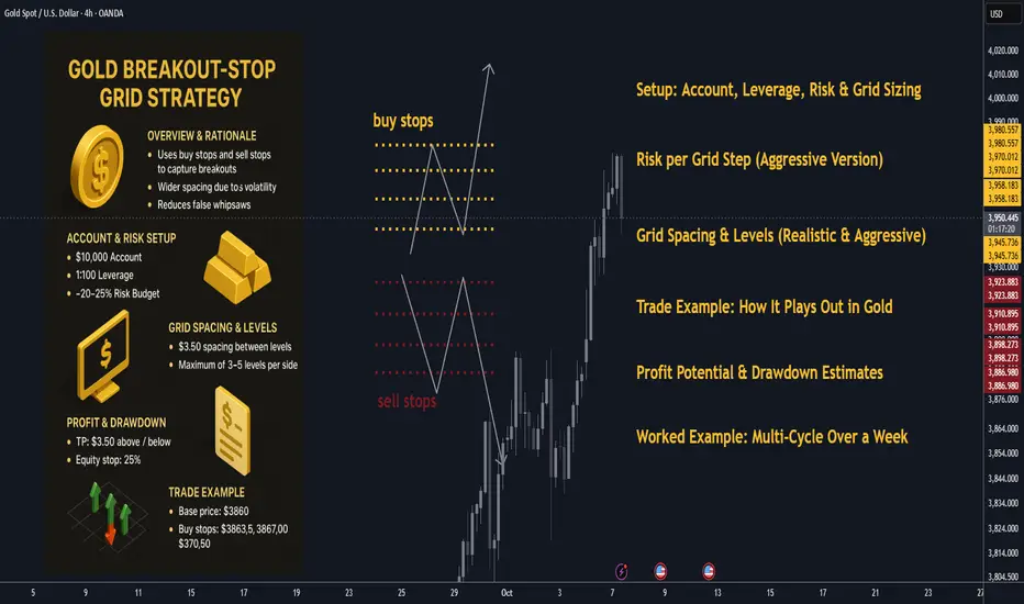
Cutting Losses is an Art – and the Trader is the Artist.🎨 Cutting Losses is an Art – and the Trader is the Artist.
Why Traders Struggle with Losses
In theory: cut your losses early, let your winners run.
In practice? It's an art – forged through discipline, experience, and the battle within.
Many enter the market quickly, full of hope, with no plan or risk awareness.
One wrong click – and they rely on luck instead of a system.
Anyone who trades without a setup or stop-loss isn't playing the game –
they're gambling.
Stop-Loss Isn’t Just Technical – It’s a Mirror of Your Discipline
It should be placed where your idea is objectively invalidated,
not where it just "feels okay."
Why is that so hard?
Because money is emotional
Because losses feel like personal failure
Because the market teaches you with pain if you don’t learn
🧠 “You should consider the money gone the moment you enter a trade.”
That’s not cynicism – it’s psychological armor.
If the trade fails, your self-worth and peace of mind remain intact.
That’s how you protect your mental capital and stay in the game – in trading and in life.
Technical Control + Psychological Honesty = Survival
Ask yourself:
Where is my personal pain threshold?
When do my hands start to sweat?
What is “a lot of money” – to me, objectively and emotionally?
Can I lose without falling apart emotionally?
Because the market will test you.
📉 It will test your ego.
💸 It will take without giving – if you're not prepared.
⏳ Patience is your sharpest weapon.
⚔️ And your greatest enemy? Greed, fear, hope.
A Pro Cuts Losses Mechanically – Not Emotionally
Every trade is just a try – with risk, with expectation, but no guarantee.
In the end, it’s not about how often you win –
it’s about how little you lose when you’re wrong.
📊 Chart Examples: Real-World Loss Management in Action
✅ Disciplined Exit
Clean stop-loss executed as planned. No hesitation, no hope.
“My setup was invalidated. The loss was expected, sized correctly, and accepted.”
❌ Emotional Hold
Ignored the stop-loss, hoping for a reversal.
“I hoped instead of acted. This was costly and unnecessary.”
⚖️ Clean Loss Despite Perfect Setup
All rules followed – but still hit the stop.
“Good trade, bad outcome. Still the right decision. Long-term edge remains.”
💬 How do YOU handle losses? Share your thoughts in the comments below.
🔔 Follow me for more on trading psychology, risk management & real chart breakdowns.