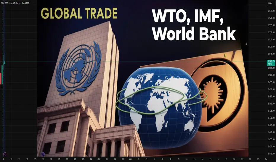
WTO, IMF, and World Bank in Global Trading1. Historical Background of Global Trade Institutions
1.1 The Bretton Woods Conference (1944)
In the aftermath of World War II, world leaders recognized the need for a stable international economic order.
The Bretton Woods Conference, held in New Hampshire, USA, in 1944, gave birth to two major institutions: the IMF and the World Bank.
Their purpose was to rebuild war-torn economies, stabilize currencies, and finance reconstruction.
1.2 The General Agreement on Tariffs and Trade (GATT) and WTO
In 1947, the General Agreement on Tariffs and Trade (GATT) was established to reduce tariffs and encourage trade liberalization.
GATT evolved over decades and was eventually replaced by the World Trade Organization (WTO) in 1995, which took on broader responsibilities in managing international trade rules.
Thus, the global economic framework today rests on three pillars: WTO (trade rules), IMF (financial stability), and World Bank (development financing).
2. World Trade Organization (WTO)
2.1 What is the WTO?
The WTO is the only global organization dealing with the rules of trade between nations. With over 160 member countries, it regulates trade agreements, monitors compliance, and settles disputes.
2.2 Core Objectives
Trade Liberalization – Reduce tariffs, quotas, and other barriers.
Predictability – Ensure stable trade policies through binding commitments.
Non-Discrimination – “Most-Favored Nation” (MFN) treatment, ensuring countries don’t discriminate among trade partners.
Fair Competition – Prevent unfair practices like dumping or subsidies.
Development – Provide special provisions for developing and least-developed countries.
2.3 WTO Functions in Global Trade
Negotiation Forum: Members negotiate trade deals (e.g., Doha Round).
Implementation and Monitoring: Ensures countries comply with trade agreements.
Dispute Settlement: Provides a legal framework to resolve trade conflicts.
Capacity Building: Assists developing nations with trade knowledge.
2.4 Impact of WTO on Global Trade
Dramatic reduction in average tariffs (from >30% in 1947 to <5% today).
Expansion of world trade, allowing developing countries like China, India, and Brazil to emerge as major players.
Legal dispute resolution prevents trade wars and supports stability.
2.5 Criticisms of WTO
Seen as favoring developed nations with stronger bargaining power.
Negotiation rounds often stall due to conflicting interests.
Critics argue WTO undermines national sovereignty by enforcing global rules.
3. International Monetary Fund (IMF)
3.1 What is the IMF?
The IMF is a global financial institution headquartered in Washington, D.C., with 190+ member countries. It ensures the stability of the international monetary system—exchange rates, payments, and cross-border capital flows.
3.2 Objectives of IMF
Exchange Rate Stability – Prevent currency crises and competitive devaluations.
Balance of Payments Assistance – Provide short-term loans to countries in crisis.
Policy Surveillance – Monitor global economic trends and provide policy advice.
Capacity Development – Offer training to strengthen economic institutions.
3.3 Functions in Global Trade
Financing Trade Deficits: Countries with shortages of foreign currency can borrow from IMF to finance imports.
Crisis Management: Provides emergency support during global shocks (e.g., Asian Financial Crisis 1997, Eurozone crisis, COVID-19 pandemic).
Exchange Rate Stability: Prevents destabilizing fluctuations that could disrupt trade.
Confidence Building: By backing countries with funds, IMF assures trading partners of stability.
3.4 IMF Tools
Lending Programs: Stand-By Arrangements, Extended Fund Facility, and Rapid Financing Instrument.
Special Drawing Rights (SDRs): International reserve asset to boost global liquidity.
Surveillance Reports: The World Economic Outlook and Global Financial Stability Report.
3.5 Impact of IMF on Global Trade
Prevents collapse of trade flows by ensuring liquidity.
Encourages trade-oriented reforms in developing countries.
Enhances investor confidence by stabilizing economies.
3.6 Criticisms of IMF
Conditionality: Loans often come with austerity measures, criticized for worsening poverty.
Western Dominance: Voting rights favor developed nations, especially the U.S. and Europe.
One-Size-Fits-All Policies: Structural adjustment programs have been criticized for imposing uniform economic models.
4. World Bank
4.1 What is the World Bank?
The World Bank Group (WBG) is a collection of five institutions, the most prominent being the International Bank for Reconstruction and Development (IBRD) and the International Development Association (IDA). Its primary mission is poverty reduction and long-term development.
4.2 Objectives
Reconstruction & Development – Initially focused on post-war rebuilding, now on infrastructure and growth.
Poverty Reduction – Promote inclusive and sustainable development.
Financing Trade Infrastructure – Ports, roads, digital connectivity, and energy supply that enable trade.
Knowledge Sharing – Research and technical expertise.
4.3 Functions in Global Trade
Financing Development Projects: Infrastructure, education, health, energy.
Trade Facilitation: Improves logistics, reduces transaction costs.
Capacity Building: Helps developing nations integrate into global trade.
Risk Mitigation: Provides guarantees to encourage private investment.
4.4 Impact of World Bank on Trade
Building infrastructure that directly supports trade flows (e.g., transport corridors, ports).
Reducing bottlenecks and making exports competitive.
Encouraging private investment and entrepreneurship in developing markets.
4.5 Criticisms of World Bank
Projects sometimes cause displacement or environmental harm.
Critics argue the Bank pushes neoliberal reforms (privatization, deregulation).
Dependence on debt financing can burden poor countries.
5. Interrelationship Between WTO, IMF, and World Bank
These three institutions are often referred to as the “Bretton Woods Twins + WTO” or the pillars of global economic governance.
WTO → Creates the rules of trade.
IMF → Provides monetary stability for trade.
World Bank → Finances development to enable trade participation.
5.1 Coordination
WTO, IMF, and World Bank hold joint meetings to harmonize policies.
During crises (e.g., 2008 financial crash, COVID-19), they collaborated on stimulus and debt relief.
5.2 Complementary Roles
IMF stabilizes economies so they can continue trade.
World Bank builds the infrastructure that enables countries to trade.
WTO provides the legal framework that governs trade relations.
6. Case Studies
6.1 Asian Financial Crisis (1997)
IMF provided emergency loans to South Korea, Thailand, and Indonesia.
WTO prevented protectionist measures that could have worsened the crisis.
World Bank financed structural reforms in affected economies.
6.2 Global Financial Crisis (2008)
IMF expanded lending and increased SDR allocations.
World Bank financed countercyclical projects in developing countries.
WTO helped prevent a rise in tariffs and trade wars.
6.3 COVID-19 Pandemic (2020–2021)
IMF mobilized trillions in emergency support.
World Bank financed health programs, vaccine distribution, and digital infrastructure.
WTO monitored export restrictions on medical supplies and promoted trade facilitation.
7. Criticism of Global Economic Governance
Despite their contributions, these institutions face criticism:
Power Imbalance: Rich nations have more influence.
Conditionality and Sovereignty: Loans often reduce national autonomy.
Unequal Benefits: Global trade benefits are not equally distributed.
Environmental Concerns: Development projects sometimes harm ecosystems.
8. The Future of WTO, IMF, and World Bank in Global Trade
8.1 Challenges Ahead
Rise of protectionism and trade wars (e.g., U.S.–China tensions).
Global inequality and debt crises in developing countries.
Climate change and sustainable development needs.
Digital trade and financial technology disrupting traditional models.
8.2 Possible Reforms
WTO: Reform dispute settlement system and include digital trade rules.
IMF: Greater representation for emerging economies, flexible conditionality.
World Bank: Stronger focus on climate resilience and sustainable infrastructure.
8.3 Long-Term Role
Together, these institutions will remain crucial in shaping the global trade system—balancing stability, growth, and inclusivity.
Conclusion
Global trade is the lifeblood of the interconnected world economy, but it requires strong institutions to ensure fairness, stability, and sustainability. The WTO provides the rules, the IMF ensures monetary stability, and the World Bank finances development that enables participation in trade.
Though criticized for inequities and structural biases, these institutions have prevented major global trade breakdowns, facilitated economic growth, and enabled developing nations to integrate into the global economy.
In the future, reforms are needed to make them more inclusive, transparent, and responsive to new challenges such as digital trade, climate change, and inequality. Yet, their centrality in global trading remains undisputed—without them, the world economy would be far more unstable, fragmented, and vulnerable to crisis.
Chart Patterns
Global Corporate Bond Trading1. What Are Corporate Bonds?
A corporate bond is a debt security issued by a corporation to raise money for various purposes such as expansion, acquisitions, refinancing, or working capital.
Issuer: The company borrowing money.
Investor: The buyer of the bond, lending money in exchange for fixed interest payments (coupons).
Maturity: The date when the company repays the bondholder’s principal.
Coupon: The fixed or floating interest paid to the bondholder.
Unlike equities (shares), bonds do not give ownership in the company. They represent a loan, with priority repayment rights if the company faces bankruptcy.
2. Evolution of the Corporate Bond Market
Early History
The first corporate bonds date back to the 19th century, with U.S. railroads raising funds through bonds.
By the 20th century, corporate bonds became a primary source of long-term financing for industrial and service companies.
Global Expansion
After World War II, the U.S. and European companies used corporate bonds heavily to rebuild industries.
In the late 20th century, Japan and emerging markets entered the global bond market.
21st Century Trends
Today, the corporate bond market is highly international. Companies issue bonds in multiple currencies to attract global investors.
Globalization, electronic trading, and credit derivatives (like credit default swaps, CDS) have transformed bond trading into a dynamic, interconnected market.
3. Types of Corporate Bonds
Corporate bonds vary widely. Some key categories are:
Investment-Grade Bonds
Issued by financially strong companies.
Rated BBB-/Baa3 or higher by credit rating agencies.
Lower risk, lower yield.
High-Yield (Junk) Bonds
Issued by riskier companies with lower credit ratings.
Higher yields to compensate investors.
Popular in leveraged buyouts, private equity financing.
Convertible Bonds
Can be converted into equity shares at a set price.
Offer lower coupons due to the equity upside potential.
Callable & Putable Bonds
Callable: Issuer can redeem before maturity.
Putable: Investor can demand early repayment.
Floating-Rate Notes (FRNs)
Coupons linked to benchmarks (LIBOR, SOFR, Euribor).
Protects investors from interest rate risk.
Green, Social, and Sustainability Bonds
Proceeds used for environmentally or socially responsible projects.
Gaining popularity with ESG (Environmental, Social, Governance) investors.
4. The Global Corporate Bond Market Structure
The global corporate bond market is over-the-counter (OTC), meaning most trades are negotiated privately rather than on exchanges.
Primary Market: Where companies issue new bonds (IPOs for debt).
Secondary Market: Where investors buy and sell existing bonds.
Key Centers
U.S.: Largest corporate bond market (over $12 trillion outstanding).
Europe: Active Eurobond market, allowing international issuances in multiple currencies.
Asia: Rapidly growing (China, Japan, India).
Emerging Markets: Corporates from Latin America, Africa, Middle East raising funds globally.
5. Key Participants in Global Corporate Bond Trading
Issuers: Corporations from all industries.
Investors:
Pension funds, insurance companies, sovereign wealth funds.
Banks, hedge funds, mutual funds, retail investors.
Intermediaries:
Investment banks (underwriters, dealers).
Bond traders and brokers.
Regulators:
SEC (U.S.), ESMA (EU), FCA (UK), SEBI (India).
They enforce transparency, fair trading, and investor protection.
Rating Agencies:
Moody’s, S&P, Fitch provide credit ratings.
Crucial in determining yields and investor appetite.
6. Trading Mechanisms
a. Primary Issuance Process
Company hires investment banks as underwriters.
Prospectus prepared and credit rating obtained.
Bonds are priced and distributed to institutional investors.
Listing may occur in global bond markets (Luxembourg, London, Singapore).
b. Secondary Market Trading
Mostly OTC via dealers.
Electronic platforms (MarketAxess, Tradeweb, Bloomberg) growing.
Price discovery less transparent than stocks, but improving with regulation.
c. Settlement
Clearing systems like Euroclear, Clearstream, DTC handle settlements.
Typically T+2 (two business days).
7. Pricing & Valuation
Bond prices depend on:
Interest Rates: Rising rates lower bond prices, and vice versa.
Credit Spreads: Extra yield over government bonds reflecting risk.
Liquidity: Easily tradable bonds fetch higher prices.
Currency Risk: Bonds issued in foreign currencies carry FX exposure.
Market Sentiment: Risk-on vs risk-off cycles influence spreads.
8. Risks in Global Corporate Bond Trading
Credit Risk: Issuer may default.
Interest Rate Risk: Bond values fall when rates rise.
Liquidity Risk: Some bonds hard to trade in secondary markets.
Currency Risk: For bonds issued in foreign currencies.
Event Risk: M&A, lawsuits, regulatory changes affecting issuers.
Systemic Risk: Global crises (e.g., 2008, 2020 COVID) trigger sell-offs.
9. Opportunities and Benefits
Diversification: Corporate bonds add balance to portfolios alongside equities.
Stable Income: Predictable coupon payments.
Capital Preservation: Safer than stocks (especially investment-grade).
Global Access: Investors can gain exposure to different economies and industries.
ESG Investing: Growth of green and sustainable bonds.
10. Global Corporate Bond Market Statistics (as of mid-2020s)
Global corporate bond market exceeds $40 trillion outstanding.
U.S. corporate bonds: ~60% of the global market.
Europe: ~25%, with the Eurobond market dominating.
Asia-Pacific: Fastest-growing, led by China’s state-owned enterprises.
Emerging markets: Increasingly active, especially in USD-denominated bonds.
Conclusion
Global corporate bond trading is the lifeblood of modern capital markets. It connects companies seeking financing with investors searching for income and diversification. The market has evolved from railroad bonds in the 19th century to trillion-dollar electronic platforms today.
For issuers, corporate bonds are a flexible, efficient way to raise capital globally. For investors, they offer income, relative safety, and exposure to global economies. However, the market carries risks—from credit defaults to interest rate shocks—that require careful management.
As technology, regulation, and ESG trends reshape the landscape, global corporate bond trading will continue to play a central role in global finance—bridging corporations and capital on an ever-expanding scale.
Global Government Bond Trading1. Fundamentals of Government Bonds
1.1 What Are Government Bonds?
A government bond is a debt security issued by a country’s treasury or finance ministry to raise money. When an investor buys a government bond, they are lending money to the government in exchange for periodic coupon payments (interest) and repayment of the principal at maturity.
Coupon Bonds: Pay regular interest plus principal at maturity.
Zero-Coupon Bonds: Sold at a discount, repay face value at maturity.
Inflation-Linked Bonds: Adjust coupon/principal with inflation rates.
Savings Bonds / Retail Bonds: Targeted at individual investors.
1.2 Key Features of Government Bonds
Issuer: Sovereign state.
Maturity: Short-term (T-bills), medium-term (notes), long-term (bonds).
Yield: Return investors expect, inversely related to bond price.
Credit Risk: Higher in emerging economies; lower in developed ones.
Liquidity: Developed market bonds (like U.S. Treasuries) are highly liquid, emerging markets less so.
1.3 Importance in Global Finance
Provide a risk-free benchmark rate (e.g., U.S. Treasury yields influence global lending rates).
Used as collateral in repo markets.
Serve as safe-haven assets during crises.
Act as tools for monetary policy (quantitative easing, open market operations).
2. Structure of the Global Government Bond Market
2.1 Primary Market
This is where governments issue new bonds via auctions or syndications. Investors bid for these securities, and the government raises capital.
Auction System: Used by the U.S., UK, Japan. Competitive and non-competitive bidding.
Syndicated Issuance: Banks underwrite and distribute bonds, common in Europe.
2.2 Secondary Market
Bonds are traded between investors after issuance. This provides liquidity and continuous price discovery.
Over-the-Counter (OTC): Majority of global bond trading occurs OTC via dealers.
Electronic Trading Platforms: Growing importance (e.g., Tradeweb, MarketAxess).
2.3 Major Bond Markets
U.S. Treasuries: World’s largest, deepest, and most liquid government bond market.
Eurozone Bonds: German Bunds are benchmark safe assets, Italian and Spanish bonds carry higher yields.
Japanese Government Bonds (JGBs): Very large market but often low yields.
UK Gilts: Highly liquid, influenced by Bank of England policy.
Emerging Market Bonds: Offer higher yields but with currency and default risks (Brazil, India, South Africa).
3. Key Participants in Global Government Bond Trading
3.1 Central Banks
Major holders and buyers of government debt.
Conduct monetary policy through bond purchases (QE) or sales.
Hold government bonds as foreign reserves.
3.2 Institutional Investors
Pension funds, insurance companies, and mutual funds allocate heavily to sovereign debt for predictable returns.
3.3 Hedge Funds & Proprietary Traders
Trade bonds to profit from interest rate changes, arbitrage opportunities, or global macro strategies.
3.4 Foreign Governments & Sovereign Wealth Funds
Invest in foreign government bonds for diversification and reserve management.
3.5 Retail Investors
Participate via government savings bonds, ETFs, and mutual funds.
4. Trading Mechanisms
4.1 Cash Market Trading
Direct purchase/sale of government bonds in the secondary market.
Prices fluctuate with interest rates, inflation expectations, and credit risk.
4.2 Derivatives Market
Futures, options, and swaps based on government bonds or yields.
Example: U.S. Treasury futures (CME), Bund futures (Eurex).
4.3 Repo Market
Repurchase agreements use government bonds as collateral.
Essential for liquidity in the global financial system.
4.4 Electronic Platforms & Algorithmic Trading
Rapid growth in e-trading platforms.
Algorithmic and high-frequency trading now account for a significant share.
5. Factors Affecting Government Bond Prices and Yields
5.1 Interest Rates
Bond prices move inversely with interest rates. Central bank policy shifts directly impact yields.
5.2 Inflation
High inflation reduces real returns, pushing yields higher. Inflation-indexed bonds mitigate this risk.
5.3 Economic Growth
Stronger growth can lead to higher yields due to expectations of rate hikes.
5.4 Fiscal Deficits & Debt Levels
Higher government borrowing can push yields upward due to increased supply and perceived risk.
5.5 Currency Movements
Foreign investors consider exchange rate risks; weaker local currency may deter bond purchases.
5.6 Geopolitical Risk
Wars, sanctions, and political instability drive safe-haven flows into bonds of stable nations.
6. Global Government Bond Trading Strategies
6.1 Buy and Hold
Conservative investors, like pension funds, hold bonds to maturity for stable income.
6.2 Yield Curve Strategies
Steepener: Betting long-term rates rise faster than short-term.
Flattener: Opposite bet.
Butterfly Trades: Exploiting mid-term vs short/long-term curve differences.
6.3 Relative Value / Arbitrage
Traders exploit mispricing between different government bonds.
Example: Spread between U.S. Treasuries and German Bunds.
6.4 Global Macro Plays
Hedge funds trade bonds based on global interest rate cycles, inflation, and geopolitical events.
6.5 Carry Trade in Bonds
Borrowing in low-yield currencies and investing in higher-yield government bonds elsewhere.
7. Risks in Government Bond Trading
7.1 Interest Rate Risk
Sharp changes in central bank policy can cause bond price volatility.
7.2 Inflation Risk
Unexpected inflation erodes real returns.
7.3 Credit Risk
Even sovereigns can default (examples: Argentina, Greece).
7.4 Liquidity Risk
Smaller bond markets may not provide adequate trading liquidity.
7.5 Currency Risk
Foreign bond investors face exchange rate fluctuations.
7.6 Geopolitical Risk
Trade wars, sanctions, and political instability can disrupt markets.
8. Role of Government Bond Markets in Global Economy
Benchmark Rates: Government bond yields influence corporate borrowing costs.
Safe-Haven Assets: During crises, investors flock to bonds like U.S. Treasuries.
Monetary Transmission: Central bank policies work through bond markets.
Fiscal Policy Financing: Governments rely on bonds for infrastructure and welfare spending.
Global Capital Flows: Sovereign bonds drive cross-border capital allocation.
9. Case Studies in Global Bond Markets
9.1 U.S. Treasury Market
Largest and most liquid in the world (~$25 trillion outstanding).
Yields serve as a global reference for risk pricing.
Highly responsive to Federal Reserve policies.
9.2 European Sovereign Debt Crisis (2010–2012)
Greek, Portuguese, Spanish, and Italian bonds saw yield spikes.
Investors demanded higher compensation for perceived default risk.
ECB intervention (OMT, QE) stabilized the markets.
9.3 Japanese Government Bonds (JGBs)
Extremely low or negative yields for decades due to deflationary pressures.
Bank of Japan’s Yield Curve Control (YCC) dominates the market.
9.4 Emerging Market Bonds
Offer higher yields but riskier (Argentina default, Turkey’s currency crisis).
Depend heavily on foreign investor confidence.
10. Future of Global Government Bond Trading
10.1 Digital Transformation
Rise of electronic trading platforms.
Algorithmic and AI-based trading strategies.
10.2 Green & ESG-Linked Sovereign Bonds
Growing issuance of “green bonds” by governments to fund climate projects.
10.3 Impact of Global Debt Levels
Post-pandemic debt burdens remain high.
Long-term sustainability of government borrowing under scrutiny.
10.4 Geopolitical Realignment
U.S.–China rivalry may reshape global bond investment patterns.
“De-dollarization” efforts could impact U.S. Treasury dominance.
10.5 Central Bank Balance Sheets
Unwinding QE will affect bond market liquidity.
“Higher for longer” interest rate regimes may redefine yield structures.
Conclusion
Global government bond trading is the foundation of modern financial markets. It balances risk and safety, yield and liquidity, domestic policy and international capital flows. From U.S. Treasuries as the world’s risk-free benchmark to the volatile sovereign bonds of emerging markets, this market reflects the health of economies, the credibility of fiscal policy, and the confidence of investors.
In times of crisis, investors flock to safe government bonds. In times of growth, they may chase higher yields elsewhere. But regardless of market cycles, government bond trading remains central to how money moves across borders, how interest rates are set, and how nations finance themselves.
As the world transitions into an era of high debt, climate financing, digital trading, and shifting geopolitics, global government bond markets will only grow in importance. Understanding their mechanics is crucial for traders, investors, policymakers, and anyone seeking to grasp the pulse of global finance.

Swap Trading in Foreign MarketsHistorical Background of Swaps
The concept of swaps emerged in the late 1970s and early 1980s. Their development was tied to globalization, deregulation of capital markets, and the increasing volatility of interest rates and exchange rates.
1970s Energy Crisis and Volatility: Rising oil prices and inflation led to volatility in both interest rates and currencies. Companies engaged in cross-border trade needed instruments to hedge risks.
1981 Milestone: The first widely recognized currency swap was executed between the World Bank and IBM. This transaction allowed IBM to access Swiss francs and German marks at lower costs, while the World Bank obtained U.S. dollars without issuing dollar-denominated debt directly.
1980s–1990s: Swaps grew in popularity, particularly interest rate swaps, as corporations and banks used them to restructure liabilities.
2000s and Beyond: The growth of global derivatives markets, along with sophisticated technology and clearing systems, pushed swaps into the mainstream. Today, the Bank for International Settlements (BIS) estimates that the notional amount of outstanding swaps runs into hundreds of trillions of dollars, making it one of the largest segments of the derivatives market.
What is a Swap?
A swap is a derivative contract in which two parties agree to exchange sequences of cash flows for a set period. The cash flows are typically tied to interest rates, currencies, or commodities.
Key features of swaps:
Over-the-Counter (OTC) Nature: Traditionally, swaps are negotiated privately between parties, not traded on exchanges (though post-2008 reforms introduced central clearing for some swaps).
Customizable Terms: Swaps can be structured to meet the specific needs of the parties involved.
No Initial Exchange of Principal (in most cases): Unlike loans, swaps typically involve only the exchange of cash flows, not principal.
Maturity Ranges: Swaps can range from short-term (less than a year) to very long-term (over 30 years).
Types of Swaps in Foreign Markets
1. Interest Rate Swaps (IRS)
An interest rate swap is an agreement where two parties exchange interest payments, typically one fixed rate for one floating rate, on a notional principal amount.
Example: Company A pays fixed 5% interest while receiving LIBOR + 0.5% from Company B.
Usage in foreign markets: Multinational corporations often issue bonds in foreign currencies and then use IRS to manage interest rate exposure.
2. Currency Swaps
A currency swap involves exchanging principal and interest payments in one currency for principal and interest in another currency.
Example: A U.S. company needing euros can swap U.S. dollar payments with a European firm needing dollars.
Significance: Currency swaps are crucial in international finance because they allow companies to obtain foreign currency funding without directly entering the bond markets.
3. Cross-Currency Interest Rate Swaps (CCIRS)
A hybrid form where both currency and interest rate exposures are swapped. It’s common for institutions engaged in global trade and investment.
4. Commodity Swaps
Although less directly linked to currencies, commodity swaps affect global markets. For example, an oil-importing country may hedge price fluctuations by engaging in swaps with oil exporters.
5. Credit Default Swaps (CDS)
These protect against default on debt obligations. While not currency-based, CDS became highly visible during the 2008 Global Financial Crisis and remain a significant global derivative.
Mechanics of Swap Trading
Negotiation and Agreement: Two parties agree on the notional amount, payment dates, interest rate benchmarks, and currencies involved.
Cash Flow Exchanges: On each payment date, cash flows are exchanged as per the agreement.
Settlement: Settlements may be netted (only differences exchanged) or gross (full payments made in respective currencies).
Duration and Termination: Swaps usually last several years but can be terminated early through mutual agreement or by entering into an offsetting swap.
Applications of Swaps in Foreign Markets
1. Hedging
Companies hedge against foreign currency fluctuations when repaying overseas loans.
Importers/exporters lock in favorable exchange rates to protect profit margins.
2. Speculation
Traders take positions on expected changes in interest rates or currency values.
Hedge funds often speculate using cross-currency swaps.
3. Arbitrage
Exploiting differences between interest rates or currency values in different markets.
4. Liquidity Management
Central banks use swaps to provide liquidity in foreign currencies during crises (e.g., Fed swap lines during 2008 and COVID-19 crises).
Global Examples of Swap Usage
U.S. and Europe: Major banks like JPMorgan, Deutsche Bank, and Barclays dominate swap markets.
Asia: Corporations in India, China, and Japan use swaps to manage cross-border investments and trade.
Emerging Markets: Swaps help governments manage external debt denominated in foreign currencies.
Risks in Swap Trading
Credit Risk (Counterparty Risk): If one party defaults, the other may face significant losses.
Market Risk: Movements in interest rates or exchange rates may turn against a party’s position.
Liquidity Risk: Difficulty in unwinding a swap position before maturity.
Operational Risk: Errors in valuation, settlement, or reporting.
Systemic Risk: As swaps are massive in scale, failures in this market can have global implications (e.g., Lehman Brothers’ collapse).
Regulatory Framework
After the 2008 Global Financial Crisis, regulators imposed stricter rules on swaps:
Dodd-Frank Act (U.S.): Mandated central clearing and trade reporting of certain swaps.
EMIR (EU): Similar framework requiring transparency and clearing obligations.
BIS and IOSCO Guidelines: Global bodies ensuring harmonization of rules.
Central clearing via institutions like the London Clearing House (LCH) reduces counterparty risk and increases transparency.
Benefits of Swaps in Foreign Markets
Cost Efficiency: Companies can borrow in favorable markets and swap to required currencies.
Flexibility: Highly customizable structures for specific needs.
Risk Management: Effective hedging against currency and interest rate risks.
Access to Capital: Enables smaller firms and emerging economies to access global funding.
Challenges and Criticisms
Complexity: Difficult for smaller firms to understand and manage.
Systemic Risk: Can amplify crises if misused.
Transparency Issues: OTC nature makes it harder to monitor exposures.
Dependence on Benchmarks: LIBOR scandals highlighted manipulation risks.
The Future of Swap Trading
Transition from LIBOR to SOFR and Other Risk-Free Rates (RFRs): This shift will reshape interest rate swaps globally.
Digital Transformation: Blockchain and smart contracts may increase transparency and reduce operational risks.
Growth in Emerging Markets: Rising global trade will expand demand for currency and cross-currency swaps.
Climate Finance: Green swaps may emerge to align with sustainability goals.
Conclusion
Swap trading in foreign markets is not just a financial innovation; it is the backbone of modern global finance. Whether it is a multinational corporation hedging currency exposure, a government managing external debt, or a central bank stabilizing markets, swaps provide the flexibility, efficiency, and liquidity needed in today’s interconnected world.
While they offer immense benefits, the risks and systemic challenges cannot be ignored. Strong regulation, transparency, and technological evolution will shape the next phase of swap trading. For traders, corporations, and policymakers alike, understanding swaps is essential to navigating the complexities of global finance.
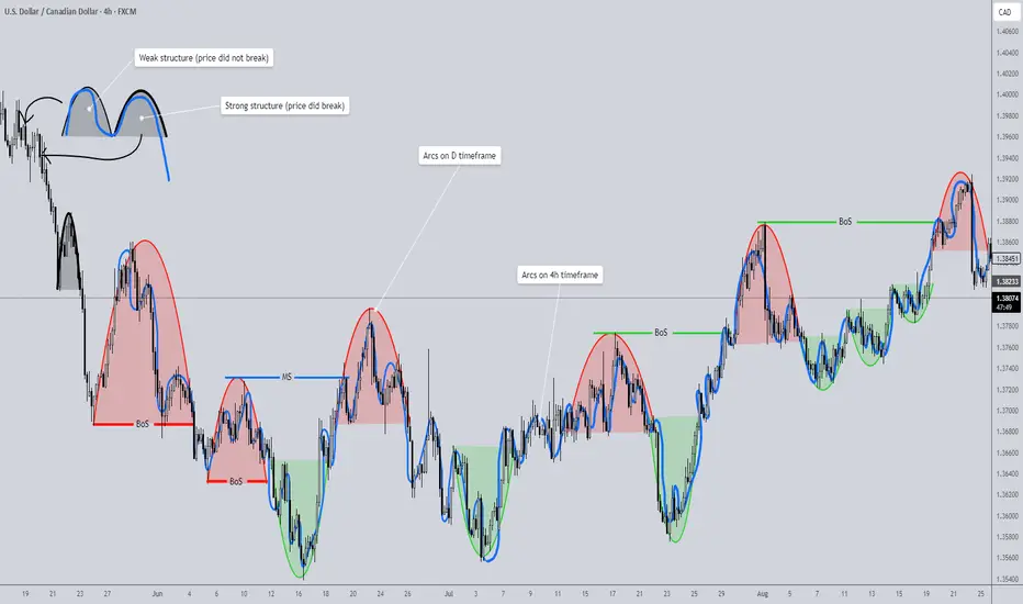
Market Structure is Actually EASY- Hear me outUnderstanding Market Structure Through Arcs
Market structure always seems simple when explained on YouTube. But open up a chart, and suddenly it feels puzzling, inconsistent, even frustrating. Imagine this: you’re analyzing the structure of a forex pair, confidently tracking highs and lows. Everything makes sense. Then you switch to a different pair—or even just a different date on the same chart—and suddenly it feels like your skill vanished. Yesterday you “understood” market structure, but today you don’t. So, what’s happening?
The truth is, when this confusion sets in, it’s usually because you’re looking for the wrong signs. Traders often get caught up searching for zigzags, breaks of structure (BoS), market shifts, supply and demand zones, or liquidity sweeps. But the key to truly understanding market structure comes down to one core skill: identifying strong and weak structures.
Redefining Market Structure
Market structure is not simply a zigzag. It’s not just supply and demand. Market structure is a collection of structures that, when viewed together, naturally form zigzags, supply/demand areas, and BoS/market shift levels.
And here’s the important part: not all structures are created equal. But don’t worry—you don’t need to memorize dozens of “types.” There are only two: strong structures and weak structures.
How to Identify Structures
This is where things get surprisingly simple. To identify structure, look for arcs. Yes—the charting tool no one ever uses. An arc represents price dipping and then returning to its prior high or low.
• If price closes beyond the previous high/low, the structure is strong.
• If price fails to break the previous high/low and closes within it, the structure is weak.
That’s it. Look at the chart example provided—you’ll see how clear this becomes once you train your eye. The Red/Green arcs represent arcs that were identified on the D timeframe (HTF). The blue squiggly line represents a collection of arcs identified on the 4h timeframe (LTF).
Multi-Timeframe Power
Here’s where arcs become even more powerful. A structure on one timeframe (say, the 4H) is essentially a supply/demand zone. Drop down to a lower timeframe (4H → 1H), and that same structure becomes a full swing move. This allows you to navigate multiple timeframes seamlessly—simply by plotting structures on the higher timeframe.
The Arc as the Foundation
Once you learn to spot arcs, everything clicks into place. An arc is supply and demand. It is liquidity boundaries. It defines strong/weak highs and lows. It creates the zigzag. In short: structure identification is the only skill you need to master market structure—and it’s surprisingly quick to learn.
Additional Notes
• A valid arc requires at least three candles. Anything less is not structure.
• Two candles may represent a reaction to supply/demand or a liquidity sweep, but they don’t form a structure.
• Why? Because structure requires balance—a brief pause where price enters, slows, stabilizes, and then reverses. That balancing process cannot be captured in one or two candles.
My Advice
For now, set aside the broader concept of “market structure” and focus only on arcs.
1. Practice identifying arcs in live price action—don’t worry about backtesting yet.
2. Mark them on your chart, and classify them as strong or weak.
3. Once you’re comfortable spotting them, move into backtesting. Watch arcs unfold in motion.
4. With enough practice, you’ll be able to recognize them instantly and without hesitation.
That’s when you return to market structure as a whole. With the skill of arc recognition in place, you’ll finally see how everything ties together—and your understanding will be unshakable.
Previous Post; Complete Market Structure: Order Flow and Multiple Timeframes
Although I felt that this was a great take on market structure, the indicator provided falls short in a sense that market it relies on alternating internal shifts, when in market structure shifts can happen consecutively instead of strictly alternating. I have developed a different tool that will help identify structural levels without missing a single arc. It is called Supply/Demand Zones (Synthetic SMA Candles). I will provide a link below. It identifies arcs and classifies them as supply/demand zones. It also provides alerts which can be helpful if you are the type of trader that likes to trade passively without being glued to the charts.
Arc Identifying Indicator (Supply/Demand)
"Aha!" Moments Are Dangerous — Here’s Why You Shouldn’t Panic Just because a big options trade appears — doesn’t mean it’s a signal.
Options move every day.
Some trades are:
-Speculative
-Hedging plays
-Pure lottery tickets
Only a few carry real directional sentiment.
And learning to separate noise from signal?
That’s one of the most powerful skills a trader can develop — even if you never trade options yourself.
Let’s Look at JPY (See Chart)
On September 5, two large put portfolios appeared:
1. 0.0064 Put
2. 0.00635 Put
Both new, both with no prior open interest — so not a roll.
And yes — they’re larger than average.
To a beginner, this screams:
“JPY is going to crash — time to short everything!”
But let’s pause.
An experienced flow analyst would ask:
Is this really a bearish signal?
🔍 Here’s What the Data Says:
❗️Size ≠ Significance
Yes, the portfolios are big — but each costs ~$90K.
In institutional terms? Not massive.
❗️Delta is ~2%
That means less than 2% chance of expiring in the money.
❗️This Happens Often in JPY
Same strike (0.0064), same structure — appeared in the previous series.
Price never went near it.
No crash. No panic.
Just… nothing.
🧠 So Why Buy It?
I don’t know.
And I don’t need to.
Could be:
1️⃣A hedge for a larger book
2️⃣A counterparty agreement
3️⃣A some extra aggressive logic
But here’s what I do know:
Based on years of CME data and personal tracking —
Trades like this don’t cause market crashes.
They don’t move the needle.
They don’t change the trend.
✅ Final Takeaway:
Don’t react to the data headline.
Ask:
How likely is this to matter?
Is it priced in?
Has this happened before? Price reaction after big OTM options?
Because real edge isn’t in the "Aha!" moment —
It’s in the "Wait, let me check…" moment.

FX Professor 101: How I Start My Charts with Trendlines & FibFX Professor 101: How I Start My Charts with Trendlines & Fib Levels 🧠📈
Some of you asked me to show my charting process again — so here it is, strictly educational, using Pepper as the example (because a few of you believe in it and asked about it). Let’s build this chart together from scratch. 🛠️
Step 1: Get Full Historical Context 📜
I always start by selecting a chart with the most data available. More history = more structure to work with. No shortcuts here.
Step 2: Anchor with Horizontal Trendlines 📏
I look for a clear support → resistance → support pattern with no manipulation. That becomes my anchor level.
Then I scan for secondary levels – if they’re too close or manipulated, I keep them dotted and as references.
Zooming in helps. Don't hesitate to get granular when needed. 🔍
Step 3: Respect the Manipulation 🤨
If a chart feels overly manipulated (wicks, fakeouts, no clear rejections), I lose trust in it. But sometimes even within manipulation, valid levels emerge — and I mark them clearly.
Step 4: Fibonacci Confirmation 🔢✨
Once I place the trendlines, I overlay Fibonacci retracements to see if they align. In this case, one of my levels landed exactly on 0.618 – no cap! 😂 That’s when experience meets structure.
Final Notes 🧘♂️
• Only two levels made the final cut
• Secondary levels marked with dotted lines
• 0.618 Fib validated the primary structure
• Support at 929 is looking strong as of now
This is my process. It’s how I start every serious chart. Nothing fancy — just history, structure, and experience. If it helps even one of you out there, I’m happy. 💙
One Love,
The FXPROFESSOR 💙
Food for Trading Thought:
From my experience as an AI developer, I’ve come to one firm conclusion — AI will never replace us. It can assist, but it can’t see what you see or feel what you feel. The real edge in trading is your human intuition, patience, and discipline.
Trading is a game — a risky game. Play it right if you're going to play it at all.
Stay human and remember: the best Blockchain is YOU, the best Altcoins are your loved ones and your work/creation/purpose in life. 🎯

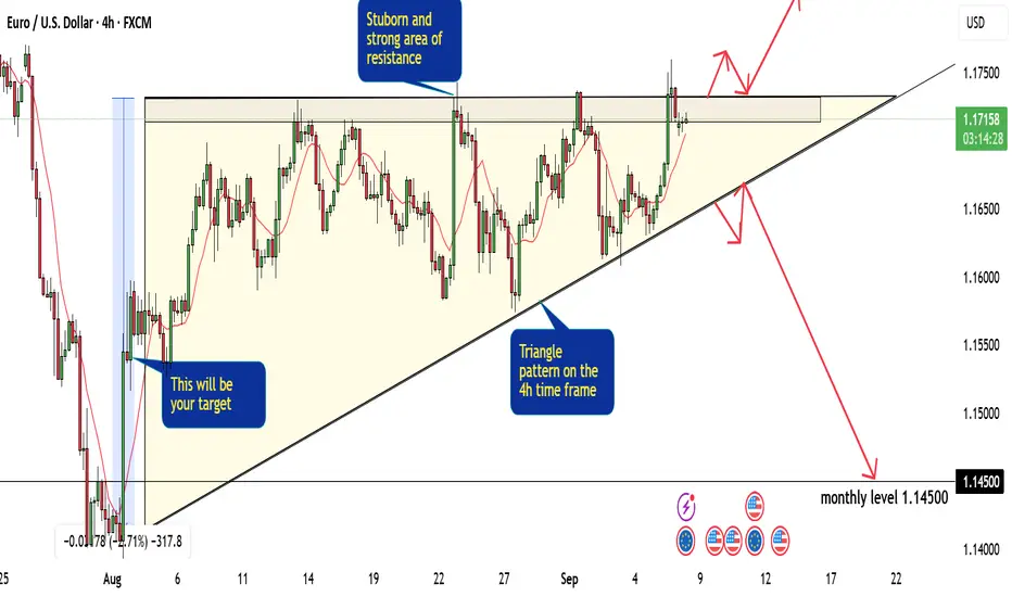
Tips And Trick On How to Trade The Flag Pattern With Perfection!Hey Everyone, in this chart we have a very clear pattern FLAG on the 4H timeframe and on the 1h timeframe. this pattern consists of three sides:
1- the trend line side:
if this side is broken then we will have to wait for a nice retest and then enter our trade which will be in the opposite direction of the trendline ( in our EURUSD it will be a sell trade).
2- the resistance area:
it is a very strong area that pushes the price very hard to the downside, once this area is broken we can enter an easy buy trade directly or we can wait for a good confirmation and a nice retest for the area.
3- the target side :
in most of the chart patterns these patterns gives you an indication of the amount of pips you are waiting for. the third side of the FLAG pattern is actually your target for the trade, try to take between 20 to 50 pips less than what is showed on this side.
so as a conclusion of the EURUSD analysis we are waiting for a good break to the trendline or the resistance area and then we can determine what our next step and if we will enter a buy or sell trade
Global Hard Commodity Trading1. Understanding Hard Commodities
Hard commodities are natural resources that must be mined, extracted, or produced through industrial processes. They are different from soft commodities, which include agricultural products like wheat, coffee, or cotton.
Examples of Hard Commodities:
Energy Commodities
Crude Oil (Brent, WTI)
Natural Gas
Coal
Uranium
Metals
Precious Metals: Gold, Silver, Platinum, Palladium
Base Metals: Copper, Aluminum, Zinc, Nickel, Lead, Tin
Rare Earth Elements (used in electronics, EVs, clean tech)
Characteristics of Hard Commodities:
Limited in supply, extracted from earth.
Prices are volatile, influenced by global demand and supply shocks.
Traded both physically and financially.
Often priced in US dollars, making them linked to global currency fluctuations.
Hard commodities are critical for energy, manufacturing, construction, defense, and technology sectors, making them a barometer of global economic health.
2. Evolution of Global Hard Commodity Trading
Commodity trading is not new—it dates back thousands of years when civilizations bartered metals, salt, and oil. However, the modern commodity trading system began in the 19th and 20th centuries with the rise of commodity exchanges like the Chicago Mercantile Exchange (CME) and the London Metal Exchange (LME).
Historical Milestones:
19th century: Industrial revolution created huge demand for coal, iron, and copper.
1900s: Oil became the world’s most important energy commodity.
1970s oil shocks: Highlighted the geopolitical importance of commodities.
2000s commodity super-cycle: Rapid demand from China and India fueled a massive rise in metal and energy prices.
Today: Hard commodities are not just traded physically but also heavily speculated on global futures markets.
3. Key Players in Hard Commodity Trading
Trading hard commodities involves a diverse range of participants:
Producers:
Oil companies (ExxonMobil, Saudi Aramco, BP)
Mining giants (Rio Tinto, BHP, Glencore)
Consumers:
Manufacturing companies, refineries, power plants, automakers, construction firms.
Traders & Intermediaries:
Global commodity trading houses like Vitol, Trafigura, Glencore, Gunvor.
These firms buy commodities from producers and sell them to consumers worldwide, often handling logistics, shipping, and financing.
Financial Institutions:
Investment banks (Goldman Sachs, JPMorgan, Morgan Stanley) actively trade in commodity derivatives.
Speculators & Investors:
Hedge funds, mutual funds, and retail traders participate in futures and ETFs for profit.
Governments & Regulators:
OPEC, IEA, WTO, and national regulators influence prices and rules.
4. Major Hard Commodity Markets
4.1 Energy Commodities
Crude Oil: Most traded commodity globally. Benchmarks: Brent (North Sea), WTI (US), Dubai/Oman.
Natural Gas: Key for heating, power generation, and industrial use. LNG (liquefied natural gas) has made gas a global trade.
Coal: Despite clean energy trends, coal still accounts for a major share of electricity generation in Asia.
Uranium: Fuels nuclear energy.
4.2 Metals
Gold & Silver: Precious metals for investment and jewelry. Also safe-haven assets during crises.
Copper: Known as “Dr. Copper” because it signals global economic health—widely used in construction and electronics.
Aluminum, Nickel, Zinc: Critical for cars, infrastructure, and batteries.
Rare Earths: Essential for EVs, wind turbines, semiconductors.
5. How Hard Commodities are Traded
5.1 Physical Trading
This involves the actual movement of goods—oil tankers, copper shipments, coal cargoes. Large trading houses dominate this space, dealing with storage, shipping, and financing.
5.2 Financial Trading
Financial markets allow traders to speculate, hedge, or invest without handling physical goods.
Futures Contracts (CME, LME, ICE)
Options & Swaps
Exchange-Traded Funds (ETFs) linked to commodities
Over-the-Counter (OTC) Derivatives
For example, an airline may hedge jet fuel prices through futures to lock in costs.
6. Price Drivers in Hard Commodity Trading
Hard commodity prices are influenced by a mix of economic, political, and natural factors:
Supply & Demand:
Strong global growth → higher demand for oil, metals.
Supply disruptions (strikes, wars, sanctions) → price spikes.
Geopolitics:
Middle East tensions → oil shocks.
Trade wars → disrupt commodity flows.
Currency Movements:
Most commodities priced in USD. A strong dollar makes them expensive for other countries.
Speculation & Investor Flows:
Hedge funds and ETFs influence short-term price swings.
Technological & Environmental Factors:
EV demand boosts lithium, cobalt, nickel.
Green energy transition reducing coal demand.
Natural Events:
Hurricanes disrupting oil production.
Mining accidents reducing metal supply.
7. Risks in Hard Commodity Trading
Price Volatility: Sharp swings make profits uncertain.
Political Risk: Sanctions, wars, and nationalization.
Credit Risk: Default by counterparties.
Logistics Risk: Shipping delays, storage costs.
Regulatory Risk: Changing government rules.
Environmental Risk: Climate policies reducing fossil fuel demand.
Traders use hedging strategies and risk management tools to minimize exposure.
8. Global Trade Hubs & Exchanges
London Metal Exchange (LME): Key center for base metals.
New York Mercantile Exchange (NYMEX): Crude oil, natural gas.
Intercontinental Exchange (ICE): Brent crude, energy futures.
Shanghai Futures Exchange (SHFE): China’s growing influence.
Dubai Mercantile Exchange (DME): Oil contracts for Middle East & Asia.
Physical hubs include Rotterdam (oil), Singapore (oil & LNG), Shanghai (metals), Dubai (gold).
9. Role of Technology in Hard Commodity Trading
Technology is transforming commodity trading:
AI & Algorithms for price forecasting.
Blockchain for trade finance and supply chain transparency.
Big Data & IoT to track shipments and consumption trends.
Digital platforms replacing traditional paper-based contracts.
10. Future of Hard Commodity Trading
Energy Transition:
Demand for oil may peak in coming decades.
Growth in renewables and metals like lithium, cobalt, nickel.
Green Commodities:
Carbon credits becoming tradable assets.
ESG (Environmental, Social, Governance) shaping investment choices.
China & India’s Role:
Asia will remain the biggest consumer of hard commodities.
Geopolitical Fragmentation:
Sanctions, supply chain shifts, and regional alliances may create “commodity blocs.”
Digitalization:
More algorithm-driven and blockchain-powered commodity trading.
Conclusion
Global hard commodity trading is more than just an economic activity—it is the heartbeat of the world economy. Energy, metals, and minerals not only determine industrial growth but also shape geopolitics, financial markets, and future technologies.
While the industry faces challenges of volatility, climate change, and regulatory shifts, it is also evolving rapidly with digitalization, green energy, and new demand sources.
For traders, investors, and policymakers alike, understanding hard commodity markets is essential—not just to profit, but also to anticipate global economic and political shifts.
Scalping in World Markets1. What is Scalping?
Scalping is a short-term trading style where traders aim to profit from small price fluctuations, typically a few pips in forex, a few cents in stocks, or a few ticks in futures. The average trade duration is extremely short – from a few seconds to a few minutes.
Key characteristics of scalping:
High trade frequency – dozens or even hundreds of trades per day.
Small profit targets – usually 0.1% to 0.5% of price movement.
Tight stop-losses – risk is controlled aggressively.
High leverage usage – to magnify small gains.
Dependence on liquidity and volatility – scalpers thrive in active markets.
2. Scalping in Different World Markets
2.1 Forex Market
The forex market is the most popular for scalping because of its 24/5 availability, tight spreads, and deep liquidity.
Major currency pairs (EUR/USD, GBP/USD, USD/JPY) are preferred for scalping due to minimal spreads.
Forex scalpers often use 1-minute and 5-minute charts to identify quick opportunities.
2.2 Stock Market
Scalping in equities focuses on high-volume stocks like Apple, Tesla, or Amazon.
Traders benefit from intraday volatility and liquidity during opening and closing market hours.
Access to Level 2 order book and Direct Market Access (DMA) is crucial for equity scalpers.
2.3 Futures and Commodities
Futures contracts like S&P 500 E-mini, crude oil, and gold are attractive for scalpers.
Commodity scalping requires understanding of economic reports (EIA crude oil inventory, OPEC meetings).
2.4 Cryptocurrencies
Crypto markets are 24/7, offering endless scalping opportunities.
High volatility and liquidity in coins like Bitcoin and Ethereum make them ideal.
However, high transaction fees and slippage can erode profits.
2.5 Global Indices
Scalpers often trade indices like Dow Jones, FTSE 100, DAX, and Nikkei 225.
Indices react quickly to macroeconomic data, providing fast scalping opportunities.
3. Scalping Strategies in World Markets
3.1 Market Making
Involves placing simultaneous buy and sell orders to profit from the bid-ask spread.
Works best in highly liquid instruments.
3.2 Momentum Scalping
Traders ride micro-trends by entering when momentum surges (e.g., after a breakout).
Useful in fast-moving markets like NASDAQ or forex majors.
3.3 Range Scalping
Scalpers trade within tight support and resistance zones.
Buy near support and sell near resistance repeatedly.
3.4 News-Based Scalping
Focuses on volatility caused by economic releases (CPI, NFP, Fed announcements).
High risk but high reward.
3.5 Algorithmic Scalping
Uses bots to execute trades automatically within milliseconds.
Common in institutional trading with access to co-location servers.
4. Tools and Techniques for Scalping
Trading Platforms – MT4/MT5, NinjaTrader, Thinkorswim, Interactive Brokers.
Charts & Timeframes – 1-minute, 5-minute, tick charts, and order flow charts.
Indicators:
Moving Averages (EMA 9, EMA 21)
Bollinger Bands
RSI (1 or 5 period)
VWAP (Volume Weighted Average Price)
Order Book & Level 2 Data – Helps scalpers see liquidity depth.
Hotkeys & Fast Execution – Essential for entering/exiting trades within seconds.
5. Risk Management in Scalping
Scalping is high-risk due to the large number of trades and leverage. Key risk controls include:
Stop-loss orders – Protect from large losses when price moves unexpectedly.
Position sizing – Never risk more than 1% of account per trade.
Spread & commissions – Monitor closely, as these eat into small profits.
Discipline – Avoid overtrading and revenge trading.
6. Advantages of Scalping
Quick Profits – Immediate feedback from trades.
Less exposure to overnight risk – No swing or position holding.
Works in all market conditions – Volatile, range-bound, or trending.
Compounding effect – Small profits add up across multiple trades.
Psychological satisfaction – For traders who like constant engagement.
7. Challenges of Scalping
High Stress – Requires constant focus and fast decision-making.
Costs – Commissions, spreads, and slippage reduce profitability.
Execution speed – Any delay can wipe out gains.
Broker restrictions – Some brokers prohibit or limit scalping.
Psychological fatigue – Scalping can be mentally exhausting.
8. Psychology of a Scalper
Scalping is not just about technical skills; it demands the right mindset:
Patience and discipline – Avoid chasing trades.
Emotional control – Handle stress and avoid panic decisions.
Consistency – Stick to predefined strategies.
Focus – Ability to concentrate for hours without distraction.
9. Regulations and Global Differences
US Markets: FINRA requires $25,000 minimum for pattern day trading in equities.
European Markets: MiFID II rules on leverage (max 1:30 for retail).
Asian Markets: Japan and Singapore allow high-frequency scalping, but require licensing for institutional scalpers.
Forex Brokers: Some brokers discourage scalping due to server load.
Best Practices for Successful Scalping
Focus on liquid assets.
Keep a trading journal.
Test strategies on demo accounts.
Control emotions and avoid overtrading.
Use technology for execution speed.
Conclusion
Scalping in world markets is one of the most challenging yet rewarding trading approaches. It requires discipline, speed, and precision to consistently extract profits from tiny market movements. While technology and globalization have made scalping more accessible, only traders with the right psychology, tools, and risk management can succeed.
As markets evolve with AI, crypto, and faster infrastructures, scalping will continue to be a dominant force in global trading. For traders who thrive under pressure and enjoy high-frequency engagement, scalping offers unparalleled opportunities – but it demands mastery of both strategy and self-control.

Options in Forex Trading1. Introduction to Forex Options
Foreign exchange (Forex or FX) is the largest and most liquid financial market in the world, where currencies are traded around the clock. Beyond spot trading, which involves buying one currency against another for immediate delivery, there exists another powerful derivative instrument: Forex Options.
Forex Options allow traders and investors to speculate on or hedge against the future movement of currency exchange rates without the obligation to actually buy or sell the currency. This flexibility makes them a popular tool among global corporations, hedge funds, institutional investors, and even sophisticated retail traders.
In simple terms: a Forex Option gives you the right, but not the obligation, to buy or sell a currency pair at a specific price before or on a specific date.
This guide explores Forex Options in detail—how they work, their types, strategies, pricing, risks, benefits, and real-world applications.
2. What Are Forex Options?
A Forex Option is a contract that gives the holder the right (but not the obligation) to exchange money in one currency for another at a pre-agreed exchange rate (strike price) on or before a specific date (expiry date).
Unlike spot or forward forex contracts, where transactions are binding, options give the trader a choice: they can either exercise the option or let it expire worthless, depending on market conditions.
Buyer of an option → Pays a premium upfront for the right.
Seller (writer) of an option → Receives the premium but assumes the obligation if the buyer exercises the contract.
This asymmetry in risk and reward is what makes options unique and powerful.
3. Basic Terminologies in Forex Options
Before diving deeper, it’s essential to understand some key terms:
Call Option – Right to buy a currency pair at the strike price.
Put Option – Right to sell a currency pair at the strike price.
Strike Price (Exercise Price) – The agreed exchange rate at which the option can be exercised.
Expiration Date – The last date on which the option can be exercised.
Premium – The price paid by the buyer to the seller for the option.
In-the-Money (ITM) – Option has intrinsic value (profitable if exercised now).
Out-of-the-Money (OTM) – Option has no intrinsic value (not profitable if exercised).
At-the-Money (ATM) – Current spot rate equals strike price.
European Option – Can only be exercised at expiry.
American Option – Can be exercised anytime before expiry.
4. How Do Forex Options Work?
Let’s take an example:
You believe that the EUR/USD (Euro vs US Dollar) pair, currently trading at 1.1000, will rise in the next month.
You buy a 1-month EUR/USD call option with a strike price of 1.1050, paying a premium of $500.
Possible outcomes:
If EUR/USD rises to 1.1200 → Your option is In-the-Money. You can exercise and buy euros cheaper than the market price. Profit = Gain – Premium.
If EUR/USD stays below 1.1050 → The option expires worthless. Loss = Premium paid ($500).
This example shows the limited risk (premium only) but unlimited upside potential for option buyers.
5. Types of Forex Options
There are multiple types of Forex Options available in global markets:
5.1 Vanilla Options (Standard Options)
The most common type.
Includes call and put options.
Available in both European and American styles.
5.2 Exotic Options
More complex and tailored contracts, often used by corporations and institutions. Examples:
Binary Options – Pay a fixed amount if the condition is met, otherwise nothing.
Barrier Options – Activated or deactivated if the currency reaches a certain level.
Digital Options – Similar to binary but with different payoff structures.
Lookback Options – Payoff depends on the best or worst exchange rate during the contract period.
Exotics are less common for retail traders but popular in corporate hedging.
6. Why Trade Forex Options?
6.1 Benefits
Hedging tool – Protect against adverse currency moves.
Leverage with defined risk – Premium is the maximum loss.
Flexibility – Traders can profit from bullish, bearish, or neutral markets.
Non-linear payoffs – Unlike forwards/futures, options have asymmetric risk-reward.
6.2 Limitations
Premium cost can be high, especially during volatile markets.
Complexity in pricing and strategies.
Not as liquid as spot forex for retail traders.
7. Pricing of Forex Options (The Greeks & Black-Scholes)
Pricing options is complex because many factors affect the premium:
Spot exchange rate
Strike price
Time to expiration
Volatility of the currency pair
Interest rate differential between two currencies
The most common pricing model is the Black-Scholes Model, adapted for currencies.
Traders also use The Greeks to measure risks:
Delta – Sensitivity of option price to currency movement.
Gamma – Sensitivity of delta to price changes.
Theta – Time decay (loss of value as expiry approaches).
Vega – Sensitivity to volatility.
Rho – Sensitivity to interest rates.
Understanding these helps traders manage risk effectively.
8. Forex Option Trading Strategies
8.1 Single-Leg Strategies
Buying Calls – Bullish view on a currency pair.
Buying Puts – Bearish view on a currency pair.
8.2 Multi-Leg Strategies
Straddle – Buy a call and put at the same strike/expiry to profit from volatility.
Strangle – Buy OTM call and put (cheaper than straddle).
Butterfly Spread – Limited-risk strategy betting on low volatility.
Collar Strategy – Combine a protective put and covered call to limit risk.
8.3 Corporate Hedging
Exporters may buy put options to protect against a falling foreign currency.
Importers may buy call options to hedge against rising foreign currency costs.
9. Risks in Forex Options
Premium Loss – Buyers can lose the entire premium.
Unlimited Loss for Sellers – Option writers face potentially large losses.
Liquidity Risk – Some exotic options may not have an active secondary market.
Complexity – Advanced strategies require deep knowledge.
Market Volatility – Unexpected events (e.g., central bank interventions) can drastically alter outcomes.
10. Real-World Applications of Forex Options
10.1 Corporate Hedging
A US company expecting payment in euros may buy a put option on EUR/USD to protect against euro depreciation.
10.2 Speculation
Hedge funds may use straddles around major events (like US Fed announcements) to profit from volatility.
10.3 Arbitrage
Traders exploit mispricings between spot, forwards, and options.
10.4 Risk Management
Central banks and large financial institutions sometimes use options to stabilize foreign reserves.
Conclusion
Forex Options are a sophisticated financial instrument that combines flexibility, leverage, and risk management. Unlike spot and forward contracts, they provide the right but not the obligation to trade currencies, making them a versatile tool for hedgers and speculators alike.
While options can protect businesses from currency risk and provide retail traders with powerful speculative opportunities, they require deep knowledge of pricing, volatility, and strategies. Misuse or lack of understanding can lead to significant losses, especially for option writers.
In the ever-evolving forex market, where geopolitical events, economic policies, and global trade dynamics influence currency prices, Forex Options remain one of the most effective instruments for managing uncertainty and capitalizing on opportunities.
Forward & Futures Forex TradingChapter 1: Basics of Forex Derivatives
1.1 What are Forex Derivatives?
A derivative is a financial instrument whose value depends on the price of an underlying asset. In forex, derivatives derive their value from currency exchange rates.
Common forex derivatives include:
Forwards – customized OTC contracts.
Futures – standardized exchange-traded contracts.
Options – rights but not obligations to exchange currencies.
Swaps – agreements to exchange cash flows in different currencies.
1.2 Why Use Forex Derivatives?
Hedging: To protect against adverse currency movements.
Speculation: To profit from expected exchange rate movements.
Arbitrage: To exploit price discrepancies across markets.
Chapter 2: Forward Forex Contracts
2.1 What is a Forward Contract?
A forward contract is a private agreement between two parties to buy or sell a specified amount of currency at a predetermined exchange rate on a future date.
Example:
A U.S. importer agrees today to buy €1 million from a bank in three months at an agreed exchange rate of 1.10 USD/EUR. Regardless of the spot rate in three months, the importer must pay at that rate.
2.2 Key Features of Forward Contracts
Customization: Amount, maturity date, and settlement terms are negotiable.
Over-the-Counter (OTC): Not traded on exchanges, but arranged between banks, institutions, and corporations.
Obligation: Both buyer and seller are bound to fulfill the contract.
No upfront payment: Typically requires no premium, though banks may ask for collateral.
2.3 Types of Forward Contracts
Outright Forward – standard agreement for a fixed amount and date.
Flexible Forward – allows settlement within a range of dates.
Non-Deliverable Forward (NDF) – cash-settled in one currency, often used for restricted currencies (e.g., INR, CNY).
Window Forward – permits multiple drawdowns during a period.
2.4 Participants in Forward Contracts
Corporations – hedge imports/exports.
Banks – provide liquidity and quotes.
Hedge Funds – speculate on currency movements.
Central Banks – occasionally use forwards to manage reserves.
Chapter 3: Forex Futures
3.1 What are Futures Contracts?
A forex futures contract is a standardized agreement traded on an exchange to buy or sell a currency at a predetermined price on a specified future date.
Example:
A trader buys a EUR/USD futures contract expiring in December at 1.1050. If the euro strengthens, the futures price rises, and the trader profits by selling the contract later.
3.2 Key Features of Futures Contracts
Standardization: Contract size, maturity, and tick value are fixed by the exchange.
Exchange-Traded: Offered on platforms like CME (Chicago Mercantile Exchange).
Daily Settlement: Marked-to-market each day, with gains/losses credited/debited.
Margin Requirement: Traders must deposit initial and maintenance margins.
Liquidity: High in major currency pairs like EUR/USD, GBP/USD, and JPY/USD.
3.3 Common Forex Futures Contracts
EUR/USD futures
GBP/USD futures
JPY/USD futures
AUD/USD futures
Emerging market currency futures (less liquid but growing).
3.4 Participants in Futures Contracts
Speculators – retail and institutional traders betting on price moves.
Hedgers – corporations, exporters, and importers.
Arbitrageurs – exploit mispricing between spot, forward, and futures.
Chapter 4: Forwards vs Futures – Key Differences
Feature Forwards Futures
Market OTC (private contracts) Exchange-traded
Standardization Fully customized Standard contract sizes/dates
Settlement On maturity Daily mark-to-market
Counterparty Risk Higher (depends on bank/party) Low (exchange clearinghouse guarantees)
Liquidity Varies by bank relationship High in major pairs
Flexibility High Low
Usage Hedging (corporates) Hedging & speculation (traders/investors)
Chapter 5: Pricing and Valuation
5.1 Forward Pricing Formula
Forward exchange rate = Spot rate × (1 + interest rate of base currency) / (1 + interest rate of quote currency).
Example:
Spot EUR/USD = 1.1000
USD interest rate = 5% p.a.
EUR interest rate = 3% p.a.
1-year forward = 1.1000 × (1.05 / 1.03) ≈ 1.1214
5.2 Futures Pricing
Futures pricing is similar but adjusted for:
Daily settlement (mark-to-market).
Exchange trading costs.
Slight deviations from theoretical parity due to liquidity.
Chapter 6: Strategies with Forwards & Futures
6.1 Hedging Strategies
Importer Hedge: Lock in forward rate to avoid rising costs.
Exporter Hedge: Lock in forward to protect against falling revenues.
Futures Hedge: Use standardized contracts to offset exposure.
6.2 Speculation Strategies
Directional Trades: Bet on EUR/USD rising or falling using futures.
Carry Trade via Forwards: Exploit interest rate differentials.
Spread Trading: Trade differences between spot and futures.
6.3 Arbitrage Opportunities
Covered Interest Arbitrage: Lock in risk-free profits by exploiting discrepancies between forward rates and interest rate differentials.
Cash-and-Carry Arbitrage: Use spot and futures price mismatches.
Chapter 7: Risks in Forward & Futures Trading
7.1 Risks in Forwards
Counterparty Risk – the other party may default.
Liquidity Risk – difficult to unwind before maturity.
Regulation Risk – OTC contracts less transparent.
7.2 Risks in Futures
Margin Calls – sudden volatility can wipe out traders.
Leverage Risk – high leverage amplifies losses.
Market Risk – currency volatility due to geopolitical or economic shocks.
Chapter 8: Real-World Applications
8.1 Corporate Hedging Example
Airline Company: A U.S. airline buying aircraft from Europe may use a forward to lock in EUR/USD exchange rate for payment due in six months.
8.2 Speculator Example
Futures Trader: A hedge fund expects USD to weaken against EUR and buys EUR/USD futures contracts. If EUR rises, profits are made without ever handling physical currency.
8.3 Emerging Market Case
Indian IT Exporter: Uses USD/INR forward contracts to protect revenue from U.S. clients.
Chapter 9: Regulatory Environment
Forwards: Governed by ISDA agreements in OTC markets.
Futures: Regulated by exchanges (CME, ICE) and oversight bodies (CFTC in the U.S., ESMA in Europe).
Basel III Framework: Requires banks to hold capital for counterparty risks in derivatives.
Chapter 10: The Future of Forward & Futures Forex Trading
Digitalization: Rise of electronic platforms for forward trading.
Crypto Futures: Growing demand for crypto/forex hybrid products.
AI & Algo Trading: Automated strategies dominating futures markets.
Emerging Market Growth: Increasing use of forwards in Asia and Latin America.
Conclusion
Forward and futures forex contracts are cornerstones of global currency trading, serving hedgers, speculators, and arbitrageurs alike.
Forwards provide customized, flexible solutions for corporations to hedge currency risk.
Futures offer standardized, liquid, and transparent trading instruments for both hedging and speculation.
Both carry risks—from counterparty risk in forwards to leverage and margin risks in futures—but they remain indispensable tools in managing the uncertainties of currency markets.
In today’s interconnected economy, where exchange rate volatility is influenced by central bank policies, geopolitical events, and global trade flows, forward and futures forex trading will continue to be critical for risk management and investment strategies worldwide.
Spot Forex Trading1. Introduction to Spot Forex Trading
In the world of global finance, foreign exchange (Forex) stands as the largest and most liquid market. With a daily trading volume surpassing $7.5 trillion (as per the Bank for International Settlements), the Forex market dwarfs equities, bonds, and commodities combined. At the very core of this enormous ecosystem lies the spot Forex market, where currencies are exchanged instantly “on the spot.”
Spot Forex trading is not only the foundation of international trade and investments but also the most popular form of retail currency speculation. Unlike forward or futures contracts, the spot market involves a direct exchange of one currency for another at the prevailing market rate, typically settled within two business days. For traders, it is the purest way to participate in currency fluctuations and capitalize on global economic dynamics.
In this guide, we’ll explore the mechanics, strategies, risks, and opportunities of spot Forex trading in depth.
2. What is Forex & How the Spot Market Works?
Forex (FX) is short for foreign exchange – the global marketplace where national currencies are exchanged. Currencies are always traded in pairs (e.g., EUR/USD, USD/JPY, GBP/INR) because one is bought while the other is sold.
The spot Forex market is the part of FX where transactions occur “on the spot” at the current market price (known as the spot rate). While in practice settlement usually occurs within T+2 days (two business days), retail traders through brokers see it as instantaneous execution.
Example:
If EUR/USD = 1.1000, it means 1 Euro = 1.10 US Dollars.
A trader buying EUR/USD expects the Euro to appreciate against the Dollar.
If the pair moves to 1.1200, the trader profits; if it drops to 1.0800, the trader loses.
The beauty of spot Forex lies in its simplicity, liquidity, and accessibility.
3. Key Features of Spot Forex
Decentralized Market – Unlike stocks traded on exchanges, Forex is an OTC (over-the-counter) market. Trading happens electronically via banks, brokers, and liquidity providers.
High Liquidity – The sheer size ensures that major pairs (like EUR/USD) have tight spreads and minimal slippage.
24-Hour Trading – Forex operates 24/5, from the Sydney open (Monday morning) to New York close (Friday evening).
Leverage – Traders can control large positions with small capital, magnifying both profits and losses.
Accessibility – With brokers and trading platforms, retail traders worldwide can access spot Forex with as little as $50.
4. Major Currencies & Currency Pairs
Currencies are categorized into majors, minors, and exotics.
Major Pairs (most traded, high liquidity): EUR/USD, GBP/USD, USD/JPY, USD/CHF, USD/CAD, AUD/USD, NZD/USD.
Cross Pairs (without USD): EUR/GBP, EUR/JPY, GBP/JPY, AUD/JPY.
Exotic Pairs (emerging market currencies): USD/INR, USD/TRY, USD/ZAR.
Most spot Forex volume is concentrated in majors, especially EUR/USD, which alone makes up ~25% of daily turnover.
5. Spot Forex vs. Forwards & Futures
Feature Spot Forex Forward Contracts Futures Contracts
Settlement T+2 days (practically instant for traders) Custom date agreed Standard dates
Trading Venue OTC (banks, brokers) OTC Exchange-traded
Flexibility High High Limited (standardized)
Use Case Speculation, trade settlement Hedging by corporates Hedging & speculation
Spot Forex is more liquid and flexible than forwards and futures, making it the preferred market for short-term traders.
6. Market Participants
The spot Forex market is vast, with multiple players:
Central Banks & Governments – Influence currency supply, demand, and stability.
Commercial Banks – The backbone of FX, providing liquidity and interbank trading.
Corporations – Engage in Forex to settle international trade and hedge risks.
Hedge Funds & Institutional Investors – Speculate with huge volumes, influencing trends.
Retail Traders – Millions of individuals trading through brokers.
Retail trading, though small compared to institutions, has grown rapidly due to online platforms.
7. How Spot Forex Trading is Conducted
Trading Platforms – MetaTrader (MT4/MT5), cTrader, and proprietary broker platforms.
Execution Models:
Market Maker – Broker sets bid/ask spread.
STP/ECN – Orders sent directly to liquidity providers, offering raw spreads.
Pricing – Derived from interbank market quotes.
Spreads & Commissions – Brokers earn via spreads or commissions per trade.
Execution speed, spreads, and broker reputation matter greatly in Forex trading.
8. Leverage & Margin in Spot Forex
One of the most attractive yet dangerous features of spot Forex is leverage.
Example: With 1:100 leverage, a trader can control a $100,000 position with just $1,000 margin.
Margin call occurs if losses reduce equity below required margin.
High leverage allows for big profits but equally big losses—making risk management essential.
9. Factors Influencing Currency Prices
Currencies reflect global macroeconomics. Key drivers:
Interest Rates – Higher rates attract investors (stronger currency).
Inflation – High inflation erodes purchasing power (weaker currency).
Economic Data – GDP, jobs reports, CPI, trade balance.
Political Stability – Elections, wars, policy changes impact FX.
Global Risk Sentiment – “Risk-on” favors emerging markets; “Risk-off” drives money to USD, JPY, CHF.
Central Bank Actions – QE, rate hikes, interventions move currencies massively.
10. Trading Strategies in Spot Forex
Scalping – Very short-term, multiple trades for a few pips profit.
Day Trading – Open/close trades within a day, avoiding overnight risk.
Swing Trading – Holding positions for days/weeks to capture larger moves.
Trend Following – Riding long-term momentum.
Counter-Trend Trading – Betting on reversals at key levels.
Carry Trade – Borrowing in low-interest currency (JPY) to invest in high-yield (AUD, NZD).
Each strategy has its own risk-reward profile and suits different personalities.
Conclusion
Spot Forex trading is a fascinating arena where global economics, politics, and psychology meet. It is the purest and most direct form of currency exchange, providing unmatched liquidity, accessibility, and opportunity. However, with great potential comes great risk—especially due to leverage.
For those who approach it with education, discipline, and risk management, spot Forex can offer immense opportunities. For the unprepared, it can be unforgiving.
In the end, success in Forex isn’t about predicting every move—it’s about managing risk, staying consistent, and playing the probabilities wisely.
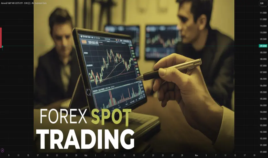
Global Index TradingIntroduction
Global financial markets are deeply interconnected. From the bustling streets of New York to the trading floors in Tokyo, stock markets react not just to domestic events but also to global developments. Investors often find it overwhelming to track thousands of individual stocks across different countries. This is where global indices come in.
Global indices—such as the S&P 500, Dow Jones, NASDAQ, FTSE 100, Nikkei 225, Hang Seng, and DAX—act as benchmarks that represent the performance of a basket of leading companies in a region or sector. Instead of focusing on a single stock, traders can participate in the performance of an entire economy, sector, or region by trading indices.
Global index trading has grown rapidly due to its simplicity, diversification benefits, and ability to capture worldwide economic movements. Whether through futures, ETFs, CFDs, or options, traders can speculate or hedge using indices.
This article explores what index trading is, how it works, its strategies, risks, advantages, and future trends, giving you a complete 360° understanding.
What is an Index?
An index is a statistical measure that tracks the performance of a group of assets. In financial markets, stock indices track a basket of company stocks.
For example:
S&P 500 → Tracks 500 largest US-listed companies.
Nikkei 225 → Represents 225 blue-chip companies listed in Japan.
FTSE 100 → Covers 100 top UK companies listed on the London Stock Exchange.
DAX 40 → Represents 40 major German companies.
By trading these indices, investors gain exposure to entire markets instead of picking individual stocks.
Why Trade Global Indices?
Diversification → Instead of betting on one company, you’re trading the collective performance of many.
Global Exposure → Access to markets worldwide (US, Europe, Asia).
Liquidity → Indices are highly traded, ensuring smooth entry and exit.
Transparency → Indices reflect real-time global economic conditions.
Opportunities in Both Directions → Traders can go long (buy) when bullish or short (sell) when bearish.
Hedging Tool → Investors hedge their portfolios against global uncertainties using index futures and options.
Major Global Indices
1. United States
Dow Jones Industrial Average (DJIA) → Tracks 30 blue-chip companies.
S&P 500 → Broadest and most followed US index (500 companies).
NASDAQ Composite → Tech-heavy index with over 3,000 companies.
2. Europe
FTSE 100 (UK) → UK’s top 100 companies.
DAX 40 (Germany) → German giants like BMW, Siemens, Allianz.
CAC 40 (France) → French market benchmark.
3. Asia-Pacific
Nikkei 225 (Japan) → Japan’s premier stock index.
Hang Seng (Hong Kong) → Reflects China’s corporate strength.
Shanghai Composite (China) → Mainland Chinese companies.
ASX 200 (Australia) → Australia’s top companies.
4. Emerging Markets
Nifty 50 (India) → India’s top 50 companies.
Bovespa (Brazil) → Brazil’s leading stock index.
RTS Index (Russia) → Russia’s blue-chip stocks.
These indices act as economic barometers, and traders worldwide monitor them daily.
How Global Index Trading Works
Trading indices isn’t about buying the index itself (since it’s just a number). Instead, traders use financial instruments tied to the index’s value:
Index Futures
Standardized contracts to buy/sell the index at a future date.
Example: S&P 500 futures.
Used by institutional investors for speculation and hedging.
Index Options
Provide the right (not obligation) to buy/sell indices at specific levels.
Useful for hedging against sudden market drops.
Exchange-Traded Funds (ETFs)
Funds that replicate index performance.
Example: SPY (S&P 500 ETF).
Suitable for long-term investors.
Contracts for Difference (CFDs)
Popular in retail trading.
Allow traders to speculate on index price movements without owning underlying assets.
Factors Influencing Global Indices
Index values fluctuate based on:
Economic Data
GDP growth, inflation, employment data.
Corporate Earnings
Quarterly earnings of large companies drive indices.
Central Bank Policies
Interest rate hikes or cuts (Fed, ECB, BOJ).
Geopolitical Events
Wars, trade disputes, elections.
Global Sentiment
Risk-on (bullish) vs. risk-off (bearish) moods.
Currency Movements
Strong/weak currencies affect export-driven companies.
Popular Strategies in Global Index Trading
Trend Following
Identify long-term trends and ride momentum.
Example: Buying NASDAQ during a tech boom.
Swing Trading
Capturing medium-term moves within global index cycles.
Day Trading / Scalping
Taking advantage of small intraday price fluctuations.
Hedging Strategies
Using index futures to protect portfolios during uncertainty.
Pairs Trading
Trade two correlated indices (e.g., long S&P 500 and short FTSE 100).
Arbitrage
Exploiting price inefficiencies between futures, ETFs, and spot indices.
Benefits of Global Index Trading
Simplicity: No need to analyze thousands of individual stocks.
Lower Volatility: Compared to single stocks, indices move more steadily.
Cost Efficiency: ETFs and CFDs allow exposure at low costs.
24-Hour Opportunities: With different time zones, global indices provide nearly round-the-clock trading.
Risks in Global Index Trading
Market Volatility
Events like COVID-19 caused sharp global index crashes.
Leverage Risk
Futures/CFDs use leverage, magnifying losses.
Systemic Risks
Global crises (2008 Financial Crash, 2020 Pandemic) affect all indices simultaneously.
Currency Risk
Non-domestic traders face forex risks.
Overexposure
Heavy index positions without proper diversification may backfire.
Case Studies of Global Index Movements
1. 2008 Global Financial Crisis
US housing bubble burst → Dow Jones & S&P 500 crashed 50%.
Global indices (Nikkei, FTSE, DAX) followed suit.
2. COVID-19 Pandemic (2020)
Panic selling → Dow fell 3,000 points in a day.
Stimulus packages → Strong rebound across all indices.
3. US Tech Boom (2010s)
NASDAQ outperformed due to Apple, Amazon, Google, Microsoft.
Tech indices became global growth drivers.
Tools & Platforms for Index Trading
MetaTrader (MT4/MT5)
Thinkorswim
Interactive Brokers
TradingView (for charting)
Bloomberg & Reuters (for news updates)
Future of Global Index Trading
Increased ETF Popularity → More passive index investments.
AI & Algo Trading → Automated strategies dominating global index flows.
Thematic Indices → ESG, clean energy, tech-focused indices growing.
Crypto Indices → Crypto-linked index trading gaining traction.
24/7 Trading → Expansion of round-the-clock index trading.
Tips for Beginners
Start with major indices (S&P 500, NASDAQ, DAX).
Use demo accounts before live trading.
Avoid over-leverage.
Follow global news & central bank updates.
Combine technical and fundamental analysis.
Conclusion
Global index trading offers a powerful, diversified, and accessible way to participate in financial markets. Instead of picking individual winners, traders can ride the economic waves of entire regions. While opportunities are vast, one must remain cautious of risks like leverage, volatility, and systemic crises.
For long-term investors, global index ETFs provide steady growth aligned with global economic progress. For traders, futures, options, and CFDs open doors to both speculative profits and hedging strategies.
In today’s interconnected world, global index trading is no longer optional—it’s essential for anyone looking to understand and profit from international financial markets.
ICT CONCEPTS BLENDED W/SUPPORT AND RESISTANCE_SELLOn the weekly and Daily timeframes the next market move is not clear, following the trend we're bullish, but there is also a higher timeframe resistance has been met creating a higher high around the 45,774.20 level, and a move to the sell side is very possible, along with recent news events.

Understanding Consolidation & Trading itWhat Consolidation Is
Consolidation is a market phase where price moves sideways within a defined range, showing indecision or balance between buyers (bulls) and sellers (bears).
Characterized by low volatility, overlapping candles, and no clear trend direction.
Often occurs after strong moves (as the market pauses) or before breakouts (accumulation/distribution).
Impact on Bulls & Bears
Bulls: View consolidation near highs as accumulation (buyers building positions before a breakout upward).
Bears: View consolidation near lows as distribution (sellers unloading before a breakdown).
Both sides place stop orders outside the range → creating liquidity pools that smart money hunts.
How Traders Can Take Advantage
Range Trading – Buy near support of the range, sell near resistance, until breakout occurs.
Liquidity Strategy – Wait for fakeouts beyond consolidation, then trade in the opposite direction (stop hunt setup).
Consolidation Across Timeframes
Lower Timeframes (1m–15m):
Looks like noise but is often where scalpers range trade.
Breakouts can give small but quick moves.
Mid Timeframes (1H–4H):
Shows clear accumulation/distribution phases.
Useful for intraday & swing traders.
Higher Timeframes (Daily–Weekly):
Represents major market indecision.
Breakouts from these zones often fuel massive trend moves.
✅ Summary:
Consolidation = sideways range = balance of bulls & bears.
Inside range → fade the extremes.
Outside range → trade support & resistance or liquidity sweep.
On different timeframes → the same consolidation can be noise on 5M, but a critical accumulation on the Daily chart.

The Power of Price Action: Reading the Market Without IndicatorsIn the trading world, many traders get caught up in countless technical indicators such as RSI, MACD, and Stochastic… However, at the core of every price movement lies Price Action – the art of reading the market purely through price and volume, without relying heavily on indicators.
1. What is Price Action?
Price Action is the art of analyzing and making trading decisions based on pure price movement. Traders focus on price patterns, market structure, support and resistance levels, and especially candlestick signals, instead of depending on formula-based indicators.
2. Why is Price Action Important?
Primal nature: Price is the most direct information from the market, not lagging like indicators.
Flexibility: Applicable across all markets (Forex, Gold, Stocks, Crypto…).
Simplicity & effectiveness: Helps traders cut out the “noise” from overly complex tools.
3. Core Elements of Price Action
Support and Resistance Zones: Where supply and demand meet, shaping trends.
Market Structure: Uptrend, downtrend, consolidation, or breakout.
Reversal & Continuation Candlestick Patterns: Offering signals for entries and exits.
4. Key Candlestick Patterns
Doji: Reflects indecision, signaling a possible reversal or continuation.
Pin Bar (Long-tailed candlestick): A long wick shows strong rejection, a reliable reversal signal.
Engulfing: A candle that fully engulfs the previous one, demonstrating dominance from buyers or sellers.

Role of Technology in Global Markets 1. Historical Evolution of Technology in Markets
a. Early Communication Systems
In the 1800s, financial markets were largely local. Traders depended on physical meetings or handwritten letters to exchange market information.
The invention of the telegraph (1837) and later the telephone (1876) dramatically reduced the time it took to transmit financial information across cities and countries. For example, stock prices could be sent from New York to London in minutes instead of weeks.
b. Electronic Trading Emergence
The 20th century saw the development of electronic ticker systems, allowing near real-time updates of market prices.
By the 1970s and 1980s, exchanges began experimenting with electronic order-matching systems. NASDAQ, founded in 1971, became the world’s first electronic stock exchange.
c. The Internet Revolution
The 1990s introduced the internet into global markets. Online trading platforms allowed retail investors to directly access markets without relying solely on brokers.
E-commerce platforms like Amazon and Alibaba transformed global consumer markets, while digital communication allowed businesses to operate internationally with ease.
d. 21st-Century Transformations
Today’s markets are dominated by high-frequency trading (HFT), artificial intelligence (AI)-driven strategies, blockchain technologies, cloud computing, and mobile financial services.
Cross-border investing is instantaneous, and global markets operate nearly 24/7 with technology as their backbone.
2. Key Roles of Technology in Global Markets
a. Enhancing Market Efficiency
Technology reduces information asymmetry by providing real-time access to prices, news, and economic data.
Algorithms match buyers and sellers instantly, narrowing bid-ask spreads and improving liquidity.
b. Democratization of Access
Earlier, only wealthy institutions could access sophisticated markets. Now, mobile apps and online brokerages allow small retail investors across the world to trade with minimal costs.
Platforms like Robinhood, Zerodha, and eToro have expanded participation, enabling global capital flows.
c. Speed and Automation
High-frequency trading systems can execute thousands of trades per second, exploiting micro-price differences across exchanges.
Automation has also entered settlement systems. For example, blockchain-based smart contracts can settle cross-border payments instantly, reducing costs and delays.
d. Integration of Global Trade and Supply Chains
Technology supports global commerce through logistics software, digital supply chain management, and e-commerce.
Platforms like Amazon, Alibaba, and Shopify connect producers in one country directly with consumers worldwide.
e. Data and Analytics
Markets today thrive on data. Artificial intelligence and machine learning analyze billions of data points—from satellite images to social media sentiment—to predict economic and financial trends.
Big data tools allow investors and companies to manage risks better, anticipate market shifts, and optimize operations.
f. Financial Innovation
Technology has given rise to new asset classes such as cryptocurrencies, NFTs, and tokenized securities.
Decentralized Finance (DeFi) platforms now allow global lending, borrowing, and investing without intermediaries.
3. The Role of Technology Across Market Segments
a. Stock Markets
Stock exchanges globally, like NYSE, NASDAQ, London Stock Exchange, and NSE India, operate through highly advanced trading platforms.
Investors across the world can place trades in milliseconds, and order books are updated in real-time.
AI-driven portfolio management tools (robo-advisors) help retail investors diversify globally at low costs.
b. Foreign Exchange (Forex) Markets
The forex market is the world’s largest, trading over $7 trillion daily. Technology enables real-time currency trading across time zones.
Electronic Communication Networks (ECNs) match global buyers and sellers, improving liquidity and reducing barriers.
Mobile apps allow individuals to hedge against currency risk or speculate, regardless of location.
c. Commodities and Energy Markets
Technology enables smart logistics, digital commodity trading platforms, and automated hedging strategies.
For oil, metals, and agricultural products, satellite data and IoT devices provide real-time production and supply information, improving transparency.
d. Cryptocurrency and Digital Assets
Blockchain technology has created entirely new forms of global markets.
Bitcoin, Ethereum, and other cryptocurrencies trade on global exchanges accessible 24/7.
DeFi protocols allow people to lend, borrow, and earn interest globally without banks.
e. E-commerce and Consumer Markets
Global consumer markets are dominated by digital platforms. Amazon, Alibaba, Flipkart, and Mercado Libre connect sellers and buyers worldwide.
Payment technologies like PayPal, UPI, and digital wallets facilitate seamless cross-border transactions.
4. Benefits of Technology in Global Markets
Accessibility: Investors and businesses worldwide can participate, regardless of geography.
Efficiency: Faster transactions, lower costs, and transparent processes.
Liquidity: Electronic platforms ensure deep pools of buyers and sellers.
Innovation: Emergence of new asset classes and financial instruments.
Transparency: Real-time reporting and monitoring reduce fraud and insider advantages.
Inclusivity: Small investors and businesses gain entry into markets once dominated by large institutions.
5. Risks and Challenges of Technology in Global Markets
a. Cybersecurity Threats
Global markets face risks of hacking, data breaches, and fraud.
High-profile exchange hacks (like Mt. Gox in 2014) show how vulnerable digital markets can be.
b. Market Volatility
Algorithmic trading sometimes amplifies volatility, as seen in the “Flash Crash” of May 2010 when the Dow dropped nearly 1,000 points within minutes.
c. Digital Divide
While technology democratizes access, millions worldwide remain excluded due to lack of internet, devices, or digital literacy.
d. Regulatory Challenges
Cross-border digital markets are hard to regulate uniformly. For example, cryptocurrency regulations differ drastically between countries, creating uncertainty.
e. Over-Reliance on Technology
System failures, outages, or glitches can halt global trading. For instance, NYSE and NSE India have both faced trading halts due to technical issues.
6. The Future of Technology in Global Markets
a. Artificial Intelligence (AI) and Machine Learning
AI will further automate trading, risk management, and fraud detection.
Predictive analytics will become central to investment decisions.
b. Blockchain and Decentralization
Blockchain has the potential to eliminate intermediaries in global markets, reducing costs and improving efficiency.
Tokenization may allow fractional ownership of real-world assets like real estate and art.
c. Quantum Computing
Quantum technology could revolutionize market modeling, encryption, and trading strategies, offering new levels of computational power.
d. Sustainable and Green Technology
Technology will enable carbon credit markets, renewable energy trading platforms, and ESG-focused investing.
Blockchain can track supply chain sustainability and ethical sourcing.
e. Global Financial Inclusion
Mobile banking and fintech will bring billions of unbanked individuals into the global financial system, especially in developing nations.
7. Case Studies
Robinhood and Gamestop (2021): Showed how technology and social media democratize access but also create risks of market manipulation.
Alibaba Singles’ Day Sales: A showcase of how e-commerce technology creates global consumer demand, with billions in sales in a single day.
Cryptocurrency Boom: Bitcoin’s rise to a trillion-dollar asset class highlights the disruptive role of blockchain in global finance.
Tesla’s Global Supply Chain: Use of AI, automation, and digital logistics to manage global production and delivery networks.
Conclusion
Technology is not just an enabler but the backbone of modern global markets. It drives speed, efficiency, innovation, and inclusivity, ensuring that capital, goods, services, and information flow seamlessly across borders. However, its power also comes with risks—cyber threats, volatility, inequality, and regulatory challenges—that must be managed carefully.
As we look ahead, technology’s role will only deepen, with AI, blockchain, and fintech shaping the next wave of market evolution. The ultimate challenge will be to harness technology’s benefits while creating safeguards that ensure global markets remain fair, stable, and inclusive for all.

Role of International Trade in Global Markets1. Understanding International Trade
International trade refers to the exchange of goods, services, capital, and ideas across national borders. Unlike domestic trade, which takes place within one country, international trade involves multiple currencies, laws, cultures, and business practices.
Key Features:
Cross-border transactions: Goods and services move from one country to another.
Comparative advantage: Nations specialize in what they produce most efficiently.
Use of currencies: Requires mechanisms for exchange rates and settlement.
Government involvement: Tariffs, quotas, trade agreements, and regulations.
Global institutions: WTO, IMF, World Bank, and regional trade blocs shape trade flows.
Historical Perspective:
Ancient trade routes like the Silk Road enabled cultural and material exchanges.
Colonial trade in the 16th–19th centuries focused on raw material extraction and global shipping networks.
Post–World War II saw the creation of institutions like the GATT (General Agreement on Tariffs and Trade), later evolving into the World Trade Organization (WTO), to facilitate rules-based trade.
21st-century trade involves digital commerce, global value chains (GVCs), and services-based exports such as IT, finance, and logistics.
2. The Economic Role of International Trade in Global Markets
(a) Driver of Economic Growth
International trade expands markets for producers, giving them access to consumers beyond national borders. For developing nations, it provides pathways to industrialization and modernization. For advanced economies, it ensures continued growth through exports and investment opportunities.
Export-led growth: Economies like China, South Korea, and Singapore have grown exponentially by adopting export-oriented development strategies.
Access to larger markets: Firms achieve economies of scale, producing more efficiently and lowering costs.
Capital inflows: Foreign trade attracts foreign direct investment (FDI), creating jobs and infrastructure.
(b) Resource Allocation and Efficiency
Trade allows countries to specialize according to comparative advantage, leading to more efficient global resource use. For example:
Middle Eastern countries specialize in oil exports.
India exports IT services and pharmaceuticals.
Germany exports automobiles and engineering products.
This specialization boosts global productivity while lowering costs for consumers.
(c) Contribution to GDP
In most economies, international trade contributes significantly to GDP (Gross Domestic Product).
For open economies like Singapore, trade (exports + imports) accounts for >300% of GDP.
Even large economies like the US, China, and EU rely heavily on trade for growth.
(d) Enhancing Consumer Choice
Through trade, consumers gain access to a wider variety of goods and services—ranging from electronics and luxury cars to agricultural products and entertainment content. This improves living standards globally.
(e) Job Creation and Employment
Trade-intensive industries generate millions of jobs. Export manufacturing zones, service outsourcing, and logistics hubs provide direct employment while also stimulating indirect job creation in supporting industries.
3. International Trade and Market Integration
(a) Global Value Chains (GVCs)
Modern trade is characterized by the fragmentation of production. A single product, like an iPhone, is designed in the US, manufactured in China, with components sourced from Japan, Korea, and Germany. GVCs integrate multiple economies into a single supply network.
(b) Financial Market Integration
International trade requires financial flows, including payments, investments, and hedging. This leads to:
Cross-border capital movement.
Global financial interdependence.
Development of international banking and currency markets.
(c) Technology and Knowledge Transfer
Trade facilitates the spread of technology and innovation. Multinational corporations bring modern techniques to host countries, enhancing productivity and competitiveness.
(d) Formation of Trade Blocs
Regional economic integration—like the European Union (EU), NAFTA/USMCA, ASEAN, and African Continental Free Trade Area (AfCFTA)—has reshaped global markets by reducing barriers and creating common markets.
4. Social and Political Role of International Trade
(a) Promoting Peace and Cooperation
Trade interdependence reduces the likelihood of conflicts. Nations that rely on each other for resources, markets, or investment have incentives to maintain peaceful relations.
(b) Cultural Exchange
Trade spreads not only products but also cultures, ideas, and lifestyles. For instance, Hollywood movies, K-pop, and yoga reached global audiences through trade-driven globalization.
(c) Political Leverage
Countries use trade as a tool of diplomacy or pressure. Sanctions, trade restrictions, and preferential trade agreements influence global politics.
(d) Reducing Poverty
Trade-led growth lifts millions out of poverty. For example, China’s integration into world trade since the 1980s has lifted over 800 million people above the poverty line.
5. Challenges of International Trade in Global Markets
While trade drives growth, it also brings vulnerabilities.
(a) Trade Imbalances
Large deficits or surpluses can destabilize economies. For instance, the persistent US-China trade imbalance has fueled economic tensions.
(b) Protectionism
Countries often impose tariffs, quotas, or subsidies to protect domestic industries, which can trigger trade wars. Example: US-China tariff war (2018–2020).
(c) Supply Chain Disruptions
Events like the COVID-19 pandemic, the Russia-Ukraine war, and the Suez Canal blockage highlighted the fragility of global supply chains.
(d) Inequality
Trade benefits are unevenly distributed. While some sectors and regions thrive, others suffer job losses due to import competition or outsourcing.
(e) Environmental Concerns
Increased trade leads to higher carbon emissions from shipping and production, contributing to climate change. At the same time, global competition pressures industries to adopt environmentally unsustainable practices.
6. Role of International Institutions in Trade
(a) World Trade Organization (WTO)
Provides rules for global trade.
Resolves disputes.
Promotes free and fair competition.
(b) International Monetary Fund (IMF) and World Bank
Support balance-of-payments stability.
Finance trade-related development projects.
(c) Regional Organizations
EU ensures a common market with free movement of goods, services, and people.
ASEAN and USMCA promote regional cooperation.
7. Future of International Trade in Global Markets
(a) Digital Trade and E-commerce
Cross-border e-commerce platforms like Amazon, Alibaba, and Shopify are reshaping trade, making it easier for small businesses to reach global markets.
(b) Services Trade
Beyond goods, international trade in IT services, fintech, tourism, and online education is becoming a major growth driver.
(c) Sustainable Trade
Green trade policies are gaining prominence, focusing on renewable energy, low-carbon logistics, and sustainable sourcing.
(d) Geopolitical Shifts
The rise of China and India as global trade powerhouses.
Trade realignment due to US-China rivalry.
Increased focus on South-South trade among emerging markets.
(e) Technological Innovations
Blockchain, artificial intelligence, and digital currencies may revolutionize trade logistics, payments, and transparency.
Conclusion
International trade is the backbone of global markets. It enables countries to grow beyond their domestic limitations, enhances efficiency through specialization, and integrates the world into a complex but interdependent economic system. While trade has its challenges—ranging from inequality and environmental concerns to geopolitical tensions—it remains an irreplaceable driver of globalization and prosperity.
In the coming decades, the role of international trade will evolve further, shaped by technology, sustainability, and geopolitics. Countries that adapt effectively, balancing openness with resilience, will thrive in an interconnected global marketplace.

Difference Between Domestic & Global Markets1. Defining Domestic and Global Markets
1.1 Domestic Market
A domestic market refers to the economic system where buying and selling of goods, services, and securities occur within a single country’s boundaries. Participants—consumers, businesses, and regulators—are all subject to the nation’s laws, taxation system, and currency.
Example: A retail chain like DMart in India primarily serves domestic customers, operating under Indian laws, pricing in rupees, and sourcing largely within the country.
1.2 Global Market
A global market refers to economic interactions that take place across national boundaries. Businesses operate internationally, customers are spread worldwide, and transactions involve multiple currencies, legal frameworks, and regulatory bodies.
Example: Apple Inc. operates in a global market by selling iPhones manufactured in China, designed in the U.S., and sold across Europe, Asia, and Africa.
2. Scope and Reach
2.1 Domestic Markets
Geographically limited to a nation’s borders.
Customer base is homogeneous to some extent, shaped by shared culture, language, and local preferences.
Easier for businesses to predict demand since consumer behavior follows national patterns.
2.2 Global Markets
Not restricted by geography.
Customer base is heterogeneous, shaped by multiple cultures, income levels, and lifestyles.
Businesses must adapt products, marketing, and pricing strategies to diverse markets.
Key Difference: Domestic markets are narrower and more predictable, whereas global markets are vast but require adaptation and flexibility.
3. Currency and Transactions
Domestic
Transactions occur in local currency (e.g., INR in India, USD in the U.S.).
Businesses are not exposed to foreign exchange risks.
Pricing is stable and predictable.
Global
Transactions involve multiple currencies.
Businesses face foreign exchange risks due to fluctuating exchange rates.
Hedging tools like forwards, futures, and options are often used to mitigate risks.
Example: An Indian exporter selling textiles to the U.S. earns in USD but pays expenses in INR, creating exposure to rupee-dollar fluctuations.
4. Regulatory Environment
Domestic
Governed by one set of laws—taxation, labor, trade, and consumer protection.
Relatively simple compliance requirements.
Global
Must comply with multiple regulatory frameworks, such as WTO guidelines, bilateral trade agreements, and local country laws.
Businesses face complex challenges like tariffs, customs duties, and import-export restrictions.
Example: Pharmaceutical companies must meet FDA regulations in the U.S., EMA rules in Europe, and CDSCO standards in India—all for the same drug.
5. Participants and Players
Domestic
Participants: Local consumers, domestic businesses, national government, and domestic financial institutions.
Competition is mostly between local companies.
Global
Participants: Multinational corporations (MNCs), foreign investors, international banks, governments, and supranational organizations (like IMF, WTO, World Bank).
Competition is global, with both domestic and foreign firms vying for market share.
6. Cultural and Social Factors
Domestic
Shared culture, traditions, and language make it easier to design marketing campaigns and business strategies.
Customer behavior is more predictable.
Global
Requires cultural sensitivity and adaptation.
Marketing campaigns must be tailored to different countries.
Misunderstandings can lead to failures.
Example: McDonald’s offers vegetarian menus in India but focuses on beef products in the U.S.—an adaptation to cultural norms.
7. Technology and Infrastructure
Domestic
Businesses depend on the nation’s infrastructure—roads, telecom, electricity, banking system.
Technological standards are uniform across the country.
Global
Requires adaptation to varying levels of infrastructure across countries.
Digital platforms and e-commerce allow businesses to reach global customers more easily.
Example: Amazon must adapt its delivery logistics differently in developed markets like the U.S. versus emerging markets like India.
8. Risks and Uncertainties
Domestic
Risks are limited to local economic cycles, political changes, or regulatory shifts.
Easier to forecast.
Global
Exposed to a wide range of risks:
Exchange rate volatility
Geopolitical tensions
Trade wars and sanctions
Global recessions
Higher uncertainty, requiring strong risk management.
9. Opportunities for Businesses
Domestic
Easier entry for startups and small businesses.
Lower operational complexity.
Opportunity to build brand loyalty in a focused market.
Global
Access to larger customer base.
Diversification across countries reduces dependency on one economy.
Economies of scale in production and sourcing.
Example: Samsung’s global operations allow it to spread risks—if demand slows in one region, it can rely on others.
10. Trade and Capital Flows
Domestic
Trade and capital flows remain within the country.
Investments are in local stocks, bonds, and banks.
Global
Involves international trade and capital flows.
Access to foreign direct investment (FDI), global venture capital, and international stock markets.
Cross-border mergers and acquisitions are common.
Advantages and Disadvantages
Domestic Markets
Advantages:
Lower risk and complexity.
Familiar consumer base.
Easier regulations.
Disadvantages:
Limited growth potential.
Vulnerable to domestic economic downturns.
Global Markets
Advantages:
Huge growth opportunities.
Risk diversification.
Access to global talent, technology, and capital.
Disadvantages:
Complex regulations and higher costs.
Cultural and operational challenges.
Exposure to global uncertainties.
Conclusion
The domestic market provides a secure foundation for businesses, enabling them to establish brand value and gain local expertise. The global market, on the other hand, offers expansion opportunities, diversification, and exposure to larger customer bases—but at the cost of higher complexity and risk.
For businesses and investors, the choice between domestic and global markets is not always an either-or scenario. In fact, the most successful strategies involve building a strong domestic base and then gradually expanding globally.
Ultimately, understanding the differences between domestic and global markets allows companies, policymakers, and investors to make informed decisions in an increasingly interconnected economic world.
Risks in International Markets1. Economic Risks
1.1 Exchange Rate Volatility
Currency fluctuations are one of the most prominent risks in international trade and investment. A company exporting goods may see profits wiped out if the foreign currency weakens against its home currency.
Example: An Indian IT company billing clients in U.S. dollars may face reduced revenues when the rupee strengthens against the dollar.
1.2 Inflation and Deflation
High inflation erodes purchasing power, increases input costs, and disrupts profit margins. Conversely, deflation can reduce demand and stall economic activity.
Example: Argentina’s chronic inflation crisis often discourages foreign investors who fear value erosion.
1.3 Interest Rate Fluctuations
Central banks’ monetary policies impact borrowing costs and investment flows. An unexpected hike in interest rates in one country may cause sudden capital flight from emerging markets.
Example: The U.S. Federal Reserve’s interest rate hikes often trigger volatility in Asian and African markets.
1.4 Recession and Economic Slowdowns
Global recessions reduce demand for exports, depress commodity prices, and weaken consumer confidence.
Example: The 2008 global financial crisis led to massive declines in cross-border trade and investment.
2. Financial Risks
2.1 Credit and Default Risks
Companies operating in international markets face the risk of counterparties defaulting on payments.
Example: During the 1997 Asian financial crisis, many firms defaulted, leaving global suppliers unpaid.
2.2 Liquidity Risks
Some foreign markets lack depth, meaning it may be difficult to sell assets quickly without losses.
2.3 Market Volatility
Stock, bond, and commodity markets in emerging economies are often more volatile due to low investor confidence, political instability, or weak regulations.
Example: The Russian stock market has historically experienced extreme volatility linked to sanctions and oil price movements.
2.4 Capital Flow Reversals
Large and sudden withdrawals of foreign portfolio investments can destabilize markets.
3. Political Risks
3.1 Government Instability
Frequent changes in government, corruption, or coups create uncertainty.
Example: Political turmoil in Pakistan often deters foreign direct investment.
3.2 Nationalization and Expropriation
Governments may seize control of foreign assets.
Example: Venezuela nationalized foreign oil companies in the 2000s, leading to billion-dollar losses for firms like ExxonMobil.
3.3 Geopolitical Conflicts
Wars, sanctions, and territorial disputes disrupt supply chains and investments.
Example: The Russia-Ukraine conflict caused global energy and food price spikes.
3.4 Protectionism
Tariffs, quotas, and restrictions limit free trade.
Example: The U.S.–China trade war imposed heavy tariffs, hurting exporters worldwide.
4. Legal and Regulatory Risks
4.1 Differing Legal Systems
What is legal in one country may be illegal in another.
Example: Intellectual property protection is strong in the U.S. but weak in some Asian economies, leading to counterfeiting risks.
4.2 Taxation Policies
Double taxation or unexpected tax reforms can erode profits.
4.3 Contract Enforcement
Weak judicial systems may delay or prevent resolution of business disputes.
4.4 Compliance and Standards
Businesses must comply with varying labor, safety, and environmental laws across markets.
5. Cultural and Social Risks
5.1 Consumer Preferences
Products that succeed in one country may fail elsewhere due to cultural differences.
Example: Walmart struggled in Germany because its retail culture clashed with German shopping habits.
5.2 Communication Barriers
Misunderstandings due to language or etiquette can harm negotiations.
5.3 Labor Relations
Different countries have unique labor practices and union dynamics.
5.4 Social Unrest
Strikes, protests, or civil movements can disrupt operations.
6. Technological Risks
6.1 Cybersecurity Threats
Cross-border businesses face heightened risks of hacking, fraud, and cyber-espionage.
Example: Global ransomware attacks like WannaCry hit companies operating internationally.
6.2 Technological Obsolescence
Rapid innovation means products and processes can quickly become outdated.
6.3 Digital Divide
Operating in markets with poor digital infrastructure limits efficiency.
7. Environmental and Natural Risks
7.1 Climate Change
Rising sea levels, extreme weather, and changing agricultural patterns disrupt global supply chains.
Example: Floods in Thailand (2011) severely disrupted global automobile and electronics supply chains.
7.2 Natural Disasters
Earthquakes, hurricanes, or pandemics can shut down markets overnight.
Example: The COVID-19 pandemic brought unprecedented disruption to international trade.
7.3 Environmental Regulations
Stricter global climate policies increase compliance costs.
8. Operational Risks
8.1 Supply Chain Disruptions
Globalized production systems are highly vulnerable to bottlenecks.
Example: The 2021 Suez Canal blockage caused billions in trade losses.
8.2 Infrastructure Limitations
Poor roads, ports, and logistics reduce efficiency.
8.3 Management Complexity
Coordinating diverse teams across countries increases risks of inefficiency.
9. Case Studies
2008 Global Financial Crisis – Showed how interconnected financial systems amplify risks.
Brexit – Created uncertainty for businesses operating across the UK and EU.
COVID-19 Pandemic – Highlighted vulnerabilities in supply chains and global health systems.
U.S.–China Trade War – Demonstrated how political tensions affect global markets.
10. Risk Mitigation Strategies
Hedging against currency and commodity risks.
Diversification across markets and sectors.
Political risk insurance for investments in volatile regions.
Robust compliance programs for navigating legal risks.
Cultural training for international teams.
Digital security investments to counter cyber threats.
Supply chain resilience through multiple sourcing and local alternatives.
Conclusion
International markets present immense opportunities for growth and diversification. However, these opportunities are shadowed by complex risks ranging from currency volatility and political instability to technological disruptions and environmental challenges.
For investors, corporations, and policymakers, success lies not in avoiding risks but in understanding, anticipating, and managing them strategically. A structured approach to risk assessment, combined with adaptive strategies, enables global players to thrive in uncertain environments.
The modern world demands resilience—businesses must prepare for shocks, governments must design stable frameworks, and investors must remain vigilant. By doing so, the promise of international markets can outweigh their perils.

Master TradingView Like a Pro – Tools, Alerts, and Hidden Gems!Are you really using everything TradingView has to offer?
In this video, I’m breaking down 8 powerful features inside TradingView that most traders don’t fully use — even though they can save time, improve your analysis, and help you catch better setups.
Here’s what I’ll walk you through step by step:
✅ How I use Drawing Tools to map market structure
✅ Why I rarely use indicators — but why you should still know them
✅ How to scan markets fast using the Screener & Heatmap
✅ The right way to use the Economic Calendar and avoid news traps
✅ The feature I use daily: Price Alerts (a total game changer)
✅ How to practice with zero risk using Paper Trading
✅ Using Multi-Chart Layouts to watch multiple timeframes
✅ And finally — how the TradingView Community helped me grow and connect
Whether you're just getting started or already experienced — this video is packed with value.
Watch it till the end, and if you find it helpful — like, comment, and share it to support my work!
Best, Arman Shaban

Bitcoin - TIP - Correct Way to Draw Support / ResistanceI see often times analysts using horizontal support and resistance on Bitcoin.
I wanted to demonstrate the proper way of using support resistance on Bitcoin - and show how the channels are ascending from left to right.
Not only can this be repeated on high time frames - by duplicating the line with the same degree of angle, and placing it at any location - it can also be applied to smaller and smaller time frames, and the price respects these angles very well.
Due to the liquidation wicks and absorptions that occur, price will move above and below the correct line - but the correct line serves as a volume support line that’s again, ascending from left to right.
Try this out on your charts - and see how reliable it is.
Ascending angles - not horizontals.
