Futures - Commodities / Financial: Gold case (MGC)Applying A+ setup, volume profile (high volume nodes, low volume nodes day and intra-day and possibly extended to swing probability), smart money concept, numerical volume buy/sell side. trend confirmation, tick charts.
Chart Patterns

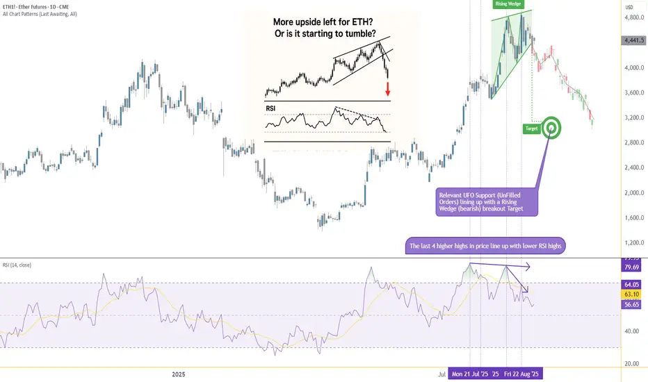
From Strength to Weakness: ETH Validates a Key Bearish PatternIntroduction (Market Context)
Ether Futures (ETH) and Micro Ether Futures (MET) have been at the center of market attention since April 2025, when prices staged a remarkable rally of more than +250%. This surge was not just a technical phenomenon—it came in the wake of major macro events such as Liberation Day and the reemergence of U.S. tariff policies under Donald Trump’s administration. Those developments sparked speculative flows into digital assets, with Ether acting as one of the prime beneficiaries of capital rotation.
Yet markets rarely move in one direction forever. After such a sharp rise, technical exhaustion often follows, and signs of that exhaustion are beginning to surface on ETH’s daily chart. Traders who enjoyed the rally now face a critical juncture: whether to protect gains or to consider new opportunities in the opposite direction. The key lies in a pattern that has appeared many times in history, often marking important reversals—the Rising Wedge.
What is a Rising Wedge?
A Rising Wedge is one of the most recognizable bearish reversal formations in technical analysis. It typically develops after a strong uptrend, where price continues to push higher but does so with diminishing momentum. On the chart, the highs and lows still point upward, but the slope of the highs is shallower than the slope of the lows, creating a narrowing upward channel.
The psychology behind the wedge is critical: buyers are still in control, but they are running out of strength with every push higher. Sellers begin to absorb demand more aggressively, and eventually, price breaks through the lower boundary of the wedge. This breakdown often accelerates as trapped buyers unwind positions.
From a measurement perspective, technicians project the maximum width of the wedge at its start, and then apply that distance downward from the point of breakdown. This projection offers a technical target for where price may gravitate in the following weeks. In the case of Ether Futures, that target points toward the 3,200 area, a level of strong technical interest and a logical area for traders to watch closely.
RSI and Bearish Divergence
Alongside the wedge, momentum indicators add further weight to the bearish case. The Relative Strength Index (RSI) is a widely used oscillator that measures momentum on a scale of 0 to 100. Values above 70 are generally interpreted as “overbought,” while values below 30 suggest “oversold.”
The most powerful signals often emerge not when RSI is at an extreme, but when it diverges from price action. A bearish divergence occurs when price sets higher highs while RSI forms lower highs. This is an indication that upward momentum is weakening even as price appears to climb.
Ether Futures have displayed this phenomenon clearly over the past few weeks. The daily chart shows four successive higher highs in price, yet RSI failed to confirm these moves, instead tracing a series of lower peaks. Notably, RSI pierced the overbought zone above 70 twice during this period, but momentum faded quickly after each attempt. This divergence is a classic early warning sign that a bullish run is running out of steam.
Forward-Looking Trade Idea
With the Rising Wedge breakdown and RSI divergence in place, a structured trade plan emerges. Futures traders can express this view through either the standard Ether Futures contract (ETH) or its smaller counterpart, the Micro Ether Futures contract (MET).
Contract Specs & Margins
Ether Futures (ETH): Notional = 50 Ether, Tick size = 0.50, Tick value = $25.00, Initial margin ≈ $68,800 (subject to CME updates).
Micro Ether Futures (MET): Notional = 0.1 Ether, Tick size = 0.50, Tick value = $0.05, Initial margin ≈ $140 (subject to CME updates).
Trade Plan (Bearish Setup)
Direction: Short
Entry: 4,360
Target: 3,200
Stop Loss: 4,702 (coinciding with a minor resistance level)
Reward-to-Risk Ratio: ≈ 3.39 : 1
The projected wedge target around 3,200 is not only a measured move from the pattern but also sits close to a previously established UFO support zone. While anecdotal, this confluence reinforces the credibility of the level as a potential magnet for price.
Risk Management
Regardless of how compelling a technical setup may appear, the most decisive factor in trading remains risk management. Defining risk in advance ensures that losses are limited if the market behaves unexpectedly. In this case, placing the stop at 4,702 not only keeps risk under control but also aligns with a minor resistance level, making the trade plan technically coherent.
Position sizing also plays a crucial role. The availability of Micro Ether Futures (MET) allows traders to participate with significantly reduced capital requirements compared to the full-sized ETH contract. This flexibility makes it easier to fine-tune exposure and manage account risk more precisely.
Equally important is the discipline of adhering to precise entries and exits. Chasing a trade or ignoring pre-defined stop levels can erode the edge provided by technical analysis. Markets often deliver multiple opportunities, but without sound risk management, traders may not survive long enough to benefit from them. Ultimately, capital preservation is the foundation on which consistent performance is built.
Closing
Ether’s spectacular rally since April 2025 is a reminder of the asset’s ability to deliver explosive moves under the right conditions. Yet history shows that parabolic advances rarely continue uninterrupted. The combination of a Rising Wedge breakdown and a confirmed RSI divergence provides strong evidence that the current uptrend is losing momentum, and the market may be entering a corrective phase.
For traders, this is less about predicting the future and more about recognizing when probabilities align in favor of a defined setup. With clear entry, target, and stop levels, the ETH and MET contracts offer a structured opportunity for those willing to take a bearish stance while managing their risk appropriately.
When charting futures, the data provided could be delayed. Traders working with the ticker symbols discussed in this idea may prefer to use CME Group real-time data plan on TradingView: www.tradingview.com - This consideration is particularly important for shorter-term traders, whereas it may be less critical for those focused on longer-term trading strategies.
General Disclaimer:
The trade ideas presented herein are solely for illustrative purposes forming a part of a case study intended to demonstrate key principles in risk management within the context of the specific market scenarios discussed. These ideas are not to be interpreted as investment recommendations or financial advice. They do not endorse or promote any specific trading strategies, financial products, or services. The information provided is based on data believed to be reliable; however, its accuracy or completeness cannot be guaranteed. Trading in financial markets involves risks, including the potential loss of principal. Each individual should conduct their own research and consult with professional financial advisors before making any investment decisions. The author or publisher of this content bears no responsibility for any actions taken based on the information provided or for any resultant financial or other losses.
Blockchain in Trading1. Introduction to Blockchain & Trading
Trading has always been the lifeblood of financial markets. From the ancient barter system to modern electronic stock exchanges, trading has evolved with technology. The 21st century brought algorithmic trading, online platforms, and digital assets. But now, another revolutionary technology is reshaping trading: Blockchain.
Blockchain is often described as a distributed digital ledger that records transactions securely, transparently, and immutably. Unlike traditional databases, it doesn’t rely on a single central authority. Instead, multiple participants (nodes) maintain a synchronized copy of the ledger.
In trading, whether it’s stocks, bonds, commodities, currencies, or derivatives, the biggest challenges have been trust, transparency, speed, and costs. Blockchain directly addresses these pain points. By combining decentralization, security, and automation, blockchain is transforming how trading is executed, cleared, and settled.
2. Core Features of Blockchain Relevant to Trading
To understand why blockchain is powerful for trading, let’s break down its key features:
Decentralization: Removes dependence on intermediaries like brokers or clearing houses.
Transparency: Every transaction is visible on the ledger, reducing fraud.
Immutability: Once recorded, transactions cannot be altered.
Security: Cryptographic encryption makes hacking extremely difficult.
Programmability: Smart contracts can automate trades, settlements, and compliance.
Speed: Reduces settlement time from days (T+2, T+3) to minutes or seconds.
These features make blockchain a natural fit for trading ecosystems, where billions of dollars move daily and where even micro-delays or small inefficiencies can create huge costs.
3. Blockchain in Stock Markets
Traditional stock markets operate with multiple intermediaries—brokers, exchanges, custodians, clearing houses, and regulators. Each layer adds cost, delay, and counterparty risk.
Blockchain can simplify this by enabling:
Direct peer-to-peer stock trading without intermediaries.
Faster settlements (T+0) instead of T+2 days.
Reduced reconciliation errors, since all parties view the same ledger.
Instant ownership transfer through tokenized shares.
Some exchanges have already started experimenting:
The Australian Securities Exchange (ASX) has explored blockchain for clearing and settlement.
Nasdaq uses blockchain in its private market to manage share issuance and trading.
In the future, we may see fully blockchain-powered exchanges, eliminating inefficiencies of legacy systems.
4. Blockchain in Commodity & Forex Trading
Commodities (gold, oil, agricultural products) and foreign currencies are traded globally, often with complex logistics and verification issues.
Blockchain adds value here by:
Tracking supply chain authenticity (e.g., proving gold is ethically sourced).
Reducing settlement risks in forex trading, where trillions of dollars are exchanged daily.
Tokenization of commodities (digital gold, digital oil futures) for easier trading.
For example, several blockchain platforms already offer gold-backed tokens that represent fractional ownership of real physical gold, making it easier for traders to hedge or invest.
5. Blockchain and Cryptocurrencies
Cryptocurrencies like Bitcoin, Ethereum, and stablecoins are themselves products of blockchain. They represent the first real-world use case of blockchain in trading.
Key points:
24/7 global trading of cryptocurrencies—unlike stock markets, crypto never sleeps.
Volatility and liquidity attract traders worldwide.
Decentralized exchanges allow crypto-to-crypto trades without intermediaries.
Stablecoins (USDT, USDC) enable easy conversion to digital dollars, simplifying settlement.
Crypto trading is proof that blockchain can handle massive trading volumes at a global scale.
6. Smart Contracts in Trading
Smart contracts are self-executing agreements coded on a blockchain. They execute automatically when predefined conditions are met.
In trading, smart contracts can:
Automate buy/sell orders once certain prices are hit.
Ensure automatic dividend payouts to shareholders.
Execute margin calls without broker intervention.
Handle derivative contracts (futures, options, swaps).
This reduces the need for manual verification and minimizes the risk of disputes.
7. Decentralized Exchanges (DEXs)
Traditional exchanges (like NYSE, NSE, or CME) are centralized, meaning a single entity controls order matching and settlements.
DEXs use blockchain to allow direct peer-to-peer trading of assets.
Advantages:
No central authority—reduces censorship risks.
Lower fees—since intermediaries are removed.
Self-custody—traders keep control of their funds until trade execution.
Examples: Uniswap, PancakeSwap, dYdX.
While currently focused on crypto assets, in the future, DEXs could expand to tokenized stocks, bonds, and commodities.
8. Tokenization of Assets & Fractional Ownership
Tokenization means converting real-world assets into digital tokens on a blockchain.
For trading, this unlocks new possibilities:
Fractional ownership: Small investors can buy a fraction of a share, a piece of real estate, or a portion of a commodity.
Liquidity: Illiquid assets (like real estate, art, or private equity) become tradeable on digital platforms.
Global access: A trader in India could own fractions of US real estate through blockchain tokens.
For example, companies are working on tokenized stocks (synthetic Tesla shares, Amazon tokens) and tokenized real estate markets.
9. Blockchain in Clearing & Settlement
In traditional trading, clearing and settlement can take 2–3 days, creating counterparty risks.
Blockchain can reduce this to real-time settlement:
T+0 instead of T+2/T+3.
Removes the need for separate reconciliation across different parties.
Cuts down operational costs significantly.
For instance, the Depository Trust & Clearing Corporation (DTCC) in the US has been experimenting with blockchain to handle trillions of dollars worth of settlements.
10. Benefits of Blockchain in Trading
Speed – Real-time settlement instead of days.
Cost Reduction – Fewer intermediaries.
Transparency – Open ledger for all participants.
Security – Difficult to tamper with records.
Accessibility – Global participation, fractional investing.
Efficiency – Automated processes reduce errors.
Conclusion
Blockchain is not just about Bitcoin—it is a transformational technology for trading. From stocks and commodities to real estate and art, blockchain enables faster, cheaper, safer, and more inclusive trading.
While challenges remain in regulation, scalability, and adoption, the trajectory is clear: Blockchain is set to become the foundation of next-generation trading ecosystems.
Just as the internet transformed communication, blockchain is transforming trust and value exchange. In trading, where trust and speed are everything, blockchain’s impact could be as profound as the invention of electronic exchanges themselves.
World Market1. Introduction: What is the World Market?
When we say world market, we are talking about the big global system where countries, companies, and people buy and sell things with each other. Imagine it like a giant marketplace, but instead of being in one city or country, it covers the whole planet.
In this marketplace, nations trade goods like oil, gold, wheat, cars, and technology. They also trade services like banking, tourism, shipping, and software. On top of that, there are financial markets—where people trade stocks, bonds, currencies, and even digital assets like Bitcoin.
The world market is not one single place. It is more like a network of many smaller markets (stock markets, commodity markets, forex, etc.) that are linked together. Thanks to the internet, globalization, and technology, all of these markets influence each other. If oil prices rise in the Middle East, it affects stock prices in America, inflation in India, and shipping costs in Europe.
So, the world market is basically the heartbeat of global economics.
2. How Did the World Market Start? (A Quick History)
The global market did not appear overnight. It evolved step by step:
Ancient Times:
People used barter systems—exchanging goods for goods.
Then came coins and early trade routes like the Silk Road, connecting China, India, and Europe.
Medieval & Colonial Era (1500s–1800s):
European countries like Spain, Portugal, and Britain started exploring new lands.
They built colonies and traded spices, gold, cotton, and sugar worldwide.
This was when global trade became organized (but often unfair, because colonies supplied raw materials while Europe got rich).
Industrial Revolution (1700s–1900s):
Factories, machines, and mass production increased trade massively.
Banks and stock markets grew in London, Paris, and New York.
20th Century (World Wars & Recovery):
World Wars disrupted trade but also made global cooperation more important.
Institutions like the IMF, World Bank, and WTO were created to stabilize world markets.
Modern Globalization (1980s onwards):
Computers, the internet, and communication technology connected markets.
Companies like Apple, Amazon, Toyota, and Samsung became global giants.
Investment started flowing across borders easily.
Today’s Digital Era:
Trade happens instantly through online platforms.
Cryptocurrencies and digital payments are becoming part of the world market.
In short, the world market grew from small local trade → regional trade → global interconnected trade.
3. The Building Blocks of the World Market
The world market is like a giant puzzle made of many smaller markets. Let’s break it down:
a) Stock Market (Equities)
This is where people buy and sell shares of companies.
Example: Buying a share of Apple means you own a tiny part of Apple.
Big stock exchanges: New York Stock Exchange (NYSE), Nasdaq, London Stock Exchange, Tokyo Stock Exchange.
Stock markets help companies raise money and help investors grow their wealth.
b) Commodity Market
This is where raw materials are traded—things like oil, gold, silver, wheat, coffee, and cotton.
Example: If there’s a drought in Brazil, coffee prices go up worldwide.
Big centers: Chicago Mercantile Exchange (CME), London Metal Exchange (LME).
c) Currency/Forex Market
This is the world’s largest financial market. Every day, more than $7 trillion worth of currencies are exchanged.
Example: If you travel from India to the U.S., you need dollars. Forex makes this possible.
Major currencies: U.S. dollar, Euro, Japanese Yen, British Pound, Chinese Yuan.
d) Bond Market (Debt Market)
Governments and companies borrow money by issuing bonds. Investors lend money and earn interest.
Example: U.S. Treasury Bonds are considered the safest investments in the world.
Global bond market size: Over $130 trillion.
e) Derivatives Market
These are financial contracts linked to other assets (stocks, currencies, commodities).
Example: A futures contract on oil lets you lock in today’s price for oil to be delivered later.
Used for hedging (reducing risk) and speculation.
f) Cryptocurrency Market
A new player in the global financial system. Bitcoin, Ethereum, and thousands of other coins are traded.
Operates on blockchain technology (decentralized, no single authority).
Still volatile but becoming mainstream.
4. The Big Players: Global Financial Centers
Some cities are hubs for world markets:
New York (Wall Street): Largest stock exchange, headquarters of major banks.
London: Strong in forex, banking, and insurance.
Tokyo: Asian powerhouse, tech-heavy companies.
Hong Kong & Singapore: Important for Asia-Pacific trade.
Dubai: Key for oil and Middle East trade.
These cities are like control rooms of the world economy.
5. Who Participates in the World Market?
The world market is made of different participants:
Governments & Central Banks: Control monetary policy, manage reserves.
Big Institutions (Mutual Funds, Hedge Funds): Invest huge amounts of money.
Banks: Provide credit, forex, and global finance.
Corporates (like Apple, Reliance, Toyota): Sell products worldwide.
Retail Investors (ordinary people): Buy shares, trade crypto, invest savings.
Each player has a role, and together they keep the market alive.
6. Why is the World Market Important?
For Countries: It allows nations to trade goods and services they don’t produce themselves. Example: India imports oil, but exports IT services.
For Companies: They can raise funds, expand globally, and access new customers.
For People: Ordinary investors can build wealth, buy international goods, and travel easily.
For Growth: It creates jobs, drives innovation, and improves living standards.
7. Challenges in the World Market
Even though it’s powerful, the world market faces many challenges:
Geopolitical Risks: Wars, sanctions, trade disputes.
Currency Fluctuations & Inflation: Exchange rates affect global trade.
Market Volatility: Global crises like 2008 crash or COVID-19 pandemic shake the market.
Regulatory Differences: Rules vary from country to country.
Cybersecurity Risks: Online trading systems can be hacked.
Inequality: Rich nations and companies often dominate, leaving poorer nations behind.
8. Future of the World Market
The world market is always changing. Some trends shaping its future are:
Green Finance & Carbon Credit Trading (to fight climate change).
Rise of Emerging Markets (India, Brazil, Africa gaining importance).
Digital Transformation (AI trading, blockchain, e-payments).
Global Retail Investors (apps like Robinhood, Zerodha making investing easy).
Cross-border IPOs (companies listing in multiple countries).
The market is becoming faster, smarter, and more digital.
9. Conclusion
The world market is like a giant web that connects everyone—countries, companies, and individuals. It has grown from ancient trade routes to today’s digital exchanges. While it offers opportunities for growth and wealth creation, it also comes with risks and challenges.
In simple words: the world market is the global stage where the drama of economics, trade, and finance plays out every day.
Institutions & Participants in Financial Markets1. Introduction
Financial markets are the backbone of global economies. They provide a platform where individuals, corporations, and governments can raise capital, invest savings, and manage risks. Behind every transaction in the stock market, currency exchange, bond market, or commodity trading, there are participants who make the system function. Some are individuals trading with their own savings, while others are large institutions managing billions of dollars. Together, they form a complex network of buyers, sellers, intermediaries, and regulators who ensure liquidity, stability, and transparency in markets.
Understanding Institutions and Participants is essential because they influence how prices are discovered, how risks are shared, and how capital flows across economies. Without them, financial markets would not function efficiently.
2. Definition of Institutions & Participants
Institutions in financial markets refer to organized bodies that create, regulate, or facilitate market activities. Examples include central banks (RBI, FED), regulators (SEBI, SEC), stock exchanges (NSE, NYSE), clearing houses, and depositories. Their primary role is to ensure smooth functioning, enforce rules, and reduce risks of defaults or fraud.
Participants are entities or individuals that actively take part in financial transactions. This includes retail traders, institutional investors, corporations, governments, and intermediaries like brokers and dealers. They provide liquidity, demand, and supply for financial assets.
Together, institutions and participants form the ecosystem of financial markets, where institutions provide the structure and participants provide the activity.
3. Types of Market Participants
(a) Retail Investors
Retail investors are individual participants who invest their personal savings in stocks, mutual funds, bonds, or derivatives. They usually trade in smaller quantities compared to institutions. Retail participation has grown tremendously with the rise of mobile trading apps, discount brokers, and financial literacy campaigns.
Strengths: Flexibility, diversity of strategies, emotional conviction.
Weaknesses: Limited capital, lack of information compared to institutions, prone to herd behavior.
Example: In India, after 2020, retail investors surged on platforms like Zerodha, Upstox, and Groww, contributing significantly to stock market liquidity.
(b) Institutional Investors
These are large organizations that pool funds from clients or members and invest systematically. They include:
Mutual Funds – Manage pooled capital for retail investors.
Pension Funds – Invest long-term for retirement benefits.
Insurance Companies – Invest premiums in safe and growth-oriented assets.
Hedge Funds & Private Equity – Use complex strategies to maximize returns.
Institutions play a dominant role because of their large capital base and access to advanced research. Their actions often influence market trends and sentiments.
(c) Brokers & Sub-Brokers
Brokers act as intermediaries between investors and the stock exchange. They provide platforms, research, and execution services. Sub-brokers or franchisees work under main brokers to service clients in smaller regions.
In India, SEBI regulates brokers, requiring them to register and follow compliance rules. Discount brokers like Zerodha revolutionized the industry by reducing costs and increasing retail participation.
(d) Market Makers & Dealers
Market makers are institutions or individuals who continuously provide buy and sell quotes for securities, ensuring liquidity in the market. Dealers trade on their own account, taking positions in securities to profit from price movements.
Example: In the Forex market, banks act as market makers by offering two-way quotes (bid and ask prices).
(e) Corporates
Companies participate in markets to raise funds by issuing shares, bonds, or commercial papers. They also engage in hedging using derivatives to manage currency or interest rate risks.
For example, Reliance Industries regularly taps debt markets, while Infosys issues shares under ESOPs.
(f) Governments & Central Banks
Governments raise capital through bonds (sovereign debt) to finance infrastructure, welfare, and development. Central banks regulate money supply, set interest rates, and intervene in foreign exchange markets.
The Federal Reserve (US) sets monetary policy that affects global markets.
The Reserve Bank of India (RBI) manages inflation, rupee stability, and liquidity.
(g) Regulators & Exchanges
Regulators (e.g., SEBI in India, SEC in the USA) create and enforce laws to protect investors and maintain fair markets.
Exchanges (e.g., NSE, NYSE) provide the physical or electronic infrastructure where buyers and sellers meet. They ensure price transparency, equal access, and fair competition.
(h) Foreign Institutional Investors (FIIs) & Foreign Portfolio Investors (FPIs)
Global investors participate in emerging markets like India to seek growth opportunities. They bring in large capital inflows, which can boost stock indices but also increase volatility if they withdraw funds quickly.
Example: In 2020–2021, FPIs invested heavily in Indian equities, leading to record highs in Nifty and Sensex.
4. Institutions in Global & Indian Context
Stock Exchanges
Global: NYSE, NASDAQ, London Stock Exchange.
India: NSE and BSE dominate trading volumes.
Clearing Corporations & Depositories
They reduce settlement risks by ensuring that buyers get their securities and sellers receive payments.
India: NSDL, CDSL.
Global: DTCC (USA), Euroclear (Europe).
Regulators
India: SEBI, RBI, IRDAI.
Global: SEC (USA), FCA (UK), ESMA (Europe).
International Institutions
IMF & World Bank – provide financial stability and funding to nations.
Bank for International Settlements (BIS) – sets banking regulations.
5. How Participants Interact in Markets
Financial markets are divided into:
Primary Market: Where new securities are issued (IPOs, bonds). Corporates and governments raise funds here.
Secondary Market: Where existing securities are traded. Retail and institutional investors interact here.
Price Discovery happens when buyers and sellers agree on prices based on demand and supply. Institutions often lead price discovery, while retail investors follow.
Technology’s Role: Algorithmic trading, high-frequency trading, and fintech platforms have transformed participation. Machines now execute trades in microseconds, increasing liquidity but also creating flash-crash risks.
6. Case Studies & Examples
2008 Financial Crisis: Triggered by reckless lending by banks, misuse of mortgage-backed securities, and regulatory gaps. It showed the danger of unregulated institutions.
Indian Markets Post-2020: Surge in retail investors and rise of discount brokers democratized investing. FIIs also played a strong role in pushing indices to record highs.
7. Challenges & Risks
Conflicts of Interest – Brokers may mis-sell products, institutions may prioritize profits over clients.
Market Manipulation – Pump-and-dump schemes, insider trading, and algorithmic manipulation distort fairness.
Globalization Risks – Capital flight during crises (e.g., FIIs pulling funds).
Regulatory Gaps – Some instruments (like crypto) still lack clear regulations.
8. Future of Institutions & Participants
AI & Algorithmic Trading will dominate markets, with human traders playing a smaller role.
Fintech & Digital Platforms will bring more retail investors into the system.
Global Institutional Flows will decide the fate of emerging markets like India.
Sustainable Finance – ESG-focused investing and green bonds will rise.
9. Conclusion
Institutions and participants together form the lifeline of financial markets. Institutions provide the rules, infrastructure, and trust needed for smooth functioning, while participants provide liquidity, capital, and demand. Their interaction shapes prices, drives innovation, and supports economic growth.
From a small retail trader buying a single stock to a central bank moving billions in currency reserves, each participant plays a vital role in maintaining balance. The future will bring more technology-driven participation, deeper global integration, and stronger institutional oversight.
In essence, the strength of a financial market depends on the quality of its institutions and the diversity of its participants.
Market Correlations between US, Europe, and AsiaIntroduction
Global financial markets are more connected today than at any other time in history. Advances in technology, international trade, cross-border investments, and geopolitical events have created a web of interdependence between major financial hubs. Among them, the United States, Europe, and Asia dominate global capital flows. The performance of one region’s stock market often ripples through the others, creating a pattern of correlations that traders, policymakers, and economists study closely.
This interconnection raises critical questions:
How do U.S. markets influence Europe and Asia?
What role do European economies play in shaping Asian and American markets?
How do Asian giants like China, Japan, and India contribute to the global cycle?
In this comprehensive discussion, we will examine the nature of these correlations, their drivers, historical examples, sectoral linkages, and future implications.
1. Understanding Market Correlations
1.1 Definition
Market correlation refers to the degree to which the returns of different financial markets move together. A positive correlation means markets rise and fall in the same direction, while a negative correlation implies one rises when the other falls. Correlation is often measured using the correlation coefficient, which ranges from -1 (perfect negative correlation) to +1 (perfect positive correlation).
1.2 Why Correlations Matter
Risk management: Investors diversify globally to reduce risk, but high correlations during crises reduce diversification benefits.
Policy implications: Central banks and regulators monitor global spillovers to manage domestic stability.
Trading strategies: Hedge funds, arbitrageurs, and institutional investors use correlation patterns for cross-market trading.
2. Historical Evolution of Cross-Market Correlations
2.1 Pre-1980s – Limited Linkages
Before the 1980s, financial markets were more domestically focused. Capital controls, underdeveloped communication systems, and restricted cross-border trading limited correlations.
2.2 1987 Crash – A Global Wake-Up Call
The Black Monday crash of October 1987 showed how U.S. market turmoil could spread worldwide. The Dow Jones fell 22.6% in a single day, and within 48 hours, Europe and Asia experienced severe declines.
2.3 1990s – Globalization of Capital
Deregulation of financial markets (e.g., Big Bang in London, reforms in Japan).
The rise of multinational corporations.
The Asian Financial Crisis of 1997 revealed how regional shocks could spread globally.
2.4 2000s – Technology & Capital Flows
The Dot-com bubble (2000) and its global consequences.
The 2008 Global Financial Crisis (GFC) originated in the U.S. housing market but triggered recessions across Europe and Asia.
Cross-asset contagion became common.
2.5 2010s – Post-Crisis & Policy Coordination
Central bank policies (Fed, ECB, BOJ) became closely watched worldwide.
Eurozone debt crisis (2010-2012) had ripple effects on U.S. and Asian equities.
Emerging markets (India, China, Brazil) became important players.
2.6 2020s – Pandemic & Geopolitics
COVID-19 shock: All three regions saw simultaneous sell-offs in March 2020.
US-China tensions: Trade wars and sanctions have shaped cross-market linkages.
Ukraine War: Europe’s energy crisis affected U.S. inflation and Asia’s commodity prices.
3. Mechanisms of Interconnection
3.1 Trade Linkages
U.S. demand drives Asian exports (China, Japan, South Korea).
European luxury and industrial goods depend on Asian markets.
Supply chain disruptions in Asia directly affect U.S. and European corporations.
3.2 Investment Flows
U.S. pension funds, European sovereign wealth funds, and Asian central banks invest across borders.
Global ETFs and index funds amplify cross-market flows.
3.3 Currency Markets
Dollar (USD), Euro (EUR), and Yen (JPY) dominate FX markets.
Dollar strength impacts Asian export competitiveness and European debt.
3.4 Interest Rate Policies
U.S. Federal Reserve policy often sets the tone for global monetary conditions.
European Central Bank and Bank of Japan policies create relative yield opportunities.
3.5 Technology & Trading Hours
With overlapping time zones, European markets act as a bridge between Asia’s close and U.S. opening.
Algorithmic trading ensures faster transmission of news across markets.
4. U.S.–Europe Correlations
4.1 General Trends
The U.S. and Europe often move together due to shared economic fundamentals (consumer demand, multinational firms).
Correlations intensify during crises (2008, 2020).
4.2 Sectoral Linkages
Banking: U.S. financial shocks transmit quickly to European banks.
Energy: European reliance on U.S. shale exports.
Tech: NASDAQ performance influences European tech firms (SAP, ASML).
4.3 Case Studies
Eurozone Crisis (2010-12): U.S. markets fell on concerns about European sovereign defaults.
Brexit (2016): U.S. markets reacted to uncertainty, though less severely than Europe.
5. U.S.–Asia Correlations
5.1 China Factor
China’s stock market is less directly correlated due to capital controls, but commodity and trade linkages create indirect effects.
U.S.-China trade war (2018–19) caused synchronized declines.
5.2 Japan & South Korea
Highly sensitive to U.S. demand for technology and automobiles.
Nikkei and KOSPI often mirror Wall Street overnight moves.
5.3 India
U.S. monetary policy strongly influences Indian equities and bonds.
Rising role of Indian IT exports (Infosys, TCS) ties it to NASDAQ trends.
6. Europe–Asia Correlations
6.1 Trade Integration
Europe is a major importer of Asian goods (electronics, automobiles).
Asian demand for European luxury and machinery is significant.
6.2 Market Sentiment
European opening hours often digest Asian trading signals.
Example: A sharp sell-off in Shanghai or Tokyo sets the tone for Europe’s morning session.
6.3 Case Studies
2015 Chinese Stock Market Crash: European equities fell sharply as fears of global slowdown spread.
Russia-Ukraine Conflict: Asian markets fell as Europe faced energy shocks.
7. The Role of Global Events in Synchronizing Markets
Oil Shocks (1973, 2008, 2022): Impacted Europe’s energy costs, Asia’s import bills, and U.S. inflation.
Technology booms: U.S. NASDAQ rallies spread optimism globally.
Pandemics & Natural Disasters: COVID-19 proved all three regions can fall together in panic-driven sell-offs.
8. Measuring Market Correlations
8.1 Statistical Methods
Correlation Coefficients
Cointegration analysis
Volatility spillover models (GARCH, VAR)
8.2 Observed Patterns
Correlations are time-varying (stronger in crises, weaker in calm periods).
Equity correlations have risen steadily since 2000.
Bond market correlations are lower but increasing.
9. Benefits and Risks of High Correlation
9.1 Benefits
Efficient capital allocation.
Faster policy response coordination.
Greater investor access to diversification.
9.2 Risks
Reduced diversification benefits during crises.
Faster contagion effects.
Emerging markets more vulnerable to external shocks.
10. Future Outlook
10.1 Decoupling vs. Integration
Some argue U.S., Europe, and Asia may decouple as regional blocs form (e.g., BRICS, EU autonomy).
However, technology and global capital suggest correlations will remain high.
10.2 Role of Geopolitics
U.S.-China tensions may create dual ecosystems.
Europe’s energy shift post-Ukraine war could change linkages.
10.3 Technology & AI
Algorithmic trading and AI-driven strategies may increase synchronicity.
24/7 crypto markets add another layer of correlation.
Conclusion
The financial ties between the U.S., Europe, and Asia are a cornerstone of the global economy. While local conditions and policies shape short-term moves, long-term trends show increasing correlations across these regions. For traders, investors, and policymakers, understanding these interconnections is critical for navigating risks and opportunities in a globalized marketplace.
Whether it is a Fed rate hike, a European energy crisis, or an Asian export slowdown, the ripple effects are felt across continents almost instantly. The 21st century has transformed financial markets into a global village, where distance no longer insulates economies.
Role of USD as the World Reserve CurrencyIntroduction
The United States dollar (USD) is not just America’s currency; it is the backbone of the global financial system. Since the mid-20th century, the USD has become the primary reserve currency of the world, meaning that central banks, governments, corporations, and investors across the globe hold significant amounts of dollars as part of their reserves for trade, stability, and financial security. Today, nearly 60% of global foreign exchange reserves are held in dollars, and the vast majority of international trade transactions—from oil to gold to manufactured goods—are priced and settled in USD.
The status of the dollar as the world’s reserve currency gives the United States enormous advantages, while also shaping the way global markets, international trade, and financial flows operate. But this role also comes with responsibilities and challenges, and it is increasingly being questioned in light of economic shifts, geopolitical rivalries, and the rise of alternative currencies such as the euro, the Chinese yuan, and even digital assets.
This essay will examine the historical background, structural reasons, benefits, challenges, and future prospects of the USD’s role as the world’s reserve currency, in about 3,000 words.
Historical Evolution of the USD as the Reserve Currency
The Gold Standard and Early Role of the Pound Sterling
Before the USD gained dominance, the British pound sterling served as the world’s reserve currency in the 19th and early 20th centuries. Britain’s colonial empire, its global trade networks, and its financial institutions in London made the pound the anchor of international commerce. The gold standard—where currencies were backed by physical gold—strengthened this system.
The Bretton Woods Agreement (1944)
The turning point for the dollar came during World War II. In 1944, the Bretton Woods Conference established the USD as the central currency of the international monetary system. The U.S. held the largest gold reserves in the world, and the USD was pegged to gold at $35 per ounce. Other currencies were pegged to the dollar, effectively making it the reference currency for global trade.
The Nixon Shock and Petrodollar System (1971–1973)
In 1971, President Richard Nixon ended the gold convertibility of the USD due to mounting fiscal deficits and inflation, marking the collapse of the Bretton Woods system. Despite this, the dollar retained its dominance. The U.S. secured agreements with oil-producing nations, particularly Saudi Arabia, to price and sell oil exclusively in dollars. This "petrodollar system" ensured continuous global demand for the USD, as all countries needed dollars to buy oil and other key commodities.
Modern Era of Dollar Dominance
From the 1980s to today, the dollar’s dominance has been reinforced by the size of the U.S. economy, deep financial markets, political stability, and the central role of American institutions like the Federal Reserve. Even during global crises—the 2008 financial crisis, the COVID-19 pandemic, or wars—investors flock to the dollar as a "safe haven" asset.
Why the USD Became the World Reserve Currency
Several structural factors explain why the USD became and has remained the world’s reserve currency:
Economic Size
The United States has been the largest or one of the largest economies in the world since the 20th century. Its vast production capacity, innovation, and consumer demand created a natural foundation for its currency to dominate.
Military and Political Power
U.S. military strength and its geopolitical influence underpin global trust in the dollar. Nations accept and hold dollars partly because of the stability of the U.S. government and its role as a guarantor of global security.
Financial Market Depth and Liquidity
The U.S. Treasury market is the largest, most liquid bond market in the world. Foreign governments and investors can easily buy and sell U.S. government securities, making the dollar a practical choice for reserves.
Network Effects
Once a currency is widely adopted, it becomes self-reinforcing. The more countries and corporations use the dollar, the more others are incentivized to do the same to reduce transaction costs and risks.
Petrodollar and Commodity Pricing
Since key global commodities such as oil, gold, and agricultural products are priced in dollars, nations must hold USD reserves to trade effectively.
Trust in U.S. Institutions
The Federal Reserve, U.S. Treasury, and American legal system are viewed as relatively transparent, stable, and reliable compared to many alternatives.
Functions of the USD in the Global Economy
The dollar plays multiple roles in the global financial architecture:
Reserve Currency for Central Banks
Central banks hold USD reserves to stabilize their own currencies, intervene in foreign exchange markets, and maintain confidence in their financial systems.
Medium of International Trade
More than 80% of trade in goods and services is invoiced in dollars. Even when trade does not involve the U.S., counterparties often prefer dollar settlement.
Anchor Currency for Exchange Rates
Many countries peg their currencies to the dollar, either formally (currency boards) or informally, to ensure stability in trade and investment.
Safe-Haven Asset
In times of global crisis or uncertainty, investors and governments buy U.S. dollars and Treasuries, considering them safer than other assets.
Investment Currency
Global investors prefer dollar-denominated assets, from U.S. bonds to equities, given their liquidity and returns.
Debt and Loan Currency
A significant share of global debt—sovereign, corporate, and private—is denominated in dollars, meaning borrowers worldwide rely on USD liquidity.
Benefits of USD Dominance
For the United States
“Exorbitant Privilege”
Coined by French Finance Minister Valéry Giscard d’Estaing, this phrase highlights America’s ability to borrow cheaply because of high global demand for its currency.
Low Borrowing Costs
The U.S. government can run larger fiscal deficits as the world consistently buys U.S. Treasury bonds.
Influence Over Global Finance
The U.S. can use its currency dominance to impose economic sanctions, monitor capital flows, and shape international institutions.
Resilience During Crises
Global capital flows into the U.S. during crises, strengthening the dollar and reducing the risk of capital flight.
For the Global Economy
Stability in Trade and Finance
Having a dominant currency reduces uncertainty and exchange rate risk in global transactions.
Liquidity and Access
Dollar markets provide unmatched liquidity, making it easier for countries and companies to trade and borrow.
Benchmarking and Pricing
Commodities, financial contracts, and international investments are priced in USD, creating uniform standards.
Challenges and Criticisms of Dollar Dominance
Despite its advantages, the dollar’s dominance has drawbacks:
Global Dependence and Imbalances
The world’s reliance on the dollar forces other nations to accumulate large reserves, often leading to trade imbalances.
Vulnerability to U.S. Policies
When the Federal Reserve changes interest rates, it affects not only the U.S. but also emerging economies, which may face capital flight, currency depreciation, or debt crises.
Weaponization of the Dollar
The U.S. uses the dollar system for sanctions against countries like Iran, Russia, and Venezuela. Critics argue this undermines trust and pushes nations to seek alternatives.
Triffin Dilemma
Belgian economist Robert Triffin pointed out that for the dollar to serve global demand, the U.S. must run persistent deficits, which eventually erode confidence in its currency.
Inflation Export
By printing more dollars to fund its deficits, the U.S. can indirectly export inflation to other countries holding dollar reserves.
Rise of Alternatives
The euro, Chinese yuan, gold, and even cryptocurrencies are increasingly seen as potential challengers to dollar dominance.
Alternatives to the USD
Euro (EUR)
Accounts for about 20% of global reserves. The eurozone is economically strong, but political fragmentation and sovereign debt crises weaken confidence.
Chinese Yuan (CNY / RMB)
China is pushing the yuan for trade settlement, especially under the Belt and Road Initiative. However, capital controls and lack of transparency limit its role.
Gold
Some countries are returning to gold as a hedge against dollar risk. Central banks, especially in emerging markets, are increasing gold reserves.
Cryptocurrencies and Digital Assets
Bitcoin and stablecoins are sometimes used for cross-border payments, but volatility and regulatory uncertainty limit adoption.
Special Drawing Rights (SDRs)
The IMF’s SDR, a basket of currencies, is designed as an alternative reserve asset, but it remains marginal in actual trade.
Future of the USD as Reserve Currency
The USD remains dominant, but challenges to its supremacy are growing. Possible scenarios include:
Continued Dominance
The dollar remains the world’s primary reserve currency due to inertia, trust, and unmatched liquidity.
Multipolar Currency System
A gradual shift where the euro, yuan, and other currencies share reserve roles alongside the dollar.
Fragmented Financial Order
Increased use of regional currencies or digital alternatives, particularly in response to U.S. sanctions.
Digital Dollar Revolution
The introduction of a U.S. central bank digital currency (CBDC) could reinforce the dollar’s global role by modernizing cross-border transactions.
Conclusion
The U.S. dollar’s role as the world reserve currency is a cornerstone of the modern global economy. It provides stability, liquidity, and efficiency in trade and finance, while granting the U.S. significant economic and geopolitical leverage. However, this dominance is not unchallenged. Structural imbalances, overreliance, and the rise of alternatives point toward a future where the dollar may face stronger competition.
Yet, for now, no other currency matches the dollar’s unique combination of trust, liquidity, and institutional support. The world remains deeply invested in the greenback, making it likely that the USD will continue to dominate global reserves and trade in the foreseeable future, albeit in a gradually more multipolar system.

Silver, Platinum & Precious Metals Market1. Introduction
Precious metals such as silver, platinum, gold, and palladium have fascinated humanity for centuries. They hold cultural, monetary, and industrial importance that makes them unique in the global economy. Unlike common metals such as iron, aluminum, or copper, precious metals are rare, valuable, and often used as a store of wealth. They also play a crucial role in industries ranging from jewelry to electronics, automotive, renewable energy, and even healthcare.
Among these, silver and platinum stand out as vital markets in their own right. While gold typically dominates headlines as the “safe-haven asset,” silver and platinum are equally influential because they serve dual roles—as investment assets and essential industrial commodities. Their prices, supply-demand dynamics, and market structures are influenced by both economic conditions and technological advancements.
This essay will explore the global market for silver, platinum, and other precious metals, focusing on their historical evolution, supply-demand factors, industrial applications, investment value, geopolitical dynamics, and future outlook.
2. Historical Significance of Precious Metals
2.1 Silver
Silver has been used for thousands of years as a currency, in jewelry, and for ceremonial purposes. Ancient civilizations, including the Greeks, Romans, and Egyptians, valued silver coins for trade. In medieval Europe, silver played a role in shaping international commerce through the Spanish “pieces of eight” minted from silver mined in South America.
2.2 Platinum
Platinum was discovered later than gold and silver. Indigenous South American tribes used platinum in jewelry as early as 1200 AD, but it wasn’t until the 18th century that it gained recognition in Europe. Due to its high melting point and resistance to tarnish, platinum became associated with luxury, prestige, and industrial innovation.
2.3 Broader Precious Metals
Other precious metals like palladium, rhodium, and iridium have also gained prominence due to their industrial and catalytic uses, especially in the automotive and clean energy sectors.
3. Supply Side of Precious Metals
3.1 Mining & Production
Silver: The majority of silver is produced as a by-product of mining other metals such as copper, gold, lead, and zinc. Major producers include Mexico, Peru, China, Chile, and Russia.
Platinum: Platinum group metals (PGMs) are found mainly in South Africa, which accounts for around 70% of global supply, followed by Russia, Zimbabwe, and North America. Mining is capital-intensive and often subject to political and labor disruptions.
3.2 Recycling
Both silver and platinum are extensively recycled.
Silver recycling comes mainly from photographic films (now declining), electronics, and jewelry.
Platinum recycling is significant in the auto industry, particularly from catalytic converters in vehicles.
3.3 Geopolitical Risks
Supply is concentrated in a few countries, which makes the market sensitive to political instability, strikes, sanctions, and trade restrictions. For example:
South Africa’s mining strikes often disrupt platinum supply.
Russian sanctions have impacted palladium and platinum exports.
4. Demand Side of Precious Metals
4.1 Investment Demand
Investors buy silver and platinum in the form of:
Coins and bars
Exchange-traded funds (ETFs)
Futures and options contracts
During times of inflation, currency devaluation, or geopolitical uncertainty, demand rises as investors seek safe-haven assets.
4.2 Jewelry Demand
Silver: Affordable and widely used in ornaments worldwide, especially in India and China.
Platinum: Associated with luxury and exclusivity, favored in high-end jewelry markets like Japan, the US, and Europe.
4.3 Industrial Demand
This is where silver and platinum truly stand out from gold:
Silver: Essential in electronics, solar panels, batteries, and medical applications due to its conductivity and antibacterial properties.
Platinum: Used in catalytic converters, fuel cells, medical devices, and chemical processing.
4.4 Emerging Technologies
Silver demand is rising due to green energy (solar PV cells, EV batteries).
Platinum demand is expanding due to hydrogen fuel cells and decarbonization trends.
5. Price Dynamics
5.1 Factors Influencing Prices
Macroeconomic conditions: Inflation, interest rates, and currency strength (especially the US Dollar).
Industrial cycles: Tech advancements and auto sector demand strongly influence silver and platinum.
Geopolitical events: Wars, sanctions, and mining strikes cause price spikes.
Investor sentiment: Market perception of economic uncertainty drives safe-haven demand.
5.2 Volatility
Silver is historically more volatile than gold because of its dual role (investment + industrial). Platinum prices are highly cyclical, linked to auto and manufacturing sectors.
6. Silver Market in Detail
6.1 Global Silver Reserves
Estimated global reserves: ~530,000 metric tons.
Major miners: Fresnillo (Mexico), KGHM (Poland), Glencore (Switzerland), Pan American Silver (Canada).
6.2 Industrial Usage
Electronics: Smartphones, 5G equipment, circuit boards.
Solar Energy: Photovoltaic panels account for over 10% of silver demand and rising.
Medicine: Antibacterial coatings, surgical tools, wound dressings.
Batteries & EVs: Silver paste improves conductivity in modern batteries.
6.3 Investment Trends
Silver ETFs like iShares Silver Trust (SLV) attract large capital inflows. Physical silver coins such as the American Silver Eagle and Canadian Maple Leaf are popular among retail investors.
7. Platinum Market in Detail
7.1 Global Platinum Reserves
Concentrated in South Africa’s Bushveld Complex and Russia.
Major companies: Anglo American Platinum, Impala Platinum, Norilsk Nickel.
7.2 Industrial Usage
Catalytic Converters: Critical in reducing vehicle emissions.
Fuel Cells: Platinum is a core catalyst in hydrogen fuel cell vehicles.
Jewelry: Particularly popular in Asia and Western luxury markets.
Medical Applications: Stents, pacemakers, anti-cancer drugs.
7.3 Market Challenges
Dependence on South Africa creates supply risk.
Competition from palladium in catalytic converters.
Transition to electric vehicles (EVs) may reduce demand for platinum in traditional auto markets, though hydrogen fuel cells could offset this.
8. Other Precious Metals Worth Noting
Palladium: Used in catalytic converters, often more expensive than platinum.
Rhodium: Scarce and extremely valuable, also used in emissions control.
Iridium & Ruthenium: Used in electronics, alloys, and chemical catalysts.
9. Role in Global Financial System
9.1 Safe-Haven Asset
During crises (e.g., 2008 financial crash, COVID-19 pandemic, geopolitical conflicts), investors flock to precious metals as protection against inflation and market instability.
9.2 Central Banks
Unlike gold, silver and platinum are not majorly held in central bank reserves. However, their role in private investment portfolios is rising.
10. Future Outlook
10.1 Silver
Growth in green energy (solar, EV batteries) is expected to boost demand.
Increasing use in electronics and medical tech will support prices.
Long-term investment appeal remains strong, though volatility will persist.
10.2 Platinum
Growth in hydrogen economy is the biggest opportunity.
Jewelry demand may grow in Asia, though automotive demand faces structural shifts with EVs.
Supply risks in South Africa could drive periodic price spikes.
10.3 Broader Precious Metals
The transition to a low-carbon economy is expected to keep demand high for platinum group metals (PGMs) and silver. Scarcity and recycling efficiency will shape market stability.
Conclusion
The silver, platinum, and precious metals market is a fascinating mix of luxury, technology, and geopolitics. Unlike gold, which is primarily an investment vehicle, silver and platinum straddle both worlds—acting as a hedge against inflation while also being indispensable for modern industries.
In the decades ahead, climate change policies, green energy adoption, and technological breakthroughs will reshape demand patterns. Silver will thrive with solar and electronics, while platinum’s future will depend heavily on hydrogen fuel cells and sustainable industries.
For investors, traders, and policymakers, understanding these dual roles is crucial. Precious metals are not just shiny relics of the past—they are strategic resources of the future.

Liquidity: The Trap That Powers the Market“The market doesn’t move to reward you.
It moves to hunt those who move without awareness.”
Every beginner asks: “Why did price stop me out before going in my direction?”
The answer is usually one word: Liquidity .
What is Liquidity?
Liquidity is simply where orders are waiting:
Buy stops above a recent high
Sell stops below a recent low
Pending orders around round numbers (like 3400, 3350 in Gold)
These areas are pools of money.
The market needs these pools to fill large institutional orders.
Why Traders Get Trapped
Price breaks above a high → retail traders buy the breakout.
Price dips below a low → retail traders sell the breakdown.
But instead of continuing, price often snaps back .
Why? Because the market just collected those stops — the liquidity it needed — before reversing.
This is why beginners often say:
“Every time I enter, the market goes the other way.”
Sweep vs Grab
Sweep = Price pushes above/below a key level to collect stops. This alone doesn’t mean reversal.
Grab = After the sweep, price rejects and shifts structure (ChoCH/BOS). This confirms intent and often leads to the true move.
Practical Example (Gold)
Suppose Gold makes a high at 3395.
Many traders place buy stops above 3395, expecting a breakout.
Price pushes to 3397 (this is the sweep ), then falls back under 3395.
If structure shifts bearish after that, it becomes a liquidity grab .
The smart entry isn’t the breakout.
It’s after the sweep, when the grab confirms direction.
Trading isn’t about being the first one in.
It’s about being the last one trapped.
Patience protects you from becoming liquidity yourself.
📘 Shared by @ChartIsMirror

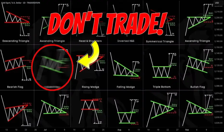
Best Price Action Chart Patterns by Accuracy Last Year
Last year I shared more than 1300 free signals and forecasts for Gold, Forex, Commodities and Indexes.
In my predictions, quite often I relied on classic price action patterns.
In this article, I will reveal the win rate of each pattern, the most accurate and the least accurate formations of last year.
Please, note that all the predictions and forecasts that I shared last year are available on TradingView and you can back test any of the setup that I identified last year by your own. Just choose a relevant tag on my TradingView page.
Also, some of the forecasts & signals were based on a combination of multiple patterns.
Here is the list of the patterns that I personally trade:
🔘 Double Top or Bottom with Equal Highs
The pattern is considered to be valid when the highs or lows of the pattern are equal.
The pattern gives a bearish/bullish signal when its neckline is broken.
🔘 Double Top or Bottom with Lower High/Higher Low or Cup & Handle
The pattern is considered to be valid when the second top/bottom of the patterns is lower/higher than the first one.
The pattern gives a bearish/bullish signal when its neckline is broken.
🔘 Head & Shoulders and Inverted Head and Shoulders
The pattern gives a bearish/bullish signal when its neckline is broken.
🔘 Horizontal Range
The pattern is the extension of a classic double top/bottom with at least 3 equal highs/lows.
The pattern gives a bearish/bullish signal when its neckline is broken.
🔘 Bullish/Bearish Flag
The pattern represents a rising/falling parallel channel.
It gives a bullish/bearish signal when its upper/lower boundary is broken.
🔘 Rising/Falling Wedge Pattern
The pattern represents a contracting rising/falling channel.
It gives a bullish/bearish signal when its upper/lower boundary is broken.
🔘 Rising/Falling Expanding Wedge
The pattern represents an expanding rising/falling channel.
It gives a bullish/bearish signal when its upper/lower boundary is broken.
🔘 Descending/Ascending Triangle
The pattern is the extension of a cup & handle pattern with at least 2 lower highs/lows.
The pattern gives a bearish/bullish signal when its neckline is broken.
Please, also note that all the patterns that I identified and traded were formed on key horizontal or vertical structures.
Remember that the accuracy of any pattern drops dramatically if it is formed beyond key levels.
I consider the pattern to be a winning one if after a neckline breakout, it managed to reach the closest horizontal or vertical structure, not invalidating the pattern's highs/lows.
For example, if the price violated the high of the cup and handle pattern after its neckline breakout, such a pattern is losing one.
If it reached the closest structure without violation of the high, it is a winning pattern.
🔍 Double Top or Bottom with Equal Highs
I spotted 85 setups featuring these patterns.
Their accuracy is 62% .
🥉 Double Top or Bottom with Lower High/Higher Low or Cup & Handle
96 setups were spotted.
The performance turned out to be a little bit higher than a classic double top/bottom with 65% of the setups hitting the target.
🔍 Head & Shoulders and Inverted Head and Shoulders
58 formations spotted last year.
Average win rate is 64%
🏆 Horizontal Range
The most accurate pattern of last year.
More than 148 patterns were spotted and 74% among them gave accurate signal.
🔍 Bullish/Bearish Flag
38 setups identified last year.
The accuracy of the pattern is 57%
Rising/Falling Wedge
The pattern turned out to be a little bit more accurate.
Among 62 formations, 59% end up being profitable.
👎 Rising/Falling Expanding Wedge
The worst pattern of last year.
I recognized 24 patterns and their accuracy was just 51%.
🥈 Descending/Ascending Triangle
64 patterns were identified.
The win rate of the pattern is 66%.
The most important conclusion that we can make analyzing the performance of these patterns is that they all have an accuracy above 50%. If you properly combine these patterns with some other technical or fundamental tools, the accuracy of the setup will increase dramatically.
Good luck in your trading!
❤️Please, support my work with like, thank you!❤️
I am part of Trade Nation's Influencer program and receive a monthly fee for using their TradingView charts in my analysis.
Global Commodity Market TrendsIntroduction
The global commodity market has always been at the heart of international trade, investment, and economic growth. Commodities—whether energy, metals, agriculture, or soft commodities—are the fundamental building blocks of economies. They provide raw materials for industries, food for people, and energy to run households and factories. Their prices are determined in highly interconnected markets influenced by supply-demand dynamics, geopolitics, currency movements, technological shifts, and increasingly, environmental and climate considerations.
In the 21st century, commodities have become more than just physical goods; they are financial assets traded in global exchanges. Investors, governments, corporations, and even consumers keep a close eye on commodity trends, since these markets influence inflation, global trade flows, stock market performance, and even geopolitical stability. For instance, oil shocks have historically triggered recessions, food price spikes have led to political unrest, and surges in metals demand have accelerated mining booms in resource-rich nations.
This essay provides a comprehensive view of global commodity market trends, covering major sectors (energy, metals, agriculture), key influences (macroeconomics, geopolitics, climate change, technology), and forward-looking themes (green transition, financialization, digitalization).
1. The Structure of the Global Commodity Market
The commodity market is broadly divided into:
Energy Commodities – Crude oil, natural gas, coal, electricity, renewable energy certificates.
Metals and Minerals – Precious metals (gold, silver, platinum), base metals (copper, aluminum, nickel), and critical minerals (lithium, cobalt, rare earths).
Agricultural Commodities – Food grains (wheat, rice, corn), oilseeds (soybean, palm oil), soft commodities (coffee, cocoa, sugar, cotton).
Other Commodities – Fertilizers, lumber, water (increasingly being financialized).
Commodity markets function through spot markets (immediate delivery), futures markets (contracts for future delivery), and OTC derivatives. Exchanges like the Chicago Board of Trade (CBOT), London Metal Exchange (LME), New York Mercantile Exchange (NYMEX), and ICE (Intercontinental Exchange) dominate global commodity trading.
2. Historical Perspective and Cyclical Nature
Commodity markets are cyclical, influenced by global economic growth, investment cycles, and technological shifts.
1970s Oil Shocks – OPEC’s supply cuts caused crude prices to quadruple, reshaping global energy security policies.
2000s Commodity Supercycle – China’s industrialization drove demand for metals, energy, and agriculture, pushing prices to record highs.
2014–2016 Commodity Downturn – Oversupply in oil and metals led to a severe market correction.
2020 COVID-19 Shock – Oil prices briefly went negative, agricultural supply chains collapsed, and gold surged as a safe haven.
2021–2022 Post-Pandemic Boom – Stimulus-driven demand and supply bottlenecks sent energy and food prices skyrocketing.
2022–2023 Russia-Ukraine War – Disrupted oil, gas, wheat, and fertilizer markets, reshaping global trade flows.
Understanding these cycles is crucial because commodity investments often follow long waves of boom and bust.
3. Major Commodity Market Segments and Trends
A. Energy Commodities
Crude Oil
Oil remains the world’s most traded commodity.
Trend 1 – Demand Shifts: While OECD demand is plateauing, emerging markets (India, Southeast Asia, Africa) are driving growth.
Trend 2 – Energy Transition: Long-term demand faces pressure from electric vehicles, renewable energy, and climate policies.
Trend 3 – Geopolitics: OPEC+ production cuts, U.S. shale supply, and Middle East conflicts heavily influence prices.
Outlook: Oil may remain volatile, with a balance between decarbonization policies and near-term reliance on fossil fuels.
Natural Gas & LNG
Gas has become a “transition fuel” in the shift toward cleaner energy.
LNG trade is expanding, with Qatar, U.S., and Australia as major exporters.
Europe’s 2022 energy crisis (post-Ukraine war) accelerated LNG imports.
Long-term growth in Asia ensures gas remains vital.
Coal
Despite climate targets, coal demand remains high, particularly in India and China.
Energy security fears after 2022 temporarily revived coal usage in Europe.
Renewables & Carbon Markets
Solar, wind, and green hydrogen are disrupting the energy mix.
Carbon trading markets (EU ETS, China ETS) are emerging as influential factors for commodity producers.
B. Metals and Minerals
Precious Metals (Gold, Silver, Platinum)
Gold: Safe-haven asset during uncertainty, hedge against inflation, central bank buying trend.
Silver: Industrial demand (solar panels, electronics) alongside investment demand.
Platinum Group Metals (PGMs): Essential for catalytic converters, fuel cells, and hydrogen economy.
Base Metals (Copper, Aluminum, Nickel, Zinc)
Copper: Known as “Dr. Copper,” a key barometer of global growth. Demand is booming due to electrification, EVs, and renewable infrastructure.
Aluminum: Lightweight metal in transport, packaging, and green tech.
Nickel & Cobalt: Crucial for EV batteries; supply bottlenecks in Indonesia, DRC, and Russia.
Trend: The Green Transition is reshaping base metals demand, creating a new supercycle in critical minerals.
Critical Minerals
Lithium, cobalt, rare earths are essential for batteries, electronics, and defense industries.
Countries are racing to secure supply chains (U.S., EU, India building alliances beyond China’s dominance).
Recycling and urban mining are growing trends.
C. Agricultural Commodities
Food Grains (Wheat, Corn, Rice)
Global food security concerns are rising due to climate change, geopolitics, and supply chain disruptions.
Wheat & Corn: Ukraine war disrupted exports; prices spiked globally.
Rice: India’s export bans caused volatility in 2023–24.
Population growth and changing diets sustain long-term demand.
Oilseeds & Edible Oils (Soybean, Palm Oil, Sunflower Oil)
Major players: Brazil (soybeans), Indonesia & Malaysia (palm oil), Ukraine (sunflower).
Biofuel demand (biodiesel, ethanol) creates additional price drivers.
Soft Commodities (Coffee, Cocoa, Sugar, Cotton)
Coffee: Climate-sensitive, Brazil & Vietnam dominate production.
Cocoa: Ghana and Ivory Coast face sustainability challenges.
Sugar: Demand linked to biofuels as well as consumption trends.
Cotton: Textile demand, weather shocks, and trade tariffs affect pricing.
4. Key Influences on Commodity Markets
A. Macroeconomic Factors
Inflation: Commodities often act as inflation hedges.
Interest Rates: High rates increase carrying costs, affecting speculative demand.
Currency Movements: Since most commodities are dollar-denominated, a strong USD suppresses prices globally.
B. Geopolitics
Russia-Ukraine war reshaped energy and grain flows.
U.S.-China trade tensions affect soybeans, rare earths, and metals.
Middle East conflicts influence oil security.
C. Climate Change & ESG
Extreme weather (droughts, floods) increasingly affects agriculture.
ESG investing pressures companies to decarbonize.
Carbon pricing impacts production costs.
D. Technology
Digitalization of commodity trading (blockchain, AI risk management).
Electric vehicles and renewable energy shift metals demand.
Precision agriculture enhances crop yields.
5. Financialization of Commodities
Commodities are not just physical goods—they are now financial assets.
Hedge funds, ETFs, index funds, and retail investors actively trade commodity futures.
Algorithmic and high-frequency trading influence intraday price swings.
Commodity-linked derivatives allow hedging but also amplify speculative volatility.
This financialization links commodities more tightly to stock and bond markets.
6. Future Trends and Outlook
Green Commodity Supercycle:
The shift toward decarbonization and renewable energy is creating massive demand for copper, lithium, nickel, cobalt, and rare earths.
Energy Diversification:
Oil will remain relevant, but LNG, hydrogen, and renewables will reshape energy trade.
Food Security Challenges:
Climate shocks, rising population, and geopolitical instability will drive volatility in agriculture.
Geopolitical Resource Wars:
Nations are building strategic reserves, securing mines, and reshaping supply chains to reduce dependency on adversarial nations.
Digital & Transparent Markets:
Blockchain-enabled commodity trading, satellite-based crop monitoring, and AI-driven price forecasting will modernize markets.
Emerging Market Consumption:
Rising middle classes in Asia and Africa will push long-term demand for both industrial and agricultural commodities.
7. Risks in Commodity Markets
Volatility: Driven by geopolitics, weather, speculation.
Resource Nationalism: Countries may restrict exports of critical minerals (e.g., Indonesia’s nickel ban).
Supply Chain Fragility: Pandemics, wars, and shipping bottlenecks.
Sustainability Pressures: ESG requirements increase costs but also open new opportunities.
Conclusion
The global commodity market is in a transformative phase. Historically driven by industrialization and geopolitics, it is now being reshaped by climate change, technology, and financialization. Energy markets are balancing fossil fuels with renewables, metals are entering a green-driven supercycle, and agriculture faces mounting climate and food security challenges.
For investors, policymakers, and businesses, understanding these trends is crucial. Commodities are no longer just cyclical—they are becoming structurally strategic assets that determine the future of global trade, inflation, and economic security.
The coming decades will witness intense competition for critical resources, greater volatility due to climate and geopolitics, and new opportunities in sustainable and digital commodity trading.
The commodity market, once the “old economy,” is now at the center of the new global order.
Short Selling & Market Volatility WorldwideIntroduction
Financial markets thrive on a balance between optimism and skepticism. While investors who buy assets express confidence in growth, those who sell short represent a contrasting, yet equally vital, belief system. Short selling refers to the practice of selling borrowed securities with the expectation that their price will fall, enabling the seller to buy them back later at a lower price for a profit. Though often controversial, short selling is deeply embedded in the functioning of global financial markets.
On the other hand, market volatility refers to the speed and magnitude of changes in asset prices, reflecting uncertainty, investor sentiment, and macroeconomic conditions. Both concepts are closely interlinked: short selling can amplify volatility, while volatile conditions often fuel short-selling opportunities.
Globally, regulators, institutional investors, and policymakers debate whether short selling destabilizes markets or provides healthy skepticism that enhances efficiency. This discussion has become more critical after episodes like the 2008 Global Financial Crisis, the 2020 COVID-19 crash, and retail-driven short squeezes like GameStop in 2021.
This paper explores the mechanisms, history, controversies, regulatory frameworks, and global impacts of short selling, along with its deep connection to market volatility.
1. Understanding Short Selling
1.1 The Mechanics of Short Selling
The process of short selling involves several steps:
Borrowing the asset: A short seller borrows shares (or other securities) from a broker.
Selling in the open market: The borrowed securities are sold at the prevailing market price.
Repurchasing (covering the short): Later, the seller buys back the same quantity of shares, ideally at a lower price.
Returning the shares: The borrowed securities are returned to the lender, and the difference between the selling and repurchasing price becomes the short seller’s profit (or loss).
For example, if a trader sells borrowed shares of Company X at ₹1,000 each and repurchases them later at ₹800, the profit per share is ₹200 (excluding fees and borrowing costs).
1.2 Types of Short Selling
Naked Short Selling: Selling shares that have not been borrowed beforehand (often restricted).
Covered Short Selling: Selling shares that have already been borrowed (legal and widely practiced).
Synthetic Shorts: Using derivatives like options and futures to replicate short exposure.
1.3 Motivations Behind Short Selling
Profit-seeking: Traders speculate on price declines.
Hedging: Institutions use short positions to protect long portfolios.
Arbitrage: Exploiting mispricings in related securities.
Market correction: Identifying overvalued companies or fraudulent firms.
2. Market Volatility: A Global Phenomenon
2.1 Defining Volatility
Volatility measures the variability of asset returns, often expressed through standard deviation or implied volatility indices (e.g., VIX in the US, India VIX).
Historical Volatility: Based on past price movements.
Implied Volatility: Derived from option prices, reflecting market expectations.
2.2 Drivers of Volatility
Macroeconomic factors: Inflation, interest rates, GDP growth.
Political & geopolitical events: Elections, wars, trade tensions.
Corporate events: Earnings surprises, fraud revelations, mergers.
Market psychology: Fear and greed cycles.
Liquidity shocks: Sudden shortages or surges in capital flows.
2.3 Measuring Volatility Across the World
US: CBOE Volatility Index (VIX), often called the “fear gauge.”
India: NSE’s India VIX.
Europe: VSTOXX index.
Japan: Nikkei Volatility Index.
Volatility has universal dimensions but varies in intensity across emerging vs. developed markets.
3. The Interplay Between Short Selling & Volatility
3.1 Short Selling as a Source of Volatility
Downward pressure: Aggressive shorting can accelerate sell-offs.
Panic amplification: Retail investors may overreact to visible short interest.
Short squeezes: When heavily shorted stocks rise sharply, short sellers rush to cover, creating upward volatility.
3.2 Short Selling as a Dampener of Volatility
Price discovery: Shorts expose overvaluation and fraud, preventing bubbles.
Liquidity enhancement: Short sellers add trading volume, reducing bid-ask spreads.
Market efficiency: They ensure both positive and negative information is reflected in prices.
Thus, short selling has a dual effect: it can either stabilize by correcting mispricings or destabilize by triggering rapid sell-offs.
4. Historical Case Studies
4.1 The Great Depression (1929)
Short sellers were widely blamed for accelerating the market crash, leading to restrictions and the introduction of the Uptick Rule in the US (1938).
4.2 The Global Financial Crisis (2008)
Amid Lehman Brothers’ collapse, regulators worldwide banned or restricted short selling to prevent systemic risk. Critics argue these bans reduced liquidity and delayed price corrections.
4.3 European Debt Crisis (2010–2012)
Countries like Spain, Italy, and Greece banned short selling during sovereign debt fears. However, studies later showed such bans were ineffective in calming markets.
4.4 COVID-19 Market Crash (2020)
Volatility surged globally. Several European countries, India, and others imposed temporary short-selling restrictions, though the US refrained. Markets eventually recovered, highlighting that volatility stemmed more from uncertainty than short sellers.
4.5 GameStop Short Squeeze (2021)
A unique retail-driven rebellion where Reddit’s WallStreetBets community targeted heavily shorted stocks like GameStop and AMC. The short squeeze led to extreme volatility, losses for hedge funds, and debates about transparency in short selling.
5. Global Regulatory Perspectives
5.1 United States
Regulated by the SEC.
Uptick Rule (1938–2007): Allowed short selling only at higher prices than previous trades.
Alternative Uptick Rule (2010): Restricts shorting when a stock falls 10%+ in a day.
Transparency: Short interest data is disclosed biweekly.
5.2 Europe
European Securities and Markets Authority (ESMA) coordinates rules.
Transparency requirements: Large short positions must be disclosed publicly.
Temporary bans are common during crises.
5.3 Asia
Japan: Longstanding short-sale disclosure rules.
India: Short selling allowed with restrictions; naked shorting is prohibited. Stock lending & borrowing (SLB) mechanism facilitates covered shorts.
China: Very restrictive, viewing short selling as destabilizing.
5.4 Emerging Markets
Regulations often stricter due to concerns about volatility and investor confidence. Many nations restrict short selling during market stress.
6. The Ethical & Controversial Side
6.1 Criticisms of Short Selling
Seen as betting against success of companies.
Can exacerbate panic during downturns.
Potential for abusive practices, such as spreading false rumors (short-and-distort).
6.2 Defense of Short Selling
Vital for price discovery.
Helps identify fraudulent companies (e.g., Enron, Wirecard, Luckin Coffee).
Encourages transparency and corporate accountability.
6.3 Public Perception
Retail investors often view short sellers negatively, especially when firms collapse. Yet institutional investors appreciate their role in balancing optimism with caution.
7. Short Selling, Technology, and the Future
7.1 Algorithmic & High-Frequency Shorting
Algorithms execute rapid-fire shorts based on news, price movements, or arbitrage.
Concerns exist about flash crashes and heightened volatility.
7.2 Role of Social Media
Platforms like Reddit, Twitter (X), and Discord amplify sentiment.
Retail coordination can now challenge institutional short sellers.
7.3 Crypto Markets
Short selling extends to Bitcoin and altcoins via futures and perpetual swaps.
Volatility in crypto is often more extreme than in traditional markets.
7.4 ESG & Ethical Investing
Debates arise whether short selling aligns with sustainable finance principles. Some argue it deters harmful companies; others view it as destructive speculation.
8. Short Selling in Different Market Structures
8.1 Developed Markets (US, UK, EU, Japan)
Deep liquidity supports active short selling.
Transparency rules balance risks.
8.2 Emerging Markets (India, Brazil, South Africa)
Lower liquidity makes volatility concerns greater.
Short selling often tightly regulated.
8.3 Frontier Markets
Limited short-selling infrastructure due to lack of stock-lending systems.
Volatility often driven by macro shocks, not short activity.
9. Empirical Research on Short Selling & Volatility
Studies suggest short selling increases intraday volatility but contributes to long-term price efficiency.
Short-sale bans during crises reduce liquidity and increase spreads, worsening volatility rather than containing it.
Transparency of short positions has a calming effect, as investors better understand bearish sentiment.
10. Policy Recommendations
Maintain transparency: Public disclosure of short positions helps reduce rumor-driven panic.
Avoid blanket bans: Evidence shows bans worsen liquidity and delay corrections.
Encourage stock-lending markets: Well-functioning lending systems reduce settlement risk.
Balance retail vs. institutional interests: Retail investors need education to understand short selling rather than fear it.
Global harmonization: Given interconnected markets, international coordination is vital during crises.
Conclusion
Short selling and market volatility are inseparable components of the financial ecosystem. While short selling often attracts controversy, it remains a critical tool for liquidity, hedging, and price discovery. Global evidence shows that volatility is not inherently caused by short sellers but by broader uncertainty and structural imbalances.
Regulators face the delicate task of balancing market stability with efficiency. A world without short selling would risk bubbles, fraud, and illiquidity. Conversely, unchecked shorting could fuel panic. The challenge is to create transparent, fair, and robust systems where skepticism and optimism coexist.
As financial markets evolve—with technology, retail participation, and new asset classes like crypto—the role of short selling in shaping volatility will continue to grow. Rather than vilifying it, policymakers and investors must acknowledge its dual nature: both a source of turbulence and a guardian of truth in markets worldwide.

Role of Institutional Investors in Global MarketsIntroduction
Global financial markets are vast ecosystems where millions of buyers and sellers engage daily in the exchange of assets, ranging from stocks and bonds to currencies, commodities, and derivatives. While individual retail investors make up an important component of these markets, the real driving force behind volumes, liquidity, and long-term trends often lies in the hands of institutional investors.
Institutional investors—such as mutual funds, pension funds, insurance companies, hedge funds, sovereign wealth funds, and endowments—collectively manage trillions of dollars worldwide. Their decisions influence not only asset prices but also corporate governance, financial stability, and economic development.
In this discussion, we will explore in detail the role of institutional investors in global markets, their categories, strategies, influence, risks, and the challenges they pose. By the end, you will understand why institutional investors are sometimes called the “whales of the financial oceans” and how they shape the flow of global capital.
1. Who Are Institutional Investors?
Institutional investors are organizations that pool large sums of money from individuals, governments, or corporations to invest in financial securities, real estate, or alternative assets. Unlike retail investors, they have access to vast resources, sophisticated analytical tools, professional fund managers, and economies of scale in investment.
Key Characteristics:
Large capital base – They manage billions or even trillions of dollars.
Professional management – Teams of analysts, traders, and fund managers design strategies.
Economies of scale – They can negotiate lower fees and better terms.
Long-term horizon – Many, like pension funds, invest for decades.
Market-moving power – Their trades significantly impact prices, liquidity, and volatility.
2. Types of Institutional Investors
2.1 Pension Funds
Pension funds manage retirement savings for workers. They are among the largest institutional investors globally. With a long-term horizon, they allocate assets to ensure stable growth and low risk. For example, California Public Employees' Retirement System (CalPERS) is one of the largest pension funds, with over $450 billion under management.
2.2 Mutual Funds & ETFs
Mutual funds pool money from retail and institutional investors to invest in diversified portfolios. Exchange-Traded Funds (ETFs), a modern version, provide liquidity and passive exposure to indexes. Giants like Vanguard and BlackRock (iShares) control trillions through ETFs and index funds.
2.3 Insurance Companies
Insurance firms collect premiums and invest them to generate returns while covering future claims. Their investments usually lean toward safer assets like government bonds but also include equities and alternatives.
2.4 Hedge Funds
Hedge funds are high-risk, high-return investors that deploy sophisticated strategies such as leverage, arbitrage, derivatives, and short-selling. Though smaller in total assets than pension funds or mutual funds, they exert strong influence due to aggressive trading strategies.
2.5 Sovereign Wealth Funds (SWFs)
Owned by governments, SWFs invest surplus revenues (often from natural resources like oil). Examples include Norway’s Government Pension Fund Global and Abu Dhabi Investment Authority. They play crucial roles in stabilizing economies and diversifying state wealth.
2.6 Endowments & Foundations
Universities (e.g., Harvard and Yale endowments) and charitable foundations invest funds to ensure perpetual financial support for education, research, and philanthropy.
3. Role in Global Markets
3.1 Providers of Liquidity
Institutional investors account for the bulk of daily trading volume. Their activity ensures that securities can be bought or sold easily, reducing transaction costs and spreads. Without them, global markets would be far less liquid.
3.2 Price Discovery
By analyzing fundamentals, using advanced models, and engaging in active trading, institutional investors help set fair asset prices. Their research-driven strategies ensure that new information is quickly reflected in prices, making markets more efficient.
3.3 Risk Management
Through diversification, hedging, and derivatives, institutional investors spread and absorb risks. For example, when a pension fund invests in both equities and bonds, it reduces volatility exposure for retirees.
3.4 Capital Allocation
Institutional investors channel capital toward productive sectors. For instance, venture capital and private equity funds (a subset of institutions) invest in startups and innovation. Similarly, mutual funds direct money toward companies with solid fundamentals, helping them grow.
3.5 Corporate Governance
Large institutional shareholders often influence corporate decision-making. They vote in annual general meetings, demand better disclosure, push for ESG (Environmental, Social, Governance) practices, and sometimes challenge management. For example, BlackRock often issues public letters urging companies to focus on climate change.
3.6 Stabilizers in Crisis
During financial stress, institutional investors can stabilize markets by providing liquidity and holding long-term investments. Conversely, rapid withdrawals can also trigger crises (e.g., 2008).
4. Influence on Different Asset Classes
4.1 Equities
Institutional investors dominate stock markets. For instance, over 70% of U.S. equity market trades involve institutions. Their buying and selling shape stock indices, sectoral flows, and valuation multiples.
4.2 Bonds & Fixed Income
Pension funds and insurance companies are massive buyers of sovereign and corporate bonds. Their demand influences interest rates and governments’ ability to borrow.
4.3 Real Estate & Infrastructure
Institutions invest in real estate investment trusts (REITs), commercial properties, and infrastructure like toll roads, airports, and renewable energy projects, providing long-term financing.
4.4 Commodities
Hedge funds and SWFs trade commodities like oil, gold, and agricultural products for diversification and speculation, influencing global prices.
4.5 Alternative Investments
Private equity, venture capital, crypto assets, and hedge fund strategies attract institutional flows. Their participation legitimizes these markets and attracts more investors.
5. Globalization and Cross-Border Impact
Institutional investors operate globally, not just domestically. Sovereign wealth funds from the Middle East invest in U.S. real estate, while U.S. pension funds allocate capital to Asian equities. This globalization leads to:
Capital mobility across borders.
Correlation of markets, where shocks in one country spill over globally.
Opportunities for diversification by accessing emerging markets.
Geopolitical influence, as SWFs sometimes invest with strategic motives.
6. Benefits of Institutional Investors
Market efficiency – Their research reduces mispricing.
Economic growth – Capital is directed to innovative firms.
Stability – Long-term funds like pensions act as anchors.
Governance improvements – Companies become more transparent.
Access for retail investors – Mutual funds and ETFs give small investors exposure to global opportunities.
7. Risks and Criticisms
7.1 Market Concentration
A few institutions control massive chunks of global assets. For instance, BlackRock, Vanguard, and State Street collectively manage over $20 trillion, raising concerns about excessive power.
7.2 Herding Behavior
When institutions follow similar strategies (e.g., index rebalancing), markets can experience artificial volatility.
7.3 Short-Termism
Despite long-term mandates, some institutions focus excessively on quarterly returns, pressuring companies for short-term profits.
7.4 Systemic Risk
If a large hedge fund or institution collapses, it can destabilize markets (e.g., Long-Term Capital Management in 1998).
7.5 Political & Ethical Concerns
SWFs may pursue political objectives, and institutions may invest in sectors harmful to environment or society.
8. Regulatory Environment
To balance their influence, regulators worldwide impose rules:
Basel III for banks and insurers to maintain capital buffers.
Dodd-Frank Act (US) requiring greater transparency in derivatives.
MiFID II (EU) to improve investor protection.
SEBI (India) overseeing mutual funds and institutional flows.
Regulation aims to ensure transparency, protect retail investors, and reduce systemic risk.
9. Future Trends
ESG Investing – Institutions increasingly demand climate-friendly, socially responsible investments.
Technology & AI – Algorithms, big data, and AI are transforming how institutions analyze markets.
Emerging Markets Focus – Asia, Africa, and Latin America are attracting capital due to growth prospects.
Tokenization & Digital Assets – Blockchain-based securities are attracting institutional experiments.
Private Markets Expansion – Institutions are allocating more to private equity, infrastructure, and venture capital for higher returns.
10. Case Studies
Case 1: BlackRock’s ESG Push
BlackRock, with $10 trillion AUM, uses its voting power to push companies toward sustainable practices. This shows how one institution can reshape global corporate behavior.
Case 2: Norway’s Sovereign Wealth Fund
Worth over $1.6 trillion, it invests globally across equities, bonds, and real estate. It also excludes companies that harm the environment or human rights, setting ethical benchmarks.
Case 3: 2008 Financial Crisis
Some institutions acted as stabilizers, but others, like AIG, became sources of contagion. This highlighted both the risks and importance of institutional investors.
Conclusion
Institutional investors are the backbone of global markets. They supply liquidity, guide price discovery, allocate capital efficiently, and influence corporate governance. Their long-term focus provides stability, yet their sheer size and interconnectedness also pose systemic risks.
As markets globalize and new challenges like climate change and digital disruption arise, institutional investors will continue to shape the evolution of finance. Their role will expand from simply seeking returns to addressing broader societal, environmental, and economic goals.
In short, institutional investors are not just participants in global markets—they are architects of the financial system, shaping its present and future direction.
Global IPO & SME IPO TrendsIntroduction
Initial Public Offerings (IPOs) have always been a symbol of ambition, growth, and transformation. They represent the moment when a company decides to move beyond private ownership and open its doors to the public capital markets. IPOs not only provide companies with capital for expansion but also give investors an opportunity to participate in wealth creation.
Over the last few decades, IPOs have evolved significantly, shaped by globalization, technological change, regulatory reforms, and shifting investor behavior. In addition to traditional large-cap IPOs, the rise of Small and Medium Enterprise (SME) IPOs has been a defining trend in recent years, especially in developing markets like India, Southeast Asia, and parts of Africa.
This paper explores global IPO trends and SME IPO dynamics, examining how the landscape has transformed, the challenges and opportunities it presents, and what the future holds.
Part I: The Global IPO Landscape
1. Historical Overview
Early IPOs: The concept of public share issuance dates back to the 1600s with the Dutch East India Company, which allowed investors to buy shares in overseas trade.
20th Century Boom: IPOs became mainstream in the U.S. and Europe during the industrial boom, with companies in oil, steel, and manufacturing driving listings.
Dot-Com Bubble (1990s-2000s): Technology IPOs surged in the late 1990s, many without strong fundamentals, leading to the dot-com crash in 2000.
Post-2008 Era: After the global financial crisis, IPO markets slowed but revived with technology giants like Facebook, Alibaba, and Uber entering the public space.
2. Regional IPO Hotspots
United States: Still the largest IPO market by value. Nasdaq and NYSE dominate global tech and unicorn listings.
China & Hong Kong: Became global leaders in IPO volumes, especially in technology, fintech, and manufacturing. Hong Kong has been a preferred listing destination for Chinese firms.
Europe: More selective, with strong activity in London, Frankfurt, and Amsterdam.
India: A rising star, with both large-cap IPOs and booming SME IPOs. Retail participation is strong.
Middle East: Saudi Arabia’s Aramco IPO (2019) became the world’s largest, showing the region’s growing importance.
3. Global IPO Trends in Numbers
IPO activity tends to move in cycles, often tied to macroeconomic conditions, liquidity availability, and investor sentiment.
2020-2021: Record IPO activity, fueled by low interest rates, stimulus-driven liquidity, and tech growth during COVID-19.
2022-2023: IPO slowdown due to inflation, interest rate hikes, and geopolitical tensions (Ukraine war, US-China rivalry).
2024-2025: Signs of revival, with AI, EV, renewable energy, and fintech companies leading the pipeline.
Part II: Factors Shaping IPO Markets
1. Macroeconomic Environment
Interest Rates: Low rates encourage risk-taking and IPOs; high rates deter them.
Liquidity: Abundant global liquidity fuels IPO demand.
Geopolitics: Wars, trade disputes, and regulatory crackdowns influence cross-border IPOs.
2. Sectoral Trends
Technology: AI, semiconductors, SaaS, and fintech dominate listings.
Green Energy: EVs, solar, wind, and hydrogen IPOs attract ESG-focused investors.
Healthcare & Biotech: Rising due to pandemic learnings and aging populations.
Consumer & Retail: Still strong, but facing disruptions from e-commerce.
3. Regulatory Environment
The U.S. SEC, Europe’s ESMA, and Asian regulators have tightened disclosure norms.
China has restricted overseas listings of sensitive tech companies.
India’s SEBI has become stricter but supportive of SME and tech listings.
Part III: Rise of SME IPOs
1. Why SME IPOs Matter
SMEs are the backbone of most economies, contributing 30–60% of GDP in many countries.
Access to capital markets allows SMEs to reduce dependence on banks and private equity.
SME IPOs democratize wealth creation by involving retail investors.
2. India as a Case Study
India has emerged as a global leader in SME IPOs.
Platforms like NSE Emerge and BSE SME Exchange have hosted hundreds of SME listings.
Retail investors flock to SME IPOs due to small ticket sizes and potential for multi-bagger returns.
In 2023–2025, SME IPOs in India often delivered stronger short-term gains than large IPOs.
3. Global SME IPO Landscape
China: Has STAR Market for tech-driven SMEs.
Europe: AIM (Alternative Investment Market) in London supports SME listings.
U.S.: Nasdaq SmallCap and OTC markets exist, but venture capital dominates.
Africa & Middle East: Nascent SME IPO frameworks are being developed.
4. Key Challenges
Liquidity Issues: SME IPOs often face thin trading volumes.
Governance: Risk of weak disclosure and manipulation.
Investor Education: Retail investors sometimes underestimate risks.
Part IV: Investor Behavior & Market Psychology
1. Institutional vs Retail Investors
Institutional investors dominate large-cap IPOs.
Retail investors are increasingly active in SME IPOs.
Behavioral biases — such as FOMO (Fear of Missing Out) — drive oversubscriptions.
2. IPO Pricing & Valuation Dynamics
Companies often price aggressively, leading to mixed post-listing performance.
The “listing pop” culture attracts traders seeking quick gains.
3. The Role of Anchor Investors
Anchor investors provide credibility to IPOs and influence demand.
Part V: Risks and Challenges in IPO Markets
Volatility: IPOs are highly sensitive to market sentiment.
Regulatory Crackdowns: Sudden changes (like China’s tech crackdown) disrupt IPO pipelines.
Post-IPO Underperformance: Many IPOs fail to sustain valuations beyond the first year.
Speculative Bubbles: Retail-driven hype can inflate SME valuations unsustainably.
Part VI: The Future of IPOs & SME IPOs
1. Technology’s Role
Digital Platforms: E-IPO applications and online brokerages increase retail participation.
Blockchain & Tokenized IPOs: A possible future trend where companies raise funds via tokenized shares.
AI in Valuation: Algorithms now play a role in IPO pricing and demand analysis.
2. ESG & Sustainable Finance
Investors increasingly prefer companies with Environmental, Social, and Governance (ESG) credentials.
Green IPOs (renewable energy, EV, sustainability tech) will dominate.
3. Globalization vs Protectionism
While globalization pushes for cross-border listings, geopolitics may encourage companies to list domestically.
India, China, and Middle East will become more self-reliant IPO hubs.
4. SME IPOs Outlook
SME IPOs will expand rapidly in Asia and Africa, where small businesses dominate.
Regulatory reforms and investor education will decide sustainability.
Conclusion
The global IPO market is a mirror of the world economy, reflecting growth cycles, technological revolutions, and investor sentiment. While traditional large-cap IPOs continue to capture headlines, the rise of SME IPOs represents a deeper democratization of finance.
SMEs, once constrained by limited access to capital, are now using public markets to scale up, attract visibility, and create wealth for investors. Markets like India, China, and the Middle East are emerging as epicenters of SME IPO growth, while the U.S. and Europe remain leaders in large-cap listings.
Going forward, IPO trends will be shaped by AI, ESG, fintech innovations, and shifting geopolitics. Investors and regulators must balance opportunity with caution, especially in SME IPOs where risks are higher but so are the rewards.
In short, IPOs — both global and SME-focused — will continue to remain a critical engine of capital formation, innovation funding, and wealth creation in the evolving global economy.
Cross-Border Listings and Dual-Listed CompaniesIntroduction
In today’s interconnected financial world, companies are no longer confined to raising capital solely in their domestic markets. Increasing globalization, advancements in technology, and integration of capital markets have paved the way for businesses to list their shares beyond their home country. Two significant strategies that companies adopt to tap international investors are cross-border listings and dual listings.
A cross-border listing occurs when a company lists its equity shares on a stock exchange outside its home country. For example, Alibaba, a Chinese company, listing its shares on the New York Stock Exchange (NYSE) in 2014 is a classic case of cross-border listing.
On the other hand, a dual listing (sometimes called a "dual-listed company" or DLC structure) is when a company is simultaneously listed on two stock exchanges, usually in different countries, and both sets of shares represent the same ownership rights. For instance, Royal Dutch Shell historically operated under a dual-listed structure between the UK and the Netherlands before unifying in 2022.
This essay explores the concepts of cross-border listings and dual-listed companies in detail, analyzing motivations, processes, challenges, advantages, risks, case studies, and their broader impact on global capital markets.
Part 1: Understanding Cross-Border Listings
What is a Cross-Border Listing?
A cross-border listing refers to the practice where a company headquartered in one country seeks to have its shares traded on an exchange in another country, in addition to or instead of its home market. This is often achieved through mechanisms such as:
Direct Listing – where shares are directly listed on the foreign exchange.
Depositary Receipts (DRs) – such as American Depositary Receipts (ADRs) in the U.S. or Global Depositary Receipts (GDRs) in Europe, which represent shares of foreign companies.
Cross-border listings provide visibility, credibility, and access to broader pools of investors.
Motivations for Cross-Border Listings
Access to Larger Capital Pools
Listing on global exchanges like NYSE, NASDAQ, or London Stock Exchange (LSE) allows firms to attract institutional investors and hedge funds that may not invest in emerging or smaller domestic markets.
Enhanced Liquidity
International listings improve trading volumes and reduce bid-ask spreads, providing shareholders with more liquidity.
Prestige and Visibility
Being listed on prestigious exchanges boosts the company’s brand recognition and signals financial strength. For example, many tech companies aim for a U.S. listing for global visibility.
Diversification of Investor Base
Companies can mitigate reliance on a single country’s investor sentiment by tapping into international investors with different risk profiles.
Strategic Expansion
Firms expanding globally may list abroad to strengthen their presence in target markets. For instance, Tata Motors listed ADRs in the U.S. as it acquired Jaguar Land Rover to align with Western investors.
Improved Valuation
Investors in developed markets often assign higher valuations due to better liquidity, lower perceived risk, and stronger corporate governance requirements.
Mechanisms of Cross-Border Listing
American Depositary Receipts (ADRs)
Non-U.S. companies issue ADRs to trade on U.S. exchanges. ADRs are denominated in USD and simplify investment for U.S. investors. Example: Infosys trades as ADRs on NYSE.
Global Depositary Receipts (GDRs)
Used primarily in European and Asian markets, GDRs allow companies to raise funds in multiple regions.
Direct Listings
Companies directly register their ordinary shares in a foreign market.
Secondary Listings
Some companies maintain a primary listing in their home country while pursuing secondary listings abroad.
Advantages of Cross-Border Listings
Cheaper capital costs – Broader investor demand reduces the cost of equity.
Global credibility – Enhanced corporate reputation and international media coverage.
Investor protection perception – Stricter regulatory environments provide comfort to foreign investors.
Potential currency hedging – Raising funds in multiple currencies may help offset forex risks.
Challenges in Cross-Border Listings
Regulatory Burden
Complying with multiple jurisdictions (e.g., U.S. SEC rules like Sarbanes-Oxley Act) can be costly and complex.
Accounting Standards
Firms may need to reconcile financial statements between different accounting standards (e.g., IFRS vs. U.S. GAAP).
Costs
Listing fees, legal advisory costs, auditing, and compliance expenses are significantly higher.
Risk of Overexposure
Greater scrutiny from international investors, analysts, and media can pressure management.
Delisting Risks
If trading volumes are low, foreign exchanges may consider delisting (e.g., Chinese firms facing U.S. delisting threats in 2020–22).
Part 2: Understanding Dual-Listed Companies (DLCs)
What is a Dual Listing?
A dual-listed company structure involves two corporations incorporated in different countries agreeing to function as a single entity for strategic and economic purposes while maintaining separate legal entities. Shares of both companies trade on their respective stock exchanges, but shareholders share common ownership and voting rights.
For example:
Royal Dutch Shell (Netherlands & UK, until 2022).
BHP Group (Australia & UK).
Why Choose Dual Listings?
Market Accessibility
Dual listings allow companies to raise funds simultaneously in multiple regions.
Regulatory Flexibility
Companies may avoid high costs of cross-border compliance by splitting structures.
National Interests
Governments may push for dual listings to protect local investor participation and maintain corporate identity.
Mergers and Acquisitions
Dual structures often arise from cross-border mergers (e.g., BHP and Billiton).
Advantages of Dual-Listed Structures
Equal Treatment of Shareholders
Shareholders in both countries maintain equal economic and voting rights.
Investor Base Expansion
Encourages domestic investors in both regions to invest without currency or foreign-exchange hurdles.
Synergies Without National Loss
Companies retain national identity while operating as one entity, politically acceptable in sensitive sectors.
Strategic Flexibility
Helps maintain listings in home and host countries simultaneously.
Challenges of Dual Listings
Complex Corporate Governance
Coordinating two boards, shareholder meetings, and legal jurisdictions is administratively heavy.
Arbitrage Opportunities
Share prices in both markets may diverge due to currency fluctuations or investor sentiment, inviting arbitrage.
Taxation Complexities
Differing tax regimes can complicate dividend distribution and profit allocation.
Eventual Simplification Pressure
Many DLCs eventually simplify into a single listing due to inefficiencies (e.g., Unilever ended its dual listing in 2020).
Part 3: Cross-Border Listings vs. Dual Listings
Feature Cross-Border Listing Dual-Listed Company
Structure Single entity listed abroad Two entities operating as one
Investor Base International investors Both domestic and foreign investors
Governance Centralized Complex, two boards
Liquidity Concentrated in one market Split between two markets
Examples Alibaba (NYSE), Infosys (NYSE ADRs) BHP (Australia & UK), Shell (UK & NL)
Regulatory Compliance Multiple jurisdictions for one entity Two legal systems, harmonized by agreements
Part 4: Case Studies
Case Study 1: Alibaba’s U.S. Listing (2014)
Alibaba raised $25 billion in its NYSE IPO, the largest in history at the time. The listing gave Alibaba global visibility, access to U.S. investors, and enhanced credibility. However, political tensions and U.S. scrutiny later forced Alibaba to also pursue a dual primary listing in Hong Kong (2019) to hedge regulatory risks.
Case Study 2: Royal Dutch Shell
Shell operated for decades as a dual-listed company with separate UK and Dutch entities. While this allowed national identity retention, it eventually simplified in 2022 into a single UK-based entity to cut administrative costs and simplify dividend taxation. This demonstrates the long-term inefficiencies of DLC structures.
Case Study 3: Infosys ADRs in the U.S.
Infosys pioneered the ADR model among Indian IT firms. By listing on NYSE in 1999, Infosys attracted U.S. institutional investors, boosted transparency through U.S. GAAP compliance, and improved its global brand recognition.
Case Study 4: BHP Billiton Dual Listing
BHP (Australia) and Billiton (UK) merged in 2001 using a dual-listed company structure to respect national interests. The DLC allowed both companies to share profits and operate as one without full legal merger. In 2022, however, BHP simplified by unifying its structure in Australia, citing complexity costs.
Part 5: Impact on Global Capital Markets
Integration of Capital Markets
Cross-border listings and DLCs bring investors from multiple geographies into closer alignment.
Corporate Governance Improvements
To qualify for international listings, companies often adopt stricter governance standards, benefiting shareholders globally.
Capital Flow Diversification
Emerging market companies gain access to developed market capital, reducing dependency on local investors.
Political and Regulatory Frictions
As seen in U.S.-China tensions, foreign listings can become entangled in geopolitical disputes.
Part 6: Future Trends
Rise of Asian Financial Centers
Hong Kong, Singapore, and Shanghai are emerging as attractive alternatives to New York and London.
Technological Advancements
Blockchain-based securities and digital exchanges may redefine how companies pursue cross-border listings.
Regulatory Harmonization
Efforts like the EU’s capital markets union and IFRS adoption may simplify compliance for multinational companies.
Shift Toward Secondary Home Listings
Many firms may adopt secondary listings in home regions (like Alibaba in Hong Kong) as a hedge against foreign political risks.
Conclusion
Cross-border listings and dual-listed companies are powerful mechanisms enabling firms to expand investor bases, access global capital, and enhance international presence. While cross-border listings emphasize visibility and liquidity in foreign markets, dual listings balance political, cultural, and economic interests across nations.
Both models bring opportunities—such as higher valuations and global credibility—and challenges—like regulatory burdens, governance complexity, and geopolitical risks. Over time, trends show that while cross-border listings remain popular, dual-listed structures often simplify into single listings due to inefficiencies.
Ultimately, as capital markets continue to globalize and technology reduces geographic barriers, the future will likely see innovative models of cross-border capital raising that blend the strengths of these existing approaches while minimizing their limitations.
USD/CAD, GBP/USD, EUR/USD Video of my trades last week.My 3rd video explaining my trades for last week 25-29nd August and the week ended with a nice profit of 2.58%.
If you have any questions send me a message here or on X and enjoy the weekend.

Supply + liquidity hunt = breakout failure1.This breakout failed because it lacked consolidation strength and ran directly into a strong supply/FVG zone.
2.Liquidity above the trendline was hunted, trapping breakout buyers.
3.Momentum was weak, with no strong volume or follow-through.
4.The higher timeframe bias was still bearish, limiting upside potential.
Without retest and acceptance above resistance, the move couldn’t sustain.
⚡ Key Points
📝Trendline break without consolidation.
📝Rejection from FVG / supply zone.
📝Liquidity grab above highs.
📝Weak momentum and no follow-through.

Mastering the Elliott Wave Pattern🔵 Mastering the Elliott Wave Pattern: Structure, Psychology, and Trading Tips
Difficulty: 🐳🐳🐳🐋🐋 (Intermediate+)
This article is for traders who want to understand the logic behind Elliott Waves — not just memorize patterns. We’ll cover the structure, trader psychology behind each wave, and practical tips for applying it in modern markets.
🔵 INTRODUCTION
The Elliott Wave Theory is one of the oldest and most respected market models. Developed by Ralph Nelson Elliott in the 1930s, it proposes that price doesn’t move randomly — it follows repeating cycles of optimism and pessimism.
At its core, Elliott Wave helps traders see the bigger picture structure of the market. Instead of focusing on one candle or one setup, you learn to read the “story” across multiple waves.
2021 BTC TOP
TESLA Stock
🔵 THE BASIC 5-WAVE STRUCTURE
The foundation of Elliott Wave is the Impulse Wave — a 5-wave pattern that moves in the direction of the trend.
Wave 1: The first push, often driven by smart money entering early.
Wave 2: A correction that shakes out weak hands but doesn’t retrace fully.
Wave 3: The strongest and longest wave — fueled by mass participation.
Wave 4: A pause, consolidation, or sideways correction.
Wave 5: The final push — often weaker, driven by late retail traders.
🔵 THE CORRECTIVE 3-WAVE STRUCTURE
After the 5-wave impulse comes a 3-wave correction , labeled A-B-C.
Wave A: First countertrend move — often mistaken as a dip.
Wave B: A false rally — traps late buyers.
Wave C: A stronger decline (or rally in bearish market), often equal to or longer than Wave A.
Together, the impulse (5) and correction (3) form an 8-wave cycle .
🔵 PSYCHOLOGY BEHIND THE WAVES
Each wave reflects trader psychology:
Wave 1: Smart money positions quietly.
Wave 2: Retail doubts the trend — “it’s just a pullback.”
Wave 3: Mass recognition, everyone piles in.
Wave 4: Profit-taking and hesitation.
Wave 5: Final retail FOMO.
A-B-C: Reality check, trend unwinds before cycle resets.
🔵 TRADING WITH ELLIOTT WAVES
1️⃣ Spot the Trend
Identify whether the market is in an impulse (5-wave) or correction (A-B-C).
2️⃣ Use Fibonacci for Validation
Wave 2 usually retraces 50–61.8-78.6% of Wave 1.
Wave 3 often extends 161.8% of Wave 1.
Wave 5 is often equal to Wave 1.
3️⃣ Trade the Highest-Probability Waves
Wave 3 (trend acceleration) and Wave C (correction completion) are often the cleanest opportunities.
4️⃣ Don’t Force It
Not every market move is Elliott Wave. Use it as a framework, not a rulebook.
🔵 COMMON MISTAKES
Over-labeling: Trying to force waves where they don’t exist.
Ignoring timeframes: Waves may look different across scales.
Trading every wave: Not all waves are high-probability setups.
🔵 CONCLUSION
The Elliott Wave Theory isn’t about perfection — it’s about perspective. It helps traders understand market cycles, recognize crowd psychology, and anticipate major turning points.
Use Elliott Wave as a map , not a prediction tool. When combined with confluence — volume, liquidity zones, or trend filters — it becomes a powerful edge.
Do you trade with Elliott Waves? Or do you think they’re too subjective? Share your experience below!
Healthcare & Pharma StocksIntroduction
Healthcare and pharmaceutical (pharma) stocks represent one of the most vital and resilient segments of global equity markets. Unlike cyclical sectors such as automobiles or real estate, healthcare is a necessity-driven industry—people require medical care, medicines, and treatments regardless of economic ups and downs. This inherent demand creates a unique investment landscape where growth, stability, and innovation intersect.
Pharma and healthcare stocks include a wide variety of companies—ranging from multinational giants like Pfizer, Johnson & Johnson, and Novartis to Indian leaders such as Sun Pharma, Dr. Reddy’s Laboratories, and Cipla. The sector also encompasses hospitals, diagnostic chains, biotech innovators, medical device manufacturers, and health-tech startups.
This write-up provides a deep 360-degree analysis of healthcare & pharma stocks, covering their structure, business drivers, global trends, risks, opportunities, and investment strategies.
1. Structure of Healthcare & Pharma Sector
The healthcare & pharma ecosystem can be broadly divided into:
A. Pharmaceuticals
Generic drugs: Off-patent medicines manufactured at lower costs. (e.g., Sun Pharma, Teva)
Branded drugs: Patented products with high margins. (e.g., Pfizer, Novartis)
Active Pharmaceutical Ingredients (APIs): Raw drug materials, where India and China dominate.
Contract Research & Manufacturing Services (CRAMS): Outsourcing R&D and manufacturing.
B. Biotechnology
Companies focused on genetic engineering, cell therapies, and monoclonal antibodies.
High-risk but high-reward investments (e.g., Moderna, Biocon).
C. Hospitals & Healthcare Services
Hospital chains (Apollo, Fortis, Max Healthcare).
Diagnostics (Dr. Lal PathLabs, Metropolis, Thyrocare).
Health insurance companies.
D. Medical Devices & Technology
Imaging equipment, surgical tools, wearables (Medtronic, Siemens Healthineers).
Digital health platforms and telemedicine providers.
E. Global vs. Domestic Markets
Global players dominate innovation-driven drug discovery.
Indian players dominate generics, APIs, and affordable healthcare solutions.
2. Key Growth Drivers
A. Rising Global Healthcare Spending
Worldwide healthcare spending is projected to cross $10 trillion by 2030.
Ageing populations in developed nations and increasing middle-class healthcare demand in emerging economies fuel growth.
B. Lifestyle Diseases
Diabetes, hypertension, cardiovascular disorders, and obesity are increasing.
Continuous demand for chronic therapy drugs.
C. Patents & Innovation
Innovative drugs with patent protection ensure high profit margins.
Pipeline of oncology, rare disease, and immunology drugs is expanding.
D. COVID-19 Acceleration
Pandemic showcased the sector’s importance.
Vaccine manufacturers, diagnostics, and hospital chains saw exponential growth.
E. Government Policies & Healthcare Access
India’s Ayushman Bharat scheme, US Medicare expansion, and Europe’s universal healthcare systems are pushing accessibility.
F. Digital Transformation
Telemedicine, AI-based diagnostics, robotic surgeries, and wearable devices.
Creates new sub-segments for investors.
3. Risks & Challenges
A. Regulatory Risks
FDA (US), EMA (Europe), and CDSCO (India) have stringent regulations.
Compliance failures lead to import bans, plant shutdowns, and fines.
B. Patent Expirations
Blockbuster drugs lose exclusivity after 10–15 years.
Leads to generic competition and margin erosion.
C. Pricing Pressure
Governments cap drug prices to maintain affordability.
Generic drug prices are constantly under pressure.
D. R&D Uncertainty
Only 1 in 10,000 drug molecules successfully reaches the market.
High R&D costs with uncertain returns.
E. Geopolitical & Supply Chain Issues
China controls key raw materials (APIs).
Any disruption impacts global supply.
4. Global Leaders in Healthcare & Pharma
A. Pharma Giants
Pfizer (US): COVID-19 vaccine, oncology, cardiovascular drugs.
Johnson & Johnson (US): Diversified pharma, medical devices, consumer healthcare.
Novartis (Switzerland): Oncology, gene therapy.
Roche (Switzerland): Diagnostics and cancer treatments.
AstraZeneca (UK): Cardiovascular and respiratory therapies.
B. Biotechnology Leaders
Moderna & BioNTech: mRNA vaccine technology.
Gilead Sciences: HIV and hepatitis treatments.
Amgen: Biologic drugs.
C. Indian Leaders
Sun Pharma: Largest Indian pharma company, strong in generics.
Dr. Reddy’s: APIs, generics, biosimilars.
Cipla: Strong in respiratory segment.
Biocon: Pioneer in biosimilars.
Apollo Hospitals: Leading hospital chain.
Metropolis & Dr. Lal PathLabs: Diagnostics leaders.
5. Market Trends
A. Consolidation & M&A
Big pharma acquiring biotech startups.
Indian firms expanding globally via acquisitions.
B. Biosimilars & Biologics
Biologics (complex drugs made from living organisms) are the future.
Biosimilars (generic versions of biologics) gaining ground after patent expiry.
C. Personalized Medicine
Genetic testing enables customized treatments.
Oncology leading the way.
D. Artificial Intelligence in Drug Discovery
AI reduces time and costs in clinical trials.
Companies like Exscientia and BenevolentAI working with pharma giants.
E. Medical Tourism
India, Thailand, and Singapore attract patients globally due to cost advantage.
Growth in hospital and diagnostic sector.
6. Investment Perspective
A. Defensive Nature
Healthcare is non-cyclical—stable demand even in recessions.
Acts as a hedge in uncertain markets.
B. Growth Potential
Emerging markets like India offer double-digit growth.
Biotech and innovation-driven companies can deliver multibagger returns.
C. Dividends & Stability
Big pharma firms are cash-rich and provide regular dividends.
Stable revenue models for hospitals and insurers.
D. Valuation Metrics
Investors should analyze:
R&D pipeline: Future drug launches.
Regulatory compliance: FDA approvals, audits.
Debt levels & cash flow: Capital-intensive sector.
Market presence: US, Europe, and India exposure.
7. Indian Market Outlook
Pharma exports: India supplies 20% of global generics by volume.
Domestic healthcare: Rising insurance penetration and government spending.
Diagnostics: High growth with preventive healthcare awareness.
Hospital chains: Consolidation and increasing private equity investments.
API manufacturing push: Government incentives to reduce dependency on China.
8. Future Opportunities
Gene Therapy & CRISPR: Revolutionary treatments for genetic disorders.
mRNA Technology: Beyond vaccines, applicable in cancer therapies.
Wearable Health Tech: Smartwatches, glucose monitors, cardiac sensors.
Telemedicine: Remote healthcare becoming mainstream.
AI in Healthcare: Faster drug discovery, predictive healthcare analytics.
9. Risks for Investors
Litigation Risks: Patent disputes, product liability lawsuits.
Currency Fluctuations: Export-driven Indian pharma firms face forex risk.
Competition: Generic wars in the US and EU.
Policy Shifts: Government price controls can reduce profitability.
10. Investment Strategies
A. Long-Term Play
Biotech & R&D-driven pharma are long-term investments (10–15 years).
Examples: Biocon, Moderna, Roche.
B. Defensive Allocation
Hospitals, insurance, and generic pharma are safer bets for portfolio stability.
C. Thematic Investing
Focus on oncology, biosimilars, digital health, or telemedicine themes.
D. Diversification
Spread across global pharma (Pfizer, J&J), Indian generics (Sun, Cipla), and hospitals (Apollo, Fortis).
Conclusion
Healthcare & pharma stocks represent a unique mix of stability, growth, and innovation. The sector is driven by non-cyclical demand, global healthcare spending, lifestyle diseases, and constant innovation in biotechnology. At the same time, it faces challenges like regulatory hurdles, pricing pressures, and patent expirations.
For investors, healthcare and pharma provide defensive positioning in uncertain times and long-term multibagger opportunities in high-growth biotech and digital health. In India, the sector is set to grow rapidly with rising domestic demand, government support, and increasing global market share.
In essence, investing in healthcare & pharma stocks is not just about chasing profits—it is about betting on the future of human health and well-being.

Emerging Markets & BRICS Impact1. Introduction
The world economy today is not shaped only by the traditional powerhouses like the United States, Western Europe, or Japan. Instead, a large share of global growth is now being driven by emerging markets, countries that are rapidly industrializing, expanding their middle class, and gaining importance in trade and investment.
Among these, the BRICS group (Brazil, Russia, India, China, and South Africa) has become a major symbol of the rise of the Global South. Together, these countries account for over 40% of the world’s population and around 25% of global GDP (and growing). Their rise has significant implications for trade, geopolitics, technology, finance, and global governance.
This essay explores what emerging markets are, why they matter, how BRICS is shaping the global landscape, and what the future may hold.
2. What Are Emerging Markets?
An emerging market is an economy that is transitioning from being low-income, less developed, and heavily reliant on agriculture or resource exports, toward being more industrialized, technologically advanced, and integrated with the global economy.
Key Characteristics
Rapid economic growth (higher than developed nations)
Industrialization & urbanization
Expanding middle class and consumption base
Integration with global financial markets
Structural reforms and policy changes
Examples
Asia: India, China, Indonesia, Vietnam, Philippines
Latin America: Brazil, Mexico, Chile, Colombia
Africa: South Africa, Nigeria, Egypt, Kenya
Eastern Europe: Poland, Turkey
These nations are often seen as the growth engines of the 21st century. Investors view them as high-risk, high-reward markets, because while they promise rapid returns, they also face risks like political instability, weak institutions, or volatility.
3. Drivers of Growth in Emerging Markets
Why are emerging markets so important? Because they offer new sources of demand, labor, and innovation.
Demographics: Young populations compared to aging Western societies. India, for instance, has a median age of just 28.
Urbanization: Millions moving from rural to urban centers, fueling demand for housing, infrastructure, and consumer goods.
Technology adoption: Leapfrogging old models—Africa went straight to mobile banking (like M-Pesa), skipping traditional banking.
Globalization: Integration into global supply chains, manufacturing hubs, and service outsourcing (e.g., India in IT, Vietnam in electronics).
Natural resources: Rich deposits of oil, gas, minerals, and agricultural products.
Domestic reforms: Liberalization of trade, privatization, financial reforms, attracting foreign direct investment (FDI).
4. Challenges Facing Emerging Markets
Despite opportunities, emerging markets face significant hurdles:
Political risks: Corruption, unstable governments, populism.
Debt burdens: Many borrow in foreign currency, making them vulnerable to US dollar strength.
Geopolitical tensions: Sanctions, wars, trade wars, supply chain disruptions.
Infrastructure gaps: Lack of roads, power, digital connectivity.
Climate risks: Extreme weather impacts agriculture and coastal cities.
Thus, emerging markets are not a straight growth story—they are volatile yet transformative.
5. BRICS: The Symbol of Emerging Market Power
The term BRIC was first coined in 2001 by economist Jim O’Neill of Goldman Sachs to highlight the economic potential of Brazil, Russia, India, and China. In 2010, South Africa joined, making it BRICS.
Key Features
Represent ~40% of global population
Combined GDP: Over $28 trillion (2024 est.)
Hold significant natural resources (oil, gas, minerals, agriculture)
Increasing role in global politics
The group is not a formal union like the EU but a coalition of cooperation on economic, trade, and geopolitical issues.
6. Economic Contributions of BRICS
China: The manufacturing hub of the world, second-largest economy, key player in AI, green energy, and Belt & Road Initiative.
India: IT powerhouse, pharmaceutical leader, fastest-growing large economy, huge young labor force.
Brazil: Agricultural superpower (soybeans, coffee, beef), energy producer, growing fintech sector.
Russia: Major exporter of oil, natural gas, defense technology, though under Western sanctions.
South Africa: Gateway to Africa, strong in mining (gold, platinum), growing financial services sector.
Together, these economies contribute to global demand, innovation, and diversification of trade flows.
7. BRICS & Global Trade
One of the main goals of BRICS is to reduce dependency on Western markets and currencies. Key initiatives include:
Trade in local currencies instead of relying on the US dollar.
New Development Bank (NDB), founded in 2014, to finance infrastructure and sustainable projects in developing nations.
Expansion of intra-BRICS trade—for example, India-China trade in goods and services, Brazil-China agricultural exports, Russia-India defense trade.
The BRICS grouping is also seen as a counterweight to Western institutions like the IMF and World Bank.
8. Geopolitical Impact of BRICS
BRICS is more than economics—it is geopolitics.
Multipolar world order: Challenging US/EU dominance in global decision-making.
Alternative institutions: NDB as an alternative to IMF/World Bank, BRICS Summits as rival platforms to G7.
South-South cooperation: Giving developing nations more bargaining power in WTO, UN, and climate talks.
Strategic partnerships: India-Russia defense, China-Brazil trade, South Africa-China infrastructure.
BRICS has even discussed creating a common currency to reduce dollar dominance, though this remains a long-term idea.
9. Sectoral Impact of BRICS
Energy: Russia and Brazil are oil & gas exporters, China and India are importers—this creates synergy.
Agriculture: Brazil & Russia supply food to China & India.
Technology: China leads in 5G, AI, semiconductors; India excels in software & digital services.
Finance: BRICS is building payment systems outside of SWIFT to bypass Western sanctions.
Climate & Green Energy: Joint investments in solar, wind, and electric vehicles.
10. Criticism & Limitations of BRICS
BRICS is not without challenges:
Internal differences: India vs. China border disputes, Russia vs. West sanctions, Brazil’s political volatility.
Economic imbalance: China dominates the group—its GDP is bigger than all others combined.
Lack of cohesion: Different political systems (democracies, authoritarian states) and conflicting foreign policies.
Slow institutional development: NDB is still small compared to IMF/World Bank.
Despite these, BRICS has survived and expanded its influence.
Conclusion
Emerging markets are no longer just “developing nations.” They are active shapers of the global order, with BRICS as their most visible symbol. The rise of these economies is rebalancing global power from West to East and North to South.
While challenges remain—geopolitical rivalries, financial instability, governance issues—the long-term trajectory is clear: emerging markets and BRICS will be central to the 21st-century economy.
They represent not only new opportunities for investors, businesses, and policymakers but also a more multipolar, inclusive, and diverse global system.

US Federal Reserve & Central Bank Policies1. Introduction
Every economy in the world runs on money – but money is not just about paper notes or coins. Behind every financial system stands a central authority that manages the flow of money, credit, and liquidity. In the United States, that authority is the Federal Reserve System, commonly known as “The Fed.”
The Federal Reserve doesn’t just print money – it plays a much bigger role. It manages interest rates, regulates banks, provides stability during crises, and sets the overall monetary policy that affects the stock market, bond market, inflation, employment, housing, and even global trade.
To truly understand the global economy, traders, investors, and policymakers must understand how the Federal Reserve works and what central bank policies mean.
2. The Birth of the Federal Reserve
Before the Fed was established in 1913, the U.S. economy was chaotic. The country suffered repeated banking panics in the late 1800s and early 1900s. Banks failed often, depositors lost money, and there was no central authority to stabilize markets during crises.
The panic of 1907 became the turning point. With no central bank, private financiers like J.P. Morgan personally organized rescues for failing banks. This made it clear that America needed a central institution.
Thus, in December 1913, Congress passed the Federal Reserve Act, creating the Federal Reserve System. Its goals were:
Provide stability to the banking system
Act as a “lender of last resort”
Manage monetary policy to prevent panics
Support sustainable economic growth
3. Structure of the Federal Reserve
The Fed is not a single building or a single person. It’s a networked system designed to balance independence with government oversight.
The Main Parts:
Board of Governors – Based in Washington D.C., made up of 7 members appointed by the U.S. President. They guide overall policy.
Federal Reserve Banks – 12 regional banks across major U.S. cities (like New York, Chicago, San Francisco). They implement policies and interact with commercial banks.
Federal Open Market Committee (FOMC) – The most important decision-making body for monetary policy, particularly interest rates.
Member Banks – Thousands of commercial banks that hold reserves with the Fed and borrow when needed.
This system ensures checks and balances: the Fed is independent in decision-making but still accountable to Congress and the public.
4. Objectives of the Federal Reserve (Dual Mandate)
Unlike many central banks that focus only on inflation, the Federal Reserve has a dual mandate:
Price Stability – Keep inflation under control (not too high, not too low).
Maximum Employment – Ensure that as many people as possible have jobs in a healthy economy.
Additionally, financial stability and moderate long-term interest rates are also implicit goals.
5. Tools of the Federal Reserve
The Fed has several powerful tools to shape the economy:
(A) Monetary Policy Tools
Open Market Operations (OMO) – Buying and selling U.S. government securities (like Treasury bonds) to control money supply.
Buying securities → injects money → lowers interest rates → boosts growth.
Selling securities → absorbs money → raises interest rates → slows inflation.
Federal Funds Rate (Interest Rate Policy)
The Fed sets a target for the rate banks charge each other for overnight loans.
Lowering rates → cheaper borrowing → more spending & investing.
Raising rates → expensive borrowing → cooling the economy.
Reserve Requirements
The percentage of deposits banks must keep as reserves. Lower requirements → more lending. Higher requirements → less lending.
Rarely used today, as OMO and interest rates are more effective.
Discount Rate
The interest rate charged when commercial banks borrow directly from the Fed.
(B) Unconventional Tools (Used in Crises)
Quantitative Easing (QE) – Large-scale purchase of government bonds or mortgage-backed securities to inject liquidity (used after the 2008 crisis and COVID-19).
Forward Guidance – Communicating future policy intentions to influence market expectations.
Emergency Lending Programs – Special facilities to rescue banks, companies, or markets (example: COVID-19 corporate bond buying programs).
6. How Fed Policies Influence the Economy
The chain of influence looks like this:
Fed Actions → Interest Rates & Liquidity → Consumer & Business Borrowing → Investment & Spending → Employment & Inflation → Stock & Bond Markets → Overall Economy
Example:
If inflation is too high, the Fed raises rates → mortgages, car loans, business loans become expensive → spending falls → demand cools → inflation comes down.
If unemployment is high, the Fed cuts rates → cheaper credit → businesses expand → jobs increase.
7. Historical Policy Examples
(A) Great Depression (1930s)
The Fed failed to act aggressively, allowing banks to collapse.
Lesson: Central banks must act as lenders of last resort in crises.
(B) 1970s Inflation
Inflation reached double digits due to oil shocks and loose policy.
Fed Chair Paul Volcker (1979–1987) raised interest rates dramatically, even up to 20%, to crush inflation.
Short-term pain but long-term stability.
(C) 2008 Financial Crisis
Housing bubble burst, banks collapsed (Lehman Brothers).
Fed slashed rates to near 0%, launched QE worth trillions, and bailed out the system.
Critics said it encouraged risk-taking, but it prevented a depression.
(D) COVID-19 Pandemic (2020)
Fed cut rates to 0%, launched unlimited QE, provided emergency loans, and stabilized global dollar liquidity.
Prevented a financial collapse during lockdowns.
8. Impact on Global Markets
The Federal Reserve’s policies don’t just affect the U.S.—they impact the entire world because:
The U.S. dollar is the global reserve currency.
Most international trade, commodities (like oil), and debt are priced in dollars.
When the Fed raises rates, capital flows back to the U.S., causing emerging markets to suffer currency weakness and capital outflows.
When the Fed cuts rates, global liquidity rises, and risk assets (stocks, crypto, real estate) boom worldwide.
This is why traders globally watch every FOMC meeting, speech, and policy announcement.
9. Criticisms & Challenges of the Fed
While the Fed is powerful, it faces criticism:
Too much influence on markets – Investors often say markets are addicted to “easy money.”
Delay in action – Policies work with a time lag, so the Fed sometimes reacts late.
Political pressures – Even though independent, Presidents often criticize Fed decisions.
Income inequality – QE and asset purchases often benefit wealthy investors more than ordinary citizens.
Global ripple effects – Rate hikes in the U.S. can trigger crises in developing nations.
10. The Future of Central Bank Policies
As economies evolve, central banks face new challenges:
Digital Currencies (CBDCs) – The Fed is studying a “digital dollar.”
Climate Risks – Some argue central banks should consider environmental stability.
Geopolitical Pressures – Sanctions, trade wars, and global fragmentation may test Fed policy.
Technology & AI – Data-driven finance could change how monetary policy is transmitted.
Conclusion
The U.S. Federal Reserve is not just an American institution – it’s a global financial powerhouse. Its policies affect inflation, jobs, housing, stock markets, currencies, and even geopolitics.
Understanding the Fed means understanding how money moves, how economies grow or shrink, and how financial markets react.
For traders and investors, following Fed decisions is as important as tracking company earnings or global news. Every rate hike, cut, or policy signal from the Fed sends ripples across the world’s financial oceans.
In short, the Federal Reserve is like the captain of the world’s financial ship – sometimes steering smoothly, sometimes making hard turns, but always holding the power to influence the course of global markets.

What no one will reveal to you about volume. Theory and PracticeFor Richard W. Schabacker, whom I consider the father of Technical Analysis in the West, rigorous technical analysis must combine the study of price and volume. Paradoxically, volume was the last piece of data I effectively integrated into my trading, due to the scarcity of practical information.
In this article, I will explore the classical view of using volume and then my personal approach, based on logic and accumulated experience.
Whether you are a novice or an expert in the markets, and whether or not you use volume to clarify your analyses, reading this article will enrich your perspective on this topic.
The Ichimoku indicator values displayed on the screen are personal variations, resulting from my research. I hope they are useful to you.
What is Volume?
In the context of financial markets, volume represents the number of shares, contracts, or lots traded in an asset over a specific period of time.
Volume reflects the intensity of market activity and is represented as a histogram just below the price chart.
"Volume is a relative matter; that is, when we speak of high volume, we refer to a transaction volume greater than what has prevailed for some time before."
— Richard W. Schabacker, Technical Analysis and Stock Market Profits
Classical View of Volume:
Generally, the main proponents inShannon proponents in this discipline see volume as useful for the following purposes:
1. Confirming the Strength of a Trend:
Volume should accompany the strength of a trend, and if volume is weak, it is likely that we can anticipate a reversal, as low volumes in a trend indicate a loss of interest among participants.
2. Analyzing Support and Resistance:
Most major proponents tend to view weak volume as a signal for potential reversals, while recommending validating breakouts of support and resistance with increased volume.
3. Analyzing Continuation or Exhaustion Patterns:
The classical approach suggests that before entering continuation or exhaustion patterns (such as accumulations, distributions, head and shoulders, double tops and bottoms, triangles, etc.), there should be a depletion of volume, followed by a breakout of the pattern with a significant increase in volume to confirm the presence of participant interest.
This approach is solid in theory, but in practice, it can lead to subjective interpretations and errors if not properly contextualized.
Personal View: May the Force Be with You
In my experience, volume should not be primarily interpreted by observing weakness, as this can lead to misreadings and premature market entries. Instead, I recommend focusing on detecting strength as the decisive factor. High volume reveals the massive entry of participants or large orders—whether from large investors or institutions—leaving a clear footprint in the market. These large orders, whether buy or sell, indicate real commitment and potential for sustained movements.
On Volume and Trend Analysis:
Why base a reversal on the weakness of a trend when the key is to identify the context and strength driving the change? A clearly weakened price action backed by low volumes can extend in the direction of the trend, draining our accounts if we base our entries on volume weakness. Whether trading with or against the trend, the turning point must be supported by robust volume. This spike in activity confirms the presence of large investors or institutions in action, translating into greater interest and liquidity.
As technical analysts, our goal is to capture fluctuations or trends, not to diagnose whether a trend is "healthy." Weakness is relevant information for detecting exhaustion, but it is strength, in the right context and with proper confirmation (through patterns), that will increase our success rate and improve our risk-reward ratio.
In Figure 1.1, we can see how volume spikes generally predict pauses or reversals in trends.
Figure 1.1
Tesla. Daily Chart
In Figure 1.2, we can observe how weak volume could indicate a loss of interest from participants (1 and 2), but it is an increase in volume combined with a Japanese candlestick pattern (3) that can confirm a likely effective entry.
Figure 1.2
BTC/USDT Daily Chart
On Volume in Support and Resistance Analysis:
As mentioned earlier, weakness is relevant information, but strength is essential to validate a trend reversal or continuation.
According to the classical approach, a breakout of support or resistance should be backed by a significant increase in volume. However, experience has taught me that the high volume detected during a breakout often represents common bull or bear traps, where buyers or sellers get trapped.
There are several reasons for this: supports and resistances are psychological zones that are constantly evolving, making it easy to confuse breakout volume with rejection volume. Additionally, during breakouts of significant supports or resistances, large institutions often manipulate or protect their positions by executing large buy or sell orders.
How can we avoid falling into bull or bear traps, or even use them to our advantage?
Personally, I recommend not seeking breakouts of supports and resistances based on volume. Price compressions around supports and resistances are more useful for this purpose, as they reveal the intent and dominance of buyers or sellers while offering a superior risk-reward ratio. High volumes generally indicate rejection, even if the zone appears to have been broken. Without prior compression—or accumulation or distribution—it is never advisable to chase breakouts.
In Figure 1.3, we can observe two phenomena in one: the breakout of a consolidation pattern and the breakout of a resistance ($110,000) following a price compression (3). Notice how buying forces intensely defended the $100,000 zone, as evidenced by volume spikes and large engulfing patterns that preceded them (1 and 2). The price compression at the $110,000 zone reveals the bullish intent to break the resistance in a context where buying strength is dominant.
On the other hand, in Figure 1.4, I show you what a bear trap looks like. Observe how what appears to be a confirmed breakout with volume at a defended support level ended up being a significant rejection by large investors or institutions (1).
At this point, I will make two clarifications:
The volume histogram is represented with colors on some investment platforms to facilitate the visual detection of patterns, but volumes themselves do not have color. Whether a volume is bullish or bearish does not depend on whether the accompanying candlestick is bullish or bearish, but rather on the real-time interpretation of the technical analyst and, above all, on the subsequent development of events. In the example of the false breakout in Figure 1.4, we observe a bullish rejection volume.
Another vital aspect is that supports in strong and healthy uptrends will generate more false breakouts than reliable ones, so I recommend taking more long entries. Additionally, during the euphoria and hope characteristic of a bullish market, short entries will be extremely risky.
In the articles “Bear and Bull Traps” and “Double Pressure: The Key to Successful Breakout Trading,” I describe these phenomena in detail.
Figure 1.3
BTC/USDT Daily Chart
Figure 1.4
BTC/USDT 4-Hour Chart
On Volume in Continuation or Exhaustion Patterns:
While it is often recommended to ensure a decrease in volume prior to the breakout of an exhaustion pattern, I recommend ensuring the detection of large volumes within the exhaustion pattern itself and confirming entries based on price compressions at the boundaries of the accumulation or distribution range.
Large volumes in continuation or exhaustion patterns indicate that many participants or strong institutions are partially or fully closing their buy or sell positions, which can lead to a correction. Even investors like Thomas Bulkowski have noted that the success rate increases in patterns where large volumes are present.
On the other hand, contrary to the classical approach, I recommend avoiding confirming entries based on pattern breakouts with large volume, as exhaustion and trend continuation patterns often generate strong bursts of volatility. In the best case, this may cause you to miss the trend, but in the worst case, it will expose you to entries with poor risk-reward ratios. Price compressions are a safer option for making entries and capitalizing on volatility bursts.
In Figure 1.5, you can observe the effectiveness of price compressions in the right context and how volume is a key factor in determining the presence of large investors.
Figure 1.5
BTC/USDT Daily Chart
Some Additional Examples:
An ABCD pattern offers excellent opportunities to take entries based on volume, always with confirmation from price action. In Figure 1.6, you will observe how I would effectively use bear traps (D), which are very common in strong uptrends.
Figure 1.6
BTC/USDT Daily Chart
Relevant Data on Volume:
Volume in Forex and CFDs
Both the Forex market (currencies) and CFDs (contracts for difference) operate in a decentralized, over-the-counter (OTC) manner, meaning there is no centralized exchange where all trading volume is recorded.
In Forex, the volume displayed on platforms does not represent the "true" total volume of the global market, but rather the flow of trades within the liquidity pool of the broker or its liquidity providers.
CFDs, being OTC derivatives offered by brokers, follow the same pattern: the visible volume is specific to the broker and its liquidity network, not the total volume of the underlying market. Brokers aggregate liquidity from multiple providers (such as banks or dark pools), but traders only see a fraction of this, which may not reflect the actual volume of the underlying asset (e.g., a CFD on stocks does not show the total volume of the stock exchange).
Volume in Centralized Stock Exchanges
Stock markets like the NYSE are centralized, meaning all transactions are executed and recorded on a single regulated exchange. This allows for consolidated, real-time reporting of the total volume of shares traded on that exchange. The volume reflects all executed trades, including the total number of shares bought and sold. Under strict regulation, the data is standardized, audited, and publicly accessible.
Volume in the Cryptocurrency Market
The cryptocurrency market is decentralized and fragmented, similar to Forex: transactions occur across multiple global exchanges (such as Binance or Coinbase) without a unified central record. This makes the total volume an aggregation of data reported by each platform, introducing inconsistencies and potential manipulations.
Personally, I recommend prioritizing data from Binance, as it consistently leads in spot and derivatives trading volume globally, representing a significant portion of the market (approximately 30-40% in recent aggregated metrics).
Volume and the S&P 500
Although the S&P 500 index, being a composite indicator and not a tradable asset itself, does not record transaction volume, a smart strategy for analyzing volume related to this index involves monitoring the trading volume of the SPY ETF (SPDR S&P 500 ETF Trust). This exchange-traded fund closely tracks the performance of the S&P 500 and attracts a high level of trading activity, providing a valuable metric for assessing market interest, liquidity, and potential volume patterns during bullish or bearish trends.
In Figures 1.7 and 1.8, you can see how S&P 500 readings can be cleverly combined with SPY volume data.
Figure 1.7
S&P 500 Daily Chart
Figure 1.8
SPY Daily Chart
Final Note:
If you’d like to take a look at my analysis record, you can check out my profile in Spanish, where I transparently share well-defined market entries. Send your good vibes if you enjoyed this article, and may God bless you all.
Understanding Candle Range TheoryUnderstanding Candle Range Theory.
Candle Range Theory (CRT) is a trading strategy used in Forex to analyze market movements within specific price ranges defined by candlesticks. It involves understanding the range of a candlestick, which is the distance between its high and low, and identifying patterns that indicate underlying market sentiment and institutional behaviors.
Key Components of CRT:
- Candlestick Range: Each candlestick represents a snapshot of price movement, with the body showing primary price action and wicks reflecting price fluctuations.
- Multi-Timeframe Analysis: Analyzing higher-timeframe candles in lower timeframes reveals structured price movements, providing insights into market dynamics.
- Accumulation, Manipulation, and Distribution (AMD): CRT views the market as a continuous loop of these phases, helping traders identify potential market moves.
How CRT Works:
1. Identify a higher-timeframe candlestick and mark its high and low. The candle should preferably be an institutional candle.
2. After the opening of the second candle, switch to a lower timeframe and look for false breakouts of the range.
3. Confirm trend reversals by anticipating a market structure shift.
4. After the close of the second candle, mark out possible entry points using order blocks, change of character, fair value gaps and breaker blocks. Set limits or execute in real time as it approaches your entry level. Always use a stop loss.
5. Targets should preferably be 50% of the CRT.
Benefits of CRT:
- Predicting Price Movements: CRT helps traders anticipate price movements by analyzing candlestick patterns and market sentiment.
- Identifying High-Probability Trades: By recognizing specific candle formations, traders can identify high-probability trading opportunities.
- Refining Trade Strategies: CRT provides a robust framework for understanding market dynamics, allowing traders to refine their trade strategies across timeframes
Note: CRT should not be used on its own as it should be used as a confirmation to trades. It should be implemented with market structure and key levels
