You Don’t Lose by Being Wrong — You Lose by OveranalyzingYour problem isn’t that you don’t understand the market.
In fact, most losing traders understand the market fairly well. They know what a trend is, where key levels sit, and which side the structure is leaning toward. But when it’s time to make a decision, they sabotage that edge with something very familiar: just a little more analysis.
At first, everything is clear. The chart tells a simple story.
Then doubt creeps in. You zoom into another timeframe. Add another zone. Add another tool. Not because the market demands it, but because you’re not ready to accept the risk of a decision. And with every extra layer of analysis, you don’t gain more certainty — you create another narrative.
This is the key point many traders miss:
the market hasn’t changed — the story in your head has.
When you overanalyze, you’re no longer reading the market; you’re negotiating with yourself. One timeframe says buy, another says wait. One level looks valid, another suddenly looks dangerous. In the end, you’re no longer searching for a good opportunity — you’re searching for reasons to delay or reverse a decision. And by the time you enter, you’re either late or lacking conviction.
Overanalysis also destroys your sense of informational weight.
On a chart, not all data carries equal value. A price level in the right context is worth more than ten minor signals. But when everything is marked, everything looks “important,” and you lose sight of what’s actually worth risking money on. The market needs prioritization, not enumeration.
Here’s an uncomfortable truth:
Many traders overanalyze not because they’re curious, but because they’re afraid to commit. They fear being wrong, so they look for more confirmation. But the market doesn’t reward the trader with the most confirmations. It rewards the trader who accepts risk at the right location. Every time you delay a decision through analysis, you move yourself further away from that location.
I only started trading better when I realized this:
analysis is not meant to make decisions certain — it’s meant to make them reasonable.
Beyond that point, what matters is discipline and acceptance of outcomes. The market doesn’t require you to be right 100% of the time. It only requires that you don’t break your own structure.
If you often find yourself “right on direction but wrong on results,” try cutting back on analysis. Not to oversimplify the market, but to clarify what truly matters. When the picture is already clear, adding detail doesn’t make it better — it just makes you hesitate.
And in trading, hesitation is often more expensive than being wrong.
Chart Patterns

Market Panic: Gold or Crypto?When the market enters a state of panic, the question is no longer “How much profit can I make?” but rather “Which asset helps me survive and protect my capital?”
In moments like these, gold and crypto are often placed side by side. Both are seen as safe havens—but in very different ways, and that difference is the key to making the right decision.
1) Gold – Where Capital Flows When Confidence Breaks
Gold has existed for thousands of years with one core purpose: preserving value.
When inflation rises, geopolitical tensions escalate, or the financial system shows signs of stress, large capital tends to move into gold first.
Why gold performs well during crises:
High global liquidity, accepted across all markets
Relatively “orderly” volatility, suitable for defensive positioning
Often benefits when real interest rates fall and the USD weakens
In other words, gold won’t make you rich overnight, but it helps you avoid being washed away when the storm hits.
2) Crypto – An Asset Driven by Expectations and Emotion
Crypto represents a new generation of assets, where value is heavily influenced by future expectations, technology narratives, and speculative capital.
In normal or euphoric market conditions, crypto can rise very quickly.
But when panic sets in, the story changes.
Here’s the reality we need to face:
Crypto reacts extremely sensitively to “risk-off” sentiment
High leverage + thin liquidity during stress periods can trigger chain liquidations
In major shocks, crypto is often sold alongside growth stocks, rather than acting as a true safe haven
Therefore, crypto is not a defensive asset in the traditional sense—it is an asset of belief and market cycles.
3) When Should You Choose Gold? When Should You Hold Crypto?
The answer is not “which is better,” but what the market context is.
True panic (systemic risk, war, financial crisis):
➡ Gold is usually the preferred choice.
Capital seeks certainty, not stories.
Short-term crisis followed by monetary easing:
➡ Gold often leads the first wave,
➡ Crypto tends to recover more aggressively after a psychological bottom forms.
Stable markets with abundant liquidity:
➡ Crypto performs at its best.
4) My Perspective: Don’t Choose with Emotion
From my experience, the biggest mistake traders make during panic is choosing assets based on personal belief instead of capital flow and market behavior.
A professional trader asks:
Where is large capital taking refuge?
Is current volatility suitable for my trading style?
Is my goal capital preservation or outsized returns?
If your priority is safety and stability, gold is usually the more reasonable choice.
If you accept high risk in pursuit of high reward, crypto should only be approached after clear confirmation, not during extreme panic.

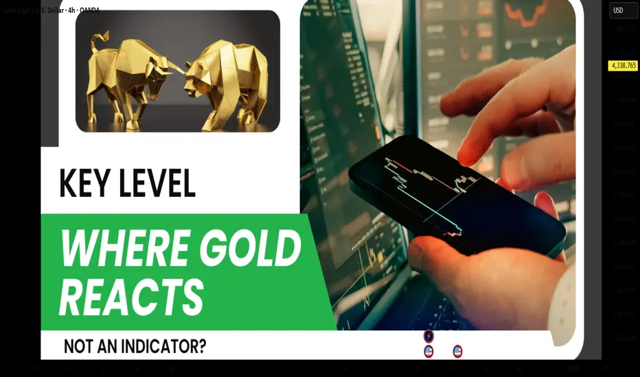
Key Levels – Where Gold Reacts, Not Indicators?Many traders start trading gold using indicators, and that’s something almost everyone goes through. However, the longer you stay in the market, the more clearly you realize one important truth: gold does not react to indicators; it reacts at key levels . Indicators only describe what price has already done, while key levels are where real money actually makes decisions.
Price does not move randomly. It reacts at important price zones.
Key levels are areas where the market has shown clear reactions in the past — strong reversals, repeated rejections, or consolidation before a breakout. In gold trading, these zones often align with major highs and lows, round numbers, or areas of concentrated liquidity.
This is where both retail traders and large capital are paying attention.
One major reason many traders consistently enter too late is over-reliance on indicators. Indicators are always based on past price data, so when a signal appears, the key reaction has often already happened. At that point, entries are less attractive, risk-to-reward deteriorates, and the probability of false breaks or stop hunts increases.
Indicators are not wrong, but they always lag behind price.
Professional traders don’t try to predict whether price will go up or down. They wait for price to reach a key level and then observe how the market reacts. Is price strongly rejected, or does it break through easily? Is real buying or selling pressure actually showing up?
Key levels are not places to predict — they are places to observe and react.
This doesn’t mean indicators are useless. Indicators still have value for momentum confirmation or for understanding market context. But they should not be the primary factor for making entry decisions.
Key levels tell you where to trade.
Indicators only help you understand how price is behaving.
Conclusion
If you are trading gold and still searching for the “best indicator for XAUUSD,” you may be asking the wrong question.
The better question is:
Which key level is the market respecting right now?
Because in the end, price reacts at levels — not at indicators.
How Emotions Destroy Profitable TradersHow Emotions Destroy Profitable Traders
🧠 How Emotions Destroy Profitable Traders | Trading Psychology Explained
Most traders don’t fail because of strategy.
They fail because they can’t control emotions.
Even a profitable system becomes useless when emotions take control of decision-making. Let’s break it down 👇
😨 Fear: The Profit Killer
Fear appears after losses or during volatility.
What fear causes:
Closing trades too early
Missing high-probability setups
Moving stop losses emotionally
📉 Result: Small wins, big regrets.
Fear stops traders from letting probabilities play out.
😤 Greed: The Account Destroyer
Greed appears after wins.
What greed causes:
Overleveraging
Ignoring risk management
Holding trades too long
📈 Traders want “more” and end up losing everything.
Greed turns discipline into gambling.
😡 Revenge Trading: The Fastest Way to Blow an Account
After a loss, many traders try to win it back quickly.
Revenge trading leads to:
Random entries
No confirmations
Breaking trading rules
🔥 One emotional trade often leads to many bad trades.
🤯 Overconfidence After Wins
Winning streaks create false confidence.
Overconfidence causes:
Larger position sizes
Ignoring market context
Believing losses “won’t happen”
Markets punish ego — always.
😴 Impatience: Silent Consistency Killer
Good trades require waiting.
Impatience leads to:
Forcing setups
Trading low-quality zones
Entering without confirmation
⏳ The market rewards patience, not speed.
🧘♂️ How Profitable Traders Control Emotions
Professional traders don’t eliminate emotions — they manage them.
Key habits:
Fixed risk per trade
Pre-planned entries & exits
Accepting losses as part of business
Waiting for confirmation
Trading less, not more
🧠 Discipline > Emotion
📊 Process > Outcome
📌 Final Thought
If emotions control your trades, the market will control your money.
Master your psychology, and your strategy will finally work.
Trade the plan.
Respect risk.
Stay patient.

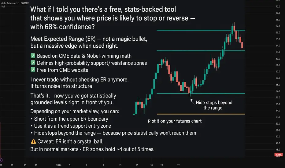
Last week Expected Ranges levels in actionQuick Recap: Last week Expected Ranges levels in action
What is Expected Range Volatility (ER)?
The Expected Range (ER) is a framework that helps traders understand how much an asset is likely to move within a specific timeframe. Based on CME market data and Nobel Prize-winning calculations, price movements within the expected volatility corridor have a 68%-95% probability of staying within those boundaries.
Crude Oil - 6 reactions to levels🔥
EUR - 4 reactions to levels
BTC - 3 reactions
GOLD - 1 reaction to levels
It's really an amazing tool to enhance your market entry💲
!!! - It doesn't guarantee trades every day.
!! it's better to combine it when working with the trend and when there's a clear sideways movement.
Quantitative Algorithmic Trading in the Global MarketData-Driven Strategies for Modern Finance
Quantitative algorithmic trading, often called quant trading, represents the convergence of finance, mathematics, statistics, and computer science. In the global market—spanning equities, commodities, forex, fixed income, and derivatives—quantitative trading has transformed how capital is deployed, risks are managed, and opportunities are identified. Instead of relying on intuition or discretionary decision-making, quant trading uses data-driven models and automated algorithms to execute trades with speed, precision, and discipline across international markets.
Understanding Quantitative Algorithmic Trading
At its core, quantitative algorithmic trading involves creating mathematical models that identify trading opportunities based on historical and real-time data. These models are translated into algorithms that automatically place buy or sell orders when predefined conditions are met. The trader’s role shifts from manual execution to designing, testing, and refining strategies.
In global markets, quant trading operates across multiple exchanges, time zones, and asset classes. This global reach allows algorithms to exploit inefficiencies arising from market fragmentation, differing regulations, currency fluctuations, and regional economic cycles.
Evolution of Quant Trading in Global Markets
Quantitative trading began with simple statistical arbitrage strategies in developed markets such as the United States and Europe. Over time, advances in computing power, access to large datasets, and the growth of electronic exchanges expanded its scope. Today, quant trading dominates volumes in major global markets, particularly in equities and foreign exchange.
Emerging markets have also seen rapid adoption as infrastructure improves and liquidity deepens. Global hedge funds, proprietary trading firms, and institutional investors deploy algorithms that operate 24 hours a day, adapting to market conditions in Asia, Europe, and the Americas.
Key Components of a Quant Trading System
A successful quantitative trading system typically consists of several interconnected components. First is data acquisition, which includes price data, volume, order book information, macroeconomic indicators, corporate fundamentals, and alternative data such as news sentiment or satellite data. In global markets, handling data from multiple sources and ensuring consistency across regions is a major challenge.
Second is model development, where statistical techniques, machine learning, or econometric models are used to identify patterns and predict price movements. These models are backtested using historical data to evaluate performance under different market conditions.
Third is execution logic, which determines how trades are placed to minimize costs such as slippage and market impact. In global markets, execution algorithms must account for varying liquidity, trading hours, and regulatory constraints.
Finally, risk management is embedded into the system to control exposure, limit drawdowns, and ensure capital preservation across volatile global environments.
Types of Quantitative Trading Strategies
Quantitative strategies in global markets can be broadly classified into several categories. Statistical arbitrage strategies exploit pricing inefficiencies between related instruments, such as pairs trading across international exchanges or ADRs versus local shares.
Trend-following strategies identify and ride sustained price movements across global asset classes. These strategies are popular in futures and forex markets, where macroeconomic trends often play out over long periods.
Mean-reversion strategies assume that prices revert to historical averages. These are commonly used in equity markets and volatility trading.
High-frequency trading (HFT) focuses on extremely short time frames, using speed and micro-price movements to generate profits. While controversial, HFT plays a significant role in global market liquidity.
Machine learning-based strategies use advanced algorithms to detect complex, nonlinear relationships in data. These approaches are increasingly popular as data availability and computing power expand.
Advantages of Quant Trading in Global Markets
One of the biggest advantages of quantitative algorithmic trading is objectivity. Decisions are based on data and rules, reducing emotional bias. This is particularly important in global markets, where geopolitical events, policy decisions, and sudden shocks can trigger extreme volatility.
Another key benefit is scalability. Algorithms can simultaneously monitor and trade hundreds of instruments across multiple countries, something impossible for manual traders. This allows firms to diversify strategies and reduce dependence on a single market.
Speed and efficiency are also critical advantages. Automated systems can react to market changes in milliseconds, capturing opportunities before they disappear. In global markets with overlapping trading sessions, this speed is a competitive edge.
Challenges and Risks
Despite its advantages, quantitative trading faces significant challenges. Model risk is a major concern—strategies that perform well in historical tests may fail in live markets due to changing conditions. Global markets add complexity due to differing regulations, political risks, and currency exposure.
Data quality and availability can also be problematic, especially in emerging markets where historical data may be limited or unreliable. Poor data can lead to flawed models and unexpected losses.
Technology and infrastructure risk is another factor. System failures, latency issues, or cyber threats can disrupt trading operations, potentially leading to large losses.
Regulation and Ethical Considerations
Global regulators closely monitor algorithmic trading due to its impact on market stability. Different countries impose varying rules on order types, position limits, and reporting requirements. Quant traders operating globally must ensure compliance with multiple regulatory frameworks.
Ethical considerations also arise, particularly around market fairness and transparency. Responsible quant trading emphasizes liquidity provision and risk control rather than exploitative practices.
The Future of Quantitative Algorithmic Trading
The future of quant trading in global markets is closely tied to technological innovation. Artificial intelligence, alternative data, and cloud computing are reshaping how strategies are developed and deployed. As markets become more interconnected, cross-asset and cross-border strategies will gain importance.
At the same time, competition is intensifying. Alpha is becoming harder to find, pushing quants to focus on better risk management, execution efficiency, and innovation rather than pure prediction.
Conclusion
Quantitative algorithmic trading has become a cornerstone of modern global financial markets. By leveraging data, technology, and systematic processes, it enables traders and institutions to operate efficiently across borders and asset classes. While challenges such as model risk, regulation, and market complexity remain, the disciplined and scalable nature of quant trading ensures its continued dominance in the global market landscape.
Why This Support Held | Market Pressure Explained #2🧠 WHY THIS SUPPORT HELD | MARKET PRESSURE EXPLAINED #2 (EURNZD)
This chart illustrates how price stability and continuation can emerge from collective market participation , rather than from candlesticks or indicators in isolation.
📌 In this historical example, s upport held due to sustained buy-side interest becoming visible across multiple timeframes , particularly as price approached previously established support areas.
Key observations include:
• Increased market participation near higher-timeframe support
• Price compression followed by renewed directional activity
• Alignment of structural price zones across timeframes
• Gradual absorption of selling pressure
• Continuation supported by overlapping participation behaviors
📊 Candlesticks do not cause price movement.
They reflect past interactions between buyers and sellers.
🧠 Understanding market behavior is clearer when focusing on
how different participants may interact at specific price areas , rather than treating indicators as standalone decision tools.
📘 This content is provided solely for educational and explanatory purposes , aiming to improve understanding of market structure and price behavior based on historical data.
⚠️ DISCLAIMER
This material is strictly educational and informational.
It does not constitute financial advice, trading instructions, or a recommendation to engage in any financial activity.
The author does not offer personalized guidance.
Any decisions made based on this content are entirely the responsibility of the individual.

One Gold Trade Can Destroy a Week of Profits
💥 One Gold Trade Can Destroy a Week of Profits – Education
One Gold Trade Can Destroy a Week of Profits
Gold (XAUUSD) is one of the most exciting yet dangerous instruments in trading. Its high volatility offers massive profit potential—but one wrong move can erase all your hard-earned gains. Let’s break this down in detail.
1️⃣ Understanding Gold Market Volatility 🔥
Gold reacts sharply to geopolitical events, economic news, and central bank decisions.
Price swings of 50–200 pips in a day are common.
High volatility means both high reward and high risk—making risk management essential.
Example:
If you earned $500 in small, careful trades, one unexpected spike or wrong trade in XAUUSD could cost $600+, wiping out a week’s profits in minutes. 😱
2️⃣ Risk Management is Your Lifesaver 🛡️
Trading without protecting your capital is like walking on a tightrope without a safety net.
✅ Rules to Follow:
Risk 1–2% of your account per trade.
Always set a stop-loss and take-profit.
Use a risk-to-reward ratio of at least 1:2 or 1:3.
Avoid over-leveraging—even small mistakes become huge losses with high leverage.
Tip: A single trade should never threaten your entire weekly profit.
3️⃣ Emotions Can Kill Your Profits 😵🧠
Trading isn’t just about charts; it’s about psychology. One impulsive decision can erase a week of careful work.
Avoid revenge trading after losses.
Don’t chase trades that don’t meet your plan.
Practice discipline and patience—stick to your strategy and setups.
Reality Check: Emotional trades often ignore risk management, which is why one trade can wipe out a week of profits.
4️⃣ Timing is Everything ⏱️
Gold has major moves during:
US session open 🌎
Fed announcements 🏦
High-impact economic news 📊
Avoid trading blindly during these times unless you are highly experienced.
Pro Tip: Sometimes the best trade is no trade—waiting for clear setups can save your profits.
5️⃣ Technical Analysis Must Be Precise 📈🔍
Before entering a trade, confirm setups using:
Order Blocks & Fair Value Gaps
Momentum Shifts
Volume & Price Action Confirmation
Avoid: Entering on impulse or guessing the trend. Even a small error can result in losses bigger than weekly profits.
6️⃣ Practical Example: The “Profit Destroyer” Trade 💣
Imagine your trading week:
Monday to Friday: 5 small, calculated trades → $500 profit 💰
Friday afternoon: Impulsive Gold trade without stop-loss → $600 loss 😱
Result? You’re down $100 for the week despite a strong start.
Lesson: Protect your capital first. Profits come from consistent, disciplined trading—not luck.
7️⃣ Key Takeaways ✅
Gold = High Risk, High Reward ⚖️
Risk Management is Non-Negotiable 🛡️
Discipline Beats Emotions Every Time 🧘♂️
Wait for Clear Setups 🕵️♂️
One Wrong Trade Can Erase a Week of Profits ⚠️
Follow for More Gold & Forex Trading Insights! 🚀📈
Stay updated with XAUUSD tips, risk management strategies, and profitable trading setups. Don’t miss out—follow now and trade smarter every day! 💎🔥

Understanding Candlesticks Within Market Structure | Tutorial #1Candlesticks + Support & Resistance in an Uptrend (Contextual Analysis)
In this tutorial, we developing an understanding of market context by observing how candlesticks behave within a bullish market environment.
Rather than viewing candlesticks as independent signals, this lesson focuses on how price behavior interacts with Support & Resistance levels during an uptrend , from a purely analytical and educational perspective.
The goal is to explain market behavior and structure , not to instruct or encourage any form of trading activity.
⚠️ Important Note
If anything on the chart is unclear, feel free to ask questions in the comments, and I will clarify the conceptual logic behind the price behavior shown.
If the material feels complex at first, that is completely normal.
This series is focused on building foundational understanding step by step , not on decision-making or execution.
📌 Chart Explanation (EURJPY Example)
On the chart, the following elements are highlighted:
1️⃣ Candlesticks
→ Illustrate how price reacts after pullbacks and pauses within a broader upward structure.
2️⃣ Support & Resistance Zones
→ Areas where price has historically shown repeated reactions.
3️⃣ Market Structure
→ Higher highs and higher lows, which define an upward structural environment.
4️⃣ Directional Arrows
→ Visual references to help distinguish between impulsive movements and corrective phases within the trend.
These elements are shown solely to explain market structure and price interaction , not to imply or suggest any action.
🧠 Why Context Matters in an Uptrend
👉 Support & Resistance as contextual reference points
Candlesticks, on their own, do not carry inherent meaning.
They become informative only when analyzed within market structure and key price areas.
In an uptrend, price often displays different behavior during pullbacks compared to trend reversals.
Understanding this distinction is essential for accurate market interpretation , not for execution.
📊 Step-by-Step Market Interpretation
1️⃣ Recognizing an upward market structure
→ Higher highs and higher lows
2️⃣ Identifying relevant Support & Resistance areas
→ Zones where price previously reacted
3️⃣ Observing candlestick behavior near these areas
→ Sequences, momentum shifts, and pressure buildup
These steps are presented to organize analytical thinking , not to guide participation in the market.
🔍 Additional Observational Elements
When certain candlestick formations appear after a pullback—such as stronger momentum candles or engulfing structures—they are often discussed in technical analysis literature as signs of renewed buying pressure.
It is important to understand that:
No single candle has predictive power on its own
Observations are probabilistic, not deterministic
Market behavior is interpreted, not guaranteed
🛡 General Risk Awareness (Educational Context)
No market pattern guarantees any outcome.
Financial markets involve uncertainty by nature.
Anyone studying these concepts should understand that:
Analysis does not equal results
Knowledge does not remove risk
Learning should always precede real-world application
This content does not encourage participation , but rather explains analytical frameworks used in market study.
👀 What’s Next?
In the next tutorial, we will introduce the concept of areas of confluence in an uptrend.
We’ll focus on how different forms of analysis can align in the same region on the chart , increasing its structural relevance from a technical perspective.
The goal is to improve contextual understanding of price behavior , not to provide trading instructions.
Follow to continue learning about market structure and price behavior
⚠️ DISCLAIMER
This content is provided strictly for educational and informational purposes only.
It does not constitute financial advice, trading instruction, or a recommendation to engage in any financial activity.
The author does not provide personalized advice.
Any actions taken based on this content are solely the responsibility of the individual.

Understanding Currency ConvertibilityWhat is Currency Convertibility?
Currency convertibility refers to the ease with which a country’s currency can be converted into foreign currencies without restrictions imposed by the government or central bank. When a currency is fully convertible, individuals, businesses, and investors can freely exchange it for another currency for any purpose—trade, travel, investment, or capital transfers.
For example, if an Indian exporter earns US dollars, currency convertibility determines whether and how easily those dollars can be converted into Indian rupees or reinvested abroad. Similarly, foreign investors assess convertibility before investing, as it affects their ability to repatriate profits and capital.
Why Currency Convertibility Matters
Currency convertibility is not just a technical financial concept; it has broad economic implications:
Facilitates International Trade
Convertibility allows exporters and importers to settle cross-border transactions smoothly, reducing friction in global trade.
Encourages Foreign Investment
Investors prefer countries where profits and capital can be freely repatriated, making convertible currencies more attractive.
Integrates Economies Globally
Convertibility helps integrate domestic financial markets with global markets, improving efficiency and competitiveness.
Signals Economic Confidence
A convertible currency often reflects confidence in a country’s economic fundamentals and monetary stability.
Types of Currency Convertibility
Currency convertibility is broadly classified into three main types:
1. Current Account Convertibility
This allows free exchange of currency for transactions related to trade in goods and services, remittances, interest payments, and tourism. Most countries, including India, have current account convertibility.
Example:
An Indian student paying tuition fees abroad or an exporter receiving payment in foreign currency falls under current account transactions.
2. Capital Account Convertibility
Capital account convertibility permits free movement of capital across borders for investments such as foreign direct investment (FDI), portfolio investment, real estate purchases, and loans.
This form is more sensitive because unrestricted capital flows can expose economies to volatility. Hence, many developing nations impose partial controls.
Example:
An Indian investor buying foreign stocks without limits would require full capital account convertibility.
3. Full Convertibility
A currency is fully convertible when both current and capital account transactions are unrestricted. Major global currencies like the US Dollar, Euro, British Pound, and Japanese Yen are fully convertible.
Partial vs Full Convertibility
Many emerging economies adopt partial convertibility as a balanced approach. Under this system:
Trade and service-related transactions are liberalized.
Capital flows are regulated through limits, approvals, or sector-specific controls.
This allows countries to enjoy the benefits of globalization while safeguarding against sudden capital flight and financial instability.
Advantages of Currency Convertibility
Boosts Trade and Exports
Easier currency exchange reduces transaction costs and improves competitiveness of exporters.
Attracts Foreign Capital
Convertible currencies signal openness and stability, attracting FDI and portfolio investments.
Improves Resource Allocation
Capital flows to sectors with higher returns, increasing overall economic efficiency.
Enhances Financial Market Development
Convertibility encourages deeper bond, equity, and forex markets.
Strengthens Global Integration
Countries with convertible currencies participate more actively in global financial systems.
Risks and Challenges of Currency Convertibility
Despite its advantages, currency convertibility also carries significant risks:
Capital Flight Risk
Sudden withdrawal of foreign capital during economic or political instability can destabilize the economy.
Exchange Rate Volatility
Free capital flows can lead to sharp currency fluctuations, affecting trade and inflation.
Loss of Monetary Control
Central banks may find it harder to control money supply and interest rates under full convertibility.
Exposure to Global Shocks
Global financial crises can quickly transmit to domestic markets through capital flows.
Speculative Attacks
Weak economies with open capital accounts may face speculative pressure on their currencies.
Currency Convertibility and Developing Economies
For developing countries, currency convertibility is a strategic decision rather than a binary choice. Gradual liberalization is often preferred to ensure:
Strong banking systems
Adequate foreign exchange reserves
Fiscal discipline
Stable inflation
India, for instance, adopted current account convertibility in the 1990s while cautiously liberalizing the capital account. This phased approach helped balance growth with stability.
Role of Central Banks and Governments
Central banks play a vital role in managing currency convertibility by:
Regulating foreign exchange markets
Managing reserves
Monitoring capital flows
Intervening during excessive volatility
Governments complement this by maintaining sound fiscal policies, regulatory oversight, and transparent financial systems.
Currency Convertibility in the Era of Globalization
With globalization, digital payments, and cross-border investments, currency convertibility has become even more relevant. However, recent trends show that even advanced economies may impose temporary controls during crises, highlighting that convertibility is dynamic and policy-driven rather than absolute.
Conclusion
Understanding currency convertibility is essential for grasping how modern economies function in a globalized world. It influences trade, investment, exchange rates, and financial stability. While full convertibility offers greater integration and efficiency, it also exposes economies to external risks. Therefore, the optimal level of convertibility depends on a country’s economic strength, financial maturity, and policy preparedness.
A well-managed convertibility framework—supported by strong institutions, prudent regulation, and sound macroeconomic policies—can serve as a powerful engine for sustainable growth and global economic participation.

Why This Support Held | Market Pressure Explained #1🧠 WHO REALLY MOVES THE MARKET? (NZDJPY)
This chart is presented for educational purposes only and illustrates
how price movement can emerge from collective market participation ,
rather than from individual indicators or candlestick patterns in isolation.
📌 In this historical example, increasing market pressure developed through the alignment of multiple forms of participation , including:
• Reactions around support and resistance zones
• Structural price compression and expansion
• Pullback-related participation within existing structure
• Trendline-related price behavior
• Observed changes in participation intensity over time
🔥 When several forms of market participation overlap in the same direction,
price movement may expand as a result of accumulated pressure.
Candlesticks do not cause price movement.
They reflect past interactions between buyers and sellers.
🧠 This content focuses on understanding market structure and participation ,
not on predicting future price movement or suggesting actions.
📘 The instrument shown is used solely for explanatory and visual clarity .
Any application of these concepts should be aligned with individual responsibility, ethical considerations, and applicable religious or legal guidelines.
⚠️ DISCLAIMER
This content is provided strictly for educational and informational purposes only.
It does not constitute financial advice, trading instructions, or a recommendation to engage in any financial activity.
The author does not provide personalized guidance.
Any decisions made based on this material are solely the responsibility of the individual.

Why This Resistance Failed | Market Pressure Explained #1🧠 WHO REALLY MOVES THE MARKET? (CHFJPY)
This chart illustrates how price movement emerges from collective market participation ,
not from candlesticks in isolation.
📌 In this example, strong bullish pressure developed as a result of multiple participant behaviors aligning in the same direction , including:
📐 Participants reacting to support & resistance zones
📊 Participants observing chart formations
📉 Participants referencing Fibonacci-based price areas
🔄 Participants responding to pullbacks within structure
📈 Participants observing moving-average-related price behavior
🔥 When multiple forms of market participation overlap, price movement tends to expand.
Candlesticks do not cause price movement.
They reflect past interactions between buyers and sellers.
🧠 To understand market behavior more clearly, it is useful to focus on
who may be participating at different price areas , rather than treating indicators as standalone signals.
📘 This analysis is intended to explain market structure and price behavior , not to suggest specific actions.
If you’d like to continue exploring how market participation shapes price movement,
you can follow for future educational content.
⚠️ DISCLAIMER
This content is provided strictly for educational and informational purposes only.
It does not constitute financial advice, trading instructions, or a recommendation to engage in any financial activity.
The author does not provide personalized guidance.
Any decisions made based on this material are solely the responsibility of the individual.

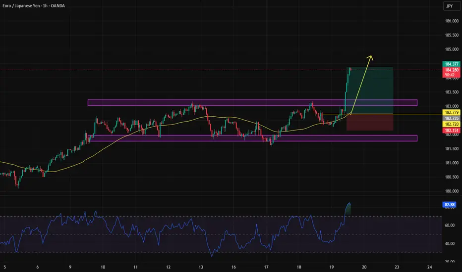
EURJPY-Educational TipEducational Tip: When price stays in a range for a long time, the probability increases that a whale (big player) will break it from one side. Look at this pair— what a great opportunity it was for an earlier entry into the position without missing the move.
The background trend is strongly bullish, and in the end, price couldn't even reach the channel bottom—this in itself is a signal for early entry. If we had entered at the point marked with the yellow line, we wouldn't have missed this move.
You might say, "It's easy to say this now that it's clear," but the truth is: with proper money management, there's no fear of getting stopped out.
| This Chart Shows How We Look at BTC Halving & Market Cycles | This chart shows how we look at BTC halvings and market cycles. Every cycle follows a similar structure — accumulation, expansion, distribution, reaccumulation — but the way it plays out is never the same. That’s the key part most people miss.
Yes, around 539 days have already passed since the last halving, but so far what we’ve really seen is BTC printing a new ATH. And that alone does not define the start of a bull market. BTC making an ATH has happened before without a proper broad market expansion right away.
For us, the real confirmation comes from ETH. Once ETH prints a new ATH — or at least starts hovering close to it — that’s when we can say the bull market has actually started. Only then do we expect the kind of expansion most people are waiting for, especially on alts. Until that happens, everything before it is just positioning and volatility.
We’ve said it before and we’ll say it again: every bull run is different. This one is no exception. Too many people were waiting for the bull run to “just work” the same way it always did. When expectations become that obvious, markets rarely deliver in a clean way.
The most logical outcomes in that case are either delaying the bull run or aggressively taking liquidity — exactly like the recent dip that wiped out a lot of positions and shook people out. Bigger players need fuel, and that fuel comes from impatience.
So no, this doesn’t mean the bull run is cancelled. It means it’s evolving differently. BTC did its part by making a new ATH. Now the market is waiting on ETH. Once that happens, the smaller bull run most people are hoping for can finally kick off.
Until then, patience, positioning, and understanding the cycle matters more than hype.

How to Use Candlesticks in a High-Probability Way | Tutorial #4Candlesticks + Support & Resistance in a Downtrend (Context Matters)
In this part, we move beyond isolated candlesticks and place them into real market context.
This tutorial focuses on combining candlesticks with Support & Resistance within a downtrend , which is where high-probability setups are actually formed.
⚠️ Important note:
This part is slightly more advanced than the previous three tutorials.
If something on the chart is unclear, feel free to ask in the comments — I’ll do my best to answer everyone.
Don’t worry if it feels complex at first.
We are just scratching the surface — from here, the real trading logic begins.
Strongly recommended:
Review Tutorials #1–#3 first.
Each part builds on the previous one, and this structure will continue throughout the series.
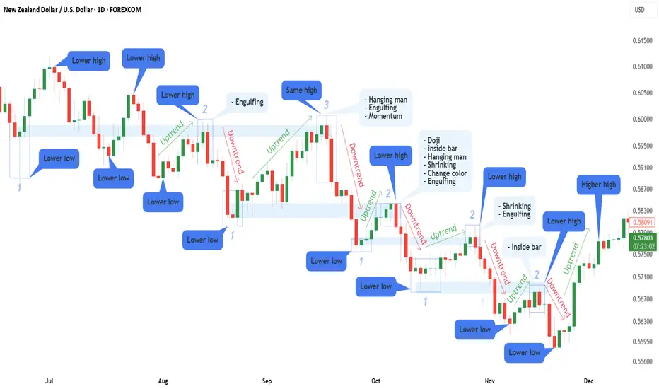
📌 Chart Explanation (NZDUSD Example)
I’m using NZDUSD again , the same pair from Part 1, to keep everything consistent and easier to follow.
On the chart, you can see:
1️⃣ Candlesticks
→ They show price reactions when reversals or rejections occur.
2️⃣ Support & Resistance Zones
→ Key areas where price previously reacted.
3️⃣ Numbers (1–3)
→ Represent multiple touches of support and resistance, increasing their importance.
4️⃣ Market Structure
→ Lower Highs + Lower Lows = Downtrend context
5️⃣ Directional Arrows
→ Visual guidance for trend direction and corrections.
🧠 Why Context Changes Everything
Up to now, we worked mainly with candlesticks and trend direction.
Now we add the most important missing piece for high-probability trading:
👉 Support & Resistance
Candlesticks do not create signals on their own.
They become powerful only when they appear at the right location within market structure.
(If Support & Resistance is not fully clear yet, I’ve already published Part 1 of that tutorial — feel free to ask in the comments, and I’ll gladly make Part 2.)
📈 Finding Trade Opportunities — Step by Step
(Using all 4 tutorials together)
1️⃣ Identify a downtrend
→ Lower highs & lower lows
2️⃣ Draw Support & Resistance zones
3️⃣ Wait for candlestick stacking
→ As explained in previous tutorials (clusters, sequences, pressure buildup)
🔥 Bonus Confirmation
If, after candlesticks stack together, you see:
an Engulfing candle , or
a Momentum candle
that’s a strong sign that buyers or sellers are stepping in aggressively.
This is where probability increases , not because of one candle — but because everything aligns.
🛡 Risk Management Reminder
No setup is guaranteed.
Always apply proper risk management and position sizing.
If you’re still learning or testing these concepts, it is strongly recommended to practice on a demo account first before risking real capital.
Trading is a process, not a shortcut to fast profits.
Focus on consistency, discipline, and execution — not outcomes.
🧠 Continuing the Series
If anything on the chart is unclear, feel free to ask in the comments — I’ll do my best to help.
This tutorial is part of a structured series where each part builds on the previous one.
Following simply helps you keep track of future lessons.
⚠️ DISCLAIMER
This content is for educational purposes only and does not constitute financial advice.
Trading involves risk — always conduct your own analysis.
I am not responsible for any decisions or losses based on this material.
The Hidden Signal of the Rectangle PatternWhat Is the Rectangle Pattern?
The Rectangle Pattern is one of the classic technical analysis patterns. It forms when the market enters a consolidation or ranging phase. Price moves between a horizontal support and a horizontal resistance, and the market hasn’t decided which direction to move yet.
🧠 Simple Concept
Buyers prevent price from dropping below support
Sellers prevent price from rising above resistance
Result: Price oscillates inside a horizontal box 📦
This phase usually happens before a strong move.
📐 Structure of the Rectangle Pattern
For the pattern to be valid, we usually need:
At least 2 touches on resistance
At least 2 touches on support
Lines should be mostly horizontal (not sloped)
🔄 Types of Rectangle Patterns
1️⃣ Continuation Rectangle (Most Common)
Forms after a strong trend
Market takes a breather 😮💨
After the breakout, the previous trend continues
📈 Uptrend → Breakout upward
📉 Downtrend → Breakout downward
2️⃣ Reversal Rectangle (Less Common)
Breakout happens against the prior trend
Requires strong confirmation
🚪 How to Identify a Valid Breakout?
A good breakout should have:
🕯 Candle close outside the range
📊 Increase in volume
🔁 Preferably a pullback to the broken level
⚠️ A wick-only breakout is not valid.
🎯 Price Target of the Rectangle Pattern
Very simple calculation:
Rectangle Height = Resistance − Support
Project the same distance from the breakout point.
📌 Example:
Support: 100
Resistance: 120
Height: 20
🔼 Bullish breakout → Target = 140
🔽 Bearish breakout → Target = 80
🛑 Stop Loss Placement
Bullish breakout 📈 → SL below former resistance
Bearish breakout 📉 → SL above former support
Or:
Behind the last swing high/low inside the rectangle
🧩 Role of Volume
Low volume inside the rectangle → Healthy consolidation ✅
High volume on breakout → Pattern confirmation 💪
Breakout without volume → Suspicious ❌
⏱ Best Timeframes
The pattern appears on all timeframes, but works best on:
1H
4H
Daily
⚠️ Very low timeframes = more fake breakouts
❌ Common Trader Mistakes
Entering before the breakout
Ignoring volume
No stop loss
Trading inside the box 😬
✅ Golden Tips for Success
Be patient and wait for the breakout 🧘
Always confirm with volume
Pullbacks offer the safest entries
Risk-to-reward should be at least 1:2
🧠 Professional Rectangle Trading Strategies
🎯 Entry Methods
1️⃣ Aggressive Entry
Enter immediately after breakout candle closes
Suitable for strong momentum markets
Higher risk, faster profit
📌 Best for experienced traders
2️⃣ Conservative Entry (Recommended)
Wait for pullback to the broken level
Enter after price confirmation
Higher win rate ✅
📌 Best choice for most traders
🧯 What Is a Fake Breakout & How to Avoid It?
A fake breakout happens when price briefly exits the rectangle and quickly returns inside 😵
Warning Signs:
❌ No volume
❌ No candle close outside the range
❌ Breakout against higher-timeframe trend
Professional Solution:
Wait for candle close
Confirm with Volume or RSI
Enter on pullback, not the first impulse
📊 Trade Management
🎯 Multi-Target Strategy
Instead of one target:
TP1 = 50% of rectangle height
TP2 = 100% of rectangle height
Trail the remaining position
📈 This reduces psychological pressure
🛑 Smart Stop Loss Techniques
Advanced methods include:
Above/below breakout candle
Behind VWAP or EMA 20/50
ATR-based stop (volatility-based)
🧩 Combining Rectangle Pattern with Other Tools
📉 With RSI
Bullish breakout + RSI above 50 → Strong confirmation
Divergence inside rectangle → Trend change warning
📈 With EMAs
Price above EMA 50 → Long bias
Price below EMA 50 → Short bias
📊 With Volume Profile
Breakout from High-Volume Area → More reliable
⏳ Higher Timeframe Analysis (Top-Down)
Before entering a trade:
Identify the higher-timeframe trend
Align the rectangle breakout with it
📌 Rectangle against the major trend = higher risk ⚠️
🧪 Real Trade Scenario Example
Overall trend: Bullish
Rectangle forms on 4H
Low volume inside the box
Bullish breakout with volume
Pullback to broken resistance
🎯 Long entry | SL below box | TP = rectangle height
❌ Even Pros Make These Mistakes
Overtrading inside ranges
Drawing the rectangle too wide
Ignoring major news events
Risking more than 1–2% per trade
✅ Golden Pre-Trade Checklist
☑️ At least 2 touches on support & resistance
☑️ Low volume inside the rectangle
☑️ Breakout with candle close
☑️ Aligned with higher-timeframe trend
☑️ Risk-to-reward ≥ 1:2
📌 Final Summary
The Rectangle Pattern means:
“The market is building energy” ⚡️
If you:
Stay patient
Filter fake breakouts
Follow proper risk management
This pattern can become one of the most reliable tools in your trading system 🚀

Risk Management Is Not Protection... It’s Your Edge!!!Most traders treat risk management like a seatbelt.
Something you use just in case.
🧳Professionals treat risk management as their main edge.
Because in trading, you don’t get paid for being right...
you get paid for staying in the game long enough for probabilities to work.
1️⃣ Risk Is Defined Before the Trade Exists
Before you think about entries or targets, one question must already be answered:
Where am I wrong?
If you don’t know where your idea fails,
you’re not managing risk... you’re hoping.
Professionals define risk first.
The trade only exists after invalidation is clear.
2️⃣ Small Risk Creates Big Freedom
When risk is small and predefined:
- hesitation disappears
- emotions calm down
- execution improves
Why?
Because no single trade matters anymore.
You stop needing trades to work, and that’s when trading becomes objective.
3️⃣ Risk Management Turns Losses Into Data
Losses are unavoidable.
Damage is optional.
A controlled loss is not a failure; it’s information.
Every loss tells you:
- the market condition wasn’t right
- the timing was early
- or the structure changed
When risk is managed, losses educate instead of punish.
4️⃣ Consistency Is Built on Risk, Not Wins
Winning streaks feel good.
They don’t build careers.
Surviving losing streaks does.
Proper risk management ensures:
- drawdowns stay shallow
- confidence stays intact
- discipline stays repeatable
That’s how traders last long enough to improve.
💡The Real Truth
You don’t need a better strategy.
You need better control over downside.
Risk management is what allows:
- imperfect strategies to work
- average win rates to grow accounts
- traders to evolve instead of quit
⚠️ Disclaimer: This is not financial advice. Always do your own research and manage risk properly.
📚 Stick to your trading plan regarding entries, risk, and management.
Good luck! 🍀
All Strategies Are Good; If Managed Properly!
~Richard Nasr

XAU/USD potential breakLet's dive into the gold price analysis. Currently, gold is trading at $4327.27, having bounced off the $4300 support level. The big question is whether there's enough demand to push the price past the next target of $4350
Key Levels to Watch:
- Resistance: $4350 and $4349 as our point of interest
- Support: $4320
*Market Sentiment:
Traders are watching the Fed's rate cut decision, which could impact gold prices. Central banks have been accumulating gold, with over 1,000 tonnes purchased year-to-date, supporting the bullish outlook
Given the current price action, it's possible that gold could break past $4350 and head towards $4400 if the demand remains strong. However, it's essential to monitor the support levels and adjust your strategy accordingly

Caution: Cash Levels Among Fund Managers Are at Record LowsAccording to the latest Global Fund Manager Survey conducted by Bank of America, the percentage of cash held by fund managers has fallen to 3.3%, the lowest level since 1999. In terms of asset allocation, historically low cash levels among managers have often coincided with peaks in equity markets. Conversely, periods when cash levels reached elevated zones were frequently precursors to major market bottoms and to the end of bear markets.
At a time when S&P 500 valuations are in an overextended bullish zone, this new historical low in cash holdings among managers therefore constitutes a signal of caution. Sooner or later, cash levels are likely to rebound, which would translate into downward pressure on equity markets. This reflects the basic principle of asset allocation between cash, equities, and bonds, with capital flowing from one reservoir to another. It is the fundamental mechanism of asset allocation: the reservoirs represented by cash, equities, and bonds fill and empty at the expense of one another.
This signal is all the more significant because such a low level of cash implies that managers are already heavily invested. In other words, the vast majority of available capital has already been allocated to equities. In this environment, the pool of marginal buyers shrinks considerably, making the market more vulnerable to any negative shock: macroeconomic disappointment, a rise in long-term interest rates, geopolitical tensions, or even simple profit-taking.
Moreover, historically low cash levels reflect an extreme bullish consensus. Financial markets, however, tend to move against overly established consensuses. When everyone is positioned in the same direction, the risk-reward balance deteriorates. In such cases, the market does not necessarily need a major negative catalyst to correct; the mere absence of positive news can sometimes be enough to trigger a consolidation.
It is also important to recall that the rise in the S&P 500 has been accompanied by an extreme concentration of performance in a limited number of stocks, mainly related to technology and artificial intelligence. In such an environment, a simple portfolio rebalancing or sector rotation can amplify downward moves.
Finally, the gradual return of cash typically does not occur without pain for equity markets. It is often accompanied by a phase of increased volatility, or even a correction, allowing a healthier balance to be restored between valuations, positioning, and economic prospects.
In summary, this historically low level of cash among fund managers is not a signal of an imminent crash, but it clearly calls for caution, more rigorous risk management, and greater selectivity within the S&P 500, in an environment where optimism appears to be largely priced in.
DISCLAIMER:
This content is intended for individuals who are familiar with financial markets and instruments and is for information purposes only. The presented idea (including market commentary, market data and observations) is not a work product of any research department of Swissquote or its affiliates. This material is intended to highlight market action and does not constitute investment, legal or tax advice. If you are a retail investor or lack experience in trading complex financial products, it is advisable to seek professional advice from licensed advisor before making any financial decisions.
This content is not intended to manipulate the market or encourage any specific financial behavior.
Swissquote makes no representation or warranty as to the quality, completeness, accuracy, comprehensiveness or non-infringement of such content. The views expressed are those of the consultant and are provided for educational purposes only. Any information provided relating to a product or market should not be construed as recommending an investment strategy or transaction. Past performance is not a guarantee of future results.
Swissquote and its employees and representatives shall in no event be held liable for any damages or losses arising directly or indirectly from decisions made on the basis of this content.
The use of any third-party brands or trademarks is for information only and does not imply endorsement by Swissquote, or that the trademark owner has authorised Swissquote to promote its products or services.
Swissquote is the marketing brand for the activities of Swissquote Bank Ltd (Switzerland) regulated by FINMA, Swissquote Capital Markets Limited regulated by CySEC (Cyprus), Swissquote Bank Europe SA (Luxembourg) regulated by the CSSF, Swissquote Ltd (UK) regulated by the FCA, Swissquote Financial Services (Malta) Ltd regulated by the Malta Financial Services Authority, Swissquote MEA Ltd. (UAE) regulated by the Dubai Financial Services Authority, Swissquote Pte Ltd (Singapore) regulated by the Monetary Authority of Singapore, Swissquote Asia Limited (Hong Kong) licensed by the Hong Kong Securities and Futures Commission (SFC) and Swissquote South Africa (Pty) Ltd supervised by the FSCA.
Products and services of Swissquote are only intended for those permitted to receive them under local law.
All investments carry a degree of risk. The risk of loss in trading or holding financial instruments can be substantial. The value of financial instruments, including but not limited to stocks, bonds, cryptocurrencies, and other assets, can fluctuate both upwards and downwards. There is a significant risk of financial loss when buying, selling, holding, staking, or investing in these instruments. SQBE makes no recommendations regarding any specific investment, transaction, or the use of any particular investment strategy.
CFDs are complex instruments and come with a high risk of losing money rapidly due to leverage. The vast majority of retail client accounts suffer capital losses when trading in CFDs. You should consider whether you understand how CFDs work and whether you can afford to take the high risk of losing your money.
Digital Assets are unregulated in most countries and consumer protection rules may not apply. As highly volatile speculative investments, Digital Assets are not suitable for investors without a high-risk tolerance. Make sure you understand each Digital Asset before you trade.
Cryptocurrencies are not considered legal tender in some jurisdictions and are subject to regulatory uncertainties.
The use of Internet-based systems can involve high risks, including, but not limited to, fraud, cyber-attacks, network and communication failures, as well as identity theft and phishing attacks related to crypto-assets.

A Strategic Approach to Profiting from Market InformationNews Trading Without Noise
In modern financial markets, news travels faster than ever. Economic data releases, central bank statements, corporate earnings, geopolitical developments, and even social media posts can move prices within seconds. While news creates opportunities, it also creates noise—misleading signals, emotional reactions, rumors, and short-term volatility that can trap unprepared traders. News trading without noise is the disciplined practice of extracting high-quality, actionable information from news while filtering out distractions, overreactions, and irrelevant data. This approach allows traders to participate in major market moves with clarity, confidence, and consistency.
Understanding the Difference Between News and Noise
Not all news is equal. Markets react strongly only to information that changes expectations. Noise, on the other hand, consists of repetitive commentary, speculative opinions, exaggerated headlines, and minor developments that do not materially alter fundamentals. For example, a central bank interest rate decision that deviates from expectations is meaningful news, while repeated media debates about possible outcomes before the announcement are often noise. Successful news traders focus on what is new, unexpected, and impactful, rather than what is loud or popular.
Noise is dangerous because it triggers emotional trading—fear of missing out (FOMO), panic selling, or impulsive entries. News trading without noise requires emotional detachment and a rules-based mindset, where decisions are driven by predefined criteria rather than instant reactions.
Focusing on High-Impact News Events
A noise-free news trading strategy begins with selectivity. Traders should focus only on high-impact, scheduled, and well-defined events such as:
Central bank interest rate decisions and policy statements
Inflation data (CPI, PPI), employment reports, and GDP figures
Corporate earnings from market leaders
Major geopolitical events that affect global risk sentiment
Low-impact data releases and speculative breaking news should be ignored unless they directly affect market expectations. By limiting attention to a small set of powerful events, traders reduce cognitive overload and improve decision quality.
Trading Expectations, Not Headlines
Markets move based on the gap between expectations and reality. A positive news headline does not always lead to rising prices if the market had already priced in better outcomes. News trading without noise means understanding consensus forecasts, market positioning, and sentiment before the event.
For instance, if inflation data comes in high but slightly below expectations, markets may rally despite inflation remaining elevated. Traders who focus only on the headline number may misinterpret the move, while those who analyze expectations understand the true driver. This expectation-based approach helps traders align with institutional flows rather than fighting them.
Using Price Action as the Final Filter
Price action is the most reliable filter against noise. Before acting on news, traders should observe how the market reacts in the first few minutes or hours. Strong, sustained moves with high volume often indicate genuine institutional participation, while sharp spikes followed by quick reversals usually signal noise-driven volatility.
News trading without noise does not mean reacting instantly. Instead, it means waiting for confirmation. Breakouts above key resistance levels, breakdowns below support, or continuation patterns after news provide clearer, lower-risk entry points. Letting price validate the news helps traders avoid false signals.
Timeframe Alignment and Patience
Many traders lose money by trading news on timeframes that do not match the event’s significance. Short-term scalping during major news releases is extremely risky due to slippage and whipsaws. Noise-free news traders often prefer higher timeframes—15-minute, 1-hour, or even daily charts—where the true impact of news becomes clearer.
Patience is critical. Not every news event needs to be traded immediately. Sometimes the best opportunity emerges hours or days later, once the market digests the information and establishes a clear trend.
Risk Management Over Prediction
A core principle of news trading without noise is accepting uncertainty. News outcomes are unpredictable, and even correct analysis can result in losses due to unexpected market reactions. Therefore, risk management is more important than prediction.
Traders should use predefined stop-loss levels, conservative position sizing, and avoid overexposure during high-volatility periods. Protecting capital ensures longevity and reduces emotional pressure, making it easier to stay disciplined and ignore noise.
Avoiding Media and Social Media Traps
Financial media and social platforms often amplify noise. Sensational headlines, conflicting expert opinions, and real-time commentary can distort perception and push traders into impulsive decisions. Noise-free traders limit exposure to such inputs, relying instead on primary data sources, official releases, and their own analysis frameworks.
Developing a personal trading plan and sticking to it is the best defense against external influence. When traders know exactly what they are looking for, irrelevant information naturally fades into the background.
Building a Structured News Trading Framework
To trade news without noise, traders should create a structured framework that includes:
A predefined list of tradable news events
Clear rules for pre-news preparation and post-news execution
Specific technical levels for confirmation
Strict risk management guidelines
This structure transforms news trading from reactive gambling into a professional, repeatable process.
Conclusion
News trading without noise is not about being the fastest or reacting to every headline. It is about clarity, selectivity, and discipline. By focusing on high-impact information, understanding expectations, waiting for price confirmation, and managing risk carefully, traders can turn news from a source of confusion into a powerful trading edge. In an age of information overload, the ability to filter noise is not just an advantage—it is a necessity for consistent success in financial markets.

Inflation, Recession Fears, and Geopolitical ConflictsSafe Haven Gold Trading:
Gold has long occupied a unique position in global financial markets as a safe haven asset—a store of value that investors turn to during periods of uncertainty. Unlike equities, which are closely tied to corporate earnings and economic growth, or fiat currencies, which are subject to monetary policy and inflation risk, gold derives its value from scarcity, durability, and universal acceptance. In times marked by rising inflation, looming recession fears, and escalating geopolitical conflicts, gold trading becomes especially significant as investors seek stability, capital preservation, and portfolio diversification.
Gold as a Hedge Against Inflation
Inflation erodes the purchasing power of money, reducing the real value of cash and fixed-income investments. When inflation rises sharply or is expected to remain elevated, investors often shift capital toward assets that historically maintain value over time. Gold is widely perceived as one such hedge. Its supply grows slowly and cannot be expanded easily by central banks, unlike paper currency, which can be created through monetary easing and deficit financing.
During inflationary periods, real interest rates—nominal rates minus inflation—often turn negative. When real yields fall, the opportunity cost of holding non-yielding assets like gold decreases, making it more attractive. Traders closely monitor inflation indicators such as consumer price indices (CPI), producer prices, and wage growth, as well as central bank signals regarding interest rates. Sustained inflation combined with accommodative monetary policy typically supports bullish gold trends.
For traders, inflation-driven gold movements offer opportunities across multiple time frames. Long-term investors may accumulate gold or gold-backed instruments as a strategic hedge, while short-term traders capitalize on volatility around inflation data releases and policy announcements.
Gold During Recession Fears and Economic Slowdowns
Recession fears often trigger risk aversion across financial markets. As economic growth slows, corporate profits decline, unemployment rises, and equity markets tend to weaken. In such environments, investors reduce exposure to risk assets and reallocate capital toward defensive instruments, including gold.
Gold’s appeal during recessions lies in its perceived stability and independence from economic cycles. While demand for industrial commodities may fall during downturns, gold demand often increases due to its role as a monetary and investment asset. Central banks may also respond to recessions with rate cuts, liquidity injections, and quantitative easing—policies that can weaken currencies and further support gold prices.
From a trading perspective, recession-driven gold rallies are often characterized by strong trends and momentum. Technical indicators such as moving averages, trend channels, and momentum oscillators are widely used to identify entry and exit points. Additionally, correlations play a crucial role: gold often shows an inverse relationship with equities and, at times, with the US dollar, making it a valuable tool for portfolio hedging during economic stress.
Geopolitical Conflicts and Crisis-Driven Demand
Geopolitical conflicts—wars, trade disputes, sanctions, and political instability—are among the most powerful drivers of safe haven demand for gold. Such events increase uncertainty, disrupt supply chains, and threaten global economic stability. When traditional financial systems appear vulnerable, gold’s status as a universally recognized asset becomes particularly valuable.
Historically, gold prices tend to spike during periods of heightened geopolitical tension. Even the risk or anticipation of conflict can drive speculative and hedging demand. Traders pay close attention to developments in major geopolitical hotspots, diplomatic breakdowns, and military escalations, as these events can trigger sudden price movements and increased volatility.
In conflict-driven markets, gold trading often requires swift decision-making and robust risk management. Prices may react sharply to news headlines, making stop-loss placement, position sizing, and disciplined execution essential. For experienced traders, such volatility can present lucrative opportunities, while for long-term investors, it reinforces gold’s role as insurance against extreme scenarios.
Role of Central Banks and Global Demand
Central banks are major players in the gold market and significantly influence long-term price trends. In recent years, many central banks—particularly in emerging economies—have increased gold reserves to diversify away from dependence on major reserve currencies. This structural demand provides a strong underlying support for gold prices, especially during periods of global financial fragmentation.
In addition to central banks, physical demand from jewelry, technology, and investment products such as exchange-traded funds (ETFs) shapes the gold market. During crises, ETF inflows often surge as investors seek quick and liquid exposure to gold, amplifying price movements.
Trading Gold as a Safe Haven Strategy
Safe haven gold trading involves more than simply buying during crises. Successful traders integrate fundamental analysis, technical analysis, and macroeconomic awareness. Fundamentals help identify the broader environment—such as inflation trends, monetary policy, and geopolitical risk—while technical tools guide precise trade execution.
Risk management is critical, as gold can experience sharp corrections even in bullish environments, particularly when markets shift toward risk-on sentiment or when interest rates rise unexpectedly. Diversification across instruments—spot gold, futures, options, and gold mining equities—allows traders to tailor exposure according to risk tolerance and market conditions.
Conclusion
Safe haven gold trading plays a vital role in navigating periods of inflation, recession fears, and geopolitical conflicts. Gold’s enduring value, limited supply, and global acceptance make it a powerful hedge against economic instability and financial uncertainty. Whether used as a long-term store of value or actively traded to capitalize on market volatility, gold remains a cornerstone asset in times of crisis. In an increasingly interconnected and unpredictable world, understanding the dynamics of safe haven gold trading is essential for investors and traders seeking resilience, protection, and strategic advantage in global markets.

Global Soft Commodity Trading: Dynamics and StrategiesUnderstanding the Global Soft Commodity Market
Soft commodity markets operate on a global scale, with production concentrated in specific regions and consumption spread worldwide. For example, coffee production is dominated by Brazil, Vietnam, and Colombia, while cocoa largely comes from West African nations such as Ivory Coast and Ghana. Sugar production is led by Brazil and India, whereas wheat and corn are heavily produced in the United States, Russia, and parts of Europe.
This geographical imbalance between producers and consumers makes international trade essential. Prices are generally discovered on major commodity exchanges such as the Chicago Board of Trade (CBOT), Intercontinental Exchange (ICE), and Euronext. These exchanges provide standardized futures and options contracts that allow producers, consumers, traders, and investors to hedge risk or speculate on price movements.
Key Drivers of Soft Commodity Prices
Soft commodity prices are influenced by a wide range of interconnected factors:
Weather and Climate Conditions
Weather is the single most important factor affecting soft commodities. Droughts, floods, cyclones, frost, and changing rainfall patterns can significantly impact crop yields. Climate phenomena such as El Niño and La Niña often cause global supply disruptions, leading to sharp price volatility.
Supply and Demand Dynamics
Changes in population, income levels, dietary habits, and industrial usage directly affect demand. For instance, rising coffee consumption in Asia or increased ethanol production boosting corn demand can alter global price trends.
Government Policies and Trade Regulations
Export bans, import duties, subsidies, and minimum support prices play a crucial role, especially in emerging economies. Policies in major producing countries like India, Brazil, or the United States can influence global supply availability and price stability.
Currency Movements
Since most soft commodities are priced in U.S. dollars, fluctuations in currency exchange rates impact international trade. A weaker dollar generally supports higher commodity prices, while a stronger dollar can suppress demand.
Logistics and Geopolitical Factors
Transportation costs, port congestion, trade routes, and geopolitical tensions can disrupt supply chains. Conflicts, sanctions, or shipping bottlenecks often translate into sudden price spikes.
Market Participants in Soft Commodity Trading
The global soft commodity market includes diverse participants, each with different objectives:
Producers and Farmers use futures contracts to hedge against adverse price movements and protect their income.
Processors and End Users such as food manufacturers and textile companies hedge to stabilize input costs.
Traders and Merchants act as intermediaries, managing storage, transportation, and arbitrage opportunities.
Speculators and Investors, including hedge funds and institutional investors, aim to profit from price movements and market trends.
Retail Traders increasingly participate through online platforms offering commodity derivatives and ETFs.
Trading Instruments and Strategies
Soft commodities can be traded through several financial instruments:
Futures Contracts are the most common, providing standardized exposure to commodity prices.
Options allow traders to manage risk with limited downside.
ETFs and ETNs offer indirect exposure for investors who do not wish to trade futures directly.
Spot and Physical Trading is mainly used by large commercial participants.
Successful soft commodity trading often relies on a blend of strategies:
Fundamental Analysis, focusing on crop reports, weather forecasts, acreage data, and inventory levels.
Technical Analysis, using price charts, trends, support-resistance levels, and momentum indicators.
Seasonal Trading, which takes advantage of recurring patterns related to planting and harvesting cycles.
Spread Trading, involving the price difference between related commodities or different contract months.
Risks and Volatility in Soft Commodity Markets
Soft commodities are known for high volatility due to their dependence on uncontrollable natural factors. Sudden weather changes or policy announcements can cause rapid price movements. Additionally, leverage in futures trading can amplify both profits and losses. Effective risk management through position sizing, stop-loss strategies, and diversification is essential for long-term success.
Another key risk is market uncertainty due to climate change, which has increased the frequency of extreme weather events. This has made price forecasting more challenging, increasing both risk and opportunity for traders.
Role of Emerging Markets and Sustainability
Emerging markets play a growing role in global soft commodity trading, both as producers and consumers. Rising incomes in Asia and Africa are driving demand for food commodities, while technological advancements are improving agricultural productivity.
Sustainability and ESG (Environmental, Social, and Governance) considerations are also reshaping the market. Ethical sourcing, carbon footprints, and sustainable farming practices increasingly influence investment decisions and trade flows. Certifications such as Fair Trade and organic labeling are becoming important price differentiators in global markets.
Future Outlook of Global Soft Commodity Trading
The future of global soft commodity trading is expected to be shaped by several long-term trends: climate variability, population growth, technological innovation in agriculture, and digitalization of trading platforms. Data analytics, satellite imagery, and AI-driven weather models are enhancing market transparency and decision-making.
At the same time, increased financial participation is likely to keep volatility elevated, offering both risks and opportunities. Traders who can combine strong fundamental understanding with disciplined technical execution will be better positioned to navigate these evolving markets.
Conclusion
Global soft commodity trading is a dynamic and multifaceted market that reflects the intersection of nature, economics, and finance. From coffee and cocoa to grains and sugar, these commodities are essential to everyday life and global trade. While the market carries significant risks due to volatility and uncertainty, it also offers substantial opportunities for informed and disciplined traders. A deep understanding of global supply chains, weather patterns, policy impacts, and market behavior is essential for success in the ever-evolving world of soft commodity trading.
Global Positional TradingA Strategic Approach to Profiting from Medium- to Long-Term Market Trends
Global positional trading is a widely practiced trading and investment strategy that focuses on capturing price movements over a medium- to long-term horizon across international financial markets. Unlike intraday or short-term swing trading, positional trading emphasizes holding positions for weeks, months, or sometimes even years, based on strong macroeconomic, fundamental, and technical convictions. In an increasingly interconnected global financial system, positional trading allows market participants to benefit from structural trends, policy shifts, and economic cycles that shape asset prices worldwide.
Understanding Positional Trading in a Global Context
Positional trading is rooted in the belief that major market trends tend to persist over time. Global positional traders aim to identify these trends early and maintain exposure until the underlying drivers weaken or reverse. The “global” dimension expands this approach beyond domestic markets, enabling traders to operate in equities, commodities, forex, bonds, indices, and alternative assets across multiple countries and regions.
This strategy benefits from globalization, where events in one part of the world can influence markets elsewhere. For example, changes in U.S. Federal Reserve policy can impact emerging market currencies, global bond yields, and equity flows. Positional traders analyze such interconnections to position themselves advantageously.
Time Horizon and Trading Psychology
The holding period in global positional trading typically ranges from several weeks to multiple months. This longer timeframe reduces the noise associated with intraday volatility and allows traders to focus on broader price structures. However, it also requires patience, discipline, and emotional control, as positions may experience interim drawdowns before reaching their intended targets.
Psychologically, positional trading demands confidence in analysis and the ability to withstand short-term market fluctuations. Traders must avoid overreacting to daily news or price movements and instead remain aligned with the broader thesis supporting their trade.
Key Asset Classes in Global Positional Trading
Global positional traders operate across a wide array of asset classes:
Equities and Global Indices: Traders may take positions in individual stocks or major indices such as the S&P 500, FTSE 100, Nikkei 225, DAX, or emerging market indices, based on economic growth prospects, earnings cycles, and valuation trends.
Forex Markets: Currency pairs are particularly suited for positional trading due to clear macroeconomic drivers like interest rate differentials, inflation trends, and balance-of-payments dynamics.
Commodities: Gold, crude oil, natural gas, industrial metals, and agricultural commodities often experience long-lasting trends driven by supply-demand imbalances, geopolitical tensions, and global growth cycles.
Fixed Income and Bonds: Positional traders may trade government bonds or bond ETFs to capitalize on changing interest rate expectations and monetary policy cycles.
Role of Fundamental Analysis
Fundamental analysis forms the backbone of global positional trading. Traders closely monitor macroeconomic indicators such as GDP growth, inflation, employment data, interest rates, fiscal policy, and central bank guidance. Geopolitical developments, trade agreements, sanctions, and political stability also play a crucial role in shaping long-term trends.
For example, an expectation of prolonged monetary tightening in developed economies may lead a positional trader to favor stronger currencies, weaker equity markets, or rising bond yields. Similarly, long-term infrastructure spending plans can support bullish positions in industrial metals or construction-related equities.
Technical Analysis for Timing and Risk Control
While fundamentals define the “what” and “why” of a trade, technical analysis helps determine the “when.” Global positional traders rely on higher-timeframe charts such as daily, weekly, or even monthly charts to identify trend direction, key support and resistance levels, and price patterns.
Common tools include moving averages, trendlines, Fibonacci retracements, momentum indicators, and chart formations. Technical analysis is especially useful for optimizing entry points, setting stop-loss levels, and planning profit targets without undermining the core fundamental view.
Risk Management in Global Positional Trading
Effective risk management is critical in positional trading, particularly when dealing with global markets that can be affected by sudden political or economic shocks. Traders typically use wider stop-losses compared to short-term strategies but compensate by reducing position size to maintain acceptable risk exposure.
Diversification across asset classes and regions is another key element. By spreading capital across uncorrelated markets, traders reduce the impact of adverse movements in any single position. Currency risk, overnight gaps, and varying market regulations are also carefully considered in global positioning.
Impact of Global Events and Geopolitics
Global positional trading is highly sensitive to geopolitical developments. Wars, trade conflicts, elections, sanctions, and diplomatic shifts can redefine long-term market narratives. A well-informed positional trader continuously reassesses positions in light of new information while avoiding impulsive decisions.
For instance, escalating geopolitical tensions may support defensive assets such as gold or safe-haven currencies, while easing tensions could encourage risk-on positions in equities and emerging markets.
Advantages of Global Positional Trading
One of the main advantages of global positional trading is reduced transaction frequency, which lowers trading costs and minimizes the impact of short-term market noise. It also allows traders to align with powerful, long-lasting trends rather than chasing daily price movements.
Additionally, this approach is well-suited for individuals who cannot monitor markets continuously, as decisions are made based on broader analysis rather than minute-by-minute price action.
Challenges and Limitations
Despite its advantages, global positional trading is not without challenges. Markets can remain range-bound for extended periods, testing a trader’s patience. Unexpected policy changes or black-swan events can disrupt even the strongest fundamental setups. Furthermore, holding positions over long periods exposes traders to overnight and weekend risks.
Success therefore depends on continuous learning, adaptability, and a structured trading plan that balances conviction with flexibility.
Conclusion
Global positional trading represents a disciplined, strategic approach to participating in international financial markets. By combining macroeconomic insight, fundamental research, and higher-timeframe technical analysis, traders can position themselves to benefit from major global trends. While it requires patience, strong risk management, and emotional resilience, positional trading offers a powerful framework for those seeking consistent, well-researched exposure to global market opportunities over the medium to long term.
