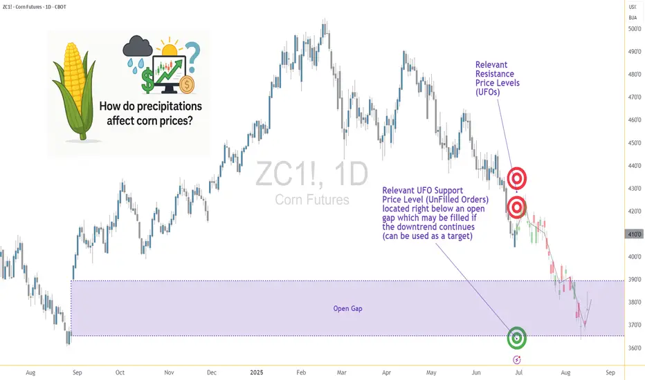
Weather and Corn: Understanding the Precipitation Factor1. Introduction: Rain, Grain, and Market Chain Reactions
In the world of agricultural commodities, few forces carry as much weight as weather — and when it comes to corn, precipitation is paramount. Unlike temperature, which can have nuanced and sometimes ambiguous effects depending on the growth stage, rainfall exerts a more direct and consistent influence on crop performance. For traders, understanding the role of rainfall in shaping market sentiment and price behavior isn't just an agricultural curiosity — it's a trading edge.
This article unpacks the relationship between weekly rainfall levels and corn futures prices. By leveraging normalized weather data and historical returns from Corn Futures (ZC), we aim to translate weather signals into actionable market insights. Whether you're managing large agricultural positions or exploring micro futures like MZC, precipitation patterns can provide vital context for your trades.
2. Corn’s Moisture Dependency
Corn is not just sensitive to water — it thrives or suffers because of it. From the moment seeds are planted, the crop enters a delicate dance with precipitation. Too little moisture during the early stages can impair root development. Too much during germination may lead to rot. And during pollination — particularly the tasseling and silking stages — insufficient rainfall can cause the plant to abort kernels, drastically reducing yield.
On the other hand, excessive rainfall isn't necessarily beneficial either. Prolonged wet periods can saturate soil, hinder nutrient uptake, and encourage fungal diseases. Farmers in the U.S. Corn Belt — particularly in states like Iowa, Illinois, and Nebraska — know this well. A single unexpected weather shift in these regions can send ripple effects across global markets, causing speculators to reassess their positions.
For traders, these weather events aren’t just environmental footnotes — they are catalysts that influence prices, volatility, and risk sentiment. And while annual production is important, it's the week-to-week rhythm of the growing season where short-term trades are born.
3. Our Data-Driven Approach: Weekly Rainfall and Corn Returns
To understand how rainfall impacts price, we collected and analyzed decades of historical weather and futures data, aligning weekly precipitation totals from major corn-growing regions with weekly returns from Corn Futures (ZC).
The weather data was normalized using percentiles for each location and week of the year. We then assigned each weekly observation to one of three precipitation categories:
Low rainfall (<25th percentile)
Normal rainfall (25th–75th percentile)
High rainfall (>75th percentile)
We then calculated the weekly percent change in corn futures prices and matched each return to the rainfall category for that week. The result was a dataset that let us measure not just general trends but statistically significant shifts in market behavior based on weather. One key finding stood out: the difference in returns between low-rainfall and high-rainfall weeks was highly significant, with a p-value of approximately 0.0006.
4. What the Numbers Tell Us
The results are striking. During low-rainfall weeks, corn futures often posted higher average returns, suggesting that the market responds to early signs of drought with anticipatory price rallies. Traders and institutions appear to adjust positions quickly when weather models hint at below-normal moisture during key growth stages.
In contrast, high-rainfall weeks displayed lower returns on average — and greater variability. While rain is essential, excess moisture raises fears of waterlogging, planting delays, and quality issues at harvest. The futures market, ever forward-looking, seems to price in both optimism and concern depending on the volume of rain.
Boxplots of these weekly returns reinforce the pattern: drier-than-usual weeks tend to tilt bullish, while wetter periods introduce uncertainty. For discretionary and algorithmic traders alike, this insight opens the door to strategies that incorporate weather forecasts into entry, exit, and risk models.
📊 Boxplot Chart: Weekly corn futures returns plotted against precipitation category (low, normal, high). This visual helps traders grasp how price behavior shifts under varying rainfall conditions.
5. Strategy: How Traders Can Position Themselves
With the clear statistical link between rainfall extremes and price behavior in corn futures, the logical next step is applying this insight to real-world trading. One straightforward approach is to incorporate weather forecast models into your weekly market prep. If a key growing region is expected to receive below-normal rainfall, that could serve as a signal for a potential bullish bias in the upcoming trading sessions.
This doesn’t mean blindly buying futures on dry weeks, but rather layering this data into a broader trading thesis. For example, traders could combine weather signals with volume surges, technical breakouts, or news sentiment to form confluence-based setups. On the risk management side, understanding how price behaves during extreme weather periods can inform smarter stop-loss placements, position sizing, or even the use of option strategies to protect against unexpected reversals.
Additionally, this information becomes particularly valuable during the planting and pollination seasons, when the corn crop is most vulnerable and the market reacts most strongly. Knowing the historical patterns of price behavior in those weeks — and aligning them with current forecast data — offers a clear edge that fundamental and technical analysis alone may not reveal.
🗺️ Global Corn Map Screenshot: A world map highlighting major corn-growing regions with weather overlay. This helps illustrate the geographic variability in rainfall and how it intersects with key production zones.
6. Corn Futures Contracts: Speculating with Flexibility
For traders looking to act on this kind of seasonal weather intelligence, CME Group provides two practical tools: the standard-size Corn Futures contract (ZC) and the Micro Corn Futures contract (MZC).
Here are some quick key points to remember:
Tick size for ZC is ¼ cent (0.0025) per bushel, equating to $12.50 per tick.
For MZC, each tick is 0.0050 equating to $2.50 per tick.
Standard ZC initial margin is approximately $1,000 and MZC margins are around $100 per contract, though this can vary by broker.
Micro contracts are ideal for those who want exposure to corn prices without the capital intensity of full-size contracts. They’re especially helpful for weather-based trades, where your thesis may rely on shorter holding periods, rapid scaling, or position hedging.
7. Conclusion: Rain’s Role in the Corn Trade
Precipitation isn’t just a farmer’s concern — it’s a trader’s opportunity. Our analysis shows that weather data, especially rainfall, has a statistically significant relationship with corn futures prices. By normalizing historical precipitation data and matching it to weekly returns, we uncovered a clear pattern: drought stress tends to lift prices, while excessive moisture creates volatility and downside risk.
For futures traders, understanding this dynamic adds another layer to market analysis.
As part of a broader series, this article is just one piece of a puzzle that spans multiple commodities and weather variables. Stay tuned for our upcoming releases, where we’ll continue exploring how nature’s forces shape the futures markets.
When charting futures, the data provided could be delayed. Traders working with the ticker symbols discussed in this idea may prefer to use CME Group real-time data plan on TradingView: www.tradingview.com - This consideration is particularly important for shorter-term traders, whereas it may be less critical for those focused on longer-term trading strategies.
General Disclaimer:
The trade ideas presented herein are solely for illustrative purposes forming a part of a case study intended to demonstrate key principles in risk management within the context of the specific market scenarios discussed. These ideas are not to be interpreted as investment recommendations or financial advice. They do not endorse or promote any specific trading strategies, financial products, or services. The information provided is based on data believed to be reliable; however, its accuracy or completeness cannot be guaranteed. Trading in financial markets involves risks, including the potential loss of principal. Each individual should conduct their own research and consult with professional financial advisors before making any investment decisions. The author or publisher of this content bears no responsibility for any actions taken based on the information provided or for any resultant financial or other losses.
Harmonic Patterns
Learn how to trade EOD / FOD Professional StrategyEOD /FOD is an acronym for End of Day buy or sell short entry that holds overnight and the First of Day sell the ETF or stock at Market Open. This is a strategy for experienced to Elite aka Semi-Professional Traders. Beginners need to hone skills and practice in a simulator.
Professional Traders use this strategy all the time. They rarely intraday trade aka "day trading" unless they are Sell Side Institution floor traders who do intraday trading all daylong.
EOD /FOD is a very simple, easy to learn strategy for when Buy Side Giant Dark Pools have accumulated OR have Supported the Market and the Dark Pools foot print of a rectangle that is narrow with consistent highs and lows.
TWAP Dark Pool orders trigger at a low price or lower and usually move price minimally. When in Support the Market mode. The run up is a long white candle.
TWAPs are automated Time Weighted At Average Price. These orders ping at a specific time and buy in accumulation mode. If the stock price suddenly moves up beyond the high range of the TWAP, then the orders pause or halt.
Then pro traders do nudges and runs are instigated by either Gap Ups by HFTs, OR smaller funds VWAP ORDERS, or MEME's or other large groups of retail traders all trading and entering orders in sync or as close to sync as possible to create a flood of small lots that do move price upward OR downward rapidly.
Using the EOD /FOD requires understanding of how the Dark Pools, Pro Traders and other groups react to price and what, where and when orders are automated.
When ever you see a platform trend pattern such as we have on the QQQ yesterday at close and early this morning, then the entry would have been in the last 5 minutes of yesterday's market.

Impact on the Dollar and Forex — Artavion AnalyticsThe development of central bank digital currencies (CBDCs) — especially the digital yuan (e-CNY) — is becoming a key factor in transforming global currency flows. While the US dollar still dominates, the architecture of global liquidity is beginning to shift.
At Artavion, we see the e-CNY not just as a technological experiment but as a tool of China’s currency policy. Its goal is to strengthen the yuan’s role in international settlements and reduce dependence on the dollar, particularly in developing regions.
Why the Digital Yuan Matters
The e-CNY is already being used in China for retail payments and is being tested in cross-border transactions (e.g., in the mBridge project with the UAE and Thailand). This enables the creation of alternative payment systems not tied to SWIFT.
If the digital yuan gains broader acceptance, especially for commodity and energy settlements, its role in forex will grow, potentially weakening the dollar’s monopoly in certain regions.
CBDCs and Forex Structure
CBDCs won’t displace the dollar in the near term, but they are already influencing the structure of currency trading:
New currency pairs are emerging, especially in Asia;
Transactions are becoming faster and cheaper, particularly in the B2B segment;
Market participants are adjusting strategies to real-time settlements and the potential programmability of currencies.
Risks and Limitations
Privacy: CBDCs are under full state control;
Fragmentation: There is no unified technical standard across different countries’ CBDCs;
Geopolitics: The rise of the e-CNY could intensify currency competition with the dollar.
Artavion’s Conclusion
The digital yuan will not replace the dollar, but it is creating an alternative — especially in regions seeking autonomy from Western financial infrastructure. For traders and investors, this means reassessing currency risks and exploring new opportunities in decentralized settlement channels.

How to Trade the Commitment of Traders Report Part 1Hey Traders so today I wanted to start a 3 part series on how to use the Commitment of Traders report to help you in your trading.
Enjoy!
Hope This Helps Your Trading 😃
Clifford

Top 5 Most Effective Forex Trading StrategiesTop 5 Most Effective Forex Trading Strategies Used by Professional Traders
Forex trading requires not just knowledge, but discipline and a clear strategy. So what are the most effective forex trading strategies that professional traders consistently use to achieve sustainable profits?
Let’s explore the 5 most trusted strategies that have stood the test of time – helping you level up your skills and reduce risk in this trillion-dollar market.
1. Breakout Strategy – Catching the Wave When the Market Explodes
A breakout occurs when price moves beyond a key support or resistance level after a period of consolidation. This usually signals the start of a new trend.
Best for: Traders who love strong momentum.
Pro tip: Confirm breakout with volume or candlestick patterns (e.g., engulfing).
Caution: Avoid entering right after the breakout – wait for a retest.
2. Trend Following Strategy – Trade with the Market, Not Against It
“Trend is your friend” – one of the most famous sayings in trading. This strategy helps traders ride the main trend, buying in uptrends and selling in downtrends.
Recommended tools: MA 20, MA 50, RSI, MACD.
Insider tip: Combine with pullback entries (enter when price retraces to dynamic support/resistance).
3. Price Action Strategy – Reading the Market Without Indicators
Price Action focuses on interpreting pure price behavior, without relying on indicators. Many pro traders prefer this approach to understand market psychology in real time.
Advantages: Clean, flexible, sharpens decision-making.
Popular candlestick patterns: Pin Bar, Inside Bar, Fakey, Engulfing.
4. News Trading Strategy – For Quick Thinkers and Fast Hands
When major news events like CPI, NFP, FOMC, or rate decisions hit the market, volatility surges. This creates both high-profit opportunities and high risks.
Common tactic: Straddle – place Buy Stop & Sell Stop before news release.
Risk warning: Watch out for slippage and widened spreads.
5. Fibonacci & Confluence Strategy – High-Probability Entries
This strategy combines tools like Fibonacci retracement, trendlines, support/resistance zones, and moving averages to find high-probability entry points.
Strength: Optimizes Risk: Reward ratio.
Tip: Focus on Fib levels 0.382 – 0.618 (commonly used retracement zones).
Conclusion: The Best Strategy is the One That Matches Your Style
There’s no perfect strategy – but understanding and applying the one that best fits your trading style will help you avoid emotional decisions and build long-term consistency.
Remember: Risk management – Emotional control – Systematic discipline = Long-term trading survival.

Trading Gold with Leverage: Smart or Dangerous?XAUUSD trading (Gold vs. US Dollar) is a popular choice among global traders due to its high liquidity, strong volatility, and profit potential. One of the tools that help traders amplify their returns is financial leverage. However, using leverage also carries significant risks if not managed properly. So, what exactly is leverage in XAUUSD trading? Should you use it? Let’s explore the advantages and disadvantages below.
1. What is Leverage in XAUUSD Trading?
Leverage is a financial tool that allows traders to control a larger position in the market than the capital they actually own. For example, with 1:100 leverage, you only need $1,000 to trade a position worth $100,000.
In the XAUUSD market, brokers often offer leverage ranging from 1:50 to 1:500, or even up to 1:2000—depending on their risk policies and regulations.
2. Pros of Using Leverage in XAUUSD Trading
🔹 Amplifies Potential Profits
Leverage allows traders to maximize profits with a relatively small amount of capital. When the market moves in the expected direction, the gains can be multiplied significantly.
🔹 Lower Capital Requirement
Instead of needing $10,000 to trade 1 lot of gold, a trader may only need $100–$500 depending on the leverage. This lowers the entry barrier and offers greater flexibility in capital management.
🔹 Enables Strategy Diversification
With the same amount of capital, traders can open multiple positions across different timeframes or strategies. Leverage allows for broader portfolio diversification while still maintaining control over total risk.
🔹 Takes Advantage of Short-Term Opportunities
Gold markets often react strongly to news and economic data. Leverage lets traders capitalize on short-term price swings, enabling faster profits without needing to hold positions long-term.
3. Cons and Risks of Using Leverage in XAUUSD Trading
Risk of Account Blowout
The higher the leverage, the lower the safety margin. A small market move against the position can trigger a margin call or stop-out, resulting in a full loss of the initial capital.
Emotional and Psychological Stress
High leverage often leads traders to gamble instead of follow a strategy, increasing the likelihood of emotional decisions and impulsive trading behaviors.
Difficult to Manage During Volatility
XAUUSD is a highly volatile asset, especially during U.S. sessions or major news releases (like CPI, Fed announcements, NFP). Over-leveraging can lead to rapid losses in seconds during sudden price spikes.
Increased Emotional Pressure
When using high leverage, every small fluctuation feels significant, causing stress and encouraging poor decisions—like exiting too early or revenge trading.
4. Conclusion: Should You Use Leverage in XAUUSD Trading?
Yes, but only with a disciplined and strategic approach.
Use moderate leverage (e.g. 1:100 or lower if you're a beginner)
Always set clear stop-loss and take-profit levels
Risk no more than 2% of your account per trade
Avoid “all-in” trades and don’t let emotions dictate position size
In Summary
Leverage in XAUUSD trading is a double-edged sword. Used wisely, it accelerates your profit potential. Used recklessly, it can wipe out your account in moments. The key is to trade with discipline, knowledge, and a solid plan to harness the power of leverage without falling into its traps.

How to Use Fibonacci Extension for Effective ProfitHow to Use Fibonacci Extension for Effective Profit-Taking in Forex.
Fibonacci Extension is a powerful tool for identifying profit-taking levels in Forex, including XAU/USD trading. Here’s a concise, SEO-optimized guide to maximize your gains:
1. Understand Fibonacci Extension Levels
The 127.2%, 161.8%, and 261.8% extension levels predict price targets after a breakout, making them ideal for setting profit goals.
2. Identify Key Price Swings
Select swing low (e.g., 3.300 USD), swing high (e.g., 3.344.70 USD), and retracement low (e.g., 3.312.570 USD) on the chart.
3. Apply Fibonacci Extension
Draw from swing low to high, then extend from the retracement low. For example, 161.8% may project to approximately 3.360 USD.
4. Set Profit-Taking Targets
Conservative: Target 127.2% (e.g., 3.350 USD).
Aggressive: Aim for 161.8% (e.g., 3.360 USD), aligning with resistance levels.
5. Manage Risk
Place a stop-loss below the retracement low (e.g., 3.300 USD) and aim for a 1:2 risk-reward ratio.
6. Pro Tips
Combine with resistance, RSI, or volume; exit early if momentum fades. Update levels with new swings.
Leverage this strategy to optimize profits in volatile Forex markets like XAU/USD!

What is a Fibonacci Sequence and Its Application in Forex?What is a Fibonacci Sequence?
The Fibonacci sequence is a series of numbers where each number is the sum of the two preceding ones, typically starting with 0 and 1 (e.g., 0, 1, 1, 2, 3, 5, 8, 13, 21, ...). In trading, the Fibonacci retracement levels are derived from key ratios (23.6%, 38.2%, 50%, 61.8%, and 100%) based on this sequence. These levels are used to identify potential support and resistance zones where price reversals or continuations may occur.
Application in Forex
In Forex trading, Fibonacci retracement is a popular technical analysis tool applied to chart price movements to predict future price action:
- Identifying Support and Resistance**: Traders draw Fibonacci levels between a significant high and low on a chart. For example, after a price drop, the 61.8% retracement level often acts as support where the price might bounce back.
- Entry and Exit Points**: Forex traders use these levels to determine optimal entry points (e.g., buying near a 50% retracement) or exit points (e.g., taking profit near a 23.6% retracement after a rally).
- Stop-Loss and Take-Profit**: Fibonacci levels help set stop-loss orders below support (e.g., below 61.8%) or take-profit targets near resistance (e.g., 38.2% or 50%).
- Trend Confirmation**: In a downtrend, if the price retraces to the 38.2% level and resumes falling, it confirms the bearish trend. Conversely, a break above this level in an uptrend may signal bullish momentum.
Example in Practice
On the XAU/USD chart, if the price drops from 3.344.70 USD to 3.312.570 USD, Fibonacci levels can be plotted. The 38.2% retracement might fall around 3.330 USD, serving as a potential support zone for traders to watch.

Harmonic AB=CD Pattern Guide for TradingViewThe Harmonic AB=CD pattern is a powerful technical analysis tool used to predict price reversals in financial markets. Based on Fibonacci ratios, it helps traders identify high-probability entry and exit points. This concise guide is designed for TradingView users to apply the pattern effectively.
Pattern Overview
- Structure: Four points (A, B, C, D). AB and CD legs are equal in length or follow Fibonacci ratios.
- Fibonacci Ratios:
- BC retraces 61.8%-78.6% of AB.
- CD equals AB (1:1) or extends 1.272/1.618 of BC.
- Types:
- Bullish: Signals a buy at point D (price rises).
- Bearish: Signals a sell at point D (price falls).
How to Identify and Trade
1. Spot AB: Find a clear price swing from A to B.
2. Measure BC: Use TradingView’s Fibonacci Retracement tool to confirm BC retraces 61.8%-78.6% of AB.
3. Project CD: Use Fibonacci Extension to project CD, matching AB’s length or extending 1.272/1.618 of BC.
4. Confirm D: Check for confluence with support/resistance, candlestick patterns (e.g., doji), or indicators (e.g., RSI divergence).
5. Trade Execution:
- Bullish: Buy at D, set stop-loss below D, target point C or A.
- Bearish: Sell at D, set stop-loss above D, target point C or A.
Tips for TradingView
- Use TradingView’s Fib tools for precision.
- Confirm signals with additional indicators (e.g., MACD, volume).
- Avoid choppy markets; focus on trending or range-bound charts.
The AB=CD pattern is a reliable method for spotting reversals when used with proper confirmation. By mastering Fibonacci tools on TradingView and combining the pattern with other signals, traders can enhance their decision-making and improve trade outcomes. Practice on historical charts to build confidence.

What are Harmonic Price Patterns?Harmonic price patterns are chart patterns based on Fibonacci ratios and market geometry, used to identify potential reversal points in Forex. They rely on Fibonacci levels (e.g., 0.618, 0.786, 1.618) to measure price structures, predicting reversal zones (PRZ - Potential Reversal Zone).
Key Features:
- Based on Fibonacci ratios.
- Geometric structure with 4-5 points (X, A, B, C, D).
- Identifies PRZ for buy/sell opportunities.
- Symmetrical, reflecting market psychology.
Key Harmonic Patterns in Forex:
1. Gartley:
- AB retraces 61.8% of XA.
- D at 78.6% of XA.
- Buy/sell at D.
2. Bat:
- AB retraces 38.2-50% of XA.
- D at 88.6% of XA.
- High-precision at D.
3. Crab:
- CD extends 161.8% of XA.
- D at extreme levels.
- Suited for strong volatility.
4. Butterfly:
- AB retraces 78.6% of XA.
- D extends 127-161.8% of XA.
- End of strong trends.
5. Shark:
- AB retraces 113-161.8% of XA.
- D at 88.6-113% of XA.
- Volatile markets.
6. Cypher:
- CD retraces 78.6% of XC.
- Short-term timeframes.
How to Use:
1. Measure Fibonacci ratios to identify the pattern.
2. Locate PRZ at D, combine with support/resistance, RSI, or candlestick patterns.
3. Set stop-loss beyond PRZ, aim for risk/reward ≥ 1:2.
4. Enter trades at D after price/indicator confirmation.
Notes:
- Requires precise measurements.
- Combine with other tools for reliability.
- Practice on a demo account first.
- Avoid during high-volatility events (e.g., news releases).
Let me know if you need details on a specific pattern!

Using The Zig-Zag Indicator To Gain Clarity On Your Price ChartIn my experience, learning how to read a price chart, specifically understanding the ebbs and flows of a trend, is the biggest hurdle that newer traders face. At least on the technical side of things.
Something that helped me shorten that learning curve at the beginning of my trading career was the "Zig-Zag" indicator. Now, I didn't use it as part of a strategy or anything like that. Rather, it was a tool that helped train my eyes to read extensions and retracements in the markets both at a beginner and advanced level.
If you're someone that is struggling, hopefully it can do the same for you.
Please remember to support by hitting that like button and if you thought this video was helpful please share so other traders can benefit as well.
Akil

How to Trade Gold Market with the 50% Retracement CandleHey Traders so today wanted to show why you don't really need indicators to trade. Price action is the best way to trade imo because it's easier. For the most part indicators lag and can give you false signals. So if you are looking for a way to trade that does not involve indicators check this out.
So we can see that Gold is in a strong uptrend the strategy is wait until market pulls back to trendline and buy but what if you miss that pullback?
So you can still get in the uptrend look for a strong bullish candle like the one I highlighted on May 20. Then place an order to buy when the market pulls back to 50% of that candle. Measure it with the Fibonacci tool. Place your stop below the low of the candle or under support so that way you most likely won't get stopped out. Now this trade was textbook but not all of them are check out how as soon as it hit the 50% retracement of that candle market rocketed higher!
There you go simple way to trade and no need for complex indicators! This strategy works in all markets!
Always use Risk Management!
(Just in case your wrong in your analysis most experts recommend never to risk more than 2% of your account equity on any given trade.)
Hope This Helps Your Trading 😃
Clifford

A Brief Overview of Price Patterns in TradingPrice patterns are technical analysis tools that help identify price behavior on charts to predict future trends.
Common patterns include continuation and reversal formations. Continuation patterns such as flags, triangles, and rectangles often appear during strong trends and indicate the likelihood of the trend continuing after a period of consolidation. Reversal patterns like head and shoulders, double tops and bottoms, and wedges signal potential changes in trend direction. Recognizing these patterns allows traders to optimize entry points, stop-loss levels, and take-profit targets. The clearer the pattern and the higher the timeframe it appears on, the more reliable it tends to be. However, no pattern guarantees success, so it's important to combine them with other factors like volume, support and resistance zones, and confirmation signals before making trading decisions. Each pattern has its own identifying characteristics such as shape, length, and breakout zones, so consistent observation and practice are essential. Price patterns not only assist in technical analysis but also reflect market psychology and crowd behavior. For best results, traders should combine pattern recognition with risk management and patiently wait for clear signals instead of reacting emotionally. A deep understanding of price patterns can increase the probability of success and reduce risk in the trading process.
Wishing you effective trading and strong discipline!

The Ultra Idea : d-MR96nBa's Ultimate Market Journal🌌The Ultra Idea : d-MR96nBa's🌠Ultimate Market Journal🎨
Hello Fellow Travelers
It's been some time since I've posted a Fresh Idea, though I've remained actively trading.
What better way to mark my TradView return, than to start an Ultimate Market Journal.
Financial Markets have taken my deep interest again recently, especially as we seem to be at a time of accelerating change and shifting regimes.
I believe many opportunities abound to those with open, flexible and creative minds.
A bit more about myself.
I've been involved with financial markets in one form or fashion for 18 years now.
I started out like most of us, approaching the game with fundamental analysis, only to later incorporate and then fully graduate to T/A.
I'm a natural Contrarian.
My brand of technical analysis is as much about aesthetics, creative expression, discovering hidden truths and applying Universal Principles as it is running the numbers.
I'm starting this off with Ultra Bond Futures, as UB's are the trading instrument I've come to specialise in, having had the most ongoing consistent success trading.
This by no means is going to be a "I bought here and sold there" type of Journal, as that's not my style.
Nor am I going to focus on a single market instrument, observation or style of analysis.
I'd like this to become a repository of accumulated wisdom and unique market perceptives.
I've just begun contemplating what this may evolve into in time, and I invite you to join me in taking this Leap
d-MR96nBa🌌
Concept
Inversion📈📉
Seek out and analyse whatever moves exactly inverse to what you intend to trade.
If you're having trouble discerning trend or observing price patterns, check the inverse.
This can be an excellent technique for exposing Bias.
This can work particularly well for currency traders, though can be Universally applied.
For US Ultra Bonds, the inverse is the US 30 Year Yield
Ultra Bond Futures
US 30 Year Yield
Currency traders, say you're about to trade AUD/CHF
Check out the CHF/AUD chart first, if they both appear Bullish or Bearish, you've got a Bias.
AUD/CHF
CHF/AUD
GBP/JPY
JPY/GBP
EUR/USD
USD/EUR
Are there any examples of Inversion in Trading you'd like to share ?
What else is on my🧠
Well just casually, I believe we're currently witnessing Peak Bitcoin in it's entire Life-cycle.
Have we Bull Trapped & Breakaway Gapped on Berkshire Hathaway
BRK.B
It's in the Detail

BITX — Harmonic Completion: Expression in Time for point ‘D’CBOE:BITX
I wanted to share my concept of fibonacci retracement in time with the community and why I selected the 86.6% retracement of this sell off for point ‘D’ within my harmonic structure with an exit and completion of today.
This was a 45 day sell off after the first ‘W’ price distribution from the top. I always decide on a pivot candle to start my retracement off the impulse rally. Doesn’t matter if it is bullish or bearish by nature. When point ‘B’ was created it extended past the 23.6% value but fell short of 50% where it continued to sell down below the original impulse rally. When CBOE:BITX pivoted at point ‘C’ we had a confirmation of retracement anywhere from .886-1.13 for how I read fibonacci levels.
Next I run the ‘A-B-C Trend-Based Time’ tool and input my extensions. You will find when I build my ‘Fibonacci Triangle’ I run .382-.786 symmetrically in price/time, but for my harmonics I use extension in time to locate my point ‘D’ and pair that with my retracement level. You can see in my chart above that there is daily significance more often than not on these days. I tend to run my X-A-B-C-D tool to the harmonic extension zones in time and track the trend. This example above, it was the 86.6% retracement of a 45 sell off that executed on the 141% value in time from that sell off.
Feel me?
If you like the conversation, drop a boost and give a follow! Let’s talked price and time fibonacci symmetry. I always get down on historical volatility as well with my weighted system to ever sliding IV — Come find me, let’s go!

Popular Trading Styles in ForexHere are some common trading styles used in the Forex market:
Trend Following: Traders identify and follow the main market trend, buying in an uptrend and selling in a downtrend.
Reversal Trading: Traders look for points where the trend may reverse and enter positions against the current trend.
Range Trading: Traders buy near support and sell near resistance when the price moves within a defined range.
News Trading: Traders capitalize on strong market movements following major economic news releases.
Scalping: Traders open and close trades very quickly, aiming to profit from small price movements.
Swing Trading: Traders hold positions from several days to weeks, taking advantage of short-term price swings within a larger trend.
Technical Analysis Trading: Decisions are based on indicators, price patterns, and volume analysis.
Fundamental Analysis Trading: Traders analyze economic and political factors affecting currency values to make trading decisions.
If you have any questions or need further explanation on any style, feel free to ask.
Good luck and happy trading!

April 2025 Market Crash: Causes, Impact, and Strategic ResponseApril 2025 will go down in financial history as one of the most turbulent months of the past decade. A large-scale market crash, triggered by geopolitical escalation and intensified trade tensions, revealed just how fragile the global investment landscape remains—even after a relatively stable start to the year.
What Happened?
On April 6, 2025, the U.S. administration announced sweeping tariffs of up to 145% on all Chinese imports. This decision, though preceded by months of political strain, took the markets by surprise. Panic-selling ensued almost immediately. The Dow Jones plummeted over 4,000 points within two days—the steepest decline since the COVID-era crash of 2020. The S&P 500 and Nasdaq followed suit, dropping 6–9% in a matter of hours.
Asian and European indices mirrored the collapse: Japan’s Nikkei 225 fell by 7.8%, and Germany’s DAX dropped by 5.4%. The synchronized reaction emphasized the ongoing interdependence of global markets, even in an era of growing protectionism.
Why It Matters
For GeldVision clients and institutional investors worldwide, such events highlight the importance of risk-managed portfolio strategies. The April crash wasn’t solely a reaction to tariffs—it was also driven by fears of a potential recession and uncertainty surrounding central bank policies.
Another destabilizing factor was the automatic response of algorithmic trading systems, which exited positions en masse as technical indicators were breached—amplifying volatility and accelerating the selloff.
How GeldVision Responded
Since early 2025, we at GeldVision have implemented a strategy of “adaptive conservatism,” gradually reducing equity exposure in client portfolios and reinforcing positions in defensive assets such as gold, investment-grade bonds, and liquid currency instruments.
During the height of the market turmoil, our team activated internal stress protocols, including temporary order freezes on automated buy-ins and direct client communications for real-time portfolio reviews. This proactive approach allowed us to minimize losses and maintain client confidence.
What’s Next?
We expect volatility to persist at least through Q3. For investors, the key is to avoid reactive decisions and maintain a long-term perspective. GeldVision will continue to expand its macroeconomic monitoring, enhance risk models, and provide clients with the tools needed to navigate uncertain markets safely.

BTCUSDT 13R Trade Breakdown: Deep Crab Pattern + SMC Precision Hello Traders!
If you enjoyed my previous post on combining Harmonic Patterns with Smart Money Concepts (SMC) for high-precision, high-risk-to-reward trades, then you're going to love this breakdown on BTCUSDT.
If you haven’t checked out my earlier content, make sure to scroll below this post and see that first—it sets the foundation for what we’re diving into here.
📈 BTCUSDT Trade Breakdown: Harmonic x SMC Precision Entry
This analysis was originally shared around three weeks ago on my YouTube channel, and if you were with me live, you’ll remember I was closely watching for a Bullish Deep Crab Pattern to complete before considering a LONG position.
Let’s walk through the setup and outcome step-by-step:
🕰 WEEKLY TIMEFRAME:
Price was reacting to a Weekly Fair Value Gap (FVG) and had filled the imbalance.
As shown in the chart:
🔍 SETUP: Strategy Confirmation
Important Reminder:
Just because price hits a key level doesn’t mean we jump in to buy or sell.
✅ There must be a confirmed Harmonic Pattern that aligns with the key SMC level.
On the Daily Chart, we identified a valid Bullish Deep Crab Pattern:
B-point at 0.886
PRZ (Potential Reversal Zone) at 1.618 FIB Extension
This PRZ aligned perfectly with the key level identified on the Weekly chart.
🎯 ENTRY STRATEGY (15-Minute Chart):
We zoomed into the 15M chart for an SMC-based entry.
Supply-to-demand flip confirmed with a visible liquidity inducement—textbook confirmation.
Entry was just a few pips below the recent swing low to limit downside risk in case of invalidation.
Take Profits (TPs) were set using standard Deep Crab targets, based on FIB retracements from A to D:
✅ TP1 at 0.382
✅ TP2 at 0.618
✅ TP3 at 0.786
✅ TRADE OUTCOME:
Entry was cleanly triggered and the price followed through as expected.
All three profit levels were successfully hit:
✅ TP1
✅ TP2
✅ TP3
We secured an impressive 13R on this single BTCUSDT trade —a solid example of what happens when Harmonics and Smart Money Concepts are aligned.
💬 Your Turn:
Did you take this BTC trade using a different strategy?
Or did you spot the pattern and enter alongside me?
Drop your thoughts and experiences below this analysis—let’s learn together!

Futures on CME and Launch of XpFinance DeFi PlatformOn May 7, 2025, the XRP ecosystem received two major developments that signal a new chapter in its evolution. First, the Chicago Mercantile Exchange (CME) announced the launch of futures contracts for XRP. Shortly thereafter, developers behind the XRP Ledger unveiled XpFinance — the first non-custodial lending platform built on the network. These two events are poised to reshape XRP's market perception and could attract a wave of new investment.
XRP Futures on CME: A Leap Toward Institutional Adoption
Set to go live on May 19, the new CME product will enable investors to trade XRP through regulated futures contracts. This is a major milestone. With similar contracts already in place for Bitcoin and Ethereum, XRP becomes the third digital asset to gain such legitimacy in institutional markets.
The introduction of futures means greater liquidity, risk management tools, and a clear path for hedge funds, pension managers, and banks to engage with XRP — without needing to custody the underlying token directly. Analysts anticipate that this added market structure could drive up demand, especially if the rollout is smooth and met with trading interest.
XpFinance and the XPF Token: DeFi Comes to XRP Ledger
The second big announcement came from XpFinance, a new decentralized lending protocol. What sets it apart is its non-custodial model — users can lend assets and earn interest while retaining full control of their private keys. At a time when centralized platforms are under scrutiny, this approach appeals to security-conscious users.
XpFinance is powered by a new token, XPF, which will be used for staking rewards, fee payments, and governance. The pre-sale of XPF has already begun and is generating buzz, especially among XRP community members eager to participate in the first major DeFi initiative on the ledger.
Market Outlook and Analyst Forecasts
Reactions from analysts have been positive. According to a report from DigitalMetrics, if both the CME futures and XpFinance platforms gain traction, XRP could see a sharp upward move — potentially reaching $10 by summer 2025. That would represent a fourfold increase from its current price.
However, risks remain. Ripple Labs continues to face regulatory pressure in the U.S., and crypto markets overall remain volatile. Still, the general tone has shifted. With increasing institutional interest and expanding utility, XRP appears to be entering a new phase of growth.
Conclusion
The combination of institutional infrastructure and decentralized finance innovation makes May 2025 a pivotal moment for XRP. If these initiatives succeed, XRP could transition from a mid-cap altcoin to a primary digital asset in the eyes of both institutional investors and the broader crypto community. Whether this momentum will translate into long-term market dominance remains to be seen — but the foundation is clearly being laid.

Mastering Order Blocks: How to Trade Like Smart MoneyIntroduction
Order Blocks (OBs) are one of the most critical concepts in Smart Money trading. They represent areas where institutional traders have entered the market with significant volume, typically leading to strong price movements. Identifying and trading Order Blocks gives traders an edge by aligning with the footprints of Smart Money.
What is an Order Block?
An Order Block is the last bearish candle before a bullish move for bullish OBs, or the last bullish candle before a bearish move for bearish OBs. These candles represent areas where institutions accumulated or distributed large positions, leading to a market shift.
Types of Order Blocks
A Bullish Order Block appears at the end of a downtrend or during a retracement just before the price moves sharply upward. It is typically represented by the last bearish candle prior to an impulsive bullish move. Price will often return to this level to mitigate institutional orders before continuing upward.
A Bearish Order Block, in contrast, forms at the end of an uptrend or retracement where price begins a downward reversal. It is characterized by the last bullish candle before a strong bearish move. Price tends to revisit this level to mitigate before continuing lower.
How to Identify a Valid Order Block
The key to identifying a valid Order Block is first observing a strong impulsive move, also known as displacement, that follows the OB candle. The move must also result in a break of market structure or a significant shift in direction. Order Blocks that produce Fair Value Gaps (FVGs) or Market Structure Shifts (MSS) tend to be more reliable. Another important sign is when price returns to the OB for mitigation, offering a potential entry.
Entry Model Using Order Blocks
After locating a valid OB, the next step is to wait for price to return to this area. The ideal entry happens within the OB body or near its 50% level. For extra confirmation, look for a Market Structure Shift or Break of Structure on a lower timeframe. Entries are more powerful when combined with additional elements like Fair Value Gaps, liquidity grabs, or SMT Divergences. The stop-loss should be placed just beyond the OB’s high or low, depending on the direction of the trade.
Refinement Techniques
To increase precision, higher timeframe OBs can be refined by zooming into lower timeframes like the 1M or 5M chart. Within a broad OB zone, identify internal market structure, displacement candles, or embedded FVGs to determine a more precise entry point. One effective refinement is the Optimal Trade Entry (OTE), which is often found at the 50% level of the Order Block.
Order Blocks vs. Supply and Demand Zones
While they may seem similar, Order Blocks are more narrowly defined and specifically related to institutional order flow. Supply and Demand zones are broader and typically drawn around areas of price reaction, but OBs are derived from the final institutional candle before a large move and are often confirmed by structure shifts or displacement. This makes OBs more precise and actionable in the context of Smart Money concepts.
Target Setting from Order Blocks
Targets after entering from an OB should align with liquidity objectives. Common targets include internal liquidity like equal highs or lows, or consolidation zones just beyond the OB. External liquidity targets such as previous major swing highs or lows are also ideal, especially when they align with imbalances or Fair Value Gaps. It's important to adjust targets based on the current market structure and trading session.
Common Mistakes to Avoid
A frequent mistake is treating any candle before a move as an OB without verifying key signals like displacement or a Break of Structure. Entering without other confirmations, such as an MSS or liquidity sweep, can lead to poor trades. Another common error is placing the stop-loss too tightly within the OB, instead of just beyond it, increasing the chance of premature stop-outs. Traders should also avoid executing OB trades during low-liquidity sessions where price action can be unpredictable and wicky.
Final Thoughts
Order Blocks are foundational to Smart Money trading. They allow you to enter where institutions have placed large positions and offer clear invalidation and entry logic. With practice, you can identify high-quality OBs and combine them with other concepts like FVGs, MSS, and SMT for powerful, precise trades.
Practice on different timeframes and assets, and always look for clean displacement and structure confirmation. Mastering OBs is a big step toward becoming a consistently profitable trader.
Trust the Blocks. Trade with Intention.

Goldfinch makes a beautiful Wyckoff patternThis a small diagram to help with identifying Wyckoff patterns.
GFI made a pretty one that is very easy to see.
PSY - Preliminary Supply
BC - Buying Climax
AR - Automatic Response
ST - Secondary Test

Visa-Ripple Partnership Could Spark a Significan from Trenovia GThe financial world is undergoing a period of active transformation, and one of the most talked-about developments is the potential partnership between Visa and Ripple. According to a new analytical report by Trenovia Group, such a strategic collaboration could act as a catalyst for a substantial rise in Visa's stock value in the coming months.
Key Growth Drivers
Trenovia Group analysts emphasize that integrating Ripple’s technologies into Visa’s ecosystem would dramatically enhance the speed and reduce the cost of international transactions. RippleNet, built on blockchain technology, offers unique advantages: near-instant settlements, greater transparency, and lower fees compared to traditional interbank systems.
Partnering with Ripple would provide Visa with a powerful technological upgrade, reinforcing its dominance in the payment solutions market, particularly in cross-border transfers.
Expected Market Reaction
According to Trenovia Group, even the announcement of such a partnership could trigger a strong positive reaction from investors. In an increasingly competitive payments landscape, adopting blockchain innovations would be seen as a forward-looking move, enhancing Visa’s market appeal.
Technical analysis also points to favorable conditions: Visa shares are maintaining solid support around $260, and the formation of a "bullish flag" pattern suggests the potential for a breakout following positive news.
Strategic Importance of the Alliance
Trenovia Group highlights the long-term strategic benefits of this union. As digital currencies and decentralized payment systems gain traction, the integration of blockchain-based solutions would ensure Visa’s adaptability to evolving market and regulatory demands.
Meanwhile, Ripple would gain access to Visa’s vast global client network, boosting its position as a leader in the corporate cross-border payments sector.
Conclusion
According to Trenovia Group’s forecast, the Visa-Ripple partnership could provide a powerful boost to Visa’s stock. Upon successful integration of RippleNet technologies, analysts project a 15–25% rise in Visa's share price within the first six months after the announcement.
For investors, this could represent a rare opportunity to invest in the expansion of the world’s leading payment platform during a crucial phase of digital transformation.

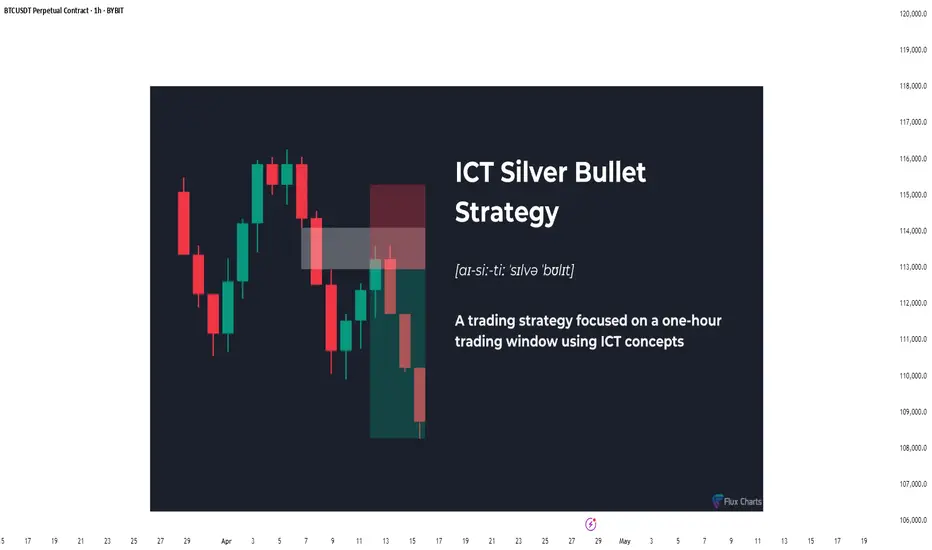
The Hidden Power of the Silver Bullet Strategy - Full GuideIntroduction
The Silver Bullet Strategy is a high-probability intraday trading technique popularized within the Smart Money Concepts community. It focuses on taking precision trades during specific times of the day when liquidity is most active. Mastering this strategy can help traders consistently capture high-quality setups with minimal risk.
In this guide, we will cover:
- What the Silver Bullet Strategy is
- Key Times to Watch
- Entry Models
- Target Setting
- Risk Management
- Real Chart Examples
---
What is the Silver Bullet Strategy?
The Silver Bullet Strategy is based on trading within a "window" of high-probability price action, typically during key liquidity times. It looks to capture moves after liquidity sweeps, order block mitigations, and Fair Value Gap (FVG) plays.
Key Principles:
- Focuses on high-probability windows (New York session especially)
- Waits for a liquidity grab and displacement
- Entries are often on FVGs, OBs, or MSS points
---
Silver Bullet Timing Windows
Timing is crucial to this strategy. The "Silver Bullet" typically occurs in these windows (New York time):
- First Window: 10:00 AM - 11:00 AM (New York)
- Second Window: 2:00 PM - 3:00 PM (New York)
These times capture major moves post-liquidity sweeps or reversals after news/market manipulation.
---
Silver Bullet Entry Model
The classic sequence for a Silver Bullet setup:
1. Identify Liquidity Sweep: Look for price to grab liquidity above a swing high or below a swing low.
2. Look for Displacement: A strong move away from the sweep, creating a Fair Value Gap (FVG) or Breaker Block.
3. Entry in FVG or OB: Enter on a retracement into the FVG or Order Block after displacement.
4. Confirmation: Use lower timeframe MSS or BOS to confirm the reversal.
Liquidity sweep and FVG at the 5m:
MSS + Displacement candle at the 1m:
So all 4 steps completed!
Example Entry Checklist:
- Liquidity sweep
- Strong displacement creating an FVG
- Price retraces into FVG or OB
- MSS/BOS confirmation
- Execute trade with tight stop-loss
---
Where to Set Targets
Targets should be logical based on market structure:
- First Target: Recent internal liquidity (equal highs/lows)
- Second Target: External liquidity zones (major swing highs/lows)
- Optional: Use 1R/2R/3R scaling based on risk-to-reward goals
---
Risk Management for Silver Bullet Trades
Golden Rules:
- Risk less than 1% per Silver Bullet setup
- Set stop-loss beyond the liquidity sweep (not too tight, not too loose) or above FVG
candle
- Stick to one or two trades per window maximum
- Avoid revenge trading outside the windows
---
Common Mistakes to Avoid
- Trading outside the specified time windows
- Entering without a confirmed sweep and displacement
- Overleveraging because the strategy "looks easy"
- Ignoring higher timeframe bias (HTF context is still critical!)
Pro Tip: Combine Silver Bullet entries with SMT Divergences, MSS, and IFVGs for maximum confluence.
---
Final Thoughts
The Silver Bullet Strategy is one of the cleanest ways to approach intraday trading. By mastering liquidity concepts, timing, and precision entries, traders can catch powerful moves with strong risk-to-reward setups.
Be patient, wait for your window, and always trade with discipline.
Happy Sniping!