Alternate Bat harmonic patternWhat is the Alternate Bat harmonic pattern?
The alternate bat pattern is a variation of the Gartley pattern. Scott Carney developed it in 2003. It is popular for incorporating the 1.13XA retracement as the defining element in the Potential Reversal Zone (PRZ). The alternate bat harmonic pattern is one of the most precise trading patterns that works exceptionally great in the relative strength index (RSI) BAMM set up.
How to identify the Alternate Bat harmonic pattern?
The alternate bat is a unique trading pattern that involves certain precise measurements. Those measures are crucial in order to identify the alternate bat. A pattern must meet the following conditions to be an alternate bat pattern:
The first important factor is the B point retracement that must be 0.382 retracements or it must be less of the XA leg.
The alternate bat only utilizes 2.0 BC projections or greater than that.
The AB = CD pattern within the alternate bat pattern always extends requiring a 1.618 AB = CD calculations.
Generally, the best structures use 50% retracement at the midpoint.
Harmonic Patterns

Butterfly patternHow to trade when you see the Butterfly harmonic pattern?
Before trading the butterfly harmonic pattern, confirm from the following checklist that the pattern is real. It should have the following vital elements:
AB= an ideal target of 78.6 percent of XA leg
BC= minimum 38.2 percent and maximum 88.6 percent Fibonacci retracement of AB leg
CD= Is a target between 1.618 to 2.618 percent Fibonacci extension of AB leg between 1.272 to 1.618 of XA leg
Entry point
Determine the place where the pattern will complete at point D – this will be at the 127 percent extension of the X-A leg.
Stop-loss
Put a stop-loss just below the 161.8 percent Fibonacci extension of the X-A leg.
Take profit target
The location for placing a take-profit target with this pattern is very subjective and depends on your trading goals as well as the conditions of the market. To have an aggressive profit target, put it at point A of the pattern. For a more conservative profit target, put it at point B.
Trading a bearish butterfly harmonic pattern
Place the sell order at point D (a 127 percent extension of the XA leg). Position the stop-loss right above an extension of 161.8 percent of the XA leg. And place the profit target at A for an aggressive move at B for a defensive move.
Trading a bullish butterfly harmonic pattern
Determine the end of the pattern at point D, which is an extension of 127 percent of the XA leg. You need to put a buy order at this point. Now, below a Fibonacci extension of 161.8 percent of the XA leg, a stop-loss can be placed. Placing a profit target depends on both market conditions and your trading goals.

📚13 Topics You MUST Study in Trading👨🎓👩🎓
Hey traders,
I receive dozens of questions each and every day concerning the topics to study to become an expert in technical analysis.
Here I have collected the main subjects that, in my view, are essential for successful trading.
*the order of the topics is spontaneous and there is no logical sequence
1️⃣ - Candlestick patterns
To me, candlesticks are very important for understanding market behavior. A single wick quite often can tell you a story.
Mastering different candle stick patterns, you will be impressed by how much data and information you may derive from analyzing them.
2️⃣ - Price action patterns
At first glance price chart is complete chaos.
The market looks irrational and it feels like there is no way to read it.
Price action patterns are the language of the market.
With them, the price fluctuations start to make sense.
3️⃣ - Support & resistance
All my predictions, all my trades & signals are always based on support & resistance levels.
These are the levels that make the market change its direction, they influence the market so much, therefore you should learn to identify them and constantly hold them on focus.
4️⃣ - Supply & demand zones
The only difference between support & resistance and supply & demand zones is the fact that the first ones are represented as levels while the second ones are represented as the zones.
The identification of these zones is very important for proper market analysis.
5️⃣ - Key levels
Key levels are the strongest supports and resistances.
Of course, spotting various supports and resistances on the chart,
we can not say that they all are equal in their significance.
There is a strong (however subjective) hierarchy of them.
The most significant are called key levels and from them, the most significant moves are always expected.
6️⃣ - Trend analysis
When I teach my students how to analyze the price chart,
I always start with a trend analysis topic.
Knowing where exactly the market is going,
having specific and objective rules for the trend identification
are necessary for successful trading.
7️⃣ - Top-Down analysis
Multi-time frame analysis is my passion.
I am constantly combining the signals & observations from different time frames to make my trading decision and predict future market moves.
It proved to be a very efficient method of trading various markets.
8️⃣ - Financial instruments
Though to many it may sound obvious, in practice I know that a lot of people are struggling with a simple question "What to trade?".
You must learn to properly build your watchlist and you should have strong reasoning behind the selection of each unite that is inside.
9️⃣ - Trend following trading
As we know, the trend is our friend. And even though the phrase itself is very simple and straightforward, it takes so much effort and time to learn to follow the trend properly.
1️⃣0️⃣ - Counter trend trading
Occasionally the market reverses. Properly identifying early reversal signs and then catching a sharp counter-trend move, huge profits can be made.
Even though such a style of trading is considered to be extremely risky, being applied properly will generate a lot of cash.
1️⃣1️⃣ - Risk management
Losses are inevitable.
They are part of the game and we can do nothing about that.
The only thing that we can do, however, is to control the losses.
Calculating the risk for every single transaction is essential to avoid a margin call.
1️⃣2️⃣ - Leverage trading
Leverage selection, margin are the things that are tightly connected with risk management topic.
These are the terms that you must know how to operate with.
1️⃣3️⃣ - Trading psychology
Playing with real money, occasionally losing significant portions of your trading account can be a tough game.
It takes time to build a strong psyche to deal with the irrationality of the market.
Which topic to start with?
Pick any, learn it, study it.
They all are equally important so at the end of the day you need to cover them all in order to become successful.
❤️Please, support this idea with a like and comment!❤️

Rectangle BreakoutThe bullish rectangle is a continuation pattern that develops during a strong uptrend.
Once the pattern is established, a break to the upside would imply a continuation of the bullish trend.
In this case, there is clearly a breakout .

CAD/JPY Short - 01 June 2021 | Hybrid Move Result: +3.00%Hey all,
Another quick breakdown of a Hybrid setup taken this month..
The trade initiated from a Sr. Daily Zone which was created all the way back in January 2018, where price showed a beautiful trendline break and a huge crash in price. Overall the monthly time-frame was sitting at major value as well together with the weekly chart being in need of a reversal after the strong 2020 and 2021 volatility in the markets.
The 4hour started to top out here after the daily showed a clearly over-extended run. When the double top formed at the 4hour chart, price confirmed the bearish bias with a clean 4hour star formation to the downside and a clean move later on. The orange candles at my chart are from our unique entry indicator developed to be optimal for our supply and demand zones.
If you have any questions, feel free to comment below!
Kind regards,
Max Nieveld

Nifty 50 - Bearis wolfewaveNifty spot is probably heading towards 15750 - a bearish wolfewave is in progress

How to trade in diamond patterns How to trade in diamond pattern:
1: Break;
2: Pivot;
3: Bounce;
4: Higher volume than last ones.


understanding chart patterns can give you a good profit150 is the 10 week sma and multi year support/resistance and 144 is 20 sma. both of these levels will be a buying level. so strategy should be buy the dips although a bearish gartley has formed. view to be changed below 150 for 144.

BTC - Harmonic Patterns pt.1 'THREE DRIVES PATTERN' (beginners)You may be wondering why you keep losing money in the markets. Well, we've all been there - more often than we wished for. But we asked for it every single time. So, why is that?
After years of repeatedly or constantly losing money, I know very well what I've been doing wrong for so long. I came to the conclusion that I - and most people I observed or know in person - keep losing money because of several factors, one of which I will elaborate in this sheet:
The absence of a system
Many people, who are new to the world of trading and investing, especially those who have suffered (severe) losses in the past, are drifting around, clueless, and are seeking for a helping hand that is supposed to guide them around in the world of making and losing money. That state of helplessness and the general accessability of the internet and social media is the perfect playground for fraud. Since there has been a wave of fake (marketing) gurus all over the internet for quite a while, that many fell victim to, the term 'system' is now broadly misunderstood and causes fear among those who were scammed by 'THE MAGIC AND ALWAYS WORKING SYSTEM'. Usually 'gurus' on the internet charge money for providing a system or pretending to educate people about how to 'REALLY' make money. So what is a system?
Before finally adopting or developing a system, one must know what a system is defined by, and what criteria a system has to meet. So what does a system do?
A system is supposed to allow one to evaluate more or less reliable entry points/levels. But what does that mean? It means that you don't want to participate in EVERY major move the markets offer you to be part of. In fact a system will focuse on a very specific kind of moves, and you are only supposed to trade/invest according to the potential entry that the system you use provided. You will most likely miss out on many moves, and you will think about the amounts of money you could have made if you had just been part of that one major move that you can't stop thinking about. That thought-process is self destructive though, and will lead to suffering even more losses because most people force themselves to not miss out on the next move, in order to finally be part of the wave that makes the real money. But what defines a proper system? How do you know it works? Well, there is only one way to find out.
One who sticks to a system - or several - would only want to take the entries the system provides for them, regardless of what happens outside of their system's frame. And yes, that means missing out on many, many, and many more major moves. However, atually making money by applying a system leads to 'strategy building', which focuses on, or consists of 'money management' and 'risk management'. That is a whole other topic though, which I am looking forward to explaining in further educational posts, but not in this one.
A system is supposed to allow you to evaluate ONE specific entry, according to specific conditions that have to be met. In order to allow you to pick up on what I'm trying to say I have prepared a very simple example of a system (also referred to as 'technique'). Since many people wanted to be part of the crypto-spikes that we have recently seen, and bought coins at all time highs, I decided to demonstrate several harmonic techniques on the BTC chart.
First of all: Where are we? Where is the example taking place?
For having a better idea about the scale and location I added this snapshot of the BTC chart in the daily timeframe:
(ALL FOLLOWING SNAPSHOTS WERE TAKEN IN 13H TMF)
A system, or technique, may be very simple. The strategy your system will be part of will be more complex. But the system itself may surprisingly be very simplistic. For instance: I have been trading with the use of 'harmonics' for a very long time. I focused on TWO different types of harmonic patterns.
1) AB=CD patterns (ABCD)
2) Three Drives patterns
In this case, you could make use of the examples I will provide in a second in two different ways, since they'd have given away a short signal on BTC at the ATH.
1) actually shorting BTC, which isn't a very popular method, since not many brokers offer the ability to short sell crypto currencies, and if they do, it often is very expensive to execute. However, some still do it, and this would've been a perfect entry for a short order.
2) interpreting it as a warning signal to either a) getting out of BTC or to b) not buying more coins.
I'll introduce the 'Three Drives pattern' in this post, because it was a very clean, textbook-like pattern in this specific case:
So, this is the pattern I have spotted that the BTC ATH (all time high) consists of/portrays. As I have mentioned several times already, a system shall provide an entry. So, only if the requirements are met, you are allowed to make a trade. Since some of you may be unaware of what a three drives pattern is, and how to trade it, i will break it down for you:
A three drives pattern is a series of lower lows or higher highs which occur in a very specific relation to each other and usually indicate the market may turn around after completing the pattern. It focuses on analysing the time/price relation between said highs or lows. In detail:
It consists of three drives, as the name gives away, which may be a series of three consecutive higher highs, or lower lows:
bearish:
bullish:
each drive is interconnected with a corrective move, the corrective moves will play a very decisive role in determining the entry.
bearish:
bullish:
The numbers (1.27) that the three drives pattern, that Tradingview offers, already includes, measure the price excess of the correction move in relation to the next high.
In order for the trade to be executed the price excess must either be 1.27 or 1.618 (1.62 approx.).
If you're uncomfortable with the three drives drawing tool you could simply measure it by yourself using a fibonacci retracement featuring the 1.27 and 1.618 extensions and apply it on the corrective moves of the three drives pattern, just like this:
The following drive should then bounce off the 1.27 or 1.618 extension. You must apply the Fib rectracement on the second correction wave too.
The end of the 3rd drive, which should bounce off the 1.27 or 1.618 extension too would then initiate the trade. You would SIMPLY (according to this system) make a trade.
All that you have to do is to find a system that has proven to work out to a certain degree in the past (always do never ending backtesting), implement it in your strategy (risk-, and money management) and strictly take the entries that your system provides for you. A system is supposed to give you the confidence you need to blindly execute it according to its rules and requirements. The only way to gain said confidence is to a significant amount of backtesting
over and over again, and literally studying the system. A trade that you are afraid of to take, for whatever reason, can still be interpreted as a strong signal to close your current positions, as in the case of this BTC example. Not many people would dare to simply short BTC on the ATH, but relatively many people would probably start takeing profits or selling their coins if they spotted a short entry - according to whatever system(s) they may use. There is not THE perfect system out there. Find a system you can apply confidently and implement it in your strategy.
Now, the remaining question is where to take profits once you're in. The Three Drives pattern offers several take profit levels. There may be other ways to successfully take profits, but this is the way that has proven to be the most profitable one for me:
I usually simply attach a FIB retracement to the end of the first correction move and to the end of the 3rd drive , and I take partial profits at each of these marked levels. (0.382; 0.5; 0.618; 1.0; 1.27; 1.618).
Back to the REAL example:
the entry:
the take profits:
While there are many ways to apply or trade the Three Drives pattern, and some focuse on the retracements in specific, while I focuse on the extensions of the correction moves only. I don't pay much attention to the retracement level of the correction moves because there simply isn't a reliable retracement level. Some fall back to 0.382 while others retrace as far as 0.618 or 0.786.
The issue with trading and investing is, that one's ANALYSIS is one thing, but actually initiating a trade, spotting the chance of making money in time and not hesitating to take action is a whole other thing. The only way to act with confidence when the time has come and to actually making the trade is to apply a system that has PROVEN to work. If you don't have a system you won't have the guts to take the chance for a good trade because you burned your hands in the past. Focuse on the entry. Not on where prices may go in the future. If you got your entry right, you can take profits wherever you want to. An analysis doesn't make money. The trade does. The market may do whatever, no one knows what tomorrow will bring, so focuse on the only thing you can influence: The entry and the risk that comes with it. And take profits. Especially in these times.
Whatever it is that you do, may it be automated or manual trading, the only way to prove a system is working, is to backtest it. Over and over again, on hundreds or thousands of examples.
Thank you for taking the time to reading this rather complex and long article. Cheers ;)

Technical Analysts already knew that Bitcoin will dump! Head and Shoulder
Often considered the most steadfast of all major reversal patterns, the Head and Shoulders chart pattern is employed by novice and experience traders alike to speculate on both forex and stock markets. The benefit of this chart pattern is defined areas to set risk levels and profit targets.
The inverse (reverse) head and shoulders pattern is equally useful in any trader’s arsenal and adopts the same approach as the traditional formation.
This pattern already notified us of BITCOIN DUMP.
Also, I earned a lot from Bitcoin because of Support and Resistance.
SUPPORT & RESISTANCE + Trading Pattern = Best Combination =>> Profit$$

H1 & M3 IBO EXAMPLEsame as daily h1 just lower timeframe, the ltf can be a bit messier sometimes. so need clean setup.

📚 Supply Zones: How to Identify and trade them?Hello Traders. Welcome to this Post about How to properly Draw and trade demand levels. In this post first post we will talk about how to draw it. if you can memorize the simple methodology, then you can start applying more advanced theories on top of them! Make sure to follow for more content
Frequent Questions :
How to Draw a Supply level ?
When to Know when we have a valid demand Level? and Invalid level
When a Supply level is invalidated?
When to execute a trade in a valid area?
-----
How to Draw it ?
You just need to start with current price on the chart . Then look left and down until you find the origin of a very strong drop in price. Understand that behind every drop and strong mouvement someone is behind leaving a footprint.
Identify the base and mark it from the messy top of the base to the extreme bottom.
When to Know when we have a valid demand Level?
Rules:
When you have a very strong bearish monthly structure , supply levels tend to be accurate a stronger. In downtrend they are valid but less accurate. By other side we like to trade the first retest. The more a zone is being tested the less accurate it becomes.
When to execute a trade in a valid demand area?
→ It is possible that price retest the zone. If that happens , from my experience you need to combine multiple factors. One of the most important is the fundamental. when you have a strong fundamental trend confirmed , then a pullback into a supply level in a strong downtrend structure is valid. By other side when you have valid micro signals in a valid macro sell zone then, probably price will be using the supply level to continue to the upside.
When a Supply level is invalidated?
❗The purpose of Supply levels are to push the price to the downside. in that way a supply level is invalidated when price cross beyond the base . By other side if price consolidate a lot in a strong supply level and slowly start to break the zone keep in mind that the price can slide up and totally invalidate the supply zone . make sure to only trade the first retest of the zone. Never trade MULTIPLE retests
❗Watch out for the big time frames trend
I hope this Educational Post was helpful . Make sure to follow and let me know in the comment section if you trade supply and demand ? have a nice day!

Bearish Wolfe Wave Day Trade SetupNice bearish wolfe wave day trading setup..look for them on 15 minute charts, with breakout at start of London session going to end of London session.

Day Trading Bullish Wolfe Wave ExampleUsing Wolfe Waves can be done, on any time frames and type of trading.

Symmetrical Triangle GBPJPYSymmetrical Triangle spotted on GBPJPY. Long entry on break of pattern.
You can find these Patterns across all charts. Mark out your areas of interest and monitor Price Action!

How To Use Bearish Wolfe Wave SetupThe key to recognizing the Wolfe Wave setups is symmetry.
Ideally, waves 1-3-5 are established with very regular timing intervals between moves.
The other key ingredient is that the wave 4 should revisit the price range established by waves 1-2 for the best results.
Another way to describe the pattern is that it comes as a rising wedge / channel in an uptrend, or falling wedge / channel in a downtrend.
Wave 5 is often a false breakout move beyond the bounds of the pattern. Unlike either bull or bear flags, the movement is in the same direction as the overall trend, with the overlapping waves giving signals that an impending reversal is taking shape.
This pattern has different names, depending on the source - Larry Pesavento describes the pattern as "3 pushes to a top/bottom" and uses Fibonacci relationships to confirm the setup (waves 3 and 5 are 127% or 162% extensions of the previous pullback.) Jeff Cooper uses "Cooper 1-2-3 swing" nomenclature, and Linda Raschke likes to call this setup "3 Indians".
The unique quality about wolfe waves, however, is the objective target projection from waves 1 -> 4

EURUSD trade and mini lessonHey guys just showing here a trade i took and a couple of lessons shown on the markup as to how im looking at PA and making supply and demand more simple

The Evolution Of A Profitable Trader (Educational Idea)Hello traders , make sure to read this post . This is probably something that everyone need to read if he or she want to jump into the next level.
Please Like to make this post reach as much as possible traders in order to Help the community.
With that being said let's jump into the explanation.
The average human is not wired to properly trade the financial markets. We are wired in the worst way to be a good profitable trader. We are emotional human being by nature. As a trader you are 100% responsible of your results. You cannot blame your mentor the market or any other person because you are the one behind the ''click'''. No one can manage external parameters more than you ( you can manage when to open close how much to risk etc...)
This should be a very transformative post , and you should take advantage of that and use it to begin your cycle of positive momentum. Just like we are able to exponentially grow an account we can also use this opportunity to trade properly and compound your own results
1 stage : Self destructive Trader
In this stage , you do not have rules , you do not respect the money Management and you believe in the holy grail. You are here to make money because you think in that get rich quick solution.
Most of traders in this stage believe that there is a magic solution that it's going to make them money. Most of these traders tend to blame the market the mentor etc... They have so many back-up bridges available for retreat. They have a backup plan if it doesn’t work out and their attention is scattered across different areas that won't help to improve. They are already preparing mentally for failure. These are the part-timers GAMBLERS. They have a Plan B and C and on and on to the last letter of the alphabet. They doubt their decisions and jump from one thing to the next. How many traders have you seen changing form one strategy to another? from one class of assets to another? , from one course to another technical course?
In order to become profitable you should know that the outcome does not come from the market . You are the Problem and good news you are also the solution. In the related section you will find post that is going to change your trading. just follow us for more content.
2 stage Booms and Bust Trader.
In this stage you have probably lost your first account ( like me at the beginning) , you realized that all they have been told you about the markets it's real. you can make a lot of money and you can lose a lot of money. Most of traders stay in this Stage sometimes for years. You already have a trading system , but most of your problems come from your perspective and your actions. Between the perception and the action there is a space and it's up to you to chose the response . You must learn that this is not a get rich scheme. You need to understand that you need to build subconscient proper trading habits to PROTECT YOUR ACCOUNT.
3 Profitable trader
In this stage you probable have overcome the worst moments in your trading carrer and you realized that you should play with probabilities . In this stage profitable traders have a probabilistic approach that a few minority of the traders use. This approach is not based on predicting anything; rather is a precise pre-defined system of pulling the trigger when your system or edge presents itself, and the outcome of the trade is irrelevant Win lose , Breakeven , who cares. You don't focus or you don't expect anything from one single trade rather you focus on the outcome of a series of trades.
You effortlessly pull the trigger no matter what when your charts meet the criteria of your system or edge.
We take a series of trades, and we are entirely focused on the outcome of the series, and NOT the outcome of each individual trade. The outcome of each trade and attempting to predict the outcome of each and every trade is an non sense battle because humans are designed to expect what they predict. It is difficult to implement your system or edge in the markets flawlessly if we become attached to any one single prediction. Like most of those retail gamblers that expect everything believing that their life depends on one single trade.
we do not know what will happen next; we don't need to know what is going to happen as mark Douglas say : the only certainty is the markets uncertainty.
Hope this post was helpful , make sure to follow and support this idea to impact more traders.
What advise would you give to someone in order to become Profitable? Comment your thought
Please do Follow and Like this post in order to support this work. AFX1

How To Trade Cradle PatternThe Cradle Pattern
Normally it should be a signal of reversal of the current Trend.
– It occurs during a Downtrend; confirmation is required by the candles that follow the Pattern.
– The Pattern starts with a long and black Candle, during a downtrend (Due to the Traders that are selling because they are worried by the downtrend).
– Then there is a phase of indecision in the Prices (There are Doji Candles, Spinning Tops, Hammer, Inverted Hammer), so the Prices remain in a precarious balance.
– At the end of the Pattern, starts a rise in the Prices with a long and white Candle (That shows the strength of the rise).

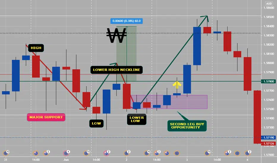
How To Trade "W" Pattern5 Tips to trade W reversal patterns:
1) Only trade W’s off the lows
2)Only trade W formations London & NY Session
3)Wait for the second leg stop hunt to the high/low of the day to confirm entry
4) Asian consolidation range should be very well defined
5) Always use proper risk management, if the Risk reward ratio is less than 1:3+ the trade is not worth taking
Each day there is a new high and low that is created.Trade the “W” formation reversal pattern at the lows.
This is a universal guide to trading W formations on any pair in Forex. This works on all time frames under the daily time frame. We recommend back testing everything we have highlighted in this post for greater clarity of the power you are tapping into!
The concept of trading M and W patterns
The retail trader masses may be dumb, but they are not that dumb. They will always continue to look for confirmation in order to validate their trades. So, we must understand the reverse psychology behind why the M and W pattern is such an effective reversal strategy. The confirmation the masses use to determine a trend is the creation of higher highs and higher lows in the case of an uptrend.
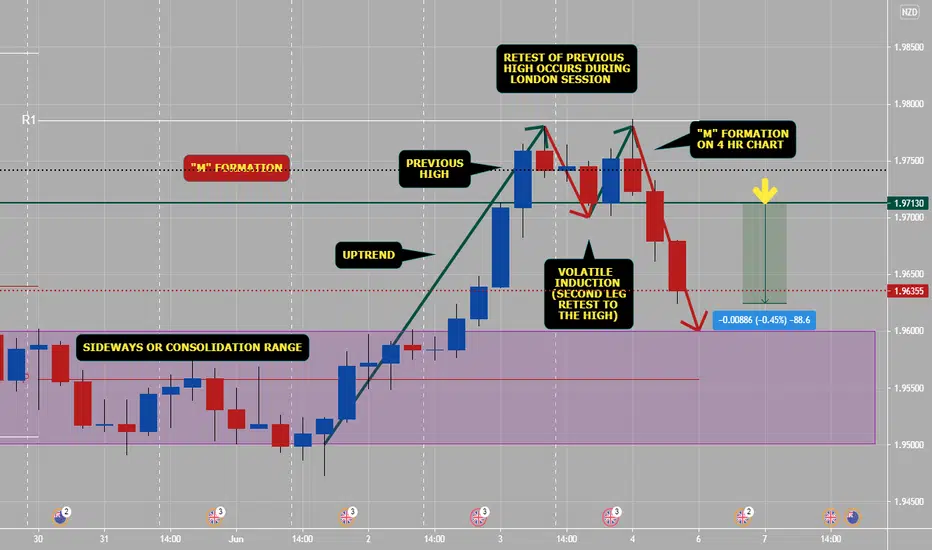
How To Trade "M" pattern (part 1)5 Tips to trade M reversal patterns:
1) Only trade M’s off the highs or overbought/supply areas.
2) Only trade M & W formations London & NY Session
3) Wait for the second leg stop hunt to the high/low of the day to confirm entry
4) Asian consolidation range should be very well defined
5. Always use proper risk management, if the Risk reward ratio is less than 1:3+ the trade is not worth taking.
These patterns occur on all scales and on all time frames. The time frame above is on the 4 hr, here we can clearly see the structure of the different sessions that occur on a daily basis.
The best sessions to trade are London Session and New York Session. These sessions will present the best reversal setups. Asian session should be avoided as there is very little movement.