[Candlestick Patterns] Just need to know these three!#Candlestick #CandlePattern #Tocademy #Tutorial
Hello traders from all over the world, this is HAMZA_ZDH=)
I was unexpectedly surprised by many of you who liked and supported my last post about the basic concept of TA( Technical Analysis ). Today I prepared a brief lecture about the Candlestick Pattern, one of the most fundamental phenomenon and behaviors that traders must be well-informed. In fact, we should be very familiar with these textbook contents and interpret it in a glimpse on the technical chart unconsciously. Just like we don't pay direct attention about each breathes when breathing, like we don't care each and all of the alphabets when we speak, or like we don’t perceive location of each keyboards every moment as we type, this very technique should be performed automatically and quickly by observing dominant formations of candlestick bars.
As a matter of fact, comprehending market trends and price actions only by referring to the candlesticks is yet too spurious. It should be used in such a way to weight on certain scenarios in a macroscopic view, rather than deriving precise and specific PRZ(Potential Reversal Zone)s and distinguish the accurate market trend. It’s never like ‘The price must go up because this pattern just appeared’. Furthermore, I strongly believe that the reliability of the candlestick pattern strategy is declining especially in recent financial market, where we encounter countless non-traditional and abnormal situations that were not very common in the past. Hence among the existing ‘Textbook’ candlestick pattern strategies that can easily be found on Google , there are particular patterns that are still very reliable on current market and there are ones that are not as reliable as it used to be. So here, I will organize everything very clearly for you guys.
Harmonic Patterns

A Investor Story That Nobody Heard AboutThis is a fictionalized story about a lady who enjoyed great success throughout her life, investing in the stock market using a simple “Buy and Hold” approach. This article not only tells us how and why she succeeded but how you too can easily master and exploit this truly amazing strategy .
Many of us have known or at least heard about someone like Aunt Betsey (if you dont know its ok) She was a kind, good natured person of somewhat eccentric character who, for reasons best known to herself, had never married or entered into any kind of committed relationship. She lived her life alone, comfortably but modestly. When she retired at the mandatory age of 65, she owned a 2 bedroom apartment in what had become a fashionable inner suburb plus a significant portfolio of shares in a dozen or so “substantial” companies.
Betsey simply saved some of her wages each week and every few years, when her bank account had built up to a sizable amount, went out and bought another parcel of shares in a company of her choosing.
Betsey never sold any of her shares. She simply filled them away with any correspondence under “S” in the small filling cabinet that stood beside a well-crafted oak writing desk in her fussy living room.
When dividend cheques arrived she deposited them into her savings account which in the course of time found their way back into further share purchases.
Betsey didn’t really know much about the share market, in fact she wasn’t even really interested in it. Her sole motivation for this lifelong habit was that her father had once told her that putting her surplus money into shares was a prudent thing to do. One of the qualities that Betsey valued highly was prudence.
When it came time to buy another share parcel, she simply browsed through a couple of stock market magazines during her lunch break at one of the news agencies that provided her long term employment. She jotted down the names of any shares that caught her attention in the small notebook she always carried in her handbag. Most of the stock market jargon in the magazine went way above her head, but that didn’t really faze Betsey. Her final solitary selection on each occasion was made after a judicious reading of the tea leaves at the completion of her evening meal.
Betsey passed away at the respectable age of 87, bequeathing a worthwhile inheritance to several nieces and nephews together with a substantial sum to a long favored charity.
The accountant who helped finalise her affairs was impressed by Betsey’s financial achievements. He commented to the executor of the estate that she had done far better than if she had just left her money sitting in her bank savings account.
Like the accountant, a casual observer may have concluded that Betsy had a knack for successful stock picking or if s/he had known the real truth, that reading tea leaves did in fact have some scientific basis to it after all. If nothing else, Betsey’s efforts surely proved the wisdom of having a well balanced portfolio.
Sadly, none of these things are true, although reading tea leaves are probably just as good an indicator for stock picking as input from the majority of expert or professional advisors. A handful of professionals do over time do better than random, while others do far worse. Numerous studies have shown, time and again, that the net results of professional advisers are about the same as tossing a coin.
Another thing that may have attributed to Betsey’s success was her market timing. Her entry signal that triggered a stock purchase occurred only when her bank account had reached a certain level.
By being totally oblivious to what the markets were doing she inadvertently insulated herself from the generally losing game of trying to pick the tops and bottoms that both amateurs and professionals tend to get caught up in.
Many people, who think they understand randomness, are often very surprised by the way it often pans out in practice.
A typical response to encountering a proven random result for the first time is “I didn’t think that luck could be responsible for such a wide range of outcomes” . For example it would have been perfectly reasonable for Aunt Betsey to have finished up with a portfolio of 9 losing stocks and 3 winners with just one of those winners responsible for nearly all her profits. If that is so, people will then often ask how one goes about picking these big winners. The answer is you can’t. It is just a matter of luck. Many however, struggle to accept that explanation and attempt to attribute other supposedly rational causes to essentially random events and outcomes.
There is a mathematical law in statistics known as the Law of Large Numbers. This law is frequently broken, not just in financial markets but in many other areas of life where statistics are used or quoted in an attempt to make sense of numerical data. The breaking of this law leads to the heinous Crime of Small Samples, committed frequently by traders and investors. In simple terms it means attempting to draw conclusions from inadequate sized data samples. This in turn leads to misleading or incorrect conclusions.
Aunt Betsey’s 12 stocks are a very small sample indeed and no explanation, other than a run of good luck, could be rationally drawn from her results.
For every person like Betsy who did well, there is another untold story about someone who would have been better off simply leaving their money in the bank.
Nobody tells these stories because nobody wants to hear about those who lose. This results is a steady source of “good news” informational bias which is passed on ad nauseam by market professionals and others.
This leads to people developing unrealistic beliefs, hopes and aspirations.

How to calculate a trading lot. Why is it worth knowing?Many traders, beginners and not only do not know how to calculate the lot and act in practice not selectively and illiterately
Let's examine what a lot is, how much it costs and how to calculate it:
We will calculate by the old quotation system (four decimal places).
The cost of lots in forex:
The size of each position opened by a trader is measured in lots
Standard 1.0 lot = $100,000
Mini lot 0.10 = $10,000
Micro lot 0.01 = $1,000
*This size is always a constant value, independent of currency rates.
*Leverage does not affect the calculation of the lot
High leverage will only allow more lots to be opened.
How to calculate the lot:
Calculating the lot by yourself will give the trader a conscious understanding of possible losses, which is necessary for evaluating the situation, strategy and risks. This requires to know the pip value in any lot size
Then, a trader won't care about the leverage size and won't need to know the number of currency units in a lot at all.
Let's look at calculation of lot size as an example:
Let's assume that the EURUSD chart shows a long entry price of 1.0251 .
The trader needs to place a stop-loss, but he must know the amount of possible future losses on this trade, if a protective order triggers.
As we know from theory, a stop-loss order should be placed
Below the minimum/maximums;
A fixed value using indicators or Expert Advisors.
We measure the size from the current position to the lower tail of the candle, we get 25 points.
We add a small reserve of 7 points to prevent the downward breakout from accidentally catching the stop loss and obtain 32 points.
This stop loss should be subtracted from the current price.
We multiply the quote by 10000 for convenience and obtain 10251 - 32 = 10219 .
We divide it back by 10000 and get 1.0219 (this is the stop-loss quote) and set our stop-loss at 1.0219
For ease of risk calculation we should always take the lot size 0.1 .
For a 0.1 lot one pip of price movement is approximately worth $ 1 ,
for a micro lot 0.01 the cost per pip would be 10 cents,
for a whole 1.0 lot it would be $ 10
Why is it easier to start with 0.1 lot?
It is very easy for a trader to calculate that 32 points of stop loss in our example would cost him $ 32 in losses. This is quite reasonable for a $ 1000 deposit.
It is easy to think how much his potential loss will be worth, for example at 0.07 lots:
32 points at 0.1 lot costs $ 32 ,
at 0.01 lot ten times less - $ 3.2 . At lot 0.07 : 3.2 x 7 = $ 22.4 .

Harmonic PatternsHarmonic Patterns
we have so many kinds of “Harmonic Pattern”:
Black Swan
Bat
Crab
Butterfly
Gartly
White Swan
Shark
Zero_Five
Cypher
Double Top
Double Bottom
📚👌🏻 Each one of them has its unique Fibonacci levels.
⚡️ Do you want to know them?
😍 Happy to see what you find in the charts, please share yours with us

XAUUSD:Playing with lines,Part 6Hello friends
..Based on the chart we can play with lines and patterns
.In this method we learn how to trade with lines and patterns
.Price reacts beautifully to lines and patterns
.We compete with big computers and artificial intelligence in analysis
.Repetition is important to us
.Analysis is like a series. Continue from wherever you start to the end
.important points:
.New York close time is important to us
.Breakout and pullback trend lines are important
.High and Low of the previous days are important for us
.Times M5 and M1are important
.This method has no limitations. We can use it in all markets
.Follow us for more training and analysis

HOW-TO: Use external filters on Auto Harmonic Pattern UltimateXHello Everyone,
In this video, I have explained following things:
1. What is a filter indicator and how it can be used
2. Example demonstration of Relative Bandwidth Filter to define trade no-trade zones based on volatility.
3. How to use filters along with Auto Harmonic Pattern UltimateX or any other script which follows similar design for external filters.
4. How to develop your own filter based on different conditions which can be used with AHPUx or other scripts which are designed to use the Filters.
Please let me know if you have any questions.

Explanation | the US Federal Reserve conference is of great impoAt the Jackson Hole conference, financial markets will keenly watch if US Fed chair Jerome Powell mentions the word taper in his speech and whether US Treasury Secretary Janet Yellen has anything to say on the interlinkages between fiscal and monetary policy
The financial media and markets will be buzzing for the next few weeks over the Jackson Hole conference. It is an important economics conference hosted by the Kansas City Fed, one of the 12 regional Federal Reserves created by the United States government. There is a history of important policy decisions unveiled at the Jackson Hole conference with implications for world markets. Here’s a lowdown.
What is the Jackson Hole?
In 1978, Kansas City Fed started organising an economics conference, and in 1982 moved the conference location to a valley named Jackson Hole (JH) in the Wyoming state. The annual conference has been held in the last days of August for quite some time now.
What is the history behind it?
Jackson Hole started as any other economics conference. The first four conferences were on agriculture, given the importance of the sector in this part of the US. In 1982, it organised the first conference on the monetary policy theme titled ‘Monetary Policy Issues in the 1980s’.
The 1982 conference was attended by then Federal Reserve Chair Paul Volcker, which set a precedent of sorts as most subsequent conferences were attended by the Fed chairpersons/senior officials. In 1982, the conference was attended by eminent macroeconomists and monetary policy scholars such as James Tobin (Nobel Prize in 1985), John Taylor (of Taylor Rule), William Poole (who became head of San Francisco Fed later), and so on.
In 1989, then Fed chair Alan Greenspan also made a speech at the conference. This added to its aura as now it was not just about the attendance of the US Fed chair but also about the remarks/speeches at the conference.
As linkages between monetary policy and financial markets deepened post-1990s, market participants started tracking the Fed chair’s remarks to figure the direction of the monetary policy.
Since 1982, the conference has been held 41 times including the 2021 edition. The theme has usually been around macroeconomics, monetary policy, long-term growth and policy, including the 2021 theme on ‘Macroeconomic Policy in an Uneven Economy’.
In 1990, the conference on ‘Monetary Policy Issues in the 1990's’ had representations from the erstwhile USSR, Czechoslovakia and Yugoslavia, and Bulgaria.
Gradually, the forum was attended by governors and central bankers from major advanced economies in Europe and Asia. This led to the financial markets in these respective economies tracking speeches and remarks from both global central bankers and representatives of their country’s central banks.
What makes Jackson Hole so special?
In many cases, it sets the agenda for monetary policy and shaped star economists.
The 1996 edition raised the importance of price stability. The 1999 edition highlighted the interaction of monetary policy with asset markets.
The 2005 edition was a swansong for Greenspan where his policies were praised only to be tarnished during the 2008 crisis.
The 2007 edition focused on housing and monetary policy where chair Ben Bernanke expressed confidence that the subprime housing markets are unlikely to lead to a crisis only to be proven wrong a year later.
The 2008 crisis led to increased attention on financial stability which was the theme in both the 2008 and 2009 editions.
In recent years as monetary policy has struggled to elevate inflation to the 2 percent target (for the US), there have been discussions on unconventional monetary policy (2013), designing resilient monetary policy frameworks (2016), monetary policy challenges in the next decade (both 2010 and 2020).
In 2020, Fed chair Jerome Powell released a new monetary policy framework named Average Inflation targeting which has become a major discussion point amidst the central banking research community.
The conference even catapulted the careers of economists. The name that comes to mind is that of Raghuram Rajan who had questioned the financial market developments in the Greenspan swansong edition in 2005. Rajan was dubbed a ‘luddite’ then but had the last laugh as the 2008 financial crisis engulfed the world economy.
What should we expect from the 2021 edition?
The theme of the 2021 conference is ‘Macroeconomic Policy in an Uneven Economy’. The global economy has been highly uneven due to the pandemic shock with rising inflation amidst stagnant growth prospects.
Conference watchers will keenly follow this edition as it is expected to be attended by US Treasury Secretary Janet Yellen, and Powell. This is rare as usually, the treasury secretaries do not attend the conference. Yellen is no stranger to Jackson Hole as she was the chairperson before Powell, and has been a chief speaker at the conference. If both attend and speak, it will be interesting as both the guardians of fiscal policy (Treasury) and monetary policy (Federal Reserve) will get together to provide solutions to the uneven economy.
They have to answer some big questions facing the US economy which will also impact the world economy. The foremost question is whether the fiscal and monetary stimulus will continue to remain in the US economy, and for how long.
The financial markets in emerging markets will see if Powell mentions the word taper in his speech and whether Yellen has anything to say on the interlinkages between fiscal and monetary policy.

Why you need exit strategy ???It was March 7th when I published my first VLO analysis:
I revised my target price to 140 on April 26:
then VLO went up to 148
+84% in less than 100 days..!
Now you see the highest ever revenue and learning per share, but the price is 25% below its All time high???
Why?
Maybe the best answer is provided by George Soros:
The reality is that financial markets are self-destabilizing; occasionally they tend toward disequilibrium, not equilibrium.
Best,

harmonic patterns for education purposefew patterns for education purpose
ab=cd pattern bullish
c point 0.345
bc is at 2.76

XAUUSD : M15:Playing with lines, part twoHello friends
.Based on the chart we can play with lines and patterns
.New York close time is important to us
.Breakout and pullback trend lines are important
.HH and LL of the previous days are important for us
.Times M5 and M1are important
.This method has no limitations. We can use it in all markets
.Follow us for more training and analysis
.

RULE#1: patience as key to success 📉In trading, research has shown that one of the reasons why most people are unsuccessful in trading is because of their in ability to follow process, to wait patiently to "check out the checklist" which when neglected can lead to some serious losses. Your ability and Willingness to wait ; not losing one's temper while waiting will help you not to only be successful but to also be consistent in your trading career.
HOW DO ONE BECOME A PATIENT TRADER ?
My dear friends, there's no other way than to discipline yourself; write out your goals/ checklist in line with your winning strategy. So that when the market does not meet your requirements, you let it go and wait for the next one.
Remember this "But if we hope for what we do not see, we wait for it with patience."

Follow the eye - detailsIn the chart there are 2 Median Lines, 1 Fan (Dr . Alan H. Andrews style) a trendline - and... a smiling dog 'cause it's Fun!
Now the Median Line per 1.2.3. been shared for the first time here
The Upper Parallel Median line test is where the Blu arrow is and it shows a dynamic resistance level that worked pretty well.
Here is another update of the same pattern:
Right now prices are close to the 50% lower inside Parallel Median Line, first small green arrow in the chart. The 2 green arrows show 2 potentially relevant support zones.
The second Median Line is the one per 1'.2.3. The prices tested the Center Line of this pattern (orange arrow). The second test been where the blu arrow is, and it's the 50% upside parallel of this Median Line (resistance).
This Median line been shared for the first time here:
and then here:
but the most important been this one
Considered the efficacy of these 2 Median Lines in the past we may have high probability to see these patterns working as good dynamic levels to check even in the future.
The dynamic trendline offered extremely relevant Res. zone that been tested multiple times and may worth a check in the future. The first time we pointed out the potential efficacy of that trendline been here:
The Fan using the Dr Alan H. Andrews settings could be used as dynamic support and resistance to check and the crosses of the fan with the trendlines generated form the Median Lines are called "energy points" and could be checked as price magnet levels as well as resistance or support and trend chaange detectors.
Maybe U can use the levels in this chart to track the future price fluctuations.
Hope you enjoy!
(Too much hurry from me yesterday, have to say sorry to Nico the moderator.)

RLinda | Market cycles and the role of the market maker 🤠The price channel is a limited trading range in which the price moves during a certain period of time. In other words, it is a "corridor" on the price chart. The boundaries of the price channel are outlined by two lines: resistance and support.
A resistance level is a price level from which price reverses as it approaches from the bottom to the top. This level is as if it is resisting the price, preventing it from going higher.
A support level is a price level from which price reverses when approaching from above downward. This level as if supports the price, not allowing it to go lower. A resistance level is a price level from which price reverses on the downward approach.
Accumulative flat is a limited area within which there is only a slight fluctuation in price. In some cases, a consolidation is referred to as a sideways trend movement in which there is only a slight change in price, varying within a fairly narrow corridor.
A bear market is a period when the price of an asset has fallen by about 20% or more from recent highs. At this point, the investor fear index increases and panic is possible in the market. A bear market is the same as a bear market, it is also called a downtrend. It is opposed to a bull market. Bullish - vice versa
-----------------------------------
Always before a move in one direction, the market maker forms an accumulative flat, the price in it trades from border to border.
An accumulative flat can form for a long time. The narrower and the longer is the consolidation, the stronger is the momentum.
Before a large impulse movement, a large player forms a shakeout relative to the upper and lower boundaries, determines positions, and after all bids are activated, moves towards the larger accumulation of players.
Then a distributive drop (free) is formed where there is no resistance from the support side, since earlier the balance was already broken. Bids are collected and the ratio of buyers and sellers begins to change. Price passes into consolidation after the fall.
The subsequent fall is the entry of liquidity from those players who had previously entered at the highs
The price after the fall goes into consolidation, if we see that there is no deep pullback, it means that the big player is not interested and the resistance limit zones do not allow the price to grow.
To determine the boundaries and consolidations, to understand where the big player is gaining and where he distributes them, it is better to use the higher timeframes, and for entry points - the lower ones.
Sincerely, R. Linda!
*The wording is taken from google

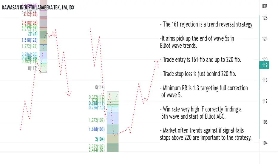
161 Rejection Strategy Strategy Name: 161 Rejection
Type of strategy: A reversal strategy.
Conditions for use: This strategy is used if there are valid Elliot wave trend legs. It is used to attempt to trade the reversal of wave 5 into the ABC correction.
Drawing the fib swing:
In Elliot wave, there should be a consistent trend and then this starting to get a bit more messy. The messy stuff will usually have a false reversal. A range and breakout of the range making it look like the trend has ended. From this there will come another big trend leg (Wave 5).
We are able to draw our swing when we have seen:
A steady trend with few dips. Starting to pick up pace.
The trend getting choppy and probably false reversals.
A new high/low being made in the trend.
Once we have these, we can fib the range and the 161 - 220 of this is our intended zone of entry for reversals. Also where we want to be protective of any profits we have from trading the trend. Even if not betting on reversal, it’s wise to trail stops tight into these levels. 161s can create reversals.
When a strong wave 3 has transitioned into a range and a pullback in the trend, this is when we can draw fibs on the pullback and look for this trade.
Basic strategy theory:
In the guidelines for Elliot wave 161 extensions are mentioned as a common ending point. And if you go through lots of examples of reversals you’ll probably come to see that has a point. Strategy is based loosely on that Elliot wave guideline. That it should be obvious seeing the hyper strong wave 5 into 161 extensions if you draw them.
To make a guideline into a practical strategy we need to work out entry and exit criteria. In testing I’ve found the reversal usually will come from the 161 or close to the 220. Sometimes just kissing the 220 fib. In most instances price is able to break the 220 the planned trade will fail. That’s why the stop is there.
Things we usually see before the strategy trades:
An early spot to notice this setting up is late into wave 3. Late into wave 3 the trend in question will be getting a lot of attention. You should look for strong trends that seem to be getting stronger and if it’s a big move there should be a lot of public chatter about it and forecasts getting increasingly more optimistic.
This obviously strong trend should transition into a messy range and/or sharp pullback. Then there should be the fastest move of the trend so far when this pullback reverses. Confidence in the trend should be ultra high and price should be consistently trending up to the 161.
Thing we usually see when strategy is not working (Stop loss conditions):
This is a great strategy when it works but it fails when used in the wrong part of a move in a big way. The rules for this strategy are price reverses at or before 220 fib. When it fails we either break the 220 and head into a strong trend or we go a bit over, make pullback smaller than we were targeting and the 220 make big break next time.
It’s best to stop out over the 220 in case a big trend move comes. Unfortunately, it’s also the case that a lot of time price will go just over the 220 and then pullback. It won’t be the target swing the trade was taking, but it would have put the trade in profit. Which means you can stop out at the worst time.
After a 220 break the probability of a bigger pullback decrease. It’s usually better to switch to following the trend and enter into any big pullbacks retesting previous support/resistance levels. Which is worth noting, it’s tempting to enter again if stopped out and it looks like it’s working. Often a trap.
Strategy strengths: Can be very high risk:reward. Helps a lot with protecting profits in a running trend trade. When this is working once the swings targeted start they are often strong and smooth and easy to take close to the full value of the move. Trailing stops do not hit and big profit targets can.
Strategy weaknesses: When used in a move that is not forming a wave 5 (For example using it through wave 3) this strategy generates false signals that price will usually trend against. Losses not cut can be devastating. Entries can sometimes be spiked out at the end of a move just over the 220 fib.
Here's Why the Tech-Led Selloff is Likely Over (for now)In this post, I will attempt to provide evidence to show why the tech-led selloff is likely to be over (for now). I will use the Nasdaq 100 (QQQ) and its inverse derivative, SQQQ, as my argument's basis.
The inverse (short) ETF of the Nasdaq, SQQQ, has never closed a weekly candle above the Leading Span B of the Ichimoku Cloud (pink line in chart). Last week and the previous week, the weekly candle was very strongly resisted at this level.
Now, the weekly and monthly momentum oscillators started to move in the opposite direction. This will not only make it much harder for SQQQ to pierce the line, but it could also result in SQQQ plummeting quickly, and therefore QQQ and the Nasdaq rebounding quickly.
For comparison, many data points are covered in this chart, and there is a high statistical probability that the Nasdaq has bottomed. Not even during the peak fear of COVID-19, when the global economy shut down and governments feared millions of deaths, did SQQQ pierce the weekly Ichimoku Cloud.
In December 2018 when the Fed was starting to rapidly roll off assets on its balance sheet and was raising interest rates, SQQQ still did not pierce the cloud. This fear is very similar to today's fear.
Even further back, not even during the major flash crash in 2015 or on Black Monday in 2011 when the market crashed did SQQQ pierce the cloud. Today, hardly anyone remembers these episodes in stock market history. Similarly, in ten years or so, few people (except maybe those who sold all their positions at the market bottom) will remember what happened in May 2022.
The NDTH is a chart of the percentage of Nasdaq 100 stocks that are above their 200-day moving average. It dropped to nearly 10 in May 2022, meaning almost 90% of Nasdaq 100 stocks were below their 200-day moving average. The last time this level was reached was in March 2020 right at the bottom of the COVID market crash. The NDTH has never dropped below 15 except during significant bottoms on the Nasdaq.
There are many other examples in which the charts suggest, with high probability data, that we just experienced a significant bottom on the Nasdaq 100. (Eg. The Nasdaq 100 was supported on the monthly base line, the monthly candle is extremely bullish, the monthly EMA ribbon of the QQQ/SPY ratio chart strongly held the outperformance trend in place, inflation and interest rate charts are cooling.
Although this may be a significant bottom, it does not mean a years-long bull span is ahead. Rather the charts suggest the panic selling has ended for at least the short to intermediate-term. To be fair, some charts suggest that the QQQ/SPY outperformance trend could be nearing the end of its decades-long run. (Credit to @Breakout_Charts for identifying this) If this occurs, then it could be the start of a new cycle, or even super cycle, whereby the Nasdaq underperforms for years.
Finally, a point about market psychology. Bottoms occur when 'extreme fear' turns into just 'fear' (yes, there's actually an indicator that measures this). That indicator has moved significantly from 'extreme fear' towards 'fear'. With this said, there might be a lot of people who might comment on this post and say scary-sounding things about the state of the economy or stock market. If none of these fears existed among market participants, we would never even have gotten to this bottom. Never sell because of fear alone.
Not financial advice. As always anything can happen. Just my thoughts. Leave a like if this was helpful and you'd like me to post more analyses. Please feel free to comment below if you have additional thoughts.

How To: Size your position using 'Historical Volatility'Wassup folks! In today's vid I'm explaining a new topic - How to size your position (read: how to size risk per trade).
Necessary Indicators: Historical Volatility
Prerequisites:
1. Have a defined trade plan.
2. Know the outcome you're expecting.
3. Have a hypothesis on how long you plan to hold the trade.
4. *not mentioned, but obviously have a way to protect downside risk (stop loss, psychological cut off level)
Because Bitcoin is in a range, and also because the moves have been _somewhat_ easy to anticipate, I came to the conclusion utilizing previous price action that in order to make 10%, I'd probably have to hold this trade somewhere between 3-5 days.
After knowing my end goal, and time horizon, I then needed to know how much added risk (leverage) I needed in order to reach my goal in 4 days with the expected volatility.
Calculation:
Expected Gain/Expected Volatility = Leverage
10/23 = 0.43x Leverage
Keep in mind that past events cannot predict future outcomes. We can only use them as a guide to give us a probable outcome, nothing can truly be predicted.
This indicator something I've recently learned and thought it would be good to share, which also helps me understand it better by having to break it down to someone else.
I haven't used this indicator before to make trades, however I plan to test this hypothesis out and will update this idea thread on the results in 3-5 days.
If you have more insight on this indicator on how you use it or any tips, feel free to leave a comment below.

Price Inefficiencies + Fair Value GapsNote: The bigger the gap (stronger momentum move) the more likely for price to retest that area.
Dont use this as an indicator to buy or sell, use it in conjunction with other strategies you may have. This is just one way to come to a conclusion about price. I will link another video that will show the same thing utilizing other indicators.
Note: I know my explanation of price inefficiencies isnt scientifically correct, however it's explained in a way that makes it easier to understand.

example harmonicjust practice harmonic lessons in im.academy
Harmonic patterns are specific formations used in technical analysis that can help traders understand price action and forecast where prices may go next. When analysing harmonic patterns in price charts, a trader can make predictions about where and to what extent an asset’s price might move.

Bearish Cyphery Pattern - Elliott Wave Analysis Bearish Cypher Pattern , in Elliott Wave Analysis is
Irregular Flat Correction or Running Flat Correction
Rules
The B point stands at the end of the AB leg, which is a retracement of the XA leg. The B point must lie between a 0.382 and 0.618 retracement of the XA leg;
The C point lies at the end of the BC leg and should be a 1.272 to 1.414 projection of the XA leg;
Point D should be a precise 0.786 retracement of the line between X and C (XC). The D point is the end of the pattern.

Bullish Cypher Pattern - Elliott Wave Analysis Bullish Cypher Pattern , in Elliott Wave Analysis is
Irregular Flat Correction or Running Flat Correction
Rules
The B point stands at the end of the AB leg, which is a retracement of the XA leg. The B point must lie between a 0.382 and 0.618 retracement of the XA leg;
The C point lies at the end of the BC leg and should be a 1.272 to 1.414 projection of the XA leg;
Point D should be a precise 0.786 retracement of the line between X and C (XC). The D point is the end of the pattern.

Bearish 5-0 Pattern - Elliott Wave Analysis The 5-0 Pattern has the following ratios.
A no specific retracement level
AB leg extends XA leg between 113% – 161.8%
BC leg extends 0X leg between 88,6% - 113% 113%
BC leg is also an extension of AB by 161.8% – 224%
CD leg should to be 50% retracement of BC
The first part of 5-0 Pattern is Shark Pattern.
The A-B-C leg of Shark Pattern is in Elliott Wave (w) - (x) - (y), legs of Wave A from Flat Correction
The second part of 5-0 Pattern is Shark Pattern is D.
D leg in Shark Pattern, in Elliott Wave is Wave B , leg of Flat Correction
That is mean after B we are waiting Wave C and then PRZ

Bullish 5-0 Pattern - Elliott Wave Analysis The 5-0 Pattern has the following ratios.
A no specific retracement level
AB leg extends XA leg between 113% – 161.8%
BC leg extends 0X leg between 88,6% - 113% 113%
BC leg is also an extension of AB by 161.8% – 224%
CD leg should to be 50% retracement of BC
The first part of 5-0 Pattern is Shark Pattern.
The A-B-C leg of Shark Pattern is in Elliott Wave (w) - (x) - (y), legs of Wave A from Flat Correction
The second part of 5-0 Pattern is Shark Pattern is D.
D leg in Shark Pattern, in Elliott Wave is Wave B , leg of Flat Correction
That is mean after B we are waiting Wave C and then PRZ

Bearish Shark Pattern - Elliott Wave Analysis The Shark pattern has the following ratios.
A no specific retracement level
AB leg extends XA leg between 113% – 161.8%
BC leg extends 0X leg between 88,6% - 113% 113%
BC leg is also an extension of AB by 161.8% – 224%
