History of the American Dollar. Ups and Downs
1825-1906: US begins market operations to maintain the gold standard.
1924-1931: US engages in number of market operations, including buying foreign currencies, to maintain the gold standard.
1934-1961: US Treasury creates the Exchange Stabilization Fund (ESF), conducts frequent operations directly in foreign exchange markets.
1971: Nixon Administration ends USD convertibility to gold, which had become unsustainable due to the large supply of dollars outstanding relative to gold reserves.
1973: US conducts intervention against German mark.
1974: US conducts intervention against Japanese yen.
1976: The USD officially becomes: fiat currency.
1977-1979: Very easy monetary policy weakens the USD. US intervenes often to support USD.
1979: Fed announces change in its open market procedures to combat inflation and, partly, to support a weakening USD.
1980-1981: US intervenes to tame strengthened dollar.
1985: Major economies agree in the Plaza Accord to devalue the USD relative to the JPY and DEM. In the following weeks, US intervenes often, selling dollars for other G5 currencies.
1987: Major economies sign Louvre Accord to halt USD depreciation. In coordinated interventions, US intervenes often to buy USD.
1988 - 1990: US intervenes repeatedly after G7 statement on importance of maintaing exchange rate stability.
1990: USD appreciates on a backdrop of solid economic growth and dormant inflation.
1991-1992: US and European central banks intervene often against the backdrop of a US recession and weakening USD.
1993: US intervenes to buy dollars and sell yen.
1994: Fed unexpectedly starts rate hiking cycle on an improving economy following the recession. US intervenes repeatedly to support the USD.
1998: US intervenes to purchase yen in a coordinated intervention to support Japan's economy following the Asian financial crisis.
2000: Dot-com bubble bursts. leading to recession.
2000: Coordinated G7 FX intervention to support the Euro, initiated by the ECB.
2001: 9/11 attacks increase overall uncertainty. Fed lowers rates to prop up the economy.
2002: Japan intervenes, selling yen for dollars, often supported by the Fed and ECB.
2004-2006: Fed tightens policy to curb inflation.
2008: Global Financial Crisis ushers in an era of exceptionally easy monetary policy in the US, much of the developed world, and some EMs. Flight to safety strengthens the USD.
2010: Euro sovereign debt crisis unfolds.
2011: US. UK and European central banks sell yen in a coordinated intervention following a sharp rise In FX volatility as a result of an earthquake in Japan.
2011: Standard & Poor's downgrades US sovereign debt; flight to safety nevertheless boosts USD in the months that follow.
2014: USD begins to rally on the back of stronger growth relative to other major economies and divergence in DM monetary policy.
2015: Fed begins raising rates.
2015: China surprises global financial markets by devaluing the renminbi for three consecutive days.
2017-2018: USD depreciates on the back of convergence in global growth, President Trump's sentiments for a weaker Dollar, and strength in other major currencies, particularly the euro.
2018-2019: USD rallies on tax reform and Fed's continuing tightening cycle.
2020: COVID-19 spreads globally; recession begins.
March 2022: Fed begins raising rates again.
July 2022: Dollar reaches parity with the euro for the first time since 2002.
Source: Federal Reserve Board, Congressional Research Service, Haver Analytics, various news sources, Goldman Sachs GIR.
Regards, R.Linda!
Harmonic Patterns

Paid in Cryptocurrency: The Salary Of The Future?With the introduction of cryptocurrencies into our lives, there have been changes in the economy and our habits. In this century everyone wants to access everything easily and quickly. Likewise, employees want to be paid in time without any effort. So, now we talk about the new idea of salary with cryptocurrencies. These days some brands have started to pay in cryptocurrencies. However, we should take a
look at positive and negative effects and also how and where we can find that kind of job.
First of all, I want to explain how and when cryptocurrencies started. At first it was a long time ago when they found the crypto.
Over years they developed the cryptocurrencies and in 2009 Bitcoin has joined our lives. After Bitcoin came out,
most people realized the importance of crypto.
Actually, it was a good idea to invest in Bitcoin because it was so expensive and you could double your money.
After Bitcoin, some altcoins have started. Ethereum, Dogecoin and many more altcoins are also quite famous.
In fact, a lot of people earn money thanks to cryptocurrencies. But you should be wise about it because it’s like gambling.
Therefore, you should be aware of the risks.
POSITIVE ASPECT OF BEING PAID IN CRYPTOCURRENCY
First and foremost, when receiving payment with cryptocurrency, it doesn’t include any tax. Also the transaction of crypto money is so easy. You can do it
from an application. Another positive aspect of being paid in cryptocurrency is that it can be converted into any currency internationally.
Moreover, for companies looking to hire more employees to work online, crypto can be a great way to pay staff evenly and then have them convert to their local currency.
NEGATIVE ASPECT OF BEING PAID IN CRYPTOCURRENCY
Like every good thing, crypto also has a lot of risks as I mentioned before. In particular, you can either earn good or lose for good, so it can be tricky in many cases. In fact, you can check data and do your research but in the end, you never
know for sure. There are lots of parameters that affect the market prices.
Sometimes that relies on other markets, or politics, or sectors, or even a person. By ‘a person’, you might have an idea of who we are talking about. Of course, it is no one other than, mighty Elon Musk.
In 2021, Elon Musk changed the whole market prices by just mentioning Bitcoin in one of his tweets. Something similar happened when he put the symbol of Bitcoin into the description part of his account. But of course, he is fully aware of his
actions. These actions may be a game to him but ethically, the situation he caused is not fair. In times like this, what is fair is not so important. This is because there is nothing to do to change what happened. Crypto-market can get affected by many different concepts. Because of all this, paying in crypto can be risky and should evaluate positive and negative aspects carefully.
HOW AND WHERE CAN YOU FIND A JOB PAYING IN CRYPTO?
If you want to find a job and receive payment with crypto money, there are a lot of websites and applications for that. For example, you can check out these; Bitcoiner Jobs, Proof of Talent, Crypto Jobs, AngelList. You need to apply them with your CV and you should explain why you are interested in this kind of job. Also you should highlight that you know all the risks. There are vacancies for social media managers, product managers, Graphics designer, Bitcoin Developer etc. So, if you are curious or just fond of trying something new, here is your chance!
I hope you found this post informative and beneficial. Feel free to leave a comment :)

Channel Down and W with Fail PatternThis is an example of Channel Down and W with Fail Pattern.
Found that W Pattern (Bearish Crab) within Channel down.
Fail pattern occurs after Point C, thus RSI need to be reviewed.
Indicator used :
1. Regression Channel Alternative MTF
2. HH-LL ZZ
3. XABCD Harmonic Pattern Custom Range Interactive

Strange similarity between BTCUSDT 4H and USDJPY 3M
I found some intriguing similarities between the BTCUSDT 4h-TF chart and the USDJPY 3M-TF chart.
Although one is a chart of a short to middle timeframe, and the other is of the very long term, the similarity tells something of how a price conversatio shapes under a significant, horizontal supply zone.
Regardless of whether they are the bottom formations or the variations of the bear flag, I read an Elliott-wise flat correction from both charts- what would you think?
For my detailed analysis of both currency pairs, please look at my previous ideas of the links below.

IBM - Harmonics (theory)The first thing to look for when identifying the Bat pattern is the impulsive leg or the XA leg. We’re looking for a strong move up or down depending if we either have a bullish or a bearish Bat structure.
The next thing that needs to be satisfied for a valid Bat pattern structure is a minimum 0.382 Fibonacci retracement of the XA leg and it can go as deep as 0.50 Fibonacci retracement of the XA leg, but it can’t break below the 0.618. This will create the B leg of our Bat pattern.
How to trade the bat pattern
The next thing we’re going to look for is a retracement of the AB leg up to at least 0.382 Fibonacci ratios, but it can’t go above 0.886, and this will create our third point C of the harmonic Bat pattern strategy.
The last thing we want to establish is the D point and in order to get to the D point, all we do is to find the 0.886 Fibonacci ratios of the impulsive XA leg, which will result in a deep CD leg and finally it will complete the whole Bat pattern structure.
In the current scenario, I presented also a surprising correlation between the time cycles, where the X and A leg time frame could indicate potential CD range. As described above - if this scenario turns true and price action will indeed form a bullish harmonic bat here, the initial retracement could potentially reach levels of the previous low of this cycle (X).
This is just a tutorial and an idea for a potential Long, at the bottom of the formation and end of the current time cycle - nevertheless, I mark this idea as Neutral and place IBM in my 'watched' list.

Harmonic Decomposition of Trend Exhaustion - - ALGOUSD (1h)L I N E - W O R K : The foregoing, and more, populate my Object Tree, which is summarized as a separate item, below. Any line or drawing tool that I use frequently is saved as a color-coded template for rapid repetition.
Fib Space - A concrete Leading Indicator comprising several overlapping Fibonacci Trend-Based Extensions and a Retracement or two. Rather than to find Support & Resistance, its purpose is to target Volatility as the areas between highlighted zones.
AVWAP Array - A fluid Leading Indicator comprising several overlapping Anchored VWAPs, as well as some some standard and nonstandard deviations and anchor-points. Although Price itself behaves violently when interacting either with VWAPs, experience shows that the crossing of key VWAPs is a Leading Indicator of high Volatility. Among the VWAps, three in particular deserve special attention, namely the 1.272 Std Deviation VWAP since the chart’s inception, below the current price, as well as those marked by this year’s dates of 2.24 (two-tone red) and 9.8 (two-tone green), above the price.
Further line-work includes a Schiff Pitchfork implied by the right wing of the pattern (points ABC), and a section of a larger bullish arrow consequent to a larger Bullish Harmonic Reversal Pattern that does not fit within the hourly chart.
Notice the use of S-Curves as projected future trend lines, following the conservative path of Maximum Market Pain. Price is like a pendulum. It does not move in straight lines; rather, it describes the struggle between buyers & sellers pulled into maximum commitment before shorter term swings.
See below for more on Harmonics.
. . . . . . . . . . . .
V O L U M E : The various horizontal histograms of volume simply indicate accumulation and distribution. Volume Profiles, however, serve two purposes. 1) As a Lagging Indicator, to discover ranges of Supply & Demand, and the all-important Mean, and 2) as a Leading Indicator to corroborate entries, profit targets and stop-losses, as well as any discretionary management of the latter, if needed. Notice that each day, beginning with the Tokyo Session at 12:00 UTC, has its own 24-hour Volume Profile (see the Object Tree, below).
None of these are as useful as the custom construction in my Object Tree under the name AWAP Array.
In this case, Volume has been healthy partially due to the ongoing FTX Crash (as of this writing), and ALGO tends to have high Volume in general, making it a good indicator of the health of the sector. A recent spike in selling has dropped price to point C which, for those less familiar with them, is NOT considered complete until confirmation at D.
. . . . . . . . . . . .
V O L A T I L I T Y : This is the least understood of the the three fundamental axes of trading, or at least of my style. In any timeframe, price rises more slowly than it falls, which is to say that Volatility is the opposite of price variation. To see Volatility with any hope of clarity, it is essential to remove innate directional bias. In general, it rises sharply and declines slowly. The Question, even more than HOW FAR?, is WHEN? The mystery of Volatility tests, and rewards, patience.
Generally and in this case, too, the greatest Volatility occurred at X, which coincides approximately the 9.8 VWAP and the midpoint between the price drop begun near the 2.24 VWAP and the bottom of that swing, at A. As expected, there is a rise leading into the midpoint of the pattern, B, which is also the second highest price (so far). Another peak in Volatility may be expected at D, if it is reached.
Again, see below for more on Harmonics.
. . . . . . . . . . . .
T R E N D - E X H A U S T I O N : In order to maximize the Risk:Reward ratio, one must act at the edges, or as close as possible. Therefore, one needs an improving sense of where the potential for reversal is highest BEFORE price reaches it. Like Volatility, and unlike Volume, it is impossible to measure directly, and yet with clean Line-Work and a sound market narrative, or trade thesis, various containment and decomposition techniques exist to estimate probable areas in a chart where price vectors will reverse.
In this case, a Schiff Pitchfork is implied by interwoven patterns, among other evidence. Although the Price Action in the near term may be described by it, a larger Bullish Reversal Pattern (to large for the hourly chart) appears to have completed as well, implying an even larger set of Pitchforks.
. . . . . . . . . . . .
H A R M O N I C S : Whether by definition or analogy, harmony implies cooperation between two or more agents. To draw X5 patterns without understanding which elements one seeks to reconcile is like a chimpanzee playing with an iPad. When I draw them, I visualize the interplay of 1) the Range between Supply & Demand, 2) the Volume Spread and 3) Probability over Time.
In this case, in addition to the much larger (green) Bullish pattern completing, a smaller such pattern can be seen in the (red) Bearish Reversal Pattern whose CD Leg comprises the vector of the trade. In effect, the trade can also be seen as the AD Retracement of the smaller Harmonic Bull, since it coincides with the ABC Fib-Based Trend Extension.
Upon the Red W-Pattern are superimposed two smaller bullish patterns, one completed and one potential. Of these, the second marks a point, or an area, of risk along CD Leg.
. . . . . . . . . . . .
F O R E C A S T : Trading the CD Leg of a Reversal Pattern is technically premature, and risky. In this case, not only the coincidence of the Fib ratios but several factors of the Big Picture, as well as the Indicators make this a decent t proposition. As always, there is a point between 1/2 and 2/3 up the vector when it will be tested (and where it tends to fail, if it does fail) therefore some profit may taken along the way. Considering the high R:R Ratio and the duration of the swing, it’s not a bad idea to de-risk.
On this timeframe as of this writing, price is testing the 1.0618 custom “Overthrow” line in the template marked as a “Moving Stop Loss”. Considering recent price drops, this retest near the prospective bottom suggests support rather than a further run to the downside. Also, being a holiday weekend with other markets closed, crypto may indeed have an upsurge due to bored and/or her-eager traders. Setting the left edge of the window to the peak above X, near the 8.9 VWAP, shows the Point of Control of the Visible Range Volume Profile to be above the current price, further suggesting a price reversal in this zone.
_____________________________________________________________________
O B J E C T - T R E E :
The most overlooked tool in Tradingview is the Object Tree. When cleverly rooted, it enables the chartist to arrange (i.e layer) the Drawings and Indicators (if any) and then selectively toggle them on and off.
I am sometimes asked about my suite of indicators, which I have listed below, per the order in which they are layered. (The settings I use are beyond the present scope.) A more relevant detail is that the major Volatility Indicators are placed in the upper windows while those which measure Volume appear in windows below the price action.
In the main window, the preference is inverted. Any original Line-Work that I might create is collected beneath all (12) Indicators.
Again, the purpose of this groundwork to deliberately overlap objects and to selectively turn them on or off like light bulbs in order to discover and/or important but not obvious facts about the potential action space.
. . . . . . . . . . . .
Tesla Coil
____________________________________
Average Volatility Movement
____________________________________
Buying & Selling Pressure
Average True Range (Line)
Average True Range (Histogram)
____________________________________
ALGOUSD, COINBASE, 1h
Indicators VSA v6
Volume Pressure Analysis
Time Segmented Volume Bands
Visible Range Volume Profile
Periodic Volume Profile
Daily High/Low/Mid/Open/Close+Weekly/Monthly Open
Volatility Stop MTF
Volatility Bands by DGT
Double SuperTrend ATR
Moving Average Shaded Fill Area Crossover EMA
Moving Average Ribbon
>📁”Object Group 1”
>📁”Object Group 2”
>📁”etc.”
____________________________________
Time Segmented Volume Bands
____________________________________
Heatmap Volume
Volume Analysis
Time Segmented Volume Bands
. . . . . . . . . . . .
R E M A R K S : I will attempt to post a larger, higher timeframe view of the position, showing the major Bullish Reversal possibly beginning, or at least the end of selling pressure.
🧸

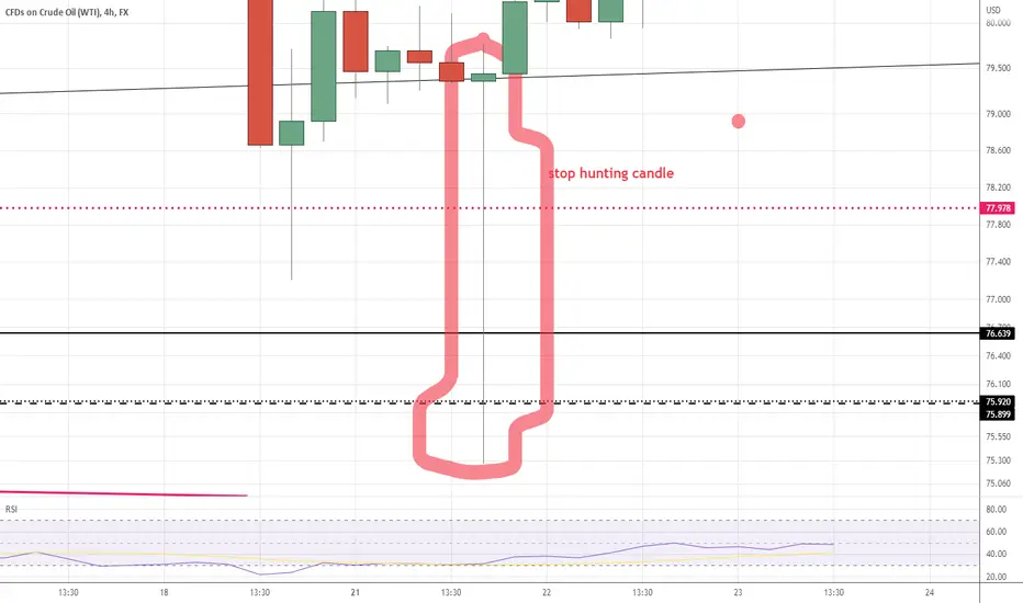
stop hunting by intermediary bank ,unauthorized brokerCurrently, there is a strategy that is followed by most investment banks around the world, and that is known as Stop Hunting. It attempts to force some market participants out of their positions by driving an asset’s price to a level where many retail traders set their stop-loss orders. The triggering of many stop losses at once generally leads to high volatility, and this can present opportunities to some smart traders who seek to trade in such an environment.
The fact that the price of a currency pair can experience sharp moves when many stop losses are triggered is exactly why many traders engage in stop hunting. Traders who are aware of this fact and have observed this phenomenon of the market try to make of this opportunity by being patient and conservative.
as some banks and brokers are aware of traders stop levels they push the asset toward those stops to collect them and the result is fake break out with which both sellers and buyers are losers .
Money Affects HappinessConventionally, we used to hear the saying, "Money can't buy happiness.". Is it really true? Let's look at some facts about happiness, money, and life.
Easy to talk about happiness and specific amounts of it, but how do we measure happiness in real life? It isn’t something we perceptibly see in a computer game. In fact, it is more like a feeling and believe it or not, there are ways to measure it.
How To Measure Happiness?
As we look at the behavioral aspect, when we feel happy our behaviors change. We smile more and feel much more energetic. Hence we might be much more patient and helpful to others. However, any external factors can affect our happiness, which simultaneously affects our behaviors such as sun, exercising, eating, etc. Other than our behaviors, there are some biological ways to assess and reveal people's happiness levels in laboratories, but these are way too scientific. Reports, on the other hand, are another helpful source of information. In Particular, we can consider self-reports of people about their emotions and the feedback from other people. For example, as a parent, brief information about their child's emotional state to another person is valuable feedback. Of course, this data is mostly based on a person's emotional well-being, but it is also helping researchers carry out certain types of studies.
Attitudes Towards Money
For most people, the relationship with money, happiness, and living standards compose complicated relationships. It isn't like something that turns off when they achieve a certain amount of wage per year. They want more. Therefore, they try to find ways to earn more, usually by advancing in their career, which results in economic growth on a societal basis. On the other hand, things may lead in a different direction. More income means more flexibility on living expenses. However, with the pandemic, things started to change dimensions. The pandemic was actually the emergence of some crises. Some people lost their jobs or gave up what they love for the sake of themselves and their loved ones. Thus, the pandemic started a new pursuit to make money in challenging times. So happiness had to be put away from people in order to survive. For some people, money might be the indicator of success. In that case, if you are not earning much from your current job, you might think, "Am I not successful enough?" That creates a twisted sense of success and affects the lives of many. For some other people, however, only the job they are performing gives their lives a purpose that brings happiness simultaneously. As you can see, "money" can be determined in many ways depending on the person.
Killingworth's Study
In this post, I will also talk about a study by Matthew Killingworth. This research was conducted to measure people's well-being by collecting data from them on a daily basis. Actually, it has an extremely interesting content-collecting process. At some point, he links people's happiness with their income, as I mentioned before.
According to a paper from 2010 by Daniel Kahneman and Angus Deaton, well-being stops increasing after achieving a $75,000 annual salary. In his study, Killingworth declares that the possibility of increasing well-being stops after some time. This is since money no longer means something. However, he suggests well-being continues to increase with income as it can also give some satisfaction even just to see the ability to make "more" money.
Following on the study, Killingworth highlights that people earning more are happier. This derives from their high income and the possibility of doing things without doubt and worry. Who wouldn't be pleased by not caring about money while doing things they want to do? On the other side of the story, working excessively to earn more brings problems such as depression. People who link their self-worth with their income most definitely suffer from stress and, even more, depression. So, the key is trying to keep everything at proper and healthy levels. For example, the passion of earning more or dreaming about an alternative life that comes with more money.

How to save money as a student Many students are trading crypto, forex or stocks so this time we have something for you! We hope that you will find this publication interesting and beneficial! Enjoy!
Although your time as a student is the best time of your life, it is way more expensive than it should be. You want to discover, learn, meet new people, try new food and go to new places. At the same time you aren’t earning your own money yet and your books are your best friends every evening . Therefore, even if you don’t have to pay thousands euros for your education every year, it might be difficult to manage and save some money during your student time.
Fortunately, there are some simple ways to save money while still having fun and enjoying being a student. But before sharing with you those tips, there is one thing that is even more important for you to remember: adopting a saving mentality. You need to realize that being economical is a mindset. So, if you are open to trying it, follow the advice we are going to give you. It doesn’t mean that you have to give up all the things you love doing because they cost you a lot of money. Instead, you need to find a balance between being economical and treating yourself from time to time.
⦁ Set a budget & follow the 50/30/20 budget rule.
Before anything, it is important to be aware of the money that you receive every month. The 50/30/20 rule is a perfect budgeting rule for beginners. It means that you split your money into 3 categories: needs, wants and savings. In general, it looks like this: 50% of your money goes toward your absolute necessities (rent, transportation etc.). Then, the 30% goes to things that you want but not necessarily need (eating out, going to a concert, buying a book). So, what’s left is the last 20% which goes towards your financial future: saving money aside to reach your goals and stay calm in an emergency situation.
⦁ Cook your own food & be smart at the supermarket
While eating out might be very tempting, it certainly won’t be beneficial to your wallet. Try to set out a rule of eating out for example once a week, or once every 2 weeks. Secondly, never do your grocery shopping when you are hungry as this is the easiest way to overspend your weekly budget. Last but not least, make sure to plan your meals in advance. It will help you estimate how much the ingredients will cost and also actually use the products that you will buy. And if you have a whole day of classes ahead of you, make sure to prepare enough food for the day.
⦁ Explore student discounts
Being a student has many perks, and one of them is student discounts. If you know where to look, you can easily save on movies, travel, food, retail, software and many more. In addition, when you are looking to buy something specific, try googling if there is a student discount on this product. For example, ‘Adobe Photoshop students’ sends you directly to a discount page for students and teachers. Or, if you are looking to buy a new laptop from Apple, definitely check the ‘back to school’ discount that the company offers every year.
⦁ Cut out unnecessary subscriptions
This one is especially important when you are planning out your monthly budget. By checking on all your subscriptions you can cut out regular payments you don’t use before the prices go up. Nevertheless, if for example paying 15 euro per month for Netflix keeps you from going to the cinema every week, you should definitely keep that subscription.
⦁ Find a side hustle
Although you don’t have time for a full time job during your studies, you can definitely afford to spend 10-20 hours a week by earning some money on the side. It can be a very simple job, such as working in a coffee shop or a restaurant but there are also plenty of online opportunities! You could become a virtual assistant, for instance. That means mainly helping your clients manage their day-to-day life by answering emails, booking flights and organizing their schedule. Or, if you are fluent in 2 languages or more, you could try freelancing as a translator on websites such as Fiverr or UpWork.
⦁ Share a flat with your friends
Another way of saving money while being a student is sharing a house or apartment with more people instead of living alone. By splitting the rent, but most importantly also all the utility bills you will save a significant amount each month.
⦁ Search for free entertainments & get creative
Social life is probably one of the most expensive things in your student life. Most of the activities cost money, but there are many less expensive ways to have fun with your friends. Why not have a picnic instead of eating out for the third day in a row? Or going hiking in the valley closeby instead of going to the overpriced party on Saturday night?
To conclude, even though you might not have enough money as a student, there are tons of ways to save what you have. In fact, you can even earn some money by doing a part-time job. Hence, following the tips mentioned above will help you create a healthy balance and good relationship with money for the future.

Macro Harmonics of Bitcoin: How & When the Bull will RIseHARMONIC: Whether by definition or analogy, harmony implies cooperation between two or more agents. To draw X5 patterns without understanding which elements one seeks to reconcile is like a chimpanzee operating a flight simulator on an iPad.
When I draw Harmonic Patterns, I visualize the interplay of:
1) the Range between Supply & Demand
2) the Volume Spread
3) Probability over Time.
I use this particular chart layout to forecast the Big Picture, and another for trading on the small time frames. The BTC/USD Index has the longest price history, and these data appear both in the Fib Space and in the AVWAP Array.
For live trading, different data are needed. I post this now as a reference for the future, and a point of comparison with other charts and ideas in other time frames that I hope to post in the coming days and weeks.
For what it's worth, my goal is to get enough followers to start streaming here. With that in mind, I welcome technical questions. Cheers.

double X vortexgreat balls of crossing vortexes .
MA cross isnt accurate by itself and tends to flip flop too much untill the asset makes a price break. The vo4tex just vap8day4s it that way not to buy too soon or sell too soon and go back the other way.
Tue two vortexes idea is so you can input two separate time variables. Which seems to makeit pretty dang accurate.Double vortexes along with the MA Cross seems to be about 95% accurate and the other 5% it adjists for it pretty quickly. The other 5% is only when trading pair volume is low or large gap between buy and sell trades.. i have tested it and used it and fine tuned it over the past 8 months for my manual trades. It also does well on any timeframe with my settings. I just need to now make it live and automated.
Its very simple to use and read(if your not color blind, that is)
Just pick and timeframe depending on how long you plan on sitting
there or how often you plan on checking it to make a trade every min, 5,15,30min,1hr,2,4,8hr,1day,or once a week.,.
Then just wait for the green lines to cross the red lines
Dont make a trade untill both charts
green lines cross up above red lines to buy.
Or
both green lines cross down below red lines to sell.
(advice: dont make trade when vortex lines at thier peak.unless you have some inside info or a good hunch to do otherwise.)
Good luck
if anyone out there like to use this, and can possibly help me.I would be extremely grateful.
I would like to figure out how to make visible cross when green line on one vortex crosses the red line of the other vortex.
After that i could use some help making that into an alert when both charrts green lines have crossed up and only after both have crossed the red lines down as the other alert.
Thank you for reading ,Enjoy ,;^j d°_•°b ¶<% ¶^& 8>D ({|})

How to trade Breakout/Breakdown from consolidation pattern?1) What is a consolidation?
Consolidation means when the price of a stock or security moves sideways within a range.
In this pattern the price makes the same highs and/or same lows. The highs form a resistance level, and lows form a support level. The longer the consolidation is, the stronger the breakout/breakdown will be.
When the price is moving within the range you can not really predict if it will go up or down, you always have to wait for the breakout/down to enter the trade. Once the channel is broken it usually leads to a stronger up/downtrend.
Breakout
We are talking about Breakout pattern when the price that has been moving within the range of the consolidation pattern breaks above the previous resistance line. At this momentum,
when we have a confirmation candle, there is a high probability that it can be a start of a new uptrend, and we can enter the trade.
Breakdown
In case of a Breakdown, the price is moving downwards, and not only hit but breaks out of the support level. We need a confirmation candle to ensure that there is a high probability that bearish momentum will trigger the start of a new downtrend and it is a good time to enter short.
2) What are the valid consolidation patterns?
Consolidation pattern does not mean in every case that the price must make the same highs and the same lows at the same time. For a Breakout pattern from the consolidation we want to see a strong, flat top resistance line that is tested three times or more. The price can either make the same lows or higher lows.
On the other hand, when we are talking about a Breakdown from the consolidation, we are always looking for a strong support line that is tested at least three times before. In this case,
the consolidation pattern can be either making same highs or lower highs.
3) How to identify a Breakout/Breakdown momentum and which indicators to use?
We only want to enter the trade on a breakout/breakdown with a high probability of succeeding and for that we always want to see a confirmation candle after the price breaks above or below the range to avoid false breakouts. For a Breakout, the candle must be bullish and open and close above the resistance level and it must be near the 20EMA.
In case of a Breakdown the bearish candle body must open and close below the support line and the breakout candle must be near or touching the 20EMA.
Indicators (examples)
Force Index (13) measures the strength of the volume. When the Force Index is above the zero line, that tells you that the market is bullish. If the price goes under the line, the price is bearish. So, when we want to go long, make sure that the Force Index is above the signal line and it’s rising. When we want to sell, then the Force Index should be under the signal line and falling.
or
MACD (12,26,9) When the MACD line is above the signal line, it means that the momentum is bullish (good if you want to go long) if it goes under the signal line, means the market is bearish (great time to enter short).

HOW-TO: Auto Harmonic Patterns - UltimateX (Revised)Hello Everyone,
Here is a video on detailed settings guide to invite only script -
In this video, we discuss about:
* Few important settings and how to use them
* Few references to other tutorials for extended help
Also please refer to linked ideas about:
* How to customise alerts in Auto Harmonic scripts
* How to use external filters
Let me know if you have any questions.

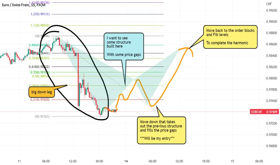
Harmonics how toThis is what I look for, trades with great RR using fibs, structure, order blocks and price gaps...
-Big move (down or up)
-structure the other way to a harmonic fib retracement level
-that structure taken out with a move the other way filling price gaps
-entry with previous swing low as stops
-target is previous highs, also where there's liquidity
Golden Cross is a Golden Strategy?Hello Hello Traders ,
Please if you like the ideas, don't forget to support them with likes and comments thank you very much.
Here we go ,
I want to talk with yours about Golden Cross.
Defination,
The golden cross is a chart pattern with a short-term and a long-term moving average. Generally, 50-day data is used for short-term moving average and 200-day data is used for long-term moving average. This pattern can occur at any time, and the main idea is that the short-term average and the long-term average cross the long-term average from the bottom up.
Let's look at the stages of when we can decide that it is a golden cross.
Step 1 ,
⦁ During a downtrend, the short-term moving average is below the long-term moving average.
Step 2 ,
⦁ With the appearance of a trend change in the market, short-term moving averages exceed long-term moving averages
Step 3 ,
⦁ In an uptrend, the short-term moving averages stay above the long-term moving averages.
The summarize of the Steps,
The first phase requires that a downtrend finally bottoms out as the sell-off is exhausted. In the second phase, the short-term moving average surpasses the longer-term moving average, indicating a trend reversal. This is a bullish signal. In the final stage, the uptrend continues until higher prices and its short-term movements remain above the average, long-term. Until the intersection of death is seen.
When we look Our Chart ,
I examined 2 golden crosses of BTC-USDT formed between 27 July and 19 November.
First Orange circle , As you can see on the chart on July 27, the 50-day bitcoin average cuts the 200-day average from below. At this stage, we see that the BTC-USDT value has increased with the high purchases. With the death cross that took place on September 13, btc usdt went down with high sales.
Second Orange Circle, As you can see on the chart on Octobe 6 the 50-day bitcoin average cuts the 200-day average from below. The rise with high purchases shows us the effect of golden cross on coins. With the realization of the golden cross, btc usdt continued to rise above the 50-day average and saw the top point in the period on November 11th. With the death cross that took place on November 19, btc usdt started to decline.
Conclusion,
Period represents a specific time period. The most commonly used moving averages when evaluating the gold cross indicator are the 50 and 200-period moving averages. In general, larger timeframes create stronger permanent breaks.
The higher the chart time frame, the stronger and more persistent the golden cross break will be.
The long-term moving average is a strong support area when the crossover occurs. Therefore, when there is a golden cross, it is a high buy zone and at this time we can make the necessary investment in the coin.
I really hope it will be useful for you.
Make big profits!

Why are fundamentals ESSENTIAL in forex trading?What is the thing that manipulates the market to make sure your stop loss is touched in less than a minute? Simple, Fundamentals.
Forex trading constitutes the most accessible form of trading for individuals. Low barrier entries, low commissions, forex possess everything that a young trader wants. However, content that most young traders learn from on YouTube puts emphasis on technical analysis and neglects fundamental trading.
Big institutions like central banks or hedge funds, who are the ones moving the price, always make entries depending on the economics of a state. For example, EURUSD has recently reached the historical level of under 1.00000, a level that hasn’t been reached for over 20 years, after the European Union stopped dealing gas and oil with Russia.
(see the image in the chart)
Furthermore, oil prices are closely related to Canadian currency, where increasing the price will increase the value of the currency. As the price of oil is increasing, AUDCAD is reaching historical levels of under 0.86000.
Therefore, we can clearly see that fundamentals influence the market’s direction.
We can apply fundamentals to reduce our risk as well. Indeed, we can identify risky opportunities and filter out bad trades or reduce the position size.
However, over the short term technical analysis can be a practical tool to determine price reversals or the timing of an entry. History tends to repeat itself, it is the same about markets. As a matter of fact, we can use historical market price data to forecast market movements.
In a perfect world, each trade would be the result of a mix of the two, with fundamental analysis assisting technical analysis. In conclusion, digital content to learn trading leans toward technical analysis even though fundamentals contribute to an important part of profitable trades by forecasting future market prices.

WHAT ARE GAPS? TRIGGERS AND TIPS TO SPOT & TRADE THEM
Gaps are important parts of the financial market, especially in stocks and currencies. They happen when an asset opens at a significantly lower or higher price than where it closed at.
Gap is a situation where a currency or any other asset opens sharply lower or higher than where it closed the previous day. Such a gap happens when there is a major event or news when the markets are closed.
It usually represents an area where there is no trading taking place.
There are three main scenarios that happen after a gap in the market forms.
First, an asset price can continue moving in the direction of the gap. For example, when a bullish gap forms, an asset’s price can continue with that trend.
Second, a gap can be filled within a few days or months.
Finally, a gap can be followed by a long period of consolidation as traders focus on the next major moves. In all these, it is always good to focus on the asset’s volume.
The most common strategy of gap trading is when you decide to enter a trade in the opposite direction of the gap. In this case, you will be betting that the asset will reverse after forming a gap. Ideally, one way of doing this is to check the trends of volume after the gap happens.
Still, the risk of doing this is that the asset will either consolidate or resume the gap trend.

47. A lesson in SYMMETRYGood evening,
Those of you who have read my ideas surely know my views are totally different from the rest.
It rest upon the use of the simple COMMON SENSE and constantly on the look out for what WORKS and what DON'T.
Perhaps I may be able to convince you now on the use of the simple ABCD. If you have, you would have made some handsome profit.
ABCD rest upon the simple fact that price moves in SYMMETRY. Don't ask me why but it seems that is how it is. All you need to do is pay attention to its movement. If you need PROOF, I am sure you can find lots of it in the chart.
The FED will PIVOT. Logic and Common Sense will tell you that they can't continue to keep raising rates. It will have to stop one day.
The 10y/02y had been inverted since 04/2022 and 07/2022. This means a RECESSION is coming, most likely in spring 2023.
The 10y/03m had just inverted. This means a PIVOT is near. Not forgetting that the MOVE Index is around 150.
So other than guessing WHEN the FED will PIVOT, perhaps we may also want to know HOW LOW EURUSD will go.
Good luck.
P/S : As always, do not just believe what I say. Use your common sense.

Fundamental analysis in cryptoThrough fundamental analysis , we can try to detect the authentic and objective value of cryptocurrencies in spite of their market price.
Through these techniques, we can assess whether a cryptocurrency is undervalued or overvalued, and we can detect a trading opportunity.
With fundamental analysis , traders evaluate and study what can affect the price of a security, such as external factors or events. This type of analysis takes advantage of tools like periodic financial statements, financial ratios, economic forecasts and other types
of additional information that can affect the value of a security.
There are different approaches to fundamental analysis that analyse micro and macroeconomic variables in different ways:
1. Top-down approach: through this approach, the trader analyses macroeconomic variables first and then microeconomic variables. Global information is taken in first, followed by more detailed and specific values and variables addressed. With this approach, the trader looks at the world economic situation, and then looks more at the most economically attractive countries, along with the sectors with the most potential, and within them, chooses which ones are most convenient to invest in.
2. Bottom-Up approach: this approach is the opposite of the previous one: first the trader chooses companies with growth potential, analyses the sector they operate in and then the economic situation of their countries; the overall global economic situation is the last thing to be analysed.
THE ADVANTAGES:
This approach allows the investor to collect and analyse information external to the markets but that might still influence prices. This way, the investor has a clearer vision of the reality of the market.
THE DISADVANTAGES:
The trader using fundamental analysis needs more thorough knowledge and experience of accounting, business and, in the specific, the sector of interest.
Moreover, investment terms with a fundamental analysis are longer because it requires more studying and background with respect to other analytical tools, like technical one.
It can also be outweighed by chance factors, such as physical disasters affecting commodity prices and companies in general. In general, markets can also be surprised by unexpected changes in economic and political scenarios.
In the specific case of crypto markets, fundamental analysis can be used to analyse the exterior components that can affect cryptocurrencies.
Fundamental analysis can be carried out by looking at its use cases or community, but also at the team behind every specific crypto project, something that tells a lot about its
overvaluation or undervaluation.
Indeed, in the case of crypto markets, there are no financial statements, and therefore they cannot be evaluated as normal financial assets. Most cryptocurrencies are still in the
developing stage and they do not have a lot of real-world applications; they rely mostly on miners, users and, of course, developers.
It can be of great importance given that crypto markets are relatively more volatile and less stable than others, and due to their irregular situation investors react quickly to exogenous factors. These factors can vary and go from regulatory pressures to simple tweets - take Elon Musk as an example.
Fundamental analysis can indeed help comprehend the fair value of crypto assets - data about this can be found on different websites, such as Reddit or Telegram. The use of technology is of utter importance.
The investor can assess the usability of the adoption of the cryptocurrency he's interested in, but this tool can also be used to study how governments value cryptocurrencies and whether they want to implement new regulatory policies about it. We can also identify the progress that it's being made in terms of technology, such as how the activity of cryptocurrency is developing, along with its software or media coverage - all these factors contribute to
increasing the crypto asset's value.
From a psychological point of view, it can also help the investor trade with more confidence, knowing that a thorough analysis has been carried out. When the analysis is done daily, it
can help you develop a finer investment strategy.
In terms of financial metrics, what can be used is:
Market capitalisation: the investor can look at the total market worth of cryptocurrency, which indicates whether there is space for growth. To get that, you multiply the current price per coin by its supply.
Liquidity, or how easy it is to buy or sell the asset. A liquid market is a competitive market and is usually favoured by investors, also because it entails a lower bid-ask spread.
Volume:
it spurs liquidity because it is telling of how much money has been exchanged for a certain asset.
Fundamental analysis usually prioritises the assessment of transaction values. If the transaction value is consistently high, it means that the cryptocurrency is in steady circulation.
Fees:
they reflect the demand on the blockchain. Every cryptocurrency can have its own transaction fee.
The assessment of the fees paid over various periods gives the
trader an idea of how secure the crypto asset is.
Supply mechanisms:
general microeconomics state that when supply is low and demand is high, price rises. A general belief for cryptocurrencies is that when supply runs out, the price will rise (this is, for example, a general prediction of Bitcoin holders). On the other hand, investors can also use project metrics for their fundamental analysis:
Whitepaper:
it is a technical document outlining the purpose and operation of the
project. It should comprise the blockchain technology solutions, the use cases for the currency, the planned features and upgrades, sale and team information, and tokenomics (the factors that impact the tokens' use and value).
The team:
crypto teams are easily accessible to assess nowadays so that the investor can learn more about them and their credibility.
The competitors:
the investor can conduct an analysis of the crypto assets; competitors. If there are other cryptos which are more widely adopted or valuable, maybe it is best to back off from the item of interest.
Last but not least, important instruments when evaluating cryptos through fundamental analysis are Blockchain metrics or On-chain metrics. The rising popularity of blockchain
has made sure that lots of different types of information could become extremely popular, such as the number of active users, total transactions and transaction value.
There are three fundamental metrics in this case:
1. Hash Rate :
this is a measure of the mining machine's ability to conduct hashing computations in an efficient way.
The hash rate also determines the profitability of the miner, as it indicates the likelihood that a block will be mined, and, indirectly, the chance of receiving the block reward. An investor should look at cryptos with a more extensive network because they are more resistant to attacks or data manipulation.
2. Status and Active Addresses:
active addresses measure the number of dynamic blockchain addresses over a period of time. They are helpful in comparing the growth or decline of the activity or interest in the coin or token. The investor can also get to
the active address through the computation of the total number of unique addresses over time (and a comparison of the results).
3. Transaction values : they can be determined for the assessment of the regular circulation of the crypto asset. It indicates how much money was exchanged on a given period, and therefore, the number of transactions.

Mastering and Understanding Candlesticks Patterns
An overview of Candlesticks
A candle represents the changes in price over an interval of time, such as 1 day or 1 minute. The main body of the candle illustrates the opening price at the start of the time interval and the price when the market closed at the end of the interval. The length of the shadows shows how much the price has moved up and down with respect to a candlestick within a specific duration.
The candlestick body describes the difference between the opening and closing prices for the corresponding time period.
THe market is a battleftield between buyers and sellers. If one side is stronger than the other, the financial markets will see the following trends emerging:
If there are more buyers than sellers, or more buying interest than selling interest, the buyers do not have anyone they can buy from. The prices then increase until the price becomes so high that the sellers once again find it attractive to get involved. At the same time, the price is eventually too high for the buyers to keep buying.
However, if there are more sellers than buyers, prices will fall until a balance is restored and more buyers enter the market.
The greater the imbalance between these two market players, the faster the movement of the market in one direction. However, if there is only a slight overhang, prices tend to change more slowly.
When the buying and selling interests are in equilibrium, there is no reason for the price to change. Both parties are satisfied with the current price and there is a market balance.
Analysis aims at comparing the strength ratio of the two sides to evaluate which market players are stronger and in which direction the price is, therefore, more likely to move.

CYPHER Harmonic Pattern - Made Easy For Everyone !The Cypher harmonic pattern is a technical analysis indicator used by traders to identify valuable support and resistance levels based on the Fibonacci sequence of numbers and detect trend reversals.
Here, in this article, we explain how the Cypher harmonic pattern works, identify it, and trade it.
What is the Cypher Harmonic Candlestick Pattern?
The Cypher harmonic pattern is a technical analysis formation indicating a price-action reversal.
The pattern was discovered by D. Oglesbee and is known as a relatively advanced pattern formation. In structure, the Cypher pattern is similar to the butterfly harmonic pattern; however, the Cypher is not a very common chart pattern due to its unique Fibonacci ratios.
The Cypher pattern, which can be either bullish or bearish, has five points (X, A, B, C, and D) and four legs (XA, AB, BC, and CD). Like any other harmonic pattern, the theory behind the Cypher chart pattern is that there is a strong correlation between Fibonacci ratios and price movements.
Eventually, the market is expected to reverse from point D after the four market swing wave movements
How to Identify and Use the Cypher Harmonic Pattern in Forex Trading?
Much like any other harmonic chart pattern, several conditions must occur so you can identify the Cypher pattern:
B point retracement of the primary XA leg ranges between 38.2% to 61.8% Fibonacci levels
C point is an extension leg with a Fibonacci ratio that should be between 127.2% to 141.4% of the primary XA leg
D point should break the 78.6 retracement level of XC
Let’s see what the Cypher harmonic pattern looks like on a trading chart.
Cypher Pattern – Set a Stop Loss
A reasonable stop-loss level when trading the Cypher pattern is simple and does not necessarily require the combination of Fibonacci retracement.
All you need to do is to place the stop loss somewhere below the D level because if this level breaks, the entire Cypher pattern is invalidated. So, the stop would be placed at the next support or resistance level, which is the X-point
Cypher Pattern – Set a Take Profit Target
The simple Cypher pattern trading method is using its points as profit targets, meaning the A and C levels.
How accurate is the Cypher harmonic chart pattern?
The Cypher harmonic pattern has been historically proven to be a fairly reliable and accurate chart pattern. According to various studies, the pattern has an accuracy rate of around 70%.

Quotes from Stock Market Wizards“Buy things that are going up. Sell things that are going down. And when they stop, get out!” - Rob Smith
Meaning : Buying when low and selling when high is not enough. You also need to know the direction the instrument will move in.

TRADING FOR BEGINEERS! USING SUPPORT AND RESISTANCE IN 2022!!!This tutorial video discusses how to find KEY support and resistance within trading on any timeframe or market including FOREX, STOCKS or CRYPTO. DROP A LIKE AND SHARE WITH OTHER PEOPLE.
P.S NOT A FINANCIAL ADVISOR... JUST FOR EDUCATIONAL AND LEARNING PURPOSES ONLY...
