StochRSI indicator and support and resistance levels
Hello, traders.
If you "follow" me, you can always get the latest information quickly.
Have a nice day today.
-------------------------------------
The StochRSI indicator on the left chart is slightly different from the StochRSI indicator on the right.
The StochRSI indicator on the left chart is the StochRSI indicator provided by default in TradingView, and the StochRSI indicator on the right chart is an indicator with a modified formula.
The StochRSI indicator is a leading indicator that is reflected almost in real time.
Therefore, it reacts sensitively to price changes.
Although it is advantageous because it reacts sensitively, it also increases the possibility of being caught in a fake, so I thought that a slight delay(?) was necessary, and so I created the StochRSI indicator on the left chart.
If you look at the relationship between the K and D of the StochRSI indicators on the two charts, you can see that there is a big difference.
In the end, you can predict the movement by checking whether the movement of the K line has escaped the overbought or oversold section.
However, I think that you will receive information that can determine the sustainability of the trend depending on the positional relationship between K and D.
Therefore, it is important to distinguish the inflection points that occur in the StochRSI indicator.
This is because these inflection points provide important information for drawing trend lines.
Therefore, the StochRSI indicator on the left chart, which better expresses the inflection point, is being used to draw the trend line.
(Unfortunately, this indicator was not registered on TradingView because I did not explain it well.)
-
As a new candle was created, the StochRSI indicator on the left chart is showing an inflection point on the K line.
The StochRSI indicator on the right chart is showing a transition to a state where K < D.
We will have to check whether the inflection point was created only when today's candle closes, but I think that the fact that it is showing this pattern means that there is a high possibility of a change in the future trend.
Since the next volatility period is expected to start around July 2nd (July 1st-3rd), I think it has started to show meaningful movements.
-
It is true that you want to buy at the lowest price possible and sell at the highest price.
However, because of this greed, one mistake can lead to a loss that can overturn nine victories, so you should always be careful.
Therefore, if possible, it is better to check for support and respond.
In that sense, I think it is worth referring to the relationship between K and D of the StochRSI indicator on the left chart.
This is because the actual downtrend is likely to start when K < D.
-
In order to check for support, you definitely need support and resistance points drawn on the 1M, 1W, and 1D charts.
Ignoring this and checking for support at the drawn support and resistance points can result in not being able to apply the chart you drew to actual trading.
Therefore, you should draw support and resistance points first before starting a trade.
Otherwise, if you draw support and resistance points after starting a trade, you are more likely to set support and resistance points that reflect your subjective thoughts, so as I mentioned earlier, you are more likely to lose faith in the chart you drew.
If this phenomenon continues, it will eventually lead to leaving the investment market.
-
It is important to determine whether there is support by checking the correlation between the StochRSI indicator and other indicators at the support and resistance points drawn on the 1M, 1W, and 1D charts.
Even if the inflection point of the StochRSI indicator or other indicators occurs at a point other than the support and resistance points you drew, you should consider it as something that occurred beyond your ability to handle.
In other words, you should observe the price movement but not actually trade.
As I mentioned earlier, if you start to violate this, you will become less and less able to trust the chart you drew.
-
Accordingly, the basic trading strategy I suggest is to buy near the HA-Low indicator and sell near the HA-High indicator.
However, since the HA-Low and HA-High indicators are expressed as average values, they may move in the opposite direction to the basic trading strategy.
In other words, if the HA-Low indicator is resisted and falls, there is a possibility of a stepwise downward trend, and if the HA-High indicator is supported and rises, there is a possibility of a stepwise upward trend.
Therefore, the basic trading strategy mentioned above can be considered a trading strategy in the box section.
In the case of deviating from this box section, it is highly likely to occur before and after the volatility period indicated by the relationship between the trend line using the StochRSI indicator mentioned above and the support and resistance points drawn on the 1M, 1W, and 1D charts.
Therefore, special care is required when conducting new transactions during the volatility period.
This is because there is a high possibility of being caught in a fake when trading during the volatility period.
-
The DOM(60) and DOM(-60) indicators are good indicators to look at together with the HA-Low and HA-High indicators.
The DOM indicator is an indicator that comprehensively evaluates the DMI, OBV, and MOMENTUM indicators.
Therefore, the DOM(60) indicator is likely to be at the end of the high point range, and the DOM(060) indicator is likely to be at the end of the low point range.
In the explanation of the HA-Low and HA-High indicators,
- I said that if the HA-Low indicator receives resistance and falls, there is a possibility that a stepwise downtrend will begin,
- and if the HA-High indicator receives support and rises, there is a possibility that a stepwise uptrend will begin.
In order for an actual stepwise downtrend to begin, the price must fall below DOM(-60), and in order for a stepwise uptrend to begin, it must rise above DOM(60).
In other words, the DOM(-60) ~ HA-Low section and the HA-High ~ DOM(60) section can be seen as support and resistance sections.
-
If these correlations start to appear, I think you will be able to create a trading strategy that fits your investment style without being swayed by price volatility and proceed with trading.
The reason for analyzing charts is to trade.
Therefore, the shorter the time for chart analysis, the better, and you should increase the start of creating a trading strategy.
-
Thank you for reading to the end.
I hope you have a successful trade.
--------------------------------------------------
Bitcoin (Cryptocurrency)

Sharing the advanced Bollinger Bands strategyHere are the Bollinger Band trading tips: *
📌 If you break above the upper band and then drop back down through it, confirm a short signal!
📌 If you drop below the lower band and then move back up through it, confirm a long signal!
📌 If you continue to drop below the middle band, add to your short position; if you break above the middle band, add to your long position!
Pretty straightforward, right? This means you won’t be waiting for the middle band to signal before acting; you’ll be ahead of the game, capturing market turning points!
Let’s break it down with some examples:
1. When Bitcoin breaks above the upper Bollinger Band, it looks strong, but quickly drops back below:
➡️ That’s a “bull trap”—time to go short!
2. If Bitcoin crashes below the lower band and then pops back up:
➡️ Bears are running out of steam—time to go long and grab that rebound!
3. If the price keeps moving above the middle band:
➡️ Add to your long or short positions to ride the trend without being greedy or hesitant.
Why is this method powerful?
It combines “edge recognition + trend confirmation” for double protection:
1. Edge Recognition—spot the turning point and act early.
2. Trend Confirmation—wait for the middle band breakout and then confidently add positions!
You won’t be reacting after the fact; you’ll be ahead of the curve, increasing your positions in the trend’s middle and locking in profits at the end. This is the rhythm of professional traders and the core logic of systematic profits!
Who is this method for?
- You want precise entry and exit points.
- You’re tired of “chasing highs and cutting losses.”
- You want a clear, executable trading system.
- You want to go from “I see the chart but don’t act” to “I see the signal and take action.”
Follow for more. Make sure to like this if you found it useful.

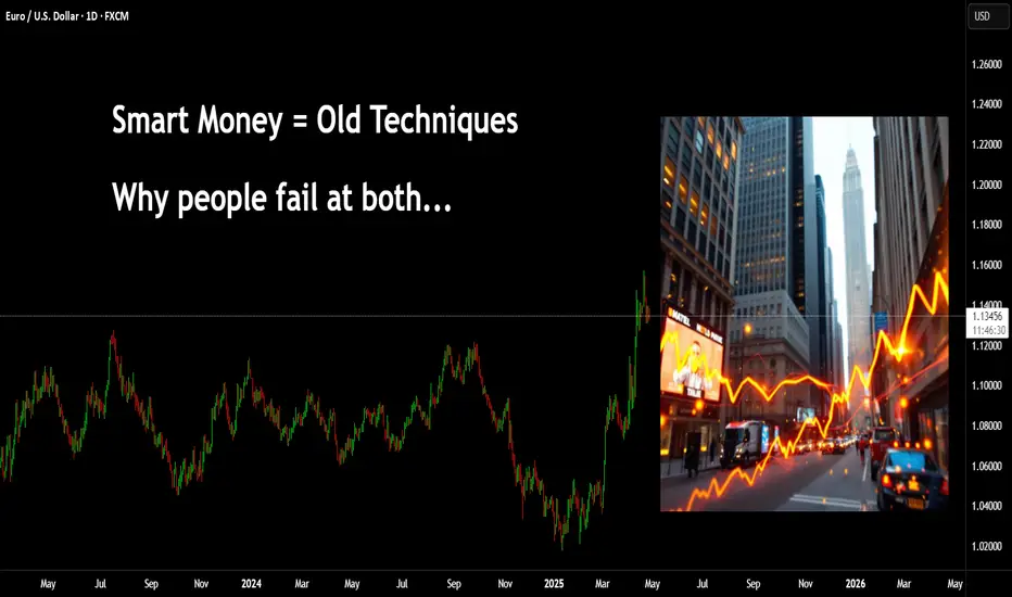
Mechanical rangesMany traders will talk about things like "Smart Money Concepts" (SMC) and think they have found something new.
The truth is, everything in trading stems back to Liquidity.
There is no "Algo" nobody is out to get you specifically. The market is always right, where you position yourself is your own choice.
I have written several posts on mechanical trading, recorded a number of streams. The more mechanical you can make the process, the less the emotions have a chance to kick your ass.
Let me give you a very simple method of being able to identify the ranges. Ignore the timeframes as this will work on any of them, on most instruments. (I say most, as some behave differently due to how it attracts liquidity). Lets assume high end crypto such as Bitcoin (BTC) and of course Forex in the general sense, stocks, commodities etc.
This is simple - only 2 rules.
You start by zooming out and giving yourself a general feel for the trend.
Let's say this looks to be an uptrend - we now need to understand the rules.
An opposing candle can simply be defined by a different colour. If the trend is up (Green) and we see a red candle - then it's an opposing candle.
The inverse is true, if we are down and the trend is Red. Then a Green candle would be opposing.
This is only half of the story. The second rule is a pullback candle or even a sequence of candles. This simply means either the very same opposing candle that doesn't make a new high or low (depending on the trend up not making fresh highs or down not taking new lows).
In this image, you can see we have in one candle both an opposing and pullback in one candle. This means we can now mark the high of the range. Working backwards to identify the swing range low.
This easy method means I can draw a range exactly the same and mechanically every single time.
Giving me a mechanical range.
We could then get a lot more technical by looking for liquidity, 50% of the range or places such as supply or demand areas.
But these are all for other posts.
For now, getting a range on the higher timeframes means you can work down and down into a timeframe you are likely to want to trade on.
These ranges will give clues to draws and runs of liquidity.
This will also help identify changes in the character and fresh breaks of structure.
Here's another post I posted on the mechanical structures and techniques.
More in the next post.
Have a great week!
Disclaimer
This idea does not constitute as financial advice. It is for educational purposes only, our principal trader has over 25 years' experience in stocks, ETF's, and Forex. Hence each trade setup might have different hold times, entry or exit conditions, and will vary from the post/idea shared here. You can use the information from this post to make your own trading plan for the instrument discussed. Trading carries a risk; a high percentage of retail traders lose money. Please keep this in mind when entering any trade. Stay safe.

How Bitcoin can impact alt coins like sol and sui This video is a very quick update on the potential for bitcoin to drop into the 96/97k region and the effect it will have on alt coins .
If you hold altcoins and you see them bleed in price then its important to know and understand whats ahead for Bitcoin .
Understanding this will help you with your entry's and your exits on all altcoins .

An example of a new way to interpret the OBV indicator
Hello, traders.
If you "follow", you can always get new information quickly.
Have a nice day today.
-------------------------------------
I think the reason why there are difficulties in using auxiliary indicators and why they say not to use indicators is because they do not properly reflect the price flow.
Therefore, I think many people use indicators added to the price part because they reflect the price flow.
However, I think auxiliary indicators are not used that much.
Among them, indicators related to trading volume are ambiguous to use and interpret.
To compensate for this, the OBV indicator has been modified and added.
-
The ambiguous part in interpreting the OBV indicator is that the price flow is not reflected.
Therefore, even if it performs its role well as an auxiliary indicator, it can be difficult to interpret.
To compensate for this, the High Line and Low Line of the OBV auxiliary indicator have been made to be displayed in the price section.
That is, High Line = OBV High, Low Line = OBV Low
-
Then, let's interpret the OBV at the current price position.
The OBV of the auxiliary indicator is currently located near the OBV EMA.
That is, the current OBV is located within the Low Line ~ High Line section.
However, if you look at the OBV High and OBV Low indicators displayed in the price section, you can see that it has fallen below the OBV Low indicator.
In other words, you can see that the price has fallen below the Low Line of the OBV indicator.
You can see that the OBV position of the auxiliary indicator and the OBV position displayed in the price section are different.
Therefore, in order to normally interpret the OBV of the auxiliary indicator, the price must have risen above the OBV Low indicator in the price section.
If not, you should consider that the interpretation of the OBV of the auxiliary indicator may be incorrect information.
In other words, if it fails to rise above the OBV Low indicator, you should interpret it as a high possibility of eventually falling and think about a countermeasure for that.
Since time frame charts below the 1D chart show too fast volatility, it is recommended to use it on a 1D chart or larger if possible.
-
It is not good to analyze a chart with just one indicator.
Therefore, you should comprehensively evaluate by adding different indicators or indicators that you understand.
The indicators that I use are mainly StochRSI indicator, OBV indicator, and MACD indicator.
I use these indicators to create and use M-Signal indicator, StochRSI(20, 50, 80) indicator, and OBV(High, Low) indicator.
DOM(60, -60) indicator is an indicator that comprehensively evaluates DMI, OBV, and Momentum indicators to display high and low points.
And, there are HA-Low, HA-High indicators, which are my basic trading strategy indicators that I created for trading on Heikin-Ashi charts.
Among these indicators, the most important indicators are HA-Low, HA-High indicators.
The remaining indicators are auxiliary indicators that are necessary when creating trading strategies or detailed response strategies from HA-Low, HA-High indicators.
-
Thank you for reading to the end.
I hope you have a successful trade.
--------------------------------------------------

Explanation of indicators indicating high points
Hello, traders.
If you "Follow", you can always get new information quickly.
Have a nice day today.
-------------------------------------
(BTCUSDT 1D chart)
If it falls below the finger point indicated by the OBV indicator, it can be interpreted that the channel consisting of the High Line ~ Low Line is likely to turn into a downward channel.
And, if it falls to the point indicated by the arrow, it is expected that the channel consisting of the High Line ~ Low Line will turn into a downward channel.
Therefore, if it is maintained above the point indicated by the finger, I think it is likely to show a movement to rise above the High Line.
In this situation, the price is located near the M-Signal indicator on the 1D chart, so its importance increases.
To say that it has turned into a short-term uptrend, the price must be maintained above the M-Signal indicator on the 1D chart.
In that sense, the 106133.74 point is an important support and resistance point.
(1W chart)
The HA-High indicator is showing signs of being created at the 99705.62 point.
The fact that the HA-High indicator has been created means that it has fallen from the high point range.
However, since the HA-High indicator receives the value of the Heikin-Ashi chart, it indicates the middle point.
In other words, the value of Heikin-Ashi's Close = (Open + High + Low + Close) / 4 is received.
Since the HA-High indicator has not been created yet, we will be able to know for sure whether it has been created next week.
In any case, it seems to be about to be created, and if it maintains the downward candle, the HA-High indicator will eventually be created anew.
Therefore, I think it is important to be able to maintain the price by rising above the right Fibonacci ratio 2 (106178.85).
Indicators that indicate high points include DOM (60), StochRSI 80, OBV High, and HA-High indicators.
Indicators that indicate these high points are likely to eventually play the role of resistance points.
Therefore,
1st high point range: 104463.99-104984.57
2nd high point range: 99705.62-100732.01
You should consider a response plan depending on whether there is support near the 1st and 2nd above.
The basic trading strategy is to buy at the HA-Low indicator and sell at the HA-High indicator.
However, if it is supported and rises in the HA-High indicator, it is likely to show a stepwise rise, and if it is resisted and falls in the HA-Low indicator, it is likely to show a stepwise decline.
Therefore, the basic trading method should utilize the split trading method.
Other indicators besides the HA-Low and HA-High indicators are auxiliary indicators.
Therefore, the trading strategy in the big picture should be created around the HA-Low and HA-High indicators, and the detailed response strategy can be carried out by referring to other indicators according to the price movement.
In that sense, if we interpret the current chart, it should be interpreted that it is likely to show a stepwise rise since it has risen above the HA-High indicator.
However, you can choose whether to respond depending on whether there is support from other indicators that indicate the high point.
On the other hand, indicators that indicate the low point include the DOM (-60), StochRSI 20, OBV Low, and HA-Low indicators.
These indicators pointing to lows are likely to eventually serve as support points.
I will explain this again when the point pointing to the lows has fallen.
-
Thank you for reading to the end.
I hope you have a successful trade.
--------------------------------------------------
- Here is an explanation of the big picture.
(3-year bull market, 1-year bear market pattern)
I will explain the details again when the bear market starts.
------------------------------------------------------

Correlation between USDT.D and BTC.D
Hello, traders.
If you "Follow", you can always get new information quickly.
Have a nice day today.
-------------------------------------
(USDT.D 1M chart)
If USDT dominance is maintained below 4.97 or continues to decline, the coin market is likely to be on the rise.
The maximum decline is expected to be around 2.84-3.42.
-
(BTC.D 1M chart)
However, in order for the altcoin bull market to begin, BTC dominance is expected to fall below 55.01 and remain there or show a downward trend.
Therefore, we need to see if it falls below the 55.01-62.47 range.
The maximum rise range is expected to be around 73.63-77.07.
-
In summary of the above, since funds are currently concentrated in BTC, it is likely that BTC will show an upward trend, and altcoins are likely to show a sideways or downward trend as they fail to follow the rise of BTC.
The major bear market in the coin market is expected to begin in 2026.
For the basis, please refer to the explanation of the big picture below.
-
Thank you for reading to the end.
I hope you have a successful transaction.
--------------------------------------------------
- This is an explanation of the big picture.
(3-year bull market, 1-year bear market pattern)
I will explain more details when the bear market starts.
------------------------------------------------------

Is It Time to Enter, or time to escape?One green candle is all it takes to trigger thousands of minds into thinking
Should I jump in now?
But is this truly a good entry point, or are you just afraid of missing the move?
Let’s break down how psychology tricks us into bad trades—and how to fight back with real chart data.
Hello✌
Spend 3 minutes ⏰ reading this educational material.
🎯 Analytical Insight on Bitcoin:
📈 Bitcoin is currently respecting a well-structured ascending channel, with price action aligning closely with a key Fibonacci retracement level and a major daily support zone—both acting as strong technical confluence. Given the strength of this setup, a potential short-term move of at least +6% seems likely, while the broader structure remains supportive of an extended bullish scenario toward the $116K target. 🚀
Now, let's dive into the educational section ,
📉 Why Do We Buy More When Markets Are High?
It’s a simple question—but the answer runs deep into our psychology. When a crypto pumps, and we’re not in it, our brain doesn’t analyze—it rationalizes:
"If I don’t buy now, I’ll miss out."
But most people who think like this enter at the top—and exit with regret .
🧠 The Psychology of FOMO and Poor Timing
In every rally, a large chunk of entries are triggered by FOMO (Fear of Missing Out).
But buying high means you're buying from those who bought lower.
And here's the trick: your brain loves the green candles—but ignores volume drops, RSI spikes, or exhaustion signals.
🛠 TradingView Tools to Spot Smart Entry Points
When it comes to entering a position, emotions are your worst advisor. Fortunately, TradingView offers powerful tools to help you act based on evidence, not instinct. Here’s how to use them:
🔹 Trend-Based Fib Extension: One of the best tools to estimate how much room a move still has. Plot it on the previous wave to identify realistic targets.
🔹 RSI (Relative Strength Index): When RSI is over 70 or under 30, you’re in emotional territory. Be careful—buying during peak RSI often means you're entering late.
🔹 MACD: Look for crossovers between lines and histogram patterns. Use it as confirmation—not a solo trigger—for entries.
🔹 Volume Profile: This hidden gem on TradingView shows you where most trading volume has occurred. Buying at volume-supported levels is way safer.
🔹 Alerts & Watchlists: Don’t glue yourself to the chart. Set alerts for your conditions and build smart watchlists to stay updated.
🔹 Replay Mode: Want to master entries without risking real capital? Use Replay Mode to test strategies and train your eyes.
If you want to replace "guessing" with "planning," these tools should be your daily companions.
🔍 5-Point Checklist Before You Hit "Buy"
Ask yourself these five questions before entering a trade:
Is the broader trend actually bullish—or is this just a short-lived bounce?
What does RSI or other indicators say about overbuying?
Are there major support/resistance zones nearby?
Is the volume confirming the move—or fading out?
Do you have a target and stop in place—or just a “need to be in”?
📊 No Plan Entry = Planned Loss
If you jump in without a clear plan, your only focus becomes: “Am I in profit yet?”
Not “Is my strategy playing out?”
And that’s the trap.
A solid entry means you have a signal, a plan, and controlled risk.
🧲 How to Avoid Getting Pulled Into Fake Rallies
Always check higher timeframes for confirmation
Don’t enter without volume agreement
Plan entries after pullbacks, not mid-hype
Think in probabilities, not dreams
🧭 Final Takeaway & Recommendation
Opportunities never end in the market.
Opportunities never end in the market.
Opportunities never end in the market.
Opportunities never end in the market.
Opportunities never end in the market.
Opportunities never end in the market.
Opportunities never end in the market.
i should write this thousand of time ☝️
But rushing in only guarantees missed ones.
Use your tools and stay calm.
The trader who plans always beats the one who panics.
always conduct your own research before making investment decisions. That being said, please take note of the disclaimer section at the bottom of each post for further details 📜✅.
Give me some energy !!
✨We invest countless hours researching opportunities and crafting valuable ideas. Your support means the world to us! If you have any questions, feel free to drop them in the comment box.
Cheers, Mad Whale. 🐋

Golden Cross? You are late! Here’s How to Get In Early.📉 “Golden Cross? No Thanks. Here’s How to Get In Early.”
By FXProfessor
Video here:
Everyone’s hyped about the Golden Cross again...
📰 “Bullish Signal!”
📈 “50 SMA crossed the 200!”
🎉 “Party time!”
Let me stop you right there.
If you’re waiting for that cross to go long —
You’re not late.
You’re definitely late.
The Golden Cross is a lagging indication.
It’s the afterparty. The smart money already had the drinks and left.
🔍 Here's the deal:
✅ Golden Cross forms after the move
✅ Price is usually already up double digits
✅ Sometimes it triggers right before a top
✅ Even EMAs (which I prefer) are still confirmation tools
✅ The real edge? Structure. Trendlines. Pressure zones.
📊 What I use instead:
-Custom EMAs that react faster
-My signature parallelogram method for early pressure
-Focus on trendlines and structure
-Above all — logic, not hype
- Fundamentals first!
For example, while the Golden Cross just printed, I was already watching $74,394 and $79,000.
Why? Because pressure builds before indicators react.
That's where the best entries live.
So next time someone posts
“Golden Cross confirmed!” 😏 Just smile and remember:
By the time the cross lights up, I’m already halfway to the next target.
Use EMAs if you like. But structure comes first.
That’s where the party starts.
One Love,
The FXProfessor 🧠📈
Disclosure: I am happy to be part of the Trade Nation's Influencer program and receive a monthly fee for using their TradingView charts in my analysis.

Market Psychology 101Good day traders and investors,
There are benefits to being (AWAKE) or at least there should be.
This is where I stand at the moment with the Bitcoin & crypto market. I do believe Is in the final stages of the bull market marked with a circle. The final stage has biggest gains and it happens in 30 to 45 days.
Most of what I wan to say is in the chart. Please, feel free to add something you feel I have missed or why you may disagree.
Kind regards,
Demetrios

Bitcoin Bulls Aim for $102K – Breakout or Rejection Ahead?🚀📈 Bitcoin Bulls Aim for $102K – Breakout or Rejection Ahead? 🔍🧠
Good morning, good afternoon, or good evening — wherever you are in the world, Bitcoin is pumping, and that’s always a good sign for the bulls! 🐂
In my last BTC update, we anticipated a bounce from the key support zone around $93,600–$93,800, and price respected this level to the dot, rocketing upward just as expected. 🔥✅ That level acted as a strong springboard, and now BTC is climbing through a well-respected ascending channel on the 15-min chart.
📊 Key levels to watch:
Middle of the channel: ~$98,689
Top of the channel: ~$100,636
Psychological level: $100,000
Projected breakout target: $102,774 (60% probability 🚦)
Major resistance beyond: $113,000
However, there's always the alternate scenario: a 40% chance that we reject under $97,400, re-enter the lower end of the channel, and potentially drop toward $92,000 if that support fails. This would flip the bullish structure short-term — something to keep on your radar. ⚠️
This is a high-momentum situation, and I’ll be watching for confirmation of breakout or breakdown. Stay alert, keep your risk in check, and let the chart guide your trades. 📉📈
Let me know your thoughts in the comments — are we headed for $113K or due for a cooldown?
One Love,
The FXPROFESSOR 💙

Mastering Order Blocks: How to Trade Like Smart MoneyIntroduction
Order Blocks (OBs) are one of the most critical concepts in Smart Money trading. They represent areas where institutional traders have entered the market with significant volume, typically leading to strong price movements. Identifying and trading Order Blocks gives traders an edge by aligning with the footprints of Smart Money.
What is an Order Block?
An Order Block is the last bearish candle before a bullish move for bullish OBs, or the last bullish candle before a bearish move for bearish OBs. These candles represent areas where institutions accumulated or distributed large positions, leading to a market shift.
Types of Order Blocks
A Bullish Order Block appears at the end of a downtrend or during a retracement just before the price moves sharply upward. It is typically represented by the last bearish candle prior to an impulsive bullish move. Price will often return to this level to mitigate institutional orders before continuing upward.
A Bearish Order Block, in contrast, forms at the end of an uptrend or retracement where price begins a downward reversal. It is characterized by the last bullish candle before a strong bearish move. Price tends to revisit this level to mitigate before continuing lower.
How to Identify a Valid Order Block
The key to identifying a valid Order Block is first observing a strong impulsive move, also known as displacement, that follows the OB candle. The move must also result in a break of market structure or a significant shift in direction. Order Blocks that produce Fair Value Gaps (FVGs) or Market Structure Shifts (MSS) tend to be more reliable. Another important sign is when price returns to the OB for mitigation, offering a potential entry.
Entry Model Using Order Blocks
After locating a valid OB, the next step is to wait for price to return to this area. The ideal entry happens within the OB body or near its 50% level. For extra confirmation, look for a Market Structure Shift or Break of Structure on a lower timeframe. Entries are more powerful when combined with additional elements like Fair Value Gaps, liquidity grabs, or SMT Divergences. The stop-loss should be placed just beyond the OB’s high or low, depending on the direction of the trade.
Refinement Techniques
To increase precision, higher timeframe OBs can be refined by zooming into lower timeframes like the 1M or 5M chart. Within a broad OB zone, identify internal market structure, displacement candles, or embedded FVGs to determine a more precise entry point. One effective refinement is the Optimal Trade Entry (OTE), which is often found at the 50% level of the Order Block.
Order Blocks vs. Supply and Demand Zones
While they may seem similar, Order Blocks are more narrowly defined and specifically related to institutional order flow. Supply and Demand zones are broader and typically drawn around areas of price reaction, but OBs are derived from the final institutional candle before a large move and are often confirmed by structure shifts or displacement. This makes OBs more precise and actionable in the context of Smart Money concepts.
Target Setting from Order Blocks
Targets after entering from an OB should align with liquidity objectives. Common targets include internal liquidity like equal highs or lows, or consolidation zones just beyond the OB. External liquidity targets such as previous major swing highs or lows are also ideal, especially when they align with imbalances or Fair Value Gaps. It's important to adjust targets based on the current market structure and trading session.
Common Mistakes to Avoid
A frequent mistake is treating any candle before a move as an OB without verifying key signals like displacement or a Break of Structure. Entering without other confirmations, such as an MSS or liquidity sweep, can lead to poor trades. Another common error is placing the stop-loss too tightly within the OB, instead of just beyond it, increasing the chance of premature stop-outs. Traders should also avoid executing OB trades during low-liquidity sessions where price action can be unpredictable and wicky.
Final Thoughts
Order Blocks are foundational to Smart Money trading. They allow you to enter where institutions have placed large positions and offer clear invalidation and entry logic. With practice, you can identify high-quality OBs and combine them with other concepts like FVGs, MSS, and SMT for powerful, precise trades.
Practice on different timeframes and assets, and always look for clean displacement and structure confirmation. Mastering OBs is a big step toward becoming a consistently profitable trader.
Trust the Blocks. Trade with Intention.

Why does it always go against you? You might be new to trading, you may have several years of experience. But, where a lot of people still seem to go wrong is in not realising the relationships.
I have posted hundreds of educational posts here on Tradingview from cartoons, trying to simplify techniques through to market relationships between technical systems such as Elliott Wave and Wyckoff.
Many new traders fall foul of social media posts covering "SMC - Smart Money Concepts" and are not seasoned enough to appreciate what or why these can work for some and not for others.
You have Elliott Wave traders, there is a saying along the lines of "if you put 10 Elliott traders in a room searching for a wave count you will come out with 11 different answers"
This isn't to say Elliott doesn't work, nor Smart Money.
The market seeks liquidity, it forms seemingly complex patterns that humans try to make sense of. We are great at that, seeing patterns even if they are not there. - Look, there's an upside-down butterfly 1.618 extension!
First, you need to appreciate Elliott Wave counts on smaller timeframe are pointless, especially in the age of algo's and bots. However, sentiment on the larger timeframes can't really be spoofed.
In this first image; you can see a market wave that is straight out of a textbook.
Let's also add some Wyckoff; if you were to visualise this - Wyckoff schematics would be visible on smaller timeframes, the Green boxes represent accumulation and the Red show distribution.
Let's overlay and Elliott Wave count -
Take that to the next level, this count is only part of a higher fractal count.
How does this fit into smart money concepts? well, it's more like - How does Smart Money fit into this?
Elliott waves and Wyckoff have been around for over 100 years. Many of the techniques shown on YT video's today can be traced back to these older concepts.
Now, if you can see how a 1-2 EW count pushes up for a 3. You can zoom in again and start to see what to expect when trading using SMC.
In this image you can see a drop, then a gap as price pushes back up (I haven't bothered drawing wicks for simplicity assume their inside the box)
Many traders would now anticipate a move that looks something like this.
Only to see price do this
Yeah - you're not the only one!
The next issue is where and how Supply and Demand is drawn.
Ok, the gap didn't hold, it must be the demand level there. GO AGAIN!!!
How did that play out? Trade 1, Trade 2 =
What about now?
Price holds the support
This time you are afraid to go in. Then one of two things happens.
1)
Or
2)
In the first image, we can see a sweep of prior liquidity and that creates momentum for a move up. In the second image, price simply melts away.
This is an easy fix. It all comes down to understanding what the charts are trying to tell you.
People love to talk about how "Smart Money" is the banks and institutional players - how they are playing against you on every click of the button.
The truth is, most people don't understand the market.
When larger players enter the market, the can leave a pretty obvious footprint. In addition to that - they leave behind orders they had but were unable to fill. These orders they will be defended with even more buying or selling (if they need to), and this is the premise for a rally and pullback or a drop to pullback.
Now, visualise a 1-2 Elliott Wave move. Why do you think 2 often comes back so deep?
What would you expect the move from 2-3 to do?
Powerful push, yes?
In this image, the move that created demand is simply the opposing colour candle before the power play. The significant move pushed up (showing institutional involvement). Hence, a location they will likely defend.
In addition to the push up, they pushed with so much money - it created a natural gap.
This type of example doesn't always have to be a power play 1-5 up, it could be visualised on pullback moves too.
Here's a great example recently on Euro.
The demand candle 'buy before the sell" is clearly targeted on the way up. Price fails to close above it, drops, goes back to retest - sweeps and drops. If you were to zoom in you will see on smaller timeframes evidence of a Wyckoff schematic with a UTAD.
Add a volume profile there.
As the price breaks above, after it's pullback you can see an acceleration in price and of course the area has the PoC.
Back to where people go wrong.
They will see this GAP created and assume price will come back here to reject and go. However, look closer and the demand that started the move is very near that gap.
Where is the juicy liquidity? PoC is another little clue.
Let's take this to another level.
In this image I have a range, using the prior high just to give the example in this post.
We are in an uptrend = we just broke the high, we expect a Pullback. Where would that likely target?
Zoom in again. This time I have added a fixed range volume tool.
What do you know?!
Anyways, once you get a handle on the bigger picture and understand the relationships, you can zoom into any timeframe you like - the game is always the same.
Have a great week all!
Disclaimer
This idea does not constitute as financial advice. It is for educational purposes only, our principal trader has over 25 years' experience in stocks, ETF's, and Forex. Hence each trade setup might have different hold times, entry or exit conditions, and will vary from the post/idea shared here. You can use the information from this post to make your own trading plan for the instrument discussed. Trading carries a risk; a high percentage of retail traders lose money. Please keep this in mind when entering any trade. Stay safe.
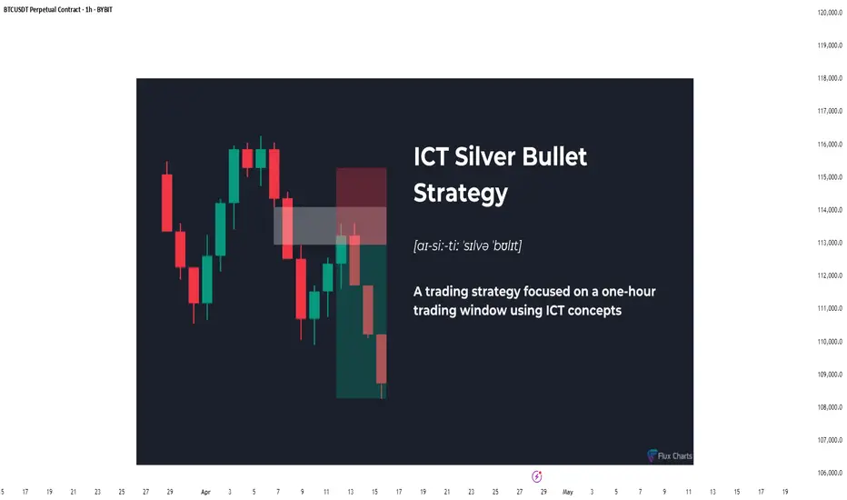
The Hidden Power of the Silver Bullet Strategy - Full GuideIntroduction
The Silver Bullet Strategy is a high-probability intraday trading technique popularized within the Smart Money Concepts community. It focuses on taking precision trades during specific times of the day when liquidity is most active. Mastering this strategy can help traders consistently capture high-quality setups with minimal risk.
In this guide, we will cover:
- What the Silver Bullet Strategy is
- Key Times to Watch
- Entry Models
- Target Setting
- Risk Management
- Real Chart Examples
---
What is the Silver Bullet Strategy?
The Silver Bullet Strategy is based on trading within a "window" of high-probability price action, typically during key liquidity times. It looks to capture moves after liquidity sweeps, order block mitigations, and Fair Value Gap (FVG) plays.
Key Principles:
- Focuses on high-probability windows (New York session especially)
- Waits for a liquidity grab and displacement
- Entries are often on FVGs, OBs, or MSS points
---
Silver Bullet Timing Windows
Timing is crucial to this strategy. The "Silver Bullet" typically occurs in these windows (New York time):
- First Window: 10:00 AM - 11:00 AM (New York)
- Second Window: 2:00 PM - 3:00 PM (New York)
These times capture major moves post-liquidity sweeps or reversals after news/market manipulation.
---
Silver Bullet Entry Model
The classic sequence for a Silver Bullet setup:
1. Identify Liquidity Sweep: Look for price to grab liquidity above a swing high or below a swing low.
2. Look for Displacement: A strong move away from the sweep, creating a Fair Value Gap (FVG) or Breaker Block.
3. Entry in FVG or OB: Enter on a retracement into the FVG or Order Block after displacement.
4. Confirmation: Use lower timeframe MSS or BOS to confirm the reversal.
Liquidity sweep and FVG at the 5m:
MSS + Displacement candle at the 1m:
So all 4 steps completed!
Example Entry Checklist:
- Liquidity sweep
- Strong displacement creating an FVG
- Price retraces into FVG or OB
- MSS/BOS confirmation
- Execute trade with tight stop-loss
---
Where to Set Targets
Targets should be logical based on market structure:
- First Target: Recent internal liquidity (equal highs/lows)
- Second Target: External liquidity zones (major swing highs/lows)
- Optional: Use 1R/2R/3R scaling based on risk-to-reward goals
---
Risk Management for Silver Bullet Trades
Golden Rules:
- Risk less than 1% per Silver Bullet setup
- Set stop-loss beyond the liquidity sweep (not too tight, not too loose) or above FVG
candle
- Stick to one or two trades per window maximum
- Avoid revenge trading outside the windows
---
Common Mistakes to Avoid
- Trading outside the specified time windows
- Entering without a confirmed sweep and displacement
- Overleveraging because the strategy "looks easy"
- Ignoring higher timeframe bias (HTF context is still critical!)
Pro Tip: Combine Silver Bullet entries with SMT Divergences, MSS, and IFVGs for maximum confluence.
---
Final Thoughts
The Silver Bullet Strategy is one of the cleanest ways to approach intraday trading. By mastering liquidity concepts, timing, and precision entries, traders can catch powerful moves with strong risk-to-reward setups.
Be patient, wait for your window, and always trade with discipline.
Happy Sniping!
Real Success Rates of the Falling Wedge in TradingReal Success Rates of the Falling Wedge in Trading
The falling wedge is a chart pattern highly valued by traders for its potential for bullish reversals after a bearish or consolidation phase. Its effectiveness has been extensively studied and documented by various technical analysts and leading authors.
Key Statistics
Bullish Exit: In 82% of cases, the exit from the falling wedge is upward, making it one of the most reliable patterns for anticipating a positive reversal.
Price Target Achieved: The pattern's theoretical target (calculated by plotting the height of the wedge at the breakout point) is achieved in approximately 63% to 88% of cases, depending on the source, demonstrating a high success rate for profit-taking.
Trend Reversal: In 55% to 68% of cases, the falling wedge acts as a reversal pattern, signaling the end of a downtrend and the beginning of a new bullish phase.
Pullback: After the breakout, a pullback (return to the resistance line) occurs in approximately 53% to 56% of cases, which can provide a second entry opportunity but tends to reduce the pattern's overall performance.
False Breakouts: False exits represent between 10% and 27% of cases. However, a false bullish breakout only results in a true bearish breakout in 3% of cases, making the bullish signal particularly robust.
Performance and Context
Bull Market: The pattern performs particularly well when it appears during a corrective phase of an uptrend, with a profit target reached in 70% of cases within three months.
Gain Potential: The maximum gain potential can reach 32% in half of cases during a bullish breakout, according to statistical studies on equity markets.
Formation Time: The wider the wedge and the steeper the trend lines, the faster and more violent the post-breakout upward movement will be.
Comparative Summary of Success Rates:
Criteria Rate Observed Frequency
Bullish Exit 82%
Price Target Achieved 63% to 88%
Reversal Pattern 55% to 68%
Pullback After Breakout 53% to 56%
False Breakouts (False Exits) 10% to 27%
Bullish False Breakouts Leading to a Downside 3%
Points of Attention
The falling wedge is a rare and difficult pattern to correctly identify, requiring at least five contact points to be valid.
Performance is best when the breakout occurs around 60% of the pattern's length and when volume increases at the time of the breakout.
Pullbacks, although frequent, tend to weaken the initial bullish momentum.
Conclusion
The falling wedge has a remarkable success rate, with more than 8 out of 10 cases resulting in a bullish exit and a price target being reached in the majority of cases. However, it remains essential to validate the pattern with other technical signals (volume, momentum) and to remain vigilant against false breakouts, even if their rate is relatively low. When mastered, this pattern proves to be a valuable tool for traders looking for optimized entry points on bullish reversals.

Market Structure Shift (MSS) & Break of Structure (BOS) - GuideIntroduction
Understanding market structure is fundamental to becoming a consistently profitable trader. Two key concepts that Smart Money traders rely on are the Break of Structure (BOS) and the Market Structure Shift (MSS) . While they may seem similar at first glance, they serve different purposes and signal different market intentions.
In this guide, we will break down:
- The difference between BOS and MSS
- When and why they occur
- How to identify them on your charts
- How to trade based on these structures
- Real chart examples for visual clarity
---
Break of Structure (BOS)
A Break of Structure is a continuation signal. It confirms that the current trend remains intact. BOS typically occurs when price breaks a recent swing high or low in the direction of the existing trend .
Key Characteristics:
- Happens with the trend
- Confirms continuation
- Can be used to trail stops or add to positions
Example:
In an uptrend:
- Higher High (HH) and Higher Low (HL) form
- Price breaks above the last HH → BOS to the upside
---
Market Structure Shift (MSS)
Market Structure Shift signals a potential reversal . It occurs when price breaks a significant swing level against the prevailing trend and is often followed by a shift in the internal structure (e.g., lower highs after higher highs).
Key Characteristics:
- Happens against the trend]
- Signals possible trend reversal
- Often occurs after a liquidity grab or stop hunt
- Optional: is created by a displacement candle
Example:
In an uptrend:
- Price takes out a significant high (liquidity grab)
- Then aggressively breaks the most recent HL → MSS to the downside
---
How to Identify BOS and MSS
For BOS:
1. Determine the current trend.
2. Identify swing highs/lows.
3. Look for price breaking past these levels in the same direction as the trend .
For MSS:
1. Look for signs of exhaustion or liquidity grabs near swing highs/lows.
2. Watch for price to break against the trend structure .
3. Confirm with a shift in internal structure (e.g., lower highs start forming in an uptrend).
---
Using BOS and MSS in Your Trading Strategy
With BOS:
- Use it to confirm trend continuation
- Add to your position after a retracement into an OB or FVG
- Trail your stop-loss below the most recent HL or above LH
With MSS:
- Look for confluence (liquidity sweep + MSS = strong signal)
- Use it to spot early reversal entries
- Wait for a confirmation candle or structure shift on LTF (1m, 5m, 15m)
- If the displacement candle is too big you can wait for the retest
---
Common Mistakes to Avoid
- Confusing BOS with MSS
- Ignoring higher timeframe context
- Trading MSS too early without confirmation
- Chasing BOS without waiting for a proper retracement
Pro Tip: Use BOS/MSS with confluences like SMT Divergence, IFVGs, or key session times for higher probability setups.
---
Final Thoughts
Mastering BOS and MSS will give you an edge in understanding price delivery and anticipating market moves. BOS confirms strength in the current trend, while MSS warns of a possible reversal and new trend forming. Combine these with smart money tools, and you’ll be equipped to enter the market like a pro.
Happy Trading!

Behind the Curtain: Bitcoin’s Surprising Macro Triggers1. Introduction
Bitcoin Futures (BTC), once viewed as a niche or speculative product, have now entered the macroeconomic spotlight. Traded on the CME and embraced by institutions through ETF exposure, BTC Futures reflect not only digital asset sentiment—but also evolving reactions to traditional economic forces.
While many traders still associate Bitcoin with crypto-native catalysts, machine learning reveals a different story. Today, BTC responds dynamically to macro indicators like Treasury yields, labor data, and liquidity trends.
In this article, we apply a Random Forest Regressor to historical data to uncover the top economic signals impacting Bitcoin Futures returns across daily, weekly, and monthly timeframes—some of which may surprise even seasoned macro traders.
2. Understanding Bitcoin Futures Contracts
Bitcoin Futures provide institutional-grade access to BTC price movements—with efficient clearing and capital flexibility.
o Standard BTC Futures (BTC):
Tick Size: $5 per tick = $25 per tick per contract
Initial Margin: ≈ $102,000 (subject to volatility)
o Micro Bitcoin Futures (MBT):
Contract Size: 1/50th the BTC size
Tick Size: $5 = $0.50 per tick per contract
Initial Margin: ≈ $2,000
BTC and MBT trade nearly 24 hours per day, five days a week, offering deep liquidity and expanding participation across hedge funds, asset managers, and active retail traders.
3. Daily Timeframe: Short-Term Macro Sensitivity
Bitcoin’s volatility makes it highly reactive to daily data surprises, especially those affecting liquidity and rates.
Velocity of Money (M2): This lesser-watched indicator captures how quickly money circulates. Rising velocity can signal renewed risk-taking, often leading to short-term BTC movements. A declining M2 velocity implies tightening conditions, potentially pressuring BTC as risk appetite contracts.
10-Year Treasury Yield: One of the most sensitive intraday indicators for BTC. Yield spikes make holding non-yielding assets like Bitcoin potentially less attractive. Declining yields could signal easing financial conditions, inviting capital back into crypto.
Labor Force Participation Rate: While not a headline number, sudden shifts in labor force data can affect consumer confidence and policy tone—especially if they suggest a weakening economy. Bitcoin could react positively when data implies future easing.
4. Weekly Timeframe: Labor-Driven Market Reactions
As BTC increasingly correlates with traditional markets, weekly economic data—especially related to labor—has become a mid-term directional driver.
Initial Jobless Claims: Spikes in this metric can indicate rising economic stress. BTC could react defensively to rising claims, but may rally on drops, especially when seen as signs of stability returning.
ISM Manufacturing Employment: This metric reflects hiring strength in the manufacturing sector. Slowing employment growth here could correlate with broader economic softening—something BTC traders can track as part of their risk sentiment gauge.
Continuing Jobless Claims: Tracks the persistence of unemployment. Sustained increases can shake risk markets and pull BTC lower, while ongoing declines suggest an improving outlook, which could help BTC resume upward movement.
5. Monthly Timeframe: Macro Structural Themes
Institutional positioning in Bitcoin increasingly aligns with high-impact monthly data. These indicators help shape longer-term views on liquidity, rate policy, and capital allocation:
Unemployment Rate: A rising unemployment rate could shift market expectations toward a more accommodative monetary policy. Bitcoin, often viewed as a hedge against fiat debasement and monetary easing, can benefit from this shift. In contrast, a low and steady unemployment rate may pressure BTC as it reinforces the case for higher interest rates.
10-Year Treasury Yield (again): On a monthly basis, this repeats and become a cornerstone macro theme.
Initial Jobless Claims (again): Rather than individual weekly prints, the broader trend reveals structural shifts in the labor market.
6. Style-Based Strategy Insights
Bitcoin traders often span a wide range of styles—from short-term volatility hunters to long-duration macro allocators. Aligning indicator focus by style is essential:
o Day Traders
Zero in on M2 velocity and 10-Year Yield to time intraday reversals or continuation setups.
Quick pivots in bond yields or liquidity metrics could coincide with BTC spikes.
o Swing Traders
Use Initial Jobless Claims and ISM Employment trends to track momentum for 3–10 day moves.
Weekly data may help catch directional shifts before they appear in price charts.
o Position Traders
Monitor macro structure via Unemployment Rate, 10Y Yield, and Initial Claims.
These traders align portfolios based on broader economic trends, often holding exposure through cycles.
7. Risk Management Commentary
Bitcoin Futures demand tactical risk management:
Use Micro BTC Contracts (MBT) to scale in or out of trades precisely.
Expect volatility around macro data releases—set wider stops with volatility-adjusted sizing.
Avoid over-positioning near major Fed meetings, CPI prints, or labor reports.
Unlike legacy markets, BTC can make multi-percent intraday moves. A robust risk plan isn’t optional—it’s survival.
8. Conclusion
Bitcoin has matured into a macro-responsive asset. What once moved on hype now responds to the pulse of the global economy. From M2 liquidity flows and interest rate expectations, to labor market stability, BTC Futures reflect institutional sentiment shaped by data.
BTC’s role in the modern portfolio is still evolving. But one thing is clear: macro matters. And those who understand which indicators truly move Bitcoin can trade with more confidence and precision.
Stay tuned for the next edition of the "Behind the Curtain" series as we decode the economic machinery behind another CME futures product.
When charting futures, the data provided could be delayed. Traders working with the ticker symbols discussed in this idea may prefer to use CME Group real-time data plan on TradingView: www.tradingview.com - This consideration is particularly important for shorter-term traders, whereas it may be less critical for those focused on longer-term trading strategies.
General Disclaimer:
The trade ideas presented herein are solely for illustrative purposes forming a part of a case study intended to demonstrate key principles in risk management within the context of the specific market scenarios discussed. These ideas are not to be interpreted as investment recommendations or financial advice. They do not endorse or promote any specific trading strategies, financial products, or services. The information provided is based on data believed to be reliable; however, its accuracy or completeness cannot be guaranteed. Trading in financial markets involves risks, including the potential loss of principal. Each individual should conduct their own research and consult with professional financial advisors before making any investment decisions. The author or publisher of this content bears no responsibility for any actions taken based on the information provided or for any resultant financial or other losses.

The Charts Wall Street Watches – And Why Crypto Should Too📉 Crisis or Rotation? Understanding Bonds Before the Bitcoin Reveal 🔍
Hi everyone 👋
Before we dive into the next major Bitcoin post (the 'Bitcoin Reveal' is coming up, yes!), let's take a moment to unpack something critical most crypto traders overlook — the world of bonds .
Why does this matter? Because the bond market often signals risk... before crypto even reacts.
We're going to walk through 4 charts I've posted recently — not the usual BTC or altcoin setups, but key pieces of the credit puzzle . So here’s a simple breakdown:
1️⃣ BKLN – Leveraged Loans = Floating Risk 🟠
These are loans to risky companies with floating interest rates.
When rates go up and liquidity is flowing, these do well.
But when the economy weakens? They’re often the first to fall.
📌 Key level: $20.31
This level held in COVID (2020), the 2022 bank scare... and now again in 2025.
⚠️ Watch for a breakdown here = real credit stress.
Right now? Concerned, but no panic.
2️⃣ HYG – Junk Bonds = Risk Appetite Tracker 🔴
Junk bonds are fixed-rate debt from companies with poor credit.
They pay high interest — if they survive.
When HYG bounces, it means investors still want risk.
📌 Fear line: 75.72
Held in 2008, 2020 (COVID), and again now.
Price rebounded — suggesting risk appetite is trying to return .
3️⃣ LQD – Investment Grade = Quality Credit 💼
LQD holds bonds from blue-chip companies like Apple, Microsoft, Johnson & Johnson.
These are lower-risk and seen as safer during stress.
📊 Chart still shows an ascending structure since 2003, with recent pressure on support.
📌 Support: 103.81
Holding well. Rebound looks solid.
Unless we break 100, this says: "No panic here."
4️⃣ TLT – U.S. Treasuries = Trust in the Government 🇺🇸
This is the BIG one.
TLT = Long-term U.S. bonds (20+ yrs) = safe haven assets .
But since 2022, that trust has been visibly broken .
A key trendline going back to 2004 was lost — and is now resistance.
📉 Price is in a clear descending channel .
📌 My expectation: One final flush to $76 or even $71–68
…before a potential macro reversal toward $112–115
🔍 The Big Picture – What Are Bonds Telling Us?
| Chart | Risk Level | Signal |
|--------|------------|--------|
| BKLN | High | Credit stress rising, but support holding |
| HYG | High | Risk appetite bouncing at a key level |
| LQD | Medium | Rotation into quality, no panic |
| TLT | Low | Trust in Treasuries fading, support being tested |
If BKLN breaks $20...
If HYG fails to hold 75.72...
If LQD dips under 100...
If TLT falls to all-time lows...
That’s your crisis signal .
Until then — the system is still rotating, not collapsing.
So, Should We Panic? 🧠
Not yet.
But we’re watching closely.
Next: We add Bitcoin to the chart.
Because if the traditional system starts breaking... 🟧 Bitcoin is the alternative.
One Love,
The FXPROFESSOR 💙
📌 Next Post:
BTC vs Treasuries – The Inversion Nobody Saw Coming
Because if the system is shaking… Bitcoin is Plan B.
Stay ready.

Inversion Fair Value Gaps (IFVGs) - A Deep Dive Trading GuideIntroduction
Inversion Fair Value Gaps (IFVGs) are an advanced price action concept rooted in Smart Money theory. Unlike standard Fair Value Gaps (FVGs), IFVGs consider the idea of price revisiting inefficiencies from an inverse perspective. When price "respects" a previously violated gap from the opposite side, it creates a powerful confluence for entries or exits.
This guide will cover:
- What an IFVG is
- How it differs from traditional FVGs
- Market context for IFVG setups
- How to trade them effectively
- Real chart examples for clarity
---
What is an IFVG?
An Inversion Fair Value Gap (IFVG) occurs when price trades through a traditional Fair Value Gap and later returns to that area, but instead of continuing in the original direction, it uses the gap as a support or resistance from the other side.
Standard FVG vs. IFVG:
- FVG: Price creates a gap (imbalance), and we expect a return to the gap for mitigation.
- IFVG: Price violates the FVG, but instead of invalidation, it respects it from the other side.
Example Logic: A bullish FVG is formed -> price trades through it -> later, price revisits the FVG from below and uses it as resistance.
---
Structure and Market Context
Understanding structure is key when trading IFVGs. Price must break structure convincingly through a Fair Value Gap. The gap then acts as an inversion zone for future reactions.
Ideal Market Conditions for IFVGs:
1. Market is trending or has recently had a strong impulsive move.
2. A Fair Value Gap is created and violated with displacement .
3. Price retraces back to the FVG from the opposite side .
4. The gap holds as support/resistance, indicating smart money has respected the zone.
---
Types of IFVGs
1. Bullish IFVG: Price trades up through a bearish FVG and later uses it as support.
2. Bearish IFVG: Price trades down through a bullish FVG and later uses it as resistance.
Note: The best IFVGs are often aligned with Order Blocks, liquidity levels, or SMT divergences.
---
How to Trade IFVGs
1. Identify a clear Fair Value Gap in a trending market.
2. Wait for price to break through the FVG with momentum .
3. Mark the original FVG zone on your chart.
4. Monitor for price to revisit the zone from the other side.
5. Look for reaction + market structure shift on lower timeframes.
6. Enter trade with a clear stop loss just beyond the IFVG.
Entry Confluences:
- SMT divergence
- Order Block inside or near the IFVG
- Breaker Blocks
- Time of day (e.g., NY open)
---
Refined Entries & Risk Management
Once the IFVG is identified and price begins to react, refine entries using:
- Lower timeframe market structure shift
- Liquidity sweeps just before tapping the zone
- Candle closures showing rejection
Risk Management Tips:
- Set stop loss just beyond the IFVG opposite wick
- Use partials at 1:2 RR and scale out based on structure
- Don’t chase missed entries—wait for clean setups
---
Common Mistakes to Avoid
- Confusing IFVG with invalidated FVGs
- Trading them in low volume or choppy conditions
- Ignoring market context or structure shifts
- Blindly entering on first touch without confirmation
Tip: Let price prove the level—wait for reaction, not prediction.
---
Final Thoughts
IFVGs are an advanced but powerful tool when used with precision. They highlight how Smart Money uses inefficiencies in both directions, and when combined with other concepts, they can form sniper-like entries.
Practice finding IFVGs on historical charts. Combine them with SMT divergences, OBs, and market structure, and soon you’ll start seeing the market through Smart Money eyes.
Happy Trading!

Could Bitcoin Crash 60%—But Only 20% of Traders Lose?Analyzing the current BTC/USDT chart, we see that Bitcoin is hanging just above a critical support zone—what many traders recognize as “the most important support level” from a volume perspective on Binance. The chart illustrates a potential 60.37% drop, which would pull BTC down nearly $49,000, back toward the high-volume range near $30K.
This sounds catastrophic, right? But here’s the twist...
🔍 Why Only 20% of Traders Might Actually Lose
According to Binance's volume profile data:
The majority of buying activity and position accumulation happened below $35,000.
Most long-term holders and smart money entered during the 2022-2023 accumulation range.
The Volume Profile Visible Range (VPVR) shows significant support below the current price, with minimal trading volume at higher levels.
💡 That means only a minority (approx. 20%) of traders bought BTC during its late-stage bull run above $70K. These are the traders most at risk if a drop occurs.
In contrast, the majority are still sitting in profit—or near break-even—even if Bitcoin retraces back to its base.
📊 So while the price could drop 60%, 80% of holders might remain safe, having entered at lower levels.
🧠 What This Means for You:
If you're a late bull, it’s time to assess risk.
If you're a smart accumulator, the pullback could offer another golden entry.
If you're a bear, this chart supports your thesis—but don't forget the whales are watching this zone closely.
Stay sharp. Stay informed.

Chaos to Clarity: Mastering the Discipline Mindset5min read
Looking back on my journey as an investor, I can see how much my mindset shaped my path. When I first started, I was a mess—chasing every hot tip, jumping into trades without a plan, and letting my emotions call the shots. I’d feel a surge of excitement when price spiked, but the moment it dipped, I’d panic and sell, locking in losses. It was a chaotic rollercoaster, and I was losing more than I was gaining. I knew something had to change, but I wasn’t sure where to begin.
One day, I took a step back and really looked at myself. I realized the market wasn’t my biggest problem—I was. I was reacting to every little fluctuation, letting fear and greed drive my decisions. I started paying close attention to how I felt when I made trades. Was I anxious? Overconfident? I began noticing patterns. When I was stressed, I’d make impulsive moves that almost never worked out. But when I was calm and focused, my choices were better, and I’d often come out ahead. That was my first big revelation: my state of mind was the key to everything.
I decided to get serious about controlling my emotions. I started small, setting strict rules for myself. I’d only trade when I was in a good headspace—calm, clear, and ready to stick to my plan. If I felt off, I’d step away from the screen, no exceptions. It was tough at first. I’d catch myself itching to jump into a trade just because everyone else was talking about it. But I learned to pause, take a deep breath, and check in with myself. Over time, I got better at staying steady, even when the market was a whirlwind.
I also realized how much my beliefs were holding me back. I used to think I had to be in the market constantly to make money. If I wasn’t trading, I felt like I was missing out. But that mindset just led to burnout and bad calls. I started to change my thinking—I told myself it was okay to sit on the sidelines if the conditions weren’t right. I began to see that success wasn’t about being the busiest; it was about being the smartest. I focused on quality over quantity, and that shift made a huge difference. My wins started to outnumber my losses, and I felt more in control than I ever had.
One of the toughest lessons came when I stopped blaming external factors for my failures. If a trade went south, I’d point the finger at the market, the news, or even the system I was using. But deep down, I knew that wasn’t the whole truth. I had to take responsibility for my own actions. I started treating every loss as a chance to learn. What was I feeling when I made that trade? Was I following my rules, or did I let my emotions take over? By owning my mistakes, I began to grow. I became more disciplined, more aware of my own patterns, and better at sticking to what worked.
I’m not going to pretend I’m perfect now—I still make mistakes, plenty of them. At the beginning of this week, I came into trading loaded with personal problems from real life. I didn’t even pause to clear my head; I just dove straight into the charts and started opening long positions without much thought. By Friday, I realized what I’d done—I’d let my distracted, emotional state drive my decisions. So, I closed all my positions except one, cutting my losses quickly and stepping back to reassess. That’s what’s changed: I recognize those mistakes almost immediately now. I don’t hang on to them or let them spiral. I catch myself, fix the problem fast, and move on without beating myself up. That ability to pivot quickly has been a game-changer. I’m not stuck in the past anymore—I’m focused on getting better with every step.
Over time, I learned to tune out the noise and focus on what I could control. I stopped worrying about what other people were doing and started trusting my own process. I’d remind myself that investing isn’t just about the numbers—it’s about the person behind the trades. The more I worked on my mindset, the more consistent my results became. I learned to stay present, keep my emotions in check, and approach every decision with a clear head. That’s what turned me into the investor I am today—someone who’s not just chasing profits, but building a sustainable, successful approach to the markets, mistakes and all.

Trading is the realm of response
Hello, traders.
If you "Follow", you can always get new information quickly.
Please also click "Boost".
Have a nice day today.
-------------------------------------
It's been a while since I made an indicator and explained it, so I'd like to take the time to introduce and explain something I heard a long time ago.
(Original text)
I made purchases at m-signal 1W in yesterday's fall as I see it rose above ha-low and closed above m-signals. It looks like m-signals can't prevent traps. Now I'm losing money again. I think it's better to make purchases when RSI is below 30. I don't want to feed market makers, somehow it happens over and over.
-
Looking at the above, it seems that the purchase (LONG) was made when the price rose above the M-Signal indicator on the 1W, 1D chart and then started to fall.
If we check this on the 30m chart, it is expected that the purchase (LONG) was made near the section indicated by the circle section.
I said that it would have been much better to buy (LONG) when RSI was below 30, but when RSI was below 30, it refers to the section from February 25 to March 1, so I think it's regret due to the loss.
-
If you look at what I explained as an idea, I said that you need to get support in the section marked with a circle to continue the upward trend.
And, I said that support is important near the HA-Low indicator when it falls.
Therefore, if it falls in the section marked with a circle, you should enter a sell (SHORT) position.
However, if you do not see a downward trend, you should trade based on whether there is support in the HA-Low indicator.
-
To check for support, you need to check the movement for at least 1-3 days.
Therefore, checking for support is a difficult and tedious task.
Since most futures transactions are made on time frame charts below the 1D chart, you cannot check for support for 1-3 days.
Therefore, you need to check the movement at the support and resistance points you want to trade and respond accordingly.
-
The coin market is a market where trend trading is good.
Therefore, it is important to know what the current trend is.
It is better to think of the basic trend based on the trend of the 1D chart.
The current trend of the 1D chart is a downtrend.
Therefore, the SHORT position can be said to be the main position.
As mentioned earlier, in order to turn into an uptrend, support must be received within the range indicated by the circle.
If not, it is likely to continue the downtrend again.
Since the HA-Low indicator has been newly formed, the 89253.9 point is the point where a new trading strategy can be created.
If it is not supported by the HA-Low indicator, it is likely to lead to a stepwise downtrend, so you should also think about a countermeasure for this.
-
What we want to know through chart analysis is the trading point, that is, the support and resistance points.
You should decide whether to start trading depending on whether there is support at the support and resistance points.
Even if you start trading properly at the support and resistance points you want, you must also think about how to respond to a loss cut.
If you cannot think of a response plan for a loss cut, it is better not to trade at all.
-
Indicators are only reference materials for your decisions, not absolute.
- The M-Signal indicator on the 1D, 1W, and 1M charts is an indicator for viewing trends,
- The HA-Low and HA-High indicators correspond to points for creating trading strategies.
The creation of the HA-Low indicator means that it has risen from the low range, and if it is supported by the HA-Low indicator, it is the time to buy.
If it does not, and it falls, there is a possibility of a stepwise decline, so you should think about a response plan for this.
The creation of the HA-High indicator means that it has fallen from the high range, and if it is supported by the HA-High indicator, there is a possibility of a full-scale upward trend.
If not, it may fall until it meets the HA-Low indicator, so you should think about a countermeasure for this.
-
If the price is maintained near the StochRSI 50 indicator on the 1D chart, it is expected to lead to an increase to rise above the HA-Low indicator on the 1D chart.
At this time, if it rises above the M-Signal indicator on the 1D and 1W charts, it is likely to lead to an attempt to rise near 94827.9.
If not, it is likely to end as a rebound.
-
Thank you for reading to the end.
I hope you have a successful trade.
--------------------------------------------------

Supply and Demand Zones Trading in Forex: A Detailed OverviewSupply and demand zones are a core concept in price action trading, helping you spot areas of strong buying or selling interest. Mastering these zones can help you predict reversals, breakouts, and continuations with high accuracy. Let’s dive in! 🚀
🧠 What are Supply and Demand Zones?
📉 Supply Zone (Bearish): An area of high selling pressure where price tends to drop. It forms when sellers overwhelm buyers.
📈 Demand Zone (Bullish): An area of high buying pressure where price tends to rise. It forms when buyers overpower sellers.
These zones act like magnets for price — when price returns to these levels, you often see strong reactions.
🗂️ Characteristics of Strong Zones
✅ Sharp Price Movement: Strong supply and demand zones create fast and aggressive price moves away from the area. 💥
✅ Multiple Rejections: The more times a zone holds and rejects price, the stronger it is. 🛑
✅ Freshness: The first retest of a fresh zone often yields the strongest reaction. 🆕
✅ Volume Spike: Higher volumes show genuine interest from large players. 📊
🎯 How to Identify Supply and Demand Zones
1️⃣ Find Strong Moves: Look for big bullish or bearish candles after a consolidation or small pullback.
2️⃣ Mark the Base: Draw a rectangle from the start of the strong move to the end of the consolidation.
3️⃣ Adjust for Wick/Body: Include the entire wick for aggressive zones or just the body for conservative zones.
📈 Bullish Supply and Demand Zone Strategies
1️⃣ Demand Zone Bounce (Buy Setup)
🛑 Identify: A clear demand zone with a strong bullish move away.
📉 Wait: For price to return to the zone.
🕯️ Confirm: With a bullish candlestick pattern (like Hammer, Engulfing).
🎯 Enter: A buy order at the zone’s edge.
🛡️ Stop Loss: Below the zone’s low.
🏁 Target: Nearest supply zone or strong resistance.
💡 Example: Price rallies from 1.2000, pulls back to the same zone, then forms a bullish engulfing — you buy.
2️⃣ Demand Zone Breakout (Continuation Setup)
🛑 Identify: A demand zone forming a higher low in an uptrend.
💥 Breakout: Wait for price to break the supply zone above.
📉 Retest: When price retests the broken supply (now demand), enter long.
💡 Example: Price breaks 1.2500 resistance, retests it, and bounces higher — you enter.
📉 Bearish Supply and Demand Zone Strategies
3️⃣ Supply Zone Rejection (Sell Setup)
🛑 Identify: A clear supply zone with a strong bearish move away.
📈 Wait: For price to return to the zone.
🕯️ Confirm: With a bearish candlestick pattern (like Shooting Star, Engulfing).
🔻 Enter: A sell order at the zone’s edge.
🛡️ Stop Loss: Above the zone’s high.
🏁 Target: Nearest demand zone or strong support.
💡 Example: Price spikes up to 1.3000, then drops sharply — on a retest, you short.
4️⃣ Supply Zone Breakout (Continuation Setup)
🛑 Identify: A supply zone forming a lower high in a downtrend.
💥 Breakout: Wait for price to break the demand zone below.
📈 Retest: When price retests the broken demand (now supply), enter short.
💡 Example: Price breaks 1.1800 support, retests it, and drops further — you enter short.
🛠️ Tools to Enhance Supply and Demand Trading
🧰 Support & Resistance Levels – Combine zones with horizontal levels for added confluence.
📐 Fibonacci Retracements – Zones aligning with Fibo levels are extra strong.
📉 Trendlines – A zone break + trendline retest makes a powerful entry signal.
📊 Volume Analysis – High volume confirms genuine buying or selling pressure.
⏳ Timeframes & Zone Strength
⏱️ Higher Timeframes (4H, Daily, Weekly):
Stronger & more reliable zones.
Great for swing trading.
⏱️ Lower Timeframes (5M, 15M, 1H):
More frequent but weaker zones.
Ideal for day trading or scalping.
⚠️ Common Mistakes to Avoid
❌ Forcing trades: Not every zone gives a valid signal — be patient.
❌ Ignoring context: Always follow the trend unless there’s clear reversal evidence.
❌ Skipping confirmation: Wait for candlestick patterns and rejections.
❌ Poor risk management: Always set a stop loss and manage position size.
