Learn What is Inducement and Trap in Smart Money Concepts SMC
Smart Money Concepts can be applied for the identification of trend reversal in Forex and Gold trading.
In this article, we will discuss how to apply basic SMC techniques : trap and inducement to identify early reversal signs. We will study the important theory and go through real market examples on XAUUSD chart.
Imagine that there is a strong historical resistance on a price chart.
Because the price reacted to that strongly in the past, many sellers will place selling orders on that in future, anticipating a similar reaction.
Placing short trades, their stop losses will lie above the resistance.
In case of a bullish violation of the underlined resistance,
sellers will be stopped out from their short trades and close their positions in loss.
After the violation of a resistance, according to the rules, it should turn into support . Many traders will place their buy orders there, anticipating a bullish continuation.
Bearish violation of such a support will stop out the buyers as well.
Such a price action will be called an inducement and a bullish trap.
With that, smart money grab the liquidity both from the buyers and from the sellers.
After that, with a high probability, the market will drop .
Bullish violation of an all-time-high on Gold can easily be a bullish trap.
To confirm that, the price should simply break and close below a broken horizontal resistance.
That will confirm a local bearish reversal.
With a bullish trap and inducement, smart money are quietly placing HUGE SELLING ORDERS , making the retail traders close short trades in loss (buy their positions) and buy from the broken structure, providing them the liquidity.
The ability to recognize the traps will let you understand real intentions of smart money and trade with them.
❤️Please, support my work with like, thank you!❤️
Support and Resistance

Volumes. Why every trader should be able to work with them.The third “stream” of incoming real data, which simply cannot be ignored when analyzing a chart, is volumes. I’ll try to explain why the third stream, what are the first two.
On any chart of a trading instrument there are two scales, price and time. These are two real and independent incoming data streams.
All Technical Analysis studies them inside and out.
Price behavior is studied in the form of graphic figures, support/resistance levels, candlestick analysis and patterns, trend lines and channels, the movement of waves of price movement, using indicators, Renko charts, tic-tac-toe, etc. and so on.
The time scale is divided into seasonality, quarters, trading sessions, sessions for hours before and after lunch, and simply into hours and minutes of possible manipulations (in ICT smartmoney, for example, Kill zones, macros).
I would call volumes the third stream of data, the “3rd scale on the chart.”
This is an independent and independent flow of data about the turnover of money, or more precisely, contracts traded at a certain time and at a certain price.
All indicators and volume analysis tools do not depend on price and time in the direct sense. They work with their data coming from the exchange.
A clear example... Any oscillator, for example, depends on the price, is calculated using a formula based on the price value, and produces a certain “averaged” option.” The cumulative delta curve is constructed based on data on the number of contracts traded from the exchange, and does not depend in any way on the price value; it has its own data.
Volumes also include not only analysis using various indicators and clusters. And the ability to work with COT reports, open interest and other data from CME. This is also data on contracts traded by different groups of participants.
And understanding how options work, all markets are closely related and influence each other. There are many complex risk hedging designs. Nobody wants to lose money.
And I think ignoring this data flow and not being able to work with it is, at the very least, stupid.
And simply, isn’t it interesting to look inside a candle or figure to see what’s really going on there? The price is in a “triangle or sideways”, accumulation/distribution is taking place, but is anything really happening there? Are you waiting for a rollback to imbalance (FVG), but is there this imbalance there? Are you waiting for a reaction to a level, “liquidity withdrawal”, order block, but is there something or someone inside the reaction or not?
By the way, I don’t know the fourth data stream, if you know, please let me know. I'll be happy to study it.
I hope the information will be useful. Don't forget to like, subscribe, share with friends, leave comments. All you have to do is click a button, and I love seeing feedback. Thank you.

The TradingView Show: Live With OKX & TradeTravelChillGreetings, TradingViewers worldwide! This interview was conducted live and is now available for playback and on-demand viewing on our TradingView account, accessible for free. This program delves into trader education, cryptocurrencies, and the flexibility of trading from anywhere with an Internet connection.
Keep in mind that this show was streamed LIVE, so you might come across references to our live chat. No worries, though; you can still watch the show instantly and access the comments section below. Feel free to leave us your feedback!
Here's a glimpse of what we cover in this episode:
1. Gain insights into crypto trading, specific strategies, and the essence of trading them.
2. Understand the dynamics of trading on-the-go and establishing personal rules in an era where crypto trades round-the-clock and connectivity is constant.
3. Discover how TradeTravelChill began on TradingView and OKX, now leveraging our integrated broker partnership. TradeTravelChill and OKX are partners, with OKX being a broker partner on our platform, facilitating seamless connections for traders.
4. Dive into trade ideas and setups in crypto markets, particularly focusing on major coins.
5. Explore some of the hottest topics in crypto markets at the moment.
Our objective with this show is to educate traders worldwide! While we don't provide direct advice, our focus is on empowering traders to learn, practice, and excel in the markets.
Relax, ask questions, and enjoy the show!

Technical Analysis DOES NOT WORK in GOLD Trading
Does technical analysis really work in Gold trading?
In this article, we will discuss whether the traditional, classic methods of technical analysis: support and resistance, breakouts, patterns can be reliable in this specific market.
We will explore the dynamics of Gold prices so far this year and discuss the most efficient way to trade Gold.
So if you are a gold trader or simple interested in the market analysis, you should not miss this eye-opening discussion!
First, let's discuss how Gold market behaves from the beginning of the year from technical analysis perspective.
Gold started this year in a strong bullish trend, the market opened after setting a new higher high on a daily the second of January.
After a formation of a higher high, the market became overbought and a correctional movement initiated. The price formed a bullish flag pattern and reached the level of the last higher low - a very important support.
After the test of structure, the price bounced and violated a resistance line of a flag with a strong bullish candle.
From the technical perspective, it was a very strong trend-following signal and a bullish continuation was anticipated.
However, it turned out that it was a false signal, and instead of going higher, the market dropped, setting a new lower low.
Why this false signal is so important is that the breakouts, key levels and price action analysis are the most reliable on a daily time frame.
Such a strong combination: bullish trend, bullish pattern, key support; has a very high accuracy on a daily.
That was the first time this year, when technical analysis on a daily was completely screwed .
It felt like the market was turning bearish.
The price violated a level of the higher low, setting a new lower low.
For Smart Money traders, it is a very important event that is called a Change of Character. It strongly confirms a bearish reversal on the market.
One more bearish confirmation that I spotted was a completed head and shoulders pattern formation with a confirmed violation of its neckline. That signal also confirms a bearish reversal.
And again, these 2 bearish confirmations were the false signals.
The price went back above the neckline and a bullish movement initiated.
This time, a classic price action pattern did not work , and smart money concepts gave a false signal.
Then I spotted a very bullish signal - the price violated a major falling trend line and closed above that.
It clearly indicated that the market was returning to a global bullish trend.
And again, that signal was completely false.
And the price dropped.
Trend line breakout in the direction of the trend - a classic trend-following confirmation did not work.
Then we saw 2 strong bearish signals: a bearish breakout of a rising trend line and a key horizontal support with a high momentum bearish candle. It felt like now it confirms that the market is bearish and it should drop lower to the closest key support.
And again, technicals failed miserably and after a retest of a broken horizontal structure and a trend line, the price just went higher completely neglecting them
From the beginning of the year, technical analysis: key levels, patterns, smart money, breakouts do not work on a daily.
All the signals that were spotted so far failed.
If you just started trading, you may easily come to the conclusion that technical analysis does not make any sense on Gold.
And you will be completely right, in that period it does not work at all.
I am trading Gold and Forex for more than 9 years, and year after year I noticed that there always are the periods when some techniques, some strategies do not work. Sometimes these periods are very short, but some time they can be quite long.
The only proven way to overcome such periods is consistency and proper risk management .
Risking a tiny portion of your trading account per trade, you will be able to survive the stubborn market.
The market always returns to normal conditions and starts respecting the technicals again. However, no one knows when.
There is a famous quote by John Keynes:
"Markets can remain irrational longer than you stay solvent""
And only proper risk management will keep you solvent longer than the market stays irrational.
❤️Please, support my work with like, thank you!❤️

Best SUPPORT and RESISTANCE Indicator to Identify Key Levels
In this article, I will show you a simple technical indicator that will help you to identify support and resistance levels easily trading any financial market.
And what I like about this indicator is that it is absolutely free and it is available on all popular trading platforms: tradingview, meta trader 4, meta trader 5, etc.
This indicator is called Zig Zag.
After adding the indicator, the price chart will look like that.
First, I recommend changing its settings.
Price deviation - 1.5
Pivot legs - 5
Here are the inputs that I recommend for structure analysis on a daily time frame.
And in style remove labels because they really distract.
What this technical indicator does, it underlines the significant impulse legs. The completion and initial points of the impulses will be the important structures.
Your key structures will be the areas based on the initial/completion points of impulses based on wicks and candle closes.
A key horizontal support will be based on the initial point of the impulse and the lowest candle close.
Key supports will be all the structures that are below current price levels.
A key horizontal resistance will be based on the initial point of the impulse and the highest candle close.
Key resistances will be all the structures that are above current price levels.
Also, the completion/initial points of the impulses will occasionally compose the vertical structures - the trend lines.
Underline all the supports/resistances based on Zig Zag indicator.
All these structures are significant and can be applied for pullback/breakout trading.
Also, remember that you can modify the inputs of the indicator.
Increase Price deviation and Pivot legs number will show the stronger structures, while decreasing these numbers more structures will appear on the chart.
On the left chart:
Price deviation - 1.5
Pivot legs - 5
On the right chart:
Price deviation - 5
Pivot legs - 10
The right chart shows just 2 structures, but very important ones.
This indicator is very powerful and it can help you a lot in learning structure analysis.
❤️Please, support my work with like, thank you!❤️

''Pulse'' of an asset times Fibonacci: Chapter 4: Impulse ReDuxThis is my 4th Idea or "Chapter" to collect evidence for my theories.
This Chapter is to observe the results of price Returning to Impulse.
I will be adding examples as ongoing "Updates" whenever I spot them.
Impulse = strong continuous force for a limited amount of time.
When there is a return to Impulse, it is a critical zone to watch.
Rejection from, Penetration of, or Traversal through are clues.
In this particular example, there was clear and exact Rejection.
The resulting move followed the same Ripples as original move.
Possible Deduction: the selling power in this Impulse is still 100%.
Please take momen to look at the previous Chapters below.
Original Edition with numerous examples:
Chapter 2 with more advanced exampels:
Chapter 3 to study the 9.618 Extension in particular:
ALSO see the numerous other examples in the "Related Ideas" below.

Top-5 tips for Top-Down Multiple Time Frame Analysis Trading
I am trading multiple time frame analysis for many years. After reviewing trading ideas from various traders on Tradingview, I noticed that many traders are applying that incorrectly
In this article, I will share with you 5 essential tips , that will help you improve your multiple time frame analysis and top-down trading.
The Order of Analysis Matters
Multiple time frame analysis is also called top-down analysis for a reason. When you trade with that, you should strictly start your analysis with higher time frames and then dive lower, investigating shorter-term time frames.
Unfortunately, most of the traders do the opposite. They start from a lower time frame and finish on a higher one.
Above are 3 time frames of EURGBP pair: daily, 4h, 1h.
To execute multiple time frames analysis properly, start with a daily, then check a 4h and only then the hourly time frame.
Limit the Number of Time Frames
Executing multiple time frame analysis, many traders analyse a lot of time frames.
They may start from a weekly and finish on 5 minute time frame, going through 5-8 time frames.
Remember that is it completely wrong. For execution of a multiple time frame analysis, it is more than enough to analyse 3 or even 2 time frames. Adding more time frames will overwhelm your analysis and make it too complex.
Analyse Particular Time Frames
Your multiple time frame analysis should be consistent and rule-based. It means that you should strictly define the time frames that you analyse.
For example, for day trading, my main trading time frames are daily, 4h, 1h. I consistently analyse ONLY these trading time frames and I look for day trades only analysing this combination of time frames.
Higher is the time frame, stronger the signal in provides
Trading with multiple time frame analysis, very often you will encounter controversial signals: you may see a very bullish pattern on a daily and a very bearish confirmation on 30 minutes time frame.
Always remember that the higher time frames confirmations are always stronger, and their accuracy is probability is always higher.
Above there are 2 patterns:
a head and shoulders pattern on a daily time frame with a confirmed neckline breakout, and an inverted head and shoulders pattern on a 4h time frame with a confirmed neckline breakout.
2 patterns give 2 controversial signals:
the pattern on a daily is very bullish and the pattern on a 4h is very bearish.
The signal on a daily time frame will be always stronger ,
so it is reasonable to be on a bearish side here.
You can see that the price dropped after a retest of a neckline of a head and shoulders on a daily, completely neglecting a bullish pattern on a 4H.
Each Time Frame Should Have Its Purpose
You should analyse any particular time frame for a reason.
You should know exactly what you are looking for there and what is the purpose of your analysis.
For example, for day trading, I analyse 3 time frames.
On a daily, I analyse the market trend and key levels.
On a 4H time frame, I analyse candlesticks.
On an hourly time frame, I look for a price action pattern as a confirmation.
On GBPAUD on a daily, I see a test of a key horizontal resistance.
On a 4H time frame, the price formed a doji candle.
On an hourly, I spotted a double top, giving me a bearish confirmation.
These trading tips will increase the accuracy of your multiple time frame analysis. Study them carefully and adopt them in your trading.
❤️Please, support my work with like, thank you!❤️

Building my algorithms on a weekly chartThis has been a highly requested video and AMD may not have been the best place to start - but it is helpful to see nonetheless.
I will start to do this type of analysis video more in the future if people find it helpful toward building their own algorithms and their own "story".
See you all next time!
Happy Trading :)
- TraderDaddyOG

Top 4 Price Action Signals For Beginners. Best Trading Entries
I will reveal 4 accurate price action signals that even a newbie trader will manage to easily recognize.
Watch carefully because these signals alone will help you to make a lot of money trading Forex, Gold or any other financial market.
Change of Character
Change of character is a strong signal that indicates a trend violation and a highly probable market reversal.
In a bearish trend, the change of character will be a bullish violation of the level of the last lower high.
Check how the change of character accurately indicated a bullish reversal on EURJPY pair.
In a bullish trend, a bearish violation of the level of the last higher low will signify a change of character and a highly probable bearish reversal.
Bearish violation of the last higher low level and a change of character on USDJPY gave a perfect bearish signal.
Breakout of Consolidation
No matter what time frame you trader, you probably noticed that quite often the markets become weak and start consolidating .
Most of the time, the prices tend to consolidate within horizontal ranges.
Breakout of one of the boundaries of the range can give you a strong trading signal.
Check how the price acted on GBPCHF.
The breakout of the support/resistance of the range always gave an accurate signal, no matter what was the preceding direction of the market.
Trend Line Breakout of a Pattern
There are a lot of trend line based bullish and bearish price action patterns: the ranges, the wedges, the triangles, the channels.
What unites these patterns is that the violation of the trend line of the pattern gives a strong trading signal.
A bullish breakout of a resistance line of a falling wedge, a bullish flag and a symmetrical triangle will give us a strong bullish signal.
Just look how EURUSD bounced after a bullish breakout of a resistance line of a falling wedge pattern.
While a bearish breakout of a support line of a rising wedge, a bearish flag or a symmetrical triangle will indicate a highly probable bearish continuation
Here is how a bearish breakout of the support of a symmetrical triangle formation helped me to predict a bearish movement on Gold.
Neckline breakout of a horizontal pattern
There are a lot of different price action patterns.
One element that unites many of them is the so-called horizontal neckline.
In bearish price action patterns like double top, head and shoulders, descending triangle, triple top, etc. a horizontal neckline represents a support from where buyers are placing their orders.
Bearish violation of such a neckline will be considered to be an important sign of strength of the sellers and a strong bearish signal.
In bullish price action patterns like double bottom, inverted head and shoulders pattern, ascending triangle, cup & handle, etc. a horizontal neckline represents a resistance where sellers a placing their orders.
Its bullish violation will a strong bullish signal.
Below is a perfect example how a bullish breakout of a neckline of an inverted head and shoulders pattern on Bitcoin triggered a strong bullish rally.
Here is how a breakout of a neckline of a double top on USDCAD confirmed an initiation of a bearish correctional movement.
The most important thing about these price action signals is that it is very simple to recognize them. You should learn the basic price action rules and a couple of classic price action patterns, it will be more than enough for you to identify confirmed bullish and bearish reversals on any time frame and any trading instrument.
❤️Please, support my work with like, thank you!❤️

1-Indicator Strategy For Beginners...The Stochastic Hey Rich Friends,
Happy Wednesday!
I wanted to share one of my top 3 favorite indicators with you.... The Stochastic (STOCH). As a leading (vs lagging) indicator, it is perfect for beginners because you can find entry and exit signals with only a few key details.
Adding the STOCH to your chart:
1. Search the indicators for "STOCHASTIC" and click once to add to your chart. The only thing that I modify is the thickness of the lines but feel free to make further changes to your liking.
2. Make sure that the "indicators and financial values" option is ON. Right-click your scales, select labels, and make sure "indicators and financial values" is checkmarked.
Entry signals for a buy:
- The STOCH is facing up
- The fast line (blue) is above the slow line (orange)
- The STOCH has crossed above the 20% level, from oversold, back into the blue-shaded area
Exit the trade or take profit once the STOCH has crossed back below the 80% level, from overbought, into the blue-shaded area.
Entry Signals for a sell:
- The STOCH is facing down
- The slow line (orange) is above the fast line (blue)
- The STOCH has crossed below the 80% level, from overbought, back into the blue shaded area
Exit the trade or take profit once the STOCH has crossed back above the 20% level, from oversold, into the blue-shaded area.
I hope that this video helps someone become a more independent and profitable trader. Let me know in the comments if you try this strategy!
Peace and Profits,
Cha

The importance of identifying our control algorithmHere you can see the slightest difference between orange controlled buying and magenta controlled selling - but the fact that magenta has proven control over the past 2 bounces indicates that magenta is in control and this is in fact a larger liquidity build for the bulls.
Helpful to know this for all future analysis!
Happy Trading :)
- TraderDaddyOG

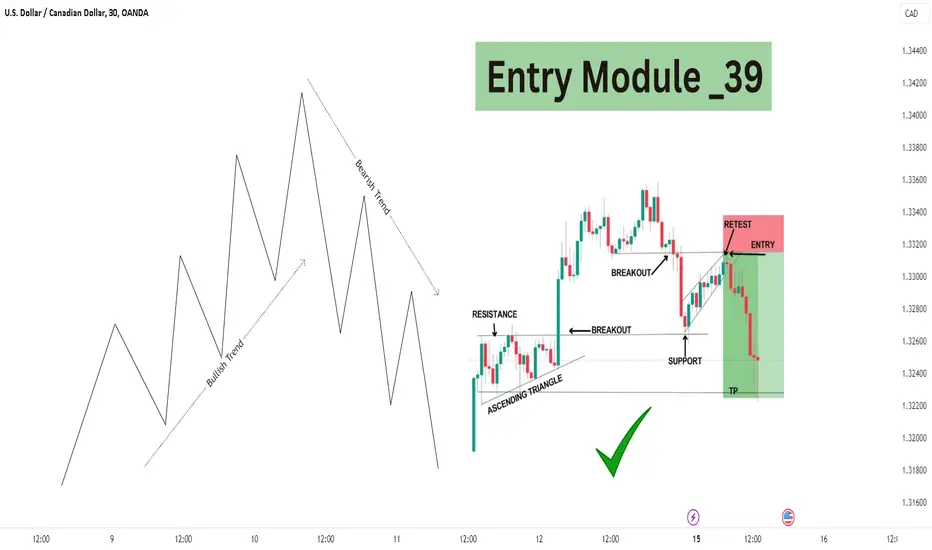
Flip Entry Module _ 39 How Flip Entry Works in Bullish to Bearish Trend Wait For Confirmation Like This And Sell.Thanks
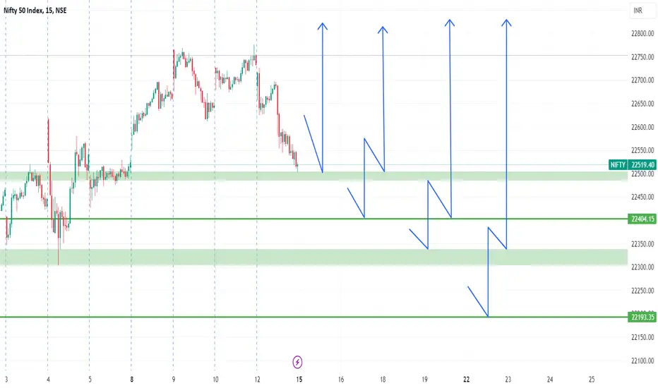
Support Levels onlyTake entry at levels By keeping 21 ponit SL.... ( NIFTY 50 )
This is just educational Purpose only.....
I am also Learner.....
Thank You.
Best of Luck
Strategy model - basic framework V1I am developing this 3 stage manual trading strategy model based on trend trading and break and re-tests for 1:1 trades with TP set equidistant to the SL.

Don't Trade These Trend Lines | Forex Trading Basics
A lot of traders apply trend lines for trading and making predictions on different financial markets.
Trend line can also be an important element of price action patterns.
However, only few knows that some trend lines are better to be avoided.
In this article, I will share with you the types of trend lines that you should avoid and not rely on for making trading decisions.
Invalidated Trend Line
Even the strongest trend lines may lose their significance with time.
Before you take a trade from a trend line, make sure that it still remains valid.
If the trend line is not respected by the buyers and then by the sellers,
or by the sellers and then by the buyers, we say that such a trend line lost its significance, and it is better to not trade it.
Have a look at that rising trend line on USDCAD.
We see strong bullish reactions to that, and we may expect a bullish movement from that, once it is tested.
However, it was violated and after a breakout it should turn into a vertical resistance.
Retesting that, the price easily went through the broken trend line.
The trend line lost its significance, and it is better to not trade that in future.
2 Touches Based Trend Line
When you are looking for a strong trend line to trade, remember that the trend line should be confirmed by at least 3 touches and 3 consequent bullish / bearish reactions to that.
Above is the example of a valid and reliable trend line.
However, quite often, newbie trade 2 touches based trend lines.
Most of the time, such trend lines are neglected by the market.
Moreover, relying on 2-touches-based trend lines, your chart will look like a complete mess.
Simply because there are too many trend line meeting that criteria.
Receding trend line
There are the trend lines that go against your trade with time while remaining valid.
Have a look at a major falling trend line on NZDCHF on a daily time frame.
You may open a swing long position from that on a daily or a day trade on intraday time frames like an hourly.
You can see that the market may easily go against your predictions for a long time, while perfectly respecting a trend line.
The price was sliding on that trend line for 6 consequent days before it finally started to grow.
Such trend lines are better to be avoided .
Make sure that a trend line and your trade have the same direction.
Trend lines can provide very safe points for trading entries. However, the trend lines are not equal and while some of them can be very profitable, some of them can lead to substantial losses.
❤️Please, support my work with like, thank you!❤️

HOW TO SET STOP LOSS | 3 SIMPLE STRATEGIES 📚
Hey traders,
In this post, we will discuss 3 classic trading strategies and stop placement rules .
I will teach you how to set a safe stop loss, relying on price action.
1️⃣The first trading strategy is a trend line strategy .
The technique implies buying/selling the touch of strong trend lines, expecting a strong bullish/bearish reaction from that.
If you are buying a trend line , you should identify the previous low.
Your stop loss should lie strictly below that.
Buying a test of arising trend line on GBPCHF, stop loss is lying strictly below the previous low.
If you are selling a trend line , you should identify the previous high .
Your stop loss should lie strictly above that.
2️⃣The second trading strategy is a breakout trading strategy .
The technique implies buying/selling the breakout of a structure,
expecting a further bullish/bearish continuation.
If you are buying a breakout of a resistance , you should identify the previous low . Your stop loss should lie strictly below that.
If you are selling a breakout of a support , you should identify the previous high. Your stop loss should lie strictly above that.
Selling a retest of a broken structure on AUDJPY, Stop Loss is strictly set above the previous high.
3️⃣The third trading strategy is a range trading strategy .
The technique implies buying/selling the boundaries of horizontal ranges , expecting bullish/bearish reaction from them.
If you are buying the support of the range , your stop loss should strictly lie below the lowest point of support.
Opening a long position from the support of the range on Dollar Index, stop loss is placed below its support.
If you are selling the resistance of the range , your stop loss should strictly lie above the highest point of resistance.
As you can see, these stop placement techniques are very simple. Following them, you will avoid a lot of stop hunts and manipulations.
How do you set stop loss?

The Wash and Rinse To See True Support/ResistanceTrue support and resistance is found in the meat of the move, not at the extreme highs and lows. To find it, Simply draw a zone or box and look for the place that price touches the most, and then pay attention to what happens afterward.
In this lesson, I set up a trade plan and show how a Wash and Rinse structure at the pivot of a swing uses the most touches to find true support in a market. I then show how to identify it.
The Wash and Rinse has a process that we can follow in real-time.
1. Multi-Pivot Line (MPL)
2. Zoom through the MPL
3. Come back and retest the MPL
4. Zoom back through the MPL the other way
What happens in this process, is that buyers are holding some level. Price then busts that level triggering stops and at the same time encouraging shorts to enter. Then price rips back up essentially cleaning the book of orders and showing where the true support is (at least for the time being).
Once you can recognize this structure, you can begin making your own observations and use these levels to read a market or begin to build a setup around it. The most important part is to learn to design a plan with objective rules around what you observe.
Shane

Tracking The Footprints of WRB GapsThis is the first in a series of posts on Gaps. Gaps are a sudden supply/demand imbalance that shows up in the price bars of a chart, It's the expansion that comes after a contraction. Gaps will show us a significant area of buyers/sellers that take control and when they lose that control.
In the video, I discuss and define a Wide Range Bar (WRB) Gap and show how to mark it out on a chart. A WRB Gap is a bar larger than the last 3 bars with a space between the previous bar and the subsequent bar. We will be marking the base of the gap. If it's an up Gap, mark out the bottom 1/3 of the bar, if it's a down gap, mark out the upper 1/3 of the bar.
We can then make observations about how price interacts with the base of this gap when or if it gets there. Then begin to notice where in the swing process the Gap is happening. Don't make conclusions, just observe and learn.
There are many ways to trade Gaps but first, we must first lay out some foundations and then come up with objective ways to see them. For now, simply look for the biggest ugliest bars on your chart and mark them out and observe. These are footprints that we can follow and track.
Shane

Level breakdown. The most effective setupsWhat is a level breakout?
A breakout is the price's consolidation above a certain level followed by further movement in the direction of the breakout. But the immediate question that should arise in your mind is about the consolidation of price, as it might be difficult for inexperienced individuals to understand. However, there is nothing overly complex about it either; consolidation refers to the candle closing above the level
A breakdown can occur at a horizontal or inclined level.
Bullish breakout:
We observe a trending market encountering resistance at a horizontal level. After two unsuccessful attempts, the price breaks through the level.
Bearish breakout:
Why do level breakouts work?
Imagine a scenario: a strong resistance level on the chart is heavily defended by bears, preventing the price from breaking through. Despite several attempts, the bears hold their ground until the bulls come to the rescue. They overpower the bears, but their strategy doesn't end there. Instead of retreating, they press forward, driving the opposition towards the next resistance level, where the cycle repeats.
Breakouts occur when the price breaches a significant level. Observing price movements on a chart reveals that prices often consolidate and encounter specific levels.
When the price reaches a level and swiftly reverses, it indicates the strength of that level. Upon a price retest of this level, careful monitoring is essential to anticipate a potential breakout.
Repeated tests of the same level signify its strength, yet eventually, the price will break through any level. This is when traders should be prepared to initiate a breakout trade.
Breakouts offer lucrative trading opportunities because they often mark the inception of new price movements and trends. By entering trades at the onset of emerging trends, traders position themselves for potential profits.
Moreover, reliable breakouts typically occur during periods of robust price momentum when traders seek to capitalize on rapid price fluctuations.
Breakouts occur at important price levels. It can be:
Support or resistance levels.
Patterns
Market highs or lows.
Trend lines.
Price channels.
Moving averages.
Fibonacci levels.
One reason breakouts can lead to rapid price movements is due to the attention they attract from market participants monitoring key levels. When one group of traders capitalizes on a breakout, another group is compelled to swiftly exit their losing positions, resulting in sharp price fluctuations post-breakout.
There exist various types of breakouts, and as traders, our objective is to identify high-probability breakout opportunities and initiate trades. However, this task is not always straightforward. Consequently, levels marked at potential breakout points should be regarded as zones rather than rigid lines.
Identifying Psychologically Important Levels:
Repeated testing of a specific zone by the price often signifies its significance.
Having reached a certain level, the price enters a sideways movement, forming a consolidation. Using a rectangle, we outline the area encompassing the lower wicks of the candles, delineating our support/resistance area. When trading breakouts, it is wise to wait until the candle closes outside the support or resistance area to confirm the breakout.
Triangles are chart patterns indicating price compression, often culminating in a breakout. The direction of the breakout is typically uncertain.
Within the circle, you can observe the precise location of a potential breakout. Notably, there is a robust breakout momentum evidenced by several full-bodied candles. Subsequent to breaching the upper level of the triangle, the price retraces to test the previously breached resistance, now acting as a support area. This pullback serves as a crucial confirmation signal.
Breakouts and false breakouts:
Typically, candlestick shadow breakouts are not considered true breakouts. A true breakout occurs only when the price finally closes outside the level. This approach provides a more secure entry point, making it easier to open positions in the appropriate direction.
The upper rectangle constantly holds down the price, with the exception of some candles, characterized as a pin bar. This represents an initial false breakout as only one candle breaks the resistance area but fails to close, leaving its body above that area. Therefore, we classify this signal as false.
However, the subsequent pin bar pushes the price higher, causing the candle to close above the resistance area. This is a genuine breakout signal, especially enhanced by the presence of a strong, saturated breakout candle.
Trading Breakouts:
Trading market breakouts carries inherent risks due to the prevalence of false breakouts, which are statistically more common. Therefore, it is extremely important to understand the market structure and monitor the movement of prices to the appropriate level.
Markets operate in cycles, moving between trending phases and periods of consolidation. The duration of market consolidation correlates with the strength of subsequent breakouts and subsequent trends.
Prolonged consolidation periods are not only observed by you, but by traders worldwide. Among them, some opt for trading bounces from levels, while others prefer trading breakouts. Extended consolidation behind a resistance level can trigger stop-loss orders for many bears and prompt numerous bulls to initiate new buying positions. Consequently, after prolonged periods of flat movement, prices frequently surge explosively following a breakout, ushering in a robust trend.
The breakout trading strategy offers multiple entry approaches, allowing traders to select the one that aligns best with their preferences and objectives.
Entering the breakout after the price has consolidated beyond the zone:
One strategy assumes that the breakout occurred when the candle closed outside the level. While this pattern can be effective, I personally find it risky due to the many nuances associated with this strategy. Instead I prefer a different approach...
Breakout entry with retest:
This tactic is a bit more challenging as it requires patience and discipline.
What particularly appeals to me in this strategy is that I rely on additional data during a potential retest (with a 60-70% likelihood after the zone is breached).
Breakout of the symmetrical triangle pattern:
As the market tightens its consolidation, it eventually breaches the support of the triangle, followed by a retest of this level as new resistance.
For the stop-loss placement, it's advisable to position it inside the triangle above the breakout candle.
Regarding take profit, we target the nearest level, ensuring the risk-to-reward ratio remains acceptable.
Best Breakout Trading Method:
Accumulation of positions/liquidations - consolidation.
When a tight consolidation occurs near a resistance level, it tells us that buying pressure remains high for a long period of time and sellers do not have enough strength to reverse the price from the level.
When the price breaks through a resistance level, traders with short positions cut their losses. At the same time, the pressure from buying traders who will open breakout transactions is increasing. All these factors cause the price to rapidly move up without significant pullbacks.
__________________________________________________________________________________
I have only covered a portion of the basics. Of course, trading involves various elements such as price action, indicators (divergences), but that would make this post too long ;)
If you enjoy my educational articles, please leave comments, and I'll continue writing them.

The Hidden Key --> Multi-Timeframe Analysis 🪀I begin by explaining the Video Idea--> Using Multi-Timeframe analysis to put together a trade idea. MTF analysis is absolutely crucial for running a profitable trading business... It's something that takes some experience but once you understand the way in which all timeframes move together it's like an Aha moment. We look at 3 timeframes.. the 1Hr, 4hr and the Daily timeframes. We observe an example from just a few days ago that outlines how it was very possible to catch a 20 pips after the Monday(3/25/24) daily candle closed bullish.. Give and rocket and leave a comment for similar content in the future!

Support And Resistance Lines Are Not Real: Prove Me WrongIn this video, I draw random lines on the chart to prove a point. I think we need to ask ourselves the following questions to become better traders:
How will I define support and resistance consistently ?
How will I use support and resistance in my trading?
Do I need support and resistance in my trading?
Is support and resistance a reliable measure for markets?
Are the lines that I have been drawing for so long actually meaningful?

Support and resistance validationMain rules to consider when identifying a valid level of support ad resistance
Must have:
- 3 or more bounces
- The last interaction must be a bounce
- Must be more bounces than breaks

Gaps and How Markets Move In Contraction and ExpansionThere are several ways to trade gaps but first, there should be a solid understanding of what Gaps are and how they show up. Markets aren't that hard to read if we have some simple ways to see them that adhere to the principles of movement.
All markets move in contraction and expansion. A Gap is the sudden supply/demand imbalance that comes out of the contraction and shows up as the expansion. These expansions can even be used to measure how far the next expansion will go.
Start with a simple bar chart and erase everything else off the chart. Look and simply see the dense areas of contraction (Range). Then see the expansion (Gap), followed by another contraction.
Look for same-size contractions and expansion and you will start to see how organized price flow can be. It's no different than swings in that minor contractions and expansions make up the major contractions and expansions.
Shane
