Simple Break of Structure BoS Trading Strategy Explained
One of the best and reliable strategies to trade break of structure BoS is to apply multiple time frame analysis.
In this article, I will teach you my break of structure gold forex trading strategy. You will get a complete step-by-step guide with examples.
Let's start with a quick theory and let me explain to you what is break of structure BoS in Smart Money Concept SMC trading.
In a bullish trend, break of structure BoS is an important event that signifies a continuation of an uptrend. It is based on a violation and a candle close above the level of the last higher high (HH).
After a breakout, the broken level becomes the first strong support for trend-following buying.
Check multiple examples of confirmed breaks of structure BoS on GBPNZD forex pair on a weekly time frame.
In a downtrend, Break of Structure BoS means a bearish trend continuation . Break of Structure is considered to be confirmed when a candle closes below the level of the last lower low (LL).
The broken key level becomes the closest strong support for buying.
That's the example of a healthy downtrend on USDJPY forex pair on a daily. Each break of structure BoS pushed the prices lower, providing a strong signal to sell.
What newbie traders do incorrectly, they trade break of structure without a confirmation strategy, and it leads to substantial losses.
Though GBPCHF is trading in a bullish trend and though each BoS provided a trend-following signal. The price retraced significantly lower below the broken structure before the growth resumed.
When the price retests a broken structure after BoS in a bullish trend, start lower time frame analysis.
If you identified a break of structure on a daily, analyze 4h/1h time frames.
If on a 4H, then 30/15 minutes.
After the price sets a new higher high with BoS in uptrend, it usually starts trading in a minor bearish trend on lower time frames.
With our strategy, your signal to buy will be a retest of a broken structure and a consequent bullish Change of Character CHoCH . That will provide an accurate bullish signal.
In a bearish trend, analyze the lower time frames after a retest of a broken structure. Your signal to sell will be a bearish Change of Character CHoCH.
Look at a price action on EURCHF on a daily.
We see a strong bullish trend and a confirmed Break of Structure BoS.
According to the rules of our trading strategy, we start analyzing 4h/1h time frames after a retest of a broken level of the last Higher High.
Our signal to buy is an intraday bullish CHoCH. We open a long trade after that with the stop loss below the intraday lows and take profit being a current high.
That's how simple this strategy is.
Multiple time frame analysis provides the extra level of security.
Strong lower time frame confirmation substantially increases the win ratio of a trading setup.
❤️Please, support my work with like, thank you!❤️
I am part of Trade Nation's Influencer program and receive a monthly fee for using their TradingView charts in my analysis.
Support and Resistance

Understanding Moving Averages In TradingToday, we dive into a comprehensive guide on Moving Averages (MAs) — one of the most fundamental yet powerful tools in technical analysis. Whether you're a seasoned trader or just starting out, understanding how MAs work can help you better interpret market trends, identify potential entry and exit points, and smooth out price data for clearer decision-making.
In this article, we’ll break down the different types of moving averages, how they’re calculated, when to use them, and common strategies that incorporate them into successful trading plans.
1️⃣ 1. What are Moving Averages?
Moving averages (MAs) are statistical calculations used in technical analysis to smooth out price data and identify trends over a specific period. They help traders filter out short-term fluctuations and focus on the overall direction of an asset's price.
2️⃣ 2. Importance
Moving averages (MAs) play a crucial role in technical analysis by helping traders identify trends, reduce noise, and make informed trading decisions. Here’s why they are important:
Trend Identification: MAs help traders determine the overall direction of the market.
Dynamic Support & Resistance: Traders watch key MAs (e.g., 50-day and 200-day) to anticipate price reactions.
Trading Signals & Crossovers: Detects potential changes in trend direction.
Golden Cross (Bullish): When a short-term MA (e.g., 50-day) crosses above a long-term MA (e.g., 200-day), signaling a potential uptrend.
Death Cross (Bearish): When a short-term MA crosses below a long-term MA, indicating a possible downtrend.
Momentum Confirmation: A steeply rising MA suggests strong bullish momentum, while a declining MA signals bearish strength.
3️⃣ 3. Moving Averages Types
Simple Moving Average (SMA): Calculates the simple average of past prices.
Exponential Moving Average (EMA): Prioritizes recent prices for faster response.
Weighted Moving Average (WMA): Prioritizes recent prices for faster response.
Hull Moving Average (HMA): Smooths trends while reducing lag effectively.
Smoothed Moving Average (SMMA): Averages data with less sensitivity to noise.
Triangular Moving Average (TMA): Applies a double smoothing to price data.
Adaptive Moving Average (AMA): Adapts dynamically to changing market trends.
Kaufman Adaptive Moving Average (KAMA): Adjusts speed based on volatility and noise.
Double Exponential Moving Average (DEMA): Uses dual EMAs to reduce lag in trends.
Triple Exponential Moving Average (TEMA): Enhances trend detection with triple EMAs.
Arnaud Legoux Moving Average (ALMA): Minimizes lag while improving price smoothness.
Variable Moving Average (VMA): Adjusts its value based on market conditions.
Volume-Weighted Moving Average (VWMA): Weights price data according to trading volume
Jurik Moving Average (JMA): A highly smooth and responsive MA that reduces lag and noise.
Fractal Adaptive Moving Average (FRAMA): Adapts to market fractal geometry, adjusting speed based on volatility.
Zero Lag Exponential Moving Average (ZLAMA): A variation of EMA that eliminates lag by compensating for past price movements.
4️⃣ 4. Calculations
Moving averages are fundamental tools in technical analysis, helping to smooth price data and highlight trends. However, not all moving averages are created equal—each type is calculated differently, affecting how it responds to market movement.
In this section, we’ll focus on the formulas behind a few of the most relevant and widely used types: the Simple Moving Average (SMA), Exponential Moving Average (EMA), and Weighted Moving Average (WMA).
a. Simple Moving Average (SMA)
The Simple Moving Average (SMA) calculates the average price of an asset over a specified period.
Lag: High (delayed response to price changes)
Best for: Identifying long-term trends and support/resistance
SMA = P1 + P2... + ... + Pn / n
Where:
P1 + P2... + ... + Pn: are the prices (usually closing prices) of the last n periods.
n: is the number of periods on average.
It gives an equal weight to all prices in the period.
ta.sma(close, length)
b. Exponential Moving Average (EMA)
The Weighted Moving Average (WMA) assigns higher weights to more recent prices, reducing lag and increasing responsiveness compared to SMA.
Lag: Lower than SMA but higher than EMA
Best for: Short-term trading strategies
EMA = (Pt × α) + EMAy × (1 − α)
Where:
Pt: Current price (usually the closing price)
EMAy: Previous period’s EMA
α (alpha): Smoothing factor = 2 / (n + 1)
n: Number of periods in the EMA
It gives more weight to recent prices, reducing the lag compared to SMA.
ema = ta.ema(close, length)
c. Weighted Moving Average (WMA)
The Weighted Moving Average (WMA) assigns higher weights to more recent prices, reducing lag and increasing responsiveness compared to SMA.
Lag: Lower than SMA but higher than EMA
Best for: Short-term trading strategies
WMA = (P1 × w1 + P2 × w2 + ... + Pn × wn) / (w1 + w2 + ... + wn)
Where:
P1...Pn: Prices (usually closing) over the last n periods
w1...wn: Weights assigned to each period (most recent gets the highest weight)
n: Number of periods
It reacts faster than SMA but smoother than EMA due to its linear weighting.
wma = ta.wma(close, length)
While there are many variations of moving averages available, the formulas covered here—SMA, EMA, and WMA—represent the most essential and commonly applied in both trading platforms and manual analysis.
Understanding how these are calculated gives deeper insight into their strengths, limitations, and the types of signals they provide.
5️⃣ 5. Choosing the Right MA
Choosing the Right Moving Average for Your Trading Style
Choosing the right moving average (MA) depends on your trading style, time horizon, and goals. Different types of MAs have varying levels of sensitivity to price movements, so the choice should align with your trading strategy.
Here’s how you can choose the best moving average based on your trading approach:
Short-Term Traders (Day Traders, Scalpers)
Exponential Moving Average (EMA): The EMA reacts faster to price changes, which is crucial for short-term traders who need to enter and exit positions quickly.
Simple Moving Average (SMA): While less sensitive than the EMA, shorter-term SMAs (like the 5 or 10-period) can still be useful for spotting very quick trend changes.
Hull Moving Average (HMA): Offers a good balance between smoothness and responsiveness, reducing lag while staying sensitive to price changes.
Medium-Term Traders (Swing Traders)
Simple Moving Average (SMA): Longer SMAs (like the 50-period or 100-period) are effective in identifying the general trend over a few days or weeks.
Exponential Moving Average (EMA): The 20-period or 50-period EMA can work well for medium-term traders, providing a smoother trend signal while still responding to changes.
Smoothed Moving Average (SMMA): The SMMA gives a smoother trend and reduces the noise, which is ideal for swing traders who look for stable trends over a couple of weeks.
Long-Term Traders (Position Traders, Investors)
Simple Moving Average (SMA): Longer SMAs like the 100-period or 200-period SMA are perfect for long-term traders and investors. These averages provide a clear indication of the long-term trend and act as reliable support and resistance levels.
Triangular Moving Average (TMA): TMA smooths out price movements even more and is useful for capturing long-term trends. It's slower, but highly effective for those trading in longer time frames.
Trend-Following Traders
Exponential Moving Average (EMA): As trend-following traders rely on capturing long trends, EMAs with longer periods (50, 100, 200) are a solid choice, providing smoother signals with less noise.
Hull Moving Average (HMA): The HMA reduces lag, making it a great choice for trend-following traders who want to react quickly to changes while staying in the trend.
6️⃣ 6. How To Use Moving Averages
Moving averages (MAs) are one of the most widely used tools in technical analysis due to their simplicity and effectiveness in identifying trends, smoothing price data, and signaling potential market reversals. They are used by traders to help spot entry and exit points, determine the direction of the market, and define dynamic support and resistance levels.
Here’s a deeper dive into how moving averages are used in trading:
Identifying Trends
Uptrend: When the price is consistently above the moving average, it indicates a bullish trend. The longer the period of the moving average, the smoother it becomes, showing the overall direction of the market.
Downtrend: Conversely, when the price is consistently below the moving average, it indicates a bearish trend.
Sideways/Consolidation Market: When the price hovers around the moving average without a clear direction, the market is often in a consolidation phase.
Support and Resistance Levels
Support Levels: When the price is above a moving average and then pulls back to touch it, the moving average often acts as a support level. Traders anticipate the price to bounce off the moving average and resume its uptrend.
Resistance Levels: When the price is below a moving average and then rallies back to it, the moving average often acts as a resistance level. This resistance can lead to a reversal or consolidation as the price struggles to break above the MA.
7️⃣ 7. Golden Cross & Death Cross
One of the most well-known signals involving moving averages is the crossover of short-term and long-term moving averages. These crossovers are used to signal potential trend changes and provide traders with entry and exit signals.
Golden Cross: Occurs when a short-term moving average crosses above a long-term moving average.
Death Cross: Occurs when a short-term moving average crosses below a long-term moving average.
Golden Cross
This is considered a bullish signal, indicating that an uptrend may be starting or strengthening.
When it happens: A common example of a Golden Cross is when the 50-day moving average crosses above the 200-day moving average. The short-term trend is gaining strength and could signal the beginning of a sustained uptrend.
Why it works: The Golden Cross indicates that recent prices are moving higher and that momentum is accelerating. It suggests that buying pressure is overpowering selling pressure.
Death Cross
This is considered a bearish signal, indicating that a downtrend may be imminent or already in place.
When it happens: A typical example of a Death Cross is when the 50-day moving average crosses below the 200-day moving average, signaling that the short-term trend is weakening and a bearish shift may be in play.
Why it works: The Death Cross shows that short-term price movements are declining relative to longer-term trends, and it indicates increasing selling pressure.
8️⃣ 8. MA Strategies
Trend Following
The trend following strategy focuses on identifying and capitalizing on strong price movements in one direction.
Trend Identification: Moving averages are used to identify whether the market is trending up or down. The most common trend-following strategy is to buy when the price is above a key moving average and sell when it’s below.
Trend Confirmation: Once the trend is identified using MAs, traders can enter trades that align with the trend. The idea is to "ride the wave" of the trend as long as possible until there is evidence of a reversal or loss of momentum.
MA Crossover
Moving average crossovers are one of the most popular and widely used strategies in technical analysis. Crossovers occur when a short-term moving average crosses over a longer-term moving average, signaling potential trend changes.
Short-Term Crossovers: These are typically faster and more sensitive, which can help traders spot quicker market changes. Short-term crossovers tend to generate more signals, but they can also lead to more false signals in choppy or sideways markets. (9 EMA & 21 EMA Strategy)
Long-Term Crossovers: These are slower and less frequent but tend to produce more reliable trend signals. Long-term crossovers filter out market noise and provide a clearer view of the overall market direction. (The 50/200-Day Moving Average Strategy)
Mean Reversion
Mean reversion is based on the idea that prices tend to return to their average over time.
How to Identify Overextended Prices
Overbought and Oversold Conditions: When the price is significantly above or below a moving average, it may be overextended. In such cases, traders expect the price to revert to the moving average.
Using MAs as a Benchmark: Traders can use longer-term MAs, like the 50-day or 200-day moving averages, to identify overextended conditions. If the price moves significantly above or below the moving average, it is often seen as an opportunity for mean reversion trades.
Trading Moving Average Pullbacks
Pullbacks: A pullback is when the price moves against the prevailing trend, temporarily retracing toward the moving average before resuming its original trend.
Buying Pullbacks in Uptrends: In an uptrend, traders look to buy when the price pulls back to a moving average like the 50-day or 200-day MA, assuming the trend will continue.
Selling Pullbacks in Downtrends: In a downtrend, traders look for selling opportunities when the price temporarily rallies back to a moving average, anticipating a return to the downtrend.
9️⃣ 9. Key Takeaways
Moving Averages (MAs) smooth price data, helping identify trends, entry, and exit points.
Trend Following Strategies use MAs to align trades with the market’s direction (uptrend, downtrend).
Support & Resistance: MAs act as dynamic levels where prices may reverse or consolidate.
Crossovers:
- Golden Cross (50/200-day crossover) signals a bullish trend.
- Death Cross (50/200-day crossover) signals a bearish trend.
- Short-Term Crossovers (9/21 EMA) provide faster signals for active traders.
Mean Reversion Strategy: Prices often revert to their moving average after being overextended.
Pullback Trading: Enter trades when prices pull back to key MAs during trends.
Combining Indicators:
- RSI confirms MAs’ buy or sell signals.
- MACD crossover strengthens trend direction confirmation.
- Bollinger Bands help assess volatility, confirming price targets and trends.
Timeframe Selection: Short-term traders use quicker MAs (e.g., 9 EMA), while long-term traders prefer slower MAs (e.g., 200-day SMA).
Best MA Settings: For trend-following, use 50/200-day MAs; for short-term, use 9/21 EMAs.
Stay sharp, stay ahead, and let’s make those moves. Until next time, happy trading!

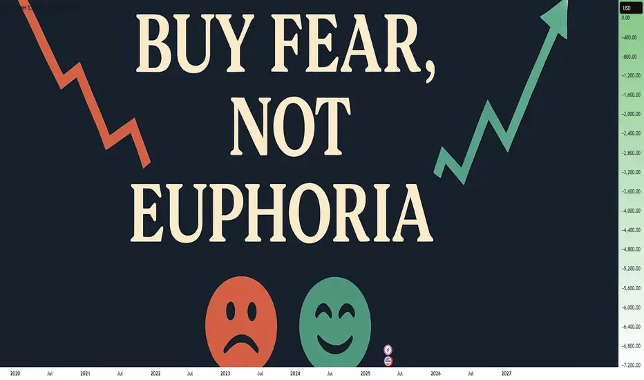
Buy Fear, Not Euphoria: The Trader's EdgeWhen you look back at the greatest trading opportunities in history, they all seem to share a common element: fear. Yet, when you're in the moment, it feels almost impossible to pull the trigger. Why? Because fear paralyzes, while euphoria seduces. If you want to truly evolve as a trader, you need to master this fundamental shift: buy fear, not euphoria.
Let's break it down together.
________________________________________
What Fear and Euphoria Really Mean in Markets
In simple terms, fear shows up when prices are falling sharply, when bad news dominates the headlines, and when people around you are saying "it's all over."
Euphoria, on the other hand, is everywhere when prices are skyrocketing, when everyone on social media is celebrating, and when it feels like "this can only go higher."
In those moments:
• Fear tells you to run away.
• Euphoria tells you to throw caution to the wind.
Both emotions are signals. But they are inverted signals. When fear is extreme, value appears. When euphoria is extreme, danger hides.
________________________________________
Why Buying Fear Works
Markets are pricing machines. They constantly adjust prices based on emotions, news, and expectations. When fear hits, selling pressure often goes beyond what is rational. People dump assets for emotional reasons, not fundamental ones.
Here’s why buying fear works:
• Overreaction: Bad news usually causes exaggerated moves.
• Liquidity Vacuums: Everyone sells, no one buys, creating sharp discounts.
• Reversion to Mean: Extreme moves tend to revert once emotions stabilize.
Buying into fear is not about being reckless. It’s about recognizing that the best deals are available when others are too scared to see them.
________________________________________
Why Chasing Euphoria Fails
At the peak of euphoria, risks are often invisible to the crowd. Valuations are stretched. Expectations are unrealistic. Everyone "knows" it's going higher — which ironically means there's no one left to buy.
Chasing euphoria often leads to:
• Buying high, selling low.
• Getting trapped at tops.
• Emotional regret and revenge trading.
You’re not just buying an asset — you're buying into a mass illusion.
________________________________________
How to Train Yourself to Buy Fear
It's not enough to "know" this. In the heat of the moment, you will still feel the fear. Here's how you build the right habit:
1. Pre-plan your entries: Before panic strikes, have a plan. Know where you want to buy.
2. Focus on strong assets: Not everything that falls is worth buying. Choose assets with strong fundamentals or clear technical setups.
3. Scale in: Don’t try to catch the bottom perfectly. Build positions gradually as fear peaks.
4. Use alerts, not emotions: Set price alerts. When they trigger, act mechanically.
5. Remember past patterns: Study previous fear-driven crashes. See how they recovered over time.
Trading is a game of memory. The more you internalize past patterns, the easier it is to act when everyone else panics.
________________________________________
A Recent Example: April 2025 Tariff Panic
Very recently, at the start of April, Trump’s new tariff announcements sent shockwaves through the market. Panic took over. Headlines screamed. Social media was flooded with fear.
But if you looked beyond the noise, charts like SP500 and US30 told a different story: the drops took price right into strong support zones.
At the time, I even posted this : support zones were being tested under emotional pressure.
If you had price alerts set and reacted mechanically, not emotionally , you could have bought into that fear — and potentially benefited from the rebound that followed just days later.
This is the essence of buying fear.
________________________________________
Final Thoughts
In trading, you are paid for doing the hard things. Buying when it feels terrible. Selling when it feels amazing.
Remember:
Fear offers you discounts. Euphoria offers you traps.
The next time the market feels like it's crashing, ask yourself:
• Is this fear real, or exaggerated?
• Is this an opportunity hiding under an emotional fog?
If you can answer that with clarity, you're already ahead of 90% of traders.
Stay rational. Stay prepared. And above all: buy fear, not euphoria.
Disclosure: I am part of Trade Nation's Influencer program and receive a monthly fee for using their TradingView charts in my analyses and educational articles.
Have Right Tools and Right StructureHi there,
Some insights on the recent movement of XRPUSDT. It recently broke through two key support trendlines, creating lows that line up with the 0.38 Fibonacci retracement level. This area has significant importance, especially when considering the lower point at 2.2404. The bullish RSI suggests we might see a positive price movement soon.
However, it's essential to recognize that while we're anticipating a bullish trend, we need more confirmation. We’ve identified 2.2404 as a significant low, supported by multiple indicators, but we should also validate this level using higher timeframes to ensure we have a solid structure behind it.
Measuring probabilities against the inherent randomness of the market, along with keeping an eye on the market calendar, is crucial. It's important to have clear definitions for the concepts you trade. Jumping into live trades without clarity can lead to confusion, mixing varying strategies like change of character (choch), liquidity, and price action coming all together as a confusing mess.
Remember, trading isn’t about shifting from one strategy to another. It’s about understanding how the market behaves at price lows and highs and aligning that movement with the concepts that work best for you.
So, it’s all about interpretation. The tools must allow you to see clearly without straining to understand what the market might be doing. The structure must also be clear. This means breaking previous highs and breaking previous lows, each followed by measurable retests, respectively.
Stay sharp and trade smart
Khiwe.

Why Should You Care About ER?🚀 Hey Traders! Have You Ever Felt Lost in the Chaos of Market Fluctuations?
What if I told you there’s a powerful tool that can help you cut through the noise and give you a statistical edge to predict SUPPORT and RESISTANCE movements with confidence?
Let me take 5 minutes of your time to introduce you to something that could transform your trading game: Expected Range Volatility (ER) .
What is Expected Range Volatility (ER)?
The Expected Range (ER) is a framework that helps traders understand how much an asset is likely to move within a specific timeframe. Based on CME market data and Nobel Prize-winning calculations, price movements within the expected volatility corridor have a 68% probability of staying within those boundaries.
💡 Key Insight: When the price approaching certain levels, there’s a 68% chance the price won’t break through those boundaries. This means you can use ER as a powerful filter to identify more precise entry and exit points for your trades.
Why Should You Care About ER?
When I first discovered the ER tool, it felt like stumbling upon a gold mine in the trading world. Here’s why:
It’s free and available on the CME exchange’s website.
It’s underutilized —95% of traders don’t even know it exists.
It provides statistical clarity in a world full of uncertainty.
I remember the first time I used ER in my analysis—it completely changed the way I approached intraday trading. Now, I never make a trade without checking the ER data. It’s become an essential part of my strategy.
How to Use ER in Your Trading
1️⃣ Input the Data: Head over to the CME website, plug in the necessary parameters, and get your ER values.
2️⃣ Set Boundaries: Use the ER range as a guide to set potential support and resistance levels.
3️⃣ Filter Trades: Only take trades that align with the ER framework to improve your precision.
A recent example is the Japanese yen futures market.
Don't be confused by the fact that we take futures levels, it can easily be plotted on a spot chart for forex market (the dollar/yen).
Limitations to Keep in Mind
While ER is a powerful tool, it’s not a crystal ball. Here are some limitations:
Market Dynamics: Short-term price movements can be unpredictable due to sentiment, news, or economic events. ER provides a statistical estimate, but it doesn’t guarantee outcomes.
Assumptions: The formula assumes price movements follow a log-normal distribution , which may not hold true in all market conditions.
Your Turn: Are You Using ER in Your Strategy?
💭 Here’s the million-dollar question: Are you leveraging the power of Expected Range Volatility in your trading? If not, why not start today?
💬 Share your thoughts in the comments below:
Do you currently use ER or similar statistical tools?
Want to Dive Deeper?
If you’re ready to take your trading to the next level, don’t miss out on our all-in-one resource designed to help you master tools like ER and other valuable sources to gain market edge!
🔥 Remember:
No Valuable Data = No Edge!

Market Psychology and ImpressionsHi There,
Right now, BTCUSDT looks like it’s going up, but the price movement isn’t very stable. It could still go higher—but there’s also a chance it might drop. The market is kind of in a tricky area where it’s not clear what will happen next. This is where a Fibonacci tool can be useful to spot areas of interest drawn from a High to Low and take note of 0.618 and 0.5. Never chase the market; only react. Let price come to your area and give you a clear signal in terms of higher lows and lower highs for entry with some confirmation.
This is the kind of situation where people often get caught up in FOMO, jumping in too fast because they’re afraid of missing a big move. But that can lead to getting stuck if the price suddenly moves the other way.
When the market is behaving like this—unpredictable and uncertain—it’s often better to just watch and wait.
Remember: not every move needs to be traded. Sometimes, the best position is no position at all.
Stay sharp and trade smart.
Khiwe.

DON'T Make This MISTAKE in MULTIPLE TIME FRAME Analysis
Most of the traders apply multiple time frame analysis incorrectly . In the today's article, we will discuss how to properly use it and how to build the correct thinking process with that trading approach.
The problem is that many traders start their analysis with lower time frames first . They build the opinion and the directional bias analyzing hourly or even lower time frames and look for bullish / bearish signals there.
Once some solid setup is spotted, they start looking for confirmations , analyzing higher time frames. They are trying to find the clues that support their observations.
However, the pro traders do the opposite .
The fact is that higher is the time frame, more significant it is for the analysis. The key structures and the patterns that are spotted on an hourly time frame most of the time will be completely irrelevant on a daily time frame.
In the picture above, I underlined the key levels on USDJPY on an hourly time frame on the left.
On the right, I opened a daily time frame. You can see that on a higher time frame, the structures went completely lost.
BUT the structures that are identified on a daily, will be extremely important on any lower time frame.
In the example above, I have underlined key levels on a daily.
On an hourly time frame, we simply see in detail how important are these structures and how the market reacts to them.
The correct way to apply the top-down approach is to start with the higher time frame first: daily or weekly. Identify the market trend there, spot the important key levels. Make prediction on these time frames and let the analysis on lower time frames be your confirmation.
❤️Please, support my work with like, thank you!❤️
I am part of Trade Nation's Influencer program and receive a monthly fee for using their TradingView charts in my analysis.

EUR/USD- Elliott Wave + Smart Money Concepts (SMC)SMC Insight
Supply Zone Marked: Between 1.1500 – 1.2000.
Price is heading toward the supply zone.
On the right visual, schematic shows:
Liquidity build-up below equal highs.
Possible liquidity grab just above the supply zone.
Expect reaction or reversal around that supply.
---
Trade Bias
Short-term: Bullish (momentum and structure are up).
Long-term: Watch for reaction at the 1.1500–1.2000 zone. This could be a major sell zone if price shows rejection/mitigation signs

Trendlines and broken trendlines resultsTrendlines are one of the major supports or resistances and on this Bitcoin chart we can see few examples which price react well to them and start to pump from green trendlines and sometimes dump from red trendlines and it is easy to draw one trendline ----> simple like drawing support line this time try to find support line which is Diagonal and one or two touch with this trendline you can find next support which is third touch and you can set your buy there like below example:
also sometimes trendline broke and their support turn to resistance and after retest of breakout you can enter sell like example:
there are so many rules about trendline like when it can break or after how many touches trendline lose it's power and ... we can discuss in comments more about them so ask any questions there and lets discuss.
Also currently if we have a valid breakout of red trendline to the upside for Bitcoin price can easily pump to 90K$ at least.
DISCLAIMER: ((trade based on your own decision))
<

Trading A Divergence Trade (Breakdown) with Pivots and LiquidityTrading divergences was always a problem for me in the past. I did the same thing you did and got it wrong every time. I was trading divergences when i saw them instead of realizing a divergence is a flip of support and resistance levels. I just needed to know where they are.
In this video:
Internal vs External Pivot divergence confirmation:
You can have two types of pivots on your chart. One for long term and one for short term.
Using them to confirm short and long term price action is intuitive as youll be able to see the market squeezing on the short term while knowing where your long term price structure exists.
Price action to Divergence Confirmation:
A divergence on a short term pivot is an indication of short term loss of trend or reversal.
If the short term has no divergence but the long term does, you are about to end up with some pretty large price moves.
Youll be confirming the divergence by looking for highs, lows, and closes moving the wrong way from current price action.
This video will give you a method you can use to draw out your support zone / resistance zone / divergence zone and use them to your advantage.
The "Divergence Zone" that you draw out is the very reason why so many people fail at divergences.
Bare in mind that when you have a divergence, support and resistance are on the WRONG sides as their normally are so you'll learn here how to find those zones as well.
Then in the end of the video ill show you how to use lower timeframes to confirm the new move of the market.
Thanks, everyone. For coming through to the CoffeeShop.

Why Support and Resistance are Made to Be Broken ?Hello fellow traders! Hope you're navigating the markets smoothly. As we go through the daily dance of price action, one thing becomes clear support and resistance are just moments, not walls. They're temporary. Momentum and trend strength? Now that’s where the real story lies.
This publication dives into how these so-called key levels break and more importantly, how to position yourself smartly when they do. Stay flexible, trade with confidence, and let the market lead. Let’s get into it.
Why Support and Resistance Levels Break
Support and resistance are some of the most talked-about tools in technical analysis. But here's the truth they’re not meant to last forever.
No matter how strong a level may appear on your chart, it eventually gets tested, challenged, and often broken. Why? Because the market is dynamic. The real edge for a trader lies not in hoping a level holds, but in reading when it’s about to fail and being ready for it.
No Resistance in a Bull, No Support in a Bear
Ever seen a strong bull market pause just because of a resistance line? It doesn’t. Price keeps pushing higher as buyers keep stepping in. Same goes for a strong bear market support levels collapse as fear takes over and selling snowballs.
Instead of clinging to lines on a chart, think bigger: Where is the momentum? What’s the trend saying? That’s where your trading decisions should come from.
Support and Resistance: Not Fixed, Always Shifting
Yes, these levels matter but only as zones, not exact prices. They’re areas where price has reacted in the past, where traders might expect something to happen again. But they’re not magic numbers.
When traders treat these levels as absolute, they fall into traps false confidence, poor entries, tighter than-needed stop losses. Always remember: market sentiment, liquidity, and institutional activity are constantly changing. So should your interpretation of the chart.
The Temporary Nature of These Levels
Markets move on supply and demand. A level that acted as resistance last week could easily become support next week. Or break completely.
Take the classic example support turning into resistance. When support breaks, former buyers might now be sellers, trying to get out on a bounce. That flip happens because behavior and sentiment have shifted. And as traders, that’s the real pattern we need to track not just price levels, but the psychology behind them.
“Strong” Support? It’s Mostly an Illusion
We all love the idea of a strong level something we can lean on. But large players? They don’t think like that.
Institutions don’t place massive orders at a single price point. They spread across a zone building positions slowly without moving the market too much. What looks like a strong level to us might just be an accumulation or distribution range for them. Always think beyond what’s visible on the surface.
How to Spot Breakouts Before They Hit
Here’s what separates seasoned traders from the rest the ability to spot potential breakouts before they explode.
🔹 Volume Confirmation: If a resistance level is tested repeatedly on rising volume, that’s a big clue buyers are serious.
🔹 Structure Shifts: Higher highs in an uptrend or lower lows in a downtrend signal that the old levels are being challenged.
🔹 Liquidity Traps: Watch out for fakeouts. These are designed to trap impatient traders just before the real move.
🔹 News & Events: Never ignore macro triggers. Earnings, economic data, or geopolitical surprises can fuel breakouts that crush technical levels.
🔹 Break & Retest: A solid strategy — wait for the level to break, then get in on the retest.
🔹 Momentum Tools: Indicators like RSI, MACD, or even EMAs can offer extra confidence that a move has legs.
3 Practical Trading Setups
1. Breakout Trading
Mark key levels on daily or weekly charts.
Watch for volume and momentum confirmation.
Enter after a clear breakout or retest.
Stop-loss: Just below resistance (for longs) or above support (for shorts).
2. Range Trading
If price is stuck between support and resistance, trade the range.
Look for price rejection (wicks, pin bars, etc.).
Use RSI or Stochastics to time entries.
3. Trend Following
Identify the dominant trend using moving averages or price structure.
Avoid going against the trend unless reversal signs are very clear.
Let profits run use trailing stops instead of fixed targets.
Mind Over Market: Psychology of S&R
One of the biggest traps in trading? Overtrusting support and resistance.
We get emotionally attached. We want the support to hold or the resistance to reject. And that bias clouds our judgment. How many times have you seen price break a level — and you freeze because it “wasn’t supposed to”?
To break free of that:
✅ Trade with a plan.
✅ Set your risk before the trade, not after.
✅ Don’t treat any level as sacred.
✅ Stay open to what the market is telling you not what you want it to say.
Final Thoughts
Support and resistance are great tools but they’re just one part of the puzzle. The real power lies in reading price action, watching volume, and understanding market sentiment. Don’t ask, “Will this level hold?” Ask instead, “What happens if it breaks?”
That shift in thinking? It can make all the difference.
Stay sharp, stay adaptive, and keep evolving with the market.
Wishing you green trades and growing accounts!
Best Regards- Amit Rajan.

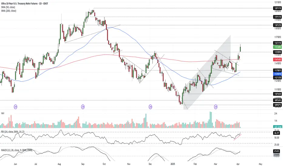
Bonds Don’t Lie: The Signal is ClearU.S. 10-year Treasuries are a crucial cog in the global financial machine, serving as a benchmark borrowing rate, a tool for asset valuation, and a gauge of the longer-term outlook for U.S. economic growth and inflation.
As such, I keep a close eye on 10-year note futures, as they can offer clues on directional risks for bond prices and yields. The price action over the past few days has sent a clear and obvious signal as to where the risks lie: prices higher, yields lower.
Futures had been grinding lower within a falling wedge for several weeks but broke higher last Friday on decent volumes following soft U.S. household spending data. It has since extended bullish the move, reclaiming the 200-day moving average before surging above key resistance at 115’09’0 after Trump’s reciprocal tariff announcement on Wednesday.
RSI (14) is trending higher but isn’t yet overbought, while MACD has crossed the signal line above 0, confirming the bullish momentum signal. That favours further upside, putting resistance at 116’11’0 and 118’12’0 on the immediate radar. For those who prefer it expressed in yield terms, that’s around 4% and 3.8% respectively.
Good luck!
DS
3 Best Trading Opportunities to Maximize Profit Potential
Hey traders,
In the today's article, we will discuss 3 types of incredibly accurate setups that you can apply for trading financial markets.
1. Trend Line Breakout and Retest
The first setup is a classic trend line breakout.
Please, note that such a setup will be accurate if the trend line is based on at least 3 consequent bullish or bearish moves.
If the market bounces from a trend line, it is a vertical support.
If the market drops from a trend line, it is a vertical resistance.
The breakout of the trend line - vertical support is a candle close below that. After a breakout, it turns into a safe point to sell the market from.
The breakout of the trend line - vertical resistance is a candle close above that. After a breakout, it turns into a safe point to buy the market from.
Take a look at the example. On GBPJPY, the market was growing steadily, respecting a rising trend line that was a vertical support.
A candle close below that confirmed its bearish violation.
It turned into a vertical resistance .
Its retest was a perfect point to sell the market from.
2. Horizontal Structure Breakout and Retest
The second setup is a breakout of a horizontal key level.
The breakout of a horizontal support and a candle close below that is a strong bearish signal. After a breakout, a support turns into a resistance.
Its retest is a safe point to sell the market from.
The breakout of a horizontal resistance and a candle close above that is a strong bullish signal. After a breakout, a resistance turns into a support.
Its retest if a safe point to buy the market from.
Here is the example. WTI Crude Oil broke a key daily structure resistance. A candle close above confirmed the violation.
After a breakout, the broken resistance turned into a support.
Its test was a perfect point to buy the market from.
3. Buying / Selling the Market After Pullbacks
The third option is to trade the market after pullbacks.
However, remember that the market should be strictly in a trend .
In a bullish trend, the market corrects itself after it sets new higher highs. The higher lows usually respect the rising trend lines.
Buying the market from such a trend line, you open a safe trend-following trade.
In a bearish trend, after the price sets lower lows, the correctional movements initiate. The lower highs quite often respect the falling trend lines.
Selling the market from such a trend line, you open a safe trend-following trade.
On the chart above, we can see EURAUD pair trading in a bullish trend.
After the price sets new highs, it retraces to a rising trend line.
Once the trend line is reached, trend-following movements initiate.
What I like about these 3 setups is the fact that they work on every market and on every time frame. So no matter what you trade and what is your trading style, you can apply them for making nice profits.
❤️Please, support my work with like, thank you!❤️
I am part of Trade Nation's Influencer program and receive a monthly fee for using their TradingView charts in my analysis.

Power of trendline + support/resistanceI would like to show the power of combining trendlines and support & resistance on your chart work. As we all know in order for a trendline to be effective it must be used with key major points and the trend must be clear whether it's an uptrend or downtrend, cause if the trend is neither then that would lead to false signals that would cause people to get stopped out.
If used with S&R it can give us way better entries and more accurate with high probability of winning, We all know if for example an Uptrend trendline is broken then that would mean we have sellers active and that means the trend will go down, however that is not entirely true if it was then we would all be millionaires lol. So in order to fix this and know for sure the trend is changing for real we need to combine both our Trendlines and S&R, as you can see from the chart our uptrend trendline was broken and those who entered immediately after the breakout would have been trapped by professional traders when the price pulled back to their entry points, but to avoid this and get a much better entry that has high accuracy like mine you would also need to use your "visible" support and resistance.
As the uptrend line was broken that gave us a sign sellers are active and might push the price down but that is not enough confirmation to sell, unless you want to make a loss obviously💀,If you noticed I also marked my Visible Support(CHANGE OF TREND), since this is the lowest point in the uptrend then we know if price breaks below it then it's a clear confirmation that sellers will overpower buyers and push the price down, our first confirmation was Price breaking the uptrend(not enough to sell), our second powerful confirmation was price breaking below the CHANGE OF TREND, now this shows that bears overpowered bulls causing a CHANGE OF TREND and a much higher winning probability and a much better R:R.
I know most people would see this as a late entry, but it's not trust me there's no better entry you can get better than this that has higher chance of winning and a better R:R also less risky. Most people chase the trend instead of waiting for the trend to come to them, that's also why they make many losses because they enter with few confirmations that have low probability

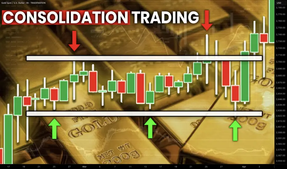
Best GOLD XAUUSD Consolidation Trading Strategy Explained
In article , you will learn how to identify and trade consolidation on Gold easily.
I will share with you my consolidation trading strategy and a lot of useful XAUUSD trading tips.
1. How to Identify Consolidation
In order to trade consolidation, you should learn to recognize that.
The best and reliable way to spot consolidation is to analyse a price action.
Consolidation is the state of the market when it STOPS updating higher highs & higher lows in a bullish trend OR lower lows & lower highs in a bearish trend.
In other words, it is the situation when the market IS NOT trending.
Most of the time, during such a period, the price forms a horizontal channel.
Above is a perfect example of a consolidation on Gold chart on a daily.
We see a horizontal parallel channel with multiple equal or almost equal highs and lows inside.
For a correct trading of a consolidation, you should correctly underline its boundaries.
Following the chart above, the upper boundary - the resistance, is based on the highest high and the highest candle close.
The lowest candle close and the lowest low compose the lower boundary - the support.
2. What Consolidation Means
Spotting the consolidating market, it is important to understand its meaning and the processes that happen inside.
Consolidation signifies that the market found a fair value.
Growth and bullish impulses occur because of the excess of demand on the market, while bearish moves happen because of the excess of supply.
When supply and demand find a balance, sideways movements start .
Look at the price movements on Gold above.
First, the market was rising because of a strong buying pressure.
Finally, the excess of buying interest was curbed by the sellers.
The market started to trade with a sideways range and found the equilibrium
At some moment, demand started to exceed the supply again and the consolidation was violated . The price updated the high and continued growth.
Usually, the violation of the consolidation happens because of some fundamental event that makes the market participants reassess the value of the asset.
At the same time, the institutional traders, the smart money accumulate their trading positions within the consolidation ranges. As the accumulation completes, they push the prices higher/lower, violating the consolidation.
3. How to Trade Consolidation
Once you identified a consolidation on Gold, there are 2 strategies to trade it.
The resistance of the consolidation provides a perfect zone to sell the market from. You simply put your stop loss above the resistance and your take profit should be the upper boundary of the support.
That is the example of a long trade from support of the consolidation on Gold.
The support of the sideways movement will be a safe zone to buy Gold from. Stop loss will lie below the support zone, take profit will be the lower boundary of the resistance.
AS the price reached a take profit level and tested a resistance, that is a short trade from that.
You can follow such a strategy till the price violates the consolidation and establishes a trend.
The market may stay a very extended period of time in sideways, providing a lot of profitable trading opportunities.
What I like about Gold consolidation trading is that the strategy is very straightforward and completely appropriate for beginners.
It works on any time frame and can be used for intraday, swing trading and scalping
❤️Please, support my work with like, thank you!❤️
I am part of Trade Nation's Influencer program and receive a monthly fee for using their TradingView charts in my analysis.
Mastering MACD- Complete Guide- 10 ways to trade itThe Moving Average Convergence Divergence (MACD) is a versatile indicator that can help traders navigate the markets with precision. From trend identification to momentum assessment, the MACD provides multiple actionable insights. In this educational post, we’ll explore the key ways to use MACD effectively, with an example illustration accompanying each strategy.
________________________________________
1. Signal Line Crossovers
The most common use of MACD is the signal line crossover, which identifies potential shifts in market momentum:
• Bullish Signal: When the MACD line (fast-moving) crosses above the signal line (slow-moving), it suggests upward momentum is increasing. This can be an entry signal for a long trade. Bullish crossovers often occur after a period of consolidation or a downtrend, signaling a reversal in market sentiment.
• Bearish Signal: When the MACD line crosses below the signal line, it signals downward momentum, often triggering a short-selling opportunity. Bearish crossovers can occur during retracements in an uptrend or at the start of a bearish reversal.
How to Use: Look for confirmation from price action or other indicators, such as a breakout above a resistance level for a bullish signal or a breakdown below support for a bearish signal. It's essential to avoid acting solely on a crossover; consider volume (stocks, crypto), candle stick formations and other market conditions.
Example: A bullish crossover on the daily chart on TRADENATION:XAUUSD indicates a potential buying opportunity as the price begins to rise. Add a stop-loss below recent lows to manage risk and look for a 1:2 risk:r eward in the next resistance.
________________________________________
2. Zero Line Crossovers
The MACD’s zero line acts as a boundary between bullish and bearish momentum, making it a valuable trend confirmation tool:
• Above Zero: When the MACD line moves above the zero line, it confirms an uptrend, as the fast-moving average is above the slow-moving average. Sustained movement above zero often indicates a strong bullish trend.
• Below Zero: A MACD line below zero reflects a downtrend, indicating bearish market conditions. Persistent movement below zero confirms bearish momentum.
How to Use: Use the zero line crossover to validate trades based on other signals, such as candlestick patterns or trendline breaks. The crossover can act as a second layer of confirmation for existing trade setups.
Example: MACD on a crypto pair crosses above the zero line, confirming the start of a new bullish trend. Traders can combine this with volume analysis to ensure strong market participation.
________________________________________
3. Histogram Analysis
The histogram represents the distance between the MACD line and the signal line, offering insights into momentum:
• Expanding Histogram: Indicates strengthening momentum in the direction of the trend. Larger bars show increasing dominance of bulls or bears.
• Contracting Histogram: Suggests weakening momentum, signaling a possible reversal or consolidation. Smaller bars indicate a loss of trend strength.
How to Use: Monitor the histogram for early signs of momentum shifts before a crossover occurs. The histogram can act as a leading indicator, providing advanced warning of potential changes in price direction.
Example: A shrinking histogram in a forex pair signals that the bullish momentum is losing steam, warning traders of a possible retracement. This can be a cue to tighten stop-loss levels or take partial profits. Conversely, an expanding histogram during a breakout confirms the strength of the move.
________________________________________
4. Identifying Divergences
MACD divergences are powerful tools for spotting potential reversals:
• Bullish Divergence: Occurs when the price makes a lower low, but the MACD forms a higher low, signaling weakening bearish momentum. This often precedes a trend reversal to the upside.
• Bearish Divergence: Happens when the price makes a higher high, but the MACD forms a lower high, indicating diminishing bullish strength. This suggests a potential reversal to the downside.
How to Use: Combine divergence signals with support or resistance levels to enhance reliability. Divergences are most effective when spotted at major turning points in the market.
Example: On a TRADENATION:EURUSD chart, a bearish divergence signals an upcoming price reversal from an up trend to a down trend.
________________________________________
5. Trend Confirmation
MACD confirms trends by staying consistently above or below the zero line:
• Above Zero: Indicates a strong uptrend. Look for pullbacks to enter long trades. The longer the MACD remains above zero, the stronger the trend.
• Below Zero: Reflects a persistent downtrend. Use rallies as opportunities to short. A sustained period below zero reinforces bearish dominance.
How to Use: Use MACD’s trend confirmation alongside other trend-following tools like moving averages or Ichimoku clouds. Ensure that market conditions align with the broader trend.
Example: Combining MACD trend confirmation with moving averages helps traders stay on the right side of the trend in a stock market index. For example, buy when both MACD and a 50-day moving average indicate an uptrend. Exit trades when the MACD begins to cross below zero or shows a divergence.
________________________________________
6. Overbought and Oversold Conditions
Although MACD is not traditionally an overbought/oversold indicator, extreme deviations between the MACD line and the signal line can hint at stretched market conditions:
• Overbought: When the MACD line is significantly above the signal line, it may indicate a price correction is imminent. This often occurs after an extended rally.
• Oversold: When the MACD line is well below the signal line, it suggests a potential rebound. Such conditions are common following sharp sell-offs.
How to Use: Monitor extreme readings in conjunction with oscillators like RSI for added confidence. Look for reversals near key support or resistance levels.
Example: An extended bearish move with a large MACD-signal line gap warns traders of a potential price correction. This can signal an opportunity to exit. Pair this observation with a bullish candlestick pattern to confirm the move (in this example morning star)
________________________________________
7. Combining MACD with Other Indicators
MACD works best when paired with complementary indicators to provide a more comprehensive market analysis:
• RSI (Relative Strength Index): Use RSI to confirm momentum and overbought/oversold conditions.
• Bollinger Bands: Validate price breakouts or consolidations with MACD signals.
• Support and Resistance: Use MACD signals around key levels for confluence.
How to Use: Wait for MACD signals to align with other indicator readings to improve accuracy. Cross-validation reduces false signals and increases confidence in trades.
Example: A bearish MACD crossover near a key resistance level reinforces a short-selling opportunity.
________________________________________
8. Multi-Timeframe Analysis
Using MACD across different timeframes strengthens trade signals and provides context:
• Higher Timeframe: Identify the broader trend to avoid trading against the market. For instance, if the daily chart shows a bullish MACD, focus on long trades in lower timeframes.
• Lower Timeframe: Pinpoint precise entries and exits within the higher timeframe’s trend. The MACD on lower timeframes can help fine-tune timing.
How to Use: Align MACD signals on both higher and lower timeframes to confirm trade setups. This alignment minimizes the risk of false signals.
________________________________________
9. Customizing MACD Settings
Traders can tailor MACD settings to suit different trading styles and timeframes:
• Shorter Periods: Provide more sensitive signals for scalping or day trading. Shorter settings react quickly to price changes but may generate more false signals.
• Longer Periods: Produce smoother signals for swing trading or position trading. Longer settings are less responsive but more reliable.
How to Use: Experiment with different settings on a demo account to find what works best for your strategy. Adjust settings based on the volatility and nature of the asset.
Example: A scalper uses a 5, 13, 6 MACD setting to capture quick momentum shifts in the market, while a swing trader sticks with the standard 12, 26, 9 for broader trends. Compare results across different markets to refine the approach.
________________________________________
10. Crossovers or Divergence at Key Levels
Combining MACD crossovers with price action levels enhances the reliability of trade signals:
• Horizontal Levels: Use MACD signals to confirm reversals or breakouts at support and resistance levels. Crossovers near these levels are often more reliable.
• Fibonacci Retracements: You can combine MACD with retracement levels to validate potential entries or exits. Confluence with retracements adds weight to the signal.
How to Use: Wait for MACD signals to align with key price levels for higher probability trades. Confirmation from candlestick patterns or volume (stock and crypto) adds further credibility.
Example: A bullish MACD divergence aligns with a strong support level, signaling a strong buy setup. Add confirmation with a candlestick reversal pattern, such as a piercing pattern in our case, to enhance precision.
________________________________________
Conclusion:
The MACD indicator’s flexibility makes it a must-have tool for traders of all styles. By mastering these strategies and integrating them in your trading, you can elevate your trading decisions.
Disclosure: I am part of Trade Nation's Influencer program and receive a monthly fee for using their TradingView charts in my analyses and educational articles.

Use Buy The Dip Like a LynchWhile we can’t say for certain that Merrill Lynch specifically uses VWAP (Volume Weighted Average Price) in their strategies, one thing is clear: they certainly rely on sophisticated statistical tools and data-driven insights to inform their investment decisions. Merrill Lynch, known for its expertise and successful track record, employs a range of techniques to navigate market fluctuations and identify profitable opportunities.
In the fast-paced world of trading, every decision counts. One strategy that has stood the test of time is Buy the Dip (BTD). This approach involves buying assets after they’ve experienced a temporary drop, anticipating that the price will bounce back 📉➡️📈. However, timing the dip correctly can be challenging without accurate data and predictive tools.
This article explores how to enhance your Buy the Dip predictions using OHLC Range Map and 4 VWAPs set to Century on TradingView.
What is the Buy the Dip Strategy? 🤔
The Buy the Dip (BTD) strategy is simple yet effective. Traders buy an asset after its price has fallen, believing that the dip is temporary and the price will soon rise again 📉➡️📈. The challenge, however, is knowing when the dip is truly an opportunity rather than the start of a longer-term downtrend.
This is where data-driven insights come into play. Rather than relying solely on intuition, having the right tools can make all the difference. With the OHLC Range Map, traders can gain a clearer understanding of price action, which helps identify whether a dip is worth buying 💰.
Strategies for Predicting Buy the Dip Levels 📍
Spot the Dip Using 4 VWAPS set to Century
Spot the Dip Using OHLC Range Map
1. Spot the Dip Using 4 VWAPS set to Century 🎯
Load 4 VWAPs on the chart, and configure them as follow:
1st VWAP: Source - Open, Period - Century
2st VWAP: Source - High, Period - Century
3rd VWAP: Source - Low, Period - Century
4th VWAP: Source - Close, Period - Century
When the price approaches key support or resistance zones, such as VWAP bands, particularly for well-established assets like ES, NQ, BTC, NVDA, AAPL, and others, there's a high probability of price reversal.
By combining this with price action analysis, you can identify precise entry points for a position with greater accuracy.
2. Spot the Dip Using OHLC Range Map 👀
The OHLC Range Map is a powerful statistical tool designed to plot key Manipulation (M) and Distribution levels over a specific time period. By visualizing these levels, traders can gain insights into market behavior and potential price movements.
For example, when analyzing the ES chart, we can observe that the bearish distribution level has already been reached for the next 12 months. This suggests that the market may be poised for a reversal, with the expectation of higher prices in the near future. By identifying these critical levels, traders can anticipate market trends and adjust their strategies accordingly.
Key Takeaways 🔍📊
Buy the Dip (BTD): The BTD strategy involves buying assets after a temporary price drop, expecting a price rebound.
Enhancing BTD Predictions: Using OHLC Range Map and 4 VWAPs on TradingView improves the accuracy of Buy the Dip predictions.
Spotting the Dip with 4 VWAPs: Configuring 4 VWAPs (Open, High, Low, Close) on a chart helps identify key support and resistance zones for potential price reversals.
Using the OHLC Range Map: The OHLC Range Map helps pinpoint Manipulation and Distribution levels, aiding in market trend anticipation and timing.
Combining Tools for Precision: Integrating the OHLC Range Map and VWAPs with price action analysis allows for more accurate Buy the Dip entry points.

What to do after you missed a big price move (Example: EUR/USD)There was a big fast move in EUR/USD last week.
The ‘European currencies’ did especially well versus the US dollar, including GBP/USD and USD/CHF as well as the ‘Skandies’ SEK/USD and NOK/USD.
If you rode the move, then job done. If you did ride the move up, you might have taken full profits already - or maybe you are leaving a little bit of the position open to ride any continuation of the move.
But, what to do if you missed it completely?
Explosive moves in the market usually mean traders who were on the ‘losing’ side step out for a while, having lost confidence in their view. For example if you were bearish and the market makes a significant move higher - you’re probably going to be a lot less confident in your bearish view - but perhaps also not ready to take an opposite bullish view. The loss of sellers in the market can see the up-move continue with minimal pullback.
This might suggest buying any small dips to ride the next leg higher, and emotionally it would offer some salvation to capture the second leg of the move even if you missed the first leg. However, what you are doing here is ‘chasing the market’.
One trouble is that after a big move in the market, there is no definitive place to put your stop loss, except at the beginning of the move - which is now far away. That's a bad risk: reward.
It is tempting to place a closer (more manageable) stop loss under lower timeframe levels of support - but then you find yourself trading an unknown strategy that requires different rules to follow because it is based on a lower timeframe.
And indeed, after a sharp move in the market - there is still a chance for a sharp pullback to match. Why? Because buyers quickly take profits on their unexpected quick gains, which will create selling pressure into minimal support - because the next support level is far away.
A sharp pullback would mean an opportunity to buy into the uptrend at a lower level, closer to the previous support. But then the flipside of the sharp pullback is that it raises questions over the sustainability of the initial move.
Probably the biggest takeaway here is not to think about this ‘explosive’ move in isolation.
Instead of forcing a trade, consider:
1. Waiting for the right setup in the same market. If your strategy is based on structured breakouts, wait for the next clean consolidation or pattern before re-engaging. A big move often leads to a new setup—but forcing a trade in the middle of a volatile move isn’t a strategy, it’s FOMO.
2. Looking at uncorrelated markets. Just because EUR/USD already made a big move doesn’t mean you have to trade it now. If you want to be in at the start of a move, shift focus to another market that hasn’t yet made its move.
3. Sticking to your edge. If your strategy works over hundreds of trades, don’t abandon it just because one market moved without you. The next opportunity will come—if not in this market, then in another.
Again, the best trades don’t come from reacting to what already happened, but from positioning for what’s about to happen. If you missed the move, accept it, reset, and wait for the next high-quality setup—whether in the same market or somewhere else.

What is Double Top or Double Bottom and how it works?Hello in this educational content we are talking about one of the major reversal pattern in market or maybe even the most important reversal pattern which is exist.
Double Top: Like the pattern mentioned on the chart now double Top is made by two reject from resistance but it is complete when the support or neckline of this two top break and then the pattern is complete and we can say this is a valid double Top and market now can get correction and get bearish.
here is chart & example take a look at Two kinds of Double Top available in my View:
As we can see sometimes price even made fake breakout to the upside or downside of the pattern and in these kinds of situation we can expect more fall if we had Advance Double Top because the liquidity was more at the beginning of second phase rejection.
We also have other Strong Reversal patterns like Head & shoulders and ... which you can mention them in comments or we may have another live post for them in next Educational posts.
most of You know about Regular Double top or Double Bottom and in this Educational post we mention some data about Advance form of it too and also so many know this form as regular form and consider this fake breakout a sign of good double Top and ....
Double Bottom is the same like the Double Top but reverse(This time support can not break two times and price after breaking neckline or resistance start to pump and bear market turn to bullish with Double Bottom).
DISCLAIMER: ((Always trade based on your own decision))-----this post is not signal content or analysis and just Try to talk about an important Reversal pattern with Example which happened also on Bitcoin in previous days in my Opinion.
<<press like👍 if you enjoy💚

Seeds in Chaos, Petals in Profit -A trader's guideSeeds in Chaos, Petals in Profit
A trader's guide to reading the market through nature's lens.
By: Masterolive
Intro:
This trader's guide is not another cookie-cutter trading system.
Instead, it focuses on building a long-term mindset and a way to read the market's chaos through nature's lens. This guide is grounded in real success but is not for the daily trader; it works for long-term swings using hourly price moves.
Over seven years of trading, I developed a unique way to view the market, which led to a practical trading mindset. The technique comes from simplifying the chart after experiencing endless combinations of indicators to no avail. It wasn't until I had to explain my concept to someone else that I found a way to use a garden analogy that fits the mindset well to see the market as a natural system: planting in chaos, thriving through storms.
Later, I read two books: "The Alchemy of Finance" by George Soros and "The Misbehavior of Markets" by Benoit Mandelbrot and Richard L. Hudson. Surprisingly, these two books validated my approach and inspired me to share it. Previously, I would tell no one because I thought it was silly.
The overall goal is to plant a garden, watch it grow, and understand how the weather affects the plants. This guide walks you through determining what flowers you want to plant and how to read the weather after you have made your choice.
It uses a garden and planting flowers as an analogy to choosing the right stocks and interpreting an EMA indicator to determine the market's direction. This guide also works well for Bitcoin.
This guide will help you understand how to read and interpret the chart. It will also give you accurate future context so you react less to the market moves and see the bigger picture: Plant while they panic.
This guide is not financial advice.
Part One - Planting.
Some traders focus on various companies based on technicals or fundamentals, some short-term and some long-term. Other traders will focus on a few stocks or diversify across many.
For this guide, we pick and diversify a sector with roles that thrive together. The industry can be broad or small, but we will use 10 assets, including nine stocks and Bitcoin, and explain how they correlate and grow into a weather-worthy garden.
In this garden, we will focus on Tech and Finance and explain how to plant and organize the garden. First, we must look back at the broadest picture in finance. We will choose a stock exchange and a crypto exchange in this garden. (1 and 2 out of 10 flowers)
Why an exchange? Simply put, traders will always look for stocks and crypto to buy. They will look for the best companies and the best opportunities. Therefore, stock exchanges will benefit from the revenue they generate. If a stock goes parabolic, the exchange still profits from that price move.
Choosing the exchange skips the hassle of finding companies in a haystack. The same is true for the crypto exchange. Our garden has two flowers: one stock exchange and one crypto exchange, representing those two sectors.
Next, what else can correlate with our garden from a zoomed-out view?
Let's choose a Bank and a payment processor. (3 and 4 out of 10 flowers)
Traders will need the bank to on and offramp their cash profits to and from the stock and crypto exchange. Meanwhile, they will need to process those electronic payments.
The bank and payment processors benefit from trading surges; if everyone piles in for a parabolic price move of a particular stock, the bank and payment processors benefit from the action, and the exchanges offering the stock get revenue from the surge.
Once again, this choice skips the need to hunt for specific stocks. It takes advantage of all stocks since traders need cash, banks, electronic payments, and exchanges to buy those company stocks or bitcoin.
Our garden now has Four flowers, a bank and payment processor, and two exchanges for this sector. The correlation? Exchanges, banks, and processors all thrive when traders move money.
The fifth is a pivot flower before we discuss the tech company sector. This pivot flower is a gambling company (5 out of 10).
How does this correlate? Some traders and other users gamble with their cash and profits; even in a recession or a depression, people will still gamble. Plus, users might take their gambling winnings and invest them in a stock or buy bitcoin. They need a bank, an exchange, and a payment method.
In this case, the flowers are self-reinforcing: gambling winnings or losses, stock booms or busts; it doesn't matter in the big picture because, once again, exchanges, banks, and processors all thrive when people move money. Our garden now has five flowers with a broad but strong correlation.
Now, on to the tech sector with the last five flowers.
You will hone in on specific tech roles at this point, but remember that your choices will be self-reinforcing.
If your choice booms, the exchange benefits, and you benefit again from the exchange stock. You will electronically transfer your profits to your bank, which you benefit from by owning the bank stock and payment processor. But if you're smart, you will skip the gambling and let the crowd roll the dice while you plant the profits.
We will focus on two more flowers (6 and 7 out of 10) for tech, so we need to find companies exposed to the popular and relevant tech we want. For tech company 1, you could expose yourself to AI, EVs, and ROBOTS. For tech company 2, Semiconductors (or graphics cards).
In this section of our garden, graphic cards and AI rely on one another, while EVs and robots use AI to operate. Eventually, people will buy or sell the robot and EV, and some may use the profits to buy stock (or Bitcoin), requiring a bank and payment processor.
Meanwhile, people use LLMs, log into their bank, or exchange daily on a computer that requires a graphics card.
Our garden now has seven flowers out of 10, 3 more to go!
We want to diversify (but stay correlated with our garden), so next, we will look at a real estate company or ETF—but not just any company or ETF, one that develops in tech hub areas. How does this correlate?
Robots, AI, EVs, and graphics cards all need workers to operate the companies; young talent will want to move to places where they can work in AI or Robotics or factory EV workers, so the real estate in those areas will be in high demand, so now we own the real estate for our Ai, EV, Robots, and graphic card workers.
As tech grows, real estate booms, driving more money through exchanges, banks, and processors.
We now have eight flowers in our weather-worthy garden.
For the 9th flower, we turn to a wildflower: none other than Bitcoin. Bitcoin is not just a crypto coin but a capital asset, a store of value for your currency when it debases.
People, especially tech workers, will buy, trade, and sell Bitcoin.
As people learn and turn to the asset, global capital will flow through Bitcoin as people around the world save their cash value,
whether it be from gambling winnings, selling a car, selling real estate, selling a stock, or simply putting part of their income from their tech job into it regularly. All of this requires Exchanges, Banks, and payment processors to move.
Bitcoin correlates with that, as exchanges profit off bitcoin, which you own stock in the exchange company. You still need a bank to land on and a payment processor to move the money electronically.
We now have nine flowers in our garden, and it's almost complete.
How can we diversify even more? We can use industrial metal for our last flower, but how does an industrial metal correlate with our tech and finance garden?
Copper is the metal that conducts electricity, and electricity is needed to move money, send Bitcoin, power a growing network of EV superchargers, and power the factories that produce EVs, graphics cards, robots, and more. Copper's the most vigorous root, tying every flower, from tech to finance, into a weather-worthy bed. Meanwhile, the crowds go for gold and sleep on copper.
That completes our garden with 10 flowers. It's a diversified flowerbed, but the flowers correlate in the big picture: Tech drives money movement, which benefits exchanges, banks, and processors; copper powers tech, which drives Bitcoin adoption.
Your goal is to find and build your garden. Think up different bigger pictures with other sectors and roles. Correlating these assets keeps the garden strong through chaos and self-reinforces one another.
To review, we have the following:
Stock exchange
Crypto Exchange
Bank
Payment processor
Gambling
Ai / EV / Robots
Semiconductors (Graphics cards)
Real estate
Bitcoin
Copper
Now that we have planted our garden, let's examine the weather and its meaning. We will learn to read the weather and see when storms are coming or clearing.
In part 2, you will set a simple EMA indicator, learn how to interpret the weather, and tend to the flowers in our garden.

How I play 0DTE during EOD volatility of last 15min/30minChart is from yesterday 3/3/2024(mon) + today 3/4/2024(tue)
Timeframe:1min
Indicator used: MACD, SlowStochastic RSI, 5MA, 20MA.
I use 1min 5ma as TREND(S) to scalp, just make sure MACD+SlowStochastic agrees.

How to Find Best Supply and Demand Zones/Areas in Forex & Gold
In this article, I will show you the strongest supply and demand zones.
These zones are called confluence zones.
I will teach you to identify these areas properly and explain how to apply it in Forex and Gold trading.
Let's start with a short but important theory.
In technical analysis, there are 2 types of supports and resistances.
Horizontal structures are supports and resistance that are based on horizontal key levels.
Vertical structures are supports and resistance that are based on trend lines.
A confluence supply or demand zone, will be the area of the intersection between a horizontal and vertical structures.
Look at GBPJPY pair. I underlined a significant horizontal support and a rising trend line - a vertical support.
We see a clear crossing of both structures.
The trend line and a horizontal support will compose a narrow, contracting area. It will be a confluence demand zone.
Within, with a high probability, a high volume of buying orders will concentrate, and a strong bullish movement will initiate after its test.
Above is one more example of a powerful demand zone.
It was spotted on a Gold chart.
Now let's discuss the supply zone.
There are 2 strong structures on GBPNZD: a vertical resistance - a falling trend line and a horizontal resistance.
These 2 resistances will constitute a confluence supply zone.
That is a powerful resistance cluster that will concentrate the selling orders. Chances will be high to see a strong bearish movement from that.
There is a strong supply zone on CHFJPY that is based on the intersection of a wide horizontal resistance and a falling trend line.
Supply and demand zones that we discussed are very significant. Very often, strong bullish and bearish waves will initiate from these clusters.
Your ability to recognize these zones will help you to make accurate predictions and identify a safe point to open a trading position from
❤️Please, support my work with like, thank you!❤️

The Right Questions to Ask Before Entering a TradeEvery day, traders—especially beginners—ask the same recurring question:
❓ What do you think Gold will do today? Will it go up or down?
While this seems like a logical question, it’s actually completely wrong and one that no professional trader would ever ask in this way.
Trading is not about predicting the market like a fortune teller. Instead, it's about analyzing price action, managing risk, and executing trades strategically.
So, instead of asking, "Will Gold go up or down?" , a professional trader asks three critical questions before taking any trade.
Let's break them down.
________________________________________
Step 1: Identifying the Right Entry Point
Let’s say you’ve done your analysis, and you believe Gold will drop. That’s great—but that’s just an opinion. What really matters is execution.
🔹 Where do I enter the trade?
Professional traders don’t jump into the market impulsively. They use pending orders instead of market orders to wait for the right price.
If you believe Gold will fall, you shouldn’t just sell at any price. You need to identify a key resistance level where a reversal is likely to happen.
For example:
• If Gold is trading at $2900, and strong resistance is at $2920, a professional trader will set a sell limit order at that resistance level rather than shorting randomly.
This approach ensures that you enter at a strategic point where the probability of success is higher.
________________________________________
Step 2: Setting the Stop Loss
🔹 Where do I place my stop loss?
A trade without a stop loss is just gambling. Managing risk is far more important than being right about market direction.
The key is to determine:
✅ How much risk am I willing to take?
✅ Where is the invalidation level for my trade idea?
For example:
• If you are shorting Gold at $2920, you might place your stop loss at $2935—above a recent high or key technical level.
• This way, if the price moves against you, you have a predefined maximum loss, avoiding emotional decision-making.
Professional traders never risk more than a small percentage of their account on a single trade. Risk management is everything.
________________________________________
Step 3: Setting the Take Profit Target
🔹 Where do I set my take profit, and does the trade make sense in terms of risk/reward?
Before taking any trade, you must ensure that your reward outweighs your risk.
For example:
• If you risk $15 per ounce (short at $2920, stop loss at $2935), your take profit should be at least $30 away (for a 1:2 risk/reward).
• A good target in this case could be $2890 or lower.
This means that for every dollar you risk, you aim to make two dollars—ensuring long-term profitability even if only 40-50% of your trades succeed.
If the trade doesn’t offer a good risk/reward, it’s simply not worth taking.
________________________________________
Conclusion: The “Set and Forget” Mentality
Once you’ve answered these three key questions and placed your trade, the best approach is to let the market do its thing.
✅ Set your entry, stop loss, and take profit.
✅ Follow your trading plan.
✅ Avoid emotional reactions.
Many traders lose money because they constantly interfere with their trades—moving stop losses, closing positions too early, or hesitating to take profits.
Instead, adopt a professional approach: set your trade and let it run.
📌 Final Thought:
The next time you find yourself asking, “Will Gold go up or down today?” , stop and ask yourself:
📊 Where is my entry?
📉 Where is my stop loss?
💰 Where is my take profit, and does the risk/reward make sense?
This is how professional traders think, plan, and execute—and it’s what separates them from amateurs.
👉 What’s your biggest struggle when it comes to executing trades? Let’s discuss in the comments! 🚀
Disclosure: I am part of Trade Nation's Influencer program and receive a monthly fee for using their TradingView charts in my analyses and educational articles.
