Supply and Demand patterns scanned automaticallyVery often the main issue for traders is to just on time (quickly?) spot on chart correct patterns that may warn traders about incoming to market Supply or Demand. Everyone tries to catch reversals as this is beginning of potentially long new trend. And asking yourself try to answer honestly to yourself - how often you skipped the move because you didn't notice it at first glance and only it was visible to you AFTER the move happen, when you revisited chart and tried to take lesson learnt from chart and wondering why you didn't enter trade that time..
There could be a lot of reasons of that but one of main that I try to fight is - eliminate subjectiveness. Therefore still I don't automate trading, but try to get potential signals identified by software. After multiple months of research and work, I modified original VSA approach and prepared better version of definitions combining knowledge and tips from multiple VSA Experts. That's how software was created and is learnt to identify Demand and Supply Signals automatically notifying me via alerts/notifications about potential trades. When we add to those signals automatic drawing of Volume Zones, we have complete trading system. Especially during first retest Volume Zones works like a charm when there's perfect opportunities to enter trades in original direction of first breakthrough.
On chart I also marked recent examples of Demand & Supply signals that were identified by Scanner BEFORE the trend move happened. Still judgement of trader (manual) is needed but Scanner gives already big edge on market. Combining this with Volume Analysis known from VSA approach and with knowledge about basic market structures, there's no other option than become profitable trader. Of course if you follow your own trading rules and properly manage money alongside with Risk:Reward ratio.
Support and Resistance

Fibonacci Expansion (How To Use)PLOTTING A FIBONACCI EXPANSION:
- Select the Fibonacci Expansion Tool
1) Start From The Top Of The Trend (In A Down Trend)
2) Set The Middle Point Where The Correction Started
3) Set The 3rd Point, Where The Correction Ended
Possible Target areas and/or zones are plotted below this 3rd point for you to utilize as per your risk management and trading style.
*For an uptrend set up you would just need to turn the above upside down, not hard but will help lessen your stress when trading FX.

Fibonacci Retracement Definition Part 4Fibonacci Retracement Definition Is:
In finance, Fibonacci retracement is a method of technical analysis for determining support and resistance levels.
It is named after the Fibonacci sequence of numbers, whose ratios provide price levels to which markets tend to retrace a portion of a move, before a trend continues in the original direction.
A Fibonacci retracement forecast is created by taking two extreme points on a chart and dividing the vertical distance by important Fibonacci ratios.
0% is considered to be the start of the retracement, while 100% is a complete reversal to the original price before the move.
Horizontal lines are drawn in the chart for these price levels to provide support and resistance levels. Common levels are 23.6%, 38.2%, 50%, and 61.8%.
Yes, you can add or change any and/or all of these numbers to your trading style- they can be used to enter a trade, set stop loss and targets.
This retracement percentage lines are short term reversal areas to possible take new trades with the main trend of day, week or month.

Fibonacci Retracement Entries Part 3Fibonacci Retracement Tool can:
1) Give you Support lines or areas
2) Give you Resistance lines or areas
3) Where to enter a trade
4) Where to place your stop loss
5) Where to place your target profit (use the Fibonacci extension tool for profit targets)- where price action MIGHT go too.
Your trading will be easier if you use the Fibonacci Retracement tool (and Extension tool)- by making your trading strategy mechanical. Trading without emotions and with risk management will put you into the 10% of successful traders, this is where you want to be.
Buy low into an upwards trend and Sell low into a downtrend will great increase your profits and reduce your stress- Fibonacci Tool is the one for this.

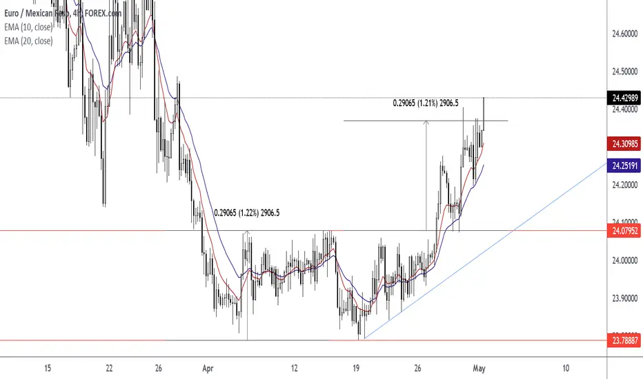
How To Trade The Ascending Triangle + Double Bottom ComboWait For The Close Above the Neckline at Horizontal Level 24.07952. After the close above level; resistance level turned support.
Wait For The Retest Of The Neckline At 24.07952. Watch For A Pin Bar or Rejection Candlestick to form at the horizontal neckline.
Enter Trade At The Closing Price Of Pin Bar or Rejection Candlestick.
Set Target Price Using Measured Objective Of Pattern. Measured Objective Is 24.37017. Measured Move Is 2906.5. Height Is 2906.5.
Exit Trade At Target Price.
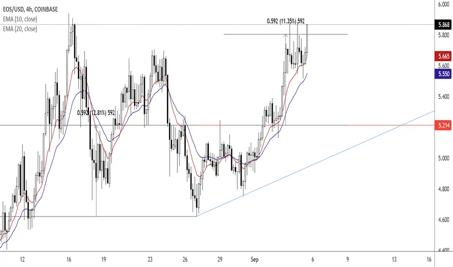
How To Trade The Ascending Triangle Trading The Ascending Triangle
Wait For The Close Above The Horizontal Level
Wait For The Retest in the form of a pin bar or rejection candlestick.
Enter At The Close Price of Pin Bar or Rejection Candlestick
Exit At The Measured Objective of Pattern. The Height of Pattern is 592.
ETHUSDTLook at Black Lines on My Chart...
They are Support & Resistance for Moving Average thats Mean when MA Cross Above or Below this Lines,Price starting to Reaction...
Check when Moving Average in Daily & Weekly Time Frames Reach the Black Lines on the Chart and Watch the Price ...

How To Spot and Use Liquidity Zones In Your TradingIn this video we show how you can easily spot where liquidity is on a chart and how to use this information to profit from in your own trading
Of course for a successful trading strategy, this is only a small part of the puzzle and you will need to add many more aspects of analysis.
Please LIKE, SHARE & COMMENT on this video to show your support.
Let me know if you have any questions below!

What is Support and Resistance?If you have ever looked at a chart or made a trade then you have most likely heard of support and resistance, but everyone has their own approach to identifying and trading it.
What is it?
Support is an area where there is a surplus of buyers. When price enters this area the buying pressure is stronger and price increases.
Resistance is an area where there is a surplus of sellers. When price enters this area the selling pressure is stronger and price falls.
How is support and resistance formed?
As price moves up buying pressure will gradually decrease until the selling pressure becomes the dominant force. When this happens, the area become resistance .
When the selling pressure is stronger than the buying pressure the price will start to retrace (also known as a pullback). Price will continue to retrace until buying pressure becomes the dominant force again. When this happens, the area becomes support .
How to plot support and resistance
You’ll often see support and resistance plotted as a single thin line on the previous low or high. It is important to remember that support and resistance are areas not exact numbers. Buy and sell orders will be scattered throughout the area, not just on the exact high or low, so we should draw our support and resistance as an area, not a single line.
How to trade support and resistance
Trade the bounce
Buy when price bounces on support
Sell when price bounces off resistance
Trade the break
Buy when price pushes through resistance
Sell when price falls through support
Important things to remember
When price breaks through an area of resistance, that area has potential to turn into support. Likewise, when price breaks through an area of support, the area has potential to turn into resistance.
Price will often revisit an area of support or resistance multiple times. The more times this happens, the weaker the area becomes and the more likely price is to break through. This happens because every time price visits that area the orders are absorbed, and the next time it visits the area there are fewer orders. Fewer orders make the area easier to break through.
Share your thoughts in the comment section below.
Happy trading!

How to Find trends ?This video explains how easy it is to trades ? Don't make this complicated ,trading is simple

IMPROVE YOUR TRADING | Simple Flowchart For You to Follow 🧭📍
A short ⚠️disclaimer before we start:
the rules that will be discussed in this post are applicable only for technicians - traders that are relying on price action/structure/etc.
Also, we assume that structure levels do work and for us, key levels are considered to be the safest trading zones/points.
In order to increase the accuracy of your predictions analyzing different financial markets, you must learn to identify the direction of the market.📈
The identification of the market trend must be based on strict & reliable & testable rules.
It can be based on technical indicators or price action
Personally, I prefer to rely on price action.
Here are a couple of examples of how I identify the market trend:
There are three main types of market trends:
Bullish Trend
Bearish Trend
Sideways Market
Depending on the current direction of the market, on the chart, I drew a flow chart✔️ that will help you to act safely.
➡️Sideways market signifies consolidation & indecision. Usually being in such a state the market tends to coil in horizontal ranges.
To trade such a market safely, the best option for you will be to wait for a breakout of the range & wait for the initiation of the trend.
➡️Once you spotted a bullish market, do not rush to buy.
Your task will be to identify the closest strong structure support.
You must be patient enough to let the price reach that support first (and by the way, there is no guarantee that it will happen) and then you must wait for a certain confirmation.
Please, check the article about different types of confirmations:
Only once you get the needed confirmation you can buy the market.
➡️The same strategy will be applicable to a bearish market.
Spotting a short rally it is way early to just sell the asset from a random point.
You must find the closest strong structure resistance and wait for the moment when the price will approach that.
Then your task will be to wait for a confirmation and only when you got the reliable trigger you short the market.
🦉Try to rely on this flow chart and I promise you that you will see a dramatic increase in your trading performance.
And even though it may appear to you that this flow chart is TOO SIMPLE, in practice, even such a set of rules requires iron discipline and patience.
Thank you so much for reading this article,
I hope you enjoy it!
❤️Please, support it with like and comment. Thank you!

Supply & Demand zone trading (Continuation and Confirmation)You should use a few charts when you trade (I use three minimum)- daily, 4 hour and 1 hour (enter on either 4 hour or 1 hour) scalps or day trades.
You want to used supply and demand zones to trade from, either continuations or bounces out of back into major trends.
Please practice finding and trading out of during your trading- in zones is mostly accumulation and sideways/ or ranging price action.
As noted on example charts: both demand and supply zones can switch after price action breaks areas and turn into the opposite one. Be flexible.

Supply and Demand Zones (Strong or Weak)Why Are Some Supply and Demand Zones Stronger Then Other Ones?
1) The strength of a zone is determined by the move it makes
2) Recent zones will be more powerful than the old zones
3) Untouched zones are stronger than the zones that have been tested
Drawing demand and supply zones is a subjective job, but as you practice they will becomes easier to do. Yes, Practice on TV charts...
How to trade out of zones:
1) Find origin of 1st move and extend zone box to right on daily chart.
2) Only trade when price action goes out of either supply or demand box with harami, engulfing or pin bar setups- they are easy to see on charts.
3) Entries and stop losses are based on original candle of zone: Demand zone enter of price action about candle with stop loss below candle (see chart)
4) If you trade based on daily candles, then look for a 1:1 minimum Risk Reward or higher with correct risk management and lot size,etc..
Note on chart: possible bullish future trade out of Demand zone rectangle box. Something to think about for last part of month or next month.

Daily Supply & Demand Zone (How To Draw Them)Pick where the origin of a daily time frame chart move suddenly down or up and place a long rectangle box around high and low of candle (see chart) and extend this rectangle box right on chart.
If that rectangle box engulfs future price action and PA reverses then you have found a respected demand or supply zone- to set up new trades from.
Supply and Demand zone areas on daily charts are where big banks or institutions trade from and leave their FOOTPRINTS that you can read on charts.
Do not ever fight big banks or big institutions- just trade with them related to having less stress and emotions.
If you can trade breaks of these demand and supple zones trades will be much easier to do and you will not be involved in that much of price action chop or sideways ranging price action.
These areas are where consolation or accumulation of orders occur and can last longer then most retail traders have time or money to wait for breakouts of price action. Trading when price action breaks either Demand or Supply zones means one side has waved white flag and surrendered, thus price action breaks outs of these areas mostly with big large institutional candles.

Poor Reversals GuidePoor Reversals Indicator
This indicator finds Poor Reversals. Poor reversals are reversals in price with consecutive highs or lows that are close together. Look for the different types of highs and lows. Some say candle patterns don't matter, but they forget it's the orderflow that makes the pattern. Find poor, tweezer , and 1 tic rejections and study what happens next. We don't need to read the depth of market to see what the orderflow is saying. They are called poor because the auction didn't run its course. It didn't continue the direction until all activity in that direction was exhausted. Proper reversals create excess. Excess is a long tail/wick. A proper reversal leaves a long tailed excess unfilled.
The different highs and lows give clues to what kind of orderflow happened there. The difference between them is which high or low happened first. Price does often come back to these areas and clears them up with a proper reversal. We can see them on all timeframes. Knowing what they mean in the orderflow helps with reading charts.
The Poor Reversals are:
Poor
1 Tick Rejection
Tweezer
When looking at 2 bars that have very close high or lows, there are a few different types. They are each poor and can be further defined as each are price action clues.
If next low is higher, it's a poor low
If next low is lower, it's 1 tic rejection
If next low is equal, it's tweezer bottom
If next high is lower, it's a poor low
If next high is higher it's 1 tic rejection
If next high is equal it's tweezer top
Poor Highs and Lows:
The high or low comes first. The next bar does not go past it. Poor highs and lows are often created from price exhaustions. This means at poor highs buyers are trapped. At poor lows sellers are trapped. Price ran out of steam to continue in that direction. There wasn't enough activity/participation to continue the auction in that direction.
Poor lows are defined when 2 lows are very close, and the 1st bar is lower. The 2nd comes very close to a new low. It happens most when shorts, at the moment, "run out of steam". They were "too aggressive" and got themselves "short in the hole". When a poor low is made, price will bounce because shorts are buying to protect profits.
Poor highs are defined when 2 highs are very close. The 1st bar is higher. The 2nd comes very close to a new high. It happens most when longs, at the moment, "run out of steam". They were "too aggressive" and got themselves "long in the tooth". When a poor high is made, price will pullback because longs are selling to protect profits.
1 Tick Rejections:
The high or low comes last. The last bar goes just a little bit beyond the first bar. A "1 tic rejection" happens when a new low is made and quickly rejects. The name is misleading. It doesn't have to be "1 tic". Different markets have different measurements. For ES, it's less than 8 tics. For NQ, it's about 5-20 points. It varies depending on relative market volatility .
1 Tick highs are defined when 2 highs are very close, and the 1st high is lower. The second high is a small peek above. This happens when longs are aggressive and drive price up. Price makes a newer high and longs rapidly start taking profits. Their selling activity drives price lower. In the orderflow, longs likely closed at the same time new shorts sell. This competition to sell drives price lower. At the high, it says longs saw it wouldn't go higher and they took rapid exit.
1 Tick lows are defined when 2 lows are very close, and the 1st low is higher. The second low is a small peek below. This happens when shorts are aggressive and drive price down. Price makes a newer low and shorts rapidly start taking profits. Their buying activity drives price higher. In the orderflow, shorts likely closed at the same time new longs buy. This competition to buy drives price higher. At the low, it says shorts saw it wouldn't go lower and they took rapid exit.
Tweezer Tops and Bottoms
The highs or lows of the bars are equal. Tweezers most often mean that an aggressive trader is influencing price. They drove price in one direction and then quickly reversed sentiment. Tweezers most often happen in stop hunts. An aggressive trader found where the stops were located and then entered an aggressive order to turn the market.
Tweezer Tops are defined when 2 highs are equal. The first bar sets the high. The second bar matches the high. This happens when there is an active seller entering. It could be simple profit taking from longs or new aggressive shorts. In price action, price will move up to find short stops. When the stops are found, the market reverses sharply lower.
Tweezer Bottoms are defined when 2 lows are equal. The first bar sets the low. The second bar matches the low. This happens when there is an active buyer entering. It could be simple profit taking from shorts or new aggressive longs. In price action, price will move down to find long stops. When the stops are found, the market reverses sharply higher.
Poor Reversals can be Poor, 1 Tick Rejections, or Tweezers. They are all considered poor and upon further investigation we can see they are created from different conditions in the orderflow. They are not called Poor Reversals because they are weak. They are called poor because of the action that happened there. One side got caught in a bad position. Other sharks in the market smelled blood and ripped them apart.
This indicator is a work in process. While the concepts are great for real time trading, this indicator is not designed to be used in real time trading. It will repaint based on the bar close. The purpose of this indicator is to train our brains to see these nuances on candle charts. Some say candle patterns don't matter, but they forget it's the orderflow that makes the pattern. We must make split second decisions and knowing the context behind the orderflow reduces response time. These poor reversals don't have to retest, and the best ones won't come back. I use these concepts to find exits, where my trades might be wrong, confirmation I'm on the right side. It's amazing how these simple nuances can turn the markets. But sure enough, they do. Check them out in all time frames.
It's a fun indicator to play with. Some markets do require tweaks to the “Ticks” setting. Too big and charts will be noisy. Too low and not much will show up. A general rule of thumb is more volatile markets need higher tick values while less volatile need lower Tick values. Higher timeframes are also more reliable than lower time frames. I've included some customizable settings and I plan on adding more in the future. Enjoy!

BITCOIN IS A PROPHECY , IT HAS A CYCLE TO FULFILL !!!Hello Traders !!!
INTRODUCTION
First I want to introduce you to a content of what I want to say and that you will all call me an unnecessary person of course on what I say and you will think that everything is a conspiracy theory, but in fact it is not so but is the truth about what happens to Bitcoin and a complete theory that will be described in this section.
(V1) Is bitcoin a gambling game that sinks traders once in 2 years ?
We all know the crash of 2017 when the news spread and rumored a lot on bitcoin that it is a scam a similar ponzi scheme and fell to a big% of 83.94%. But I want to remain now you have her fall not to the year she has fallen. Its decline was about 83.94% and that in fact its recovery came after 2 years where in 2019 it came with a great frenzy that created an all time high and again a big boom it exploded and sank its traders who had bought by then retailer selling their bitcoin as soon as FUD news was doing its thing and its decline was about 74%.
Going back to the present time another decline comes and destroys everything it was 2021 April, we all experienced that decline that we had barely reached a sum of 61k for bitcoin but already in April it read the lowest note 28k for Bitcoin this demonstrated best that Bitcoin does not have a stability but its fact all analysts were expecting a drop to 24k or 20k as of course the support points were in these 20k and 18k areas.
My question to you is, again bitcoin turned into a 30k support? and why is it making its way to 57k so fast? Do we have something that stands out and that we actually do not know?
I think she is completing a cycle as her decline has been only 56.44% but in fact she is looking for an even higher support point, while at 57k and 61k we have an unfilled space from the sellers who throw the price with forward and that are continuing to increase it by taking a liquidity.
The bitcoin sales cycle has not been achieved and in fact we have to meet at least 80% of its falling which will come soon.

The Best & Most Reliable Candlestick Patterns To UseIn this video I explain my favourite candlestick patterns and how to use them in your own trading.
Here we describe:
Engulfing Candles
Doji Candles
Hammer Candles
And I explain how to use them with confluence & context of where on the chart they occur.

AUD/USD: Power of round numbers in forex tradingA look at the following downtrend in the AUD/USD currency pair shows 3x 300-pip swings that start and end close to round numbers.
The swings in the price sometimes stop almost perfectly at the round numbers, but sometimes they fall just short or runover them before reversing. Which one happens doesn’t matter for the purposes of a swing trader. If you are targeting a 300-pip profit on a forex trade, you don’t care about missing 20-pips or even 50 pips at the start or end of the move. Your sole objective is capturing those core 300 pips. The scalpers and day traders can fight over the rest.
Hope this was instructive

Is there hidden rationality beyond irrationality?Gama Squeeze Happens between Quadruple Witching Dates
When stock prices experience rapid shifts, the conditions may be ripe for a squeeze. In this scenario, investors may find themselves buying or selling shares of stock outside their normal trading pattern in order to minimize losses. A gamma squeeze is an extreme example of this, in which investor buying activity forces a stock’s price up. Gamma squeezes are often associated with options trading and they can be problematic for investors who don’t fully understand how they work.
A short squeeze is a specific type of stock squeeze. With a short squeeze, an increase in stock prices can force people who shorted the stock to buy back their shares.
How a Gamma Squeeze Works
Certain conditions have to be met for a gamma squeeze to manifest in the market. It starts with investors making assumptions about a particular stock’s price. Specifically, they assume that the stock will rise in price.
This leads to buying short-dated call options in the stock on a large scale. A call option’s value increases when the underlying stock it’s associated with increases in value. Meanwhile, this puts the institutional investors selling the options in a short position.
If this pattern continues with investors sinking more money into call potions, that can force institutional investors to buy more shares of the stock. This is a necessary step for hedging against the short position they now find themselves in.
The gamma squeeze happens when the underlying stock’s price begins to go up very quickly within a short period of time. As more money flows into call options from investors, that forces more buying activity which can lead to higher stock prices. Investors who purchased call options and sell when stock prices are high can reap sizable profits but the institutional investors who had to cover their short positions might see significant losses. (1)
Now lets review 10 famous example in 2021:
1- NYSE:GME
2- NYSE:AMC
3- NYSE:BB
4- NASDAQ:BBBY
5- NYSE:NOK
6- NASDAQ:CLOV
7- NASDAQ:SOFI
8- NASDAQ:WKHS
9- NYSE:FSLY
10- NASDAQ:NAKD
As you see all these spike patterns happened between Quadruple Witching Dates!
What Is Quadruple Witching?
Quadruple witching refers to a date on which stock index futures, stock index options, stock options, and single stock futures expire simultaneously. While stock options contracts and index options expire on the third Friday of every month, all four asset classes expire simultaneously on the third Friday of March, June, September, and December.
Quadruple Witching Dates 2021
March 19, 2021
June 18, 2021
September 17, 2021
December 17, 2021
I believe a new round of Squeezing has just started and VLDR and GOEV, two of the most shorted stocks are just the tip of the iceberg.
GOEV: Short Percent of Float 32.48 %, 32.3M, 10 days to cover..!
VLDR: Short Percent of Float 16.06 %', days to cover 4.5
Do you know Which stocks have the potential to be the next Short or Gamma squeeze???
Reference Article:
www.yahoo.com
www.investopedia.com

Pulse of an Asset via Fibonacci: AMP's perfect Golden Growth FibThis Chart is a an example of a "Golden" Fib series.
This Concept is from "Chapter 5" of my going "book".
This Religion is of the universality of the "Golden Ratio".
Marked on chart are "Pings", ricochets that one can almost HEAR.
"Not all Pings start a reversal, but Most reversals start with a Ping."
Top had a "Loud" ping, with subsequent waves also marked by Pings.
Every Ping is like a bug hitting a spider's Web.
The vibration alerts and emboldens other strands.
Thus we observe the behavior at each strand for clues.
.
I do not use "Fibs" in the "traditional" manner (retracements).
I use Fibs to plot "Ripples" (extensions) created by "Impulses".
Then look for "Confluences" to map the "interference Pattern".
My "Book" detailing my Methodology with Numerous Examples:
Chapter 1: Introduction and numerous Examples
Chapter 2: Detailed views and Wave Analysis
Chapter 3: The Dreaded 9.618: Murderer of Moves
Chapter 4: Impulse Redux: Return to Birth place
Chapter 5: Golden Growth: Parabolic Expansions
Chapter 6: Give me a ping Vasili: 'one' Ping only
Chapter 7: The Mighty 2.618: like a Rook in Chess
.

Support & Resistance (Look For Swing Points)Support and Resistance
The price action trader pays particular attention to pivotal price levels, often “drawing” these lines horizontally as Support and Resistance levels. The theory behind employing these lines is that the market has a sort of memory: price behaves with respect to certain levels that have previously been significant
turning points in the historical narrative of the price’s action, and other market participants are likely to also be trading with consideration for these levels.
When the levels are below the current price, they constitute “Support,” a potential buffer against bearish movement; when the levels are above the
current price, they appear as “Resistance,” a potential barrier to bullish movement. As price comes close to these levels, traders often wait until the levels have been tested and either broken or defended before they are confident enough in the direction of price’s movement to enter into a trade.
As price moves through one of these levels, they convert into the opposite role –when pierced by an uptrend, a Resistance level becomes a Support level, indicating a significant level at which buyers successfully drove price up beyond a level previously guarded by sellers.
In general, price action traders buy at Support and sell at Resistance, relying on these previously-tested levels to make safer bets on the future behavior of price. Most significant Support and Resistance levels are those closest to current price level, as they are the most likely to be taken into consideration in the immediate developments of price movement – some traders will only draw in the nearest reliable level of Support and Resistance to simplify their charts.

The Breakthrough StrategyGreetings, traders! Welcome to this short, 7-step strategy lesson.
Are you new to trading? Don't worry: we're dedicated toward providing the most high-quality, easy-to-understand, and straight-to-the-point investing education to the TradingView community. This strategy lesson is beginner-friendly (we have pictures!), as we've inserted helpful links into each and every term, just in case you don't know them yet. Anyways, let's get right into the steps of this effective trading method , which we've named " The Breakthrough Strategy ":
• STEP 1, The Breakthrough:
Identify a breakout (or "breakthrough") at the most recent Support/Resistance (S&R) zone. With the horizontal line tool, if you haven't already, mark the level at which price broke: this will be your potential Entry Point (EP).
• STEP 2, The Turnaround:
Immediately following the breakout, you'll wanna see two or more consecutive candlesticks, going in the same direction of the breakout. After the streak, when you spot the first completely-formed candle, going in the opposite direction, you've found your "turnaround" point! Mark it up with a S&R line: this will be your potential Take Profit (TP) level.
• STEP 3, The Other Side:
Now, identify the most recent S&R zone, on the opposite side of the breakout zone: this will be your potential Stop Loss (SL) level.
• STEP 4, The Average:
Make sure that you have your Exponential Moving Average (EMA, 50) installed on TradingView. Is the end of it between the EP and the SL? Perfect! You're ready for the next step.
• STEP 5, The Order:
Place a Limit Order (TP, SL, and EP levels are mentioned in the previous steps). If, before price hits the Entry Point, things start to get choppy, close the pending order: it is now invalid.
• STEP 6, The Execution:
Did price hit your Entry Point? The order has been triggered —we're in! Good job, good luck, and hope for some profits.
• STEP 7, The Final Step:
"Practice makes perfect," so make sure that you backtest this method, to test it out before using it on the live market. Be sure to follow us, for future lessons which will help you significantly increase the power of this strategy!
We hoped that this helped you! We ask that you pay it forward, and share this lesson with a friend, a fellow trader, or... heck... share it with your grandmother.
“My mission is to help you see forex for what it is: it’s not ‘rocket science,’ but a simple strategy game. Get on the ‘good side’ of probability, develop the proper mindset, and you will prosper.”
— Nio Pomilia, Forex Free Press

Support and resistance trading Wipro was bouncing between a strong support and resistance. After the breakout bought at the pull back .
Huge moment after the pull back .
