What is Inverse Head and Shoulders Pattern?Inverse Head and shoulders Pattern is the mirror image of head and shoulders pattern.
Read about Head and Shoulder Pattern here:
Inverse H&S Pattern is bullish reversal pattern. Signals the traders to enter into long position above the neckline.
Volume play a major role in both H&S and Inverse H&S Patterns. Usually the spike in volume on breakout is considered as a great signal for bullish entry.
Again a suitable target can be obtained by measuring the distance between head and neckline of the pattern and using same distance to project the target .
After the neckline breakout there is also a probability that prices can be retrace again to neckline due to lack of demand . Prices can only rise if again there is more demand which will lead to bullish uptrend.
Also if the neckline slopes slightly upward that is the sign of greater market strength thus gives further conformation to go bullish on Inverse H&S Patter .
Let us know what do you think about Inverse H&S Pattern? Please comment your views/doubts!
As always nothing works every time in
markets. Please do your research before taking any position. This is only for Educational Purpose.
We are covering all Major Reversal and continuation patterns in this series.
Follow to get updated with all the informative and educational trading ideas.
Next Pattern we will cover: Round Bottom Pattern
PS: We are publishing this again for global audience.
Support and Resistance

Free public indicator helps free user.
---> The screenshot was ETH Perp, 1H, from 28th June to 13th of July.
a) First, limited access to indicator for free users.
Sorry for being poor, but I have to resort to this.
Some videos in youtube shows how you can click the same indicator multiple times, in order to utilize them to read the chart.
Like adding multiple EMA from public library. But doing that actually take two slot of your free indicator slot.
So, as poor as I sounds, there is free public indicator that combine or have multiple indicator in them. Like the one in my
screenshot, I used the multiple EMA + bollinger bands included.
I do think I need to adjust the BB, but I still don't understand which values is the best, so I stick with the current one.
This saves me EMA + EMA + EMA + BB = 4 slot already!
As I prefer to be able to tell something from just looking at the chart directly, so my design is all three free indicator slot is
viewable, but need to be quite transparent and distinguishable too. Sometimes the free public indicator can be save as another
template with different colors and designs, I just stick to Save as default.
b) Some free indicator is good!
Yes, there is no truly one indicator for all, but this Magic Lines VWAP / FOR SALE indicator is to me, is awesome.
I previously used MACD to read incoming uptrend or downtrend, because I watched the youtube tries 100x MACD and seeing
the winning rate is awesome, I stuck with MACD all the time. Until the market rekt me. Oh, this lagging indicator is truly live up
it's name eh?
So, I explore multiple public ones after heard the VWAP concept. It's too bad if you think VWAP is for smaller time frames, but if
there is VWAP for ALL time frames, that is awesome.
So, as from the screenshot, that MAGIC LINES VWAP is already edited just to show,
i- blue flexible lines is showing uptrend. A VWAP uptrend. As VWAP basically didn't change it's shape at all, this is great.
ii- pink flexible lines that connected with the blue line show downtrend. Also a VWAP downtrend.
iii- the blue plusses or pink plusses indicated "the best starting" entry for either long or short.
So form that free indicator alone, instead of me waiting for MACD crossing, VWAP just directly shows me this stuff already.
Even this is also good for swing trade. (Oh how I envy the ChartChampion thousands of precentage win).
Yes, there is an option just by using the heikin ashi candle, it's also serve the same uptrend and downtrend. But you know
right heikin ashi is just cosmetic right? Just an average ones right? (Sorry bad puns, I'll get myself out after finishing this).
c) The free MAGIC VWAP combines with EMAs crossing, it helps to read the chart.
i- Usually, when EMAs are under 200 EMA, it is downtrend. I purposely make 200 EMA as an area instead of line is too always
easily read at a glance whether we are in downtrend or uptrend. As long EMA 7 and 20 still inside the 200 area, it's still
going down. The further the downtrend it is. The closer, we can see the reversal thing, but wait the market to decide this.
ii- There is one youtuber video about riding the EMA lines, I can't remember. Say, on July 8th in screenshot, you enter at that
point, how do you know it's time to stop? You ride the EMA until it cross itself (the 7 and 20 ones). Remember, riding the
wave we get you pullback/retracement, so don't close your position too early, be patient and be calm.
When to stop? I'm not an expert about this, to me either you satisfy with your percentage or crossing appears.
Oh, before I forget, always and ALWAYS draw your 4H current resistance and support. The outermost range. The mini ones
like in the screenshot is any resistance or support that happens between the outermost 4h resistance and support range.
Make sure to touch as many as you can form the candle open/close and extend that range to the longest wick/shadow.
d) Bollinger band and Volume profile.
I'm still learning about this, but my prediction from this screenshot is the candle will come to the middle BB, and later going
downtrend back. And there is a free Volume profile indicator. (Oh how I wish I got money even for the Pro plan. Hmmmmm....)
Volume profile is interesting. Free indicator didn't show whether buying pressure is higher or selling pressure is higher, but we
can decipher is the trend is still going down or up. The highest in volume profile shows the current support or resistance range
there.
The key level/daily level or whatnot is got from youtube. Still I cannot afford their best membership, it's just I'm trying
to decipher the mentality the intelligence the psychology that they have. Maybe discovering there is free indicator that can
help free user too. Definitely joined after I can afford.
To conclude, TradingView is the best! And I'm sorry for my English. Writing this piece is meant to help me remember because
sometimes I forgot what some indicators do and to inspire or help other free user out there. It's not one month free trial is bad,
just it's not enough. And I think if I want to use that free trial, it's when I really really needs to. Don't you think it's tiring to
create multiple emails just to get the free stuff? Nope. I don't like that idea. If I can afford it, I will do it.
It helps support this free service that I love too.
Thank you so much for your time, you understanding of this, thank you very much for coming to my Ted-TradingView-Talk.
.

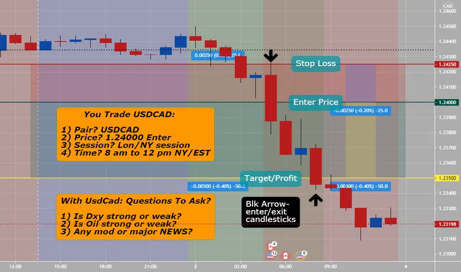
UsdCad (Day Trading Hourly Setup) All setups should have at least a 1:2 Risk and Reward set up. With UsdCad trading you should trade only during London NY overlap and/or just NY- why? related to high liquidity and volume at that time.
Questions to ask yourself when trading UsdCad are:
1) What does monthly, weekly, daily and 4 hour charts look like?
2) Any moderate to major news events? fundamental...
3) is DXY strong or weak?
4) is OIL strong or weak?
5) Where is price action on daily time frame concerning the Master Forex pattern?
6) is price action breaking support and or resistance areas? Asia ranges a lot.
7) any chart patterns? pinbars, inside bar or engulfing showing up on trading chart?
Note:
If you trade Sydney session: AUD, NZD best pairs
If you trade Tokyo session: JPY best pairs
If you trade London session: GBP, EUR, CHF best pairs
If you trade NY session: USD, CAD best pairs, plus OIL, GOLD
3 FX Candlestick Patterns (To Increase Profits)Understanding the hidden meaning behind FX candlesticks is paramount if you intend to become consistently profitable.
1) The Pin Bar (reversal or continuation candlestick pattern)- The pin bar is my favorite of the three. These patterns consist of the following characteristics.
*Tail, which should be at least two-thirds of the entire candle
*The body, which is the space between the open and close (the color is irrelevant when distinguishing between bullish and bearish patterns)
*The nose, which is the much smaller wick on the opposite side as the tail
While pin bars can form anywhere on a chart, the best and most effective formations occur at key support or resistance.
2) The Inside Bar (continuation candlestick pattern)- Although a bit trickier to trade than the pin bar, the inside bar can be an excellent continuation signal if it forms within the right context.
*Hence its name, the range (low to high) should be completely inside of the mother bar, which is the larger of the two candles
*What makes the inside bar bullish or bearish is not how it forms but rather where it forms with respect to the current trend
*The color of the inside bar (bullish or bearish) does not matter
The bullishness or bearishness of the inside bar comes from direction of the established trend, not whether the inside bar itself is bullish or bearish.
3) The Engulfing Bar (reversal candlestick pattern)- Last but not least are the bullish and bearish engulfing patterns. Here's what you need to know:
*The range (high to low) of the engulfing bar must completely surround or engulf the range of the previous candle to be deemed valid
*To be effective, a bullish engulfing bar must form at a swing low while the bearish engulfing bar must occur at a swing high
Always remember that the bullish and bearish engulfing patterns must form at a swing low or swing high respectively or pattern should not be traded.

What is Breakout?I personally trade breakouts with volume conformations because after the breakout the resistance become support. And that gives me very good risk to reward.
Do you trade breakouts?
Lets us know what you think about this educational idea in comments!

Reasons Why I trade on Higher Timeframes OnlyOver here I explain why its necessary to stay on higher timeframes and avoid noise on the lower timeframes.
Hope you enjoy it.
Thank you

What are Trend Lines?Trend lines are lines that are drawn on the charts connecting a series of prices together . They helps traders to find the further support and resistance .
Further there are two types of Trend Lines:
1. Body to Body Trend lines .
2. Wick to Wick Trend lines .
How often you use Trend Lines?
Lets us know what you think about this educational idea in comments!

Risk Management in Price Action TradingRisk Management in Price Action Trading
Risk management in price action trading is much like risk management in any other style of trading; the same basic rules apply:
1. Know your maximum risk tolerance, i.e. the loss you are willing to take on each trade, before you place the trade. A common rule is that traders will not put more than 2% of their funds in the market at a time.
2. Understand correlation between assets, and to what extent you would like to be diversified.
3. Know when you will exit before you enter.
4. Know your reward/risk ratio.
5. Identify what you expect to happen and why, and what price point negates that expectation. This is the price point at which you should put your stop.
Of course, with risk management, techniques are important, but, ultimately, it is up to the trader to ensure they are psychologically prepared for all that is involved. Even if a trader is using a fully automated system, he/she must still have confidence in the system, and must know when any losing streak experienced is just a temporary losing streak versus a more fundamental problem suggesting the system is no longer valid.
In terms of actual techniques, there are a few concepts traders can bear in mind:
1. Enter at support/resistance levels, or levels that suggest turning points in the market
2. Put your stop loss between such levels, or at points where there is no real signs of a force that will cause a change of direction in the market.
Basically, traders want to enter at turning points. Levels between turning points, “empty zones,” of sorts, are where stops can be put as they are where ideas are often disproved. For example, if you entered a trade at a support level expecting price to rally, you could place your stop at a level sufficiently below the support level you entered at, provided it was not a support level as well.

Trend lines (How To Use Them) Trend lines
General way of describing the behavior of price over time is the “trend.” A trend is simply the primary direction of price movement in the pertinent window of time. A number of “legs,” smaller-scale price trends that necessarily alternate between uptrend and downtrends – bullish and bearish legs, respectively.
When price remains closely within a diagonal range bounded by two parallel lines, this small price range is often delimited with “trend channels,” indicating
the upper and lower boundaries of the trend. When price moves within a horizontal range without moving in a clear directional trend, the price’s action is said to be in the “trading range.”
There are a few basic rules to bear in mind when drawing trend lines:
1. Tentative trend line - A diagonal line the market bounces off of twice. This trend line is indicative of a potential trend, but is not confirmed and actionable just yet. Two points touching the line, suggests the possibility of a trend in the making, though conventional analysis will not regarding the trend as established until there are three points on the line.
2. Confirmed trend line - The market has bounced off this trend line three times. Conventional analysis regards this as a sign that the trend line is real, and that the market will react around it.
It is easiest to trade from a trend when its highs or lows hew closely to a recognizable diagonal line, since this line may be used to predict future highs or lows. Opinions vary on whether trend lines should be drawn from the highs and lows of candles or from the body of the candle, the open and close prices; successful traders can be found employing either approach.

Normal vs Logarithmic view?The interpretation of a stock chart can vary among different traders depending on the type of price scale used when viewing the data.
A logarithmic price scale uses the percentage of change to plot data points, so, the scale prices are not positioned equidistantly.
A linear price scale uses an equal value between price scales providing an equal distance between values. (Investopedia)
(I usually use Logarithmic Auto Adjusted charts in my analysis)
For further readings, you can read the article attached.
Reference article:
www.investopedia.com

This is ALL you need to be Profitable in TradingGood morning traders! Today we will make an educational post about something that generates many doubts in many people:
That is, what are the tools that I should use to trade correctly? Do I need indicators? do I need extremely complex strategies? The answer is DEPENDS.
Why does it depend? It depends because there are many ways to see and trade the market, and just as there are thousands of traders, so there are also thousands of strategies since there are many ways to combine the different tools that we have. That said, it is worth clarifying that this post is made 100% from our experience, and the objective is not to discredit or downplay other trading methods. This is simply what we use, and for a long period of time, it has served us well.
We will divide this post into two parts, first, a theoretical explanation of each tool, and second, show how we apply the previously explained concepts.
🔸Price action:
This is the first concept that we must cover since it incorporates everything in a certain way. The price action, basically, is the behavior of the price. Depending on the market situation (trend, either bearish or bullish or in range), we may see different price actions. The technical analysis starts from the basis that the price action discounts everything necessary to decide on an asset; therefore, everything that is happening, the price is transmitting in its behavior. For example, if the price is in strong support, and we see that a candle with a lot of volume appears, and it forms a candlestick pattern (suppose bullish engulfing), clearly the price action tells us that there is strong buying interest. This applies to all scenarios; we can also consider a breakout of a structure or correction that closes with a strong candle above the previous high, and so on with infinite cases.
Example of price action in support (real situation in USD / CAD in Weekly Chart):
🔸Trendlines/channels:
This will be a determining tool when defining a trend. Depending on which market or timeframe we trade, we will see more or fewer trends, but they are a very comfortable visual way of marking them. In the case of an upward trend, the concept is based on joining the increasing lows with a line and the same with the increasing highs. Same situation for a downtrend, but with the highs and lows in reverse. The price tends to respect these lines very well, bouncing off them every time it touches them.
Example of trend lines in channel form in EUR / USD Daily Chart (Real example):
🔸Support / Resistance Zones:
The Support and Resistance zones are horizontal and static supply and demand zones. As we saw previously in the trend lines that the price reacts (these are considered dynamic supports and resistances since the value changes as time progresses), the same thing happens here, since they are specific places where there are many buy or sell orders. The key is to wait for a reaction in the price in that area to confirm the movement. When the price moves for a long time between support and resistance, we can say that it is within a range. This usually happens after periods of a powerful trend, where the price begins accumulation/distribution consolidation processes that last a long time.
Here, we have an example on Amazon (AMZN):
🔸Corrective Patterns:
This is a particular concept since it is focused on momentum/trend traders. This trading style is characterized by taking positions that are always in favor of the trend, and corrective patterns are an exciting time to join the movement. These patterns happen after impulses; if we have a strong upward movement, then once the price starts to retrace, it will form a correction pattern in the opposite direction of the trend. They are very useful to be able to join the next trend.
Real example on Facebook (FB):
🔸Risk Management:
The basic idea of risk management is to be able to earn as much as possible but always keeping losses as low as possible, and of course, avoid destroying an account. It is very common to see traders who try to "duplicate" accounts or obtain exorbitant results in very short periods of time. Is this possible? Of course, YES, but we must ask ourselves whether this is functional in the long term, and the answer is NO. OBLIGATORY, if we take high risks, we will lose a lot of money after a certain period of time. This is very simple, trading is a game of statistics, and streaks exist either for better or worse.
There are certain basic rules, such as the % risk of the total capital in each trade. For example, if we have an account of $10,000, a conservative and correct risk to assume, it would not be more than $300 per trade, which implies 3% of the total capital. We recommend risking that value as much as possible, and even the optimum is a little less. We handle ourselves with risks between 1-2%.
Assuming real situations, there are bad streaks of trades that can reach 10-15 consecutive negative trades. Assuming a risk of 2% per operation, we would have a maximum loss of capital of 30%. In this way, we can stay in the game for the long term. Never forget that capital is the raw material of labor, and rule number 1 is NOT TO LOSE IT.
🔸Psychology:
When it comes to trading, thousands of emotions appear that go through our heads, both positive and negative. We will feel fear, euphoria, anxiety, greed, depression, excitement, happiness, and infinite emotions depending on the situation in which we find ourselves. The objective of working on psychology is, obviously, to reduce these sensations, but more importantly, it is to ensure that they do not affect us in our daily work. In the end, we are human, and we will always feel emotions, but the goal is that they do not negatively influence our trading.
In the first place, to reduce negative emotions, we must necessarily know perfectly the statistics of the strategy that we are carrying out. This implies knowing what your return is, what period, maximum loss, how long it will take me to recover it, etc.
On the other hand, it is necessary to perform a backtest to know how it behaved over time and if what I see at the moment is correct. In this way, we will have peace of mind when operating.
We must never forget that this is a business, and expectations must be long-term. Do not measure the result in days or weeks. Look at it in months, quarters, or years. In this way, the results will be more representative.
🔸With the concepts explained, we will see how we can unite them all to take a trade. Although they are all useful, individually, they do not serve us to take a trade. We must unite them in an organized way to use them to our advantage.
We will show you some positions we have taken over the last few months (some already closed, others active).
Bullish Trade on INTU:
In this trade, we see a clear uptrend. The price, after making a maximum, was consolidating for a few months. We detected a clear corrective pattern and took a bullish position once it was broken to the upside. The entry was above the previous high, the stop loss behind the low, and the target in the Fibonacci extension (this concept is not explained, but we can make an informative post later if you want). The risk assumed was 1% of the capital, with a potential gain of +2.5%. The position is open but near the take profit.
Bullish Trade on FB:
Similar scenario to the previous one. Price builds bullish momentum and then corrects. We operate the correction breakout, assuming a risk of 1% with a potential gain of +2.4%.
Bullish Trade on FB (short-term):
This is a trade that we take in addition to the previous one; it is an internal trade. Here, we also incorporate the concept of support/resistance. There was a broken resistance to the upside, and then the price generates a throwback (retest). This setback forms a corrective pattern, which gives us a good opportunity to enter the market—assumed the risk of 1% with a potential gain of +2%.
Bullish Trade on GOOGL:
In this trade, the price breaks the upper end of the bullish channel and begins to correct at the edge. We see a clear consolidation, and we trade the bullish breakout. This trade is already closed with a profit of +1.75% with an assumed risk of 1%.
Of course, not everything is so nice, and there are also stop losses.
Bullish Trade on TLRY:
In this trade, the price breaks the descending trendline and the resistance zone (then support). It generates a corrective structure, and we take a bullish position at the break. The price was a bit in our favor, but then everything turned against us, and we jumped our stop loss.
🔸 This is a small sample of certain technical analysis concepts and how they can be applied to the market. There is no complex science here, no confusing indicators. Simply clear trends, trade-in that direction, and interesting profits with limited risks. That's all it takes to make money on this.

HOW TO CHOOSE WHICH ORDER BLOCKS TO USE HOW TO CHOOSE WHICH ORDER BLOCKS TO USE PART 2 (smart money concepts., institutional trading)


Using past consolidation zones to determine key areas of S/RUsing past consolidation zones to determine key areas of support/resistance ("S/R")
In this chart, I'm using a script that I've published (called " Bollinger bands + RSI Strategy" ) to determine the key areas of S/R (refer to Note 1 (below) to briefly understand how the script behind works). For the purpose of this analysis, we will ignore the performance of backtested results. We will only rely on past entry/exit price points to plot horizontal lines and treat them as S/R going forward.
In the above Illustrated BTCUSD example :
Marked up in freehand (lime circles), you will see that the strategy has entered long at positions of prices at approx. 35.8k, 31.8k, 34.2k, and 31k, respectively, in chronological time order. For marketable securities (or crypto in this case) that are frequently traded in high volumes, these areas of S/R tend to get re-tested in the near future. (Maybe, can imagine, it is because humans (whales) tend to see them as having meanings, and may view them as targets). Take 35.8k in the example; it didn't hold at the very beginning, shortly gets re-tested, tanks again, and up to the the point-in-time of now when this idea is being published, "it may possibly" re-test 35.8k again.
--
Note1: The strategy in the underlying script simply enters into long position whenever indicators of BOLL + ATR suggest price volatility is decreasing, later exits the position when RSIs show overbought, or in alternative case when price touches the trailing-stop-loss limit. For details, you may read the summary of that strategy.
Disclaimer : The idea above is solely based my personal views. This post is not an investment advice. Viewers are suggested to consider the advantages & practical limitations of the idea/strategy on their own. If this post contradicts with other school of thoughts, then viewers will apply their own professional judgment to make the prevailing investment decisions.

Top 10 Patterns (Engulfing) #10 BestBullish Engulfing and Bearish Engulfing Candlestick Patterns: Chart example is a bearish one hour that happened on GbpChf.
Engulfing Patterns are the strongest and most effective candlestick patterns.
The reason is that when they are strong enough, the market usually follows them strongly. They can be the beginning of the strong trends and reversals.
There are two kinds of Engulfing Patterns:
1. Bullish Engulfing Pattern- A Bullish Engulfing Pattern forms when a strong bullish candlestick opens below the close price of the previous candlestick.
Previous candlestick has to be a bearish candlestick. Then the bullish candlestick goes up and covers the whole body of the bearish candlestick. Finally, it closes above the open price of the bearish candlestick. This pattern which forms on a downtrend, is a reversal pattern and causes the downtrend to reverse and goes up. The formation of this pattern means that bulls have taken the control. It means they have been able to take the price up and close it above the open price of the previous bearish candlestick. The more the bullish candlestick engulfs the previous bearish candlestick, the stronger the reversal signal is:
2. Bearish Engulfing Pattern- Bearish Engulfing Pattern forms by a bearish candlestick that engulfs the previous bullish candlestick.This patterns forms at the end of an uptrend or a bull market:the bearish candlestick has a very strong body that has engulfed the body of two previous candlesticks:
That was just the general information about the Bullish Engulfing and Bearish Engulfing candlestick patterns. Indeed, you can locate many of these patterns on all charts and time frames.However, it doesn't mean that each of them can be known as strong reversal patterns that you can take and enter the market.
Therefore, you should know how to evaluate and gauge these patterns and choose the strongest ones to enter.

Top 10 Patterns (Pin Bar) #8Pin Bar patterns are in the top three patterns to know: Example is bearish pin bar with nose which happens at a high liquidity time and volume too.
Three types of pin bars are: Standard pin bar, Pin bar with nose and Pin bar with no real body.
In general, Pin Bars are two types. The bullish pin bar, and the Bearish Pin bar. Bullish Pin Bar signals Long or Buy trade entry, and a Bearish Pin Bar signals the Short or Sell trade entry. Use 1 hour, 4 hour or daily pin bars at major support or resistance for better results. Fib Ret tool helps & pullbacks work.
Every pin bar consists of a real body or a head. And a tail or long shadow.The real body is the difference between the opening price and closing price of a
candle. So, if the closing price is higher than the opening price of a pin bar, then this types of pin bars are called the bullish pin bar. And if the closing price is lesser than the opening price, then this types of pin bars are called the bearish pin bar. A bullish pin bar is the sign of buyer’s strength and a bearish pin bar signals the strong selling pressure of a certain security.
Based on the formation of pin bar, you will find 3 types of valid pin bars in a price action chart.
1- Standard Pin Bar: The first type of pin bar is the standard pin bar, this types of pin bars contains a real body and a long tail. They are the strongest than other two pin bars. You will see no extra shadow or wicks attached to the real body of this types of pin bars.
2- Pin Bar with extra shadow: The second types of the pin bar, is the pin bar with a nose or extra wick attached to the real body. These pin bars are also called as the hanging man. This types of pin bars shows less strong market momentum than the standard pin bars. The nose above or below the real body indicates the opposite directional force and hence shows weakness of the pin bar.
3- Pin Bar with no real body: This type has no real body but a tail. That means the opening price and closing price of the pin bar is same. The signal strength of this types of pin bar is very week. If you can find a strong bullish or bearish candle after these types of pin bars, then this patterns gives a very strong trading signal.

Let's refresh some Forex Market Theory and AnalysisGood morning, traders! Today we have an informative post about the Forex Market. The idea is that traders who have just started in this have clear the fundamental concepts, and for those of us who have been around for a long time, it never hurts to refresh some content!
🔸Let's start with some basic concepts:
The forex market is where numerous participants, including banks, funds, and individuals, carry out transactions to buy or sell currencies. There are several reasons why this happens, but most of the volume of transactions is for speculative or investment reasons. This market operates every business day of the week, 24 hours a day.
There are three sessions, the Asian session, the European session, and the US session.
It is the largest financial market in the world, and the main participants (those that negotiate the highest volume) are private banks, central banks, private companies, investment firms, or funds and brokers. Retail investors are involved, of course, but they do not do the high volume.
The main characteristic of this market is that it is not a centralized market such as futures or stocks. It comprises two levels, the interbank level and the OTC level (over the counter). The interbank market is where large institutions carry out their transactions, and the OTC market is where individuals carry out theirs.
The volume that is handled daily usually exceeds 5 trillion dollars.
In short, the foreign exchange market is unique because of the following characteristics:
- its huge trading volume, representing the largest asset class in the world, leading to high liquidity;
- its geographical dispersion;
- its continuous operation: 24 hours a day except for weekends, i.e., trading from 22:00 GMT on Sunday (Sydney) until 22:00 GMT Friday (New York);
- the variety of factors that affect exchange rates;
- the use of leverage to enhance profit and loss margins and concerning account size.
🔸How did the Forex Market originate?
After the Second World War, the system known (currencies tied to precious metals) collapsed and was replaced by the Bretton Woods agreement. This implied creating three international organizations that are in charge of facilitating economic activities within the planet. They were the IMF (International Monetary Fund), the General Agreement on Tariffs and Trade (GATT), and the International Bank for Reconstruction and Development (IBRD). The idea of this system was to replace gold with the US dollar to tie international currencies.
🔸Currency Predominance:
Obviously, the USD is the most traded currency in the forex market, with approximately 85% of transactions, followed by the euro and the Japanese Yen.
The currencies are shown in pairs, where the value of one currency to another—the base currency (or the first one) versus the second or the quote currency. It indicates how much of the quote currency is needed to purchase one unit of the base currency.
Here, we leave our daily chart analysis of all the major pairs, that is, the pairs tied to the USD.
🔸AUD/USD:
The price has bounced at the Daily Demand Zone and was rejected there. We expect a bullish push towards the Descending Trendline of the current structure.
🔸EUR/USD:
The price was slightly rejected at the Ascending Trendline, making us think about a potential bullish move towards the Resistance Zone again. However, if that fails, we need to consider the bearish view also.
🔸GBP/USD:
It broke the Ascending Channel, with a nice push to the downside. We expect a bearish move towards the next Support/Demand Zone.
🔸NZD/USD:
This scenario is pretty similar to AUD/USD. The price bounced at the Demand Zone, and we are waiting for the movement to reach the Descending Trendline.
🔸USD/CAD:
The price broke the Descending Channel with a strong impulse, and now it is correcting on edge. If we see a rejection here, the bullish view will remain valid towards the next Resistance Zone.
🔸USD/JPY:
The price is facing the previous high, where it has been consolidating a bit. If we see a breakout, a safe scenario would be to wait for a retest + rejection to confirm the bullish move towards the next Resistance Zone.
🔸USD/CHF:
The price bounced slightly at the Ascending Trendline (pullback), but we need to see a deeper push to confirm the downside continuation. We consider this because the main trend is bearish at this pair.

Price Action vs Indicators: Who wins?Happy Friday, ladies and gentlemen. The topic of our first educational post for the day is the following: Price Action vs Technical Indicators.
To begin with, each and every traders has his or her own strategy. Some of them would prefer using only indicators to open trades, some would use indicators as confluences, some of them do not use indicators at all and so forth. The truth is, indicators deceive a lot of new beginner traders into thinking that they are the key to successful trading and investing. Right after hoping on the charts, beginners tend to saturate their graphics with tons of indicators which contradict to each other. One indicator shows a buy signal, another one shows a sell signal, which makes it harder for traders to make decisions on the markets. Of course, using some spesific indicators as confluences to open positions is not bad at all. If it fits your strategy, you may add some technical indicators to backup your analysis. But at the end of the day, using several indicators and saturating your beautiful graphs with them will never lead you to success.
All in all, as it has been stated above, everyone has his or her own strategy. Therefore, if indicators work for you, go ahead and implement them in your analyses! At the end of the day, it is all about making money, isn’t it?
Have an amazing Friday and a brilliant upcoming weekend, everyone!


DOGEUSD Target Price 0.16500000 Pin Bar DOGEUSD closed below 0.21380000 price level and retested that level in the form of a Pin Bar. Pin formed on the horizontal support resistance line and exponential moving average period 10 exponential moving average period 20.
Three factors for this trade strategy is Trend Level Signal. 1 Downtrend 2 Horizontal Level 3 Pin Bar.
The target is the previous swing low.
