Unlock Hidden Trading Edges: Master Support & Resistance Levels Master Support & Resistance Levels – The Most Powerful Tool in Technical Analysis 📈🔥
Support and Resistance (S&R) are the foundation of price action.
Support = where price tends to stop falling (buyers step in) 🛡️
Resistance = where price tends to stop rising (sellers take control) ⚔️
These levels are not always exact, but when used correctly they give you high-probability entries and exits in Forex, Crypto, and Stocks.
How to Find Strong S&R Levels:
1-Look left → Previous swing highs & lows
The more times price has touched and bounced, the stronger the level becomes.
2-Round numbers & psychological levels
Examples: $50,000 BTC, 1.2000 EUR/USD, $200 AAPL – traders love these!
3-Use TradingView tools
Horizontal Line
Fibonacci Retracement (38.2%, 50%, 61.8%)
Volume Profile (High-volume nodes often act as S&R)
2Role Reversal – The Magic Trick ✨
Broken resistance → becomes new support
Broken support → becomes new resistance
This is where the big moves start!
Real Examples Right Now:
Bitcoin → $100,000 break support → now strong resistance
Pro Tips:
Always check multiple timeframes (Daily + 4H give the strongest levels)
Combine with RSI or volume for confirmation
Place stop-loss just below support / above resistance
When a level breaks with high volume → jump on the breakout!
Start drawing your S&R levels today and watch your win rate improve instantly.
Which market are you trading right now? Drop your favorite S&R level in the comments! 👇
Support and Resistance
Practicing mind set..
I don't trade low TF, i'm not day-trading,, just boring, look and practicing mind set for fun. I show you how i find the price movements, key levels, sweet spots, ranking-price of the "play field". This is a "old school way" i used from year 1995 and recently.
I don't tell you when buy/sell, entry/exit, TP/SL.. you learn by yourself like i did by myself. Just look the chart and figure it out. Hope to help struggle traders.
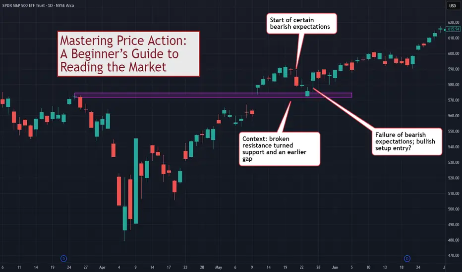
Mastering Price Action: A Beginner’s Guide to Reading the MarketThis discussion goes beyond the basic idea of "memorizing candlestick names." If you want to truly master price action as a tool for reading the market and understanding it as a basis for trading, this guide is for you.
Disclaimer:
The information provided in this tutorial is intended solely for educational purposes. Nothing in this material should be interpreted as financial, investment, or trading advice. Any strategies, methods, tools, or concepts discussed are presented for learning and demonstration only. You are responsible for evaluating your own decisions and risks. Always conduct independent research and consult a qualified professional before making financial or investment choices.
⚠️ WHY MOST TRADERS MISUSE PRICE ACTION
Most traders use price action in a simplistic way:
See a Pin Bar = Buy
See a Doji = Indecision
See an Engulfing = Reversal
The problem with this approach is that you are trading shapes instead of market dynamics.
Price action is not merely pattern recognition. It is a language.
To master price action, you must understand:
Volatility (Range)
Conviction (Body)
Buying/Selling Pressure (Shadows)
Context (Relative performance)
Expectation vs. Reality (Market Inertia)
Price action tells you the story of the battle between buyers and sellers.
📊 1. DECODING THE SINGLE BAR (THE DNA)
Before you can read a chart, you must be able to read a single bar.
Although a single bar is created from Open/High/Low/Close, it gives you critical information beyond that.
🕯️Range = Volatility
The distance between High and Low.
Wide Range: Active market, high volatility.
Narrow Range: Dead market, low volatility.
This chart shows the low volatility period transitioning to the high volatility prior to a major reversal.
🕯️Body = Conviction
Large Body: The market conquered territory. Strong conviction (Bullish or Bearish).
Small/No Body (Doji): The market is undecided. A battle with no winner.
This chart points out two bullish bars, one with weaker conviction than the other.
🕯️Shadows = Pressure
Upper Shadow: Selling Pressure. The market tried to go higher but was rejected.
Lower Shadow: Buying Pressure. The market tried to go lower but was rejected.
This chart shows how we can observe the shifting of buying/selling pressure by observing the wicks (tails/shadows) of candlesticks.
TIP: For examining shadows, focus on the shadows (wicks) that take up around at least 50% of the bar range.
📊 2. CONTEXT IS KING (TWO-BAR ANALYSIS)
Now, let’s go on to two-bar analysis.
Nothing works in isolation. A "wide" bar is only wide(r) if its range is larger than the previous bar.
The key here is to use the first bar to set the context for the second.
Volatility Check: Is the range expanding (market waking up) or contracting (market resting)?
The "Test": Every bar's High and Low are natural support and resistance levels.
- If Bar 2 breaks Bar 1's Low and closes lower → Bearish Victory .
- If Bar 2 breaks Bar 1's Low but reverses to close higher → Bullish Rejection (False Break) .
This chart focuses on one specific bar and compares it with the previous bar. Our observation produces no conclusion, only more questions.
📊 3. THE EXPECTATION GAME (THREE-BAR ANALYSIS)
This is the secret sauce of price action readers, forming expectations and observing. The market has inertia , for e.g. bullishness should follow bullishness.
This chart extends our earlier two-bar analysis. The third bar is a Doji, confirming uncertainty on the side of the bulls.
The Basic Analytical Framework For Close Price Action Analysis:
Read Bars 1 & 2: Form an expectation. (e.g., "Strong bearish bars, I expect Bar 3 to go down.")
Watch Bar 3: Does it confirm or fail your expectation?
Confirmation: Market moves as expected (Trend continues).
Failure: Market defies expectation (Potential Reversal).
📊 4. PATTERNS ARE JUST LABELS
Stop looking for "Pin Bars" or "Engulfing patterns" by name. Look for the behavior.
Pin Bar: Essentially a bar where the market tested a support/resistance level and was violently rejected (Long Shadow).
Outside Bar: A bar where volatility expanded and totally overwhelmed the previous session.
When you read the story, you don't need the labels.
📊 EXAMPLE TRADING FRAMEWORK
From the above, we can build a simple trading framework based on identifying context, forming expectations, and trading the failure of expectations . This is not the only framework but one of the many possible.
Bullish Setup
Context: Price tests a support level or previous low.
The Trigger: A bar shows a failure of bearish expectation (e.g., tries to go lower but closes high).
Bearish Setup
Context: Price tests a resistance level or previous high.
The Trigger: A bar shows a failure of bullish expectation (e.g., tries to break out but slams back down).
This chart shows a example leading to a potential long setup.
⚠️ COMMON MISTAKES
Trading in a Vacuum: Taking a "Pin Bar" signal without checking if the market is trending or ranging.
Ignoring the Body: A long shadow means nothing if the body shows the other side still has control.
Fixating on Names: Worrying if it's a "Harami" or an "Inside Bar" instead of asking "Who is winning?"
🎯 CONCLUSION
Reading price action is about knowing what the market has done and what it is doing now . It increases your chances of predicting what it will do .
Forget the fancy names.
Focus on the OHLC relationship.
Trade the failure of expectations.
Master this microscopic view, and then combine it with macroscopic market structure for the ultimate edge.
How do you read price action? Do you use patterns or read the flow? Share your approach below!
FireHoseReel | Engulfing Candlestick Pattern (Crypto Version)🔥 Welcome FireHoseReel !
Let’s dive into the Engulfing Candlestick Pattern.
✔️ Bearish Engulfing – Basics
The Bearish Engulfing is a two-candlestick reversal pattern.
The first candle is bullish, and the second is a larger bearish candle that fully engulfs the first candle’s body and closes below its low.
Since crypto rarely has gaps, the key condition is that the second body completely covers the first body.
Shadows are not significant.
This pattern is most reliable after a weakening uptrend.
🎯 Bearish Engulfing – Psychology
This pattern shows a strong bearish shift.
Buyers push price upward at first, but the second candle proves sellers have taken full control, dragging price down and even breaking the previous candle’s low.
It signals momentum shifting from bulls to bears.
🧮 Bearish Engulfing – Setup & Levels
• Trigger: Break below the low of the second candle.
• Confirmation: A close below the trigger.
• Stoploss: Above the high of the second candle or whole structure.
• Buy-stop entry: Only if the main trend remains strongly bullish (rare in crypto).
✔️ Bullish Engulfing – Basics
The Bullish Engulfing is a two-candlestick reversal.
The first candle is bearish, and the second is a larger bullish candle that fully engulfs the first body and closes above its high.
In crypto, the key factor is that the second bullish body fully covers the first bearish body.
It works best after a downtrend or capitulation phase.
🎯 Bullish Engulfing – Psychology
This pattern indicates a strong bullish reversal.
Sellers control the first candle, but buyers return aggressively on the second candle, overpowering them and closing above the previous high.
It signals momentum shifting from bears to bulls.
🧮 Bullish Engulfing – Setup & Levels
• Trigger: Break above the high of the second candle.
• Confirmation: A close above the trigger.
• Stoploss: Below the low of the second candle or structure.
• Sell-stop entry: Only in strong downtrends and rarely recommended.
🛞 Risk Management & Disclaimer
Please remember to always use proper risk management and position sizing. Nothing in this analysis is financial advice. The market can change quickly, so always trade based on your own strategy, research, and risk tolerance. You are fully responsible for your own trades.

Don't Trade These Trend Lines. Forex Gold Trading Basics
A lot of traders apply trend lines for trading and making predictions on different financial markets.
Trend line can also be an important element of price action patterns.
However, only few knows that some trend lines are better to be avoided .
In this article, I will share with you the types of trend lines that you should avoid and not rely on for making trading decisions.
Invalidated Trend Line
Even the strongest trend lines may lose their significance with time.
Before you take a trade from a trend line, make sure that it still remains valid.
If the trend line is not respected by the buyers and then by the sellers,
or by the sellers and then by the buyers, we say that such a trend line lost its significance, and it is better to not trade it.
Have a look at that rising trend line on USDCAD.
We see strong bullish reactions to that, and we may expect a bullish movement from that, once it is tested.
However, it was violated and after a breakout it should turn into a vertical resistance.
Retesting that, the price easily went through the broken trend line.
The trend line lost its significance, and it is better to not trade that in the future.
2 Touches Based Trend Line
When you are looking for a strong trend line to trade, remember that the trend line should be confirmed by at least 3 touches and 3 consequent bullish / bearish reactions to that.
Above is the example of a valid and reliable trend line.
However, quite often, newbie trade 2 touches based trend lines.
Most of the time, such trend lines are neglected by the market.
Moreover, relying on 2-touches-based trend lines, your chart will look like a complete mess .
Simply because there are too many trend line meeting that criteria.
Receding trend line
There are the trend lines that go against your trade with time while remaining valid.
Have a look at a major falling trend line on NZDCHF on a daily time frame.
You may open a swing long position from that on a daily or a day trade on intraday time frames like an hourly.
You can see that the market may easily go against your predictions for a long time, while perfectly respecting a trend line.
The price was sliding on that trend line for 6 consequent days before it finally started to grow.
Such trend lines are better to be avoided .
Make sure that a trend line and your trade have the same direction.
Trend lines can provide very safe points for trading entries. However, the trend lines are not equal and while some of them can be very profitable, some of them can lead to substantial losses.
❤️Please, support my work with like, thank you!❤️
I am part of Trade Nation's Influencer program and receive a monthly fee for using their TradingView charts in my analysis.

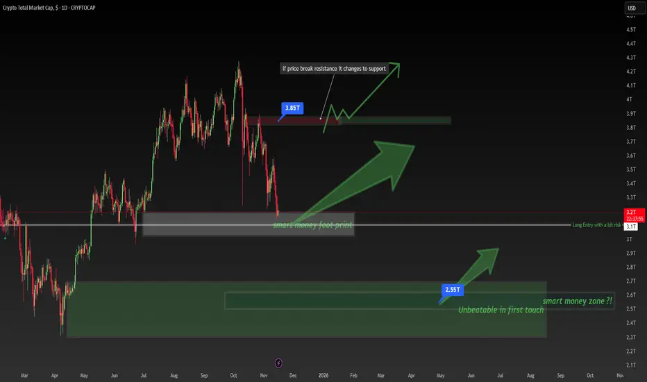
Crypto Total Market Cap Is at a BREAKING Point – Smart Money FooCrypto Total Market Cap Is at a BREAKING Point – Smart Money Footprint Explained!
🧠 Smart Money Footprint: The Level Most Retail Traders Ignore
The entire crypto market cap has dropped into a massive Smart Money footprint zone — a level where institutional players historically accumulate before major bullish legs.
At the same time, the $3.85T resistance above is the key battlefield.
👉 If price breaks this level, it flips into support, opening the door for a strong upside continuation.
What This Chart Teaches You 👇
✔ Support → Resistance → Support transitions
✔ How Smart Money leaves footprints at major accumulation zones
✔ Why price often reverses from areas retail traders overlook
✔ Market structure timing for long entries
Key Levels to Watch:
🔹 $3.1T – $3.2T → Smart Money accumulation block
🔹 $3.85T → Major resistance flip zone
🔹 Above this = bullish momentum can accelerate fast
Trade Idea (Educational Only, Not Financial Advice):
📈 Long bias as long as price holds within or above the Smart Money footprint.
🔥 Break & retest of $3.85T = high-probability continuation setup.
If this helped you, hit 👍 and save it — more Smart Money lessons coming!
Comment “SMC” if you want the next educational chart breakdown.
Follow @TradeWithMky for daily Smart Money insights.
DON'T TRADE THESE SUPPORTS AND RESISTANCES (FOREX GOLD)
When it comes to technical analysis,
the understanding of which support and resistance levels to not trade can be as important as knowing which ones to trade.
In this article, I will show you the structure levels that professional traders avoid to maximize their profits and minimize losses.
Invalidated support and resistance
Invalidated support/resistance is the structure that has a clear historical significance, but that lost its strength and was neglected by the market during the last 2 tests.
Have a look at that key horizontal support.
We can see that in the recent past, the price bounced from that multiple times, confirming its significance.
Then, the price suddenly broke and closed below that support.
According to the rules, that structure should turn into a resistance after a violation.
However, after its test, the price bounced and violated that to the upside.
The structure became invalid , and you should not trade that in future.
Resistance in a Bullish Trend
If the market is trading in a bullish trend, according to the rules its last higher high composes a key horizontal resistance.
USDJPY is trading in a strong bullish trend.
The price dropped once it set a new higher high higher close.
It composes a key horizontal resistance.
Always remember, that in a bullish trend, the price tends to set new higher highs and higher lows over time.
Quite often, the test of the level of the last high leads to a further bullish continuation and a formation of a new higher high.
For that reason, it is better not to trade such resistances.
Support in a Bearish Trend
In a bearish trend, the last lower low is always considered to be a key horizontal support.
Above is a price action on USDCHF.
The pair is bearish and recently set a new lower low.
It is a key horizontal support now.
However, in a bearish trend, the price tends to set a new low after a retracement. Most of the time, it does not respect the support based on the last lower low.
I recommend you not to trade such supports.
I always repeat to my students that key levels work, but they are not equal in their significance. While some of them are very strong, some are better to be avoided.
❤️Please, support my work with like, thank you!❤️
I am part of Trade Nation's Influencer program and receive a monthly fee for using their TradingView charts in my analysis.

Equilibrium Zones: The Power of the 50% (Part 1)An equilibrium zone is a price level or range where supply and demand are momentarily balanced. These zones create big price swings while acting like magnets in the market, drawing investors' attention.
Today I'm sharing one of the most useful equilibrium zones for spotting and capitalizing on major opportunities: the 50% of large-body candles.
What are large-body candles?
Large-body candles (or those with a long real body) feature a significant distance between open and close compared to the preceding candles. These patterns show strong directional momentum from bulls or bears.
As Steve Nison—who brought Japanese candlestick patterns to the West—notes, some Japanese traders consider the real body meaningful only if it's at least three times longer than the previous day's body.
The 50% of large-body candles
When a large-body candle forms, price has made a fast, impulsive move. In lower timeframes, this leads to overbought (bullish candle) or oversold (bearish candle) conditions. This imbalance often triggers a natural reaction: a pullback or profit-taking by early participants.
The midpoint of the large candle's body serves as a value or psychological equilibrium point in the momentum. The pullback lets investors join the strong impulse at a much better price than the candle's close, maximizing risk-reward.
In higher timeframes like daily or weekly, the pattern is more reliable due to greater institutional presence and consistent data.
Practical examples
To boost entry effectiveness, I recommend aligning the zone near the 50% (it's a zone, not a precise line) of impulse candles with other equilibrium zones or price action structures.
In figure 1, you'll see how the 50% zone of an engulfing candle on a 4-hour chart lines up with the EMA 20—a key moving average for investors in strong trends. You can explore new applications in my article: Double Pressure: The Key to Good Breakout Trading (El Especulador magazine, issue 01).
Figure 1
BTCUSDT (4-hour chart)
In figures 2 and 2.1, check out how multi-timeframe alignment of equilibrium zones can deliver excellent setups. Here, the 50% of a large-body candle on weekly is a spot to watch closely—especially if lower-timeframe price action confirms investor entry.
Figure 2
BTCUSDT (Weekly chart)
Figure 2.1
BTCUSDT (Daily chart)
A similar example in figures 3 and 3.1: the 50% of a large-body candle on weekly clearly coincided with a daily equilibrium point (EMA 20). Price action, backed by a large gap and an island gap reversal, would have justified a long entry.
Figure 3
Tesla (Weekly chart)
Figure 3.1
Tesla (Daily chart)
Additional note
Some modern educators have popularized concepts based on phenomena like the one described here. The standout case is Michael Huddleston and his Inner Circle Trader (ICT) methodology.
I recommend caution with narratives inspired by classic knowledge—studying investor psychology should stay free of biases and beliefs without solid evidence.
Long before heated debates on the reliability of Fair Value Gaps (FVG) , classic price action already viewed the 50% of impulse or large-body candles as opportunity zones.
The phenomenon was popularized by Steve Nison in the early 90s through his book, Japanese Candlestick Charting Techniques .

What is bitcoin CME Gap? How to use BTC gap IndicatorWhat is bitcoin CME Gap? How to use BTC gap Indicator
The 'Gap' in the CME (Chicago Mercantile Exchange) futures market, which offers a glimpse into the movements of institutional investors, is one of the key indicators many professional traders watch closely.
1️⃣ What is the Bitcoin CME Gap?
CME is one of the primary avenues for institutional investors to access Bitcoin. However, the CME Bitcoin futures market closes over the weekend (from Friday afternoon to Sunday afternoon, Chicago time, USA). Additionally, there is a one-hour trading break after market close on weekdays.
Conversely, spot exchanges like Binance and OKX, which we commonly see, operate 24 hours a day.
This difference is where a 'Gap' occurs. Especially during weekends, when the break is longer, gaps tend to be larger.
Bearish Gap: Occurs when the opening price after the CME market closes is lower than the closing price. This means that the Bitcoin price fell in the spot market during the off-hours.
Bullish Gap: Occurs when the opening price after the CME market closes is higher than the closing price. This means that the Bitcoin price rose significantly in the spot market during the off-hours.
Abrupt Psychological Shift: This implies that investor sentiment leaned heavily towards one side during the weekend.
Unfilled Order Blocks: The gap area is interpreted as a region where potential unfilled orders (buy/sell pressure) may exist.
Gap Fill Phenomenon: Many traders believe in the adage "gaps get filled" and use it as a trading strategy. This suggests a tendency for the price to move in the opposite direction of the gap, eventually attempting to cover the gap area. However, this phenomenon is not 'mandatory', and whether a gap will be filled immediately or much later must be judged through various analyses.
2️⃣ Easily Find CME Gaps
The Bitcoin CME gaps multi-timeframe auto finder indicator automates CME candle analysis and displays it intuitively on the chart.
⚡Indicator Features and Usage
Multi-Timeframe Gap Detection: 5-minute, 15-minute, 30-minute, 1-hour, 4-hour, and even 1-day candles! It simultaneously detects and displays CME gaps occurring across various timeframes. Whether you're a short-term trader or a long-term investor, you can check gaps according to your trading style.
Automatic Box and Label Display: The detected gap areas are drawn as rectangular boxes on the chart. Bullish gaps are displayed in green tones, and bearish gaps in red tones, making them easy to identify at a glance. The size of each gap (%) is displayed as a label above its respective box.
Highlight Function: Large gaps above a set threshold (e.g., 0.5%) are highlighted with an emphasized color. 'Big gaps' can have a greater impact on the market, so they should be noted.
Chart Price Synchronization: The price of spot charts from other exchanges may differ from the CME futures price. This indicator adjusts the price of the gap boxes to the price level of the chart you are currently viewing via the "Chart_price" mode. By using the "Chart_price" mode, you can more intuitively grasp the price level of the gap box on the spot chart and make direct trading plans on the chart of another exchange you are viewing.
Real-time Alerts: You can receive real-time alerts when a new CME gap is detected. You can also set alerts to notify you only about gaps from a specific timeframe. This is extremely useful when you can't continuously watch the chart during weekends or specific times on weekdays.
3️⃣ Trading Strategies
💡Gap Fill Strategy:
When a Bullish Gap Occurs: If the price breaks above a bullish gap but then falls back into the gap area attempting to fill it, one might consider a long position near the bottom of the gap, or a short position if the price fails to rebound from the top of the gap. Alternatively, a strategy of considering a short position in a resistance zone before the gap is filled is also possible.
When a Bearish Gap Occurs: If the price breaks below a bearish gap but then rises back into the gap area attempting to fill it, one might consider a short position near the top of the gap, or a long position if the price fails to fall from the bottom of the gap. Alternatively, a strategy of considering a long position in a lower support zone before the gap is filled is also possible.
💡Utilizing as Support/Resistance Areas:
Old CME gap areas can act as strong support or resistance lines when the price retests those levels in the future.
Observe whether the price encounters resistance and falls again when it reaches the top of a bearish gap, or if it finds support and rises again when it reaches the bottom of a bullish gap. Gaps that overlap across multiple timeframes can hold even stronger significance.
💡Trend Confirmation and Reversal Signals:
If a strong bearish gap occurs and is not immediately filled, but the price continues to fall, this could indicate the start or continuation of a strong downtrend.
If a strong bullish gap occurs and is not immediately filled, but the price continues to rise, this could indicate the start or continuation of a strong uptrend.
You can use the price movement after a gap occurs to gauge market momentum and apply trend-following or trend-reversal strategies.
For example, if a bearish gap occurs but is quickly filled within a few days and breaks above the top of the gap, this could be interpreted as an early sign that the bearish market has ended.
💡Multi-Timeframe Analysis:
When looking for key support/resistance levels, check not only the gaps of the current timeframe you are viewing but also gaps from higher timeframes (e.g., 4-hour or daily gaps on a 1-hour chart).
Gaps from larger timeframes are areas of stronger market interest. When making trading decisions in smaller timeframes, consider the location of important gaps from higher timeframes for risk management or to set entry/exit targets.
Short-term Gaps (5m, 15m): Most gaps occur within 1% and can be utilized for short-term volatility, high-leverage scalping, or day trading. They are suitable for quick entry/exit strategies, with caution against whipsaws. They tend to be filled before the 4-hour candle closes after the market opens.
Medium-term Gaps (1h, 4h): Can be referenced for swing trading or position trading. They can become significant support/resistance areas depending on price movement after the gap occurs.
Long-term Gaps (1d): Can act as major turning points in market trends or as important support/resistance levels from a long-term perspective. If a 'big gap' occurs, the possibility of a shift in the market's overall direction should also be considered. They usually occur during the weekend off-hours, and sometimes large gaps of over 3% occur.
A weekday short-term gap that was filled 4 hours ago.
A weekend long-term gap that saw a trend increase after a 4% big gap occurred.
4️⃣ Conclusion
The 'Bitcoin CME Gap Multi-Timeframe Auto Detector' indicator is a powerful tool that helps you not miss crucial price fluctuation points in the market.
However, no indicator should be blindly trusted. Gaps may not be fully filled, or the price may immediately break out in the opposite direction after surpassing a gap. Instead of relying solely on gap filling, it is crucial to analyze it in conjunction with other indicators to increase your win rate.
We hope you utilize the information gained from this indicator and combine it with your existing analysis methods (chart patterns, auxiliary indicators, macroeconomic analysis, etc.) to build more sophisticated trading strategies.
📌If this content was useful, please support us with a boost and comments. Your small encouragement is a great strength for creating better analyses and content. By following, you can also receive notifications about our postings

Powerful Fibonacci Trading Strategy For Beginners (GOLD FOREX)
I am going to reveal a powerful fibonacci trading strategy that I learned many years ago. It combines structure analysis, fibonacci retracement and extension levels and candlestick analysis, and it is suitable for beginners.
Step 1
Find a trending market - the market that is trading in a bullish or in a bearish trend on a daily time frame.
AUDUSD is trading in a bullish trend on a daily.
Step 2
Execute structure analysis - identify key horizontal and vertical structures on a daily time frame.
Have a look at key structures that I spotted on AUDUSD.
Step 3
Draw fibonacci retracement levels.
Here are the important ratios you should look for: 382, 50, 618, 786.
In a bearish trend,
draw fibonacci retracement levels from the high of the trend to current low based on wicks.
In a bullish trend,
You should apply fibonacci retracement from the low of the trend to a current high based on wicks.
Take a look how I draw the retracement levels,
I took the low of the trend and the high of the trend.
Step 4
Find confluence .
Look for fibonacci numbers that match - lie within key structures that you identified.
Support 1 matches with 382 retracement.
Support 2 matches with 786 retracement.
Remove other ratios from the chart.
Step 5
Wait for a test of one of the fibonacci levels that match with key structure
The price perfectly tested 382 retracement level.
Step 6
Wait for a confirmation on a 4h time frame.
Our confirmation will be a formation of an engulfing candle - a strong candle that completely engulfs the entire range of a previous candle with its body.
In a bearish trend, we will look for a formation of a bearish engulfing candle. Bearish engulfing candle indicates a strong selling pressure and the strength of the sellers.
In a bullish trend, we will look for a bullish engulfing candle. It indicates a strong buying reaction and imbalance.
Have a look at a bullish engulfing candle that was formed on AUDUSD on a 4H time frame after a test of 382 retracement.
Step 7
Open a trading position, set stop loss and choose the target.
After you spotted an engulfing candle, open a trading position.
Open short after a formation of a bearish engulfing candle and open long after a formation of a bullish engulfing candle.
If you sell , your safest stop loss will be 1.272 extension of the last bullish impulse on a 4H.
If you buy , your stop loss will be 1.272 extension of the last bearish impulse on a 4H.
In our example, our stop loss will be 1.272 extension of a bearish impulse leg on a 4H time frame. The extension is based on high and low of the impulse.
If you short , your take profit will be the closest key structure support on a daily.
If you buy , your take profit will be the closest key structure resistanc e on a daily.
Being applied properly, the strategy should generate 60%+ winning rate.
Always remember to check your reward to risk ratio before you open the trade. It should be at least 1.1/1.
Also, before you place a trade, always make sure that you trade WITH the trend and take only trend-following trades.
The strategy works perfectly on Forex, Gold, Silver, Oil, Indexes.
Good luck in your trading.
❤️Please, support my work with like, thank you!❤️
I am part of Trade Nation's Influencer program and receive a monthly fee for using their TradingView charts in my analysis.
HOW-TO: Ranger in TradingViewChart patterns and ranges are essential in technical analysis, helping traders identify potential support/resistance zones, volatility expansions, and reversal points. However, manually detecting daily or weekly ranges can be time-consuming and subjective. In this post, we describe how to effectively use the Automatic Range Detection feature inside the ZenAlgo - Ranger indicator, which calculates VWAP-based ranges and standard deviation lines automatically to save time and improve accuracy.
Using the Range Detection Feature
Add the Indicator : Access the ZenAlgo - Ranger and add it to your chart. It works on any timeframe up to 4H for optimal performance.
Key Settings :
Show Today's VWAP Range : Enabled by default. This displays the current day's range based on VWAP ±2.0 standard deviations (core range).
Show Previous Day's Range : Toggle to view historical daily ranges (up to 70 days back).
Show Monday Range : Activates weekly-like ranges derived from Monday's data (shiftable forward for projection).
Standard Deviation Lines : Customize visibility for ±3.0 to ±10.0 (and halves like ±0.5, ±1.5). Highlighted lines (e.g., ±5.0, ±10.0) use solid styles for emphasis.
Monday Range StdDev Lines : Extended up to ±40.0 for advanced volatility analysis.
Box Transparency : Adjust for visual clarity (0-100%).
Tip : Start with defaults – today's range in teal, previous in gray, Monday in yellow/blue – and tweak based on your asset's volatility.
The indicator uses a locked 1-min VWAP calculation for precision, incorporating buy/sell volume delta from 4H data to color ranges dynamically.
Range Detection Overview
ZenAlgo - Ranger detects and plots:
Daily Ranges : VWAP-centered core (±2.0 std) with extensions via std dev lines. Supports up to 50 previous days.
Monday (Weekly Projection) Ranges : Special ranges from Tuesday's data (representing Monday's VWAP), extendable up to 30 weeks. Includes core levels (25%, 50%, 75%) and extreme std devs (±40.0).
Half StdDev Lines : For finer granularity (e.g., ±2.5, ±3.5).
Volume Delta : Integrated buy/sell volume calculation for each range, helping identify bullish/bearish bias.
Return Labels : Automatically labels entries back into the range (e.g., "dS" for daily short return above RH).
Detection relies on VWAP and std dev thresholds – higher std lines indicate potential overextensions.
Examples
Here are some practical examples on BTCUSD (see chart snapshots below):
Daily Range in Action : The red box shows today's VWAP range (±2.0 std). Notice how price bounces off the midrange (MID) acting as resistance.
Previous Ranges for Context : Gray boxes overlay past days. In a trending market, price often respects these as dynamic S/R – e.g., breaking below a previous RL signals strength.
Monday Range Projection : Yellow core with blue borders. Shift forward to project weekly volatility. The 50% midline often acts as equilibrium.
StdDev Extensions : ±5.0 (solid) and ±10.0 lines for extreme targets. Useful in high-vol assets like crypto.
Tips
Validate ranges with volume delta for bias confirmation.
Use on intraday charts; combine with other indicators for entries.
For volatile markets, enable higher STDs on Monday ranges.
A better alternative to Fibonacci grid🙏🏻 Fibonacci based grid is a great inspiration from the Universe, but imo ain’t the final product, and here it is:
For traders
Use these values above and put em into grid tool here, and you’ll end up with uniform distribution based grid:
1.6134612334371357
1.0196152422706632
0.7886751345948129
0.5
0.21132486540518708
-0.019615242270663247
-0.6134612334371357
Then about how to apply it, you can divide trading activity by analytical units, these are in turn are based on:
^^ by price
^^ by time
^^ by signed volume waves/volume delta
Explanation
If you’ve followed my latest work you know I’ve identified a way to combine higher order moments to construct natural data driven estimates of data’s extremums and “ever possible” values (I still got no idea how no1 Ever posted it anywhere over the last centuries).
Now imagine you got only 2 input values: actual max and min (just like in Fibo grid, it ain’t knows nothing else). Given only these 2 values we can model stuff with uniform distribution that has precisely known values of standardized moments, so we end up with (and remember that uniform distro is symmetric around its mid, so all odd moments are zero):
dev = 1 / math.sqrt(12) //standard deviation
kurt = 1.8 //kurtosis (not excess ofc, the raw one)
hkurt = 27 / 7 //hyperkurtosis, 6th moment, raw af as well
0.5 + dev * hkurt
0.5 + dev * kurt
0.5 + dev
0.5
0.5 - dev
0.5 - dev * kurt
0.5 - dev * hkurt
And the resulting output of it u seen at the beginning of the post, notice how the edges *almost* match your lovely golden ratio.
For wanderers:
Now for the wanderers, creators etc etc etc
We might have a new math constant in our hands.
This can’t be a coincidence that limit levels (the ones at the edges) almost match the golden ratio . What if we find some kind of ‘almost’ uniform distro, where the limit levels would ‘exactly’ match the golden ratio? No problem - Beta distribution with parameters alpha = beta = (smth just a bit greater than 1).
I solved it numerically in python with mpmath library (necessary for high precision stuff, default packages are gonna truncate too much and we work with gamma functions there, high powers, huge numbers).
The following constant used as both parameters for Beta distribution provides us an almost uniform beautiful distro, with a minimal necessary deviation from uniform distro if u pls, just with a lil bit gently smoothed corners, and all connected to fibonacci sequence and golden ratio:
1.013156499304251804283836146883597463164059088989506487984660881392552993230097518061037104047261922219476043198153474114525730243848097530913517155085537693517359999905511951459927003624291626547046737804828112785002512650…
… and it goes on and on. I called it Sagitta constant, because visually it creates that beautiful almost flat shape, the minimal natural curvature. And now if we put this as c in Beta(c, c) following the same levels construction method from before we get these levels:
std = 0.28741741
K = 1.80628205
Hk = 3.88993123
0.5 + std * hk = 1.61803398
0.5 + std * k = 1.01915692
0.5 + std = 0.78741741
0.5 = 0.5
0.5 - std = 0.21258258
0.5 - std * k = -0.01915692
0.5 - std * hk = -0.61803398
Visuals, plots, graphics
^^ here you can see how our resulting distro & derivatives look like, kinda cute aye?
Beta(c, c), where c is our constant Sagitta, actually might be a natural prior for Bayesian stuff, almost a boxcar windowing function for DSP so u gonna tame that famous spectral leakage, or a kernel for KDE, like u name it, every case when u need a uniform shape yet with slightly relaxed endpoints, you can use it in design and architecture.
Go for it bros, test it in your R&D. Maybe some1 gonna use it to prove Riemann assumption conjecture , if u get dat milli send me 25% ima find a good use for it.
∞
What is Equilibrium in SMC. Balance and Imbalance in Forex Gold
Equilibrium is one of the core elements for understanding market liquidity.
In this article, we will go through the essential basics of liquidity in Forex trading with Smart Money Concepts SMC.
You will learn the interconnections between supply and demand and I will explain how to easily identify balance and imbalance on any market.
Let's start our discussion with understanding how forex pairs move.
The price of an asset goes up if the market demand is stronger than the market supply. The excess of buying activity make the markets update the highs. In smart money concepts, such an event will also be called a buying imbalance.
Look at a strong bullish rally on Gold.
The price is going up because of a buying imbalance.
A strong buying activity creates a massive amount of buyers with unfilled orders.
To entice sellers to start selling, they must offer a higher-better price.
At the same time, if the price of an asset goes down , it means that the market supply is stronger than a demand. The excess of supply will make the markets update the lows. In smc, it will be called a selling imbalance.
That is exactly what is happening with GBPUSD forex pair.
A strong selling activity and the shortage of demand makes the price go down.
The excess of supply or demand on the market can not be eternal.
The lower the price becomes, the more buyers will start buying, and the more sellers will start closing their positions.
At some moment, the surplus of supply will be absorbed by the buyers.
That will be a moment when the market will find equilibrium , the balance between supply and demand.
A strong bearish imbalance on USDJPY made the price drop significantly.
The falling price made 3 things:
It attracted more buyers, because the lower the price the more profitable is buying USDJPY.
It discouraged some buyers from buying, considering that the price is already "too low".
It encouraged some buyers to close their positions in profit.
Because of that, USDJPY stopped falling and found a balance in supply and demand. That is what we call Equilibrium .
In a bull run, the higher the price will go, the more sellers will start selling.
At some moment, buying imbalance will be absorbed by the bears and supply & demand will eventually balance.
Such an event will be called the equilibrium .
EURGBP was rallying strongly.
The higher the price went, the more sellers started to sell, considering selling the pair more and more profitable.
And the same time, fewer buyers were buying and the more started to close their buy positions in profits.
At some moment, the entire excess of the market demand was absorbed by a supply. The market stopped growing and equilibrium was found.
One of the main characteristics of a market equilibrium is sideways price movement and a termination of a formation of new highs or new lows.
Usually, such a sideways price action will form a horizontal range.
That's a real example how a CAD JPY pair found an equilibrium after an extended bearish movement. A formation of a horizontal range confirmed a balance between a supply and a demand.
Please, note that these ranges will form on any time frame that you analyse.
The rule is that the higher is the time frame of the range, the stronger is the market equilibrium.
Above, I have 3 different charts:
USDJPY on a daily time frame, EURJPY on a 4H and GBPUSD on 15 minutes.
All the pairs found an equilibrium in horizontal ranges.
An equilibrium on USDJPY will signify intra week or even intra month balance,
while on EURJPY it will mean intraday/intra week balance.
On GBPUSD, it will signify intraday equilibrium.
Market equilibrium can not last forever.
Fundamentals news and changing market conditions, make the market participants constantly reassess a fair value of an asset.
A violation of the range and a breakout of one of its boundaries will be a trigger of an occurrence of an imbalance .
A bullish violation of the upper boundary of the range will signify a buying imbalance and a highly probable rise to the new highs.
While a bearish violation of the lower boundary of the range will mean a selling imbalance and a highly probable fall to the new lows.
Please, study how GBPCHF was moving for a week on an hourly time frame.
The periods of balance were changed by the periods of bullish or bearish imbalances, that found a new equilibrium on higher/lower price levels.
Understanding of basic principles of supply and demand in trading is essential for profitable trading smart money concepts.
Learn to recognize the periods of imbalance and equilibrium.
It will provide you the edge in understanding and trading any forex pair.
❤️Please, support my work with like, thank you!❤️
I am part of Trade Nation's Influencer program and receive a monthly fee for using their TradingView charts in my analysis.
TradeCityPro Academy | Support & Resistance Part 2👋 Welcome to TradeCityPro Channel
🎓 Educational Section Technical Analysis Training Series
Welcome to the Educational Content Section of our channel!
Here, we aim to teach you technical analysis from A to Z through structured playlists.
We’ll cover everything from risk and capital management, Dow Theory, support and resistance, trends, and market cycles, to more advanced concepts.
Our lessons are based on both real market experience and The Handbook of Technical Analysis.
🎨 What is Technical Analysis?
Technical Analysis (TA) is a method used to forecast price movements in financial markets by analyzing historical data, especially price and volume.
It’s based on the idea that history tends to repeat itself, and that recurring patterns can reveal profitable trading opportunities.
📚 Complete Guide to Support and Resistance in Technical Analysis
🧩 Introduction
In technical analysis, two key concepts form the foundation of nearly every trading strategy: Support and Resistance.
These levels represent areas on the chart where the price is likely to change direction, as buyers or sellers regain control.
But to truly understand them, you must go beyond the chart — because their origin lies in human psychology and collective behavior.
🟢 What Is Support?
A support level is an area where buying pressure increases and prevents the price from falling further.
It acts like a floor where buyers believe the asset has become cheap enough to buy.
As a result, the market tends to bounce upward from that area.
For example, if Bitcoin has repeatedly reversed near $55,000, that zone is considered a support level.
🔴 What Is Resistance?
A resistance level is an area where selling pressure increases and stops the price from rising higher.
When the price approaches this level, traders often feel the asset is “too expensive” and start selling.
For example, if Ethereum has failed multiple times to break above $3,800, that area is considered resistance.
💭 Why Do Support and Resistance Form?
Markets are not just numbers — they’re the reflection of human emotion and crowd behavior.
When large groups of traders make similar decisions (to buy or sell) around the same price zone, it creates a psychological memory in the market.
If price has reacted there before, traders remember it — and react the same way next time.
This repetition forms the backbone of how support and resistance levels develop and strengthen over time.
🧠 The Role of Emotion and Crowd Psychology
Emotions drive markets.
When prices rise quickly, people experience FOMO (Fear of Missing Out) and rush to buy — until demand runs out and price reverses (resistance).
When prices fall, fear of losing money triggers panic selling — until sellers dry up and price rebounds (support).
This constant emotional cycle repeats endlessly, creating recurring support and resistance zones on every chart.
⚙️ The Structure Behind the Levels
From a technical perspective, these levels form because large clusters of orders are placed around them.
Traders typically set buy orders below the current price (near support) and sell orders above it (near resistance).
So when the market reaches those areas, there’s a strong battle between buyers and sellers.
That’s why these zones are not just psychological — they’re also built into the order flow and liquidity structure of the market.
📈 Reactions and Breakouts
When price approaches a key level, two outcomes are possible: Reaction or Breakout.
In a reaction, price touches the level and reverses — meaning buyers or sellers defend it successfully.
In a breakout, price pushes through with strong momentum and high volume, breaking the market’s previous belief.
After a breakout, the level often changes its role:
A broken resistance becomes new support.
A broken support becomes new resistance.
This behavior is known as Role Reversal, one of the most powerful principles in chart analysis.
⚖️ The Professional Mindset
Support and resistance are zones, not exact numbers.
The market may slightly move above or below them before reacting — this is known as a fake breakout.
Professional traders look for confirmation such as reversal candles, volume spikes, or RSI divergences before acting.
The key is not to memorize lines but to read crowd behavior.
Once you understand why people buy or sell at certain points, you gain a true edge over the average trader.
🧩 Conclusion
Support and resistance are not just lines on a chart; they are the visible footprints of fear, greed, and collective memory in the market.
By understanding their psychological and structural roots, you can identify better entry and exit zones,
predict reactions more accurately, and avoid emotional mistakes.
Learn to read the emotions behind the candles — because at its core, the market is simply a crowd of human minds trying to win.

My Plan To Improve My Win/Loss Ratio In Forex TradingThe trading plan that I have been designing based on SMC was amazingly beautful in terms of its mechanics. Yet, it had a terrible Win/Loss ratio.
Because I loved its mechanics, I didn't want to drop it all together, and was looking for ways to enhance it. I tried to merge it with the classical school and with some Volume indicator, but things still went south.
Finally, I came by some educational material that showed me a couple of things on using Stochastic. I loved it, and this will be my addition, and what I will test in the coming week.
My plan will include the same SMC rules, and the Stochastic. I will draw the support and resistance zones and maybe trendlines.
I will be using the daily timeframe on two different sets of settings for the stochastic, one is long term and another is shorter term.
I will be coming back with my test results next week.

Top-Down Analysis Strategy: How I Open and Manage TradesLearn how I use top-down analysis from senior to junior timeframes to find high-probability entry points and confidently follow through on trades.
On the weekly chart, I identify point A and the presumed point B — this is my idea. Then, gradually shifting through the timeframes, I need to confirm this idea. I get confirmation when volume appears on the chart.
On the daily chart, I note the formation of a new trading range, which arises as a result of the interaction of the price with the key level. I determine the POI in the form of a daily FVG — my idea is confirmed, and the price is ready to move towards point B.
I also note the daily SNR as a potential zone of interest. If the price reacts to the SNR, it will mean that I am working in a strong trend. If the reaction occurs on the FVG, the movement simply continues along the trend.
If you are interested in the topic of working in ranges, write in the comments — I will definitely cover it.
As a result of the daily SNR test, the price confirms the presence of volume through the formation of a 4-hour True SNR. You can open a position from it with a limit order with a target beyond point B and fix the risk/profit ratio at 1:2.
If you found this article interesting and my method useful, I would appreciate your support — please like, share, and help promote this article so that it reaches more traders.

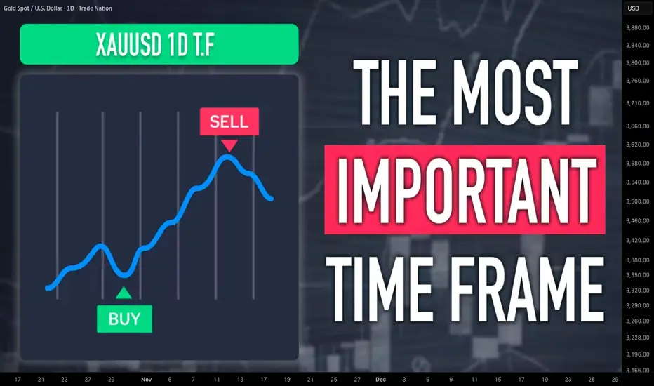
How to Analyze Daily Time Frame on Gold. 5 Important Things
There are 5 important things that you should analyze on Gold on a daily time frame to accurately predict long term, midterm and short term movements.
In this article, I will share with you a step-by-step guide for daily time frame analysis that you can apply on Gold or any other financial instrument.
1 - Identify the market trend
When you analyze a daily time frame, you should identify long term, midterm and short term market trends.
Long-term trend is based on the analysis of one year long price action.
In the example above, Gold is trading in a long term bullish trend because the price keeps setting new higher high and new higher lows during the year.
Midterm trend is based on the analysis of a price action for the last 4–5 months.
Above, we can clearly see that a mid-term trend is bullish because again, the price sets new higher highs and higher lows over time.
Short-term trend is based on the analysis of price movements for the last 2 months.
Short-term price action is also bullish on Gold, with a clear sequence of higher highs and higher lows.
According to the trend analysis, long-term, mid-term and short-term trends are bullish.
2 - Identify the directional bias
The directional bias defines a highly probable future direction on the market.
In our example, we can anticipate that Gold will keep growing among all the dimensions: long-term, mid-term and short-term.
3 - Execute structure analysis
Identify important historic horizontal and vertical structures.
That will be the points from where you should look for trading opportunities.
When you analyze key levels, identify the structures that are lying close to the current price levels.
Make sure that all the structures that you spotted were respected by the market in the past.
4 - Look for price action patterns
Price action patterns are the language of the market.
Proper identification of the patters will help you correctly understand the intentions of the market participants.
You can see that a bearish breakout of a rising channel triggered a correctional movement on the market.
Gold started to fall steadily within a bullish flag pattern and after it tested a key support, the price violated the resistance of the flag.
5 - Analyze candlesticks
Candlestick patterns can provide extra clues and confirmations.
You can see that the market formed multiple rejections from key support, an inside bar formation and bullish engulfing candle.
Violation of the inside bar to the upside with a strong bullish candle is an important bullish signal.
Combining trend analysis, structure analysis, price action and candlestick analysis, and you can make predictions and look for trading opportunities.
You can also make your analysis even more sophisticated, for example, analyzing fundamental analysis or applying technical indicators.
❤️Please, support my work with like, thank you!❤️
I am part of Trade Nation's Influencer program and receive a monthly fee for using their TradingView charts in my analysis.
TradeCityPro Academy | Support & Resistance Part 1👋 Welcome to TradeCityPro Channel
🎓 Educational Section Technical Analysis Training Series
Welcome to the Educational Content Section of our channel!
Here, we aim to teach you technical analysis from A to Z through structured playlists.
We’ll cover everything from risk and capital management, Dow Theory, support and resistance, trends, and market cycles, to more advanced concepts.
Our lessons are based on both real market experience and The Handbook of Technical Analysis.
🎨 What is Technical Analysis?
Technical Analysis (TA) is a method used to forecast price movements in financial markets by analyzing historical data, especially price and volume.
It’s based on the idea that history tends to repeat itself, and that recurring patterns can reveal profitable trading opportunities.
🧩 The Human Concept of Support and Resistance
Support and resistance aren’t just numbers on a chart — they’re the result of collective human behavior.
When large groups of traders make similar decisions — buying or selling — at a certain level, that area becomes psychologically important in the market.
Support forms where fear of missing out (FOMO) drives people to buy.
Resistance forms where fear of loss motivates people to sell.
💭 The Psychology Behind Formation
In a downtrend, when prices fall too much, traders start thinking “It can’t go any lower”, and buying pressure increases — forming support.
In an uptrend, when prices rise sharply, traders think “It’s too expensive now”, and selling pressure builds — forming resistance.
So, these levels reflect emotions like fear, greed, and FOMO, rather than being purely technical.
🌍 Real-World Example
When the USD price drops so low that everyone rushes to buy it — that’s support.
When gold becomes so expensive that no one wants to buy anymore — that’s resistance.
Markets operate on these same human instincts — only visualized through candlesticks and numbers.
🧩 Introduction
In technical analysis, two key concepts exist in nearly every strategy:
Support and Resistance.
These are areas on the chart where the probability of price reaction or reversal is high.
🟢 What is Support?
A support level is where buying pressure is expected to increase and prevent further price decline.
It acts like a floor that supports price.
📘 Example:
If Bitcoin repeatedly bounces from the $60,000 level, that area is considered a support zone.
🔴 What is Resistance?
A resistance level is where selling pressure increases, preventing further price growth.
It acts like a ceiling that stops price movement upward.
📘 Example:
If Ethereum fails multiple times to break above $3,800, that area is a resistance zone.
📈 How to Identify Support and Resistance
There are several methods to detect these levels:
Previous Highs and Lows:
The most common method — look for areas where price has reacted before.
Trendlines:
In an uptrend, connecting higher lows gives you a dynamic support line.
Moving Averages (MA):
MAs like MA50 or MA200 often act as dynamic support or resistance.
Supply and Demand Zones:
Areas where heavy buying or selling previously occurred.
⚙️ Market Psychology
Support and resistance are emotional memory points for traders.
When price reacts to a level once, it becomes mentally significant, leading to similar reactions in the future.
That’s why these zones often repeat over time.
🔄 Breakouts and Role Reversal
When price breaks a support or resistance level with strong volume and momentum, that level changes its role:
Broken resistance → becomes new support
Broken support → becomes new resistance
This concept is known as Role Reversal.
🎯 Importance of Timeframes
Support and resistance zones on higher timeframes (Daily, Weekly) carry greater significance, since more traders and larger volumes are involved.
🧠 Pro Tips
✅ Always treat support and resistance as zones, not fixed price points.
✅ If price approaches a level with strong momentum, it’s more likely to break it.
✅ Combine S/R with candlestick reactions, volume, and indicators for confirmation.
✅ Levels that repeat multiple times usually grow stronger over time.
💬 Summary
Support and resistance are the foundation of technical analysis.
Understanding them helps you find better entry and exit points and gain a deeper insight into market psychology.
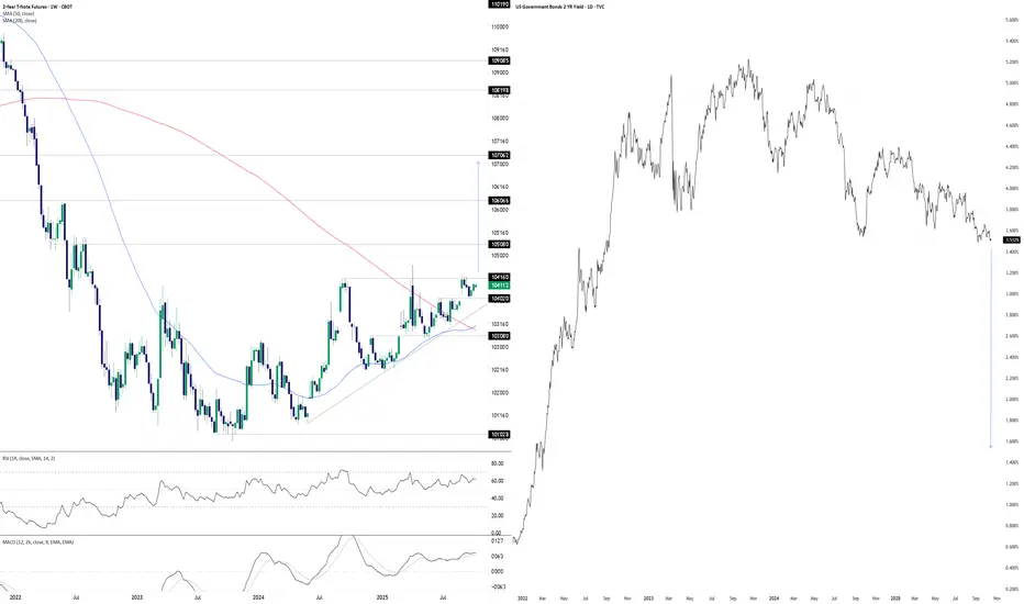
Something’s Brewing at the Front EndDonald Trump wants lower interest rates. He may well get his wish soon, at least at the front of the U.S. Treasury curve. The chart you’re looking at has two panes. On the left, we have U.S. two-year Treasury futures. On the right, we have two-year U.S. Treasury yields. The former uses a weekly tick, the latter daily.
With futures coiling in a well-defined ascending triangle pattern for more than a year, you get the sense that should we see a weekly close above 104’16’0, it may act as a catalyst to spark further upside, potentially explosive. The contract has been rejected at the level six separate times since July 2024, including four failed breakout attempts over the same period. This reinforces its importance. Given its proximity to the level with RSI (14) and MACD generating bullish momentum signals, attempt number seven—if we see it—stands a decent chance of sticking.
If we see a sustained break above 104’16’0, 105’08’0, 106’06’6 and 107’06’2 loom as the levels to watch, especially the latter as it aligns with the extension target based on the triangle’s height. If it were to be achieved, it points to a nominal two-year Treasury yield of around 1.5%.
That’s obviously far lower than where it currently resides, pointing to negative real rates given the Fed’s 2% inflation target and, in all likelihood, economic conditions far weaker than recent years or monetary policy being guided by factors other than fundamentals.
While the setup is tradable, if it plays out, it will have ramifications far beyond rate futures given the economic signal it would provide. When you look at recent moves in hard assets with perceived scarcity value, it appears many investors and traders are already positioning for such an environment.
Good luck,
DS
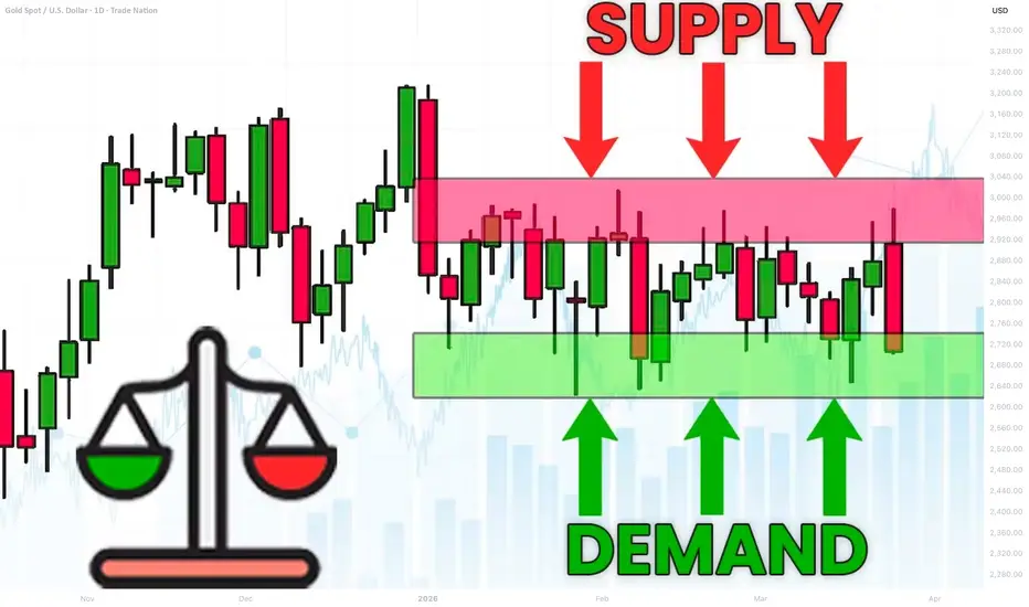
Support and Resistance VS Supply and Demand Explained
In the today's post, I will compare support and resistance levels with supply and demand zones.
I will explain to you the difference between them and share important tips and examples.
What are support and resistance levels?
We also call them key levels. These are particular levels on a price chart from where in the past we saw significant bullish or bearish movements.
Key support will be a one single level, that has a historical significance and from where a bullish reaction will be anticipated.
The all-time low on USDCHF will be a perfect example of a key support.
It is one single level that was respected one time in the past and from where a bullish reversal initiated.
Key resistance will be a one single level on a price chart that has a historical significance and from where a bearish movement will be expected.
The all-time high on Gold will represent a key horizontal resistance.
That level was respected one time in the past and from that level exactly the market dropped heavily.
What are supply and demand zones?
In comparison to support and resistance levels, supply and demand zones are the areas on a price chart. The zones that are based on multiple touches and consequent strong bullish or bearish reactions.
Demand zone will be the area that was tested at least 2 times in the past, and the price should strictly respect different price levels within that area.
A similar reaction will be anticipated from the demand zone in the future.
The yellow area above will a good example of a demand zone.
You can see that the price tested that area 3 times, and each time the market respected different levels lying within that.
These 3 tests compose the demand area.
Supply zone will be the area that was tested at least 2 times in the past and the price should strictly respect different price levels within that area.
A similar reaction will be anticipated from the demand zone in the future.
In this example, a supply area on EURUSD is based on 2 touches of key levels, lying very close to each other.
On the chart above, I underlined 2 horizontal support levels - the single levels that were respected by the market multiple times, and a supply zone - the area that is based on tests of multiple levels lying close to each other.
Support and resistance levels give you SINGLE levels from where you can look for trading opportunities. While supply and demand zones represent the areas . After a test of a supply and demand zone, the market may react to a RANDOM level within that.
For newbie traders, it is highly recommendable to trade single key levels, while experienced traders can broaden their strategies and trade supply and demand zones as well.
❤️Please, support my work with like, thank you!❤️
I am part of Trade Nation's Influencer program and receive a monthly fee for using their TradingView charts in my analysis.

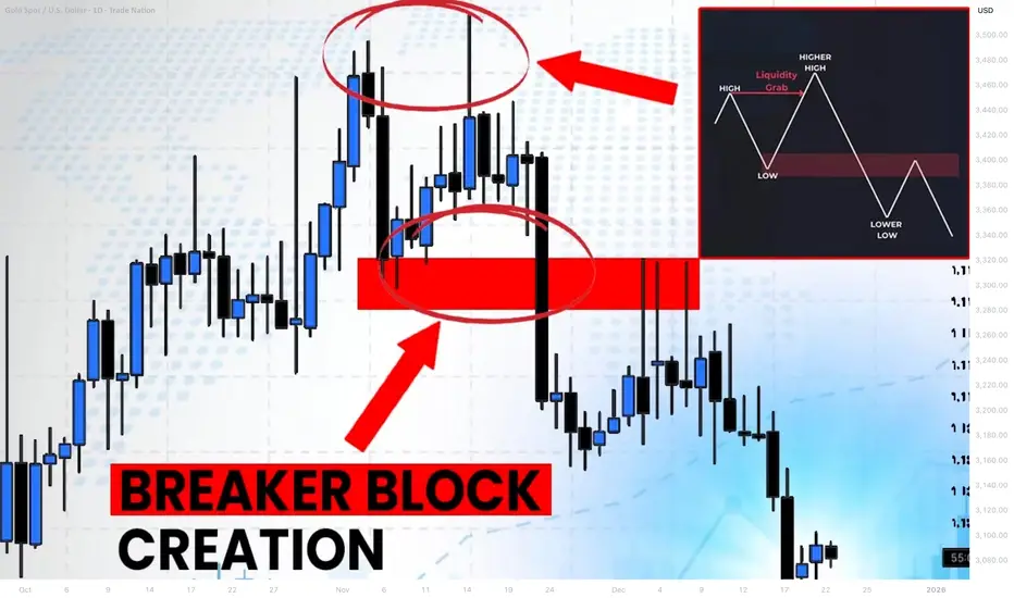
What is Bullish/Bearish Breaker Block & How to Find It Easily
Breaker blocks are easier to find than you think.
In this article, I will share with you very efficient price models for the identification of Order Blocks and Breaker Blocks.
You will learn their meaning, how to draw and use them in trading Smart Money Concepts SMC.
Bullish Trend Model & Breaker Block.
Let's start with an essential theory .
Please, examine a following price model:
In a classic bullish structure where the price consistently updates Higher Highs HH and Higher Lows HH, a bullish order block zone will be the area based on the last Higher How.
I will explain how to draw that zone in the examples below.
In some instances, a bullish order block zone will fail to deliver a bullish wave. Its bearish breakout will follow after its test instead.
It will be a critical event that is called a market structure shift in Smart Money Concepts SMC.
A formation of a new low will signify a violation of a bullish trend and a highly probable change of the market sentiment.
A broken bullish order block zone will turn into a Bearish Breaker Block.
The zone from where the next bearish wave will most likely follow.
It will provide a very safe place to sell from.
Market structure shift in a bullish trend is not a random event.
It usually occurs after a test of a significant supply zone with a liquidity grab.
It can help you to predict the change of the sentiment way before it happens.
That's an example of such a price model on GBPAUD forex pair.
We see a confirmed bullish liquidity sweep in uptrend after a test of a historic supply zone.
A bearish wave followed then and a bullish order block zone was broken.
To draw Order Block Zone, I picked the level of the last higher low as its lower boundary and a low of a body of that candlestick as the upper boundary.
After a breakout, it turned into a Bearish Breaker Block.
A bearish continuation occurred after its test.
Bearish Trend Model & Breaker Block.
Please, check this model:
In a classic bearish structure where the price consistently updates Lower Lows LL and Lower Highs LH, a bearish order block zone will be the area based on the last Lower High.
In some instances, a bearish order block zone will fail to deliver a bearish wave. Its bullish breakout will follow after its test instead.
It will be a significant event that is called a bullish market structure shift in Smart Money Concepts SMC.
A formation of a new high will signify a violation of a bearish trend and a highly probable change of the market sentiment.
A broken bearish order block zone will turn into a Bullish Breaker Block.
The zone from where the next bullish wave will most likely follow.
It will provide a very safe place to buy from.
Market structure shift in a bearish trend is not a random event.
It usually occurs after a test of a significant demand zone with a liquidity grab.
That's a real example of such a price model on WTI Crude Oil.
A bearish structure was violated after a test of a demand zone.
A bearish order block was broken, and it turned into a Bullish Breaker Block Zone then.
(Drawing a bullish order block zone, I picked the level of the last lower high as its upper boundary and a high of a body of that candle as its lower boundary )
A bullish movement followed after a deep test of that.
A proper combination of structure mapping and liquidity analysis will help you to predict a market structure shirt and a breaker block creation before they happen.
The models that I shared will help you to confirm bullish and bearish breaker blocks trading Forex or any other markets with Smart Money Concepts SMC ICT.
❤️Please, support my work with like, thank you!❤️
I am part of Trade Nation's Influencer program and receive a monthly fee for using their TradingView charts in my analysis.
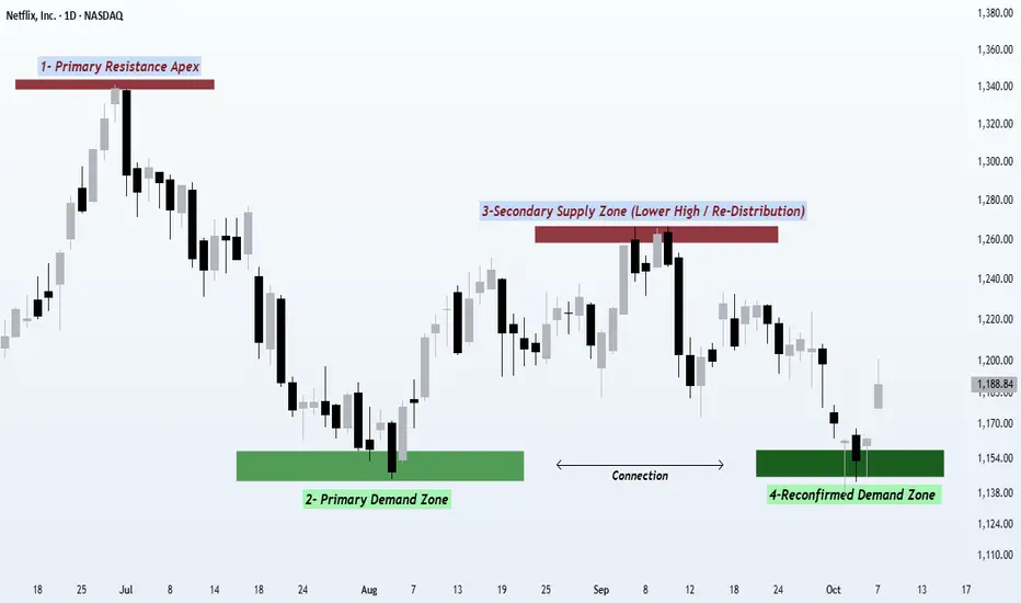
From Distribution to Defense Reading the Market’s MessageHello TradingView family, One thing about price it never forgets. Here’s how smart money distribute defends, tests, and retests the same levels to shape every trend.
So In this post we’ll explore how market structure evolves through repeated interactions with the same zones and why smart money often revisits prior levels to confirm or reject market direction.This phenomenon, often called reconfirmed demand and supply, offers valuable insight into how institutions defend, test, or abandon positions during structural transitions.
Understanding the Sequence--::
The price action we’re looking at highlights how an all-time high can transform into a repeating cycle of supply and demand a classic story of how the market moves in waves of distribution and accumulation.
Let’s walk through the four stages of this evolving structure 👇
1️⃣ Primary Supply Zone (Distribution High)--::
The first rally culminates in a zone where aggressive buying starts to weaken. Volatility increases, candles become larger, and momentum slows. This area represents smart money distributing positions where liquidity is abundant because breakout traders are still buying, and institutions can quietly sell into that strength. This phase often sets the benchmark high that defines the rest of the structure.
2️⃣ Initial Demand Zone (Accumulation Response)--::
After the distribution, price declines until new demand emerges. The downtrend pauses here, forming a clear demand base a level where institutional buyers see value and start building exposure again. This level often becomes the anchor of the upcoming structure, as it’s where the first response from buyers is confirmed by noticeable rejection and strength.
From here, the market begins to rebound.
3️⃣ Secondary Supply Zone (Lower High Confirmation)--::
The rally from the demand base faces resistance before reclaiming the prior high a lower high. This lower-high reaction is a crucial sign that supply remains dominant and that the recent buying was likely re-distribution rather than new strength. This is the zone where smart money offloads again, using the recent bounce to re-sell into liquidity. It also marks a Change of Character (ChoCH) and a potential trend transition.
It’s not a new high it’s the confirmation of a shift.
4️⃣ Reconfirmed Demand Zone (Previous Support Retest)
The final swing shows price declining back into the same demand zone from Stage 2. This zone isn’t new it’s a reconfirmation of prior institutional activity. When the same level holds again, it signifies that the same participants are defending the zone, maintaining the structure and keeping the market in balance. If the level breaks, however, it signals distribution completion the moment when prior demand can’t hold, and the market transitions into a markdown phase.
💡 The Bigger Picture--::
This repeating interaction between supply and demand is a snapshot of market psychology where the big players constantly test the same levels to validate whether the market still agrees with the prior valuation. Each touch, rejection, or breakthrough reveals who’s winning the battle between smart money and retail momentum.
By recognizing this pattern — distribution ➜ accumulation ➜ re-distribution ➜ retest — traders can better understand where the true liquidity zones are and how the market’s behavior constantly revolves around these zones.
This is not just about recognizing patterns it’s about understanding why these patterns form and how they reflect the business of smart money as they manage risk, scale positions, and trap liquidity.
🚀 Takeaway--::
When a previous level reacts again, the zone itself becomes part of the story not just a random reaction, but a confirmation of intent from bigger players. If you can read how the same zones behave on the second touch, you can anticipate where the next impulsive move or breakdown may occur. Mastering this pattern doesn’t just improve your entries it helps you think like the pros.
Regards- Amit.
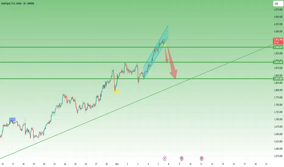
Ascending channels trading applied to Gold current situation🔼 Ascending Channel – Explained Simply
An ascending channel is a bullish pattern — but not always a bullish ending.
It shows a market climbing step by step between two parallel rising lines:
the lower trendline (support) and the upper trendline (resistance).
🧠 Market Psychology
Buyers dominate, but sellers still show up at every swing high.
Each dip gets bought, keeping the trend alive —
until one side finally breaks the rhythm.
⚙️ How to Trade It
• Inside the channel:
Buy near the lower rail, take profit near the upper rail.
• Breakout play:
Go long on a confirmed close above resistance,
or short on a clean break below support.
• Stops:
Just outside the opposite rail — below support for longs, above resistance for shorts.
• Targets:
Use the channel height projected from the breakout point.
⚠️ What to Watch Out For
• False breakouts happen often.
• Too-steep channels usually fail faster.
• Volume must confirm — low volume = fake strength.
• Statistically, breakdowns occur slightly more often than breakouts.
________________________________________
Key takeaway:
An ascending channel isn’t a promise of a bull run —it’s a structured climb that eventually ends.
Trade the rhythm, not the hope. 🎯
Statistically, in 57% of cases, up channels are broken to the downside
Gold now situation: the recent 1k pips is way-way-way to steep
Confirmation came with a drop under 3950 zone
Usually, in the case of such a steep channel, all the move is negated, so a drop to the 3850 zone.
However 3900 zone is strong support now, so a break under 3950 zone could lead to "only" a drop to this support.