Learn How to Trade Descending Triangle Pattern
Descending triangle formation is a classic reversal pattern. It signifies the weakness of buyers in a bullish trend and bearish accumulation.
⭐️The pattern has a very peculiar price action structure:
Trading in a bullish trend the price sets a higher high and retraces setting a higher low.
Then the market starts growing again but does not manage to set a new high, setting a lower high instead.
Then the price drops again perfectly respecting the level of the last higher low setting an equal low.
After that one more bullish movement and one more consequent lower high, bearish move, and equal low.
Based on the last three highs a trend line can be drawn.
Based on the equal lows a horizontal neckline is spotted.
❗What is peculiar about such price action is the fact that a set of lower highs signifies a weakening bullish momentum: fewer and fewer buyers are willing to buy from horizontal support based on equal lows.
🔔 Such price action is called a bearish accumulation.
Once the pattern is formed it is still not a trend reversal predictor though. Remember that the price may set many lower highs and equal lows within the pattern.
The trigger that is applied to confirm a trend reversal is a bearish breakout of the neckline of the pattern.
📉Then a short position can be opened.
For conservative trading, a retest entry is suggested.
Safest stop is lying at least above the level of the last lower high.
However, in case the levels of the lower highs are almost equal it is highly recommendable to set a stop loss above them all.
🎯For targets look for the closest strong structure support.
❤️If you have any questions, please, ask me in the comment section.
Please, support my work with like, thank you!❤️
Support and Resistance

Drawing Volume Based Trendlines Support and ResistanceFor this to work you're going to need your bull bear power void oscillator.
I have mine set on its default settings but you can also set it up with the following.
Click the image below for that indicator for free
The Setup
the length is 50
the moving average is 20
the macd settings are 12 / 26 / 9
With this I have a 50 period EMA on my chart.
Drawing Support and Resistance Levels Based on Volume
When drawing support and resistance levels you should always do them on a 1 hour time frame or higher. You can do them on a 30 minute time frame but some of them will be less relevant.
Since most people and most institutions do them a 1 hour time frame and hire you might as well be doing the same.
Support and resistance levels are found in the non-tradable areas of the oscillator. in other words it's the area of the oscillator where it has a black background.
As an example if you have a pink volume bar coming down first followed by a red volume bar afterwards this would mean resistance. But both of these bars must clear the void
If you have a light green bar first outside with the tradable area followed by a dark green bar this means support and both bars must be outside the void.
As an example if you have more than one light colored bar in the tradable area followed by a darker colored bar volume then you draw your support or resistance level at the 1st alternating color bars.
Find out where your current price level is and then draw about 2 or 3 support and resistance levels above current price and two or three below current price. You don't really want more than that.
Drawing Trendlines Based on Volume
To draw trend lines you need to have a background that goes from one color to Black and then to the alternate color for example green to Black to red or red to Black to Green. if you get the same color twice then what you have is a continuation of your trend.
In a trend that goes from green to Black to Red you're looking for the highest volume in the non-tradable area and then drawing of line from there to the very first tradable volume in the red area.
Once you do this you can't move to a smaller time frame and use that trend line as a Target when moving to it or an exit point.

Depth of corrective waves. Elliott Wave.Elliott Wave Guidelines:
Depth of Corrective Waves
Understanding Elliott Waves is much more then the basic rules and 3s and 5s. A largely underused aspect of Elliott Waves is the Elliott Wave Guidelines. These go beyond the guidelines for each specific pattern and are meant to assist in determining the most probabilistic wave pattern. This is just the primary guideline of this larger Elliott Wave guideline.
If you have found this inspiring/helpful, please consider a boost and follow! Also, check out the links in my signature to get to know me better! Cheers!

GOLDEN ZONE - FibonacciHello guys! Take a look at how smoothly the market respects the Golden Zone on Fibonacci retracement levels. The Golden Zone or Golden Ratio is the area between 50% and 61.8% on retracement levels, which acts as a strong support zone. After an impulse, on the correction the price usually gets rejected by this zone and it continues its previous trend. However, if it is broken, there is a high change of a trend reversal, as we can see in this chart.

Learn How to Apply Multiple Time Frame Analysis
Hey traders,
In this article, we will discuss Multiple Time Frame Analysis.
I will teach you how to apply different time frames and will share with you some useful tips.
Firstly, let's briefly define the classification of time frames that we will discuss:
There are 3 main categories of time frames:
1️⃣Higher time frames
2️⃣Trading time frames
3️⃣Lower time frames
1️⃣Higher time frames are used for identification of the market trend and global picture. Weekly and daily time frames belong to this category.
The analysis of these time frames is the most important.
On these time frames, we make predictions and forecast the future direction of the market with trend analysis and we identify the levels, the areas from where we will trade our predictions with structure analysis.
2️⃣Trading time frames are the time frames where the positions are opened. The analysis of these time frames initiates only after the market reaches the underlined trading levels, the areas on higher time frames.
My trading time frames are 4h/1h. There I am looking for a confirmation of the strength of the structures that I spotted on higher time frames. There are multiple ways to confirm that. My confirmations are the reversal price action patterns.
Once the confirmation is spotted, the position is opened.
3️⃣Lower time frames are 30/15 minutes charts. Even though these time frames are NOT applied for trading, occasionally they provide some extra clues. Also, these time frames can be applied by riskier traders for opening trading positions before the confirmation is spotted on trading time frames.
Learn to apply these 3 categories of time frames in a combination. Start your analysis with the highest time frame and steadily go lower, identifying more and more clues.
You will be impressed how efficient that strategy is.
❤️If you have any questions, please, ask me in the comment section.
Please, support my work with like, thank you!❤️

How to trade using Value Areas and POC?A few key concepts when using Market Profile in your trading:
1) Point of Control (POC) acts as price magnets, as they represent the price level where most time was spent during a trading day. Price tends to gravitate towards them.
2) Naked (Not visited) POC acts as stronger magnets than visited POCs.
3) When price enters / breaks into a Value Area, which represents a range of "fair value", price tends to visit the other end of the Value Area. For example above, the price breaks up from the Value Area Low before end of day yesterday, hit the Value Area High this morning.
You definitely won't find these key levels and ranges with traditional support and resistance lines drawing methods. Using Market Profile will give you the edge to become a better trader.
See my previous 2 posts:

Using Multi-Time Frame Analysis To Find Key Levels That MatterDo you find yourself drawing too many levels on your charts?
Do you struggle to know which levels that actually matter for trading decisions?
Do you wonder why price moves straight through some key levels and not others?
This video will show you how to analyse a stock using Multi-Timeframe Analysis techniques to find the key levels that actually matter for trading, and how to quickly find the most important levels where price is likely to react.

Special Entry Patterns - IPO'sJS-TechTrading Masterclass : Special Entry Patterns - IPO's
In a previous tutorial, I have explained the general characteristics of a perfect buy point. In this tutorial, we will look at IPO's (Initial Public Offerings) and discuss how to identify primary bases.
IPO's coming out of primary bases can make huge price moves - let's discuss how to find the next monster mover, similar to what stocks like Amazon could achieve after their Initial Public Offering phase.
Perfect Entry Points – IPO’s – The Primary Base
When it comes to investing in IPO stocks, new issues don't play by the usual rules.
Companies making initial public offerings draw a lot of investor attention. That often results in unusual and brand-new chart patterns. Volatility can rise as investors size up demand for the new stock. Yet there are opportunities in these cases, if you can spot the correct characteristics amid the price-and-volume action.
The framework of a good IPO base is simple. The decline from peak to low usually doesn't top 20%, but the most volatile markets have produced declines of up to 50%. The length is often less than five weeks and can be as short as seven days. These two factors alone make IPO bases wayward cousins compared with proper bases, such as the cup with handle and flat base, which need at least five to seven weeks of work.
In an IPO base, the pattern typically starts within 25 days of the stock's first day of trading. Know the important similarities with regular bases. For example, the buy point is drawn by taking the prior high and adding 10 cents. The price gain on the breakout should be strong.
There are ways to evaluate these blind spots, however. Important factors include seeing a shallow correction within the base during normal market conditions, a large increase in price and a close near session highs on the breakout day, and heavy volume on the breakout day and week.
Also, the stock should generally form the base above its IPO price.
Example - ServiceNow (NOW)
The business software company, went public in June 2012, at 18 a share and has built its primary base during the period from the initial offering to April 2013 when the stock developed its first perfect buy point.

🟢PRICE ACTION SECRETS
🔴Multi-candle patterns are more reliable
The more candles a specific pattern contains, the more reliable it usually is. 3 candle patterns are better than single candle patterns. 30 candle patterns are usually better than 3 candle patterns. Patterns like head and shoulders, double and triple tops are among my favorites, exactly because of this reason. They consistently result in higher probability trades, which is what we’re all after. It doesn’t mean that a good pin bar setup won’t work, it just means there’s a higher probability of having these multi-candle setups resulting in a winning trade.
🟠Know where to place your stop loss
Knowing where to place an order is just the beginning. Where do you place your stop loss? Fixed pips stop loss levels are hardly a good approach since the market volatility can change and every trade should be looked at within the context of the recent market history.
🟢Always look for confluence
This is absolutely one of the most important secrets you have to know about. Confluence is everything.
So you’ve found a sweet price action setup. Great! Now make sure it has confluence, meaning that it coincides with other valid signals that support your trading idea.
🔵Tell a story of what happened
Every chart tells a story. It might be a story of clear direction or a story of messy back-and-forth battling between buyers and sellers. In a similar way, we can talk about clean price action vs messy price action. It is up to the trader to find the story and better understand what the market might do.
🟣Context is everything
Depending on where a price action setup occurs, you should interpret it differently. The same pin bar could be bullish or bearish, depending on if they show up at the bottom of a downtrend or top of an uptrend, respectively. Not all patterns are also worth taking if they are not preceded by the right price action and happen at the levels that are in one way or the other of significance.
🟤Identify key support & resistance zones
Support and resistance (or S&R for short) are terms used to denote areas where price reverses at its lowest point (support) and the highest point (resistance) on a chart. Often, these zones are “tested” multiple times as traders look for an increased buyer and seller activity around these levels. It’s important to note that support and resistance are usually not thin lines, but rather zones.
🔴The Bottom Line
The price action strategy is one of the most powerful tools for extracting money from the markets with predictability and manageable risks, but only if used correctly.
Thank you!
Please give a Thumbs UP and Leave Comment👍🏻

Andrew's Pitchfork TradingThe Andrews Median line or Pitchfork is a form of tool that is used to identify potential reversals or continuation of trends. The median line tool is one of the standard charting tools available with most trading/charting platforms.
The Andrews pitchfork tool or median line comprises of trend lines that are drawn connecting three price points. Swing high/Swing low/Swing high or Swing low/Swing high/Swing low. The median line comprises of three lines, the median line which dissects the two Swing highs or lows, and the upper and lower median lines. It is the appearance of the median lines which gives it the popular name of Pitchfork.
After identifying the swing high/low points, the Median line should be adjusted in order for the median line to make some sense. The chart below shows the pitchfork plotted which is adjusted to the swing high and low points to make sense of the price action.
The Andrew’s Pitchfork is based on the concept of Action/Reaction and Newton’s law of “Every action has an equal and opposite reaction”.
There are different elements of the Pitchfork tool, they are:
Median line, Upper median line, Lower median line, Upper/lower Trigger line & Upper/Lower Warning line
Andrew’s Pitchfork Trading Rules:
The following is a summary of the Andrews Pitchfork Trading rules.
80% of the time, price reaches the Median line
When price reaches the median line, it can either reverse to the upper or lower median line, or cut through the median line
Failure to break reach the upper or lower median lines, after the median line is cut through indicates a reversal back to the median line
When price reverses before reaching the median line, there is a high probability of price will continue to move in the direction, reaching the upper or lower median line, opposite to the median line
When price breaks the upper or lower median line, they are most likely to reach the upper or lower warning lines
When price cuts through the upper or lower warning lines, they indicate consolidation or the start of a new trend.
Andrews Pitchfork Trading – Conclusion
To summarize, the Andrew’s Pitchfork tool is a versatile trading tool that can be used in any market and in any timeframe. It is best when used with other trading systems or method, but can be traded as a standalone tool as well. Trading with Andrew’s pitchfork requires quite a bit of practice and more importantly patience and with good experience the possibility of developing your own custom trading system based on Andrew’s pitchfork tool should be quite simple and rewarding.

0% Inflation very soon?United States Inflation Rate, Year-over-Year, 1914-2022 chart
----------------------------------------------------------------
Why do I think inflation will go down to 0%?
Inflation is currently at the main trendline (established in 1920). This is a very strong resistance, and as a general rule, do not short a support or long a resistance. In other words, you don't want to speculate on inflation increasing when inflation is at its critical point. FED cares about their charts, and they also want the charts to look great. That's why they will push inflation down.
----------------------------------------------------------------
Why the Inflation Rate Matter?
The inflation rate demonstrates the health of a country's economy. It is a measurement tool used by a country's central bank, economists, and government officials to gauge whether action is needed to keep an economy healthy. That's when businesses are producing, consumers are spending, and supply and demand are as close to equilibrium as possible.
A healthy rate of inflation is good for both consumers and businesses. During deflation, consumers hold on to their cash because the goods will be cheaper tomorrow. Businesses lose money, cutting costs by reducing pay or employment. That happened during the subprime housing crisis.
In galloping inflation, consumers spend now before prices rise tomorrow. That artificially increases demand. Businesses raise prices because they can, as inflation spirals out of control.
When inflation is steady, at around 2%, the economy is more or less as stable as it can get. Consumers are buying what businesses are selling.
----------------------------------------------------------------
How is inflation measured?
There are several ways to measure inflation, but the U.S. Bureau of Labor Statistics uses the consumer price index. The CPI aggregates price data from 23,000 businesses and 80,000 consumer goods to determine how much prices have changed in a given period of time. If the CPI rises by 3% year over year, for example, then the inflation rate is 3%. The Fed, on the other hand, relies on the price index for personal consumption expenditures (PCE). This index gives more weight to items such as healthcare costs.
----------------------------------------------------------------
How do you hedge against inflation?
Because inflation causes money to lose value over time, hedging against it is an important part of any sound investing strategy. Investors use a diversified portfolio with a variety of asset types to offset inflation and ensure that the overall growth of their portfolio outpaces it.
----------------------------------------------------------------
YEAR - INFLATION RATE YOY - FED FUNDS RATE - BUSINESS CYCLE (GDP GROWTH) - EVENTS AFFECTING INFLATION
1929 0.6% NA August peak Market crash
1930 -6.4% NA Contraction (-8.5%) Smoot-Hawley
1931 -9.3% NA Contraction (-6.4%) Dust Bowl
1932 -10.3% NA Contraction (-12.9%) Hoover tax hikes
1933 0.8% NA Contraction ended in March (-1.2%) FDR's New Deal
1934 1.5% NA Expansion (10.8%) U.S. debt rose
1935 3.0% NA Expansion (8.9%) Social Security
1936 1.4% NA Expansion (12.9%) FDR tax hikes
1937 2.9% NA Expansion peaked in May (5.1%) Depression resumes
1938 -2.8% NA Contraction ended in June (-3.3%) Depression ended
1939 0.0% NA Expansion (8.0% Dust Bowl ended
1940 0.7% NA Expansion (8.8%) Defense increased
1941 9.9% NA Expansion (17.7%) Pearl Harbor
1942 9.0% NA Expansion (18.9%) Defense spending
1943 3.0% NA Expansion (17.0%) Defense spending
1944 2.3% NA Expansion (8.0%) Bretton Woods
1945 2.2% NA Feb. peak, Oct. trough (-1.0%) Truman ended WWII
1946 18.1% NA Expansion (-11.6%) Budget cuts
1947 8.8% NA Expansion (-1.1%) Cold War spending
1948 3.0% NA Nov. peak (4.1%)
1949 -2.1% NA Oct trough (-0.6%) Fair Deal, NATO
1950 5.9% NA Expansion (8.7%) Korean War
1951 6.0% NA Expansion (8.0%)
1952 0.8% NA Expansion (4.1%)
1953 0.7% NA July peak (4.7%) Eisenhower ended Korean War
1954 -0.7% 1.25% May trough (-0.6%) Dow returned to 1929 high
1955 0.4% 2.50% Expansion (7.1%)
1956 3.0% 3.00% Expansion (2.1%)
1957 2.9% 3.00% Aug. peak (2.1%) Recession
1958 1.8% 2.50% April trough (-0.7%) Recession ended
1959 1.7% 4.00% Expansion (6.9%) Fed raised rates
1960 1.4% 2.00% April peak (2.6%) Recession
1961 0.7% 2.25% Feb. trough (2.6%) JFK's deficit spending ended recession
1962 1.3% 3.00% Expansion (6.1%)
1963 1.6% 3.5% Expansion (4.4%)
1964 1.0% 3.75% Expansion (5.8%) LBJ Medicare, Medicaid
1965 1.9% 4.25% Expansion (6.5%)
1966 3.5% 5.50% Expansion (6.6%) Vietnam War
1967 3.0% 4.50% Expansion (2.7%)
1968 4.7% 6.00% Expansion (4.9%) Moon landing
1969 6.2% 9.00% Dec. peak (3.1%) Nixon took office
1970 5.6% 5.00% Nov. trough (0.2%) Recession
1971 3.3% 5.00% Expansion (3.3%) Wage-price controls
1972 3.4% 5.75% Expansion (5.3%) Stagflation
1973 8.7% 9.00% Nov. peak (5.6%) End of gold standard
1974 12.3% 8.00% Contraction (-0.5%) Watergate
1975 6.9% 4.75% March trough (-0.2%) Stop-gap monetary policy confused businesses and kept prices high
1976 4.9% 4.75% Expansion (5.4%)
1977 6.7% 6.50% Expansion (4.6%)
1978 9.0% 10.00% Expansion (5.5%)
1979 13.3% 12.00% Expansion (3.2%)
1980 12.5% 18.00% Jan. peak (-0.3%) Recession
1981 8.9% 12.00% July trough (2.5%) Reagan tax cut
1982 3.8% 8.50% November (-1.8%) Recession ended
1983 3.8% 9.25% Expansion (4.6%) Military spending
1984 3.9% 8.25% Expansion (7.2%)
1985 3.8% 7.75% Expansion (4.2%)
1986 1.1% 6.00% Expansion (3.5%) Tax cut
1987 4.4% 6.75% Expansion (3.5%) Black Monday crash
1988 4.4% 9.75% Expansion (4.2%) Fed raised rates
1989 4.6% 8.25% Expansion (3.7%) S&L Crisis
1990 6.1% 7.00% July peak (1.9%) Recession
1991 3.1% 4.00% Mar trough (-0.1%) Fed lowered rates
1992 2.9% 3.00% Expansion (3.5%) NAFTA drafted
1993 2.7% 3.00% Expansion (2.8%) Balanced Budget Act
1994 2.7% 5.50% Expansion (4.0%)
1995 2.5% 5.50% Expansion (2.7%)
1996 3.3% 5.25% Expansion (3.8%) Welfare reform
1997 1.7% 5.50% Expansion (4.4%) Fed raised rates
1998 1.6% 4.75% Expansion (4.5%) LTCM crisis
1999 2.7% 5.50% Expansion (4.8%) Glass-Steagall repealed
2000 3.4% 6.50% Expansion (4.1%) Tech bubble burst
2001 1.6% 1.75% March peak, Nov. trough (1.0%) Bush tax cut, 9/11 attacks
2002 2.4% 1.25% Expansion (1.7%) War on Terror
2003 1.9% 1.00% Expansion (2.9%) JGTRRA
2004 3.3% 2.25% Expansion (3.8%)
2005 3.4% 4.25% Expansion (3.5%) Katrina, Bankruptcy Act
2006 2.5% 5.25% Expansion (2.9%)
2007 4.1% 4.25% Dec peak (1.9%) Bank crisis
2008 0.1% 0.25% Contraction (-0.1%) Financial crisis
2009 2.7% 0.25% June trough (-2.5%) ARRA
2010 1.5% 0.25% Expansion (2.6%) ACA, Dodd-Frank Act
2011 3.0% 0.25% Expansion (1.6%) Debt ceiling crisis
2012 1.7% 0.25% Expansion (2.2%)
2013 1.5% 0.25% Expansion (1.8%) Government shutdown. Sequestration
2014 0.8% 0.25% Expansion (2.5%) QE ends
2015 0.7% 0.50% Expansion (3.1%) Deflation in oil and gas prices
2016 2.1% 0.75% Expansion (1.7%)
2017 2.1% 1.50% Expansion (2.3%)
2018 1.9% 2.50% Expansion (3.0%)
2019 2.3% 1.75% Expansion (2.2%)
2020 1.4% 0.25% Contraction (-3.4%) COVID-19
2021 7.0% 0.25% Expansion (5.9%) COVID-19
2022 8.3% 3.25% Contraction (-1.6%) As of Sept. 21. 2022
2023 2.7% (est.) 2.8% (est.) Expansion (2.2%) March 2022 projection

💥Weekend Learning: Simple Approach to Market Structure💥I try to draw a simple market structure for trading range and trend. Lets check details about market structure.
Trading Range:
Trading range is where both buyers and sellers are active and trade. On the range market we see 2 sided liquidity. Above range that is buy side LQ and below range that is sell side LQ.
If one side LQ sweep happens, we can expect the other side sweep too.
USDJPY 4H Example of Trading range and LQ Sweep:
I recommend to avoid trading in trading ranges and wait for clear breakout, but if you want you can use the buy low, sell high strategy. Check out my September 15th analysis on bitcoin to understand what I mean by buy low, sell high👇🏽
Trend
When market is not moving within trading range, moving fast(creating inefficiency) or creating series of HHs and HLs if buyers in control, LLs and LHs if sellers in control. We are going to learn about market structure after trading range breakout or break of prior high and low.
1. Break of Trading Range Happens(4H Timeframe):
2. After Break of Trading Range or Prior High/Low, Always Expect PB. When PB ends look for entries in direction of trend(15M Timeframe):
Check out the 15M chart for CHoCH opposite side on trend. When happens, sign of PB!
3. If CHoCH happens in direction of HTF trend, signaling the trend resumption(15M Timeframe):
4. Trend Resumption(4H Timeframe):
Tips:
1. You check the 4H chart and if you see a movement more than 40-50pips, its another sign for beginning of PB:
2. CHoCH in 15M Timeframe is just a signal for beginning/end of PB. Nothing is 100% in the market.
3. You can use premium/discount areas as filter to check the end of PB:
**You can combine the market structure stuff with supply/demand zones and find entries.**
What do you think about this chart? Feel Free and Comment Below!

Extreme Day Trading/Scalping Strategy-------------------------------------------------------------------------------------------------------------------------------------------------------------------------------------
HD Session Volume Profile (SVP HD) -
Go to settings under Inputs. Click custom. I set to 10:00am-10:00pm Pacific/Auckland time. I live in NZ. Set to your time zone. Click extend right box for POC, VAH, and VAL. Then go to Style and click VAH and VAL box. Unclick labels in price scale and values in status line box. Click histogram box and turn down opacity from 6% to 0.
-------------------------------------------------------------------------------------------------------------------------------------------------------------------------------------
Visible Range Volume Profile (VRVP) -
Go to settings under Style. Click VAH and VAL box. Unclick labels in price scale and values in status line box.
-------------------------------------------------------------------------------------------------------------------------------------------------------------------------------------
Volume Weighted Average Price (VWAP) -
Go to settings under Inputs. Click bands multiplier #2 and #3 box. Go to style. Unclick bands fill box #1, #2, and #3. Unclick labels price line and values in status line box.
-------------------------------------------------------------------------------------------------------------------------------------------------------------------------------------
100 Volume Weighted Moving Average (VWMA) -
Go to settings under Inputs. Set length to 100. Go to style and set color to white. Unclick labels on price scale and values in status line box.
-------------------------------------------------------------------------------------------------------------------------------------------------------------------------------------
Vertical dotted lines (1period) -
They are the open and close for each session. Red: Tokyo 1pm-8pm NZST. Blue: London 9pm-4.30am NZST. White: New York 2.30am-9am NZST.
-------------------------------------------------------------------------------------------------------------------------------------------------------------------------------------
Horizontal dotted lines (1 period) -
They are very useful and powerful price levels I believe. The big players (banks and financial institutions) especially love big round even numbers in the market. I simply put them down and divided them into quarters. l put levels on whole, half, and quarters of values of price. So for example I put one on 144 and 145. I then simply divided in half, 145.5. Then I divided again to get 145.25 and 145.75. I believe this principle/idea can help to find useful support and resistance levels. It's based from the bigger whole round numbers in the market.
-------------------------------------------------------------------------------------------------------------------------------------------------------------------------------------
Range Bars (I flick between 10R to 50R for EJ and GJ) -
I use range bars. I love range bars. 100X better than time based charts. I've ditched all time based charts. Range bars filter out and remove time from the equation. They simply just show raw movements of price. Raw and uncensored. They show every nook and cranny of market structure and market structures on any chart. They show the market as it really is with no lag no delay. You see the market as it when it is playing out. No filter. You plainly and sharply see every single price movement. This is incredibly invaluable for day trading and scalping. They are very powerful for seeing patterns, breakouts, breakout and retests, and support and resistance. They are far better than time charts because you don't have rely on time. You are actually only relying on price to move. That is all you are focusing on. If you can focus on market structure instead of time I believe it really helps to read the chart in a way deeper and powerful way.

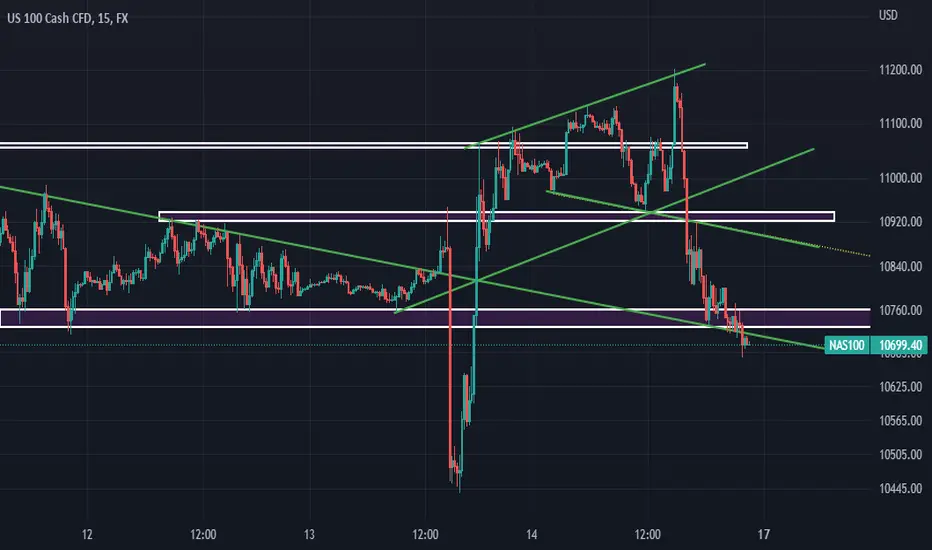
NAS100 CONSOLIDATION TRADE 1hour/30 minutes, there are many visible/ trustworthy moves in there..
Every move in 15mnts?1hour/30 minutes influences the whole day chart
So check for every move IN 1hour/30-minutes TF(draw trendlines and analyze the every move the market makes in the 1hour/30 minutes TF)
Trust ME
So for every move made in 30 minutes you take(provided move perfect AF)
i realized today that you have to stick to your stratergy and timeframe youre best at... please take note, and be patient with yourself. stick to what youre best at, this analysis was made a day after trading on the 4 hour chart. wasn't a profitable day/ week trading on the 4 hourly chart...
Sticking to stop loss is a must to do when ((BUYING the DIP))Opening a position without setting a stop loss is a big mistake and it can be disastrous when buying the dip !
Here, we show a tempting setup to open a long position in rectangle (1) . It is of course OK to go long in this setup in the hope of catching possible up coming up going wave shown in green. But without setting a stop loss? Not at all ! Followings are just two simple possible scenario which may happen:
Rectangle (2) shows a scenario which may happen if lucky. Although it will bring us profit, believe me it bothers all the traders a lot emotionally. Lots of hopes and fears which makes us nervous. This not only ruin our current trade but also has a powerful negative impact on our next trades.
Rectangle (3) shows a terrifying scenario which can whip out all our capital ! Please keep it in mind that " Preserving capital is a first rule of trading ". If you think this is an unrealistic scenario just take a look at ETSY, SHOP, SQ and ROKU.
Be aware my friends : what we consider a possible abc form of correction can just be waves 1,2 and 3 of a larger degree wave 1 or A . This concept is shown on the rectangle (3) scenario. It is worth to note what is labeled as wave 1 or A in this rectangle is not end of down side move .There will be another at least same size down side move after a wave 2 or B counter trend correction. See the charts carefully to find out what is next after waves 1 or A.
There are 4 major rules in trading :
1. preserving the capital
2. preserving the capital
3. preserving the capital and if successful then:
4. making profit.
Hope to be helpful and good luck.

SIMPLE TRADING STRATEGY FOR BEGGINNERSWatch and learn this simple trading strategy that will make you money.
the tutorial is based on support and resistance and trend direction.

TRADING FOR BEGINEERS! USING SUPPORT AND RESISTANCE IN 2022!!!This tutorial video discusses how to find KEY support and resistance within trading on any timeframe or market including FOREX, STOCKS or CRYPTO. DROP A LIKE AND SHARE WITH OTHER PEOPLE.
P.S NOT A FINANCIAL ADVISOR... JUST FOR EDUCATIONAL AND LEARNING PURPOSES ONLY...

Ichimoku Kinkō Hyō Wave Theory Introduction and Indicator BasicsIchimoku Kinkō Hyō Wave Theory Introduction and Indicator Basics Cheat Sheet.
Note that there are 5 Waves in the Ichimoku Kinkō Hyō System.
1: I Wave
2: V Wave
3: N Wave
4: P Wave
5: Y Wave
I Wave = 1 directional movement in price up or down over a period of time.
V Wave = 2 directional movements in price over a period of time so 1 direction movement up over a period of time and 1 directional movement down over a period of time. Or 1 directional movement down over a period of time and 1 directional movement up over a period of time. Note that a V Wave is made from 2 I Waves.
N Wave = 3 movements in price over a period of time so 1 price movement up over a period of time, 1 shorter price movement down over a period of time and 1 longer price movement back up over a period of time. Or 1 price movement down over a period of time, 1 shorter price movement up over a period of time and 1 longer price movement back down over a period of time. Note that an N Wave is made from 3 I Waves.
P Wave = 2 Converging trend-lines. The P Wave is similar to the Bullish/Bearish Pennant but note that with the Ichimoku P Wave it does not matter the amount of times that the price hits the upper and lower trend-lines.
Y Wave = 2 Diverging trend-lines. The Y Wave is similar to the Bullish/Bearish Inverted Triangle Pattern or Megaphone Pattern but note that with the Ichimoku Y Wave it does not matter the amount of times that the price hits the upper and lower trend-lines.
Please look at the above chart if this all sounds a little confusing and it will all become clear.
For those interested, the 3 basic and most important Waves I, V and N are used in Ichimoku Price Theory for both Negative and Positive price directions.
V Calculation: V = B + (B-C) for Positive and V = B - (C-B) for Negative.
N Calculation: N = C + (B-A) for Positive and N = C - (A-B) for Negative.
E Calculation: E = B + (B-A) for Positive and E = B - (A-B) for Negative.
NT Calculation: NT = C + (C-A) for Positive and NT = C - (A-C) for Negative.
Here is a post with some examples of the Ichimoku Price Theory in action.
Back to Basics for those who are new to The Ichimoku Kinkō Hyō. Note that i’ll be using the original Ichimoku settings 9,26,52,26 in this write up but not on the actual chart.
The Ichimoku Cloud is comprised of 5 indicators, The Conversion Line (Tenkan Sen), The Base Line (Kijun Sen), The Leading Span A (Senkou Span A), The Leading Span B (Senkou Span B) and the The Lagging Span (Chikou Span) with 3 areas of interest, the Bullish Zone, The Bearish Zone and the Equilibrium Zone.
The Conversion Line (Tenkan Sen) is the midpoint of the last 9 Period highs and 9 Period lows in whatever timeframe you are in. As well as being a potential support or resistance level, the Conversion Line (Tenkan Sen) also gives you a sense of potential short-term price momentum in whatever timeframe you are in as well as potential reversals. So if the Conversion Line (Tenkan Sen) is pointing either upwards, sideways or downwards, then this gives you a sense of what the short-term price momentum is in whatever timeframe you are in. Note that the Tenkan Sen is not an SMA or EMA and should not be treated as such.
The Base Line (Kijun Sen) is the midpoint of the last 26 Period highs and 26 Period lows in whatever timeframe you are in. As well as being a potential support or resistance level, the Base Line (Kijun Sen) also gives you sense of potential mid-term price momentum in whatever timeframe you are in as well as confirmation of a trend change if the Tenkan Sen crosses under the Kijun Sen. So if the Base Line (Tenkan Sen) is pointing either upwards, sideways or downwards, then this gives you a sense of what the mid-term price momentum is in whatever timeframe you are in. Note that the Kijun Sen is not an SMA or EMA and should not be treated as such.
The Lagging Span (Chikou Span) is a momentum indicator and also a 2nd confirmation indicator that enables you to see potential trend changes. The Lagging Span (Chikou Span) is the current price shifted 26 periods in the past. If the Lagging Span (Chikou Span) indicator is above where the price was at 26 periods ago then that is considered an uptrend for the timeframe you are in. If the Lagging Span (Chikou Span) indicator is below where the price was at 26 periods ago then that is considered a downtrend for the timeframe you are in. A Bullish and Bearish confirmation signal can be seen if the Lagging Span (Chikou Span) indicator crosses up (Bullish) or under (Bearish) for that previous 26 period price respectively, but also using the other indicators as confirmation. If the Lagging Span (Chikou Span) is inside the previous Price from 26 Periods ago, then that is considered sideways trading, choppy or trend-less.
The Leading Span A (Senkou Span A) is a Leading momentum indicator and is calculated from the Conversion and Base Line values. Note that the Leading Span A (Senkou Span A) is plotted 26 Period into the future and identifies future areas of support and resistance.
The Leading Span B (Senkou Span B) is calculated using double the periods of 26 so 52 Periods and is again plotted 26 Periods into the future and also identifies future areas of support and resistance.
The Leading Span A (Senkou Span A) & Leading Span B (Senkou Span B) make up the Cloud (Kumo). If the Cloud (Kumo) is green, that indicates we are potentially in a Bullish Trend for that timeframe. If the Cloud (Kumo) is red, that indicates we are potentially in a Bearish Trend for that timeframe.
The area above the cloud is the Bullish Zone & the area below the cloud is the Bearish Zone. The area Inside of the cloud is the Equilibrium Zone, which can be seen as trend-less, uncertainty or trading sideways. A key move to look out for is if the Leading Spans A,B are Crossing/Twisting from either a green cloud into a red cloud or vice versa to indicate a trend reversal for the timeframe you are in. Note the Cloud (Kumo) can be Red or Green while the price action is in the Equilibrium Zone depending on if it dipped down or up into the Cloud (Kumo). Note that because we dip downwards outside of the Cloud (Kumo) that doesn’t mean the Cloud will turn red because we may rebound before the Leading Span A (Senkou Span A) gets a chance to cross Leading Span B (Senkou Span B) and vice versa. If the Cloud (Kumo) is thin pointing upwards or downwards then this is a good sign of momentum. When the Cloud (Kumo) starts getting wider, that means momentum is slowing down.
An important thing to note is that the Conversion Line (Tenkan Sen) & Base Line (Kijun Sen) are not SMA’s or EMA’s they are X amount high/low calculated period midpoints, so they should not be used as SMA or EMAs.
I hope this basic quick introduction is helpful with your trading and hodl-ing.

🔥Almost 1 month after the MERGE! WHY ETH DOESN'T PUMP?!Hi friends! Almost a month has passed since the Merge, and Ethereum still has not grown. What is the reason? What are my targets for Ethereum?
✅ As i mention in the last idea, the merge is like the Halving for BTC. A lot of retailers expect the HUGE pump with x10-100 profit. But in the real life it doesn't work.
✅ If a lot of people expect something, it has lower chance to happen. Take a look on BTC after the Halving. Usually BTC start to consolidate for 2-3 month or DUMP for 20-30% after this. The same happen now. It's force weak hodlers to sell their ETH and it's good for the future growth.
✅ My recommendation is to be prepared for strong price movements in the near future.
📊 Preconditions to open a long:
🔥 squeeze to the trendline
🔥 bullish BTC pull the altcoins to the new highs and it`s highly expected. At least local pump to $25-32k
🔥 whales orders to buy on DOM and Footprint scalping tools. They help me to identify the big g uys and open a trade with them
🚩 According to second scenario that shown on the chart, the volumes should grow if the liquidity collection will happen. Pay your attention to this scenario too.
📊 The targets for the long:
1. $1540-1650 - the closest value area
2. $2030 - the key level, vale
🔥 Usually, I recommend you to book at least 50% of profit but according to the fundamental expectations, you can hold this long trade a little bit longer. Especially, if BTC become local bull market.
💻Friends, press the "boost"🚀 button, write comments and share with your friends - it will be the best THANK YOU.
P.S. Personally, I open an entry if the price shows it according to my strategy.
Always do your analysis before making a trade

3 FIBONACCI TOOLS YOU MUST KNOW 💡
Hey traders,
In this article, we will discuss 3 classic Fibonacci tools you must know.
1️⃣Fibonacci Retracement
Fib.Retracement is my favorite fib.tool. It is aimed to identify strong horizontal support and resistance levels within the impulse leg.
We draw this tool based on the high and low of the impulse (from wick to wick) and it shows us POTENTIALLY strong structure levels determined by Fibonacci numbers.
Common Fib.Retracement levels are: 0.382, 0.5, 0.618, 0.786.
Once one of the levels is reached, wait for a confirmation before you open a trading positions.
2️⃣Fibonacci Extension
Fib.Extension indicates strong horizontal support and resistance levels beyond the impulse. Similar to Fib.Retracement tool, Fib.Extension is drawn relying on impulse's high and low (from wick to wick) and it shows POTENTIALLY strong structure levels where the consequent impulses may complete based on Fibonacci number.
Common Fib.Extension levels are: 1.272, 1.414, 1.618.
Once one of the levels is reached, wait for a confirmation before you open a trading positions.
3️⃣Fibonacci Channel
Fib.Channel shows strong vertical supports and resistances (trend lines) within the channel. The tool is drawn based on the trend line of a valid parallel channel (based on wicks) and it shows POTENTIALLY strong trend lines from where the market may retrace.
The trend lines within Fib.Channel rest on 0.382, 0.5, 0.618, 0.786 Fib.Levels.
Once one of the levels is reached, wait for a confirmation before you open a trading positions.
Remember that Fibonacci's are simply tools in a toolbox. In order to use them properly, you need to build a trading system around them, test it and confirm its efficiency.
❤️If you have any questions, please, ask me in the comment section.
Please, support my work with like, thank you!❤️

🔥THE VOLUME PROFILE: HOW TO IDENTIFY THE BOTTOM ON BTC?Hi friends! Today i explain you the method that gives you another confirmation that the bottom of BTC is already reached. You will be well prepared for the next BTC bullrun using this method.
📊 What is volume profile?
Volume profile is the indicator that show us how many trades (volume) were made at some price. If the common volume indicator show us how many trades were made through the time, the volume profile show us how many trades were made at some price (10-12k, 58-60k etc.).
It help to identify the largest support and resistance areas, as well as liquidity gaps where the price PUMP/DUMP🔥 the most. Here is the educational idea with detailed explanation and instruction to the volume profile!
📊 How to identify the bottom of Bitcoin using Volume Profile?
This is what we need:
1. volume profile from the ATH to the bottom
2. point of control or POC
Point of control or POC is the area where the most trades were made. We marked it as the yellow line at the volume profile.
3. BTC dump for >-50%
If the price fell by 50% from the place where the most margin trades on Bitcoins were opened, it means that most marginal traders even with x1 leverage were liquidated.
🚩 Traders with x10 leverage were liquidated at a 10% drop, with x20 leverage were liquidated at a 5% drop.
✅ As you can see it was in 2015, 2018 and it`s happening now. After the 4-6 months consolidations (yellow areas) the small bullruns begin. Will it happen this time? Write your thoughts in the comments.
📊 Why are liquidations important for the growth of crypto?
This way the market becomes "healthier" and is cleared of weak hands. At this time, whales can accumulate a large position in Bitcoin or in another crypto. Liquidity at the bottom allows you to buy 10,000-20,000 Bitcoins. For example, over the past week, 60,000 Bitcoins were withdrawn from exchanges.
🏁 How to open the Volume profile?
1. Look at the left side tools in the TradingView chart
2. Choose the "Prediction and Measurment Tools"
3. Tap on "Fixed range Volume Profile"
That's it.
✅ Traders, every strategy has it's win rate. This one have the 100% win rate. If some patterns work very good for the couple of cycles, it can be changed with the times and market sentiment. So be carefully. Now the world economy has a not the best market conditions, but we get a lot of positive signals. Take a look at the Greenwhich indicator which also already confirm the bottom. Previously it help to sell BTC at 60-63k!
💻Friends, press the "boost"🚀 button, write comments and share with your friends - it will be the best THANK YOU.
P.S. Personally, I open an entry if the price shows it according to my strategy.
Always do your analysis before making a trade

USOIL 3rd OCTOBER 2022 - COMBINATION STRATEGYUSOIL Combination strategy with a Trendline, Unfilled Order (UFO) and Psychological level.
Trend is a movement that shows where the market is moving. The term "trend" in everyday life is often used to express a situation, where something is in vogue or is gaining public attention.
As you know, a trendline is a tool that can be used to recognize the direction of a trend. Therefore, a trendline can serve as both Support (in an uptrend) and Resistance (in a downtrend). Trend line, Its function as a technical tool does not need to be doubted. Besides being able to help identify trends, this tool can also be used to find entry points. In looking for entry points, you can use bounce and breakout opportunities. remember "the trend is your friend". Believe it or not, in forex trading, the trendline is one of the friends that can help you to follow the direction where the market is moving.
This trend movement forms a series of sequential waves with the following levels:
Peak (High/H),
Higher peak (Higher High / HH)
Lower peak (Lower High / LH )
Valley (Low/L)
higher valley (Higher Low / HL )
Lower valley (Lower Low / LL)
By knowing the support and resistance levels, a trader can minimize risks and maximize profits. During a downtrend, a trendline can serve as resistance. But conversely, during an uptrend, the trendline can function as support. In finance market, a psychological level, is a price level in technical analysis that significantly influences the price of the underlying security, commodity or derivative. Usually, the number is something "easy to remember," like a number that is rounded up.
Meanwhile, Unfilled order is a shipment of orders that have not been fulfilled and inventory reported by domestic manufacturing companies. historically it can be seen that the balance between buyers and sellers is broken due to high volatility.
for example in the case of US30 23rd AUGUST 2022

Educational Series: Trading with Boxes (Part 1)Boxes are drawn on the chart of any timeframe, depending on the trader's preference.
Typically, drawn on the
- H1 timeframe identifies short-term, weekly trend and interim support & resistance levels
- H4 timeframe identifies medium-term, monthly trend and key support & resistance levels
- Daily timeframe identifies longer-term trend and major support & resistance levels.
These boxes help traders identify momentum and is used as a trend-following indicator. However, these boxes do not predict or anticipate a move. Instead, it reacts to the price movement.
Drawing the Boxes
1) Identify the Highs & Lows of the period (Day/Week/Month)
2) Draw a box encompassing the Highs & Lows with a box
Basically, on the H1 chart, you would have drawn a daily candle (without tails or shadows).
Support & Resistance levels with Boxes
When the lows of 2 boxes align, this can form a support level.
In another example, if a series of boxes form a high within the same area, this could form a resistance area.
