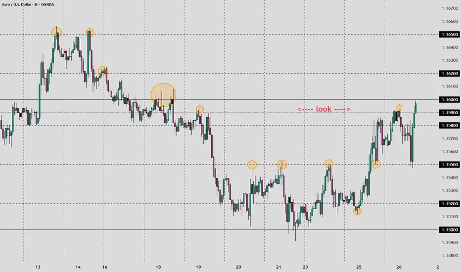
Learning from the losses.Hello, in this series i am going over all my losing trades and study each case to become a better trader! Feel free to join me.
GU: CSFR - poor (candle:size:flow:ratio)
GU: impatience,
USDCHF: Fib less than 50, CSFR poor
GBPCHF: narrow focus, long in short market, calling the bottom
EURUSD: CSFR poor, no engulfing, 61.8 disrespected - last fib in bullish trend.
Fibonacci

FIB RETRACEMENT TOOLthis tool is highly accurate and recommended to use. do well to watch the video so as to note the key points before usuage.

How to Read Volume Profile + AVWAP — A Complete GuideVolume Profile is one of the most underutilized tools in technical analysis. This guide breaks down how to read it and combine it with AVWAP for a complete market structure framework.
VOLUME PROFILE BASICS
Most traders use volume over time (the bars at the bottom). Volume Profile shows volume at price — where buyers and sellers actually agreed.
Point of Control (POC)
The price with the highest volume. The market's "fair value." Price above POC = bullish bias. Price below = bearish.
Value Area (70%)
The range where most trading occurred. Inside = balance. Outside = imbalance seeking new value.
High Volume Nodes (HVN)
Heavy volume zones. Expect slowdown or reversal. Positions were built here — traders defend them.
Low Volume Nodes (LVN)
Thin volume zones. Price rejected these levels. When price returns, expect fast movement.
ADDING AVWAP
Anchor VWAP to the last significant swing. This shows the average cost basis for everyone who entered during this move.
Price above AVWAP = longs in profit, dips get bought
Price below AVWAP = longs underwater, rallies get sold
The confluence:
POC + AVWAP alignment = high-probability zone
POC + AVWAP divergence = expect reversion
THE FRAMEWORK
Identify POC, VAH, VAL
Mark nearest HVN/LVN above and below
Anchor AVWAP to the swing that started the current move
Determine regime: price above or below AVWAP?
Now you have:
Structure (where will price react?)
Bias (which direction is favored?)
APPLYING THIS DAILY
This is the framework I use every day in my market analysis.
I publish a daily newsletter that applies Volume Profile, AVWAP, and regime analysis to real markets — with specific levels and scenarios for the session ahead.
Happy trading!

Unlock Fibonacci Retracement: Predict Pullbacks & TargetsFibonacci Retracement is a powerful tool based on mathematical ratios from the Fibonacci sequence. It helps identify potential support/resistance levels during price pullbacks in trends.
Key levels: 23.6%, 38.2%, 50%, 61.8%, 78.6% (and extensions like 161.8%).
Draw from swing high to low (or low to high) – perfect for spotting entries in Forex, Crypto, and Stocks.
How Fibonacci Works (Quick Setup)
On TradingView: Use the Fib Retracement tool. Select recent high/low points. Levels auto-plot where price might bounce or reverse.
Key Strategies
1- Pullback Entries
Buy at 38.2% or 61.8% in uptrends; sell in downtrends.
2- Target Projections
Use extensions (100%, 161.8%) for take-profits beyond the swing.
3-Confluences
Combine with S&R, RSI, or MAs for stronger signals.
Real Examples Right Now (Jan 3, 2026)
Bitcoin BINANCE:BTCUSDT :
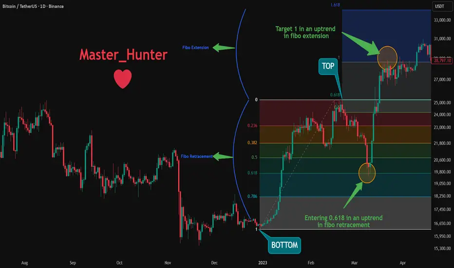
Between 30 Dec 2022 and 20 Feb 2023 We saw a pullback from top to the 0.618 Fibonacci level.
We also saw a hit to the 1st Fibonacci Extension level as a target on March 22, 2023.
Pro Tips
Use in trending markets; avoid choppy ranges.
Adjust for volatility: Shorter swings in Crypto, longer in Stocks.
Confirm with volume – strong moves break Fib levels.
Backtest on historical charts to master it!
Add Fib to your toolkit today and nail those pullbacks!
What's your best Fib win? Share in the comments! 👇
Why You Need to Know Elliott WavesThis is an introductory article in a series on Elliott Waves, designed to explain the basics of the theory and how to apply it in practice.
We will cover the key points you’ll encounter while learning this theory and developing your trading skills.
Definition
Elliott Wave Theory is a method of technical analysis that explains price movements through repeating wave patterns that reflect crowd psychology.
Learning
Like anything new, learning this requires dedicated time. It involves identifying waves, counting them, and spotting corrections - a process that can be very engaging. You won’t immediately see waves and subwaves or find the perfect entry points. Be patient and give your mind time to grasp the concepts. Over time, recognizing familiar structures on charts becomes so absorbing that you won’t want to stop analyzing.
Technical Level
Anyone can learn this theory, regardless of their starting skill level. Prior knowledge of technical analysis is helpful but not required. Elliott Wave Theory offers a different perspective on the market and, for some, can become the primary way to interpret price movements. Since it is a popular method, you have many tools on TradingView for analysis and forecasting.
Reducing Noise
Another key advantage is reducing unnecessary information. When working with charts, you don’t need to overload your mind with news or market data. Chart analysis can reveal more than external reports. Imagine trying to track multiple markets across exchanges and countries - the context could be overwhelming. Elliott Waves help simplify this process. You can analyze independently, relying solely on the chart.
Universality
With this knowledge, you can trade any instrument - futures, options, indices, stocks, gold, silver, or cryptocurrencies. Some assets may require more effort to discern the wave structure, while others show clear patterns immediately.
Everyday Applications
Wave patterns can appear everywhere: price charts for household goods, car parts, flu incidence, or livestock growth. Life itself is a series of waves - rises and falls, successes and setbacks. Recognizing these patterns can help you understand and anticipate changes in many areas.
Mistakes
Mistakes are inevitable. You cannot avoid them. Whatever strategy you choose, whatever experience you have, Elliott Wave Theory will help you learn from them, and over time, your errors will become less significant.
Timeframe
This approach works on any timeframe - minute, hourly, or weekly. Smaller timeframes are useful for trading, while larger timeframes reveal trends that can span years. You can anticipate market behavior and understand economic or political trends locally and globally. Local patterns are always linked to the bigger picture.
Human Weaknesses
Fear and greed are obstacles every trader must overcome. Knowledge and recognition of patterns provide a foundation to regulate behavior. Without this foundation, achieving goals is difficult - whether in trading or in other areas of life.
Discipline
Discipline is essential. Even if you are naturally unsystematic, accurately identifying waves and choosing entries at the right time and place will gradually develop discipline and prevent random trading.
Calmness
By mastering your weaknesses and developing discipline, you will gain calmness - a critical skill for any trader. You will understand when the market may reverse, anticipate corrections, and know the general direction. While others panic, you will remain calm and act confidently.
Money
Elliott Wave Theory helps you preserve and grow your capital, turning the waves on the chart into financial waves in your life. The key is consistent effort and dedication, just as in any other discipline.
Magic
This may seem like magic, but it isn’t. This is the result of careful work and analysis, not magic. Another important point: if this theory did not work, it would have long been forgotten. On the contrary, the most successful traders use wave analysis in their market strategies. Elliott Wave Theory is a “superpower” that can surprise both others and yourself.
Conclusion
Elliott Wave Theory is not a magic solution and offers no absolute guarantees. It is a tool that must be learned and applied correctly. Experience and accurate wave identification are essential, and it can be combined with other technical analysis methods.
Perhaps this is the gold you’ve been searching for.
Future articles will show live examples of how it works.
It will be very interesting, so stay tuned and don’t miss out.

ICT Trader - Top Down Analysis on ETH!Guys this is the first time I’ve fully broken down exactly how I trade crypto using the ICT strategy step by step, top down.
In this video, I take you through my entire charting process, starting from the monthly timeframe all the way down to the 1 hour, explaining how I build conviction, define bias, and execute trades using the ICT concepts.
I also explain why I’m bullish, even while most people are bearish and why I’m completely fine going against the crowd when the charts support it.
You’ll see:
-Top Down analysis from Monthly to 1HR
-How I read the charts and use liquidity to decide my bias
-HTF Bias vs LTF bias
-How we can make money regardless if we are bearish of bullish!
If you want to understand how ICT concepts are actually applied in real market conditions, this video will change how you look at charts.
I am launching my website soon which where I will essentially give you the full education of ICT from beginners to advanced in FOREX and CRYPTO. So hit the follow button and I will keep you all updated.
⚠️ Disclaimer:
I am not a financial advisor. The content shared on this channel is for educational and informational purposes only and should not be considered financial advice.
Trading and investing in cryptocurrency involve high risk — you could lose some, or all, of your money. Always do your own research and make sure you understand the risks before making any financial decisions.

Professional Fibonacci Trading GuideMost professional traders use Fibonacci for one reason
It defines where risk and opportunity are asymmetric
Fibonacci levels highlight where pullbacks tend to pause before trend continuation
Not because of magic
Because order flow and trader behavior cluster there
The Only Levels That Matter
✓ 0.50 psychological balance
✓ 0.618 highest probability continuation zone
✓ 0.786 trend validation level
These zones are where professionals wait
Not chase
How It’s Used
✓ Identify a clean impulse move
✓ Draw from swing low to swing high
✓ Wait for price to retrace into 0.50 to 0.618
✓ Enter only after price shows acceptance
✓ Stops sit below 0.786
✓ First target is prior high
✓ Extensions project continuation targets
Why Daily Timeframe
✓ Filters noise
✓ Aligns with institutional flow
✓ Cleaner structure
✓ Better risk to reward
✓ Less overtrading
Lower timeframes distort Fibonacci
Daily charts reveal intent
Key Rule
Fibonacci is not an entry signal
Price reaction is
Wait for price to reach the level
Then wait for confirmation
That patience is the edge
RB Trading
Education only
Risk management required

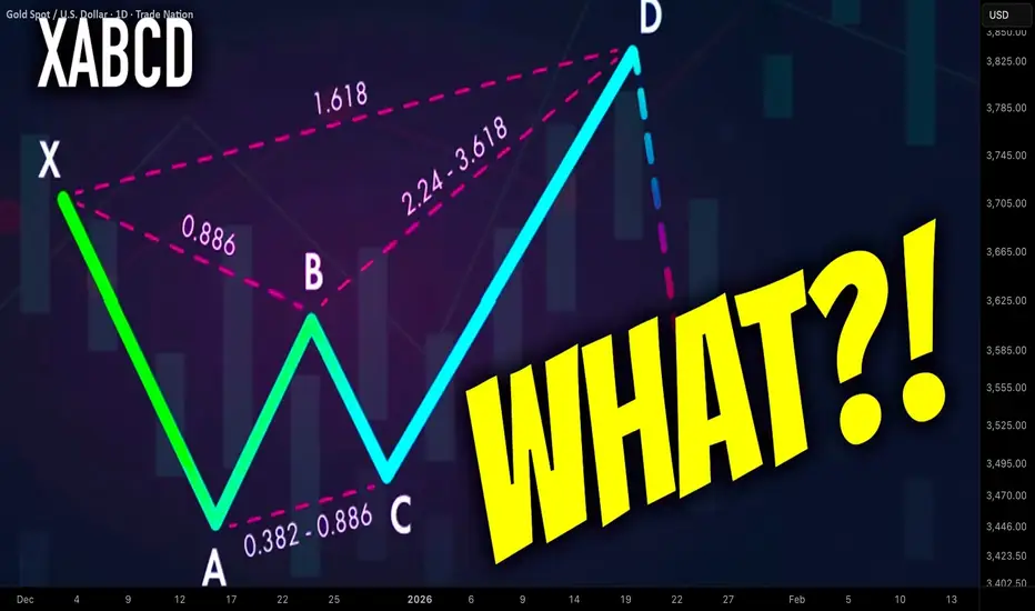
What is Harmonic XABCD Pattern and How to Identify It Easily
In the today's article, we will discuss the absolute basics of harmonic trading: I will explain to you what is harmonic ABCD pattern and how to recognize it, using fibonacci ratios.
The foundation of harmonic trading is impulse leg.
Impulse leg is a strong, directional bullish or bearish movement.
Harmonic traders perceive a price chart like a combination of impulse legs.
Here are the impulse legs on AUDUSD on a daily time frame. All these impulses are significant bullish or bearish movements.
In harmonic pattern trading, the impulse leg will also be called the XA leg.
XABCD pattern is based on 4 consequent price movements.
XA leg will be a fundamental component of each harmonic XABCD pattern and the first price movement within the pattern.
The direction of the XA leg will determine the bias of the pattern:
Bullish XA will be a foundation of a bullish harmonic pattern,
while, a bearish XA leg will be a foundation for a bearish harmonic pattern.
Above, the examples of a bullish and bearish impulse legs.
After identification of XA leg, a harmonic trader should analyse a consequent price action.
AB leg will be the next movement after a completion of XA leg.
BC leg will be the movement after a completion of AB leg.
CD leg will be the movement after a completion of BC leg.
CD leg will be a completion point of a harmonic pattern.
In a bullish harmonic pattern, a bullish movement will be anticipated from D point.
Above is a structure of a bearish harmonic XABCD pattern.
There are a lot of different types of harmonic XABCD patterns: bullish/bearish Gartley, Bat, Cypher, etc...
The type of the pattern will depend on the fibonacci ratios of B, C, D points of the pattern.
B, C, D points should have very specific ratios to make a pattern harmonic.
First, a harmonic trader should measure the fibonacci retracement level of B point in XA leg.
In the example below, B point is lying between 618 and 786 retracements of XA leg.
Then, if a C point is lying beyond the range of the XA impulse, one should measure its fibonacci extension level.
If a C is lying within XA, its retracement level should be measured.
Below, we can see that C point of the pattern is lying between 618 and 786 retracements of AB.
Depending on the type of the pattern, a D point will either be based on a certain fibonacci retracement of XA leg or extension of AB leg.
In our example, the criteria for a bullish harmonic Gartley pattern are met.
The completion point of the pattern - D point will be based on 786 retracement of XA leg.
From that retracement level, a bullish movement will be anticipated.
Your task as a harmonic trader is to learn the specific rations of each harmonic pattern. With experience, you will learn to identify impulse legs and trade them profitable.
❤️Please, support my work with like, thank you!❤️
I am part of Trade Nation's Influencer program and receive a monthly fee for using their TradingView charts in my analysis.
How to Trade Breakouts in TradingViewBreakout trading is a strategy that aims to capture strong price movements when markets break through key support or resistance levels, often signaling the start of a new trend or continuation move.
What You'll Learn:
Understanding breakouts as price movements beyond established support or resistance levels
How breakouts can occur at horizontal levels, trendlines, or chart patterns like triangles, rectangles, and flags
Why consolidation patterns often precede strong breakout moves
Recognizing the difference between false breakouts and confirmed breakouts
How to use candle closes beyond key levels as confirmation rather than relying on quick spikes
The critical role of volume in validating breakouts and separating real moves from fakeouts
Why expanding ATR during a breakout confirms increasing volatility and momentum
Understanding the break and close entry method for conservative breakout trades
How to scale into positions by entering partially on the break and adding on continuation
Using the pullback entry strategy to trade retests of broken levels as new support or resistance
Setting stop losses using ATR-based methods or placing them beyond consolidation patterns
Calculating profit targets with measured move techniques by projecting pattern heights
How to mark key levels in TradingView using the horizontal line tool from the left toolbar
Drawing trendlines and connecting swing points for pattern recognition
Accessing built-in pattern recognition tools through the Indicators menu
Practical examples using futures charts across multiple timeframes
This tutorial is designed for futures traders, day traders, and swing traders who want to capitalize on momentum moves and volatility expansion using technical breakout strategies.
The methods discussed may help you identify high-probability breakout setups, manage entries with proper confirmation, and set risk-appropriate stops and targets across multiple markets and timeframes.
Learn more about futures trading with TradingView: optimusfutures.com
Disclaimer
There is a substantial risk of loss in futures trading. Past performance is not indicative of future results. Please trade only with risk capital. We are not responsible for any third-party links, comments, or content shared on TradingView. Any opinions, links, or messages posted by users on TradingView do not represent our views or recommendations. Please exercise your own judgment and due diligence when engaging with any external content or user commentary.
This video represents the opinion of Optimus Futures and is intended for educational purposes only. Chart interpretations are presented solely to illustrate objective technical concepts and should not be viewed as predictive of future market behavior. In our opinion, charts are analytical tools, not forecasting instruments.

Unlock Hidden Trading Edges: Master Support & Resistance Levels Master Support & Resistance Levels – The Most Powerful Tool in Technical Analysis 📈🔥
Support and Resistance (S&R) are the foundation of price action.
Support = where price tends to stop falling (buyers step in) 🛡️
Resistance = where price tends to stop rising (sellers take control) ⚔️
These levels are not always exact, but when used correctly they give you high-probability entries and exits in Forex, Crypto, and Stocks.
How to Find Strong S&R Levels:
1-Look left → Previous swing highs & lows
The more times price has touched and bounced, the stronger the level becomes.
2-Round numbers & psychological levels
Examples: $50,000 BTC, 1.2000 EUR/USD, $200 AAPL – traders love these!
3-Use TradingView tools
Horizontal Line
Fibonacci Retracement (38.2%, 50%, 61.8%)
Volume Profile (High-volume nodes often act as S&R)
2Role Reversal – The Magic Trick ✨
Broken resistance → becomes new support
Broken support → becomes new resistance
This is where the big moves start!
Real Examples Right Now:
Bitcoin → $100,000 break support → now strong resistance
Pro Tips:
Always check multiple timeframes (Daily + 4H give the strongest levels)
Combine with RSI or volume for confirmation
Place stop-loss just below support / above resistance
When a level breaks with high volume → jump on the breakout!
Start drawing your S&R levels today and watch your win rate improve instantly.
Which market are you trading right now? Drop your favorite S&R level in the comments! 👇
Practicing mind set..
I don't trade low TF, i'm not day-trading,, just boring, look and practicing mind set for fun. I show you how i find the price movements, key levels, sweet spots, ranking-price of the "play field". This is a "old school way" i used from year 1995 and recently.
I don't tell you when buy/sell, entry/exit, TP/SL.. you learn by yourself like i did by myself. Just look the chart and figure it out. Hope to help struggle traders.
My Ideal Elliott Wave Entry ModelThe IMSETT 3/C Entry Model.
Every trader wants to catch the big moves the ones that pay quickly and decisively. In Elliott Wave, those moves often come during Wave 3. It's the strongest part of the trend, and when you're positioned early, the risk-to-reward is unmatched.
But not every opportunity hands you a clean Wave 3 on a silver platter. Sometimes you’re looking at a Wave C instead. That’s where the 3/C Entry Model comes in. It’s designed to get you aligned with high-conviction moves—whether the market is in a trend or a zig zag.
Here’s the edge: both Wave 3 and Wave C often start the same way—a strong, motive push off an AOI (area of interest), followed by a retracement. That shared structure gives us an anchor. Whether we’re labeling it a 3 or a C doesn’t change the fact that the initial impulse gives us clarity, direction, and a place to manage risk.
That’s what the IMSETT Model is built around:
Identify
Motive
Scout
Entry Plan
Track
Trade
Each step is focused, actionable, and repeatable. You're not trying to outguess the market—you’re reacting to structure, preparing for common behavior, and executing with intent.
I do have a video with a walk through.
This just the way I look for clarity in setups. As with everything in trading, nothing will work every time so do your own research this is not financial advice.
Cheers!
Trade Safe, Trade Clarity.

Powerful Fibonacci Trading Strategy For Beginners (GOLD FOREX)
I am going to reveal a powerful fibonacci trading strategy that I learned many years ago. It combines structure analysis, fibonacci retracement and extension levels and candlestick analysis, and it is suitable for beginners.
Step 1
Find a trending market - the market that is trading in a bullish or in a bearish trend on a daily time frame.
AUDUSD is trading in a bullish trend on a daily.
Step 2
Execute structure analysis - identify key horizontal and vertical structures on a daily time frame.
Have a look at key structures that I spotted on AUDUSD.
Step 3
Draw fibonacci retracement levels.
Here are the important ratios you should look for: 382, 50, 618, 786.
In a bearish trend,
draw fibonacci retracement levels from the high of the trend to current low based on wicks.
In a bullish trend,
You should apply fibonacci retracement from the low of the trend to a current high based on wicks.
Take a look how I draw the retracement levels,
I took the low of the trend and the high of the trend.
Step 4
Find confluence .
Look for fibonacci numbers that match - lie within key structures that you identified.
Support 1 matches with 382 retracement.
Support 2 matches with 786 retracement.
Remove other ratios from the chart.
Step 5
Wait for a test of one of the fibonacci levels that match with key structure
The price perfectly tested 382 retracement level.
Step 6
Wait for a confirmation on a 4h time frame.
Our confirmation will be a formation of an engulfing candle - a strong candle that completely engulfs the entire range of a previous candle with its body.
In a bearish trend, we will look for a formation of a bearish engulfing candle. Bearish engulfing candle indicates a strong selling pressure and the strength of the sellers.
In a bullish trend, we will look for a bullish engulfing candle. It indicates a strong buying reaction and imbalance.
Have a look at a bullish engulfing candle that was formed on AUDUSD on a 4H time frame after a test of 382 retracement.
Step 7
Open a trading position, set stop loss and choose the target.
After you spotted an engulfing candle, open a trading position.
Open short after a formation of a bearish engulfing candle and open long after a formation of a bullish engulfing candle.
If you sell , your safest stop loss will be 1.272 extension of the last bullish impulse on a 4H.
If you buy , your stop loss will be 1.272 extension of the last bearish impulse on a 4H.
In our example, our stop loss will be 1.272 extension of a bearish impulse leg on a 4H time frame. The extension is based on high and low of the impulse.
If you short , your take profit will be the closest key structure support on a daily.
If you buy , your take profit will be the closest key structure resistanc e on a daily.
Being applied properly, the strategy should generate 60%+ winning rate.
Always remember to check your reward to risk ratio before you open the trade. It should be at least 1.1/1.
Also, before you place a trade, always make sure that you trade WITH the trend and take only trend-following trades.
The strategy works perfectly on Forex, Gold, Silver, Oil, Indexes.
Good luck in your trading.
❤️Please, support my work with like, thank you!❤️
I am part of Trade Nation's Influencer program and receive a monthly fee for using their TradingView charts in my analysis.
Fibonacci levels. Trading corrections.I saw a Lance B video saying that fibonacci is garbage that people use with a confirmation bias, and it doesn't work. (He says, anything besides the 50% FIB). His thesis is that fibonacci is a phenomenum from nature and at some point traders decide to test and apply it in markets.
I disagree. Using LOG trend, during corrections, prices respect the fib level ratio . It's math, more or less. I only trade tickers, if the moves are in the correlation with whole market (index). I also think, it's practical only on corrections, bear markets. 🤔
-> When the "key" level breaks, it tests the next level . Which isn't practical due to high variance.
-> which means, you build the shorts during last resistance . Where market forces pull over. (50dma death cross as a force).
(Your hedge is the inertia from 50dma DC).
I think this is a cool, powerful setup to keep it mind. 👏
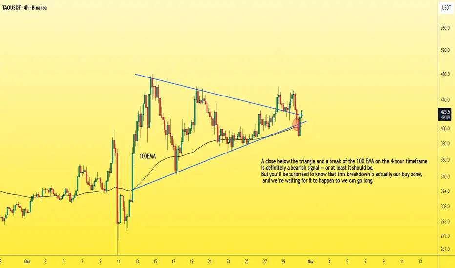
How to enter a successful futures tradeDrop everything and let me show you how to enter a successful long position with the lowest possible risk.
You need to understand that the market maker usually acts against us at major support areas on the chart — like the 100 EMA, 0.618 Fibonacci level, or a trendline.
To make this clearer, let’s take TAO as an example and I’ll explain why.
TAO has strong momentum and a large market cap,
so don’t apply what I’m about to say to meme coins, for example.
Now let’s go step by step on how to enter a futures position after choosing the coin 👇
1. First, wait for a bullish pattern to form — like a triangle — and for the coin to break it upwards with increasing long momentum.
2. The price will then retest the trendline, encouraging people to enter with larger positions, and those who missed the first breakout will likely place buy orders at the retest zone.
3. Then, the market surprises them — it drops back inside the triangle, giving a small bounce at the lower side.
4. But it doesn’t stop there — it continues dropping, breaking below the triangle and closing below the 100 EMA on the 4-hour chart.
This makes you panic and close your long position.
Others start entering shorts thinking it’s a real breakdown.
5. That’s when the market reverses sharply upward,
trapping short traders in losses,
while long traders who exited too early also lose.
In the end, only those who placed buy orders slightly below the strong support level (not directly on it, like under the 100 EMA) — and of course the market maker — end up winning.
So basically, the long traders lose, the short traders lose,
and only a small percentage of smart traders and the market maker win.
Small things to pay attention to 👇
-Your entry point should be slightly below the support, not too far below it.
(That support could be the 100 EMA, below the triangle pattern, or the 0.618 Fibonacci level, as we mentioned.)
-Don’t use high leverage — x5 should be your maximum.
-Place your stop loss 5% below your entry zone,
which equals about 25% loss if you’re using x5 leverage.
And with that, you’ve got yourself a long setup with over a 90% success rate,
and you can apply the same logic in reverse when taking a short position.
Best Regards:
Ceciliones🎯
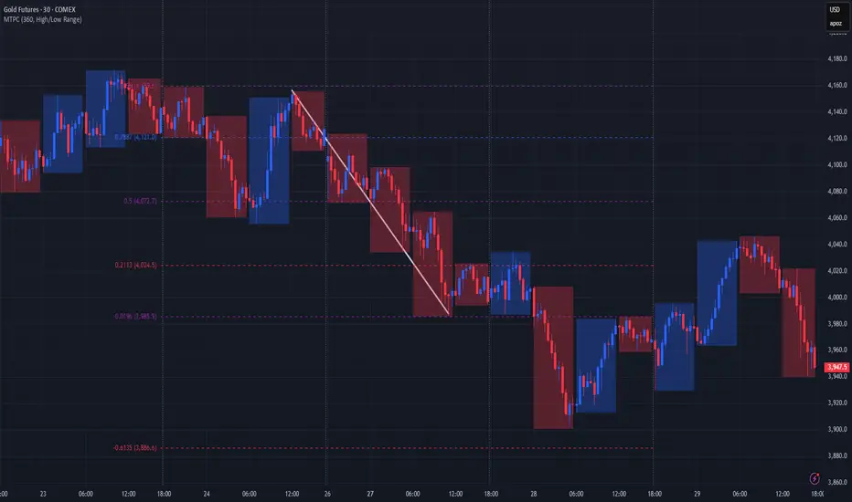
A better alternative to Fibonacci grid🙏🏻 Fibonacci based grid is a great inspiration from the Universe, but imo ain’t the final product, and here it is:
For traders
Use these values above and put em into grid tool here, and you’ll end up with uniform distribution based grid:
1.6134612334371357
1.0196152422706632
0.7886751345948129
0.5
0.21132486540518708
-0.019615242270663247
-0.6134612334371357
Then about how to apply it, you can divide trading activity by analytical units, these are in turn are based on:
^^ by price
^^ by time
^^ by signed volume waves/volume delta
Explanation
If you’ve followed my latest work you know I’ve identified a way to combine higher order moments to construct natural data driven estimates of data’s extremums and “ever possible” values (I still got no idea how no1 Ever posted it anywhere over the last centuries).
Now imagine you got only 2 input values: actual max and min (just like in Fibo grid, it ain’t knows nothing else). Given only these 2 values we can model stuff with uniform distribution that has precisely known values of standardized moments, so we end up with (and remember that uniform distro is symmetric around its mid, so all odd moments are zero):
dev = 1 / math.sqrt(12) //standard deviation
kurt = 1.8 //kurtosis (not excess ofc, the raw one)
hkurt = 27 / 7 //hyperkurtosis, 6th moment, raw af as well
0.5 + dev * hkurt
0.5 + dev * kurt
0.5 + dev
0.5
0.5 - dev
0.5 - dev * kurt
0.5 - dev * hkurt
And the resulting output of it u seen at the beginning of the post, notice how the edges *almost* match your lovely golden ratio.
For wanderers:
Now for the wanderers, creators etc etc etc
We might have a new math constant in our hands.
This can’t be a coincidence that limit levels (the ones at the edges) almost match the golden ratio . What if we find some kind of ‘almost’ uniform distro, where the limit levels would ‘exactly’ match the golden ratio? No problem - Beta distribution with parameters alpha = beta = (smth just a bit greater than 1).
I solved it numerically in python with mpmath library (necessary for high precision stuff, default packages are gonna truncate too much and we work with gamma functions there, high powers, huge numbers).
The following constant used as both parameters for Beta distribution provides us an almost uniform beautiful distro, with a minimal necessary deviation from uniform distro if u pls, just with a lil bit gently smoothed corners, and all connected to fibonacci sequence and golden ratio:
1.013156499304251804283836146883597463164059088989506487984660881392552993230097518061037104047261922219476043198153474114525730243848097530913517155085537693517359999905511951459927003624291626547046737804828112785002512650…
… and it goes on and on. I called it Sagitta constant, because visually it creates that beautiful almost flat shape, the minimal natural curvature. And now if we put this as c in Beta(c, c) following the same levels construction method from before we get these levels:
std = 0.28741741
K = 1.80628205
Hk = 3.88993123
0.5 + std * hk = 1.61803398
0.5 + std * k = 1.01915692
0.5 + std = 0.78741741
0.5 = 0.5
0.5 - std = 0.21258258
0.5 - std * k = -0.01915692
0.5 - std * hk = -0.61803398
Visuals, plots, graphics
^^ here you can see how our resulting distro & derivatives look like, kinda cute aye?
Beta(c, c), where c is our constant Sagitta, actually might be a natural prior for Bayesian stuff, almost a boxcar windowing function for DSP so u gonna tame that famous spectral leakage, or a kernel for KDE, like u name it, every case when u need a uniform shape yet with slightly relaxed endpoints, you can use it in design and architecture.
Go for it bros, test it in your R&D. Maybe some1 gonna use it to prove Riemann assumption conjecture , if u get dat milli send me 25% ima find a good use for it.
∞
Fibonacci Beyond the ObviousFibonacci Beyond the Obvious
The Professional Approach — WerkTrader Edition 🎯
1️⃣ Introduction – More Than Just a Sequence
Fibonacci is not magic, myth, or a decorative tool for colorful charts.
It is a mathematical ratio that appears in nature, architecture, music – and yes, in markets.
If you only know Fibonacci as the 61.8 retracement, you understand the concept,
but not the depth.
A true analyst doesn’t use Fibonacci to draw lines –
he uses it to measure structure,
to see where the market stands in relation to itself.
2️⃣ The Principle of Self-Similarity
Markets are fractal.
They move in repeating proportions, regardless of timeframe.
A 38.2 pullback on the 15-minute chart can have the same character
as a 61.8 retracement on the daily.
Professionals call this Fractal Alignment –
multiple timeframes reacting to the same ratio,
and that’s exactly where the decisive moves occur.
3️⃣ Fibonacci Timing – The Invisible Factor
Most traders measure price, not time.
But Fibonacci also works horizontally.
13, 21, 34, 55 – not as price levels,
but as candle intervals between significant highs and lows.
These Fibonacci Time Projections reveal
when market cycles overlap –
often the moment before price reacts to a known zone.
Institutional models use this quietly,
while retail traders almost always overlook it.
4️⃣ Fibonacci in Orderflow
Fibonacci zones are not magical support lines –
they are points of liquidity interaction.
At 61.8 %, three groups often collide:
1️⃣ Retail shorts fading the retracement,
2️⃣ Smart-money algorithms collecting liquidity,
3️⃣ Position builders using the pullback for entry.
Fibonacci is not a signal – it’s a trigger area,
a place where energy releases.
5️⃣ Asymmetry and Precision
The famous ratio φ ≈ 1.618 is mathematically perfect,
but markets are not.
A professional observes the deviation from the ideal –
often just 1–2 %.
Those small over- or undershoots reveal who dominates:
reaction or manipulation.
This is called Fibonacci Deviation Bias –
a subtle detail that shows whether a zone was merely tested
or truly broken.
6️⃣ Cluster Theory – The Art of Overlap
A single level is coincidence.
But when multiple retracements or extensions
align within the same price area,
a cluster is formed.
This overlap of different swings is called Confluence.
The more Fibonacci relationships converge,
the stronger the reaction.
A professional doesn’t look for the “perfect number” –
he looks for the connection of proportions.
Mathematics confirms itself where ratios intersect.
7️⃣ Fibonacci & Harmonic Patterns – Geometry of Confirmation
Harmonic patterns are the advanced geometry of Fibonacci relationships.
They consist of several precisely measured retracements and extensions,
forming a geometric reversal structure –
like the Gartley, Bat, Butterfly, or Crab.
Each one is built on the same base ratios:
XA → AB = 61.8 %,
BC = 38.2–88.6 %,
CD = 127–161.8 %.
When these measurements meet at a single point,
they create the PRZ (Potential Reversal Zone) –
the mathematical intersection between order and chaos.
The more Fibonacci connections overlap,
the stronger the confirmation.
That’s not coincidence – that’s confluence in its purest form.
8️⃣ Fibonacci as a Language
Fibonacci is not a strategy – it’s a language of proportion.
It doesn’t tell you where to buy,
it tells you where to listen.
The market doesn’t speak in words,
it speaks in ratios.
Those who understand them see structure
where others see only lines.
9️⃣ Conclusion – The Silence of Numbers
Fibonacci is not a myth.
It is the quietest form of truth in the market.
Numbers themselves do not speak –
but they show you where the market reacts,
where mathematics meets psychology,
and where patience becomes power.
Fewer lines.
More meaning.
This is Fibonacci – beyond the obvious.
WerkTrader 🎯

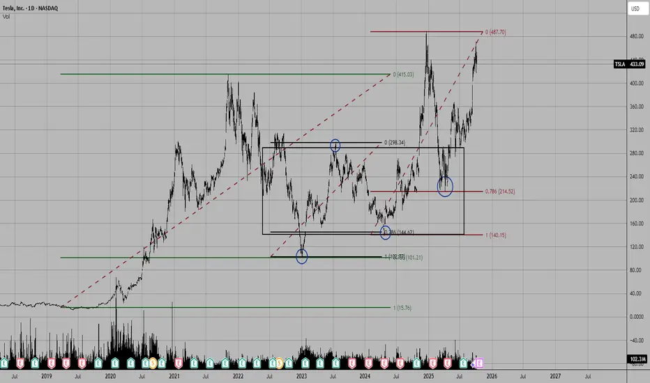
GameStop and Fibonacci: It's About TimeThis is my first attempt at publishing a video on TradingView, so hopefully it works.
I wanted to put together something educational about fib channels and why I like to use them. They're not a silver bullet, but they do tell you a lot about where to expect support and resistance because the chart has a very good memory, and you can see this play out on pretty much any instrument, including cryptocurrencies.
I follow NYSE:GME closer than any other ticker, so this video is about my philosophy on the fib channels that I have been using on the GME chart and talking about on the Echo Chamber Podcast. Hopefully this adds a little more context to that discussion, how the flat price levels are not always the only thing that matters, but taking time-based trends into account can make a big difference in your analysis and understanding of price movement.
Happy to hear people's thoughts on my crayons 🖍️ which color should I eat next?
Since this is a bit of a longer video, here's an AI summary of the content with timestamps:
Introduction 00:00-01:05
I introduce the topic of explaining my TradingView chart, which has many colorful lines. I clarify that I didn't manually draw all the lines, but used Fibonacci channels that only require selecting 3 points.
Explaining Current Chart 01:05-04:33
I show my current GameStop chart, explaining various trend lines and Fibonacci channels. I demonstrate how to adjust the Fibonacci channel points to analyze different price movements.
Fresh Chart Walkthrough 04:33-11:57
Moving to a clean chart, I explain global chart items, including trend lines from major tops and bottoms. I discuss dividend-adjusted vs non-adjusted charts and explain the "Gandalf line" of support.
Fibonacci Channels Explanation 11:57-24:54
I provide a detailed explanation of how Fibonacci channels work, demonstrating how to draw them and interpret the resulting lines. I show how these channels can describe price action across long time periods.
Additional Examples 24:54-33:44
I show more examples of Fibonacci channels applied to GameStop's entire price history. I discuss how these channels can provide insight into potential future price movements and support/resistance levels.
Conclusion 33:44-34:40
I summarize my thoughts on GameStop's current price action in relation to the Fibonacci channels and support levels identified.
Some Quotes
"I find them mathematically interesting." 11:54 - Referring to trend-based Fibonacci tools.
"Math is your friend here. But you don't have to do the math, you just can use tools that will help you." 17:19
"Price is fractal in nature in that patterns are repeating and Fibonacci is everywhere." 17:19
"Things like history repeats itself. It's just a question of when, not if." 24:30
"The point I want to drive home here is that when we start to get a little bit more granular here, and this is why I have lots of crayons on my chart." 28:34
Key Tips/Concepts
Fibonacci channels can be powerful tools for technical analysis, providing insight into potential support and resistance levels.
These channels can sometimes describe price action across very long time periods, even when drawn based on recent price movements with thoughtfully selected endpoints.
The importance of considering price, time, and volume in technical analysis, as demonstrated by the "Gandalf line".
The value of using multiple timeframes and chart types (dividend-adjusted vs non-adjusted, trading hours only vs extended hours included) to gain a more complete picture of a stock's price history. (Editorial note: something I didn't cover in the video, but the difference between log scale and linear scale sometimes will make for an interesting story on trendlines and fib channels too. I prefer to keep my chart in log scale, but will toggle between log and linear occasionally to see if there's something interesting there in the lines already drawn.)
The concept of fractal nature in price movements and how patterns tend to repeat over time.

Fibonacci: Theory and Practice (Part 1) RetracementsThe Fibonacci proportions are a widely used technical tool in financial markets. They are based on the Fibonacci sequence, a numerical series introduced to the West by the Italian mathematician Leonardo de Pisa (13th century) after his travels in the Mediterranean (especially in Béjaïa, Algeria): 0, 1, 1, 2, 3, 5, 8, 13, 21, 34, 55, 89, 144..., where each number is the sum of the two preceding ones.
Although Ralph Nelson Elliott incorporated concepts related to Fibonacci ratios in his wave theory (published in 1938), it was Charles Collins who first explicitly used price retracements and extensions in the 1940s.
I will divide the content into three parts to enhance understanding of this approach: Fibonacci Retracements, Fibonacci Extensions, and Harmonic Alignments.
Fibonacci Ratios
In trading, the sequence itself is not used directly but rather its ratios, which approximate natural proportions observed in nature, art, and price patterns.
The ratio of any number to the next higher number approaches 0.618 after the first four numbers. For example, 1/1 is 1.00, 1/2 is 0.50, 2/3 is 0.67, 3/5 is 0.60, 5/8 is 0.625, 8/13 is 0.615, 13/21 is 0.619, etc. (pay attention to the value 0.50).
The ratio of any number to the preceding lower number is approximately 1.618, or the inverse of 0.618. For example, 13/8 is 1.625, 21/13 is 1.615, 34/21 is 1.619. The higher the numbers, the closer they get to 0.618 and 1.618.
The ratios of alternate numbers approximate 2.618 or its inverse, 0.382. For example, 13/34 is 0.382, 34/13 is 2.615.
0.786 is the square root of 0.618.
Personal Perspective on Fibonacci Proportions
None of the ratios we will explore below possess magical properties. The truly decisive factor is price action, which acts as a mirror of the collective psychology of investors. Fibonacci proportions are excellent for highlighting proportionality and harmony, aspects that directly influence participants' decisions. This is where the importance of this approach lies.
Fibonacci Retracement Adjustments
In Figure 1, you can see how to correctly draw Fibonacci retracements in an uptrend: from bottom to top, from the low of the impulse (1) (including the lower wicks or shadows) to the upper high (2) (considering its wicks or shadows). The clearer and more defined these impulses are, the greater their influence on market participants' psychology. Clarity ensures better results when studying tools, indicators, or price action.
I discard the 0.236 level in my trading, but you can include it and experiment.
Timeframe is also important to consider: applying Fibonacci on 5-minute charts, for example, would be like trying to control the ocean with a measuring tape. As I demonstrated in the article “Timeframe is Everything” , lower timeframes degrade the success rate due to the greater influence of news and rumors, high-frequency trading, lower capitalization, and interests, etc.
If the drawing is incorrect, the values will not match those in the image, and the diagonal line will point downward.
Figure 1
In Figure 2, I show the correct drawing of Fibonacci retracements in a downtrend, from top to bottom, from the high of the impulse (1) (including the lower wicks or shadows) to the low (2) (considering its wicks or shadows). If the drawing is incorrect, the values will not match, and the diagonal line will point upward.
Figure 2:
Psychology of the Ratios
Ratio 0.382
This ratio is extremely useful for avoiding premature entries in favor of the trend. In my experience, in most cases, we should wait for the price to touch the 0.382 level unless a consistent price formation justifies a trend continuation.
This level indicates a typical retracement zone, making it ideal for detecting "pauses" in strong trends. It is also necessary that entries at this and other ratios we will study are validated by price action and context.
In Figure 3, you can observe how the price offers an excellent reversal opportunity at the 0.382 Fibonacci level. A previously respected 50 EMA and a strong point like the 50% of the body of a weekly engulfing candle increase the robustness of the zone. The confirmation of price action manifests in increased volumes that may signal a likely reversal and a bullish engulfing candle.
Figure 3
I won’t provide examples in downtrends for this level, as the buying pressure inherent in market nature makes short entries based on the 0.382 level very unstable. Thus, this ratio is primarily evident in uptrends.
Ratio 0.50
It is generally believed that this ratio does not belong to the Fibonacci sequence, but 0.50 is a harmonic starting point in the progression.
It marks a balance between supply and demand, thus serving as a psychological magnet that tends to attract the price while delineating a battle zone between buyers and sellers.
In Figure 4, you can see the correct use of the level: The 0.50 ratio is perfectly aligned with the presence of a 50 SMA and price action elements like a ceiling test , offering extremely robust resistance. An island gap pattern is an excellent reversal signal to confirm a short entry.
Figure 4
In Figure 5, we observe the alignment of the 0.50 level with the presence of a large gap acting as robust support. Additionally, the level coincides with the 50% of the body of a bullish engulfing candle on a weekly chart, adding significant confidence. The price action would confirm an entry with a large bullish engulfing candle.
Figure 5
Ratio 0.618 (Golden Ratio)
The 0.618 ratio is a universal "equilibrium point" in crowd psychology; the place where many investors expect a bounce, as it represents a deep but not exhaustive correction.
Studies and tests (such as those by Robert Prechter in Elliott Wave Principle ) show that the 61.8% level appears in up to 70% of significant corrections in indices like the S&P 500 or Dow Jones, while behavioral economists argue that its "success" is more due to confirmation bias than strict causality.
In Figure 6, we observe how the golden ratio (0.618) aligns with a high order volume zone (volume profile). The noticeable weakness in price action, graphically represented in oscillators like the MACD (bearish divergence), combined with a volume spike, could provide clues about a likely rejection in the zone.
Figure 6
In Figure 7, we observe a bullish example where the 0.618 level aligns with a strong support generated by accumulation. Note how this zone shows a high order volume (volume profile). This support was also backed by a 20 EMA on a weekly chart. The price action would confirm the entry after several rejection candles.
Figure 7
Ratio 0.786
This is my favorite Fibonacci retracement ratio, and I use it exclusively to seek reversals in uptrends. It indicates trend weakness, but I like to consider it a high-probability reaction zone, as selling pressure in such a deep correction tends to be weak, while large participants or institutions may see a good opportunity to buy low.
I apply this ratio exclusively to double bottoms, as seen in Figures 8 and 9.
Figure 8
Figure 9
In Figure 8, the 0.786 level aligns with the 50% of a monthly engulfing candle and a large gap visible on the daily chart. Additionally, volume and a large engulfing candle pattern would have confirmed the entry well.
Figure 9 shows an alignment between the 0.786 level and a strong support on the daily chart. In the same zone, a 20 EMA on a weekly chart coincides. The price action confirmation manifests in compression and an explosion of bullish volatility.
Fun Facts
1-Leonardo de Pisa (or Leonardo Pisano) was born around 1170 in Pisa, Italy, and was the son of Guglielmo Bonacci, a commercial official working in North Africa.
The nickname Fibonacci comes from "filius Bonacci," which in Latin literally means "son of Bonacci." He signed his works as "Leonardo, son of Bonacci, Pisan," but the term "Fibonacci" was shortened and popularized centuries later.
2-The Fibonacci numerical series actually dates back to ancient Indian texts (such as those by Pingala in the 2nd century BC, used for poetic meter).
3-Leonardo de Pisa popularized the numerical series in Western Europe through his book, Liber Abaci (1202), where he used it to solve practical problems, such as rabbit population growth (the famous example: a pair of rabbits produces a sequence of births generating the numbers 1, 1, 2, 3, 5, 8...).
Conclusions
Fibonacci proportions are a valuable complement, but not the holy grail. In my strategies, I find them extremely useful and feel comfortable incorporating them in specific contexts, though not all systems require them. For example, I like having a Fibonacci at hand in patterns like double bottoms to identify key supports or when a price overextends or retraces strongly, delineating potential reversal zones.
I recommend that investors avoid chasing mystical numerical alignments and maintain a logical approach to each tool, method, or pattern studied.
Final Note
If you want to take a look at my analysis record, you can find my profile in Spanish, where I transparently share well-defined market entries. Send your good vibes if you enjoyed this article, and may God bless you all.
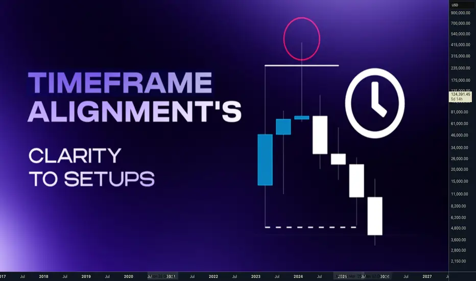
TOP down analysis and Scaling the Range setups.Hey whats up traders,
lets have a look to the Timeframe alignment's, its a key point to clarity in the setups. Price is fractal and what is happening on one timeframe we can find on lower timeframe also.
📌 Why it's important to use correct timeframes?
- We should use timeframes based on what type of traders we are, not just random.
- We cant trade M5 reversal from Monthly etc. There must be structured approach.
🧪 Know yourself
Based on your lifestyle, patience. Decide how much time you want to give to trading.
But remember - Trading is not employment. You are paid for best decisions & being in the right position, not for your time and effort. More trades are not equal more profits. Full time trading and day trading doesn't mean trading every and sit whole day behind PC.
🧪 What type of trader you are ?
• Position Trader - Trade the monthly range.
• Swing Trader - Trade the weekly range.
• Short Term Trader - Trade the daily range.
• Day Trader or Intraday Trader - Trade the daily candle's range.
• Scalper - Trade the hourly range.
🧩 Im mentioning ranges, because it's core of mechanical strategy, which I explained in the post below. 🔗Click to the picture below to learn more 👇
‼️ When analyzing the market don't start, just with the range. It's just one element of the trade. We need to understand whole market context. Always go step by step , rule based analysis of trade elements with correct timeframe sequences.
🧪 Timeframes of trade elements
• Trend / Bias - Higher Timeframe
• Ranges - Higher Timeframe
• Key Levels - Higher Timeframe
• Structure - Intermediate Timeframe
• Profiling AMD - Lower Timeframe
• Order Flow / Entry - Lower Timeframe
📌 Bullish Scenario 📌 Bearish Scenario 🧪 Whats your timeframes?
Position Trader - Monthly Key Level + Range- Daily Structure - H4 Profiling + Entries
Swing trader - Weekly Key Level + Range- H4 Structure - H1 Profiling + Entries
Short term Trader - Daily/H4 Key Level + Range- H1 Structure - M15 Profiling + Entries
Day Trader / Scalper - H1 Key Level + Range- M5 Structure - M1 Profiling + Entries
Im most confident in Swing Trading and Short term trading, hence I trade Weekly and Daily ranges. I use monthly ranges for HTF bias, but I will explain this later.
🧩If you apply these timeframes correctly, you will be easily buying lows and selling highs. I have explained this in this post below.
🔗Click to the picture to open lean more 👇
This framework by itself is good enough to be successful in the trading. I suggest you to create your own trade checklist and do always step by step analysis. Remember nothing comes easy to master anything takes time you need to give it at least 6 months, without jumping from strategy to strategy. Use Trading journal to collect information, without it you will not improve and will repeat the mistakes. To fasten the process run backtests at least 300 examples.
🧩Dont forget that whole concept is based on the liquidity, you must understand it also. I have explained in this post. 🔗Click to the picture to open lean more 👇 🧪 Power of scaling
If we look to the 1 minute chart and Monthly chart we will not recognize what chart it is. Patterns are playin on all timeframes. That is why is 100% mechanical approach based on liqudity and candles - Open , High, Low, Close powerful. What Im going to show you now you cant be achieved with diagonal drawings or random patterns.
📍First lets start with our basic knowledge
If the range is manipulated the CLS sequence is suggesting that opposing side of the range will be reached. It can be by just quick move - Model 1, or we can get Model 2 opportunity.
📍 Bullish continuation setups
Model 1 - Entry after manipulation - 50% target
Model 2 - Entry on pullback on level between 61.8 - 80% pullback 📍 Bearish Continuation setups
Model 1 - Entry after manipulation - 50% target
Model 2 - Entry on pullback on level between 61.8 - 80% pullback 🧩Dont forget that best enties comes in trend on the right pullbacks.I have explained in this post. 🔗Click to the picture to open lean more 👇 🧪 Now lets use this knowledge as a fractal
I have clarified our Range timeframes for each type of trader, but you definitely should not skip bigger timeframes even if it's not your timeframe. Knowing the sequence from HTF give us a bias perspective so we can trade LTF ranges within HTF Range Models.
📍 Bullish LTF Range within HTF Range
Analyze HTF range and define models, then drop it to your TF and trade your ranges with the HTF range. Always follow the same process only on the LTF - Lower timeframe. 📍 BearishLTF Range within HTF Range
Analyze HTF range and define models, then drop it to your TF and trade your ranges with the HTF range. Always follow the same process only on the LTF - Lower timeframe. Now, practice that, you have one trading framework which you can apply to all timeframes and scale it down, means you are looking at the markets with always same approach and this receptiveness give you confidence and clarity = MASTERY ✨Trading Mastery is reflection of your life
Have a longterm plan, No Alcohol & Drugs, Ignore others, Focus on your journey , Backtest regularly, Review your weeks, Journal mistakes, Exercise, Sleep well, Read books, Walks in nature (no phone) , Meditate, Reduce social media time, Spend time with family, Live Life.
Trading is hard, but not impossible. I believe in you 💪
David Perk aka Dave Fx Hunter
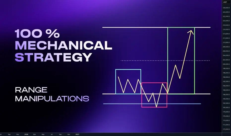
Complete system for Day & Swing TradersHey whats up traders,
Today Im going reveal simple but effective way to analyze and trade any markets - Stocks, Indices, Forex and Crypto. This thing works on everything because it's based on liquidity manipulations.
It's 100% mechanical structured aproach with fixed targets and defined. So unlike traders who trade various patterns and have on charts different patterns and diagonal subjective lines, you can backtest it and measure its and yours execution performance to get your statistical data for Risk Reward and Winning Ratio.
‼️Once you obtain such data from data sample large enough you will also solve biggest trading problems - FEAR, GREED and OVERTRADING. Why ?
📊 Because if you know you win rate is 60 - 70 % trades with RR 2.3 with aprox. 4 trades in a month per instrument, why would you then do following?
Try to look for trade every day when there is not your setup.
Fear open next trade after few losses?
Open huge gamble trade if you know 30% of trades can be loss
Try to hold for unrealistic target if you know most of your trades hit 2.5 RR
Try to pass prop challenge in one trade ?
... and many more psychological and undisciplined mistakes which discretional pattern traders without EDGE and statistical data about their strategy are doing.
🧠 Having mechanical system with backtested data is your EDGE.
💪 That is what makes you DISCIPLINED TRADER.
🧩 Basic Concept
Im looking for the fake break out of the range. Whether we call it manipulation or Stop hunt. It really doesn't matter. The idea is that once big candle is created it creates fomo and break out traders are entering continuation. I trade against them.
📍Bullish continuation setups
Model 1 - Entry after manipulation - 50% target
Model 2 - Entry on pullback on level between 61.8 - 80% pullback
📍Bearish Continuation setups
Model 1 - Entry after manipulation - 50% target
Model 2 - Entry on pullback on level between 61.8 - 80% pullback
🧩 Manipulation phase
is key for this concept. Without it happening, institutional move cant happen. Why ? Market makers are not looking to stop hunt our stop losses. They dont care about your or mine stop losses even if we trade 100 lots. Most of the brokers are B-Book anyway. But they are seeking the liquidity and they are placed above the highs and lows. You dont even need to read order book or book map to know it. To understand liqudity better read this post below
Now you understand after the liquidity was swept. Big players have guns loaded and the move can start. This is what we want to participate. But !! What I have just shown you are patterns. Without adding them in to the right context with the market they will not have highest winning ratio. You must be selective. Basically you want to:
📍Down Trend - Trade Stop hunts above the highs
📍Up Trend - Trade Stop Hunt below the lows
In other words we want be buying lows and selling highs. 🧪 How to do it I explained in this post below 📍 Top- Down analysis
Before we go to the refined entries we must understand top down analysis and what to look for on the charts. Never start with LTF. You always must go with top Down analysis.
🧩 TOP Down analysis
HTF Timeframe for the trend
ITF - Timeframe - Ranges and Key Levels
LTF - Timeframe Profiling and entries
Once we analyze the trend define our range on our timeframe we are looking for manipulation before we go to entries remember this:
🧪Range is mostly created close the key level. If any candle close above the range - Its makes it invalid.
🧪We want see and trade wicks above the range, there you are looking for LTF entry.
📍 Bearish Scenario - (ITF view ) Price should not have candle close above the range on the same timeframe otherwise setup is invalidated and new range created. 📍 Bearish Scenario - (LTF view) - price (yellow has structured movements and should be crating AMD profiles on the edge of the range. We need to drop to LTF to read the structure. 📍 Bullish Scenario ITF view - Price should not have candle close below the range on the same timeframe otherwise setup is invalidated and new range created. 📍 Bullish Scenario - (LTF view) - price (yellow) has structured movements and should be crating AMD profiles on the edge of the range. We need to drop to LTF to read the structure. ‼️Note that Im always referring to the key level. It's called key level , because it's key for the success of the setup. Without it it will work only sometimes. This element must be part of the setup. I personally like the Order Block in other word Supply / Demand zone.
🧪 I have explained Order block in the post below Before we go to trade setup let's clarify timeframes again. Price is fractal you can basically trade this on any timeframes, but you still need to keep structure of 3 Timeframes.
🧩 Timeframe Alignments
🧪Short Term Trading
Trend - Monthly - Directional draw on liquidity
RangeS - Weekly - Stop hunts
AMD Profiles / Entries - H4/H1
🧪Swing Trading
Trend - Weekly - Directional draw on liquidity
Range - Daily - Stop hunts
AMD Profiles / Entries - H1/M15
🧪Day trading
Trend - Daily - Directional draw on liquidity
Range - H4 - Stop Hunts
AMD Profiles / Entries - M15/ M5
🧪Scalping
Trend - H4 - Directional draw on liquidity
Range - H1 - Stop hunts
AMD Profiles / Entries - M5/M1
🔥I recommend to trade daily and weekly ranges. Im not saying Day trading and Scalping is impossible. But Im sure none of us started trading for being isolated nerd behind the PC whole day stressing yourself about every minute. You want live social live and enjoy the freedom which trading can give you and mainly Daily and weekly ranges are higher probability.
🧩 AMD- Accumulation Manipulation Distribution
This is happening on the markets over and over. Everyone who trades profitably use it and if not they are not continuous about using it but they use it is what is necessary to move the market. And we want see It on the Edge of the range with confluence of the key level.
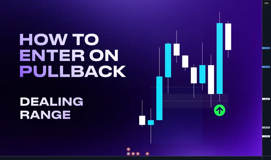
Dealing Ranges - Powerful filter tool to your tradingHello Traders today. I ll break down for you how to enter on a pullback with high accuracy and not being stopped out by using a fibonacci in other words a Dealing range.
A Dealing Range forms when price takes out both a swing high and a swing low, followed by a clear expansion move. That expansion swing becomes the dealing range.
• By dividing the dealing range in half, we get two zones:
• Discount region (lower half) – where buying opportunities are typically more favorable.
• Premium region (upper half) – where selling opportunities are typically more favorable.
• You can think of a dealing range as similar to a PD Array Matrix, but specifically applied to expansion swings rather than consolidation phases.
On the example bellow I drew a Dealing range. If I took the long from the key level in the premium the trade would fail. But if waited for the key level in discount I could get much better RR and explosive move vice versa is happening on the bearish order flow charts. Check on your charts
So why is this situation on the above happening quite often?
It's simple - Liquidity. Market makers needs liquidity to fill their orders so they print nice trade opportunities in the premium where trader enter this setup, for trend continuation.
Setup is technically right. But by placing the trades in premium they creates a stop loss cluster = liquidity in the discount. Then this happen - price go for the liquidity of early buyers in the premium hits key level in the discount and it continue with the trend.
Im not saying that key levels in the premium cant work, in the strong trend there is no always pullback to the discount. But by applying Dealing ranges you will get:
Less but more accurate trades
Higher Risk reward setups
You can build HTF narrative
Use it for targets
Better risk management
Remember, there is not always a key level in the premium and pullback to the discount is not enough. Trade must go from a key level. So if there is not a key level in the premium price is often retracing to the discount key level in order to create a liquidity around a key level price makes a false break which sucks traders in to the market and create a liquidity on a key level.
Dont enter if price is not going from key level its a trap.
Time frame alignments
Always use 2 timeframes Higher time frame (HTF) and Lower timeframe (LTF)
• Higher Timeframe (HTF) = Dealing ranges
• Lower Timeframe (LTF) = Market Profiles / Profiling
Timeframe sequence
HTF Monthly - LTF - Daily / H4
HTF Weekly - LTF - H4 / H1
HTF Daily - LTF H1/ M15
HTF H4 - LTF M15 / M5
Im giving 2x LTF options because sometimes you need to scale lower timeframe to understand price action and best entries. However for the confirmations you can do well with the main sequence of first two.
Apply this rule to any markets. Im adding links to few examples from stocks, crypto an FX where you can see application of this concept. Click to charts to open them and see how price behave in discount and premium.
Examples from successful Tradingview Ideas
Tesla pullback to the discount - Low created in discount ATH most likely coming
Bitcoin pullback to the discount - Followed by expansion to ATH
Palantir pullback to the discount - followed by expansion to ATH
Bitcoin pullback to the Discount - followed by expansion
GBPCHF - Targeting Liquidity in the discount
Hope this help you in your trading journey. Let me know in the comments
David Perk aka Dave FX Hunter
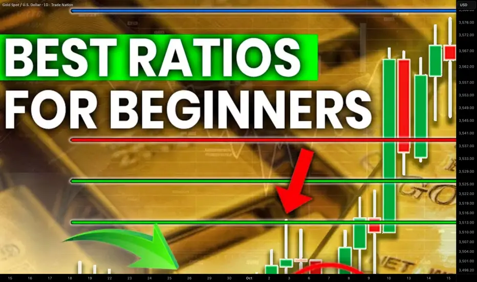
How to Use Fibonacci Levels in Gold Trading. Best Ratios For XAU
I will teach you a simple but efficient way of using Fibonacci levels for Gold analysis.
You will learn the strongest Fib.retracement levels and a proven strategy for XAUUSD trading.
First, let me show you the most powerful Fibonacci retracement levels that you should use for trading Gold.
The most significant ones are: 382, 50, 618, 786.
To use these Fib.Retracement levels properly, you will need to find the strongest 3 impulse legs.
Please, note that you can execute Fibonacci analysis of Gold on any time frame, for the sake of the example, we will do that on a daily.
Here are 3 impulses that I found.
I was simply trying to identify the price waves with the strongest impact. I underlined them from their lows to their highs.
We will draw Fibonacci Retracement levels based on these 3 movements.
We plot Fib.Retracement of a bullish impulse from its low to its high.
We plot Fib.Retracement of a bearish impulse from its high to its low.
That is how it looks.
After that we will need to find a confluence - zones or levels where Fib.Retracement levels of different impulses match .
Such zones will be significant liquidity clusters where market participants will place huge volumes of trading orders.
The first 2 confluence zones that I spotted on a Gold chart will be specific. They are based on 1 and 0 Fib.Retracement levels that match.
These 2 areas are both completion and starting points of our impulse legs.
The fact that significant price movements completed and started after tests of these zones indicates their significance .
Confluence zones 3/4/5/6 are based on a convergence of at least 2 Fib.Retracement levels of different impulses.
Probabilities will be high that these zones will attract the market liquidity.
After we found all confluence zones, I recommend removing Fibonacci levels from the chart to keep it clean .
That is how our complete Fib.Analysis will look.
From these zones, we will look for trading opportunities.
The areas that are above current price levels will be significant supply areas , and we will look for sell signals from them.
The zones that are below Gold spot price will be demand areas. Chances will be high that a strong buying reaction will follow after their test.
Confluence zones that we spotted on Gold chart provide unique perspective. Integrating them in your XAUUSD analysis, you will increase the accuracy of your predictions and trading decisions.
❤️Please, support my work with like, thank you!❤️
I am part of Trade Nation's Influencer program and receive a monthly fee for using their TradingView charts in my analysis.