USDJPY nearing resistance of Fib 127.1% extensionUSDJPY is nearing critical resistance zone level which is 127.1% Fib extension. When a chart enters unchartered territory these Fib levels help us identify supports and resistances.
Fibonacci

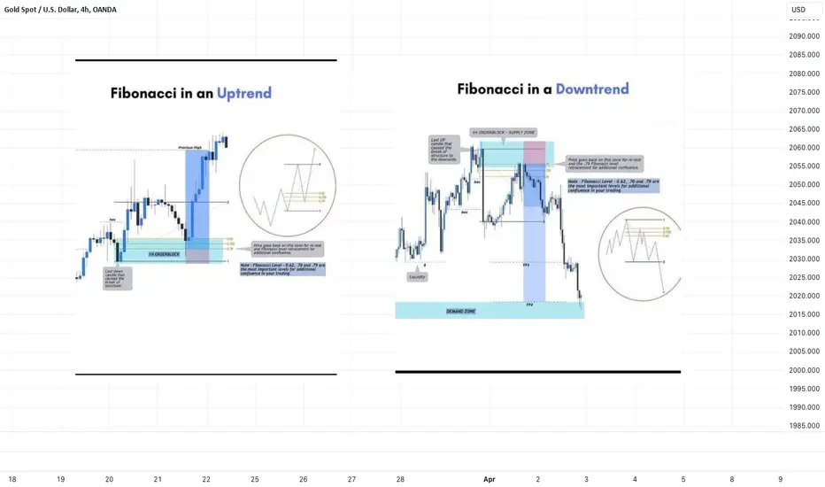
QUICK GUIDES: Fibonacci SettingHere is a quick guide on how I have my FIB RETRACEMENT TOOL set up with Retracement & Extension levels.

From Leonardo to Trading: The Evolution of Fibonacci LevelsIn the labyrinthine landscape of financial markets, where volatility reigns supreme and uncertainty lurks around every corner, traders seek reliable navigational tools to steer through the tumultuous waters of price movements. Among the myriad techniques at their disposal, Fibonacci analysis emerges as a stalwart companion, offering a nuanced understanding of market dynamics rooted in mathematical precision. In this comprehensive exploration, we delve deep into the multifaceted realm of Fibonacci levels, unraveling their historical significance, evolutionary trajectory, practical applications, and the diverse perspectives that shape their interpretation.
Tracing the Roots:
To appreciate the profound impact of Fibonacci analysis on modern trading methodologies, a journey back in time to the 13th century is warranted. It was during this epoch that Leonardo of Pisa, known colloquially as Fibonacci, unveiled a numerical sequence that would transcend mathematical realms and find profound resonance in the domain of financial markets. Beginning with 0 and 1, each subsequent number in the sequence is the sum of the two preceding ones, laying the groundwork for a sophisticated understanding of market movements rooted in the natural order of mathematics.
Evolution in Financial Analysis:
While Fibonacci himself might not have envisaged the application of his sequence in financial markets, the 20th century witnessed a paradigm shift as visionaries such as Ralph Elliott and Robert Prechter pioneered its integration into trading methodologies. Elliott's Wave Theory, with its emphasis on repeating patterns and sequences, forged an intriguing connection with Fibonacci numbers, laying the groundwork for a symbiotic relationship between mathematical principles and market analysis. This union catalyzed a renaissance in technical analysis, ushering in an era where Fibonacci levels became indispensable tools in the arsenal of traders worldwide.
Unveiling Fibonacci Retracement Levels:
At the heart of Fibonacci analysis lies the concept of retracement levels, a cornerstone of technical analysis that echoes the natural order observed in the Fibonacci sequence. These levels, including 23.6%, 38.2%, 50%, and 61.8%, serve as pivotal markers in identifying potential zones of price reversal, offering traders valuable insights into market sentiment and trend dynamics. By applying the Fibonacci retracement tool to significant highs and lows, traders gain a nuanced understanding of market psychology, discerning the underlying rhythm of price movements amidst the chaos of market fluctuations.
Venturing into Fibonacci Extension Levels:
Beyond retracement levels, Fibonacci extension levels offer a panoramic vista into the future trajectory of price movements, illuminating the path for traders seeking to navigate the complexities of trending markets. With extensions such as 161.8%, 261.8%, and 423.6%, traders can delineate potential targets for price continuation after a correction, harnessing the mathematical harmony inherent in the Golden Ratio to set profit targets and manage risk effectively. These extension levels, rooted in the timeless principles of Fibonacci analysis, serve as guiding beacons for traders navigating the ever-shifting tides of financial markets.
Practical Applications and Precautions:
While Fibonacci levels furnish traders with a potent framework for analysis, it is essential to exercise caution and supplement Fibonacci analysis with corroborating indicators and risk management strategies. By integrating tools such as Moving Averages, Relative Strength Index, and candlestick patterns, traders can enhance the robustness of their trading decisions, mitigating the inherent uncertainties of financial markets and maximizing the efficacy of Fibonacci analysis.
A Tapestry of Perspectives:
As we reflect on the journey of Fibonacci levels through the annals of financial history, we encounter a tapestry of perspectives that weave together to form a rich tapestry of knowledge and insight. From Larry Pesavento's exploration of harmonic price patterns to Philip Carret's pioneering work in long-term investing, the legacy of Fibonacci continues to inspire and guide traders in their quest for market mastery. These diverse perspectives underscore the enduring relevance of Fibonacci analysis in an ever-changing landscape, reaffirming its status as a timeless ally in the pursuit of profit and prosperity.
Conclusion:
In conclusion, the comprehensive exploration of Fibonacci analysis reveals its enduring significance as a cornerstone of technical analysis in financial markets. From its humble origins in the mathematical treatises of Leonardo of Pisa to its integration into modern trading methodologies, Fibonacci analysis embodies the timeless principles of mathematical harmony and market psychology. As traders navigate the labyrinthine paths of price movements, they find solace in the elegant simplicity of Fibonacci analysis, a steadfast companion in their quest for success amidst the ever-shifting currents of financial markets.
Thank you for reading! I hope this article proves to be interesting for all of you!

How to use Fibonacci Retracement ⁉️‼️ Forex traders use Fibonacci retracements to pinpoint where to place orders for market entry, taking profits and stop-loss orders. Fibonacci levels are commonly used in forex trading to identify and trade off support and resistance levels. After a significant price movement up or down, the new support and resistance levels are often at or near these trend lines . Usually the price retracts to 50% or until OTE (0.62, 0.705, 0.79) before another impulse movement occurs.
Powerful Fibonacci Trading Strategy For Beginners
I am going to reveal a powerful fibonacci trading strategy that I learned many years ago. It combines structure analysis, fibonacci retracement and extension levels and candlestick analysis.
Step 1
Find a trending market - the market that is trading in a bullish or in a bearish trend on a daily time frame.
AUDUSD is trading in a bullish trend on a daily.
Step 2
Execute structure analysis - identify key horizontal and vertical structures on a daily time frame.
Take a look at key structures that I spotted on AUDUSD.
Step 3
Draw fibonacci retracement levels.
Here are the important ratios you should look for: 382, 50, 618, 786.
In a bearish trend,
draw fibonacci retracement levels from the high of the trend to current low based on wicks.
In a bullish trend,
You should apply fibonacci retracement from the low of the trend to a current high based on wicks.
Take a look how I draw the retracement levels,
I took the low of the trend and the high of the trend.
Step 4
Find confluence.
Look for fibonacci numbers that match - lie within key structures that you identified.
Support 1 matches with 382 retracement.
Support 2 matches with 786 retracement.
Remove other ratios from the chart.
Step 5
Wait for a test of one of the fibonacci levels that match with key structure
The price perfectly tested 382 retracement level.
Step 6
Wait for a confirmation on a 4h time frame.
Our confirmation will be a formation of an engulfing candle - a strong candle that completely engulfs the entire range of a previous candle with its body.
In a bearish trend, we will look for a formation of a bearish engulfing candle. Bearish engulfing candle indicates a strong selling pressure and the strength of the sellers.
In a bullish trend, we will look for a bullish engulfing candle. It indicates a strong buying reaction and imbalance.
Have a look at a bullish engulfing candle that was formed on AUDUSD on a 4H time frame after a test of 382 retracement.
Step 7
Open a trading position, set stop loss and choose the target.
After you spotted an engulfing candle, open a trading position.
Open short after a formation of a bearish engulfing candle and open long after a formation of a bullish engulfing candle.
If you sell, your safest stop loss will be 1.272 extension of the last bullish impulse on a 4H.
If you buy, your stop loss will be 1.272 extension of the last bearish impulse on a 4H.
In our example, our stop loss will be 1.272 extension of a bearish impulse leg on a 4H time frame. The extension is based on high and low of the impulse.
If you short, your take profit will be the closest key structure support on a daily.
If you buy, your take profit will be the closes key structure resistance on a daily.
Here is our take profit level.
Being applied properly, the strategy should generate 60%+ winning rate.
Always remember to check your reward to risk ratio before you open the trade. It should be at least 1.1/1.
Also, before you place a trade, always make sure that you trade WITH the trend and take only trend-following trades.
The strategy works perfectly on Forex, Gold, Silver, Oil, Indexes.
Good luck in your trading.
❤️Please, support my work with like, thank you!❤️

A Comprehensive Guide to Fibonacci Retracements (Updated)Hello traders, in this post, we will be going over one of the most commonly used tools in all asset classes - the "Fibonacci Retracement" (or Fib for short). For a better viewing experience, please view this on your desktop/PC, as the mobile and tablet versions of the charts are harder to read.
Although I have briefly touched on how to use the Fibonacci Retracement tool in my previous Elliott Waves series, we are now going to go over it in depth, and talk about how this tool can help you find entries and exits within an existing trend with or without the use of the Elliott Wave Theory, which also helps identify whether you are in a bullish or bearish trend.
The Fibonacci Retracement tool, although widely used by many traders, is almost always not correctly used by new traders. Most traders will often connect the wrong points, indicating the wrong Fibonacci retracement levels. Here, I will be explaining the proper way to use the Fibonacci Retracement tool in a very simple translated friendly guide in one post.
-------
What Is the Fibonacci Retracement?
Fibonacci Retracements (Fib(s) for short), are a set of 'ratios', defined by mathematically important Fibonacci sequence. This allows traders to identify key levels of support and resistances for price action. Unlike other indicators, Fibonacci retracements are FIXED, making them very easy to interpret. When combined with additional indicators, Fibs can be used to identify potential entry and exit points with high probability to trade on trending movements. Fibonacci retracements are used to indicate levels of support and resistance for a stock’s price. Although they are similar to moving averages in this respect, Fibonacci retracements are set by the extent of the previous bullish or bearish run and do not change each day in the current trend as moving averages do. Therefore, it can be significantly easier to identify and anticipate support and resistance levels from Fibonacci sequences.
How Is the Fibonacci Retracement Calculated? (You don't need to calculate it yourself - It's already done for you!)
Fibonacci retracements are based on what is known as the 'Fibonacci sequence', where each number in the sequence can be added to the previous number to produce the following number within the sequence. Now, you might be confused here, but don't! - I am just explaining the concept on how it's calculated. You do not need to personally calculate the actual sequence of the Fibonacci Retracement, as everything is already pre-determined and calculated within the tool itself on TradingView. To put it simply, dividing any number in the sequence by the following number yields 1.6180 – known as the "Golden Ratio" – while dividing any number by its predecessor yields 0.6180. Dividing any number in the sequence by two positions in advance yields 0.382, while dividing any number by a number three positions in advance yields 0.236. These ratios originated from the Fibonacci sequence are found throughout nature, mathematics, and architecture - such as flowers, buildings, and so forth. Yes, if you search for Fibonacci sequence examples, you can find these within daily uses, not only in trading.
------
Retracement levels for an asset are drawn based on the prior bearish or bullish movement. Don't forget this - you need to know whether you are in a bullish or bearish trend. Is the stock or coin going up? or down? To plot the retracements, draw a trendline from the low to the high (also known as the swing low to the swing high), or vice versa, high to low, within a continuous price movement trend – Fibonacci retracement levels should be placed at 61.80%, 38.20%, and 23.60% of the height of the line for you by the tool itself. Again, these numbers are already calculated for you within the tool itself. In a bullish trend, the retracement lines start from the top of the movement (i.e. the 23.60% line is closest to the top of the movement), whereas in a bearish movement the retracements are calculated from the bottom of the movement (i.e. the 23.60% line is closest to the bottom of the movement).
------
How to Trade Using the Fibonacci Retracement
Once you have drawn a set of Fibonacci retracements on a chart of your liking, it is possible to anticipate potential reversal points where support or resistance will be encountered. If the retracements are based on a bullish trend, the retracements should indicate potential support levels where a downtrend will reverse bullishly. So to put it simply, the pre-determined Fibonacci levels, should in theory and practicality, act as support if in a bullish trend, and resistance in a bearish trend.
There will always be some form of price reaction at each Fibonacci level just based on Market Psychology. If the retracements are based on a bearish movement, the retracements should indicate potential resistance levels where a rebound will be reversed bearishly, which is vice-versa for the bullish movement trend.
The most common reversals based on Fibonacci retracement levels occur at the 38.20%, 50%, and 61.80% levels (50% comes not from the Fibonacci sequence, but from the theory that on average, stocks retrace half of their prior movements - so this is considered a 'psychological level'). Although retracements do occur at the 23.60% line, these are less frequent and require close attention since they occur relatively quickly after the start of a reversal. In general, retracement lines can be considered stronger support and resistance levels when they coincide with the overall trend, meaning, that if you know that you are in an established bullish or bearish trend, you will most certainly get some form of reaction at the most common reversal levels within the Fibonacci level, which is shown in the image below.
Whenever applying Fibonacci retracements, keep in mind that retracement lines represent only potential support and resistance levels, they are NOT 100% set in stone – they represent price levels at which to be alert, rather than hard buy and sell signals; however, they have HIGH PROBABILITY. It is important to use additional indicators, in particular MACD, to identify when support or resistance is actually being encountered and a reversal is likely. The more that additional indicators are pointing towards a reversal, the more likely one is to occur. Also note that failed reversals, especially at the 38.20% and 50% retracement levels, are common.

Bitcoin - Probabilistic MapSince traders are literally made of particles, it's vital to know the principles of their behavior in micro scale. Some people even use planetary cycles to implement into charting. But I believe the answer is deep in quantum world of probabilities - the fabric of reality itself.
Reference to Quantum Mechanics
The universe itself prohibits 100% prediction accuracy. This is called Heisenberg Uncertainty Principle, and it's the fundamental building blocks of Quantum Mechanics. In order to predict particles behavior, all you need are just 2 quantities/data/features:
1) Position of the particle
2) Momentum of the particles.
If you know it's position and it's momentum, you can easily predict it's trajectory. So if you have position and momentum data of all particles in the universe, and you have unlimited computational power, you can predict their behavior (interaction, movement, etc.), and basically predict the future (stock market, weather, natural disaster, etc).
However, the Heisenberg Uncertainty Principle states that it is impossible to collect information of particles's position and momentum with 100% certainty. The more certain you know about particle's position, the less certain it's momentum" and vice versa.
So if somehow with the unlimited computational power you can predict particle's position at time with 100% accuracy, then your prediction error for its velocity will be infinity, which prevent you for making accurate further predictions, rendering your model useless.
Hence, it's theoretically impossible to make 100% accurate prediction even with unlimited data and unlimited computational power.
So Is The Universe deterministic or probabilistic?
100% prediction accuracy also means the universe is deterministic - there's only one possible outcome of the future. Einstein was on this side, citing "God doesn't play with dice". On the other hand, folks like Heisenberg, Max Born, Schrodinger, Oppenheimer, etc.., the founding fathers of Quantum Mechanics, viewed the future as set of possible outcomes each having it's own probability.
Since market couldn't care less about anyone's subjective forecasts, I do predictions solely based on historic price dynamics in macro scale to stay objective and true with the market pulse rather than be bared with my endless interpretations of patterns. I don't need my consciousness to interpret because we already have a data derived from collective consciousnesses to work with. Chart is already a reflection of reality that captures the emotions of participants. In other words, it's a time fractal that exposes the essence of the market across timeframes. In turn the market itself is a function of trading time . These basis justify linking systematic fragments of cycles to work out the capacity of price action. Basically in Fractal Analysis, the question is how can direct metrics of the historic waves geometrically explain current and future price levels.
The Fibonacci sequence is a mathematical concept that appears in various aspects of nature. This connection between mathematics and the natural world is a fascinating example of how patterns and structures found in abstract concepts like numbers can manifest in physical reality . Particularly, using Golden Ratio as a key rule that governs order in chaos.
In TradingView, the "Fibonacci Channels" is a great tool to capture the waves (domestic certainty) and turn them into a probabilistic interconnected structure that captures the uncertainty of the market - the entanglement of price action.
To start with it's vital to use log scale where percentages are equally captured in distances. So a 100% a growth, say a vertical distance from $40 to $80 measures the same distance as from $1000 to $2000. Besides, percentages are what drives people to feel emotions which affect market behavior (collective executions). Finding geometric relationship between waves, the use of log scale is a must.
As I've done this before I want to show how market deviates near fibs.
A Direction of 2013 HIGH ⇨ 2017 HIGH with bottom of 2011 gives next bottom 2015 at 0.618 after -86% drop.
And also predicts the COVID bottom in 2019 after -72% drop as well as current level where price has cooled down locally.
We can note that previous ATHs are explained with logarithmic curve.
That's why we'd need another fib channel to connect 2017 HIGH ⇨ 2021 HIGH direction with previous bottom of -86% drop in 2015. FC of that direction predicts bottoms of 2018 (-84%) and covid 2019 (-72%) at 0.618 again.
Together they produce an interference pattern covers significant historic price changes.
To further interpret current levels though the chart itself, we can use line with angle of direction connecting 2021 double tops:
This shows the capacity of how high the market might still grow before next significant correction, if the local fib to the price hasn't yet dimmed the bullish incentive.
Another straight line can be used to connect 2019 COVID LOW (-72%) with 2022 LOW, because we might probably never see such price levels in the nearest future as price has broken out with high rate of change.
Now it needs more time and bearish capacity to go there. This line can indicate the bottom of hypothetical correction, if it happens now. Other than that it's a clear trendline with almost 4Y wavelength.
Since straight lines doesn't exist in nature, I didn't extend them to the right. Now we need a more adaptive version of it to connect recent local bottoms of the trend.
That would be a logarithmic trendline, in other words curves to mimic the function of exponential growth. Therefore falling below it, might indicate a possibility of correction and even reversal. Each day if it fails to grow with the curve, the bears will get depleted. A cross below the logarithmic curve of spreading information would be a confirmation of new bearish incentive. This is simply done to work out boundaries as limits of the function that explains the market.
Corrective wave has a timing of 15 days in respect to its domestic volatility properties, before it becomes bearish impulsive or continues the impulsive bullish wave.
Curves as a function of trading time explain pretty much all historic bullrun growths.
As if there is some kind of gravity that governs the trend or it's the PriceTime that curves with the emerging trend.
Individual cycles can be too curved accordingly.
So the more the price fails to break out that function, the more predictive curve becomes.

How to trade the Fibonacci indicator in 2024Today, we’ll start with what Fibonacci is and how to use it to spot significant market turning points.
Let’s start with...
A short story about Fibonacci
In 13th century Italy, lived a man named Leonardo Pisano – one of the greatest mathematicians of all time.
Leonardo (also known as Fibonacci), learnt all about Arabic and Indian mathematics during his travels in North Africa and around the Mediterranean regions.
Each time he travelled to a new place, he kept noticing a consistent pattern that repeated itself throughout nature.
The sequence he defined was as follows.
0, 1, 1, 2, 3, 5, 8, 13, 21, 34, 55, 89, 144…
Basically, all you do is take the last two numbers and add them up to get the next number.
0 + 1 = 1
1 + 1 = 2
1 + 2 = 3
2 + 3 = 5
3 + 5 = 8
8 + 5 = 13
And so on…
Fibonacci first contrived this pattern through a pair of breeding rabbits but he then saw this pattern throughout nature - in the breeding of honeybees , the shape of seashells as well as plants.
This sequence also applies to trading and investing charts and is called the Fibonacci Retracement indicator.
The Fibonacci Retracement indicator is used to help identify possible support and resistance levels for any market.
The idea is all high liquid markets tend to move, to and retrace back, to certain levels after a big price move.
The indicator is used to calculate the ratios and percentages using the Fibonacci sequence.
Let’s look at an example with the South African JSE ALSI 40.
Fibonacci on the JSE ALSI 40
Looking at the above daily chart of the JSE ALSI 40, you can see the index has fallen from a Swing High point of (100%) at 70,522 down to a Swing Low point (0%) to 65,386.
On your platform, when you add the Fibonacci Retracement tool onto your chart, you'll drag it from the swing high to the swing low price of the uptrend to see six main horizontal fib lines present themselves:
Fib line #1: 100% (Swing high)
Fib line #2: 61.8%
Fib line #3: 50%
Fib line #4: 38.2%
Fib line #5: 23.6%
Fib line #6: 0% (Swing low)
Traders use these lines to establish and identify supports (floor) and resistances (ceiling) levels.
And with these levels you’ll be able to spot good entry, stop loss and take profit price levels.
Once you draw the Swing High and Swing Low on the JSE ALSI 40, the Fibonacci lines will be plotted on the chart.
You would also have seen the market then went to one of the high points at 61.80% at 68,560.
The price then retraced back to the 23.6% level at 66,598.
So you can see where we are going with this.
As a reversal trader, you could have sold (gone short) the index around 68,560 and held it until it hit the 66,598 line at 23/6%.
That’s where you would have banked a gain just by waiting for the market to bounce off a fib line.
That’s a good introduction and a different way for you to trade and use the Fibonacci Retracement tool with your trading in 2024.
Let me know if this was helpful!

5 Elements of the Best Key Level in Trading
What are the best key levels to trade?
Last year I analysed more than 1500 key structures on Forex, Gold, Crypto and Indexes.
In the today's article, I prepared for you a list of 5 elements of a perfect support and resistance for trading.
As always, remember that the best key levels are always on a daily time frame. So all the structures that we will discuss will be strictly on a daily.
Also, all the structures that I analyzed and traded are available on my TradingView page, so you can back test them by your own.
1. Clear historical significance
The structure that you spotted should act as a significant historical support or resistance.
Here are the important historical support and resistance that I spotted on USDCAD on a daily time frame.
2. Psychological significance
The structure that you identified should match with round numbers.
All the structures that we spotted on USDCAD match with psychological numbers.
3. Confluence with other technical tools
The best structure should align with other trading tools such as trend lines of Fibonacci levels, strengthening its significance.
After adding fibonacci levels and a significant falling trend line on the chart, the confluence was found in Resistance 6, Resistance 3, Resistance 2, Resistance 1, Support 2. Other structure does not match with technical tolls.
4. Volume
The level experiences high trading volumes, indicating strong participation and interest from market participants, especially smart money.
All the structures that we underlined show significant volume spikes. By volume spike, I mean a volume being higher than the average volume - a blue curve on volume.
5. Multiple touches
The more, the better. There are numerous instances where price has respected and reacted to the structure, confirming its strength (at least 2).
Only these 3 structures were confirmed by the multiple touches. These resistances will be considered the strongest ones.
That checklist will help you to identify the most significant structures from where you will be able to catch impulsive movement and make nice profits.
❤️Please, support my work with like, thank you!❤️

Mastering Fibonacci Retracement :Navigating Bitcoin's VolatilityMastering Fibonacci Retracement :Navigating Bitcoin's Volatility
Navigating the volatile landscape of Bitcoin trading can be a daunting task for both novice and experienced traders alike. However, equipped with the right tools, traders can identify potential support and resistance levels, make informed decisions, and capitalize on market movements. One such tool that has stood the test of time is the Fibonacci retracement tool, a staple in the arsenal of many traders due to its uncanny ability to forecast potential price reversals with remarkable accuracy.
Understanding Fibonacci Retracement
Fibonacci retracement is based on the idea that markets will retrace a predictable portion of a move, after which they will continue to move in the original direction. The concept draws from the Fibonacci sequence, a series of numbers where each number is the sum of the two preceding ones (0, 1, 1, 2, 3, 5, 8, 13, 21, and so on). In trading, these numbers are translated into percentage levels that traders use to identify potential reversal points on price charts.
Key Levels to Watch
The most commonly used Fibonacci retracement levels are 23.6%, 38.2%, 50%, 61.8%, and 78.6%. These percentages represent potential support and resistance levels where the price of an asset like Bitcoin could experience a reversal or consolidation. The 61.8% level, often referred to as the "golden ratio," is particularly noteworthy for its reliability in predicting price movements.
Applying Fibonacci to Bitcoin Trading
When applying Fibonacci retracement levels to Bitcoin's price action, traders often look for significant highs and lows to place their retracement lines. From there, the tool provides a visual representation of potential areas where the price may stall or reverse. For instance, during a downtrend, a retracement to a higher Fibonacci level like 61.8% could indicate a potential area of resistance where traders might consider taking profits or entering short positions.
The Significance of the 78.6% Level
Recent discussions among traders have highlighted the 78.6% retracement level as a crucial point for Bitcoin, suggesting that reaching this level often precedes significant corrections. This phenomenon underscores the importance of Fibonacci levels in anticipating market movements, allowing traders to adjust their strategies accordingly.
Real-world Application
Consider Bitcoin's historic rally and subsequent corrections. Traders have observed that significant pullbacks often align with key Fibonacci levels. For example, during a bullish phase, if Bitcoin's price retraces to the 61.8% or 78.6% levels before bouncing back, this could be seen as a strong signal for trend continuation.
Conclusion
The Fibonacci retracement tool is more than just a mathematical curiosity; it's a reflection of human psychology and market sentiment. By identifying levels where price action may change direction, traders can make more informed decisions, manage risk more effectively, and potentially increase their chances of success in the market.
As with any trading tool, it's important to use Fibonacci retracements in conjunction with other indicators and analysis methods to validate potential trading signals. Remember, no tool can predict market movements with absolute certainty, but by understanding the tendencies and patterns, traders can navigate the Bitcoin market with greater confidence. BINANCE:BTCUSDT BITSTAMP:BTCUSD BINANCE:BTCUSDT.P
Don't forget to check our latest publications

AUD JPY Swing Buys Ask Me Live ($9K Banked)"Explore the intricacies of Forex trading with a focus on the AUD/JPY Buy Swing Position in my latest video - 'AUD JPY Fibonacci Entries Unveiled (Forex Trading).' 📈💹 Join me on a journey through the market nuances as I delve into the specific details of Fibonacci entries for this strategic swing position.
In this comprehensive guide, I unveil the power of Fibonacci retracement levels in navigating the AUD/JPY market. Discover the secrets to identifying optimal entry points and enhancing your trading precision. Whether you're a seasoned trader seeking advanced strategies or a beginner aiming to grasp the fundamentals, this video is tailored to elevate your trading game.
Don't miss the opportunity to fine-tune your skills and gain a competitive edge in the dynamic world of Forex trading. Subscribe, hit the notification bell, and let's master the markets together! 🌐✨ #ForexTrading #AUDJPY #FibonacciEntries #TradingStrategies #MarketAnalysis"

Taking the Guesswork Out of Take Profit: A Fibonacci Approach
In the world of trading, one of the most influential factors that can either make or break a trader is the mind. How often have we found ourselves saying, "I should have done this" or "I would have done that" after a trade has unfolded? Yet, when we were in the heat of the moment, those seemingly obvious solutions never crossed our minds. To overcome this common pitfall and make more calculated decisions when it comes to setting take profit levels, we can turn to the Fibonacci tool.
Utilizing Fibonacci retracement levels can help traders establish mechanical and consistent take profit points. This is especially crucial for mechanical traders who rely on predetermined parameters for their trading strategies. Let's delve into how you can use Fibonacci step by step to set your take profit levels, taking into consideration a buying scenario (though the process remains the same for selling, but in reverse).
**Step 1: Add -0.272 and -0.618 Levels to Your Fibonacci Tool**
Begin by adding the -0.272 and -0.618 Fibonacci retracement levels to your Fibonacci tool. These negative levels will be instrumental in creating mechanical take profit points.
**Step 2: Place Your Fibonacci Tool from Low to High**
Next, take your Fibonacci tool and place it from the low point to the high point of the relative price movement you're analyzing. This essentially helps you identify potential retracement levels within the price action.
**Step 3: Identify Negative Levels**
As you apply the Fibonacci tool, you'll notice the negative levels (-0.272 and -0.618) on your chart. These levels will suggest specific price points that you can consider for setting your take profit. Interestingly, you'll often find that prices tend to react near these negative Fibonacci levels because they represent strong psychological levels in the market.
By following these steps, you can establish a mechanical and objective approach to determine your take profit levels. This approach not only reduces the influence of emotions in your trading decisions but also provides you with a systematic way to lock in profits. Remember that while the example here focuses on buying, the process remains the same for selling, with the Fibonacci levels adjusted accordingly.
Incorporating Fibonacci retracement levels into your trading strategy can be a game-changer, helping you trade with greater discipline and consistency. The key is to trust the numbers and your predetermined plan, allowing you to make more informed trading decisions and ultimately enhance your overall trading performance.

Navigating the Markets with Fibonacci ChannelsToday we delve into the fascinating world of Fibonacci Channels, a powerful tool for traders looking to identify potential non-horizontal support and resistance levels in the market.
Throughout the video, we provide a step-by-step guide on how to place Fibonacci Channels on price charts, allowing you to visualize and understand their significance in identifying key price levels. We also showcase real-world examples to demonstrate how Fibonacci Channels can be used to find points of interest, such as trend reversals and price targets.
Furthermore, we discuss the integration of Fibonacci Channels with other technical indicators, providing insights into how this combination can enhance your trading strategy. By the end of this video, you will have a comprehensive understanding of Fibonacci Channels and the ability to confidently incorporate them into your trading approach. Get ready to unlock the potential of Fibonacci Channels and take your trading skills to the next level!

of Fibonacci RetracementsIn this article, we delve into the intricacies of the Springboard Effect of Fibonacci Retracements , drawing parallels between the trading world and the physics of a springboard.
💜 If you appreciate our guides, support us with boost button 💜
The Springboard Analogy:
Imagine a scenario with four different springboards, each with varying degrees of stiffness. Now, drop an identical weight from the same height onto each board. The resulting bounce illustrates the concept of retracement and extension in the context of momentum trading.
Barely Any Springs (0.236 Retracement):
A bounce at the 0.236 retracement level is seen as a potential trend failure. Buyers may step in, but the bounce is likely weak. Traders shift focus to shorter-term scalping opportunities, targeting other fib levels within the retracement as potential resistance.
Few Springs (0.328 Retracement):
Here, the bounce on the 0.328% retracement is viewed with caution. While a good bounce may occur, traders remain vigilant about a potential double top, closely monitoring candlestick reactions and utilizing the CCI to identify divergence if momentum falters.
Moderate Springs (0.5 Retracement):
A bounce at the 0.5 retracement level signifies continued bullish momentum. Buyers are willing to enter at a relatively lower point, maintaining optimism. Targeting the 1.272 extension, traders consider this a bullish signal. Aligning with nearby resistance or front-running the level becomes a strategic move.
Lots of Springs (0.618 Retracement):
This scenario represents a strong market extension. A bounce at the 38.2% retracement level indicates a plethora of buyers eager to enter the market promptly. This serves as a positive sign, suggesting a robust extension. The target? The 1.618 extension, potentially aligned with a nearby resistance level.
The Springboard Effect provides traders with a tangible framework for interpreting retracements and anticipating market extensions. By aligning retracement levels with the stiffness of a springboard, traders gain insights into the potential strength or weakness of a continuation. Whether aiming for robust extensions or preparing for short-term scalps, understanding the nuances of the Springboard Effect adds value to a trader's toolkit.
Embrace this strategy, and may your trades be propelled to new heights.

Fibonacci Retracement StrategiesFibonacci retracements are a cornerstone in the toolkit of many traders, offering a mathematical approach to identifying potential areas where reversals may occur. This article delves into the intricacies of using Fibonacci retracements, covering everything from basic understanding to strategies involving other indicators. Read on to gain insights into how to effectively incorporate these levels into your trading strategy.
What Are Fibonacci Retracements?
Fibonacci retracements are a popular technical analysis tool used to identify potential support and resistance levels on a chart. Developed around the concept of the Fibonacci sequence—a series of numbers where each number is the sum of the two preceding ones—the Fibonacci indicator applies this mathematical formula to financial markets.
Key retracement levels are often considered at 38.2%, 50%, and 61.8% of a price move. The 61.8% level, in particular, is frequently referred to as the Fibonacci retracement golden ratio, owing to its significance in both nature and financial markets. Traders commonly use these areas to anticipate where the price may reverse, thus providing strategic entry and exit points.
Fibonacci Retracements: How to Use Them
Using the Fibonacci tool for trading begins with identifying a significant swing, either an uptrend or a downtrend, on the chart. The tool is then applied at the swing low and swing high of the price movement. In an uptrend, it starts at the swing low and ends at the swing high; in a downtrend, it's the opposite. This action plots horizontal lines at the key Fibonacci levels, providing potential areas where price could reverse.
Concerning the Fibonacci retracement time frame, it's essential to know that this tool can be applied across various time frames—from one-minute charts to monthly charts. However, the reliability of the retracement levels often increases on higher time frames. That means those plotted on daily or weekly charts generally offer stronger support or resistance compared to those on shorter time frames.
Strategies Using Fibonacci Retracements
In trading, combining Fibonacci retracements with other technical indicators can significantly enhance decision-making. Below are three distinct strategies that utilise these retracements in conjunction with other tools to identify high-probability trade setups.
To see how they work, consider following along in FXOpen’s free TickTrader platform. There, you’ll gain access to over 1,200 trading tools—including the ones featured in this article.
Fibonacci Retracement with Moving Average Crossover
In this Fibonacci trading strategy, traders combine Fibonacci retracements with two Exponential Moving Averages (EMAs) set to 9 and 12 periods to pinpoint entry and exit points. After identifying a trend, either bullish or bearish, they apply the retracement tool to gauge potential reversal zones. Specifically, the focus is on the 38.2%, 50%, and 61.8% retracement levels. If the price reacts at any of these zones—potentially confirmed by a bullish or bearish candlestick pattern—the next step is to observe the EMA indicators.
Entry
Traders often watch for a moving average crossover in the direction of the existing trend as an indication of potential entry.
Stop Loss
Stop losses may be placed above or below the nearest swing high or low. Alternatively, some opt for setting it beyond the next level, including 23.6% or 78.6%.
Take Profit
Profits are typically taken at the high or low of the retracement zone where the price initially reacted.
Fibonacci Retracement with Stochastic Oscillator
In this Fibonacci retracement strategy, the initial setup is similar to the one involving moving averages: traders identify a prevailing trend and apply Fibonacci retracements to find possible reversal zones at 38.2%, 50%, and 61.8%. The twist here is the use of the Stochastic Oscillator, a momentum indicator that ranges between 0 and 100. The oscillator helps identify overbought or oversold conditions when the price reaches these areas.
Entry
Traders generally look for the Stochastic Oscillator to exceed 80 (overbought) or drop below 20 (oversold) when the price reaches one of these Fibonacci zones. The entry signal often comes when the oscillator crosses back below 80 or above 20 after a reaction.
Stop Loss
Stop losses can be situated either above or below the closest swing high or swing low. Some traders may also choose to place it beyond an adjacent level, such as 23.6% or 78.6%.
Take Profit
Take profits are commonly located at the level where the price first exhibited a reaction, be it a high or a low.
50% Fibonacci Retracement Strategy
The 50% Fibonacci retracement strategy is a lower risk-to-reward approach but one that’s simple. Unlike other strategies that utilise multiple Fibonacci levels or additional indicators, this method zeroes in on the 50% mark as the focal point for entry, making it straightforward for traders. The 50% point specifically plays into the idea of mean reversion, which states that the price is likely to return to its average over time; however, traders can choose 38.2% or 61.8% areas if preferred.
Entry
Traders typically look to enter a position when the price reaches and reacts from the 50% retracement level, aiming to ride an existing trend.
Stop Loss
Due to the wider scope of this strategy, stop losses are usually set beyond the high or low of the entire Fibonacci retracement, offering a buffer against potential volatility.
Take Profit
Traders often opt to take profits at key support or resistance areas that offer at least a 2:1 reward-to-risk ratio. Alternatively, one may choose to forgo setting a take profit and instead trail a stop loss above or below new swing points that develop.
The Bottom Line
In summary, understanding and applying Fibonacci retracements can enhance your trading strategies, especially when used in conjunction with other technical indicators. These retracement levels offer high-probability zones where price might reverse, creating potential entry and exit points. If you're looking to implement a Fibonacci forex strategy in a secure, low-cost trading environment, consider opening an FXOpen account to access over 50 currency pairs and a comprehensive range of trading resources.
This article represents the opinion of the Companies operating under the FXOpen brand only. It is not to be construed as an offer, solicitation, or recommendation with respect to products and services provided by the Companies operating under the FXOpen brand, nor is it to be considered financial advice.

Day Traders (U.S.) Call it a Day!take a look at this video if you want to see how I set up a range based on daily ATR and figure a valid "day trading range"

Fibonacci Retracement/Extensions- How & Why? | Live ExampleFibonacci retracements in technical analysis of various assets use a mathematical sequence discovered by Italian mathematician Leonardo Fibonacci. This sequence is a series of numbers where each number is the sum of the two preceding ones: 0, 1, 1, 2, 3, 5, 8, 13, 21, and so on. In stock trading, Fibonacci retracements are used to identify potential levels of support or resistance during price corrections.
Imagine you have a stock that has been rising in price for some time. Suddenly, it starts to decline. Traders who use Fibonacci retracements believe that during this downward movement, the stock price will likely retrace or bounce back to certain levels before continuing its downward trend.
These retracement levels are derived from the Fibonacci sequence. The most commonly used levels are 38.2%, 50%, and 61.8%. For example, if a stock's price drops from 100 to 80, traders would expect it to bounce back to around 88.20 (38.2% retracement), 90 (50% retracement), or 93.20 (61.8% retracement) before continuing its decline.
While their effectiveness is debated just like any other tool, many traders including myself believe that these levels act as psychological support or resistance points due to the large number of market participants who follow this approach.
Let us get back on the example above.
I drew a trendline which had helped me back in 2021 to predict the top in GOLD. This is the perfect example of how EVERY PRICE movement matters. The Fibonacci levels are derived from levels from 2008. In this example the Fibonacci extension level 3.618 held as a perfect resistance for the price of GOLD.
2008 to 2023, isn't this amazing? How long can a single price movement can have its affect!
How to draw a Fibonacci Retracement/Extension?
It's fairly simple. Just plot one end of the fib to the high of the price movement and the other to the low or vice versa.
I'll answering all your queries in the comments below. Please feel free to reach out!

DO NOT Day-Trade Forex Without Watching This Video (US traders)This is the biggest misconception I see with (new) U.S. traders - day traders especially - and nobody is talking about this! You need to learn when the daily candle prints!!
If your guru didn't teach you this.. it's probably time to find a new one..

How to Determine a Day Trading Range with ATRWhen I put these two tricks together, entering low time frame positions got way smoother. Give it a try and see if it clicks for you—I'm hope you find this valuable 🚀

SP500 Entanglement of Price Action IIThe price touched the line with specific angle that covers ATH and (current) Lower High.
I consider it as a point of reference because current observable price can be explained with that vector.
The line separates 2 outcomes:
Continuation of the uptrend
Rejection
Significant reversals that caused the structure to look the way it looks are:
"ATH" 4 JAN'22
13 OCT'22 Lowest (> 2 years)
27 JUL'23 Lower High
Those dates initiated longer term movements, hence defining the entanglement.
The angle of general direction can be defined by the Fibonacci Channels of macro-fractal which emerged from Covid Low:
It kinda exposes their domestic "spin to the side".
Another example:
Since the angle of -27.47% drop (ATH and Lowest >2yrs) are more perpendicular to the direction of time scale, the derived fibonacci would define periods of waves.
Matches angle of -10.93% drop from 27 JUL'23 to 0.382 fib of the domestic structure.
But, since after such drop, it didn't fall further but in reverse grew back, it must be defined with upward direction vector, the fibs of which would cover that low with cold colors. The fact of growing at higher levels after just 10% drop, deserve to get filtered with upward fibs.
In respect to 31% growth the current price resides at 0.618.
Further interconnectedness of points:
1.236 fib confirms that price is indeed at crossroad and in case of violating it, the price would set its tendency to move to next (1.382) fib line and reverse there under heavier pressure.
Currently price is still under pressure because the market has grown to levels of domestic resistance. The curve shows mathematical function that mimics highs before reversing.
Hence, it can be used to refer deviation where the price can end up after escaping ATH-LH-Current_Price vector.
Otherwise, with failing to breakout now, it might go for correction in short-term perspective as soon as players notice that market is at already saturated levels.


Example of The Retracement TheoryOn the chart I include the formula and a example of how to get shirt term price targets using the retrace theory.
Basic retracement theory
(B-A)+C
(130.77-128.71)+129.94=$132
the low = A
the retrace high = B
current retracement low = C
Trend Strength Maximum Retracements Upside Targets (downside targets are inverse)
Very Strong
-14.6% to 23.7%
A to B added to C
Easily exceed B
-Strong
38.2%
A to B added to C
Easily exceed B
-Medium Strong
38.2% to 50%
80% of A to B added to C
Should Easily exceed B
-Medium
50%
80% of A to B added to C
Should Easily exceed B
-Medium Weak
61.8% to 50%
80% of A to B added to C
Possibly exceed B
-Weak
61.8%
80% of A to B added to C
Possibly exceed B
-Very Weak
85.4%to 76.3%
80% of A to B added to C
Probably will not exceed B

TRADER9224, DXY, and Fibonacci :DVOLUME WARNING! My computer's mic is insane and I don't have any recording equipment so I apologize for the lack of video quality. Hopefully, my insights make up for that. Here is a quick video previewing my trading system and what I will be looking for in the next week of trading.
💡 Why Follow?
Gain insights into my Fibonacci approach.
Track the progress of the 100k funded account.
Participate in discussions to enhance our trading knowledge.
