RSI Divergence – Momentum Weakening Framework📉 RSI Divergence – Momentum Weakening Framework
This chart illustrates how RSI divergence helps identify weakening momentum during a down move, even when price continues to fall.
RSI divergence is not a buy or sell signal by itself. Instead, it highlights a loss of momentum, often appearing before price stabilizes or reacts.
This framework focuses on:
The relationship between price action and momentum
Identifying exhaustion during sustained moves
Avoiding emotional entries during strong trends
RSI divergence reveals what is changing under the surface, not what price must do next.
📊 Key Observations
1️⃣ Price Action (Lower Low Formation)
In the price chart:
Price continues to make a lower low (LL)
Visually, the trend still appears bearish
At this stage, most traders assume downside continuation.
2️⃣ RSI Behavior (Higher Low Formation)
On the RSI indicator:
RSI fails to make a lower low
RSI instead forms a higher low (HL)
This creates a clear mismatch between price and momentum.
3️⃣ What RSI Divergence Means
RSI divergence occurs when:
Price and RSI move in opposite directions
Price shows strength in the trend, but momentum does not
Important clarification:
RSI divergence does not predict a reversal.
It signals that selling pressure is weakening, even if price is still falling.
4️⃣ Why This Matters
In trending markets:
Price can continue falling even as momentum fades
Strong trends slow down before they reverse or consolidate
RSI divergence often appears during:
Trend exhaustion
Pullback completion
Volatility compression before a reaction
Momentum usually changes before price structure does.
5️⃣ How RSI Divergence Is Used Effectively
RSI divergence works best when:
Used as a context tool, not a trigger
Combined with price structure or support zones
Followed by visible price stabilization or reaction
RSI tells you pressure is changing, not where to enter blindly.
6️⃣ What Invalidates the Idea?
The divergence loses relevance if:
Price continues making strong impulsive lower lows
RSI starts breaking down and follows price lower
No pause or reaction appears in price
Divergence without price response is information, not confirmation.
📊 Chart Explanation
Symbol: FX:EURUSD
Timeframe: 2H
This chart highlights:
Price forming a clear lower low
RSI forming a higher low
A bullish RSI divergence structure
Early signs of momentum exhaustion
Expected Market Behavior:
Strong trend → Momentum slows → Divergence forms → Price stabilizes or reacts
RSI divergence explains why momentum is weakening, not when to enter.
📘 How to Use RSI Divergence Correctly
Best Practices
Use RSI divergence as a warning signal
Always wait for price confirmation
Combine with structure, zones, or trend context
Common Mistake
Buying immediately after spotting divergence
Correct Approach
Let price show that sellers are losing control
⚠️ Disclaimer
For educational purposes only
Not financial advice
Markets involve risk
Support and Resistance

A Practical Guide to Price Action Trading🔥 A PRACTICAL GUIDE TO PRICE ACTION TRADING 🔥
Most traders are taught to search for winning signals.
Experienced traders learn to spot the right context.
While price action is not a shortcut to certainty, it is a framework for interpreting market behavior in real time.
🧭 THE HOLY GRAIL MYTH
Many traders spend years rotating through indicators, systems, and templates, hoping one combination will finally eliminate uncertainty. Not surprisingly, this search usually comes from frustration with lag, contradiction, and noise.
First, price action is not a secret technique that can guarantee success. It is a practical way to prioritize what the market is already doing , instead of what tools suggest it should do.
📌 PRICE ACTION IS NOT AN ANTI-INDICATOR RELIGION
A common misunderstanding is that price action requires a “naked chart” at all costs.
But professionals do not think in absolutes. They use whatever works, with a clear prioritization.
Price action remains the primary source of information, while other tools continue to contribute to your analysis.
The key here is that indicators should not override price. They are secondary measurements that should confirm, not override, what price is already expressing.
Price action trading means using price movement as your principal focus.
🎯 WHY FAILED MOVES MATTER MORE THAN SUCCESSFUL ONES
Retail traders fear failed breakouts and stopped-out trades; experienced traders study them.
When the market attempts to move in one direction and fails repeatedly, it reveals positioning pressure and trapped traders
This is why second attempts often matter more than first ones. A two-legged pullback in a trend is not interesting because of its shape. It is interesting because it shows repeated failure by countertrend traders.
The same logic applies to double bottoms and double tops. What matters is not the pattern, but the apparent inability of price to continue.
📐 SWINGS CREATE CONTEXT, NOT SINGLE CANDLES
Isolated candlestick patterns have little meaning without structure.
Context comes from price swings. And swings are extremely useful, revealing whether the market is progressing, retracing, or compressing.
Market state can be defined objectively by swing behavior:
Bull trend: rising swing highs and rising swing lows
Bear trend: falling swing highs and falling swing lows
Consolidation: overlapping highs and lows with no clear progression
This swing-based framework removes much of the subjectivity found in pattern-based trading.
Once you work out the market structure, signals only matter when they align with structure.
⏱ WHY TIME CAN BE A DISTRACTION
Time-based charts force the market to print bars even when nothing meaningful happens. For example, a 1-minute chart will produce a candlestick every minute, even if there's no price movement within that minute.
This creates the illusion of movement during stagnation.
Consider price-based charts that removes time for a different perspective, as they only update when price actually moves.
When the market pauses, the chart pauses.
Common price-based chart types include:
Renko
Range bars
Point and Figure
Heiken Ashi
These chart types are all available on TradingView so you can experiment with them freely. This is an example of a Point and Figure chart.
These tools do not predict direction, but they can help to reduce noise created by inactivity.
🔁 SUPPORT AND RESISTANCE ARE ZONES THAT FLIP
Support and resistance are not precise lines. Instead, they are areas where participation has historically changed behavior.
Key sources of these zones include:
Prior swing highs and lows
Round numbers
Fibonacci levels
Moving averages and pivots
One of the most persistent dynamics in markets is role reversal. Former support often becomes resistance, and vice versa.
This happens because memory exists in price. Levels that mattered before tend to matter again.
Support and resistance zones, combined with market inertia, form a durable edge.
🛠 A SIMPLE, REPEATABLE ANALYTICAL PROCESS
Identify market state using swing structure
Define key zones where participation previously shifted
Wait for failure or acceptance near those zones
Execute only when price confirms your thesis
Exit when structure invalidates your idea
📍 FINAL TAKEAWAY
There is no magic method. But you can design a streamlined analytical process that clarifies rather than muddles.
The most important question is not what indicator you are using. It is whether you are reacting to tools, or responding to price itself.

are you ignoring the power of divergence in trading?Let’s talk about divergences - the closest thing we have to seeing the future in technical analysis.
Price is lying to you all the time. Indicators lie too. But when price and indicator start lying in different directions - that’s divergence. And that moment, when the lies don’t match anymore, is where reversals are often born.
Imagine a car climbing a hill. It’s still moving forward, but the engine is clearly dying, speed is dropping. That’s a trend with divergence. Price still pushes in the old direction, but momentum is already bailing out.
Classic bullish divergence:
- Price makes a lower low
- Your indicator (RSI, MACD, whatever you use) makes a higher low
Translation into normal human language: sellers pushed price even lower, but they did it with less strength than before. The punch is weaker. That’s often how downtrends fade and bottoms form.
Classic bearish divergence:
- Price makes a higher high
- Indicator makes a lower high
Market makes a fresh high, everyone gets euphoric, but under the hood momentum is already dropping. That’s how tops are made - not with fireworks, but with quiet exhaustion.
Why divergences are so powerful:
Because most TA tools react to what already happened. Divergence is one of the few things that lets you catch when the current trend is running out of fuel before the actual reversal candle hits you in the face.
A few simple rules I use so divergences don’t kill my account:
1. Higher timeframe - stronger signal
H1 divergence beats M5. H4 and Daily are kings. On low timeframes, the market draws divergences every time it sneezes.
2. I never trade divergence alone
Best combo: divergence + level.
Support/resistance, demand/supply, trendline, key zone - if price shows divergence exactly there, that’s where I pay attention.
3. I don’t try to nail the exact top or bottom
Divergence is a warning, not an entry trigger. I wait for price action: break of structure, impulse in the new direction, retest. Let the market show it really wants to turn.
4. Stops are not optional
Bullish divergence - stop usually goes under the last low.
Bearish divergence - above the last high.
Otherwise you’ll watch a “strong signal” keep diverging while your account converges to zero.
There is also hidden divergence - when price makes a higher low, but the indicator makes a lower low (in an uptrend), or the opposite in a downtrend. That’s more about trend continuation: the market is correcting, but momentum hinting that the main trend is still strong.
Maybe I’m wrong, but divergence is the only TA signal I still respect after watching thousands of indicators lie to people for years.
The market doesn’t reverse out of nowhere. It first slows down, runs out of fuel, and only then turns. Divergence is you watching the fuel gauge, not just the speedometer.
Next time you see a clean trend, don’t just stare at candles. Glance at your RSI or MACD and ask:
“Are you sure you still believe in this move?”
If price says “yes” and momentum says “no” - that’s where things get interesting.

Are you trading price zones or just guessing lines?Ever watched price slam into some line on your chart, bounce like a rubber ball, and thought: “What kind of witchcraft is this?”
Relax, that “witchcraft” has a boring name - support and resistance.
In human words:
Support - zone below price where buyers usually wake up and say “cheap, I’m in”. Price often stops falling or bounces from there.
Resistance - zone above price where sellers say “enough, too expensive”. Price often stops rising or pulls back from there.
Key word here - zone. Not an exact pixel line you worship like a religion.
Let me give you 5 simple principles of trading from levels that I wish someone had yelled at me when I started.
1) Levels are crowds, not lines
A level is just a place where many traders are watching the same price. Limit orders, stop losses, take profits - all parked there. That’s why price reacts.
So don’t draw 10 lines like a spider web. Mark the area where reactions happened before and think in zones.
2) The stronger the history, the stronger the level
Good level has a backstory:
- price reversed there several times
- there were strong candles away from that zone
- it’s visible on higher timeframes (H4, D1)
One tiny bounce on M5 doesn’t make it “iron support”. That’s like calling someone your soulmate after one date.
3) Trade reaction, not prediction
Classic beginner mistake:
“Price is near support - I buy.”
My logic:
“Price is near support - I watch.”
I don’t care that price is approaching the level, I care how it behaves there:
- sharp wick and fast rejection
- volume spike
- several failed attempts to break
No reaction - no trade. Level is not a button, it’s just a potential battle zone.
4) Trend + level = your best friend
Buying support in an uptrend - you’re with the smart money.
Buying support in a downtrend - you’re that hero trying to catch a falling knife with bare hands.
Same level, totally different probabilities. I use levels with the trend for main entries, and against the trend only for small, tactical trades with tight stops.
5) Levels break - don’t marry them
Biggest trap: “It bounced 3 times, it MUST bounce again.”
No, it doesn’t. Sometimes level breaks, eats all stops, and keeps going.
I always have a simple plan:
- if level holds - I trade bounce
- if level breaks and fixes behind it - I trade in new direction
Price doesn’t “betray” you. It just doesn’t owe you anything.
Maybe I’m wrong, but most traders don’t lose on levels because “levels don’t work” - they lose because they fall in love with one line and ignore the actual price behavior.
Support and resistance are just places where crowd psychology leaves footprints. Learn to read those footprints - and suddenly the chart stops looking random and starts looking like a story. And that’s when trading levels becomes fun.


Factor of "low volatility"BINANCE:XVSUSDT.P
In almost every analysis, I emphasize the factor of "low volatility". Right now, we have a perfect example to illustrate this signal.
The rule is simple: the tighter and longer the consolidation, the stronger and faster the subsequent impulse will be.
Pay attention to how volatility dropped on the daily timeframe: from high (11.41%) to abnormally low (0.99%). This is an anomaly. The energy is compressing like a spring.
When this factor is combined with other confirmations from my trading system, it significantly tilts the probabilities in the trader's favor.
Conclusion: If you see extremely low volatility (volatility contraction), especially after a period of high volatility — be ready: an explosive move is coming.

Price Action Trading PrimerMost traders don’t fail because they lack indicators.
They fail because they stop seeing price action .
If your chart is crowded, your thinking usually is too. This post lays out five foundational truths of modern Price Action trading. There are no new patterns to memorize, but principles that simplify decision-making across any market and timeframe.
📌 TRUTH #1 — PRICE ALREADY KNOWS EVERYTHING
Modern Price Action is rooted in Dow Theory. Its most important insight is simple:
The market price discounts everything.
All available information—fundamentals, news, sentiment, expectations—is already reflected in price.
This shifts the trader’s role from prediction to response . Instead of asking what should happen, the price action trader asks:
What is happening right now?
Once you accept price as the final authority, the chart becomes your primary source of information.
📌 TRUTH #2 — PRICE ACTION IS A FRAMEWORK, NOT A PATTERN
Price Action is often misunderstood as a hunt for candlesticks and chart patterns. In reality, it is a complete analytical framework for reading market behavior.
It includes:
Chart patterns — structural formations that reflect shifting control
Bar & candlestick patterns — short-term expressions of sentiment
Market structure — swings, trends, ranges
Context tools — support, resistance, trend lines, channels
Patterns are only meaningful when they appear in the right context . Without structure, they are noise.
📌 TRUTH #3 — ONE CANDLE CONTAINS MORE INFORMATION THAN MOST INDICATORS
A single price bar is a direct record of the battle between buyers and sellers.
🟢 The body
Where price closes relative to the open shows who won that period.
🟢 The wicks
Rejections reveal failed attempts and hidden pressure.
🟢 The range
Expansion signals participation and urgency. Contraction signals balance and potential energy.
Unlike indicators, candles do not filter price. Candlesticks are price, sampled for a certain period.
📌 TRUTH #4 — INDICATORS ARE TOOLS, NOT OPPONENTS
Price Action does not require abandoning indicators.
Price is the cause .
Indicators are the effect .
Used correctly, indicators can clarify structure rather than replace it. A common example is the 20-period EMA , often used to visualize trend direction and dynamic support or resistance.
Furthermore, in Dow Theory, volume plays a secondary but critical role:
Healthy trends are confirmed by rising volume and questioned by divergence.
Indicators should support price-based decisions—not lead them.
📌 TRUTH #5 — MARKET STRUCTURE IS FRACTAL
Markets move in swings, not straight lines. These swings form structure.
UPTREND — higher highs and higher lows
DOWNTREND — lower highs and lower lows
This structure repeats across all timeframes. The same principles apply whether you trade intraday or position swings.
Once structure is clear, future areas of interest—including support, resistance, continuation, and failure—become easier to anticipate.
🧭 A SIMPLE PROCESS THAT ACTUALLY SCALES
Before looking for setups, follow this sequence:
DESCRIBE — structure, swings, key levels
ANALYZE — trend, volatility, participation
SELECT — only then consider entries
Skipping the first two steps is the fastest way to overtrade and misread signals.
🎯 FINAL THOUGHT
If you removed every indicator from your chart right now, price would still be telling a story.
The question is whether you are listening—or covering it up.

HOW-TO- Introduction- Blockcircle Fair Value Gap (GAP) IndicatorA detailed step-by-step walkthrough of the open-source BLOCKCIRCLE FAIR VALUE GAPS (FVG) AND VOLUME VALIDATION indicator, which solves the most common FVG (or price value gap) problem: chart clutter from irrelevant gaps and adds two important features, volume validation and trend filtering.
It implements proximity filtering to only show gaps within a configurable percentage of the current price, automatic age-based deletion, and maximum gap size limits to exclude extreme moves. The result is a clean chart showing only actionable gaps near current price action.
You can access it HERE:
I hope you find this tutorial helpful! If you have any questions, please just ask!

AVGO - 26 Jan 2026 (Head and Shoulder Breakdown)This analysis is purely for education purposes. This is not a Buy or Sell Tip. Please consult your Financial advisor before taking any trades.
- Currently, AVGO has broken the Head and Shoulder neckline.
- Stock could also take Support at the lower end of the Gap and bounce back. In this case, there could be an opportunity for a Long Trade.
- Price action over the next few days will have to be observed.

ARKQ example: drawing the CCI system trendlines and horizontalsA walk through outlining how to construct a CCI 55 System chart. Some analysis of what I look for from the trendlines and horizontal zones.

FIB RETRACEMENT TOOLthis tool is highly accurate and recommended to use. do well to watch the video so as to note the key points before usuage.

How to Sit through Drawdown on GBPUSD (Part 2)Most traders don’t fail because they lack strategy.
They fail because they never slow down long enough to master one market.
In this video, I’m starting the only series I’m running in 2026: Mastering GBPUSD.
This is not about indicators or hype. It’s about rebuilding consistency by focusing on one pair, learning its rhythm, managing drawdown, and developing the discipline most traders avoid.
We cover
• Why mastering GBPUSD starts with a decision, not a strategy
• How to build trust in a market before increasing position size
• How to sit through normal drawdown without sabotaging your plan
• Practical ways to observe price, mark levels, and reduce overtrading
• Why alerts and walking away matter more than staring at charts
If you’ve traded before, had success, lost momentum, and you’re looking to get back into rhythm, this video is for you.
This series is about focus, patience, and self-mastery through one market.
Watch. Apply. Repeat.
Comment “GBPUSD only” if you’re committing to this journey, and subscribe so you don’t miss the next deep dive in the series.

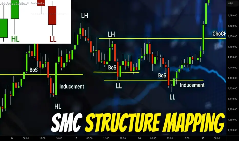
Learn SMC Structure Mapping in Forex & Gold Trading
This article will teach you the absolute basics of Forex & Gold trading with Smart Money Concepts.
We will discuss SMC structure mapping and important events that are applied for making predictions, identifying trading entries and powerful confirmations with this advanced trading strategy.
Smart money traders perceive a price chart as a sequence of price movements: of impulse and retracement legs.
Each leg of a move has a direction, the initial, and completion points.
The initial and completion points of the price movements will have different names depending on their positioning and trend direction.
The legs of a price movement will have a different degree of significance.
The relations of initial and completion points of different impulses may mark critical events as, for example, a market reversal or trend continuation.
Here is how SMC trader perceives a price chart.
It is a pure sequence of price legs.
In order to start structure mapping, one should pick the initial point of analysis - usually it is a local bottom or top.
Our initial point of mapping will be a local bottom.
If the first leg of a move that you start the analysis with is bullish ,
its initial point will be called the Initial Low.
If the first leg of a move that you start the analysis with is bearish ,
its initial point will be called the Initial High .
The completion point of our first bullish movement will be called Higher High or HH.
After a completion of the first bullish movement, a bearish movement follows. The position of a completion point of this movement will determine its name.
If the movement completes with the range of a bullish movement,
its completion point will be called Higher Low.
If the movement completes below the range of a bullish movement,
its completion point will be called Lower Low.
In our case, we have a Higher Low.
When a new bullish movement initiates after a formation of a higher low, pay attention to a completion point of such a bullish movement.
If the price violates a level of a current high, the completion point of such a movement will be called a Higher High.
If the bullish movement completes below the level of a current high and a bearish movement follows, the completion point of such a movement will be called Lower High.
The sequence of 2 Higher Highs with a Higher Low between them confirms that the trend is bullish.
When the price violates a level of a current higher high or a current lower low, such an event is called Break of Structure or BoS.
Such an event is an important indicator of the strength of the buyers/sellers in Smart Money Concepts.
Here are the Break of Structures of Higher Highs
One more critical SMC event that we can recognize is Inducement .
With the Inducement, big players are grabbing the liquidity from the market participants, providing false bullish and bearish signals.
Each High in SMC is a potentially strong resistance.
Its bullish violation turns that into support from where buyers start placing orders, with a stop loss lying below that.
As the price is not respecting the broken structure, buyers start closing their long positions in loss - selling them and sellers start opening short positions.
Real intention of the big players was to buy huge volumes of an asset.
With the inducement, they made the crowd provide the liquidity for them.
A similar event may easily happen after a bearish breakout of a Low.
Above is the example of Inducement after a bullish breakout of a High.
Continuing the structure mapping, we can note a change of sentiment.
Analyzing bearish movements, we may recognize 2 important events.
In a bullish trend, a bearish violation of the level of the last higher low signifies a violation of a trend.
Such an event is called Change of Character (CHoCH).
Change of Character in a bearish trend, will be a bullish violation of the level of the last lower high. It will signify a bearish trend violation.
In our example, we can easily identify Change of Character, bullish trend violation and initiation of a bearish trend.
Here is how a complete structure mapping should look.
The rules that we discussed can be applied on any market and any time frame. However, the rule is that higher is the time frame, more reliable is the SMC structure mapping and more reliable signals it provides.
Study structure mapping with care, because it is a foundation of Smart Money Concepts.
❤️Please, support my work with like, thank you!❤️
I am part of Trade Nation's Influencer program and receive a monthly fee for using their TradingView charts in my analysis.
How to Trade Smart Money Concepts SMC with Top-Down Analysis
Today, I will show you how to trade SMC with Top-Down Analysis.
You will learn how to combine liquidity, structure mapping, mitigation and breaker blocks on different time frames for spotting accurate entries in Gold and Forex.
In this strategy, we will use 2 time frames: daily time frame and 4H.
To understand how to use them step by step, let's start with studying 2 price models.
Always start your analysis with a daily time frame.
You will need to identify liquidity supply and demand zones there.
After you see a test of a supply zone on a daily time frame, start analyzing a 4H time frame.
On a 4H, you will need to do structure mapping and make sure that the market is in an intraday bullish trend.
In this bullish trend, you will need to identify Order Block zone.
It will a liquidity demand zone based on the last Higher Low.
Your signal to sell will be its breakout and a 4H candle close below.
Depending on the price action, set your sell limit order on the broken order block zone (it will be either a breaker or mitigation block).
Your stop loss should be above the last Higher High and your take profit should be the next demand zone on a 4H.
Here is the example of such a price model on EURUSD.
The price reached a significant daily supply zone.
After its test, the price dropped, breaking a bullish order block zone.
Selling on its retest (entry was the lowest candle close within a broken OB zone), stop loss was above the highs and tp - the closest 4H demand zone.
Now, let's study the second price model.
If you see a test of a supply zone on a daily time frame, start analyzing a 4H time frame .
On a 4H, you will need to do structure mapping and make sure that the market is in an intraday bearish trend.
In this down trend, you will need to identify Order Block zone.
It will a liquidity supply zone based on the last Lower High.
Your signal to buy will be its breakout and a 4H candle close above.
Depending on a price action, set your buy limit order on the broken order block zone (it will be either a breaker or mitigation block).
Your stop loss should be below the last Lower Low and your take profit should be the next supply zone on a 4H.
Examine the following setup on EURNZD.
We see a test of a significant daily demand cluster.
The pair is bearish on a 4H time frame.
Our signal to buy will be a bullish breakout of an Order Block zone and a 4H candle close above that.
We will set a buy limit on its retest then (entry level will be the highest candle 4H close with OB zone).
TP will be the next 4H supply zone and SL will lie below LL.
2 simple price models that we studied in this video will help you to effectively trade liquidity supply and demand zones.
A combination of 2 time frames, basic structure mapping and change of character will provide an accurate entry signal for your trades.
❤️Please, support my work with like, thank you!❤️
I am part of Trade Nation's Influencer program and receive a monthly fee for using their TradingView charts in my analysis.


How to Trade Opening Range on TradingViewMaster the opening range strategy using TradingView's charting tools in this comprehensive tutorial from Optimus Futures.
The opening range captures the high and low established during a defined period at the market open. It represents the first consensus between overnight positioning and new session orders, often setting the tone for the rest of the trading day.
What You'll Learn:
Understanding the opening range as a key price zone formed during the first minutes of a session
How the Opening Range High (ORH) marks the ceiling of early session activity and acts as a breakout trigger
How the Opening Range Low (ORL) marks the floor and signals potential bearish momentum when broken
Why range width matters — narrow ranges often precede explosive moves, while wide ranges may indicate exhaustion
Recognizing failed breakouts when price breaches the range but reverses back inside
How to use the range midpoint as a magnet for price and a target for profit-taking
Identifying breakout entries when price closes outside the range with conviction
Why breakouts should be confirmed with volume and price action, not used in isolation
How to add the Opening Range indicator to a TradingView chart via the Indicators menu
Understanding session settings and how to customize the time window (15, 30, or 60 minutes)
Practical examples on the E-mini S&P 500 futures chart to illustrate opening range signals in real market conditions
Applying opening range analysis across different sessions and products for higher-confidence setups
This tutorial will benefit futures traders, day traders, and technical analysts who want to incorporate opening range strategies into their trading process.
The concepts covered may help you identify early directional bias, breakout opportunities, and potential entry or exit points across different markets and timeframes.
Learn more about futures trading with TradingView:
optimusfutures.com
Disclaimer
There is a substantial risk of loss in futures trading. Past performance is not indicative of future results. Please trade only with risk capital. We are not responsible for any third-party links, comments, or content shared on TradingView. Any opinions, links, or messages posted by users on TradingView do not represent our views or recommendations. Please exercise your own judgment and due diligence when engaging with any external content or user commentary.
This video represents the opinion of Optimus Futures and is intended for educational purposes only.
Chart interpretations are presented solely to illustrate objective technical concepts and should not be viewed as predictive of future market behavior. In our opinion, charts are analytical tools — not forecasting instruments.

How and Where AI is being used by Professionals of the Market.There is a plethora of misinformation on the retail internet about how AI is used by professionals, Buy Side Institutions, Sell Side Institutions, etc.
This tutorial explains how Buy Side Institutions, aka Mutual Fund companies,
ETF developers, etc, and how Sell Side Institutions are using AI.
These two giant Market Participant Groups dominate the professional side
of the market.
Buy Side Institutions are also called Dark Pools of Liquidity as they hold trillions of assets worldwide and manage the colossal pension monies of the middle class of America.
The Buy Side and the Sell Side have entirely different internal market structures, goals, trading systems, but both have floor traders who do not use AI for their work except to route the orders on the millisecond scale.

Breakout Candles Decoded a Complete AnatomyHello traders, This is mine first educational idea of 2026, and I wanted to start the year by sharing a concept that looks simple on charts but is deeply misunderstood in real trading and why every breakout is meant to be chased some are meant to be trusted, some avoided, and some waited upon and why Some Breakouts Fly and others fail? Let's decode that!
So most traders focus on whether a breakout happened.
Professional traders focus on how the breakout happened ?
In this publication we’ll break down three very common breakout candle behaviors near resistance, what they actually indicate, and how you can align your entries with probability instead of emotion.
First, a Quick Truth About Breakouts-:
A horizontal resistance level is not broken by price alone.
It is broken by acceptance.
Acceptance means?
* Price spends time above the level
* Market participants agree on higher value
* Pullbacks hold above the level
With that in mind, let’s decode the candles!
Type 1: The Ideal / Balanced Breakout Candle
Structure-:
Breaks above resistance
Candle body is clean and balanced
Close is comfortably above the level
No extreme extension
What it tells us?
This is a sign of healthy participation, not panic buying. Buyers are stepping in gradually, allowing price to build acceptance above resistance.
High probability outcome-:
Continuation without deep pullback
Why this works?
Late sellers get trapped, No urgency from buyers (no FOMO), Institutions are comfortable holding above the level and This is the breakout most traders should look to trade.
Type 2: Weak Breakout / Overlapping Candle (Fakeout Zone)
Structure:
Price crosses resistance but struggles
Candle overlaps the level heavily
Wicks on both sides
Close is near the level, not above it
What it tells us?
This shows indecision and lack of acceptance and The market tested higher prices but failed to attract enough commitment.
High probability outcome-:
False breakout (fakeout)
Range continuation or reversal
Why this fails?
Buyers lack conviction, Sellers are still active at resistance, Breakout traders get trapped quickly and The best trade here is often NO trade here.
Type 3: Powerful Impulsive Breakout Candle (Retest Candidate)
Structure:
Large, wide-range candle
Strong momentum through resistance
Little to no overlap with the level
Often accompanied by volume expansion
What it tells us?
This is a momentum breakout, driven by urgency. Stops get triggered, breakout traders pile in, and price moves fast and the common mistake most traders chase this candle.
High probability outcome-:
Pullback / retest of the breakout level
Re-accumulation before continuation
Why retests happen?
Early buyers book partial profits, Late buyers get trapped, Smart money looks for cheaper re-entry and The best trade is usually on the retest, not the breakout candle itself.
The Key Insight (Most Important Part)
The strongest-looking breakout candle is not always the best entry.
Moderate, well-accepted breakouts- smooth continuation
Weak breakouts- fakeouts
Very strong breakouts- retests first
Understanding this single idea can:
Reduce FOMO trades
Improve entry timing
Improve risk–reward dramatically
When Trade? acceptance breakouts immediately.
When Avoid? overlapping breakouts.
When Wait for? retest after impulsive breakouts.
Final Thoughts-:Charts speak a language, Candles are words and structure is the grammar.
Once you stop chasing every breakout and start reading the story behind the candle, your trading automatically becomes calmer, cleaner, and more consistent.
Adding some chart examples mates, hope this may help to understand the shared concept more better-:
Type One Breakout:
Type Two Breakout:
Type Three Breakout:
Hope this idea added value to your trading. Wishing you all clarity, discipline, and consistency in the markets ahead.
Happy Trading
Regards- Amit.

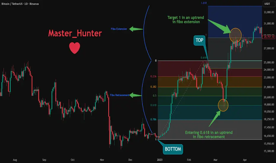
Unlock Fibonacci Retracement: Predict Pullbacks & TargetsFibonacci Retracement is a powerful tool based on mathematical ratios from the Fibonacci sequence. It helps identify potential support/resistance levels during price pullbacks in trends.
Key levels: 23.6%, 38.2%, 50%, 61.8%, 78.6% (and extensions like 161.8%).
Draw from swing high to low (or low to high) – perfect for spotting entries in Forex, Crypto, and Stocks.
How Fibonacci Works (Quick Setup)
On TradingView: Use the Fib Retracement tool. Select recent high/low points. Levels auto-plot where price might bounce or reverse.
Key Strategies
1- Pullback Entries
Buy at 38.2% or 61.8% in uptrends; sell in downtrends.
2- Target Projections
Use extensions (100%, 161.8%) for take-profits beyond the swing.
3-Confluences
Combine with S&R, RSI, or MAs for stronger signals.
Real Examples Right Now (Jan 3, 2026)
Bitcoin BINANCE:BTCUSDT :
Between 30 Dec 2022 and 20 Feb 2023 We saw a pullback from top to the 0.618 Fibonacci level.
We also saw a hit to the 1st Fibonacci Extension level as a target on March 22, 2023.
Pro Tips
Use in trending markets; avoid choppy ranges.
Adjust for volatility: Shorter swings in Crypto, longer in Stocks.
Confirm with volume – strong moves break Fib levels.
Backtest on historical charts to master it!
Add Fib to your toolkit today and nail those pullbacks!
What's your best Fib win? Share in the comments! 👇
Support and Resistance in Financial MarketsAn Empirical Investigation of Price Level Trading Across Asset Classes
Abstract
This essay evaluates 158,391 strategy configurations across 22 instruments spanning equities, bonds, commodities, currencies, and cryptocurrencies. Using 14 years of daily price data, we test whether prices reverse at historically significant levels. Support levels exhibit an average bounce rate of 28.4 percent, below the 50 percent threshold that would indicate predictive value. The mean Sharpe ratio for bounce strategies is negative 0.264. Only 26.7 percent of tested configurations achieve a Sharpe ratio of 0.5. These results indicate that support and resistance, as commonly applied, does not provide a trading edge.
1. Introduction
The horizontal line drawn on a price chart represents a common gesture in technical analysis. Retail traders identify support and resistance levels and place capital on the expectation that price will reverse at these zones. Trading educators offer courses on these levels. Online forums share chart screenshots highlighting where price should bounce. The concept has achieved wide acceptance among non professional market participants.
When we subject this belief to empirical testing, the levels do not work as expected. They do not provide sufficient reliability to generate profits after accounting for trading frictions. This study documents the evidence across a dataset of 22 instruments over 14 years.
Retail participation in financial markets has increased in recent years. Many participants have absorbed technical analysis concepts through social media and online courses, often without understanding the distinction between description and prediction. If support and resistance levels lack forecasting power, traders using them are disadvantaging themselves.
Our contribution is threefold. First, we provide a mathematically precise definition of support and resistance that can be implemented algorithmically. Second, we evaluate this definition across 158,391 configurations to assess robustness. Third, we analyze performance across multiple asset classes.
Section 2 reviews the existing literature. Section 3 describes our methodology. Section 4 presents empirical results. Section 5 discusses implications. Section 6 concludes.
2. Literature Review
2.1 The Efficient Markets Debate
The academic study of technical analysis has been shaped by the efficient markets hypothesis articulated by Fama (1970). Under the strong form, all information is instantly reflected in prices, rendering any trading rule based on historical data futile. The weak form suggests that past prices contain no predictive information about future prices.
Early empirical work appeared to support market efficiency. Fama and Blume (1966) found that filter rules failed to outperform buy and hold strategies after transaction costs. Jensen (1978) stated that there was no other proposition in economics with more solid empirical support than the efficient markets hypothesis.
Subsequent research documented anomalies inconsistent with strict efficiency. Lo and MacKinlay (1988) demonstrated positive autocorrelation in weekly stock returns. Jegadeesh and Titman (1993) established the momentum effect, showing that stocks with high recent returns continue to outperform. These findings suggest past prices contain some information about future returns.
2.2 Technical Analysis Studies
The academic literature on technical analysis remains limited relative to its widespread use. Brock, Lakonishok, and LeBaron (1992) found that moving average and breakout rules generated returns on the Dow Jones from 1897 to 1986. Sullivan, Timmermann, and White (1999) showed that after accounting for data snooping through bootstrap methods, the best performing rules failed to demonstrate significant outperformance.
Lo, Mamaysky, and Wang (2000) applied pattern recognition algorithms to identify technical patterns including head and shoulders and double tops. They found these patterns occurred more frequently than expected under the random walk hypothesis, though they did not demonstrate profitable trading after costs.
Harvey, Liu, and Zhu (2016) raised concerns about the multiple testing problem. They demonstrated that with hundreds of factors tested, many apparent anomalies appear significant by chance. They recommended t statistics exceeding 3.0 before claiming discovery. This critique applies to technical analysis research where many rule variations have been tested.
2.3 Support and Resistance
Few academic studies have examined support and resistance as a standalone concept. Osler (2003) focused on currency markets and found that orders cluster at round numbers, creating price effects. She documented these effects in institutional order flow data, not in the ability of technical traders to identify levels in advance.
Kavajecz and Odders White (2004) examined the relationship between technical analysis and liquidity provision on the NYSE. They found that specialists were more likely to provide liquidity at technically significant levels, suggesting support and resistance may reflect market microstructure effects rather than predictive signals.
The gap in the literature is clear. While practitioners assign importance to support and resistance levels, systematic testing of their predictive power across multiple asset classes has been limited. This study addresses that gap.
3. Methodology
3.1 Formal Definition of Support and Resistance
The lack of a standard mathematical definition has hampered previous research. Different practitioners identify levels using different criteria. We provide a precise algorithmic definition based on local extrema detection.
Let P(t) denote the closing price at time t for t in {1, 2, ..., T}. We define the set of local minima M minus as:
M minus = {t : P(t) < P(t minus k) and P(t) < P(t plus k) for all k in {1, ..., w}}
where w represents the window parameter. The set of local maxima M plus is defined analogously. These definitions follow the Bry Boschan (1971) algorithm for turning point detection.
Raw extrema detection produces many candidate levels that cluster together. To consolidate these into zones, we apply Mean Shift clustering with bandwidth parameter tau, specified as a percentage of current price. Levels within tau of each other are grouped and represented by their mean.
A level qualifies as validated support if it originates from a local minimum, has been touched at least n times, and its bounce rate exceeds some threshold. Resistance levels are defined symmetrically.
The bounce rate for a level L is calculated as follows. For each touch at time t, we observe price at time t plus h, where h is the lookahead parameter. For support, a successful bounce occurs if P(t plus h) exceeds P(t) plus tau. The bounce rate is the proportion of touches resulting in successful bounces.
3.2 Parameter Space
Previous studies tested single specifications or few variations. We test across a parameter grid.
The window parameter w takes values from {3, 5, 7, 10, 15, 20, 30, 50, 75, 100}. The tolerance parameter tau takes percentage values from {0.5, 0.75, 1.0, 1.25, 1.5, 2.0, 2.5, 3.0, 4.0, 5.0}. The minimum touch requirement takes values from {2, 3, 4, 5, 6, 7, 8, 10}. The lookahead parameter takes values from {1, 2, 3, 5, 7, 10, 15, 20, 30}.
The full parameter grid combined with 22 assets produces 158,400 theoretical configurations. After excluding cases where no valid levels are detected, we retain 158,391 configurations.
3.3 Trading Strategies
We implement two trading strategies. The bounce strategy enters long positions when price touches support and exits when price touches resistance. The breakout strategy enters long when price breaks above resistance and exits when price breaks below support.
Both strategies incorporate transaction costs of 10 basis points per trade. We calculate returns assuming full capital deployment on each trade with no leverage.
Performance is measured through the Sharpe ratio, defined as annualized mean return divided by annualized standard deviation. Following Pedersen (2015), we consider Sharpe ratios below 0.5 as failing to meet professional thresholds.
3.4 Data
Our dataset comprises daily closing prices from January 2010 through December 2024 for 22 instruments across six asset classes. US equities include SPY, QQQ, IWM, and DIA. International equities include EFA, EEM, VGK, and FXI. Commodities include GLD, SLV, USO, and UNG. Fixed income includes TLT, IEF, LQD, and HYG. Currencies include EUR/USD, GBP/USD, USD/JPY, and AUD/USD. Cryptocurrencies include Bitcoin and Ethereum.
The 14 year sample encompasses the post financial crisis recovery, the 2015 commodity decline, the 2018 volatility spike, the 2020 pandemic, and the 2022 inflation correction.
Data were obtained through API providers including TwelveData, Tiingo, Alpha Vantage, EOD Historical Data, and Financial Modeling Prep.
3.5 Computational Implementation
Code was implemented in Python using NumPy, pandas, scipy, and scikit learn.
4. Results
4.1 Bounce Rates
Support and resistance levels fail to predict price reversals at rates exceeding random chance. Across 158,391 configurations, support levels exhibit a mean bounce rate of 28.4 percent with standard deviation of 20.5 percent. Resistance levels show a mean bounce rate of 23.3 percent with standard deviation of 17.5 percent.
Under the null hypothesis that price movements following a level touch are random, we would expect a bounce rate of approximately 50 percent. Our observed rates fall below this threshold. Support levels are not neutral predictors; they are negative predictors. Prices that touch support are more likely to continue falling than to bounce.
This finding inverts the conventional understanding. Rather than acting as barriers where price reverses, support and resistance zones appear to function as momentum indicators. A price that has fallen to touch a local minimum exhibits negative momentum that tends to persist.
One sample t tests reject the null hypothesis of 50 percent bounce rates with t statistics exceeding 55 in absolute value and p values effectively equal to zero.
4.2 Trading Strategy Performance
The bounce strategy produces a mean Sharpe ratio of negative 0.264 across all configurations. The standard deviation of Sharpe ratios is 2.120.
Of 158,391 bounce configurations, 80,991 or 51.1 percent produce positive Sharpe ratios. Only 42,255 or 26.7 percent exceed 0.5. Nearly half, 73,863 or 46.6 percent, produce negative Sharpe ratios.
The breakout strategy shows different results. With a mean Sharpe ratio of 1.610, breakout approaches outperform bounce strategies. This aligns with the momentum literature: prices that break through historical barriers tend to continue. Of breakout configurations, 81.3 percent produce positive Sharpe ratios and 71.1 percent exceed 0.5.
The breakout win rate averages only 32.3 percent per trade, indicating profitability derives from large winners offsetting frequent small losses. This return profile is psychologically difficult for traders who tend to cut winners short and hold losers.
4.3 Asset Class Variation
Performance varies across asset classes. If support and resistance reflected universal market dynamics, we would expect uniform results. Instead, we observe heterogeneity.
US equities produce the highest average bounce Sharpe ratio at 0.453. This may reflect deeper liquidity and more efficient price discovery, where level effects could persist due to the volume of retail participants trading on these signals.
Cryptocurrencies show an average of 0.765 for bounce strategies with high variance. The volatility and continuous trading creates more frequent level touches.
International equities show a negative mean Sharpe of negative 0.180. Commodities show 0.001. Fixed income shows negative 0.546.
Currencies show the worst performance with a mean bounce Sharpe of negative 1.563. This finding differs from Osler (2003), who documented order clustering at round numbers in foreign exchange. However, Osler examined institutional order flow, not the ability of technical traders to identify and trade these levels profitably.
4.4 Parameter Sensitivity
Analysis of parameter sensitivity reveals no clear optimal specification. Longer window sizes in the range of 20 to 50 periods generally produce higher bounce rates than shorter windows, but the relationship is not monotonic. Wider tolerance bands capture more touches but dilute signal precision. Stricter minimum touch requirements improve win rates but reduce trading frequency.
The heatmap in Figure 3 illustrates parameter sensitivity for bounce Sharpe ratios. The predominance of red and yellow cells demonstrates that most parameter combinations fail to generate positive returns.
Without a principled method for selecting parameters, the practitioner faces a multiple testing dilemma. Testing many specifications and selecting the best one for forward trading leads to overfitting.
4.5 The Multiple Testing Problem
Figure 8 visualizes the multiple testing problem. We simulated strategy returns under the null hypothesis of zero true Sharpe ratio and tracked the best performing configuration across varying numbers of tests.
With 100 configurations tested, the expected best Sharpe ratio exceeds 0.5 even when no genuine edge exists. With 1,000 configurations, it exceeds 0.8. With 10,000 configurations, it exceeds 1.2. With 100,000 configurations, it exceeds 1.5.
Our observed results are consistent with this random variation. Finding configurations with Sharpe ratios above 1.0 does not indicate discovery of a trading edge. Harvey, Liu, and Zhu (2016) argue that t statistics must exceed 3.0 to claim discovery after accounting for multiple testing. By this standard, none of our bounce strategy results would qualify.
4.6 Correlation with Performance
A question is whether bounce rates predict trading performance. Figure 7 examines this through a scatter plot of support bounce rates against bounce strategy Sharpe ratios.
The correlation is weak. Bounce rate explains only a small fraction of variance in trading performance. Many configurations with high bounce rates produce negative Sharpe ratios, while some with lower bounce rates generate returns. Factors beyond bounce probability, such as magnitude of successful bounces and cost of failures, drive profitability.
4.7 Benchmark Comparison
Figure 9 presents cumulative returns for the SPY bounce strategy compared to buy and hold. Using default parameters of window 10, tolerance 2 percent, minimum 3 touches, and lookahead 5 days, the bounce strategy underperforms passive investment.
Buy and hold captures the upward drift of the equity market over 14 years. The bounce strategy, by moving to cash when not positioned, misses portions of this drift. Support touches occur during market weakness. By the time support is touched and the strategy enters, the best of the subsequent move has often occurred.
This timing problem is fundamental to bounce trading. The strategy is reactive, entering after price has fallen. In trending markets, this produces late entries and early exits.
5. Discussion
5.1 Why Do Traders Believe in Support and Resistance
Given the poor empirical performance, why does support and resistance remain popular? Several psychological mechanisms contribute.
Confirmation bias leads traders to remember instances where levels held while forgetting instances where they failed. A successful bounce creates a memorable story, while a break through represents another loss among many. Selective memory creates inflated perception of reliability.
Hindsight bias causes levels to appear obvious after the fact. Looking at a historical chart, the eye identifies turning points and draws lines through them. These levels appear predictable because they are identified from the turning points. In real time, these were one of many candidates.
The narrative appeal of price memory provides a satisfying explanation for random fluctuations. The idea that markets remember previous highs and lows creates a compelling story. Stories do not generate trading profits.
5.2 How Professionals Use Price Levels
Successful quantitative trading firms do not draw horizontal lines on charts and bet on bounces. Their approach differs.
First, professional firms treat price levels as one input among many. A potential support level might contribute to a signal, but only combined with momentum indicators, volatility measures, cross asset correlations, and macroeconomic factors. No single element receives definitive weight.
Second, professional systems are backtested with proper out of sample validation. Parameters are not selected by looking at which values worked best historically. Parameters are chosen based on theoretical priors or rolling optimization that never looks ahead.
Third, position sizing reflects statistical confidence. Professional traders do not bet the same amount on every signal. When confidence is high based on multiple factors, position sizes increase. Retail traders typically use constant position sizes.
Fourth, professional systems incorporate transaction costs, market impact, and slippage from the beginning. A strategy profitable on paper may become unprofitable once frictions are modeled.
Fifth, professional firms monitor for strategy decay. A pattern that worked may stop working as it becomes known and arbitraged away. Firms update models and retire strategies that have lost edge.
5.3 What Does Work
Our findings should not be interpreted as evidence that all technical analysis is worthless. The breakout results suggest momentum based approaches retain validity. This aligns with academic literature on momentum.
Moskowitz, Ooi, and Pedersen (2012) documented time series momentum across multiple asset classes. Hurst, Ooi, and Pedersen (2017) showed trend following has generated positive returns for over a century. Asness, Moskowitz, and Pedersen (2013) demonstrated that momentum and value represent pervasive factors.
Momentum strategies align with behavioral finance predictions. Underreaction to new information creates initial trends. Overreaction as trends persist creates reversals. These dynamics are grounded in documented psychological biases.
Support and resistance lack clear behavioral foundations. The claim that price remembers previous levels requires a mechanism. Order clustering at certain prices, as documented by Osler (2003), provides one potential mechanism, but our results suggest this clustering does not translate into exploitable bounces.
5.4 Implications for Retail Traders
For retail traders, these findings carry implications. The hours spent drawing horizontal lines and waiting for touches could be spent on other activities. Support and resistance as commonly taught is not a path to profitability.
This does not mean traders should abandon technical analysis entirely. Moving average crossovers align with momentum principles that have theoretical support. Volume analysis may provide confirmation of price moves.
The deeper lesson concerns the distinction between description and prediction. Support and resistance describes where price has previously reversed. This description is accurate. But description does not equal prediction. Price reversing at a level in the past does not mean it will reverse at similar levels in the future.
Retail traders should approach trading education with skepticism. Course vendors have incentives to present simple frameworks that promise profits. Complexity and uncertainty do not sell courses.
5.5 Limitations
Several limitations should be acknowledged. Our definition of support and resistance may not capture all variations used by practitioners. Some traders incorporate volume analysis or Fibonacci retracements. Our results speak to local extrema based levels.
The daily timeframe may mask intraday effects. Support and resistance could work differently on shorter or longer timeframes. Our data do not permit evaluation of these alternatives.
Transaction cost assumptions affect strategy profitability. We used 10 basis points per trade. Actual costs vary by instrument and execution method.
The 2010 to 2024 sample period represents a specific regime with accommodative monetary policy and a secular bull market in bonds. Results may differ in other environments.
Despite these limitations, the central findings hold. Support levels do not predict bounces at rates exceeding random chance. The average bounce strategy generates negative risk adjusted returns. These conclusions hold across thousands of parameter combinations and multiple asset classes.
6. Conclusion
This essay subjected support and resistance trading to empirical testing across 158,391 configurations. Bounce rates at support and resistance levels average 28.4 percent and 23.3 percent respectively, below the 50 percent threshold indicating predictive value. The mean Sharpe ratio for bounce strategies is negative 0.264. Only 26.7 percent of tested configurations achieve a Sharpe ratio of 0.5.
These findings should prompt reflection among traders who rely on support and resistance. The technique that appears intuitively compelling, that is taught in courses and videos, that seems to work when looking at historical charts, does not work in forward testing.
The gap between belief and reality has consequences. Traders who believe in support and resistance make decisions that disadvantage them. They enter positions based on level touches that more often continue than reverse. They incur transaction costs chasing signals that lack predictive power.
The path forward lies in education grounded in empirical evidence rather than narrative appeal. The academic literature on momentum, value, and carry factors provides a foundation for understanding what works in financial markets. The quantitative finance community has developed methods for testing trading ideas and avoiding overfitting.
Support and resistance will likely remain popular despite this evidence. The psychological appeal, reinforced by confirmation bias and hindsight, creates a self sustaining belief system. Traders who evaluate their approaches based on rigorous backtesting rather than selective memory will reach the same conclusion documented here.
7. Recommendations for Further Study
Several avenues merit investigation. Testing support and resistance on intraday data could reveal whether microstructure effects create patterns at shorter timeframes. Cross sectional analysis could determine whether certain instruments consistently show stronger level effects.
The relationship between support and resistance and options markets deserves attention. Large option positions at specific strikes create gamma effects that can reinforce or undermine price levels.
The evolution of level efficacy over time merits examination. If support and resistance ever provided edge, that edge may have decayed as technical analysis became widespread.
Bibliography
Antonacci, G. (2014) Dual Momentum Investing. New York: McGraw Hill.
Aronson, D. (2007) Evidence Based Technical Analysis. Hoboken: John Wiley and Sons.
Asness, C.S., Moskowitz, T.J. and Pedersen, L.H. (2013) Value and Momentum Everywhere. Journal of Finance, 68(3), pp. 929 to 985.
Bajgrowicz, P. and Scaillet, O. (2012) Technical Trading Revisited: False Discoveries, Persistence Tests, and Transaction Costs. Journal of Financial Economics, 106(3), pp. 473 to 491.
Barber, B.M. and Odean, T. (2008) All That Glitters: The Effect of Attention and News on the Buying Behavior of Individual and Institutional Investors. Review of Financial Studies, 21(2), pp. 785 to 818.
Brock, W., Lakonishok, J. and LeBaron, B. (1992) Simple Technical Trading Rules and the Stochastic Properties of Stock Returns. Journal of Finance, 47(5), pp. 1731 to 1764.
Bry, G. and Boschan, C. (1971) Cyclical Analysis of Time Series: Selected Procedures and Computer Programs. New York: National Bureau of Economic Research.
Covel, M. (2017) Trend Following. 5th edition. Hoboken: John Wiley and Sons.
De Prado, M.L. (2018) Advances in Financial Machine Learning. Hoboken: John Wiley and Sons.
Fama, E.F. (1970) Efficient Capital Markets: A Review of Theory and Empirical Work. Journal of Finance, 25(2), pp. 383 to 417.
Fama, E.F. and Blume, M.E. (1966) Filter Rules and Stock Market Trading. Journal of Business, 39(1), pp. 226 to 241.
Grinblatt, M. and Keloharju, M. (2001) What Makes Investors Trade. Journal of Finance, 56(2), pp. 589 to 616.
Harris, L. (2003) Trading and Exchanges: Market Microstructure for Practitioners. Oxford: Oxford University Press.
Harvey, C.R., Liu, Y. and Zhu, H. (2016) And the Cross Section of Expected Returns. Review of Financial Studies, 29(1), pp. 5 to 68.
Hurst, B., Ooi, Y.H. and Pedersen, L.H. (2017) A Century of Evidence on Trend Following Investing. Journal of Portfolio Management, 44(1), pp. 15 to 29.
Jegadeesh, N. and Titman, S. (1993) Returns to Buying Winners and Selling Losers: Implications for Stock Market Efficiency. Journal of Finance, 48(1), pp. 65 to 91.
Jensen, M.C. (1978) Some Anomalous Evidence Regarding Market Efficiency. Journal of Financial Economics, 6(2 and 3), pp. 95 to 101.
Kavajecz, K.A. and Odders White, E.R. (2004) Technical Analysis and Liquidity Provision. Review of Financial Studies, 17(4), pp. 1043 to 1071.
Lo, A.W. (2004) The Adaptive Markets Hypothesis. Journal of Portfolio Management, 30(5), pp. 15 to 29.
Lo, A.W. and MacKinlay, A.C. (1988) Stock Market Prices Do Not Follow Random Walks: Evidence from a Simple Specification Test. Review of Financial Studies, 1(1), pp. 41 to 66.
Lo, A.W., Mamaysky, H. and Wang, J. (2000) Foundations of Technical Analysis: Computational Algorithms, Statistical Inference, and Empirical Implementation. Journal of Finance, 55(4), pp. 1705 to 1765.
Moskowitz, T.J., Ooi, Y.H. and Pedersen, L.H. (2012) Time Series Momentum. Journal of Financial Economics, 104(2), pp. 228 to 250.
Osler, C.L. (2003) Currency Orders and Exchange Rate Dynamics: An Explanation for the Predictive Success of Technical Analysis. Journal of Finance, 58(5), pp. 1791 to 1820.
Pedersen, L.H. (2015) Efficiently Inefficient: How Smart Money Invests and Market Prices Are Determined. Princeton: Princeton University Press.
Shiller, R.J. (2015) Irrational Exuberance. 3rd edition. Princeton: Princeton University Press.
Sullivan, R., Timmermann, A. and White, H. (1999) Data Snooping, Technical Trading Rule Performance, and the Bootstrap. Journal of Finance, 54(5), pp. 1647 to 1691.
Thaler, R.H. (2015) Misbehaving: The Making of Behavioral Economics. New York: W.W. Norton.

Unified Support And Resistance Theory: real mechanical levelsBefore we start:
Wave Auction Theory and many preceding posts concerning the levels are now considered legacy. It’s an absolutely working entity, but it’s just a ‘model’.
Volume & signed volume & volume delta would be used interchangeably;
Timeframe = ‘rolling’ amount of data we utilize, e.g. weekly, intra-week.
Resolution = aggregation frequency we use to represent that timeframe, e.g 30m.
E.g a daily (intra-day) timeframe on CME can be represented as 276 5min bars, 46 30min bars, 12 2h bars, or 1380 1min bars, etc. (Yes btw, that's your seasonal windows you heard from me).
Support and resistance levels are exclusively based on (aggregated) tick data, not on orderflow, not on liquidity. Liquidity and CVD based level are structural levels, they form ‘before’ market and limit orders meet, before ticks even emerge. For gaining this information mathematically, you need these 2 scripts: volume analysis & liquidity analysis .
Prerequisites:
Uniform / Sagitta grid , these grid levels would be later referred as anchors or seeds. We would be finding & using only the closest real levels to these anchors.
How levels get positioned & cleared aka consumed aka broken. The same logic would apply to other kinds of levels, not only price-based ones. The main rule stays the same: a level can be positioned with new bars ‘only’ on the same resolution it was located initially.
How to separate (aggregated) tick data into analytical units aka auctions (also briefly mentioned there )
(optional) knowing what Bias-Variance Tradeoff is.
I think USART is not a model, good chances are this is the endpoint source entity. It explains the deepest low-level nature of support & resistance levels, which is tightly linked with information theory. Ironically, the nature of support and resistances is much closer to DSP (Digital Signal Processing) then all this endless variety of custom time-domain filters. Let’s start.
3 Methods of discovering S&R levels
Mathematical method (the blueprint of reality): this is the most general way. Represented by what I called MBAD , QBAD , and PBAD .
- Performs best when market activity is typical or decreased
- Performs ok when market activity is increased
- Performs bad when market activity is extreme
Mechanical method (‘the’ objective reality): these are the real actual levels, this post is focused on them.
- Performs best when market activity is increased
- Performs ok when market activity is extreme
- Performs ok when market activity is typical or decreased
Representation/learning/intuitive/”by feel” method (what objective reality Wants to be): a quick & compressed grasp of reality. An experienced organic would just take a look at the data and ‘feel’ where the levels are. In code, it can be done with a proper clustering algorithm & a couple of other things. The idea is to match the way an organic brain does it. Another script and/or post would be made for this one.
- Performs best when market activity is extreme
- Performs ok when market activity is increased
- Performs bad when market activity is typical or decreased
Also, knowing the 2nd and 3rd method would save you if for some reason your quant math is unavailable atm. Like imagine you rely on MBAD for your objective trading signals, but need to trade / make a decision fast without TV nearby.
Mechanical (real) levels
Signal = information = change
In (aggregated) tick data, supports and resistances are simply locations of change events in (Price & Time & (signed) Volume) field. This is it, the most general and complete definition of what S&R levels really are, mechanically.
These change points carry & reveal & prove information. Imagine a counter example, you have a perfect straight diagonal line (not necessary price movement, any process) that goes on and on forever. There are no distinct points of interest to detect, no S&R levels there, because nothing changes, it just keeps going as it goes. Now once smth changes, e.g it reverses, now we have a point of interest at that reversal.
How to define changes in price, time, volume (necessary for final levels)
Given tick data (aggregated, say 5min chart) has 3 types of fields i.e Price, time, volume delta, we have 3 types of levels as well (we’ll need all the types, but won’t need every individual level).
Choose correct data resolutions first
The mechanical method requires 3 distinct resolutions for each type of level over the same timeframe.
Say our timeframe is intra-week aka inter-day, on CME, we need:
High resolution: last 230 30min bars, for price-based levels. High variance, low bias.
Medium resolution: last 60 2h bars, for time-based levels. Medium variance, medium bias.
Low resolution: last 20 6h bars, for volume-based levels. Low variance, high bias.
^^Me I like to display all 3 resolutions on the same chart
Price-based supports and resistances
^^ When the direction of price movement changes, so simply pivot highs and pivot lows, a couple of examples are marked. Note: when the first or the last datapoint in a triplet is NaN/na, 2 points are enough to detect a pivot high/low. E.g: na, 45, 67: 45 is pivot low; 76, 11, na: 11 is pivot low.
Notice that we use bar highs and lows, these points are recorded by price rule (highest and lowest print of a bar).
Time-based supports and resistances
^^ Basically open-close pairs between the bars: closing print of a bar & opening print of the next following bar. If the previous or next bar is na, like when a session starts/ends. We then use only one print. Study the screenshot pls. After it is clear if a level is becoming resistance or support, we can get rid of one of the prints and choose the final print representing the level: the lowest out of 2 for supports, the highest out of 2 for resistances. Only then levels are considered as formed.
Notice that we use close and open here, these points are recorded by time rule (earliest and latest prints of a bar).
Volume-based supports and resistances
^^ When (inferred or real, depending on asset class) volume delta switches from negative to positive, both bars (say the last with positive delta and the first with negative delta) would provide us 2 levels each: price of the largest sell tick and price of the largest buy tick. This info is unavailable in retail trading platforms, but good news we don’t need it for the assets where we prefer inferred volumes vs the real ones, so equities, bonds, FX. There. Both largest sell tick price and largest but tick price would collapse to bar midrange.
...
The process
Once we know how to locate the levels, we need to pick the ones we need:
Put/imagine the anchors on every finished analytical unit aka auction, and on currently on-going auction. In this post we’d separate market activity into auctions by trading sessions.
Always recall that each anchor has a predetermined lifespan (levels do Not exist 4ever if not-broken):
^^ in mechanical method we don’t use limit levels
After a level is formed (a session is finished):
- Basis lives for 1 more session
- Deviations live for 2 more sessions
- Extensions live for 3 more sessions
- We don’t use limit levels in mechanical method
Look when a new auction opens. We need to find supports below and resistances above.
Find the closest real levels (both positioned and not-positioned ones) to anchors, priority is always: price > time > volume. This way, each anchor would be represented and objectified by 1 or several nearby real mechanical levels. That’s what fibo traders are missing: instead of locating the real price-action based levels ‘nearby’ dem fibo levels, they use the fibo levels like the endpoint truth.
^^ levels for the next sessions
Final hard stop loss & take profit for each level is the level itself +- 1 volatility measure, which is ~ the auction range divided by 3.4641 (aka sqrt12)., of that auction that originated the level. I can explain more how to make it absolutely data-driven and real on request, but it's a negligible improvement.
Improved stop losses: if a level is already positioned (tested), it has a native soft invalidation point. If it’s hit, you can keep the final hard SL but try to exit at breakeven where you’ve entered. It doesn’t mean that the anchor level itself is broken, remember, we can represent each anchor with several real levels nearby.
Improved take-profits: in any doubts, in questionable context etc, 1:1 Risk:Reward is the rule. Because from info perspective, when price leaves the field of a level (remember +- 1 vola measure), it loses contact with it, now it’s outside of the influence area of that level, it means our position also loses the connection with the level from info perspective.
Otherwise, if there’re some supporting factors, you can keep the position, but remember, now you're doing long-n-hold or short-n-hold. One of the supporting factors can be when liquidity and volume imbalance are ‘both’ favoring the hold.
...
∞

How High Risk-to-Reward Trades Are Actually BuiltIf you want to understand how I achieve risk-to-reward ratios of 5, 10, or higher — something you’ve probably seen in many of my analyses — stay with me until the end. 🍵
I’ll explain this step by step, directly, and without unnecessary complexity.
Step 1: Fix Your Expectations First 🔧🧠
Before anything else, your expectations must be corrected.
If you expect to trade with an average R:R of 5 and maintain an 80% win rate, you should stop reading right now. That mindset is fundamentally flawed.
Profitability does not require a high win rate. ❌
For example:
With an R:R of 2, a win rate of around 40% can already be profitable.
With an R:R of 5, profitability requires only about a 20% win rate.
That means out of 100 trades, you only need 20 winners — and you must be mentally prepared for 80 stop losses.
This brings us to a concept that is rarely discussed properly: losing streaks. 📉
A losing streak means taking multiple stop losses in a row during a trading period With a 40% win rate (R:R 2), a losing streak of 4 trades is statistically normal.
With a 20% win rate (R:R 5), losing streaks of 9 trades are expected.
If your numbers are significantly different from this, your journal needs review — not your strategy.
Once expectations are realistic, we can move forward.
Step 2: The Art of the Range 🎨
Personally, I love ranges :)
Why?
Because ranges accumulate liquidity — and liquidity eventually fuels strong, impulsive moves.
Do we trade inside the range?
Absolutely not.
You don’t want to become liquidity for others.
We trade the break — either the top or the bottom of the range.
Is it that simple? No.
Let’s walk through a real example.
On December 9, in my XAGUSD analysis on the 1H timeframe, price entered a range after a clear impulsive leg up.
Both HWC and MWC structures remained bullish, with higher lows forming inside the range.
Momentum favored buyers.
Candles were stronger on the upside.
Even fundamentals supported silver.
In this case, I waited for a break of the range high, not the low — because all parameters aligned with continuation.
When the breakout candle appeared, the position was opened.
At this point, execution paths may differ:
Some place stops below the previous range low.
Others place them behind the breakout candle.
In my case, I placed the stop below the lower wick of the breakout candle.
Why?
Because seller presence was visible, yet buyers absorbed it aggressively.
The liquidity below that wick made it statistically difficult for price to return there.
This is where trade quality increases — and high R:R becomes possible.
Step 3: Where the Real Edge Is Built 🧙♂️
This is where most traders struggle: when to exit.
I almost always use partial profit-taking — especially when HWC, MWC, and even LWC structures remain bullish.
Closing too early is a mistake.
Instead:
Close 35% at R:R 2 → the trade becomes risk-free.
Close 40% at R:R 5 → another R:R 2 is secured.
Close 20% at R:R 10 → yet another layer of edge.
Beyond R:R 10, exits depend on:
Momentum weakness
Candle rejection
Structural changes based on Dow Theory
At that point, experience and market reading matter more than rules.
(Reviewing your Personal Trading journal after 100 trades or more, helps you clearly understand how to read the market better.)
If you have questions, leave them in the comments — I’ll respond.
By the way, I’m Skeptic , founder of Skeptic Lab.
I focus on long-term performance through psychology, data-driven thinking, and tested processes.
If this was useful, feel free to support it. 🩵
More education continues tomorrow.
Peace out.
— Skeptic

FREE SUPPORT and RESISTANCE Indicator to Identify Key Levels
In this article, I will show you a simple technical indicator that will help you to identify support and resistance levels easily trading any financial market.
And what I like about this indicator is that it is absolutely free and it is available on all popular trading platforms: tradingview, meta trader 4, meta trader 5, etc.
This indicator is called Zig Zag.
After adding the indicator, the price chart will look like that.
First, I recommend changing its settings .
Price deviation - 1.5
Pivot legs - 5
Here are the inputs that I recommend for structure analysis on a daily time frame.
And in style remove labels because they really distract.
What this technical indicator does, it underlines the significant impulse legs. The completion and initial points of the impulses will be the important structures.
Your key structures will be the areas based on the initial/completion points of impulses based on wicks and candle closes.
A key horizontal support will be based on the initial point of the impulse and the lowest candle close.
Key supports will be all the structures that are below current price levels.
A key horizontal resistance will be based on the initial point of the impulse and the highest candle close.
Key resistances will be all the structures that are above current price levels.
Also, the completion/initial points of the impulses will occasionally compose the vertical structures - the trend lines.
Underline all the supports/resistances based on Zig Zag indicator.
All these structures are significant and can be applied for pullback/breakout trading.
Also, remember that you can modify the inputs of the indicator.
Increase Price deviation and Pivot legs number will show the stronger structures, while decreasing these numbers, more structures will appear on the chart.
On the left chart:
Price deviation - 1.5
Pivot legs - 5
On the right chart:
Price deviation - 5
Pivot legs - 10
The right chart shows just 2 structures, but very important ones.
This indicator is very powerful and it can help you a lot in learning structure analysis.
❤️Please, support my work with like, thank you!❤️
I am part of Trade Nation's Influencer program and receive a monthly fee for using their TradingView charts in my analysis.
