TradeCityPro Academy | Support & Resistance Part 1👋 Welcome to TradeCityPro Channel
🎓 Educational Section Technical Analysis Training Series
Welcome to the Educational Content Section of our channel!
Here, we aim to teach you technical analysis from A to Z through structured playlists.
We’ll cover everything from risk and capital management, Dow Theory, support and resistance, trends, and market cycles, to more advanced concepts.
Our lessons are based on both real market experience and The Handbook of Technical Analysis.
🎨 What is Technical Analysis?
Technical Analysis (TA) is a method used to forecast price movements in financial markets by analyzing historical data, especially price and volume.
It’s based on the idea that history tends to repeat itself, and that recurring patterns can reveal profitable trading opportunities.
🧩 The Human Concept of Support and Resistance
Support and resistance aren’t just numbers on a chart — they’re the result of collective human behavior.
When large groups of traders make similar decisions — buying or selling — at a certain level, that area becomes psychologically important in the market.
Support forms where fear of missing out (FOMO) drives people to buy.
Resistance forms where fear of loss motivates people to sell.
💭 The Psychology Behind Formation
In a downtrend, when prices fall too much, traders start thinking “It can’t go any lower”, and buying pressure increases — forming support.
In an uptrend, when prices rise sharply, traders think “It’s too expensive now”, and selling pressure builds — forming resistance.
So, these levels reflect emotions like fear, greed, and FOMO, rather than being purely technical.
🌍 Real-World Example
When the USD price drops so low that everyone rushes to buy it — that’s support.
When gold becomes so expensive that no one wants to buy anymore — that’s resistance.
Markets operate on these same human instincts — only visualized through candlesticks and numbers.
🧩 Introduction
In technical analysis, two key concepts exist in nearly every strategy:
Support and Resistance.
These are areas on the chart where the probability of price reaction or reversal is high.
🟢 What is Support?
A support level is where buying pressure is expected to increase and prevent further price decline.
It acts like a floor that supports price.
📘 Example:
If Bitcoin repeatedly bounces from the $60,000 level, that area is considered a support zone.
🔴 What is Resistance?
A resistance level is where selling pressure increases, preventing further price growth.
It acts like a ceiling that stops price movement upward.
📘 Example:
If Ethereum fails multiple times to break above $3,800, that area is a resistance zone.
📈 How to Identify Support and Resistance
There are several methods to detect these levels:
Previous Highs and Lows:
The most common method — look for areas where price has reacted before.
Trendlines:
In an uptrend, connecting higher lows gives you a dynamic support line.
Moving Averages (MA):
MAs like MA50 or MA200 often act as dynamic support or resistance.
Supply and Demand Zones:
Areas where heavy buying or selling previously occurred.
⚙️ Market Psychology
Support and resistance are emotional memory points for traders.
When price reacts to a level once, it becomes mentally significant, leading to similar reactions in the future.
That’s why these zones often repeat over time.
🔄 Breakouts and Role Reversal
When price breaks a support or resistance level with strong volume and momentum, that level changes its role:
Broken resistance → becomes new support
Broken support → becomes new resistance
This concept is known as Role Reversal.
🎯 Importance of Timeframes
Support and resistance zones on higher timeframes (Daily, Weekly) carry greater significance, since more traders and larger volumes are involved.
🧠 Pro Tips
✅ Always treat support and resistance as zones, not fixed price points.
✅ If price approaches a level with strong momentum, it’s more likely to break it.
✅ Combine S/R with candlestick reactions, volume, and indicators for confirmation.
✅ Levels that repeat multiple times usually grow stronger over time.
💬 Summary
Support and resistance are the foundation of technical analysis.
Understanding them helps you find better entry and exit points and gain a deeper insight into market psychology.
Support and Resistance
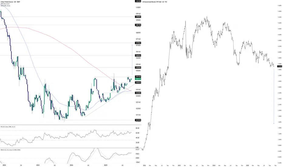
Something’s Brewing at the Front EndDonald Trump wants lower interest rates. He may well get his wish soon, at least at the front of the U.S. Treasury curve. The chart you’re looking at has two panes. On the left, we have U.S. two-year Treasury futures. On the right, we have two-year U.S. Treasury yields. The former uses a weekly tick, the latter daily.
With futures coiling in a well-defined ascending triangle pattern for more than a year, you get the sense that should we see a weekly close above 104’16’0, it may act as a catalyst to spark further upside, potentially explosive. The contract has been rejected at the level six separate times since July 2024, including four failed breakout attempts over the same period. This reinforces its importance. Given its proximity to the level with RSI (14) and MACD generating bullish momentum signals, attempt number seven—if we see it—stands a decent chance of sticking.
If we see a sustained break above 104’16’0, 105’08’0, 106’06’6 and 107’06’2 loom as the levels to watch, especially the latter as it aligns with the extension target based on the triangle’s height. If it were to be achieved, it points to a nominal two-year Treasury yield of around 1.5%.
That’s obviously far lower than where it currently resides, pointing to negative real rates given the Fed’s 2% inflation target and, in all likelihood, economic conditions far weaker than recent years or monetary policy being guided by factors other than fundamentals.
While the setup is tradable, if it plays out, it will have ramifications far beyond rate futures given the economic signal it would provide. When you look at recent moves in hard assets with perceived scarcity value, it appears many investors and traders are already positioning for such an environment.
Good luck,
DS
Support and Resistance VS Supply and Demand Explained
In the today's post, I will compare support and resistance levels with supply and demand zones.
I will explain to you the difference between them and share important tips and examples.
What are support and resistance levels?
We also call them key levels. These are particular levels on a price chart from where in the past we saw significant bullish or bearish movements.
Key support will be a one single level, that has a historical significance and from where a bullish reaction will be anticipated.
The all-time low on USDCHF will be a perfect example of a key support.
It is one single level that was respected one time in the past and from where a bullish reversal initiated.
Key resistance will be a one single level on a price chart that has a historical significance and from where a bearish movement will be expected.
The all-time high on Gold will represent a key horizontal resistance.
That level was respected one time in the past and from that level exactly the market dropped heavily.
What are supply and demand zones?
In comparison to support and resistance levels, supply and demand zones are the areas on a price chart. The zones that are based on multiple touches and consequent strong bullish or bearish reactions.
Demand zone will be the area that was tested at least 2 times in the past, and the price should strictly respect different price levels within that area.
A similar reaction will be anticipated from the demand zone in the future.
The yellow area above will a good example of a demand zone.
You can see that the price tested that area 3 times, and each time the market respected different levels lying within that.
These 3 tests compose the demand area.
Supply zone will be the area that was tested at least 2 times in the past and the price should strictly respect different price levels within that area.
A similar reaction will be anticipated from the demand zone in the future.
In this example, a supply area on EURUSD is based on 2 touches of key levels, lying very close to each other.
On the chart above, I underlined 2 horizontal support levels - the single levels that were respected by the market multiple times, and a supply zone - the area that is based on tests of multiple levels lying close to each other.
Support and resistance levels give you SINGLE levels from where you can look for trading opportunities. While supply and demand zones represent the areas . After a test of a supply and demand zone, the market may react to a RANDOM level within that.
For newbie traders, it is highly recommendable to trade single key levels, while experienced traders can broaden their strategies and trade supply and demand zones as well.
❤️Please, support my work with like, thank you!❤️
I am part of Trade Nation's Influencer program and receive a monthly fee for using their TradingView charts in my analysis.

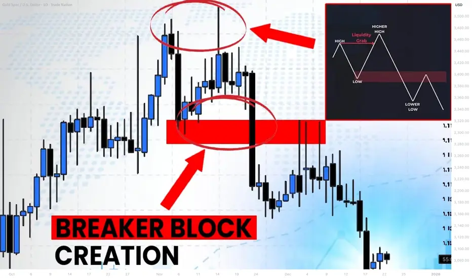
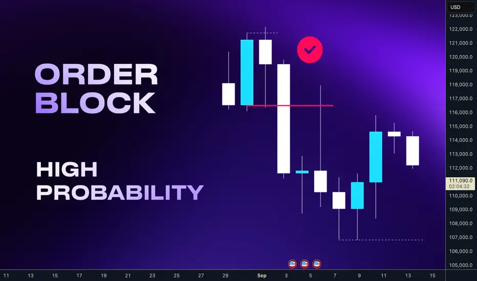
What is Bullish/Bearish Breaker Block & How to Find It Easily
Breaker blocks are easier to find than you think.
In this article, I will share with you very efficient price models for the identification of Order Blocks and Breaker Blocks.
You will learn their meaning, how to draw and use them in trading Smart Money Concepts SMC.
Bullish Trend Model & Breaker Block.
Let's start with an essential theory .
Please, examine a following price model:
In a classic bullish structure where the price consistently updates Higher Highs HH and Higher Lows HH, a bullish order block zone will be the area based on the last Higher How.
I will explain how to draw that zone in the examples below.
In some instances, a bullish order block zone will fail to deliver a bullish wave. Its bearish breakout will follow after its test instead.
It will be a critical event that is called a market structure shift in Smart Money Concepts SMC.
A formation of a new low will signify a violation of a bullish trend and a highly probable change of the market sentiment.
A broken bullish order block zone will turn into a Bearish Breaker Block.
The zone from where the next bearish wave will most likely follow.
It will provide a very safe place to sell from.
Market structure shift in a bullish trend is not a random event.
It usually occurs after a test of a significant supply zone with a liquidity grab.
It can help you to predict the change of the sentiment way before it happens.
That's an example of such a price model on GBPAUD forex pair.
We see a confirmed bullish liquidity sweep in uptrend after a test of a historic supply zone.
A bearish wave followed then and a bullish order block zone was broken.
To draw Order Block Zone, I picked the level of the last higher low as its lower boundary and a low of a body of that candlestick as the upper boundary.
After a breakout, it turned into a Bearish Breaker Block.
A bearish continuation occurred after its test.
Bearish Trend Model & Breaker Block.
Please, check this model:
In a classic bearish structure where the price consistently updates Lower Lows LL and Lower Highs LH, a bearish order block zone will be the area based on the last Lower High.
In some instances, a bearish order block zone will fail to deliver a bearish wave. Its bullish breakout will follow after its test instead.
It will be a significant event that is called a bullish market structure shift in Smart Money Concepts SMC.
A formation of a new high will signify a violation of a bearish trend and a highly probable change of the market sentiment.
A broken bearish order block zone will turn into a Bullish Breaker Block.
The zone from where the next bullish wave will most likely follow.
It will provide a very safe place to buy from.
Market structure shift in a bearish trend is not a random event.
It usually occurs after a test of a significant demand zone with a liquidity grab.
That's a real example of such a price model on WTI Crude Oil.
A bearish structure was violated after a test of a demand zone.
A bearish order block was broken, and it turned into a Bullish Breaker Block Zone then.
(Drawing a bullish order block zone, I picked the level of the last lower high as its upper boundary and a high of a body of that candle as its lower boundary )
A bullish movement followed after a deep test of that.
A proper combination of structure mapping and liquidity analysis will help you to predict a market structure shirt and a breaker block creation before they happen.
The models that I shared will help you to confirm bullish and bearish breaker blocks trading Forex or any other markets with Smart Money Concepts SMC ICT.
❤️Please, support my work with like, thank you!❤️
I am part of Trade Nation's Influencer program and receive a monthly fee for using their TradingView charts in my analysis.
From Distribution to Defense Reading the Market’s MessageHello TradingView family, One thing about price it never forgets. Here’s how smart money distribute defends, tests, and retests the same levels to shape every trend.
So In this post we’ll explore how market structure evolves through repeated interactions with the same zones and why smart money often revisits prior levels to confirm or reject market direction.This phenomenon, often called reconfirmed demand and supply, offers valuable insight into how institutions defend, test, or abandon positions during structural transitions.
Understanding the Sequence--::
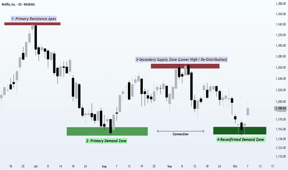
The price action we’re looking at highlights how an all-time high can transform into a repeating cycle of supply and demand a classic story of how the market moves in waves of distribution and accumulation.
Let’s walk through the four stages of this evolving structure 👇
1️⃣ Primary Supply Zone (Distribution High)--::
The first rally culminates in a zone where aggressive buying starts to weaken. Volatility increases, candles become larger, and momentum slows. This area represents smart money distributing positions where liquidity is abundant because breakout traders are still buying, and institutions can quietly sell into that strength. This phase often sets the benchmark high that defines the rest of the structure.
2️⃣ Initial Demand Zone (Accumulation Response)--::
After the distribution, price declines until new demand emerges. The downtrend pauses here, forming a clear demand base a level where institutional buyers see value and start building exposure again. This level often becomes the anchor of the upcoming structure, as it’s where the first response from buyers is confirmed by noticeable rejection and strength.
From here, the market begins to rebound.
3️⃣ Secondary Supply Zone (Lower High Confirmation)--::
The rally from the demand base faces resistance before reclaiming the prior high a lower high. This lower-high reaction is a crucial sign that supply remains dominant and that the recent buying was likely re-distribution rather than new strength. This is the zone where smart money offloads again, using the recent bounce to re-sell into liquidity. It also marks a Change of Character (ChoCH) and a potential trend transition.
It’s not a new high it’s the confirmation of a shift.
4️⃣ Reconfirmed Demand Zone (Previous Support Retest)
The final swing shows price declining back into the same demand zone from Stage 2. This zone isn’t new it’s a reconfirmation of prior institutional activity. When the same level holds again, it signifies that the same participants are defending the zone, maintaining the structure and keeping the market in balance. If the level breaks, however, it signals distribution completion the moment when prior demand can’t hold, and the market transitions into a markdown phase.
💡 The Bigger Picture--::
This repeating interaction between supply and demand is a snapshot of market psychology where the big players constantly test the same levels to validate whether the market still agrees with the prior valuation. Each touch, rejection, or breakthrough reveals who’s winning the battle between smart money and retail momentum.
By recognizing this pattern — distribution ➜ accumulation ➜ re-distribution ➜ retest — traders can better understand where the true liquidity zones are and how the market’s behavior constantly revolves around these zones.
This is not just about recognizing patterns it’s about understanding why these patterns form and how they reflect the business of smart money as they manage risk, scale positions, and trap liquidity.
🚀 Takeaway--::
When a previous level reacts again, the zone itself becomes part of the story not just a random reaction, but a confirmation of intent from bigger players. If you can read how the same zones behave on the second touch, you can anticipate where the next impulsive move or breakdown may occur. Mastering this pattern doesn’t just improve your entries it helps you think like the pros.
Regards- Amit.
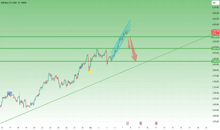
Ascending channels trading applied to Gold current situation🔼 Ascending Channel – Explained Simply
An ascending channel is a bullish pattern — but not always a bullish ending.
It shows a market climbing step by step between two parallel rising lines:
the lower trendline (support) and the upper trendline (resistance).
🧠 Market Psychology
Buyers dominate, but sellers still show up at every swing high.
Each dip gets bought, keeping the trend alive —
until one side finally breaks the rhythm.
⚙️ How to Trade It
• Inside the channel:
Buy near the lower rail, take profit near the upper rail.
• Breakout play:
Go long on a confirmed close above resistance,
or short on a clean break below support.
• Stops:
Just outside the opposite rail — below support for longs, above resistance for shorts.
• Targets:
Use the channel height projected from the breakout point.
⚠️ What to Watch Out For
• False breakouts happen often.
• Too-steep channels usually fail faster.
• Volume must confirm — low volume = fake strength.
• Statistically, breakdowns occur slightly more often than breakouts.
________________________________________
Key takeaway:
An ascending channel isn’t a promise of a bull run —it’s a structured climb that eventually ends.
Trade the rhythm, not the hope. 🎯
Statistically, in 57% of cases, up channels are broken to the downside
Gold now situation: the recent 1k pips is way-way-way to steep
Confirmation came with a drop under 3950 zone
Usually, in the case of such a steep channel, all the move is negated, so a drop to the 3850 zone.
However 3900 zone is strong support now, so a break under 3950 zone could lead to "only" a drop to this support.
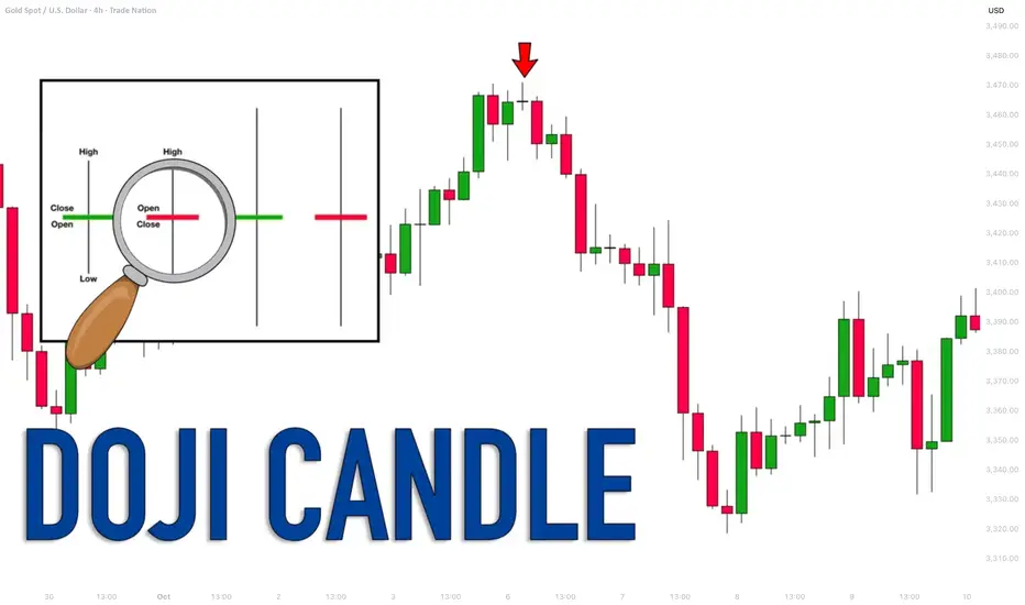
Learn Profitable Doji Candle Trading Strategy (GOLD, FOREX)
In the today's post, I will share my Doji Candle trading strategy.
This strategy combines the elements of multiple time frame analysis, price action and key levels.
Step 1
Analyze key levels on a daily time frame.
Identify vertical and horizontal supports and resistances.
Here are the key structures that I spotted on AUDUSD.
Step 2
Look for a formation Doji Candle on a key structure.
This rule is crucially important: we will trade only the Doji candles that are formed on key levels.
From key supports , we will look for buying , and we will look for shorting from key resistances .
Look at this Doji Candle that was formed on a key daily support on AUDUSD.
Step 3
Look for a horizontal range on a 4h/1h time frames.
Doji Candle signifies indecision . Quite often, you will notice the horizontal ranges on lower time frames when this candlestick is formed.
Here is a horizontal range that was formed on a 4H time frame on AUDUSD after a formation of Doji.
Step 4
Look for a breakout of the range.
To sell from a key resistance, we will need a bearish breakout of the support of the range. That will be our bearish confirmation.
To buy from a key support, we will need a bullish breakout of the resistance of the range. It will be our bullish signal.
Here is a confirmed breakout of the resistance of the range with a 4H candle close above. That is our bullish confirmation on AUDUSD.
Step 5
Buy aggressively or on a retest.
After you spotted a confirmed breakout of the range, open a trading position aggressively or on a retest.
Personally, I prefer trading on a retest.
If you sell, a stop loss should be above the high of the range and your target should be the closest key daily support.
If you buy, your stop loss should be below the low of the range and a take profit will be on the closest daily resistance.
On AUDUSD, a long position was opened on a retest. Stop loss is lying below the lows. Take profit is the closest resistance.
Here is how this great strategy works!
Always patiently wait for a confirmation! That is your key to successful trading Doji Candle.
❤️Please, support my work with like, thank you!❤️
I am part of Trade Nation's Influencer program and receive a monthly fee for using their TradingView charts in my analysis.
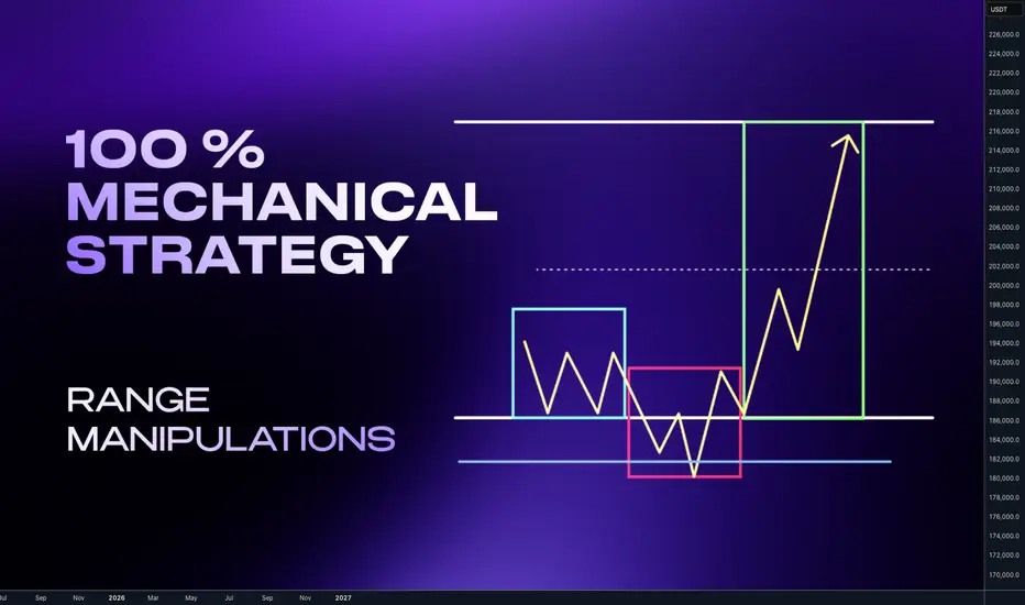
Complete system for Day & Swing TradersHey whats up traders,
Today Im going reveal simple but effective way to analyze and trade any markets - Stocks, Indices, Forex and Crypto. This thing works on everything because it's based on liquidity manipulations.
It's 100% mechanical structured aproach with fixed targets and defined. So unlike traders who trade various patterns and have on charts different patterns and diagonal subjective lines, you can backtest it and measure its and yours execution performance to get your statistical data for Risk Reward and Winning Ratio.
‼️Once you obtain such data from data sample large enough you will also solve biggest trading problems - FEAR, GREED and OVERTRADING. Why ?
📊 Because if you know you win rate is 60 - 70 % trades with RR 2.3 with aprox. 4 trades in a month per instrument, why would you then do following?
Try to look for trade every day when there is not your setup.
Fear open next trade after few losses?
Open huge gamble trade if you know 30% of trades can be loss
Try to hold for unrealistic target if you know most of your trades hit 2.5 RR
Try to pass prop challenge in one trade ?
... and many more psychological and undisciplined mistakes which discretional pattern traders without EDGE and statistical data about their strategy are doing.
🧠 Having mechanical system with backtested data is your EDGE.
💪 That is what makes you DISCIPLINED TRADER.
🧩 Basic Concept
Im looking for the fake break out of the range. Whether we call it manipulation or Stop hunt. It really doesn't matter. The idea is that once big candle is created it creates fomo and break out traders are entering continuation. I trade against them.
📍Bullish continuation setups
Model 1 - Entry after manipulation - 50% target
Model 2 - Entry on pullback on level between 61.8 - 80% pullback
📍Bearish Continuation setups
Model 1 - Entry after manipulation - 50% target
Model 2 - Entry on pullback on level between 61.8 - 80% pullback
🧩 Manipulation phase
is key for this concept. Without it happening, institutional move cant happen. Why ? Market makers are not looking to stop hunt our stop losses. They dont care about your or mine stop losses even if we trade 100 lots. Most of the brokers are B-Book anyway. But they are seeking the liquidity and they are placed above the highs and lows. You dont even need to read order book or book map to know it. To understand liqudity better read this post below
Now you understand after the liquidity was swept. Big players have guns loaded and the move can start. This is what we want to participate. But !! What I have just shown you are patterns. Without adding them in to the right context with the market they will not have highest winning ratio. You must be selective. Basically you want to:
📍Down Trend - Trade Stop hunts above the highs
📍Up Trend - Trade Stop Hunt below the lows
In other words we want be buying lows and selling highs. 🧪 How to do it I explained in this post below 📍 Top- Down analysis
Before we go to the refined entries we must understand top down analysis and what to look for on the charts. Never start with LTF. You always must go with top Down analysis.
🧩 TOP Down analysis
HTF Timeframe for the trend
ITF - Timeframe - Ranges and Key Levels
LTF - Timeframe Profiling and entries
Once we analyze the trend define our range on our timeframe we are looking for manipulation before we go to entries remember this:
🧪Range is mostly created close the key level. If any candle close above the range - Its makes it invalid.
🧪We want see and trade wicks above the range, there you are looking for LTF entry.
📍 Bearish Scenario - (ITF view ) Price should not have candle close above the range on the same timeframe otherwise setup is invalidated and new range created. 📍 Bearish Scenario - (LTF view) - price (yellow has structured movements and should be crating AMD profiles on the edge of the range. We need to drop to LTF to read the structure. 📍 Bullish Scenario ITF view - Price should not have candle close below the range on the same timeframe otherwise setup is invalidated and new range created. 📍 Bullish Scenario - (LTF view) - price (yellow) has structured movements and should be crating AMD profiles on the edge of the range. We need to drop to LTF to read the structure. ‼️Note that Im always referring to the key level. It's called key level , because it's key for the success of the setup. Without it it will work only sometimes. This element must be part of the setup. I personally like the Order Block in other word Supply / Demand zone.
🧪 I have explained Order block in the post below Before we go to trade setup let's clarify timeframes again. Price is fractal you can basically trade this on any timeframes, but you still need to keep structure of 3 Timeframes.
🧩 Timeframe Alignments
🧪Short Term Trading
Trend - Monthly - Directional draw on liquidity
RangeS - Weekly - Stop hunts
AMD Profiles / Entries - H4/H1
🧪Swing Trading
Trend - Weekly - Directional draw on liquidity
Range - Daily - Stop hunts
AMD Profiles / Entries - H1/M15
🧪Day trading
Trend - Daily - Directional draw on liquidity
Range - H4 - Stop Hunts
AMD Profiles / Entries - M15/ M5
🧪Scalping
Trend - H4 - Directional draw on liquidity
Range - H1 - Stop hunts
AMD Profiles / Entries - M5/M1
🔥I recommend to trade daily and weekly ranges. Im not saying Day trading and Scalping is impossible. But Im sure none of us started trading for being isolated nerd behind the PC whole day stressing yourself about every minute. You want live social live and enjoy the freedom which trading can give you and mainly Daily and weekly ranges are higher probability.
🧩 AMD- Accumulation Manipulation Distribution
This is happening on the markets over and over. Everyone who trades profitably use it and if not they are not continuous about using it but they use it is what is necessary to move the market. And we want see It on the Edge of the range with confluence of the key level.
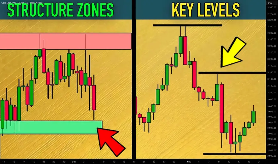
How to Find Key Levels and Support/Resistance Zones Gold XAUUSD
Key levels and support/resistance zones are 2 essential concepts for profitable trading Gold.
In this article, I will share with you a simple and a proven way to find levels and supply/demand clusters on XAUUSD chart.
I will provide a complete guide with examples.
Always start levels/zones analysis on Gold with key levels identification.
Simply put, a key level is a completion point of a strong bullish or bearish movement.
It is the highest high of a bullish wave and the lowest low of a bearish wave.
Let's take a price action on Gold for the last month and let's try to identify key levels.
Analyzing peeks and bottoms of significant price movements, I managed to quickly find a bunch of important key levels.
The ones that are below current spot prices will be called key support levels, while the ones that are above current prices will be called key resistance levels.
What many traders miss, analyzing key levels, is that every key level will always be a part of support/resistance zones.
Candle closes of highs and lows of important price movement will also be important levels.
I underlined all such levels on our Gold chart.
These levels and highs/lows of the impulses will compose supply and demand zones.
That is how these zones look.
The areas that are based on key supports will be called demand zones.
The areas that are based on key resistances will be called supply zones.
The logic is that a high volume of selling orders will be distributed within supply clusters.
Probabilities will be high that a bearish reaction will follow after a test of such a zone.
Demand zones will accumulate buying orders and buying activity.
With a high probability, Gold price will bounce from such zones.
Levels and zones analysis will provide you with a map for trading Gold.
Use that as a map that 95% of retail traders will not see.
It will help you find profitable trades.
❤️Please, support my work with like, thank you!❤️
I am part of Trade Nation's Influencer program and receive a monthly fee for using their TradingView charts in my analysis.
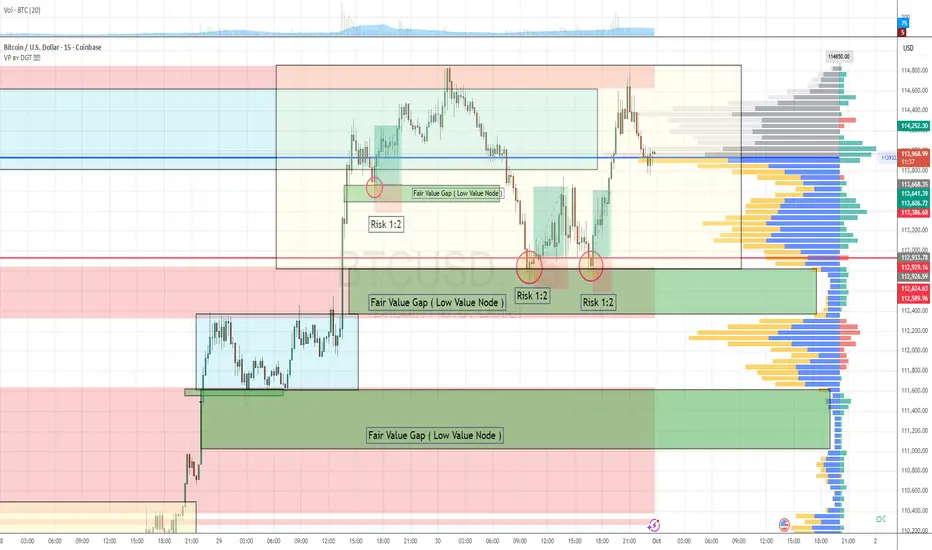
Order Flow & Fair Value Gap Approach 3 Setups in the last 48hourThis strategy leverages order flow analysis and the concept of fair value gaps, operating on the principle that the market behaves as an auction—constantly seeking areas of balance and imbalance.
Over the past 48 hours, BTCUSD has presented three high-probability scalping setups aligned with this methodology.
Market Context
Trend: Bullish
The market has shown clear bullish momentum over the last 48 hours.
Breakout Event:
Price broke out of a consolidation zone with strong, aggressive buying activity, indicating a shift in market sentiment and the initiation of a new leg in the trend.
Imbalance Creation:
During this breakout, two fair value gaps (FVGs)—also referred to as low value nodes (LVNs)—were formed as a result of inefficient price movement.
Trade Setup Criteria & Checklist
To validate each setup, we apply the following checklist:
Criteria Status
1. Trend is bullish ✅ Confirmed
2. Breakout from a consolidation zone with aggressive buy orders ✅ Confirmed
3. Fair value gap created by impulsive buying ✅ Confirmed
4. Retracement into the fair value gap ✅ Confirmed
5. Confirmation of strong buyers defending the FVG zone ✅ Confirmed
6. Defined risk with favorable R:R (1:2 or better) ✅ Confirmed
Risk Management
Each trade setup followed a 1:2 risk-to-reward ratio, maintaining consistency with our strategy's risk parameters.
This sequence illustrates how combining order flow with structural imbalances like fair value gaps can produce high-quality scalping opportunities. Always remember: context, confirmation, and confluence are key.
September 28, Forex Outlook: What Can Traders Expect This Week?Welcome back, traders!
In today’s video, we’ll be conducting a Forex Weekly Outlook, analyzing multiple currency pairs from a top-down perspective—starting from the higher timeframes and working our way down to the lower timeframes.
Our focus will be on identifying high-probability price action scenarios using clear market structure, institutional order flow, and key confirmation levels. This detailed breakdown is designed to give you a strategic edge and help you navigate this week’s trading opportunities with confidence.
📊 What to Expect in This Video:
1. Higher timeframe trend analysis
2. Key zones of interest and potential setups
3. High-precision confirmations on lower timeframes
4. Institutional insight into where price is likely to go next
Stay tuned, take notes, and be sure to like, comment, and subscribe so you don’t miss future trading insights!
Have a great week ahead, God bless you!
The Architect 🏛️📉

Master Horizontal Lines on Trading Charts | Signal & Structure 2In this second episode of the Signal and Structure series, we dive deep into one of the most fundamental yet powerful tools in technical analysis - horizontal support and resistance lines. This practical tutorial demonstrates a systematic approach to identifying and marking key price levels across multiple timeframes.
What You'll Learn:
Color-Coded Line System for Multiple Timeframes:
Monthly (Black, thickness 4) - The strongest levels from monthly candle closes
Weekly (Maroon/Brown, thickness 3) - Key weekly support/resistance zones
2-Day (Red, thickness 2) - Intermediate term levels
12-Hour (Orange, thickness 1-2) - Short-term trading levels
3-Hour (Yellow, thickness 1) - Day trading reference points
Key Concepts Covered:
Why monthly candle closes often matter more than wicks (with live examples)
How previous resistance becomes new support - demonstrated on Bitcoin's chart
Identifying distribution and accumulation ranges using horizontal levels
The importance of avoiding chart clutter - when NOT to add more lines
Using transparent candles to see through to your levels and indicators
Practical Techniques:
Live demonstration on TradingView using Bitcoin/USD charts
How to identify the most significant levels from each timeframe
Creating "boxes" to visualize trading ranges and distribution zones
Brief introduction to Wyckoff theory concepts (spring patterns)
Tips for maintaining clarity when working with multiple overlapping levels
Chart Setup Tips:
Why exchange charts (KuCoin, Gate.io) provide better volume data than index charts
Continuing emphasis on logarithmic scale for crypto analysis
How to organize your workspace for multi-timeframe analysis
This 20-minute tutorial walks you through the exact process of building a professional-grade support and resistance framework on your charts. The presenter demonstrates each concept in real-time on TradingView, making it easy to follow along and implement these techniques immediately.
Perfect for traders who want to move beyond random line drawing and develop a systematic, color-coded approach to identifying key market levels. Whether you're scalping on the 3-hour or position trading on the monthly, this hierarchical system helps you see exactly where the important levels are at a glance.
Next episode preview: Diagonal trend lines, channels, and Fibonacci levels - including a unique approach to stacking channels that provides an edge in the markets.

Learn the Significance of Psychological Levels and Round Numbers
When traders analyze the key levels, quite often then neglect the psychological levels in trading.
In this article, we will discuss what are the psychological levels and how to identify them.
What is Psychological Level?
Let's start with the definition.
Psychological level is a price level on a chart that has a strong significance for the market participants due to the round numbers.
By the round numbers, I imply the whole numbers that are multiples of 5, 10, 100, etc.
These levels act as strong supports and resistances and the points of interest of the market participants.
Take a look at 2 important psychological levels on EURGBP: 0.95 and 0.82. As the market approached these levels, we saw a strong reaction of the price to them.
Why Psychological Levels Work?
And here is why the psychological levels work:
Research in behavioral finance has shown that individuals exhibit a tendency to anchor their judgments and decisions to round numbers.
Such a decision-making can be attributed to the cognitive biases.
Quite typically, these levels act as reference points for the market participants for setting entry, exit points and placing stop-loss orders.
Bad Psychological Levels?
However, one should remember that not all price levels based on round numbers are significant.
When one is looking for an important psychological level, he should take into consideration the historical price action.
Here are the round number based levels that I identified on AUDUSD on a weekly time frame.
After all such levels are underlined, check the historical price action and make sure that the market reacted to that at least one time in the recent past.
With the circles, I highlighted the recent reaction to the underlined levels. Such ones we will keep on the chart, while others should be removed.
Here are the psychological levels and proved their significance with a recent historical price action.
From these levels, we will look for trading opportunities.
Market Reaction to Psychological Levels
Please, note that psychological levels may trigger various reactions of the market participants.
For instance, a price approaching a round number may trigger feelings of greed, leading to increased selling pressure as traders seek to lock in profits.
Alternatively, a breakout above/below a psychological level can trigger buying/selling activity as traders anticipate further price momentum.
For that reason, it is very important to monitor the price action around such levels and look for confirmations.
Learn to identify psychological levels. They are very powerful and for you, they can become a source of tremendous profits.
❤️Please, support my work with like, thank you!❤️
I am part of Trade Nation's Influencer program and receive a monthly fee for using their TradingView charts in my analysis.
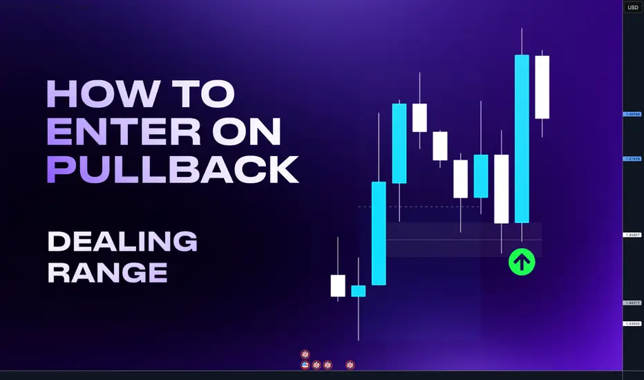
Dealing Ranges - Powerful filter tool to your tradingHello Traders today. I ll break down for you how to enter on a pullback with high accuracy and not being stopped out by using a fibonacci in other words a Dealing range.
A Dealing Range forms when price takes out both a swing high and a swing low, followed by a clear expansion move. That expansion swing becomes the dealing range.
• By dividing the dealing range in half, we get two zones:
• Discount region (lower half) – where buying opportunities are typically more favorable.
• Premium region (upper half) – where selling opportunities are typically more favorable.
• You can think of a dealing range as similar to a PD Array Matrix, but specifically applied to expansion swings rather than consolidation phases.
On the example bellow I drew a Dealing range. If I took the long from the key level in the premium the trade would fail. But if waited for the key level in discount I could get much better RR and explosive move vice versa is happening on the bearish order flow charts. Check on your charts
So why is this situation on the above happening quite often?
It's simple - Liquidity. Market makers needs liquidity to fill their orders so they print nice trade opportunities in the premium where trader enter this setup, for trend continuation.
Setup is technically right. But by placing the trades in premium they creates a stop loss cluster = liquidity in the discount. Then this happen - price go for the liquidity of early buyers in the premium hits key level in the discount and it continue with the trend.
Im not saying that key levels in the premium cant work, in the strong trend there is no always pullback to the discount. But by applying Dealing ranges you will get:
Less but more accurate trades
Higher Risk reward setups
You can build HTF narrative
Use it for targets
Better risk management
Remember, there is not always a key level in the premium and pullback to the discount is not enough. Trade must go from a key level. So if there is not a key level in the premium price is often retracing to the discount key level in order to create a liquidity around a key level price makes a false break which sucks traders in to the market and create a liquidity on a key level.
Dont enter if price is not going from key level its a trap.
Time frame alignments
Always use 2 timeframes Higher time frame (HTF) and Lower timeframe (LTF)
• Higher Timeframe (HTF) = Dealing ranges
• Lower Timeframe (LTF) = Market Profiles / Profiling
Timeframe sequence
HTF Monthly - LTF - Daily / H4
HTF Weekly - LTF - H4 / H1
HTF Daily - LTF H1/ M15
HTF H4 - LTF M15 / M5
Im giving 2x LTF options because sometimes you need to scale lower timeframe to understand price action and best entries. However for the confirmations you can do well with the main sequence of first two.
Apply this rule to any markets. Im adding links to few examples from stocks, crypto an FX where you can see application of this concept. Click to charts to open them and see how price behave in discount and premium.
Examples from successful Tradingview Ideas
Tesla pullback to the discount - Low created in discount ATH most likely coming
Bitcoin pullback to the discount - Followed by expansion to ATH
Palantir pullback to the discount - followed by expansion to ATH
Bitcoin pullback to the Discount - followed by expansion
GBPCHF - Targeting Liquidity in the discount
Hope this help you in your trading journey. Let me know in the comments
David Perk aka Dave FX Hunter
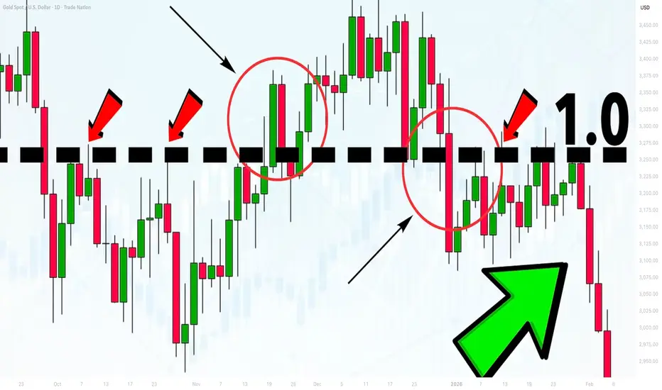
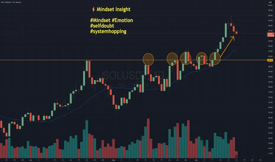
System Hopping - The Hidden Cost of Self-DoubtNOTE – This is a post on Mindset and emotion. It is NOT a Trade idea or strategy designed to make you money. If anything, I’m taking the time here to post as an effort to help you preserve your capital, energy and will so that you are able to execute your own trading system as best you can from a place of calm, patience and confidence.
Here’s a scenario:
You take a loss.
Then another.
Suddenly, the system you trusted yesterday feels broken today.
On this chart of Solana, imagine you were trading a breakout system. You may have had four false breaks that didn’t really follow through before the market finally broke higher. When do you give up on the idea or the system altogether?
How self-doubt shows up:
You start thinking: “Maybe another system would have worked better…”
You switch, tweak, reinvent mid-cycle.
You lose patience with the method you worked so hard to design.
You are in danger of system hopping.
Emotional side:
Self-doubt often disguises itself as “rational analysis,” but underneath it’s uncertainty, frustration, even a tightening in the chest. You hesitate to pull the trigger, second-guess your plan, or overcorrect with a brand-new approach.
It’s rarely your system that’s broken.
It’s the lack of trust in yourself to see it through.
Shift your mindset
Every system has drawdowns. If you abandon yours too soon, you never let it prove itself. So the task really is to find a way to collect the data without blowing out / over extending yourself.
Practical tips … the How:
Write down your system rules and keep them visible, so you trade what’s planned, not what you feel.
Track results over a proper sample size (50–100 trades) before judging performance.
Make sure you are position sizing sensibly. This is an art in and of itself. The key being - do not risk what you can not afford on any one trade / series of trades. Paper trade if you need to to start with just to collect the data on the system.
Journal emotions separately from trade outcomes — so you see when doubt is about you, not the system.
Set a “no system changes” rule during drawdowns. Only review at scheduled intervals.
Closing thought:
Your edge doesn’t come from finding the perfect system.
It comes from trusting a good one long enough to let it work.
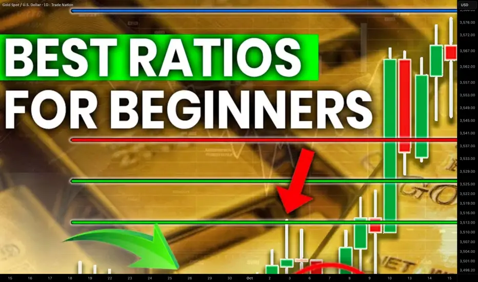
How to Use Fibonacci Levels in Gold Trading. Best Ratios For XAU
I will teach you a simple but efficient way of using Fibonacci levels for Gold analysis.
You will learn the strongest Fib.retracement levels and a proven strategy for XAUUSD trading.
First, let me show you the most powerful Fibonacci retracement levels that you should use for trading Gold.
The most significant ones are: 382, 50, 618, 786.
To use these Fib.Retracement levels properly, you will need to find the strongest 3 impulse legs.
Please, note that you can execute Fibonacci analysis of Gold on any time frame, for the sake of the example, we will do that on a daily.
Here are 3 impulses that I found.
I was simply trying to identify the price waves with the strongest impact. I underlined them from their lows to their highs.
We will draw Fibonacci Retracement levels based on these 3 movements.
We plot Fib.Retracement of a bullish impulse from its low to its high.
We plot Fib.Retracement of a bearish impulse from its high to its low.
That is how it looks.
After that we will need to find a confluence - zones or levels where Fib.Retracement levels of different impulses match .
Such zones will be significant liquidity clusters where market participants will place huge volumes of trading orders.
The first 2 confluence zones that I spotted on a Gold chart will be specific. They are based on 1 and 0 Fib.Retracement levels that match.
These 2 areas are both completion and starting points of our impulse legs.
The fact that significant price movements completed and started after tests of these zones indicates their significance .
Confluence zones 3/4/5/6 are based on a convergence of at least 2 Fib.Retracement levels of different impulses.
Probabilities will be high that these zones will attract the market liquidity.
After we found all confluence zones, I recommend removing Fibonacci levels from the chart to keep it clean .
That is how our complete Fib.Analysis will look.
From these zones, we will look for trading opportunities.
The areas that are above current price levels will be significant supply areas , and we will look for sell signals from them.
The zones that are below Gold spot price will be demand areas. Chances will be high that a strong buying reaction will follow after their test.
Confluence zones that we spotted on Gold chart provide unique perspective. Integrating them in your XAUUSD analysis, you will increase the accuracy of your predictions and trading decisions.
❤️Please, support my work with like, thank you!❤️
I am part of Trade Nation's Influencer program and receive a monthly fee for using their TradingView charts in my analysis.
How to Use Moving Averages in TradingViewMaster moving averages using TradingView's charting tools in this comprehensive tutorial from Optimus Futures.
Moving averages are among the most versatile technical analysis tools available, helping traders analyze trends, identify overbought/oversold conditions, and create tradeable support and resistance levels.
What You'll Learn:
Understanding moving averages: lagging indicators with multiple applications
Simple moving average basics: calculating price averages over set periods
Key configuration choices: lookback periods, price inputs, and timeframes
How to select optimal lookback periods (like 200-day) for different trading styles
Using different price inputs: close, open, high, or low prices
Applying moving averages across all timeframes from daily to 5-minute charts
Analyzing price relative to moving averages for trend identification
Using 50-day and 200-day moving averages for trend analysis on E-Mini S&P 500
Mean reversion trading: how price tends to return to moving averages
Trend direction analysis using moving average slopes
Famous crossover signals: "Death Cross" and "Golden Cross" explained
Trading moving averages as dynamic support and resistance levels
Advanced moving average types: weighted and exponential moving averages
Applying moving averages to other indicators like MACD and Stochastics
Balancing sensitivity vs. noise when choosing periods
This tutorial may benefit futures traders, swing traders, and technical analysts who want to incorporate moving averages into their trading strategies.
The concepts covered could help you identify trend direction, potential reversal points, and dynamic trading levels across multiple timeframes.
Learn more about futures trading with TradingView:
optimusfutures.com
Disclaimer:
There is a substantial risk of loss in futures trading. Past performance is not indicative of future results. Please trade only with risk capital. We are not responsible for any third-party links, comments, or content shared on TradingView. Any opinions, links, or messages posted by users on TradingView do not represent our views or recommendations. Please exercise your own judgment and due diligence when engaging with any external content or user commentary.
This video represents the opinion of Optimus Futures and is intended for educational purposes only. Chart interpretations are presented solely to illustrate objective technical concepts and should not be viewed as predictive of future market behavior. In our opinion, charts are analytical tools—not forecasting

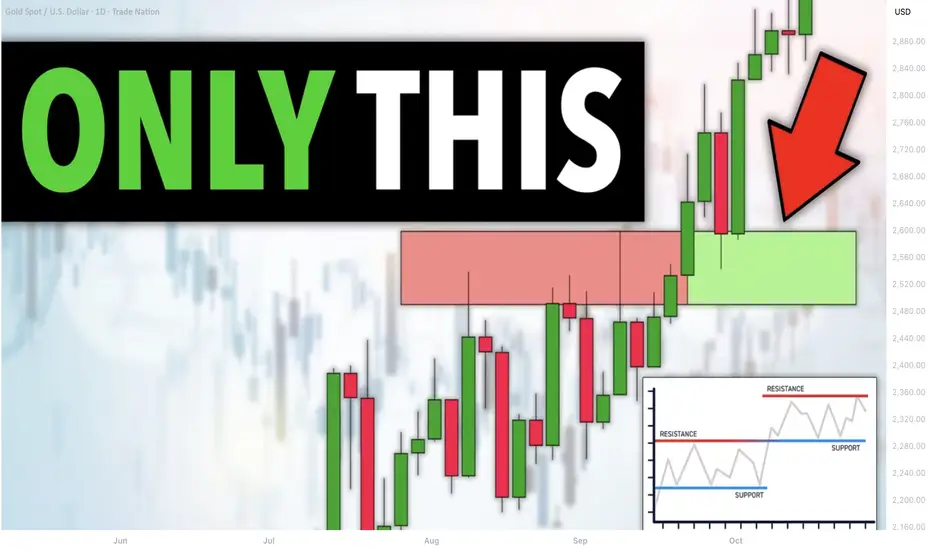
5 Elements of the Best Key Level in Forex, Gold Trading
What are the best key levels to trade?
This year I analyzed more than 1500 key structures on Forex, Gold, Crypto and Indexes.
In the today's article, I prepared for you a list of 5 elements of a perfect support and resistance for trading.
As always, remember that the best key levels are always on a daily time frame . So all the structures that we will discuss will be strictly on a daily .
Also, all the structures that I analyzed and traded are available on my TradingView page, so you can back test them by your own.
1. Clear historical significance
The structure that you spotted should act as a significant historical support or resistance.
Here are the important historical support and resistance that I spotted on USDCAD on a daily time frame.
2. Psychological significance
The structure that you identified should match with round numbers.
All the structures that we spotted on USDCAD match with psychological numbers.
3. Confluence with other technical tools
The best structure should align with other trading tools such as trend lines or Fibonacci levels , strengthening its significance.
After adding fibonacci levels and a significant falling trend line on the chart, the confluence was found in Resistance 6, Resistance 3, Resistance 2, Resistance 1, Support 2. Other structure does not match with technical tolls.
4. Volume
The level experiences high trading volumes, indicating strong participation and interest from market participants, especially smart money.
All the structures that we underlined show significant volume spikes. By volume spike, I mean a volume being higher than the average volume - a blue curve on volume.
5. Multiple touches
The more, the better. There are numerous instances where price has respected and reacted to the structure, confirming its strength (at least 2).
Only these 3 structures were confirmed by the multiple touches. These resistances will be considered the strongest ones.
That checklist will help you to identify the most significant structures from where you will be able to catch impulsive movement and make nice profits.
❤️Please, support my work with like, thank you!❤️
I am part of Trade Nation's Influencer program and receive a monthly fee for using their TradingView charts in my analysis.
Its Non-Farm: How much will ES Move?Hi all - Happy Non-Farm Friday!
I haven't done this in a while and thought it might be helpful to share my process for estimating the size of the move that we may get on ES after the Non-Farm Payrolls data is released.
I'm not trying to make a prediction on direction here - but more understand where the boundaries could be so I can determine how to trade this (what trading tool I can pull out of my box) once the announcement comes out.
Hope it helps and please let me know if you find it useful and I'll create more posts .
Cheers,
Jeff

Order Block - Powerful Key level and Entry confirmationHey whats up guys,
Today we are going to break down Order Block. This powerful pattern can be used as the level and also as the lower timeframe entry confirmation. We will break down both.
An Order block is the last bullish or bearish candle before a strong market move that signals where institutions placed large orders, often acting as future support or resistance.
Yes, its basically Demand zone, and it will quite often will be in confluence with POC when using market profile.
Not every order block is high probability one. In order to filter out best levels my order block must meet these two conditions:
1. Located at Premium / Discount Level
As we can so on charts below order block which failed is one which had expansion, but not proper dip in to liquidity and not placed in the discount. And thats what makes it weak because institutions need liquidity dip to buy and they don't do it in the premium prices. So No Liquidity raid - No trade and also it has to be in the discount.
2. Must have FVG or IFVG
In order to move market and create a liquidity void - gap. You need quite large money. Only big players can do it. Therefore if there is not gap, its signs that they are not trading and you should not be also. If there is gap within OB it will be strong one.
As mentioned we can use order block as key level from which we can trade or we can use it as entry confirmation - Change in order flow. We use it on the lower timeframe.
Here is correct timeframe alignment's
Monthly OB as Key Level - Daily Order Block entry
Weekly OB as Key Level - H4 Order Block entry
Daily OB as Key Level - H1 Order Block entry
H4 OB as Key Level - M15 Order Block entry
The entry is simple you need
- Pullback in to the discount
- HTF key Level
- LTF OB being created
Once the candles close above / bellow last down / Up close candle or consecutive candles, you enter your position.
Below is few examples of my successful calls before the fact. No hindsight, its working.
Bitcoin - Order Block entry
Bitcoin - Order Block Entry
Dogecoin - Order Block Entry
Palantir - Order Block Mid point entry
Dollar Index - Order Block entry
Don't hesitate to drop any question's. Im always glad to answer.
Follow me for more educational blog posts.
David Perk
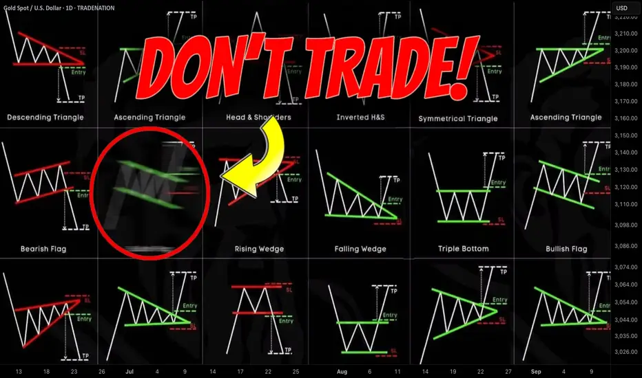
Best Price Action Chart Patterns by Accuracy Last Year
Last year I shared more than 1300 free signals and forecasts for Gold, Forex, Commodities and Indexes.
In my predictions, quite often I relied on classic price action patterns.
In this article, I will reveal the win rate of each pattern, the most accurate and the least accurate formations of last year.
Please, note that all the predictions and forecasts that I shared last year are available on TradingView and you can back test any of the setup that I identified last year by your own. Just choose a relevant tag on my TradingView page.
Also, some of the forecasts & signals were based on a combination of multiple patterns.
Here is the list of the patterns that I personally trade:
🔘 Double Top or Bottom with Equal Highs
The pattern is considered to be valid when the highs or lows of the pattern are equal.
The pattern gives a bearish/bullish signal when its neckline is broken.
🔘 Double Top or Bottom with Lower High/Higher Low or Cup & Handle
The pattern is considered to be valid when the second top/bottom of the patterns is lower/higher than the first one.
The pattern gives a bearish/bullish signal when its neckline is broken.
🔘 Head & Shoulders and Inverted Head and Shoulders
The pattern gives a bearish/bullish signal when its neckline is broken.
🔘 Horizontal Range
The pattern is the extension of a classic double top/bottom with at least 3 equal highs/lows.
The pattern gives a bearish/bullish signal when its neckline is broken.
🔘 Bullish/Bearish Flag
The pattern represents a rising/falling parallel channel.
It gives a bullish/bearish signal when its upper/lower boundary is broken.
🔘 Rising/Falling Wedge Pattern
The pattern represents a contracting rising/falling channel.
It gives a bullish/bearish signal when its upper/lower boundary is broken.
🔘 Rising/Falling Expanding Wedge
The pattern represents an expanding rising/falling channel.
It gives a bullish/bearish signal when its upper/lower boundary is broken.
🔘 Descending/Ascending Triangle
The pattern is the extension of a cup & handle pattern with at least 2 lower highs/lows.
The pattern gives a bearish/bullish signal when its neckline is broken.
Please, also note that all the patterns that I identified and traded were formed on key horizontal or vertical structures.
Remember that the accuracy of any pattern drops dramatically if it is formed beyond key levels.
I consider the pattern to be a winning one if after a neckline breakout, it managed to reach the closest horizontal or vertical structure, not invalidating the pattern's highs/lows.
For example, if the price violated the high of the cup and handle pattern after its neckline breakout, such a pattern is losing one.
If it reached the closest structure without violation of the high, it is a winning pattern.
🔍 Double Top or Bottom with Equal Highs
I spotted 85 setups featuring these patterns.
Their accuracy is 62% .
🥉 Double Top or Bottom with Lower High/Higher Low or Cup & Handle
96 setups were spotted.
The performance turned out to be a little bit higher than a classic double top/bottom with 65% of the setups hitting the target.
🔍 Head & Shoulders and Inverted Head and Shoulders
58 formations spotted last year.
Average win rate is 64%
🏆 Horizontal Range
The most accurate pattern of last year.
More than 148 patterns were spotted and 74% among them gave accurate signal.
🔍 Bullish/Bearish Flag
38 setups identified last year.
The accuracy of the pattern is 57%
Rising/Falling Wedge
The pattern turned out to be a little bit more accurate.
Among 62 formations, 59% end up being profitable.
👎 Rising/Falling Expanding Wedge
The worst pattern of last year.
I recognized 24 patterns and their accuracy was just 51%.
🥈 Descending/Ascending Triangle
64 patterns were identified.
The win rate of the pattern is 66%.
The most important conclusion that we can make analyzing the performance of these patterns is that they all have an accuracy above 50%. If you properly combine these patterns with some other technical or fundamental tools, the accuracy of the setup will increase dramatically.
Good luck in your trading!
❤️Please, support my work with like, thank you!❤️
I am part of Trade Nation's Influencer program and receive a monthly fee for using their TradingView charts in my analysis.
Fib levels can be easy to draw but when do they matter most?So I have used Fibonacci extensions and retracement along with time based extensions to show how one can determine not only where and what levels are significant but Also, when they should be paying closer attention, that is the point of these lines along the vertical axis because one cannot simply watch the chart all the time
I like to use FaceTime based Fibonacci extensions when I have observed a large move and participated in it and I’m trying to figure out a good way to move forward afterwards. I will often settle Alerts to know when price is touched the 2.8 or the 38 line so that I can check on the chart and see where things are at. It’s helped tremendously with timing, especially if you pay attention to volatility with this.

How to Trade Morning Star and Evening Star Candlestick Patterns Learn to identify and trade Morning Star and Evening Star candlestick formations using TradingView’s charting tools in this detailed tutorial from Optimus Futures.
Morning and Evening Stars are powerful reversal patterns that often mark turning points in the market. Recognizing them can help you anticipate when momentum is about to shift—and take advantage of new trading opportunities.
What You’ll Learn:
• How Morning Stars signal bullish reversals at the end of a downtrend
• How Evening Stars indicate bearish reversals after extended uptrends
• The three-candle structure of each pattern and what it means for trader psychology
• Why indecision candles (like dojis) play a critical role in confirming momentum shifts
• Using volume confirmation to validate Morning and Evening Star setups
• The importance of context: spotting these patterns at major support and resistance levels
• Setting effective stop losses at the high/low of the pattern for risk control
• Advanced entry tactic: waiting for retracement after confirmation to optimize risk/reward
This tutorial may help futures traders and technical analysts who want to harness candlestick reversal signals to identify potential market turning points.
The strategies covered could assist you in creating structured setups when strong buying or selling pressure appears at key chart levels.
Learn more about futures trading with TradingView:
optimusfutures.com
Disclaimer:
There is a substantial risk of loss in futures trading. Past performance is not indicative of future results. Please trade only with risk capital. We are not responsible for any third-party links, comments, or content shared on TradingView. Any opinions, links, or messages posted by users on TradingView do not represent our views or recommendations. Please exercise your own judgment and due diligence when engaging with any external content or user commentary.
This video represents the opinion of Optimus Futures and is intended for educational purposes only. Chart interpretations are presented solely to illustrate objective technical concepts and should not be viewed as predictive of future market behavior. In our opinion, charts are analytical tools—not forecasting instruments. Market conditions are constantly evolving, and all trading decisions should be made independently, with careful consideration of individual risk tolerance and financial objective
