Warren Buffett's Approach to Long-Term Wealth BuildingUnderstanding Value Investing: Warren Buffett's Educational Approach to Long-Term Wealth Building
Learn the educational principles behind value investing and dollar-cost averaging strategies, based on historical market data and Warren Buffett's documented investment philosophy.
---
Introduction: The Million-Dollar Question Every Investor Asks
Warren Buffett—the Oracle of Omaha—has consistently advocated that index fund investing provides a simple, educational approach to long-term wealth building for most investors.
His famous 2007 bet against hedge funds proved this principle in dramatic fashion: Buffett wagered $1 million that a basic S&P 500 index fund would outperform a collection of hedge funds over 10 years. He crushed them. The S&P 500 returned 7.1% annually while the hedge funds averaged just 2.2%.
Today, we'll explore the educational principles behind this approach—examining historical data, mathematical concepts, and implementation strategies for learning purposes.
---
Part 1: Understanding Value Investing for Modern Markets
Value investing isn't about finding the next GameStop or Tesla. It's about buying quality assets at attractive prices and holding them for compound growth .
For beginners, this translates to:
Broad Market Exposure: Own a cross-section of businesses through low-cost index funds
Long-term Perspective: Think decades, not months
Disciplined Approach: Systematic investing regardless of market noise
"Time is the friend of the wonderful business, the enemy of the mediocre." - Warren Buffett
Real-World Application:
Instead of trying to pick between NASDAQ:AAPL , NASDAQ:MSFT , or NASDAQ:GOOGL , you simply buy AMEX:SPY (SPDR S&P 500 ETF) and own pieces of all 500 companies automatically.
---
Part 2: Dollar-Cost Averaging - Your Secret Weapon Against Market Timing
The Problem: Everyone tries to time the market. Studies show that even professional investors get this wrong 70% of the time.
The Solution: Dollar-Cost Averaging (DCA) eliminates timing risk entirely.
How DCA Works:
Decide on your total investment amount (e.g., $24,000)
Split it into equal parts (e.g., 12 months = $2,000/month)
Invest the same amount on the same day each month
Ignore market fluctuations completely
DCA in Action - Real Example:
Let's say you started DCA into AMEX:SPY in January 2022 (right before the bear market):
January 2022: AMEX:SPY at $450 → You buy $1,000 worth (2.22 shares)
June 2022: AMEX:SPY at $380 → You buy $1,000 worth (2.63 shares)
December 2022: AMEX:SPY at $385 → You buy $1,000 worth (2.60 shares)
Result: Your average cost per share was $405, significantly better than the $450 you would have paid with a lump sum in January.
---
Part 3: The Mathematics of Wealth Creation
Here's where value investing gets exciting. Let's run the actual numbers using historical S&P 500 returns:
Historical Performance:
- Average Annual Return: 10.3% (1957-2023)
- Inflation-Adjusted: ~6-7% real returns
- Conservative Estimate: 8% for planning purposes
Scenario 1: The $24K Start
Initial Investment: $24,000 | Annual Addition: $2,400 | Return: 8%
Calculation Summary:
- Initial Investment: $24,000
- Annual Contribution: $2,400 ($200/month)
- Expected Return: 8%
- Time Period: 20 years
Results:
- Year 10 Balance: $86,581
- Year 20 Balance: $221,692
- Total Contributed: $72,000
- Investment Gains: $149,692
Scenario 2: The Aggressive Investor
Initial Investment: $60,000 | Annual Addition: $6,000 | Return: 10%
Historical example after 20 years: $747,300
- Total Contributed: $180,000
- Calculated Investment Gains: $567,300
Educational Insight on Compound Returns:
This historical example illustrates how 2% higher returns (10% vs 8%) could dramatically impact long-term outcomes. This is why even small differences in return rates can create life-changing wealth over decades. The mathematics of compound growth are both simple and incredibly powerful.
---
Part 4: Investing vs. Savings - The Shocking Truth
Let's compare the same contributions invested in stocks vs. a high-yield savings account:
20-Year Comparison:
- Stock Investment (8% return): $221,692
- High-Yield Savings (5% return): $143,037
- Difference: $78,655 (55% more wealth!)
"Compound interest is the eighth wonder of the world. He who understands it, earns it... he who doesn't, pays it." - Often attributed to Einstein
Key Insight: That extra 3% annual return created an additional $78,655 over 20 years. Over 30-40 years, this difference becomes truly life-changing.
📍 Global Savings Reality - The Investment Advantage Worldwide:
The power of index fund investing becomes even more dramatic when we examine savings rates around the world. Here's how the same $24K initial + $2,400 annual investment compares globally:
🇯🇵 Japan (0.5% savings):
- Stock Investment: $221,692
- Savings Account: $76,868
- Advantage: $144,824 (188% more wealth)
🇪🇺 Western Europe Average (3% savings):
- Stock Investment: $221,692
- Savings Account: $107,834
- Advantage: $113,858 (106% more wealth)
🇬🇷 Greece/Southern Europe (2% savings):
- Stock Investment: $221,692
- Savings Account: $93,975
- Advantage: $127,717 (136% more wealth)
🇰🇷 South Korea (2.5% savings):
- Stock Investment: $221,692
- Savings Account: $100,634
- Advantage: $121,058 (120% more wealth)
💡 The Global Lesson:
The lower your country's savings rates, the MORE dramatic the advantage of global index fund investing becomes. For investors in countries with minimal savings returns, staying in cash is essentially guaranteed wealth destruction when compared to broad market investing.
This is exactly why Warren Buffett's advice transcends borders - mathematical principles of compound growth work the same whether you're in New York, London, or Athens.
Note: Savings rates shown are approximate regional averages and may vary by institution and current market conditions. Always check current rates in your specific market for precise calculations.
---
Part 5: Building Your Value Investing Portfolio
Core Holdings (80% of portfolio):
AMEX:SPY - S&P 500 ETF (Large-cap US stocks)
AMEX:VTI - Total Stock Market ETF (Broader US exposure)
LSE:VUAA - S&P 500 UCITS Accumulating (Tax-efficient for international investors)
Satellite Holdings (20% of portfolio):
NASDAQ:QQQ - Technology-focused (Higher growth potential)
AMEX:VYM - Dividend-focused (Income generation)
NYSE:BRK.B - Berkshire Hathaway (Value investing & diversification)
---
Part 6: Implementation Strategy - Your Action Plan
Month 1: Foundation
Open a brokerage account (research low-cost brokers available in your region)
Set up automatic transfers from your bank
Buy your first AMEX:SPY shares
💡 Broker Selection Considerations:
Traditional Brokers: Interactive Brokers, Fidelity, Vanguard, Schwab
Digital Platforms: Revolut, Trading 212, eToro (check availability in your country)
Key Factors: Low fees, ETF access, automatic investing features, regulatory protection
Research: Compare costs and features for your specific location/needs
Month 2-12: Execution
Invest the same amount on the same day each month
Ignore market news and volatility
Track your progress in a simple spreadsheet
Year 2+: Optimization
Increase contributions with salary increases
Consider additional core holdings like LSE:VUAA for tax efficiency
Consider tax-loss harvesting opportunities
Visualizing Your DCA Strategy
Understanding DCA concepts is easier when you can visualize the results. TradingView offers various tools to help you understand investment strategies, including DCA tracking indicators like the DCA Investment Tracker Pro which help visualize long-term investment concepts.
🎯 Key Visualization Features:
These types of tools typically help visualize:
Historical Analysis: How your strategy would have performed using real market data
Growth Projections: Educational scenarios showing potential long-term outcomes
Performance Comparison: Comparing actual vs theoretical DCA performance
Volatility Understanding: How different stocks behave with DCA over time
📊 Real-World Examples from Live Users:
Stable Index Investing Success:
AMEX:SPY (S&P 500) Example: $60K initial + $500/month starting 2020. The indicator shows SPY's historical 10%+ returns, demonstrating how consistent broad market investing builds wealth over time. Notice the smooth theoretical growth line vs actual performance tracking.
Value Investing Approach:
NYSE:BRK.B (Berkshire Hathaway): Warren Buffett's legendary performance through DCA lens. The indicator demonstrates how quality value companies compound wealth over decades. Lower volatility = standard CAGR calculations used.
High-Volatility Stock Management:
NASDAQ:NVDA (NVIDIA): Shows smart volatility detection in action. NVIDIA's explosive AI boom creates extreme years that trigger automatic switch to "Median (High Vol): 50%" calculations for conservative projections, protecting against unrealistic future estimates.
Tech Stock Long-Term Analysis:
NASDAQ:META (Meta Platforms): Despite being a tech stock and experiencing the 2022 crash, META's 10-year history shows consistent enough performance (23.98% CAGR) that volatility detection doesn't trigger. Standard CAGR calculations demonstrate stable long-term growth.
⚡ Educational Application:
When using visualization tools on TradingView:
Select Your Asset: Choose the stock/ETF you want to analyze (like AMEX:SPY )
Input Parameters: Enter your investment amounts and time periods
Study Historical Data: See how your strategy would have performed in real markets
Understand Projections: Learn from educational growth scenarios
🎓 Educational Benefits:
This tool helps you understand:
- How compound growth actually works in real markets
- The difference between volatile and stable investment returns
- Why consistent DCA often outperforms timing strategies
- How your current performance compares to historical market patterns
- The visual power of long-term wealth building
As Warren Buffett said: "Someone's sitting in the shade today because someone planted a tree a long time ago." This tool helps you visualize your financial tree growing over time through actual market data and educational projections.
---
Part 7: Common Mistakes to Avoid
The "Perfect Timing" Trap
Waiting for the "perfect" entry point often means missing years of compound growth. Time in the market beats timing the market.
The "Hot Stock" Temptation
Chasing individual stocks like NASDAQ:NVDA or NASDAQ:TSLA might seem exciting, but it introduces unnecessary risk for beginners.
The "Market Crash" Panic
Every bear market feels like "this time is different." Historical data shows that patient investors who continued their DCA through 2008, 2020, and other crashes were handsomely rewarded.
---
Conclusion: Your Path to Financial Freedom
Value investing through broad index funds and dollar-cost averaging isn't glamorous. You won't get rich overnight, and you won't have exciting stories about your latest trade.
But here's what you will have:
Proven strategy backed by decades of data
Peace of mind during market volatility
Compound growth working in your favor 24/7
A realistic path to serious wealth creation
The Bottom Line: Warren Buffett's approach works because it's simple, sustainable, and based on fundamental economic principles. Start today, stay consistent, and let compound growth do the heavy lifting.
"Someone's sitting in the shade today because someone planted a tree a long time ago." - Warren Buffett
Educational Summary:
Understanding these principles provides a foundation for informed decision-making. As Warren Buffett noted: "The best time to plant a tree was 20 years ago. The second-best time is now" - emphasizing the educational value of understanding long-term investment principles early.
---
🙏 Personal Note & Acknowledgment
This article was not entirely my own work, but the result of artificial intelligence in-depth research and information gathering. I fine-tuned and brought it to my own vision and ideas. While working with AI, I found this research so valuable for myself that I could not avoid sharing it with all of you.
I hope this perspective gives you a different approach to long-term investing. It completely changed my style of thinking and my approach to the markets. As a father of 3 kids, I'm always seeking the best investment strategies for our future. While I was aware of the power of compound interest, I could never truly visualize its actual power.
That's exactly why I also created the open-source DCA Investment Tracker Pro indicator - so everyone can see and visualize the benefits of choosing a long, steady investment approach. Being able to see compound growth in action makes all the difference in staying committed to a strategy.
As someone truly said: compound interest is the 8th wonder of the world.
---
Disclaimer: This article is for educational purposes only and does not constitute financial advice. Past performance does not guarantee future results. Always consult with a qualified financial advisor before making investment decisions.
X-indicator

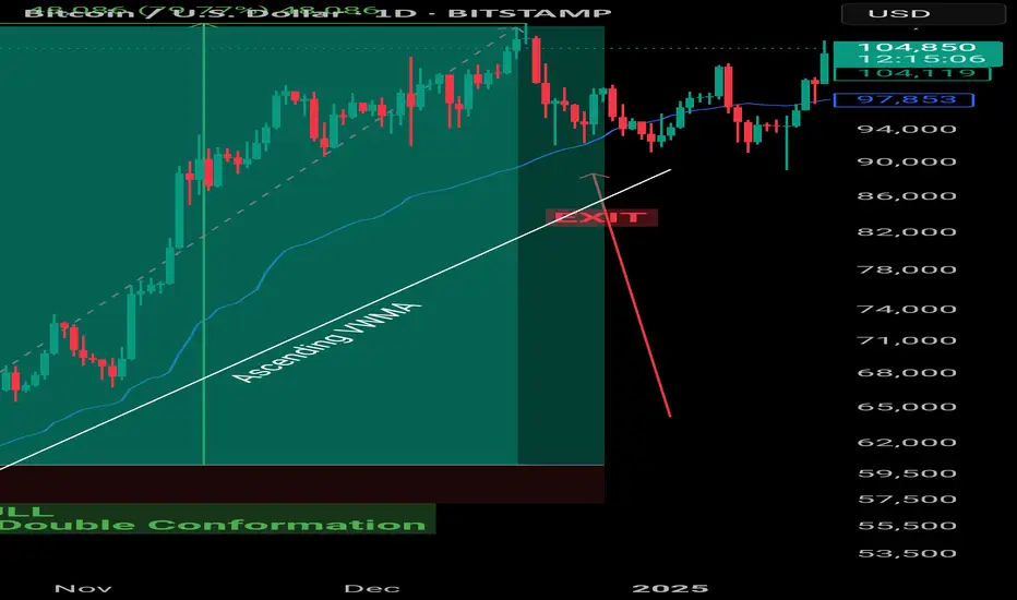
VWMA : Example Volume weighted Moving Average
🔍 VWMA in Crypto Trading
Smarter than simple MAs. Powered by volume.
What is VWMA?
🎯 VWMA = Price + Volume Combined
Unlike SMA/EMA, VWMA gives more weight to high-volume candles.
✅ Shows where the real trading pressure is.
Why Use VWMA?
💥 Volume Confirms Price
Price movement + High Volume = Stronger Signal
VWMA adjusts faster when volume spikes
📊 More reliable in volatile crypto markets.
Some VWMA Settings
📊 Optimal VWMA Periods by Timeframe
🕒 15m – VWMA 20 → For scalping
🕞 30m – VWMA 20/30 → Intraday breakouts
🕐 1h – VWMA 30/50 → Trend filter + RSI combo
🕓 4h – VWMA 50/100 → Swing trading
📅 1D – VWMA 50/100/200 → Macro trend + S/R levels
Go through different settings to see what suits you best.
VWMA in Action
📈 Price Above VWMA = Bullish Strength
More confidence in uptrend
Especially valid during high volume surges
🟢 Great confluence with MA 7/9 in short-term setups
Dynamic Support/Resistance
🛡️ VWMA Reacts to Market Strength
Acts as dynamic support or resistance—especially when volume increases.
Useful in catching pullback entries or trailing SLs.
🚦 Filter Fakeouts with VWMA + MA
✅ Use in confluence for stronger edge.
Tips for VWMA
📌 Use shorter VWMA (20–30) for entries
📌 Use longer VWMA (50–200) for trend validation
🎯 Works best in trending, high-volume conditions
An example of a new way to interpret the OBV indicator
Hello, traders.
If you "follow", you can always get new information quickly.
Have a nice day today.
-------------------------------------
I think the reason why there are difficulties in using auxiliary indicators and why they say not to use indicators is because they do not properly reflect the price flow.
Therefore, I think many people use indicators added to the price part because they reflect the price flow.
However, I think auxiliary indicators are not used that much.
Among them, indicators related to trading volume are ambiguous to use and interpret.
To compensate for this, the OBV indicator has been modified and added.
-
The ambiguous part in interpreting the OBV indicator is that the price flow is not reflected.
Therefore, even if it performs its role well as an auxiliary indicator, it can be difficult to interpret.
To compensate for this, the High Line and Low Line of the OBV auxiliary indicator have been made to be displayed in the price section.
That is, High Line = OBV High, Low Line = OBV Low
-
Then, let's interpret the OBV at the current price position.
The OBV of the auxiliary indicator is currently located near the OBV EMA.
That is, the current OBV is located within the Low Line ~ High Line section.
However, if you look at the OBV High and OBV Low indicators displayed in the price section, you can see that it has fallen below the OBV Low indicator.
In other words, you can see that the price has fallen below the Low Line of the OBV indicator.
You can see that the OBV position of the auxiliary indicator and the OBV position displayed in the price section are different.
Therefore, in order to normally interpret the OBV of the auxiliary indicator, the price must have risen above the OBV Low indicator in the price section.
If not, you should consider that the interpretation of the OBV of the auxiliary indicator may be incorrect information.
In other words, if it fails to rise above the OBV Low indicator, you should interpret it as a high possibility of eventually falling and think about a countermeasure for that.
Since time frame charts below the 1D chart show too fast volatility, it is recommended to use it on a 1D chart or larger if possible.
-
It is not good to analyze a chart with just one indicator.
Therefore, you should comprehensively evaluate by adding different indicators or indicators that you understand.
The indicators that I use are mainly StochRSI indicator, OBV indicator, and MACD indicator.
I use these indicators to create and use M-Signal indicator, StochRSI(20, 50, 80) indicator, and OBV(High, Low) indicator.
DOM(60, -60) indicator is an indicator that comprehensively evaluates DMI, OBV, and Momentum indicators to display high and low points.
And, there are HA-Low, HA-High indicators, which are my basic trading strategy indicators that I created for trading on Heikin-Ashi charts.
Among these indicators, the most important indicators are HA-Low, HA-High indicators.
The remaining indicators are auxiliary indicators that are necessary when creating trading strategies or detailed response strategies from HA-Low, HA-High indicators.
-
Thank you for reading to the end.
I hope you have a successful trade.
--------------------------------------------------

Volume Speaks Louder: My Custom Volume Indicator for Futures
My Indicator Philosophy: Think Complex, Model Simple
In my first “Modeling 101” class as an undergrad, I learned a mantra that’s stuck with me ever since: “Think complex, but model simple.” In other words, you can imagine all the complexities of a system, but your actual model doesn’t have to be a giant non-convex, nonlinear neural network or LLM—sometimes a straightforward, rule-based approach is all you need.
With that principle in mind, and given my passion for trading, I set out to invent an indicator that was both unique and useful. I knew countless indicators already existed, each reflecting its creator’s priorities—but none captured my goal: seeing what traders themselves are thinking in real time . After all, news is one driver of the market, but you can’t control or predict news. What you can observe is how traders react—especially intraday—so I wanted a simple way to gauge that reaction.
Why intraday volume ? Most retail traders (myself included) focus on shorter timeframes. When they decide to jump into a trade, they’re thinking within the boundaries of a single trading day. They rarely carry yesterday’s logic into today—everything “resets” overnight. If I wanted to see what intraday traders were thinking, I needed something that also resets daily. Price alone didn’t do it, because price continuously moves and never truly “starts over” each morning. Volume, however, does reset at the close. And volume behaves like buying/selling pressure—except that raw volume numbers are always positive, so they don’t tell you who is winning: buyers or sellers?
To turn volume into a “signed” metric, I simply use the candle’s color as a sign function. In Pine Script, that looks like:
isGreenBar = close >= open
isRedBar = close < open
if (not na(priceAtStartHour))
summedVolume += isGreenBar ? volume : -volume
This way, green candles add volume and red candles subtract volume, giving me positive values when buying pressure dominates and negative values when selling pressure dominates. By summing those signed volumes throughout the day, I get a single metric—let’s call it SummedVolume—that truly reflects intraday sentiment.
Because I focus on futures markets (which have a session close at 18:00 ET), SummedVolume needs to reset exactly at session close. In Pine, that reset is as simple as:
if (isStartOfSession())
priceAtStartHour := close
summedVolume := 0.0
Once that bar (6 PM ET) appears, everything zeroes out and a fresh count begins.
SummedVolume isn’t just descriptive—it generates actionable signals. When SummedVolume rises above a user-defined Long Threshold, that suggests intraday buying pressure is strong enough to consider a long entry. Conversely, when SummedVolume falls below a Short Threshold, that points to below-the-surface selling pressure, flagging a potential short. You can fine-tune those thresholds however you like, but the core idea remains:
• Positive SummedVolume ⇒ net buying pressure (bullish)
• Negative SummedVolume ⇒ net selling pressure (bearish)
Why do I think it works: Retail/intraday traders think in discrete days. They reset their mindset at the close. Volume naturally resets at session close, so by signing volume with candle color, I capture whether intraday participants are predominantly buying or selling—right now.
Once again: “Think complex, model simple.” My Daily Volume Delta (DVD) indicator may look deceptively simple, but five years of backtesting have proven its edge. It’s a standalone gauge of intraday sentiment, and it can easily be combined with other signals—moving averages, volatility bands, whatever you like—to amplify your strategy. So if you want a fresh lens on intraday momentum, give SummedVolume a try.

Multi-Time Frame Analysis (MTF) — Explained SimplyWant to level up your trading decisions? Mastering Multi-Time Frame Analysis helps you see the market more clearly and align your trades with the bigger picture.
Here’s how to break it down:
🔹 What is MTF Analysis?
It’s the process of analyzing a chart using different time frames to understand market direction and behavior more clearly.
👉 Example: You spot a trade setup on the 15m chart, but you confirm trend and structure using the 1H and Daily charts.
🔹 Why Use It?
✅ Avoids tunnel vision
✅ Aligns your trades with the larger trend
✅ Confirms or filters out weak setups
✅ Helps you find strong support/resistance zones across time frames
🔹 The 3-Level MTF Framework
Use this to structure your chart analysis effectively:
Higher Time Frame (HTF) → Trend Direction & Key Levels
📅 (e.g., Daily or Weekly)
Mid Time Frame (MTF) → Structure & Confirmation
🕐 (e.g., 4H or 1H)
Lower Time Frame (LTF) → Entry Timing
⏱ (e.g., 15m or 5m)
🚀 If you’re not using MTF analysis, you might be missing critical market signals. Start implementing it into your strategy and notice the clarity it brings.
💬 Drop a comment if you want to see live trade examples using this method!

What is a Bearish Breakaway and How To Spot One!This Educational Idea consists of:
- What a Bearish Breakaway Candlestick Pattern is
- How its Formed
- Added Confirmations
The example comes to us from EURGBP over the evening hours!
Since I was late to turn it into a Trade Idea, perfect opportunity for a Learning Curve!
Hope you enjoy and find value!

Is Bitcoin Crashing or Just a Psychological Trap Unfolding?Is this brutal Bitcoin drop really a trend shift—or just another psychological game?
Candles tell a story every day, but only a few traders read it right.
In this breakdown, we decode the emotional traps behind price action and show you how not to fall for them.
Hello✌
Spend 3 minutes ⏰ reading this educational material.
🎯 Analytical Insight on Bitcoin:
📈 Bitcoin is currently respecting a well-structured ascending channel, with price action aligning closely with a key Fibonacci retracement level and a major daily support zone—both acting as strong technical confluence. Given the strength of this setup, a potential short-term move of at least +10% seems likely, while the broader structure remains supportive of an extended bullish scenario toward the $116K target. 🚀
Now , let's dive into the educational section,
🧠 The Power of TradingView: Tools That Spot the Mind Games
When it comes to psychological traps in the market, a huge part of them can be spotted by just looking at the candles—with the right tools. TradingView offers several free indicators and features that, when combined wisely, can act like an early warning system against emotional decisions. Let’s walk through a few:
Volume Profile (Fixed Range)
Use the “Fixed Range Volume Profile” to see where real money is moving. If large red candles appear in low-volume zones, it often signals manipulation, not genuine sell pressure.
RSI Custom Alerts
Don’t just set RSI alerts at overbought/oversold levels. When RSI crashes but price barely moves, you’re watching fear being injected into the market—without actual sellers stepping in.
Divergence Detectors (Free Scripts)
Use public scripts to auto-detect bullish divergences. These often pop up right during panic drops and are gold mines of opportunity—if you’re calm enough to see them.
These tools are not just technical—they’re psychological weapons . Master them and you’ll read the market like a mind reader.
🔍 The Candle Lies Begin
One big red candle does not equal doom. It usually equals setup. Panic is a requirement before reversals.
💣 Collective Fear: The Whales' Favorite Weapon
When everyone on social media screams “sell,” guess who’s quietly buying? The whales. Fear is their liquidity provider.
🧩 Liquidity Zones: The Real Target
If you can’t see liquidity clusters on your chart, you're blind to half the game. Sudden crashes often aim at stop-loss and liquidation zones.
🔄 Quick Recovery = Fake Breakdown
If a strong red move is followed by a sharp V-shaped bounce within 24 hours—it was likely a trap. Quick recovery often means fake fear.
⚔️ Why Most Retail Traders Sell the Bottom
The brain reacts late. By the time retail decides it’s time to sell, the big players are already buying.
🧭 Real Decision Tools Over Emotion
Combine RSI, divergences, and volume metrics to make your decisions. Your gut is not a strategy—your tools are.
📉 Fake Candles: How to Spot Them
A candle with huge body but weak volume? Red flag. Especially on low timeframes. Always confirm with volume.
🔍 Timeframes Trick the Mind
M15 always looks scarier than H4. Zoom out. What feels like a meltdown might just be a hiccup on the daily chart.
🎯 Final Answer: Crash or Trap?
When you overlay psychology on top of price, traps become obvious. Don't trade the fear—trade the setup behind it.
🧨 Final Note: Summary & Suggestion
Most crashes are emotional plays, not structural failures. Use TradingView’s tools to decode the fear and flip it to your advantage. Add emotional analysis to your charting, and the market will start making sense.
always conduct your own research before making investment decisions. That being said, please take note of the disclaimer section at the bottom of each post for further details 📜✅.
Give me some energy !!
✨We invest countless hours researching opportunities and crafting valuable ideas. Your support means the world to us! If you have any questions, feel free to drop them in the comment box.
Cheers, Mad Whale. 🐋

Explanation of indicators indicating high points
Hello, traders.
If you "Follow", you can always get new information quickly.
Have a nice day today.
-------------------------------------
(BTCUSDT 1D chart)
If it falls below the finger point indicated by the OBV indicator, it can be interpreted that the channel consisting of the High Line ~ Low Line is likely to turn into a downward channel.
And, if it falls to the point indicated by the arrow, it is expected that the channel consisting of the High Line ~ Low Line will turn into a downward channel.
Therefore, if it is maintained above the point indicated by the finger, I think it is likely to show a movement to rise above the High Line.
In this situation, the price is located near the M-Signal indicator on the 1D chart, so its importance increases.
To say that it has turned into a short-term uptrend, the price must be maintained above the M-Signal indicator on the 1D chart.
In that sense, the 106133.74 point is an important support and resistance point.
(1W chart)
The HA-High indicator is showing signs of being created at the 99705.62 point.
The fact that the HA-High indicator has been created means that it has fallen from the high point range.
However, since the HA-High indicator receives the value of the Heikin-Ashi chart, it indicates the middle point.
In other words, the value of Heikin-Ashi's Close = (Open + High + Low + Close) / 4 is received.
Since the HA-High indicator has not been created yet, we will be able to know for sure whether it has been created next week.
In any case, it seems to be about to be created, and if it maintains the downward candle, the HA-High indicator will eventually be created anew.
Therefore, I think it is important to be able to maintain the price by rising above the right Fibonacci ratio 2 (106178.85).
Indicators that indicate high points include DOM (60), StochRSI 80, OBV High, and HA-High indicators.
Indicators that indicate these high points are likely to eventually play the role of resistance points.
Therefore,
1st high point range: 104463.99-104984.57
2nd high point range: 99705.62-100732.01
You should consider a response plan depending on whether there is support near the 1st and 2nd above.
The basic trading strategy is to buy at the HA-Low indicator and sell at the HA-High indicator.
However, if it is supported and rises in the HA-High indicator, it is likely to show a stepwise rise, and if it is resisted and falls in the HA-Low indicator, it is likely to show a stepwise decline.
Therefore, the basic trading method should utilize the split trading method.
Other indicators besides the HA-Low and HA-High indicators are auxiliary indicators.
Therefore, the trading strategy in the big picture should be created around the HA-Low and HA-High indicators, and the detailed response strategy can be carried out by referring to other indicators according to the price movement.
In that sense, if we interpret the current chart, it should be interpreted that it is likely to show a stepwise rise since it has risen above the HA-High indicator.
However, you can choose whether to respond depending on whether there is support from other indicators that indicate the high point.
On the other hand, indicators that indicate the low point include the DOM (-60), StochRSI 20, OBV Low, and HA-Low indicators.
These indicators pointing to lows are likely to eventually serve as support points.
I will explain this again when the point pointing to the lows has fallen.
-
Thank you for reading to the end.
I hope you have a successful trade.
--------------------------------------------------
- Here is an explanation of the big picture.
(3-year bull market, 1-year bear market pattern)
I will explain the details again when the bear market starts.
------------------------------------------------------

HOW TO: The right way to use the MACDMany people mistakenly use the MACD histogram to enter trades without taking price action into context. In this video I'm going to show you how to interoperate the MACD Histogram, what it means and when its warning you.

Correlation between USDT.D and BTC.D
Hello, traders.
If you "Follow", you can always get new information quickly.
Have a nice day today.
-------------------------------------
(USDT.D 1M chart)
If USDT dominance is maintained below 4.97 or continues to decline, the coin market is likely to be on the rise.
The maximum decline is expected to be around 2.84-3.42.
-
(BTC.D 1M chart)
However, in order for the altcoin bull market to begin, BTC dominance is expected to fall below 55.01 and remain there or show a downward trend.
Therefore, we need to see if it falls below the 55.01-62.47 range.
The maximum rise range is expected to be around 73.63-77.07.
-
In summary of the above, since funds are currently concentrated in BTC, it is likely that BTC will show an upward trend, and altcoins are likely to show a sideways or downward trend as they fail to follow the rise of BTC.
The major bear market in the coin market is expected to begin in 2026.
For the basis, please refer to the explanation of the big picture below.
-
Thank you for reading to the end.
I hope you have a successful transaction.
--------------------------------------------------
- This is an explanation of the big picture.
(3-year bull market, 1-year bear market pattern)
I will explain more details when the bear market starts.
------------------------------------------------------

HA-RSI + Stochastic Ribbon: The Hidden Gem for Trend & MomentumNavigating volatile markets requires more than just raw price action. The Heikin Ashi RSI Oscillator blends the power of smoothed candlesticks with momentum insights to give traders a clearer picture of trend strength and reversals.
At Xuantify , we use the Heikin Ashi RSI Oscillator as a hybrid momentum and trend tool. While the indicator calculations are based on Heikin Ashi values to smooth out noise and better capture trend dynamics, the chart itself displays standard candlesticks (real price data) . This ensures that all signals are aligned with actual market structure, making it easier to execute trades with confidence and clarity.
This dual-layer approach gives us the best of both worlds: clarity from smoothing and precision from real price action. MEXC:SOLUSDT.P
🧠 How We Use It at Xuantify
At Xuantify , we integrate the Heikin Ashi RSI Oscillator into our multi-layered strategy framework. It acts as a trend confirmation filter and a momentum divergence detector , helping us avoid false breakouts and time entries with greater precision. We pair it with volume and volatility metrics to validate signals and reduce noise. Note the Stochastic Ribbon Overlay as shown in the chart, very accurate for momentum.
⭐ Key Features
Heikin Ashi Smoothing : Filters out market noise for clearer trend visualization.
RSI-Based Oscillation : Measures momentum shifts with precision.
Color-Coded Bars : Instantly identify bullish/bearish momentum.
Dynamic Signal Zones : Customizable overbought/oversold thresholds.
Stochastic Ribbon Overlay : A powerful multi-line stochastic system that enhances momentum analysis and trend continuation signals.
💡 Benefits Compared to Other Indicators
Less Whipsaw : Heikin Ashi smoothing reduces false signals common in traditional RSI.
Dual Insight : Combines trend and momentum in one visual.
Better Divergence Detection : Easier to spot hidden and regular divergences.
Visual Simplicity : Clean, intuitive design for faster decision-making.
⚙️ Settings That Matter
RSI Length : Default is 14, but we often test 10 or 21 for different timeframes.
Smoothing Type : EMA vs. SMA – EMA reacts faster, SMA is smoother.
Overbought/Oversold Levels : 70/30 is standard, but 80/20 can reduce noise in trending markets.
📊 Enhancing Signal Accuracy
Combine with Volume Oscillators to confirm momentum strength.
Use Price Action Zones to validate oscillator signals.
Look for Divergences between price and oscillator for early reversal clues.
🧩 Best Combinations with This Indicator
MACD : For cross-confirmation of momentum shifts.
Bollinger Bands : To identify volatility squeezes and breakouts.
Support/Resistance Levels : For contextual trade entries and exits.
⚠️ What to Watch Out For
Lag in Strong Trends : Like all smoothed indicators, it may react slightly late.
Over-Optimization : Avoid curve-fitting settings to past data.
Standalone Use : Best used in conjunction with other tools, not in isolation.
🚀 Final Thoughts
The Heikin Ashi RSI Oscillator is a powerful hybrid tool that simplifies complex market behavior into actionable insights. At Xuantify, it’s a core part of our strategy toolkit, helping us stay ahead of the curve with clarity and confidence.
🔔 Follow us for more educational insights and strategy breakdowns!
We regularly share deep dives into indicators, trading psychology, and backtested strategies. Stay tuned and level up your trading game with us!

SMI vs. Stochastic: Which One Gives You the Edge?Momentum indicators are essential tools in every trader’s arsenal—but not all are created equal. While the Stochastic Oscillator has been a go-to for decades, the Stochastic Momentum Index (SMI) offers a more refined and reliable way to read market momentum.
In this post, we’ll break down the key differences between these two indicators, how we use them at Xuantify , and why the SMI might just give you the edge you’ve been looking for.
🧠 How We Use It at Xuantify
We’re always looking for tools that offer greater precision and less noise . While the Stochastic Oscillator is one of the most commonly used tools for spotting overbought and oversold conditions, the Stochastic Momentum Index (SMI) gives us a clearer, smoother view of momentum —especially in volatile or choppy markets.
We use the SMI to refine our entries and exits , particularly when trading breakouts or reversals. MEXC:ETHUSDT.P
⭐ Key Features
Stochastic Oscillator : Measures the closing price relative to the high-low range. Simple and responsive. Great for spotting short-term reversals.
Stochastic Momentum Index (SMI) : Measures the distance of the current close from the midpoint of the high-low range. Smoother and more centered around zero. Better at filtering out false signals.
💡 Benefits Compared to Other Indicators
Stochastic Oscillator vs. SMI:
Signal Smoothness: Moderate vs. High
Noise Filtering: Low vs. Excellent
Centered Oscillation: No vs. Yes (around 0)
Best Use Case: Range-bound markets vs. Trend shifts & momentum confirmation
False Signal Risk: Higher vs. Lower
The SMI is especially useful when you want to avoid whipsaws and get a more reliable read on momentum .
⚙️ Settings That Matter
Stochastic Oscillator : %K = 14, %D = 3
SMI : Length = 14, Signal Smoothing = 3, Double Smoothing = 3
You can adjust the SMI smoothing values to match the volatility of the asset— lower smoothing for fast markets , higher for slower ones.
📊 Enhancing Signal Accuracy
Enhance SMI signals by combining them with:
Trend filters like EMAs or Supertrend
Volume confirmation
Support/resistance zones
Divergence spotting for early trend reversals
This layered approach helps us avoid false positives and stay aligned with the broader trend .
🧩 Best Combinations with This Indicator
SMI + EMA Crossovers: Confirm momentum with trend direction
SMI + RSI Divergence: Spot early reversals with confluence
SMI + Volume Profile: Validate momentum near key price levels
⚠️ What to Watch Out For
Lag in fast markets: SMI’s smoothing can delay signals slightly
Over-optimization: Avoid excessive tweaking of parameters
Not ideal alone: Best used with confluence tools for confirmation
🚀 Final Thoughts
The Stochastic Oscillator is a classic for a reason—but the Stochastic Momentum Index is a refined evolution . We’ve found that SMI gives us cleaner signals , better momentum clarity , and fewer false alarms —especially when paired with smart filters.
If you're looking to upgrade your momentum toolkit , the SMI might just be your edge.
🔔 Follow us for more educational insights and strategy breakdowns!
We break down indicators, strategies, and market psychology to help you trade smarter—not harder.

Strategy & Education: Trading with Fibonacci and Order Blocks🔍 Trading Strategy Based on Fibonacci Levels and Order Blocks
This chart showcases three consecutive sell trades I executed on the BTCUSDT pair, each resulting in a profitable outcome. The purpose of this explanation is to demonstrate how Fibonacci retracement levels can be combined with Order Block zones to identify high-probability trade setups.
🧩 The Foundation: Understanding Price Retracement Behavior
The ABC, abc, and (a)(b)(c) structures marked on the chart are not Elliott Waves. Instead, these labels are used to represent simple retracement movements in the market. The focus here is not wave theory, but recognizing how price reacts and pulls back after a move, and how we can benefit from these reactions.
📌 Trade 1: Primary Fibo-OB Confluence
I drew a Fibonacci retracement from the A wave to the B wave.
The price then retraced to the C area, landing between the 0.618 and 0.786 Fibonacci levels, where an Order Block (OB) was also present.
This overlap created a strong technical and structural resistance zone.
I entered the first sell trade from this confluence.
📌 Trade 2: Internal Retracement and OB Alignment
Inside the first corrective move, a smaller abc pattern formed.
I applied Fibonacci again from small a to small b.
The c leg reached the same key Fibonacci zone (0.618–0.786) and overlapped with a second OB.
This confluence offered a second sell entry.
📌 Trade 3: Micro Structure – Same Logic Reapplied
I repeated the exact same logic one more time on a micro (a)(b)(c) structure.
Fibonacci from (a) to (b), price touched 0.618–0.786, coinciding again with an OB.
This became the third and final sell position.
🧠 The Logic Behind the Strategy:
Price doesn’t move in straight lines—it flows in waves. During pullbacks, if Fibonacci levels align with Order Block zones, the market tends to react strongly. My focus here was to identify these areas of confluence in advance and enter trades at high-probability turning points.

Using The Zig-Zag Indicator To Gain Clarity On Your Price ChartIn my experience, learning how to read a price chart, specifically understanding the ebbs and flows of a trend, is the biggest hurdle that newer traders face. At least on the technical side of things.
Something that helped me shorten that learning curve at the beginning of my trading career was the "Zig-Zag" indicator. Now, I didn't use it as part of a strategy or anything like that. Rather, it was a tool that helped train my eyes to read extensions and retracements in the markets both at a beginner and advanced level.
If you're someone that is struggling, hopefully it can do the same for you.
Please remember to support by hitting that like button and if you thought this video was helpful please share so other traders can benefit as well.
Akil

Taming the Trend: Mastering the Williams Alligator IndicatorEver wondered how to spot when the market is sleeping or ready to roar? At Xuantify , we use the Williams Alligator Indicator to decode market behavior with precision. Whether you're trading crypto, forex, stocks, or indices — this tool adapts across all markets. Let's take a closer look using BINANCE:BTCUSDT
🧠 How We Use It at Xuantify
We treat the Alligator as a trend confirmation and timing tool . We don’t just look for crossovers — we analyze the distance , angle , and alignment of the lines to gauge market momentum and trend maturity. It’s especially powerful when combined with volume and volatility filters.
⭐ Key Features
Three Smoothed Moving Averages
Jaw (Blue) : 13-period, shifted 8 bars forward
Teeth (Red) : 8-period, shifted 5 bars forward
Lips (Green) : 5-period, shifted 3 bars forward
Visual Trend Clarity :
The spacing and direction of the lines reveal trend strength and direction
Built-in Delay :
Forward shifting helps anticipate rather than react
💡 Benefits Compared to Other Indicators
Trend Clarity
Alligator : Strong — bold trend visualization
Moving Averages : Moderate — can lag or overlap
MACD : Good — clear histogram and signal line
Noise Filtering
Alligator : Excellent — smooths out market noise
Moving Averages : Low — sensitive to short-term fluctuations
MACD : Good — filters minor moves
Early Signals
Alligator : Moderate — waits for confirmation
Moving Averages : Fast — quick crossovers
MACD : Fast — early divergence signals
Visual Simplicity
Alligator : Clear — easy to interpret trend phases
Moving Averages : Cluttered — multiple lines can overlap
MACD : Complex — requires interpretation of histogram + lines
⚙️ Settings That Matter
For shorter timeframes : Reduce periods (e.g., 8-5-3) for faster signals
For longer timeframes : Stick with defaults or increase smoothing for clarity
Shift values : Keep them forward-shifted to maintain predictive edge
📊 Enhancing Signal Accuracy
Wait for clear separation between the lines
Confirm with volume spikes or breakouts
Use price action (e.g., higher highs/lows) as confirmation
🧩 Best Combinations with This Indicator
Fractals : For entry/exit signals
ATR : For dynamic stop-loss placement
RSI or Stochastic : To avoid overbought/oversold traps
Volume Profile : To validate breakout zones
⚠️ What to Watch Out For
Flat Alligator = No Trade Zone : Avoid trading when lines are tangled
Lag in Fast Markets : In high-volatility assets, the Alligator may react late
Over-reliance : Always combine with other tools for confirmation
🚀 Final Thoughts
The Williams Alligator isn’t just an indicator — it’s a market behavior model . At Xuantify, we use it to stay aligned with the market’s rhythm, avoid chop, and ride trends with confidence.
🔔 Follow us for more educational insights and strategy breakdowns!

Most Traders Want Certainty. The Best Ones Want Probability.Hard truth:
You’re trying to trade like an engineer in a casino.
You want certainty in an environment that only rewards probabilistic thinking.
Here’s how that kills your edge:
You wait for “confirmation” — and enter too late.
By the time it feels safe, the market has moved.
You fear losses — but they’re the cost of data.
Good traders don’t fear being wrong. They fear not knowing why.
You need to think in bets, not absolutes.
Outcomes don’t equal decisions. Losing on a great setup is still a good trade.
🎯 Fix it with better framing.
That’s exactly what we designed TrendGo f or — to help you see trend strength and structure without delusions of certainty.
Not perfect calls. Just cleaner probabilities.
🔍 Train your brain for the game you’re playing — or you’ll keep losing by default.

Using Previous Day’s High and Low to Decide Intraday TrendIntroduction and Disclaimer
This article explains how to use the daily chart to understand and plan for short-term or intraday market direction.
To fully understand this, you should already know what directional bias means. If you’re not familiar with it, I highly recommend reading my previous article on the topic before continuing here.
Disclaimer
I'm not a financial advisor.
This article does not offer financial, investment, legal, or any kind of regulated advice.
It's made for educational and entertainment purposes only.
Trading involves risk. You can lose all your money—or even more—if you’re not careful.
You're reading the thoughts of a 22-year-old.
The goal of this article is to show you how to use the previous day’s high and low on a daily chart to:
Get a clear intraday bias (bullish or bearish).
Find entry signals for your trades.
Set clear invalidation points, meaning when a trade idea becomes invalid.
This is part of what’s called multi-timeframe analysis—looking at higher time frames to understand what might happen on lower ones.
Even if you trade short-term (like on 5 or 15-minute charts), it's still helpful to know what the bigger picture (like the daily chart) looks like. Why? Because it shows the main trend, important levels, and key zones that may not appear on lower time frames.
In my opinion, smart trading involves breaking down the price chart from top to bottom—starting with the big picture—then making decisions based on your trading strategy.
The ideas in this article work well for:
Intraday traders who want to capture moves during the day, and
Swing traders who want to catch bigger moves by entering early.
This concept can also be applied to higher time frames, such as the previous week’s high and low.

How to Secure Prop Firm Funding: Proven Strategies to Pass1️⃣ How to Secure Prop Firm Funding: Proven Strategies to Pass Challenges 📈
Introduction ✨
Securing prop firm funding opens the door to trading substantial capital and achieving financial freedom. However, passing these evaluations requires meticulous strategy, disciplined execution, and smart risk management. This article provides actionable strategies, optimized trading setups, and insights on leveraging AI to ensure you successfully navigate and pass your prop firm challenges.
Understanding Prop Firm Evaluations 📊🔍
Prop firm challenges typically include specific trading objectives:
💰 Profit targets (8–10% within 30 days)
⛔ Daily loss limits (usually 5%)
📉 Maximum drawdown limits (typically 10%)
💡 Tip: Print the rules and display them at your workspace to avoid rule breaches.
Focus on One High-Probability Strategy 📌🎯
Consistently profitable traders use one rigorously tested strategy. For example, a popular setup:
🔄 Liquidity Sweep: Wait for price to clear stops above recent highs or lows.
⚡ Market Structure Break (BOS): Enter after price breaks and confirms a new trend.
📥 Entry: Order block (OB) or Fair Value Gap (FVG).
Example Trade:
🔗 Pair: EUR/USD
🔽 Entry: OB after sweep at 1.0800
🛑 Stop Loss (SL): 1.0820
🎯 Take Profit (TP): 1.0740
📊 Risk-to-Reward Ratio (RRR): 3:1
Start Small, Think Big 🧠🌱
Initially, risk only 0.5% per trade to maintain psychological comfort and buffer against drawdowns. Increase risk gradually once you have a profit cushion.
Leverage AI Insights 🤖📊
Modern traders enhance decision-making using AI-driven tools:
🟢 AI indicators for real-time liquidity detection
🔵 Predictive analytics for entry confirmations
Efficient Risk Management 🛡️⚖️
Set daily and weekly risk limits. For instance:
⏳ Maximum daily risk: 1%
📅 Weekly drawdown cap: 3%
Practical Example:
💵 If trading a $100,000 account, never risk more than $1,000 in a single day.
Journaling for Improvement 📒📝
Record every trade’s rationale, execution details, and outcome. This fosters accountability and improvement.
Conclusion ✅
Securing prop funding isn't about luck but disciplined, strategic execution. Optimize your trading, leverage technology, and strictly manage risk to ensure long-term success. 🏆

Strategies to Save Capital and Thrive in Bear MarketsEver felt stuck in a downtrend, unsure how to protect your capital?
Most traders burn their portfolios in bear markets just because they lack a real escape plan.
In this analysis, you'll uncover little-known strategies that could literally rescue your investments.
Hello✌
Spend 3 minutes ⏰ reading this educational material.
🎯 Analytical Insight on Dogecoin:
If Dogecoin fails to gain at least 20% in the next two weeks—while Bitcoin continues to rally—this divergence could signal a broader market weakness. When BTC outperforms and altcoins lag, it often reflects declining risk appetite and potential capital rotation out of speculative assets. A move toward the $0.27 target is key for confirming bullish continuation across the altcoin sector. 📉
Now , let's dive into the educational section,
🔧 TradingView Tools to Hunt Opportunities in Bear Markets
In bearish conditions, most traders only stare at price movements. But smart ones go deeper. With the right TradingView tools, you don’t just survive a bear market—you exploit it. Here are some must-use tools that can change your game:
Volume Profile: This helps highlight where trading activity is concentrated. These zones often act as hidden support in bearish phases.
Fixed Range Volume Profile: Use this to scan specific chart segments to understand volume-based zones of control. Perfect for pinpointing possible rebounds.
Auto Fib Retracement: TradingView’s automated Fibonacci retracement tool helps identify pullback levels. A critical asset when timing entries during downtrends.
Divergence Detector: Combine RSI or MACD to catch bullish divergences—these subtle signs often come before a trend reversal.
Multi-Timeframe S/R Indicator: This reveals support and resistance levels across different timeframes. Knowing where multiple levels align helps predict strong reactions.
For practical use, open a BTC or ETH chart, apply these tools, and look for volume clusters, divergences, and Fibonacci confluences. The more layers you add, the stronger your edge becomes. TradingView isn’t just a charting platform—it’s your bear market radar .
📉 Understanding Bear Market Psychology
Bear markets are all about fear and exhaustion. But that doesn’t mean opportunity is gone. If you learn to read the crowd’s psychology, you’ll see it’s just a phase—one you can use to your advantage.
🛡️ Capital Protection Comes First
Rule one in bear phases: protect, not profit. Logical stop-losses, reducing position sizes, using stablecoins, and cutting emotional trades are your survival kit.
🧲 Catching Opportunities in Pullbacks
Even bearish trends have bounces. These are golden moments to take short-term trades or exit from poor positions. The 4H chart with Fib retracement is your best friend here.
🔄 Range Trading = Consistent Gains
Sideways movement = scalping zone. Once price enters a range, clearly marked support/resistance levels from your indicators give sniper-level entries and exits.
🔮 Reverse Market Sentiment Like a Pro
In bear markets, everyone’s scared. Which means smart money starts buying. Flip your emotional lens. Fear on the street = quiet opportunity for the patient.
📊 Indicator Fusion for Early Signals
RSI + MACD + Volume = market whisperers. If RSI bottoms while volume spikes, you’re probably seeing the quiet before a bullish storm. Most won’t notice. You will.
🧬 Learn From the Past Market Cycles
History repeats. Mark previous bear market lows on your chart. Compare price action. Similar structure = similar outcome. Patterns from BTC 2018 or COVID crash are still valid today.
🧠 Your Mindset Is Your Strongest Tool
More than any tool or strategy, it’s your mental control that saves capital. If you can master your thoughts, you can master your trades. Bear markets punish the weak-minded—not just the unskilled.
🧭 Final Thoughts:
If you take away just one insight, let it be this: in bear markets, survival is the goal, and hidden opportunities are born from fear. No trend lasts forever. But the prepared trader lasts through every trend.
always conduct your own research before making investment decisions. That being said, please take note of the disclaimer section at the bottom of each post for further details 📜✅.
Give me some energy !!
✨We invest countless hours researching opportunities and crafting valuable ideas. Your support means the world to us! If you have any questions, feel free to drop them in the comment box.
Cheers, Mad Whale. 🐋

Price Patterns Every Trader Should KnowLearn how to trade using price patterns! In this video, we cover continuation, reversal, and bi-directional patterns, including flags, wedges, triangles, and more. You'll see schematics, real chart examples, and learn how to combine them with confluence for better setups.
#PriceAction #ChartPatterns #TechnicalAnalysis #TradingStrategy #ForexTrading #CryptoTrading

Retro Editors' picks 2020As we move forward through time, we occasionally must look backward to evaluate our progress and address our shortcomings.
For years, PineCoders has voluntarily analyzed numerous published scripts, selecting the most exceptional among them as Editors' picks . To enhance our process and spotlight more high-quality work from our community, we've conducted a comprehensive review of script publications from the past five years. Through this effort, we've identified several additional scripts that deserve greater recognition than they initially received.
Below is a collection of additional scripts from 2020 that have earned a spot in our Editors' picks. These retrospective selections reflect our continued commitment to honoring outstanding contributions in our community, regardless of when they were published. To the authors of these highlighted scripts: our sincere thanks, on behalf of all TradingViewers. Congrats!
Support Resistance Channels - LonesomeTheBlue
BERLIN Candles - lejmer
Delta Volume Columns Pro - LucF
Range Filter - DonovanWall
Over the next four months, in the last week of each month, we will share retro Editors' picks for subsequent years:
June: retro EPs for 2021
July: retro EPs for 2022
August: retro EPs for 2023
September: retro EPs for 2024
They will be visible in the Editors' picks feed .
█ What are Editors' picks ?
The Editors' picks showcase the best open-source script publications selected by our PineCoders team. Many of these scripts are original and only available on TradingView. These picks are not recommendations to buy or sell anything or use a specific indicator. We aim to highlight the most interesting publications to encourage learning and sharing in our community.
Any open-source script publication in the Community Scripts can be picked if it is original, provides good potential value to traders, includes a helpful description, and complies with the House Rules.
— The PineCoders team

A Brief Overview of Price Patterns in TradingPrice patterns are technical analysis tools that help identify price behavior on charts to predict future trends.
Common patterns include continuation and reversal formations. Continuation patterns such as flags, triangles, and rectangles often appear during strong trends and indicate the likelihood of the trend continuing after a period of consolidation. Reversal patterns like head and shoulders, double tops and bottoms, and wedges signal potential changes in trend direction. Recognizing these patterns allows traders to optimize entry points, stop-loss levels, and take-profit targets. The clearer the pattern and the higher the timeframe it appears on, the more reliable it tends to be. However, no pattern guarantees success, so it's important to combine them with other factors like volume, support and resistance zones, and confirmation signals before making trading decisions. Each pattern has its own identifying characteristics such as shape, length, and breakout zones, so consistent observation and practice are essential. Price patterns not only assist in technical analysis but also reflect market psychology and crowd behavior. For best results, traders should combine pattern recognition with risk management and patiently wait for clear signals instead of reacting emotionally. A deep understanding of price patterns can increase the probability of success and reduce risk in the trading process.
Wishing you effective trading and strong discipline!

Whales Wrote the Rules stop your imagination and Lose more Is it true that whales control the charts, or is it just another trading myth?
Why does everything look perfect—until the exact opposite happens?
This analysis reveals how smart money traps retail traders in plain sight.
Hello✌
Spend 3 minutes ⏰ reading this educational material.
🎯 Analytical Insight on XRP:
XRP is showing classic signs of compression, resembling a tightly wound spring ready to release. Momentum is building, and a breakout appears imminent based on current price structure and volume behavior 📈. While my long-term outlook remains significantly bullish, this setup suggests a conservative upside of at least 18%, with a key target in focus at $2.70 🚀.
Now , let's dive into the educational section,
📊 TradingView Tools to Track Whale Behavior
One of the most powerful truths in trading is this:
Smart money always leaves a trace—you just need to know where and how to look. TradingView provides some powerful tools to help you identify those footprints.
Volume Profile (Fixed Range / Session Volume): Use this tool to spot where the most volume was traded in specific ranges. These high-volume areas often signal zones where whales have entered or exited positions.
Smart Money Concepts / Order Blocks : Now natively available in TradingView for Pro+ and Premium plans, these highlight potential manipulation zones, institutional footprints, and key support/resistance levels.
Liquidity Zones: Use custom indicators like Liquidity Pools Detector or combine ATR with price structure to visualize high-risk/high-reward zones—whales love ambushing retail here.
Practical Tip:
Open the Bitcoin chart. Apply the Volume Profile Fixed Range tool across a two-week range. Look for areas with the highest volume concentration—these are likely whale action zones. Now overlay the Order Block indicator. You’ll often find those zones overlap.
🧠 Understanding Whale Behavior
Whales typically act when the crowd is at extreme fear or greed.
They move against the market’s emotional wave—and to do that, they need to mislead the herd. They create setups that look obvious but are designed to trap.
🐟 How Retail Traders Get Hunted
Here’s the classic trap:
The market makes a fake drop → panic selling → retail goes short.
Then whales step in, absorb liquidity, push price up → retail goes long too late.
Finally, whales dump at the top, and price collapses again.
🔄 Whale Playbook: The Four Phases
Silent Accumulation
Fake Breakout Pump
Distribution During Peak Greed
Dump + Liquidity Grab
You’ll find this playbook hidden in plain sight—if you stop chasing noise and start tracking volume, liquidity, and sentiment.
⚠️ Why Retail Always Ends Up on the Wrong Side
Because they’re looking for confirmation, not truth.
Whales exploit this—chart patterns, indicators, and fake breakouts are all part of the trap.
You need more than candles—you need context.
🔍 Chart Patterns or Psychological Traps?
Patterns like Head & Shoulders, Wyckoff Phases, or Triangles?
Whales know you’re watching them. They use these patterns as bait.
Unless combined with volume confirmation and liquidity context, most patterns are psychological illusions.
🧭 How to Follow the Smart Money
Study candle behavior with volume (Volume Spread Analysis)
Drop to lower timeframes to confirm liquidity zones
Use Anchored VWAP from major pivot highs/lows
Watch for divergence between price and volume—especially at highs/lows
💡 Conclusion:
There’s no holy grail in trading—but if you start thinking like a whale instead of chasing them, you’ll stop being the bait.
Use TradingView’s institutional-level tools to decode real market intentions.
Next time you spot a "perfect breakout," ask: who's on the other side of this trade—and why?
always conduct your own research before making investment decisions. That being said, please take note of the disclaimer section at the bottom of each post for further details 📜✅.
Give me some energy !!
✨We invest countless hours researching opportunities and crafting valuable ideas. Your support means the world to us! If you have any questions, feel free to drop them in the comment box.
Cheers, Mad Whale. 🐋
