DCA Buy Alert Script for Long-Term InvestorsHello, TradingView traders!
I'm sharing a simple Pine Script for cautious DCA (Dollar-Cost Averaging) entries.
This script helps accumulate only on weakness — no buying blindly. (Use only on high volatility altcoins!)
🔍 Strategy logic:
• RSI < 40 → market is oversold
• Price below EMA 21 → short-term trend is down
• Price below SMA 200 → long-term trend is weak
Only when ALL three conditions are met, the script triggers a BUY alert.
✅ How to use:
1. Add the script to your chart
2. Create an alert: choose “Cautious DCA Buy Signal”
3. You’ll get notified when the market dips into a DCA zone
//@version=6
indicator("Cautious DCA on Dips", overlay=true)
rsi = ta.rsi(close, 14)
sma = ta.sma(close, 200)
ema = ta.ema(close, 21)
buySignal = rsi < 40 and close < sma and close < ema
plotshape(buySignal, title="Buy Signal", location=location.belowbar, style=shape.labelup, size=size.normal, color=color.green, text="Buy", textcolor=color.white)
plot(sma, title="SMA 200", color=color.orange)
plot(ema, title="EMA 21", color=color.blue)
alertcondition(buySignal, title="Buy Alert", message="DCA Buy Signal: RSI is low and price is below EMA and SMA")
🔔 This script reduces noise and waits patiently for real dips.
Useful for long-term investors who want to buy with discipline.
Let me know how it works for your strategy!
#DCA #LongTerm
X-indicator

Using Fibonacci/Measured Moves To Understand Price TargetThis video is really an answer to a question from a subscriber.
Can the SPY/QQQ move downward to touch COVID levels (pre-COVID High or COVID Low).
The answer is YES, it could move down far enough to touch the pre-COVID highs or COVID lows, but that would represent a very big BREAKDOWN of Fibonacci/ElliotWave price structure.
In other words, a breakdown of that magnitude would mean the markets have moved into a decidedly BEARISH trend and have broken the opportunity to potentially move substantially higher in 2025-2026 and beyond (at least for a while).
Price structure if very important to understand.
Measured moves happen all the time. They are part of Fibonacci Price Theory, Elliot Wave, and many of my proprietary price patterns.
Think of Measured Moves like waves on a beach. There are bigger waves, middle waves, smaller waves, and minute waves. They are all waves. But their size, magnitude, strength vary.
That is kind of what we are trying to measure using Fibonacci and Measured Move structures.
Watch this video. Tell me if you can see how these Measured Moves work and how to apply Fibonacci structure to them.
This is really the BASICS of price structure.
Get Some.
#trading #research #investing #tradingalgos #tradingsignals #cycles #fibonacci #elliotwave #modelingsystems #stocks #bitcoin #btcusd #cryptos #spy #gold #nq #investing #trading #spytrading #spymarket #tradingmarket #stockmarket #silver

The Power of Technical Indicators: ETH 4H Chart Breakdown📈 In this analysis, I demonstrate how a combination of key technical indicators can provide high-probability trade setups. By using Auto Fibonacci Gauge, Quantum Moving Average, Momentum Charge Theory, and Smart Money Concept, we can decode market movements with precision.
🔹 Auto Fibonacci Gauge: The Perfect Retracement
The Auto Fib Gauge shows a textbook retracement, respecting key levels like 23.6% & 61.8%.
These levels act as potential reversal zones where price reacts based on trader sentiment.
🔹 Quantum Moving Average & Momentum Charge Theory: Trend Confirmation
The Quantum Moving Average aligns perfectly with the momentum shift, confirming trend direction.
The Momentum Charge Theory further validates entry & exit signals, showing confluence with the Fib levels.
🔹 Smart Money Concept: Tracking Institutional Moves
The SMC method helps identify where large institutional orders (aka smart money) are likely placed.
Key structure points like BOS (Break of Structure) & CHoCH (Change of Character) signal potential trend shifts.
📊 Why is this important?
Combining these indicators enhances probability of successful trades.
Understanding retracements, momentum, and institutional order flows helps traders avoid weak setups and trade with confidence.
🚀 What’s your take? Do you use similar confluences in your trading? Let me know in the comments!

FXAN & Heikin Ashi TradeOANDA:AUDCHF
In this video, I’ll be sharing my analysis of AUDCHF, using FXAN's proprietary algo indicators with my unique Heikin Ashi strategy. I’ll walk you through the reasoning behind my trade setup and highlight key areas where I’m anticipating potential opportunities.
I’m always happy to receive any feedback.
Like, share and comment! ❤️
Thank you for watching my videos! 🙏

Book keepingWhat is Bookkeeping?
Bookkeeping is simply keeping track of all the money coming in and going out. Businesses use it to record their income, expenses, and profits, but traders can use it too. In trading, bookkeeping means recording every trade you take—wins, losses, fees, and even your emotions during the trade.
How to Apply Bookkeeping in Trading
Record Every Trade: Write down details like:
1. The currency pair you traded.
2. Entry and exit prices.
3. Stop loss and take profit.
4. Win or loss amount.
The reason for taking the trade.
Track Your Emotions: Were you confident, scared, or overexcited? Noting this down helps you spot patterns in your mindset.
Review Weekly and Monthly: At the end of the week/month, check your stats:
What’s your win rate?
Which setups work best for you?
Are you making more than you’re losing?
How This Improves Trading
Identifies Strengths & Weaknesses: You’ll see what works and what doesn’t.
Stops Emotional Trading: Tracking emotions helps you avoid revenge trading.
Helps Adjust Risk Management: If losses are too big, you’ll see it early and adjust.
Increases Consistency: The more data you have, the easier it is to refine your strategy.
A simple trading journal (even in a notebook or spreadsheet) can make a big difference over time.
As for me I do all my book keeping in notion

Trump's Tariff Wars : What To Expect And How To Trade Them.I promised all of you I would create a Trump's Tariff Wars video and try to relate that is happening through the global economy into a rational explanation of HOW and WHY you need to be keenly away of the opportunities presented by the new Trump administration.
Like Trump or not. I don't care.
He is going to try to enact policies and efforts to move in a direction to support the US consumer, worker, business, and economy.
He made that very clear while campaigning and while running for office (again).
This video looks at the "free and fair" global tariffs imposed on US manufacturers and exports by global nations over the past 3+ decades.
For more than 30+ years, global nations have imposed extreme tariffs on US goods/exports in order to try to protect and grow their economies. The purpose of these tariffs on US good was to protect THEIR workers/population, to protect THEIR business/economy, to protect THEIR manufacturing/products.
Yes, the tariffs they imposed on US goods was directly responsible for THEIR economic growth over the past 30-50+ years and helped them build new manufacturing, distribution, consumer engagement, banking, wealth, and more.
The entire purpose of their tariffs on US goods was to create an unfair advantage for their population to BUILD, MANUFACTURE, and BUY locally made products - avoiding US products as much as possible.
As I suggested, that is why Apple, and many other US manufacturers moved to Asia and overseas. They could not compete in the US with China charging 67% tariffs on US goods. So they had to move to China to manufacture products because importing Chinese-made products into the US was cheaper than importing US-made products into China.
Get it?
The current foreign Tariffs create an incredibly unfair global marketplace/economy - and that has to STOP (or at least be re-negotiated so it is more fair for everyone).
And I believe THAT is why Trump is raising tariffs on foreign nations.
Ultimately, this will likely be resolved as I suggest in this video (unless many foreign nations continue to raise tariff levels trying to combat US tariffs).
If other foreign nation simply say, "I won't stand for this, I'm raising my tariff levels to combat the new US tariffs", then we end up where we started - a grossly unfair global marketplace.
This is the 21st century, not the 18th century.
Step up to the table and realize we are not in the 1850s or 1950s any longer.
We are in 2025. Many global economies are competing at levels nearly equal to the US economy in terms of population, GDP, manufacturing, and more.
It's time to create a FREE and FAIR global economy, not some tariff-driven false economy on the backs of the US consumers. That has to end.
Get some.
#trading #research #investing #tradingalgos #tradingsignals #cycles #fibonacci #elliotwave #modelingsystems #stocks #bitcoin #btcusd #cryptos #spy #gold #nq #investing #trading #spytrading #spymarket #tradingmarket #stockmarket #silver

$100, $1,000, $100,000 — When Numbers Become Turning PointsHey! Have you ever wondered why 100 feels... special? 🤔
Round numbers are like hidden magnets in the market. 100. 500. 1,000. They feel complete. They stand out. They grab our attention and make us pause. In financial markets, these are the levels where price often slows down, stalls, or makes a surprising turn.
I’ll admit, once I confused the market with real life. I hoped a round number would cause a reversal in any situation. Like when I stepped on the scale and saw a clean 100 staring back at me, a level often known as strong resistance. I waited for a bounce, a sudden reversal... but nothing. The market reacts. My body? Not so much. 🤷♂️
The market reacts. But why? What makes these numbers so powerful? The answer lies in our minds, in market dynamics, and in our human tendency to crave simplicity.
-------------------------------------
Psychology: Why our brain loves round numbers
The human mind is designed to create structure. Round numbers are like lighthouses in the chaos — simple, memorable, and logical. If someone asks how much your sofa cost, you’re more likely to say "a grand" than "963.40 dollars." That’s normal. It’s your brain seeking clarity with minimal effort.
In financial markets, round numbers become key reference points. Traders, investors, even algorithms gravitate toward them. If enough people believe 100 is important, they start acting around that level — buying, selling, waiting. That belief becomes reality, whether it's rational or not. We anchor decisions to familiar numbers because they feel safe, clean, and "right."
Walmart (WMT) and the $100 mark
Round numbers also carry emotional weight. 100 feels like a milestone, a finish line. It’s not just a number, it’s both an ending and a beginning.
-------------------------------------
Round numbers in the market: Resistance and support
Round number as a resistance
Imagine a stock climbing steadily: 85, 92, 98... and then it hits 100. Suddenly, it stalls. Why? Investors who bought earlier see 100 as a "perfect" profit point. "A hundred bucks. Time to sell." Many pre-set sell orders are already waiting. Most people don’t place orders at $96.73. They aim for 100. A strong and symbolic.
At the same time, speculators and short sellers may step in, viewing 100 as too high. This creates pressure, slowing the rally or pushing the price back down.
If a stock begins its journey at, say, $35, the next key round levels for me are: 50, 100, 150, 200, 500, 1,000, 2,000, 5,000, 10,000…
Slide from my training materials
These levels have proven themselves again and again — often causing sideways movement or corrections. When I recently reviewed the entire S&P 500 list, for example $200 showed up consistently as a resistance point.
It’s pure psychology. Round numbers feel "high" — and it's often the perfect moment to lock in profits and reallocate capital. Bitcoin at $100,000. Netflix at $1,000. Tesla at $500. Walmart at $100. Palantir at $100. These are just a few recent examples.
Round number support: A lifeline for buyers
The same logic works in reverse. When price falls through 130, 115, 105... and lands near 100, buyers often step in. "100 looks like a good entry," they say. It feels like solid ground after a drop. We love comeback stories. Phoenix moments. Underdogs rising. Buy orders stack up and the price drop pauses.
Some examples:
Meta Platforms (META)
Amazon.com (AMZN) — $100 acted as resistance for years, then became support after a breakout
Tesla (TSLA)
-------------------------------------
Why round numbers work for both buyers and sellers
Buyers and the illusion of a bargain
If a stock falls from 137 to 110 and approaches 100, buyers feel like it’s hit bottom. Psychologically, 100 feels cheap and safe. Even if the company’s fundamentals haven’t changed, 100 just "feels right." It’s like seeing a price tag of $9.99 — our brain rounds it down and feels like we got an epic deal.
Sellers and the "perfect" exit
When a stock rises from 180 to 195 and nears 200, many sellers place orders right at 200. "That’s a nice round number, I’ll exit there." There’s emotional satisfaction. The gain feels cleaner, more meaningful, when it ends on a round note.
To be fair, I always suggest not waiting for an exact level like 200. If your stock moved through 145 > 165 > 185, don’t expect perfection. Leave room. A $190 target zone makes more sense. Often, greed kills profit before it can be realized. Don’t squeeze the lemon dry.
Example: My Tesla analysis on TradingView with a $500 target — TESLA: Money On Your Screen 2.0 | Lock in Fully…
Before & After: As you see there, the zone is important, not the exact number.
-------------------------------------
Round numbers in breakout trades
When price reaches a round number, the market often enters a kind of standoff. Buyers and sellers hesitate. The price moves sideways, say between 90 and 110. Psychologically, it’s a zone of indecision. The number is too important to ignore, but the direction isn’t clear until news or momentum pushes it.
When the direction is up and the market breaks above a key level, round numbers work brilliantly for breakout trades or strength-based entries.
Slide from my training materials
People are willing to pay more once they see the price break through a familiar barrier. FOMO kicks in. Those who sold earlier feel regret and jump back in. And just like that, momentum builds again — until the next round-number milestone.
Berkshire Hathaway (BRK.B) — every round number so far has caused mild corrections or sideways action. I’d think $500 won’t be any different.
-------------------------------------
Conclusion: Simplicity rules the market
Round numbers aren’t magic. They work because we, the people, make the market. We love simplicity, patterns, and emotional anchors. These price levels are where the market breathes, pauses, thinks, and decides. When you learn to recognize them, you gain an edge — not because the numbers do something, but because crowds do.
A round number alone is never a reason to act.
If a stock drops to 100, it doesn’t mean it’s time to buy. No single number works in isolation. You need a strategy — a set of supporting criteria that together increase the odds. Round numbers are powerful psychological levels, but the real advantage appears when they align with structure and signals.
Keep round numbers on your radar. They’re the market’s psychological mirror, and just like us, the market loves beautiful numbers.
If this article made you see price behavior differently, or gave you something to think about, feel free to share it.
🙌 So, that's it! A brief overview and hopefully, you found this informative. If this article made you see price behavior differently, or gave you something to think about, feel free to share it & leave a comment with your thoughts!
Before you leave - Like & Boost if you find this useful! 🚀
Trade smart,
Vaido

Calibrating Trading Indicators for Different MarketsCalibrating Trading Indicators for Different Markets: A Beginner's Guide
(Simple Steps to Adjust RSI , MACD , and Other Tools for Better Results)
Key Idea : Just like you'd tune a guitar differently for rock vs. classical music, trading tools like RSI or MACD need adjustments depending on what you're trading (stocks, crypto, forex) and how it moves. This guide shows you how to tweak these tools using price swings (pivot points) to make them work better for your specific asset.
---
Why "One Size Fits All" Doesn't Work
Most traders use default settings for indicators (like RSI's 14-day period). But these defaults were created for "average " markets. Real markets aren't average!
Example:
- Crypto ( CME:BTC1! ) : Super volatile → Needs faster, more sensitive indicators.
- Blue-Chip Stocks ( NASDAQ:AAPL ) : Less wild swings → Needs slower, smoother indicators.
If you use the same RSI settings for both, you'll get bad signals. Calibration fixes this.
---
The Pivot Point Method for Calibration
One effective approach to calibration is measuring the natural rhythm of price swings between high and low points. Here's how to do it step by step:
Step 1: Find Pivot Points on Your Chart
Pivot points are like "price turning points." Use TradingView's ZigZag indicator (or draw them manually) to spot these swings.
How to Add ZigZag on TradingView :
1. Open your chart.
2. Click "Indicators" → Search " ZigZag " → Select it.
3. Adjust settings (defaults work fine for starters).
The ZigZag will draw lines between significant highs (peaks) and lows (valleys).
---
Step 2: Measure the "Rhythm" of the Market
Count the bars (candles) between pivot points to find the market's natural cycle.
Example :
- If Bitcoin swings from peak to peak every 14 bars on average, its "cycle" is 14 bars.
- If Apple does this every 16 bars, its cycle is 16 bars.
In the picture above, we used the Williams Fractal to identify pivots.
Formula for Indicator Settings :
- RSI Period = Half the average cycle → If cycle = 16 bars → RSI = 8 days.
- MACD Settings : Fast EMA = ¼ cycle, Slow EMA = ½ cycle → Cycle = 16 → Fast EMA = 4, Slow EMA = 8
---
Step 3: Test Your Calibrated Indicators
Backtest on TradingView :
1. Add your indicator (e.g., RSI) with the new settings.
2. Use the Strategy Tester (click "Add to Chart" → " RSI Strategy ") to see if signals improve.
Look For :
- Fewer false signals (e.g., RSI saying "oversold" too early).
- Clearer trends (MACD crossovers matching price moves).
---
Calibrating Popular Indicators (Simple Rules)
1. RSI (Relative Strength Index)
- Default : 14 days.
- Calibrated : Half the average cycle length.
- Example : Cycle = 16 bars → RSI = 8 days.
Why It Works : Shorter RSI reacts faster to volatile markets (like crypto).
2. MACD
- Default : 12, 26, 9.
- Calibrated :
- Fast EMA = ¼ of cycle.
- Slow EMA = ½ of cycle.
- Signal Line = ⅙ of cycle.
- Example : Cycle = 20 → Fast = 5, Slow = 10, Signal = 3.
Why It Works : Matches the asset's natural momentum shifts.
3. Williams %R
- Default : 14 days.
- Calibrated : Same as RSI (half the cycle).
---
How to Avoid Common Mistakes
Mistake 1 : Overfitting (Making It Too Perfect for the Past)
- Problem : If you calibrate too precisely to old data, it might fail in the future.
- Fix : Test on 2 types of data:
1. Training Data : First 70% of your chart (to calibrate).
2. Testing Data : Last 30% (to check if it still works).
Mistake 2 : Ignoring Market Changes
- Problem : What works today might not work next month.
- Fix : Recheck your settings every 3 months or after big news (e.g., Fed rate hikes).
---
Free Tools to Help (No Coding Needed)
1. TradingView's "Auto-Detect Cycle" Scripts
Search for indicators like "Cycle", "RSI Adaptive" or " Rainbow Adaptive RSI " in TradingView's public library. These automatically calculate cycle lengths (Not tested).
2. Adaptive MACD/RSI Indicators
Try pre-built adaptive indicators like:
- Adaptive MACD : Adjusts itself based on volatility.
- Dynamic Pivot : Uses pivots to set stop-loss and take-profit levels.
---
Building a Simple Pivot Calibration System
Basic ZigZag Calibrator Method :
1. Add ZigZag to your chart.
2. Manually count the bars between 5 recent swings.
3. Calculate the average → Divide by 2 → Use that number for your RSI/MACD.
Example :
- Swings: 12, 14, 16, 10, 8 bars → Average = 12.
- Calibrated RSI = 6 days.
---
Why This Works (Without the Math)
Markets move in waves. By matching your indicator's speed to the wave length, you "surf" the trend instead of fighting it. Research shows adaptive methods like this beat default settings.
The Science Behind It
When you calibrate to an instrument's natural rhythm:
- Oscillators (RSI, %R) catch extremes at the right time
- Trend indicators (MACD) signal changes faster
- Volatility bands (Bollinger Bands) expand and contract appropriately
---
A Step Further: Multi-Timeframe Calibration
For even better results, calibrate across timeframes:
1. Calculate cycles on daily charts for swing trading
2. Calculate cycles on 4-hour charts for day trading
3. Use both calibrated indicators together for confirmation
---
Final Tips for Beginners
1. Start Small : Calibrate one indicator (like RSI) first.
2. Use Free Tools : TradingView has thousands of free scripts to automate calculations.
3. Keep Records : Document what settings work for which assets.
4. Be Patient : Finding the right calibration takes time, but the results are worth it.
Calibration isn't about being perfect—it's about making your tools work better for specific markets . Happy trading!

Using The CRADLE Pattern To Time/Execute TradesThis simple video highlights one of my newest pattern definitions - the Cradle Pattern.
In addition to the many other patterns my technology identified, this Cradle Pattern seems to be a constant type of price construct.
I'm sharing it with all of you so you can learn how to identify it and use it for your trading.
Ideally, this pattern represents FLAGGING after a trend phase.
It is a consolidation of price within a flag after a broad trending phase.
It usually resolves in the direction of the major trend, but can present a very solid reversal trigger if the upper/lower pullback range is broken (see the examples in this video).
Learn it. Use it.
Price is the ultimate indicator.
Learn to read price data more efficiently to become a better trader.
Get some.
#trading #research #investing #tradingalgos #tradingsignals #cycles #fibonacci #elliotwave #modelingsystems #stocks #bitcoin #btcusd #cryptos #spy #gold #nq #investing #trading #spytrading #spymarket #tradingmarket #stockmarket #silver

Smart Money Technique (SMT) Divergences - The Ultimate GuideIntroduction
SMT Divergences are a powerful concept used by professional traders to spot inefficiencies in the market. By comparing correlated assets, traders can identify hidden opportunities where one market shows strength while the other shows weakness. This guide will break down the major SMT divergences: EURUSD/GBPUSD, US100/US500, and XAUUSD/XAGUSD .
---
What is SMT Divergence?
SMT Divergence occurs when two correlated assets do not move in sync, signaling potential liquidity grabs or market inefficiencies. These divergences can be used to confirm trend reversals, identify smart money movements, and improve trade precision.
Key Concepts:
- If one asset makes a higher high while the correlated asset fails to do so, this suggests potential weakness in the pair making the higher high.
- If one asset makes a lower low while the correlated asset does not, this suggests potential strength in the pair that did not make a lower low.
- Smart Money often exploits these inefficiencies to engineer liquidity hunts before moving price in the intended direction.
---
EURUSD vs. GBPUSD SMT Divergence
These two forex pairs are highly correlated because both share the USD as the quote currency. However, when divergence occurs, it often signals liquidity manipulations.
How to Use:
- If GBPUSD makes a higher high but EURUSD does not, GBPUSD may be trapping breakout traders before reversing.
- If EURUSD makes a lower low but GBPUSD does not, EURUSD might be in a liquidity grab, signaling a potential reversal.
---
US100 vs. US500 SMT Divergence
The NASDAQ (US100) and S&P 500 (US500) are both major indices with a strong correlation, but tech-heavy NASDAQ can sometimes lead or lag the S&P.
How to Use:
- If US100 makes a higher high but US500 does not, it suggests US100 is extended and may reverse soon.
- If US500 makes a lower low but US100 does not, US500 might be experiencing a liquidity grab before a reversal.
---
XAUUSD vs. XAGUSD SMT Divergence
Gold (XAUUSD) and Silver (XAGUSD) have a historic correlation. However, due to differences in volatility and liquidity, they can diverge, presenting trading opportunities.
How to Use:
- If Gold makes a higher high but Silver does not, Gold might be overextended and ready to reverse.
- If Silver makes a lower low but Gold does not, Silver might be in a liquidity grab, signaling strength.
---
Indicator Used for SMT Divergences
To simplify the process of identifying SMT divergences, this guide utilizes the TradingView indicator TehThomas ICT SMT Divergences . This tool automatically detects divergences between correlated assets, highlighting potential trade opportunities.
You can access the indicator here:
Why Use This Indicator?
- Automatically plots divergences, saving time on manual comparisons.
- Works across multiple asset classes (Forex, Indices, Metals, etc.).
- Helps traders spot Smart Money inefficiencies with ease.
---
Final Tips for Trading SMT Divergences
1. Use Higher Timeframes for Confirmation: SMT Divergences on 1H or 4H hold more weight than those on lower timeframes.
2. Combine with Other Confluences: ICT concepts like Order Blocks, FVGs, or liquidity sweeps can strengthen the SMT setup.
3. Wait for Market Structure Confirmation: After spotting SMT divergence, look for a market structure shift before entering trades.
4. Be Mindful of Economic Events: Divergences can appear due to news releases, so always check the economic calendar.
---
Conclusion
SMT Divergences are a valuable tool for traders looking to gain an edge in the markets. By analyzing inefficiencies between correlated assets, traders can anticipate smart money movements and improve trade precision. Practice spotting these divergences on real charts, and soon, you'll develop a keen eye for hidden liquidity traps.
Happy trading!

The Greatest Opportunity of Your Life : Answering QuestionsThis video is an answer to Luck264's question about potential price rotation.
I go into much more details because I want to highlight the need to keep price action in perspective related to overall (broader) and more immediate (shorter-term) trends.
Additionally, I try to highlight what I've been trying to tell all of you over the past 3+ years...
The next 3-%+ years are the GREATEST OPPORTUNITY OF YOUR LIFE.
You can't even imagine the potential for gains unless I try to draw it out for you. So, here you go.
This video highlights why price is the ultimate indicator and why my research/data is superior to many other types of analysis.
My data is factual, process-based, and results in A or B outcomes.
I don't mess around with too many indicators because I find them confusing at times.
Price tells me everything I need to know - learn what I do to improve your trading.
Hope you enjoy this video.
Get Some.
#trading #research #investing #tradingalgos #tradingsignals #cycles #fibonacci #elliotwave #modelingsystems #stocks #bitcoin #btcusd #cryptos #spy #gold #nq #investing #trading #spytrading #spymarket #tradingmarket #stockmarket #silver

Easy & Effective Multi-Timeframe Trading StrategyI show you how to use simple market structure to determine a bias, 18 period moving average to confirm trend on entry timeframe, and how to use the %R to time your entries into the market in alignment with the dominant momentum.

How I Used COT to Make $2,450 in Crude Oil This WeekI show you my process from start to finish, the same process I use every week to profit from the markets.
-Fundamental Setup
-Confirmation
-Technical Entry
-Exit/Stop

Title: How to Spot Potential Price Reversals: Part 2A subject within technical analysis that many find difficult to apply to their day-to-day trading is the ability to spot reversals in price.
Yesterday we posted part 1 of this 2 part educational series, where we used GBPUSD as an example of how you could identify and trade a Head and Shoulders/Reversed Head and Shoulders pattern.
In today’s post we discuss a Double Top/Double Bottom, using a recent US 100 example.
Our intention is to help you understand why price activity is reversing and highlight how knowledge of this may be applied within your own individual trading strategies.
The Double Top Reversal:
The Double Top, is formed by 2 distinct price highs.
This pattern highlights the potential,
• reversal of a previous uptrend in price, into a phase of price weakness
• reversal of a previous downtrend in price into a more prolonged period of price strength.
In this example, we are going to talk about a bearish reversal in price called a Double Top.
Points to Note: A Double Top
• An uptrend in price must be in place for the pattern to form.
• A Double Top pattern is made up of 2 clear highs and one low, forming a letter ‘M’ shape on a price chart.
• This pattern reflects an inability of buyers to push price activity above a previous peak in price, potentially highlighting a negative shift in sentiment and sellers gaining the upper hand. This is regarded as a ‘weak test’ of a previous price failure high and leaves 2 price peaks at, or very close to each other.
• A horizontal trendline is drawn at the low between the 2 peaks, which highlights the neckline of the pattern. If this is broken on a closing basis, the pattern is completed, reflecting a negative sentiment shift and the potential of further price weakness.
Point to Note: To understand a bullish reversal, known as a ‘Double Bottom’ please simply follow the opposite analysis of what is highlighted above.
US 100 Example:
In the chart below, we look at the US 100 index and the formation of a Double Top pattern from earlier in 2025.
As with any bearish reversal in price, a clear uptrend and extended price advance must have been seen for the reversal pattern to be valid. On the chart above, this was reflected by the advance from the August 5th 2024 low up into the December 16th price high.
The Double Top pattern is made up of 2 price highs close or at the same level as each other, with a low trade in the middle, which forms a letter ‘M’ on the chart (see below).
In this example above, the highs are marked by 22142, the December 16th and 22226, the February 18th highs, with the 20477 level posted on January 13th represents the low traded in the middle, which helps to form the ‘M’.
The Neckline of the pattern is drawn using a horizontal line at the 20477 January 13th low, with the Double Top pattern completed on closes below this level. Potential then turns towards a more extended phase of price weakness to reverse the previous uptrend, even opening the possibility a new downtrend in price being formed.
Does the Double Top Pattern Suggest a Potential Price Objective?
Yes, it does. This can be done by measuring the height of the 2nd peak in price down to the Neckline level at that time, this distance is projected lower from the point the neckline was broken, suggesting a possible minimum objective for any future price decline.
In the example above, the 2nd high was at 22226, posted on February 18th 2025, with the Neckline at 20477, meaning the height of the pattern was 1749 (points). On February 27th the Neckline of the pattern was broken on a closing basis.
This means… 20477 – 1749 = 18728 as a minimum potential price objective for the Double Top pattern.
Of course, as with any technical pattern, completion is not a guarantee of a significant phase of price movement, with much still dependent on future sentiment and price trends.
Therefore, if initiating a trade based on a Double Top pattern, you must ALWAYS place a stop loss to protect against any unforeseen event or price movement.
This stop loss should initially be placed just above the level of the 2nd price high, as any break negates the pattern, meaning we were wrong to class the pattern as we did.
Hopefully, as prices fall after completion of the pattern, you can consider moving your stop loss lower, keeping it just above lower resistance levels to protect your position and lock in potential gains.
While both the Head and Shoulders and Double Top/Bottom patterns can take a prolonged period to form and we must be patient to wait for completion, they reflect important signals indicating potential changes in price sentiment and direction.
By understanding how and why these patterns form can offer an important insight to potential price activity that can help to support day to day decision making when deciding on trading strategies.
The material provided here has not been prepared in accordance with legal requirements designed to promote the independence of investment research and as such is considered to be a marketing communication. Whilst it is not subject to any prohibition on dealing ahead of the dissemination of investment research, we will not seek to take any advantage before providing it to our clients.
Pepperstone doesn’t represent that the material provided here is accurate, current or complete, and therefore shouldn’t be relied upon as such. The information, whether from a third party or not, isn’t to be considered as a recommendation; or an offer to buy or sell; or the solicitation of an offer to buy or sell any security, financial product or instrument; or to participate in any particular trading strategy. It does not take into account readers’ financial situation or investment objectives. We advise any readers of this content to seek their own advice. Without the approval of Pepperstone, reproduction or redistribution of this information isn’t permitted.

My version of the Relative Strength IndicatorI wanted to build something less choppy and more actionable, so there you go.

US Cash Market Goes 'Flippant'. Understanding Revenge in TradingFirst of all, revenge trading is a destructive pattern of behavior in trading where individuals make impulsive and emotionally-driven decisions in an attempt to recoup previous losses. This practice is not limited to novice traders; even experienced traders can fall prey to it. The primary emotions driving revenge trading include anger, frustration, greed, fear, and shame, which cloud judgment and lead to irrational decision-making.
Causes of Revenge Trading
Emotional Response: Traders often react emotionally to significant losses, feeling compelled to immediately recover their losses without adequate analysis or strategy.
Lack of Discipline: Deviating from established trading plans and risk management principles is common in revenge trading.
Psychological Triggers: Feelings of injustice, anger, or a desire for vengeance against the market can trigger revenge trading.
Consequences of Revenge Trading
Financial Losses: Revenge trading often results in larger losses due to riskier trades and poor timing.
Emotional Burnout: The stress and frustration from repeated losses can lead to emotional exhaustion and decreased trading performance.
Career Impact: Persistent revenge trading can erode confidence and lead to a trader questioning their abilities.
Real-Life Examples of Revenge Trading
Increasing Position Size: A trader experiences a significant loss and decides to double or triple their position size in the next trade, hoping to quickly recover their losses. This action disregards risk management principles and often leads to even greater losses.
Ignoring Stop-Loss Orders: After a loss, a trader might hold onto a losing position longer than planned, hoping it will turn around. This behavior ignores established stop-loss orders and can result in further financial damage.
Chasing Trades: A trader feels compelled to enter trades without proper analysis, driven by the urge to recoup losses quickly. This impulsive behavior can lead to a series of poor trading decisions.
Market Reversal Scenario: A trader suffers a loss due to a sudden market reversal. In an attempt to recover, they enter a trade in the opposite direction without thorough analysis, which can exacerbate their losses.
Wish more examples? Watch recent one below 👇👇
How to Avoid Revenge Trading
To avoid revenge trading, traders should focus on maintaining discipline and adhering to their trading strategies. This includes:
Taking Breaks: After a loss, taking time to reassess the market and calm emotions can help prevent impulsive decisions.
Sticking to Plans: Adhering to established trading plans and risk management principles is crucial.
Emotional Awareness: Recognizing emotional triggers and taking steps to manage them can help prevent revenge trading.
In conclusion, revenge trading is a HARMFUL AND DANGEROUS practice that can lead to significant financial and emotional consequences. Understanding its causes and recognizing its signs are essential steps in avoiding this behavior and maintaining a successful trading career.
--
Best wishes,
@PandorraResearch Team 😎

How to Spot Potential Price Reversals - Part 1: GBPUSD ExampleA subject within technical analysis that many traders find difficult to apply to their day-to-day trading is the ability to spot reversals in price.
The misreading of price activity when a reversal is materialising can often lead to incorrect decisions, such as entering a trade too early, which can result in being stopped out of a potentially successful trade before price activity moves in the intended direction.
In this piece today, and part 2 tomorrow, we want to look at 2 types of reversal in price – the Head and Shoulders/Reversed Head and Shoulders and the Double Top/Double Bottom.
The intention is to help you understand why price activity is reversing and highlight how knowledge of this may be applied within your own individual trading strategies.
The Head and Shoulders Pattern
This pattern highlights the potential,
• reversal of a previous downtrend in price into a more prolonged period of upside strength
• reversal of a previous uptrend in price into a phase of weakness
In this example, we are going to outline in more detail a bullish reversal in price, which is called a ‘Reversed Head and Shoulders’.
Points to Note: Reversed Head and Shoulders
• A downtrend in price must have been in place.
• A Reversed Head and Shoulders is made up of 3 clear troughs on a price chart.
• The middle trough (called the Head) is lower than the 2 outer price troughs (called the
Left Hand Shoulder and the Right Hand Shoulder).
• The 3rd low in price (Right Hand Shoulder) being higher than the Head, reflects the
inability of sellers to be able to break under a previous low in price. This is regarded as a
‘weak test’ of a previous price extreme, suggesting buyers may be gaining the upper hand,
readying for a potential positive sentiment shift and price strength.
• A trendline connecting highs in price that mark the upper extremes of the Head is drawn.
This highlights the Neckline of the pattern, which if broken on a closing basis, completes
the reversal, to represent a positive shift in sentiment and the potential of further price strength.
Point to Note: To understand a bearish reversal, known as a ‘Head and Shoulders Top’ please simply follow the opposite analysis of what is highlighted above.
GBPUSD Example:
In the chart below, we look at the recent activity of GBPUSD, which formed a bullish Reversed Head and Shoulders Pattern between December 20th 2024 and February 13th 2025, when the pattern was completed.
As with any bullish reversal in price, a clear downtrend and extended price decline must have been seen previously, for the reversal pattern to be valid. On the chart above, this was reflected by the decline from the September 20th 2024 high at 1.3434, into the January 13th price low at 1.2100.
The Head and Shoulders pattern is made up of 3 troughs in price and in this example, these are marked by the period between December 30th 2024 to January 7th 2025 which forms the Left Hand Shoulder , between January 7th to February 5th 2025 which was the Head developing , and between February 5th to February 13th 2025, which then formed the Right Hand Shoulder .
The Neckline of the pattern is drawn connecting the December 30th 2024 high and the February 5th 2025 highs, which was broken on a closing basis on February 13th 2025. It was on this day, the Reversed Head and Shoulders Pattern was completed with potential then turning towards a more extended phase of price strength.
Does the Head and Shoulders offer an Insight into a Potential Price Objective?
Yes, it does, by measuring the height from the bottom of the Head to the level of the Neckline at the time that low was posted, we can project this distance higher from the point the neckline was broken. This suggests a possible minimum objective for any future price strength.
In the example above, a low of 1.2100 was registered on January 13th 2025, at which time the Neckline stood at 1.2576. This means the height of the Head was 0.0476 (476 pips). On February 13th when the Neckline was broken on a closing basis, the Neckline stood at 1.2529.
As such…
1.2529 + 0.0476 = 1.3005, which would be the minimum potential price objective for the Reversed Head and Shoulders. This level was in fact achieved on March 18th 2025.
Of course, while the Head and Shoulders pattern is regarded as one of the most reliable patterns within technical analysis, it is not a guarantee of a significant price movement, as much will still depend on future sentiment and price trends.
Therefore, if initiating a trade based on a Reversed Head and Shoulders pattern, you must ALWAYS place a stop loss to protect against any unforeseen event or price movement.
The stop loss should initially be placed just under the level of the Right Hand Shoulder, as any break of this point negates the pattern, meaning we were wrong to class the pattern as we did.
However, if prices rise after completion of the pattern, you can consider moving a stop loss higher, keeping it just under higher support levels to protect your position.
We highlighted the formation of the potential GBPUSD reversed Head and Shoulders pattern on February 13th 2025, so please take a look at our timeline for further details.
Remember to watch out for tomorrow’s Part 2 post
The material provided here has not been prepared in accordance with legal requirements designed to promote the independence of investment research and as such is considered to be a marketing communication. Whilst it is not subject to any prohibition on dealing ahead of the dissemination of investment research, we will not seek to take any advantage before providing it to our clients.
Pepperstone doesn’t represent that the material provided here is accurate, current or complete, and therefore shouldn’t be relied upon as such. The information, whether from a third party or not, isn’t to be considered as a recommendation; or an offer to buy or sell; or the solicitation of an offer to buy or sell any security, financial product or instrument; or to participate in any particular trading strategy. It does not take into account readers’ financial situation or investment objectives. We advise any readers of this content to seek their own advice. Without the approval of Pepperstone, reproduction or redistribution of this information isn’t permitted.

BTC EMA TRADING STRATEGYIn this video, I show you guys how I trade using the higher timeframe 12,21 EMA bands to find entries on 1min timeframe and capture the bigger trend with tight SL and huge R/R.
Benefits
1. Tight invalidation, leading to Massive winners
2. Entry and SL is based on pure Market structure.
3. Price first apporach

Mastering Fibonacci Retracements & Extensions on TradingView!1. Introduction to Fibonacci in Trading
Fibonacci levels are widely used in trading to identify potential reversal zones, support, and resistance levels. These levels are derived from the Fibonacci sequence, a mathematical pattern found in nature and financial markets. Traders rely on Fibonacci retracements to find potential entry points and Fibonacci extensions to determine profit targets. The most critical area of interest is the golden pocket zone, which ranges between 0.618 and 0.65. Price often reacts strongly in this zone, either reversing or continuing its trend, making it a key level for traders to watch.
2. Key Fibonacci Levels for Trading
Several Fibonacci levels are commonly used in trading. The 0.5 level, although not an actual Fibonacci number, is often observed as a psychological retracement level. The golden pocket zone, which consists of the 0.618 and 0.65 levels, is considered the most important for potential reversals. The 0.786 level represents a deeper retracement and is frequently used by traders for more precise entries before a strong price move. On the other hand, Fibonacci extensions, such as -0.618 and -1.618, are used to project potential price targets. These levels serve as reference points for identifying support and resistance, allowing traders to make more informed trading decisions.
3. How to Draw Fibonacci Retracements on TradingView
To effectively use Fibonacci retracements, traders must first identify a swing high and a swing low on the chart. This process starts by recognizing a strong uptrend or downtrend. Once identified, the Fibonacci tool in TradingView can be used to plot retracement levels. By selecting the swing low and dragging it to the swing high in a bullish setup, or vice versa in a bearish setup, traders can visualize the key Fibonacci levels. It is essential to adjust the settings to only display 0.5, 0.618, 0.65, 0.786, -0.618, and -1.618 for better clarity. This method provides a structured approach to analyzing potential price reactions and planning trades with greater accuracy.
4. Trading Strategies Using Fibonacci Levels
A. The Golden Pocket Entry Strategy (0.618–0.65)
One of the most reliable trading strategies involving Fibonacci retracements is based on the golden pocket zone. When price retraces to the 0.618–0.65 area, traders look for confirmation signals before entering a trade. These confirmations may include bullish or bearish candlestick patterns, such as engulfing candles, pin bars, or hammer formations. Additionally, traders may use momentum indicators like RSI or MACD to identify divergences, which suggest a potential trend reversal. A spike in volume at these levels can further validate the trade setup. A typical strategy involves entering a trade within the golden pocket, setting a stop-loss slightly below the 0.786 level for risk management, and targeting Fibonacci extensions for profit-taking.
B. Fibonacci Extensions (-0.618 & -1.618) for Profit Targets
Fibonacci extensions serve as valuable tools for setting take-profit levels in trending markets. Once price confirms a reversal from a retracement level, traders use extensions to project future price movements. The -0.618 extension is often considered a conservative target, providing an early profit-taking opportunity. Meanwhile, the -1.618 extension is a more aggressive target, generally used in strong trends where price momentum is high. By integrating Fibonacci extensions into their strategy, traders can optimize their exits, ensuring they capture the full potential of a move while minimizing premature exits.
5. Common Mistakes & How to Avoid Them
Despite its effectiveness, Fibonacci analysis requires proper execution. One common mistake traders make is drawing Fibonacci levels incorrectly by selecting the wrong swing points. Accuracy in identifying the correct high and low points is crucial for reliable retracement levels. Another mistake is over-reliance on Fibonacci without additional confirmations. Traders should always seek confluence with other technical indicators, such as support and resistance levels, moving averages, or volume analysis. Additionally, failing to wait for confirmation signals can lead to premature entries, increasing the risk of losses. Understanding these pitfalls and applying Fibonacci with proper validation techniques can significantly improve trading outcomes.
6. Pro Tips for Using Fibonacci Like a Pro
For best results, traders should use Fibonacci analysis on higher timeframes, such as the 1-hour, 4-hour, or daily charts, as these provide more reliable signals compared to lower timeframes. Confluence plays a crucial role in validating Fibonacci levels, so traders should always look for overlapping support and resistance, trendlines, or moving averages. Additionally, backtesting Fibonacci strategies using TradingView’s replay mode can help traders refine their approach and gain confidence in their setups before applying them in live trading. By combining Fibonacci with other technical tools and maintaining discipline in execution, traders can enhance their decision-making process and improve their overall trading success.
Final Thoughts
Mastering Fibonacci retracements and extensions can significantly improve trade accuracy. By focusing on the golden pocket zone (0.618–0.65) and using Fibonacci extensions like -0.618 and -1.618 as profit targets, traders can refine their strategies and maximize profitability. Understanding how price interacts with these levels and applying additional confirmations ensures more precise trade entries and exits. With practice and proper analysis, Fibonacci can become a powerful tool in any trader’s arsenal.
__________________________________________
Thanks for your support!
If you found this idea helpful or learned something new, drop a like 👍 and leave a comment, I’d love to hear your thoughts! 🚀
Make sure to follow me for more price action insights, free indicators, and trading strategies. Let’s grow and trade smarter together! 📈

Behind the Curtain The Economic Pulse Behind Euro FX1. Introduction
Euro FX Futures (6E), traded on the CME, offer traders exposure to the euro-dollar exchange rate with precision, liquidity, and leverage. Whether hedging European currency risk or speculating on macro shifts, Euro FX contracts remain a vital component of global currency markets.
But what truly moves the euro? Beyond central bank meetings and headlines, the euro reacts sharply to macroeconomic data that signals growth, inflation, or risk appetite. Using a Random Forest Regressor, we explored how economic indicators correlate with Euro FX Futures returns across different timeframes.
In this article, we uncover which metrics drive the euro daily, weekly, and monthly, offering traders a structured, data-backed approach to navigating the Euro FX landscape.
2. Understanding Euro FX Futures Contracts
The CME offers two primary Euro FX Futures products:
o Standard Euro FX Futures (6E):
Contract Size: 125,000 €
Tick Size: 0.000050 per euro = $6.25 per tick per contract
Trading Hours: Nearly 24 hours, Sunday to Friday (US)
o Micro Euro FX Futures (M6E):
Contract Size: 12,500 € (1/10th the size of 6E)
Tick Size: 0.0001 per euro = $1.25 per tick per contract
Accessible to: Smaller accounts, strategy testers, and traders managing precise exposure
o Margins:
6E Initial Margin: ≈ $2,600 per contract (subject to volatility)
M6E Initial Margin: ≈ $260 per contract
Whether trading full-size or micro contracts, Euro FX Futures offer capital-efficient access to one of the most liquid currency pairs globally. Traders benefit from leverage, scalability, and transparent pricing, with the ability to hedge or speculate on Euro FX trends across timeframes.
3. Daily Timeframe: Key Economic Indicators
For day traders, short-term price action in the euro often hinges on rapidly released data that affects market sentiment and intraday flow. According to machine learning results, the top 3 daily drivers are:
Housing Starts: Surging housing starts in the U.S. can signal economic strength and pressure the euro via stronger USD flows. Conversely, weaker construction activity may weaken the dollar and support the euro.
Consumer Sentiment Index: A sentiment-driven metric that reflects household confidence. Optimistic consumers suggest robust consumption and a firm dollar, while pessimism may favor EUR strength on defensive rotation.
Housing Price Index (HPI): Rising home prices can stoke inflation fears and central bank hawkishness, affecting yield differentials between the euro and the dollar. HPI moves often spark short-term FX volatility.
4. Weekly Timeframe: Key Economic Indicators
Swing traders looking for trends spanning several sessions often lean on energy prices and labor data. Weekly insights from our Random Forest model show these three indicators as top drivers:
WTI Crude Oil Prices: Oil prices affect global inflation and trade dynamics. Rising WTI can fuel EUR strength if it leads to USD weakness via inflation concerns or reduced real yields.
Continuing Jobless Claims: An uptick in claims may suggest softening labor conditions in the U.S., potentially bullish for EUR as it implies slower Fed tightening or economic strain.
Brent Crude Oil Prices: As the global benchmark, Brent’s influence on inflation and trade flows is significant. Sustained Brent rallies could create euro tailwinds through weakening dollar momentum.
5. Monthly Timeframe: Key Economic Indicators
Position traders and institutional participants often focus on macroeconomic indicators with structural weight—those that influence monetary policy direction, capital flow, and long-term sentiment. The following three monthly indicators emerged as dominant forces shaping Euro FX Futures:
Industrial Production: A cornerstone of economic output, rising industrial production reflects strong manufacturing activity. Strong U.S. numbers can support the dollar, while a slowdown may benefit the euro. Likewise, weaker European output could undermine EUR demand.
Velocity of Money (M2): This metric reveals how quickly money is circulating in the economy. A rising M2 velocity suggests increased spending and inflationary pressures—potentially positive for the dollar and negative for the euro. Falling velocity signals stagnation and may shift flows into the euro as a lower-yield alternative.
Initial Jobless Claims: While often viewed weekly, the monthly average could reveal structural labor market resilience. A rising trend may weaken the dollar, reinforcing EUR gains as expectations for interest rate cuts grow.
6. Strategy Alignment by Trading Style
Each indicator offers unique insights depending on your approach to market participation:
Day Traders: Focus on the immediacy of daily indicators like Housing Starts, Consumer Sentiment, and Housing Price Index.
Swing Traders: Leverage weekly indicators like Crude Oil Prices and Continuing Claims to ride mid-term moves.
Position Traders: Watch longer-term data such as Industrial Production and M2 Velocity.
7. Risk Management
Currency futures provide access to high leverage and broad macro exposure. With that comes responsibility. Traders must actively manage position sizing, volatility exposure, and stop placement.
Economic indicators inform price movement probabilities—not certainties—making risk protocols just as essential as trade entries.
8. Conclusion
Euro FX Futures are shaped by a deep web of macroeconomic forces. From Consumer Sentiment and Oil Prices to Industrial Production and Money Velocity, each indicator tells part of the story behind Euro FX movement.
Thanks to machine learning, we’ve spotlighted the most impactful data across timeframes, offering traders a framework to align their approach with the heartbeat of the market.
As we continue the "Behind the Curtain" series, stay tuned for future editions uncovering the hidden economic forces behind other major futures markets.
When charting futures, the data provided could be delayed. Traders working with the ticker symbols discussed in this idea may prefer to use CME Group real-time data plan on TradingView: www.tradingview.com - This consideration is particularly important for shorter-term traders, whereas it may be less critical for those focused on longer-term trading strategies.
General Disclaimer:
The trade ideas presented herein are solely for illustrative purposes forming a part of a case study intended to demonstrate key principles in risk management within the context of the specific market scenarios discussed. These ideas are not to be interpreted as investment recommendations or financial advice. They do not endorse or promote any specific trading strategies, financial products, or services. The information provided is based on data believed to be reliable; however, its accuracy or completeness cannot be guaranteed. Trading in financial markets involves risks, including the potential loss of principal. Each individual should conduct their own research and consult with professional financial advisors before making any investment decisions. The author or publisher of this content bears no responsibility for any actions taken based on the information provided or for any resultant financial or other losses.

How to Trade Descending Channels Like a Pro!
🚀 TRON (TRX) is stuck in a descending channel! But how can you trade this setup effectively? Let’s break it down:
📌 What is a Descending Channel?
A descending channel forms when price makes lower highs and lower lows, staying between two parallel trendlines. It shows a downtrend, but it also creates trading opportunities!
🔥 How to Trade It?
✅ Breakout Strategy: If price breaks above the channel and retests, it could signal a bullish move! (Potential target: $0.29)
✅ Breakdown Strategy: If price drops below the key level, it might dump to the next support ($0.19).
✅ Mid-Range Trades: You can short at resistance and long at support inside the channel – but only with strong confirmations!
💡 Pro Tip: Always wait for confirmation candles before entering a trade to avoid false breakouts!
📊 What do you think? Will TRX break out or dump? Comment below! 👇👇
🔄 Tag a trader who needs to learn this! 🚀 #CryptoEducation #TradingTips #TRX #TradingView
#Miracle #TradeWithMky #MegaAltseason 2025

Trading Is Not Gambling: Become A Better Trader Part III'm so thankful the admins at Tradingview selected my first Trading Is Not Gambling video for their Editor's Pick section. What an honor.
I put together this video to try to teach all the new followers how to use analysis to try to plan trade actions and to attempt to minimize risks.
Within this video, I try to teach you to explore the best opportunities based on strong research/analysis skills and to learn to wait for the best opportunities for profits.
Trading is very similar to hunting or trying to hit a baseball... you have to WAIT for the best opportunity, then make a decision on how to execute for the best results.
Trust me, if trading was easy, everyone would be making millions and no one would be trying to find the best trade solutions.
In my opinion, the best solution is to learn the skills to try to develop the best consistent outcomes. And that is what I'm trying to teach you in this video.
I look forward to your comments and suggestions.
Get some.
#trading #research #investing #tradingalgos #tradingsignals #cycles #fibonacci #elliotwave #modelingsystems #stocks #bitcoin #btcusd #cryptos #spy #gold #nq #investing #trading #spytrading #spymarket #tradingmarket #stockmarket #silver

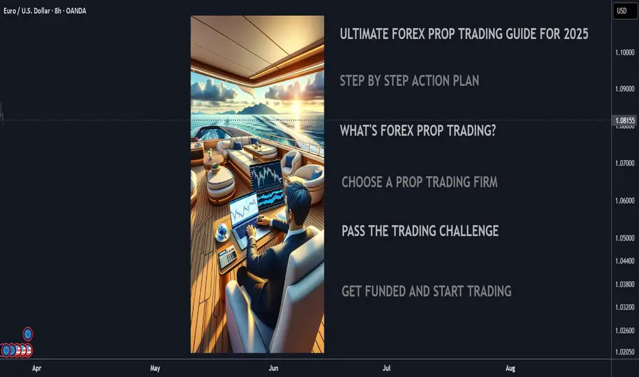
Ultimate 2025 Forex Prop Trading FAQ + Strategy Guide🧠 Forex Prop Trading: What Is It?
Prop trading (proprietary trading) is when a trader uses a firm’s capital to trade the markets (instead of their own), and keeps a share of the profits – usually 70–90%.
✅ Low startup cost
✅ No personal risk (firm takes the loss)
✅ Big upside potential with scaling plans
📋 Step-by-Step Action Plan to Get Started (2025)
🔍 1. Understand the Prop Firm Model
🏦 Prop firms fund skilled traders with $10K to $500K+
🎯 You pass a challenge or evaluation phase to prove your skills
💵 Once funded, you earn a profit split (70%–90%)
🧪 2. Choose a Top Prop Firm (2025)
Look for reliable and regulated firms with transparent rules:
FTMO 🌍 – Trusted globally, up to $400K scaling
MyFundedFX 📊 – Up to 90% profit split, no time limit
E8 Funding ⚡ – Fast scaling and instant funding
FundedNext 💼 – 15% profit share during challenge phase
The Funded Trader 🏰 – Up to $600K with leaderboard bonuses
🔎 Compare features: fees, drawdown limits, trading style freedom
💻 3. Train & Master Your Strategy
🧠 Pick a clear, rule-based strategy (e.g. trend following, breakout, supply/demand)
📅 Backtest over 6–12 months of data
💡 Use AI tools & trade journals like Edgewonk or MyFXBook
🎯 Focus on:
Win rate (above 50–60%)
Risk-reward ratio (1:2 or better)
Consistency, not wild profits
🧪 4. Pass the Evaluation Phase
🔐 Follow risk rules strictly (daily & max drawdown)
⚖️ Use proper risk management (0.5–1% risk per trade)
🧘♂️ Trade calmly, avoid overtrading or revenge trades
📈 Most challenges:
Hit 8–10% profit target
Stay under 5–10% total drawdown
Trade for at least 5–10 days
🧠 Tip: Pass in a demo environment first before going live!
💵 5. Get Funded & Start Earning
🟢 Once approved, you trade real firm capital
💰 You keep up to 90% of profits, with withdrawals every 2 weeks to 1 month
🚀 Many firms offer scaling plans to grow your account over time
💬 FAQ – Prop Trading in 2025
❓ How much can you make?
🔹 Small accounts ($50K): $2K–$8K/month with 4–8% returns
🔹 Large accounts ($200K+): $10K+/month possible for consistent traders
💡 Many traders start part-time and scale as they build trust with the firm
❓ How much do I need to start?
💳 Challenge fees range from:
$100 for $10K
$250–$350 for $50K
$500–$700 for $100K+
⚠️ No need to deposit trade capital – just the challenge fee
❓ What are the risks?
You can lose the challenge fee if you break rules or over-leverage
You won’t owe money to the firm
The biggest risk is psychological – many fail from overtrading or emotional decisions
🚀 Final Tips to Succeed
✅ Trade like a robot, think like a CEO
✅ Journal every trade – self-awareness is key
✅ Avoid over-leveraging and gambling mindset
✅ Stick to one strategy and master it
✅ Focus on consistency over quick wins