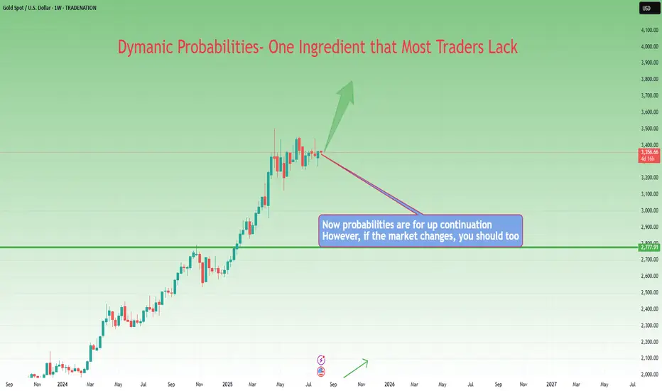
Chart Patterns – Key to Market MovementsChart patterns are the roadmap to market psychology. They show where the market is likely to go, based on previous price action.
Understanding these patterns can give you a significant edge in making trading
Description:
📌 **Pattern 1 – Trendline Breakout**
* Price forms higher lows along a trendline.
* Breakout above resistance confirms bullish momentum.
* ✅ Entry only after **retest of the trendline**.
* 🎯 Target → continuation toward higher liquidity zones.
📌 **Pattern 2 – Bull Flag**
* A bullish continuation setup after a strong impulse.
* Breakout above flag = confirmation of trend continuation.
* ✅ Entry comes after **retest of flag resistance**.
* 🎯 Target → measured move equal to previous impulse.
⚡ **Key Lesson:**
Breakouts without retest = retail trap.
Breakouts with retest = professional entry.
📌 **Step 1 – Double Bottom (W Pattern)**
* This pattern indicates a **bullish reversal** from the support zone.
* Entry comes after the **breakout above the neckline**.
📌 **Step 2 – Breakout & Retest**
* After the breakout, wait for the **retest** of the neckline (support turned resistance).
* Once price confirms the retest, it’s a **high probability buy**.
📌 **Step 3 – Target**
* Target = measured move from the bottom of the W pattern to the neckline.
* This gives a strong risk-to-reward ratio for continuation.
💡 **Key Lesson:**
A **retest** confirms the trend continuation — don’t chase breakouts. Wait for confirmation before entering!
X-indicator
EUR/GBP, EUR/USD, NZD/USD, Video of my trades last weekMy second video explaining my trades for last week 18-22nd August. I have been trading for years but just started publishing my trades. Hopefully this will keep me more disciplined and someone might learn something. If you have any questions send me a message here or on X and enjoy the weekend.

Daytrading Risk Management Strategy Hold Until CloseAfter reviewing my past 500 trades, the absolute most profitable trade management is to hold until market close. If you study the daily chart, most days will close near the highs/lows of the bar.
By only using just a stop loss and no profit target, one can capture monster moves.
One trade per day, win or loss.
Wins will be small 1-2R wins or giant 3-8R wins
Losses will be small half R losses or simple 1R losses
5-10% of the trades should make up 90% of profits.
Most trading months offer around 8-10 really great setups on Dow Jones. The other 10-12 days should be on the sidelines in cash, waiting.
To really stay in the game, simple 1 or 2R wins WILL NOT cut it.
One has to pay for:
Small Losses
Commissions
Fees
Taxes
Spreads
End of Day Hold Until Close Trade Management maximizes profits and routinely produces 30-40R gains per month.
Go through your own past trades and see if holding until 4pm EST would have yielded substantially more profits vs what you have achieved with your current management. I know I did and I am floored.
Some Examples:
These are all trades that could have been taken. My point is if just using a simple 2 to 1, the profit would have been SUBSTANTIALLY LESS than Hold till Close.
What Are Autoregressive Models in Trading?What Are Autoregressive Models in Trading?
Autoregressive (AR) models help traders analyse market movements by identifying statistical relationships in historical price data. These models assume that past values influence current prices, making them useful for spotting trends and price behaviour. This article explores “What is autoregression?”, how AR models function, their role in trading, and how traders apply them to market analysis.
What Is an Autoregressive Model?
Autoregressive (AR) models are statistical tools that can be used in numerous spheres, including market prices, weather, and traffic conditions. They analyse market movements by using past price data to understand current trends. The autoregressive definition refers to a model where each value in a time series depends on previous values plus an error term.
The number of previous values considered is called the “lag order,” denoted as AR(p), where ‘p’ represents the number of lags. In an autoregressive model example, an AR(1) model looks at just the previous value to estimate the current one, while an AR(3) model considers the last three. In trading, the key idea is that if historical prices show a consistent pattern—whether trending or reverting to a mean—an AR model can help identify that structure.
This approach differs from other time series models. Moving averages (MA) smooth out fluctuations by averaging past prices, while autoregressive integrated moving averages (ARIMA) combine both approaches and adjust for trends. AR models, however, focus purely on the statistical relationship between past and present values, making them particularly useful in markets where past behaviour has a clear influence on future movements.
Traders use an autoregressive process to explore trends, momentum, and potential reversals in markets that exhibit persistent patterns. However, their effectiveness depends on market conditions and the assumption that past relationships remain relevant—something that isn’t always guaranteed, especially in volatile or news-driven environments.
How Autoregressive Models Work in Trading
Traders use AR models to examine how past prices influence current movements. An autoregressive model trading strategy often involves assessing whether an asset’s price exhibits momentum or mean reversion tendencies. For example, if an AR(1) model shows that today’s price is strongly influenced by yesterday’s price, it may suggest a continuation bias—meaning traders could expect trends to persist in the short term.
In contrast, if an AR(2) or AR(3) model highlights a tendency for prices to move back toward an average after a few periods, it could indicate mean reversion. This is particularly relevant in range-bound markets where prices frequently return to support and resistance levels.
The number of past values included in an AR model is a key decision. Too few lags might miss relevant patterns, while too many can add unnecessary complexity. Traders typically determine the appropriate lag length by evaluating past data and statistical criteria like the Akaike Information Criterion (AIC).
AR models are more popular in markets where historical relationships hold for extended periods. It’s common to use autoregressive models for trading forex, equities, and commodities, especially in detecting short-term trends or cycles. While they aren’t predictive tools, they provide a structured way to analyse price behaviour, offering traders a statistical foundation for evaluating market movements.
Stationarity and Its Role in AR Models
For an autoregressive time series model to work, the data must be stationary. This means the statistical properties of the time series—such as its mean, variance, and autocorrelation—remain constant over time. If a dataset is non-stationary, meaning its trends, volatility, or relationships shift unpredictably, the AR model's analysis can become unreliable.
Why Stationarity Matters
The autoregressive model, meaning it assumes a consistent statistical structure, can struggle with shifting market conditions if stationarity is not ensured. If a time series is non-stationary, it might show an upward or downward drift, meaning price relationships aren’t consistent over time. This makes it difficult to analyse patterns. For example, a stock experiencing long-term growth won’t have a stable mean, which can distort AR-based analysis.
Testing for Stationarity
Traders often check for stationarity using statistical tests like the Augmented Dickey-Fuller (ADF) test. This test helps determine whether a time series has a unit root—a key characteristic of non-stationary data. If the test suggests a unit root is present, traders may need to adjust the data before using an AR model.
Transforming Data to Stationarity
When data is non-stationary, traders often apply transformations to stabilise it and convert it to an autoregressive model time series. Differencing is a common method, where they subtract the previous value from the current value to remove trends. Log transformations can also reduce the impact of volatility. Once stationarity is achieved, an AR model is believed to be more effective to analyse price movements.
Using an Autoregressive Model in Practice
Understanding how autoregressive models work is one thing—actually applying them in trading is another. These models are primarily used in quantitative strategies, where traders rely on statistical methods rather than gut feelings or news events. While AR models aren’t a complete trading strategy on their own, they can provide valuable insights when used correctly.
Building an AR Model
The first step in using an AR model is preparing the data. Traders typically start with a time series dataset—such as daily closing prices—and ensure it is stationary. If the data shows trends or changing volatility, they may apply differencing or log transformations to stabilise it.
Once the data is ready, the next step is determining the lag order—how many past values should be included in an AR(p) model. This is done through statistical tests like the Akaike Information Criterion (AIC) or Partial Autocorrelation Function (PACF), which help identify how far back price movements remain relevant. For instance, an AR1 model considers only the previous price point, while an AR3 model incorporates the last three observations. Choosing too few lags might miss important relationships, while too many can overcomplicate the model.
After selecting the lag order, traders fit the AR model using statistical software such as Python’s statsmodels or R’s forecast package. The model estimates how past prices influence current ones, producing a set of coefficients that define these relationships. The trader then analyses these results to determine if the model aligns with market behaviour.
Applying AR Models to Trading
Once built, an AR model provides insights into how past price behaviour influences future movement. For example:
- If an AR(1) model shows a strong positive coefficient, it suggests that today’s price is closely linked to yesterday’s, reinforcing a short-term trend.
- If an AR(2) or AR(3) model suggests a return toward a long-term mean, it may indicate a market where price cycles are present.
Traders use these insights in different ways. Some apply AR models to analyse short-term market momentum, while others use them to examine mean-reverting assets like certain forex pairs or commodities. They can also compare AR-based analysis with other indicators like moving averages or Bollinger Bands to refine their decision-making process.
Autoregressive models are also used in machine learning for time series forecasting, helping algorithms detect patterns in sequential data. In trading, autoregressive model machine learning techniques can refine models by dynamically adjusting lag parameters, improving adaptability to changing market conditions and reducing reliance on fixed assumptions.
ARIMA: Extending AR Models
While AR models work well on stationary data, many financial time series contain trends or seasonality that a basic AR model can’t handle. This is a scenario where Autoregressive Integrated Moving Average (ARIMA) models become useful. ARIMA combines AR components with moving averages (MA) and differencing (I for “integrated”) to account for non-stationary behaviour.
For example, if a stock price has an upward drift, an AR model alone won’t be sufficient. An ARIMA model can first remove the trend through differencing, and then apply AR and MA components to analyse underlying patterns. This makes ARIMA more flexible for complex market environments.
Challenges and Considerations When Using AR Models
Autoregressive models can be useful for analysing price movements, but they come with limitations that traders should consider. Financial markets are complex, and historical price patterns don’t always repeat in the same way. Understanding where AR models fall short might help traders apply them more effectively.
Overfitting and Choosing the Right Lag Order
One of the biggest challenges in using AR models is selecting the right lag order. Including too many past values can lead to overfitting, where the model becomes overly sensitive to historical fluctuations that may not be relevant going forward. Overfitting can create misleading analysis, making the model seem accurate in hindsight but ineffective in real-time market conditions. Traders typically balance complexity with statistical tests like the Akaike Information Criterion (AIC) to determine an optimal lag length.
Market Noise and Unexpected Events
AR forecasting assumes that past price relationships remain relatively consistent. However, financial markets are influenced by a wide range of external factors—economic reports, central bank decisions, and geopolitical events—that models based purely on past prices cannot account for. A market that has historically followed a trend can abruptly reverse due to news or institutional flows, reducing the usefulness of AR-based analysis.
Data Quality and Stationarity
The reliability of an AR model depends on the quality of the data used. Non-stationary data, sudden regime changes, or structural shifts in the market can distort results. Traders often need to check for stationarity and adjust their approach when market conditions change, ensuring that their models remain relevant rather than assuming past relationships always hold.
The Bottom Line
Autoregressive models offer traders a statistical approach to analysing price movements, helping them identify trends and market behaviour based on historical data. While they are not standalone trading signals, they can be valuable when combined with other analytical tools.
FAQ
What Is an Autoregressive Model?
An autoregressive (AR) model is a type of statistical model that analyses time series data by expressing a variable as a function of its past values. It assumes that past observations influence current values, making it useful for identifying patterns in sequential data.
What Is an Autoregressive Model in Finance?
In finance, AR models are used to analyse price movements by examining historical data. Traders apply them to identify trends, momentum, or mean-reverting behaviour in assets like stocks, forex, and commodities. AR models help quantify how past price changes relate to current movements.
What Is an Autoregressive Model for Stock Analysis?
AR models in stock analysis assess price patterns by using historical data to determine potential relationships between past and present values. They can highlight statistical trends but do not account for external market drivers like news or economic events.
This article represents the opinion of the Companies operating under the FXOpen brand only. It is not to be construed as an offer, solicitation, or recommendation with respect to products and services provided by the Companies operating under the FXOpen brand, nor is it to be considered financial advice.
from Rice to Robots, evolution of TA The History and Origin of Technical Analysis
Every chart we study today. Every candlestick, moving average, or RSI indicator is built on centuries of market wisdom. While many believe technical analysis began with Charles Dow in the 1800s, its origins reach much further back, to Amsterdam’s bustling spice markets in the 1600s and Japan’s rice exchanges in the 1700s.
Let’s take a journey through time and see how technical analysis evolved into the powerful tool traders and investors use today.
17th Century: The First Signs of Charting
1. Dutch East India Company Traders (1602)
The Dutch East India Company, established in Amsterdam in 1602, became the first publicly traded company. Its shares were bought and sold on the world’s first stock exchange, the Amsterdam Stock Exchange. Early traders began tracking price fluctuations in simple graphical forms — the very first steps toward technical analysis.
2. Joseph de la Vega (1650–1692)
A Spanish diamond merchant and philosopher, Joseph de la Vega, authored Confusión de Confusiones (1688), the earliest known book on stock markets. He described investor behavior, speculative patterns, and even outlined concepts resembling modern puts, calls, and pools. His insights captured both the psychology of markets and the primitive beginnings of technical analysis.
18th Century: Japan’s Candlestick Revolution
Homma Munehisa (1724–1803)
In Osaka’s Dōjima Rice Exchange, Japanese rice merchant Homma Munehisa created what remains one of the most widely used charting methods in history: the Japanese Candlestick (then called Sakata Charts).
His book The Fountain of Gold – The Three Monkey Record of Money detailed not only price charts but also market psychology, emotions, and crowd behavior. Today, candlestick patterns remain a cornerstone of technical analysis worldwide.
Late 19th & Early 20th Century: The Modern Foundations
Charles Dow (1851–1902)
Often called the father of modern technical analysis, Charles Dow co-founded Dow Jones & Company and The Wall Street Journal in 1889. His market observations led to:
The Dow Jones Industrial Average and Transportation Average
The Dow Theory, which identified three types of trends: primary, secondary, and minor.
Dow believed markets reflect the overall health of the economy, and his work inspired generations of analysts, including William Hamilton, Robert Rhea, George Schaefer, and Richard Russell.
Ralph Nelson Elliott (1871–1948)
Building on Dow’s ideas, Elliott studied 75 years of stock market data and developed the Elliott Wave Theory, arguing that markets move in recurring wave patterns driven by crowd psychology. In March 1935, he famously predicted a market bottom and the Dow Jones indeed hit its lowest point the following day, cementing his theory’s credibility.
20th Century: The Rise of Indicators
The computer era supercharged technical analysis. Mathematically driven technical indicators were developed to analyze price, volume, and momentum on a scale that manual charting could never achieve.
Example: RSI (Relative Strength Index)
Developed by J. Welles Wilder Jr. in 1978, RSI measures the speed and magnitude of price changes on a scale of 0–100.
Above 70 = Overbought (potential sell signal)
Below 30 = Oversold (potential buy signal)
Other popular indicators soon followed, such as Moving Averages, MACD, and Bollinger Bands, giving traders an expanding toolbox to forecast market movements.
21st Century: From Charts to Algorithms and AI
Today, technical analysis has evolved far beyond hand-drawn charts:
Algorithmic Trading: Automated systems use indicators and strategies to execute trades at lightning speed.
AI Trading Bots: Artificial intelligence combines both technical and fundamental analysis, processing massive datasets to generate signals and even execute trades.
Platforms like TradingView: Empower traders worldwide to build custom indicators, test strategies and share insights, democratizing access to advanced market tools.
nerdy thoughts
From Amsterdam’s first stock traders to Osaka’s candlestick pioneers, from Charles Dow’s theories to AI-powered trading bots, technical analysis has always been about one thing: decoding price to understand human behavior in markets.
It’s a discipline born from centuries of observation, innovation, and adaptation, one that continues to evolve every day.
“Life is a moving, breathing thing. We have to be willing to constantly evolve. Perfection is constant transformation.”
put together by: Pako Phutietsile ( @currencynerd )
courtesy of : @TradingView
this is inspired by a publication i once posted this is the revamped edition...

How to Properly Use Stop-Loss in TradingStop-loss is one of the simplest yet most underestimated tools in trading. Many beginners see it only as a “loss limiter” and place it randomly. In reality, stop-loss is a core element of a trading system, defining not only the risk size but also the logic behind the trade itself.
What is a stop-loss?
A stop-loss (SL) is a pre-set price level at which your trade closes automatically to limit losses. If you enter a long position, the SL is placed below your entry point. If you go short, it’s set above.
The main purpose of SL is to ensure you never lose more than planned. That’s why experienced traders say: a stop-loss is not just protection against losses — it’s a capital management tool.
Where to place a stop-loss correctly?
The biggest mistake beginners make is placing stops “by guess.” Professionals always base it on market structure. Here are the key principles:
- Beyond support or resistance. In a long, the stop is placed slightly below support; in a short, slightly above resistance.
- Considering volatility. On calm markets, the stop can be tighter. On volatile moves, it’s safer to widen the distance.
- By indicator signals. If an algorithm highlights a key zone, the SL is best hidden in that range.
So, a stop-loss is not a random number, but a logical point where your trade idea becomes invalid.
How does stop-loss relate to risk management?
Another common mistake is ignoring the risk/reward ratio (RRR). Professionals never take trades where the potential loss equals or exceeds the potential profit.
For example, if you go long on BTC at $114,000, set a stop at $112,000 (risk: $2,000), and a target at $118,000 (profit: $4,000), your RRR is 1:2 — a good setup. But if your target is only $115,000 (profit: $1,000), the trade doesn’t make sense since the risk outweighs the reward.
Why is it essential to always use a stop-loss?
Many beginners think: “I’ll close the trade manually when needed.” But markets are faster and harsher. One sudden move can wipe out a position before you react.
That’s why the golden rule is: it’s better to exit on a stop than to lose your account by holding onto losses.
Conclusion
A stop-loss is not “insurance against mistakes” — it’s a strategic tool. It defines the level where your trade idea stops being valid and enforces discipline by removing the temptation to hold onto losses.
Remember: you can’t control price, but you can control your risk. And it’s the stop-loss that turns trading from chaos into a manageable process.
Double Bottom followed by Higher LowTom Bulkowski analysed 1000s,s of chart patterns. The double bottom pattern showed that many of the patterns performed 50% of the time.
However, the double bottom defined by 2 valleys holding on a parallel support level followed by a Higher low confirms the trend shifting from bearish to Bullish. This pattern occurs frequently at the bottom of a downtrend, and Bulkowski found the % of failure rate of this pattern to be very low. He ranked this pattern a 3 on the scale of powerful trading tools.

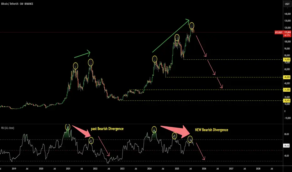
Bitcoin: This Simple Indicator Predicts Crash AheadThe Relative Strength Index (RSI) is a simple yet effective indicator, especially when it doesn't follow the market. This situation is called Divergence.
It has recently appeared on the Bitcoin chart as Bearish Divergence. This occurs when the market price makes a new peak, but the RSI, on the contrary, forms lower highs.
Looking back at the same chart, we can rewind to 2021, where a similar Bearish Divergence played out, pushing Bitcoin’s price down heavily from $69k to $15k.
This time, the Bearish Divergence on RSI is more pronounced, as it consists of 3 ascending peaks on the price chart, contrasted with 3 falling tops on the RSI sub-chart.
There are 4 key supports that could underpin the anticipated crash:
1) $74.5k - This year’s bottom
2) $49k - Consolidation low in 2024
3) $31k - Consolidation top in 2023
4) $15.5k - 2022 minimum
Where do you think the crash will stop?
Indicator Design 101Markets are noisy. Indicators exist to help filter through that noise and translate raw data into something usable. But here’s the truth: a good indicator isn’t always just about the math, it’s about how the data is designed, displayed, and interpreted.
Not all traders stare at charts because they love equations, they want clarity, guidance, and insight. Naturally there are those of us who take fascination in this however there are a large majority who find comfort in familiarity. Research from fields like data visualization, cognitive psychology, and decision making consistently shows that the way information is conveyed matters more than the complexity of the calculation behind it.
Design First: Turning Data Into Decisions
1. Cognitive Load and Chart Overwhelm
Cognitive science tells us that humans have a limited working memory (Miller, 1956; Cowan, 2001). When an indicator throws 10 different colors, lines, and plots onto a chart, it overwhelms that memory. Traders end up reacting to noise instead of clarity.
Bad Example: An oscillator with six lines showing similar data in different ways and a rainbow gradient that forces you to pause and decode every signal with no actionable events.
Good Example: A clean system that breaks this noise into actionable events via signals or distinct coloring.
2. Anchors and Intuition
Indicators like RSI and Bollinger Bands work because they give traders anchors. RSI is bounded between 0–100, with clear “overbought/oversold” zones. Bollinger Bands expand and contract in ways that are visually intuitive.
If your indicator requires constant parameter tuning or subjective guesswork, it violates usability theory. Studies on decision making (Kahneman & Tversky, 1979) show that humans rely on heuristics anchored reference points that simplify complex environments. A good indicator provides those anchors.
3. Complexity Isn’t Always Better
It’s tempting to think that stacking more formulas = more edge. But more complexity often means more noise. Traders don’t need an indicator to tell them everything; they often need it to sharpen focus.
Complex Math + Poor Design = a black box that few can use.
Simple Math + Elegant Design = a tool that traders return to daily.
The lesson: brilliance lies in usability, not obscurity.
4. Simple vs. Simplistic Signals
Once design is in place, we can talk about signals. Arrows, green/red flips, and “buy/sell” labels look appealing, but they’re rarely the full story. The advantages are they are easy to understand, digestible for beginners.
The cons; they strip away context. A green arrow doesn’t tell you trend strength, volatility, or probability it just pretends to.
Research on trading behavior (Barberis et al., 1998; Odean, 1999) shows that oversimplification leads to overconfidence and poor decision-making. Good indicators don’t eliminate judgment, they should aim to enhance it.
5. Repainting: Transparency Over Fear
Now let’s tackle repainting one of the most interesting areas. It’s extremely commonplace to see a comment section filled under an indicator with questions on repaints.
Repainting CAN shift past signals with new data, making indicators look flawless in hindsight. Traders understandably feel cheated.
However, many useful tools are repainted by necessity. ZigZag, fractals, swing detectors, and forecasting models must adjust to confirm patterns. That’s not deception—it’s the nature of adaptive models. The real issue isn’t repainting itself, it's hidden repainting. If a tool pretends to give real-time buy/sell calls but constantly moves them, it destroys trust.
The fix is simple: be transparent. If a tool repaints, label it clearly, and position it as a contextual tool (to map structure, reduce noise, or highlight potential setups) rather than a standalone trading system.
6. The Balance of a Good Indicator
We believe a good indicator balances three dimensions:
Design & Conveyance reduring cognative load and using visual hierachy with anchor points
Signal Theory where avoiding oversimplistic arrows without context is damaging
Transparency in Mechanics being clear about WHY something is occuring
At its core, a good indicator doesn’t aim to “predict the future.” It aims to make the present more interpretable. The goal is not to impress traders with complexity or spoon feed them with simplistic arrows, it's to design a tool that integrates seamlessly into decision making, guiding the eye and focusing attention where it matters most.
Complexity without clarity is noise. Simplicity without context is misleading.
A good indicator lives in the middle: transparent, usable, and thoughtfully designed.
This is are of course our humble views.
- Alex Friend / ChartPrime
Sources:
Miller, G. A. (1956). The Magical Number Seven, Plus or Minus Two: Some Limits on Our Capacity for Processing Information. Psychological Review.
Kahneman, D., & Tversky, A. (1979). Prospect Theory: An Analysis of Decision under Risk. Econometrica.
Barberis, N., Shleifer, A., & Vishny, R. (1998). A model of investor sentiment. Journal of Financial Economics.

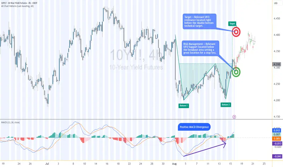
10Y Futures Case Study: Trading the Breakout with Defined Risk1. Introduction
The 10-Year Yield Futures market has recently drawn attention as it builds a constructive base and attempts to shift momentum higher. After weeks of choppy movement, price action on the 4-hour chart has resolved into a breakout scenario that could define the next leg for yields. At the heart of this case study is a double bottom formation, a classical reversal structure, confirmed at 4.321. What makes this setup more compelling is the presence of nearby support and resistance zones, providing a precise technical framework to define entries, targets, and stop placement with discipline.
2. Double Bottom Pattern
The double bottom is one of the most reliable chart patterns signaling the potential exhaustion of selling pressure. It typically forms after a downtrend, with two consecutive troughs creating a strong support base before buyers regain control. In the current 10-Year Yield Futures chart, the first bottom occurred near 4.20, followed by a retest close to the same level. The neckline breakout emerged at 4.312, marking the confirmation point. Applying classical pattern analysis, the measured move points toward a target near 4.396. This alignment of structure and projection provides traders with a clear and objective technical roadmap.
3. MACD Confirmation
Momentum indicators often add depth to price action analysis, and the MACD (Moving Average Convergence Divergence) is one of the most widely followed. Built from the relationship of short- and long-term moving averages, it helps reveal underlying shifts in strength. In the current 10-Year Yield Futures chart, the MACD displayed a positive divergence: while price carved lower lows during the second bottom, the MACD lines began to slope higher. This divergence often signals weakening bearish momentum and the early stages of accumulation. In this case, it reinforces the validity of the double bottom breakout and its bullish potential.
4. UFO Support & Resistance
UnFilled Orders, or UFOs, represent areas where pending buy or sell orders may remain active, providing powerful zones of support or resistance. On the 10-Year Yield Futures chart, a key UFO support sits just below the breakout at 4.278, making it a logical stop-loss placement to protect the trade. Meanwhile, the upside target of the double bottom at 4.396 coincides with a UFO resistance zone. This overlap creates a clear exit area where supply may re-emerge. By combining classical charting techniques with order-flow–based zones, traders gain a structured plan that balances opportunity with risk control.
5. Trade Idea (Illustrative Case Study)
In this case study, the trade idea develops around the breakout point of 4.312 with the current price at the time of writing this article of 4.321. A trader could consider going long if the market sustains above this neckline level. The projected target is the resistance zone at 4.396, while the protective stop loss can be placed just below the UFO support at 4.278. This creates a defined risk profile with a reward-to-risk ratio of roughly 2:1. Alternatively, more conservative traders might consider a wider stop beneath the second bottom, offering more tolerance against volatility but at the expense of risk-reward efficiency. Both options maintain risk clarity and structure.
6. Contract Specifications & Margin Overview
The 10-Year Yield Futures (ticker: 10Y or 10Y1! on TradingView) is a cash-settled futures contract that tracks the 10-year U.S. Treasury yield directly. The gain or loss per tick per contract is as follows: 1 tick = 0.001 Index points (1/10th basis point per annum) = $1.00.
According to CME’s margin schedule (which changes as market conditions change through time), the current margin requirement is approximately $300 per contract. These relatively modest requirements make the product accessible while still providing meaningful exposure to U.S. interest rate markets.
7. Importance of Risk Management
Even with technically strong setups, the defining factor between consistent traders and inconsistent ones is risk management. Futures are leveraged products, meaning a small price move can translate into significant profit or loss. Using stop-loss orders helps enforce discipline, ensuring that one trade does not spiral into uncontrolled exposure. In this case, the support at 4.278 provides a logical technical area for a stop. Regardless of market outlook, avoiding undefined risk is key to long-term survival and consistency.
8. Closing Remarks
The alignment of a double bottom breakout, positive MACD divergence, and key support and resistance zones creates a textbook technical case study in the 10-Year Yield Futures market. With a clearly defined entry, target, and stop-loss, this setup demonstrates how combining price patterns with momentum and order-flow levels can help build structured trade plans. Yet, no analysis guarantees outcomes, and discipline remains at the core of every approach.
When charting futures, the data provided could be delayed. Traders working with the ticker symbols discussed in this idea may prefer to use CME Group real-time data plan on TradingView: www.tradingview.com - This consideration is particularly important for shorter-term traders, whereas it may be less critical for those focused on longer-term trading strategies.
General Disclaimer:
The trade ideas presented herein are solely for illustrative purposes forming a part of a case study intended to demonstrate key principles in risk management within the context of the specific market scenarios discussed. These ideas are not to be interpreted as investment recommendations or financial advice. They do not endorse or promote any specific trading strategies, financial products, or services. The information provided is based on data believed to be reliable; however, its accuracy or completeness cannot be guaranteed. Trading in financial markets involves risks, including the potential loss of principal. Each individual should conduct their own research and consult with professional financial advisors before making any investment decisions. The author or publisher of this content bears no responsibility for any actions taken based on the information provided or for any resultant financial or other losses.
XAUUSDThe Relative Strength Index (RSI), developed by J. Welles Wilder, is a momentum oscillator that measures the speed and change of price movements.
• Traditionally the RSI is considered overbought when above 70 and may be primed for a trend reversal or corrective pullback in price, and oversold or undervalued condition when below 30. During strong trends, the RSI may remain in overbought or oversold for extended periods.
• Signals can be generated by looking for divergences and failure swings. If underlying prices make a new high or low that isn't confirmed by the RSI, this divergence can signal a price reversal. If the RSI makes a lower high and then follows with a downside move below a previous low, a Top Swing Failure has occurred. If the RSI makes a higher low and then follows with an upside move above a previous high, a Bottom Swing Failure has occurred
• RSI can also be used to identify the general trend. In an uptrend or bull market, the RSI tends to remain in the 40 to 90 range with the 40-50 zone acting as support. During a downtrend or bear market the RSI tends to stay between the 10 to 60 range with the 50-60 zone acting as resistance
This study aim to implement Relative Strength concept on most common Volume indicators, such as
• Accumulation Distribution is a volume based indicator designed to measure underlying supply and demand
• Elder's Force Index (EFI) measures the power behind a price movement using price and volume
• Money Flow Index (MFI) measures buying and selling pressure through analyzing both price and volume (used as it is)
• On Balance Volume (OBV), created by Joe Granville, is a momentum indicator that measures positive and negative volume flow
• Price Volume Trend (PVT) is a momentum based indicator used to measure money flow
Plotting will be performed for regular RSI and RSI of Volume indicator (RSI(VOLX)) selected from the dialog box, where the possibility to apply smoothing is provided as option. Additionally, labels can be added optionally to display the value and name of selected volume indicator
Secondly, ability to present Volume Histogram within the same study along with its Moving Average or Volume Oscillator based on selection
Finally, Volume Based Colored Bars, a study of Kıvanç Özbilgiç is added to emphasis volume changes on top of the bars
Nothing excessively new, the study combines RSI with;
- RSI concept applied to some of the common Volume indicators presented with a highlighted over/under valued threshold area, optional labeling and smoothing,
- added Volume data with additional information and
- colored bars based on volume
Thanks Vishant_Meshram for the inspiration 🙏

What Is the Evening Star Candlestick Pattern?What Is the Evening Star Candlestick Pattern?
Candlestick patterns offer traders a way to read price action and spot potential changes in momentum. One notable pattern is the evening star, a three-candle formation that signals the start of a possible downtrend. This article breaks down what the evening star looks like, how it works, and how traders typically use it.
What Is the Evening Star Candlestick Pattern?
The evening star is a three-candle pattern that traders watch for after a strong upward move. It’s considered a bearish reversal pattern, signalling that bullish momentum is fading. The setup consists of three candles:
- The first candle is a large bullish candle—it shows a clear upward direction.
- The second is much smaller. This middle candle—the star—reflects hesitation. Buyers and sellers are more balanced, and the market’s pace slows.
- The third candle acts as confirmation. It’s a solid bearish candle that closes deep into the body of the first.
The middle candle also often gaps up from the first, especially in stocks or indices, but gaps aren’t essential. What matters is the sequence: strength, indecision, reversal. The further the final candle closes into the body of the first, the stronger the pattern is considered.
Evening stars can appear on any timeframe, but many traders look for them on the daily chart where the signals tend to be clearer. It’s not a pattern to act on blindly—but in the right context, such as after a sustained bullish trend, it’s a useful sign that buyers might be losing control.
The Psychology Behind the Evening Star
It may be always useful to frame the formations like the evening star candle pattern in the context of market psychology.
Here, the first bullish candle signals buyer confidence. They drive prices higher and the candle closes strongly. The next candle is smaller, suggesting that momentum is slowing. Buyers aren’t pushing as hard, and sellers start to step in.
When the third candle closes strongly bearish, it confirms that sentiment is changing. Sellers are now in control, and previous buying strength fades. This shift often happens at the end of an extended upward movement, where fewer buyers are willing to bid the price up and begin closing positions.
How Traders May Use the Evening Star Candlestick Formation
The evening star may be a useful part of a trader’s toolkit, especially when it lines up with other pieces of analysis.
Opening and Closing a Trade
The evening star pattern candlesticks become more meaningful when they appear around known areas of resistance or previous swing highs. If the market’s been edging closer to a clear level—like a horizontal resistance line, Fibonacci retracement, or trendline—and then an evening star forms, it can add weight to the idea that the rally is weakening. Some traders also watch for patterns forming near round numbers or psychological price points.
If traders notice an evening star pattern occurring at a resistance level, they typically look for confluence using another indicator. The RSI might signal a bearish divergence, the price may be piercing an upper Bollinger Band, or it could also be bouncing from a 200-period EMA. Volume can be another factor—rising volume on the third candle can signal more participation behind the selling.
Once a trader has confidence that a bearish reversal is likely underway, they often use the candles following the third candlestick as an entry trigger. A stop loss might be set above the middle candle’s high, while take-profit targets might be placed at an area where a bullish reversal might occur, like a support level. Some might simply trail a stop to take advantage of the strong downtrend or exit when an indicator/candlestick pattern signals that bearish momentum is fading.
Marking Potential Trend Shifts
Some traders use the evening star to flag potential trend exhaustion. While they may not act on the signal (e.g. they are bullish overall and not willing to take shorts yet), the presence of an evening star can suggest the uptrend is vulnerable. They may prepare to buy a pullback, partially close an existing long position, or start watching for further bearish signals.
Example Trades
In the example above, we see a slight rally in AUD/USD in a broader downtrend (off-screen). Price initially pierces the upper Bollinger Band, with slight rejections visible in the upper wicks. After a brief dip, the market retests highs and finds resistance. At this point, the pattern forms, with confirmation coming from relatively weak candles afterwards. Price then closes through the midline of the Bollinger Bands, providing full confirmation of a bearish reversal.
In this second example, we can see a failed evening star. Here, Amazon (AMZN) gaps up over two consecutive days. That leads the 50-period EMA to slope up and cross above its 200-period counterpart—a clear bullish signal.
In this context, it may be better to ignore the signal. The market continues to move higher in an uptrend with consecutive bullish gaps, confirmed by the EMA crossover, indicating a lower probability the pattern will work successfully. Like any pattern, the evening star is expected to be more reliable when contextual factors align, such as in the AUD/USD example.
Strengths and Limitations of the Evening Star
The evening star has its strengths and limitations. To rely on the evening star in trading, it’s worth being aware of both sides.
Strengths
- Clear visual structure: The three-candle formation is straightforward, especially on higher timeframes.
- Logical: The pattern reflects an evident change in momentum that shifts from buying to selling pressure.
- Useful in a wider toolkit: When combined with other forms of analysis (resistance levels, overbought signals, strong volume), it can help traders pinpoint potential turning points and offer an entry.
Limitations
- Requires confirmation: On its own, the pattern doesn’t confirm a downtrend. It’s a potential signal, but not a guarantee.
- Less reliable in choppy markets: In sideways or low-volume markets, evening stars usually produce false signals.
- Subject to interpretation: Candle size, wicks, and placement can vary, which means not every setup is clean or tradable.
The Bottom Line
The evening star pattern offers traders a structured way to identify potential turning points in the market. Its three-candle formation makes it popular among those seeking greater confirmation than single-candle patterns.
FAQ
What Does an Evening Star Candle Pattern Mean?
It’s a three-candle formation that appears at the end of a solid uptrend. An evening star in trading indicates a potential bearish reversal or a short-term downward movement depending on market conditions and the timeframe used.
Is the Evening Star Bullish or Bearish?
The evening star is considered a bearish pattern that shows buyer exhaustion. A third long bearish candle reflects a change in the market sentiment.
How Do an Evening Star and a Hanging Man Differ?
The evening star is a three-candle pattern showing a gradual change in momentum. The hanging man is a single-candle pattern, with a small body and long lower wick. Both are bearish reversal signals, but the hanging man typically requires greater confirmation.
How Do a Shooting Star and an Evening Star Differ?
The shooting star is a one-candle pattern with a long upper wick and a small body that signals rejection at higher prices. The evening star is a three-candle pattern. Both formations reflect a shift from bullish to bearish sentiment.
This article represents the opinion of the Companies operating under the FXOpen brand only. It is not to be construed as an offer, solicitation, or recommendation with respect to products and services provided by the Companies operating under the FXOpen brand, nor is it to be considered financial advice.
Skeptic's Night Byte: 3 Hacks to Beat a Losing StreakHey, it’s Skeptic 👋
We’ve all been there — losing streaks suck, but they don’t have to wipe you out.
In under 60 seconds, I’ll show you 3 quick hacks that make a huge difference:
Build friction into your trading decisions
Stop letting news events wreck your win rate
Use higher time frames to avoid the noise
Simple moves. Massive impact.
If this helped, hit that boost so I know to drop more tips like this.

Bullish Energy in Natural Gas: -DMI Extreme + Wedge BreakoutThe Spark in the Gas Market
Natural gas has been quietly simmering in recent weeks, building pressure beneath a surface of consolidation. Traders watching closely will have noticed a rare alignment — one that history shows can potentially precede outsized moves. We’re talking about the convergence of two powerful signals: a -DMI yearly extreme and a falling wedge breakout.
In the past, this combination has marked moments when bearish momentum had run its course, giving way to swift and decisive bullish reversals. Now, that same alignment is flashing again, inviting a closer look at the technical landscape and the potential opportunities it presents.
Why This Setup Matters
The -DMI (Directional Movement Index) measures the strength of downward price moves. When it pushes beyond two standard deviations above its yearly linear regression channel, it signals an overextended bearish phase. Historically, these extremes have often coincided with market bottoms in Natural Gas Futures.
Layer on top a falling wedge — a bullish reversal chart pattern — and the probability of an upside move gains weight. The wedge compresses price action into a narrowing range, reflecting reduced volatility and setting the stage for a potential explosive breakout once resistance gives way. The current breakout level sits near 3.18, with technical projections aligning closely to a well-defined UFO resistance (UnFilled Orders) zone around 3.90.
The Technical Story Unfolds
Looking at the daily chart in the present, the -DMI has recently breached the +2 standard deviation boundary of its 252-period regression channel — a rare occurrence that, as said, has preceded multiple major bullish reversals in the past year. When this condition appeared, downside momentum often faded, making room for buyers to take control.
This time, the current signal aligns with a falling wedge that has been developing for weeks. Price is about to break above the wedge’s upper boundary at approximately 3.18, suggesting a potential trend reversal.
The Trade Blueprint
Direction: Long
Entry: 3.18 (confirmed breakout above wedge resistance)
Target: 3.90 (wedge projection + UFO resistance)
Stop Loss: 2.858 (below wedge and technical support floor)
Reward-to-Risk Ratio: ~2+ to 1
This structure allows traders to define risk tightly while targeting a meaningful upside move. The setup applies equally to both Natural Gas Futures (NG) and Micro Natural Gas Futures (MNG), offering flexibility in capital allocation. For smaller accounts or those wanting to reduce margin exposure, the MNG contract delivers the same tick size precision with only one-quarter of the notional value.
The Contract Advantage
Natural Gas Futures (NG) represent 10,000 MMBtu per contract, with a minimum tick size of 0.00025 — equivalent to $2.50 per tick.
Micro Natural Gas Futures (MNG) are one-tenth the size at 1,000 MMBtu per contract, with the same 0.00025 tick size equaling $0.25 per tick.
Margin requirements vary with volatility and exchange adjustments, but at the time of writing, the CME lists initial margin for NG in the range of $3,500 per contract, while MNG margins are proportionally lower at $350 per contract. This creates flexibility for traders to scale positions or manage risk without altering the technical logic of the trade. Both contracts trade nearly 24 hours per day, Sunday through Friday, offering the ability to react to global energy market shifts in real time.
Risk Management as the Safety Valve
Defining risk is the cornerstone of any trade plan. The stop loss at 2.858 is not arbitrary — it sits below both the wedge’s lower boundary and a nearby technical support level. If price were to close below this level, it would undermine the bullish thesis and call for an exit.
Using smaller MNG contracts can help align risk with account size, allowing for partial position scaling and better drawdown control. Equally important is avoiding undefined risk scenarios, particularly in a commodity as volatile as natural gas. Precision in both entries and exits reduces exposure to intraday whipsaws while maintaining the trade’s structural integrity.
Closing the Loop
The natural gas market has aligned a rare set of conditions — a -DMI yearly extreme and a falling wedge breakout — each of which has historically preceded significant upside moves on their own. Together, they offer a compelling technical case for a defined, risk-managed long position targeting the 3.90 zone.
While no setup guarantees success, this one seems to offer clarity: a well-defined entry, stop, and target, supported by historical probability and pattern structure. In volatile markets, those moments of clarity are worth paying attention to — and acting on with discipline, and always depending on the trader’s trading plan.
When charting futures, the data provided could be delayed. Traders working with the ticker symbols discussed in this idea may prefer to use CME Group real-time data plan on TradingView: www.tradingview.com - This consideration is particularly important for shorter-term traders, whereas it may be less critical for those focused on longer-term trading strategies.
General Disclaimer:
The trade ideas presented herein are solely for illustrative purposes forming a part of a case study intended to demonstrate key principles in risk management within the context of the specific market scenarios discussed. These ideas are not to be interpreted as investment recommendations or financial advice. They do not endorse or promote any specific trading strategies, financial products, or services. The information provided is based on data believed to be reliable; however, its accuracy or completeness cannot be guaranteed. Trading in financial markets involves risks, including the potential loss of principal. Each individual should conduct their own research and consult with professional financial advisors before making any investment decisions. The author or publisher of this content bears no responsibility for any actions taken based on the information provided or for any resultant financial or other losses.

500% APY with Low Risk — Fake? Fact!This is not clickbait! This is a real working strategy! Read to the end!
Hello!
My name is Michael Hypov!
I have been trading for 16 years, and during this time I have seen it all: booms, crashes, crises, hype, and long periods of market silence.
My articles on technical and fundamental analysis, as well as my forecasts for Forex currencies and cryptocurrencies, are translated into 20 languages and gather millions of views.
But what I want to share with you today became a turning point in my understanding of trading.
How it all began
In 2019, I moved to Malaysia and entered the Universiti Sains Malaysia (USM) — the second most prestigious university in the country after UM.
I was lucky to get into the Master's program in Data Science and Analytics. It was an intensive course where we deeply studied mathematical analysis, statistics, neural networks, and machine learning — at a time when no one had even heard of ChatGPT yet.
This knowledge literally turned my understanding of trading upside down.
I suddenly saw that many market processes could be explained by strict mathematical laws, and therefore — predicted with high accuracy.
A bit of theory in simple terms
One of the key discoveries for me was the law of normal distribution.
Visually, it is represented by the “Gaussian bell” — a symmetrical curve where most values are in the middle, and extreme values are rare.
To make it clearer, let me give you an example.
Imagine baking muffins
The dough is the same for all, and the oven is the same. But the result is always slightly different:
most muffins turn out average in size
some are slightly smaller or slightly larger
very few are either tiny or gigantic.
If you draw a chart of “how many muffins of what size,” you’ll get that same bell-shaped curve: many in the center, few on the edges.
Examples from real life
We see the same principle everywhere:
uman height — most people are of average height, very short and very tall are rare
school grades — most students have average grades, and extremes are rare
apple weight in an orchard — most are about the same, but there are a few very small or very large ones.
💡 To put it simply: in nature and life, most values are “average,” and extremes are rare.
Why this matters in trading
In trading, the price at any given moment is a random variable.
We cannot know exactly where it will be in a second or an hour, but we can calculate the average value that is most likely to be reached.
If we return to the bell curve, the blue dotted line in the centre is the price the market tends to most often.
For each time frame, you can calculate this average price and use it as a guide.
Box Plot — a chart that says more
The law of normal distribution can be conveniently represented using a Box Plot (“box and whiskers”).
The median = the expected value,
The “box” — the range of 25% deviations,
The “whiskers” — minimum and maximum within 1.5×IQR (where IQR is the size of the box body).
If you plot the asset price along the X-axis and rotate the graph by 90°, the shape will strikingly resemble a Japanese candlestick.
And if you build such “boxes” for different time frames, you get a clear picture of market fluctuations, which in some cases is more informative than a candlestick chart.
Intrabar BoxPlot and two patterns
Recently, TradingView introduced the Intrabar BoxPlot indicator. It builds these “boxes” right on the chart and marks the medians and closing prices.
On the chart, these boxes are displayed with colored dots for the medians of each period and blue dots for the closing price levels.
Comparing the price chart with the BoxPlot, you can identify two patterns:
1/ The market always tends toward the median; therefore, with high probability, if the close for the period was within the box, the candle of the next period will reach the median of the last closed candle.
2/ If the close occurred outside the box, this is a signal for a trend continuation. Moreover, the further the closing point is from the median, the stronger the signal for continued movement.
These patterns work both on 12-month candles and on second-level time frames, which makes it possible to conduct cross-analysis from macro to micro trends and build a trading strategy that delivers excellent results: on large time frames, we identify major trends, and on minute and second charts, we determine entry and exit points on micro-waves within the day.
How it turned into a strategy
Three years ago, I decided to turn this observation into a full-fledged trading system.
At first, I wrote a thesis based on this idea, forecasting Bitcoin’s price.
For three years, I tested and refined the algorithm, brought in a team of programmers who helped me build a custom trading bot from scratch.
Since trading requires a limited set of parameters — closing/opening prices, high/low, as well as box parameters and expected value — the bot’s neural model is well trainable and capable of not only conducting cross-analysis but also identifying patterns and inefficiencies in the market on its own. Moreover, the bot self-learns and improves its trading over time.
Results
We trade on Binance futures, with an average leverage of 0.63x — less than one, which almost eliminates the risk of liquidation.
We don’t use stop-losses: if a trade goes against us, the bot moves to a higher time frame and averages the position.
Maximum leverage — 3x.
Backtest results show returns from 100% to 500% per year, depending on the market cycle. On a bear market, we reduce leverage to lower risks, which also reduces returns.
The strategy has now been trading on a real account for more than a month.
The first month of trading brought +31% to the deposit.
Even giving 50% to the fund, when calculating compound interest (with reinvestment of income), your annual income will approach 500%
Thank you very much for reading to the end!
I will be glad to receive your comments under the posts and questions in private messages

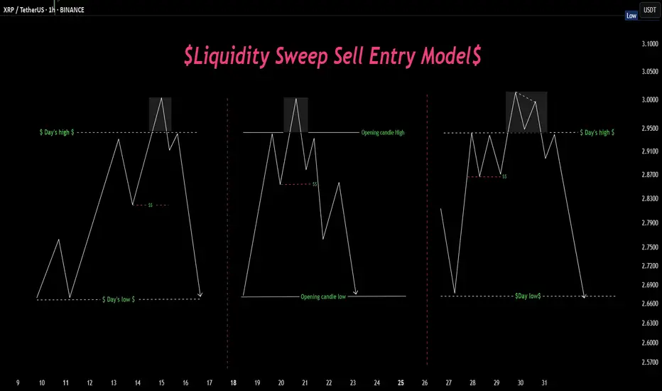
Sweep, trap, send. Textbook manipulation move Liquidity hunts in action 🏹 — Three variations of price sweeping key highs before a major move down. Spot the trap, ride the reversal. 📉💧
RSI Divergence - Daily ChartsWhat is RSI Divergence?
RSI Divergence occurs when the price action and the RSI indicator move in opposite directions. It signals a potential trend reversal or correction. As shown in the chart, Clearly marked the real time scenario. Manipulation can be done in the prices but they cant manipulate RSI meter.
🔻 Types of RSI Divergence
1. Bullish Divergence
Price makes lower lows
RSI makes higher lows
🔁 Suggests weakening bearish momentum → potential upward reversal
2. Bearish Divergence
Price makes higher highs
RSI makes lower highs
🔁 Suggests weakening bullish momentum → potential downward reversal
Enhance your trading with simple concepts. Go deep not broad.
MEMEFİUSDT CHART ANALYSİS WHAT IS A CRYPTO WALLET?
Cryptocurrency wallets, or simply crypto wallets, are places where
traders store secure digital codes needed to interact with a blockchain.
They do not actively store your cryptocurrencies despite what their
name may lead you to believe.
Crypto wallets need to locate the crypto associated with your address
in the blockchain, which is why they must interact with it. In fact,
crypto wallets are not as much a wallet as they are ledgers: They
function as an owner’s identity and account on a blockchain network
and provide access to transaction history.

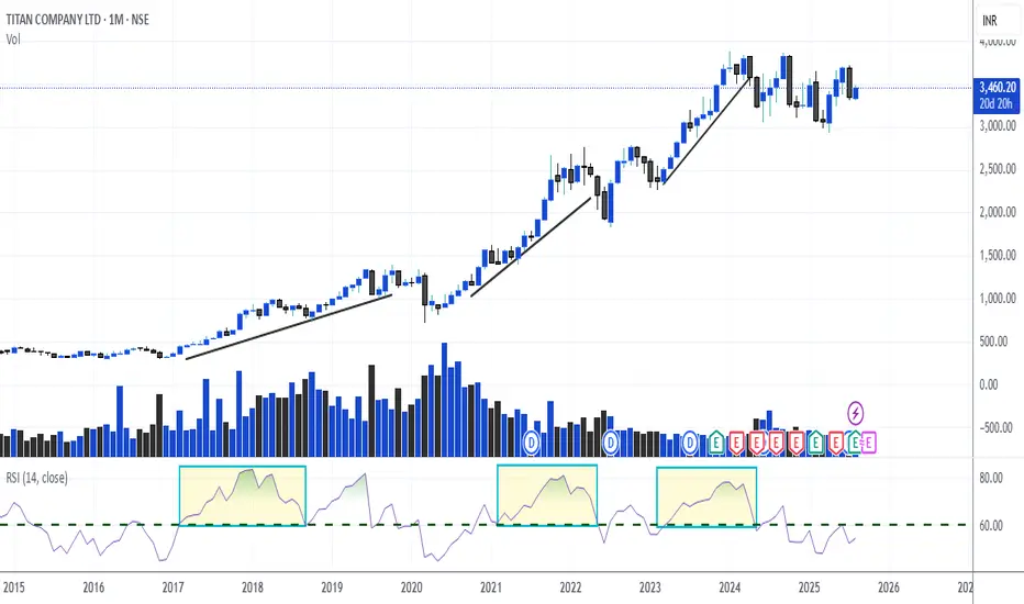
RSI - 60 Crossing - Monthly Plus Daily Chart - High Momentum As explained in the chart of Titan Monthly, whenever RSI has crossed 60 levels - it has given an exemplary gain in the stock. Now you can check with any script -
Monthly - RSI - 60 Crossing
Daily - RSI - 60 Crossing
If you focus on this simple concept only, You will win 8 out of 10 times in a trade.
You can opt for positional Trades or Swing Trade or Stock Options buying.
I have shared the setup of all in my last post. Kindly check it.
Also I have shared 75 High Beta Liquid Stocks if you want to focus on Stock Options or Normal Trades. That will be more than enough.
Go practise it and let me know in the comment if you want any assistance in understanding this concept.
Faraaz T
Sr. Research and Equity Analyst
Stockholm Securities - UK
Examples of Conditions for Starting a Trade
Hello, fellow traders!
Follow us to get the latest information quickly.
Have a great day!
-------------------------------------
This time, I'm going to talk about when to start and when to close a trade.
Trading has no beginning or end.
In other words, you can start a trade at any time and close it at any time.
The only question is whether you can profit from the time you start the trade and when you close it.
Therefore, it's best to be clear about why you need to start trading.
In other words, you need to be able to explain why you need to start trading now.
If you can't, it's best not to start trading.
You should also be able to explain why you're closing the trade now or selling in installments.
If you can't, it's likely that you don't have a well-established trading strategy.
A trading strategy should be developed from a broad perspective.
After that, you should develop a detailed response strategy that stabilizes your psychological state according to price volatility and guides your trading accordingly.
Therefore, a basic trading strategy is essential.
This basic trading strategy may vary depending on your investment style, so it's important to establish a basic trading strategy that suits you.
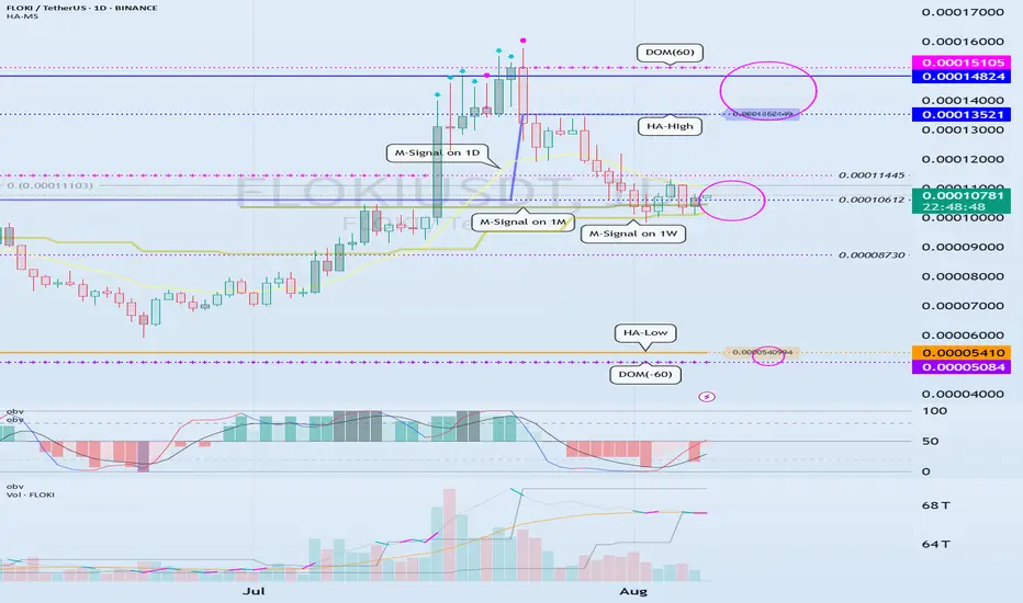
My basic trading strategy is to buy in the DOM(-60) ~ HA-Low range and sell in the HA-High ~ DOM(60) range.
------------------------------------------------------------------------------
To initiate a trade, you can determine whether support is available at important support and resistance levels or areas.
The optimal range for this is when support is found and the price rises in the DOM (-60) ~ HA-Low range.
This corresponds to the conditions for trading on the Heikin-Ashi chart.
-
Next, the M-Signal indicators on the 1M, 1W, and 1D charts converge and break upward, sustaining the price.
In other words, the price rises when support is found around the current price range of 0.000010612-0.00011445.
This represents an important turning point from a trend perspective.
-
If you bought in the above range, the sell range would be 0.00013521-0.00014824.
This sell zone corresponds to the high point, HA-High ~ DOM(60).
This means that a stepwise uptrend, or a full-blown uptrend, is likely to begin only when the price rises above the HA-High ~ DOM(60) range.
-
If you start trading at other support and resistance points or zones, it can be difficult to respond to price volatility.
Therefore, it's best to check for support and initiate trading within the DOM(-60) ~ HA-Low and HA-High ~ DOM(60) zones, if possible.
From a trend perspective, if the M-Signal indicators on the 1M, 1W, and 1D charts converge, and the price breaks upward and sustains, as is currently the case, trading is possible if support is found at the support and resistance levels near those points.
While this trading method cannot guarantee profit, it is worth developing a trading strategy and attempting it.
-
Thank you for reading to the end. I wish you successful trading.
--------------------------------------------------
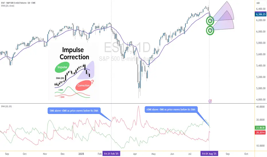
Corrective Dip or New Downtrend on the S&P 500 Futures?🟣 1. Impulses vs. Corrections – The Classical View
When price trends, it doesn't move in a straight line. Instead, it alternates between directional movements called impulses and counter-directional pauses or retracements known as corrections. Most analysts define an impulse as a sharp, dominant move in the direction of the trend—typically accompanied by rising volume and momentum indicators. Corrections, on the other hand, tend to be slower, overlapping, and often occur with declining volume.
Common methods to identify impulses vs. corrections include:
Swing structure: Higher highs and higher lows suggest impulse; overlapping lows suggest correction.
Fibonacci retracements: Corrections often retrace up to 61.8% of a prior impulse.
Moving averages: Price above a rising MA is often viewed as impulse territory.
Volume analysis and oscillators such as RSI or MACD are used to confirm price behavior.
Despite the abundance of methods, the distinction between impulses and corrections often remains subjective. That’s where the Directional Movement Index (DMI) provides an objective lens—especially when paired with price action.
🟣 2. Rethinking Impulses with the DMI Indicator
The Directional Movement Index (DMI), developed by J. Welles Wilder, offers a quantitative way to assess the strength and direction of price movement. It breaks down market activity into three components:
+DMI (Positive Directional Movement Index): Measures the strength of upward movements.
−DMI (Negative Directional Movement Index): Measures the strength of downward movements.
ADX (Average Directional Index): Quantifies overall trend strength but is optional in this discussion.
The key to applying DMI lies in the crossover between +DMI and -DMI:
When +DMI > -DMI, upward price moves dominate—suggesting bullish impulses.
When −DMI > +DMI, downward moves dominate—suggesting bearish impulses.
Calculation is based on a comparison of successive highs and lows over a specific lookback period—commonly set to 14 or 20 periods.
While EMAs track trend direction and momentum, DMI helps dissect who’s in control. This makes it a powerful filter when evaluating whether a breakdown or breakout is likely to become an impulsive trend—or just another correction in disguise.
🟣 3. Case Study – Two Breakdowns, Two Outcomes
Let’s apply this logic to two recent moments on the E-mini S&P 500 Futures (ES) daily chart.
🔹 Feb 21, 2025 Breakdown
Price broke sharply below the 20-period EMA. At first glance, this looked like a potential trend reversal. The DMI confirmed this suspicion: −DMI surged above +DMI, signaling downside impulses were in control. The market followed through with a clear downtrend, confirming the move was not just a pullback—it was a shift in market structure.
🔹 Aug 1, 2025 Breakdown
A similar sharp break below the 20 EMA just occurred again. However, this time +DMI remains above −DMI, despite the bearish price action. This divergence tells a different story: the breakdown may not be impulsive in nature. Instead, it's likely a corrective dip within a broader uptrend, where buyers are still the dominant force.
This is a textbook example of how a moving average crossover without DMI confirmation can mislead traders. By combining these tools, we’re able to make more informed decisions about whether price action is signaling a true shift—or just a pause.
🟣 4. CME Product Specs – ES vs. MES
Traders can express directional views on the S&P 500 using two primary CME futures contracts: the E-mini S&P 500 Futures (ES) and the Micro E-mini S&P 500 Futures (MES). Both track the same underlying index but differ in size, capital requirement, and tick value.
✅ E-mini S&P 500 Futures (ES)
Symbol: ES
Contract Size: $50 x S&P 500 Index
Tick Size: 0.25 index points
Tick Value: $12.50
Initial Margin: Approximately $21,000 (varies by broker and through time)
Market Hours: Nearly 24/6
✅ Micro E-mini S&P 500 Futures (MES)
Symbol: MES
Contract Size: $5 x S&P 500 Index
Tick Size: 0.25 index points
Tick Value: $1.25
Initial Margin: Approximately $2,100 (varies by broker and through time)
The Micro contract provides access to the same market structure, liquidity, and price movement as the E-mini, but with a fraction of the exposure—making it ideal for smaller accounts or more precise position sizing.
🟣 5. Risk Management Matters
Understanding whether a market move is impulsive or corrective isn’t just academic—it’s the difference between positioning with the dominant flow or fighting it. Traders often get trapped by sharp moves that appear trend-defining but are simply noise or temporary pullbacks.
Using tools like DMI to confirm whether directional strength supports price action provides a layer of risk filtration. It prevents overreaction to every EMA crossover or sudden price drop.
Stop-loss orders become vital in both impulsive and corrective conditions. In impulsive environments, stops help lock in profits while protecting from reversals. In corrective phases, they act as circuit breakers against breakouts that fail.
Moreover, knowing the product you're trading is critical:
A single ES contract controls ~$320,000 of notional value.
An MES contract controls ~$32,000.
This disparity means poor sizing on ES can magnify errors, while proper sizing on MES can offer flexibility to test, scale, and hedge with tighter capital control.
Whether you're reacting to price or preparing for continuation, risk management is the only constant. It’s what turns analysis into disciplined execution.
When charting futures, the data provided could be delayed. Traders working with the ticker symbols discussed in this idea may prefer to use CME Group real-time data plan on TradingView: www.tradingview.com - This consideration is particularly important for shorter-term traders, whereas it may be less critical for those focused on longer-term trading strategies.
General Disclaimer:
The trade ideas presented herein are solely for illustrative purposes forming a part of a case study intended to demonstrate key principles in risk management within the context of the specific market scenarios discussed. These ideas are not to be interpreted as investment recommendations or financial advice. They do not endorse or promote any specific trading strategies, financial products, or services. The information provided is based on data believed to be reliable; however, its accuracy or completeness cannot be guaranteed. Trading in financial markets involves risks, including the potential loss of principal. Each individual should conduct their own research and consult with professional financial advisors before making any investment decisions. The author or publisher of this content bears no responsibility for any actions taken based on the information provided or for any resultant financial or other losses.
Turning Stock Declines Into Your Best Trading OpportunityTurning Stock Declines Into Your Best Trading Opportunity
When stocks fall dramatically, many investors panic. But what if those drops were actually the set-up for some of the most lucrative opportunities?
In this article, you’ll discover why sharp declines can set the stage for outsized gains, how the mathematics of recovery works, and how to use classic technical patterns to identify the ideal entry points. And the most important, how to do it easily on Tradingview!
The Power of Recovery: Why a Drop = Big Upside
Every percentage drop in a stock’s price requires a much larger percentage gain to return to its previous high. Recognizing this simple truth can turn “market fear” into “trader’s opportunity.”
Here’s exactly what a stock would need to climb, after various drops, to reclaim old highs:
| Drop (%) | Required Gain to Recover (%) |
|----------|-----------------------------|
| 10 | 11.1 |
| 20 | 25.0 |
| 30 | 42.9 |
| 40 | 66.7 |
| 50 | 100.0 |
| 60 | 150.0 |
| 70 | 233.3 |
If a top-quality stock drops 50%, it needs to go up 100% just to get back, so smart entries after steep drops can double your money on a bounce.
When These Pullbacks Are Opportunity: The Case of Market Leaders
Stocks like Eli Lilly, UNH, Novo Nordisk, ASML, AMD, or Lululemon are examples of quality growth companies that sometimes undergo sharp, hype-driven sell-offs.
Recent history shows:
- Eli Lilly, UNH or Novo Nordisk : Leaders in innovative health solutions, frequently see pullbacks despite strong demand in their sectors.
💊 NYSE:LLY (Down up to 30%)
Most analysts are highly bullish on Eli Lilly , with most giving it a "Strong Buy" rating. The 12-month consensus price target ranges between $956 and $1,016 , suggesting a 25–32% upside from current levels . Optimism is driven by strong momentum in its obesity and diabetes drug pipeline, especially GLP-1 treatments like orforglipron. Risks include high valuation and dependence on future drug approvals.
Technically speaking, Eli Lilly is currently trading within a channel , also known as a flag pattern when it forms during a bull trend. There are two common ways to trade this setup:
You can either wait for the price to drop to the bottom of the channel for a lower-risk entry, or wait for an upside breakout to join the rally at its strongest point.
Both approaches are considered low-risk, high-reward trades. However, entering a position right now is not ideal , as there is still room for the price to decline before a potential breakout in this premium stock.
💊 NYSE:UNH (Down up to 60%)
The Analysts are generally positive on UnitedHealth Group , despite recent challenges like CEO changes and regulatory concerns. Most believe the company has strong fundamentals and expect it to recover over time. The average 12-month price target ranges from $380 to $400, which suggests a potential upside of over 60% from current levels . While a few firms have lowered their outlook, the majority still recommend buying the stock.
Technically speaking , the price dropped after breaking below its support zone (red).
It briefly paused in a first support area (blue), where some optimistic buyers stepped in, but eventually continued down to a more important zone.
The green area marks the main trading zone from before COVID , with high volume and strong interest, this is where many institutional investors are likely to see value and start buying this premium stock again .
Interestingly, analysts’ average price targets are below the previous support, suggesting a possible pullback to that area. If this happens, it could mean a 60% to 90% rally for UNH from current levels (though some further decline within the green zone is still possible and as we saw at the start, even more profits!).
💊 NYSE:NVO (Down up to 70%)
Analysts have a cautious but constructive outlook on Novo Nordisk, with an average 12‑month price target of around $80.
While some firms maintain buy ratings, many have recently lowered their views amid mounting competition from Eli Lilly and concerns over copycat semaglutide products depressing growth. A few stronger bulls still point to the long-term potential in obesity and diabetes markets as reasons for future upside. Others see significant headwinds, noting falling demand for legacy drugs and disappointing trial outcomes such as CagriSema setbacks. Overall, most analysts expect a recovery from current levels.
Technically speaking , the price dropped after breaking below a Head and Shoulders pattern , which led to a sharp decline in Novo Nordisk's stock.
The price has now reached a key previous support zone, where the Volume Profile (VRVP) shows significant activity, this often suggests institutional investors may start buying again, viewing the current levels as a bargain. While it's wise to be cautious ahead of tomorrow’s earnings report, the overall downside risk appears limited, given the company’s strong cash flow and solid product pipeline.
That said, investor expectations around obesity and diabetes treatments are no longer as optimistic as they were a few years ago, which could weigh on future growth. Still, from a technical and fundamental standpoint, this area may offer an attractive entry point to sell at $80 for a 70% profit!
Other well-known stocks that could present an amazing opportunity soon include NASDAQ:LULU , EURONEXT:ASML , NYSE:MRK , NASDAQ:PEP , SPOT NYSE:SPOT or $NYSE:PFE. Right now, I don’t see strong patterns in these charts , but they’re approaching interesting buy zones. I’ll be keeping a close eye on them, just in case a setup starts to form.
These tickers, as of August 2025, stand well below consensus price targets, so a recovery from current levels toward analyst consensus highs could deliver powerful returns.
⚠️ An example of previous opportunities
I like to understand the past before trying to predict the future , so it’s fair to show some previous examples of stocks that were "on sale."
The first example is NASDAQ:META
A well-known premium stock that experienced a massive crash during 2021 and 2022 due to the failure of its metaverse strategy. The stock lost more than 75% of its value , a truly astonishing drop. During this period, a falling wedge pattern formed on the chart , indicating that bearish sentiment was fading. After confirming the pattern, the stock went on to rally more than 700% , yes, you read that right, a 700% rally followed.
Later, another crisis, this time triggered by Trump, hit the stock, causing a sharp 35% drop in just a few weeks. Eventually, the price reached a strong buy zone (high VRVP and previous important supports), and in the weeks that followed, we’ve seen a 63% rally that is still unfolding.
During 2025 , we’ve also seen
NASDAQ:NVDA fall 35%, only to come back with a 110% rally .
NASDAQ:MSFT dropped 25% and then delivered an impressive 60% gain afterward.
NYSE:ORCL lost 40% in just a few months, and now we’re seeing a massive rally, up 120% , even outperforming NVDA. Simply amazing.
🚀 Finally, some previous published ideas based on the same principle:
⭐ Buying COINBASE:XRPUSD after a large decline (Yes, the methodology also work for other assets!)
⭐ Buying NASDAQ:DLTR at the bottom, after a 65% decline to enjoy a (for now) 90% rally.
⭐ Buying AMEX:GROY after doing two Double Bottoms and breaking the resistances for a 25% rally.
You can find more Ideas on my profile, always based on Chart patterns with low risk and high returns profile .
⏳ Entry Timing: Rely On Technical Patterns, Not Indicators
The key to entering these stocks efficiently isn’t about moving averages, RSI, or fundamentals. It’s about reading price action, volumes and technical chart patterns that reflect buyer behavior and sentiment shift.
Some famous examples:
- Double Bottom : Two clear lows near the same support zone, signaling sellers are losing strength and buyers may take control. The breakout above the intermediate high is usually a decisive signal of a trend reversal. I have published multiple ideas with double bottoms recently.
- Hammer Candle at Support : After a strong decline, a single candle with a short body and a long lower wick near a known support. This shows aggressive intraday buying, hinting that the sell-off momentum is vanishing.
- High Volume at Support: While volume isn’t a classic “indicator,” a surge in transactions as price holds support often marks institutional buying, confirming higher conviction in a potential bottom. Also the VRVP lateral indicator is a great help to know price levels with masive volume.
Spotting these technical structures on stocks deeply “on sale” lets you step in with a skewed risk/reward: your downside is defined (below support), your upside is open (toward recovery), and your edge comes from patient pattern recognition, not luck.
The TradingView screener is a great tool for finding “on-sale” stocks by filtering based on % Change. Pro Tip : The % Change is set to 1-day by default, but you can adjust it to show up to 1 month using the blue dropdown at the top.
After that, you have pattern recognition indicators like double bottoms or the VRVP for volume zones which are both AMAZING.
🔍 Visualize the Opportunity
Here’s your roadmap :
1. Scan for sharp declines in leading names, ideally those with price objectives far above current prices.
2. Strong technical pattern (double bottom, hammer on support, high-volume reversal days).
3. Wait for confirmation of pattern completion with renewed bullish price action or buy in the support, that is risky, but gives a unique risk reweard ratio when it works!
4. Act decisively when patterns confirm, your entry is efficient, your risk controlled, and your recovery math is in your favor.
> Remember : Technical patterns are your best ally for timing entries during periods of panic-driven price drops. Used well, they help you capture robust returns with clear risk management, making market sell-offs a trader’s opportunity, not a threat.
It seems that this August is a good month to start practicing finding bargains.
💬 Does this post helped you?
🚀 Hit the rocket if this helped you spot the opportunity and follow for more clean, educational Chart Patterns trade ideas!
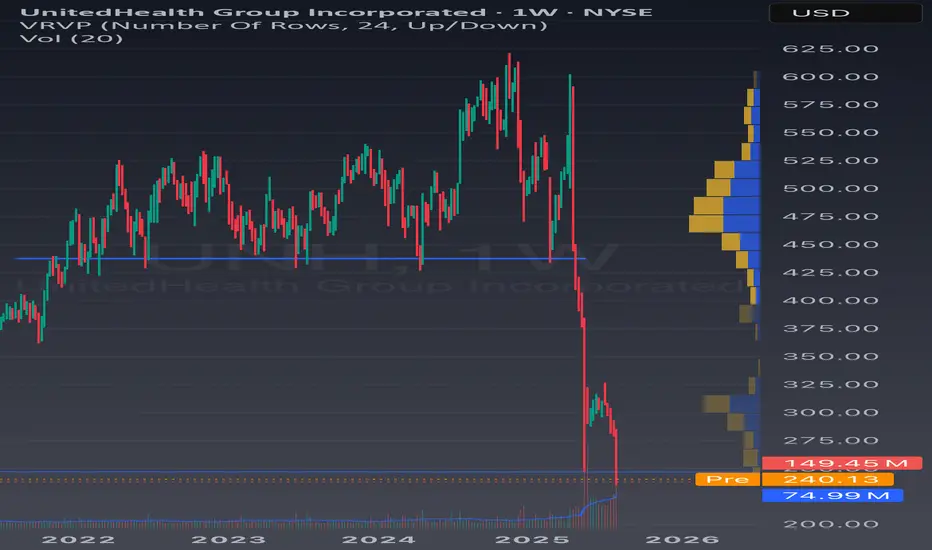
From Execution to Adaptation: Enter Dynamic ProbabilitiesIn the previous article , we looked at a real trade on Gold where I shifted from a clean mechanical short setup to an anticipatory long — not because of a hunch, but because the market behavior demanded it.
That decision wasn’t random. It was based on new information. On structure. On price action.
It was based on something deeper than just “rules” — it was about recognizing when the probability of success had changed.
That brings us to a powerful but rarely discussed concept in trading:
👉 Dynamic probabilities.
________________________________________
📉 Static Thinking in a Dynamic Market
Most traders operate with static probabilities — whether they realize it or not.
They assign a probability to a trade idea (let’s say, “this breakout has a 70% chance”) and treat that number as if it’s written in stone.
But markets don’t care about your numbers.
The moment new candles print, volatility shifts, or structure morphs — the probability landscape changes. What once looked like a clean setup can begin to deteriorate. Conversely, something that looked uncertain can start aligning into high-probability territory.
Yet many traders fail to adapt because they’re emotionally invested in the original plan.
They’ve already “decided” what the market should do, so they stop listening to what the market is actually doing.
________________________________________
🧠 Dynamic Probabilities Require Dynamic Thinking
To trade dynamically, you must be able to update your internal odds in real time.
This doesn’t mean constantly second-guessing or overanalyzing — it means refining your bias based on evolving context:
• A strong breakout followed by weak continuation? → probability drops.
• Price holding above broken resistance with clean structure? → probability increases.
• Choppy pullback into support with fading volume? → potential reversal builds.
It’s like playing poker: you might start with a good hand, but if the flop goes against you, your odds change.
If you ignore that and keep betting like you’ve got the nuts, you’re not being bold — you’re being blind.
________________________________________
📍 Back to the Gold Trade
In the Gold trade, the initial short was based on structure: broken support turned resistance.
The entry was mechanical, the reaction was clean. All good.
But then:
• Price came back fast into the same zone.
• Sellers failed to defend it decisively.
• The second leg down was sluggish, overlapping, and lacked momentum.
• Compression began to form.
That’s when the probability of continued downside collapsed — and the probability of a reversal increased.
The market had changed. So did my bias.
That’s dynamic probability in action — not because of a feeling, but because of evolving evidence.
________________________________________
🧘♂️ The Psychological Trap
Many traders intellectually accept the idea of being flexible — but emotionally, they cling to certainty.
They fear being “inconsistent” more than they fear being wrong.
But in a dynamic environment, consistency of thinking is not about repeating the same action — it’s about consistently reacting to what’s real.
True consistency is not mechanical repetition. It’s mental adaptability grounded in logic.
________________________________________
🧠 Takeaway
If you want to trade professionally, you must upgrade your mindset from fixed-probability execution to fluid-probability reasoning.
That doesn’t mean chaos. It means structured flexibility.
Your edge isn’t just in spotting patterns — it’s in knowing when those patterns are breaking down.
And acting accordingly, before your PnL does it for you.
Disclosure: I am part of TradeNation's Influencer program and receive a monthly fee for using their TradingView charts in my analyses and educational articles.